Transcripts
1. Introduction: DIY is an independent artist. Have you ever wanted to create eye catching artwork for your music without needing
expensive software? In this class, I'm going
to show you how to unleash the creative
power of Canva, an inexpensive and
powerful tool that I personally use to make
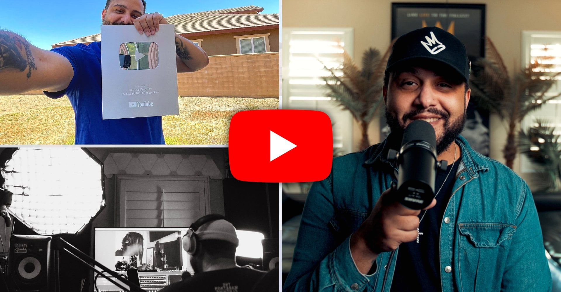
professional visuals. By the way, I'm Curtis King,
an independent artist, music producer, author, and YouTuber of the channel
Curtis King TV. Over 20 years as an
independent creative, I've built my career
as a successful DIY, do it yourself,
independent artist and music producer by finding
success on my own terms. And as an artist myself, I know what it feels like to
put the responsibility of artwork and design
in the hands of a graphic designer
that doesn't deliver. This is why I'm
passionate about helping independent creatives like
yourself do it yourself. Thing that I've learned
in my experience is that your visual presentation is just as important as
the music itself. By the end of this class,
you'll be able to design single song artwork that truly represents
your musical style. Whether you're a
complete beginner or someone who's dabbled
in design before, this class is for you. I'm super excited about
teaching this class because once you
learn the skills that I'm getting
ready to teach you, you will have full control over how your music is
presented to the world. And this class is perfect
for independent artists and creatives that want
to make a memorable impact with their visuals. Course, we'll go step by step. I'll walk you through
everything from how to use Canvas tools
to how to create your own custom design for your single art or
your album artwork. And the best part to me
is that you don't need any prior designing experience to get through this course. We'll cover color psychology,
typography, psychology, and how to apply that when making decisions about the
artwork for your music. All you really need
is a computer or laptop or your phone in
order to access Canva. For the class project, I'll be requiring you
to make artwork for a single song that best represents your style
and your sound. And honestly, I can't wait to
see what you come up with. With that said, let's get started on taking your
visuals to the next level. I'll see you in Lesson one.
2. A Tour of Canva Desktop: In Lesson one, I'm going to
take you on a tour of Canva. I'm going to show you
the tools that I use. I'm going to show you
how to navigate it. But in order for us to do that, I need you to download
the Canva Desktop App. Now, I'm a Windows user, so I have downloaded
the Windows version. There is a Mac OS version. There's also a version that you can use for your smartphone. What you'll be seeing
for the majority of this course will be
for the desktop app. There's so many features
that are so much easier to navigate
when you download. Once you download the
Canva desktop app, this is what the dashboard
is going to look like. The only thing that's
going to be missing is recent designs unless you've
already signed up for Canva. The Canva account that I have is the one that you pay
$12 a month for. I use it because it
gives me full access to any and every tool that is
necessary to what I do. If you're just getting started and you're curious about Canva, it may not be a necessity, but it is something I wanted to. Things first, you'll
see on the left side, you have a few different windows that you can click
through on Canva. We're going to start
here on the Home tab, and as you can see, the Home tab has a variety
of options to choose from. This is where you're
probably going to spend the majority of your time. Here at the top, you'll see that it even gives you options of what type of artwork
you may want to create. By clicking on these, it'll
navigate to a new window, and it'll give you
further options to dig into that we're going to talk about here
in just a second. As you create designs, you're going to also see your recent designs fall down here. There's even a convenient
recent designs tab here that you can easily open up new windows and
navigate through. Next up is the projects tab. Here you're going to see a
more extensive breakdown and list of the designs and even sub folders that you
can create that will include the important assets that you'll use from every single
piece of artwork, whether it's your logo, specific
photos that you may use. This is where you're
going to organize things if you choose to do so. Here is where you're
going to find images that you upload. Don't need to be
concerned about this one because we're going to find this when we actually
edit an actual photo, and I show you some of the
options that are available. Canva, you also have the
ability to upload videos, and as you can imagine, in combination with
their templates, this can create some
really cool designs. Next tab is the templates. In the Templates tab, this is where you're going
to navigate what I believe makes Canva so
different from other platforms. One of my biggest challenge as an independent
artist was finding a graphic designer that had the ability to create professional artwork in
different categories. What Canva has done with this templates tab is brought
together some of the best graphic designers
from around the world and had them create templates
for different scenarios, artwork for songs, art albums, artwork for banners, fliers, whatever you can
think of, you'll find that here in the templates. With these being made
by graphic designers, they have already gone through the process of picking
the right fonts, picking the right colors that all reflect a very
specific message. Next, brand. Now, this brand tab comes with the premium account that you pay up to at this
moment in time, I believe it's $13 a month. This is where you can organize
assets of your brands. It says here,
introducing your brand, easily set up, manage, and grow your brand with
all of your ingredients, assets, controls, and
workflows in one place. Replace logos, images across existing designs in
just a few clicks. Find all of your
brand assets and templates from One
place in the editor. I've seen a lot of people use
this in order to save time. I rarely use it, but I at least want to make sure that
you've been exposed to it. This is an awesome place
for you to upload. All of your logo designs to one place, assign brand colors, assign brand fonts,
and even assign a brand voice for those of
you that are AI enthusiasts. Next tab is the Apps tab. Inside here, what
you're going to find are additional apps, additional tools that help you do some very
specific things. For instance, you
can add effects like a liquefy effect
to your photos. You can convert
low quality videos into stunning HD
with the help of AI. You can even integrate and quickly add your
artwork that you make inside here into some of your other programs
like Dropbox. Last but not least, you
have this dream lab tab, which is a newer tab that
allows you to generate AI images just from
a single prompt. Of all the AI image generating tools that
are out there right now, this is just yet another that you can use to
experiment with.
3. Navigating Canva's Image Editor: Okay, now that we've
seen these main tabs, let's navigate here to where we're going to spend
most of our time, which is the dashboard
and Home tab. Since we're probably
going to be spending most of our time in this class, creating square artwork for
singles and for albums, why don't we start
first by creating a custom size artwork
just so you can see some of the tools that are internally once you
start to create. Going to go over here to the
top and go to custom size. Now, of course, most of
the artwork that we create for our music is going to
be in a square format. And most of the distributors that we use are
going to require us to use 3,000 by 3,000
as our measurement. Let's go ahead and
create that design. Whenever you create
a new design, this is where you're going
to go ahead and title it. Let's just call this
single artwork. Once you're inside
your new artwork, you're going to
see there's a ton of new tabs that weren't
available before. The first one being
the template tab, and this is going to be
a quicker way for you to navigate through a lot of those templates that
you saw before. Now, based upon the template
or the size that you choose, Canva usually creates
templates that are made specifically
for that size, and they assume what type
of artwork you're making. Since we didn't
designate this as a single artwork, let's
just put it in here. Okay, so I've typed
in here single cover, and what you're seeing already are a bunch of
inspirations here. If you see a template
that you like, you can easily click
over the top of here. And what you'll see is
that every single one of these tools are now
able to be edited. You can move around the
layers, the letters. What I like about
using the templates is that it also serves as an educational piece to show you how to actually
make your artwork. Whenever you click on any layer, you're going to be met
with a bar at the top that gives you the option
to edit, change the border, round the corners,
crop the image, reverse and flip the image, change the opacity
or the transparency of the image, animate the image. Change the position or
copy the layer style. We'll go more into
detail with that when we actually
design our artwork. The next tab is
the Elements tab, and the elements tab,
let me tell you, is so powerful that I
feel like it helps you to replace the necessity
to download images, search out images, PNGs, and transparent
images on Google. Are you looking for
an ice cream cone? It's here. And in many
different styles. What I love the most
about it is that they don't have anything in
here that is low Rz. So whenever you're on
Google and you're looking for images to add
to your artwork, you run the risk
of one not having the permission to use
it and two of it being so low rez that it
looks unprofessional when contrasting it with other
elements in your artwork. And as you can see here,
you can add charts, tables, frames where you can
put your own photos in here into these
customized shapes. Grids, if you wanted to add multiple photos on an
i tab is the text tab, and this is how you
add your own text. If you click down
here to Add New page. And just like the templates, you also get some
pre made options here for adding your own text. These are all, of course,
created by graphic designers that took into consideration
typography psychology. So, of course, if
you see something that catches your eye, you click on it and you can use the corners in
order to expand it. Double click you can type whatever message
that you want there. Now that we have brought
text into the equation, we have more options up
here, as you can see. Here, if I click on
top of this font, I'm able to navigate through the numerous fonts that
are provided by Canva, as well as uploaded fonts
from my own collection. The next window
is the font size. Next over, this is where
you change your text color. Highlight the entire text that you want to
change the color of. Click here to add new color, and then you can browse all
the different colors across the color wheel and then pinpoint what color you
would like your text to be. As you choose colors, what
you're going to see is that they're going to also
start to populate up here. So you can always reference any color that
you've used before. Here is where you're going
to be able to borrow colors from an image that you
share with the text, and then here is where
you're going to see some default colors that choose from that Canva provides to you. Next over is obviously the
ability to bold your text, put it in italics, underline it, create a strike
through, choose whether or not you want every
letter to be uppercase, the alignment of your text, bullet points on your text. Then next up, this is where you change the spacing of your text, whether it's the spacing between every individual letter or
spacing between every line. Next over, this is where
you're going to change the transparency on your text. Next up, you have an effects
tab here for the text. Here's where you're
going to unlock ways to make your text stand
out even more. You can add drop shadows, IFs. You can hollow out your text, create a slice effect. You can outline your text
while changing the colors, create an echo effect, glitch, even a neon effect. You can create a
background effect to further highlight your text, and you can even
curve your text here. Last but not least, this is where you're going to
change the animation. We'll talk about this
as we get into more of the Instagram stories
and add artwork. This is something
you typically won't use for static images. Next tab is the brand tab, and this is where
you're going to access those things that you initially set up
in your brand kit. Next tab is the Uploads tab. This is where you're going
to be able to provide your own images and upload
them directly to Canva. Canva will, of course, host your images, logos, photos. One awesome thing that I love
about this tab is that you could always search for
things by typing it in. So if I put logo, now let's load up an image so I
can show you some of the additional options
that are made available. Whenever you add a
photo to your project, of course, you can
change the size of it. If you click on Edit, it opens
up so many more options. Most important one here
is the adjust option. This is where you can
edit your photos the same way you would in any
photo editing software. They have an auto adjust
option that uses AI to make sure that your images
are perfectly contrasted. They have great saturation, lighting, brightness,
and all that good stuff. You can change the
temperature of the image, change the tint, the brightness, contrast,
highlights, shadows. And if you ever do anything that manipulates the photo in a
way that you don't like, just push reset adjustments and you're back to
where you right, next up, let's talk
about Magic Studio. Magic Studio is where
you're going to unlock even more powerful
tools for your images. This is probably the most
common one that I use. This is an automatic background
remover. Let's click on. For those of you that remember
the days when you had to manually delete backgrounds, and it wasn't just this easy, I'm sure you see that and
think that this is witchcraft. No, it is not witchcraft. Not only is it quick through Canva to delete a background, but you can go into
here and you can actually use their brush tool and delete anything
else that you don't feel like should fit here. Now, some of these are some of the premium options that come along with
the paid account. Next up in the advanced
image settings, you also have a filters tab. This is where you can have
some pre baked filters over the top of your image. The next tab is the Effects tab. Here's where you can add
things like drop shadows, dual tone effects, blur
effects, autofocus. In the Effects tab, I typically use the drop
shadow pretty often. Let's go ahead and
remove the background, and let's go ahead and click on the Drop Shadow and let's
see what it looks like. And as you click over
every single one of these, you'll see that you even have some additional ways to
manipulate these drop shadows. And the last tab here
is the Apps tab, and this is where
whatever app you find, you're going to be able
to access it here really quickly for this
particular image. For the next tab, you
have a draw tool. This is a crazy tool
that allows you to draw directly over the top of your
images using your mouse. Next up, you have another way to access your projects
quickly through here. You have another quick
navigation to your apps. The next tab is another
way that I feel like Canva makes Google
obsolete when images, pretty much any image
that you could think of. In the next tab,
this is where you're going to see videos
that are made available royalty free by Canva that you can utilize
within your artwork. Next, this is where
you're going to find some creative and high
resolution backgrounds provided by Canva to whatever artwork that
you're working on. And then after this, this
is where you're going to be able to access any files that you may have chosen to
organize before jumping into. Last thing I want to
talk about are some of these tabs here
at the very top. If you click here on the file, you'll see that you can
create a new design quickly right here
and within the app. You can upload new files,
change the settings, show margins, print bleed, change your
accessibility options. Canva typically auto saves. You don't have to worry
about that. You can move your designs
to a new folder, make a copy, download. If you navigate over here, you can undo and redo anything that you
do within your artwork. By clicking here, you
can give access to someone to share in your
designs and add to them, add commentary, as well as help. Here you can get insights
on your designs. And last but not least, this is going to be the
powerful button that allows you to export whatever artwork that
you're working on. Alright, now that you've
taken the tour of Canva, let's talk about
your class project.
4. Class Project: Alright, let's talk
about the class project. By the end of this course,
you'll be exposed to so many different
styles and tools and lessons and techniques
that will help you to create your own artwork
whenever you need it. To see where you're at, I would love by the end
of this course for you to create your own artwork
for a singular song. It could be for a song
that's already released or for a song that
you plan to release. Either way, I want you to put the things that you
learn into action. Once you create it, feel free to submit it
for some feedback.
5. Understanding Color and Font Psychology: In this lesson, I want to
explain the importance of color psychology as well
as typography psychology. For those that don't know, every color that
you choose to use, every font that you
choose to use sends a message to your potential
listener and viewer. When creating your artwork, I think it is supremely
important that you choose colors and fonts that
represent the color, the style, the temperature of the message and the music that you're
trying to convey. Of times people are choosing colors because it's
their favorite, and sometimes they're even
choosing fonts because, well, it just looked good. But it doesn't always
mean that it's going to accurately represent the message
that you want to convey. Do it the right way and you can attract the right eyes and ears, but do it the wrong way, and you could
alienate people that could potentially
be fans of yours. First off, let's talk
about color psychology. Here it says color psychology
is the study of how colors can affect our
moods and behaviors. Here are some
common associations between colors and emotions. Red can be associated
with anger, passion, excitement, and love. Orange can be associated
with warmth, kindness, joy, and friendliness, yellow
associated with hope, joy, dangerous and happiness,
green associated with nature, growth, freshness
and contentment, blue associated with wisdom,
hope, reason, peace, and relief, purple
associated with mystery, nobility, and glamour, pink. Associated with softness,
reserve, and earthiness, brown associated with disgust, Black, associated with sadness, fear, nobility,
mystery, and coldness, gray associated with sadness, regret and disappointment and white associated with
truth and indifference. Of these things are subjective based upon our upbringings. Now, for many of us,
these associations with emotions and colors start
at a very young age, whether it was through the
cartoons that we chose to use, whether it was the colors
that we were attracted to, based upon our gender or based
upon our social circles, or even by our favorite
clothing brands or our favorite cereals. There are corporations that have done millions and
millions of dollars of research to make sure that they understand how these
colors make us feel. We need to make sure that us as independent creatives have
a basic understanding of this if we wish to convey the right emotions to
the right consumers. Font itself also
carries a psychology. It's called typography
psychology. Now, fonts are typically separated into different
font families. But if you can, just
follow the way that these fonts look
and ask yourself, how do they make you feel? It says here, the
family of Seripant. If you look at it, it looks traditional, trustworthy,
and timeless. Kind of like something
that you would associate maybe with Apple products. For the slab Serafont, it looks like confidence,
unique innovation. For San sera font, it looks clean, modern
and to the point. And if you notice the
differences are very, very subtle in the sizing of the letters and the
spacing of the letters, and the sharpness or the smoothness of the
edges of the letters. Next, script font
gives off the feel of elegant, creative, emotional, modern font, style, innovation, individuality, decorative font, casual, whimsical and creative. To reinforce this even more, I thought this was a
really cool image. As you can see, every
single font looks like the word that it
represents. Innocent. Looks childish. Street
looks kind of 90s urban. Scary looks like an
actual horror movie. Fun, looks like almost
like a balloon animal. Intelligent. Looks
corporate, cool. Looks pretty modern.
Straightforward. Cool. The more that
you sit with fonts, the more that you
start to understand the message that is
trying to get from you. Magazines do a
great job of this. So as you start to
choose colors that you think best
represent the song that you're going to make a
single artwork for or the album artwork that you're making, think
about these things. What best represents
the message, color wise that you
want to convey. In addition to that, make
sure that you're not using a font that misrepresents
what your album is all about, because when things are not done in an appropriate
way for your artwork, it can look like a movie poster to a movie that
nobody wants to see.
6. Designing Your Music Artwork: Now that we have a pretty
good understanding of color and
typography psychology, we should be able to confidently move forward into choosing the appropriate template for our music in terms of what
will best represent it. As we did before, let's set up a new session for 3,000 by
3,000 piece of artwork. As we did before, we're
going to go ahead and access the single
cover templates. I'm also going to
navigate here to uploads, and I'm going to
upload some photos that I took in my backyard. Thing that I like to do
is sit with the music in the background and really get a different type of
understanding of the song. Now, obviously, you wrote it, you produced it, so you have a great understanding as it is. But now I want you to look at this as if you
have been employed as the graphic designer
for your particular song. I want you to ask yourself some very general
questions such as, does the song pull me in? Does the song push me away? Is the song in my face
or does it feel distant? When you ask certain
questions like that, they make certain
types of templates, make that much more sense. Think if a song feels distant, the text should align with that, such as this
template right here. It feels mysterious. It
feels at a distance. However, if a song is in
your face and over the top, perhaps a template like this makes a whole
lot more sense. And then also keep in mind, although we're going to edit these templates so
that we don't have an exact type of artwork like somebody
else to a certain degree, we're also going to make
sure that we hold together its original integrity set in place by the
graphic designer. Avoid analysis paralysis where you won't know what to choose, I like to open up
multiple browsers in order for me to go back and forth through a few
different templates. So what I'll do is I'll
kind of just go through these and see which
ones grab my attention. Now, for this
particular artwork, we're going to call
this song Angels. I like this artwork as well. And we're going to imagine
that this is a song that pulls us in as a listener. We're going to
imagine that this is a song that has some
reflective energy to it, that has some really
warm energy to it. And so I'm going to
find artwork that I feel aligns with so with
these already in mind, all I have to do
next is just put in my images and then
manipulate those images or edit those images so
that they make sense in context of what this template has already laid out for me. Now, I have a few photos that my wife snapped of
me in the backyard, and I'm going to see how these translate within this template. If I drag the photo
over the background, it will replace whatever
the template had in place. It'll also expose some other elements
that maybe I couldn't see before that won't be necessary for the
artwork we're doing. So if you just hover over it, click on it, and push
delete, it'll be gone. Let's try this one.
That's not too bad. And what I can do here is just replace some of the elements
as they are given to us. I put my name here,
and as you can see, this is all in lowercase
letters. Let's keep it that way. Now, something that I'm
already noticing is that this blends in a little bit too
much with the background. Originally, it was on
a black background. So something that I can do to
match this photo more so to the original template is to edit this image and take away
some of the brightness. Increase some of the contrasts, change the vibrance
and the saturation, and I can even choose to
either sharpen it or blur it, depending on what effect
that I want to give. Would just be careful
about what you're actually adding and always keep in
mind that as you zoom it out, that's going to be a more
accurate representation of what your artwork is going to look like on a mobile device, which will be most of
your listeners anyways. So just something
to keep in mind. Something else that you
can do to really contrast the background is you can
click on the background, click on the transparency, and then turn this down, it's actually move this to the side because as you can see, the original background
is still here. Let's click on it, press delete. And now what you're
noticing is that there's a missing background
color, which is black. Click on the background,
click on background color, and then black background, and this should return it back to where it was
looking like before. I like the positioning
of where the name is at. Not too sold on how
the actual font looks. But what I want to do is
kind of stay as close as I can to the relationship between these two
fonts. I like that. Something else I
might want to add. Say, for instance, if this is an album cover would be a
parental advisory sticker. But now, as this is, I
wouldn't be mad at this, but I think another
way that we could really make it look
unique from anybody else who uses a very similar template would be to grab the
background image, and I do this so that we can establish some
separation between the next thing that I'm
getting ready to add. I want to find some texture. What you'll see a
lot of times in artwork in a very
subtle way is you'll see these sort of overlays that represent
a bit of texture. You'll see this
image right here. And if you put it over the
top of the original image, and we click here on
the transparency, let's test what
it will look like if this was the texture that we added over the top
of the g. Already, it's giving it an entirely
different energy. Now, I like the way
that this is looking. I think it has a nice
little contrast on things, but let's try one
more. All right. And let's choose another
one of these images. If we double click it, we can
even move it up and down. I want to move this
one up so that the text at the bottom
shows up where it needs to. This right here, which we're going to end up having
to change anyways. So let's go ahead
and get this here. Then here, it gives
you an option to add sort of a message to the listener or the viewer that reinforces what
this song is about. It says, To my distant
daydream, you know who you are. Let's say to the angels, watching over M. Thank you. Would definitely want to
change the color here so that it evokes more of the emotions that
we're going for it. Let's try some blues. One thing you want
to keep in mind as you're adding the colors, make sure that it's actually
popping off the background, and it's contrasting what the
background has given you. If the background
has given you dark, make sure the text is light. If the background has
given you bright, you want to contrast
that with dark. There's always another way
to contrast what's going on. Say, for instance, you
do like this color, but you just want it to pop and separate itself from
the background, click here to the Effects tab and choose one of
these shadow presets. For instance, like the lift, change the intensity of it, or we can choose outline. Keep in mind, as you
start to add things, you're straying away
from the original look of this design as it was intended by
the graphic designer. Because even though it may look aesthetically pleasing
to you to do this, it may start to come off a bit amateurish if you don't
know what you're doing. Also, when you start to change
too many of the elements, it starts to emphasize things that you may
not want to emphasize. So I'd be very subtle about the way that you're
adding these things. So there's a part of me
that wants to test out? What would this look
like if we borrowed colors from the original image, which to me is another
cheek code to make this either match well or
to contrast well. Let's try some brighter colors. And there you have
it. I like that. Something else that might
be interesting to add, and let's just test it out
would be maybe Angel wings. When you find an image
you want to use, if you click on it, you
can hover it there, and you could easily
just add that. Something I would do to blend
this in a little bit more, since we know these are
obviously two different sources, I would add a texture
over the top of this. One texture that I love to use is plastic, because
as you can see, it just already looks like a graphic design has put
some detail to this. When you add this
particular layer, if you right click on it, you can determine where you want this layer to be in relation to the other
images that are here. Here's the hot keys to
change these layers. I'm going to make
sure that the layers sit behind the text, but in front of the image. But I'm going to also
take the opacity, the transparency so that it looks just a little
bit more subtle. One thing that I can
guarantee is that as you try different things, you will find different
techniques that work specifically to your taste and to the sound of your music.
7. Creating Promo Assets For Social Media: Alright, now that we have
our artwork put together, let's talk about converting
that artwork into a promotional item that we
can use for social media, specifically into an Instagram
story or vertical post. With this window still open, what I want you
to do is navigate over here to the plus sign, and let's create an
Instagram story, which is typically
ten ADP by 1920. Something that you want
to keep in mind as you start to develop these and
look through the templates, there are spaces that
are already occupied by tools on your different
social media platforms. So it's important that
you honor those by creating native content that knows where these things are at. What I love about using
these Canva templates, they have already taken into consideration where the text
should be and should not be. Now, let's say
that I chose to go with this artwork
and I wanted to take elements away from this one
in order to convert a post. We can easily do that by clicking on any of these
particular elements, pressing copy, and then pasting it over to
the other file. Let's go ahead and
copy the background. Let's start with that
one. Copy the wings. Sometimes you got to
reorganize those. Let's copy the text. And you want to pay attention
to these borders and make sure that you
don't have text that is too close
to the borders. And as you can see, there's these pink boxes
that are around here that are guiding you in terms of
where your borders are at. And then also, too, as
you hover your mouse, what you're going to
feel is that sometimes your images and your
text lock in place. That is also a guide
that is telling you, Hey, this text is centered, it is in a nice place. Keep it there. Then
I'll copy this text, and I'm also going to use
this in a different way. Instead of using
this as the message, I'm going to put this
and I want to say out now because obviously
this is for a story, and I can use this now
as kind of a call to action for those who
are last but not least, this is optional, but you
can copy over the texture, and you can add it here
for that same effect. Then as you can see
at the top here, I have a lot of empty space. That is on purpose because
what it allows me to do is then use some
of the in house features such as the music
preview tool that I can use on Instagram and allow my music to play there
over the top of here, and then I can preview my music within the stories and lead people to downloading
and purchasing my music. Another cool feature I
want to expose you to, especially because people
are used to seeing more dynamic images or moving images on Instagram and
social media platforms. You want to make sure that
you separate yourself from everybody else who has access
to the same templates. Well, one way to do
that is if you click on any of these elements
here and hit Animate, you get access to a bunch of
different animation presets. If you click on one, add animation to whatever layer
you have going on here. However, if you click on page, it'll animate the
entire page and design. So if I just click this
one or if I hover over it, it'll show me what it looks
like. Isn't that cool? And this, of course,
makes your image pop out just that much more. It looks a little
bit more exciting. Now, once you pick the actual animation
that you want to use, go ahead and click here on the Play button and see
what it looks like. Boom. Now you have a five second edit that
you can go ahead and use. To export it, you're going to export it a little
bit differently. We're going to go over a whole section of
that in a second. You'll push share, download, and you're going to
actually export it as a video so that you can upload it as a video within your stories and promote
it on multiple platforms.
8. How to Export Your Artwork In Canva: Okay, in this final lesson, I want to show you
really quickly how to export your new artwork. After you're done
with your artwork, go over here and hover
above the Share button, click it, then click Download. When it comes to file type, you can use JPEG,
PNG or multiple. We're going to be more so
centered in on PNG and JPEG. It's definitely important
that you use PNG, which is suggested unless you're dealing with a
website in which you're uploading your music and artwork that doesn't allow
for larger files. JPEGs typically are able to give you great quality just
in a smaller file. PNGs typically are the ones
that we want to go for because they're able to handle
complex layers and images. Of course, we want to keep the
resolution 3,000 by 3,000. Then we want to
make sure that we choose the page that
we want to export. Now, you can export
both of these. Only issue is that it's
going to export as a zip file if you're on the desktop. Let's
just choose one. Click Done and then download. And then there you are. You have your artwork and you
have access to it, and you can use it
wherever you see fit.
9. Quick Tips and Final Thoughts: Okay, D wires, as you can see, we have completed the course, and we have only cracked through a fraction of the power
and capability of Canva. Of course, as you
start to dive into your artwork and you start to
create your class project, I want you to keep
in mind the things that we said about
color psychology, fonts, and just really pay attention to the albums and things that
you have consumed. Start to really dive into the why you may be making the
decisions that you're making. Some of those may be decisions that are
being made for you. Now, obviously, we're
dealing with art. So these are not all absolutes, but I wanted to at
least give you an idea, a framework of how
to navigate canva so that you can take care of your own art responsibilities. It can be a headache sometimes putting this in the
hands of other people, especially when
they're not reliable. You, however, can
rely upon yourself. At the end of the day, I
look at music and I look at the artwork that is attached to it as photos in a photo album. Get to choose what best
represents what you're doing. Have fun with it, make sure that you're telling the stories that
you want to tell, and at the end of the day, you have the full control
as a DI wire. I wish you the absolute best, and I look forward to
seeing your class projects. Once again, my name is Curtis
King. Have a good one.
 Curtiss King, DIY Musician, Author, & YouTuber