Transcripts
1. Course Introduction: The hours you have spent from creating your poster
for your client, as well as from your project, can now be easily
generated by using Canva. In this Kenva course, I will teach you how to master the art of poster in Kenva, as well as I will
teach you how you can easily create some of the
unique and amazing poster. My name is Manton Patel and
I have helped thousands of students in changing their
art life by using Kenva. In this course, I will guide
you how you can elevate your journey of poster creation to new heights by using Kenva. We will start by
learning about Kva, creating about Kanva,
know what age Canva, and how things works in Canva. After you have mastered
all the second skills that require from poster
creation in Kenva, I will show you how I create a new poster campaign
by using Kenva. This course is
designed from anyone interested in looking how you
can make poster in Kenva, regardless of any
prior experience in graphic design as
well as in Canva. Right from the first lesson, you will learn how
you can create amazing art of poster
design in Canva, and you will enhance more
in the upcoming lectures.
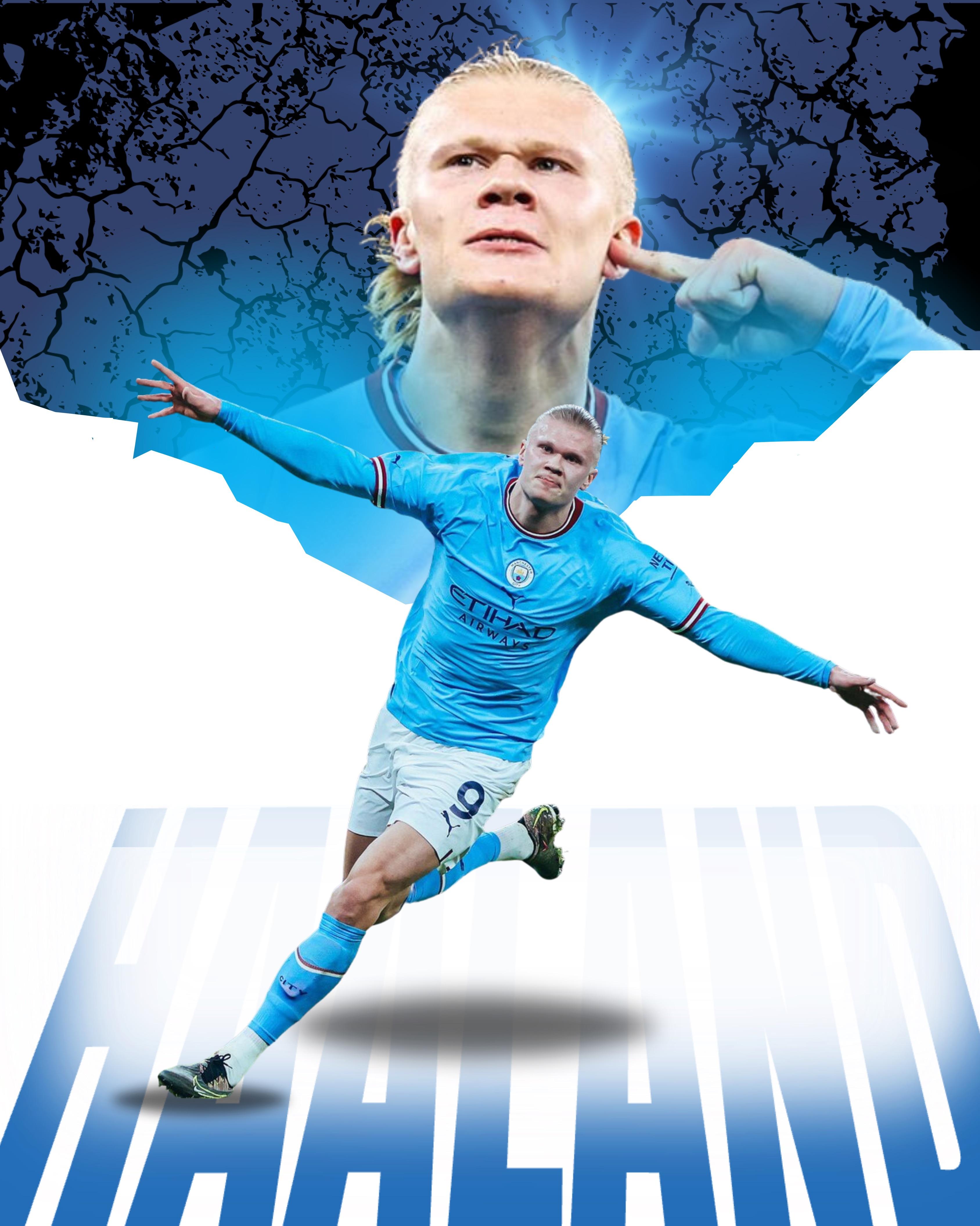
2. Design Sport Poster In Canva: Hello everyone and we
will be starting off with making a poster
or a sports game, which is bike riding. Let's move on to our mainscreen. Just go on Google and type Canva.com and make sure you
register with an account. Whether it is Pro or it is free. It doesn't matter, I'm
logged in into my account. This is workspace of
Canva and it is very interesting there are a bunch of things you can do in Canva. But here we will customize
an Instagram poster. Right now we will go to
our custom size first. And then the size is with is
1080 and the height is 1350. And then click on
Create, New Design. I want to make sure
all of that you have this margin and ruler
guide how to do it. Go on Files, then View Setting. And then click on
Show and Ruler. Make sure you have
this check mark done. Now we will be making
a poster about a person that is very
famous in the biking. I have already
downloaded my pictures, which I will be
using in my poster. If you are going to
make similar poster, I want to make sure
that you first surf the Google and find relevant picture that
you want in your poster. Now let us start by putting our first image
into action here. We will use this image now. Resizes as per your need. We will resize to this. Now it's time to
duplicate image. How you can duplicate image
is you just have to click on this plus button and it
will duplicate itself. Then place the image on the first image
itself, like this. Now it's time to remove the background from
the first image. Click on the first image
and click on Added Photo. It's time to remove
the background. You can see this is
the background photo. Now time to add our main
photo into our poster. Then click on In Again, Add Photo and remove background. We don't want
unnecessary background. After removing the background, make sure to crop the
image as per your need. Let us crop this image
right this and resizes, make it larger and put it
just above the first image. This is our first image. Now what you can do is now you can easily see
here that there is this line. We don't. Now you can see that there is
this line in the image. You can clearly see that
there is second image. But we don't want to do that. What we will do is we will just send our main image to
backwards like this. Click on the main image and then right click and click on
Layer and send to Backwards. Now it's time to add
our third image. Click on third image
and again remove the background per
crop to icon only. Now let us rotate this image
to look cool and just resize this image a little bigger and then place it
right here, cool. Now you can see this image is
overlapping our main photo, thus we do is we will
send it backwards, cool. Click on right click layer
and sent to backward. And add just as per need. Now it's time to add
our fourth image. Click on this fourth image. We want our main champion
to be in the image. Again, what we have to do is we have to send it backwards. Click on right click
layer and sent to back. Now it's time to add
our fifth image. Let's click on our fifth image. We will be choosing
this image now, crop this a little black thing and we will zoom in this photo. All right, now again, we have to send it backwards. This time we will send
it to the whole back, but we want this image
to above this image. What we'll do is we will
click on the position. Click on position, and you are able to see that this image. In the last option, what we will do is we will just bring this image to the
front just like this. Cool. This is how it's work. Now, read just the photo, it's time to add our last
image into the frame. Click on the last image, and then there you go, crop it to the middle part. Only like this indicator says. You can see this indicator. Then crop it again. Again, what we have to do is we have
to send it backward. Click on right click
layer, and send to back. After adding all
the images we need, we will change our canvas
from white to black. Just resize this image. Click on canvas,
change white to black, cool, and again
adjust the image. Here you can see that the top
two images, which is this, and these are gaining more attraction rather
than our main photo. Here, we will reduce
the transparency. To solve this problem,
click on this image, and let us reduce it
transparency to 43. For this, let us
degrade to that five. Here you can see
this is happening. Click on Position.
And because of this image, click on this image. Adjust it to middle. After adding all the images, you can still see there
is this spot remaining. Let us add one more image. Cool, so make it in
front of his hand. Adjust it again, and you
know what you have to do. Click on Layer and
send it to backward. We want this image in
front of the first image. Click on position, then click
on this and move it upward.
3. Design Racing Poster In Canva: Our image arrangement is done. Now let us add some
elements like shadow, black blur, fire and lighting to make this
poster very energetic. Click on Element. First thing we will add is fire, write fire. Then on graphics,
click on See All. We will add some of
the fire graphics. Cool, We will add this, resizes like this
and send it to here. Why we are adding this
fire on our first photo is because you remember
there was little part that was still left
to blur by using fire element or as well as any element you
can blur the photo, Adjust it and recite
it like this. Cool. Then click on Position. This fire element is on top. But we don't want
on top behind this, but we want this fire
image above our main here, which is this cool. Again, duplicate it.
Click on this image, and then there you'll
see plus button. Now rotate it 180 degree, then place again, as well as on the other side.
Click on Position. Readjust the Fire
graphics like this. Let us add some more fire images in background of our main image. Let's use this. It is in center. Now click on Position and bring it backward
of our main hero. By adding the fire, it will give the furious
look to our poster. After adding fire,
we want to blur the background by using
black blur type black blur. Then you will see
this blur here. We will use the blur on both sides on left
as well as on right. Make it this blur bigger, place it here and
then duplicate. We will add two
blur layers here, make it a little bigger. And make sure to send this blur layer
behind our main hero. Let us use blur like this. After re arranging the blur, you can see that our
main icon is getting a lot of attraction
rather than background. Again, reposition this
and likewise duplicate this blur and paste it
here. Again, duplicate it. We will use two blur and make
sure to send it backward. Our main hero image are
blurred now and it will give us that authentic and retro wite which we are looking
in our poster. Now it's time to add some
shadow and some typography. Go and type shadow. Click on this first
shadow, which you'll find. And make sure to
duplicate this shadow, which we will be using twice. Cool, Even you know it, without words, you can
describe a poster. We will add some words as well as some typography
into our poster. Click on text, add a heading, We will write the
name of the eraser. Cool, let us change
our front first. We will use tone. You can use whatever front
you like, but I like this. Make this front bigger. So let's say that it
is 57 and resize it. Click on Effect and
then click on Curve. We will make this
authentic clue. But we don't want 100% curve, we just want simple curve. Let us keep 37. Now we will use some
outline to this typography. Click on Duplicate
and then align it. Now go to effect,
click on Hello, and we will change the color
to our poster, which is red. Click on this and
color red so that it will give us what
we are looking for. Now it's time to add some of
the lighting and thunder. And you can use any
lighting as Perion needs. Select lighting which you like. I will use this lighting, then position and then
bring it in front of the typography that
it will give us, the thunder wipe again, we will use another
lighting, resize it. There you have it. This is the final poster that
we are looking for. This parameter of adding certain blur shadows,
lighting fire, as well as pluring
and transferring the image is the fundamental
of poster in Canva. This principle can be applied
in any sport or any poster. We will look further
in the next video. Thank you guys. Take care.
4. Business Poster In Canva: Hello everyone. In this lecture, we will be going to discuss
about how you can create a poster or flyer about your business or
about any seminar. So let's move on to it. Again, custom size, We will use this 1080 and then 1350
create new design. As we are building a
poster from business, we will be using
terms related to business as well as images
related to business. Click on search element, then paste this black
business man portrait. We will explore
some of the photos. We will use this image
from our referencia. You can choose any image you
want and any type of image. But make sure your image has
the particular character as a main focus and background as a dull background or
very dark background. Resize this image. I have taken personally a horizontal image
for this purpose. Resize this and
put it in center. Click on Element, go
to Frames and Search. The laters we will
use word high, search H and use the
sensory font only later. H. Incensory font, cool. So click on this as
well as from high. We will use I, G. Make sure you are using
incensory font, cool. Then we will duplicate
the word H and then duplicate the word H. Select
all the frame we have done, and then group it and then recite it into a
smaller perspective. Now it's time to add this
image in each of this frame. Click on Element and then add this image in each of the frame. It's time to readjust each frame as our main
perspective of the image. Double click on the
word that you want and recite it to the whole
image sector like this. Then you have to adjust the
images from your background. And don't worry, it may
or may not be perfect, but it will work just fine. Do it from as well. From similarly and H. After doing all
the word per this, click on the background image and then crop it out like this. This will give you the
premium look of the poster, which we are looking for. Again, click on all and just
resize it and mix smaller. Put it in center. Now we
will use a golden type of element or silver
type of element to put it in our background search. Golden metal texture background. We will use this photo
as our background. Now let us add some of the heading as well as
some of the typography. Let's say high ticket. Then we will use the front tone, align it down here, and then increase the size of
spacing between characters. Now again, click on all
the front and typography, and then just adjust it
and make it smaller again. Let's add a third adding, saying the word specialist. And let us use funt handwriting, Make it bigger,
rotate it a little, and change the color of the front to make
a contrast in it. Let's use red or maroon. Let's pick this color
and choose maroon. If you want to add
something as venue or timing or event
place, you can do it. You just have to click all and then a and make
little space for it. Then add an element
or a square box in it that I will use
this box for now. Adjust it. I will change the color of the box as
our background here. You can add any venue, place, or any timing or any
address you want. This is how we can build a premium looking business
flyer as well as poster. And you can use in
your own seminar as well as your own
clients seminar. Thank you guys. See
you in the next one.
5. Save Nature Poster In Canva: In this lecture,
I will teach you a little trick trips from Canva Typography
editing like this. We will create Save
Environment Poster. In this lecture we
will use this animal. We will use this frame
which is known as, you can find it easily here. Go to frames, then This
is known as frame. We will use this and insert this image into
this splash frame. Resize it as you like. Now we will add an image
on the background. Go to element, we
will use this image Indonesia and right click on it and set image as
background perfect. Now let us reduce the
transparency of our background. Let us keep as 20. In the meantime, we will blur or portrate the
background so that our main focus of
the poster remains intact con added photo. And then use this blur option, which you can find in Effects. Let us set it as 30, cool. Here you can see the
background is blur here. We will use some of the
splatter or some of the brush effect we are using,
illustration or splatter. Add this size it down a little and then change the
color to, let's say green. Duplicate this.
Rotate it a little. We will use the trunk color. Duplicate it again,
placed below the animal. Again, rotate it so
that it looks unique. Then we will use the
color of the animal. Now our main part
comes to the play. We will use a typography, that in typography we will have our background of the
forest in the typography. Let's add another page here. Heading. Add a heading. We use the front on the
name of the animal. Now placed it on the center. Here we will add a
box. Let us add a box. And make sure this box is behind the X and adjust according
to its front size. Change the color of
the box to yellow, as well as change the color
of the front to white. Now download this image. Now add a third page here. Change the color to,
let's say brown. We will use this image, adjust it to the whole size, then click on Added Photo, and use Background Removal. After it had removed the
background grope this image. Now let us add our
main background here. Send it backwards.
And then adjust the front of background you like I want all the
funds to be in green. I will use the remaining
part of the image, make sure you crop it. Now, change the background
color to similar yellow. It's time to download
the third image as well. Upload the image and go back to our first main page and
then edit the photo, and click on Background Removal. Here you are able to see
that we have encrypted the background in our typography of the name of the animal. That's how you do encryption or this is known as a morph
technique into your text. This image then
readjust the size. Let us addit the photo here. We will use some other effect. Also go on effect
and click Shadows. We will use this drop
effect and make sure the blur amount is 40 as
well as the angle is 70. Now let us add some
of the text here. We will use this name as so
put it above the animal name. Click on it, change
our color first, then click on Effect. We will use shadow
effect for this word. Make sure the blur is 100% as well as transparency
is 100% also. Now change the color
to let's say black. Then go on offset
and click on one. Here. We will use the offset of one which is
black color here. It's time to add some
of the typography for the poster you are trying
to convey a message. I have already a brief
description about this animal. I will write it,
then post it here. And then change the color
of the fund to black. That's how you do a
environmental poster with the help of a unique
set of typography, which is including the
background in our funds.
6. Soccer Poster In Canva: Hello guys. In this lecture, you will be going to
learn about some of the color combination that
we must apply in poster. Let's get into it.
Click on Custom Size. We is 1080, height is
1350, create new design. Now we will be going to discuss a poster about a spot
which is a football. I will approad my images. There are these two images. What we will do is we want
to do a background removal. I will just cropt it out here. Click on Added Photo, Remove the Background.
Don't worry. If you don't have
a perfect picture, you can use background removal and remove all the
unnecessary part. Now drop this image and
again remove the background. From the second image, you can see there is some spot which is left from
background reviewing. Click on this adjust button, Erase this, then added photo, and it will be
applied successfully. Let us delete our second image. We will use this in
the later video. Now, adjust this image, change the color of our canvas. Let's say we'll try to it. Dark blue works fine. Now let's add some
of the element in our background to create that contrast look
that we are achieving. The first is cracked overlay illustration, then adjust it. Now let's add our
second element. You can see grungy, seamless black and white
texture. Now adjust it. Now let's go to position.
You know what to do. We have to send both of them in. Backward will be last, and this is second last. Now let us add some of the
lighting in our picture. We will use blue dot
lights, Click on Enter, and then use this
blue dot lights, make it a little
smaller, then Duplicate. Then again duplicate
for the right side. Now we will add
even brighter light here, blue light, fair. And click Enter.
We will use this, placed it on the player's head. Go to position, and then send it backwards
of the player head. Cool, we got that glistening
effect on the player. Now let us add some square here. Change color of
squared to white. Make it bigger.
Rotate, Duplicated for the right side rotate, then just enlarge it. Now we will use some of the
wall cracks here to bifurcate the above image and the later
image search on element. And then use wall crack image. This is the wall crack image. Click on it now, change the color of black
to white in both of them. And then adjust it like this. Let us duplicate. Then placed
it here again, duplicate. Change the rotation again. Duplicate again, duplicate. Now, this time we will readjust
it in a smaller position. Again, duplicate
for the left side. Now, duplicate again. We will place this in
middle duplicate again. Now let's flip this. Here we have used
the wall crack image to bifurcate the
following image. Now go on apps, and it's time to add
some typography. Traft, this is the type craft, we will use the
name of the player. We will use the front, as you may choose
any front you want. Now we will change
the orientation. This is the thing
you should learn. Now let us contrast
this typography word. Now let us give some color. We will use blue color
because you will able to see the color
combination cool. This is our color. And click
on Add Element to Design. Here we have our
design. Enlarge it. Let us make this image a little bigger, Update the element. Now let us add our second image. Clickon added photo. Remove the background
clickon adjustment. Before doing anything
to the second image, let us add a white blur. We will use this white blur, rotate it to -90 then placed
it on the typography. Let us reduce the
transparency to 91. Now bring this second image on the top layer at just
duplicate this white blur. Reduce the transparency
of this even more. Change the position again. Now let us add some
shadow to leg. Click on the first shadow. Don't forget to send
it backwards again. Duplicate this for
the bigger image. This is how you do
a poster in Canva by using color combination
theory and type craft. Thank you guys. See
you in the next.
7. Movie Film Poster In Canva: Hello everyone. In this
lecture we will be going to discuss about how you can
make a movie poster in Canva. For this movie poster, we have decided a theme
of an marriage break up. So we will add this image. I have selected this image. You can choose any
image you want in your poster, clones added photo. And again, we will
remove the background. Now let us add a man
into our poster. This is the name of the graphic. Then let us rotate it
180 degree or more. Make sure to crop the image after removing the background. Let us crop this. Let us add some shape
element into it. Click on this, resize
it to our whole canvas. Make sure this box is
covering the half part here. And we will change
our background color to the girl wearing dress. Click on Canvas Color, select color, and you can
select any color you want. Now let us add some. This is Skyline
photo of New York. Let us add here added photo. Remove the background of feet. Adjust it like this. Let us make it even bigger. Now let's send this image to backward click on the image and let us reduce
the transparency. Bring it to 14 click
on arid photo. We will bring down the
brightness and contrast, 200 and -100 Brightness
is -100 contrast is plus 100 as well as we will down -100 of
situations like this. This will give us that elegant
look in the background. Now let us add some more image. This is you are a body
click on the image, adjust it like this. Again, send this image to backwards crop the image
into first part only. Now let us reduce this
transparency also, let us bring it down to nine. We will add another image. Here it photo. Now remove this,
this element name is woman in great top Again, crop the image after
removing the background, enlarge the image, then
send it backwards, reduce the transparency to 25. For these images, let us it and then bring down the
saturation to -100 cool. After imaging set times
of background images, it will give us that
chaotic and energetic wipe that we are looking
in our poster. Furthermore, it's time to add
typography in our poster. Click on typography.
Add element. Let us change Ponto Antonio
Bolt from the first heading. We will use Bolt
from the second. Use light, Click on Bolt, then let us give us as
unhappy, Change it like this. Increase the spacing
between the fonts. Now, let us add a
subheading to it. Add a subheading, Change
the fund to Antonio. Now, this time we
will use regular. Now let us add a
body text into it. We will use this body text from theater play as well as
date of publication. Add it like this. Change it to light fund, let's say 332023. Increase the size a little. Now to add dramatic
effect to typography, we will use an element
called splat, right split. We will use this plat
element into our typography. Resize it down state like this. Again, duplicate it, and
placed it on the end. Now let us group all of the. Click on Group, Duplicate it. Turn it 180 degree and placed it on the
first part of our poster. Change the color to
the background image of the lady congratulation. There you have it. You have now a movie poster as well
as a film poster you can create through
permutation and combination with various
types of element and photos. You can easily create multiple niche and multiple
story lineup in Kenvaed.
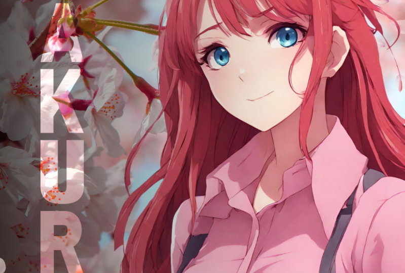
8. Create Anime Poster Using Canva AI: Guys, in today's lecture, we are going to
build and poster of an Anime picture or
an Tokyo picture. Let's move on to it.
Create on custom size. As usual, weight is
1080, height is 1350. Rather than using stock images, we will use AI or Canva AI to generate multiple images
of anime girl or boy. Let's go to our apps, then search app Clickonmgic. The first one we'll
open is magic media. Click on that. This
is text to image, or you can say this is mid
journey or Leonardo AI. But it is already installed
in Canva workplace. Now we have to just write prompt to make the
image generation. Here you can write any prompt
you want in your images. I will use an Anime prompt, which I have already
found by using Che GTP, you can do the same.
This is the prompt. Beautiful anime
girl using glasses. Half body portrait, half
glass, slim figure schoolware. It is highly detailed digital
art and it is sharp focus. Now we will also use a
white background prompt. The style will be none except
ratio will be portrait. We will use a portrait
image from our poster. Just click on Create Your Image, and it will take some
time to create image. These are the images that
are produced by Canva AI. We will click on each one of it. We will try again and again to find a perfect picture that
we are looking in our poster. Click on Generate again. Finally we have found our image. We will first thing do is
remove the background of it. Click on Added Photo,
then BG removal. Now we will resize this image. Make it a larger image so
that only face can cover. Now as it is an anime poster, we will add a Tokyo Tower. Click on Element Search Tokyo
Tower, we will use photo. For this, you may use
any Tokyo tower photo. I like this one and I will click on it as set image
as background. This will be our
background image. Resize it, rotate
it as you like. Cool. Now we will add
an effect on the image to give us that aesthetic k
we are looking in our poster. Click on Edit Photo and
then Filter. See all. We will use this vintage and retrovipe to get our
field of our poster. Now again, we will
do some adjustment. Click on adjust and then
bring down the saturation. Let's say -35 Now it's time to add some
of the typography. We will do a vertical typography now as it is not
a normal poster, it is an anime poster. And based on Tokyo, we will use Japanese fund Pota. One is Japanese fund. You may use any Japanese
fund or any fund you like, but I will use this gives us our image and aesthetic
lo click on this, Reduce the spacing
Work perfectly. Now just copy this and
add another text here. Now duplicate this again, and then let us add word Girl. Now click on the three
group this again. Duplicate this as
we are going to add an outline and
highlighting typography. Duplicate. Change
the color to white. Adjust it, it will look
as they are overlapping. This is how you
create your poster for animation or
your anime movie. Now what do you have
to understand here is we have chosen our
background as our theme. Like anime, we have chosen
our theme as of Tokyo Tower. Well as we are
choosing our front as Peto One because they are
resemblance with Japanese art. That is what you have
to keep in mind. Whatever frame or whatever
theme you're choosing, you have to go through it, all the typography,
all the graphics, as well as all the background and images as per your theme. This is the main
fundamental principle of editing your poster in Canva.
9. Real Estate Poster In Canva: Hello guys. You will
learn about some of the essential part of
creating poster in Canva, For example, in this
lecture we will be going to build real
estate poster. In that poster, we will be
using certain types of effect, typography, effect,
certain types of blur, as well as shadows and fogs. These are some of
the key part in any poster and why
we create poster. We create poster to focus
our main product on the front page so that it is
eye catching and attractive. In order to create that
attractive poster, we need certain type of
elements like shadows, fog, sunlight, or maybe even
certain type of typography. In this lecture, you will
learn about all of this. Let us create new poster. Make sure this is in pixel as
this is real estate poster. We will be going to add photos of family as well as of home. Let us add this image, then we will remove the
background of the home. We will readjust it to
the bottom like this. Then make it bigger. Grope the upper part. Now let us change the
canvas background. Click on it and we will use some color which is
similar to home. From here you can
get that color. Now it's time to add
photo of a family. We will use this photo, readjust it to the home size. Now let us readjust the
position of family and a home. We will be using some of
the fog and shadow effects. I am using this wall
fog decoration. Click on it, then
again duplicate it so that it covers the
whole family and house. Again, go to position. Send it back. Perfect. It's time to add some of the
glowing effect here. We will glow light star. Add this so that
we can easily hide and morph the cut part of the family photo.
Duplicate this. Now again, position,
send it backwards. Cool. Now let us add some
typography. Go on title. We will use two
typography here so that our main headline or tag
line will be in bold form. In the second sub
headline or sub title. In the light form, I will be using front
of Ton for this. Let's write a
headline to be loved, and then on, let's change the color to white so that it
is more appealing. Then let us go to effect. Then we will make this
curve, let's say 50. We will make it half and
make it a little bigger. Now let us add our subheading. For this, we will be using Cooper Font, the perfect House. Change the front color to white. As this is real estate poster, we have to prompt
the customer to buy the place or buy the
home. How we can do that? We can do that easily by
providing some of the amenities, some of the features
of the house, as well as prices. Which contact or which phone number they should
contact to buy the place. Let us go to Element, and then we will use this box. Let us change this color to light yellow,
make it even bigger. Now click on Border
style, which is here. And then corner rounding, let us change to half, which is 25 and reduce
the transparency to 80% Here we have added
and we are using the, again Cooper fund only. Now let us duplicate this, but this time make
sure that the angle of the duplicated element
doesn't change like this. Now we will change the color to yellow and reduce its
transparency to let's say 75. Cool. Here we will
add the price, and the prices is
shown like this. It's time to add another element which will be the
border headline. Now we will some of the prompt, best offer or what
number they should call or what website
they should visit. That's how you do a
realistic poster. If you have your own agency, you may add your logo. Let's say we are
taking this example, smaller read, and placed
it in the corner here. We can add again fork
or smoke features. Duplicate this, perfect,
go to position and in, bring it behind the
M. That's how you can customize your own
real estate poster for your client as well
as for your own agency. You can choose any family
photo or any house or let's say you are
selling a golf or any pool. You have to just add some
of the features like it, amenities and their prices, whom they should
contact and what is the exciting feature
about that place.
10. Bike Poster In Canva: Hello guys. In this
lecture we're going to see about a hiking
or biking poster. Let's get into it. We will use the basic template
of our poster. Create new design.
We will search for the photo way to the horizon. We will use this image,
duplicate it again, and then remove the
background like this. Now we will add a
cloud element here, right cloud, missed fog smoke. We will use this smoke, enlarge this smoke,
placed it in the middle, and then grope the remaining. Now it's time to
send it backwards. Now it's time to add
some of the bicycle. We will use this
bicycle as our example. Firstly, we have to resize
our image for our background. Now let us add bicycle. Now duplicate this bicycle. We will add shadow
of the bicycle. Flip, flip vertically. Go to position, send this cycle backward,
add this image. We will now, we will lower its brightness to -100
contrast to plus 100, then saturation to -100 We will adjust this
image for the shadow. Rotate it little cool. We have our image now Let us add typography bike for
health like this. We will change the
fund to Antonio, or you can use any other
fund like Antonio also. This is how you make a poster
of a particular event or particular thing that
you are promoting by adding image and
focusing on that, as well as using typography.
11. Class Project: Hello everyone. From
our class project, we are going to
draw our own poster of our own favorite niche. For example, my favorite niche, or my favorite area of
interest is football. I will draw a
poster of football. I urge you to draw a poster of your own liking and
expertise in Canva. I urge you to create a poster, which is the combination of all the graphic design skills that we have learned
in this Canva course, which is text typography, color combination, fun theory
and background images. You may use your own fund, your own background and
your own stock images. But make sure to combine all of these to create fantastic
poster for yourself. Please make sure to practice
your poster again and again to improve your
own Canva skills. I know what it's
like to just watch the content and think
you have got it all. But applying in the
practical form or applying in the Canva will make
you to the next level. However, putting your own time and actually trying things in Canva will certainly hone your
ability to the next level. That's all from my side. I look forward for
your projects.
12. Conclusion: Congratulations on
completing the course of Mastering Poster
Design in Kenva. I hope you have enjoyed
this creative journey. Throughout this course,
you have learned the techniques and the skill
to create amazing posters that truly stand out from
mastering design principle to some of the advanced
Kenva features you have came a long way. The art of poster design
is not just about visual, it is about effectively communicating and describing
to your audience. Your newly acquired knowledge
of poster design in Kanva will serve you well in personal as well as
professional projects. This journey is
just the beginning of your creative adventures. Don't stop here,
keep experimenting, your creative thinking, and more importantly,
keep designing. The more you practice, the better you will become. If you have any question or any type of
doubt in your mind, please reach out to me. I'm here to support you
on this creative journey. Once again, thank you, and I hope you have
liked this course. If you do, please give your
review in the review section.
 Manthan Patel, AI Instructor