Transcripts
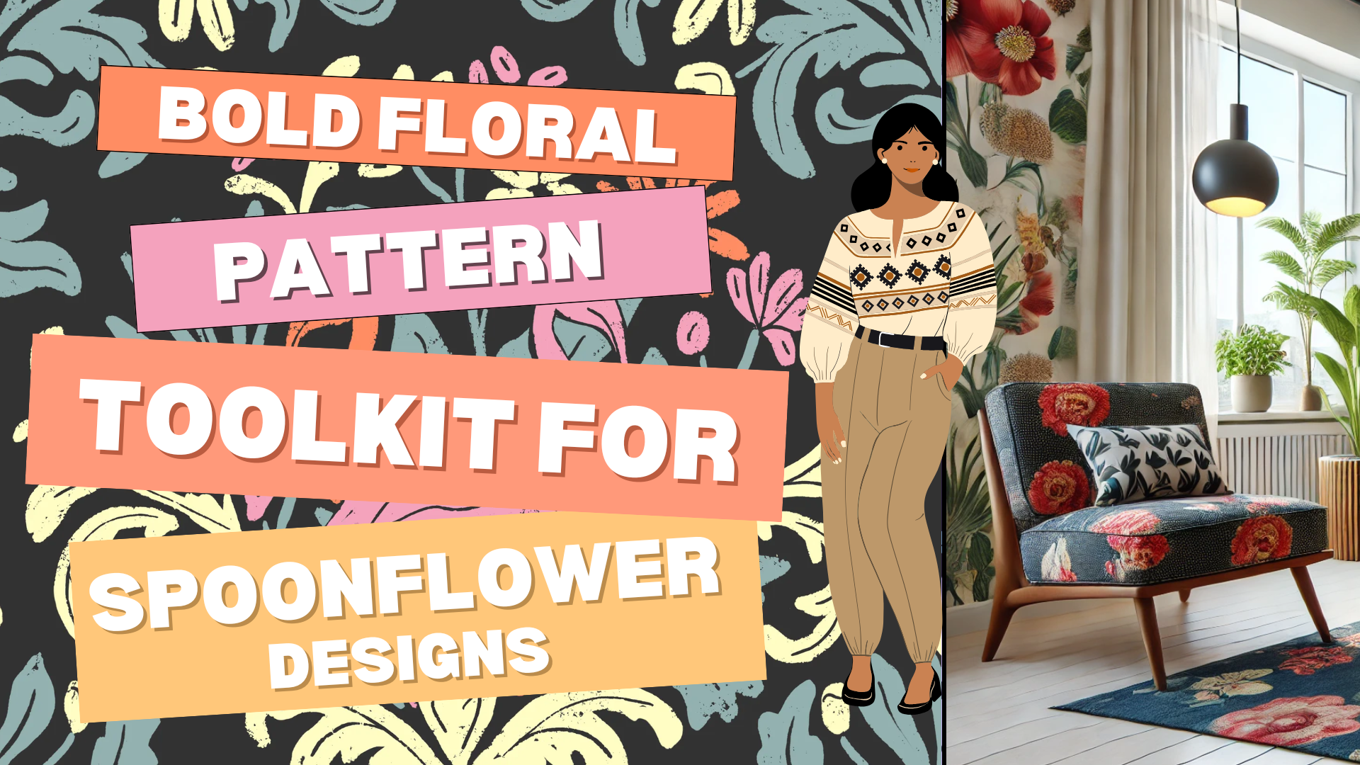
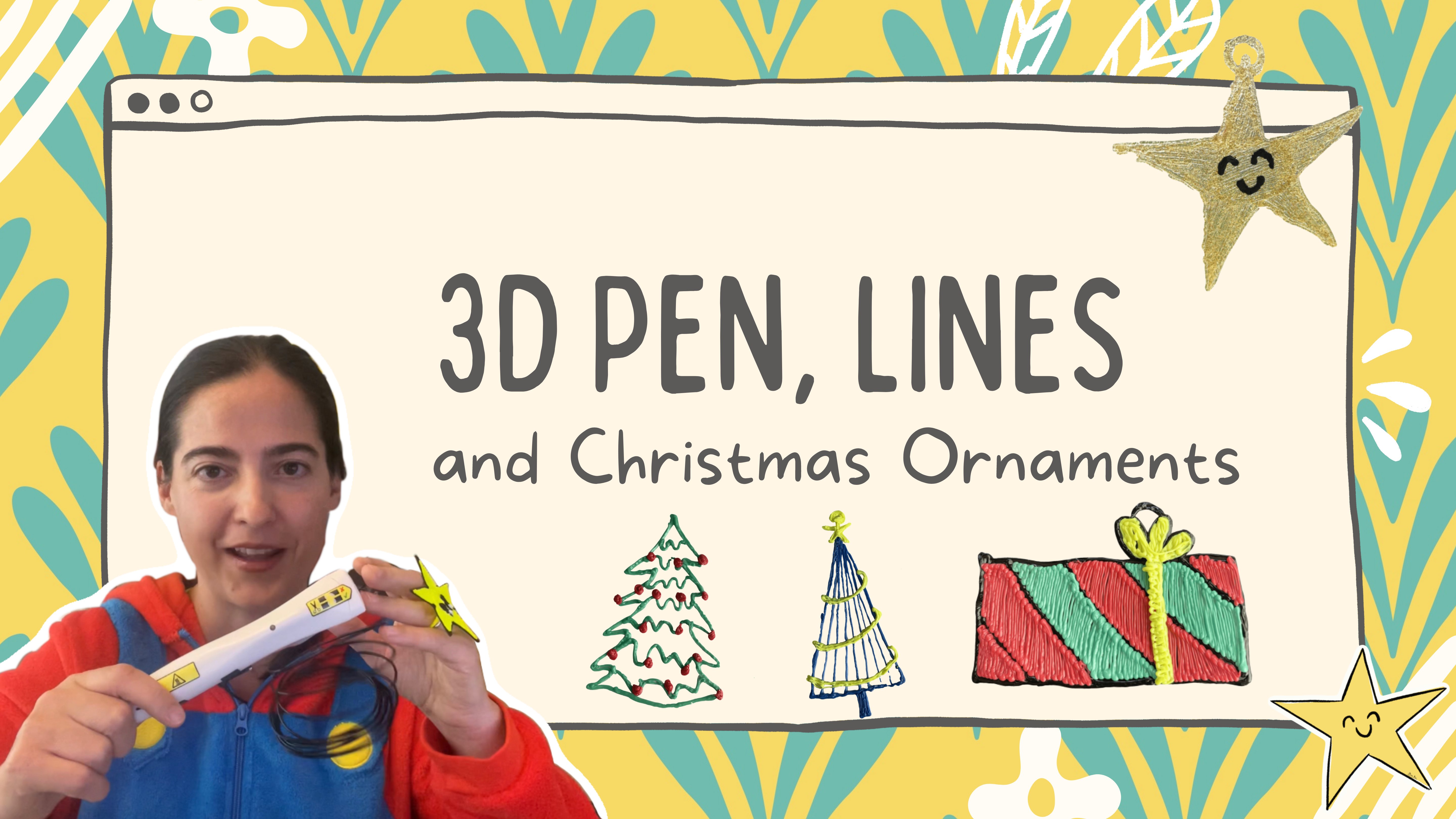
1. Intro: Bold Floral Patterns: Hi. Participating to a
design challenge is brave, but can be also super fun. And what is more
important, you can do it. So let's say that your goal for this class is to be
effectively productive. But what is more important? Why being effectively
productive to stay also ply creative. So in this class, you will learn not just how
to do a repeat pattern in procreta on an evergreen team
that you can use and reuse, but also how to step
up in the process. Yep, you're going
to build a pizza that can be your next entry
for a spoonflower design. But most importantly, you are learning an
effective workflow. To make a pattern for
real people to enjoy. This class is a great starting
point to learn in general, how to create pieces, taking in account
the big picture. That makes it also visible to people that are
interested to buy. Yes, people interested to buy, people that, for
example, in Spoonflower, are there to click and buy something for their own project
or for their own decor. So I'm here to guide you and providing you
resources and focus. And if you are a
procreate artist, puzzled by the
annoying white line. You want to see my process. As you are not a beginner. Yep, how to use also keywords and give a
context to your creation. Yep, again, we are also talking about ideal customers
in an easy, fun and approachable
way, I promise. Hi. Again, I Mata Mom, multi passionate and multi accent educator and
surface designer. I freelancer for top
industry leaders in this sector as a community
guide and content manager, and I have a background in
computer science engineering, and usability is my passion. Making complex things
approachable, effective, and enjoyable is my mission, and seeing your project and
success will sparkle my day. So what are you waiting for? I'll see you in the next lesson.
2. Project: Your Bold Florals: We're going to see
in this class, but what is more
important, what you're going to accomplish
with this class. So we're talking
about your project, but it's not just posting
here in the project area, but also how to develop and
consolidate your own workflow when you're creating a
pattern and maybe using it to submit to a spring
flower challenge, or using it in general
to create a pattern, a piece, a design, and maybe later on,
even a collection. Following a brief, having
someone specifically in mind, what you have to do is you can watch all the
lesson as you like. You can even jump
from one to the other one to see what
is more important for you because I envision
you to come back to this lesson later on to get the most of the resources
that I'm preparing for you. While this specific
class is born, having in mind a current
spoonflower challenge. And if you are participating,
please let me know. I would love to support
you. And cheer you up. Here we are talking about
bold florals and in general, let's say, floors
that are evergreen. So you can use the
concept in this class forever design that you're
going to do and redo, also reflecting
different inspiration and different phases
of your journey. What I'm expecting to see in
the project, first of all, I would like to see
one of your pizza, and maybe you can also
share where you're making this pizza available for people
interested in buying it. This one is the
basic assignment. So try to create something
and put it there, have it in mind, not
just the drawing, not how to do the pattern. All of this one is
something that we are going together
in this class. If you're not able to do
pattern in Procreate, you can follow along with me. If you're already able to
do pattern in procret, you still wanted to
check my workflow because it's super cool that
can save you a lot of time. What is more important
for me is that I think this workflow is ready for you. You are ready to do it. It's not important in which
stage you are. I'm sure you can follow it. Maybe you needed to repeat the class or the
video one more time, but I'm sure you have
everything it takes to do it. Obviously, this
class is done mainly for procrata surface designer. I love procrata, but if you have ter workflow or you prefer software to
do your own design, I would still recommend
to watch the part related to how you can approach
the SEO aspect, brainstorming for preparing and releasing design that are not just beautiful but also are reachable and visible
from real people. And above this, I also have
an class in Skillshare. Feel free to check the
resources and keep me posted. I cannot wait to see your project and what
you're going to do. So I see you now
in the next video about what is a spoon
flower challenge. We will use this
one as an example and how to approach
it. I'll see you soon.
3. SEO and Customer Avatar First: Before we start talking
about C words and our new fun approach to thinking about our customer Avatar, let me show you what you
will find in the resources. So you will get the link directly to this page
that is dedicated to the class where you can access all the resources
that I prepared for you. In particular, when you will
download this button here, you will get directly to
this PDF. Let me show you. From this PDF, you can also
go back to the resources. So it's like linking each other. It's important when we
approach a challenger to go and read the assignment of the challenge,
but at the same time, try to reinterpret
in a way that we can develop maybe
more color ways or even a mini collection
that will not just allow us to get one
pattern that we can use in a spring
flower challenge, but also in general for something that is going to be there for sale for
someone interested. Talking about
challenges, you can click here and you
will go to the current one in a spool flour. I think that the
challenges are good, especially if you are stuck on this creative phase and you
don't know what to make. I'm thinking about, for example, your signature style
didn't emerge yet, or maybe you still
wanted to explore. Well, participating to a
challenge can be super useful because somehow they can
guide you to the next phase. Be mic pull flower, but also there are team of
people that are searching for tending topic for
people to buy, right? So you want also to train
yourself in this kind of gym to prepare
things that are not just an illustration
or a pattern, but there's something
that they have potential to be bought
by someone that is going to appreciate the product and the art that will make
that product so special. So if you're not sitting
in any creative block, maybe you don't need
the challenges. But this glass might
still be helpful for you to see how when
you play something, even in your own
signature style, it's interesting to make your own story on how
this illustration, this piece is going to be enjoyed and bought
by someone real. Right? So now, let's use this specific challenge
that is this one here, the bold floral as
a case scenario. So at the end of this class, you will be able to have
at least one entry. I think more if you follow all the tutorial on
how to do the pattern. But let's say, you
will have one design that you could submit as an
entry for this challenge. Before you start to design, it's important that we take a look at what is asking this challenge and we
try to optimize it. So in this case, we're supposed to let our
creativity bloom. For the bold the
Florence design. We are asked to think about a vibrant color,
maximalism print, if you like, striking
the tails for a bright design that celebrated
the beauty of flowers. Everything here is there for you to reinterpret
on your own way. And even if you don't
have a style yet, let's take this chance to reinterpret your
point of view or your inspiration
or what speaks to you right now in this context. Remember to use rich user and strong contrast because
you want to make something that must be
energetic and impactful. If you don't know exactly
what color to use, I'm going to provide
you in the next lesson, also a color palette
that you can use. So don't worry about this part, but just keep in mind
that everything can be personalized according
to your taste or vision. If you participated
to the challenges Pofloer the voter will be casting them on the tab
nail shown as fabric. So you might want to consider
this one for the success on the spoon flour challenge
itself for the voting process. In this specific case,
it's going to be shown as a first
quarter of fabric. It is important in the voting process to
pay attention on this. Personally, in this class, I decided that we are going to test these bold florals
on what it does. Because I think
the bold Florence in particular are something that you can use really
in different scales. So this is I choose
this example. I really think that is something that you can use and reuse. And specifically, for me, I decided that while I will
participate the challenge, and I think my pattern will look good fabric I couldn't resist
thinking about a wallpaper. To summarize after
reading the challenge, try to make something
that is vibrant, and you can also go
with maximalism. Flour, go crazy. And then try to get
some catching color, striking contrast and expressive floral motives
that demand attention. Try to make something that will maybe with a detail or maybe with a particular or maybe
with a hidden meaning. You're taking the attention
of the viewer and make them want to know more about your pattern and having
your pizza in their lives. In general, I would
also suggest, especially because
this pattern could be reused also on wallpaper
and spool flower is really pushing on wallpaper, is to think of the possibility of earning oversized flowers, intense color combination, and fearless high
energy compositions. The tap to uniform
or to any style. You can follow along with me, but you don't have
to use my choices. Whatever your style is hand
draw, painterly or graphic, this is your chance to create a floral design that stand
out and make impact. Really, when you decide, try to think about this one. You're not just participating. Try really to enter in the mood of the challenge
and what it requires to do. Designing, preparing
the pattern is not enough to make the pattern in front
of the right people. Even the best pattern, the most beautiful
pattern in the world, by the way, I don't know how you can identify this vacuum. But even in this case, if you don't pay
attention on SEO words, people will not reach that pattern and they
cannot bite, right? So remember to use SEO as a key. Use floor related keywords that highlight
your design style, the color, and the mood to improve the visibility
and reachability. SEO words are important
for visibility. They can be even more
effective if you started to use them before
designing your pattern. So you do need SEO
words when you upload your design on printed domain website
or Internet in general, if you will start to make
a workflow, where first, you will think about SEO words, and then you will
start to design, and then you will make
your beautiful pattern and then you will upload it. Time by time, you will see definitely an improvement
on the matter of numbers. That I think is something
that will boost your creativity and
why not give it a try. If you need the
inspiration on SUWords, I just wanted to
remind you check the resources. Let me show you. If you click on the resources, you will go directly this
page that I created for you. Feel free to use everything here that can be useful
for your design. Let me show you what
you will find here. Five use cases. That you can use a inspiration. So one is about
modern Home Decor, and you have a list of keywords that you can copy and
taste on your own design. Here is another idea on DIY crafting enthusiast
and the quilter. Again, you will have an idea of what are
the products that you should envision your pattern and some ideas, some keywords. The Turda use case scenario is about someone
that is getting to your pattern to your piece
because they want to do some gift or
personal project. The fourth case is about
commercial application, someone working in
retail or hospitality, and the fifth case is about children and
pets friendly design. If you can combine
these bold flowers, thinking about
something that is fun, is playful and can reach
the kids decor, why not? Think about this
bright floral theme that maybe can be used on
pet accessory and bending. And again, you can use
the keywords that I already put there with
mystical floral pattern, colorful kids,
playful botanical, epiflower print, and
painted floor, la blah. You go there and you check it
and reduce it as you want. Plus, I'm also providing you five examples where I didn't
just give you the scenario, but I also give you the
clear example of title, description, and tags that I
would use in spring flower. So I'm not taking too much
of your time right now. Reading all the example,
just go there and check. Plus, you will have extra
resources as pinterest board. You can check the
best selling on spoonflower related
to this topic, and you can check as I
use it in the mockup. You can support my own
entry if you like. And you can also participate to a collective collection
spoonflower together. What does it mean? It
means that when you will have a bold
floral pattern design, Spoonflower is available for
people to see and to buy. You can also let me
know via the form. Actually, let me show you this. First of all, you can go and check the current
collective collection. This one is the one in
progress for the bold flowers. So you can go here, and when you will be
logging Spoonflower, you can support the
design and also check the other artist shop support
them is super important. Then you can participate
with your own piece. So you can just use this
form and send me the link. You can use it also
in the project area. We don't finish just by
doing the piece, personally. By practicing and study
and opening our mind, we will make this process
easier and easier. And most probably also funnier. Once I read, I forgot from Pum, that the difference between being an amateur
and a professional is that you will love also the things that at the beginning,
you didn't love at all. And this one is part
of our journey. But let's go back now and also remember to vote on Spoonflower
if you're already there. If you need a specific suggestion
on the tags, remember, you can ask feedback by posting your project
and let me know. So I would love to
give you feedback, and you can also check
this t plus that I have in Skillshare
that will show you how to use a custom plugin that I developed for surface
designer to help them get effectively title
description and tags done on Clinton Man website
or website in general. So you might want
to check this one. And as I already said, remember to share it
when you do with them. Not just with us, but also get used with this practice
to share it with the world. Doesn't matter if
it's not perfect. Really, done is
better than perfect. And what is important
in my opinion, and I hope that you will
think the same is that it is to get better
step by step. So it's like my challenge is not to be the
best one in promote, but at least to be
better than what I did the previous time or what
I did the previous month. Snow bota is good growth. I took this sentence from Stacy Bloomfield and it
is one of my favorite. I really think it
makes a difference. So remember, just a little step forward can make the
difference over time. Just show up. Be
resilient on this one. Put your efforts,
and you will see the result ping up slowly, but they will arrive. Then it's time also now to show you an extra example that I did especially
for this class. I was thinking, when I design, what if we started to practice also with the
ideal customer Avatar? One of the problem
that many artists tell me about ideal customer
avatar is that they think, Oh, I don't have a niche
or I cannot identify. Maybe it's just me or
something like that. All the work that you are going to do or that you're
already doing on IDL customer avatar is not something that will
not be useful. That if thinking about
the big picture right now in your journey is scary or is a way to procrastinate
the exercise. I'm telling you why when you participated to a challenge
or when you have a brief, you try to identify one
customer ideal avatar. Doesn't have to be
this person forever in your artistic career
or for all your pieces or for all your
connection can be just for this specific
challenge. And you know what? I provided you before
all that lista. And then while I
was preparing them, I was like, you know what? I think I want Sarah. This one is Sarah to be my ideal customer avatar,
for this challenge. Sarah is looking for something. To decorate her modern home. Actually, is an
apartment, USC zone. So she's going for
something bold and she's familiar also
to artistic interior. She's a professional. She's actually a doctor. She just moved in a new city to work as a doctor in a hospital. And the point is that
by looking at Sarah, I think that I'm interested to design for someone that might be a stylish on honer or interior design looking for a statement piece
for someone like in the case of Sarah that is
reallocating in another city but wants to make this one personal and resonating
with her style. So her lifestyle is someone
that loves high impact, created spaces and isn't afraid to play with
bold patterns. And I will also suggest you to look for
the shopping habits. For example, she's
also going to look for designer wallpaper or
upholstery fabrics to match her unique aesthetic
for her new apartment. I one for me, it was also a way to envision the
fact that, for example, with product as the new
wallpaper that you can just peel and stick and remove easily without damaging the
walls or something like this. I do think that Sarah is
really the ideal person. She wants, maybe also even to looking for something unique. So the idea of going in spoonflower and having this possibility and
at the same time, supporting an emerging artist might be also a plus for her. Each time you are starting to design
something for spoonflower, and you are thinking about the keywords or it's
not just keywords. You have to think
about who is going to search this kind of
piece of spoon flower. So ideally for my example, will be intergor designer looking for a statement
wall paper for high end clients or DIY customer decoration that wants to make something bold, the maximalism, also in terms of upholstery fabric or
homeowners or people that are locating in a new
city that are looking to just go and spoon
flour and order something to complement their
space with this kind of also bold and high vibe energy. If Sarah will go to spoon flower today
with this one in mind, most probably she
will digit something like bold the floor wallpaper, Maximal is the floalPrin,
modern botanical, statement floral, colorful
floral, contemporary floor. This is what I thought.
This one doesn't have to be all the calves that
you have a full flower. But really, when
you're choosing them, try to think about what someone, in this case, Sarah
is going to digit. And also, this one is
the cases consider that Sarah is going to move
in this kind of apartment. That it happened also to
me whenever located in the States they are
cool apartment, but they need
personalization, right? And most probably Sera did look for something
on Pinterest, maybe even something
super extreme like this. She was like, Oh, it's
an allergic reaction. Like, you see all this
we all this flat fink. And so she was going
really wild in Pinterest and magazine to
search something like that. This one is just
to tell you that this one could be
also in your mind, something to remind
that you might do one or more or mini collection where Sarah can
order a wallpaper, but also with one element, you can do the printer
and then the cushion, the pillow, the
chair, the curtain, sorry, the curtain, the
carpet, everything. So this image there
is just to trigger you on this direction.
And here we are. Now, you are ready to put
on practice what we talk about thinking about keywords first and then started to
implement your design. So just to remind, if you want to follow
along with me, to consider that I'm looking for you to do
something that should go well like a statement
floral wallpaper for bold interiors, something that is vibrant, that can be like an accent
for chairs and pillow. And this one are the keywords
that you can keep in mind. So like a statement, floral wallpaper and
upholstery fabric for vibrant spaces. And when you're
doing it, remember the picture of what
is the space right now that wants to
have this kind of personalization
thanks to our design. Plaza, now, if you
follow along with me, you will see that you will find this suggested palette,
just four colors. Of course, you can go and put many colors or
something like that. I'm just providing
you four colors plus black and white because I do think that sometime
unlimited palette is really liberating
our creativity. And so this is what
you must find. Remember, this is something like the inspiration that
Sara was looking for. So you really wanted
to impress her. In the next section
now of the class, we are going to move
in implementation. You can follow along with
me and draw together, taking in account what
we discussed up to now to design something
from Sara if you want. For example, you want
another example, I would definitely recommend you to check the
resources again, for example, so I went for
the number one home decor. And as a bonus of this class, I'm giving you
also this one that is like a deep diver
in the second Kaiser, that is the DIY crafting
enthusiast and quilter. You will find all of this one
in the resource material. But I also encourage you to check the use
case scenario and the author example to really see what resonated
the most for you. And I can't wait to see
what you're going to do. So remember again, put also your progress in
the project section. You don't have to do
everything at once. You can start together,
watch together, and start to update your project gallery there
also has a mini journey. And I'll see you soon in the next video where also
I will tell you why I do have Mama worth the
Madamam template for doing my patterning
procreate to be sure that I will do them faster, easily with fun, and they can't forget forever
about the terrible, irritating white
lines that I think everyone that already did patterning procreate,
unfortunately, no, right? I see in the next video.
4. Frustrations with Patterns in Procreate: Procret hates coffee and also is against lead to deprivation for real,
not talking here. So I might follow the
suggestion of my mag, and let's work hard
but that harder. Pattern and proprita are
one of my biggest passion. And at the same time,
they have been also the reason of my biggest
frustration in Procreate, too. What I wanted to do with
this class is to guide you through a workflow with
some specific resources that I will make
available for you that will allow
you to start or to continue your
journey with Pattern in a less frustrating way and to stay apply creative while
also effectively productive. If you already did a
pattern in Procreata, you might be familiar with the super frustrating issue of having the super bothering
noising white lines. And to be honest,
I think this one is the reason why
Spoonflower asked us to test digitally
now where we can really zoom on the product, the design that we are doing. For example, I will show you
here right now this design. If you look at that,
you will think, Oh, wow, yes, it's perfect.
It's just there. Nothing wrong. But this
one is an old design, and last weekend I took
2 hours to fix it. Trust me, not a
perfect repeat button. You don't trust me?
Yep, I will show you. I will go here and dis
select the square. And if you look closer, you will see that just in
one side of this pattern, there is this super
annoying white line. Yap is there, and check it
does in different color ways. Is there too. You don't see it if you see the
pink line there, but as soon as I remove it, you will see that
this one happened. We are going to learn
together how to do simple repeat a seamless pattern that
will not have this issue. No matter how many
coffee you're drinking, you will see that you can apply be confident that this problem
will be go, done and gone. Doing pattern is a journey
that you will develop. It's like you have
to do it and do them to build this
muscle memory, not just in your hands, but also in your brain,
both of them. And it's super normal at the
beginning to have issues. I want you to see
how fast it could be with a simple motive, and then we will also try
to do a blender together. To then use this workflow to do whatever pattern
you would like. And talking about them,
young career mistakes. Later, I'm going also to
go and spoonur and removal from sale this
pattern that I did in these two color ways
because actually, thanks to this lesson when I was desperately looking
for all the pattern, I did realize that despite I
did the proof for this one, as you can see, as a swatch. It was not visible
the problem that I had it with that
annoying white line. So now I know that it's there. I know that I cannot leave
it for sale until I fix it. I will do it. But
are you ready now? We are going to do our
first repeat pattern together with a warlo
that will be easy, fun, and faster, and white
eline free. Let's start.
5. Setting the Palette, Pattern Tile & Test: Pattern intro Creta,
and we're going to be or maybe they had
already one big person. But they can be also
very frustrating, especially at the beginning, but trust me, sometimes
also during the way, especially when we start
to get these kind of very buggy and noisy
white lines randomly. And, oh, my gosh, what happened? Right? My point
is, in this class, I want you to feel empower and liberated the workflow and
by providing you also. Some resources. In particular, I'm talking about Aten
Plata, that I did, and I'm super happy
to share with you that hopefully we'll let you enjoy more the butter
making process in progreta and let you feel not just effectively productive
but also ably creative. This one is my goal. If you're at the beginning of the journey, just follow along and enjoy directly learning
with this workflow. If you're already a
surface designer in Pro cradm used to
do pattern there, you might still want
to check this class to see if this one will
make your life easier. Let's go first and take my
template from the resources. Let's import it together. So I will go here in important, take the recent the name is
pattern Base by Madamon. And it will be important
directly through creta. For this siza, I'm
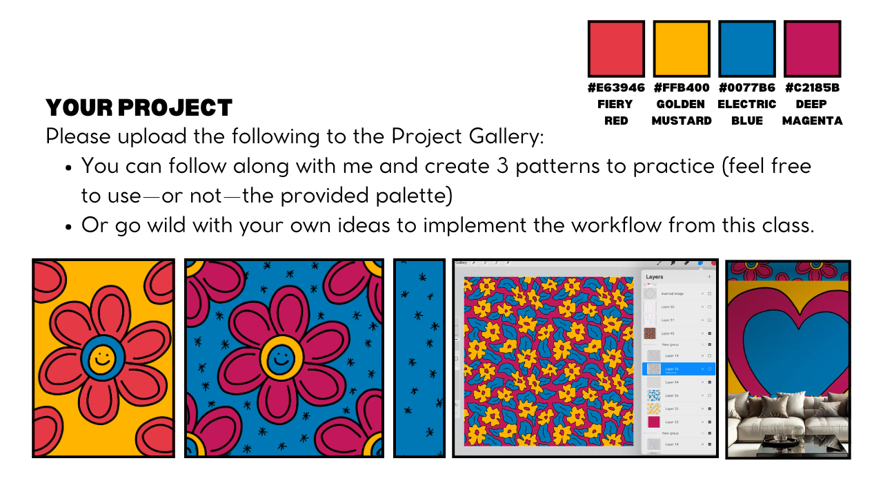
also providing you a paneta that you can use and
reuse as much as you like. The Golda is to do a floral pattern that is bolder and warm
and full of energy. I actually prepared the basa to get ready for this lesson. I already also use it to participate to a spring
flower challenge. So if you want, you can go in my spring flower shop and check it there and
chill it there. But, yeah, we're going
to do it also here, and I may also find the
time to show you how we can also envision the result of our pattern in a procrt mockup. So let us start. One thing first is
that in general, when you have let's say, a document in procreatd, you can get to the color
directly by clicking here, and you will see it appear
here and the color wheel. My suggestion is, especially if this one will be
the first button of a mini connection is to save the color palette
that you're going to use directly in procreatea. Trust me, is really
a good habit. Maybe you will be
in this go classic, you can go in palette and
then push the plus button, create a new palette, and then here, you can, for example, rename
it bold plural. And we are going to
add the color again, by clicking here,
getting the circle, then click Da do the same. The blue and the magenta. And I also like to add
the black and white. So I will say for me, the classic is easier to
visualize where it is. So in this corner is pure black. So I will go now with my
panette and add the black, and I like also to add the white that is in
this corner here. And I will add it already here, the palette here because it's just the one
that we're using, and here we are ready to go. Now, you will go
in the template, and you can, if you want, right now, select
the palette idea that I provide because
now you don't need it, we already did the palette. Then I will go here and select the Blackcom and we are
ready to start to draw. As a brush, I will suggest to go in calligraphy and Monoline. Everyone has this
brush because it's part of Procret when
you download it. And then I will use directly, let's say, my original idea. So I'm sure that I'm
sticking with it. Let me move it a little bit
here so you can see it too. And, yes, sir. So we are here not to
talk about the style. We're here to show
you how you can do a super faster picking
pattern with me. Filing to follow along or to
go with your own subject. And can you positive about that. I would do simply, let's
say, the circle inside. You can also keep
it clicked to have a better circle.
You don't have to. If you want, you can also
modify a little bit, just to make it exactly again, circle or not. Doesn't
matter for me. The point is that
we're making let's say the element around the center. If you don't see
this line coming up, it's because you don't
have snapping activated. So you might want to go
here and make this to blow. But it's not necessary,
just if you want. Personally, I like also to
leave this first circle in a new layer and then add a ton layer and start
to do the petals. And you don't have to
be exactly like I did. For example, you
see now, mine is already different.
It doesn't matter. Okay, just to show you that
you can always fix stuff, you can also go on the eraser and take away this
part if you want. And here the same. It's really not
this wonder point. I just wanted to show
you how I would do it. And just to be also
consistent on this idea, I will do inside another small
circle to put my face up. I like it more. See, I already
drink too much coffee, so I do need the help
of procreta Hello. And I might want to
make it like this. And then I will do the
smiley face inside, too. Maybe this time, I will make it more k Bay I don't
remember how to say this. Yeah, like this one. Okay,
I think for me is fine. Oh, I also wanted
to tell you that, of course, you can also
add additional motif. In this case, I just
did this one like this. I just wanted to show you that have a cap of how you
can draw something, how you can fix
something if you need the hidont and that's all. Of course, you can
also a first sketch. In my case, I will just go
directly with this one. And fix it. You are the artist. You are the one taking
decision on that. When I'm ready, I will
collapse my sketch here. Usually, I also do a duplicate. I don't think it is
necessary in this case. But what I would do is I will
put it as a reference here. And then I will add a new layer below, so
I will click here, add plaster, and I will
start also to add the color. One of the rule that
I always follow is each layer has a color.
Each color has a layer. So. Let's say that I want to go with this schema
here of the design. So I will for Simon, I take this fierce ad as
a baser so I can go in the level of the sa I can even just feel the layer,
and now it is. Then now, this one is a reference so I can just
drag and drop the color. Hopefully, I didn't
left anything open. Let's check. I will take the
yellow and bring it here. Com. Yes done. And then I will take the
blue and add it here. And I think we are fine for this design because technically, they smile here and they say, Oh, I just forgot, sorry. Let's go back.
Remember, not so bad. Like this. Then another layer, and then we bring the blue here. At the moment, basically, we have just this three color, knowing then actually
the smile face is empty. There is no color. If I remove, for example, the base you will
see what is behind. So by the way, we don't need it. For example, now we see
the background color. So I just wanted to
show you and also, I want to show you
how it looks like. Now we are ready to
make butter out of it. Ready? It's going to be
super fun and super faster. The main point is
before proceeding, we have to take
our element here. I tend to group it, and then I will
duplicate to this one, and I will take below the basa a big and now I will
take this one. Now that we're ready,
we can even take our basa and put the base, say, the background
of this one inside. You can also remove
it you can emulate. The point is that it's important
that now in this group, you have your element and you have the
background. That's all. This one is what is at the basa of making the pattern
mean this way. What you would do Isa
now select this group. Let's call it like phaser
one of the repeat pattern. Is that now we are going
here and set sorry. Okay. Sometime proclt will
not allow you to select a group. Usually, it does. If this one happen and I'm glad that actually happened
during a lesson, there is a way where you can
overcome this problem that is going directly in the group itself and select like
this all the layers. So remember to select
all the elements of your pattern and the colors
and plus also the background. Then you will go in select
and you will go in save and Dowd you will go down and
select selection one. And then you will take the arrow and flip
Orizonto, flip vertical. Then without touching anything
you will deselect it. Now go in selection
again saving Loda. Number two. Arrow,
Orizonto vertical. Then select the arrow,
go back on selection. We're going to repeat
it for number three. Arrow, clip horizonto
lip vertical. Arrow, selection, saving Loda, number four, arrow
Orizonto vertical. And now, basically, we
have separated ready and push in the corner without moving them around the element. And what we're going to do
right now is, let's go. You remember in the
first group backup. We can duplicate again, but now we are also able to keep it. We will bring it up here. And Taban is already there. Of course, when you're
doing this one, you can decide how to
reposition this element. For example, I will select
the element itself, how it was originally, and maybe in this case, I will deactivate it stepping and magnetics
to be more free. So now I'm moving it. I
think this is fine for me. It really depends as you. In the original pattern, I made it in a way that it was supposed to be one phase up
and one place upside down. But it's the same. It doesn't matter really how you do it. I think I'm going to leave it. Most probably. As I
did at the beginning, actually, I think it was fine. Like this, yeah, I think I
want to leave it like this, of course, you find the
orientation that you like. But technically, we
already did our pattern. You don't believe me? Let me show you. I will show you now that this
one is a repeat pattern, and then I will show
you also how to keep this one in order to
go with color wise. I will now take three
finger down, Copila. I will go above this one and then three finger down, paste. This come by 3,000 by 3,000. So if you click here, here, 1,500, let's go in there,
three finger down. I'm sorry, I'm too far from. Okay. Just give it a try. The repeat pactum
is already there. And then 1,500 And then 1,500. We did our first repeat button. It's already there for real. The point is that this
one is up to view, so it's a flat image. But this one here is
not a flat image. We will be able to work on colors and a lot of
things together. So let me show you how
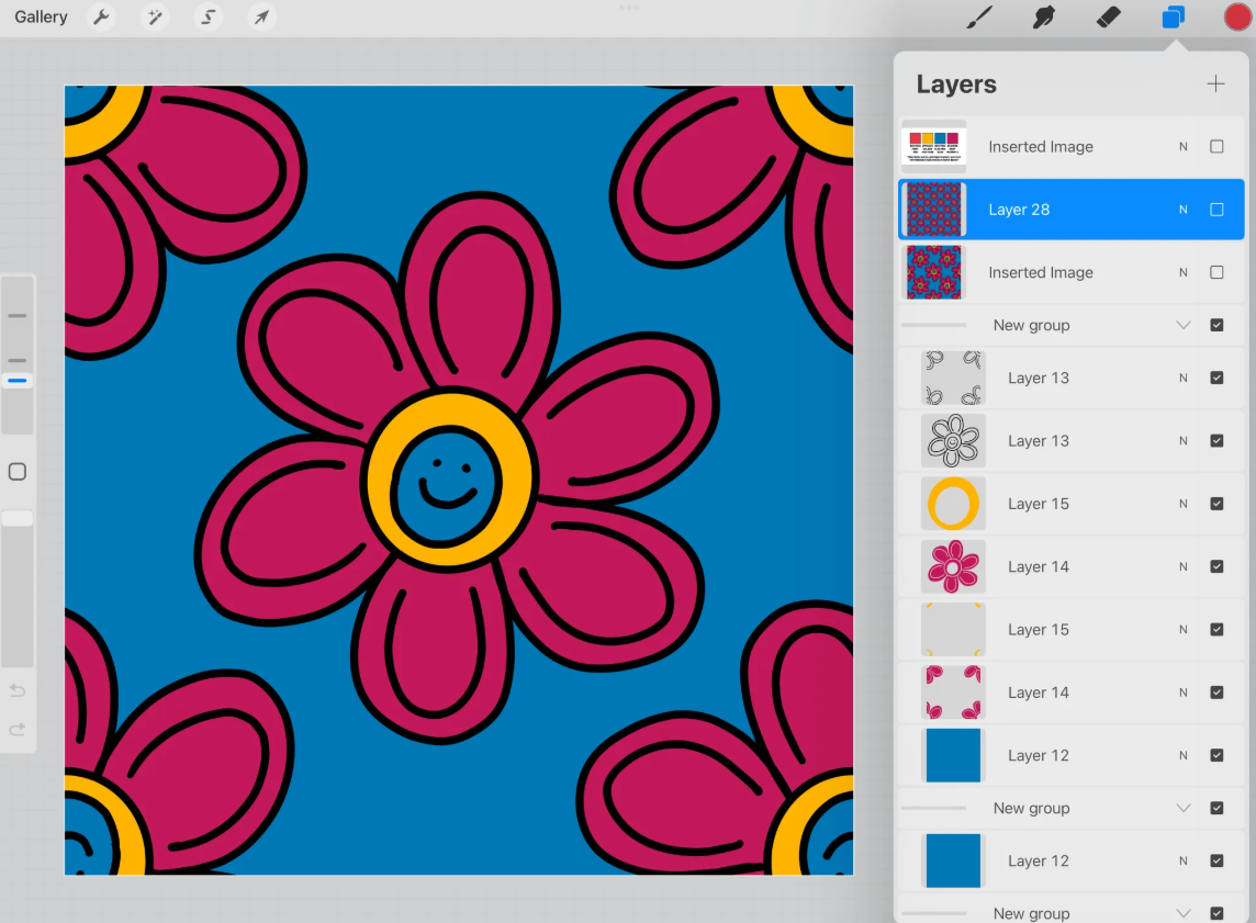
6. Colorways, Scales and Testing with Procreate Mockups: It's time now to prepare our file to be used and reuse,
especially in colorways. So I will go here
and I will start to rearrange my P one
that was phase one. So basically, what you're
going to do is that you are going to take all
the layer that belong, let's say to the same concept. So like this one
was the outline. This one is the blue color. This one is the yellow color, and you will just
merge them together. You can pinch them like this. And physically, I'm sorry. Oscar entering our
recording. Sorry. We were saying, remember
always to leave basically the ground layer,
just as a last one. So you can move it like this
and it's absolutely fine. In this way, we are super
organizer and we are ready actually to
work in color ways. And we can do it, for example, one thing that I
like to do is too, I will rename this one as original because I tend to remember also the original color that I
start to work with. And then I will alpha lock them. By clicking here, you don't need to reach
alpha lock this one. Then I will do a
duplicator like this, and I'm keeping this
one as a backup. You can also leave it to
set it up because there is this one already above,
so it's not a problem. Now I'm ready to work
with Outer colorway. For example, let's say
that now I want to make the background here blue. I can just go here,
select the blue, and then I can fill the layer. Or for example, I can take now the magenta and add the
magenta here, fill the layer. Of course, you can also
select now the S here, sorry, S here, and
then color fella. And with color fill activated, will be much easier to change the color once
you select something. So for example, now I go in Selecta you see it's
already yellow. Or I can check what I like. For example, I think that
this one is too much, so I can go like that
or as you prefer. This one is just to show you that you can do many colorways. Now that you are like that,
you could export it directly, and this one is already a
tile ready for spoonflower. And to do an other color way, for example, this
one, I don't know. I will usually I tend to save it with the
predominant color. Like, in this case, I
think I will go with blue because of the background or because of the elements. And then if I wanted to
do another color way, I would duplicate either
the original or that one. Remember, if you put it on top, you don't have to, for example, remove this parta and I will just proceed
in the same way. So in this case, I
will, for example, select again the background. Since a color field
is activated, it's super easy to change. Here they are just for color. But still, let's say that I wanted to try to see
how it is with black. I can just forkta and maybe
I can go little white here. What is it? Select, the white. We are also creating
something that is different but still a coherente if we
want to do a collection. So I think it's nice
to play with color. But another thing that
I wanted to show you before exporting it for spoon flour is that we can also create direct
scales in Procrit. Because, for example, if you see this one
now is the tail, it's a little bit
complicated for me to envision how the
pattern will look like. So we can do a scale and
then proceed in the same way to have already a
better understanding of how it will be
in a smaller scale, and maybe then reuse
it also for a mockup. So let me show you what I mean. Here, I let me reno this one before this one
is the black and yellow. Sorry. Oh. Is changing. Then let me proceed now
with the phase two. Phase two, I will take a
copy of my original here, and I will remove it above. This is how I keep organized. I know that for me, phase
one is the one where I build my original tail and maybe I started to
experiment with colors. I tend to experiment with
colors also later in ter scale, but sometime I like also to
anticipate it at this point, part and now here, exactly. I will rename it
now as phase two. And in phase two, what we're
going to do is we will duplicate this 14 times. I tend to use always the original one to
duplicate like this. And then I will start from
the one above the one here, and I will select it. And then I will
instead of drag and drop this one are really source of these kind of
white lines in procrata, I will go on the corner
and digit 1,500. It is really like when
we did the testing, but now we're
working on a group. I was like we did this one, then we will proceed
on this one here, and we will go in this
angle here and then 1,500. Just to be sure that you're not touching the comb in the
meanwhile we are doing this. I will collapse it, then I
will go in the third one, select and then here 1,500. Select it again. We just
missed the last one. And here, 1,500. Great. And now you would think,
Okay, I think you Ma, but now we have all these
things, so what should we do? Now we can collapse
them together. And this one, it
will be a scale, a smaller scale that
we can still use also in different color
ways. So let me show you. So now I will open
all the four here. I will go in the one on the top. So let's say I'm
taking this one, the draw here layer, I will make blue
also the second one here, third and fourth. And then sorry. Third and fourth. Some to go. And then
I will select group. And as you can see, all of
them are moving above here, and it will be easier for me
to collapse them like this, and I will be ready actually
to move directly above here. Then I will repeat
the same concept with each layer that was
corresponding to a color. So I will take layer 14. All of them starting always from the one above and then group. When it's group, I
will merge them in one and then bring
it above here. Let's repeat the same group, collapse them, and
then bring it here. Now, you can do the
same for this one, or since they are basically
just the background color, you could directly add a layer and bring
the color like this. Oh, sorry. Since the
reference was still activated in the original
one, that's not what it is. This one was something
that I forgot. You should remember
to deactivate the reference. Good
that we trust. We test this one. If you see now if I do it
it will just be the same. I can take away this
one or another thing if you don't want to cancel all this layer that
you don't need, you can simply collapse
them together, and it will be the same.
So you're ready to go. So now we have two bays. I can remove this one. And here we are ready for
phase two, basically. And in phase two, you
could do again, color way. So you can rename it now phase
two, let's say, original. And you could duplicate and
work again on colorways. Let's say now I will
do the magenta, and here I will select and
which one we are, This one. I can go with the blue.
We can really change. Maybe I will go again like this. Yeah, something like that. We are already doing this one, and technically, you can go
further as much as you like. Remember, Procreate
is a raster program, so you never want to scale
up, but you can scale down. So in this case, you could do exactly the same
process that we did with the phase between the
phase one and the phase two and continue
to a phase three, where you will also
make a smaller scale. For me, I think, in this case, I'm already more than happy, and I will take this chance also to show you how I might already test my pattern or
this idea in a mockup. So for example, let's
say, I will copy and paste directly in procreate
with three finger down. I will go and search for
my mockup and let's say exactly I wanted to check how we look this color way
in this setting. So what can I do is I will
basically just go here, insert a new layer, then
three finger down base. I'm already checking this
pattern on this mockup. Maybe this one is
something that is too big. So I can already play in
procreta with this mockup. Sorry. One thing I would suggest you
with the mockup is to reactivate magnetic
ensnapping because we'll make your life
easier to also, let's do a scale directly here. Let's say, yes, I want to go with something
similar to this one. I would just
duplicate the layer. And Oh, sorry, I did wrong. I will take it again. Here. Like this, I got even another
idea and then duplicate, the point is that now when
I will aplod in spoon flour or in the platform
where I will make available my design
for my customer, I will make sure
maybe to go and make sure that I have a scale
that is similar to this one. And you can do it, as you can
see, directly, let's say, Ippriate to scale down, or you can also do it in
spoonflower directly. This one is literally up to you. Now that we'll learn how to make a seamless repeat pattern in procreative from one element, I want also to show
you how actually we could do for this pattern, let's say, a blender, starting from this
pattern itself. So I will show you
in the next video.
7. Blenders and exporting the tile: Now you made your first
seamless repeat pattern in procreate using
this workflow, and you know that
you can play with color ways and also you
can do directly skills. You can replicate the
procedure with the elements. I will show you in my
gallery some example. I have this linksa that
I use for my calendar, and I basically
just reuse it to do a pattern in the same way,
exactly the same way. This is how I wanted to show you that this system seems simple, but at the same time,
it's very powerful to just leverage pieces
that you already have. Plus, I really believe that by leveraging pieces, you're
going, for example, to use S the element for
breedings card. Let me show you. Or for example,
then reposition it according to where you want it to allocate and which
kind of product. You can then experiment not
just with the element but also with the pattern
itself in more composition. You are also ready
for another exercise. That is add some
additional elements. In this case, let's say some pre handed
stars and then use this element that you
are first allocating according to your
original pattern to make a blender later on. I wanted to show
you, for example, this one is ready, ready to be a blender. This one is a seamless
repeat pattern to that I can upload. I didn't yet and I will show you actually how I can
upload it is f flour. But this one is a blender that I need out of this workflow. So it's like I'm starting from a seamless pattern with one
element and then from there, I started to generate
idea to do blender, starting by allocating
the element of this blender directly on
the original pattern. Let's start actually from this. Oh, no, sorry. Let's start
from the one we did together. That is, I guess this one. I will just go on the original
one in the phase one, but I will take really
the original here. And then, once you have
it, remember to duplicate. I will select it like
this and then duplicate. I love to have
duplicate it to be sure that I can proceed. And for example, here, I would also suggest
you to rename the file directly with
your own preferences. So now I will already call it blender at the moment,
and we are ready to go. To speed up the process, I just wanted to tell
you that I create a brush you procreate that I'm going to
share also with you. Sorry I have the bro pen. So it's going to be
this monoline story by Madam that will help
you to do this one. You can try with Monoline too, but you will see
that especially in this case of let's
take it black. What I'm going to do here is basically doing this
kind of thing, right? If you want, you can do it
actually even smaller if you want to let's try. Yes, because I think I use an outer dimension for this
one that we did together. And remember also you can
save the dimension that now, for example, I move
therap it's good. So we can save bookmark the dimension of
what we are using. Let me show you the
difference between this one and the
normal monoline. I don't know if you can
notice it make it like this. Is that the normal
monoline will make us this kind of It ending
that I don't like. So I modify the monoline, the original monoline
to make it like this according to my preference. Now, let me clear this one. And I will go back to the Brush later will
make available for you. And then let's go. What I would do at the moment, this one is basically the
general principle that you will apply with this template for Ana for all the pattern
that you're going to do is that you will try to
stay away from the border, and you will start to sell the area according
to your preferences, but never on the border. And here, I'm
definitely not doing a good job because I don't want to take
too much of your time, but this is what
you're going to do. Just try to do it and don't focus too much on what
is happening too much near the border because this
one we're going to do it in the second phase. No. So I would do
something like this. Let's say, I don't
want to do too many. So also paste the space
between the element. Remember, when you're
doing a blender, also negative spaces
are important, right? So, now that we
did like this one, here in the new original is that we have an
additional layer. Now, we will proceed
as we did before. We will select it select them. Again, we're having
this problem, so we know how to solve vita. We will just select
all of them together. Then select them,
load the layer. You'll go with selection one,
arrow Orizontal vertical. Oh, I didn't. Select sorry. Load Selection one.
Okay, now it's there. Then What the heck? What did they do? Repeat. Select it again. Select. Oh, you have to
remove corner field. Sorry. This one
was a big mistake. Luckily, Oh, wow. This class is going
to be troubleshooting also experience together. So then save and load them. Selection one nows working. And then arrow
horizontal, vertical. Done. Then seven load selection two Orizonta vertical, done. Selection three, arrow,
izonta vertical, done. Last one, four, Hizonta
vertical, done. There is more spaces
that I want to fill. A we go directly on the layer. In this case is 42,
the one where I add my star and my abstract star, and I will just
continue like this. My point is that, as
you can see right now, it's something like my pattern
is already more complex, and I can also show you again, by copying and going
say here above, that we can check it how it is. Sorry, too fast. You have to give procreate a little bit
of time to go there, yes. We already add an extra layer
of interest if you like it, but you can also decide to
make it available or not. This one is really
depends on you. I was checking how it was possible there was a lie.
Is it possible, okay? And then here Oop. Okay. So I think this one is already super cute but when
you find something cute, I will always recommend
you also to save it as the workflow that
you prefer, for example, you can even just export it
as a J tag and then save the image that is already ready to be upload
in spring flower. This one is already,
say, the smaller scale and this one is
the original tile. So the same. You can
export both of them. Well here JPEG, save the image, or save it as a
file as you prefer. But what I wanted to show you is also that now since we
have everything in layer, I can even go in the same group and make invisible oh, sorry. Another thing that I
want to tell you is that by heading all of
the layers separate, we could even decide to
do version, for example, you simply want to
do I don't know, the line work like this. This one could be also another version that you can upload, so you can still save
it, save us image. We're already making three file that you're going to
upload in firm flower. And here you could change the color as we have
different options. But my point right now is that you could even
decide now too. Take away the line work. And you will also have a repeat
pattern with the elements. You could be sometime
I find it also interesting to just
add this one as it is, maybe in a smaller scale. So let's say that
I will show you. Just to be faster, I will just show you let's
say in this way. So I will go again above and then I wanted to show you on a smaller
scale how it is, and I think it's already
interesting to see This one is really depending
on the pattern itself. But sometimes even
let's say re using exactly the element outside the original pattern
is interesting. And I will still keep
it here as example. But I want also to show
you that starting from this position that is
compatible with my elements, I can also do a blender
that will stand alone directly and will be
a seamless repeat pattern. So for example here, I can select again the same brush and if you
want to just to be sure you can use two
different layers at the beginning and
then collapse them. According to the space that
you already left before, you can add more. Sure. Just remember to
stay away from the border. You can go as you like. So I think for me, it's fine. And then guess what? I will duplicate it
just to be sure. I like to duplicate
also to be sure that I'm able to go back if
something is wrong. And then I will
select all the layer, also the original
one, and I will do the same proch
select Save and ode, selection one, arrow, horizontal
vertical, selection two. Aro selection three. Arrow, and then
selection for arrow. Now we are ready to
complete and for example, also to modify if something
doesn't make sense. For example, by
looking at this one, these two are two closer, and by the way, they were
on the same one there. So what I would do is
I will select them. Oh, sorry. I will
select as a free end. I will take them outside, and then I will
just continue here and do it like that.
Maybe I don't need. And you could even add Otter. I think this one is going to
be too close to this one. I think this is fine for me. So this one is a repeat
pattern. Is it perfect? Maybe not. I was more during the demonstration
for this class. But I think that I like the
idea that I can do also simple repeat pattern that
will work as a blender, and that really useful. And actually, they have kind
of success in Spoonflower, especially if you
think about quilter or crafter in general, that they might need
something simple to match with everything. Okay. So I think I can call this one down and
I can also export it. So perceive it as
image and done, and we are ready
actually to proceed to our last exercise where we will try to do a
non floral pattern, but a little bit more
random together.
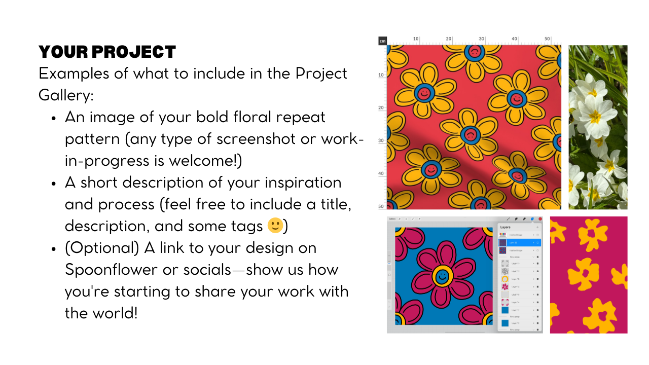
8. From Garden to Canvas: Are you ready for the
last exercise for today? Be ready for a
challenge, actually. Because while definitely you can follow along with me
also on this exercise, I would definitely recommend you also to make it your own. So how you do it First you
will go in your garden or nearby and just do a photo
of the first flower you met. So in my case, is this one. And we are going to do
a more or let's say elaborate pattern starting from this or yours in your case. You can definitely apply
and also reinterpret it. Let me move my iPad a
little bit here so you can still see my mine. What I wanted to say
is that let's try to reinterpret with
this color palette and using the same brush
that we already used in the previous exercise because we want to make something
coherent, right? And maybe we'll be part
of the same collection. I don't know. I'm just doing
it right now with you. So we will open our file and then I can't hide the palette because
I don't need it, but now it's time to open also the last section that we
keep a secret until now. So you would go here and you can select this diamond here, and you can take
it up if you like. You can leave it there,
but I think taking up will make it easier for you. So close this one for now. We don't need it and the point is that this diamond
will help you to remember that
we need to start to draw our elements
inside this party. You can go a little bit outside, but let's say, preferably
try to stay inside. So I would go here in
the draw here layer, and now I will select
only for sketching pen. I will go in sketching and then six B pencil and I will start to do a
general idea what to do. So most probably I will
try to do something like I see that they are from
different say dimension, almost the same but some
of them are different. Maybe some are in
flip on the side. So most probably I'm not here teach you
composition, okay? And also doing pretty fast. So I might just do something
to mark my ideas like this. No, I don't know. Maybe I
would do something like that. Maybe I will move this one here, I can do sultry here. I don't know. I'm
really experimenting. And once I'm pretty happy, I will just go here and reduce
the opacity of this layer, and I will start a new layer. And maybe I will try now to
give an idea of the leaves. I know that the real leaves of this plant is this one larger, but I also like the
interference of another plant. I think these two are competing for the space in my garden. It really depends on you. If you want to do large
leaf that maybe we go also below the layer. This one is really
up to you. Okay? We're not here talking
about the composition. I just wanted to show you
how we can make the pattern. So I might do
something like that. And now I will take also
this one layer down, and I will add a new layer
where I will start to do, let's say, a better sketch, but directly with the
color that I want to do. They don't have to be
this one, actually. They will be our color, the one that we already choose. So let's say that I will go maybe again with the fierce red. And just to know
exactly how it will be. So most probably I will
go with this shape. This one is like
the second layer. And also like the fact that there is a star also
in the middle here. This one is just to understand
the composition, right? And then we will put the color. Like this sem This one is
more like on the side, so I put doesn't have to be
perfect for me. Like this. And then here, there's one. That I think I was
considering it was k here. This in here. Like that. Okay, good for me. Then I will try to add directly, let's say, the green part. I will add a new layer, and I will take the
blue in this case, and I do like this, maybe they will not
be exactly the same. We are the artist, so we
can do our thing, right? So I would do like this. We can leave also, let's say, more space around it. We don't have to
fill it all, but if you want, you can, obviously. So this one is really
up to you, okay? But we don't have to fill all. And I feel like we
missed something here. Okay. So is already two. So maybe I will go like this. Just want the scenes too much in the same way so I do this. Okay. And now I will just remove the sketch layer
to get a better idea. I think it's okay. It's okay. And then when we
did like this one, we can already try to
finish the sketcher of the full pattern by
selecting everything we did. If you want, you
can leave also the original sketcher, group it. I would do a duplicator just
to be sure that I'm fine. End up with a the one above, I will do the same
process as usual. I would select it, Save and
ode get to the number one. I'm not sure if you select
it. Yes, it's here. As you can see, the number one here is in a ter
position because I think that we turn our
design a little bit. And while I will do horizontal and vertical
again, and it will work. So it doesn't matter if you
see it in a router position. Now I can go select number two, and then this one,
select number three. Select number four. This one. Okay. But I wanted to show you that if you prefer visual
to know which selection, you can go in again this part here and you can
just turn it on. So this 10, now we cannot see it because there
is this one covering, but if you uncover this part you will see that
number one was here. Okay? Number two was this one, number three was this one,
number four is this one. So you don't need it, but
just if you want to be super sure about which
section is which one, you can just check
it in this way. So basically now, we know that we have to draw inside
this diamond here. So what we can do, actually, I want to
show you a Shurga. It's like, you can draw
again inside here. But you can also, for example, go in the one that
you save as a backup, say, I will duplicate again. And this one feel a
little bit like cheating, but I can still keep it here
and move it here to fill it. And then if I want, I could
go here and let's say, select an area like this and just Oh, I select one? Sorry. Wait, yes, I was
selecting just this one. I would select both of them, and then I will deactivate for the moment
snapping and magnetics, and I can reposition it
in the parts that I want. And of course, you don't
have to do all, but you say, if you don't want to
redraw for zero, again, you can just then come here and modify and update
according to this one. For example, here, I would just maybe move this leaf
more and decide. Maybe I would even add the
one here now one here now. And then also here, I think we need more I could
have one here and one here. As I told you before,
we are not doing here, the best pattern is
just an exercise, but I think it gives a
idea of how to proceed. Now if you wanted to have
a big picture before proceeding with the final
sketch and the final inking, you can deactivate the diamond
and we can do as usual. We can copy all, go
here on the top, paste it there, and
then resize it. 1,000 501,500. 1,500. 1,500. And 1,500. And by looking at this one, I see that maybe I would go back to make maybe this
one a little bit bigger. But, I mean, in general,
I think it's fine. I'm trying to see
it also smaller. And then I will enlarge
it to get an idea. But I think that for
this example is fine to show you how we were ready able to test our design in progreta to make
the final pattern. And then I will collapse
it, keep it like this. And by the way, you can
also mark it if you want. So let's say that I think
the part that I'm not very convinced was around
this part here. So around this flower here, they're so similar and it
will be difficult to find it. I think it's this one
here. He me chuck. Well, Okay. I have to confess it.
I don't have time now to do it because I don't want to keep your
precious dimer. Always because most probably this one is specific of
my pattern right now. So I will just now
try to speed up the inking process and finish this pattern to make it
coherent with the first one. Let's try. This one
is a challenge, too. So now, I think that actually
I will just copy again, copy all and then I will keep the sketch
like another layer. I will paste this one and I can make
everything disappear, and then I will use
the white or actually, maybe I can use directly
the color that I want. So maybe I will make
them they could this magenta it with
the magenta. Sorry. I will take the magenta here. Obviously, you don't
see it because this one is a flat
layer with white. So yeah, okay, so this one was not a good idea for this specific to
show you the color. What I would do is I
will take this one here, open it up, take away the base. And then I would
just flatten it. You can do it by this or you can come here and say
flatten. That's all. Then I will take this one above the layer with the background
that I want to work with, and I can even put it on
multiply so I can see it. And then I'm ready to work. So let's say that maybe I
still want to do the outline. So I will go if you want to
proceed with the outline, I will go back in calligraphy and the monoline that I used
to use in the utter project, and I might start to do
actually, it's like this one. Oh, you wanted to go in a
noted layer, obviously. And I'm going to do
some more positive. And then I'm in the layer for drawing, and I'm ready to go. And again, it doesn't
have to be perfect, has to be your idea
of your bold pattern. Remember that you don't want to work on the one that are
touching the border. You're just working on the one that are not
touching the border. I really don't like this
part of the monoline. So to be honest, I
think I'm going to use directly also my
monoline version, the one that isn't
finding the resources. Oh, no, because I
put the streamline. Okay, no. Let's go
with the monoline. I's okay. The Let's see how many else will I use. I really don't like
this part here, but you can fix it later
on with more time. And actually, maybe I will now speed line this part because it's just
basically the drawing. Okay, and this one is smart. The important is that
remember that you want to close
everything if we wanted to use the same reference system to color super fast, right? And then I think I would do in another layer the
leaves directly. No, I don't touch this
one too much the design. Ts. I'm just making sure that
I'm touching all the lines to do not leave any open loop for to technique
are not a problem, but at least for the color, I want to really
speed up my process. So I do want to use the
reference to color super fast. Okay, I think that for
this one, I'm done. So what I would do is coloring
directly in this case, because we already
for example you see, this one is open, so Oops. You want to close it. And if everything is closed or everything
is as you like it, let me see also here. This one is the one. It's here. This one I
don't like it so much. It's also very human hand done. People might simply
realize that this one is not AI generated. So you might want it to
keep it as this one. It's okay. But it's up to you. Okay, what I want to do now
is since I'm happy, usually, I would do a backup,
but now we're ready, I will just pinch them, and I
will use it as a reference. I put here a reference, and then I will do
another layer here, and I will add to the color. Specifically, I think I
will use the yellow here. I can click F to continue
color filling, and then Took. Come on, here and
here, super fun. Ready. And then I will
open a new layer, and I will do the
leaves with the blue. Ready? Oh, I have to do the
color filling one time, cool activated, and
then I'm ready to go. Oh, this one was not close.
This one was not close. I have to go back. And, I
think it's really bold. I like it. So let me go back
to the reference layer. Let me take the black. Come here. Oops. Eraser.
And then I'm done. So I will go here. Blue. I like this. Okay, cool. So now I will remove the reference from here because I know that I will
do something else. And I will just be sure to
select all the layer here, make it a group, do a
backup if you like, and if you're facing
your art disk, and then we are ready to go
for the usual procedure. I will go here, select Save
and load, selection one. I think I get it. Now
one is here. Okay. Then two. Three, and four. We are now ready to continue to this layer here
with a black outline. First up. As usual, I would prefer first to
go with another layer and then collapse them then work directly on the one that
is, let's say, done. So let me do it here. Ready Let me flower here. I hope you can see.
Obviously, I'm not following so much my
previous sketcher, but it's more for the
position. It's okay. It's okay to go really
especially in this theme of doing something bold and energetic and
something like this. I think also the stroke will
really communicate to this. I think we are done
with the flower. Again, I will do
another layer for the leaves just to be
sure that I can dig. I can modify them
if I need them. Is this one maybe the one that I was supposed to do bicker? I decide Smith. Maybe ten. And I will try to go also. Think a date now. It's like in my brain, I'm remembering that there
was a parson that was needing more filling
with the leaf. So I'm just doing it
randomly, to be honest. It's okay. I think
it will be fine. Oh, this one, for example, is something that I
was supposed to do in the ter one and I missed it. Hopefully it will
not be a problem. But this one is something
that I miss in the ter phase. Okay. In general, we
didn't over cross. So this one is the only
one that is crossing more Menser, I think we're done. This one is open, so
we have to close it. You can fix anything
that you left around. You Wa tattoo. So this one is open. The
important is that, again, for this technique, I personally need to
close everything. Otherwise, my color filling
with reference will not work. And I think I'm fine. I'm fine as it is.
I'm ready to go. I would just
collapse everything, and I'm ready to
make it again as a reference and
the color filling. So I will select my yellow. I will go back directly to the yellow layer
and drag the color, select color filling
and continuing. Cool. Then I will
select the blue. And then go Oh, sorry. Continue color filling,
and then we Duck. It's very satisfying
to color in this way. Okay, to be honest,
I think I'm done. So what I would do is now I can deselect the original Skecha. I think it's bold florals. Obviously, if you want,
you could even add the centre of the flower
with a noted color. Let me check just
how it would be. I think that for my
limited per palette, I don't need to change if
I'm using the magenta, I don't need the Firs
rider to be there. So this one is really
depending on you. What I just wanted to show
you is that the tile is done, so I can export it. So I will export it as a
jet Bag, save as image. I can also proceed
with the phase that we did previously with the
one element pattern. So I can do colorways, so I will make all
these one like an Alpha ok and then I can
change the color. I can use the same way also to do the scales
that I can procta. What I will do right now is
simply like a faster testing. So I will just copy all
again and then go above. This one is much fast
testing in procreate. You can do it in different ways with different
software, whatever. I tend to just do it in procreate because it's so
easy and it's so fast. And again, when I really like it after I do this fast testing, I will also be able
to do directly for example a scale or different color ways as I
showed you before. So the point is that for me, this pattern is bold. Maybe if I would have more time, I would have maybe add some more details
on the yellow part. But Still I really like
it. I think it's cool. And I think also that I think that one it's not a mistake, but something that I would
do differently is on the idea of leverage our water, I would maybe not collapse
in the final outline sketch. This one here, the leaves
with the flower because oh, it's also cool
without the outline. But let's say, with the outline, I cannot separate them. I'm able, actually, for example, to also save and applaud
just the outline again, and I think it's cool.
Let's put it also there. But I'm not able
to separate this. While if I would have
separate the out, I would be able also
to say also even just to applaud the
flowers, right. So actually, I can also maybe use this one and see how it will ate
the pun flower. So the point is that in procret when I'm
experimenting in this way, I always get a new idea, what I want to upload, maybe not exactly in this collection, but it's still triggering my brain to even
do more and more. So I hope this one really
show you how much you can do with just one idea and a limited color palette
of basically four colors. Write them? So the last
part that I wanted to show you about specifically this pattern
that we created together, is how I will upload them directly from the
iPad to Spoonflower. So I see you in the next part.
9. Wrap-Up: Upload to Spoonflower & What’s Next: Wow, congratulations. We
reached the end of this class. But before concluding, I just wanted to show
you how you can upload the pattern that we just did together in Spoonflower. So if you go to my
blog, actually, I also put some links that
you want to take into account if you're
going to participate to spoonflower challenges
or in general, if you want to keep
in touch here in the bondar you will find
the logo of Spoonflower. And by going here, you will be updated about the challenge, the current one, the
one that you can vote, and the one that are happening. Then assuming that you
are already logging in spring flower to
upload your design, you will just have to go here
and push upload the design. Then you will choose a file. And for example, in
this specific case data in the photo library. So I will go here and you
can select up to ten. Say I will select this eight
here and I will add them. You will agree, you can
add up to ten at a time. Usually, I do this
process on my computer to optimize really also
the uploading process. So if you wanted to know
more about this one, again, stay updated also
on future classes, but I just wanted
to show you that literally you can do
everything on your iPad. So once you're here, I would suggest to push
Edit design new tabs. So all of them, but you can
just upload also just one. We'll spread out the browser. And then you will be able to edit type of description
and tags here. You will be able to
add a collection and save all this information. And about this specific thing, I want also to remind you that if you go to the blog
on the resources, you will find also for this
specific both the floral, a lot of useful information. So if you go to the joint part, you can find according to
the different challenge, different support
and the sources. And in particular here,
you will be able to see five use cases and keywords for search
optimization that you can reuse them according
to your preferences. I also usually provide
three example idea where I go even deeper
in one example. Again, feel free to reuse them Ethoen provided in the
resources for your own entry, Is pin flour or in general for any plot that you want
to put in spoon flour. And if you want also
extra, ideas and so on. You can also navigate
the Pinterest board, create, and there are
a lot of useful link. And here there is for
example, my entry. When you enter your challenge or your design is Spoonflower, I will also love to see it. And if you like,
also maybe add it to the collective collection
with talent artists. And some of them. I
bet I already here. So let's go back now to here because I wanted to show
you what's important to do. So I'm not going right
now to talk about tanto description
in tags because this one are really
related to your pattern. But if you go in spoonflower
and you click on Mine, you can check, for example, the work that I
did on this part, and still, I'm referring
you to other classes that I have to get really
effective on this topic. SEO words are really like another one of my
questions with pattern. So feel free to go there and please let me know if there
are additional questions. What is important that
a pattern to be on S in a platform Spoonflower
has to be proved. And to prove you
have to click here. You will start. And here you will see how it will look
as a repeat button. Of course, it will
change according to the scale that
you're adding there, and we might have also extra
resources on this one. But now I just want to
tell you that what you want to do is come here, then select this
button to double check that the pattern is
not having any problem, but if you follow this class,
I'm sure you will not. And yes, that's all. Again, I hope to stay in touch. You will definitely find all my contacts in the
references of this class. And please come back and revisit not just for
challenges, but in general, each time you wanted
to refresh how to do a button and a specifically, flou that I think is an
evergreen, right, then. So keep me puffed. I would love to see what
you're treating this class. I hope you had fun,
and I'll see you soon. Oh, and I forgot to say. If some of your friends will
benefit from this class, please, remind them
to see the class too. I cannot wait to see what you're going to create
in the project. They will really
light up my day, so you can tag me at Jump
Solution in Instagram. You will find all my contact. Remember that in
the blog poster, I will also add the
extra resources. Feel free to use my material
and tips about SEO words. And please also leave a
review and let me know if there is anything I wish list that you would
like to see soon. Hope that this class
empower you to just go outside take inspiration and make them free when
you're doing pattern. You can do it. Now you have everything to create in prograt. Remember that this one is the first step
of the big picture because you do need also to put effective title description
in tags to make them visible. You do need also to promote your creation if you want
people to be able to see it. But I think that by
designing and creating, you will really train
this muscle memory in your hands in your
brain to create even pieces that will
be more appealing. And by being resilient
and showing up, you will see that the result
will start to come up. So stay effectively productive. But what is more important, stay creative and see
you next time. Bye.
 Madda Mom, Procreate & Productivity