Transcripts
1. Introduction: Hello, and welcome to this retro Manga inspired Blender class. I'm Harry, a season three D
artist with over a decade of professional experience
and the privilege of being recognized as a top
teacher on Skillshare, specializing in
Blender tutorials. This class, we'll be creating
an animation and blender inspired by classic sci fi
manga series such as blame. Whether you're brand new
to stylized rendering or you've followed some
of my previous classes, there should be something
for everyone to learn. You'll find my classes
are easy to follow due to my focus on relaxed pacing and crystal clear instructions. This has made them popular with both beginner and
intermediate artists alike. We'll start the class
with a pre made starter file as the foundation
for our simple animation. This starter file comes
fully modeled and lit, so you won't have
to spend time on those aspects before you
start creating textures, overlaying compositing effects, and adding hand drawn details. Don't let the term hand drawn detail scare you off, though. I promise I'll make it really easy for you to follow along, and we'll even be using
our mouse to draw. So you won't need a fancy
drawing tablet, either. Grease Pencil is a really
fun and easy tool, and I promise you'll love how
it transforms who renders. Please note that Blender
version 4.4 or later is required to access the provided
files and follow along. You can download the
latest version of Blender completely free
from their website. By the end of this class, you'll be amazed at how easy it is to create stunning retro manga inspired animations in Blender. So if you're ready, I invite
you to join me in class. Let's jump into our
first lesson together.
2. Starter File Exploration: In this lesson, we'll
begin the class by exploring the starter
file. Let's begin. If this is your first time
taking a blender class, I'd highly recommend
you start with my complete beginners
guide to blender first. This class was designed
for the absolute beginner to blender and three
D art in general. We cover every single
necessary topic in order to get you up to
speed and running and blender. We'll accomplish this with
short and focused lessons that cover each topic from
a beginner's perspective, utilizing a well
organized starter file. We end the class with an
easy project where you set up and customize your
very own cozy cam site. With that out of the way, let's
continue with the lesson. We'll be using a premade
starter file for this class. But I thought it would be
a good idea to familiarize ourselves with the file before we jump right into the
rest of the class. Let's quickly go through some of the things that make
this file unique, as well as the basic
render settings. Our first step is to make
sure that you've downloaded and unzipped all of the
resources for the class. After you've downloaded
the Sciimnga class assets dot zip file, we'll need to unzip
it so that we can access all of the
files inside of it. On a Windows computer, all you need to do is right
click on this file, the one with the folder
with a zipper icon on it, and then choose extract all. Here you can choose where it's
going to extract the files to and whether or not to open the file once
it's extracted. After extracting the folder, I suggest you move
it to a location that you can find easily later. I definitely wouldn't leave this folder in your
downloads folder. My suggestion would be
either to put it in a documents folder or just on your desktop somewhere
that you can find later. Inside this folder that
we just extracted, you'll see some
blender files and folders with reference
images and textures in them. You should see all the
same files you see here, aside from this folder here, which you have
already extracted. So you should see four
different blender files and then two folders, one called reference images, and one called textures. These items will all be
important later, but for now, we're going to double
click on the starter file, underscore Sci Fi Manga underscore 01 Blender file
to open it in Blender. This is another
good time to remind you that Blender version 4.4 or later is required to use these starter files
without having any issue. If you're using an older
version of blender, I would highly
recommend that you update to Blender version 4.4 or later to follow
along with this class. Now that we have the file open, we'll see that I've customized
the interface slightly, featuring the
camera view here on the left and the perspective
view here on the right. This will simply allow us
to always have a view of what our camera sees while
we work in the file. You might also
notice that all of the models here on the
right viewport are in different bright colors rather than the gray that
you might be used to seeing. This is thanks to a
viewport shading setting found at the top right
of the right viewport. To find the setting, we can
go up here to the top right. We can click on this
drop down menu. If you can't see these buttons
here on the far right, it's likely because this bar
has been panned over too far because it's being cut off due to it not being the
full size of the window. To move this bar back and forth, we can click in our
middle mouse button, so click in your mouse wheel, and that lets you drag
it back and forth. So we'll drag it
all the way to the left so we can see these
buttons over here. Now we can click on this
drop down, and then here, we'll see it says random
underneath the color settings. So if I switch this
back to material, which is the default,
you'll see it goes back to the gray that you might be more familiar with. For now, I'm going to
leave mindset to random. This simply helps differentiate the models from each other, and later on, it'll help show the different layers of grease
pencil within our scene. This random setting is not mandatory and is mostly a
matter of personal preference. If you strongly dislike the
varied colors for your file, you can go ahead
and swap it back to material so that it's all gray. I'll be leaving mine on the
colorful random setting as it does help with
visibility during some steps. Another thing you might
have noticed as you rotate around in
this perspective on the right side is that
sometimes we're able to see through models such as this
wall here on the left. So if we rotate around,
we can actually see right through it now
that we're behind it. This is thanks to a setting
called backface culling. We can find the setting for this again in the exact same spot. So we click this drop down
menu here on the far right. We can go down here
and then turn off backface culling to
turn off that setting. So we'll see if we turn it
off and now we rotate around. This wall remains solid and
we can't see through it. For the sake of this class, I would highly
recommend they leave backface culling
on for this file as it makes it a lot
easier to navigate in this large scene that
has narrow hallways. So I'm going to go back up here and turn it on by clicking this dropdown and then
choosing backface culling. Aside from these two settings
that we just covered, I already have a
camera, a light, and our render settings
are already set up for us. This render really doesn't
need anything special, so simply setting
the render engine over here to EV is enough. If we go to the output settings found here just below this tab, we'll see that I've
already set up the output resolution
found here, and I've already changed
the frame rate for our animation to 30
frames per second. With this quick walk
through out of the way, we're ready to proceed with
the rest of the class. And the next lesson, we'll be discussing the main
reference image that this class is based on and what makes it unique.
I'll see you there.
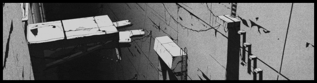
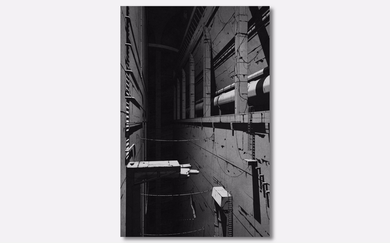
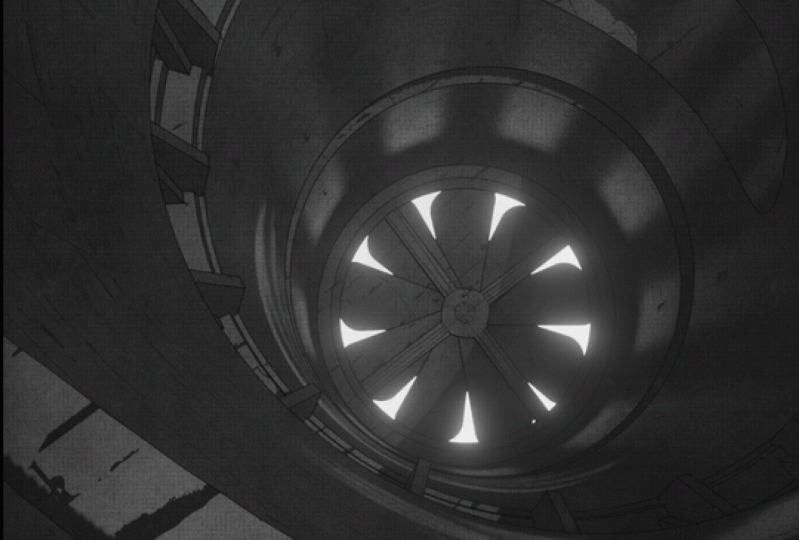
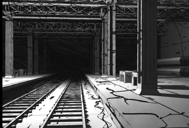
3. Discussing the Reference Image: In this lesson, we'll be discussing the main
reference image that this class is based on and what makes it unique. Let's begin. As I mentioned in the
introduction of this class, we'll be using a panel
from the 1996 manga called blame as our main inspiration for
the look of the render. This manga is well known for
its stunning depictions of a gargantuan landscape
simply known as the city. I'll spare you the complete
synopsis of the manga. But the absolute
basics of the story is humanity used to control machines to build the
city for their needs. They lost their control over these machines
thousands of years ago, and now the machines
continue to build the city without any
input from humans. The humans are
actually considered invaders by the machines and
now live in fear of them. The main artistic aspect
of the city, however, is that it's an incomprehensibly
large structure that is built with no particular logic and without humans in mind. This results in
nonsensical architecture that is almost anti human. Examples of this might be hallways that extend for
hundreds of miles with no doorways that end in a sudden dead end or elevators that take weeks
to reach the bottom of, or even simple things such
as rickety staircases over massive gaps that have no handrails to prevent
you from falling. Now that we know a little
bit about this world, what are the key
elements that we want to isolate from the visuals
of our reference image? The most obvious aspect is the stark black and white
appearance of the image. While manga is predominantly
a black and white medium, blame takes a particularly
heavy handed approach to the contrast in the image. The lighting in the scene
creates pure black shadows and pure white highlights with little gray
in between them. We can see an example of this
down here on the walkway. Any gray that we see in
the scene is predominantly just a gradient that goes from a light value to a dark value. We'll be capturing this strong black and white lighting
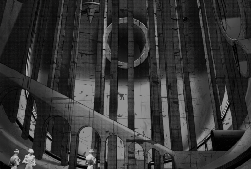
in our scene, as well. Next, we'll see that the
environment fades into darkness as the walls
extend into the distance. This can be accomplished
with lighting. However, we'll be
using a Z depth pass later on to get this effect. The walls have cracks and streaks along them and
are generally covered in huge amounts of wear and tear as the city ages
through the years. The material that
we'll be creating for our scene will capture
a lot of these details, but we'll also be using
grease pencil to add even more detail and accentuate the ones
that are already there. This reference
image also features countless broken wires and
cables spanning the chasm. While we won't have quite as
many wires in our render, we'll still add a bunch
of wires by drawing them directly into the
world using grease pencil. Lastly, the image features a pretty obvious paper texture, thanks to it being a page
from an actual manga book. We can see a pretty good
example of that here on the center of this wall
inside this gradient. To give our render that
same paper like feeling, we'll be adding a
few overlays using the compositor and blender to create paper lines and fibers. We could be here for
quite a while calling out all of the amazing
details from the manga. But I think at this
point, we have a pretty good idea of what our goal is if we want to
replicate the same feeling. In the reference
images folder in the class assets that
you downloaded earlier, you can find a few
more reference images from the same manga. Each of these images shares many details while also
featuring new ones. So go ahead and look
through these if you just wanted to get
a better idea of what this world looks like and the feeling that the
artist has captured. In the next lesson,
we'll begin creating the main stylized
material for all of the objects in our scene.
I'll see you there.
4. Creating the Object Material (Part 1): In this lesson,
we'll begin creating the main stylized material for all the objects in our
scene. Let's begin. With all of the exposition
out of the way, we're ready to begin working on the first aspect of our
render, the object material. While the material
for this scene does a lot of heavy lifting
for the overall look, it's really not all that
complicated to create. I'll be explaining a good bit
during this first section. So while it's not all
that complicated, it will be a bit longer
than the average lesson. So let's jump right in. First, we'll need to switch to the shading workspace
found here at the top. If we can get there just
by clicking on this tab. Now that we're in the
shading workspace, we can see here that
I've customized the layout for us slightly. The top left viewport will display our rendered image
once we've rendered it. The top right will display
our three D viewport, set to the camera
view currently, and the bottom viewport is
set to our shader editor. This is where we'll be
creating the material. In this class, I
won't be explaining every single aspect of how
materials work within blender. However, if you follow along with all the steps
you see on screen, you'll have no issues
creating the material. If you're interested in a
more thorough explanation of all the basics of material
creation and blender, I'd recommend my magic of materials class
found on Skillshare. Before we start adding any
new nodes to our material, let's enable a built in add
on called node wrangler. This will make our lives a lot easier as we create
the material. To do this, we're going
to go up here to edit, then go down to preferences. Now we can go to the add ons
tab here in this window. Then up here in the search bar, we're going to type in
the word node N ODE. Then here we can see it
popped up node wrangler. If you're not able to see this, make sure that you don't have
enabled only checked on. You should have this box checked
off, and then down here, once you see node wrangler, just check this box next to it to make sure
that you enable it. This add on is really
useful for quickly adding support nodes to our material
with just a single click. If you already had
this add on enabled, obviously just
leave it turned on. That you have node
wrangler turned on, we can just close this window. Okay, now it's time to
add some new nodes. We'll be using this
node wrangular add on to do this in a much
more efficient way. First thing we need
to do is go down here to the Shader
Editor on the bottom, and then we can click here on
this principled BSDF node, the one with a green
bar at the top, and then we'll hit Control, Shift, and T at the same
time on our keyboard. And then we'll navigate to the Textures folder that we unzipped in a
previous lesson. This was included in the
class assets for this class. Inside that Textures folder, you'll find a bunch of
different images here. The images that
we need right now are these metal plates
images found here. So first, we're going to select this metal plates 008 image, and then we can hold Shift, go down to the last
metal plates image, click that one, and then that'll select all
three of these. With all three of
these images selected, we can go down here and
click this blue button. As a quick side note, all
three of these images are from a really great website
called ambieng.com. All of the assets
on this website are completely free to use even
for commercial projects, so it's a fantastic resource. I really recommend
that you check it out at some point to
see what they have. Okay, so we have our
texture images loaded, and we'll notice that
the node wrangler add on even did
some setup for us. So if we use our mouse
wheels down here on the bottom window,
we can zoom out. To see all these
different nodes that node wrangler has
connected for us. One important thing to note is that these orange
nodes that symbolize the images that we selected in the previous window are all named after the
name of the image. Because we're creating a non photorealistic
stylized material, it really doesn't
matter too much what the original purpose
of these images were, only how they look and the data that we can
extract from them. This is particularly
obvious with this bottom image here,
the normal image. This image isn't even
black and white, but we'll be converting it into one for our purposes later. If you are familiar a little
bit with how materials work, I wouldn't get too caught
up on the fact that this is a normal image and that
this is a displacement, and this is an ambient
occlusion image. We're just using these for basically just the image itself. We're not really
concerned with what they used to be made for. Now let's do some rearranging of these nodes to make them more
useful for our purposes. Our first step is going to be adjusting the texture nodes, these ones here with the
orange bars at the top. First, let's go up here to this ambient occlusion texture
so we can select this. Then we're going to
click on this drop down here that says color space and then switch it from non
color to SRGB instead. This will add a bit more
contrast to this image by changing how Blender interprets the black and white values. Now we'll go here to
where it says flat. We're going to click
on this drop down and then switch it instead to box. This allows Blender to
project the image from three different directions
rather than just one. Due to us using this material on nearly every
object in the scene, we want to make sure that it's
as universal as possible. Projecting the image from multiple directions
means that it will be more likely to fit regardless of the object
that it's applied to. Let's adjust the
other two images, so we're going to scroll down. On this one here, this
displacement image, we're going to again, go to flat and then switch it to box. This image, we can
leave it set to non color for the color space. We don't need to switch that. And then the very last
image, this normal image, we again click flat and
then switch it to box. And again, we'll leave this
color space set to non color. Now that we have a few
of these nodes adjusted, let's clean up some of the
ones that we don't need. So we're going to zoom out
using our mouse wheel. Then we're going to click and drag over these three nodes
here on the right side, and then we can just
delete them by hitting the delete key on our keyboard. And then next, we're
going to select this black box that's behind these images and
then hit Delete. And then, again,
we're going to select this black box and then
delete that as well. Black boxes that we just
deleted are called frames, and we don't really
need them because right now they're
attaching these nodes together in ways that isn't super useful to us
for this material. They were auto generated by
the node wrangular add on, and are generally a
good idea to use, but in this case,
they're just going to complicate things for us. So we'll remove them for now. Then the last thing that
we need to delete is the small purple dot found here connecting all of
these nodes together. So we're just going
to drag select over this and then delete this dot. That little dot there is
called a reroute node, and it's a way just
to clean up some of these wires so that it's not quite so many
things overlapping. But in our case, we don't
really need before we move on to our next step
of adding brand new nodes, you might have noticed
that these image textures here were overlapping
each other. That's because when we changed the setting from flat to box, it added a few new
categories here, which made them a
little bit larger. To reposition these,
all you have to do is click on them and then just
drag them out of the way. So here, now they're
no longer overlapping. Okay, so now we're ready
to add brand new nodes. So to do this,
we're going to hit Shift and A at the same time. That'll bring up our ad menu. Then we can go here
where it says search. We'll click on the search bar. And we're going to
type in diffuse DFF. We'll choose diffuse, BSDF then we can place that
over here on the right side. And again, we're going to
add two more new ones. So we'll hit Shift and A
to bring up the ad menu, search, then this time
we'll type in mix MIX. We're going to choose mix
color the second option. We'll place that again over
here on the right side. And then one last node, we'll hit Shift and A. Search then type in value VAL, and we'll choose value
found here at the top. Then this one over here, we're going to
place to the left. So first, let's get the left
side of the system set up. We're going to zoom in over here so we can see these
nodes a bit better. We're going to
start by connecting the value node that
we just added, and we're going to plug
it in down here into the scale socket on
this mapping node. This will simplify the three
directional scale values that we had into just
a singular value. This isn't necessary,
but it makes adjusting the scale
a little bit less tedious as there's
only one number to adjust instead
of three of them. Now let's zoom out a bit. And then you can click in
your middle mouse button here to pan back and forth. Then we're going to select
this top left node here, this texture coordinates node, and we're going to drag
it over here to the left to make some room as
we'll need this gap here. So we just want to
separate these a bit. They're still
connected. We can see the wire. We just
need some room here. Now we're going to drag
select over these two nodes and then move them up
here next to this image. Now we're going to make two more copies of these two nodes. So make sure you
have them selected. So just drag select
over them if they're not highlighted in orange
like they are now. And then we're going
to hit Shift and D on our keyboard for duplicate. We're going to
duplicate these down here and then left
click to place them. Then we're going to do
this one more time. We're going to move
down a little bit. Shift and D, duplicate, and then place them just below. So we need three
groupings of these. Each one of these is going
to correspond to each image. So let's reposition these so that they line
up a bit better. So we can just drag this down, so it lines up with this one
and then drag this down, so it lines up with the middle. Now we're going to
connect each of these three groupings back to this texture coordinate node. Before we do this,
however, we do need to switch the mode
that this is using. Right now it's plugged
into the UV channel. We want to use the
object channel instead. To change this, we're going
to zoom out slightly. And then we're going
to plug this object. We're going to drag from object, and we're going to move it up
here and then plug it into this vector socket here
found at the very top. We'll see here that
it replaces the UV, and now it's using the
object instead of the UV. Let's do this two more times. So we're going to go down
here, drag from object, plug it into vector, found here at the top,
and then one more time, drag from object, plug
it in here to vector. Reason we chose object
is because it's the most universal and most likely to fit on a variety of
different object shapes. This works perfectly
for our needs, as we're going to
be applying it to 99% of the objects
within our scene, so we need to be pretty universal
and work in most cases. In this case, object is
the best option for that. Now we can go to each of
these three nodes here, and we're going to
connect the vector from the top of this mapping, down here to the vector on
the bottom of this image. We'll do that three times. We'll go down here,
do the middle. And then again, the bottom. With all these
nodes ready to go, we're going to start here in the middle with this one
that's named displacement. Again, remember, it's not actually the displacement image. That's just the name of the
image that we're using. After we add all
the nodes we need and get it fully
connected to the system, we can go through the
other two images, the top and the bottom, a little bit faster
because we'll know most of the
process by that point. Before we add any new nodes, let's just grab this mix node here, move it up to the top. We won't need it just yet. Now we can grab these
two nodes here. We're going to drag
select over these, drag them over to the right
to make a bit more room, and then we can select
just this green one here, this disfuse and we're going to move it over here
about in the center. Let's add two brand new nodes. So we're going to
hit Shift and A. Go to search, and then
we'll type in color COLOR. We're going to choose color
ramp, the second option. We'll place that over
here to the left. With this color ramp
still selected, we're going to hit Shift and D to duplicate this
to make a second one, and then place it over here on the far right just
before this other node, and then we're going to add
one more brand new node by hitting Shift and A. Search This time
we'll type in Shader, SHAD we're going to choose shader to RGB,
the third option. Place it between these two. With these new nodes added, let's zoom in here and let's
get them all connected. So we're going to drag from here this top color socket down
to the factor socket here, again, from the color socket to the color socket
on this diffuse. Then we'll drag from this BSDF to the shader socket
found here at the bottom. And then another time, we're
going to go color to factor, and we can move this over a little bit to make
a bit more room. We're going to plug in
the color to the surface, which is the very top socket
here on the material output. Before we go too much
further with this texture, let's make sure we go to
the top right viewport and set it to the rendered view. We can do that by clicking
this far right button here, and then we'll see our viewport
here update in a moment. And now we can see a bit
more accurate representation of what our image
actually looks like. We won't see anything
too exciting yet, but it'll be more obvious as
we start adjusting settings. As a quick note, if you're unable to see these buttons
here on the far right, you might need to click in
your middle mouse button on this option bar and
pan it back and forth. You can slot it all the
way over to the left so that you can reveal these
buttons here on the right side. Now that we have everything
connected together, let's start from
left to right and go through each of these nodes
and adjust their settings. We're going to start over
here with this value node. So we're going to zoom in here and make sure
you're adjusting the value node that's attached to this
displacement image, so it should be part
of the same chain. So we can zoom into value. Then we're going to
click on this number here and we're going to set it to 37.3 and then hit Enter. As I mentioned before,
this value node is what controls the scale
of our texture. It's just using one number and then plugging it into the X, the Y, and the Z values. When it was set to zero before, it was scaled down to
essentially nothing, so we didn't see anything. It was infinitely small. We've switched the number, but before we notice any changes, we're actually going
to need to go over here to the top of the mapping node
and switch the type from point to texture instead. Switching it from
point to texture, we've adjusted the way that blender interprets these values. In the case of this texture type that we just switched to, the larger the scale value, the larger the texture
appears on the model. So if we go down here and adjust this value and make it larger
just by sliding it up, we can see that the image
gets bigger on the model, and then if we adjust it
down, the image gets smaller. I'm going to hit
Control Z to undo that as 37.3 in our case,
works pretty well. Another change we need
to make is over here on this location settings here
inside this mapping node. Change isn't
technically necessary. However, in the
case of this class, I've built the scene to work specifically with these values. So we're going to
adjust our Y location to 16.01 hit Enter. You'll notice that it
cuts off this number. It is still 16.01. It's just simplifying
the visual here to 16. And then for our Z, we're
going to type in negative 5.73 and then hit Enter. So we'll notice that
these adjustments have simply moved the texture
around on the objects. It just slit it around on
the Y and the Z direction. In our particular case, it moves the images
around on the walls to spots that I thought looked better when I was
creating our scene. This is important for this
class in particular, though, because a lot of the grease
pencil details that I drew onto my render were embellishing some of
the texture elements. If I don't have the texture
in the exact same spot, then my drawing that
I import later on in this class won't match up to the locations
that it should be. If you don't plan on using my imported grease
pencil drawings at all in your personal render, feel free to adjust the X, Y, and Z locations to wherever
you think looks nice. However, if you
have any interest in using my drawings as a
base for your own work, which is totally
fine, be sure to use the exact locations that I just typed in so that
everything lines up. Otherwise, when you
import my drawings, you might notice that some of the details don't really match up with what
you're seeing, and that's because the
texture was assumed to be in one location, and
it's now in another. With our mapping node
finalized, we can now zoom out. We're going to go over here
to this first color ramp. So let's zoom in here so
we can get a better look. Now it's time to strip
all of the gray values out of this image and make
it really high contrast. And we'll be doing that
with this color ramp node. Let's go down here and
make a few changes. So first, we're going to
select this linear drop down, and we're going to instead
switch it to constant. Next, we're going to
select this white slider here by clicking this tiny
triangle at the top of it. Or you can simply go
down here to this bottom left and type in one or zero. Zero would be the left slider. One is the right slider. So once you have it
selected, you should see a one here and then a
white bar at the bottom. Now we're going to adjust
the position of this. So you could normally just
drag it left and right, and you can see here it's
changing the position of it. Or down here, you'll notice that this number
changes as well. So we're going to type
in an exact number here, type in 0.1, seven, and then hit Enter, that'll put it exactly where
we need to be. Notice that after changing the gradient type from
linear to constant, we've completely removed all gray values
from this gradient. It's basically just black or white with a hard
transition between. This makes the image
really high contrast. And then by adjusting the
position of this slider here, the white slider, we've changed the amount of white and
black in the image. So in this case,
we made a lot more white in the image
and a lot less black. So by removing most
of the black values, we can zoom in here and
see that all we've left behind are basically
just these cracks and lines in the texture. If we move back up, we can
see that those cracks grow, but really all we want
are just these lines. We're going to leave it
at a really low value. With this color ramp done, we're ready to move on
to the diffuse BSDF which is directly next to it. We won't be making any
changes to this node, but it's important nonetheless. When combined with
this very next node, the shader to RGB, it allows us to convert all
of the previous nodes to the left over here into color data rather
than shader data. By converting the shader
into color data instead, we can manipulate
the way that light interacts with the material
and stylistic ways. This is really key to
the look of our scene. So now that these two nodes
have worked together to convert the shader data
into color data instead, we can now adjust this here
that a second color ramp. Is where the shader
to our RGB node to the left is really
allowed to shine. We can now filter
this entire material, including the way
that light reacts to the surface through
this color ramp node. This allows us to
have fine control over the amounts of
highlights and shadows, as well as the brightness or
darkness of these elements. The main thing that
we'll be changing is the color of
the black slider. While the reference image that
we're using as a guide has really stark contrast between the highlight
and the shadow, we'll be achieving that with
other effects later on. We want to make sure
that the shadows aren't quite pure black
for this material. As such, we want to make
sure that we don't lose the gray values in our render when the shadows are
applied on top of them. To do this, all we
need to do is go down here to this left slider, so the black one, which is
currently already selected. Then we can click
on this black bar at the bottom to
adjust the color. All we need to adjust is
just this value here. We're going to make it
just slightly brighter. So we can click on
value, type in 0.02, five, and then hit Enter. This very slight brightening of the shadows will also make sure that our
grease pencil shows up while drawing in the shadows. That allows us to add details on this side here that's
entirely in shadow. Because this isn't pure black, we can draw pure
black lines on top of it and they'll still show up
on this really dark gray. Just as a quick example, while we won't be doing
this for our image, you can see just by moving
these sliders back and forth, we're not changing the
light in our scene at all, we're just changing how it's
interpreted by this surface. If you wanted a really
interesting and very stark look, you could possibly
pull these together to make a really tight
transition between the colors, or you could even invert them. By pulling them past
each other and flipping the colors and making
an inverted image. So you can see just how powerful this combination of nodes is. For now, we're just going to slide these back to
where they were. So the white all the
way to the far right, and then the black, all
the way to the far left. Alright, so now that we
have a basic idea of what we'll be doing for each of
the three texture images, let's go through the next
two images a good bit faster now that we're familiar
with what each step does. I'll stop and explain
anything new or noteworthy, though. We're going to zoom out. Go over here to the top image, one named Ambien occlusion. We'll go to the value node. We're going to
change this to 15. So one, five, hit Enter. Then we'll go to
the mapping node, switch the type from point to texture. Now we can zoom out. We're going to move this mix
node over here to the right. Then we'll hit Shift
and A, go to search, type in color ramp, COLOR, then choose
color ramp here. Place it next to this
Ambien inclusion. We'll plug in color into this bottom socket
down here at the bottom. We can zoom in on
the color ramp, switch from linear to constant. Then we'll select
this far right slider by clicking the small
triangle here above it. And then down in this position, we're going to type in 0.7
to move it to the left. And now we need to use this mixed color node that
we made earlier. We can zoom out
here. Our first step is going to be
making room for it. We're going to drag select over all four of these
far right nodes, including this diffuse node. We'll select all four of
these and we're going to drag them over to the
right to make some room. Now this mix node,
we're going to drag down here to get
it into position. Now we can zoom in and
we're going to drag from this color socket on this new color ramp that
we just made at the top. We're going to drag
that down into the A socket down here. We'll drag from this color ramp the one we just
worked on before. We're going to plug that into B and then we're
going to drag from the result and then plug that
down here into the diffuse. We're going to plug that
right into the color. Zoom into this mix node to start adjusting
some of the settings. This mixed node does exactly
what it sounds like. It mixes images. So in this case, up here,
we can see now that we're seeing new
spots on this wall, and that's because
of this image that we just added, the
ambient occlusion. So we can adjust the way that this mixed node mixes
these two images, though. So first, we're going to
change from mixed mode, and we're going to switch
it to multiply instead. Then we'll go down here
to the factor slider and we're just
going to click and drag this all the
way to the right. So it's set to one.
Switching from mix to multiply changes the way that Blender combines
these two images. Multiply tells blender to remove all the white parts
of the image and only overlay the black
parts of the image in slot B on top of slot A. This allows us to
combine a lot of different images into
one more complex image. And then setting the
factor slider from 0.5 to one simply adjusts the
opacity of the B image. So by setting it to
one, we're allowing the full opacity of image
B to overlay on image A. Well, notice that
if we lower this, we can see that parts of the
image up here in particular, start to disappear as we're
overlaying less of image B. In our case, we want to
overlay them entirely, so we're going to leave
it to set to one, and that's it for the top image. So now we can move
on to the last image down here at the bottom. So we can zoom out. Go down
here to the one named normal. We're going to adjust the value. So we'll click on value
and type in 1,010.7. So 101.7 for the value. Now we can go to the mapping, change the type from
point to texture. And then for this
image, we are going to move it again
on the location. So we'll type in
for the X value. Type in 10.64, Enter,
and then for the Z, we'll type in negative
4.25, and then Enter. Now let's zoom out. And then
over here to the right, we're going to hit Shift and A. Go to search. Type in color, and we'll choose color ramp. Place that to the right.
Now we can connect the color socket to the factor socket down
here on the bottom. Now let's zoom into
this color ramp. Again, we'll switch it
from linear to constant. Select the right slider,
the white one on the right, and then for the
position, we'll type in 0.45 and then it Enter. Our color node set
up, we can zoom out. Then we're going to select
this mixed color node, this yellow one here, and then hit Shift
and D to make a duplicate and place it here to the right just below.
Right around here. This duplicated node already has all the settings
changed for us, so we might as well
just reuse it. We can make the
process of connecting this node a little bit easier by simply dragging it
and then dragging it here and placing it
on top of this line. We'll see that as we
drag over top of it, this line turns white
instead of yellow, and then when we let go, we'll see that it automatically
connects it for us. In this case, it's
plugged the result into the A socket and then connected the result from here over into the diffuse BSDF. All we need to do is to connect this color
ramp found down here. We're going to connect
this color socket into the B socket found
here on the bottom. This chaining of
mix nodes that we just did here allows
us to combine two images together and then combine that result
with another image. This is an important
concept that we'll be using quite a lot later
on in this class. And that's it for the
basics of this material. If we zoom out here, we
can see that we have three different images all
adjusted with this color ramp. To make them a little
bit more contrasty, combined together, and then
combined together again, fed over here into this diffuse
BSDF into the shader RGB, adjusted with this color ramp, removing the black
from the image and changing it instead
to a dark gray. Then if we check our
image over here, we can see that we have
multiple layers of grunge overlaid to create a pretty interesting
pattern already. We're not done with it just yet, but we can see that we
have cracks and lines. We have panel lines and breaks, and it's starting
to come together. Soon we'll be adding
some new effects to make it look even better. In the next lesson,
we'll finish creating the object material.
I'll see you there.
5. Creating the Object Material (Part 2): In this lesson, we'll
finish creating the object material.
Let's begin. Before we put the finishing
touches on our material, let's make sure that we have
our files set up and ready. First, we need to
switch to the shading workspace found up here. And then make sure that you have this top right viewpoint set to the rendered mode by clicking
this far right button. Now let's discuss what we'll
be adding in this lesson. We've got four new
effects to add to our material that will help
make it look even better. First, we'll break up some of the most obvious repeating
patterns in our material. Next, we'll add
some distortion to the panel lines so they aren't quite so
perfect and straight. After that, we'll add
a darkening effect to the material so that it gets darker the further it
is from the camera. Lastly, we'll remove
this darkening effect, but only from the
top surfaces of the models to retain
the natural highlights. We'll start the lesson with
one of the easier effects. Let's zoom into the area above the very first
image down here, the one called
ambient occlusion. Now we can add three
new nodes by hitting Shift and A, going to search. And first, we'll add
a noise texture. So No, I, and then we're going to choose noise
texture, the first option. We can place that up
here to the top left, then hit Shift and A, Search, type in color
ramp, COLOR, color ramp. Place that here, and then
lastly, we'll hit Shift and A, search, type in mix color, and then we'll choose that here and place it to the right. Before we connect these
nodes to our system, let's talk about what we
plan to use them for. Our goal was to overlay a
random noise texture on top of the ambient occlusion
texture image to help break up what I like to call
the sunglasses pattern. We can see that
here by zooming in, we can see this sort of
sunglasses shaped pattern, and it's repeated
all over the scene. We can see it just
going straight down the line all the way
over and over again. There's a couple other
repeating patterns, but this one in particular
is really noticeable, mostly because, in my opinion, I think it looks like
a pair of sunglasses. If we can break up the
look of just this shape, it'll make a big difference in the look of the
overall material. Now that we know
what we're doing, let's start hooking
up the new nodes. First, we need to make room for them by selecting the
nodes on the right. And moving them
even further right. So we're going to drag select
over all of these nodes, including the two
yellow mixed nodes. So everything here. And
we're just going to drag these over to
the right side. About here should be good. Now we can zoom into the nodes that we
added here at the top. We're going to drag this
mixed node down here, and then we can just
drag these two nodes until they're about lined
up with the ones below. Right around here is fine. Now let's get
everything connected. So we're going to drag
from this vector, sock it here to the vector
on this noise texture. Then we can drag from this
factor, sock it here, the top one on the
noise texture, down to this factor, sock it on the bottom
of the color ramp. Then we're going to plug
this color ramp socket, so this color socket here into the factor socket
for this mix node. So not either the A or Bs, this top one, the factor. Now this color ramp below, the one attached to the
ambient occlusion image, we'll drag from color to the
A socket here on the top, and then we're going to
drag from the results of this down here and we're going to replace the
one that's currently plugged into the A so that
it bypasses it. With the system set up, let's adjust each of these nodes
to make it look better. We're going to start
with the color ramp node as it'll make all the other
changes a bit more obvious. So let's zoom into
the color ramp. We're going to switch
it from linear to constant like we
have been before. And then we're going to
select this far right slider. So click on this
little triangle, or just make sure it's set
to one here on the left, and then we'll adjust
this position to point, eight, five, and then hit enter. Just like the
previous color ramps, we're using this node to
remove the gray values from our texture and to limit it to just stark black
and white patches. Now let's go over here to the
left to this noise texture. And we're going to switch
it from the FBM mode instead to the
multi fractal mode. This is just changing
the type of noise. It'll change some of the sliders and also just changes
how the noise looks. We can now see it's a little bit different pattern
here on the wall. We can adjust the sliders
down here at the bottom. So we'll set the scale to 2.9, the detail to five, the roughness to 0.95, the lacinarty to 1.7, and then the distortion,
we'll set this to 0.6. Changed pretty much every one of these settings on
this noise texture, so it's quite a bit
different than the default. In general, our changes affected the type of noise pattern
generated by the node, which was this drop down here, the size and the smoothness
of this pattern. Then lastly, we added a
little bit of a distortion to make it swirl slightly just so it's a little
bit more organic. You can see the results
of these changes with the splotchy light gray pattern
here found on the wall. You also notice
that it's laying on top of this sunglasses pattern, so we can see here the
sunglasses pattern now has this splotchy pattern laying on top of it, helping
to break it up. And each of these sunglasses is changed in different ways. Some of them aren't
covered as much, some are covered more. Some are almost
entirely removed. It's helping break up this
repeating pattern by covering up random parts of the image and making it a
lot more organic. Then lastly, we need to go over here to this mixed color
node that we added. And then the only
change that we need to make is going down
here to the B socket. We're going to click
on this color bar, and then we're just going
to make this pure white. So we can do that
with this value slider by just dragging it all the way over here to the
right until it's set to one. Doing this, we're telling
the light gray pattern that we saw before to instead be the same white color as the base material
applied on top of. This means that the noise
pattern is no longer seen and is instead acting as a mask
for the underlying image. This method works because we
plugged the noise texture, this pattern here into the
factor socket down here. The factor socket determines how the images are
mixed together. So using an image as the factor rather than a simple number, which is just the slider
that's there by default, allows us to use a
black and white image to make the mixing of the
image a bit more complex. We're telling certain parts of the image to overlay
at a full opacity, whereas other parts are
overlaying at a zero opacity. And that's it for this effect. So we're ready to move
on to the next one. For this effect, we'll be adding a few nodes to distort
the panel lines, making them a little
bit less perfect. We can see an example of
the panel lines here, and we can see just how
straight and perfect they are. So we're going to try
to break those up. Let's go down to
our Shader Editor, and we're going to zoom
out and then go to this very bottom
image named normal. So we'll be working
on this image now. So let's add two new nodes. We'll hit Shift and
A, go to search, type in noise, and then
choose noise texture, place that down here,
and then again, we'll hit Shift and
A, go to search, and type in mix and choose mix color, and then
place that to the right. To make room for
these new nodes, we're going to drag select
over these two left nodes. So the mapping and the value, and we're just going to move
those over here to the left. And then we can drag select over these two new nodes that we
added here at the bottom, and we'll place them
here in this gap. Let's get these
connected together now. So we're going to drag
this mixed node and place it on top of this purple
line until it turns white, and then we can let it go to
let them connect each other. And then we're going to plug
this factor socket here on this noise texture into the
B socket here on the bottom. With everything connected, now we can adjust these new nodes. We'll start by adjusting this mixed color node
here on the right. So we're going to
switch from mixed mode instead to soft light found
here at the top right, and then we're going to change this factor number down here to something really tiny as we want a really
low influence. So we'll put 0.0, two,
and then hit Enter. These settings that we
adjusted change how blender is combining the noise texture we added down here
on the bottom, as well as the mapping node
here being routed in a socaa. We're using this noise
texture to warp the way that blender combines these images based on the pattern
of the noise texture. Want this effect to be
too strong, however, which is why we lowered
this factor number to something really tiny, in this case, 0.02. Now let's make some adjustments over here to this noise texture. We're going to change the scale to 20 to make it much tinier. We'll set the roughness
all the way up to one and then we'll change
the distortion to 0.3. All we did with these settings is make the noise pattern a bit smaller and increase
the distortion to add a bit more swirl to it. Now if we go up to our image
here, we can zoom out. Then we can zoom in here to the slanted wall
above these pipes, and we can see that these
panel lines now have a bit more waviness and just a bit more
character to them. They're not quite as
perfect and straight, and it just helps the world
feel a little bit more aged and have maybe a bit more of
a worn down texture to it. And that's it for
our second effect. Now let's move on
to the distance darkening effect that I mentioned at the
beginning of this lesson. Effect is going to be placed on the far right of our texture. So down here, we're
going to zoom out, and then over here
on the right side, this is where we'll
be placing it. So first, let's make
some room for it. We're going to select
this far right node, the material output,
and we're just going to drag it over here to the
right to make some room. Now we need to add
four brand new nodes. So first, we're going to hit
Shift and A, go to search, and then search camera CAM we're going to choose camera
data found here at the top. I'll place that over
here to the left. Now hit Shift and A. Go to search. This time, type in map MAP. We're going to choose Map
range, this third option. Then place that down here, two more left, so
we'll hit Shift and A. Search. We'll search color
and choose color ramp. And then one more
shift and a search, type in mix Mix and choose mix color and
then place that here. Now let's get all of
these nodes hooked up. First, we'll take this mixed
node that we just added and drag it here on top of this line to have it autocnect. Then let's zoom in down here. And we're going to
connect view Z depth down to the value found
here on Map range. Then we'll connect result
down here into factor, and then we'll zoom out a bit. And connect color from color ramp over here
into the B socket. With everything
hooked up, now we can start adjusting these nodes. But before we do
that, let's go over here to our top right
view port and just zoom out so we can
see the whole thing again in case you zoomed
in like I did before. Okay? So we're going
to go down here and start with the
mixed color node. We're going to switch
it from the mixed mode to multiply instead. And then we're going
to set this factor slider all the way to one. Just like before, we've set this mode to multiply
because we want blender to only overlay
the black parts of this new color ramp
on top of the image. Will allow us to only darken the underlying material and
ignore the lighter parts. Setting the factor to one allows us to use the full opacity of the black parts of the gradient to overlay on the
underlying texture. Now let's zoom out and go
down here to the bottom, and we'll see here we have
the camera data node. In this case, there isn't
anything to change. All we need to do is make sure that we're using
the correct mode. In this case, view Z depth. The view Z depth mode allows us to tap into the
camera data that shows how far away an object is based on its distance
from the camera. This setting almost looks like a thick white fog
across the scene with distant objects being shown in white and close objects
being shown in black. Let's zoom in down here
to this map range. We're only going to be
changing one setting here, and it's this from Max,
the second slider. We're going to set this to
172.1 and then hit enter. In basic terms, the
setting changes how far away Blender thinks
the maximum distance is. This moves the fog that I spoke about earlier
closer to the camera. You can see that up here
that our image got darker. Then lastly, we need to adjust these color ramp settings
here to the right. First, we'll select this
linear drop down and then instead switch it to B spline
found here just below. Then first, we'll make
sure that we have this left slider selected,
so the black one. We're going to click this
color bar at the bottom, and we're going to instead make this white so we can go to the value and just drag it all the way over
here to the right. Now we'll select this
right slider by clicking this triangle or
making sure that it's set to the one
channel down here. We're going to set the
position to 0.3, four, two. Enter, and then we need to
change this color from white, so we're going to click on
this bar at the bottom, and we're going to set
this value to 0.02, five and hit enter. You can see that we had quite a few changes for this node. So let's go over some of
the things we changed. Adjusting the gradient
type from linear to B spline makes the
gradient a lot more smooth. So in this case, the B
spline gradient type is just a more gradual, more smoothed out
version of linear. We swapped the black and
white slider positions to invert this gradient. So now it's white on
the left side and black on the right side
instead of the original, which was black on
the left and white on change inverts the color of the fog that we're
overlaying across the scene, meaning that the
distant objects are now darker and the closer
objects are now lighter, which is the exact opposite
of how it was before. We also lightened
the black slider, so this far right one
to a really dark gray, so it's not quite as
intense as before. We can now see with
all these changes finalized that the
distant objects, such as this column back here or this bridge or even the
corner of this wall, are significantly darker than
the objects in the front. This helps make them
feel like they're being pushed back
into the shadows, which further increases
the contrast in our scene. We're ready for the last
effect for this material. This time we're going to be
using some nodes to remove this darkening
effect that we just added only from the top
surfaces of objects. This will help retain
the highlights in the world and give it
a bit more contrast. We're going to need quite a
bit of nodes for this effect. So please bear with me as we get all these nodes laid
out and connected. It's going to be a bit
confusing to begin with, but I promise I'll
explain what they all do before the
end of the lesson. All of these new
nodes are going to be on the far right
side of the system, just like this
distance darkening effect that we just added. Before we add
anything new, though, let's make some room
for the new stuff. So we can zoom out a
bit. We're going to drag select over these
two far right nodes, and we're going to
move them way over here just to make
up plenty of room. And we're going to
drag select over this distance darkening
effect that we added down here and move them down a little bit because
we're going to need a little bit of room here. Now we can add all
eight new nodes that we need for this effect. So we'll start out
by adding nodes over here above this
grouping of nodes. And we're going to be adding
these from left to right. So we'll hit Shift and A. Search type in geometry, GEO and choose geometry. Place that over here basically
above this green node. Again, shift and A, search. We'll type in
separate color SEP, and then choose separate color, shift and A, search. We'll type in Hue HE, and choose Hue saturation
value. Place that here. Again, shift and A, search, type in invert, INV, we'll choose invert color, and then one more for this area. Shift and A, search. We'll type in color ramp
and then choose that and place it here to the we'll connect these new nodes
here in a moment. But for now, let's get the
last of the nodes created. Shift and A, search mix MX, we'll choose mix color. Place that down here,
and then the last two, shift and A, search, type in brightness, B R I, and choose brightness contrast. Place that down here, and then one more shift
and A, search. We'll type in I and V, and choose invert color again, and then place that
here to the right. Okay, so I know that was a lot, but it'll make more
sense soon, I promise. Now let's go through and connect all these new nodes together. So we're gonna start here
at the top. We'll zoom in. We're gonna connect from
normal down here into color, then from blue into color. Color into color, and
then color into factor. Now let's zoom out a bit
so we can see these nodes. We're going to connect
from color here, the top socket on this
color ramp down into A, we're going to plug the
result of this mix node down here into the factor on this
very last mixed color node. And then over here
on the left side, we're going to plug from color into color found
here on the top, then color to color, and then finally color to B. Now let me zoom
out again just to show you everything
that's lined up. So we have all these
nodes connected here. Then this is connected down here into this mixed
color that we added, and then we have these two nodes connected to this color
ramp, and then finally, this mixed color is
plugged down here into the factor for this
last mixed color. Okay, so now we're ready
to make adjustments to all of these nodes and get the effect that
we're looking for. Much of this effect might not be obvious until all of
the nodes are changed, but I'll explain what
we're doing with each node and why it's important
to the overall effect. Going to start with
the small grouping of two nodes down
here at the bottom. Let's zoom in down here. So first, we're going to change this bright value here to 1.8, three, and then we'll change
the contrast to five. We don't need to
make any adjustments here to the invert color. So this brightness contrast node does exactly what
it sounds like. We're brightening and increasing the contrast between the black and white on the Z depth nodes that we added below,
which are these. So we're making it brighter, but we're also increasing
its contrast. We also ran this new
branch this year. Through an invert color
node found here on the right to swap the black
and white on the image. This means that for this
particular version of the Z DAP, we changed it back to
the distant objects being white and the close
objects being black. This is referring to that fog that we
talked about earlier. This will be important later on. Now let's go over here to the new mixed color
node that we added. We're going to
change this from mix to screen instead,
which is found here. And then lastly, we'll set the
factor all the way to one. These adjustments tell
blender to only overlay the white parts of the image
on the underlying texture. This is the opposite of the multiply mode that we've
been using before, which only overlays the black. Factor slider set one, just make sure that
the white parts we're overlaying
are foli opaque. Now for the real
magic of this effect, we're ready to start adjusting this large group of nodes that we added up
here at the top. We'll start over here
on the left side with the geometry node. There's nothing to adjust here
other than noting that we use the normal mode on
this geometry node. Let's give you a
better look at what this normal mode
actually looks like so you can understand
why each of these following nodes
here are needed. You don't need to follow
along with this step. This is just meant for me
to show you as an example. You can just watch for now. I'm going to hold Control and
Shift and then click over here twice so that I can see what this normal
mode looks like. Now see over here in
our right viewport, the material has been
converted into black, red, blue, and green. These colors correspond to the individual directions that each of these faces
are pointing. In this example, all the faces pointing upward
are shown in blue. We can see an example of that
here on top of this bridge. So the very top of the bridge is pointing up, which
means it's blue. These blue areas will be
very useful for us in isolating only the upward
facing parts of the objects, allowing us to selectively
brighten just these parts. We can also see a
good example of that over here on the
tops of these pipes. Now I'm going to
go back down here and set my texture
back to how it was. And now we can zoom
back in on these nodes. Okay, so now that we understand the foundation for these nodes, let's get these
settings finalized. So for the separate
color node, again, there's nothing here to change, but we should better understand what this node is
actually doing. We plug the normal image over here that we just discussed
into this node and then separated these colors
and chose to only display the blue color by
plugging it in over here to this hue
saturation and value node. This allowed us to isolate just the blue parts
of that image. So we don't need the
red or the green, we only need the blue. Now for the hue
saturation and value, all we're going to
do here is drag this saturation all
the way down to zero, making this blue instead
into a light gray color. Just removing all the saturation because we don't really
need it to be blue. We just wanted those blue areas. Next, we have this
invert color node. Again, there's nothing
to change here, but this node is flipping
the colors for the image. The last time we saw that
blue, green, red image, it was mostly black with small areas of
color, such as blue. Now that we've
inverted it, the image is predominantly white, and the old blue areas
are a dark gray. This is important because
our goal here is to use these nodes as a mask for the Z depth
darkening nodes below. Mask to work as we want it, we need the areas
that we want to remove from the Z depth to be black and the areas
that we want to keep the Z depth on to
be shown in white, which is what this invert
color has done for us. Next up, we have our
color ramp found here. For this change, we're going to select this far left slider, then we'll go over here and set the position to 0.7,
and then it enter. All we need to do here is move this black
slider to the right. This increases the amount of black in the gradient and makes the old blue areas slightly larger and gives them
slightly sharper edges. As an example of this, if we zoom in on the top
of this pipe here, see that as we slide
this back and forth, we change how bright the
top of this pipe is. We can also see
that the gradient, this transition between the two gets sharper the further
right we move it. For our render, we're
going to leave this set to 0.7 for the position.
And that's it. The material and all of our
bonus effects are finished. We can see the full result
of that by zooming out here. We can also see the look of the entire system down
here by zooming out. Then if you'd like,
you can make this a little bit more compact by drag selecting
over this group on the right side and just
moving them a bit closer, so it's not quite so spread out. We spread it out originally
just to make room for stuff. But now that we know all
the nodes are in place, you can start moving
things back a little bit and just getting a
little bit more tidy. I realize this material has
been quite a lot of work, but it's really the soul of
our render, so to speak. Have it applied to nearly
every object in the scene, so it's worth spending
some extra time on to get it looking
really cool. The remaining material lesson won't be quite so long as well, as we learned a
lot of the basics in these material lessons. I won't need to
explain everything in quite so much detail
because we'll have already used the same techniques while creating this
main object material. We have just one more material to create before we move on. This one would be a good
bit more simple too. And the next lesson,
we'll create the background material.
I'll see you there.
6. Creating the Background Material: In this lesson, we'll be creating the
background material. Let's begin. This is the last material that
we need for our scene. It'll fill in that white void beyond the distant bridge and archway with some scribbles
and a dark background. This will help fill
out the world and imply wires and blurry
details beyond. As usual, before we begin, let's get the file set up. So we'll be again going back to the shading workspace
found here at the top, and then we'll set
this top right viewport to the rendered mode, which is this far right button. We need to select the
background plane in either the viewport or the outliner list on the right side. So for me, I can just
click on it here, which is this big open
area here in the back, or over here, you can find it underneath the
background collection, and it's called BG plane. And that's just in one of these collections here
on the right side. Somewhere near the bottom here. Now let's zoom in down here on Shader Editor so we can
see better the nodes. And then we'll select this
principle BSDF node here, green one, and then hit Control
and T at the same time. So just two buttons here. And now we'll create
these three new nodes. These nodes should look pretty familiar as we used those
in the last lesson. Start by opening the image that we'll be using
for this material. We can do that by
clicking the open button here on this image texture
node, so we'll click this. And then you need to navigate
to the folder that has all the textures in it that we used in the previous lessons. So here we can see
the metal plates that we used for the other
texture, and in this case, we need to use the
scribbles APIg so we can select scribbles then go down here and hit Open Image. With our image loaded, let's go through here and
make some changes. So on the left side, we're going to change
from the UV mode, which is currently
set to, and we'll instead use the generated
mode found here. So we're just going to
click and drag from generated down here to vector. As usual, each of
these modes just changes the way that
blender handles the image. In this case, generated
works best for our purposes. Mapping node, we're
going to leave it set to point, so we
won't be changing that. We will be going
down here, though, to where it says rotation, and we're going to switch this
to 180 degrees for the Z. So we'll type in 180 at enter, and then we'll
rotate our texture here just on the Z axis. Then lastly, we need
to adjust the scale, rather than using a value
node like we did last time. Let's try a different method just so you're familiar with it. So we need to change each
one of these values here. 25 instead of one. And normally, you could
just go through here and click on each one
and type in five, and that would work
perfectly fine. However, there's a little
bit quicker way to do this. So you'll find that if
you click and drag on the top value and then drag
down to the bottom value, you'll highlight all
three at the same time, and that'll allow you
to change the number for all three of them
at the same time. Going to click up here and
then quickly drag down, highlighting all three of them, then you can see here that
if I type in a number, it changes it for all of them. So in our case, we still
want to have it set to five, but that's just a
quicker way to do it. Now let's add two more nodes to this system to distort the
scribble pattern a little bit. This process will be
nearly identical to how we added distortion to the panel lines on the
object material. I won't need to explain too much about the logic
behind these nodes. So first, we need to zoom out, and then we're going to drag select over these
two left nodes. So this red and the purple drag them over to make some room. Then we can hit Shift and A, go to search and type in noise, NOI, and we can
choose noise texture, place that down here,
and then one more time, Shift and A, search, type in mix, and we want to choose mix color, and then
we can place that here. Now, let's get these
nodes hooked up, we're going to click and
drag this mix node on top of this purple line to have it automatically
connected for us. And then we're going
to zoom in down here and we're going to
connect the factor. To the B socket here. And we can see
already up here that this noise pattern has started
to distort these lines, so it's making them
a little bit more squiggly and more
organic looking. We're not quite done
yet with it, though, so let's go down here and adjust some of these parameters. So we'll zoom into
this mix node first. We're going to switch from mix to soft light found
here at the top right, and then we're going to
change the factor from 0.5 down to a much
smaller number, and we're going to
say it to 0.25. So just a quarter. Now just this noise
texture found down here. And the only thing
we really need to change here is just the scale. So we're going to
set the scale from five down to one instead, making this noise pattern much larger and causing a lot
less distortion up here. Our next step is to
add a second layer of scribbles to create an intersecting cross
hatching pattern. This will make the
scribbles a bit more complex and imply more
detail in the background. Our first step is to simply make a copy of all the
current scribble nodes. So let's zoom out
here. We're going to drag select over all four
of these nodes or five, actually. So five total. We can zoom out a bit more, hit Shift and D to
make a duplicate, we're just going to
move them down here. This is going to save
us a lot of work, so why not just reuse the
work we've already done? Now let's drag select over these nodes here
on the right side. We're gonna drag them over
here to make some room. So right around here
should be fine. Now let's add two more nodes. So we're going to
hit Shift and A. Go to search, type in mix and then choose mixed
color. We can place that here. Rather than adding a
second mixed color, we can just hit Shift and D with this one still selected and
make a duplicate of it. Now let's get these
nodes connected. We're going to be skipping
this second mixed color for now to make things a
little bit easier to explain. We'll attach it later. So
first, we can zoom in here. We're going to connect
from this color down here to slot A, and then we can move down
here and connect from this color to slot B and then we're going to
connect from this result here all the way over
here into the base color. Now let's zoom into this mix
node that we just connected. And we're going to
change it from mix to multiply instead, and then we're going to set the factor all the
way up to one. As usual, this
multiply mode just helps Blender to overlay
only the black parts. And then the factor set to one, make sure that it's
using the full opacity. Now that these images have
been blended together, let's rotate the
bottom scribble image so that they criss
cross each other. We're going to zoom out and then go to this
bottom grouping here. We're going to zoom in
here to the mapping node. So first, we'll go
to this X location, and we're going to
set this to negative 1.9, then hit Enter. This just simply shifts the image a little
bit off center. Then we'll go down here
to the X rotation. We're going to set that to 12.5, and then lastly,
we're going to set this z rotation
back down to zero. And now, if we look at the
image in the background now, we can see that these
lines criss cross each other and make sort of an X
pattern across the image. Because we have two
different scribbles overlaid on top of each other, and then we rotated one so that's rotating the
opposite direction. So rather than the
lines going from right to left, they're
not going left to right. This just creates a
nice hatching pattern. That makes it a little bit more complex and helps break
it up a little bit. So now we have our
images blended together, but it's not quite as high
contrast as we'd like, due to the amount of gray
present in these textures. Eliminate some of the gray, we'll see more defined
scribble lines in the texture that'll make them appear a little bit more like wires rather than just
a scribbly pattern. We're going to need to add
a new node for this effect. So first, we'll zoom out here so we can get
a better view. Then we're going to
click and drag on these nodes and move them to
the left to make some room. And now we can hit Shift and A, go to search, then
type in color ramp. We're going to choose color ramp here and then place that
down here in the middle. Now let's get this color
ramp attached to our system. We're just going to
click and drag it and then place it here
on top of this line, that'll automatically
connect it for us. Now let's zoom in here
to this color ramp. All we need to do is
grab this right slider, so select this little triangle or set it to the one channel. And we're going to
set the position to 0.7, then hit enter. We can see here we've added
more white to this gradient. It's also brightened this image in the background a little bit, making it a little
bit more black and white instead of black, white and gray in the middle. It's a relatively subtle change, but these small adjustments really add up to make
a better material. Can go down here and
we're going to zoom out, make sure you have this
color ramp selected and then hit Shift and
D to duplicate it. We're just going
to click and place it down here on top
of this other line. That'll automatically
connect it. Now that it's been
connected, we've applied this exact
same adjustment, making it more contrasty
to both of these images. So we can see in back
here, we're seeing a lot more of just black lines with white in between
them rather than the shades of gray
that we had before. Okay, so now we
have one last node to set up before we
finish this material. We're going to be connecting
the second mix node that we left out down here. All we need to do
is click and drag this mix node that
we have floating out here and just place
it here on this line. Be using this node to control the color behind the
black scribble texture. So rather than having black scribbles on a white background, we can have black
scribbles on top of any color background
in our case. However, we'll be
using a dark gray. So let's zoom in here
on this new mix node. We're going to change it
from mix to multiply, then we'll set it
to factor to one. And then lastly,
we're going to go down here to the B socket. And instead of plugging
anything into this, we're just going to
change this color. So we're going to go
to the value type in 0.01 and then hit Enter. And now we can see that
this black scribble texture is being overlaid on top
of a really dark gray. So it's really making
this look like it's just kind of a
dark void beyond. And if you squint, you can kind of see here that there's lines, and maybe these are wires
or the tops of buildings. Our goal here is to
make this kind of nondescript just darkness
in the background. But we don't just be pure black. We want it to have a
little bit of texture, kind of like the
rest of the image, which is where this
scribble texture comes in. Then the very last
step before we finish this texture might
seem like an odd one, but it is going to
help our scene. So we're going to zoom out here. We can see the full texture, and then we're going to
select this green node here, this principled BSDF and we're
just going to delete it. So we'll delete
this, and then we're going to plug in this mix node, the result over here right
into the surface socket. Eliminating the shader portion, which was that green
node from this material, allows us to remove
the ability to receive lighting and
shadows on this material. This means that the
background material can't receive shadows or lighting
from nearby objects. It's important that this
background material is unaffected by
shadows and lighting, as we want it to look
like an endless void of wires and structures that
stretch off into the distance, not like a nearby wall with
this void painted on it. That would make
it look more like a mat painting
from an old movie, and we're trying to avoid that. We want this to look
like it kind of stretches infinitely
into the background. You don't want shadows being
cast on this wall, say, from the bridge or
the archway nearby because this plane is actually quite close to the
backside of this. So by removing the shader node, we've removed all ability for this to interact
with lighting. It's just an image
at this point. As always, once we're
done with our material, feel free to go in
here and make things a little bit more tidy
by moving things closer together
because we do kind of spread this out to
make room for stuff. Feel free to just
move things together and make it a little bit
more pleasing looking. And that's it. The last material we needed for our
scene is complete. While this material
doesn't take up nearly as much of the image as
the objects material, it's still an important part of completing the world
that we're creating. These scribbles add an
illustrative vibe that not only adds to the hand
drawn nature of our render, but also helps fill
in that void with the implication of further
wires and structures beyond. In the next lesson, we'll add some freestyle linework to our render. I'll see you there.
7. Adding Freestyle Linework: In this lesson, we'll add some freestyle linework
to our render. Let's begin. Up to this point, all the work that
we've been doing has been on the
materials in our scene. This has laid the
groundwork for our image, but there's still
one key aspect of the manga style that we're
missing the linework. The linework of a
manga is sort of like the skeleton of the image that the rest of the
details reside within. We're going to mimic
this aspect of manga with a new tool
called freestyle. Freestyle allows us to place lines on the edges of
our models in the scene, making it look as though we
drew them into the scene before shading in the
details with pencil or ink. Let's make sure our file is set up and ready to work
before we begin. For this lesson, we'll be
switching over here to the rendering workspace
found here at the top. We'll need to be in the
rendering workspace because these freestyle lines we're adding only show up in the fully rendered
image, unfortunately. We won't be able to see
them in the viewport like we have been
with the materials. Too much of a hassle as this image renders
really quickly, though. Now on the right side,
we're going to go to the rendering Properties
tab found here at the top. It looks like the back
side of a camera. And then before we start
making any changes, let's just render
our image to see what it looks like
without freestyle. So we can do that by going
over here to render and then choosing render image or just hitting F 12
on your keyboard. And we can see rather quickly that our image has rendered. This render doesn't
look bad by any means, but it does feel more
like a three D render rather than a hand drawn image. It's obviously missing
something important that will make it look
more like a drawing. Let's fix that now. Over on the right side in
this render Properties tab, we can go down here
to the very bottom where it says freestyle. This isn't twirled
open, just click this little arrow to twirled open so you can
see the settings. Next, you'll want to
click on this little box here to turn on the
freestyle settings. And then before we
make any changes here, we're going to go up to the
top where it says slot one, and we're going to
switch it to slot two, which is just a new
version of this image. So we can always go back to Slot one and see what this
render looks like. And if we switch it
to slot two and then render our image by going
to render Render Image, or again, just hitting F 12. We can now see what
these freestyle lines are actually doing
for our image. Now we can see without
any changes at all, this render is already looking
a lot more like a drawing. If we zoom in, say, down here, we can see that all of
these edges now have black lines drawn around them as if they were
drawn in with a pen. If we flip back and forth
between slot one and slot two, we can see what this image looks like without those lines, and it's a pretty
significant difference. So this is without the lines, and this is with the lines. It used to be a transition
down here between basically identical white faces now has a nice dark black line, breaking it up and giving
this object here more form. This really helps
reinforce these shapes. As a callback to previous
decisions can also see that these black lines are visible within the shadows. If we had left the
shadows completely black like they were before
we turned them into gray, we wouldn't have been able
to see these lines at all. This is why it was important
to use that shader to RGB node to make sure that the shadows in our scene
weren't quite fully black. That's what's allowing us
to see these black lines on the sides of these pipes and on the shadow side
of the bridge. This will be equally
important when we get to the grease
pencil lessons as well. Now that we know what
freestyle does for our image, let's make some adjustments
to the line work. The first change is
a really easy one. We're just going to make these lines a
little bit thinner. They don't look bad right now, but they will look a
little bit better in distant areas if the lines
weren't quite so thick. So we'll just go down here to the bottom where it
says line thickness, and we're going to
change this 1-0 0.75. Hit Enter, and
that'll make these 0.75 pixels rather
than one full pixel. Now, after making this change, you're not going to notice
your image update at all. That's because you
need to re render it. So we'll go over here and
then hit render Image. Now we can see here in
these distant areas, the black lines
don't quite touch, so we can still see a little
bit of this wire here. Now, as it gets further
and further back, we can see that these wires are pretty much entirely black, but it does help
for the ones that are a little bit closer. There are a few other
changes that we can adjust, but we're going to
need to go to the view layer properties
to see those. So to do that, we're going
to go over here and go to this menu that looks
like three different pictures laying on
top of each other. So we can click this
to switch to that tab. Scroll all the way down here to the bottom until we
start seeing freestyle. And then here we have a
bunch of different options. There are a ton of different
changes that you can make about how the freestyle
lines are displayed. We won't be going over most of these settings as that could be an entire class on its own, but we will touch
on just a few of them that are important
elements for our render. The first set of changes
that we'll be looking at are down here
underneath Edge type. We can see that
there's a list here of different checkboxes. By default, silhouette, crease, and border are selected. In most situations, these three options work for the
majority of renders. We won't be turning
any of these off, but we will be adding
one more option. Before we turn this
new option on, though, let's zoom
out on our image. And then go all the way
up here to the top, and I'm going to zoom in
on this little balcony here that I have
attached to this wall. We can see the
freestyle has done a pretty good job of outlining this balcony going all the way around the perimeter
of this shape. We can tell, however, that it is missing one singular
line right here, and we can tell that
it's missing because this actually is
flat at the bottom. It doesn't come to
a perfect point, so there should be a line going across here, but it's missing. This happens because this
line doesn't fall into either of the three categories that we have enabled right now. Luckily for us, there is
a way to force Blender to place this linework on
whatever edge we want, though. To do this, we're going
to go down here and we're going to
check on Edge Mark. We just click this
little button here. Now, let's re render our
image to see this change, so we can go up here,
render, render image. With our image rendered,
Edge Mark turned on, we can see that this missing
line has magically appeared. Well, not entirely magically. I did make it show up, but I
can show you how I did it. For this explanation here,
feel free to just watch. This is a pretty simple process. You shouldn't have any issues figuring it out just
by watching what I do. So again, no need to
follow along here. Watch what I'm
doing. I'm going to head back to the
layout workspace. Then I'll select this
balcony and zoom into it. Now I can hit tab to
go into the edit mode, and then I'll hit two to
switch to the edge mode. And then I can just click off this model to deselect
all the edges. Now, you should notice
that the one edge that we had issues with before, not showing up is
marked here in green. This edge being shown
in light green helps to note that it's been marked
as a freestyle edge. Edge mark setting that we
turned on simply allows us to choose which edges are
forced to have lines on them, and we do this by
manually marking edges. This allows us to go into edit mode on any
model on the scene, select as many edges as we like, and mark them, forcing
them to receive linework regardless of whether
they fit into those original three
default categories. An edge. All you need to do is select it here in the edit mode, then right click and go down here where it says
Mark freestyle edge. So after marking it,
we can see if we click off that it's the same green
color as the other one. So if we re rendered this image, we would see now that we
would have a black line here extending the entire
length of this green line. If you accidentally mark an edge that you don't want
marked anymore, you can simply select that edge, right click and then choose
clear freestyle edge. And then I'll remove that mark. With this process understood, we're going to go back to
the rendering workspace. So I'll just go back up
here and go to rendering. Balcony isn't the only edge mark that I placed in
the scene for us, but I won't be going over every other object that I did this on. Feel free to explore the
scene on your own or even add more edge marks that you like to accentuate different details. Now let's make a few
more adjustments to the linework before
we end the lesson. We're going to zoom
out on our image and then go down here
to the bottom right. We're just going to zoom
in onto this area as it's a pretty good representation of the changes we're
going to make. Now, over here on
the right side, we're going to scroll down, and then over here underneath
freestyle strokes, we're going to make a pretty
simple change that just changes the way that the end
of the lines are handled. Go here where it says caps, and we're going to switch
it to round caps instead. This changes the end
of the strokes from squares into round
edges instead. I'll be 100% honest. I'm not sure that you'll even notice this change
in this render, as the vast majority of our
linework intersects itself. This means that
we'll rarely ever see the end of a
bit of linework. However, on the off
chance that we do, it usually looks better
to have it come to a round edge rather than
an abrupt square edge. This is generally a setting I change for all of my
freestyle renders. Then lastly, we're
going to scroll down here where it says
freestyle thickness. This area allows us
to add modifiers to the thickness of the linework
to change its appearance. We'll be adding an effect called noise to make our linework
a bit more varied. However, I will tell you up front that we'll
need to disable this effect later on in the class when we
animate our camera. Due to the way that this
effect is generated, it causes a really distracting
flicker in animations, so it's generally only useful for still
images in most cases. Still want to show you how
to add this effect, though, because it does make the
image look a little bit better if you only intend
on making still images. So to add this effect, we're
going to click Add modifier, and then we'll choose noise. Then if we scroll down, we
can see the noise settings. Before we adjust any
of our settings here, let's render the image
one more time so we can see what it looks like before
we make any adjustments. So we'll just go over here to render and then render image. Now we can see an example of this noise effect
at full strength. Haven't lowered any
of these settings or made any adjustments. While this hasn't really
improved the look of our image, it is an obvious example of
what this modifier is doing. This noise modifier
varies the thickness of the freestyle linework
at random intervals. We can see that
here. It gets really thin and then it gets thick
and then it gets thin again. At the current strength, it's
obviously way too strong, but we can adjust these parameters to
improve its appearance. We only really have
two parameters to change for this modifier. So we'll go down here and
we're going to change the influence to 0.1, and then we'll change the
period to 20 instead. Quickly explain what each
of these sliders do. So for the influence
slider up here, you can think of this as the overall strength
of the effect. We turned ours down to just 0.1 because we want
this noise effect to be much more
subtle than it was. So essentially, we
set it down to 10%. For the amplitude setting
found just below it, this setting controls
how strong the peaks and the valleys of the line are. Lower values will make this randomization of the
thickness less strong. So this is controlling how thick and how thin the
line is allowed to get. The period setting just below that one we
actually did change, changes how close together
these peaks and valleys. Larger values make the
variations and thickness further apart and more stretched out along the
length of the line. So this would change how close together these thickness
variations are. So a higher value will
make them further apart, so it's not quite so jam packed. And then, lastly, the seed is just changing the
randomization of this pattern. Okay, now that we understand
what this is doing, let's re render our image to see how these changes have
improved the image. Really see how it's improving
the look of the line. We can see that the lines
have a really nice, natural hand drawn appearance thanks to this new
noise pattern. The variations in
line weight give them a little bit more
life as it feels like T Illustrator decided to use a lighter or heavier touch on certain lines to imply
further details. So we can see here
that this thin line on the either end and then there's a thick
line in the middle. So maybe this thick line here is a chip out of this concrete. At this point, we
have the foundation of our linework finished, but we're not quite done yet. In the next lesson, we'll
learn the basics of the grease pencil tool.
I'll see you there.
8. Learning Grease Pencil Basics: In this lesson, we'll learn the basics of the
Grease Pencil tool. Let's begin. The time has
come to learn grease pencil. Grease pencil is an incredibly powerful tool that allows you to effortlessly add detail to your renders by drawing on
them directly in the world. Grease pencil differs from texture painting if you're
familiar with that, by creating actual
objects within the world made entirely
of pen strokes. It doesn't require a model
to be unwrapped and then painted onto as it's not
a texture based tool. In simple terms, we're
drawing orange objects or in the air to create physical pen strokes
in the world. While we learn the basics of grease pencil in this lesson, we won't be focusing on creating actual details on our render, simple doodles as example. Simply want to learn the
different tools that we have access to and how to use
them within the world. The following lessons will focus on creating real
details for the render, such as hanging wires
or cracks on the walls. To begin with, we're
going to head over to the layout workspace if
you're not there already. So currently, I'm in
the layout workspace, but if you're not, you can go up here and
click on This tab. Depending on the type of
details that you're drawing, you might be drawing in
the left camera viewport, or you might prefer to draw on the perspective viewport
here on the right. I'll explain as we go when
you would want to change your view based on the type of details that you're drawing. Now let's start by drawing in the left camera view
port found over here. With that being said, though, make sure that your
left view port is actually seeing
the camera view. If you don't see
this exact view, you should click this
little camera icon here to jump into
the camera review. Our first step is to create the grease pencil object
within our scene. Before we create
the object, though, let's go over here to the
outliner list on the right, and then we're going to click on this little white folder icon next to this word grease pencil. This will make
this Grease Pencil collection the
active collection, ensuring that any new
object that we create will automatically be placed
within this collection. These collections serve
basically just as folders as ways to organize your file a
little bit better. So now we're ready to create
our grease pencil object, so we're just going
to go over here. I either of these viewports,
it doesn't matter. Hit Shift and A to bring up the ad menu and then we'll go
down here to Grease Pencil, and then we're going
to choose blank. And now with our new Grease
Pencil object still selected, we're going to go
up to the top and we're going to click in
our Middle Mouse button to pan this bar over that we can see this menu here
called Object Mode. We're going to click this and
then switch to draw mode. It doesn't matter which
viewport that you access this menu
in, but either way, when you look for this menu, you'll likely need to click in your Middle Mouse
button to pan it over so that you can
see this drop down. Can see a whole bunch of
different brush options found down here at the bottom of
each of these viewboards. Each of these brush options produces a different
kind of stroke. But for this class,
we'll be using the one called ink pen rough. Your file will likely have
defaulted to this choice, as that's how I set
up the starter file. But if it didn't, we're
looking for this brush option. So it's someone with
a really thin line and then it really gets
thick here at the end. We can tell we have
it selected because it has a blue square around it. But as I mentioned
before, each of these pens just have
a different look, and you can kind of get
a preview of what they look like based on
this preview icon. Will you be using the ink
pen rough for this class? The ink pen rough brush has a slightly rough
texture that reminds me a lot of a fountain
pen on textured paper. This works really well
for a manga style render. Okay, so we're just about
ready to start drawing. First, we'll need to choose
how Blender is going to place our drawings
within the scene, though. There are a few different
ways to do this. But for this class, we'll
be using just two of them. Be using either surface
mode or three cursor mode. We can change which
mode that it's using based on this
dropdown found here. Currently, it's set to surface, but we also have the option
here for three D cursor. Yours will already be likely
set to the surface mode, but if it's not, select this from the drop
down found here. So let's leave it
on surface for now. The surface mode
allows us to draw directly onto the
surface of an object, just like the name implies. That means if we
click and drag on this wall over here in
this left view port, we can see that as we draw, we're just leaving a line
directly placed on this wall. If we look over
here in the right viewport and spin around, we can see that this line has been placed directly
on the surface. So it's not floating
out in space. It's been kind of snapped
to the surface here. Now, over here on the left side, if we zoom in a little bit, we can decide to draw on a
different surface, though. So if we want to draw on
the top of this step here, we could zoom in a bit so
we can see a little better, and then just click and drag
and draw another shape here, and we'll see that
it's now attached to this surface
instead of this wall. We can notice that
over here as well. So on the right side,
we'll notice that it's now applied to
the top of this step. Surface mode is super useful for drawing things like cracks on the walls or writing words
such as graffiti or signs. So if we wanted to have some graffiti written
on this wall, we could just write
it directly here. One quick thing you
might have noticed already is this line here is a lot more jagged than when I wrote the word
hello over here. And that's because
I was zoomed in a lot closer when
I was doing this. So the stroke is a lot smoother. So that is one thing
to keep in mind. If you're drawing a line and
you're really zoomed out, you can see here it
looks relatively smooth if I draw
another line here. But when I zoom in,
it's really jagged. But if I drew the same
exact shape much closer, you can see the line
is much smoother. So that's just
something you want to keep in mind when drawing. There is one more
thing to keep in mind when using the
surface mode, though. If your lines transition between different faces at
different locations, the lines will stretch and
snap to the new surfaces, regardless of how
far away they are. As a quick example of this, let's draw a line across the floating stairs
on the right side. So in this left port, we're
going to zoom out a bit. And then we're just
going to draw a line that travels between each of these steps as if it's a wire or a railing
going between them. So we'll just start here and just drawing a
line and just make sure that you hit
different surfaces and different faces
along the way. From this view, this line
looks relatively straight. It looks like it's all kind
of right in the same plane. However, if you look over
here on the right side, we can see that this
line actually snaps back and forth and
attaches to the wall, and then it jumps back
out and attaches to the side of the step and
then goes back to the wall. So while it looks relatively
fine in a camera view, in the perspective
view, it's pretty obvious that there's an
issue with this line. If you never plan on
adjusting the camera angle by having more than one view
or animating its movement, this isn't technically
a problem as it looks relatively normal
from the camera view. However, this looks pretty weird from any other view,
as we can see here. This is the main downside
of the surface mode, but it can be easily avoided by knowing where the edges
of your model are and only using this for
lines that don't change surface depths
like these stairs. So this would work
perfectly fine if we decided to only draw
on this side of the step. We can see here that it attaches directly to the step
and there's no issues. Before we explain the
next drawing mode, you're probably
thinking, how do I change the thickness
of these lines? And why does the cursor not match the size of the
line that I'm drawing? This is a great question.
First, the easy question. You can change the size
of the pen by adjusting the radius value found here
at the top of the screen. So if you increase this radius, it'll make it larger, and
if you make it smaller, it'll make the line smaller. This radius is showing the
real world size of this line, meaning that if we type in 0.03, which is what it
was set to before, this line is actually
0.03 in radius. So its actual size in this real world would be
0.06 for the diameter. This helps when making
things like your wires. So if you know you want a specific thickness
for the wire, you want to set your
radius to match that. There's also a quick
key bind for changing the radius without having to go up here and mess
with this slider. You can simply hit the
bracket keys on your keyboard found roughly above and to
the left of the enter key. So if you hit the right bracket, it'll make it larger,
and if you hit the left bracket,
it'll make it smaller. Is good when you're just
making small adjustments while you're drawing and you want it to be a little thicker, and then you can hit the left
bracket and then make it a little thinner and
just adjust on the fly. For now, I'm going
to go back to a 0.03 for my radius. So
now the second question. The reason your cursor and
line thickness don't match is because of an advanced
setting called radius unit. We can find these settings
up here on the right side, we're going to have
to pan this bar over using our
middle mouse button, and then here we'll
find advanced. We're going to twirl this
open, and we can see right now our radius unit is set
to seen instead of view. Default for this
setting is seen, which means that it's
determining the thickness of our line based on its real
world size and the scene. The other option is view. This setting instead uses a pixel size based on the
screen from your current view. The benefit of the
view mode, however, is that your cursor
and the size of the stroke on the screen
will remain the same. Let's explore this
difference quickly. First, we're going to switch to the view mode here underneath
the radius settings, and then we'll notice over
here that our radius is no longer set to meters and
instead is set to pixels. So we're going to
adjust this radius and set it to three pixels. Now if we go over here
to the left side, and we zoom into an open area. Notice that as we draw, the line is roughly the same
size as this cursor, which is a benefit of this mode. And now for the main downside
of this view based stroke, let's zoom in our camera
here so that we can see a little bit closer and then try drawing that
exact same shape. So we're just going to
draw this same shape, sort of a squiggle shape again. And we'll notice that we didn't change anything
about this radius. However, this line is
significantly thinner. And if we zoom in further, and do a similar shape, we'll notice that this line is even thinner than this one. This is because the
view based radius only cares about its pixel size
at the time of drawing. That means as long as it's three pixels wide when
you drew the line, it doesn't care how far you zoomed in or out
when you drew it. This interaction
can be useful for drawing small details
on your image, but it can also be a little frustrating when
you're trying to draw and get a consistent line
thickness for the drawing, as you zoom in and
out to see more or less of your image,
we draw out here, this line is way thicker
than it was before, and I haven't changed
anything about this radius. We'll be using both the view and the scene radius
modes for this class. But it's important to know what they're doing and why
they're doing it. Before we end the
class, let's discuss the last drawing mode
called three D cursor. First, we're going to
go back over here to the advanced settings and
then switch it back to scene. Then we can adjust our
radius and set it back to 0.03 and then hit enter. Now let's go up to this drop
down just above radius, and we're going to
switch from surface to three D cursor instead. The D cursor mode allows us to draw on a plane and
space of our choosing based on the location
of the three D cursor within our after placing
the three D cursor, we also need to determine which direction
these lines will be facing using the drop down menu directly to the right of this
three D cursor drop down. We can find that over here.
Currently, it's set to front, but we also have options
for side and top. For now, let's
switch ours to side. We're going to choose side YZ. How do we place our
three D cursor? We're going to be
doing this portion of the lesson over here
in the right viewport. Let's zoom out a bit.
Then we're going to go over here to
one of these columns. Now we can hold Shift on our keyboard and then right click on any surface
of this column. In this case, let's click
on this front side here. So the side closest
to this large gap. After holding Shift and
right click on this surface, we'll now see that our
three D cursor has moved. This plus sign with
the circle with red and white portions on it shows where our
three D cursor is. And now that we've moved our
cursor, we're ready to draw. So for this example, let's draw some simple wires between
these two columns. So let's zoom in
our view a little bit and then rotate around, and we're just
going to be drawing a wire from here to here. So we're just going
to click and drag and then just start
drawing a wire over here. And after drawing this wire, we can rotate our
camera a little bit. And notice that this
line doesn't have the same issue that it did
down here on the stairs, and that's because we're using
this three D cursor mode. We've told Blender to
only draw this line based on the plane of wherever this three
D cursor is placed. So it won't allow it to snap
back in space or go forward, can only draw on this surface, regardless of whether it's
in the air or on a model. If we hold Shift and right click and place our three D
cursor somewhere else, say, maybe the
side of this pipe, we can now draw back here. I mean, we'll just draw
some lines back here. Hanging off the
side of this pipe. This allows us to have a lot of control on exactly where
these lines appear, and it prevents
that stretching and snapping that we saw earlier
with the surface mode. It does, however,
come at the cost of being a much more
manual process, and it doesn't work well for curved surfaces like this
large pipe as we see. So here it's sticking
into the pipe, and then down here, it's hanging off the
side of the pipe. It's not actually following
the curvature of the pipe. In general, this works
better for flat surfaces. We do have one
more thing that we can control with this mode, and it's the drawing
plane direction. So we'll remember before,
we set this aside, but if we switch this
to front instead, we can then change the direction that these lines are flowing. So in this exact
same example here, I won't move this
three dcursor at all, but now when I draw,
these lines are projecting from the pipe rather than trying to go along
the surface of it. That's because I've
switched this mode. So now, any line that I draw here is going to be
along the front surface. And then if I wanted
to switch it back, I could go back to side and then draw some lines over here. And now you can see that
these lines are now going this direction along
the length of the pipe. So if we switch back
to front and then we move our three D cursor back to this side
of the column here, we can shift right click to place it on this side
of the column instead. Now we can draw some
wires that extend across the gap rather than
running from column to column. You can see that here. So now we have sort of an L
shape for these wires. Able to swap these directions for front and side will allow us to have a lot of control over where these lines exist
within the world. You might have noticed
that as you were drawing these long wires, it was kind of hard to
create a smooth line, especially if you're
drawing with a mouse. Worry not, however,
I have a tool that'll make drawing
smooth lines a lot easier, and I'll teach you
that very soon. In the next lesson,
we'll use grease pencil to add wires to our vendor.
I'll see you there.
9. Adding Grease Pencil Wires (Part 1): In this lesson, we'll
use Grease pencil to add wires to our
render. Let's begin. The time has come to draw
some wires in our scene. We'll learn some tips along the way to make this an
easier task as well. So let's jump right in. Before
we start drawing anything, let's get our file cleaned
up and ready to draw. First, we can delete the test G pencil object that we added last lesson to
test Grease pencil. We can find that over here in this Grease Pencil collection. We're just going
to select G pencil and then delete it
with a delete key. Next, we're going to
hide all the objects on the left wall to
make our view of the right wall a little
less obstructed. This can be done easily over here in the outliner
list just by clicking on this little checkbox next to the
collection left side. So we'll click this, and
then we're also going to hide wires three D as well. Lastly, we're going to go into a side orthographic
view so we can get a perfectly straight
on view of the right wall. The easiest way to do
this is to simply go up here to this colorful
little gizmo up here, and you just want
to rotate your view so that you can see
this bubble here. So you want to hover
over the one here that says negative X. And then when we
click on that, it'll jump us into this view. And then you can just
use your mouse well here to pan around
and get it censored. Benefit of this new flat
view is that it'll give us a much easier canvas
to draw on and make it feel more similar to
drawing on a piece of paper. Now that we have
everything set up, ready to add our new grease pencil object and get drawing. Make sure that this grease
pencil collection is still marked as the active by clicking on this
little white folder, then we can hit Shift and A while hovering over
this right viewport, go down here to Grease Pencil
and then choose blank. Before we do any drawing, let's go over here and
rename this D pencil object. We can rename it just
by double clicking on the name and then
we'll click over here on the right side and
we're just going to add underscore wires
to the end of it. That way we know
exactly what this. Help us differentiate it from the other grease pencil
objects in the scene, and it's just good practice to name objects to
keep the file tidy. With the grease pencil
objects still selected, we can go over here
to the drop down and then choose draw mode. Your grease pencil
object will likely remember the settings that
we used in the last lesson. Let's go through them quickly
just to make sure that everybody is ready to draw
and using the same settings. So first, make sure that
you're on the ink pen rough brush found down here
just by clicking on it. We want to be set to
three D cursor mode found up here in this drop down. We're going to switch from
front to side instead. Over here on this toolbar, we're going to pan over using
our middle mouse click. We're just going to click
in the mouse wheel, go to advanced, and then make sure that your radius
unit is set to seen. Lastly, we can go over
here to the radius, and we're going to
change the radius to 0.035 and then hit enter. Now we're ready to set
our three D cursor to the side of one
of these columns. It technically doesn't
really matter which column we choose as they're all
the exact same depth. But in our case, let's zoom in over here to
this right column, directly right of this ladder. You should be able to see the ladder here
and we're going to put the three D cursor
here on this column. Would be a good reminder for us when we're drawing that this is the first column that isn't actually in the camera view. So this is just outside
the camera view, and then this is the
first column that we see. So let's hold Shift, and then we're going to right click on this front
face of the column. Try to place it towards
the center of it. So anywhere here is fine. You'll know that the
three D cursor is moved because you should see
this symbol here now. And then, lastly, in another
step to keep our file tidy, we're going to rename the layer that these wires
will be drawn on. To do this, we're going to go down here to the bottom right. We're going to click on this
little tab here, Momothe. I guess you could
say it's a little corkscrew or a spring icon. Over here where it says layer, we're going to double click on the word layer to rename it. We're going to call this column wires and then head enter. As we add more wires, it will be useful
to have each type of wire on a separate layer, so keeping them clearly
named will be important. Well, remember from our
testing in the last lesson, that it was a
little difficult to draw nice smooth
lines for our wires. This is because by default, our brush strokes have very little smoothing
applied to them. So any small movements
of our hands while drawing the
lines are captured, and the result is a
somewhat wavy line. Luckily for us, Blender
has a handy tool to fix this exact issue and make drawing with a
mouse much easier. Let's go up to the top
where it says stroke, and then we're going to click
on this drop down menu. And then down here
at the very bottom, we'll see stabilized stroke. So we're going to
turn this on by clicking this little
box next to it. Now if we just draw a test
line using our mouse, we'll notice that the
actual pen stroke is slightly delayed behind
where the cursor is moving. So let's see an
example of that now. So I'm just going
to zoom in here, and then we're just
going to draw a line from here over here, and we'll have it
droop slightly. So we're just going
to drag down here, and we can see here
that this line is actually following behind
where the cursor is at. Also notice how much
smoother this line is. It's a lot easier to get a
nice gradual curve on this rather than having
the mouse jitter as we move the mouse
back and forth. You can see here
that as I jitter, it's barely affecting the line. It is making it a
little bit more wiggly, but it's generally
a lot smoother. And you also notice
the faster you make this stroke,
the smoother it is. The stroke stabilization
that we turned on has a similar effect to us towing the stroke behind
us on a long rope. It will make detailed
drawings a bit more difficult because there is a delay in the
movements of our mouse. It does assist
greatly in keeping your lines nice and
smooth for these wires. While we're drawing, if you make any strokes
that you don't like, you can simply hit Control and Z at the same time to undo
the last thing you drew. If you hit the button
again, Control and Z, it'll undo the second
thing you did. It'll just keep going
back through the steps. This is a really useful
keybnd to remember if you just draw a
line and then realize, Oh, maybe I drew it down too
far or I drew it too high. You can just hit Control Z a few times and then go back
to where you were. Another option that you
have is if you draw a line, then you realize
you want to erase just a certain part of it, but not the entire line, we can use the erase tool. So we can switch to the erase
tool over here on the left. It's just below the brush. And then I would suggest
that you switch it to the point mode
instead of dissolve. Well, notice that
if I go down here and I erase it with
the dissolve mode on, it makes a really soft
edge on these lines. However, if I switch
it to point instead, it makes a nice hard
edge on these lines. Personally don't use
the erase tool all that often usually when I'm drawing and if I make a stroke
that I don't like, I'll just hit Control
C a few times to undo the action and
just try the stroke again. But feel free to use
whatever method you prefer. Although in most cases,
I'm just going to be using Control Z and then
redrawing the line. Now I can switch back
here to my brush tool. So our first step here
is going to be creating a few hanging wires
between each of the columns moving left.
So let's zoom out here. We're going to be
drawing lines going from this column to this column
and then so on and so forth, all the way down the line
until we reach the end. Just going to focus on drawing a single wire between
each of these. I'd also suggest that you vary the height of
where the wires meet the column to help
give them a little bit more of a chaotic
and natural feeling. So rather than having
every one of your wires, start at the very top and then end at the very
top on the other side, maybe have one start at the top and then meet
somewhere down here, and then the next
one can go higher, and then the next
one can go lower, just to give it a
bit more variation. Speeding up the
video slightly as I draw my lines throughout
the rest of this lesson, just so it doesn't
take too long as I don't want you to have to
watch me draw in real time. Please take your time while
you're drawing, though. So feel free just
to pause the video, see what I drew, and then if you want to try to
match it, go ahead. But don't let me rush you
through your drawing. Simply pause the video and
then catch up to where I'm at. I'll see you in
just a moment when I'm done drawing my first lines. Okay, so I have my lines drawn across each
of these columns, and it's just a single
wire going between them. I also varied the heights, just so it's a little
bit more chaotic. Might have noticed
as you were drawing or if you were watching me draw that some of these
lines don't really meet up. That's a
really easy fix. So we'll just zoom into any of these intersections
that don't quite meet, and we'll just click and drag here to draw a
line between them. You really don't have to worry about these lines being perfect. We can see here this
lines a little bit more wavy and it also doesn't
line up perfectly. That really just
adds to the charm. This is supposed to be
a little bit more of a scratchy, sort sketchy process. So don't worry about having perfectly smooth
intersections between these. You really just want to make
sure that they're connected. Zoom out a little bit and just kind of fill in this gap here. Then just go through
the tops of each of these intersections and just
make sure that they meet. Okay, so I have all of my
intersections connected. And now our next
step is going to be drawing a second layer of wires. This is just going to make these wires a little bit more dense, and in general, you're
going to want these wires to meet up roughly where
the other ones meet. So you're going to be drawing a line similar to this here. So I'll draw you this first one. So you're going
to start up here. And have this one droop
down and then meet up here. They can gope through each other here at the
top and intersect. You just want to
draw a second layer of wires drooping
below the first. This is another
situation where you might want to vary how
much they're drooping, so maybe one stays a
little bit closer, and then the next one
droops down much further. So I'm going to go through
here and then draw a second line below each one
of my current first ones. Again, don't worry
about these lines being perfect. Just
try your best. I promise you it's going to look totally fine in
the final render. Just do your best and have fun. So I have all of the
second wires placed. And again, I'm going
to go through here and just connect
these intersections. So we'll just go
through each one and just draw these lines here. If you want, you can just
fill in this gap here, so it looks like it's
a bundle of wires. You can be really kind of loose
with these intersections. You'll see even in some areas, I didn't even bother connecting
them to the same point. And that, again,
is totally fine. So just draw a line here and just make it kind
of look like they all meet up somewhere here in some sort of nondescript bundle. So get and go through each of your intersections and just
make sure that they connect. Alright, we have all of our main wires drawn for the columns, so now it's time to add
some smaller detail wires that hang from these
thicker wires. These smaller wires will help
add some visual texture to the main wires and imply
age and decay to our world. We're going to make the line
a little bit thinner than the first one to help differentiate
them from each other. So we'll go over here to radius. We're going to change from
0.035 down to 0.02 instead. So slightly smaller.
Now let's go over here to the far left
side of these wires. We'll zoom in. Going to start with this one
as our first example. This is the furthest set
of wires from the camera, and it'll let us get a little bit more comfortable
with the process before drawing wires that are more prominent within
the camera view. So you can do a little practice down here when the
wires are really tiny on the camera and will generally not be
seen all that much. And then as you get comfortable, you can move further
and further right. Until you're drawing
the wires here that are a little bit more
visible in the camera. So for the process of adding
details to these wires, we're going to be
drawing squiggly lines along the length of the wire with small drooping
areas and broken segments. As an example of what I mean, I'm just going to zoom in here. We can start anywhere near
the end of this line. I'm just going to start
anywhere I want down here, and I'll just start
drawing a line, having it droop down slowly, then I'll wrap it
up over the top, then again, down the bottom. Maybe we add a little bit
of a longer droop here. We can just keep doing this
along the length of the line. We can see just by drawing a
line directly on top of the other one and having it snake back and forth over top of it, it really looks like there's
another smaller wire wrapped around this one as if somebody just twirled
it around this one to give it some support as
they ran it down the line. This is a super simple
way to add more detail to these wires and make them look a little bit more
natural and realistic. You also don't need
to do these lines in just a single stroke
like I did there. If you run out of room
while you're drawing, simply wait until the line
crosses over like I did here. Move your camera
down a little bit, and then just pick up
your stroke again. Maybe I go down
here and just keep drawing and then just having
it go back and forth. Another detail that I like
to add while drawing on these details is to have a wire that looks
like it's been cut. So for this detail, you'll
just continue the wire, maybe have it do one more loop. And then this one,
we're just going to go straight down, and then
we'll stop drawing. So it looks like here,
this wire has been cut. So it ran from over
here to over here, but at some point,
something broke this wire, and now it's just hanging down. And now, if we want to continue this to make it look like
there was a cut here, but there's still wire
on the other side, we're just going
to pick a height roughly about half the
height of this one. I'll start around
here, draw a line straight up until it
touches the wire. Go back to what I was
doing and just start doing these wiggles again just
have it go across the line. Now if we zoom out, this line
here is significantly more interesting and realistic than these single lines
that we drew here. And it was really
easy to do this. So if you haven't
already, go ahead and finish this top line. Just doing details,
something like this. A couple wiggles, areas where it droops down
a little lower, maybe at a break in the line, something similar to this until
you reach the other side. Before we work on
the lower line, I do want to let you
know that I won't be walking you through
every single bit of drawing for these wires as it's largely the exact same
technique over and over again. Doesn't mean that
you're on your own for the rest of the
lesson, though. We'll still be going
through all of the unique areas that
wires might appear in, and I'll walk you through the
first part of these areas. But the bulk of the drawing
is going to be self guided after we've given
you all the tools that you need to be successful. For the large part, these wires are basically all the same. We're going to be doing very
similar details all over the image to make
wires that look like this just in various
different locations. There's something new I can
teach you, I'll let you know. But in general, you're
just going to be adding wires like this across
the rest of the scene. The best part about
grease pencil is that it's unique to
the hand that drew it. Even if I showed you every single brush stroke that I made, your drawing would
still be a little bit different than mine because you're the one who created it. There's no way that
you could perfectly replicate exactly what
I was doing either. Those of you that would
rather have a result that's identical to mine
for learning purposes, though, I will be showing
you how to import my exact drawing into your scene at the
end of this lesson. This is by no means necessary, and you should use your own drawing if
you enjoy the process. But I want to make
sure that it's an option for those that want it. With that out of the
way, let's go down here to lower line and add
some detail here. So we're going to zoom in
over here on the left side. And this time, we can try
some different techniques, such as loops or wires that jump from the lower
line to the upper. Start with a normal wiggly
line like we did before. We're just going to start
over here in this corner, and then we'll just start
drawing lines here, that loop back and forth across
the length of this line. Do your best not to have
the exact same shape, however, directly
above one another. I wouldn't want to have drawn this longer droop area
directly below this one. I do want to vary their
positions vertically. And now as an example of
something new you can do, let's go over here
further to the right, and then this time, we're going
to pick the line back up, start drawing it down here, and then we're going
to have this line just go all the way up here to the top line and start sneaking back
and forth up here. And then once you're
satisfied with the amount of distance
it's covered, you can have it just drop right back down to this lower line. Now it looks like somebody
wrapped this wire across both of these lines instead of just
having it follow one. Can do this method as
many times as you want, if you want your line to have a lot more criss crossing wires. You'll notice over here,
the way I drew this line, now it intersects with the
end of this broken line. So if that happens to you, just feel free to extend
this line down, make it a little bit longer, and then maybe make this one a little longer to compensate. Now let's finish the
far right side of this line and finish
this wire going over. This time we can add some
loops to it instead. Instead of having droops, we can have a corkscrew go across. So let's just extend
this line down here, and then we'll have
it loop back up. And then this time,
let's just do a full loop right back this
way and then loop back. Maybe do it one more time. And then just go up to the top. These loops are just another way that we can give this wire some character as it runs the
length of the longer wire. Feel free to use any
of these tricks on any wire in the scene to
add some fun variety. I'm sure you can even think of other different techniques to add to your wires that are different than the ones
I just showed you. As the final step for
this grouping of wires, let's add another line here that covers this bottom segment
because right now, after we jumped from
the bottom to the top, there's this large bear patch. I'm not going to
bother starting from the very end and going
all the way across. I'm just going to
find any intersection here, and I'll just pick it up. So I'm just going to
add a new line here. Then just have it start cork
screwing back and forth. Maybe I'll add a
little loop here. Then I can scroll over, and then just
continue this line, maybe have it droop
down a little bit. You can see it really doesn't
matter what you do here. It can be pretty
loose and chaotic. We're just doing this to add a little bit more detail
and fill in the scene. We really just want to bulk
these wires out and make them look a little bit thicker so they take up more
room in the scene. For now, we're going to move on to the next area of wires, but feel free to
continue adding details to your wires after
this lesson or just pause the video right now
and then finish doing this type of detailing down the entirety
of the line here. The way, we're going to be
moving on to the next step. The next area of wires that
we add are going to be on the opposite side
of the column and we'll run towards the
pipes and the walls. We're going to have a wire that stretches from here and then runs this direction towards
this wall over here, this slanted wall
with the pipes. To do this, we need to decide which column we want to
have these wires start on. Let's use the camera
view on the left side to determine which of these columns is the best for this view. I think in this case, we're probably going to want to choose this column here as it's the first one that we
can see the entirety of. What we'll do is just zoom in here and we can
hold Shift and right click and then click anywhere on the side of this
column here and place it. When you move your three D
cursor in the left view, you'll notice that
it's disappeared here. We did move it, however,
we can't see it. And this is because we
have the viewport overlays turned off on this left side. If you wanted to
turn them back on, you could go over
here on this top bar, paint it all the way
over here to the right, and then click this
button here that looks like two
circles overlapping. We'll see if I
turn this back on, how I can see where
this popped up. So if I wanted to reposition it, I could reposition it
and see where it's at. But then once I'm happy with it, I am going to turn this back off as it does clean this
view up a bit more. Wires that we're
about to draw are going to flow a
different direction. We need to change the mode from side over here
on the right side. We're going to switch
it instead to front. This will change the plane
that we're drawing on based on the placement of three D cursor that we just moved. With these two settings changed, we're ready to begin drawing. We have two different ways that we could approach this drawing. We can draw directly
from the camera view over here on the left side
or over here on the right, can rotate this view
to get it back into a perspective view and then
draw over here instead. Method works, but they each
have their own concerns. We'll start by drawing a line
in the camera view first. So I'm just going
to zoom in here, and then I'm going to draw a
line from this intersection. Just click and drag a line
and then place it down here. So now we can see
I've drawn a line. And while I wasn't
expecting to have to teach you this right now, this
is as good a time as any. So you'll see here
that this line actually went into the column. I almost appears as if
it's going through it. And that's because this line got confused as to which plane
it was being drawn on. So if we zoom in
here, you can see this line is actually going
behind the column here. It's intersecting with it. The easiest way to fix
this is to simply hit Control Z to undo that
line you just drew. And then we're just
going to hold Shift, and you can do this in
the left or the right. It doesn't matter. Hold shift. And then right click
somewhere new on this column. We want to kind of
force Blender to update its position of
this three D cursor. Then we're going to
try to draw our line again, see if it
has that problem. We can see here it no
longer has that issue. Seems like it's
going in front of the column now, which
is what we want. Like Control Z, now I'm
free to draw my line again. You have this issue
at any point while you're drawing with
this three D cursor, simply hold Shift and just click somewhere near where the
three D cursor used to be and just have it
update the position slightly an inch to the left or an inch to the right
and then try to draw your line again and it
should hopefully fix it. Again, I'm going to draw
from this intersection. I'll just draw
down and I'll have this wire go until it
touches this wall. Right about there,
it stops drawing because it's going
behind the wall. So you might have
noticed already that because we drew this line
from the camera view, everything over
here looks correct. It looks like this line meets the center section well enough and it looks like
they're all connected. However, if we look over here
in this perspective view, you'll notice that line I just drew is actually
poking out slightly. That's because this
camera view isn't a great representation of how these lines are
actually meeting. This is the concern that
I mentioned before. The main downside of
drawing directly from your camera view is you're not really drawing directly
within the world. You're just drawing directly
from a view of that world. So you have issues
like this where this line looks
like it's touching, but in reality, it's not. At this point, this is a
situation where you need to decide if this small inconsistency
matters to you or not. This small gap that
we see here is not noticeable at all
from the camera view. So as far as that view is concerned, there's
nothing wrong. We would only notice this
if we included a lot of camera movement or change the angle of our
camera drastically. If neither of these
situations concern you, then there's really
nothing to worry about. You can just carry on as normal and continue adding lines. However, if you'd rather make sure that
these lines are at least close to touching or they have a believable
intersection, we'll need to do a
little bit more work. If you would like to
know how to fix this and make them a little
bit closer to each other, we're going to
control Z, this line that we just drew. We're
going to have to redraw it. And then over here in
our right viewport, we're going to be drawing
from here instead. So it's a little
bit more awkward to draw from this view
because we're kind of drawing at an angle
and we're not really drawing right
on a flat image. You'll find it's a little
bit more difficult here, and also this cursor is kind of jumping around and it's
changing its size. It will still draw the
line where we want it, wherever this three D cursor is, but visually, things are a little bit more
chaotic over here. So now in this right view, to find a view that's a
little bit more straight on. We're going to do our best here to try to make sure
that this line we start is around the same
location as this line above. I'm going to start
drawing here at a view that's a little bit more
consistent with the location. So I'll just click from here, and then I'll click and drag, draw my line down until it
makes contact with the wall. And now we can go over here and zoom in and see how well we did. So in this case, here, we can see it's roughly
on the same plane, but they're still not connected. However, this is a much
easier problem to fix. In this case, all we need to do is zoom in on these lines, get a better view, and
then just draw a line doing vertical until
these eventually touch. Now these lines are actually physically connected
to each other. So let's see. Okay, so there is a small gap here. We
are a little bit off. This is another situation where I can show
you something else. So if the same problem
happens to you, we're going to instead switch to the side view like
we were before. Then we're going to hold
Shift and right click, place our three D cursor here on the front side
of this column, and now we're going
to draw a line from here and try to
intersect it with this. We're just doing our best
from different angles here to make sure that these lines somewhat attached to each other. So in this case, we've
gotten much closer. There is still a small gap here, but you would never notice
that in most cases. So in general, these lines here are basically intersected, and we've avoided that
issue that we had before when we first drew this
line only from the camera. You do notice, however, that this is significantly
more fiddly, and there's more to think about while you're drawing them. So if that seems like a lot of work and you don't
have to worry about that, I would suggest that you just
draw from the camera view, and then if anything's
really bad, maybe go back and undo that
line or erase the portion of it that's the problem and just try to do your
best to redraw. You plan on having a lot
of different camera angles and you want to have
a lot of camera movement in your animation, this is the process that you're probably going
to end up going through to make sure that
all these lines intersect. Up to you to decide if it's worth the effort for
your intentions. You can also take the approach of waiting until you're near the end of the
project and you're basically finished drawing, then you can see if these little mismatches are
even worth fixing. You might have a mismatch
of the lines here, but then when you move
your camera around, you don't even notice it anyway, so it really wasn't worth
the effort and fixing. Either way, both
methods are valid. With that discussion
out of the way, let's go back over
here and switch it from side to front and
then we're going to hold Shift and right
click and then place our three D cursor here on the right side of
this column again. Now we can finish drawing some extra lines on this
side of this column. I won't be narrating
each movement here it's essentially an identical process to the first drawing
that we did, but feel free to follow along
roughly with what I do. So let's finish adding
some more lines here. All right, so I finished adding
some lines here that just go back and forth between this slanted wall and the column. Some of them go back and
forth across the column, and then eventually they
just terminate down here underneath this pipe or we can't really see
them from the vio. Before you add any extra
details to these wires, like we did down here with the wiggly lines
and broken lines, double check what size brush you were using when
you drew these. So right now, I know that
I used a radius of 0.02, which means that I want
to go a little bit smaller when drawing the
details on these lines. In this case, I
might go down to say 0.015 for these details just so these lines are
a little bit thinner. I mentioned before,
I'm not going to go through the entire
detail process for these wires as it's basically the exact same methods
as we used before, drawing these details
on the far left. But you would be using
the same techniques, just going back and forth, drawing some squiggly lines, going back and forth over here, maybe adding a
loop every once in a while, having them meet. And then you can also have parts where they just hang
down as if they're broken or have areas where they jump back and forth
across the line. So maybe it jumps from
here over to this one. You really just want to
add some visual texture to help tell a better story. You can see with this really messy example that
I just did here, it already looks kind of
cool from this camera view, so you really can't go
wrong with adding detail. Don't be afraid to
try new techniques and make it unique to
you and your style. You can also do this process of going back and forth
between the column and the wall on a different
column just by changing where this position
of your three D cursor is. If you wanted to do
it again down here, hold shift right click
and place it down here. Now you can do this
exact same process that we see on this
column instead. In the next lesson,
we'll finish creating the wires in our scene.
I'll see you there.
10. Adding Grease Pencil Wires (Part 2): In this lesson, we'll finish creating the wires in our scene. Let's begin. We've got a lot of other areas that
we can add wires to. So we're going to move
through them a little bit faster due to them all being basically the
same technique. Let's talk about the areas
with the three D wires now. So first, we're going to
go over here and turn back on the three D
wires collection. We'll just click on this little white box to turn them back on. And then before we
do any more drawing, let's create a new layer
for these drawings. So on this right side, inside
this little green tab here, we're going to
click on this plus button to add a new layer, double click on this,
and then type in three D wires and
then hit Enter. Unsure that these new lines
are on their own layer. So if you ever wanted to
hide them for any reason, that's possible
using this little eyeball icon here next to them. So we can see an
example of that here. If I turn off this eyeball
next to column wires, that will hide these wires, and if I turn it back on,
now we can see them again. One thing to note, however, is that if you ever
want to go back to a different layer after
creating a new one, you do need to
make sure that you select it before drawing on it. So if you wanted
to go back and add more column wires, if
you weren't done here, you have to click on
this column wires to turn it blue to let you know
that you have it selected. Then do your drawing and then switch back to the other
layer that you want to draw. Does take a little
bit of remembering to switch back and forth,
but I promise you, it's definitely worth the effort if you ever
want to get rid of a specific wire for a different render or
for an animation, it's really nice being
able to go through and selectively hide
different wires. And now with our
three D wires layers still selected,
highlighted in blue, we're ready to begin
adding detail to these three D wires here
that we just turned back on. These three D wires, all we're going to be
adding is detail. This will help add detail to these pre existing three D wires that are already
spanning the gaps. So we don't need to
draw the initial wire like we did up here. They already exist. We're just going to add more
detail to these. This will also help
blend them in with the entirely hand drawn
wires that we drew up here. By adding hand drawn details on top of these three D wires, they'll sort of mesh with
the rest of the scene. So first, let's decide which of these three D wires we're
going to be drawing on. We're a bit more
comfortable with drawing, let's choose a three D wire that's a bit closer
to the camera. So in this case, let's
choose this one here. So it's the first wire to
the left of this ladder. So over here on the right view, we can see that it's
this wire here. Now, let's zoom in
on this side here. We're going to hold
Shift and then right click on the side of this
triangle mount here. So anywhere here on the side, we're just going to place
our three D cursor. Go up to the top and
make sure you're set to the front view because that's the direction
that we'll be drawing. And then over here
in our right view, you might find it
easier to draw from an orthographic view like
we did for the first wires. To switch to this flat view, we're going to go over
to this top symbol here, and we're going to click
on this little bubble here that says negative Y. So we'll click that
and it'll just jump us right into
this nice flat view, and then we can zoom back in. And we know it's this
wire that we're drawing on because that's where our
three D cursor is sitting. And now we can start drawing new wires on top of
this three D wire. We're going to be drawing
similar details to the wires we drew before with loops
and cuts and droops in. Also probably want to switch
your radius from 0.015. If that's what you were
on, we're going to set it back to 0.02 instead. And now let's just start
drawing some wires. So in this case, I'm
going to start up here and I'll have them start wrapping around this
three d triangle amount. We can have them go down here and start sneaking
back and forth, then we can just
continue this line here, maybe adding a
larger droop here, going back and forth,
maybe a smaller one. And then maybe we'll end this
right here with a line cut. So we'll go over here and
then just go straight down to make it look like somebody cut the
wire with something. While you're drawing
this view here, you might want to look over
here to make sure that these lines don't land
anywhere that obscures them. If I drew this cut line
here a little earlier, it might have lined up with this edge and looked
a little weird. So keep that in mind when you're drawing over here
on the right side, just a glance to the left
and see how it looks. Let's quickly finish this
detail on this line, so I'll have the
line start here, parallel to it, a
little bit shorter. Maybe I'll draw a little
loop here before it ends and have it snake
around to the bottom. So now if I zoom out and
see what I drew over here. After drawing these basic wires on top of the three D wires, you could add even
further detail by adding thin detail wires on top of
the original detail wires. You can really see
that you can get as detailed as you
want with this. So for these smaller details,
let's go up to the radius, and we're going to
set this even tinier, so we're going to
set this to 0.01. It doesn't really matter
which side you start on. I'm just going to start
over here on the left. Now I'm going to take
these smaller wires and wrap them around the original drawing wires that I just did, then just have them go across these gaps, and zoom out here, and then maybe this
thin wire here just completely avoids
this cut in the line, and droop down, catch
back onto this wire here, go back up over, and
then just continue drawing these details
down these loops. Maybe it goes up
and attaches now to the three D wire and really
just do whatever you'd like. Then we'll finish it over
here going up over the back. How you add detail to your
wires is entirely up to you. One thing I wouldn't
suggest, though, is that you try to add detail to every single three D
wire in the scene. As many of them are really far away from the camera and
you're going to be drawing lines so small and back in the darkness that you really
won't notice your efforts. So I would just pick out some of the ones
that are closer to the camera and just kind of
dot them back and forth. So maybe this one,
maybe one down here, this one in the back, and
then maybe one down here. So maybe like four or five
total and just space them out. Because if you
start drawing wires on every single one of them, especially like this one back here where they really overlap, you're going to kind of
just be wasting your time drawing wires that you really won't ever see from the camera. Another important tip
is don't forget to move your three D cursor after
you draw your wires. So now that I'm
done with this one, if I wanted to draw, say, on this line down
here, I do have to remember to move
my three D cursor. Or else from this view, it'll look like I'm
drawing them correctly. But then if I spin around, I'll notice that I was
actually drawing wires for this three D wire out in space below
the first one. So make sure you move
your three D cursor to the correct three D wire
when you're drawing. Now before we
finish this lesson, let's go through each of the remaining areas that
I'd recommend that you place wires on your scene to match the look and
feel of the reference. I won't be making a new
layer over here for each of these areas just
to save myself some time, but I highly recommend that
you do for your own render. For now, I'm just
going to go over here, hit the plus sign, double click on this and
name this test. But if I was doing
this for real, I would definitely be
making a new layer for each of these
areas that I show. Okay. So with that
warning out of the way, let's go through
some of the areas quickly that you might
want to consider adding wires to your image and a brief explanation
of how I would do it. The first area would be that partial bridge on the left wall. But first, we'll need to turn
this collection back on. So we can do that over
here on the right side. We're just going to click
this little checkbox here to turn on left side. I'm going to increase the
radius of my brush back to 0.035 just so they're
a little bit thicker, now we can spin our camera around and then
I'll hold Shift and right click on the side of this bridge and then make
sure I'm set to front. So for this area, I would probably jump into
the front view, so the negative Y
view over here. Zoom in here, and then maybe I'd have a wire
hanging down here, going back and
forth, looping down. Maybe it would skip this corner, and then it could
snake back and forth, down the side of this
all the way down the bottom until it's no longer in view here
on the left side. And then as always, once you
get your main wires placed, go ahead and change your
radius to a smaller number, say maybe 0.025 and
then just start adding detail wires here that help further embellish
these wires. Again, I'm just doing
this very quickly, very sketchy as an example
of what maybe you would do. But as usual, just even
this really quick sketch already looks kind of cool
having wires hanging here. Another area you could
add detail would be this curved bridge
far in the back here. So in our camera view,
it's this bridge here. So if we hold Shift, we can move our
three D cursor back. Again, we're just
going to be drawing ribbons of wires
hanging from this. So we'll start from
the back here, have them hang down, maybe
they attach to the bottom, then this one can go
all the way up to the top and just vary the points that
they're connected and how deep the droop is, and then just have
it droop down. Always, you could
just go through here and add your detail, add your brakes, and just generally make this a little bit more chaotic and interesting. Because this area is pretty
far from the camera, you're going to need
to make your lines a little bit thicker
potentially and add a little bit more
density of wires up here for them to even be
noticeable from the camera. Moving on to the next area
that you got detail to, it's this really large archway
here in the very back. So again, hold Shift, move your three D
cursor back here by shift right clicking
on this column back here. And then since this is really, really far from the camera, we're going to need to
make our radius a lot larger just so these
lines are even seen. So in this case, I would
suggest something like maybe 0.075 to make them
a lot thicker, but still be able to be
seen from the camera. For these details, I would probably suggest
you draw them in the camera view as it's really difficult to tell
what is in view. The entirety of this archway. So for these details,
maybe we could just have them start outside of the
camera view, go down, maybe connect somewhere
over here, go to the edge, and then just start snaking
back and forth across this, and then go down this way and
disappear off to the side. You could also have
this area here branch. Maybe go down and disappear behind the side
of this building. And then as usual, you would
just go through here with a slightly smaller
brush, add your details. Maybe they skip lines, do some loops, hang down, and just general
chaos back here. And then we have two more
obvious areas to add wires. So let's quickly finish these up before we finish
the entire lesson. This right wall over
here has a lot of different model
details that we could add wires to to add
further detail. So in this case,
we can hold shift right click on this wall
anywhere on this wall here, and then don't forget
you need to switch from the front view to the side view because we're drawing it
this direction instead. Then in our right view port, we're going to rotate
our perspective view so we can get a better
view of this wall. And then you can
just start deciding where you'd like to
draw these lines. And you can see here
that this bridge and this wall here is kind
of getting in the way. So I'm going to go over here
to the left side collection, turn this off, and I have a bit better of an
unobstructed view. And then before
we start drawing, make sure you switch your radius to something a
little bit smaller, maybe 0.035, and then we can start at this bracket
and we can draw down here. Just find this area
here and connect it, maybe lead it down
to this hole in the wall or the
wire just above it, have a drape across this. And then if you want,
you can draw from the camera view instead
if you prefer that. So maybe we have this go down, go up underneath the step and
kind of stop just below it, or we can have it
stretch from here, down behind these pipes. Really up to you where you
want these wires to go. Then as usual, just add detail to these wires
to help bulk them out. And then as the
very last example, let's return to the
first example we had when we started learning how
to draw with grease pencil. We're going to add some lines to the side of these
stairs so we can hold we're going to place our three D cursor on the side of one of these shorter steps. I'm going to place
it on the very first step here right on the side. In this case, you want to choose the shorter step to place your three D cursor
because these are all on the exact same plane in
terms of their depth. However, this one
is a lot longer. If we put our three D cursor here and started drawing a line, we'll notice that it's floating
away from these steps. But if I change it back
and put it on the side of the shorter step and start
drawing a line between these, you'll notice now that
it just looks like it attaches to the bottom
of the larger step, but it's still in the correct plane for
all the short steps. So let's control Z, this. And then this time,
we're going to be using a lot smaller line. Let's go all the
way down to 0.02. These are a lot smaller details and they're closer
to the camera, so they don't need to have quite as thick lines to be seen. So for this example, maybe we'll start from the bottom
of this larger step, have it droop down,
meet the smaller one. We can skip steps, we can it go directly to the next step and then
just have them go down. You can see here that I actually missed the distance
here for this line. Would want to be a little
bit more precise when I'm drawing this from
my actual render. You can get an idea of what
you would want to do here. You can also add
multiple lines here, so you can have some
skip steps that you missed before and then
go between others. Maybe this one's broken and
it's just hanging down. With this last example
out of the way, these are by no means
the only areas that you could add wires to improve
the look of your render. But this should
at least give you plenty of ideas for
your own version. Before we move on
to the next lesson, I did promise you that
I would show you how to import some pre drawn
wires for your scene. So to do this, we're
going to go over here and we're going to
leave draw mode for now. We're going to go
back to object mode. Now go up to the top
and choose file, then go to append down here has a paper clip next to
it, so we can click this. Then navigate to
the class assets that you downloaded at the
very beginning of this class, and then we'll choose
this file here called Grease Pencil wires append. We'll choose this one
and then we'll go down here and click this blue
button that says append. Then we go to the object folder, double click into this
and then choose GP wires. And then here I wrote down the thicknesses that I used
for the wires in my scene. So I had lines that are 0.035, 0.02, and 0.01, just as a
guide for your own reference. With this object selected, now we can click
append one last time. You have all of my wires loaded
directly into your scene. So these are all
the wires that I drew for the original render. If you do plan on using these wires, the ones
you just appended, you are going to want to hide your original wires
because they're going to conflict with some
of these others. So to hide the ones
that we just drew, all you would do is click
on these two icons here, the eyeball, and then
the small camera icon. So this is left your
drawings within the scene, but they're just hidden for now so we can't see
them in the render. Now we can zoom out and see
all the different lines that I drew on the original
version of this file. You're going to also want
to go over here and turn on this left side collection
so you can see all the walls and objects
within the scene. That's it. You can either spend
some time finishing your own drawings or
you can proceed to the next lesson with me and use these appended wires
for your own render. In the next lesson, we'll
use grease pencil to add some new details to our
render. I'll see you there.
11. Adding Grease Pencil Details (Part 1): In this lesson, we'll
use Grease pencil to add new details to our
render. Let's begin. Before we begin drawing
new details on our render, let's render the
image and appreciate the wires that we added
in the last lesson. To do this, we're going
to go over here to the rendering workspace
found here at the top, and then we can go
over here on the left, hit Render and then choose
render Image or hit F 12. The render is done,
and it's really coming together with the added
details of all these wires. We can see just how much detail it's added to these areas in the background on top of these three D wires on the
sides of the bridge here, and just in general, the whole image has a
lot more character. Possible that you
might have noticed the small error pop
up here at the top, saying warning to
render Grease pencil able can bind and Z passes. This might not mean a
whole lot to us right now, but we can see the
results of what this warning is trying
to tell us about. If you're using
the imported wires that I showed you
in the last lesson, you can zoom into
this small platform down here to see an example
of what this issue is. If you're using your own wires, you'll likely have this issue present somewhere in
your image as well, but you'd have to
look around it on your own to see
where it might be. Here we can see that a
portion of these wires are visually on top of
the small platform. However, in reality,
the wires should be obscured by this platform
because they go behind it. We shouldn't see this wire
keep going past this. It should actually
disappear once it crosses over this line here as it
goes behind this large step. Is a perfect example of what this warning is
trying to tell us. This warning is
referencing the fact that our grease pencil lines are displaying on top of all
objects in the scene, regardless of whether they go behind an object
or in front of it. Luckily, for us, this
is a really easy fix. To fix this issue, let's go over here to the
View layers tab. You may already be
on it, but if not, it's this one that
looks like three images laying on
top of each other. Then let's scroll up to the top. And then eventually we'll see
a menu here called passes. To fix this issue, we simply need to check on the Z box here, and then we're
also going to turn on normal found just below. So we're going to check this
on. This normal option that we just turned on isn't needed
to fix this issue at all. However, it will be
useful later on, so we might as well just
turn it on while we're here. With these two passes turned on, now we can go back over here, go to file, render image. And now we'll see just like that this overlapping issue that we had before is completely fixed. All we need to do
is just turn on this Z box here
underneath passes. With that issue fixed,
it's now time to start adding the remaining
details to our scene, such as cracks on the walls
or dripping rust lines. We'll again be using grease
pencil to add these details. Just like the last
lesson, I'll be walking you through
all the early steps and teaching you everything
you need to know to add your own
details to the render. We won't, however, be drawing every single crack
and line together, as that will slow the class
down more than it needs to. I'll show you the
types of details I like to add to my images, as well as different tools to make that process a bit easier. After you know all
the tips and tricks and the areas that
I might add detail, it'll be up to you to
add your own detail. This detail step
of this lesson is actually my favorite part
of the entire class, as it's really easy to
just go wild and add details all over the scene in
multiple different places. You can add graffiti or
cracks or lines or drips, it's really up to
you what you add. So I suggest you just
have fun with it. Don't worry so much about
matching exactly what I do. Just learn the techniques from me and then apply it
to your ownimage. At the very end of this lesson, I'll walk you through
how to import my completed detail drawing if you'd prefer to use
my drawing instead. But as always, I
encourage you to experiment and make
something unique to you. With all these disclaimers out of the way, let's
get to drawing. So first, we're going
to go over here and head back to the
layout workspace. We're going to be doing
the bulk of our drawing over here in the left
camera view port. This is because the details
are largely dependent on what is actually visible
from the camera's view. Not a whole lot of reason
to draw cracks and lines on the backside of a column or a wall that isn't even
visible from the camera. With that being said,
let's extend the size of this left viewport to give
ourselves more area to draw. To make this viewport larger, we're just going to hover
over the border between these two viewports until our mouse turns into
these horizontal arrows, and then we can just
click and drag to pull it over and make this
left side much larger. Don't want to entirely
remove this side, though. Now that we've made the
left viewport larger, let's change the right viewport into the image editor instead. This will allow us to quickly render the image in
the right viewport, but allow us to continue drawing on the left viewport
without having to constantly switch back and forth between the layout and
the rendering workspace. So over here in this
right viewport, click in your
middle mouse button and then pan it all the
way over to the right. That way we can see this
tiny menu here on the left. We're going to click on
this menu and then go over here and choose Image Editor. It's the second
one from the top. That we've changed
this right view port into the image editor, we can click on this small drop down here next to
the new button. So we're going to click
on this tiny menu, and then we'll
choose Viewer node. Now that we've set it
to the viewer node, we can just zoom
out on this image and see the full render
that we had before. Now all we need to do to update this render is simply
go to render and Render Image or just hit F 12 to make the process a bit faster.
So we can just click that. We'll see down here the
render bars finishes, and then this image didn't really update at all because we haven't changed if we had done any drawing
over here on the left, we would see those
reflected over here. Now let's switch this left
viewport to the rendered mode. So we can do that by clicking
this far right button over here and remember to use your middle mouse button
if you can't see it. So we'll switch to
this so that we can see the better preview
of this image. The reason we want to see
the rendered version of the viewport here is because
many of the details that we draw on our scene will
be embellishments to the details already present in the material that
we made earlier. So we might be drawing cracks
or something or drip lines. Focus on these areas that
we have on our texture. So if we can't see our texture, we don't really know where
to place these details. Now we're ready to
add our new grease pencil object so we
can begin drawing. Before you add the new
Grease pencil object, make sure that you
have this grease pencil collection set to the active just by clicking on this little
white folder here. Now we can hover our mouse over here in this left viewport, hit Shift and A, and then go down here
to Grease Pencil, and then choose blank. Let's rename this object, so we can double click here, and then at the end,
we're just going to put underscore details. So we know what it is, and it differentiates
it from the other. With this new grease pencil
object still selected, let's go over here
to the left port, pan this toolbar
over to the right, and then we're going to
switch to the draw mode. Now we have a few settings to set up before we start drawing. So first, make sure you're
using the correct brush, which is the ink pen rough
brush found down here. Now we're going to
switch the mode from three D cursor to
surface instead. Next, we're going to use the
toolbar here, pan this over, go to the advanced settings, twirl this open and choose view instead for
the radius unit. And then, lastly, we'll
change our radius for the pixels to two pixels
and then hit enter. You'll notice that we switch
to the surface mode for these details rather than the three D cursor mode
that we used before. This is because we'll be
switching surfaces really frequently while drawing these little extra details
all over the place. And it would be really tedious to have to move
the three D cursor and switch the drawing plane each time we moved
around the image. With the more precise
drawing of the wires, this was easy enough to do. However, you would
be pretty annoyed having to do that
over and over again across the entire
scene every time you wanted to draw a new
crack or a new drip. So in this case, we're
just going to avoid it entirely and use
the surface mode. Also decided to use the view radius units rather
than the scene like before. This is mainly for two reasons. First off, it will just be a nice learning
experience for you to use the other
method while drawing. Both methods have
their strengths, so it's a good idea to
practice both of them to see what you like and don't
like about each method. Secondly, while
drawing these details, we'll be changing depth
quite often while we draw. What I mean by this is we'll be drawing on
objects that are really close to the camera and really far from the camera. Might be doing this rather
quickly as we just jump around the image and add
details wherever we feel like. The view based drawing
method is based on the pixels rather than
the real world size. So it's a bit more universal when changing drawing depths. We don't have to
worry about how thick the line is here
versus back here, as long as we're around
the same Zoom depth. Okay, so let's start drawing. We're going to start out with
something really simple. We're just going to draw
some cracks on the walls. Let's zoom into the very top of this vertical pipe segment here. So we're going to zoom
into this large block sitting on top of these pipes. While it's not
immediately obvious what material this box
is actually made of, we can assume it's probably some sort of concrete
or maybe a metal. That means as this object ages, it's prone to cracking
and chipping. So let's add details
similar to that. So I'm simply going to zoom in a little bit here,
not too close. And then here I can see
there's a line break, so I know this is
where the corners at, and I'm just going
to start drawing a little sort of a
lightning bolt shape. So we can just draw
a couple cracks. And don't worry about
these being perfect. I mean, they're basically
perfectly imperfect. They are cracks on a wall. So don't worry about making
perfectly straight lines. I'll really look better
if you just kind of let yourself be a little
loose while drawing. While drawing in the viewport, we unfortunately won't be able to see the linework placed on all the edges by the freestyle setting that we enabled
in a previous lesson. To see these edges, however, we can just render the image quickly to see what it looks
like on the right side. So I'm just going to hit F
12 on my keyboard or again, one last time, you
could go over here to render and then
render image instead. And now that our
render has finished, we can zoom in down here
and see what these cracks look like when combined here
with the freestyle linework. Can see just how
easy it is to add relatively complex
effects such as these deep cracks just by
drawing right onto the scene. Details like this would be kind of a pain to model in or to have to place the texture perfectly so that it lines
up here on the edge. However, we can just draw
right onto this image and add really detailed effects like this in a
matter of seconds. If you had difficulty
figuring out where this edge meets
the corner here, we can enable something called the wire frame
within the viewport. To do this, go over
here to the top right. We're going to turn
on this icon here that looks like two circles
laying on top of each other. This will enable our
viewport overlays. Twirl down the options for it by clicking this tiny
arrow to the right, and then we can go down here
to the bottom and check on this box next to
the wireframe options. So we'll check this
on, and now we can see the wireframe
for this object. This will show us where every single edge is on this model. While it does make
the view a little bit more cluttered
on objects like this ladder here where it has a lot more edges to
make this round curve. It does give you a
subtle indication where this corner actually meets instead of just being at
a relatively white face here that's difficult
to parse out. If you were having difficulties before seeing where
these edges meet, I would suggest you leave
this setting on for now. Let's add a few more cracks
along the edges and corners of this object before we
discuss any other techniques. Feel free to follow along
with what I'm drawing or just come up with your
own different details. So in my case, maybe we extend this crack across this corner. We'll have it go down here, just kind of lightning
bolt back and forth and then maybe
branch off here. We can also have a crack start from the bottom corner here, so we can see this
little black dot here from the texture. Maybe we can embellish that make this look like a chip
that's started to crack. We can also focus on
this corner here. So instead of having
a nice sharp corner, we instead of make this look
like it's been crushed. So that would be just drawing
across these corners here, kind of choosing an area
here that we've decided to crush and just break it
up with a bunch of lines. You can extend it out further in one direction if you'd like. You can also have cracks
emerge from this area. I mean, we have a crack here that's starting to snake off. And then maybe one
last detail down here, we can have a corner here, have another little
lightning bolt crack. Really just going
around this thing and just adding details
wherever we feel like. After you're satisfied with the details that you've added, go ahead and hit F 12
on your keyboard to render the image to see what it looks like over here
on the right side. Now we can zoom out and see all these different
details that we added. We can see that just by drawing some lightning
bolt shapes around the edges of the
model and scribbling some triangular doodles
in the corners, we managed to add some
pretty believable wear and tear to this
model in no time. This was really easy to do. Basically, all we did was just kind of scribble
along the edges, and you can really be
kind of messy with it, especially along these
edges here where it's going to blend in
with the freestyle. So if I do that and then just
hit F 12 again to see that even really simple and
messy scribbles like that actually look
pretty cool when we look at it on a fully
rendered image. You really don't need
to spend too much time making detailed drawings
in these areas. Just adding some visual
noise at key areas can really help imply
broken metal or concrete. The details that we just added didn't rely on pre
existing markings. We weren't embellishing
already present details. We just added them
there from scratch. Let's try another method
of adding detail, which is simply accentuating details that are already there. For this example, we're
going to zoom out here and we're going to
focus on this marking here, this one that has kind
of a triangular shape. You can also zoom out
here on the right side. Zoom into that area as well. This area will be a good place to draw some streaking rust, as if some exposed
rebar has been rusted by the moisture and is now
staining the wall below. So as a really rough example,
we can just zoom in here. And then we're going to
find a spot where it looks like maybe rust
would have streaked down. So at the end of
this point in here, I'm just going to draw a
sample line straight down. Just wiggle it a
little bit to make it look like the rust has
followed cracks in the walls, then we can add a
little thickness to it. So any point here that points downward is a good spot
to add a little streak. They can all be
different lengths. You can kind of scribble around the edges to rough them up. It's really up to
you what you do, but we just want to
make this embellished a little bit more
than it already is. One really important thing when drawing these dripping stains, though, is to consider the
perspective of the image. These lines that
we're drawing would primarily be pointing
straight up and down, regardless of where they originate from
this broken patch. Is because gravity
would be pulling this water drip straight down. It's okay to have it go back and forth a little
bit as it goes down, but you don't usually want to draw a line that
goes like this, as that'll make it look like this drip is kind
of defying gravity. So I'm going to control
Z to undo that. Now let's quickly
go through here and add just a little
bit more detail, such as more drips and
maybe even more cracks. So again, feel free
to follow along with what I'm doing or do
something of your own. Okay, so I've finished
added some more drips, and I've also added things like a rough edge here at the top and just some general cracking here along the
different parts of the concrete that are still attached to the
overall hole here. With our details
added, let's hit the F 12 key and then see what it looks
like when it's rendered. Again, we'll notice that just a few scribbles along
the edges and some well placed vertical lines can add a ton of
detail to your render. If we zoom out a bit more, we can see what it looks like in conjunction with the other side. So you can see, as we do this across the bulk of
this image here, choosing different places
that we'd like to add detail, we can really add a ton of detail and character to
this image and really make it look like it was more
hand drawn than three D. Through both of these
examples that we just did, we've been trying to
at least replicate certain details like cracks on the corners or
drips on the walls. For the next example, we're
just going to start drawing vertical and horizontal
lines on the walls that don't really mean
anything in particular, but still add to the
overall look of the image. Suppose if you wanted to assign some meaning to these lines, we could call them
more panel lines that are just scattered
across the walls. Before we start this next step, you might find it
easier to enable stroke stabilization that we used while drawing on the wires. This will help you get the
lines nice and straight, but it's also not mandatory
if you have a steady hand. As a reminder, we
can go over here to the stroke settings
and then go down here and turn on
stabilized stroke. Now on the left side,
we're just going to zoom out so we can see
more of the image. Before we draw any lines, there's really only one
guideline to follow. You should try to follow the
perspective of the image. Means that your vertical
lines should be basically completely
vertical or up and down. So if you're going
to draw a line here, it should be basically up
and down as much as you can. Again, it doesn't
need to be perfect, but just do your best
to make them vertical. And then the slightly
more tricky one is that your horizontal lines need to follow the perspective
of the image. So what that means is that the horizontal line
here, in this case, should follow the
horizontal lines that we have already
in the texture. So we can see here
there's a panel line going back in space. Here, we also have
horizontal lines following this see that they're not all perfectly straight
left and right. They start low and
then move high. And then up here, they have the opposite effect where they start high and then move low. So you want to make
sure that these lines follow those lines
backwards in space. If you have your viewport
overlays turned on like I do, we'll notice here that
we have a grid that we can use somewhat
as a guide for this. This helps us line
up our perspective. So if I was drawing a horizontal
line back in space here, I would want to follow something similar to this green line here. So I would start
here and then just start drawing my horizontal
line back in space. That way, it maintains the same perspective as the
rest of the image. So let's Control Z that now we're ready to start
drawing on some details. For this first example,
let's zoom in down here again in this bottom right corner where we were
working before. We're going to focus
here on this area. The typical pattern that
we'll be drawing to imply some extra details
on the wall is sort of like an off
center plus sign. It might look
something like this. So we would draw
a short vertical, and then we can choose either
higher or lower on this, and we're just going to
draw a horizontal line that's significantly
longer maybe in this case. Something like that. The
shape that we just drew here looks like the corners of
a metal or concrete panel. But the slightly
off center nature of the lines is less eye catching and less perfect than a simple plus sign
would actually be. So if you just go around drawing actual plus signs like this, it might be a little
bit more obvious as this is just a more
recognizable shape. So we want to make them
a little bit more off center and a little
less perfect. Goal is to add more
detail to the walls in these large empty
spots without drawing attention directly to the
drawings that we added. We want them to blend in with all the other various lines in the image and simply add to the greater
whole of the image. Also, the more these plus signs and other markings that we add, the less any single
drawing stands out. After you've drawn your
simple plus sign like this, you might want to also embellish
it with further details. We can do this just
by zooming in, and maybe I'll draw
a small line here. Have it go over, just adding more cracks and different
panels to this. For the detailing
portions of this, you might find it a
little bit easier to remove the stabilized stroke
while you're doing it. I'm going to turn that off so my mouse is a little
bit more responsive. Then we can add a line
over there on the edge. And really just go up and down this line and just help blend it into the
rest of the scene. One important note is when
you're drawing these drips, try not to draw two of them to the exact same length
right next to each other. You want to have them a little
bit shorter and a little bit longer when they're close
together, and that's it. The small detail that
we added is done. You can see as we
zoom back here, this little symbol that
we drew here really doesn't stand out from
anything else in the scene. It just looks more
of the same details. And the more we add of these, the less any one particular
one will stand out. Instead of drawing more
complex shapes like this, we could instead just draw parallel lines that are either
vertical or horizontal. So for this example, we
can zoom in down here. Find an area that's
relatively empty, and I'm just going to
draw two vertical lines, and I'm going to have
them offset a little bit. So they're relatively parallel, but they're not the exact same length directly
next to each other. We could also do
this same process maybe down here with
horizontal lines. I'll draw a horizontal
line here, and then again, I'll overlap them a little bit and draw this one a
little bit past it. As with the plus sign
that we just drew, these lines just help
fill in the open space of our walls and imply further
panel lines and breaks. There's really no
limit to the amount or combination of these
lines that you can add across the
walls or objects. Well notice the reference image we base this render off of is absolutely covered in seemingly random vertical
and horizontal lines. Your only guiding
principle should be to maintain the
perspective of the image and try to offset the lines slightly to
make them less perfect. Other than that, you're
free to go wild. As one final example
of this method, we can combine a few of
these other techniques to make one new shape. So maybe we'll zoom out here. Find somewhere
lower on this wall, maybe somewhere down here. Con draw some horizontal lines. Remember, following the
perspective of this image, this horizontal line is going
to be a lot more slanted. So maybe we'll do this, Ctraw a second one, kind
of parallel to it. Next, we can have
a vertical line, bridge the gap between these, and then maybe one more
vertical down here. And then we can just
add some more details. So we can add some more drips and cracks and really
whatever we'd like. Just remember to try to maintain the perspective while you're
adding these details. You can also add cracks between these corners as well
to make it look like we have broken edges on these panels as they meet.
Really, it's up to you. As long as these
drawings are placed in dense areas or you work
them into existing details, you can draw some
decently complex shapes without drawing unwanted
detail to any particular area. In the next lesson, we'll
use grease pencil to add some new details to our
render. I'll see you there.
12. Adding Grease Pencil Details (Part 2): In this lesson, we'll
use Grease pencil to add new details to our
render. Let's begin. That we know the types of details that we can
add to our render, let's quickly zoom around
the image and give some simple examples of how
I might detail the image. When adding details, you'll typically get the best
results for your efforts if you focus the most
detailed drawings on the areas that are the
closest to the camera. You can then save the more
simple details such as the plus sign method
for areas that are further from the camera and are a little bit more obscured. This method will
allow you to add the most implied detail to your image with the most
efficient use of your time. An area close to the
camera that's worthy of detailing are these floating stairs here on the right side. Let's add a few details
to these stairs now. So I'm just going
to zoom in down these floating stairs
might be a nice place to add more cracks and
crumbling corners. This will further add to the
aged and decrepit nature of the world by making these already unsafe stairs
feel even more precarious. So let's quickly go through here and add some more details. Okay, so I've added some
more details to these steps. So over here on the right
side, I'm just going to hit F 12 to render the image and see what the details that we've
added look like. So let's zoom over
here to the steps. If you're following
along roughly with what I did, in general, I was just replicating
the symbol details that we've added other places. So I have this kind
of crumbly corner. I have lines here
that, in this case, go around the corner, but in general, they're very
similar to the plus signs. I've also added
some cracks here. On some of the steps,
I've added details that look like a crack that has
split this corner here. So there's a deep gouge
here in this corner. I've also added a crack
that goes up the wall from the step to make it look like it's putting
strain on the wall. And then further down here,
I just did simple lines that cover the corners here and
also more crumbly edges. So even with these
really simple doodles, if we look over here
on the right side, they all kind of work
together in gel to make a much more detailed result
than we would expect. These steps now really
look like they're kind of crumbling and falling off
the wall in some cases. It's really easy to add
details like this when you simply just have to click and draw right onto your model. One word of advice, though, when you're drawing is
that we'll remember from our lesson going
over the basics of grease pencil that we
need to be careful with drawing over the edges while
using the surface mode. So you wouldn't
want to draw lines, say on this step here, that go down past the
edge of the step. While it looks correct here, if we rotated our camera, this line here that goes off the edge is
actually going to snap backwards and stretch
to meet the wall beyond. Be careful when drawing
details like this. You want to make sure
that any detail that you draw remains within the step
that you're drawing it on. It's okay to go around
corners like I did over here, but make sure that
you don't extend off the edge of a step where you know that
it's basically just open air behind it. With these steps detailed, now let's go over here to the left and add some
details to this bridge. Bridge is likely made
of some sort of metal, so let's add some details
to help reinforce that. Adding details like the
edges of metal beams or the separations between supports can really make it
feel more like metal. You can also add things like rivets to make it feel like it's multiple pieces of metal that
have been riveted together. Now let's go through here
and add some more detail. As always, feel free to
follow along with what I'm doing or just come up
with your own details. Okay, so I have my details added to the side
of this bridge. So I'm just going to hit
F 12 to render them, and then let's zoom over
here onto the render. So let's discuss some of
the details that I added. So in general, I went through on this bridge and added breaks between some of the
more obvious parts that look like they might have been a separate piece of metal. So I separated off
this front side here. I added a cross line here to separate this beam so that it looks like a different
piece of metal. Left this one down
here unbroken, but then I added a line here so that it's attached to
this larger block. And then in some
areas like down here, I added a long line
that goes along the side to make this look
more like an eye beam. This is also an area
where I added a bunch of those rivets that I
talked about earlier. And then, in general, I just kind of went through and added different cracks
along the edges where these pieces of metal
meet, similar to this. I added some cuts and drip lines along the
side of this one. Over here on this
piece of metal, I added some horizontal
lines as well as vertical lines here to make this look more like
a structural piece, and then I just went through and embellished some of the details
that were already there. I continued this scribble
line down the side, and then I went
through the top here and just added some
parallel lines. Like all the previous examples, just a little bit of
scribbling and doodling along the edges can really imply
a lot of different details. You don't really need
to put a whole ton of thought into where
these lines go, some simple decisions like making this horizontal
line carry across, or deciding to keep
this one slightly diagonal to make
this piece of metal, really the bulk of the decisions
that you need to make. After that, you can kind of
just start adding cracks and drips and rivets wherever you like on the
side of this metal thing. And when you zoom
out, it's going to look pretty cool regardless
of what you did. Everything we draw
is just to break up the surfaces and
imply further detail, even if it's just
nonspecific scribbles. At this point, we're
going to stop going through in depth examples
like the stairs, the walls, and this bridge. But before we end this lesson, let's quickly go through
all the areas that I would consider placing
extra details. The first place that you
might consider would be the sides of these columns
as well as the front. You can just go through here
and just like last time, we're just going to add some
non specific scribbles, some different cracks, and really just do
whatever you'd like. You can also add details to these pipes here
in the background. Or even along the side
of this bridge here. So maybe we extend some of these broken pipes
and add cracks here to make them
look like they're not just kind of cut off cleanly. We want these edges to be
a little bit more rough, so maybe we can make
some jagged lines here. On this side, you can
find some of these lines that already exist
and just further embellish them to
make it look like there's more drips
and stuff coming from these maybe cracks
in the pipes or just openings in them
where it's rusted through. Other areas that you could add details would be the walls. So that could be literally any of these walls,
but in this case, maybe we add some to this
slanted wall here above. So we're going to
add some drips here. And in the case of
this specific wall, for these drip lines, you
would actually want to follow the curvature
of the wall. So these drips would
actually run this direction. So they're going to run
the length of the wall. Because this wall is slanted, which means the drips
would have to flow down diagonally until
they reach the end, and then they would fall
down this direction. So that's something to
consider is the geometry of the wall that you're
drawing these drips on does make somewhat
of a difference. In general, almost all of
these walls here are flat, but in the case up here
of this slanted wall, you do have to take that
into consideration. Then the last example
I have for you, would be this area
in the back here. We have this bridge, as well as this huge
archway in the back. So for the bridge,
we can add cracks coming from the corners,
just like usual. Or we can add long
bands on this. So we can start drawing
a line here and just follow the
curvature all the way down to imply some sort of extra architectural
detail on this bridge. Maybe the top of this bridge is a different material
than the bottom. So maybe the bottom is, like, a big metal piece, and
then the top is concrete. So these are the kind of
things that you can think about you might be able to draw details that make the material look like it's made of one
thing versus the other. So if we went through
here and just started adding rivets to
the bottom of this, this might make this
look a lot more like metal rather than concrete. And then for the
archway in the back, this area is really
far back there. In general, you're
not going to add too many specific
details back here, but this would be
a good place for the plus sign method that
we discussed earlier. Or just doing the horizontal
or vertical parallel lines. This is just something here
to break up this large space. These are by no
means the only areas that you could add details to. Honestly, the possibilities
are truly endless. You could really
go wild and detail every single inch of this image if you had the time
and the desire to. Before we bring this
lesson to an end, let's quickly walk you
through how to import my personal detail drawing if you'd prefer to use that
for the rest of the class. If not, please by all means, continue using your
own unique drawing. So our first step here is going to be to
exit drawing mode. We can do that over
here by clicking this drop down and going
back to object mode. And then just like
last time, we're going to go over here to file. Append, navigate to
the project assets that we downloaded at the
very beginning of this class, then select the
Grease Pencil details Append blender file. With it selected, go down
here and click Append, then go to Object and
double click on that. And then we're
going to select GP underscore details
and hit Append. Just like last time,
this is going to import my exact drawing
into your scene. And then we're going to
want to hide the one that we were just drawing
during this lesson. So we would go over here to
G Pencil Underscore Details, click on this eyeball, and also click on
the camera icon. And now, if we select this GP
underscore details object, you can zoom in
here to the image and see all the
different places that I added drawings if you
wanted to use it as a basis for your own,
just as inspiration. If you just like to use my drawing for the
rest of the lesson. A option you choose is
perfectly fine, and that's it. You can either spend
some time finishing your own drawings or
you can proceed to the next lesson with me and use these appended details
for your render. While we're done using Grease
Pencil for this class, don't hesitate to
draw any details you want into your own world. The best thing about Grease
pencil is how easy it is to make the scene incredibly
detailed and unique. In the next lesson, we'll start the compositing process for our render. I'll see you there.
13. Adding Compositing Overlays (Part 1): In this lesson, we'll start the compositing process
for our render. Let's begin. Our worlds
have been fully detailed. However, they are
still very smooth and still resemble a three
D render in some places. There's nothing
wrong with this, and the render still
looks pretty good. But we're after a
very specific look that we haven't quite
arrived at yet. Our goal is to make our
render look as if it's a scan from a paper manga book. We want to have
visible imperfections that a printed page from
a book would create, such as print lines, paper fibers, and patchy
darkness from the ink. Be adding all of these
effects and more in the compositing workspace.
So let's head there now. You can find the
compositing workspace up here directly next
to the rendering, so we're going to
choose compositing. I've already
customized a layout of this workspace for us to make our lives a little bit easier. On the left side,
we have an editor, and on the right side, we have a window for our rendered image. Before we begin
working in the editor, let's render our image so we can see it
on the right side. So we just go over here to
render and then render image. You should now see
your completed render here in the right view port. If for some reason you're unable to see your render over
here on the right side, we can go over here
to the left window, and we're going to click
on this backdrop button, and then we're going
to turn it off again. After doing that, hopefully
everything here updates, and you should be able
to see your render. So what is compositing? Compositing is the
process of adding additional effects on top
of our rendered image. This can include simple
things like adjusting the contrast or the
saturation of an image, but it can also include slightly
more complex things like overlaying texture
images such as paper fibers or lines on top of the image
to change its look. It can also be
algorithmic effects like adding lens flares, distortion or painterly
effects on the image. There are a ton of
different things that you can do
with compositing. If you're familiar with
post processing images and applications like Photoshop, you'll likely
understand the theory behind a lot of what we do here, even if you're not familiar with the process within blender. We'll be adding all
of these effects to our image over here
on the left side. This editor might look
really similar to the shading workspace
that we created our material with, and
that's because it is. The method of using
this editor is basically identical
to the shader editor, so it should feel really
familiar as we work. This left node over here
is our rendered image, and these we two nodes
are just outputs so we can see exactly what we're working on over
here on the right. All of the effects that we'll
be adding will exist in the middle between these
two groupings of nodes. Start out by adding a
really simple effect that's going to soften
our line work slightly. To add this new node, we're
going to hit Shift and A, go to search, and we're
going to look for a dilates erode node. So D, ILA, we're going
to choose dilate erode. And then we can just
place this brand new node directly on top of this line
here when it turns white. This node hasn't done
much to our image yet, and that's because
we need to adjust the settings to fit our render. Let's zoom into
this new node now. Our goal with this
dilate Rod node is to soften the
linework in our image. We want to make it look like the ink from our linework has bled into the paper a little
bit and soften the edges. This might seem unintuitive, but a large part of our
compositing efforts here will be actually making
the image more imperfect, meaning that we want to break up the hard edges and perfect
gradients present in the image right now to give it a more hand drawn and less
computer generated look. This is the key to the manga
effect that we're after. Before we make any
adjustments to this node, let's find a spot on our image that's a good place to
look for the effect. So again, let's zoom in
down here to the bottom right on this pipe
area with the ladder. We can begin adjusting
these settings. So our first step here is
going to be switching it from mode steps to feather instead, and then we're going to change
the distance from zero. We're going to set it
instead to two just by clicking this arrow
here to the right twice. And we'll see after
making these adjustments that these lines here have
a slight blur to them. If we lower this
distance number, we'll see that this
blur is a lot less. However, we're
actually looking for this amount of blur, so
we want to set it to two. Discuss these settings quickly. So first, there are a few different modes
that we could choose. However, we use the
feather mode as it creates nice soft edges
for the linework. The distance value simply changes the strength of
the softening effect. Higher numbers mean
softer images. We still want to have distinct
lines just a bit softer, so a value of two works
nicely for this purpose. We can now see over here in this right view
port how this node has softened our image slightly. Has the effect of not only giving the lines a slight bleed, but it also helps make our
hand drawn details blend in better with the
freestyle linework that we have along the edges. By running the
entire image through this dilate slash Rode effect, we've made everything just a bit more harmonious and
blended together. It's a lot harder now to tell what parts are
from the material, what parts we hand drew, and what parts are from
the freestyle linework. Okay, so that effect
was pretty easy. Let's add something a little
bit more complicated now. Going to be overlaying
three different images over our render to make it feel
more papery and aged. Let's start with the first
of these images now. On the left side over
here, we're going to zoom out so we can see
more of the nodes. And we're going
to be adding five brand new nodes for this effect, and we're going to be adding
them from left to right. So the first one that we add, we're going to place over here, and then every new one we add, we'll just start
placing further right. So let's hit Shift
and A, go to search, and then type in image IMA, and then choose Image. Place that here to the left. Shift and A, search,
type in color. We're going to
choose color ramp. Found here on the third
option. Place that next to it. Shift and A. Search. This time we're looking for translate. So TRAN, and then we can see translate here
as the second option. Next, we went transform. So shift and A, search,
transform, TRAN. We're going to choose the
first option here, transform. And then, lastly,
shift and A, search, type in mix MIX we're going to choose mix
color and place that here. Let's get these nodes put into
place and then connected. So first, we can zoom
out a little bit. We're going to drag select
over all of these nodes here, move them a bit further to the left right around
here should be fine. Now let's start
connecting them together. So we're going to drag
this mixed node up here and place it on top of this line so it automatically connects. Then we can drag
from image here on transform to the bottom socket
here on the mixed node. And then we're just
going to be connecting from image to image
on all of these. So image from translate
to transform, from color ramp down
to the translate, and then lastly, from image to the factor down
here at the bottom. Okay? So we have
everything connected now. Render on the right
side has turned black because we didn't add the
correct texture image just yet. So first, let's go over here to the image node here
on the far left. We're going to click on
this little white button here that looks like a folder. If we make this a
little bit bigger, we can see here
that it says open. So let's click on
this open button. Now navigate to the
Textures folder that we downloaded at the very
beginning of this class. Next, you're going to choose the paper underscored
fibers image. On here and click Open Image. Our next change will be
to the mixed color node. So we're going to zoom out
here and then go over here to the right side and
we're going to adjust this mixed color. So first, we're going to switch
it from mix to multiply, and then we're going to leave
this factor set to one. As a quick reminder, the
multiply mode that we switch to overlays just the black parts of the image when
the render blow it. And now on the right side here, we can see that this
paper image that we had before is now placed
on top of our image. So we can see all
these paper fibers laid directly on
top of our render. And with just that single step, it's already looking a lot
more like a manga page. We do have some other
changes to make, though, so let's
start those now. So over here on the left,
we're going to zoom out. Go down to the bottom and
go to the color ramp. And now with the black
slider selected, also set to zero down here, we're going to change its
position to 0.175, hit Enter. And now let's select the right
slider by either clicking the small triangle here or just setting
this slider to one, and then we're going
to change the position for this to 0.4, five, and then hit Enter. The adjustments that we
just made to this gradient knock out a lot of the gray
values from the paper fibers, while still leaving behind the most prominent
fibers on the image. So we can still see
that texture applied. It's time to shrink
down this texture image so that the paper fibers
aren't quite so huge. We're going to be
doing this with the translate and transform
nodes found here. Our first step is
going to be using the translate node to make this image tile in
all directions. That way, it doesn't stop when it meets the edges of the frame, and then we're going
to use the transform to shrink these
paper fibers down. That way, they're
a better size for this image because right now
they're a little bit big. So let's start that
first change now. We're going to go over here to the translate node,
the one on the left. We're going to switch
from repeat none to both axes instead. We're not going to notice any changes to our image just yet, and that's because we haven't
shrunk however, in reality, this paper fiber image
that's being applied on top of our image now
repeats in all directions, both up, left and
right and down. Now let's move over
to the transform node directly to the right, all we're going to do here
is change this scale. So for the scale value, we're just going to type
in 0.3 and then hit Enter. This will shrink this
paper fiber image down to just 30% of its
original size. We zoom in on our
image, this paper fiber is much tinier and it's a
better size for our image. This provides the image
with a somewhat subtle, staticky appearance
across the image that has just enough variety
to make it look like fibers and not just
digital noise. Just as a quick example to see what this translate
node is doing, if we go back over here
and switch it from both axes to none instead, now see that this
paper fiber image only sits directly
in the center of the image because we
haven't told it to tile in all different
directions and repeat. So if we switched it, in
this case, say to just Y, it would only
repeat up and down, or if we did X, it would
only go left and right. But for us, we wanted to
have it set to both axes. That way, it covers
the entire image. Let's add one more image overlay before we end this lesson. This new overlay will largely be the same as the
one we just added. However, it'll feature
a few more nodes. So let's add those now.
So first, let's zoom out. We can see the
whole system here. Then we're going to drag select over these right three nodes. So including this
dilate and one, we're going to move
those over to the right. And now down here
along the bottom, we're going to add brand
new nodes again from left to right. So
let's add those now. Shift and A, search Image I A, choose image, place that
down here to the left, shift and A, color ramp. Place that down here,
shift and A, search. This is one of the new
ones, so we'll type in Rotate ROT then we
can choose Rotate. Place that next to the
color ramp, shift and A, search, mix color.
Place that here. Shift and a search
translate. Place that here. Shift and A, search transform. We'll choose transform this time. Place that to the right. And then one last node. Shift and A, search, mix. We're going to choose mix color and place that
here to the right. With our new nodes added, let's get them in position, and then we can
connect them together. So first, we're just
going to select all these nodes on the bottom here and
move them to the left, and then we can
take this mix node. And we're going to start
by just dragging this up here on top of this line, so it automatically connects it. Now, let's zoom in down
here to the bottom. And again, we can reposition these nodes just to get them
a little bit tighter here, and then we can connect them
here from left to right. So let's zoom in.
We're going to connect from image to factor. And then this one here
is a little bit tricky. So first, let's move these down. So we're going to select the
image and the color ramp, drag select over those,
move them down slightly. And now we're going
to connect from the image socket on this
color ramp up here to rotate. Then we'll connect from the
image socket on the rotate. To the top socket
here for the image. And then, again,
we're going to go down here to the color ramp, and we're going to go
from this image socket to the bottom image socket
on this mix node. So we're actually
having two versions of this color ramp going
to this mix node, one of which is being
affected by this rotate. I'll explain this here
in just a minute. For now let's keep moving right. We're going to connect
from the image socket here to the image on the
translate and then again, from image on translate to
the image on transform. Spread these out a little
bit to make some room. Then the very last step is to attach from the image socket on transform to the bottom socket here for image on this last mix. Like last time, this
is going to turn black because we haven't
attached this image yet. So let's get our
image attached now so we can go over here
to this image node. We're going to click
on this right button with the white folder
on it, click Open, then navigate back to the Textures folder that we
had the other textures in, and we're going to choose paper underscore lines for this one. We'll select this image
and then hit Open Image. And now, just like last
time, we can now see this entire image shown here in the render window
on the right side. Image that we're using
for this overlay almost looks a little
bit like cardboard, but the main thing
that we're concerned with is that one, it's paper, and two, it has these horizontal
lines going across it. These are going to
mimic something like a textured paper or maybe even print lines
from the printer. Now let's start
adjusting these nodes. So first, we're
going to zoom out. We're going to go all the
way over here to the right, and we're going to
adjust this mix node. Let's zoom in on here. Just like last time, we're
going to switch it from mix to multiply instead, and then we're going to
leave the factor set to one. Now we're able to see our render behind this image.
Now, let's zoom out. Go down here to
the bottom again, and we're going to
adjust this color ramp. So with the black
slider still selected, and it's set to zero here so we know it's
selecting the black. We can go to the position, and we're going to set
this to 0.1, hit Enter. Now we can select the right
slider, the one on the right, and we're going to
set this position to 0.3 and then hit Enter. Just like the last time
we adjusted a color ramp, we've removed a lot
of the gray from the image and left behind
just the major details. In this case, these horizontal
lines. Now let's zoom out. Then just for a moment,
we're going to skip this rotate node and go
instead to this mixed node. We need to adjust
this mix node so that we can actually see what
the rotate is doing. First, we're going to select this mixed mode and
switch it to multiply, and then again, we'll just
leave it set to factor one. Now we're ready to adjust
this rotate here on the left. We'll notice before we
make any changes here that these lines currently
only go horizontal. We don't see any
vertical lines really, at least not from
the paper texture. However, if we go
over here and switch this degree to 90 instead, we'll now see that we have
vertical and horizontal lines. We're getting a
criss cross pattern here, almost like a waffle. Setting the rotation
on this rotate node, we've rotated the second version of this image that they
cross over each other. This is the reason
that we branch this. So we have one version of the regular image that's going directly into
this mixed node, and then we have that
exact same image rotated by 90 degrees overlaying
on top of the other one, which is what's giving us
this crisscross pattern. Just like with the last
image, we can go over here, and now we need to adjust the repeat. So right
now, it's set the nun. We're going to set
it to both axes, and then for the scale, we'll go down here and
we're going to type in 0.21 and then hit enter. We want this pattern a little bit tinier than the paper fiber. Smaller scale retains that same crisscross grid
pattern that we saw before, but makes it a lot more subtle because it's
so much smaller. I particularly like how
much detail it adds to these large open areas of the wall that used to
just be primarily white. This really gives this area here almost a concrete feeling now. And at this point,
we're done with the first two image overlays, as well as this lesson. Hopefully, by now, you're
starting to appreciate how just a few simple
overlays can really transform the image
into something special. In the next lesson, we'll finish the compositing process
for our render. I'll see you there. Uh
14. Adding Compositing Overlays (Part 2): In this lesson, we'll finish the compositing process for
our render. Let's begin. We set a good foundation for our compositing in
the last lesson. We still have a few more effects to add before we move on. So let's get started.
First, make sure you're in the compositing workspace
found here at the top. Now we can hit F 12
on our keyboard or go over here and go to
render Render Image. I want to have your
rendered image displayed over here on the right
side if it's not already. Alright, so we have a
few easier effects to add to our image and then
one complicated one. Let's start with the
easier effect as a warm up and then move to the
more complicated effect. Let's start by adding
a new image overlay. Our first step is to select these three nodes here
on the right side. We're going to zoom out a bit, and then we're just going to move them over here to the
right to make some room. Now we can add our new nodes. So we'll hit Shift
and A. Go to search. We'll type in Image, choose Image, and then
one more shift and A. Search. We'll type in mix MIX, and choose mix color and place that here
over on the left. We can get our new
nodes connected. So we can zoom into these
new ones we just added. We're going to drag
this mixed node that we added on top of
this yellow line here. And then lastly, we can plug in this image socket to the bottom image socket
here on this mix node. As with all of these
image overlays, we're going to have
to load our image so that it's not
black over here. So we can just zoom in here and then select this little
white folder icon. Now navigate to the folder that we've had all these
other textures in, and we're going to choose Grunge one here at the very top. With it selected, we can
just click Open Image. With our image
loaded, we can now see what this grunge
is going to do for us. It's going to add this
splotchy darkness and lightness across the
entire image and give it kind of an aged and stained If you ever worked
with charcoal on paper, this is also a
similar effect you might see on the
edges of your frame. This would just
be caused by your fingerprints and
things like that. So we're trying to replicate that kind of hand drawn feeling. I like to move over here to
our mixed mode that we added, and we're going to
switch from mix mode to overlay instead, which is down here
at the bottom. And then we're going to
change the factor from one down to 0.75. And then head en. You'll notice that we didn't use the multiply mode this time, and that's because
we not only want to overlay the dark
parts of the image, but also the light parts. The overlay mode
allows us to do that. That means we're getting
the dark areas from the grunge map on the
tops and bottoms, but we're also getting
some slight lightning here in the middle from
the overlay as well. We also lowered
the factor to just 0.75 because we want to
diminish the effect slightly, and that's it for that effect. So now we can move
on to the next one. We'll be adjusting
the contrast of the image using a node
called RGB curves. So first, let's
add that new node. We can zoom out here.
And then we're just going to delete this
gap here as it is. We'll shift and A, search, then type in RGB and
choose RGB curves. Now we can just drag this
up here on this line. We're going to place it
off here to the left side and then drop it here so it
automatically connects it. Now let's zoom in
on this new node. I mentioned earlier,
we're going to be using this new RGB curves node to adjust the contrast
of our image to make the brights brighter
and the darks darker. We'll accomplish this
by changing the shape of this diagonal line here
in the middle of the grid. The bottom left of this grid represents the darkest pixels in our image and the top right represents the brightest
pixels in our image. To make each of these areas
a little bit more intense, we're going to create
what's known as an S curve. It's called this because
when we're done, the line will look somewhat
like the letter S. Let's start by adding two new
points on this diagonal line. You can do this simply by
clicking on this line. So we're just going to click
on the line here and here. Don't worry about exactly
where these points are. Just place them
roughly here and here. We're going to be moving
them in a second. Start with the lower
point that we just added. As an example of what
this dot is doing, let's just click and
drag this dot to a new location and then let go and let the image on
the right side update. We can see here by
moving this dot, we've significantly changed
the brightness of our image, specifically the darker tones. And that's because this dot here is on the lower
half of this grid. These lower areas in
the bottom left of this grid are what control
the dark spots in our image. If we grab this dot
and move it higher, we'll see that this
should get brighter, and then if we grab it
and move it much lower, we should see that
it gets darker. A lot of control over the image just by moving this dot around and changing which parts of the dark areas are getting
brightened or darkened. So with this bottom left
dot still selected, we can tell it's selected
because it's highlighted here, we're going to be changing
these two numbers. So this first number here
controls the position. We're going to type in 0.1, seven, five, and then hit Enter. And then don't worry if
it only says 0.1 here, it's just shortening the value. It does still know the
exact value we typed in. And then for the Y location, the second number
here on the right, we're going to click
this and then type in 0.15 and then again, hit Enter. Small adjustment to
this dot has just made the darker areas of our
image a little bit darker. Now let's do a similar process over here for this
top right dot, changing the brightness
of our image. So again, if we
move this around, we can see our image over here, we'll update with
the brighter values. Because there's not a whole lot of bright values in our image, we won't notice as
much of a change here. Our image is predominantly dark. So this one is a little
bit less sensitive than the bottom left slider.
Let's get this in place. So first, make sure you have it selected so that it's
highlighted here in white. And then the first
number for the X, we're going to
change that to 0.7, and then the second value, we're going to hit here
and then type in 0.8. As I mentioned, this change
is a little bit more subtle because of the lack of
bright areas in our image, but it still did
brighten some areas. With the contrast for
the image dialed in, we have one more image
overlay to add before we move on to the more complicated effect I mentioned earlier. Are going to need to make a
little bit more room, though. So let's zoom out
here on the left. We're going to drag over here, and then this time,
we're just going to grab this dilate node, so this purple one here, and we're going to move it left to make room here
between these two. So just move this over to the left and then
make sure you have a gap between this purple node and then these two red
ones on the right. Then this time, rather than
creating anything new, we're actually just going to
be copying some old work. So we're going to zoom
out, and now we're looking for the
paper fibers image. So we'll need this node
here, the paper fibers. We can just select on that
and then we're going to hold Shift and select this
multiply node here. So now we have both of these
selected, we can zoom out, hit Shift and D for duplicate that'll make copies
of each of these nodes. Then we can just click
to place them over here and then we'll
move them together. So we just pull these together that way
they're a bit closer. With our nodes copied,
let's get them connected. So we're going to
place the paper fibers over here to the left, drag this multiply node here on top of this
line and then plug the image socket on paper fibers into the bottom of
the multiply node. Now you can space them out so
that nothing's overlapping. The only thing that
we need to adjust is the mixed color node, as the paper fiber, image
is already loaded for us. So let's zoom in here and
we're going to switch it from the multiply mode to
screen instead found here. Then one last change,
we're going to switch the factor down to 0.015 and then enter. You'll notice this time,
we use the screen mode, which is essentially
the opposite of the multiply mode that
we've used a few times. The screen mode only overlays the white parts of the image on top of the underlying render. We've also dramatically lowered the factor value to make sure
that it's really subtle. If we zoom in down here into
this dark spot of our image, we can now see that we have
this paper fibers texture overlaid across
the entire image. Really only want a tiny bit of this brightening
across the image, though, because we don't want to lose our shadows entirely. And just by example, if I increase this factor
to something larger, we'll notice that the shadows
almost entirely disappear, and we don't want
that for the image, so we're going to
keep this pretty low. It's at 0.015. And
now if we zoom in, we just get a little
bit of kind of softening of the contrast
just for these shadow areas. This final image overlay is actually a pretty
important step. As you'll remember, our
goal is to replicate the look of an image on
an actual piece of paper. It's pretty difficult to get such a deep and pure black
when printing on paper. So limiting it to a
really dark gray is actually a little bit more
realistic for this effect. So by overloying
this light image on top of the black shadows, we're bringing them up slightly and making them more
of a dark gray, which is more realistic
for printed paper. It's also introducing just a little bit more visual
texture to the image. We can see all these little
paper fibers here on the image. Is just
a nice effect. Alright. The time
has come to add this complicated effect
that I keep hyping up. However, there's
a little secret. You've already done
this effect once before while creating
the object material. We want to utilize
the normal channel to isolate the top surfaces
of objects in our scene. Then we'll be removing many of these image overlays that we
added from just those areas. This will help restore
brightness to those areas and really help the contrast and
readability of the image. Many of the overlays that
we added darken the image, which also darken
the highlights. This step will help us restore
their brightness without affecting the mid tones or the dark areas that look
pretty cool right now. Unfortunately,
Blender doesn't let us copy the nodes
that we used in our material over to the
compositing workspace as they are
technically different. But it shouldn't take too
long to set them up again. Our first step is to
make room for them here on the left side.
So let's zoom out. We're going to be going all the way over here to the left. We're going to select our
actual render here and pull it over here just
to make a bunch of room here for the new nodes. Now let's add the
nodes that we'll need. We're going to be
placing them up here above this line
from left to right. So we'll hit Shift
and A, search, type in SEP. We're going
to choose separate color. Place that here to the left. Shift and A, search HUE. We're going to choose
saturation value, shift and a search, type in INV for invert color. Shift and a search color ramp. Place that here, and then
one more shift and a, search MIX mix color. Out here. Now we can connect all
these nodes together. So let's go from left to right. So first, we'll zoom in
over here on the left, and feel free to space
these nodes out as you move just to make everything
a little bit less crammed. So we'll drag from here
the normal socket on the rendered image and place it into the image for
the separate color. Then we can go from blue to the image socket when the
hue saturation value. Now we'll go from image here
down to the invert color. Now we can zoom out a bit, and then we're going to
plug the invert color into the factor on the
bottom of the color ramp. Then this right here is where
it gets a tiny bit tricky. So first let's zoom
out a little bit. And now we're going to
grab this mixed color node here that starts out
with the paper lines. So if you follow your
paper lines image here, it should
be on the bottom. We're going to go on to go
all the way over here to the mixed color that connects
it to the main line. We're going to pull
this up slightly, we need to get to
a specific socket here that's sort of
hidden behind it. Now, from our color ramp
up here on the top, we're going to connect
from this image socket all the way down here onto the factor socket here for the one that we just moved
for this mixed node. Then we're going
to drag again from the same image socket
on the color ramp. The top socket here on this
mix node that we just added. And then we're going
to plug from the image socket here onto the factor socket for this mixed color node just
before the one that we moved. Alright, so we have
everything connected. Let's just quickly
discuss what we did. We started this whole
chain here by going from the normal socket
to the separate color. This normal socket is what produces that red, blue, green, and black image that we saw way back when we made the
material for the object. How we're isolating just the top surfaces of these objects. We remember that they're blue, which is where the
separate color comes in. So we're choosing to only choose the blue color and then put that into the hue
saturation value. The other odd thing that
we noticed was how we connected this color ramp to
a few different locations. This color ramp here was branched off into
two different nodes, one of which has this extra
mixed color node that we had. Need this color ramp to power
two different settings, but they each require a
slightly different approach, so we added this extra mixed color node here to
help with that. Lastly, we plug this
color ramp node into the factor slider for
two different mix nodes, each of which are
responsible for the paper fibers as well as
the paper lines texture. This means that this color ramp is now being used as a mask for these overlay images rather than the simple opacity slider
that we had before, which is just the
factor set to one. This is how we're
going to eliminate the overlay textures from only certain parts of the image while leaving the
other parts untouched. Okay, so now that we know
a little bit about how these nodes are connected and the logic behind
the orientation, let's adjust the
settings on each node to finish the effect.
We'll go left to right. We'll start over here, and
here we have separate color. As usual, we don't really
have anything to change here, other than noting that we're
using the blue channel. Next, we have the hue
saturation in value. This time we're going to drag the saturation down to zero. Just like last
time, we're turning the blue color that
we're outputting here down to a medium gray by getting rid of all the
color from the image. We have the invert color.
Again, no changes here. It's just useful
to note that this is flipping the
color of the image. Now our image is mostly white with areas that are marked
out in a dark gray. Now we can adjust the
color ramp found here. The only change we
need to make is to select this black slider
here on the left side, and then for the position,
we're going to set that to 0.7 and then head enter. We're doing here
is significantly increasing the amount
of black in the image to help narrow down
the areas that we want to remove from
the overlay textures. For this effect, the more black in the mask
we're creating, the more areas that the overlay texture will be removed from. If you're unfamiliar with
the concept of masking, it's essentially using a
black and white image to control the visibility of
an effect or an image. In our case, the black
parts of the image tell blender to remove the
effect from this area, while the white parts
of the image tell blender to keep the
effect in these areas. Shades of gray are also viewed at their respective
brightness values. For example, a 50%
gray mask would limit the effect to 50%
of its typical strength. Now let's zoom out and move on to this lower mix
node that we added. This is the one
that exists between the color ramp and this
multiply node here, this mixed color that
controls the paper fibers. So we're going to zoom
in here to adjust this. This mixed node is here
to adjust how the mask is affecting the removal of the
paper fibers overlay image. To this point, the
paper fibers have been a pretty strong
presence in our image. We're going to take this
opportunity to lessen their impact now that we have so many other
overlapping effects. We're also removing them
entirely from the top surfaces. So first, we're going
to go over here to mix and switch it to
the multiply effect, and then we're going to change this color found
here on the bottom. So we can just click
on this color bar, and then we're going to
change the value to 0.5, making it a 50% gray. And we'll notice as we change
this value here that the amount of overlay across the entire image
changes as well. Higher numbers mean
more paper fibers across the rest of the image, and lower numbers mean less paper fibers across
the entire image. Going to leave our set
to the middle at 0.5. We will notice,
however, that as we zoom in here onto
the top surface of, say, this bridge, it doesn't matter what
color we make this. It doesn't add any
more paper fibers to the top surfaces because we're removing them entirely
from those areas. So anywhere that's the top of a model is being
removed entirely, this slider here only affects
the areas around those. So again, we'll just
leave this set to 0.5. And that's it. That was our final compositing effect for our final image. We can zoom out here
on the left to see all the different notes that we use to create this effect. By selectively removing
the overlay images from the top faces of objects, we've injected a lot more contrast and
brightness back into our image without
removing all of the character that
the overlays added. At this point, we've reached the final look for
our image by using various techniques and
overlay images to make our render really look like it's printed on
some rough paper. As a quick example, this is what our render looked like before
we started this process. So I can just drag from here this image socket and plug it
over here into the reroute, and we'll see just how
much our image has changed over just these
last two lessons. Under doesn't look
bad by any means, but I think it definitely
looks better when we connect all the effects together and get all the different overlays
on top of each other. You can really see
just how much age and character we
were able to add to our image with just a
little extra effort in the compositing workspace. We're getting pretty close
to the end of our class, but we're not quite done yet. And the next lesson,
we'll animate the movement of our camera.
I'll see you there.
15. Animating the Camera: And this lesson we'll animate the movement of our
camera. Let's begin. It's time to put a little motion in our world to
bring it to life. This will be a relatively
simple lesson, so let's jump right in. First, make sure that you're in the layout workspace found
here at the top left. We can set our viewport layout back to how it was when
we started the class. So first, we're going
to make this left viewport a bit smaller by grabbing this border between the two and simply dragging
it to the left. Now we can set
this left viewport back to the rendered mode, we can find those options
up here on this toolbar, click in our middle
mouse button, move it all the way to the left, and then keep going until
you see these buttons here on the far right and then
click the far right button. If you still see the wire
frame on your render, like I do here,
where we're seeing all these different lines
on top of our model, we can turn that off
by going over here to the viewport overlays
tab, twirl this down, and then go down
here to geometry and then uncheck this box here, that'll clean up our
view a little bit. Let's zoom out so we can
see the full image again. Now over here on the right side, we're going to switch this
back to the three D viewport. To do this, go to this
drop down menu here, click on the small arrow and then choose three D viewport. Okay, so our scene is set up and we're ready
to begin animating. Before we jump right into
animating the camera, I did want to mention one change that I made for us
regarding its heading. I added something
known as a constraint to the camera in our scene. What this means is I've added a constraining
effect called Track two that tells our camera to always
face a specific object. If we go over here to
the scene collection, we can twirl this open. See here that we have
an empty object named animated camera
underscore Target. For our file, I told our
camera to always face this invisible object called animated camera
Underscore Target. You can see an example of
what this constraint looks like by going down here
to the Constraints tab, this little blue Poly icon. What click this.
And then we need to select our camera because that's where the constraint is applied. You can also get
a clue that this has a constraint on
it because you'll see this same blue icon found here to the
right of the camera. If we look down here, we can see that the target is set to this animated camera underscore target object that
I mentioned before. Then we'll also see here
that I'm choosing to track the axis as negative
Z, and up is Y. As a quick example, if I
select this empty object, this target object here, and then just move it around
anywhere in the scene, you'll notice that our camera always follows
wherever this move. So if I move it all
the way down here, all the way up
here, our camera is always choosing to
follow this object. I like Control and
Z to undo this. And then the more useful option is to instead select the camera. So we'll select this,
and then we can move this camera anywhere we
want around the scene. And we'll now notice
that our camera orbits this location. So regardless of
where we move it, it's always looking towards
that point in space. This is how we'll be animating
our camera for this class. So if you decided to
move your camera, just hit Control and Z
to undo that movement. We'll be using this locked
orientation that we just saw to our advantage
when animating our camera. We'll be free to animate only the position
of our camera while the constraint will ensure that the focal point always remains at the
center of the image. Our first step is to
select our camera from the outliner list
on the top right if you haven't done it already. So you can find the
camera up here at the top right inside this
camera and Lights collection, and then just select
it here from the list. With our camera selected, we can go down here
to the timeline, we're going to click and
drag on this blue icon down here and move
it to frame zero. As a quick note, you might
have just noticed that all your grease pencil
lines in the scene disappeared when you
moved this to frame zero. But if you move it back to frame one, the lines will come back. So let's move it
back to frame zero, and then I'll show you
why this is doing that. Lines disappeared because
Grease pencil is actually drawn on specific frames due to
its use in Toti animation. Your lines disappearing
on frame zero won't have any effect on
the actual animation, as we'll never see frame zero
in the animation itself. But if you would like to fix this issue, just so
you can see them, all we need to do is move our key frames for the
lines to frame zero. This will make your
drawing start on frame zero rather
than frame one. Also worth noting that you would only notice this issue if you decided not to import my
lines for your animation. So if you're using the
ones that we drew during the class and not the ones that we imported
at the end of it, that's when you would like
me to notice this issue. So just as a really
quick example, I'm just going to hide
the imported lines, so I'll just hide both of these. And then I'm going to turn on the wires that we drew in class. So now if I select
this G pencil wires, we're on frame zero, we can see here that all
these wires are gone. We can't see then if we look
down here on frame one, we'll see our
keyframe is sitting here just ahead of the playhead. So if I just drag select
over this keyframe and then click and drag and move
it over here to frame zero, we'll see just like that, all of our lines are right
back where they were. So if you also didn't use my detail drawing, you
would need to turn that on. Select the detail
drawing, go down here, drag select over the keyframe, and then move it to frame zero. I'm going to go back to using the one that we imported before, but that's how you would fix
it for your own drawings. Okay? So if you did anything with your grease pencil lines, make sure you go back up here and select the camera again. Now that we're on frame zero and we have our camera selected, we're ready to place
our first keyframe. Let's head over here to
the object properties tab, this tiny orange square icon
found here on the right, and then this lets us see all the parameters for our camera, at least in terms
of its transform. This is things
like the location, the rotation, and the scale. Now all we need to do is go over here to our
right viewport. We're just going to hover
our mouse here and then hit the I key on our keyboard to
place our first keyframe. This will place a keyframe on all three transform values for our camera and lock them in
place just for this frame. Know the keyframe
was successfully placed if you look over
here on the right side and you see all these
numbers here shown in yellow with white diamonds
next to them on the right. And then you can also
see down here that our keyframe is placed
here on frame zero. Now let's drag our
playhead to frame 90, which is the exact middle of
the timeline for animation. Our goal with the animation
for this class is to make a really subtle
movement that loops seamlessly back to the
beginning before it starts. We make this animation seamless, we can also turn
it into a really mesmerizing gift
later in this class. We'll only be
moving our camera a very short distance
from where it is now, as we want the animation
to be quite subtle. The more subtle your
camera movement is, the less likely we
are to notice issues like stretched out
grease pencil lines, static overlay patterns, or just unmodeled or
undetailed areas. If we have large sweeping
movements in our animation, we'll not only expose issues
like I just mentioned, but we also need to
make the animation a lot longer to avoid rapid camera movements and an otherwise unpleasing
looping gift. With all of that said, we're
ready to move our camera. Over here in the right viewport, make sure you have the move tool selected here on the left. Now, let's Zoom our
camera back a little bit, so we can actually
see the camera object here in our scene. So you're looking for
this object here. It's a rectangle with a
small triangle above it, and you should also see the
move Gizmo sitting on top. Now we're going to click and
drag on this red handle, this red arrow here, and move
it to the right slightly. Don't worry about the exact
distance that you moved it. We're going to be typing in the correct distance
in just a moment. So now that we've
moved the camera, before you do anything else, don't click anywhere
else after moving it. Go down here and twirl
open this move option box. This is where we can type
in the exact amount of movement that we want in
all three directions. So let's start with the X value. So in the X, we're
just going to type in 0.5 and then hit Enter. And then for the Z value
down here at the bottom, we're going to type
in negative zero, point, six, and then hit enter. Will allow all of us to use the exact same movement
values for this class. As always, you're
free to customize your animation,
however you'd like. But please do keep in mind the potential issues that
I mentioned earlier. Now that we have both of
these values typed in, we can just hover our
mouse over here in the right viewport and then hit I to place our keyframes again. We'll see down here that we have a keyframe sitting on frame 90, and then all these values
now are set to yellow, and we can see the white
diamonds next to them. Our last step is
to make a copy of the first keyframe and
place it on frame 180, which is the last frame
of our animation. We'll ensure that our animation loops seamlessly back to itself. To do this, we can just go
over here to the timeline. We're going to click
into this empty area here to make sure that we have no keyframe currently selected, and then we can drag select over this keyframe here on frame zero and then hit Control
and C to copy that keyframe. Now we'll drag our playhead
over here to frame 180 and then hit Control
and V to paste it. Now our animation begins and ends at the
exact same place, meaning it will loop
seamlessly when the animation plays
over and over. With this final keyframe placed, we can go over here
to the play button. Watch it in motion. Just this small amount of motion that we
added to our camera in the left ep really adds
a lot of life to our world. We can see objects
pass over each other as the perspective shifts, giving the image
a lot more depth than a simple still
image could convey. In the next lesson,
we'll be rendering our final animation.
I'll see you there.
16. Rendering the Final Animation: In this lesson, we'll be
rendering our final animation. Let's begin. This is it. Time to create our final render. This will be a relatively
simple lesson, as many of the settings have already taken care of for us. But I'll explain them
quickly for you. Before we move to
the render settings, however, we do have something
important to disable. I mentioned in an earlier lesson that the noise modifier
that we added to the freestyle linework that
outlines each object in our scene needed to be turned off before we render
the animation. This effect creates more interesting lines
for still images, it also causes a
really noticeable and distracting flicker
in animations due to each frame being
calculated randomly and resulting in constantly
vibrating lines. Luckily, we are able to disable this effect without deleting
it entirely from the file. This will allow you
to turn it back on for still images if you want to render them
and then disable it again for animations. We're going to
start by heading to the view layers tab
here on the right. We can find that here
and it looks like three little photos sitting
on top of each other. Scroll down this
list until you find the freestyle thickness options. So it's pretty far down here. We can see freestyle thickness, and we can just twirl
this open here. And then all we need to do
to disable this is to click this little camera icon here found next to
the word noise. So we're going to
click this icon, so it's no longer blue, and
it has a small X on top. As I mentioned before, this
doesn't delete the effect. It simply hides it
in your render. So you're always free
to come back here, turn it on for a still image, and then turn it off if you want to render more animations. Alright, so now it's time to
head to the output settings. We can find those over
here just above this tab. It looks like a little
printer printing out a photo. We can start out by just
scrolling here to the top. We won't need to really
change much here, as I've already set up
the bulk of our settings. Let's go through some of the
notable changes, however, just so you're not completely in the dark about what's going
on behind the scenes. First up, down here, I
have the frame rate set to 30 FPS rather than
the default 24 FPS. This makes the animation
just a bit smoother thanks to the increased amount of frames rendered per second. It also makes the math for the animation
length much easier. For our animation, 180 frames at 30 frames per second creates
a six second long animation. This is a nice duration for
a simple looping movement. Now let's roll down here
to the output settings. These settings here
are where the bulk of the changes were
made for this file. So for the file format, I've changed it
to FFM pEG video. Changed the output
file type from a sequence of still
images that would need to be compiled later
into a video to simply rendering a
video file by default. This isn't always the
best solution for longer animations or files that are more likely
to crash mid render, but for our purposes,
this animation is relatively simple and short, so we have little risk of it crashing or taking
ages to render. My personal preference
is to just render animations like this directly
to video to save some time. Now we can go down here
to the encoding settings, and then we'll see
that I've changed the container to MPEG four. This will create an MP
four video as our output. This is a really
universal file format that works on pretty
much all platforms. The last setting I changed
is down here under video, I've switched the
video codec to h264, and I've also changed
the output quality to perceptually lossless. The video codec that I chose is just generally
well supported, and then for the output quality, I chose perceptually lossless. Setting the render
to perceptually lossless simply increases the quality of the
render to the point that compression is no longer
really noticeable. Setting will be more obvious in the video file rather than the animated gift
that we create later, as it will already be heavily compressed by that format
regardless of what we do. It really doesn't
change the render time for this animation
all that much, so I would just leave this
set to perceptually lossless. Then the last thing
that we need to do is set an output location so the blender
knows where to save this video file when
it's done rendering. We can find the output
location just above here next to where this
white folder icon is. So let's start by
going over here and clicking on this folder icon
to choose our location. No navigate to wherever you'd
like to save your file. I recommend that you choose the same location that you have your blender file saved in. This will keep all of your files together and easier to
find in the future. Now we can go down here and
change the name of this file. I'd recommend that you
name your file something like Sci Fi, manga, underscore animation,
underscore zero, one, and then finally, one last underscore at
the end of the file. Name you choose really
isn't all that important, but I would recommend
adding a version number like 01 at the end of the file. I'd also highly
suggest that you add an underscore at the
end of the file name, due to Blender
automatically adding frame numbers to the
end of each file. If you didn't have this
little underscore here, you would have no space
between the numbers that Blender automatically puts
at the end of the file name. So your version
number, 01 would run directly into the file numbers that it's putting at the end. Once you have everything set up here, we can just click except. With the output location set, let's head over to the
rendering workspace. We can find that here
at the very top. Now it's time to
render our animation. Before we start the
rendering process, I did want to mention that
you might not see all of the compositing effects on
each frame of the animation. Don't worry if it seems
like they're missing. They are still being added
to each frame of your video, but Blender sometimes
skips the visual and the preview to save itself
some time while rendering. And now to render our animation, we simply need to go over here, to render and then
choose render animation. Go ahead and pause the video while you
render your animation. See you back here
when it's finished. Okay, my animation is done,
and I think it looks great. It only took my computer a few minutes to render
this full video, so hopefully yours didn't
take too much longer. At this point, we have
a finished video file that we could share
anywhere we'd like, thanks to its
universal file format. We're not quite done with
a class yet, though, as we can make this
animation even easier to share on platforms that
don't support video files. In the next lesson,
we'll convert the final animation video into an animated gift.
I'll see you there.
17. Creating an Animated GIF: In this lesson, we'll convert our final animation into an
animated gif. Let's begin. We rendered our final
animation as a video file, but we can make it even more universal by converting
it into an animated gift. Animated gifts are a
really useful file format for platforms that don't let you upload video files directly. Platforms such as Skillshare
won't allow you to upload a video file directly
to your class project yet. However, you can upload animated gifts with
no issue at all. So to begin this process, we need to go to this
free converter website. For this class, we'll be using easygif.com slash MCR
to make our gifts. It's a really simple
and free way to convert our video file
into an animated gif. Now that we're on the site, we need to upload
our file first. We can do this by choosing
choose files found here. Then navigate to
wherever you saved your final animation
in the last lesson. Now we can select
it from the list and then choose open down here. After you've chosen your file, go down here to where it says Upload Files and click
this Blue button. This process might take a
minute or two to complete. So I'll see you in just a moment when my video is uploaded. After your video
file is successfully uploaded to the website,
you should now see it here. If we scroll down, we'll see all the settings
that we have to adjust. The settings that you use will depend on where you plan
on uploading your gift. If you don't have a
size restriction to the platform that you're
planning on uploading it to, you can feel free to
use higher settings. My goal is to make
this animated gif less than 8 megabytes, as that's what
Skillshare requires. So the settings I'll
be showing you here will keep it under 8 megabytes. However, if you have a
platform that you're uploading to that doesn't
have such tight restrictions, feel free to increase
the setting slightly to make a slightly
higher quality gift. So we're going to start
out by going over here towards this size. We're going to click
on this dropdown, and then we'll
choose 400 by Auto. That means that our
gift will end up being 400 pixels wide, and then whatever it
needs to be in terms of vertical to keep the
same aspect ratio. Next, we're going to switch
our frame rate 10-12 instead. Higher frame rates will
mean a smoother gift, but it also means that
the file will be larger. Due to the movement in our
animation being really subtle, we won't really notice a 12 FPS, so that'll be perfectly
fine for our purposes. We won't be adjusting the method or checking on this box here, so we can leave
these as they are. Now we can just go down here
and click Convert to GIF. And then you should
see this little tiny dancing cat here
as a loading bar, and then relatively quickly, it's popped up my animated gift. So now you'll notice below here that this is actually
an animated gift. We can see the image
just subtly moving back and forth and it's
looping perfectly on itself. One of the most important things that we need to look for here, though, is this file size. And we can see here that this
is just over 9 megabytes. Is too big for the
purposes of Skillshare, so we do need to make
this a bit smaller. Luckily, this website makes it really easy to optimize the gift and make it a good bit smaller without sacrificing too
much of the quality. To optimize the gift, we can go down here and just click on this blue hyperlink, or you can choose
this icon here that's a little broom with a cog behind it. So I'll
just click on this. Now if we scroll down,
we can see here that we have a few different settings we can change for
the optimization. Don't often change this
drop down method here, as lossy gift
usually works fine. The main setting that you'll be adjusting is this
compression level. Ideally, you want this
number to be as low as possible while still getting your gift to the desired size. So we're going to start
with a really low number. I'm just going to change
this down to five and then hit Enter and it'll immediately start
optimizing the GIF. That it's done optimizing,
we can scroll down, and we can see that the look of the gift really hasn't
changed a whole lot. There's a little bit
more compression, but you'll notice
that the size is now below 7 megabytes, which
is perfect for us. So we've lost almost nothing
in terms of its look, but we have made the
file size smaller so that's more universal
for different platforms. Once you're happy with the look and the
size of your gift, all we need to do
is right click on this image and then
choose Save Image As. Now navigate to the location that you'd like to
save your gift. I'd recommend you save it
with the blender file as well as the video file that
we saved in the last lesson, just so everything's
together, and then down here, we
can change the name. Just to make it really obvious
that this is the GIF file, I'm going to name it G F, underscore, Sci Fi, manga,
underscore animation. Then if you'd like, you can
also add a version number at the end of this with an
underscore and then a 01. That way you know which
video file this is a GIF of. In this case, this
corresponds to the video file named 01. Then when you're done,
just hit Save. We're done. You can now upload this
animated gift as though it were a regular image file in
many different platforms. For example, if you're uploading this to a project on Skillshare, choose the image
upload rather than the video upload when adding media for
your class project. Don't forget to add this
image to the textbox, though. If you only upload
it as a cover image, it'll be cropped and the
animation won't play. So you need to click
into the textbox first, then scroll down and go
to the image upload. That'll add that image
directly into the textbox, and we'll get to see the full image as well
as the animation. In the next lesson,
we'll discuss the class project and learn some useful tips to customize your vendor. I'll see you there.
18. Discussing the Class Project: In this lesson, we'll discuss
the class project and learn some useful tips to customize
your render. Let's begin. We finished the example
from class and rendered our animation as both a video
file and an animated gift. So what else is
there left to do? While you might be happy
with your render thus far, there's a lot of
satisfaction that can be had from customizing the render
to your own unique style. This could be something
as simple as moving the camera's position or as complicated as modeling new
objects for your scene. We won't be going over
every single change possible for the
render in this lesson, as the possibilities
are endless, but I'll walk you through
a few simple changes you can make to your render to
get your imagination going. Before we start
making any changes, though, let's get our file
set up and ready to go. So first, make
sure you're set to the layout workspace
that you see here. Next, make sure that you have
this left viewport set to the rendered mode found here with this button
on the far right. Okay? So now we're ready
for a very important step, saving a new version
of this file. We won't start making
any changes to this file before we save a new class
project version of it, because we want to
make sure that we have the freedom to return to the original class version of the render if we need to. First, we simply want to
save the file as it is now to make sure that
the original version is as up to date as possible. So we'll just go over here to
file and then choose Save. Now we need to create a
new version of this file, so we'll go back up
to file and then choose Save As instead. Navigate to the same place as the original blender file if it didn't put
you there already. And then down here
in this red bar, the very beginning
of your file name, put the words class project, underscore, and then you
can click off of it, and you'll see that this
word is no longer red. The red was there to let us know that we haven't
changed the name yet, so if we saved it again
with the same name, it's just going to save
over the original. We do need to change the name. Also notice that the
file name that you see down here is going to
be different than yours, and that's because I had
class example in front of mine just for class
recording purposes. So yours should just
say class project, underscore starter file,
SciPi Manga, underscore 01. With the name down here changed, go to Save As, and then
click this Blue button. Okay, so now we
have a new version of this file that's
jumped us right into. So now we're editing the class project version of the file, not the original version of it. And now we're ready
to start learning some new tips and tricks. So what's the easiest
change that we could make that would
make the largest impact on the overall look of the image? Changing the colors. Changing the colors in our image can drastically
shift the mood of the render while being
incredibly easy to adjust and customize to
your own unique style. To do this, we're going
to go over here to the compositing workspace
found at the top. And then before we
make any changes, we are going to render the image so that we can see it
here on the right side. You can go do render,
render Image, or just hit F 12. Okay, so now we're ready
to make some changes. We'll be adding a single color ramp node to the far right of this node system to allow us to change the
colors of the image. So let's zoom in over
here on the far right. And then we're
going to click and drag on these nodes here, including this reroute
node, so this little dot. And then we're just going
to move them to the right. Now we can hit Shift
and A, go to search, and then type in color and
choose color ramp found here. And then once you have
the color ramp selected, just go over here
and drop it right on top of this line
once it turns white, and that'll automatically
connect it for us. Now let's zoom in
on this new node so we can see the
settings we have. We're free to adjust
any of the settings on this color amp node to change the overall
color of our render. One thing to note about this color changing
process, though, is this is going to make it
look a bit less like a manga, as they were primarily printed on white or Sepia toned paper. Don't let that stifle
your creativity, though. It's your render. Do whatever you
want. For my render, let's just add some wild colors. As always, feel free to
choose your own colors for this step if you want to
even do this step at all. For the white, I'm
going to change this to maybe a yellow color and
then for the black slider, I'll change this to maybe
a dark purple red color. You can see right away
that these changes have made a huge impact on
the look of this image. You can also change the position of these sliders
on this as well. So if you wanted more
of any one color, you could slide this
to the left or right and create a very stark look, or if you wanted to
be a bit brighter, we could slide this to the left. Also add new colors
to this gradient, so we have more than
just two to play with. So I'm going to drag this all the way over
here to the right, and then I'll select this
last slider here on the left. In my case, the dark
reddish purple color, but for you, it might
be black still. Then we can hit this small plus sign button here
found at the top. And that'll add a brand new
slider here in the middle that we can adjust the position
of as well as the color. I'm going to select this
middle slider here, go down to the color bar, and maybe I'll make this
more of an orange color, somewhere between the
two that I have now. Now that I have
the color changed, I can also change
the position of it. So if I slide it
more to the left, I'll see a bit less of it. Now if I zoom in
on my image here, I can see that I have
yellow on the highlights, orange on these mid tones, and then this deep sort of wine purple color
for the shadows. And you could continue adding more and more
colors here just by selecting one of your
sliders and then hitting the plus sign
to add a new color, and you could change this
to something even crazier, like bright green and see
how that affects your image. In my case, I don't
think that particularly helped the look of this image, I can just select
that slider and then hit the minus
sign to remove it. These colors are a bit wild, but I'll leave them there
for the rest of this lesson. As I mentioned before, feel free to make any
changes you like, but you don't have to
go as crazy as I did. You'd prefer a more
traditional look, you could try using shades
of tan to make your render look like it's on a CPA paper rather than a
bright white paper. So that would still allow
you to experiment with this color adjustment without making it look completely
wild like mine is. For our next change,
let's head back to the layout workspace found
here at the top left. Wen anos over here
on the left side, we can see this
orange color that I changed mine too in the
compositing workflow. If you also changed your colors, but you don't see those colors reflected here on the
layout workspace, you might need to go up
here to this drop down here next to the rendered button that we turned on before. At the very bottom
of these settings, make sure you have the
compositor set to camera. If you don't see your colors, it might be set to disabled, which means that you
wouldn't be seeing any of the compositing effects, including the paper textures and the value adjustments we made in the compositing workflow. So you want to have
your set to camera. Okay, so another easy
change that we can make is simply moving the position
of the light in the scene. There's only one
light in our scene, so it should be pretty
easy to move it around and get a completely different look for our render. Over here in the right viewport, in the camera and
lights collection, if we twirl this open, we'll see an object here
just called light. And now with this
light selected in our right viewport, we
can zoom out a bit. Select our move tool found here and then decide to move this
light wherever we like. Just as an example, I'm going
to move my light down here, so I can just click
and drag this, and we can see over here on
the left port that our light is changing the look of the
scene pretty dramatically. It's really changing the way these shadows affect the scene, as well as where all
of our highlights are. So if I move this
light up or down, we can see that we're seeing more light on the top services, or if I move it
below, we're getting shadows that go straight
up into the air. For my example, I'll move
it back up a little bit. So they're kind of coming
horizontally out of this. Again, this is just an example. I understand that this might not be a look that everybody enjoys. I'm just doing this to show
you what you could do. After you've moved the
main light in the scene, which is the only light, you could also hit
shift in D to create a duplicate of this light so you have two
lights to play with. So if I wanted to do
that for this scene, I might zoom out a bit, hit shift in D over here in the right viewport
to make a duplicate, and then maybe I'll move mine
down here somewhere low, lower than the original light and on this side of the bridge, so I can fill in a
lot of those shadows. And then I can just fine tune the position of this
light wherever I'd like to get the type of shadows and the
illumination that I'd like. So maybe right here
looks good for. Okay, so now that we've adjusted our lighting as
well as the colors, let's discuss the
changes that we can make to the grease
pencil drawings. Obviously, you always
have the option to simply add more wires or
cracks to your walls. These can all help
detail the world further and make it
look even more unique. However, you also have
the option to add completely new objects to your world just by drawing them. This largely will depend on how comfortable you are at
drawing objects from scratch, but it can add a
lot of fun details to an already dense world. A quick example, let's scribble a really simple character down in this hole on the wall
at the bottom right. First, we need to create and set up the Grease
Pencil object. So first, go over here to the collection on the right
side called Grease Pencil. I make sure you click
this white folder here to make this the
active collection. Now in the right viewport, you can hit Shift and A, go down to Grease Pencil
and choose blank. Quickly rename
this, so we're just going to have it named G Pencil, underscore character,
and then head Enter. And then in either
of these viewports, it doesn't matter which
we're going to switch from the object mode to the
draw mode instead. And now over here in
our left viewport, we're going to hold Shift and
then right click to place our three D cursor somewhere on the floor here inside this hole. My example, I'm going
to place it right around where this
crack is on the wall. So I'll just hold Shift and then right click to place that. Wherever you place this
three D cursor is where the feet of your
character will be standing. So keep that in mind. And now over here in
the right viewport, we can switch from
the surface mode to the three D
cursor mode instead, and then we'll switch from
side to front instead. Alright, so we have everything set up and we're ready to draw. Our goal here is to draw a
character for your scene. It could be a human,
a robot, a creature. Anything you want,
really, do keep the scale of your character
in mind when drawing, though. We have a general sense of human scale thanks to the
ladders placed in our scene. So if you want to create
a human character, think about them
using the ladders in this scene as well as the
perspective of your drawing. A robot or some other creature could be any size
you want, though. They don't need to conform to the world that they inhabit. As a really quick
and loose example, I'm going to draw just a
simplified human shape here, looking over the drop
off on the edge. So it'll be standing here
looking down over the cliff. So we can just zoom in
here and begin drawing. Feel free to follow along with the shapes
that I'm drawing. But again, this is
just going to be a really loose and
scribbly human shape, so feel free to do much
better than I'm doing. Okay, so my perfect little
masterpiece is done. And as you can see, it really
doesn't take a whole lot of detail here to just imply
some life in this world. So if I zoom out
here, you can see my drawing gets a lot tinier, and the individual
little details and pen strokes don't
really matter as much. You can see just how tiny this person is within the world. So you really don't need to
have perfect drawings here. They can be loose and
scribbly and just kind of imply a human shape, and
you'll get along fine. This also really helps imply the massive scale of this world. We can see if this is
a normal human person, that this world is gigantic. It's really, really big, which can help really set a
perspective for this world. Repeat this process
however many times that you like and wherever
you'd like in your world. I'm really excited
to see what you add. For now, though,
I'm going to leave draw mode so that we can proceed with the
rest of the lesson. We'll just go up
here and then click draw mode and then switch
back to object mode. Our next change is
to the animation of the camera or
even the lights. A really simple way to
make the animation look different is to simply change
the movement of the camera. This could mean changing
the directions that it moves or how
quickly it moves. As a really rough example
of how you could do this, let's make our camera move
up into the left rather than down into obviously this
is a very minor difference, but it'll just show you how
you could update your camera. So first, we'll
select the camera from over here on
the right side. We're going to choose
animated camera. Now down here on the timeline, we're going to go to frame 90, which is where our middle
keyframe is sitting. And then over here in
our right viewport, can zoom into our camera. And then we're just going
to move our camera up into the left beyond the
original position that it starts at on frame zero. So if you want to get an idea
of roughly where it starts, you can drag this back to frame zero and then pay attention to roughly where
it's sitting right now, and now we can move
it back to frame 90. And then we're just
going to move our camera to where it was before and then move it up a
little bit past that instead. So
maybe up to here. Going to have to guess
the position at first, but we can always
adjust it later. Once you found the new
position for your camera, hover your mouse over here on
the right viewport and then hit I on your keyboard
to update the keyframes. This will place a new keyframe directly on top of the
old one replacing it. And now we can play
our new animation to see if we like
the new movement. Make new of that
just by going on here and hitting
the Play button. We can see that the animation is technically different,
albeit very similar. Obviously, if you
were going to make a change for your animation, you'd probably want
to do something a little bit more
exciting than this. But again, that's
totally up to you. Do whatever you'd like, but also do keep in mind that you
don't want your camera flying all over the
scene as it's going to expose some different
issues within the world. If you're happy with the
position of your camera, we can just pause
this animation. Another thing that I mentioned was that you could
animate your lights. This can be a fun way to add
life to the scene that is either in addition to the camera movements or
instead of them. This means that you could remove all the keyframes from
your camera so it remains completely still
and then animate only the lights in the scene
to give a sense of movement. Going to leave the camera
animated for this example, but we can still add
some light animations. We already understand
the process of animating movements for objects like
we did with a camera. So this time, let's animate the brightness of the light
to try out something new. So your first step is to select the light that
you want to animate. In my case, I'm going to
animate the duplicated light, the one that's providing most of the illumination for
here on the front. Move your playhead down here on the timeline to frame zero, and then over here with
your light still selected, we can go down to the
Object data Properties tab. In this case, it looks like
a little green light bulb. So now that we can
see the lights parameters that we can adjust, let's adjust the power value
to change the brightness. First, we're going
to place a keyframe without making any
adjustments on frame zero. To do this, we need to
go over here and click on this white dot next
to the power value, that'll turn it into
a white diamond, and it'll also make the
numbers here yellow. Before we go too much further, I did want to preemptively answer a question
that you might have. Notice that I didn't mention animating the colors
of the lights. Unfortunately, I didn't
mention this because it isn't really possible given the way that we've
created our material. The material in our
scene has been filtered through a shader
to our GB node in order to capture
the strong contrast and sharp lines of
our manga reference. This node forces all
lighting to appear the color of the gradient
that we set in this material. In our case, just
black and white. Due to this limitation,
the only thing that we'll be able to effect is the
brightness of our light, but not the color as it's being overridden by that
color ramp node. Limitation would be
true, even if we didn't have this bright
orange color in my case, over top of the entire image, as that compositing
node also has no effect on the way the
material interprets lighting. So even if this was
still black and white and we wanted to
change the color here, you wouldn't really
notice any difference. It would still look black and. With that out of the
way, now let's move down here to frame 45. And now we're going
to make the light dim every 3 seconds, meaning that it'll happen twice during the duration
of this animation. So our first step is
over here in the power. We're just going to change
the very first number here from four down
to two instead. So we're going to
have this number. After you've changed
this number, you'll notice that
it's orange and that this diamond over
here is now hollow. So all you need to do is
place a keyframe here by clicking on this hollow
diamond to turn it white, and then make this
number here yellow. Values for these lights
might seem incredibly high, but it's just the
brightness that we needed for a world of this scale and to achieve the effect that we're
trying to recreate. So now we'll notice if we go down here and drag our playhead back and forth that from
frame zero to frame 45, this light dims in brightness. We can notice that here on
the front of the bridge. So if we look at this area here, it's pretty obvious that it's brighter here and
it's dimmer here. Now we have the basics
of this animation setup. So now we can just
copy these keyframes for the length of the
animation to make it repeat. So our first step is to
go down here and drag select over both of these
keyframes from zero and 45. Now hit Control and C to
copy these keyframes. Then we'll go over
here to frame 90, which is right in the
middle and then hit Control and V to paste
these keyframes. And now we can drag select
over frame zero again. So we're just selecting
just this keyframe. So only the one over here, hit Control and C
and then go over to frame 180 and hit Control
V to pace that keyframe. And that's it for
the light animation. We now have a subtle pulsing
animation for the light in our scene to add to the movement already created
by the camera animation. We can see a quick
example of that down here if we hit
the Play button. Now we can see
that as our camera moves back and
forth in the scene, we also have a subtle
pulsing of that light, just adding a little bit
more life to the world. The last tip I have for you regards the models in the scene. We didn't cover any
modeling in this class, but that doesn't
mean that you can't make changes to it on your own. Modeling is probably the
most involved change that you can make to your world, but it can be
incredibly satisfying to shape the world
to your own vision. While we won't be discussing modeling anything from
scratch in this lesson, I can give you a few tips on
how you could use the models already present in the world to change the look
of your render. The first change is to simply remove models from the scene. If there's a model that
you'd rather not have present in your image,
we can just hide it. For this example,
let's hide the ladder down here on the side of
these vertical pipes. All we need to do is
select the model here in the viewport and then over
here on the right side. We're going to twirl open
the right wall collection because that's where
this model lives. Now if we scroll down this list, we'll see here we have
ladder oh two selected. To hide this model
from the render, we simply need to
click on this eyeball, as well as this
camera icon here. If you only hide it
with the eyeball, you won't see it in this
viewport render over here, but it will still show
up in the render. And if you only hide this render icon here and
not the eyeball, you'll see it in the viewport, but it won't show
up in the render, so it's kind of
confusing both ways. So generally, when you're
hiding things like this, usually, you're going to
hide both of these options. Process of hiding objects is possible with literally
every object in the scene. Some objects are a bit
more important than others based on what they
obscure or attach to, but don't let that stop
you from experimenting. One thing to note, however, is you'll need to
keep in mind that hiding a model doesn't hide the grease pentel drawings on top of it as they're
separate objects. So if I selected this
object here and hid, you'll notice that all
the drawings that I had on top of it still exist, and that's because
these drawings and the objects exist
separately from each other. I'm going to go over here
and turn this back on. You'll need to either erase the grease pencil drawings that were on the object or turn off the grease pencil
layer corresponding to those lines if you want to split up your drawing that way. As a quick example,
if I went down here to my grease
pencil wires object, I could go down to
these layers and turn off the visibility
for any one of them. If I wanted to hide all the wires here on these
columns because maybe I'm planning on removing the columns from my
class project render, I could just click on
this eyeball here, and that will remove all of these wires just
found on the columns. This would only be
possible, though, if you remember to split up your drawings into
different layers. For now, I'm going to
turn these back on. All right, so we've
learned how to remove an object from our scene,
but how do we add them? The easiest way to
add a new object would be using the
duplicate function. This would allow us to select either one object or a few at the same time and then make an exact copy of them to place somewhere
else in the world. We'll be able to craft new
focal points with this method or simply add more detail to the world to
make it more dense. First, you'll need to decide the object or objects that
you want to duplicate. I'll continue using
these vertical pipes. Here is my example. If you only wanted to
duplicate a single object, simply click it here
in the left viewpoard or over here in the
right viewpard. If you wanted to duplicate this entire group
of objects, though, so this pipe cover, as well
as the two pipes below it, I would need to select all three of them at the same time. To do this, we'll just
hold down Shift before selecting and then click on the new object and then click
on the last object here. So we can see here,
and now I have all three of these
objects selected. So I can control Z that. Holding Shift enables us to keep our previously selected objects while we continue to
select new objects. Okay, so now that you have
your desired objects selected, you can just hit Shift and D at the same time to begin
duplicating these objects. Before you left click to
place this new duplicate, we do have a few options. You can change which axis this new duplicated object moves along by simply pressing the corresponding axis
on your keyboard. So if you wanted to move it only up and down when
you're duplicating it, you can hit Z so that it stays on the Z axis when
you move the duplicate, or you could hit
X to move it this way or Y to move
it this direction. In my case, Y makes the most sense because it
keeps it attached to the wall. This obviously isn't mandatory, but it can help
you keep an object firmly planted on the wall if you want to make sure
that your duplicate remains on the same
original plane. Just going to find a place
to move this to initially. Somewhere back here
it looks fine. Then we can zoom
our camera out here to get a better view of
where it actually appears, and then we can
adjust this position. Maybe, in this case,
I'll slide it down. So let's zoom in
here and just find a spot that I like
for this on the wall. So maybe somewhere around
here would be fine. At this point, feel free
to move, rotate, scale, do really anything you
want to these objects to make them fit better in the scene that you
want to craft. For this example, now that
I've moved it back in space, maybe I want to make it
much larger so I can hit S on my keyboard to
scale it up larger. Then maybe move it
away from the wall and then slide it back down. As another quick example,
we could zoom out here, and we could select
this large pipe, hit Shift and D, then hit X
to move it this direction. Now we can hit R and Z to make sure that it only
rotates on the Z direction, and then we'll rotate
it around somewhere here maybe. Move it up. And then we could also
slide it back in space. And now, if we look at it
over here on our camera view, we can adjust the position
to match where we want it. And then feel free to adjust
it further within this view, using your rotate or your scale to get the
look that you want. You could also just keep making more duplicates to fill
out this area a bit more. You can see it's really
easy to start making some simple changes here to really change the look
of the overall image. Possibilities
really are endless, even with only using the models that already exist in the scene. Obviously, you don't let
that stop you, though, from making brand new models of your own to detail the world. At this point, I hope
you can appreciate just how much customization
is possible within the scene, even after we've finished the original example from class. I'm really excited to see where your creativity takes you. And the very last lesson, we'll end the class
with some conclusions and farewells. I'll
see you there.
19. Conclusion: Congratulations on reaching
the end of our class. I wanted to take
a moment to thank each and every one of
you for taking my class. Your participation
and excitement for learning is incredibly
rewarding for me as a teacher, and I can't thank you enough. I hope you found fun
learning how to create a stylistic manga inspired
animation and blender. It's been a pleasure
guiding you and I hope you found the class both
enjoyable and valuable. Now that you've got these awesome new
skills under your belt, I can't wait to see where
your creativity takes you. I wish you the best
of luck in creating your own awesome
animations and blender. If you like this class, let other students know
by leaving a review. Your feedback really helps me understand what you found
most valuable in the class. Leave a review easily by
going to the Reviews tab just below this video and clicking
the leave a Review button. I appreciate the support. After leaving your
review, you might want to follow me here
on Skillshare, as well. You can follow me at any time by clicking the Follow button above this video or going to my teacher profile and clicking
the follow button there. Following me is the best
way to get notified when I release a new class or make
important announcements. Don't forget to check
out my teacher profile for more classes just like this. You might find something
else that interests you. Lastly, I wanted to thank you all again so much for taking my class and supporting me by participating in
the class project. I can't wait to see what
you all come up with. Farewell for now, and I hope
to see you in another class.
 Harry Helps, Professional 3d Artist