Transcripts
1. Introduction: Hello everyone. I'm Denise Love, and in this class, we're going to explore the exciting world
of mixed media using a variety of materials to create beautiful and unique
abstract compositions. Throughout the class,
we'll be using watercolors, pastels, gold inks, posca pens, and more to create some stunning paintings
that blend and flow in unexpected ways. You'll learn a range of techniques for
working wet on wet, creating interesting
marks and textures, adding details and highlights, and balancing colors
and composition. Whether you're a seasoned artist looking to expand
your repertoire, or a beginner just starting out, this class is
designed to help you develop your skills and
unleash your creativity. By the end of class, you'll have created three beautiful paintings
that showcase your new found skills and
reflect your unique style. Let's get started. Gather your materials
and let's explore the world of mixed media
abstracts together.
2. Class Project: For the class project, you'll create some mixed
media abstract paintings using the techniques and skills
you've learned in class. I want you to practice with several smaller color
samplers and then create some medium pieces and your larger pieces based on
your color explorations. Be sure to come back
and post those. I can't wait to see
what you created.
3. Supplies: Let's talk about the supplies
that I'm using in class. This class is all about pulling random things of your
own supplies together. I pulled things together, and I thought, ooh, this is
what I want to work with. Feel free to substitute anything that I'm doing
for supplies that you have on hand because these
are mixed-media abstracts and different materials
that you add to your pieces are what's going
to make them interesting. We're going to start
off class making some smaller sampler pieces
to test out color palettes, mark ideas, stencil ideas, and just to see what
do we want to create. Then we're going to
create a couple of mini pieces that are
like seven by 10 size, and then we're going
to take one of those color palettes and go very large and
create like a 10 by 14 because I feel like when you're creating
pieces like this, when you start off little, the supplies and the techniques that you use on a little piece, they need to get bigger
with you as the piece gets bigger and you have
more space to fill, and you think, okay, what is going to make this
interesting and how do I fill the space as
it gets larger. We had to do a lot less to the little pieces than we
had to do as we got bigger, and then more even
still as we got larger. I like the challenges and
experiences that you get as you figure out
what else you need to do in a piece
as you get larger. I'm using Canson Heritage 140-pound cold press watercolor paper through this whole class. I just cut this sheet in
half for the smaller pieces, I cut it into quarters
for the little samplers, and then we use a whole
sheet for the big piece. This is the 10 by 14 pad. You can start off with
any paper you've got on hand and you can make it any size that you
want to make it. That just happens to be
what I'm using in class. I'm taping that down with some painter's tape because
I like to peal the tape and reveal the piece and it
keeps your piece in line. I have these attached
to a artist board. I like using artist boards
instead of my table because then I can move
it out of the way and then letting things dry. The artist boards, art panels, they're just like MDF, eighth-inch thick
cardboard panels. I'm also doing my project with
Daniel Smith watercolors. You could do this with
watercolors, acrylic inks, gouache, acrylic,
high-flow acrylic paints. I really want you to try to do something that will flow
very easily and very nicely because part
of the technique of these pieces is doing
wet-on-wet paint. Then we are putting paint and we're letting them blend and flow into each other and just
seeing what we can create. I want you to try to play
in something that will flow into each other when you apply water and you are
painting it on your piece. I worked in a couple of
color palettes today, I used Buff Titanium and
Titanium White on both projects. I also used a Duochrome
Arctic Fire a little bit, it just gives a little
area of possible shine, but it's basically a clear, shiny clear thing, so it's not really necessary. I just thought when
I was playing this. The blue-green one I
did was olive green, perylene green, undersea
green, lunar blue. The one that was more
in the pinks was the yellow ocher and
burnt yellow ocher. Those are the paints I was playing on my two
color palettes here. Then I also had a sepia, and then I also played
in some acrylic inks, FW indigo and sepia. These really gave me the
extra dark pop that I wanted. It was that extra
bit of contrast. That was what I was
doing with those. I also played in my very favorite Kuretake
Gold Mica ink and paste. Probably everything I do
till the day I die will have some of this gold in it
because I love it so much. [LAUGHTER] It's my own
personal preference. You don't have to do
that in your projects. I also did a little tiny bit
of stencil work in these. I love my [inaudible] which is the metal piece that's leftover when they
punch out stencils. This is my favorite
stencil to use. It's not really a stencil, it's the punch-out part, but I don't care, I love it. I also like these Tim
Holtz halftone circles and I have it in both sizes. These are super fun because
the circles are all different-sized rather
than the same size. You might consider
some stencil work in your pieces or you might
just draw circles yourself. Not necessary, just I was
pulling my favorite things. The goal on these is to
pull your favorite things. These little paint
palettes are super fun. These are kitchen plates that are used for
hors d'oeuvres. I got them at TJ Maxx, but you can get these things
at any kitchen store, I would just go look for some white hors d'oeuvres plates. They're very stylish
to be painting from, so they're pretty in photos if you like to share
photos and stuff. I love the way the
colors mix on them. They are so little that
you can get like a pack of four and have several
different things going. I love these. These are just little hors d'oeuvres
plates if you were wondering. Then I also have a disposable palette
pad here just in case. I was making some
marks today with my Princeton Round Number 4, I was putting some paint
on the smaller pieces with my Raphael SoftAqua
Number 0 quill brush. I love this brush. The bigger pieces
when I said think go bigger as you go bigger
with your paper, so I moved up to this Princeton
Neptune Quill Number 4, which is a larger brush for
a larger piece of paper. I was also playing
with my dip pen, which is my Kakimori
Brass Nib in my gold ink. You can use any brass dip pen or any dip pen that you
want with your inks, that just happens
to be my favorite. I also was using a pipette. Some pipettes are great to have. Sometimes the inks come and
their diapers don't work, and this is a great
little fill-in. I was also using a Faber-Castell Pitt
Graphite Matt pencil 14B just for some mark-making, you can use any
graphite that you have. I also did a little bit
of post-go mark-making, so I was using the white
with the fine tip. Those are fun to use. Then I had some water and some little sponges to
use with my stencils. I think I might have
even pulled out some white acrylic
paint early on just to play in color palettes. Just really anything that you've got handy that you can grab. I also usually have a
spray bottle of water over here if I want to do
some splits and some drips. Just some things to
think about and have on hand. Let's get started.
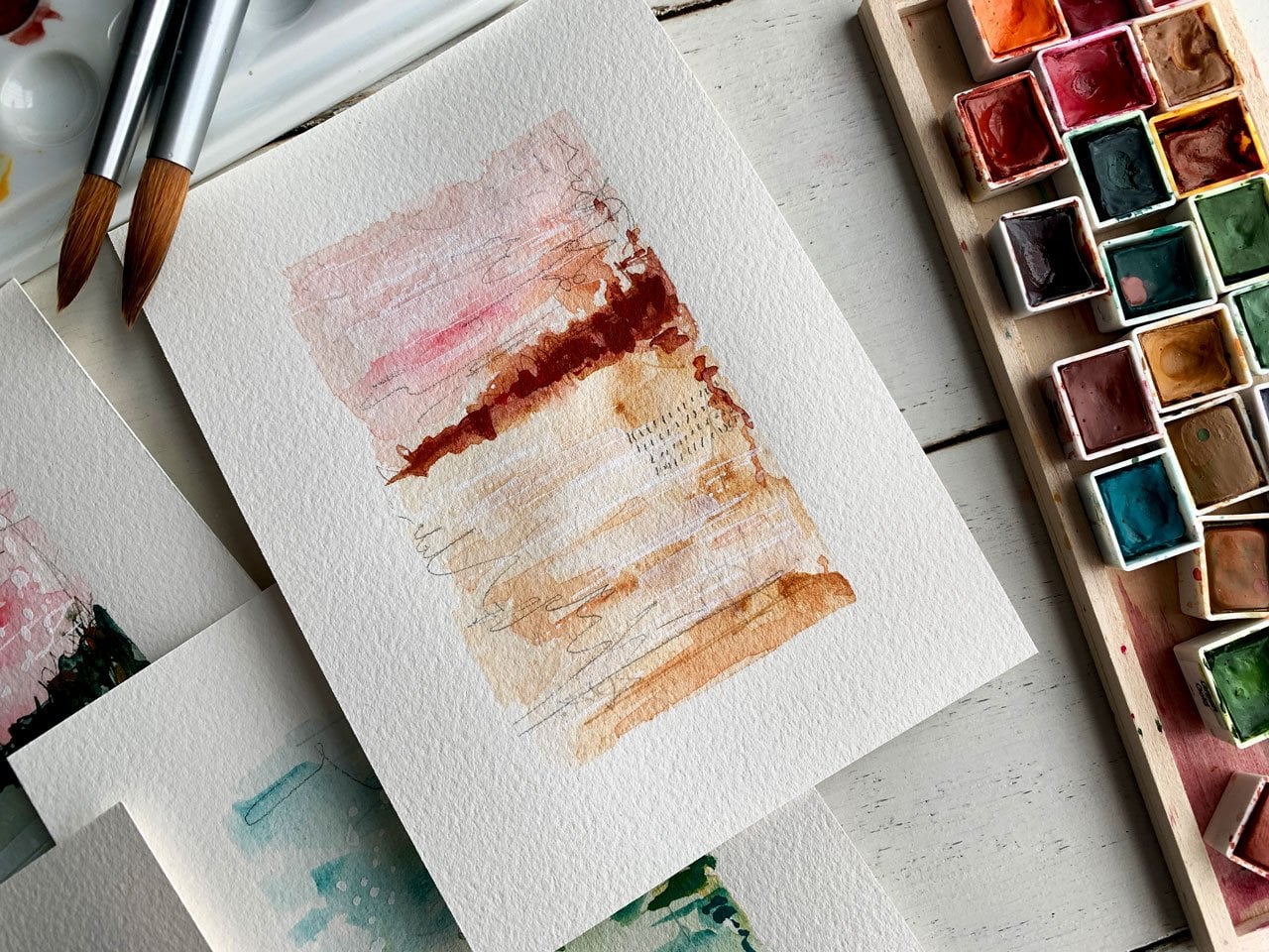
4. Choosing A Color Palette: Let's talk about the
colors that we're going to use in
our project today. I am feeling like I want to do a very harmonious
color range. I was thinking maybe an
analogous color scheme where the colors are sitting side-by-side on the color wheel. Say like blue-green, red-purple, red-orange,
orange-yellow, yellow-green. The ones that sit side-by-side
on the color wheel. But then I was also thinking, even though analogous
is what I'm feeling, then we could perhaps throw in a contrasty color directly
across the color wheel. It is fun when you can have something like a
color wheel to look at, to be like, oh, this is the
direction I want to go. Then as you get further
along, you're like, oh, how can I add contrast? What color is it
that can give me a tiny bit of a pop
or an interest spot. Today I feel like
perhaps I want to be over here in this fall setup, or maybe I want to be over here in the blues and the greens. I just want to play around and figure out where on that color
wheel do I want to fall. I'm going to actually work in some Daniel Smith watercolors. I'm going to get a
wet paint brush. I'm going to do a few little
color swatches here to see, is that the direction
I want to go? Because what if we do
some little samplers, testing out some
of these colors, and before I put these
on my color palette, putting these on
just a spare piece of paper that I've cut. Look how pretty that is. That was yellow ocher
and duo autumn mystery. I also have some other ones that are feeling
like fall colors. When I'm filming this I'm
going into the spring. See that color
right there, yummy. That's lunar earth. Lunar earth and yellow
ocher, I'm feeling those. I want you to play with
your color palettes. You don't have to just
stick to one color palette, but I want to get us started. Getting us started, I'm feeling
like that's pretty too. That's the burnt yellow ocher. [NOISE] I almost think that's got a prettier contrast than the lunar Earth
here on our paper. Maybe these two, because I want to pick a couple of
dominant colors, maybe some sepia, and then
pick something to contrast, like something that can sit
down and contrast that. See that's pretty too. Or look at here. Oh,
just came to me. I want to pick, say, a couple of colors
that we can then mix in and get
lighter shades with the white and the buff and
pick a dark color, say, like a sepia, but I'm almost
thinking something like indigo might be nice on an ink because
this is mixed media. I got sepia in the ink. It's fun to experiment with the different supplies and see how they blend and flow and
give you different contrast. I'm actually loving these
three colors today. There's tons of ways to
pick color palettes. I've got tons of different
classes and ideas that I've come up with where I
pick color palletes from the masters paintings, or I've picked
color palletes from interiors or gone into my own closet and picked out some color palettes that way. This is a fun color palette. What if we pick a
second color palette? Let's do a second color palette. Then we can paint
some small things. Because I've got the blue
greens in here, which I love. One of these duochrome's
might be cool too. This one's duochrome
lapis sunlight. The duochrome's might give us a fun shimmering something, definitely feeling the shimmer. [LAUGHTER] You see
why it's fun to start a different little page
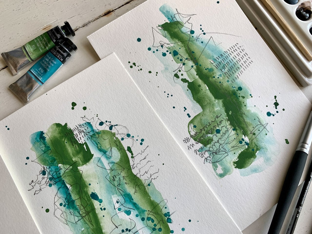
here where you can be like, these are the ones I'm loving. Over here I've got some blues
and greens, look at this. Lunar blue. So pretty. Lunar blue, that's pretty. Perylene green. That's pretty. Look at that color. That might be a really
pretty blue-green option with this yummy light
duo, shimmery one. That might be fun. I'm feeling
this and maybe one more. Maybe olive green. I wonder what the olive
green would look like. It's a little bit
brighter green. Oh, it's way brighter. [NOISE] I'm not
feeling the olive. Maybe I am feeling the olive. Might be nice for that to
be a little poppy contrast. I do like that. There's
another choice. What we could do, let me move this out of the way, I've got a couple of things on my desk that are in the way, is we could test out
some of these colors. I actually have some
of this blues and greens on a palette that I was working with the other day. I'm just going to
put on top of that. I don't mind a bit if some
of these colors mix in with these other shades
because they were basically blues and
greens in here. I hate to waste
this color palette because it's so pretty, and the white and the titanium are starting to dry on
there, but that's okay. Can activate it with some water. I do like to use these when
they're wet for some reason. I love the tube watercolors
so much, got some brown. Let's just set these over there. This was yellow ocher, burnt yellow ocher and sepia. This was duochrome, because of that duochrome light. Just put some of that
on both of these. This is basically how I
decide on color palettes. I start looking at
the color wheel. I start looking at the
paints I have and I'm like, what can I pull together? Then paint on a little scrap of paper and just see
what can we do. What I want to do is play a
little in the color mixing. Let's start off with the pretty fall palette and just play a little
bit here and see, what are these
going to look like? What if I start off with
one color and come back, blend that in with say
the titanium here. Don't be afraid to start
mixing and spreading and just seeing what
these colors do before we get to
say a large piece. Look at that color.
Already love in that. Let's make some white in. The white seems to make it a little more opaque a little bit. It's interesting. Look at that. Maybe a little more of
this with this titanium. Get in here and start mixing some of these colors
and see what they do is they mix together
too. Super cool. Then maybe some sepia
that we could just see. If we tap this in, how is that going to blend? I'm working on this particular
project, wet on wet, because I want to see what
these colors look like, blended, blowing,
doing their thing. Then I've got the sepia and
I'm thinking with the inks, while it's still wet on wet, it can start doing some
interesting movement and blow and create that extra
interest on our piece. I'm thinking of light and dark. Have I got a contrast in there
and the range of colors, so that's pretty cool. Let's check out this one here. I could have done this
while they were all still in there tubes
if you want to. Whoever it is that you
end up liking to play, I want you to
experiment and play. Just activating this titanium. A little a white there, just activating these a little bit. I was playing in this
blue and green yesterday. I'm just, oh my
gosh, so beautiful. Look at that, oh my goodness, I'm filling that right there. [LAUGHTER] Lovely. I just want you to get brave with your
colors and then say, what can we do as a color pop. Like with this right here, it's blue and green
but orange and stuff was on the other side. Don't want to come
through and touch in that contrast, the color. I don't know, maybe this
is the spot where we can experiment and
play and just see. See, I had a little bit of, I think that was maybe olive green or that might have been a little bit of
undersea green down here. I think there's some
olive under see, so that's interesting. Then maybe some dark. Let's just see what that does. Look at that. Oh my gosh, almost looks like the
way it spreads out, it's like an amoeba
in the ocean. All those soft fluffy fibers. See, I'm loving those. Definitely some contenders on, I'm feeling maybe we should do a bigger set in this
colorway right here. Let's just pick one
more and maybe play. I do like these two
colorways though. Definitely fun to see
which way do we want to go because I did like this autumn mystery and
maybe this lunar earth. We got garnet genuine. Those might be fun to play in. What is this garnet genuine? Let's just play
with the top here and we can get a little
bit on the brush. Look at that color. This is why I like doing little samplers before you get to a big piece because it gives
you a chance to experiment. Look at that color. I'm wondering, I'm going to put a little
bit of that one out. You got to be careful
picking these tubes up. You'll squeeze them and
not even realize it. But with that color, what if I came back with some of the wider, the buff titanium, lightened it up and just see
what did that do for us? Turned into some mud
there, didn't it? Well, I've got several things
a freshwater over here. I got this duo. Now the duochrome audit mystery is like a two-toned in here. It gives us some
yummy differences there. I don't like that. This is why it's fun to do
some color palette play. I've got some indigo over here because maybe I do
like it, I don't know. This is the ink, but I'm just thinking like, what does this look
like if we add some contrast on there? Turned into a puppy color range. What I want you to do first, play with all the
watercolors that you have. Do some little sampler
pieces and just see what do you get mixing and
combining colors. Then we can paint several
of these because I also want to play in some mark-making and
try to figure out, what's our favorite marks? What options do we have and
just see what can we do? Just as fun little abstracts. See now I'm liking this one with the little bit of yellow, mixing some stuff around, looking how one color
bleeds into the next color. That was super fun. Working wet on wet just
allows you to create pattern, color drippings,
texture, movement. If we do some of that, super fun, dip a
little white in, that white was doing some
fun stuff right there. Those are super fun. I might even like a little
bit of the brown in here just to see what is
that going to move and do. Then let it do its thing. Also I have a prettier, bright blue here,
that's a Sennelier. That is the cobalt green. Maybe I like a little
bit of cobalt green. Let's do this over here. That's pretty bright.
But you know what, maybe we'd like it,
let's just see here. I do like that right there. At the moment, I'm not
thinking composition, I'm not thinking, how's
this going to move around? I'm thinking how's this
going to move around, but I'm not thinking of big piece compositions
at the moment. I'm just thinking, what are these colors that I might want to
do a bigger piece in? Do I have something
that I love yet. I really love these two. Then we could, loving this. It's like a little ocean
set of colors maybe. I totally dominated
that whole side. Look at that. That is super fun. Look at that run. These are super fun. What I
want to do is let these dry. Think of colors and marks that could possibly
go along with these. We're going to let
these dry and then maybe consider some mark-making.
5. Mark Making Play: Let's check out what we like
and what we don't like. I already know that I don't like these warm colors
with that indigo. That's not a color
palette that I want to consider going forward. But I do like all
these other ones. I like the indigo with
all the blues and greens, and I like the sepia
with the blues and pinks in the
fall colors here. I know that this is a color
palette that I'm loving. Then from here, you
want to start looking at different
mark-making options. Do I want to continue painting? Do I want to make some marks
with some paint markers? Do I want to make some marks
with some oil pastels? In my mind I'm
feeling oil pastel. I'm going to pull
these out and play with these a little bit. Do you want to do
Neo color crayons? Do you want to do
inktense blocks? Do you want to add some more
marks with some watercolor? There's so many options
here for you to think of. Another thing that I really
like is using graphite. This is a Matt graphite, which I haven't
had for very long. I think it's super
cool By Faber Castell. It's a pit graphite Matt pencil. But at this point,
do you want to do mark-making in graphite? I always like to
have a little bit of pencil marks for some reason. That is just my own
particular love of graphite. Who knew graphite came in so many different
forms and quantities. Who knew I'd love it so much, but graphite is super fun. One option would be, do some scribbles and some
interesting little marks. That's one option. I might just scribble on
everything because I like it. Then as you get in you can
see the yummy scribble. But another option is to
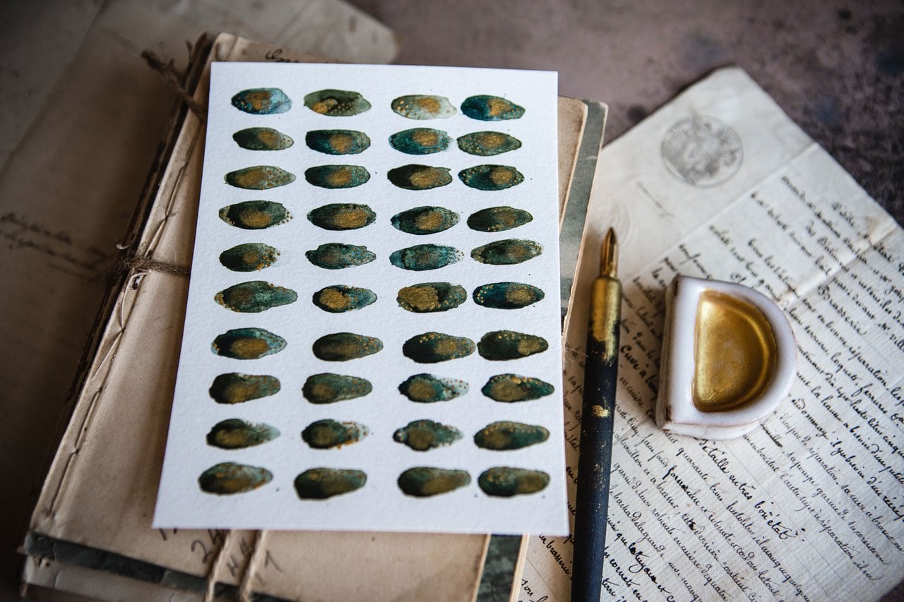
use some stencil work. I really love punchinella. I love little
half-tones circles. Then we might pull out some of our acrylic paints at
this point. [NOISE] Maybe we consider some stencil work or some punchinella work
or something like that. In this case, I
might pull out, say, my little arteza paints and
pick a color that's going to contrast or pull out or
create something interesting. I like these little arteza ones, because you get lots
of color options, but you can mix your own colors as you're getting further along, or you're wanting to create
really large yummy pieces. Then it might be fun to
definitely mix your own colors and really create
pieces that are yours. But if you're at the experimentation spot
like I'm at, at the moment, then you might think, let's work with a
bigger selection of colors so that we're getting style and technique
and interests covered. Let's just do some white. I've got a dry
sponge, white paint, and a little Tim Holtz
halftone circle stencil and then let's just see what would a little tiny
bit of stencil work. [NOISE] Looking at
that. That's fine. [LAUGHTER] That's
exactly what I wanted. Then I could have done
that with posca pen too. Don't discount just
dots with posca pen. But what if with my posca pen, maybe I want like a little
bit of writing in my little antique abstract more abstract, maybe a little bit of just, we don't know what it says. Is just there for our
imagination to guess. That might be one option. We could also pick out different paint
markers or different, like the oil pastels.
Let's pull this back out. Feel and like, let's
take this right here, trying to give you some ideas of things that you
might think about as we move on to some
larger little pieces. But what if I came
back with something major that could
give me super yummy, man these are so creamy. Look at that. See something
like that would be fun. I've got oil pastel that's in that contrasty
color that we used. Maybe we're just going to
make some marks with that. That's pretty. Soft pastels would be a good
choice with this. I like that right there. We could come back with
some stencil stuff like what if we did punchinella
and some yummy gold, get another dry sponge. These are just little
round artist sponges that I cut into little fours. I just cut it into quarters. Then I use it for stencil work because it's the perfect
little dry sponge. You have a bunch of
them and you can keep on pulling them out. See, look how fun that is, what that little touch of gold. [NOISE] It sparkles. Look at that. My goodness. Super fun. Then let's see, what can we do that's
different that we haven't already done? At this point I could have decided that I don't love the blue for everything. But we could say at this point actually put a little
bit of ink out. We could come back with, say, a really fine pointed
paintbrush and maybe we could do
some type of marker dot or line or some type of painting on the piece
to add some interest. You look at that,
that's some yummyness. I want you to start
going through your art supplies and pull
out things that you're like, this is what I'm
going to use today. I like to narrow down my
options so that I'm not overwhelmed with all the
things going on. I like that. I love that, actually. [LAUGHTER] Then we could
do other stencil work. We could do some
white posca marker. We could do white
dots, I'm thinking. Or we could even do pigma
pen and do fine lines. Fill in dots, though. I
like these as my lines. I'm a dot girl. I do like going back for
dots as an interest maker. Look at that, that's super fun. Look at that.
[NOISE] Loving that. I love all these
now it's going to be really hard to
narrow this down. [LAUGHTER] I like the color and interest that we
got in this piece with the different
materials that we used because the watercolor
contrasted with the oil pastel, contrasted with that gold, really added super amount of interest to our piece as you get up close
and you look at it. I'm definitely loving this
combo with that little bit of that orangey color thrown
in as a contrast pop. That one, super beautiful. I'm also really loving
this fall color tone with the dark sepia ink and marks. I'm definitely loving
that right there. The blue, look at
the blue and green. We ended up when we
were done mostly blue. I throw it down. [LAUGHTER] But the simplicity of
the color palette with the little bit of
white and the pencil as the contrasting
marks, super cool. This one, I do love what we did and I feel like it
could do some more layers, like maybe I didn't
do enough on it. That's something to
consider as we go forward. I want you to do several
little samplers. Get out all your
supplies and think, I'm working with
the color wheel. I want to work with
the colors on one side of the color wheel and then if I need a [inaudible] contrast, pick something opposite
like we did with the blues and green with the pop of
this orange that we did here. Look how beautiful
that turned out. I went all the way
from over here to about right here
in this color range, because we pulled out
that brightness there, which almost could
even be right right. I just want you to play
an experiment with analogous colors and then maybe a [inaudible] contrast
as you're going. You could even do split
complimentary blue, green, orange as the colors and let these two be
the dominant colors in your color palette and
that be the pop of contrast for something
little and the details. Now we have some really good
options to get started. We've played with some marks, we've played with some colors. Now I feel like I've got
a good direction to go. I'm really loving this,
really loving this. Let's do a little set of
two in the next project.
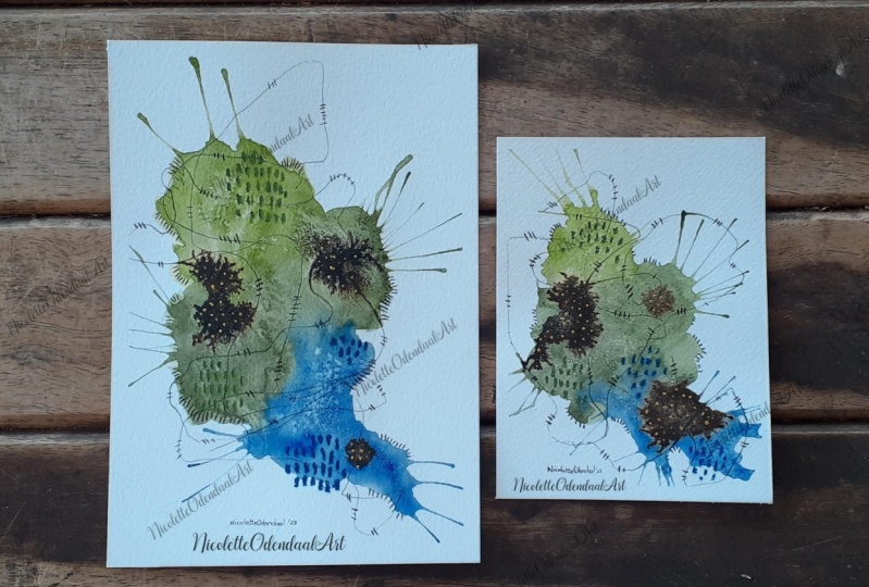
6. Medium Duo Set: Let's do some two
medium-large pieces. These are the Canson
Heritage paper, 140-pound cold press,
10 by 14 size, and I've just cut it in
half and taped it down. You're welcome to use any watercolor paper
that you have on hand. I just happened to
like that paper and I've got it so I'm using it. I really loved this one
where we used the ocher and the burnt yellow ocher
and we had the white and the buff titanium and
all that and then the sepia ink really
loved this one. This is going to be my
inspiration color palette for these larger ones and then
on the really big one, you could do the
same color palette, you could do a different
color palette, I'm thinking for the bigger one, I'm going to do the blues and
the greens but I think it is fun to think
about these things. If you love a certain
color palette and you want to
do a whole series and you find a colorway
that you love definitely, jump in and do several pieces
in the same color palette. Don't be afraid to do a
whole line in one colorway. But for class, I want to do some different colorways
to experiment with you. That was the buff titanium, this is the titanium white. I'm just getting some
fresh out there. On the smaller pieces, I was using my Raphael
SoftAqua zero brush. I think on these
I'm going to use my Princeton Neptune
quill brush. This is the number 4. I feel like when you
have a bigger area, using a bigger brush [NOISE]
helps you out there. I'm going to move the
blue-green palette out of the way for a moment and got this color palette is the one that we're
going to be working with. Let me just [NOISE] move some
of these out of the way. Now that we've talked about
the colors we're using, there's too much on the table. [LAUGHTER] Got some
fresh water over here. I just keep water off to the
side and I'm going to just start working wet-on-wet
so I am going to work fairly fast
on both pieces. I'm going to do this a little
different than a lot of the different projects that
you normally see me do. It's all about
experimenting, though. I want you to experiment,
create, play, and I am going to center
my composition for the most part
because I'm working on a piece that I want the whole thing to be part of this
and so at the moment, I'm not looking at where
does each thing go per se, but at the same time, I aim. I'm putting this out there and maybe spreading them
out and then I'm going to work in light
blobs of color and get these blobs to arrange and
be close to each other, just creating that
composition as I'm going. That white is very opaque
compared to those colors. That's very interesting
to note that and to see some of those
differences that we get as we mix
colors and do stuff. [NOISE] The first layer
might not be your favorite. Don't get hung up on that first layer because the first layer is
the underneath layer. It's the layer that we
build on and add things on top of so I don't
want you to get hung up on this layer
underneath and say, oh, it's not working
out for me yet. I want you to play and add to and just know that we're going to add stuff
on top of that. Let's get this duo
chrome color that's got some interesting
sparkle to it almost. I want while these are wet, to come back in here
and maybe drop color in if I'm not seeing
any contrast at all. [NOISE] Another thing
that we might consider as we're doing this
is some drips. Let's get this off the board. I could see on one
of these if I can get some good drippy going and you can help the drips too. You can give them a little
bit of a push there. We could take a little
bit of a spray bottle if we need to and add
some extra water in there if we needed
to really help that drip because I can always come back and add
some more stuff on top. That's fun. Then before
I set this back down, I might just take a [NOISE]
shot cloth and pick up the water that I just splured it down on the
paper on the desk. [NOISE] That's what
happen when you have lots of stuff behind you
that I might need to grab. I have lots of stuff back there, but then things run into it. [LAUGHTER] That's pretty
cool right there. I really feel like I lost some of the
contrast in this one, so I'm going to come back
and while this is wet, add some stuff on top. I don't want to forget
while I'm in here, I do want to add the
dark brown sepia. Look at that. [NOISE]
I want it to spread. I want it to be part
of that wet-on-wet. [NOISE] Now am I thinking
composition? A little bit. I'm thinking where could I
put the contrast in there? I don't want it to be smacked up in the
center of the piece, I wouldn't want to
do it right there. Maybe a little off this
way or off this way, maybe on the third. The lower or the upper. My dubber doesn't work as well, but I have a handy-dandy
little pipette. I want to pipe some
extra color in here and just see
what we can get. We could add some more
water if it's just not moving because I've
let it dry too much. I wanted to do some
interesting stuff. I don't want it to sit there. This might take you some
practice before you're like, this is what I love. It might be easier on the
smaller pieces early on because we're working super-fast
and the bigger you go, you're not working as fast because it's a bigger thing and you're looking
at it thinking, oh, what do I want here,
what do I want there? The bigger you go,
the harder it gets, but that's why I want
you to go bigger. I want you to do the
fun little pieces and then I want you to
go larger and say, what would I get
doing this or that? I want you to have
these experiences. Let's just add some more. I'm just going to start just drop in a
little bit of color on and just seeing if I add some more because
once it gets dry, it gets very light. Maybe you're losing
some of that contrast. I've got more ink in
here and I was thinking, but I've got that pipette. I just cleaned the pipettes out. [NOISE] Keep more than
one thing of water handy. That's super [NOISE]
handy because then when you've maxed out how much water
you got on a piece there, you can move to another piece, this other [LAUGHTER] cup. See I'm loving that.
I want there to be a little extra pop
of yellow in here, maybe on this piece over here. I love watching the stuff
move around. That's fun. If I put it down in one spot, I'm always thinking doesn't
need a second spot, doesn't need a third spot? These are some of the
things I'm thinking. Do I have too much of
something sitting down? If you've got a big divot
that's appeared and you think, oh, that's too much
going on right there, feel free to soak some of that up and maybe move some stuff
around if you need to. Because part of
what makes these so beautiful is this
is the first layer. This [NOISE] is not
the final piece, this is not what you end
up with when you're done. I don't want you
to get hung up on this layer and it not being perfect or exactly
like you want it or being the finished masterpiece. This first layer is just that. It's a first layer, and I want you to
continue thinking, oh, I've got more layers that
I'm going to be adding on here so don't get
hung up on this. I can also, while that color
is damp before it's dry, we're still damping some areas. I could come back
and drop some water and get it to bloom out; create the little blooms to give us some
additional texture. It doesn't work
when it's too wet, just blends in again, and it doesn't work
when it's too dry. Once it's too dry, you've lost that window of getting those
colors to bloom out. Just add some extra
texture in there. Right now I'm feeling
like this one right here it's speaking to me. I'm not sure about
this one yet but hold all judgment until you've got marks and stuff
on top of it. At this point, I'm going to need to let this dry before
I do more stuff to it. I could consider doing some
mark-making or dragging some color through this somehow so if you've got an old card, we could move stuff around
a little bit and just see what would happen if I
created some marks in here. That's fun as an element, let's just save it for this one. I like this one too much. [LAUGHTER] I'm really
thinking this one. I like doing more
than one at a time because [NOISE] that way if one is perfect
and one is not, you're, okay, it's
still a good paint day. Some of these little
combs are fun, we could have dragged
some combs through something and just
see what that does. [NOISE] I could at this
point before it's dry, do some pencils or some mark-making in here
with some pencil mark. I want to do mine on top, so [NOISE] I'm not
going to do it, I'm just throwing out
some ideas there for you. Let's let this dry and
then I'll be back.
7. Adding Marks & Finishing Duo: We're not 100% dry, but we're definitely close enough that I can now start
mark-making stints laying, and doing some other fun
things that we might have tried in our sampler
pieces that we loved. I really loved how
dark the dark was. On this one, when you're
putting the ink on, I want you to leave
some heavy areas of contrast basically. So that one it dries, it's this very deep, dark pop of darkness. I love that contrast. If you are doing that, you're thinking, I
don't love that, then definitely do
the thing that is speaking to you at the
time that you're creating. But those are what speak
to me on this piece. I also loved the dark lines and marks that we made
with the acrylic ink, with the little tight brush. I'm going to do some
of that. I also loved the marks that we got
with the posca pen. Definitely going to do that too. Then we'll look at it and say, does it need anything else? Let's get the little
ink stuff first. I'm going to pull
out my little of disposable paper that I was just using and set that right there. Put a little bit
of this ink over here on our pad of paper. There we go. Got our
little fine brush. So this is the piece I love. I recommend you working
on the piece that you don't love first and then going into the piece you love
because then you're getting your groove and you're
like, I think I got it. But I loved this line of
marks so much on this piece. But I do think I'm going
to go ahead and maybe do some mark-making over here. Or maybe I should do the
mark-making over here. Let's just do it over here.
Don't break my own rule. That's what I
should tell myself. Let's just start over here. I love the contrast on
darkness of this ink. This is just the Princeton
round number 4 brush that I'm using if I didn't
mention that before. Well, I was going to
have them lined up, but now got a little
bit off of that. Sometimes it's hard
to talk and then put paint where you wanted
it at the same time. [LAUGHTER] But I'm
a social painter. I feel like you guys are
right here next to me. You're painting with me. We're having a little
paint date. I love that. When I shoot photography
on their social shooter, I like to go out on
a little meetups, and then see what other
people are finding, chatting about their
favorite equipment and going out to
lunch afterwards. So I feel like with
the art stuff, we're having our own
little art date. Then after I'm done painting, I go have lunch. It's perfect. I hope you guys feel like
you're painting with me as we're going, set me up right
beside you and we'll talk and paint at the same time. Chem 11 that. That makes me feel pretty
good to go over here, but ofcourse, working right
on top of what I just did, I want to let that dry a bit. I also have a paint stick
over here which I love. This is just a paint store stick for a five-gallon
bucket of paint. You can use a yard stick. This even has like
measurements on it. It's my favorite little
tool that's not like an artist's tool because I set
it over here off my paper. I hold this side up with
my hand a little bit. Now I got to hand rest. I'm not putting my hand down
on anything that I just did. I can still work in other
parts of my painting without it affecting my
piece that's in the way. I'm feeling like right here. What do you think? Because
I don't know this side. This one had like a
little bit coming out which made that
look really good. But this one doesn't
really have that. I'm thinking like, where
would that look good? Actually, I feel like
this needs more. Let's just go back over
here for a second. I'd say it's fun to
have a hand rest. It's not resting on
your art because, a lot of materials I use smudge, get on your skin.
They're in the way. Having this even when
I'm working further out. I'm feeling like over here, so let's just commit. Look at that. Good choice. I'm liking the two rows like we did in our
original piece. I see. I'm feeling that. I could even come back
with another set of lines and I can continue
this set of lines. Now that we know we like it. It's like that. Maybe one more line and do
like a little three line because this piece
is bigger than our original small
sampler that we painted. One more line. That's pretty. Then I'm thinking over here, maybe we could do somethin
or maybe more line. Maybe we want another
stretch of lines here. I feel that. Let's just commit. Do we want to leave it at two or do we want
to go ahead put the three. I feel like we need to
go ahead with the three. See now, I'm loving that. You can see as we're building
and creating more layers. So let me just wipe that, brush out how we start
to add some interests. Another thing that
we did in this one was we did white posca pen work. I'm feeling like there's enough going on in here that I
might do a little stints laying on top of that
perhaps because we've got quite a bit of area
on the bigger pieces. That's where the
challenge comes in. You do a little piece and
you're thinking, I got it. You go to a big piece
and you're like, I'm stuck, what do I do next? So layers are what
really get us there. Start thinking of what are
some of your favorite marks. Do you love your stencils? I love my stencils. So what stencil might we
start thinking about. I like doing dots in
little clusters of color. If there's an area where the color separates
really beautifully. I can fill in part
of that separation. So I just like to go
ahead and fill in, say like part of
it like this head, a nice little
separation in there. It's pretty light
but I can see it. I'm not covering like the
whole thing of color. I'm covering like
a strategic part of it and it gave me like a stopping start
point. Super fun. This is starting to
come together for me. Feeling like maybe
we should do some, maybe some dots out here. I'm using the extra
fine point pen. When you go bigger,
I could have picked the fine point or the
medium point posca pen. Start thinking of that too. As you go larger, your tools might need
to go larger with you. I use a larger paintbrush
for this bigger piece, or I might use a larger
tip on my marker here. That's making me feel really
good about our piece. Now check that out. Over here, let's
do the same thing. Let's pick a section of color to strategically
put a mark in. Super fun, I got a little on
my dark, but that's okay. I'm also thinking since I did that orangey color
there, maybe up here. Pretty. I'm going to leave
that right there for a moment. We'll come back
with the option of adding more Posca pen later. Also thinking maybe a little tiny bit of
some graphite scribble just as a layer that you
can see if you got in real close and maybe you could
see something closer in. I like details that
suck you in the face, but maybe as you get closer
you're like, what is that? What's going on there? Maybe we'll do some
marks out here. This is my 14B Pitt Matt
graphite pencil, which I love. I love graphite anyway. I'm a little graphite nut. All the fun graphite
things that I do. This little matt graphite I had never heard
of this before. It came in one of my little monthly art boxes and I'm like, new favorite tool. That's why you're
seeing it come out now. [LAUGHTER] I like the graphite. Wondering, should
I keep this one a little more simplistic? This one's talking to me. This one's talking to
me in different ways. I feel no graphite, graphite. Then I'm thinking Punchinella. Let's do Punchinella
over here in the gold. Because even though we did it on this one and
I'm like, love it. Feel I might love
it on this one too. Anytime I can work some golden. [LAUGHTER] I'm going to do it. [LAUGHTER] Dry sponge. This little dry sponge. I got dry paint. Got the Punchanella.
Then I start thinking, where would I want that? Maybe right here,
maybe right here. You can see I'm
still not sticking something directly
in the center. I'm offsetting things for interest and I'm going
to continue doing that. There could almost
be a blank center because I have skipped it. [LAUGHTER] Or maybe I start
in the center and work out so we don't have an obvious blank
center that I've left. That's pretty cool. I'm loving that right there. I love that so much. I feel
it needs it over here. [LAUGHTER] This is my test
piece and my yummy piece. They match. When they're done they might both be
the yummy pieces. But there's always
one that you're like, I love this so much I
don't want to ruin it. If you have that
second piece that you're testing the ideas out on, you're less likely to be
like, I can't do that. You're less likely to ruin the good piece because you're
like, my gosh, I love that. Let's do it. Yes. That's
exactly what I wanted. You know what else
now that I see that? I feel some gold could be
good in here. More gold. [LAUGHTER] I super love the
ink because its so vibrant. I've got my brass Kakimori nib. You can use any dip
nib that you want with your pieces but I like
this brass nib because it allows me to do things in circles and squares
and I like to start it off on something that's
off to the side to make sure it's not going to give
me a big blob of something. I'm thinking maybe do
we want to do dots? Do we want to do some lines? Do we want to do some
strategic scribble? Because I think
strategic scribble might be talking to me. Doesn't have to be huge
suck them in your face, feeling like a yummy bit
of softness out here, where you're like, does
that say something? What does it say? Let me just get closer
to take a look. That's fun. It doesn't have to be perfect. I'm not trying to get it
to say something specific. I just want that implied like, what is that? What's in there? It's super cool. I like that. Let's not overdo it. I can't overdo stuff. Do I want some of
that over here? Maybe. Let's see. We could do a little bit. I like that a little bit. It's almost like,
what does that say? Then when you're
using these dip pens, make sure you go ahead and
wash those out pretty quickly. You don't want your
ink in the tip. Stop in really good. I'm filling that. Do we need anything
else or do we got it? Feeling on this piece
maybe I've got it. Maybe it's what I want it. Check out our little
sample piece that we had that inspired that. Let's peel off the tape
and see what we got. It's our opportunity
to think about it and maybe live with it
a little bit and say, what else can I do there? Before I do that, I do
see a little drip of brown ink right here
and so rather than let that live off by itself and it be something that looks
like it was a mistake, maybe if we put a little more brown ink
splatter in the piece, maybe that would actually
work out better for us. I'm going to just grab my brush, a little bit of ink. Going to do a very
soft strategic. I don't want it to be like, suck them in your
face and be like, what the heck was that? But I do like a little tiny bit. Very softly. I've got water in the brush. I've just got ink on the tip. From where I put the ink out, I just get a little bit
of that on my brush and then a little
bit of splatter. See I'm filling that. Now that little splat does
not look like a mistake. It looks like we wanted it
there and it was on purpose. Another mark to our pieces. We have to be real
careful but I'm thinking let's see what we got. I'm using painter's tape up here which I love
because you can see how easy this is to peel off my piece without
tearing the paper. But you want to go slow
when you're peeling tape and if it is pulling the paper then stop and get a little craft heat gun and
heat that tape up and that will allow the
adhesive to release from the paper [NOISE] so that you're not
tearing your paper. The biggest thing you
can do is pull it out an angle and go slow. Some people go super fast and then they're like,
I ripped my paper. This is how you prevent that. I think it just [NOISE]
peels right off. This one is so pretty. Love it. So pretty. Look how pretty. Peeling the tape off there. Then we can look at it and say, does it need anything else
because I don't think it does. This one right here, gorgeous. Look how pretty that ended up. If we shine it in the light, we can see that gold shimmer. I love that extra bit
of sparkle that that gives in there and that extra element of dimension
that it adds. Look how beautiful
that turned out. I love it. Super pretty
is our little test piece, it is also just as pretty. Look how pretty that is. Beautiful collection
of two there. Hope you enjoy doing this medium-sized piece inspired by our little color
palette pieces. Can't wait to see what
you're creating for this. This is a fairly large. It's a 7*10 piece. No, 5*10. What was this? This was a 10*14 piece of paper. Yes, 10*7. [LAUGHTER] I'm a nut. But I want you to do
these little pieces first so that you can get to the big piece without it being a lot of drama
and you're like, I hate it, because now
we know we love it. I love the very dark elements. I love how things are off centered making it
more interesting. Don't put your major things in the center even though I
centered the whole piece. The things in that
are not centered. Going to keep some
of these elements in mind and just see what
you can come up with. I can't wait to
see this project. See you back in class.
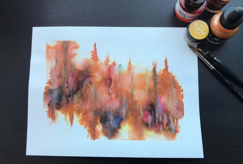
8. Going Larger: Somehow I'm getting
ink all over myself, I'm not sure what I
touched and now I'm afraid to touch
anything [LAUGHTER]. The next thing that we
did that I loved was this little sampler
with the blues and the greens and the oil pastels. I'm like gaga over this. I actually did my own little
set of two medium-sized, bigger pieces based on
this color palette, just to play and practice in
the way that we just did. This is a YouTube video that I filmed so you could see
me paint these, also. I was throwing in
some color prompts on top of it, some art prompts, where I was like, let me see
what mark I've never used before so I used this as an inspiration for
some art prompts. I'll link that video and just wanted to see
like what does this look like a little larger
and use it as my inspiration to
go even larger. This is our little color
palette inspiration piece that I'm working off of. Going to set that
right behind us. I've already taped down a 10 by 14 piece of the
watercolor paper, Canson Heritage Cold
Press 140 pound. You can use whichever
watercolor paper that you love. I've got these colors out
since I was already playing in them and I thought that we
could start with those. I've got them still
out here too. I've got the perylene green, undersea green, lunar
blue, olive green. I've got that duo
chrome, arctic fire out. I've got the titanium buff and the titanium white in there. I might add to these, but they're already
on my color palette, so I hated to waste that. I've just spritzed them with some water to get them started. Oh good. Now they're started. I want to just play a
little bit with mixing them in with each other and
using them on their own. I want to have plenty
of water on my brush. I'm using the big Princeton
Neptune Quill Number 4 brush and I want to work fast
and do wet on wet. I'm going to start on
one side and just work my way around and
see what can we get. I'm doing blobs of stuff basically and I'm mixing
the blue and the green. We're just playing. I'm not trying to get something
specific at this point, it's that first layer. I'm wanting to see how
the colors mesh and blend and I'm just
experimenting. Look at that color [LAUGHTER]. Don't get hung up on all, this didn't work or I
don't like the background, this is just that first
building block of our piece. I'm trying to move the color
around and separate it a little bit so
that I don't have big blue blobs next
to big blue blobs, maybe I have blue blobs next
to green blobs [LAUGHTER]. I could come back in
here with this titanium, which is not really softening up as fast as
those colored ones did, but maybe just some
little area in here. I could also, before it really
gets a chance to solidify, come in with that darkness. Because you remember
we did that dark on here and on these two
inspiration pieces, I actually did that indigo and that sepia, and I loved it. On this one I did the sepia, but then I did indigo
on it and made it even darker. Let's do that. Let's add some of
this because I want it to have time to move
while everything's wet. You're working fast here. I'm putting them
off to the side, giving them a chance
to do their thing. Maybe I want this even bigger. Maybe I want this to
come down even further. I don't know, but by this point we've
done several littles and we're just trying to
see what we can create. I don't know. Did I get them in the
right place? I don't know. We're just going
to move with it, it is what it is after
you've committed. After you do several of
these, you might think, oh, this is exactly where
I want this and you won't have those moments of oh, did I put that in the
right spot or not? Some of it's just definitely
practice in play. I do like the extra darkness
that I get by these being layered so I'm going
to go ahead and let there be some
dark places there. Putting out a little
extra luna blue. Then don't forget, we
might take some of this before it's really
had a chance to dry, and we could dip some color
in for some mark-making. We can come back and do
it when it's dried too, I just thought might be fun to have that bit
underneath, doing fun stuff. Like that. Do we got
enough going on here? What are we thinking? I need a little vote button. Vote. Tell me what
you're thinking. We can come through
here and just tap some extra color in too to
see what that's going to do. Another thing that I've got
going on on this was I tapped a little bit of
this pinky color, we tapped a little
bit of that in there. Do we want to go ahead and tap a little
bit of the color in here? A little pop and a
contrast just to see. We can always add that
color more as a top layer, but I want to introduce it and maybe spread it around and
get it doing its thing here. See that's fun. Just a touch. I don't want it to be too much, I just want it to be
a gentle suggestion. I really love this
olivey green color, this color here, which is why
I think with the pastels, that's why I did that
yumminess there. Now that we're looking at this, I feel like we could add
some extra water to make the stuff bloom out and
then we should let it dry. You got to do this
extra little water bit while these are damp. It's not going to work
once it gets too dry, but when it's damp,
it really works. Once it's dry, you'll
know the water will sit on top and it won't
really do anything for you. It might create a bubble with
a color ledge around it, but it's not going to
make those colors bloom. I think at this point, I need to let this dry, then just see what we've
ended up with and then it's time to do some mark making
a fun stuff on top of that.
9. Mark Making & Finishing Large Piece: We are ready to do a
little extra stuff here. We are 98% dry. I let this dry for a
long time and now I feel like next thing we did was
some of these yummy pastels. I loved these two colors on our inspiration sampler piece and I think I'm going
to use those again. I really love great
big splotch of the green and some art-making
with this samadhi color. Let me move these
out of the way. What are we feeling?
Are we feeling like where do we
want big dots at? If we look at the other two
smaller inspiration pieces, I actually did them in
different places and so was testing things out. Almost feel like up
in this corner up here is what's talking to me. Let's just commit. Or we could do right over here, can totally throw our
flushes. There we go. [LAUGHTER] Before you get
stuck in decision paralysis, do just like I did
as you're thinking, you're debating, you're
like questioning. Set that thing down and be like, this is where it's going. [LAUGHTER] Just make a
decision for yourself. As we work our way up bigger, we see what bigger
challenges we have like, I'm making bigger marks on this bigger piece than I
did on that smaller piece. Maybe I'm going out in
a little more area. I love this is a gray color. I also did yummy marks
with this that I loved. I could come back and do
some scribble or could make some deliberate marks on this
piece loved the scribble. On the inspiration
smaller pieces, I did specific marks. You can see specific
marks on that. I love it both ways
also did a little bit of graphite pencil in these pieces that I
liked quite a bit also so that's something
to think about. We could actually do the pencil, got that pit Matt pencil, and let it get us started
on some scribble. This might not be your thing, scribble might not
be your thing. But if it is, it's
just fun to see what people end up
doing. That's fine. Now I am still wanting this yummy salmon to do some
little standout pieces here. Let's just add to our scribble. Fun, super fun. I'm loving that little
piece here that we can see. I also have some goal that we
added in there thinking in my mind that we could use a
pop of green maybe over here. It doesn't have to be the great big thing
that we did here. Could just be following the
line of some color like that. I love that. We're getting some good,
we're getting places now. We could actually do
that over here too. With the salmon we could do some little marks that follow
a line. Like look at that. I love this whole little
section and I start every piece of art knowing that I have
the possibility to cut it up. If you do a great big
piece and you're like, I don't think I love it or
didn't end up like I wanted, you can always cut it up and create something
else that's amazing. Don't get hung up on things not working out because you
can always cut it up. [LAUGHTER] Then I love making stuff because I
know it don't matter. That was some good
colors out of there. Now, we also did something yummy stencil work and I actually really
loved it on there. I actually have a bigger
halftone stencil, which I'm thinking it's
the Tim Holtz collection. It's a halftone circles and I did the punch and
nella on the other, but I'm filling like these
different sized circles might be super cool as
the element for this. Let me get my little
pile and paper here. Let's put some more gold out. Can't tell you how
excited the gold is. Gold. We're going to add gold
to everything I ever make. [LAUGHTER] Then we're just going to work that
gold strategically. I don't like to do it
just the square stencil. I like to work my way through a stencil and then just pick
it up and see what I got. I'm not trying to be
specific and be like, Oh, it's only got to
go in this one spot. If I was, I'd be more careful. Look how beautiful that is. Now I can add some over here. I can add some more
that is beautiful. That just totally made
the piece for me. Yeah, loving that. Oh gosh, that is beautiful. Then you can just
keep on strategically adding it as your thinking a
little more, a little more. [LAUGHTER] They're
like some over here. I feel like we're getting there. Definitely play with
these techniques. I want to see some
of your abstracts and then I want you to
take a bigger like we did and just see what can we get and what can we
play and how can we layer these things so
that we're not caught up in the background
or the middle layer. How can we keep adding to
those layers until we're like, haha, this is it. I love that. Fill on it. We could come back
with some colored stencil. I could come back with
some other on top of that. I'm loving it like it is though it's really
talking to me. If you get to a point
where you're like, I don't know if I'm done
or not I do feel like I need some gold and some writing. If you get to the point where
you're like, I don't know, set it to the side and
live with it for a bit and then one day you will know
and then you're like, oh, okay, now I know
what this needs. I don't know, right now I'm
thinking some fun writing, so I've just gotten my gold
cure talky gold, Micah ink. I've got my cat
Gomorrah dip pen, which I'm just going to
strategically add some writing. Just an extra layer, something fun that
when you're getting close you're like, what's that? Just some scribble, some
implied it's writing. If you'd like to write,
then definitely write. But I like to scribble. You're like, what does that say? You leave it up to your viewer's imagination as to what you wrote what that
could be telling them. [LAUGHTER] The other thing
that we could have done, could have done some posca pen. Just going to wipe this out. We could do posca pen. If you feel like it's
still needs something, we could do lines, we could do like some lines, strategic lines with
some pigment marker or with some graphite. It might be fun if we had like some strategic lines out here. Let's just do it. I'm following this little
separation of watercolor there, just to give it that
little bit extra. The more of these you do, the more you'll get
a feel for what you like and what you're going for. The first one's just
do what feels good. Then as you get to
working larger, you can start thinking, now I want to create
a collection. What don't want to
do? I loved that. Let's get our little
pin out because I mean, our stick out because I
want to work over here without putting my hand down. I'm feeling like a few
lines right over here. Look at that. Totally what I wanted. Feel like I could
use a few down here. Some of these details you're
only going to see if you step up close and you
really start to study. I like them when they're subtle. That was fun. Don't want any others in
here feel like maybe I do. Maybe I want a real
light right here. These pieces, the more
interest you add, you build the layers, maybe some are very subtle, some are very pop them
in your face, exciting. Then as you get close
you're like, wow, look at all the stuff
going on in this piece. Now that we've done that, I feel like it's big
enough that it needs another little section of these green dots or these
need to even be bigger. Don't be shy about
revisiting something here. I know how a creamy and yummy
these are. Look at that. I like that. There's always
a little bit afraid of using oil pastels because they
don't ever really dry per se. I knocked that over, if you use this oil
pastel fixative spray, they do set up to the point where it become
more permanent and so this is the secret to use in the pastels on your pieces. Then what you want
to do is look at it. I love this piece so much. Stem back and think, does it have enough contrast? Is it finished? I'm feeling like for the
moment this one's finished. If it were a piece that I were painting and
I wasn't filming, turn your pieces around
and look at it in other directions and you may see some other stuff
that you can do to it. But at this point, I'm feeling like this is maybe finished. I didn't pick this
up and add drips because I was like
on the no drip look, but you could have
added some drips. I'm pulling my tape at an angle very slow so that I
don't tear my paper. If you're tearing your
paper stop and use a heat gun to heat that tape up. That is what makes that
adhesive release your paper. Because if you're using a paper with some
wood pulp in it, the tape tends to grab
those really good. On this is a cotton
paper and so it's just releasing like magic. But sometimes some
of my cotton papers, this one does good, but some of the cotton papers
don't do so good. Look at this. Now that I can see it bigger. Oh my gosh. I love
those sparks of gold. What if we turn it around? Let's just look at it. I don't like it that way. I'm not feeling it that way. I feel like the way I painted is the way I
want it [LAUGHTER]. But check it out, big piece with our
inspiration pieces and our original
color palette idea. How gorgeous is
that as a big set. I can't wait to see on your second color palette
what you chose to do. I went with the green on the second color palette because greens and
blues are right up my alley and we directly went off of our sample
piece that we created to go a little bit bigger
and then to go very large so can't wait to see the collection that you create off your
second color palette. I can't wait to see
these don't be shy. Come back and share these with me and I'll see you next time.
10. Finishing Sprays: Let's talk a little bit
about finishing your pieces. If you're doing the oil
pastel like I was doing, you need to finish
that piece off with some sennelier
oil pastel fixative. That will fix this oil
pastel in a couple of days, so it's set and it no longer is super creamy and easy to smear. I just take this
outside with my piece, spray a thin layer, let that dry, and spray another thin layer, so a couple of thin
layers of this fixative. Then that'll set up in a
couple of days so that it's not always
creamy and smudgy. If you're using soft pastels because I want you to consider all your things that you have for these different
abstract acrylic pieces. I use the soft pastel
sennelier fixative, and that will set that powder
so then it's less likely to smear and smudge and get on everything for the
rest of its life. Definitely consider fixatives
when you're doing that. If you're using other types
of stuff and you're wanting to protect a layer and then
keep building on top of it, you could consider a
workable fixative. This protects pencil
pastel and chalk drawings, prevents smudging and wrinkling, and allows you to
rework stuff so that do keep this up here. Another finishing spray
that I keep if I wanted to. Hang on, we're getting
stuff falling up here. This Krylon gallery series, UV Archival is a
matte spray varnish. This is an advanced non-yellowing protection
against fading, dirt, moisture. and discoloration. This is one option if you're to the point
that you're like, I want to spray this
with some type of protection to then sell it
or keep it or whatever. This is what I usually
use to do that. Just some options
for you to consider. Do your own little
bit of research, do some little test pieces. I would not spray a big piece
for the very first time. Having never used one of these, I would spray my samplers. Create several little samplers, use the fixative, wait a couple of days, see how you like it. Some of the fixatives
change your colors of your art if
you're not careful, especially using
the soft pastels, so I would never do it
on a big piece before testing and figuring out what
I like on a little piece. I hope that gives you an idea on possibly finishing
the pieces. I'll see you back in class.
11. Final Thoughts: I want to thank you
for joining me on this journey into the world
of mixed-media abstracts. I hope you enjoyed
the class and found it informative and inspiring. Remember to keep experimenting, pushing your
creative boundaries, and finding your own voice. I can't wait to see
what you create next. Don't forget to share
your projects on the project page so I can check out your
amazing creations. Thank you and happy creating.
 DENISE LOVE, Artist & Creative Educator