Transcripts
1. Welcome: Hey. I'm Denise Love, and I want to welcome
you to class. Let me show you what
we'll be doing. In this class, we're
going to be creating some really pretty abstract
watercolor landscapes. That's what I'm calling these, abstract watercolor
landscapes because they have a horizon line and they imply that you've
got a sky and a foreground, some type of ground. I'm playing with
different colors, I'm playing with mark making in their different layers so
that we layer things up. I did play with a
different type of paper to see how would
that be different to the one that I knew that
I was going to love just to play and experiment
and the more cottony softer paper, or maybe
it's just thinner, gave me a completely
different look than the one that
I had envisioned. That was fun to experiment. I actually started
coming up with these in my sketchbook and
very color washing, I guess you could color it
with some horizon lines, and then experimenting
some more with different layers and adding
in some mark-making, and then that is
how the eye got to the final landscapes
that I wanted to create. These would make good
pieces of art framed up. You could use these as
cards that you give away, our original little
pieces of art. You could tear the edges
like I did on the square one for a pretty
deck old finished edge and put that right
on the front of the card, and then you're sending some yummy original piece of art, I love that idea. You could put
scripture, or quotes, or some saying that
you like if you have some good handwriting
that you want to, then put that on there and have a good quote or scripture. Tons of things that
you can do here with these beautiful
abstract watercolors. You can enlarge
these, of course, making them even bigger than
I chose to work on today. But I like getting my ideas all hammered out in my sketchbook, and then working on smaller
pieces and then moving to maybe a little bit
larger piece just to see how I can scale
up different ideas. We're making a couple
of watercolors, and here we're using
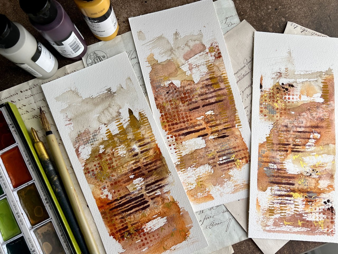
different colors, we're experimenting
with some mark-making. If you get really close, you can see all the layers and the details that the marks
and the layers of paint add. We're having a lot
of fun creating beautiful abstract
watercolor landscapes today. I hope you enjoy watching this. I can't wait to see some of
the ones that you create, so let's get started.
2. Supplies for our project: [MUSIC] Let's talk
about the supplies that I'm using in class. I encourage you to work
with what you have. You don't have to go
out and buy supplies to practice and play and
experiment with this technique. I am using some 140-pound
cold press watercolor paper. I just happened to be using the Arches
because I wanted to experiment with a
nicer grade of paper. I started out my experimenting
in my sketchbook. This is an eight-by-eight
sketchbook with 110-pound cold press
watercolor paper. I knew I liked the cold press, and so I figured why not play with the Arches
since I had it. But if you don't
have the Arches, play with whatever cold press watercolor paper that you have. Then I encourage you also to play on some other
surfaces that you might not normally experiment with to see what
you come up with. I always start off
in my sketchbook, my little art journal, I guess you could call this, and just see what do I like. Am I going to like
color combinations? How am I going to
layer these colors? This was my favorite. I don't do the
sketchbook in class, but that is how I got to this technique for
my own art-making. Cold press watercolor paper. I just cut that big sheet into smaller pieces
to work with. You can do that in any
way that works for you, but I just cut it into fours, cut it in half the other way. I'm using some watercolors. Pick out your favorite colors to work with and try this out. I have a little
quantity of some of my own favorite
colors pulled out of a Daniel Smith box
and a Sennelier box. Then over here I have some Sennelier tubes
that I squeezed out into a ceramic paint panel
to use. In this class. I'm using a couple
of these colors, this chromium oxide and this cobalt green
that I really love. Then I'm using a few favorites
out of my little palette. Sometimes when I'm talking about Daniel Smith or Sennelier, I switch the names and
call it the other. If it's the Sennelier color, I might call it Daniel Smith's, so I'll apologize
for that right now. If you look up any of the
colors that I call out in class because I do try
to tell you what they are, if you don't see it
in the one brand, look in the other brand I might have mistakenly called
one or the other. But most of the ones I'm using
in here are Daniel Smith. There's only one or two
that are Sennelier. For the most part, you can assume if I'm using a color out of here,
it was Daniel Smith. If I'm using color
from over here, it was the Sennelier. [LAUGHTER] Pick out some
watercolor that you like. I'm also using a Posca
pen a little bit, white. I'm using just a
mechanical pencil. I've got some painter's tape
to tape off my drawing. Then my watercolor brushes
that I was using today in class are just a little bit
nicer grade watercolor brush. These are from Michaels, so they're not the
most expensive, but they were the nicest
grade that Michaels has. These are the Aqua Elite, Number 10 and Number 12. If you go to the art store, some of those brushes
go up to $100. These are in the $20
price range or less. But you don't have to use those. You can use whatever watercolor
brushes that you've got. That just happens to be what
I pulled out to use today. I hope you're going to enjoy this class and playing
and experimenting, creating some abstract
watercolor landscapes. I will see you in class. [MUSIC]
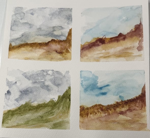
3. Landscape - Blocking out colors: [MUSIC] Let's get started
with our project, and I'm very excited for these. We are taking our
inspiration from the ones that I did in my scrapbook that I
just loved so much. Some of these work out great
and some don't work out. If you have some that don't
work out, don't despair. I had this one that
didn't work out, and then I switched
all the color around and just made a block of color. But some of these look different than I
thought they would and I really love these
couple right here. Those were my very
favorite out of this, but I had so much fun
just experimenting with color and a few marks in there and making what I'm
calling an abstract landscape. I've taped off a
couple of small pieces of cold-press watercolor paper. This is 140 pounds. You can use whatever
brand that you like. Usually, I'm using a
medium-grade paper, and I would call
the sketchbooks. You can work in sketchbooks
too if you like. I love working in
my sketchbooks. This is about 110-pound
paper, and it's nice. This is our teaser book. That's an eight by eight. It's a good size
to take things off and experiment and
test things out. I do like how these came
out in the cold press. I've picked a nicer grade of cold press just to play today, and this is a nine-by-six
sheet. It was a bigger sheet. This happens to be the
arches because I have it. I think it'd be fun to
play on it because it is a very good quality watercolor, but you can use any brand. I usually use the ones from Michael's because they get their two-for-one sale going and then I buy a couple
of pads at a time. I've cut these into fours, it's one big piece, and I've cut it into fours. These are about 4.5 by six. I have just taken painter's
tape and taped off a couple. Then I have one other
little piece of paper which may or may not actually
be watercolor paper, and if it doesn't work
out, that's okay. It's Choosing Keeping
which is an art store in London that I had
gotten some paper from. But I like it because one edge has a very pretty
torn edge to it. Some other pieces of art that
I did on that paper came out really beautifully
when I was doing some of my other abstracts.
Let me just show you. It's from the other
abstract class. But look how pretty
those came out, and so I thought
it would be nice to just experiment
on that paper today. I'm going to set some
of these to the side, and I like working
on more than one. You can fold your little
taped edges down, but I thought it might
be easier to get to take the tape off when we're
done if I left the tape up, but it might stick
to everything. [LAUGHTER] I've got just
a fairly nice brush that I'm going to be using. I'm using two sizes. This is the Aqua Elite 10
and 12 from Michael's, and I like them because they
have a nice sharp point. I'm going to be using those. I got a little piece of
paper towel here that I might put to the side just to wipe my brushes if I need it. What I like to do
with these is it's really more about more
water, less pigment. Just to get started, I might start off with
this lapis lazuli genuine. I really like this Venetian red. These are Daniel Smith colors. I'm just going to play in this little color palette of
colors that I have pulled out of Daniel Smith and a
couple of Sennelier colors. If I name a color and you
don't see it in Daniel Smith, then it's a Sennelier. These are Sennelier over here. I really like this
blue, and this green, and this ocher, and these came out of the tubes. I do have some titanium white. These came out of the tubes, and I've squirted them into the ceramic palette so
I can use them again. I do love those. These are what I
have determined are colors that I like to
work with that I enjoy. I have done several
things as experiments with color samplers and
stuff and then thought, I really loved these,
and put them to the side out of all my watercolors. That's how I came up with this little block of
colors and then these are all ones that I had in the tubes that are really
liked that I squirted out. Most of these are Sennelier, and there's two
Daniel Smith there. They're like rocks
that they create these out of Sennelier I
had thought they were so amazing [inaudible]. I thought they were
so amazing when I saw him at an art show that
I just had to have them. Of course, I got
the very last one, and there was some
artists in there that was taking her time
looking around and I grabbed them and this
one is Kyanite Genuine. These are rocks and they've
got a shimmer to them. The artists saw me get
those and was like, oh, no, you got the last ones. [LAUGHTER] I'm like,
I'm like sorry. On this, I'm looking for
more water, less pigment. What makes them
so pretty is when you get different shades and
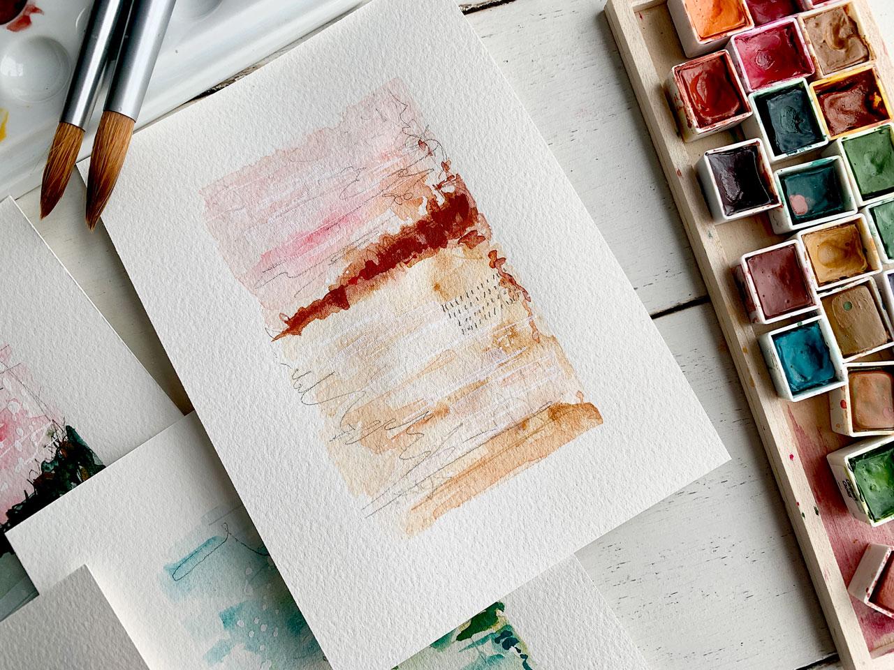
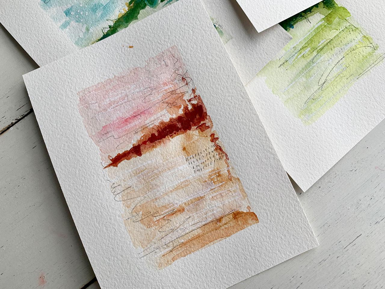
things going in the piece, and then at the end, I'll add a pretty horizon line in there to make it
a little landscape. But I'm thinking that
maybe down here, it's going to be this ocher. The lapis lazuli genuine, which is an ocher color. I'm just very carefully swishing that on a little
bit of a light color, a little bit of dark color, and then I'm going
to let that dry. I don't want to overwork it. I really want to let the watercolor have some light
ethereal layers in here. Then I might just come touch
a few more colors in there. Then I want the top to be
almost a fiery sunset. I've got a little spare piece of watercolor paper over
here so I can see how much water to
paint do I have there. Because I want to
be real careful. This is how I get ones
that I don't like as much. I tend to overwork
things when I'm going. I have too much water. I have too much pigment and then I tried to add more water, I add more pigment, and then
I'm like, I've ruined it. I do try to be careful
here and just see how much water to pigment am
I really working with here. I want these to dry a little bit before I come
back and do more to that, which is why I've got four
that I've already taped up. I'm going to set this one to the side before I overwork it, and do another one. Maybe I want this bottom
to be more like a grass. Let's see what we got here. We got this pretty
Serpentine Genuine. Let's just see if we like that. See, that's really
pretty, maybe we'll have a little grassy meadow here. Now what I like about this nicer paper is
it's really grabbing the paint pigment a little
different than cheaper papers. Look at that. Then
maybe on that sky, what do we want to
do on that sky? Maybe we want it to be
blue and cloudy maybe. Let's go for this cerulean blue. The cerulean blue is
really super blue. You got to be real careful with how much paint
you pick up with that, but I want this to maybe be
some sky and some clouds. I don't want to overwork it, so I'm going to stop
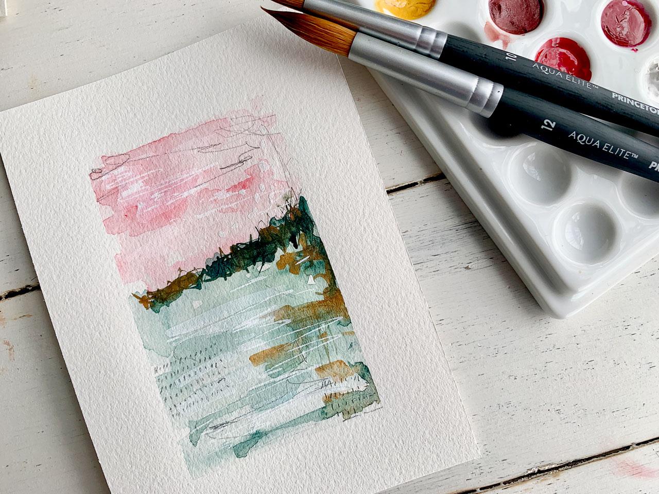
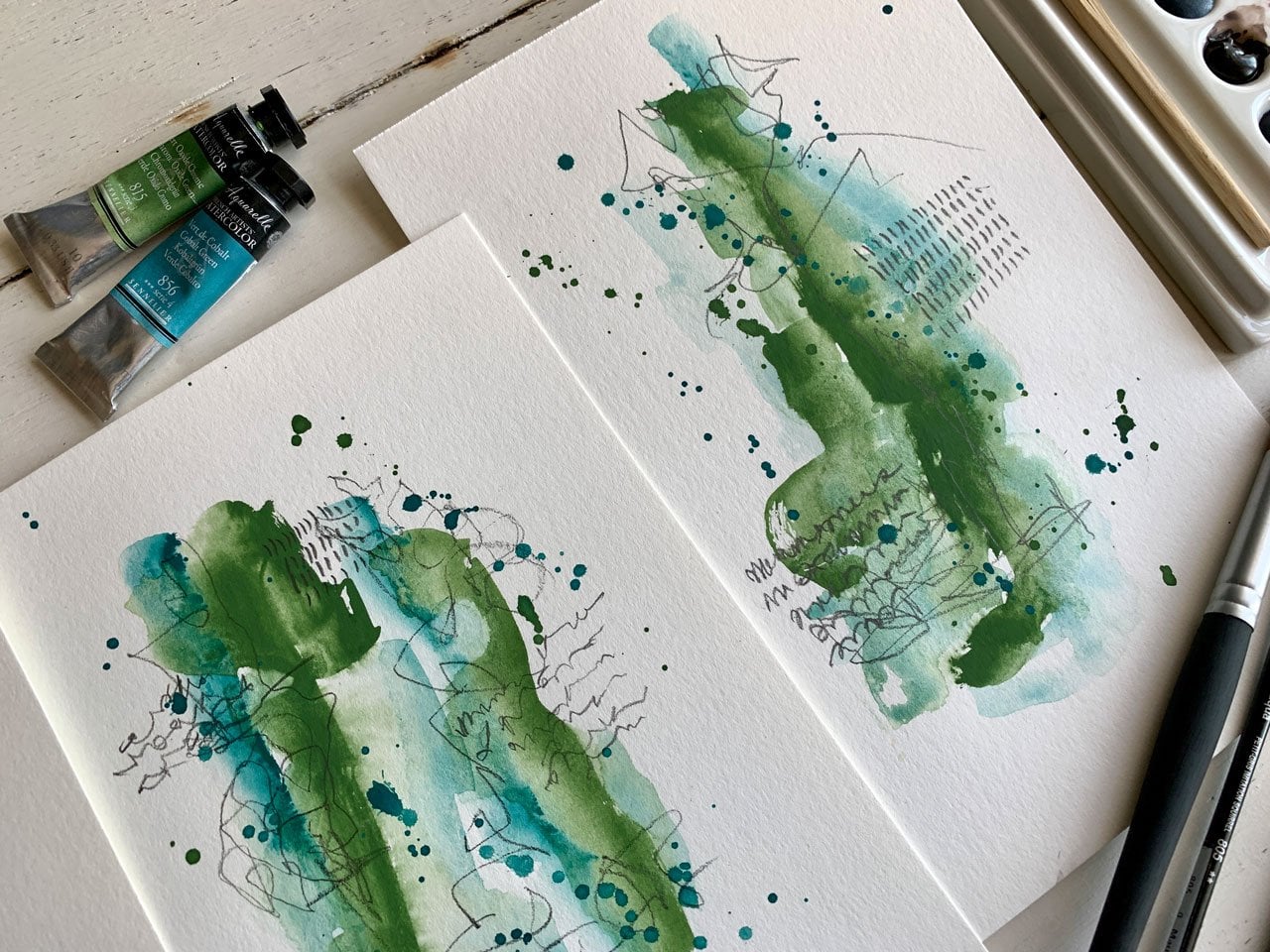
and let this one dry. Let's set that to the side. I really like my blue-green
over here in the Daniel Smith and that's the Sennelier. That's the chromium oxide
green and the cobalt green. Let's just try those, and maybe we'll do the green at the bottom and just
see how's this going to look maybe a little
tiny bit different than this other green and blue
one that we did with the Sennelier colors over here
and the Daniel Smith ones. Look at that. That's
really pretty. Again, I'm trying to
pick up a lot of water, a little bit of paint, and then I might go back
add a little bit of pigment at the end, but these will dry and
just have a really wispy, ethereal look which is
what I want for these. I want these to be
atmospheric landscapy, not in your face bright. Let's just try
some other colors. Maybe I want the
sky to be more red. Let's try this Mayan Red. I believe that's Daniel Smith. These are abstract
watercolor landscapes and so you might just get some inspiration from some actual landscapes
for colors and stuff, but then we're not trying
to do anything specific. Let's try this Viridian, which I believe is also
a Daniel Smith color. I'm not trying to emulate a really true-to-life landscape, but you could find some of those that have the sun going down, and you can see mountain
ridges and some other things and maybe emulate something
that you've truly seen. That's really pretty.
Then I'm going to try this paper that I
like with this edge just to see it might not
come out, but we'll try it. I really like the
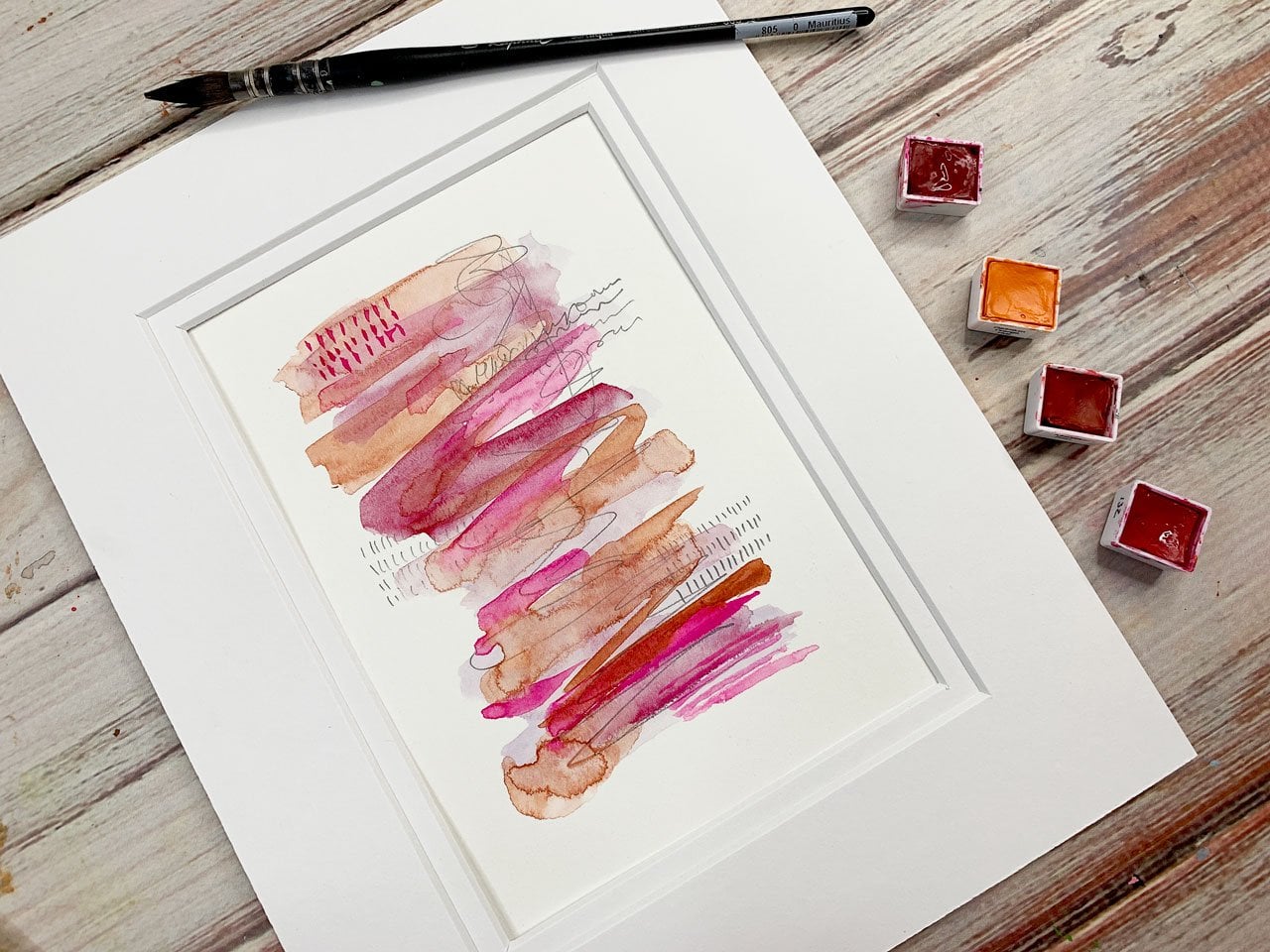
pink ocher colorway, so I think I'm going
to go back to that. I've got this Venetian
red and lapis lazuli that we're experimenting with, and this paper is going to grab the watercolor differently. That's okay, that's the fun
part of experimenting to see what is the different
surfaces that you try out. What are they going
to do for you? How are they going
to make the pieces different and just
what can you get? I am aware that this paper
is a little different, and we're going to get a little
different look and feel, and that's what I like about it. That's really fun. I think
I'm going to let that dry and pick up one of the
ones that we did earlier. Let's go back to
that very first one. We've let that dry pretty good. Now, I'm actually going to start with another layer
and maybe start creating a horizon line and maybe even some
color further down. We're just going to
imply other things in this imaginary landscape. I don't want to leave any weird squiggle brush marks
when I'm doing that, so I'm being careful and working those
back in a little bit. I also have some titanium
white over here that I might use because I might want
some white on here. This is getting into
a little bit of our abstract pieces
that we did in some of our abstract watercolor classes. We're playing in that feeling. This is just a
mechanical pencil. I'm going to put some
marks in here and maybe squeeze this watercolor
around with my pencil. I think extra marks are what
make peace interesting. You don't necessarily
see them from far back but when
you get up close, you can really see extra
tiny little detail in there. I'm going to set
this to the side. Part of the secret of
these really doing well is not overworking them
when they're wet. The ones that I liked the most, especially where I've played
in my sketchbook and this is really good reason for
you to experiment. Let's go back. I think
this is the ease. This is a good way to experiment like what you're really
going to like is do it in your sketchbook so
that you can play around with techniques and figure
out what do you really like. I like that. Let's set this to the side
and let that dry a little. I really like it when
I'm working on top of layers that are dry, so that you're not getting all the smear of the colors just blending in like I did on a
couple of those. Oh look at that.
We're going to have to let that line dry. I like working on
top of dryer layers, you just get prettier things. It's more wispy, all the colors don't
blend into each other. I don't think that's
the color I use there. Is it? What did I use there? It might be the
viridian. There we go. We come back and maybe add
some mountain ridges in here, I could add a mountain
ridge right here and then let that
dry and maybe I'll come back with some
more mountain ridge. We set that up there. Let's go ahead and
put something here in our really pretty art paper. This paper is either I'm working faster or this paper
is taking a little longer to dry and I think pure cotton and its
really different. Let's let that dry. Let's go ahead and pull
this first one back. If it's not dry enough,
we have a heat gun. [LAUGHTER] I don't really like to dry everything
with the heat gun. I like some of it
to dry naturally because I think the colors just do something different
naturally than they do when I'm
tacking color on. But when I'm doing several pieces and
I'm ready to move on, I just go with a little
bit of heat if I need it. Look how pretty that is. I almost want to have
like a little bit of that coming out. Then I might also
want to go ahead with this titanium and you could do this with
acrylic paint too, if you like or paint pens. If you want to really make
it look like we've got some birds in the sky and maybe we've got some clouds up there, you could do this with
acrylic paint also, if the watercolor doesn't
do enough for you, because this watercolor
does seem to sink into the background a bit. That's fun. I'm
going to go ahead and I'll let that dry a bit. Then let's look at this one. This one's really pretty. This is the one with the
pretty cerulean blue. That's a Daniel Smith color. That's too much pigment to water and now I
think I'm going to dock this off with my towel because it's just
more than I like. I want more water, less pigment, but this cerulean blue is the one that's
just overwhelming. Then I might come back
in here with this white, which we may or may
not see because, I don't know that
white might just not give us enough difference. Oh, here we go. We've got some green mixing up in
there, but that's fun. Look at that.
That's real pretty. Let's set that one
to the side and let it do its little
thing for a minute. That's fun too, is to set
them to the side and say, what are these going to do? Might come back few more layers here and it's almost like
a little mountain ranges. This might be fun to
add a little bit of mark-making in here
so we could go ahead. Well, that's a little
bit wet and do some scribble and you
will have to do that. I just like to do that. That one's turning
a real pretty. Let's go back to this one. That's got these to some
LEAs that are so pretty. Coming here with a
little bit of this blue. That's real pretty. That's a little more
pigment than I wanted, but I can come back in here and dot a little
bit of that off. I do like some of the movement that we're getting in here now. Maybe I'll go ahead and with
my [NOISE] pencil here. Go through the
watercolor a little bit. Yeah that's pretty. We
will let that one dry. [MUSIC]
4. Landscape - Adding details: [MUSIC] Then we might take our
cotton piece here and add some more details
coming across here. Then picking up a little
more pigment here for this just to start applying something fun here
with this horizon line. You could even go into some of these as we get further
along and imply trees. Let's set this one to the side. That one's not really working out the way some of
these other ones are, so I don't know if
I'll love that or not. But we could go in
like I've got this. That's like a burnt orange. I want something. Let's see. Do I even like that? Let's see. Let's do this burnt orange. This is Quinacridone
Burnt Orange and I think that is a DANIEL SMITH color. But we could come
in here and then imply other things
in this landscape, buildings, maybe some trees, dot some other color
in there for interest. Add some extra color into our landscape itself so it's a little tiny bit more abstract, but we have some
good movement going. I love that. I don't have
hardly any color up top. I did add the white,
but like I said, that white really blended in. That one's almost too bright, but it's fun to add some
of those variances. Let's just add a little up here, not so much that it's changing
the look of my landscape. But that little tiny bit
of color is really nice. Then let's go back to
this blue over here. Now I do have this blended
funny up into the top there. This one is this over here. Let's just play and start making some other
things happen here with our horizon line and maybe a little more movement
there in our lower part. In this one, I picked colors
that were super strong. We might embrace that
with this cerulean. The cerulean is
such a strong blue. I even noticed that
with acrylic paint, it's so strong
that it takes over [LAUGHTER] when you use it mixing stuff and I've
noticed that quite a bit. Let's set this to the side and
let that one do its thing. That might not be my favorite. This one I'm loving. We might take a little
bit of this yellow ocher. That might be Naples yellow. [NOISE] It's this one, Sennelier
Naples yellow. But it's an ocher
color and I love anything ocher so
you see a lot of ocher over here in my
little color palette. But we might start just dotting some of these
other colors in here and seeing what interest
can we add to our piece. You can see there I do
really light on the yellow, but I added some into
my horizon line. Let's go ahead and let
that dry a bit more. This is that one, the viridian. Now I'm just going
to really start building better here
on this horizon line, on this one too. Maybe adding some more
movement in here. What I love about watercolor, they change a bit
as you're going. They almost oxidized
a little bit and you see movement in there
that while it was wet, maybe you didn't see, but when it dried, it really stood
out. I love that. I might put a little bit of this La pis Lazuli Genuine
just to start tapping in some other colors here with this horizon and
I might pull that down into my background
a little bit. Then this one, I might come back and start moving that
watercolor a little bit with my mechanical pencil. [NOISE] Because we
could imply trees, we could do other stuff here, but keep in mind a little
more organic there, a little bit more abstract. That's real pretty. Might
be too dark, but we'll see. Let's go back to our first one. [inaudible] in a
little more there. This is that Venetian red. I really want to
have a little bit of this color be vivid, like nice and solid and vivid so a lot of pigment
here at the end. I'm trying to work in layers. I start off really
light and build up to statements and bright colors and things that are
a little different. Maybe dot that and look
how pretty that is. I know it's real dark right
there where horizon is, I could have made that bigger. This just happened to
be what I wanted to do on that one was a tight
little horizon line. Maybe we're in the
desert and this is the sunset and
the sky was pink, things like that
and it's what I'm imagining. Let's see here. This one, I don't think
I'm going to love, but it was fun experimenting
with a paper that's completely different than I was working with on all
these other things. It's almost like I really like the vivid abstracts
that I was doing first. Let's see what this is.
That's pretty color. This paper, in my mind,
probably works best for me with these pretty
vividy abstracts. I have a class on making those, it's the watercolor
abstracts class. But I think that's what looks
best on this paper for me, but it's not dry though, so
we can't really say for sure. Let's just throw caution to the wind and throw some
other color in here. How about this teal
color? What is this? This is Cobalt turquoise. [NOISE] I always reserve the right to not like stuff
when it's done. I'm not sure I'm
filling this, but a lot of times I'll say that and I'll think that and I'll
think I just don't love this and I'll go back tomorrow and then I'm
like, what was I thinking? That's fantastic. [LAUGHTER] You give
yourself some grace. If you're not loving
the piece today, wait a day and look at it
again because these dry in such a fantastically
fabulous way that tomorrow, I guarantee you'll like some of the things you
didn't like today. Let's come back on here. Maybe we'll add
some of this green, just the Serpentine Genuine. Start getting real heavy
with some of this color. I like the way real heavy bits of color almost oxidizes
for the next day, it turns into something
just so beautiful. This color is green gold, it's more of a yellowy green. I think I like green gold just
because of the crazy name. [LAUGHTER] I want to
love that color and sometimes I do love
that color and sometimes I'm like,
what happened here? [LAUGHTER] Let me
take my pencil, I want to play a little bit in this here with some mark-making. I just like little
scribble on everything. Maybe I'll come back and dots some of this blue in here
and just see how that mixes in, and then we'll
let that do its thing. We'll set it to the side. We love this one
or not? [LAUGHTER] You're going to hear me say that on every piece and
then when we're done, I'm going to be like,
look how amazing this is. I'm crazy. I'm just dotting those blue and that
green out of my colors. I like what that just did. Then we might like a tiny bit of this
coming down the side and I might get into
this white and just start maybe dotting
some birds up there, which I know the
birds aren't normally white, but sometimes
poetic license is what we're going for here. Maybe a little of this
down here because some of these extra little layers and details that make these so
pretty when you're done. I'm really starting to like this and if my white
doesn't show up as white enough or my little dots don't
really stay up there, I might take a paint pen or acrylic paint and
do a little extra. These would be really pretty
too if you like to do hand lettering or you
have pretty handwriting. You might write a
poem or a scripture, or a favorite saying. You could write on these. These would be really pretty as cards to send to somebody, this could be the
front of a card, a beautiful handmade
piece of art. We can hand-tear all the edges and make that really pretty. This one look quite doing
some of what I want, but maybe if I add some
of this white in here, we'll start getting some of these other layers on it that make things
so pretty to me. Now see that I just added a whole extra bit
of fun in there. Let's do that on this.
Let's just add this. Make this particular layer or white layer where we're now tacking in some other details. This one is still slightly wet. Down here, that green gold, just totally shut off over onto that
white, that was fun. That's pretty on there. Let's add some of
that to this one. This one, man, it's really
turning out beautiful. This might be the one
that I want to frame. A lot of times when I'm
doing stuff like this, I'm not looking for 15
or 20 pieces of art, sometimes I'm just
looking for one or two that I love so much. I'm thinking, I can't
wait to frame that. A lot of artists have different
reasons for doing things. I like to do the art
stuff for enjoyment, I like to teach the things
that I figured out that I'm enjoying, but my goal is not necessarily to
make big collections to sell in art galleries. But if that's your goal, then definitely work in a series like this.
It's really fun. I don't know if I love
everything I just did up top, so I'm going to
take my paper towel and wipe some of that back-off. If it's still wet and
your underlayer is dry, which is why I like
working with this on layers with certain layers dry so that when I
don't like what I did, I can pull some of that back off and I don't
feel like I ruined my piece. That one's pretty.
We'll let that dry. This one [inaudible]
just might give up on. [LAUGHTER] Well, not yet,
but I'm just saying. I am filling that, let's add some white in here. That this is better as an abstract paper with
my other ones better than what I was intending for this because I liked
the way it looks better on the clean paper. Let's let that dry. I need to let these
all dry before we see if we want to
do one last thing so I will be right back. [MUSIC]
5. Landscape - finishing up: [MUSIC] These are pretty dry now. This one, I actually like the extra white detail
that I got on there. If you got it where it sinks in and it's not as
vivid wide as you want, you might come in
with a paint pen and do a little more detail. This would be the time to decide, do you want to
do any writing on it? Do you want to do any
additional mark-making? One of my favorite mark-making
things is hash marks, not hash marks but little lines. Do I want to add any other fun, a little mark-making in here? I do particularly
love rows of lines. That's just my own
little thing that after a lot of doing
stuff that I really love, I like scribble and I like
things that look like writing, but maybe aren't
necessarily writing. So you're just going
to have to decide, what do you love? What things have you ended up really loving
mark-making-wise that you'd want to include? I love that right there. I'm really feeling that I feel
like this one is finished. I'm going to go ahead and
start peeling the tape. The tape is my
favorite part to do because it really
turns what might be a mess into an
actual piece of art because then it's framed
out and it's beautiful. Look at that
abstract watercolor. Number 1, I'm in love. That made me really happy. We're going to go
ahead and let's do this next one over here. I do like this one too. I like my little hash marks. I might do them in
a different place. I have myself a little
bitty hash mark library [LAUGHTER] that I
show off in several classes, but it's just where I've made different marks and
ideas of things that I have drawn
that I like that I want to maybe refer to later when I'm looking at
something thinking, what kind of mark can I do? These are just some
different ideas that I hang up on the board in
front of me that I can just look up and decide what's going to work
for a particular piece. I love that. I might want
some more white in here. We might take our paint pen, then come back and add
some more white detail. That's pretty. Added a little extra down there in the bottom. I could add some extra little
birds and little dots here. Birds are almost like
a little V in the sky so we could have
that going up there. Just get that detail. Not super strong,
but a little bit of something going on up there. I love that. So let's just see. After you pull your tape, you certainly might
decide you need more marks or more of this or more of that and
you can keep working on it. But look how pretty that one is. I just get so excited by
the time I'm pulling tape. Look at those, this really does feel
like a landscape. Maybe big field and tree line
and the skies or something. I'm loving that one. Let's go to this one here. This one definitely needs
some more something. [NOISE] It's fun too. If
you don't really see some of these yummy details from far back, but then you
step forward and you're like, look at that surprising little
whatever that I've just discovered that I couldn't
even see from further back. That's fun. I like when
things are in there and you don't really
see him until you get in close and take a look. We could come back with a white and do
some marks in here. That's pretty.
That's real pretty, I do like the white as some really subtle
mark-making there. That's real pretty.
Let's see what this one looks like peeled. Give me a break here how to
put that tape on. [LAUGHTER] See, once you peel that tape, you get a feel for the
piece and you're like, now I really do like
that quite a bit better than I just did
with the tape on it. Let's do the one I know
is my favorite.[LAUGHTER] I think I will come in here with these elongated white
lines that I know I love. I love this piece already. I'm telling you I love this one. We could add some
little dots in here, just something subtle. They're not even super obvious, you're not going to realize
they're there unless you really looking for them. I like these down
here where they're just a tiny detail like right
here, tiny little dots. I love that, that's real pretty. It's almost like we're
continuing our line as a dot. So pretty. Get creative with a few
of your mark-making, you don't have to be in
your face there, it can be real subtle and just a detail that comes out when
you get closer. That is so pretty. I do like my little hashes, so I might put some little
hash marks in here, a little more pencil work. You don't have to
work with a pencil if you don't want,
if you like working with Micron pens or
anything like that, I just like working
with graphite. Look at that. [NOISE] This is so pretty, look how pretty this
is turning out. Oh my goodness, I think this is hopefully definitely
going to be my favorite because it's
my favorite right now. I see us peel our
tape off and see. It's so pretty, oh my goodness. Look at that, that
clean edge around it. Oh my goodness. Definitely play with
pink and ocher, some shades of pink and ocher. Those have definitely,
even out of my sketchbook ones, have
been my very favorite. I try out ideas and
do different things before I get to working
on loose pieces of paper, but this ocher pink, this Venetian red, and the lapis or some type of ocher. [LAUGHTER] It's just my very favorite. This one I love so much. I might take that one out of
my sketchbook and frame it, but this one's got
more detail in it, but look at that. It is so beautiful. Let's take the one that
I don't think I'm going to like [LAUGHTER] as much and maybe add some extra detail in
it while we're here. It's almost looks like
when you're doing it in the sky with the paint pen, it's like you're adding some cloud cover or
something different, unique. Let's see. I don't know about this one, but let's peel the tape and see. I like this paper, but this one might not have been the best choice for this type. I like those other
abstracts better. So even peeled off,
it's very interesting. A different look than
on the other paper. I do like experimenting with different papers just
for that exact reason. How do the deeper papers react to whatever material that
you're putting on top of them? They're cleaner and sharper
and the details are yummy. This one, it's less
clean, it's less sharp. It's soaked into the
paper a bit more. It is actually still very
pretty and similar to this, but this is the look
that I really wanted. I want you to experiment
on different papers. Watercolor paper-wise,
I've used cold press, but there's also hot press
and there is rough press. The rough press, I do like for abstracts,
it's very different. I did that in one of
my other classes, maybe the art prompts
class because I liked seeing a different
surface that I normally work with and how
does that work with my materials and
effect everything, and then that was
definitely a great lesson to experiment on
different surfaces. When I'm doing
something like this, experiment on a surface
that you know you'll like, start off in your sketchbook
more than anything. Like I really love starting
off in my sketchbook, testing out ideas, figuring out, is this something that I want to create a few more of
and something that I want to create on papers that I could possibly frame these up? This is one of my very
favorite and like this, I can tell I was going
to like these colors. This is a little more
detail and more going on. This was a little
softer and just experimenting and
pushing around color. Play in your sketchbook
and do a few of these and then decide if you
loved it enough. Do them on some papers, tape them off, and then see what would you
want to do with this. You could frame these. It could be a card cover. I got a little paint
up there accidentally. I might need to
trim this one now that I've been playing around all the little
wet paints here. But I really love doing these little
abstract landscapes, and if you like lettering, again, I recommend a quote, a piece of scripture or some
saying that you really love. Those would be beautiful written
down the middle of these or going on an angle or
down this lower side. You could get really fancy with maybe some gold paint pen and a letter in
something that you love. You can do a lot with these. You can even put
like happy birthday and this can be the
front of a card. If you wanted to, say, tear
the edge of something, my very favorite way to do that, I think I'll do it over here on this little piece of
one that I don't love so that you can see how
to easily tear the edges. Let's just move our little
watercolors out of the way. In case you want to tear
the edge and you thought, well, how do I do that? I like to take a clear ruler. You don't have to take one of these great big quilting rulers, but I do like it
because it lets me see through and I can figure out how much of an
edge that I want. Let's say I want one line
is worth the edges there, then I can just hold that
down and pull that paper. [NOISE] There we go. Now we have pretty
hand-torn edge, a little different than the deckled edge that
came on the pad, but I could trim all four sides with the torn edge
that I'm doing here and that would
be beautiful. It's another element
that when you frame it, you could frame it
where you could see these torn edges or this could make it easy to then tack to a card to
be the card front, and then we could tear the
bottom edge to make it match. That's how you create your
own hand-torn deckled edge. Look how pretty that is
with the deckled edge. It's not that I don't like this because I actually do like this, but that's not the look that
I wanted for this series. I wanted this little bit
crisper, sharper look. But if you want to tear the edges so that
they're really pretty, that's how you do that. I just thought I'd
show you that. Experiment with your colors, you might look at
some sunsets and see what different
shades are you seeing in the foreground and in the sky or sunrises or something in the
middle of the day. Look on Pinterest
and you can Google Pinterest like search
sunsets or sunrises, and then emulate those colors. I like the pink ocher colorway, and I like the
blue-green colorway, so you could definitely play. This is probably my
least favorite colorway, but I'd still like it, but it's my least
favorite colorway today. Just pick a couple of
colors and then go for it and then you can add some layers as you let those dry and
tack on top of them. I'm really looking forward
to seeing what you create. Definitely come and share your project with us
because these are really fun abstract
watercolor creations, I guess, you could call them. I want to see what you came up with and see if
there's any ideas, that maybe I would
love to try too or color combinations
I didn't think of. I can't wait to see what you're creating and I'll
see you back in class. [MUSIC]
 DENISE LOVE, Artist & Creative Educator