Transcripts
1. Welcome: [MUSIC] Hey, I'm Denise Love and I want to welcome
you to class. Let me show you what
we'll be doing. In this class, I'm going
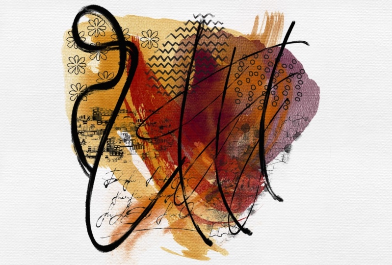
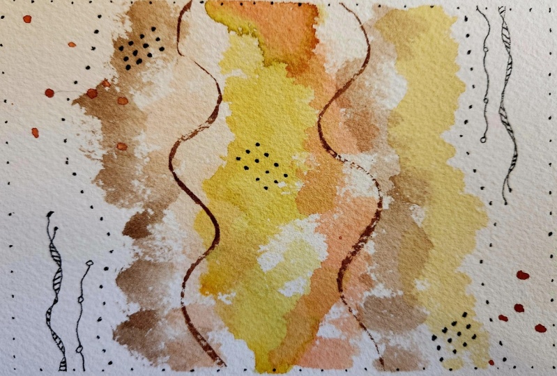
to show you how I made these yummy abstract
watercolor pieces of art. These are really fun. I enjoy making them, I enjoy practicing with
color, mark-making, just seeing all the different
ways that I can manipulate the watercolor and
my marks to come up with beautiful
abstract pieces, that then if we find some
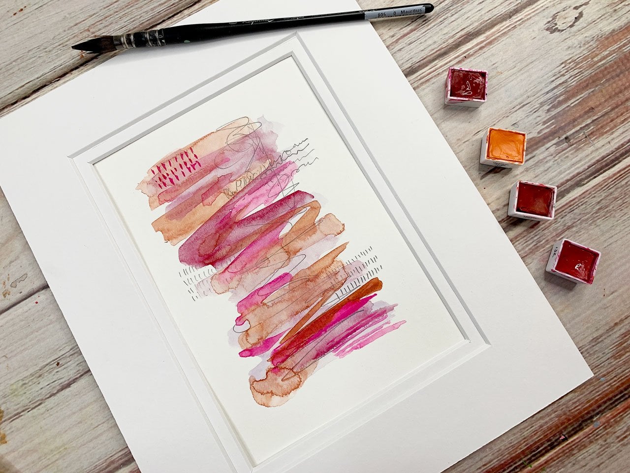
that we really love, we can easily frame these. Look how beautiful that is, matted up, ready to hang. This is a fantastic
class for playing with your watercolors,
experimenting with colors. This might even
look good this way. Look at that mark-making, coming up with just really
pretty abstract pieces when we're all done. I've done lots of these. These are some I
did before class because I was just
playing with color. I like how rich this particular color palette is so we'll be
doing some of that. I'm pretty excited to
play in this technique. I can come up here and just do lots of these playing
with color samples, basically testing out
different colorways, like I did in my first
watercolor sample class. I like to just use this as
a time to experiment and play and see what I can come
up with when I'm finished. I can't wait to show
you how I do these. I think you're going to have some fun just mark-making and creating pieces that I know you're going to love
when you're finished. Let's get started. [MUSIC]
2. Supplies: In this video, I
want to talk about the supplies that
I will be using. I've kept it a little
bit more minimum with the supplies for
this class because I want to experiment and
just push myself with a limited number of
supplies that I want to use. What I really discovered too
with these beautiful pieces, this is one I did several days ago playing
around these three are, really playing around colors and marks and just experimenting. When I do these, like here's
some that I did today, before I was recording class, I was just playing
and experimenting. Some of these, I think, oh, I don't know if I'm going
to love that and then I get the marks in
it and I think, oh, I love that. The marks really make this
technique fun for me. Then I noticed too, after a couple of days when
I walked away and came back, some of these watercolors almost needed those few days to really dry and maybe oxidize
a little bit and the colors turned out so
beautiful and vibrant. I'm pretty excited to create
some more pieces today. These are lots of pieces
that I created prior to recording class just so
that I can let these dry and oxidize and come
back and look at them later. Look how fun that one is, I think I'm going to
really like that. I definitely want to leave
them a couple of days to see if they'll vivid
up like this one here. I'm pretty excited about making some more of these because I can sit and make
these all day long, there's so much fun. What I have here is
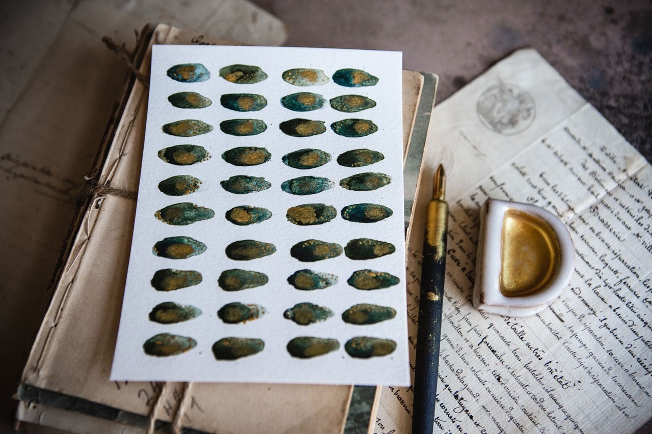
some Daniel Smith and Sennelier paints in the
colors that I like. I have a little palette here that I've put
some wet colors out because I like them and I'd like them to dry
in my little palette here. They're still wet because
I just did this because I'd been using them on my
fun watercolor palette, but I'd like to
use the watercolor palette for some other stuff, so I need to wash
that palette off. These can be more
permanent in here. The colors that I've
got in here are just some of my own favorite colors to use from Sennelier and
a couple of Daniel Smith. The Daniel Smith ones
are fun because they're made of particular rocks. This is red gouache
genuine and this is kyanite genuine and they've got a fun little sparkle in it. Then the Sennelier
that I have put out on the palette are
these other ones. I might have them
as half pans in my Sennelier half pan
palette that I figured, since I know I
like these colors, I'd go ahead and
spread them out there. I've got cobalt green,
chromium oxide green, light gray, Payne's
gray, greenish amber, cadmium red, purple, and then this is coupled mortem, some purplish shade and
then Naples yellow. That's the colors I have
out on here and then the colors on my color
palette are the ones that I have pulled out of the Sennelier and Daniel
Smith colors that I like. If I use any of these colors, I'll tell you what they
are as we get to them. But one of my particular
favorite palettes is this down here. One thing that I like to
tell people to do now is to, if you get a big
palette of colors, once you start using
them and you decide, oh, I really like this color, pull that color out and put
it in a favorites area. I have all my little favorites
on this little wood pan. Now I know that these are
colors I've used I really like. You can almost
consider that to be like your own personal
color palette, rather than having everything
still in a big pan of colors that you may or may not use and you may come
back later and say, oh, what colors was
it that I liked? I have pulled out my favorites, I can always go back
and pull out some more. But for this project, I'm going to play
in the favorites and just see what I can get. I've got my favorite
watercolors, I've got watercolor paper. I'm using six by nine
sheets here with this watercolor paper that
you get at the Michaels, you can use any paper
of your choice. I'm just going to
use these because it was convenient and I like the size,140 pound cold press. I've got a couple of watercolor
brushes that I'm using. This is a Raphael
Soft Aqua Number 0. This is a nice artists grade Aqua Elite Number 10 that
I got from the Michaels, if you want to go size-wise, I'm going to be using this
Raphael one because I like it. I have a couple of
different sizes of these paint brushes. Just get out the variety of sizes and then use
what you want to use, and experiment and play. I've got several different
watercolor sizes and just experiment and play. I might use this
one too. Let's see. I'm going to pull out this is
that Aqua Elite Number 12. Just get a couple
of like medium-size rounded watercolor brushes
to play with on this. Then I'm also going to be
working with a pencil. A lot of times I will work
with a mechanical pencil. This is a 12B, which is just a bold pencil. A couple of pencils
might be nice. I've got a graphite
set here where the 2B, 4B, 6B, I might use some of those just to have some
graphite that I'm using. Little graphite I
said I got out of a sketch box subscription. They sent me lots of random
fun things and so now I'm trying to make myself use some of them instead of just
collect them and store them. This is basically what
I'm using in class, some watercolor, medium brushes, watercolor paper,
and some pencil. That's what I have
created all of these samples that I did before I even started filming class. I'm keeping it basic and
just experimenting and seeing what can I do
with these colors and the pencil to create today? That's what I'm going to use. Those are the samples
I did before class. I'm going to do some
new ones today. Then keep in mind, I do love them after they've
sat for a couple of days and really had a chance
to dry and oxidize a bit. If you don't love them
on the first day, wait a couple of days and come
back and look at them and see if you don't love
them even more then, some fun to experiment with. Here's all our supplies
that we're going to do, and so let's get started.
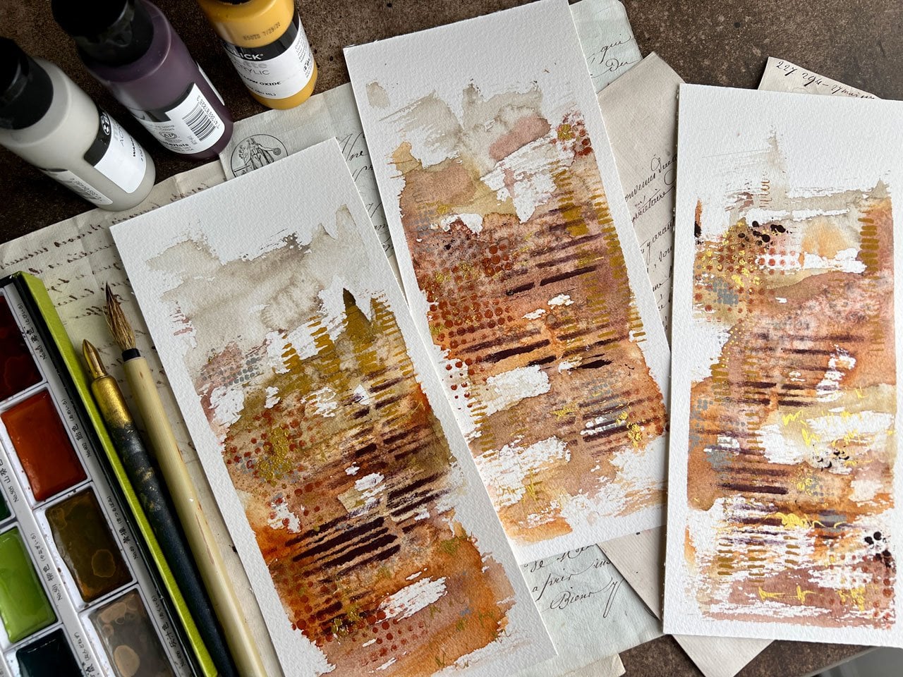
3. Laying down color: [MUSIC] I've got my paints
that I really love over here. These are all wet. They're not dry yet but
eventually they'll be dry, and then I can keep using
those out of that container. I'm going to start with
on this first piece. I'm going to do a
whole bunch of pieces because I like to do one, make some watercolor
marks on it, set it to the side,
work on another one. Set it to the side,
work on another one. Set it to the side and
then when you come back to the first one to add
some more paint to it, you can then get
cleaner edges rather than everything
smudging together. This one's got some clean
edges and some smudgy areas, and that's what I like to do. I like to have a little
bit of color blending and a little bit of clean edges where they don't smudge
together at all, and it's just about
experimenting and playing. This is turned into one of
my more favorite techniques, and I really love
this Aussie red gold, which is a Daniel Smith color. I'm going to go ahead
and just get that wet and start with that. Rather than painting like you might traditionally
paint on paper, I'm going to be a little more organic about it and
we'll get the water off the edge of the brush so
that we don't drip water but basically, what I want to do is be a little more
organic about it. Maybe roll the brush
around and just see what can I do here? That's going be my first line, and maybe I'll do a couple in the same colorway and then switch to a
different colorway, and I'm trying to be fast. You might set yourself a
timer for these so that you're not
overthinking too hard. I really love this color
for some reason when it gets mixed in with some
of these other shades. Those are pretty.
Now I'm going to actually start another colorway and come back to
these because I want that paint to really
start to dry. Let's set those to the side. I just want to do
a bunch of these today because I love them. [LAUGHTER] Maybe I will
start with a little bit of this teal color
that we've got. That's the Sennelier
teal. Look at that. If we do that and roll
the brush around, we'll get different looks than if we're just straight trying to paint,
and that's my goal. I want to roll this
around and just get some different looks and get that paint to be moving
in some other directions. I like that little Rowley
technique personally. Maybe we'll do a green one. I really like doing, say, 10 of these at a time. These wet watercolors
work a little different than the dry ones, so that's very interesting to play with, some
that are still wet. Let's just do one of these and I'm going to pull all these back in when
they're dry and add to it. I'm just going to
set them all to the side as I'm working them. This is Naples yellow, I think. I like using this
little bit nicer brand on something like these
because the color is usually way more vibrant [NOISE] than the
cheaper watercolors because there's more pigment. Let's try one of our
Michael's brushes. This is that rose opera. This is a little
different there. This one's actually
almost like it's resisting the paper
because of that brush. That brush doesn't hold
water the same way but look at the difference
in the stroke that we get, and I do like that. I'm going to play with
that a little more. It's not as softer brush
as that other one. Maybe I'll do that with this yummy Aussie gold one
that I like and just see what's the difference there. I might like it
more just the way it does the color on there. Now we've got a bunch and
we'll set that to the side. We've got a bunch that
have started to dry. I'm going to start
pulling these back in. Copper that is, oh my goodness. Let's pick that
harder brush now that we've been playing with that. I think I want to come onto
the blue with some green. You're just trying to
be real organic here, don't think very hard
about what you're doing, and then we're going to add marks to whatever
we end up with. I just love blue and green, and working with these
wet watercolors, I'm really getting fun marks that not getting with
the dry or watercolors, or it could be the
brush difference. [LAUGHTER] I do like to
play and experiment here. Let's get some green in here. I love this one. See now I even love these
as we're going. Whereas when I first
was doing these, I was like, I don't know, do I like this or not? [LAUGHTER] You got to
do some experimenting and playing and then
coming back to it. Then once you get your groove, you really start to get
some stuff that you love. I'm not sure what
color I started with, but I'm going to, oh
yeah, there we go. I'm going to go back
with this. Pretty vivid. Might even be the same color, but it's a little more
vivid here, like that. This one's more dry. I think I want to do some of this Naples yellow.
Look at that. I need like a whole
another table in front of me that I can sit all these in
front of it at a go. [LAUGHTER] This fun color is Venetian red and that's
a Daniel Smith color. Look how pretty that is, and you see now that we've
let these dry a little bit, we're getting a much
prettier definition in our color than we would if we had put that right on it. We would have gotten
more blending and with that, it would
have been pretty. I could actually come in and add maybe a little bit of say, some of this yellow and just see if we can get some
blending in there. That might be fun too, to experiment a little bit. Here's what that bright. With this, I really meant
I just really loved. Let me get a paper towel here. I've got paint on my
finger. There we go. Before I put my finger on
something I didn't intend to. [LAUGHTER] Now with this one, I'm really inspired by my
original color palette here, which has this bright gold. It's got this terracotta color, which is the Venetian red. It's got a little bit
of this green in here, which was this green over here. That's the Sennelier tube
that I like so much. [NOISE] This one here. This chromium oxide green
that I like so much, that's a little bit of that. This really bright
rose opera is in here, and then that's
probably a little bit of this ocher color, hiding in there
plus some pencil. I'm so inspired by
this yummy colorway. Then I want to play
in that colorway, which is why I had that
out where I could see it. Because in the end
it was so pretty. I think I'm going to go back
with the Michael's brushes. I really like how organic and defined our little line
drawings here are. I want to make sure I've
got the right color. I want the rose opera. Yes. Make sure I got enough
water in there. Well, look at that color. [LAUGHTER] Let's just go ahead. Paint on this one. Try not to get that paint
on everything. I like that. Maybe come back on this one, and I want them all to be a
little tiny bit different. That's why I'm working on
more than one at a time. I went further than I
intended on that one, and then that water on that one, but I might come
back in this one. Well, no, I want this one
to be something different. Let me set that to the side. We'll have one more of these. Let's do one more, and you know none of
these are going to look like my original, but it is fun to
experiment and create. Just see what can
we come up with even using a same set
of colors that we love? Now I'm using that Venetian red. Get some of that up here. [NOISE] In making these
all a little different, you have a nice fun series
[NOISE] and you also have all of them not being exactly the same,
which is the goal. We don't want them
all to look identical [NOISE] but they would
be nice if they blended. I'm going to come back
in here with this one. It's the Lapis Lazuli Genuine. I think that's just a lighter
color I've got out here. [NOISE] I don't want the
extra water drops though, so I'm just going
to wipe those off. I like that, let's stop there. Now, I'm going to come back in with a
little bit of this yummy green and just
see what we can get. I like that they're
all different. Even though I have one
inspiration piece, I don't want all the pieces
to look exactly the same. I might come back in
here with some filler. Like this one, I actually want to have more color come down here and then we might just add in color
as we think we like here. Don't know that I like
that green that I did there but now
we'll set these to the side and let those start to dry while I work on
some other pieces. Maybe they won't be my favorite but I do like the palette I was inspired by. Let's pull these
green-blue ones back out. Let's look at this one too. Let's start with the green-blue
in here, I like these. What we want to add
to the green-blue, here's a third green-blue one. See, this is the perfect time to play and experiment with color. I almost like the
super light bit of blue that I have in there. So I might just come back
with that same color, extra watery and just get a little more blue and
stick with the blue-green. Some of it's real wide. We're going to get a little
bit of blending because that green just did something
really fun right there. [NOISE] Look at that,
when I did that, I had so much green
paint there that when I added that light layer blue look at that blending
that we just got. That was pretty fun so
I might do that right there and just fill
in these white spots. That one is so beautiful, that might be my new favorite. [LAUGHTER] [NOISE] I
just love playing and experimenting here
and then seeing those fun surprises when we add some paint next to
something that's really heavily saturated
and then watching that blend in such a way
that we didn't even expect. Look how pretty that
one is. My goodness. Maybe that one is
my new favorite. [LAUGHTER] I like that these are basically
two colors and I think I'm going to
let those now dry. We're happy with the blue-green, [NOISE] so let's set
these to the side. I'm just randomly setting these everywhere [LAUGHTER] around me. That one over there
is drying really vivid let's pull these back out. [NOISE] Let me set that to the side let's
do this one first. This one, what do
we want to do here? Do we want to add some more, something to be a
vivid surprise? Do we like just the two colors? I'm thinking maybe we'll try out this Daniel Smith
one that he's got. [NOISE] There's this one, the Red Fuchsite Genuine. It's got some shimmery
elements in it. I think that shimmery part could be a good
addition to this. Look how pretty that is. Now, that completely
changed the whole look. I think that's going to be
beautiful dry let's call that one good. So [NOISE]
let's do this one. [NOISE] You see how fast these go and they're
actually rather fun, little bit meditative, relaxing. In this one, I might use that other Daniel Smith shimmery one. This Kyanite Genuine, K-Y-A-N-I-T-E is what that
is if I'm saying it wrong. That's different, I'll
keep it light I think. No, I do like that
with some extra. Look how pretty that's
working out too now. Get that order. That's real pretty and we're getting a little bit of color combining with the
yellow and it's almost a greenish
color in there. [NOISE] I think we'll go for
that. We'll go with that. Let's let that one dry. Let me set those to the side. There's another fun
thing that we're going to do on top of these. [NOISE] This one might
go with this darker, just the Daniel Smith
but it's a real dark. It's one of these here. [NOISE] This one that
says, [inaudible]. It's a weird Coca-Cola color. [LAUGHTER] Now,
that we did that, there's a color over here that's called Sepia and it's
also a Daniel Smith. That's pretty. It's also a Daniel Smith color.
Keep in mind too. Don't get satisfied with up-down try roll your brush
around for some of this because that's how we
really get some of those really neat
organic directions and extra pigment left
on here, that's fun. I think I'm going to go back on here with that
bright Rose Opera. We might just be making mud out of here, but we'll just see. Let's have this one dry. This one's weird, might
not be my favorite at all. Not all of these are going
to work out for you. [LAUGHTER] Now, what I want to do is [NOISE] take
one of my brushes. I think I'll just take
this one and I'm going to add some splatter. I don't want water to be on
there though. Let me get that water drop-off, here we go. I going to keep a towel
handy and have a little bit. I think I want that
really bright Rose Opera. We'll get it just on the tip, a watercolor on the tip
and then very gently [NOISE] create a splatter and I'm just hitting
that pretty firmly with my finger there and
splattering it. [NOISE] That's what
I'm going to do for all of these that are semi dry. These turned out bright, I don't know if I'm
going to love these nearly as much as my original. What I might do because I think the problem
for me is [NOISE] I've kept all the colors
overly separated. Maybe and it could just
be that it's not dry too. [NOISE] I told you when I'm doing them
and they're not quite dry sometimes I don't
love them and then I come back later and I'm like,
look what I created. [LAUGHTER] I don't know, if I mix a tiny bit, I think I'll be
happier with that. I'm just going back on
here with a wet brush and reactivating some of that paint and blending them a little bit. We'll set these back to the side to dry a little bit more. I do like them better if
you let them natural dry, rather than trying to do
it with a heat gun simply because a heat [NOISE] gun makes the paper curl
and I don't know, it doesn't do quite the same. I do think it looks
a little better if you let that air dry. [MUSIC]
4. Adding Splatter to your piece: But I'm letting those
other ones dry a bit, moved them to the side. Here's our pretty
blue-green ones. I think for these, I'm going to do some
blue or green splatter. Just a wet brush, a little bit of
paint on the tip. I want it to be
watered down there. Look at that. That's exactly what I wanted. Look how pretty that
is with the splatter. Then we've got another
step after the splatter. I'm going to move
this out of the way. Oh, man, that one's perfect. Look how pretty. I think I have a new favorite
set out of this hopefully. You can try to do these as light and controlled as you want. I do want them to be a
little more organic, so I'm not trying to
be as controlled. This is pretty both ways. That might be pretty that way. It might be pretty this way. We can even come back in, I don't have to keep it to
one color and I could have traded colors and
done them all green. But I could come back in. I don't want the water spots
though with just water. That's the one thing
about this brush is it tends to collect the water out here and
splatter from the handle. Now being a tiny bit more. That's pretty with the
green added in too. Let's add a little bit of
green into here and then we definitely want to set
these aside to dry. I don't want to do my next step until those
are completely dry. Let's see. Let's add a little tiny
bit of green to this one. Oh, I love that. Pretty, pretty. Let's see what else do we have
that we've created. Let's come back to this one. Set these. We're
going to set these. I have been setting everywhere. The blue-green ones may be
some of my favorites here, those are awfully pretty. There we go. This one
I think is dry enough. I'm thinking we'll
call our splatter. I'm thinking maybe the
darker red would be nice. That is the Venetian red. Not enough water, hang on. See this? A lot more subtle with my spots with that. Look how much more subtle
that little set is. Really pretty, but the
extra little speckle really adds to everything. This one, I'm just not happy
with it, I don't think. Should we try to add another
color on here? Let's see. I think I'm just going to throw this one out. I
just don't like it. Don't feel that you got to keep them all
if you just don't like it. Coming back to these which
are starting to dry, they're not as favorite to
me as the original one, but who knows when they're
all done they may be. This is that rose opera I think that's the
speckle I'm going to use and I'm going to get
the water off the edge. Look at that little
splatter though, that's a pretty,
pretty splatter. Let me set that one to the side, and pull out the other
ones that we just did the same color way because they are dry enough not to
let everything blend in. We can go back with the
same color splatter. Or I might even try
this new, not new, but this Venetian red color. That's pretty. That
one's with Venetian red. We could do each one in a
different color splatter, but you can go back with
this one maybe in the green. That's pretty. I am trying to keep most of the
stuff away from each other. I don't want splatter on one that I didn't intend
to have on there. Let's go back maybe
with this brush. This one I might want to try. How about this yellow? Maybe this one,
whatever what is this? This is the lapis
lazuli genuine. I could be saying
that wrong with the letters are so tiny, lapis lazuli genuine, that even with my glasses on. I almost can't read
that little tiny bit. There we go. We'll stop with
that right there. Love it. I think I have
everything that we just painted with some
pretty splatter on it. I'm going to pull some
of these back out and start my next step on it. Those green ones and blue ones, I think, are going to
be some of my favorite, but we're going to have
to let these really dry so that I can then draw
on them with pencil. I'm going to let all
these little sample ones that I did dry. This is one I did earlier. I don't know if I did
it in class or not. Same colors as these. I may go ahead and
draw on this one too, since I have it
sitting over here to the side and I
didn't finish it. All of these little
samples that we just did, I'm going to have
to let them really dry so that all the speckles are dry too and then we will come back and
do the next step. I actually decided
to do a few more of these while I was waiting
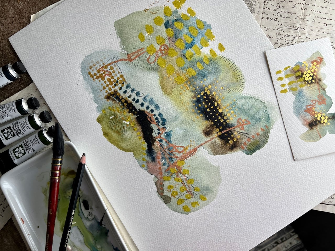
on our other ones to dry. Look how beautiful this is. This is with two of these Daniel Smith colors that are just over here
on my palette. This light gray color I used. This other one is this
mossy green looking one, which is this greenish amber. Look how beautiful those are. This might be one
of my favorite. This technique was a tiny bit different than leaving it
sitting on the ground. I actually pulled out
this brighter turquoise, which is this Grumbacher
turquoise. That's pretty vivid. It was so vivid, I got excited and then
decided to do more. Then I need to cut some paper up if I want
to do more because I've now used all my little
six by nine sheets. But I thought, wouldn't
it be fun to go ahead and just add more color to this. Here's a red one that's out
of my container over here. It's not that red, but it's this red. That is cadmium red purple. I was holding it,
I just wanted to show you this technique too, and working my way like this, a little more organic than
is sitting on the table. That is really creating a
stroke and a look that I love. I'm dropping water on my pieces here that
I don't want to do. Maybe I'll scoot these out of the way before I
drip all over them. I'm very sad that I've messed up these pretty
ones I just created. This, I almost want to just
be crazy with the colors. Maybe we could add
green gold on there. We may not like it
at all, but woah. I might not like it
at all when I'm done, but that's the
technique I was doing. I was holding my hand up. It is prettier with these
darker colors, these amber. See if I got one more
piece of paper here. I do. Let me just show you the
really pretty colors rather than the ugly colors. Got that paint on there and
look how much more organic and the different
line and stroke that we can get
holding the paper. This one's really
drawing very pretty. I need to let that dry a
little bit I want to go ahead and add in the next color. Let's do this green amber. I love this green amber. Look how pretty that is. If we get it close enough
to this grayish blue, then we can get the
color to blend a little, but I like it like
that right there. Let's leave that one there
and then we'll let these dry. Let's just do it to this one. I will come back and add
some splatter color onto here and I think
I'm going to do it in that grayish color. Oh, my goodness,
this is so pretty. Look how beautiful that is. Once we get our final little
mark making on there, that one may the be one I frame. This one is almost dry. Let me set that to the side. Get some little marks on here, some splatter. Oh, so pretty. I'm glad I kept looking
at my colors and playing before I left to
let them dry for a while. If I need to really let
them get really dry so that when I come back to
mark make on top of these, I've got plenty of dry paint
that I'm marking on top of. I could go ahead and do a
couple of these splatters. That's pretty the darker color. Let's see. I've got two
more that needs splatters. Don't be afraid to use
up your whole pad of paper and just keep
on making until you're just out
of all the paper. Then we'll come back tomorrow. We're going to come
back and mark make on top of these and
complete them out. This is so pretty. This one is real pretty. I love how it's drying. I don't know that I love this tiny bit of a
square right here. There we go. With some water, I just filled in the square. I might do that right
here too. There we go. Now officially, I'm going
to let these really get good and dry and then we'll come back and do
some mark making.
5. Mark-making: These are all mostly dry and that really
didn't take too long. I spent about 20
minutes playing on my phone just so
that I wouldn't be tempted to touch
these before they were maybe like 98 percent dry. There's maybe a spot that's
got a tiny bit left to dry but look at all these fun
pages that we have started. Now, I'm going to
just start taking these and doing the next step. I really love these blue ones and I like these greeny,
grayish, purply set. Basically what I'm
going to do is take each one and now start
marking with my graphite. I've got on a
Staedtler 12B pencil, you can use any set of
pencils that you want. I also have this little
create-a-color set that looks fun to experiment
with that has HB 2B, 4B, this is a 4B, has all these fun pieces
of graphite in here. I might also play with these, this is 6B, 4B, and 2B so that's fun these
are different hardnesses. I've been playing with this and here's basically what I do. I like to hold the pens at
the very back because it gives me a less controlled mark and I want to do just some yummy
mark-making right through the center of my piece, maybe even coming outside
of the paint some, I really like that. I don't want to be
so uncontrolled that I'm doing what I just did but I do want it to
just have yummy scribble, and that's just some of the
mark-making that I like. You don't have to do it
if you don't like it. I also like doing these
lines in my pieces. It just happens to be the marks that I've ended up liking. I have behind me, which I know I've shown you in other classes as I throw
another piece of art down, this hangs up right beside
it and I drop it every time I go to grab this. But the thing I like
about this is its little just samples
of marks that I have saved for myself
and every class you take, I'll probably show
it to you because I refer to this over and over. I'm using these little hatches
over here that I've made. But there's lots of
other little marks and things that you could do in these
little abstracts that would be really fun. I like these pretty
botanical lines. You could draw
botanicals on these, that would be fun. I do think I'm going
to do another class on doing abstract
backgrounds and drawing botanicals
on top of it because another fun thing that
I really enjoy doing, and I think you'll
enjoy that too, so that might be
the next watercolor one that I get together. But I like the graphite
with the paint. You can do this with paint pens, you don't have to
do it with pencil. You could use Stabilo pencils
which are mark-all pencils. You could use any pen or
pencil or colored pencil that you think you're
going to enjoy using to make your
pieces of abstract with. I've decided for these
to keep it to a minimum, make it things that I
enjoy working with, and so I have
narrowed it down to fine graphite watercolor and
just see what I can create. I really like that. I
like the abstract line that doesn't look very
smooth, it's very organic. I like adding in some of
these little hash marks and some little scribble that
looks like could be riding, but you can't
necessarily read it. This would be the perfect
opportunity if you have lettering or writing that you want to incorporate
into your piece of art. That could be a fun poem, saying, scripture, if
you like scripture. Anything that you want to say. It could be positivity words, it could be inspiration. That can be anything
that you enjoy, that you'd want to incorporate
into your piece of art. Then look at that.
At this point, I'd want to sign it
and call it done. Then if we had
like a little mat, here's my little test mat and we matted that
up to frame it, look how beautiful that
is all finished up. I'm in love with
that. Some of these might get framed. Let's go ahead and
set that one to the side and do the next one. I'm going to move my
watercolor palettes that I can stack these without
ruining stuff. Now, I'm going to take an
opportunity to try out these other graphite things just because I have them and this is the perfect opportunity to
figure out how to use them, how you might like them
in your art or not. If you don't like something, that would be the perfect
opportunity to move it into your I don't like
this art supplies pile, rather than keeping them and forgetting what
you don't like, which I do, I forget that. What I don't like
and what I do like, I stick it back in my stuff and I come across it
again and then I'm like, oh yeah, I didn't like this. If you don't like
something, move it out. I do like using graphite for
some reason in my art. I might go with a harder pencil, let's just try out something
with a more of a point here. This might be a 4B also, it is, but it's got
a bigger point. You don't have to do
scribble if you want to do something else
or some writing. Definitely, the time
to play with that. I just like it to
be implied writing, you don't quite know
what I've put there, but maybe I've said something. Oh, look how pretty that one is. Again, very pretty, ready to put in a mat, sign it right down
here somewhere. Love that one. All these green ones
are so pretty today. Sometimes I create
things I love and sometimes I create something
that looks like these. If you create a couple that you don't like
how the colors ended up, throw these two
over to the side. You don't have to use them. Let's use these little sticks. I never use these
sticks for anything. This gives you definitely a different line really
than the pencil just because it's a square and it's not going to retain
its sharp edge very good. They're fun for swirling around and just getting
a different color. Yes. That was fun. Maybe I'll do my scribble
over here off to the side. I like the scribble to come off. A little bit of
graphite off there, so you can see it really was some other supply
that I was using. Really like how the drips
ended up with all this. This finer pencil gives us a much finer mark than that thicker pencil,
which makes sense. But until you start
playing with this stuff, do you really know
what it's going to do, how it's going to react, if you're going to like
the mark it makes. Some of it's common sense. I've not been doing
art for a long time, but getting all these
different supplies from that supply sketch box
subscription I had, really introduced me to lots of supplies that I
wouldn't normally have purchased or thought about
or experimented with. I just wouldn't have
done anything with them. Until you do projects like this, you may get that stuff
and just set it in a box and forget about it, which I did that for awhile too. I'd collect it. Look how pretty that is. I'd get excited to see
what was showing up for the month and then I didn't
do anything with it. I'm using these art classes
as a good excuse to get these things out of my
boxes and try them and play with them and see what
they do. I love that one. The green set, definitely
beautiful. I love that. In case you're thinking what
were those colors again. These were Sennelier, and it was cobalt green
and chromium oxide green. Those are beautiful. That's what created
these yummy colors and I like how vivid they are. The nicer quality
watercolor that you use, the better vividness and
saturation of color you'll get. This is a sample that I did in the watercolor sampler class, where we talk about different
types of watercolor. It started off with the very super cheapest
one there was, and worked my way up
to the nicer grades. This right here was the Daniel Smith's
Sennelier realm where it was super saturated
and a lot of pigment. In doing this, I really want all that
pigment because I want the variation from the
very light to the very dark, and I want to see
in the splatter a very defined color and
I just want it to be very strong and really
adding to my piece of art, rather than it being
something light and fading into the
background and puny. Which that's my
own personal goal for these pieces of art, that does not make
it wrong if you have a different goal for
these pieces than I do. You might like them being in
the background and soft and maybe showing off some
type of scripture, poem, or inspiration that
you particularly love, and that would be
perfect for that. Different strokes for
different reasons for why you might
be doing stuff, and different reasons
why you may want it less saturated or
more saturated. But these I really wanted the
watercolor to be saturated. I wanted that to be part
of what I was doing. I wanted it to stand out. Look how pretty that is. Really pretty. I love having a little piece
of mat board which this will probably end
up really dirty eventually that I got from
Michael's, real cheap. But then I can look at
things and frame it out and see, is it finished? Do I love how that frames out
with how beautiful that is? I love it. Glad I went back and did
some of those in that color. That one obviously was not 100 percent dry when I stacked
it, but that's okay. You can definitely experiment different supplies on
every single one of these. I want this to be a series, I want the series to
have some cohesiveness. I don't want it to be
everyone so different that it looked like a different series
that I was working on. I want them all to be
like if I wanted to frame them and hang them
all in a big wall or take them to a gallery. I want all of these to work
in one big cohesive series. What you usually want to
do then is have elements that are similar supplies, maybe different colorways and different shapes or whatever. But you could pull all of this together as one
particular series. Look how pretty that one is. Then sell these all as
part of that same series. That one's pretty, I love that. I feel there needs to be a
little more right there. There we go. Sometimes you got to hold it back and look at it. Very pretty. I like that one. This one is the one
that still maybe a tiny bit wet and you can do some
of these when they're wet. Sometimes I'll let them
get dry enough and then let my pencil smear some of that paint around
a little bit. I like that. It doesn't always have
to be completely dry. But with the graphite, I did find it was easier
to come back and not smear my drops and stuff, if it were dry and I wouldn't
put my hand on them. I wanted to come up with three
different elements. For mine, I'll
have the scribble, I have the lines, and then I have the
scribble writing that looks like writing, but it's really not
saying anything on mine. Three elements that you can
do for each of your pieces. That's real pretty,
I love that one. To have a little
series like this. Whatever your three
elements are, repeat the three elements
with each one of these pieces to create a series. Maybe yours is botanicals, maybe it's circles,
maybe it's squares, maybe it's little cross
hatches like X's or crosses, maybe it's long lines
with crosshatching in it. There's so many ideas
that you could do, but I want you to pick
three mark-making elements and you can pick
the same three as me. I don't mind a bit. Use three to do
your whole series. If you really like a colorway, make more than one
of that color, because every one of
those look different, like each one of these
that are the same color. Look how different each
ones of these looks, but you can easily tell that
they're of the same series. I love that. Am I
done with that? Maybe I want a little pencil
mark out here to the side. I feel like I need
something over here. There we go. I like that better. You could do your
pencil mark first. If you like to scribble on
the white paper and let that be your guide as to where
you put your watercolors, that's another idea too. You don't have to scribble last, you can scribble first. For these, I've liked
scribbling last after I put the paint on and let the paint do what
it wants to do. But if you're scribble first, that could be your guide
as to where you're painting and what
colors you pick. There's no right or wrong way
to do something like this, and as you play and
practice and figure out your own marks and lines and preferences and color
likes and things., you're going to just
end up doing lots of fun things as you go. That one's pretty.
They'll change. As you do more of these two, they'll change a little
bit. I like that lot. For each set of
these that you do, you could come up
with different marks and different pencils and different colors and really
make each set individual too. These would also make
really nice cards. You could do this as
the cover of the card, and then that would be a really beautiful custom handmade card that you could send to somebody. You could easily
change the colors out and the mark-making and
the ideas and things. You can easily change
those out for each season.
6. Finishing mark-making: [MUSIC] I've got next one
in and I'm just going to again work with my lines, trying to be a
little less perfect. I want these lines to really be almost as if I did
them with my left hand, not my right hand. I don't want anything
to be perfect about it. [NOISE] I didn't want the writing, let's go to this 2B to be
a little more fine maybe. When you're scribbling
it, you could almost scribble backwards
too and make that look like words and it'd be a little
different. That'd be fun. This is the one where we
use that Daniel Smith, one of these genuine colors, this red fuchsia genuine
and this kyanite genuine because as I move this around, I can see some shimmer
in that paint, and that's what's
nice about these two, is they're real rock that has some shimmer to it that
they broke up to create these watercolors
out of and it adds a really pretty slight
shimmer to your paint. I love that about that. These are the ones that I did inspired by my original
piece and they're not exactly like the
original and they may dry up a little bit, or I may have used a different
color in here rather than the brighter one for
especially like this one. I still love this one. But I do like some
of these others, and I think as I add my
marks and stuff to this, I really like them
even more because it's the mark making that
make these so fun to me. The color itself is pretty, but then you get some of these marks in here
and then you're like, that is much nicer. [LAUGHTER] Or it did add
that extra bit of wow, or the pizzazz or the extra
oomph that it needed. It just added the extra interest that you're looking
for. I like that. Then maybe we'll go back
with the 2B over here and go backwards
with some scribble. This would be really good, especially if you had some
interesting writing to do the very specific
something there, like a poem or a saying or some inspiration
thing that you love. This would be the perfect
time to do those. We can even do this with
our non-dominant hand and really get those lines doing unexpected things because you'll have less
control over it. The reason I like
to hold it way here on the back is to
eliminate the control. I don't want it to look like something I did
way up here that's really controlled
like my mark making. I want it to look more organic and uncontrolled and just very interesting there in the color where you have to look a little closer to almost even
see it. I love that. Then these two would be really
good if you did botanicals or lines or drawings.
I love that one. Let's just for giggles because those are the
ones that I picked to do. But on our piece of paper, we could pick out
something different. Let's see. Let's just pick out. Maybe I like lines that
are doing this instead. Then maybe I still
want some scribble. I don't think I
will give that up. I do like the scribble,
but my three marks, my three things
that I like to do, don't have to always
be the same three, but I just like the three I
picked [LAUGHTER] originally. That was fun right there. But maybe we want
three other things and let's just see
what that could be. I like the lines, I like the little
t's or crosses, or x's, whatever you
want to call that. So we could certainly
do that, lines of that. We could have done some
circles, some squares, triangles, stars, there's all kinds of stuff
that we could do. Maybe I like little
circles over here, following the color, that could have been fun. If I'm using a paint pen, I like white dots. Dots are real fun so maybe
a white paint pen or dots. That's real fun. A little bit
different there. Let's see. Let's do this one in a paint pen just to see what that
would look like, and this might be a case
where you work with gold. Gold is fun. I've got some gold paint pens, or we could do white paint pens, so let's see. Let's do gold. Maybe the fine one. See that's completely different if
we do still the scribble, which I like, I'm
okay with that. I'll keep the scribble
and everything. [LAUGHTER] That's fun, and then I might use
the bigger one for some dots because it's easier
with that bigger point, and we might like some lines. I could do some
lines in the gold, and that would be really pretty. That's fun. You can
see where I've done those when the
light shines on it. White paint pen is going
to be even brighter, but that's fun to
do something subtle where you're from
far away seeing the color and then you get up close and seeing the
details and if it's gold, it'll shine in the light. Super fun experimenting with some different elements there. Maybe some more lines over here. Because I can make those
go out a little bit. Maybe some more dots. [NOISE] It might contain the dots in a certain
little color area. Super fun. Maybe a few more dots in here. Just judge it based
on your piece. Do some little marks. Look at it, hold it up. Look at that shine on there. That's really pretty. That would be like
gold paint pen. Let's pick a white paint
pen on one of these, or a black paint pen. You don't have to do
any particular color. Maybe you like the black and
we could do black paint pen. I'm going to do white.
Am I going to do white? I think I'll do white.
That's what I got here. Let's just do the white. [NOISE] Again, holding it far back because I want this to just be way more organic. Now we'll say picking white, all of my marks are
going to have to be right here on the piece because, let's do some dots, we're doing white paper, so it's not going to show
up outside the line. That might not have
been the best choice. That's something that, as
you're working through, you're like, oh, yeah. I see that now. [LAUGHTER] Whereas
when I was thinking, let's try a paint pen, I wasn't even thinking about that. Fun with the dots.
Let's do some lines. [NOISE] In a case like this
where I might still want some line going off [NOISE] the page off
of the color here, I might still add some graphite. [NOISE] That was fun
there with the lines. With this, I still might
add some graphite because I do like having lines
outside of the color. [NOISE] That's fun. Very interesting fun. Different way thing
that we can do there. Look here. I got
another one of these. If we're doing this, [NOISE] just seeing what else I've got back
here, this is white. Could've swore I
had a black one. Oh, yeah. Here's a black one. Black, we could do this
with a black paint pen. Do I like it that
way or that way? I like it this way. I do
really like this though. You could do this with paint
pen or we could do this with a Stabilo pencil,
that we could have done. I like experimenting with
our supplies though, so I do like that I'm
using a paint pen. I might like some
dots or the black, especially I like to
do botanical drawings. I might have done a little botanical instead
on top of this. That would have been pretty. This has that red fuchsite in it because I can see the pretty sparkle of
the paint in the light. I don't know if it's even
going to show up here, but it is really pretty to have that bit
of sparkle in there. That's just a delightful
little surprise that you weren't even expecting as you see the light hit it.
It's real pretty. [NOISE] That's fun with those lines. We could be a little
more whimsical. There's no right or wrong here. Then once you find something that you're like,
oh my goodness, I love this technique, put it on your
little idea thing. But that's actually pretty fun now that we've got it in there. If we were to take our little
frame and frame it out, that would frame out really
pretty as a piece of art. I don't know about you, but
I had the best time today creating all of this yummy
abstract art that we created. I'm definitely looking
forward to seeing what you come up with when you are painting some of
these for yourself, trying out some of
these techniques with the watercolor and
using the brush and rolling the brush along
rather than just straight painting and seeing what
colors you come up with. Some of these are so very yummy. My favorites being a few of these and the darker
color family that we did. Just love these. Now I'm feeling like I need to frame a few of these because
they're so beautiful. I'm just definitely in love with this colorway and the
blue-green colorway. These are so beautiful, they just speak to me. I want to hang them up and look at them and be inspired by them. I love the rolling the brush, letting that dry, doing the little
splatter of color, and then coming
back at the end and doing some yummy mark-making. This was a fun class. I hope you're going to enjoy
creating some of these with me and experimenting
with your mark-making. If you choose to do
different marks than I did, perfectly okay. I showed you a lot
of different options that I have put up on my
board here behind me. We did a couple of these where we did some
different marks just to get outside
the box a little bit. But for these, there
was certain things, three elements, that's what
I want you to pick out. Three elements that
you love yourself, that you want to
experiment with and see what you can
create as a series. Here's one of the
ones where we did some different things
and where we did the gold pen on there with some different elements
and with the paint pen. I want you to experiment
with three elements. After you do the paint
and the splatter, what three types of marks
are you going to make? Are you going to do a scribble? Then what other two
marks can go with that? Whether it'd be dots or rows of lines like I did or
scribble writing, or if you have beautiful
handwriting and you like quotes, maybe put a big quote or a
scripture onto your piece. [NOISE] That would
be really lovely. To be honest, my
real handwriting looks like my scribble writing. I'm going to have
to practice doing some script myself and practice my handwriting so
that then I could put some inspirational quote or some words or something
that I really love, or a scripture or
something in there, maybe a poem because there's
some poetry that I love. Then I can put some
of that on mine too. But for the moment I'm just doing scribble that's
not readable so that it could basically
say anything that you imagine in your
mind it's saying. [LAUGHTER] Definitely
come back and show me what you create
in this class. These are so much fun, I just kept on going. You can spend days and days making these
and then you have some beautiful pieces of art
that are ready to frame up, sign it down here at the
bottom, frame them up, take them to a gallery, and sell some of those babies because
these are so beautiful. I could definitely sell some of these and frame
some and hang them. Look how pretty this
one would be framed up. This green set is
my very favorite. I might just take it up to the framer and let them frame up a set of three for
me from my own house because every single one
of these are beautiful. This is my very favorite. I love this colorway the best. [LAUGHTER] Come back and share with me what you do
with your projects. Can't wait to see them. I will see you next time. [MUSIC]
 DENISE LOVE, Artist & Creative Educator