Transcripts
1. Introduction: Hello everyone. I'm Denise Love, and I want to welcome
you to class. In this class, we'll be
exploring the beauty of some Japanese
watercolors while creating a collection of abstract
landscape pieces tied together by
color and marks. Whether you're a seasoned
artist looking to expand your techniques or a beginner wanting to explore
your creativity, this class is designed
for everyone. Through the process of
some intuitive painting, we'll unleash our imaginations
and let the colors and marks guide us to create unique and expressive
pieces of art. Let's grab a watercolor paper
and some paint brushes, and let's get started on this
creative journey together. I hope you enjoy this class. Let's have some fun creating
some beautiful art.
2. Class Project: Your class project
is to create some of your own abstract
landscape paintings using some of the techniques
that we taught in class. I can't wait to see
what colors you picked, what marks you made, if you used any stencils, and how your pieces turned out. Come back and share those
with me in the project area, I am excited to see what you're creating. Let's get started.
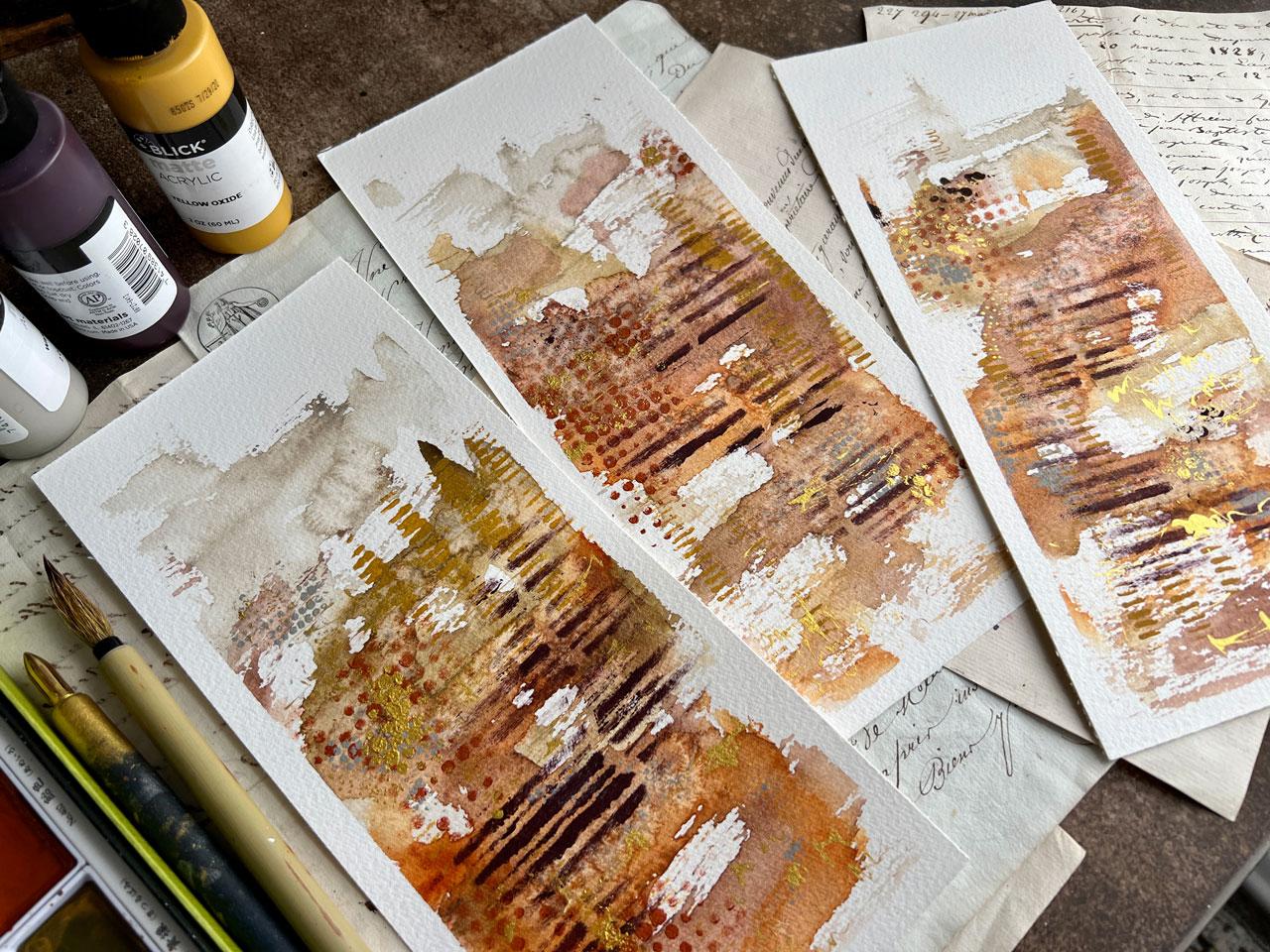
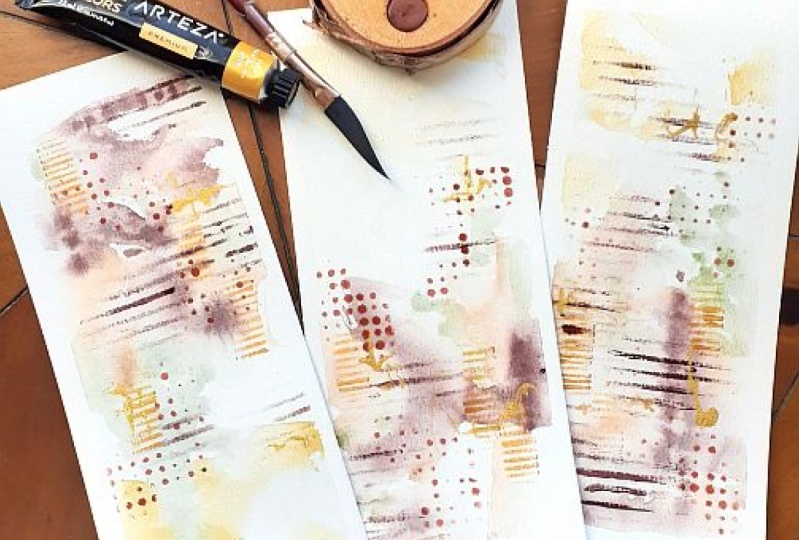
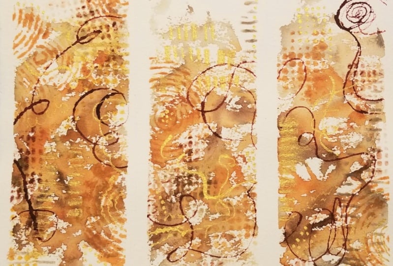
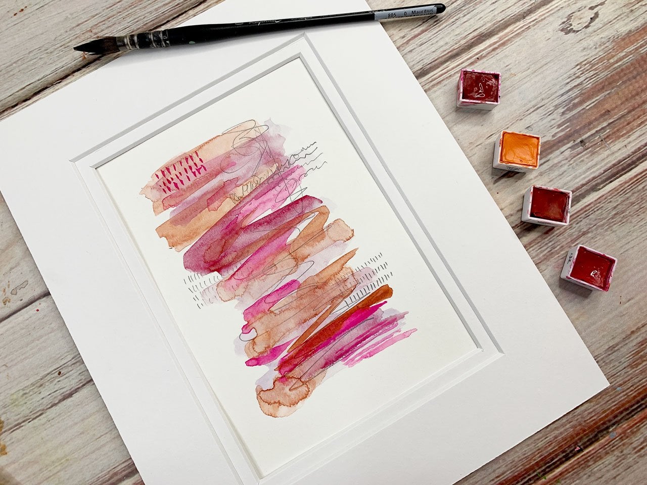
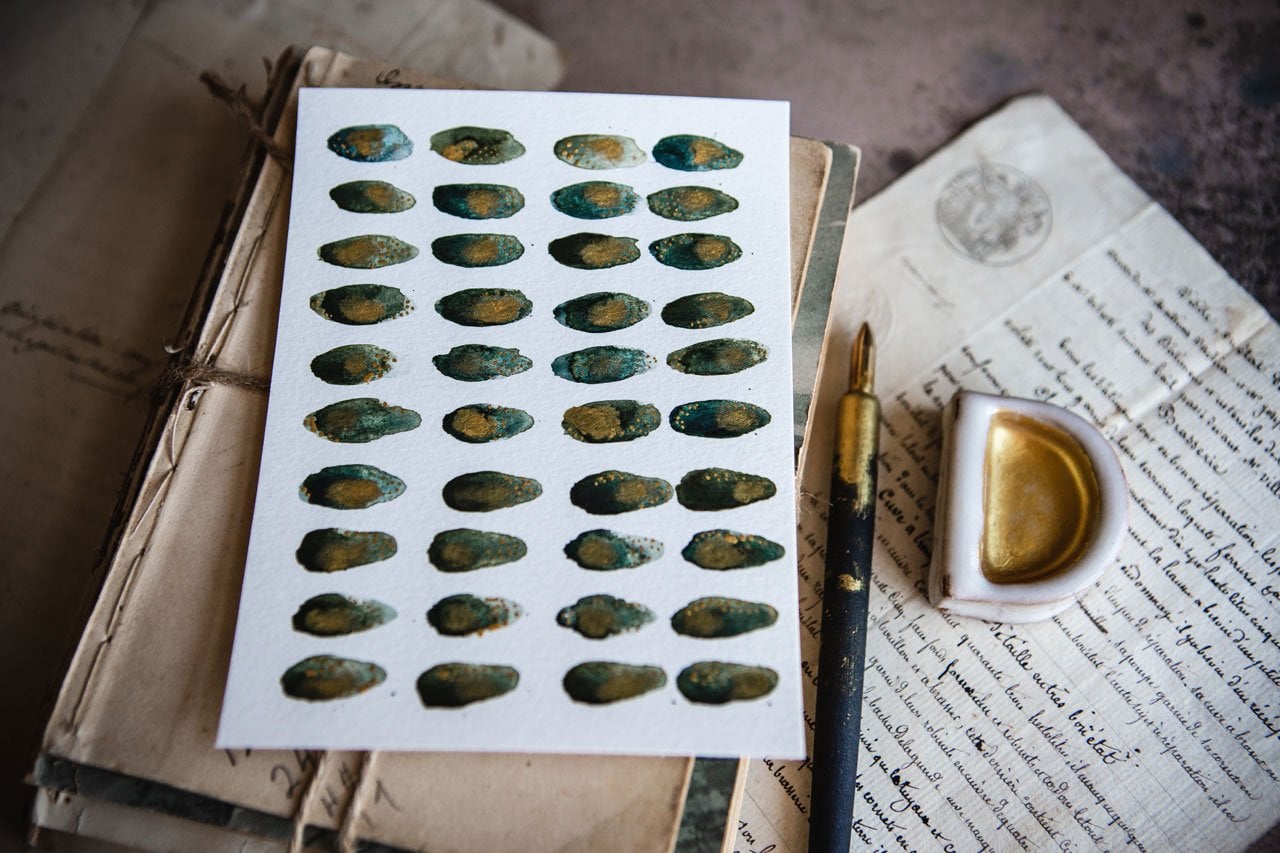
3. Supplies: Let's talk about
the supplies that we're using in class today. I'm showing you how I made these super yummy
abstract landscapes. I like that they're
tall and skinny. They're a little different
than what I might normally start creating with, with the shorter pieces, because normally I'm
creating on half a size. These are very easily, so would be very interesting, framed as a big trip tick in a rich frame maybe with
a gold mad or something, I can see that it's coming
out really rich looking. I'm going to show you
how I've created these. You might play in
some different colors than I chose today, was always like to
experiment and work outside my normal color
palette tendencies because you learn
new things when you step outside your
own creative box. I'm playing in a color
palette that we've never played in before with
some paintings and stuff. These came out so gorgeous, that I can definitely see these hanging and being
in a place of prominence. I like that it's a triptych, so it made a bigger statement. What I've done is
today I'm working in the Kuretake Gansai Tambi
Art Nouveau watercolors. Love these Japanese watercolors. This is a newer set
that they have of some beautifully muted colors
that they've put together. We've used this whole row here at the bottom
to create these, and they are just
yummy [LAUGHTER]. I love the Japanese watercolors because these are different binder than
regular watercolors. They're a little bit a mix between a watercolor
and gouache. They're very heavy
pigmented and they dry a yummy matte dryness. I love these. That's one of my
new favorite sets and I use them every time I can. I love getting obsessed with a new art supply
because I have not rode that way for a while. I'm creating today on
some Canson Heritage, this is the 10 by 14 pad. I've just cut these into
thirds for our pieces of art. I'm also using to paint with my number 4 Winsor &
Newton calligraphy brush. I love using this brush, and the way I use it is a little different than its
intended because I think you'd probably use
it straight up and down or as I
use it to the side, to rub paint on in a
different serendipitous way. It's not as controllable
as if you're painting with a fine paintbrush. I love that unpredictability
of painting in that way. I love this brush and
this is the number 4. I'm also using my cure, a talky, sorry, my Kakimori
brass nib dip pen. You can use any dip pen, but I like using this
for marks on top. Doing that with my gold
Micah ink by Kuretake. Then I am after we paint
some watercolor on our page, I am working with some stencils. I'm using some acrylic paint. I just pulled out colors
that I thought went with our color palette that we
pulled from the paints. I'm using the
Arteza Mars orange, I love that color. I'm also using some
of these acrylic blick paints because I'm using a matte watercolor and I thought these would
be perfect for that. I'm using warm gray purple
matte and yellow oxide. I'm also using my
Kuretake paste. I use the ink to draw lines
and fake words and dots. I use the ink for when
I'm doing stencil work. If you can only have
one or the other, I'd go with the ink, but I like having both of
them [LAUGHTER]. Then I'm using a few of
my favorites stencils. You don't have to use stencils. I've all of a sudden become really obsessed with stencils. I go in and out of things
I like to work with. With the stencils, I'm
using an artist sponge. A lot of these you can do any stencil and sponge you want, but I love these because I
can cut them into fours. They're fun little triangles. Then I'll always
have a dry sponge handy to do my stenciling. I have several of
these and when I use up or forget to
wash out a sponge, I can just get another one
and cut them into fours. It's been the best
for stenciling. Favorite stencils.
I love this one. This the stencil
Girl stencil S376. It's yummy little lash marks. Also love this stencil here. It's also a stencil. Girl's stencil, let me get the right
direction so I can see the words hello
[LAUGHTER], S227. I think it's called
corrugated lines. Love that stencil. I also have two Tim Holtz
layered collection stencils and these are the
half-tones circles. I like having this in
the two different sizes. We can lay them on
top of each other. I can use this for
smaller pieces, this for larger pieces. There's lots that we
can do with these. I love those stencils
and then also love my punchinello and the
half-tones circles is like a punchinello but
with different size circles, so I love that. That is the supplies
that we're playing with in class today.
Let's get started.
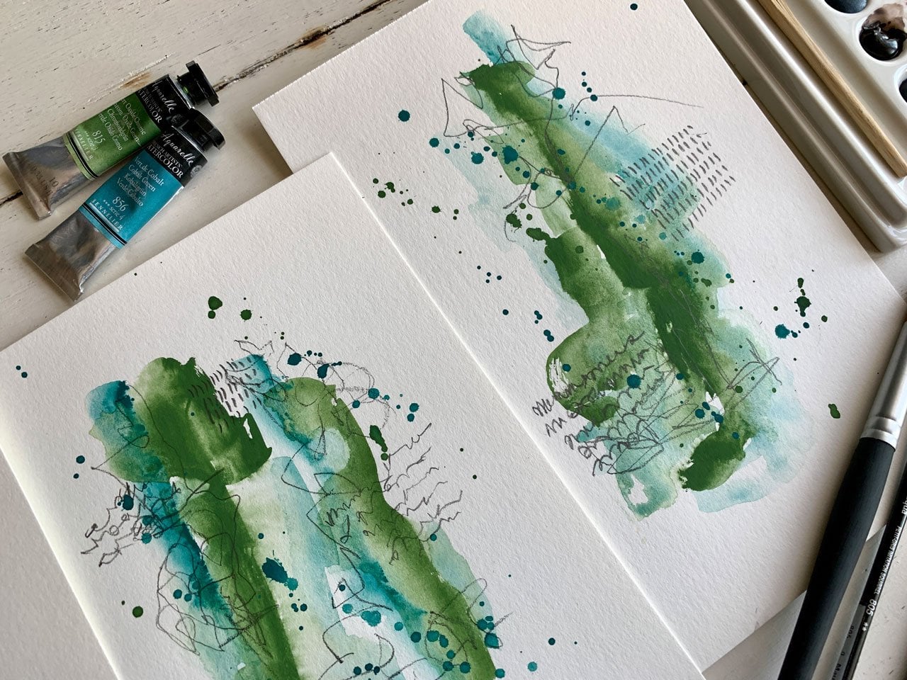
4. Layering Color: Let's get started on our magical landscape that
we're going to create. I'm just using one
piece of this Canson, 140 pound cold press, 100% cotton paper because I
like working on 100% cotton and I do encourage you to
practice on the good paper. The paper that you're like, that's the good paper, that's what I want for my
extra special pieces later on. I don't want you to get in the habit of practicing
on cheap paper, and then never practicing on the good paper because then when you go to use the good paper, whatever you're
trying to do is just not going to turn out. I want you to know how that
paper reacts to your paint, what it does as you're working on stuff and I don't
want you to get surprised when
something doesn't work out because it wasn't the paper you were
used to working on. To do these yummy, I'm going to call them
magical, atmospheric, abstract landscapes,
I'm going to use my Winsor and Newton number 4 bamboo
calligraphy brush. What I like about these brushes is they are unpredictable. They give you some atmosphere in there that maybe a regular
round brush doesn't do for us and I like that
unpredictability of the way this puts
the paint on the paper. I use it to the side and I'm moving around and I'm
scrubbing back-and-forth. This has become my new
favorite way to paint, so I thought why not paint some landscapes with you today? And some of these end up looking a little bit like cityscapes. Some of them look like the
mountains in the morning with the fog on the tips
and things like that. You can get real creative. You can do these any
color you want and come up with some
super cool abstract. I'm going to be using my Kuretake Art Nouveau Tambi
Gansai watercolor set and you can see I
get a little bit of some contamination in my
colors as I go back and forth, but I'm just not
worried about it. These are my new
favorite watercolors. They are so beautiful. They're slightly muted. They almost react
like a gouache. They have a different binder in them than watercolors
that you might be used to and they've got a
nice heavy pigment in them and they dry matte. They're just so beautiful with the colors and I thought
these are perfect for today. Then after we paint
our landscape on here, we'll come on and do some
stencil work and stuff. I'm going to take a
little spray bottle, just activate the colors. I've got a little scrap
piece here that I'm going to just practice with and say, what colors do I want? I'm almost thinking perhaps
a bluish-greenish landscape. Let's just look at these colors. I've gotten number
601, number 502. See now that's a little
brighter than I was hoping. Number 506. Let's see. What's this 501? See, now that's fine as a little brighter
color on there. This is number 504. Look at that yummy color there. I know I'm loving that 601, I love this 506 and
that 504. Let's see. And these just dry
so beautifully. Then we've got some
neutrally colors. This is 406. It's kind of a tan. Then we go over more towards
this brownish-orangey color, which is real pretty. We've got orange. I mean, maybe that's
the landscape you want to create today. I'm just sampling out. Look at that color, number 403. It's got the colors
on the bottom side, but now they're all wet so I
can't really pick them up. Now, what do we want to create? Do we like this
brown-orange tan set or do we like this
blue-green set? Almost feeling. Or we've got these
yummy purples. My gosh, so many yummy choices. This is crazy. I do particularly love the
pink-purple mauve set there. But I want to do
something different and I was thinking blue-green. But I don't know, these
orange browns are really pretty for atmospheric
landscapy. Let's just do it. Let's
just do this color way, which is not what I intended, but let's try that
for our piece. When you're thinking of
atmosphere landscapes, I'm thinking of mountains. I want these not to be just painted straight
with a mountain. I'm thinking as I go
back, things get lighter. I might consider possibly
starting with a lighter color. What I've done is I've
cut my paper into, look how pretty that is, you see as I come to the side and I work with
the other pieces of paper. We're just continuing
this like a triptych. Because what I've done is
I've taken that one 9 by 14 sheet and I've just cut it into thirds and
I've taped it off. I'm just thinking, look
how gorgeous that is. You can almost see
the rise of the Sun probably coming off and we can come down and work that color
a little bit down here. This is such a pretty
neutrally start. Look at that. I love when things start
out and you just know, like you just feel it. And every time I pick up these paints because these
are new to me paints, I've not had them very long, but every time I pick them up, I'm like best buy ever. Now I'm thinking because I tested out this little
row of colors here, it's the light top
brown, orange, deep orange but I'm
just going to go down the range because they're yummy. I'm not going to let each
layer completely dry. Something I can think
of really quick before, and I'm just going to grab a random paint brush for this, but what if I want some
pretty blooms and texture? Before each layer dry, you could come back in
and start dipping in a little bit of water
on the damp paint. It can't be super wet. Once it's already dry, it doesn't quite do the same. But if I'm thinking I might
want some texture in there, I could come back and
dip some water as I'm working because as I add
more and more layers, those are going to dry
maybe before I get to them. Look at that. It's almost
like I just created a tree out there
in the mountains. I love working on multiple
pieces fairly quick. I do want these colors to have some areas
where they blended. I don't want each layer
to be completely dry. I want them to work into each
other also. Look at that. But if we work on light to dark, we're going to create those layers that
we're hoping to get. I like it being a triptych
because if you hate one, you have one or two others
that maybe you love and if you love all three, you can hang it as
all set because, man, they're gorgeous when you work on just a whole little
series like this. You're just creating that
mountain that keeps going. I'm just very lightly
working that color in. I'm not thinking
very hard about, I want this orange here, there. I'm just going with the flow. Doing this like I do my
intuitive paintings, like what feels good, where I want some of
that color to land. Look how pretty that is. We're going to go with this last number 403,
this darker color. Do we want some of
this to dry a little? I think I do. Let's dry
a little bit of this. I do encourage you let the
piece to dry naturally, but because I'm filming, I want to go a little faster. But if you let them
dry naturally, the colors will do
some amazing things as they sit there longer and longer and move around
and do what they do. But I do want to
keep going here with my landscape as we're filming. Look at this gorgeous color. Oh my gosh, most gorgeous color. So beautiful. Then
on top of this, you could stop right there. That could be your landscape. But my goal on
this is to then on top of this do some
stencil work and then just see what we get, and maybe do some gold. It's a little easier
if you can move this around as you're going, but I want you to be able
to see the whole process. I'm not moving it around on you, but these are so pretty already. This is not my normal
color palette either. You know I like a
little bit brighter, maybe pinks and
blues and oranges, or maybe pinks and reds, or maybe blues and greens. This is not really my
normal color palette, which I absolutely love that. I've got that third
layer on there. I do this fast. Now we can say,
do we want to add any water texture blooms? Do we want to go ahead and
tap some of that texture in there and just see what it does? I love things that bloom out and just add some extra layers
of texture in there. You know what else we could
do? We could add salt. We could try salt if you wanted to see what that would do. A lot of times you add salt
to the regular watercolors. Because these are the
Japanese watercolors, they use a different
glue binder than what we normally would have
on our pieces here. But we could very easily
just test it out. Maybe I want some salt in there and just see does
it react the same? Is it got to give me
a different look? What are we going to get there? I'm just using some
very large sea salt. Just some great big granules. You can experiment with your
salting of your pieces. Little salt will give
you a little texture. Bigger salt will give
you bigger texture. You could do some little tryouts and see what does this give us? This is just great big
granules of salt and I scrape these off of here and put them
back in my container. I don't even care if I've got
some dirty salt in there, but if you like the color to be pure without rings of any
other color in there, then definitely have a
different little container. I hate just sweeping it
off into the trash can. It's not wasted if
we use it again. We don't have to waste it. Now we're going to let this dry. I want to come back and just play and do some
creative stencil work, which you might not feel like that looks
like a landscape, but I feel like it
just adds to the fun, playfulness of our
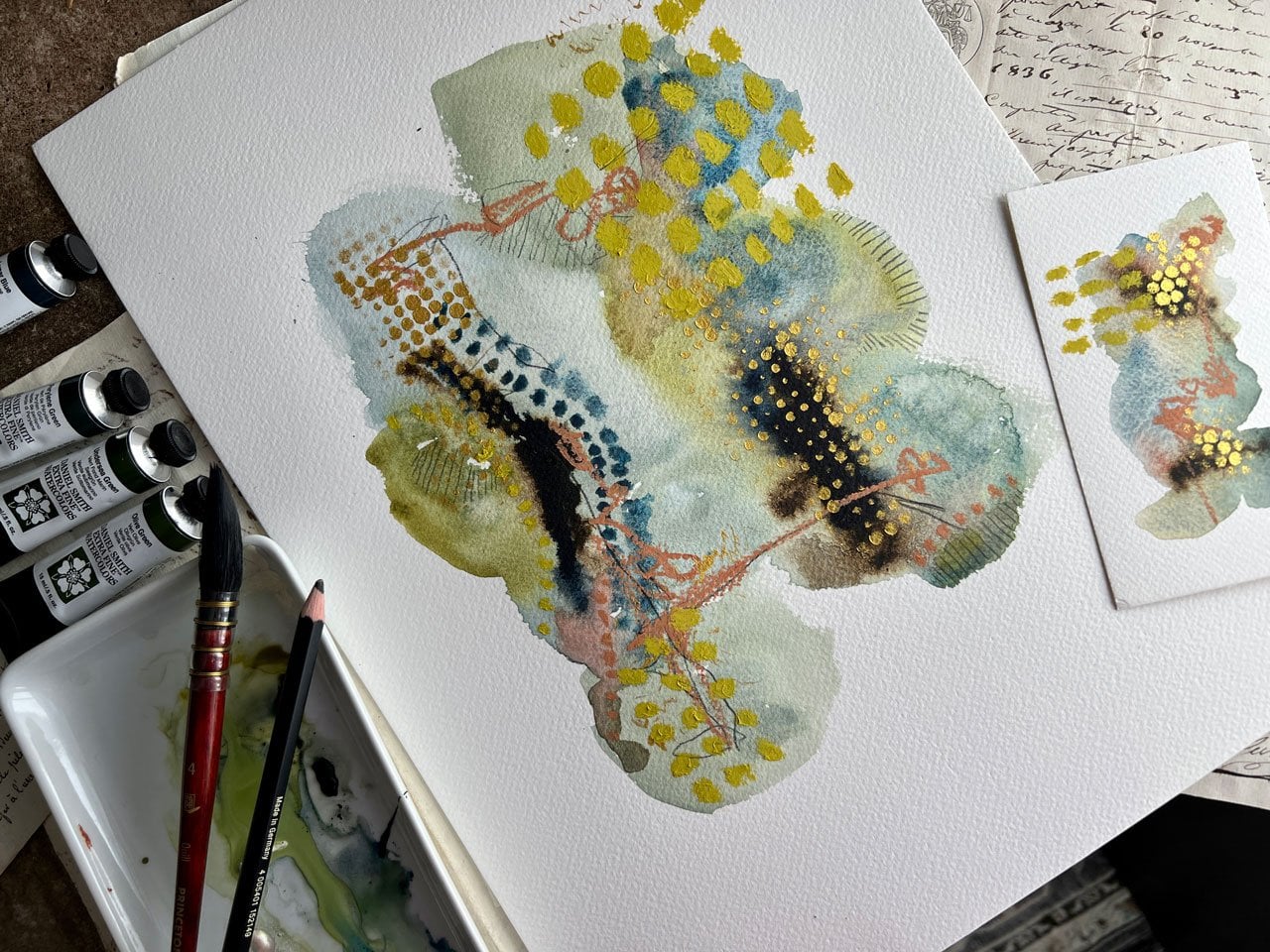
abstract pieces and I'm going to do that. I'm going to get out a few
of my favorite colors of acrylic paint and some of
my favorite stencils and then I might get
out some yummy gold because I do love gold details and just
see what we can create. We're going have to let this dry completely and then we're ready
to move to the next step.
5. Mark Making & Stencil Work: I've let this dry for a
while and I'm going to take just an old
card or a gift card, something that's stiff
and you can just very gently pull that salt
off of your piece. I can see that some of
my salt was dirty salt. If dirty salt bugs you, put your dirty salt in a different container
because you can see different
colored salt there. Clean salt will just pull
it and give you white, dirty salt will leave
color there on your piece. It doesn't really bother me. I'm just doing this
as an extra texture, with some stencil work. In my stencil work, I think that I'll
just add to it. I just wanted you to
be aware that it does that so that you're
not surprised. Then I just push
that off my table into the salt container or a lid and I've got all
of it off so I'm ready. You can see how that salt
has colors in it now. [NOISE] You can put that in a second
container if you need to. I just don't want
you to throw it away because it's useful. If the salt's too little, it's probably done with, but if the salt's
big enough, save it. Now that we're at this stage, I'm looking at it
and I'm thinking, what yummy marks and
stuff do I want to do. What stencils might I
want to use because I've gotten obsessed with
stencils lately. I really love this stencil here that's got these
hash marks on it. This is the Crafter's
Workshop and this is stencil. I got to get my little
magnifying glass out here. This is TCW456S. I also love this Tim Holtz
half-tone layered stencil and I've got this in
a couple of sizes. This is super fun. I actually think larger piece, larger stencil, but I do like
this as a layering piece. Another really favorite of mine is this one with
the little hash marks. This is StencilGirl
Products S376 Shaw. Think you have to
put that S in there. I don't think you can find
it without those letters, but that's a nice fun #1. There's one more that
I was thinking, maybe, and I keep a lot of my
favorite stencils up here behind me on this shelf
so they're easy to find. I've got lots of yummy
layering stencils. There's one one
got lines that I'm wanting and I may have put it down in
my stencil container. Oh no [LAUGHTER] I
set it right there. [LAUGHTER] I like
this uneven lines and this one's also a
StencilGirl's stencil. This one's S227.
I love that one. I'm loving this one. I love this, I love the
half-tones. I love this one too. Let's do this. I've got
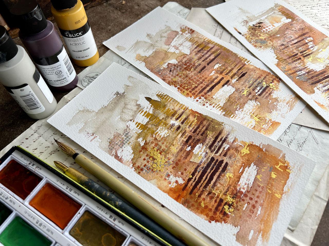
some yummy Arteza paints. The reason why I'm pulling
the Arteza's out is because we've got so
many color options without doing lots of mixing, but you can certainly
mix your own colors. Any stencil, any
paint that you're loving at the moment
would be just fine. I also love some of these
fusion paints that I have, which are mineral
paints and they've got some colors that I've got that I think would
work well with this. This is a sage green, there is a darker
green that I've got. I want the green added in there, maybe, maybe not. I want to go and get all of the colors of these fusion ones because they're mineral
paints, they dry matte. I really like them. Another set of
paints that I really love are these
Blick Matte paints. These are matte acrylic. This warm gray is a good color. Now that I'm pulling those out, I'm thinking maybe
some of those. Let's just see what I've got. This orange is too
orange I think. I do like that. I also love this burgundy. If we wanted to throw in a yummy burgundy
on top of there. What do you think of that? I'm thinking maybe
this color range right here could be fun and
then gold on top of that. How about that one? Purple madder. I'm thinking purple
madder now that we've got these
colors coming out. I also have this yellow oxide. I'm loving those right there. Here's our choices that I've pulled out of my paint
drawer that's beside me. Shut the drawer and move
these out of the way. I've also got some artist
sponges and I love the artist sponges because they come as these
little circles, little artist sponge,
and I just cut these into quarters with
a pair of scissors. What I love about
that is I want to use a dry sponge when
I'm doing stencils. Dry stencil, dry sponge, and then thicker dry paint. It's harder when the
paint is too super thin. I'll put my colors over there. I've got a little bit of
pallet paper over here. Now let's just start doing
some yummy stencil work. I'm feeling like I want to do some of these little hash marks and these could go either way. Let's see. I'm feeling
like maybe some of this yummy oxide perhaps
because it's like the gold. Way too much paint. [LAUGHTER] I like a
nice fresh dry sponge. When you have these and you
cut them into fours now you can just grab a
sponge for each one. Then I just throw these
into my cup of water until I can go wash
them off so that I can keep using
these over and over because even though
they get dirty they're still great for continuing
to use for stencils. I love that. With the stencils, I like it to be a little
bit serendipitous. I don't want it to just
be the straight stencil so I will, a lot of times, put the paint on here and then just dab or you
can sometimes rub depending on what paint you're using and then move
that stencil around. Look at that. Then
do some more in a different area
so that it's got more than one area of
that stencil perhaps. You just judge and
play. I love that. It's very subtle, it doesn't stick out until you get closer
and you're like, what is this detail
here that I'm seeing? [LAUGHTER] I'm loving these. Just adds to the abstractness and beautifulness of our piece. Then sometimes I'll
just go through and rub the paint on the stencil and
then I don't worry about it. Once these get too thick, I could go soak them in water and then scrape the paint off or I might replace the stencil, but you can paint
a lot with these before it ever gets so thick
that you're like, huh. What do we think? We've got corrugated lines. We've got half-tones. Are we thinking maybe
gray half-tones circles? It'd be something that
shines up underneath. How about that.
Little gray paint. I can't forget the orange. Wait, do I want the
gray or the orange? Let's just put some
colors out here, then they'll be there
when we get to them. See how pretty that orange is. Oh my gosh. That's
a pretty color. We've got this purple madder, let's go ahead and
put that out there. Oh, look how pretty
that color is. Oh my gosh. What
do we want to do? I'm almost feeling
a half-tone orange. What about some
half-tone orange? [LAUGHTER] I need a
little vote button and you need to vote
with me and say, oh, that one, or no, not that, don't go there. [LAUGHTER] Like we're watching a little horror movie and
you see the girl go in the house and you're
like, no don't do it. [LAUGHTER] I had somebody
tell me on one of my videos that they were
screaming at the screen no, not that one, but then
when it was all done, she's like, oh,
okay, I liked it. [LAUGHTER] I thought that was hysterical. Totally made my day. [LAUGHTER] Because I want
you to be voting with me, I need a vote button, vote it up or down in
live as we're going. See, I like that little
bit of that dot. Yes, definitely feeling
good about that. I like things that feel good. My favorite way to paint is
a little intuitive painting. I don't really get into, oh no, I don't want to do that
because I might ruin it, as much as I did years ago. Years ago I'd get to a
point and I would be like, I like it, I don't
want to ruin it, I don't feel like I
can go any further. I I you know how I feel, I know you do this
to, look at that. I know we all do it but now the more intuitive painting that you do where you're
like, yeah, let's do this, it feels good, the less you
start to worry about that., you're just like,
let's just go for it. What if, [LAUGHTER]
go with me here, what if we do the gray tiny dot? You'll notice I'm
just going right back on top of the stencils
that we've already done [NOISE] because
the paint is so thin, it dries very quickly. See, I love that
little tiny bit, just a little sprinkle. I feel like Bob Ross and we're painting some happy little
trees only in my case, it's some happy little
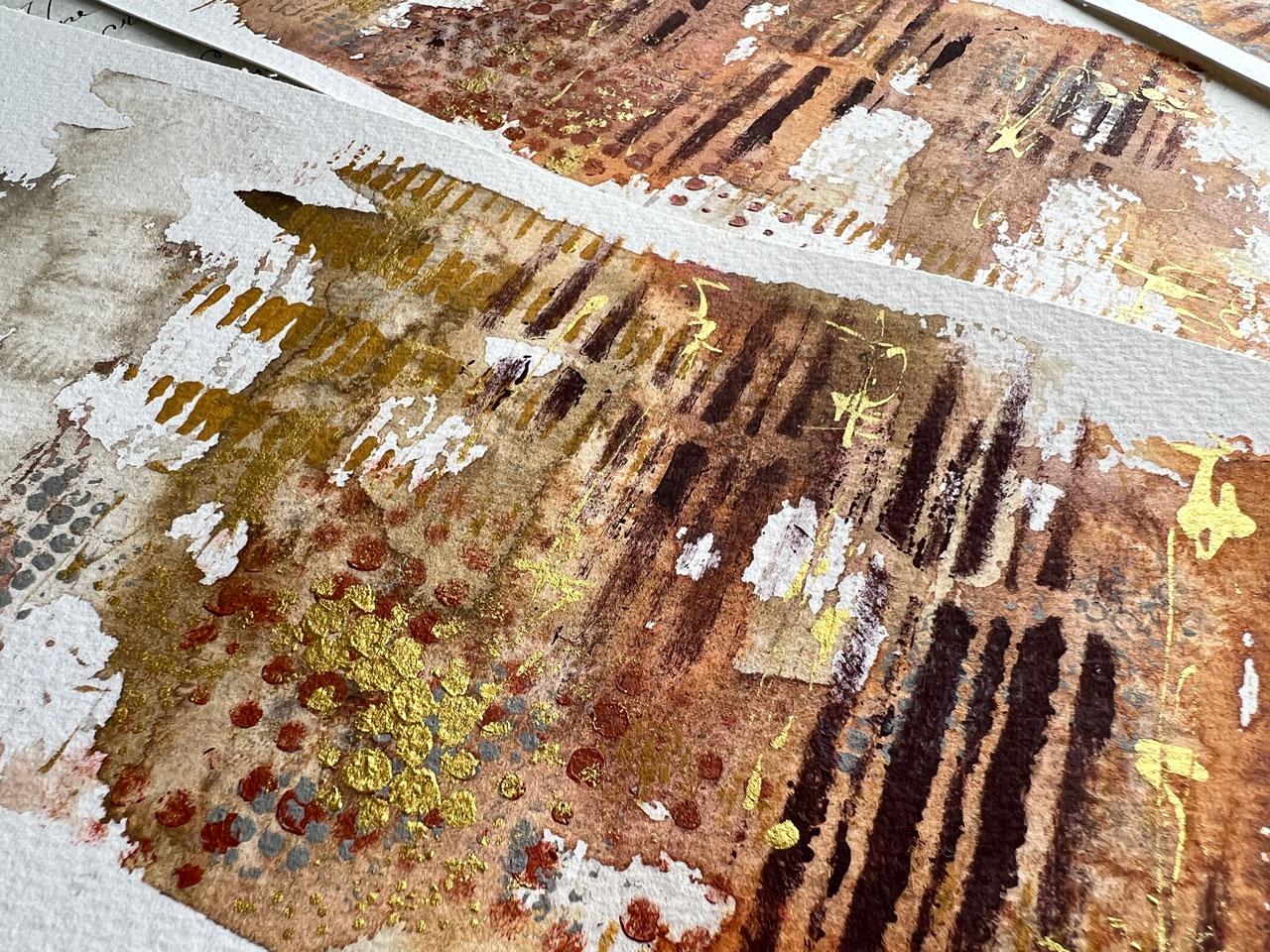
half-tone dots here. I love that. I'm going to come back on
top of this with some gold, we're just layering
and layering. The thing that makes abstracts so interesting is
all the layers. Is that purple too dark? Let's see how dark this is. Let's just get a
piece of paper and see exactly what we're
working with here. See that's pretty dark, [NOISE] but is it
the dark that we need to give us that
pop of contrast? I think it could be. It's a really beautiful,
muted darkness. I'm loving that. Be brave. [LAUGHTER] If you get to the
point where you're like, no, I'm afraid to ruin it, set your piece to the side. You don't have to continue on
a piece until you're like, I know what it needs.
See, now I like that. Just a little bump of some darkness coming through and I'm
doing it real light, scrubbing it in as a suggestion. See I love that.
That's real pretty. Not so suck them in your face, but very subtle, just working our way up
our little landscape, like some happy little trees. [LAUGHTER] I'm loving that. Now we got to be like, what can we do to
finish this off? Does it need anything else? Is it finished? I don't know. Is it finished for
you at this point? It could be. You
could totally peel the tape and say, I'm done, that's a beautiful landscape, but I tend to like
a little bling. Let's let this dry for a moment
and we'll be right back.
6. Finishing Up: I pulled out my very
favorite Golding. This is my cure
talky gold Micah ink that I have pulled
out and shake it up. You can use any metallic
that you want and even some of these cure talky, a watercolors, there was a metallic silver in one
of the sets that I have. It might not have been
that might've been the 48 p.sit with that silver
was really pretty that could have
been your metallic or you can do like me and
pull your favorite metallic that you'd like to use and decorate this
a little further. We could do some a cynic writing where we're scribbling and
we think it says something, but we're not really
sure what it says. We can just add some interesting
writing in here and then let the viewer think what it says in their mind because
I can't really read it, but it adds to our piece. That's one thing that
we could add in here. Another thing that
we could add in here is some yummy layers of dots. You could do some
dots and the layers, which I like doing some dots. You could also do
lines, hash marks, whatever your favorite
mark-making piece is at this point, now's the time to do it. You could also do some lines. We could just do lots of
interesting things here. Like I could come back
with some lines going up. What I like about some
of the lines is it's already working with some of the lines that we got there, but when it shines in the light, we're going to be like, look at that little bit of shimmer. I'm using my kaka
Maury brass nib as my dip pen today
because it's my favorite. It is a little pricey, but it lets you do
fun stuff like going in circles and holds a lot more ink than a normal dip pen and it's
just become my very favorite. You don't have to use the
same things I'm using. Feel free to play and experiment in the tools
that you already have. It's not my goal to
have you go out and buy tons of new art supplies. As much as it is, just to introduce you to
something that maybe you've not seen and you're
thinking what is that? Maybe I need it because my favorite thing to do is
discover new art supplies. Crazy enough, I have
turned what I love to do by art supplies into a job for myself
and now I can say, I need this for our new class. The next nice fun, bright, shiny, yummyness that I need, that's going to be my next thing I introduced
to you, that I love. [LAUGHTER] But
that's not my goal. My goal is not to have
you buy a million things. My goal is to get you to play and experiment in some
of your own things. If you've already got
this yummy paintbrush, here we go, the yummy
calligraphy brush, now you see a different
way that we can use it and add some interest and fun to our pieces that maybe
you didn't think of before. Or this brush is like my favorite to paint
with like this. If you do buy one thing
by that brush and play with it with any of
your watercolors and your stencils
and your paints. I just like little
bits of shimmer. You know, they're
not going to be like super in your face, like what's going on there, but they're going to shine in the light and that's
my favorite thing. [NOISE] Super fun. Then don't forget to rinse off any dip pens are using and that
way you don't get stuff's stuck in the crevices
where you don't want them stuck and sometimes what I really like now
that we did that, sometimes what the dots stuff, I like to go back on top with some more dots and the gold, and that's my favorite gold
is this piece of punchinella. Let's just go for it. Let's say, what did
I do with that piece of pallet paper here it is. I love the gold. I'm probably just going
to put the gold dots on top of dots that we've
already got going on here, because it'll just add like that extra tiny bit of
shimmer to the top of that. So I've just grabbed
another sponge that's dry. I'm just going to come in here a little bit on top of some of our existing dots as another
layer of those dots. Just because I like it. [LAUGHTER] You don't
have to do that. You decide what you like, and then do more of that. That's how we get
into our style and figuring out stuff that we love. See, that's a little different. That little bit
of gold on there. Got all my little sponges
thrown into some water. Let's peel some tape. If the paper is still wet, you're more likely
to tear your paper. I'm using an artist's tape. You want to use an
artist's tape or a painter's tape when you do something like
this or a washi tape. You don't want to
use masking tape, gaffers tape, packing tape, scotch tape, nothing like that, and you want to peel it,
add an angle fairly slowly. The reason why is so that
it will tear your paper. If you have a paper, like say, a paper that's got
wood pulp in it rather than 100% cotton, that wood pulp
likes to grab tape. If you start to peel it, tears your paper, stop
what you're doing, take your heat gun and
just hit the tape, and that will release the
tape from your paper. It's amazing. It's a fun little paper
hack to prevent you from ruining the best
masterpiece you ever created. [LAUGHTER] For me, the
peeling the tape is my favorite part because then we reveal what this looks like, completed with an edge on it. Whereas if you're just
painting the whole thing, I don't think you'd get that
excitement of that reveal. [LAUGHTER] I'd be good on a decorating show like I
want to see the reveal. I'd be totally excited. Oh, here we go. Let's grab
this up here. There we go. If you've taped the center pull both directions at
the top so you're not tearing that paper and then very slowly tear it at an angle. Look at this. Look how
beautiful that is. Then you can see as we
get a little closer, that shimmer of the gold, it's not a lot, but it's enough to be like, what's going on in there? You might be thinking,
it don't look like landscape, but it does, is it looks like those big
long scrolls that you see, almost like I could Japanese scroll and you can see some
writing and stuff in it. I love stuff like that. I think it's beautiful. Look at that as a little trio. Now those are beautiful. I can see him framed
and a rich frame, maybe a gold mat to pick up the yummy goldness in each
of our pieces, so pretty. Totally outside my
normal color palette. I do want you to
start experimenting and some other color
ways that maybe aren't your normal thing and just see like did you discover
something new that you loved? I can't wait to see
how you interprete these yummy abstract landscapes and what colors you pick and what stencil work that
you tried or didn't try, and what marks that you made. I can't wait to
see which ones you created and I'll
see you next time.
7. Final Thoughts: Congratulations. You've reached the end of
this class on creating some abstract landscape
watercolor paintings. I hope you've enjoyed the creative journey
and have learned some new techniques to incorporate into your
artistic practice. Thank you for joining me on this class and I hope to see
you again in future classes. Until then, keep creating, stay inspired, and
keep exploring the beauty of abstract
landscape painting. I'll see you next time.
 DENISE LOVE, Artist & Creative Educator