Transcripts
1. Intro: Hello everybody, welcome
back to my studio. This is Stella here, and this is class number five. In today's class, you will actually learn
about how to create a line sheet that
can be used across all departments from
design to merchandising, production and sales,
sometimes even marketing. You will also learn
how to integrate the concept cats that you have
created in previous class, class number four into aligned shoes so that the
line sheet is workable. You will learn all the
features involve in detail information needed
to create this line sheet. As well as you will
learn how to create bonus repeat swatches
with textures. And you will also learn how
to create a repeat brushes needed in these constant
cats that you created. So let's get started.
2. What Is A Linesheet: In case you've never even
heard of a line sheet, what exactly is it fair simply
is a piece of document. We usually create it either in Google sheets or in Illustrator. It's a usually created by
the design team first and it becomes a working
document that all the other departments
like the sales, to merge the production team. They will go in,
they will revise it as the product
is being created. We use the line sheet as a way to inform our
conversation or start a conversation about what
type of new products we want to bring into the
market in the upcoming season. For instance, we will have
line sheet for spring, summer, we'll have
licensed for fall, winter, we will have line sheet
for special holidays, Mother's Day or back-to-school. And on this piece
outlined sheet can be multiple pages depending
on how many new products and how many total
SKU counts you're trying to launch in
this new season. We will show you
every single skew. Basically a skew is one style per color weight,
that's one skew. We will show you
the size portion to lock the materials
that we'll be using. We will show you
the wholesale price as was suggested retail price. And obviously, we will go into product description to describe
to the rest of the team who are not part of
the production or design process such as the
sales to marketing team. So they understand what
products are coming. So on their end, they will do what they need to do to make sure that
the product arrives in the retail on
the shelf as nicely and painlessly and
accurately as possible. So that is what aligns G4.
3. How To Build A Linesheet: Hello everybody, welcome
back to class five. So open up your
sample line sheet, which is under your class file. Just download it and open
it up in Illustrator. I'm going to show you exactly
how to build a light sheet, as well as how to create repeat
texture swatches like D3, the papal letters that
you see in front of you. But before we do that, let's talk about how to
build a light sheet first. What are the features? What information
needs to be included? So what do we usually
including a line sheet? Remember, you had to think about who needs to use the line sheet, the design team, the
production team, and the sales team. Sometimes even the
marketing team will request to see the line. She's so that basically
the whole company. So right off the bat, the first thing you need
to show is what are the new styles to skews coming? And again, one style in one
color equals one skews. So as you can see, this is a very cute satchel
I created for this brand. Obviously I changed
it up for you guys. And it comes in two skews. Number one is in solid
mustard, yellow, SKU number two,
solid, solid black. So that is the first thing
you have to show how, what's the SKU count per
style and what colorway. The second thing you need to
include is what is the MSRP? Usually it is the sales
team or the PDT and who will write this information or even the merchandising
team of speaking or merge. They will also need to have a copy of the lines
sheet as well. They will figure out how much
they are going to retail this manufacturer's
suggested retail price, the price, so put it down and they figure out the
price is based on, we've talked about this
before in the previous class. The first cost, how
much it will cost, the cost of goods to make
this one single bag. And then we had to
add up our margin. We had to add our packaging and shipping everything to duty. All these causes that we've figured out what the
wholesale prices, by the way, the prices
that you see here, they have made up,
they're not real. The rule of thumb
has always been your MSRP is double
your wholesale price. Sometimes we will adjust it
kinda like a sliding scale. We will adjust it based
on any promotional goals. So it really depends on what the goal of the company
is, the sales go. Now, the second thing you
need to include as dimension, you can see almost immediately we have it in both
Imperial inches. We also have it in the
metric centimeters. Not all company requires
you to put down a centimeters unless
your company is global. So they not only sell to, let's say America,
they cells to Canada, the cells to the rest of Europe. So for everybody's convenience, we usually just write down
both to Imperial and metrics. And then this
information will be translated onto the
selling websites, onto the packaging or
encoder into the UPC code. So when they scan it, all the inflammation shows up. So after skewed dimension, we usually write
product description. And this is usually
written by the designers, the design team,
because obviously we are the people who
designed the bag. But sometimes the merge, the production will
pitch in and make the revisions because in
the process of production, sometimes we start to
change things and usually the production team is the
one handling the process. But obviously a communication, any changes will be communicated
across departments. So as you can see, lines, she is very important
because it's a shared document by
all the departments. And I'm sure you have heard
of the saying that we change things seven times
before we finalize any design. So this is a working document. Things are constantly being
changed by different teams. Anyways, coming back to this. So for product description, obviously we use a lot
of industry lingo, and this is pretty
much what will be input onto the
website as well. For instance, we always start with what type of
closure this is. This is a top SIP closure. It has used to have a pocket
which I haven't delete here. As you can see, the
pocket is gone now, so I should be deleting this entire sentence
out of the way. Contrast, black edge
pay. Black lines. As you can see, matte
black hardware, you can see everything
is coded in matte black, detachable cross
body strappy up. You can see that it's got
a little swivel hook. Also has four custom-designed
pyramid feet. You can't really see
it from this view. But it's there. So this is very important. Every single design feature
in detail of this bag, you had to put it under
the project description. Because remember, once the sales team received
as once the lessee, the website in received this, they may not even have
seen the sample, yes. So they literally would just
go by what is written here. So if you made a
mistake here or you forget to update something
like I just did, literally will create
a domino effect all the way to the retail site. And you don't want
that to happen. And let me tell you the
running joke has always been anything goes wrong
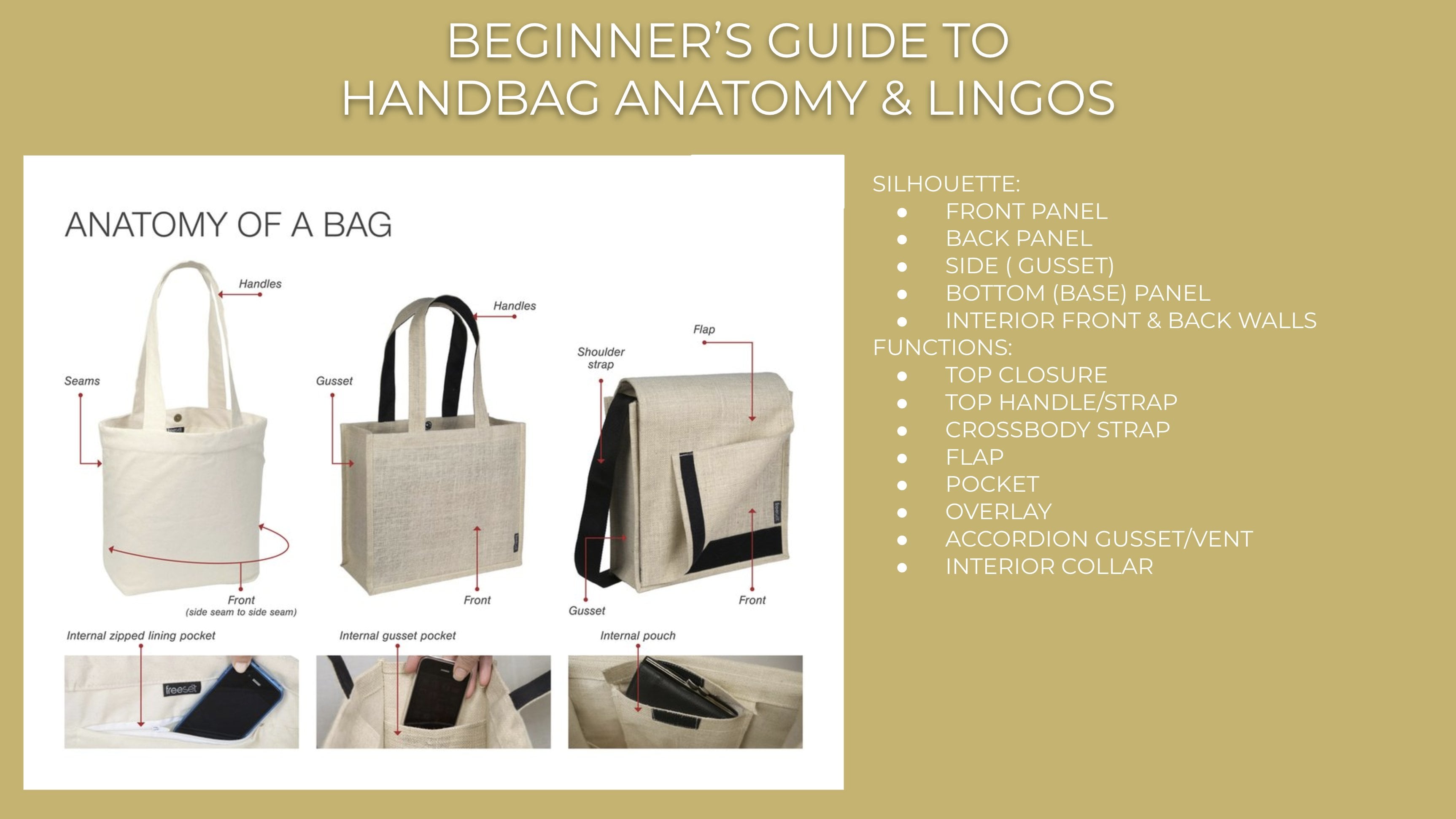
is the design is false. So yeah, there's that. Alright, so it also has standard
interior Bassett pocket. So you had to talk about the interior even though
you can't really see it. We usually only show the interior if it's
something different. Obviously here is a standard,
so everybody knows. Okay, the interior pocket is, is the standard that we've been producing year after
year after year. So we don't really have to
show a concept cat of it. So standard interior
bad zip pocket was to interior
font open pockets, just open that any of your bags, you'll see that construction, this is the logo
stamping I created for this particular brand obviously does not apply to our class. So let me just delete that. This is a three-quarter
back view. Some companies will
require you to even draw this three-quarter
view front and back in full size of value? I think I did. Yeah, I did. So if you double-click it, I saved it as a symbol. So you're in luck. You can, you can actually get this entire concept
cat for free. Haha. Yes, everything you see here, the brushes, the map,
black heart works. Just use it up however you want. So double-click it
anywhere else said, Oh, the concept cat, you will get out of
the symbol if you still have no idea how
to use this symbol, what a symbol is, please
go back to class one. And I think class for, I talk fairly extensively and
I show you how to use it. It is literally divesting that
Illustrator ever created. Now, one thing I also
want to share with you is the importance of why you should always do
constant CAD in full-size value. This is the concept cat I did. Okay, this was the
first iteration of the line sheet
with multiple skews. We cut it down to two. This is an actual photo of a sample that the factory made. It's almost the same. It looks almost the same as the concept cat I
created in Illustrator. And the reason why it is
almost identical, we did, uh, so accurately when you do anything full size up
to scale, there's, there's almost no room
for the factory to create something that's
proportionally wrong or have wonky measurements. Because it's, you did it, you did all the job for them. You want this to be 9 " long. It is exactly night
interests loans. So your actual drawing
literally looks like a physical sample as
shown in this photo. That's the accuracy
that a lot of the more higher-end
brands requires. So if you want to be a
professional designer, you have to get to this level. And the only way for
you to get there, obviously, is through practice, lots and lots of practice. Now, next, I just want to show you a
second style across body. Oh, yes, I forgot to mention. Always put the title if there is some sort of a style number, are working number
assigned to the style, just put it right over
here. My apologies. I don't know what
happened to this, why? But yes, that's also
very important. You have to name and
give a sign of style. Number two, the bag
that you're creating. We're talking about
creating close to like 100, 200 skews per season. As a result, normal line, She's not just two pages. I'm zooming all the way
out because when I create lines sheets for any
companies like H and cosplay, it literally fills
up the entire board. At k-space. Sometimes
we can go up to 202, 56 skews per season because there's a global
company is ginormous. But over here, I'm
just showing you two. So this is following
the exact same rule. Different style is
psi cross body. Obviously I made up the MSRP, I made up the
wholesale, I give it. It comes in three skews. I'm sure after two hormones on back-and-forth meeting with
a merge production team, sales team, blah, blah. Based on sales report, we need to offer call a block because colored
block is selling. And obviously we need to offer what we call the core colors, such as the midnight blue or the solid cream because
this is for springs. So let's not go too
dark. Just yet. Another thing that the line
she will show the whole team, which is very important, is that how well, well each bag or style
sit with the other one, color wise, style wise. So when you zoom out,
you can see, okay, I can see it sitting, well, there's muster
here in this style. There's also muster
here in that style. The midnight blue and the
black are always fit well together because they are
considered core colors. They don't fight each other. Obviously, cream is
close enough to y. Y is also considered
a core color, so let's not worry about it. The design team will
propose the colors, but then is to merge. That will take the time
to really figure out what they sit while
to get it into store. Would it resonate with a season that we will be selling
these styles in RDs is trending colors that
the customers will buy into. And then when you put the
trending colors right next to the basic core colors that
we will sell seasoning. And now, like the black or
the midnight or even the red, like can they actually
sit together? So these, these are all the
decision-making processes emerge designs sales team needs to come together
and figure it out. Again, same drill. You have the product
description. We'll talk about what
the flap closure is. This is actually a flap closure
was Max snap from pocket was inserted corners
design detail feature and custom design. Katie snapped up by the way, I actually did delete the logo. So again, you always have to be mindful is
something gets updated. You need to update a product
description as well. There's no snow
anything anymore. Let's just get rid of that. And then you just
follow same theme, matte black hardware
across body strap. One thing I'm, I'm very
militant about and I tell all my design systems is that the sequence and the order that you write a
product description. If you start with a closure, you need to measure
every single style. Style, one star, two
star, three star four. It has to start
with the closure. You create the systems of visually the other team members. They can glance at it very quickly and find what
they need to find. Trust me, son of these
meetings get so long. You don't want to sit
there and just trying to look for things
you'll hate yourself. I promise you that.
4. How To Create Repeat Swatch With Texture: Now let's talk about
the fun stuff. How do we create
repeat swatches? If you go to your swatch panel, you see these swatches
that are repeated with texture 0 in case you don't have your
swatch panel open. Just go to Window and
somewhere down here, make sure the
swatches is selected. So the first thing you need
to do is go to your browser. And I want you to
type pebble leather. Enter. You see many different types
of grain pebble leather. So we're actually
going to create our own pebble other in
the color that we want. So you built a whole library of texture leather that
you can use and use the eye drop in
Illustrator and add it to your concept cat to make it look more realistic and beautiful. Again, you will be working with a lot of people who
have zero imagination. That's the reason
why if you can make your life sheet as realistic, as beautiful as possible
so that you are not asking non-creative people
to use their imagination, you will make your
life a lot easier. So the first thing that I
look for when I look at all these images
are pebble leather. I pick the pebble shape, style, and size that I want to work with right off the bat. I can tell you that it will be easier to work with
either this one, this one, or this one, the cornea one reason, or even this cream
one reason being that the pebble is in
the size that I want, Aspect Ratio, the proportion of this image is already a
square that I can work with. If we go back to
Illustrator swatches, you usually come in squares. So that's what we wanna
do because that's how you repeat in case you have
no idea where repeat is, it basically means from here. Well actually let's use
this one font here. So here it repeats itself. So here we'll just connect
to hear continued this side, the top side will continue
to the bottom side. So if you create a
much larger image, let's say, of this. And you zoom in, it, just keep on repeating. But as you can see, I didn't do that great of a job. There's this first
slide striation, which I can clean
it up in Photoshop. But for the purpose
of the class, I'm gonna leave it as is. So that's why repeat
swatches means so when you, I drop it, let's just do
it with this cross body. Alright, so when you
select the flap and then just us filled it with
the new pebble leather. You see what it does. It basically just fold it over. It just keep on repeating
forever, forever. But as you can see, this pebble leather
is so much larger than a pebble other down
here, what are you do? You right-click. Go to Transform. Go to scale. Alright? This is at 100% right now. We're not transforming
the object. Let's also not transform
scale corners. Let's also not skilled stroke
effect because it will make stroke and effects
thinner by 50 per cent, which is not what I want. So make sure you just select the transform patterns and
let's do preview again. Okay, It is definitely smaller, but it's still larger than this. So now you just have to
keep going back and make the number smaller to
see which one fits. Actually, 30% looks just about, well, maybe a little bit
tiny, bit too large. Let's do 28%, might be 25%. You know what? I think
it's 28% perfect. Just click Okay, you're done. And then click anywhere outside
to get out of the symbol. That's how you do it. Now, coming back to
your Google search, Let's work with this
one. So click on this. I like to find leather textures from actual leather companies because they literally
take photos. That's already almost like a repeat swatch that
makes my life so much easier. Right off the bat. The first thing I will
look for is which color is easier for me to manipulate
into different colors. Like for instance,
I like to choose color that's a little bit
warmer, like the cognac. It this one they called this
the palomino or the rent, maybe a bit strong
or I may even go for something that's a
bit more neutral. This one is the natural. Because what will happen is
we're going to take this into Photoshop and then we're
going to use saturation. And then we're going
to change it into all the other colors
that we want, light blues or blacks or greens, or purples, whatever
it is that you need. So let's just actually
pick this one. Alright, so that's what you get. So what you do is screenshot it. If you can zoom in and screenshot and make
sure you don't get the border. You see how I'm
leaving a slight space between the edge of the swatch and at the edge
of my screenshot. You see this is a five-six phi. Now. Okay, there we go.
So make sure is that Actual squares. So the aspirations
565 times 565. Okay, you just
took a screenshot. Now, what do we do? Go to Photoshop. Open up your Photoshop. Just give it a moment. You had to create a new file. Now this here's a trick here. Any swatch that you want to
add to Adobe Illustrator, make sure the resolution
just about 72. The maximum I've
ever done is 150, but anything beyond that really will slow down
your Illustrator. It actually does not make the saturation and
the sharpness, that illness of the
texture any better. So 72 is usual. Why keep it? I like to keep her
about four inch by four inch or five-by-five,
doesn't matter. And let's just see
how large that is by pixel to ABA, to ADA. You don't want, Let's
make it to 300, 400. So it'd be easier. So measure color mode is RGB. Create. Alright, cool. So go find where
the screenshot is. And dragging here, enter. Now, you had to make sure you
change this smart object. You had to rasterize it. So the way you rasterize it, it just pick eraser or a
pen tool, click on it. It will ask you, do you
want to rasterize it? You just click OK.
Now is rasterized. Yay, perfect. So now this is a trick I
learned from one of the, the print designer who
used to work with me. The first thing that I want to do is I would like to wrap this, show me how to do it. So let's unlock this and let's just name a repeat,
doesn't matter. You don't need to unlock
it, so it's not locked. Go to Filter, go to
other, go to offset. So what this does
is you literally wrapping the swatch
right in front of you. And remember how the original
pixel was at 400, 400. In order for it to wrap around, you had to select wrapper out to 200 because you're right. You're literally dividing
this swatch in half by wrapping it in half to show
repeat, to create repeat. Okay, So right off the bat you can see that it is not repeated. You see this faint line here. You also see this faint line here that's totally expected. But before we fix that, what I like to do
is I like to make this into the color
I liked a lot. Just say, now let's
flatten the image. Let's go to Adjustment. First of all, it's a
little bit dark for me, so let's adjust the level to
where you want it to be at. There's no right or wrong here. Maybe a little bit strong. Alright, now let's go
to Image Adjustments, do hue and saturation. So for me it just like a
blanket change your colors, change of the hues. Let's just pick a hue we like. Okay, I really
liked this purple. But let's just bring down the saturation a little
bit more so that it looks more like a lavender versus this burning purple in your
face, like a royal purple. I just want more of a lavender. Let's do -40. Okay. Let's just say I really liked
this at this point. And I can see because this is not a high resolution
screenshot, I can see there's a
bit of a blurriness. So what I would do, I will put a sharper and
go to Filter Sharpen. Let's do sharpen more.
Oh, that's too much. Yeah, No, let's not do that. Let's go to sharpen edges. Okay, I can do with that. Let's us do a bit more
sharpened edges again. Repeat, no, that's too much. Let me just stick to
this and call it a day. So now you have the
color that you want. In the brightness that you want, you sharpen this slightly. It was too much, it just looks
face, so leave it as is. So now the next thing you
need to figure out is, how do we make this,
repeat this line. How do we make it disappear? You need to do what I call
the trusted stem tool. My stamp tool right
now is way too big. So let me bring down the
size 100, still too big. Let's bring it down to 50. Okay, so the hotkey for
stamp is S. So just click. Yes. So the way I like
to do is I like to select a part of the pattern that I want
to use. You see that? Stamp it. Oh, I also like to use
this very soft brush. Hardness is zero. So when you stamp it across, it just looks seamless,
is softly done. Okay, just do it like that. Okay? And then we're going
to fix the more you see slowly but surely. Little line, but you see
it's a slightly blurs. So that's why I will close the harder lines
and just slowly. Patch it up. You know, the human eyes can only
discern up to a point. When things start
to look the same. I'll bring what
immediately register. It's the same, that just
how our brain works. So in this case, when we're trying to
clone similar patterns, That's pretty much how
we tricked a break. So just add a bit of a definition so it
doesn't look so blurred. If it's still a little
bit too blurry, you can consider, consider increasing the hardness to 10%. See if, oh yeah. So maybe 20%. So this is one of
those things where you just have to like,
spend the time. And as you create each style, you create a swatch and then you build up your
little libraries. So in the future, like for me, I have an archive texture
library of over 3,000, maybe 5,000 now,
textures I created over the past almost 20 years. And then let's make this bigger. Because sometimes I just like
to go across, there we go. There we go. Now this is done. What you do is I'm
dragging this to the side. Let me close my browser. And I literally just
drag and drop over here. Alright, there. And then this is how
you create a swatch. You select drag and drop to
see the add sign edited. Okay, so now let's
test this out. Let's just use the bag. And then let's reset
transformation. Let us break the symbol
Bricklin to symbol. Okay? And then let's actually, let's start on the
back panel so you can see all amazing immediately. There's a problem.
What's the problem? I don't like this blurriness. And obviously the pebble
texture is way too large. We know how to fix
the large part. You just right-click it. Go to Transform Scale. Do not scale, do not
transform the object. Keep the object is saying
only transform the pattern. How to set this
back out 100 again. So then the Illustrator
program will read this at 100, you said, Okay, Okay, Now bring this back,
transform scale. Bring it to 50. Preview. Okay, not too bad, but I can still see it. Let's do it, bring
it down to 40%. Now this is more realistic, but I can still see the blurb. So this is when you need
to go back to Photoshop. Okay. Do your due diligence and then just break up the
blurriness like that. Alright, that looks
a lot better to me. So let's drag it here again. Oh, I need to click
Okay, before I can drag. Okay, let's go to
Photoshop again. I still have a bit of
a blurriness here. Okay? Now here, okay, a lot better. Now, we don't want this. Delete this. If you
have too many swatch, like swatches in
the swatches panel, it will slow down your computer. So whichever one that
you don't need anymore, just deleted, don't
even leave it there. There we go. Now let's try again. So much better Sita. It's gone. Perfect. So you just create it. You'll first repeat swatch. Now, here's the fun part. You liked this pattern. You also know they probably will want this
in a different color. So all you had to do, come back to hue and saturation, change it to whatever
color you need. Let's say they wanted to be
a little bit more coral. You feel like this
is a good coral, but it's a bit too yellow. So you go to image adjustments, color balance, make it, maybe make it a bit more red. So now that's the core. We have less of a yellow or
can add a bit more blue. But as you can see,
blue is kinda going towards the fuchsia color. So now, so now let's
try to ping, ping. Do I like the pink coral
order wreck correlate? You know what? I like to rest. So let's use the red. Now. You just got yourself
a chorus swatch. And that's how you do it. Now, Let's just drag it in here. Okay? And then let's
just do the coral. Now there's another way to make the pebble
texture smaller. Instead of dragging
the swatch car at this size into
the swatch panel, you can actually make a smaller. So what's going to happen is the size of the pebble
pattern right now, how big it is right in front of you is going
to show up as it, how big it is right over here. So let's create a
second coral swatch, and let's just come
here and click this. You see it got smaller. So instead of doing the
right-click Transform, you can literally just
upload a smaller, I feel like this is more
and then you can just literally drag it here and
see, does that make sense? Okay, it looks about the
same size right over here, and then you just drag it here. And then let's do the third one. There we go. You don't even have to
do transform and delete all the other swatches
are not correct. And you are done.
5. How To Create Repeat Pattern Brush: One last thing I would
like to show you guys is how to create very simple, basic pattern brushes
right over here. Again. If you don't have this
panel, go to Window, scroll all the way
down to brushes, make sure it's selected
and it should pop up. Alright, so the first
thing you need to do is that I'm sure
you have noticed we use pattern brushes
for various purposes. The easiest one is we use it to create zipper teeth like that, like that, like that. So that's what we do. And we also use it to
create stitch line. Again, you can do stitch line by using stroke and dashed line. Some companies they prefer this type of stitch line
and if you drag it out, is literally just a tiny
little stroke repeated. So if you want to see how to create anything that's light, repeat a pattern brush, and you literally just go to
the brush and drag it out. And then select it, drag it back in. And then you select
Pattern Brush. And then make sure you
assign the spacing. The scale I find is this, Do you want a corner to
actually have a corner? If you don't want to have
a corner, just say none. So the coroner would
just be blank. The spacing is zero right now. You can add one, so it's
a little bit spaced out as ten per cent is
even more spaced out. You can stretch to fit. You can ask space to fit. You can approximate path. It doesn't matter how you do it. Usually, I do I do
an add space to fit. Stretch will make
a little wonky. I don't like it. You can flip the direction, see that it went the other way. You can flip across up and down, or you can select both and then you're back to
what you were before. So yeah, there's a lot
of ways that you can create a pattern brush and
this is the easiest way. When you drag anything out
from the pattern brush, you see how it has double line. It basically says that it's ungrouped is the
invisible bounding box. Make sure that
bounding boxes gone. And you can actually
change this. Let's say if you want to
create a stitch line that's in this color, this color, or in this purple color because the bag is going to have
a purple stitch line, then you just make a
purple, you drag it in. You do pattern brush. Okay. And again, do you
want the corner? Do you not want the corner? Let's say I do. I don t let just say
I don't make enough. Let's say I want the spacing
to be a bit far apart. Let's say this is a
decorative stitch. The SPI is a bit larger, which is stitches per inch. I want less stitch lines per inch so it's wider spaced out. That just do 20% is
very spaced out. I want to do as space to fit. I don't want to stretch to fit and let us leave
it there for now. Okay, so I just created
my own pattern brush. And let's test this out. Oh, perfect. I have the
perfect Back to test this out. So you see how these
are the stitch lines, but now they're just solid. You select this. Oh, did you see that? Probably can't
because of the color. So let's make this white so
you can see out there we go. You just create a young
contrast stitch line that how fun is that? And then you would do the same. That's a dark, That's not
what I want to select. This one. This one. And then do it
again, you're done. I may have selected the
outline by accident, so let's just bring
the outline back. So when you go to
your class file, which I hope you have it open, That's the whole reason why
you're watching me do this. All these brushes are in it, inclusive or the swatch card, so inclusive, you're welcome. Just use them for your
own designs are keyed up. So now coming back to this, so that was a stitch
line is shown here. Now how do we create
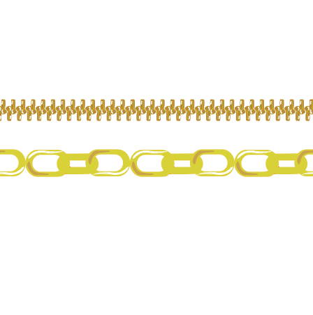
zipper track? These are the two most basic zipper track
design that we have. You can have a
literally like this. We usually use the
black and white one. It just literally felt
with why was black lines as to indicate
plastic, non-metal. Obviously, this
particular bag is using matte black hardware and that's
a reason why you see that we had to custom
create matte black. But if you really look at it, you realize that
right off the bat, we have three different colors. We have what we
called darkest tone, the median gray tone, and the white highlight. The reason why we do this is
because just like fine art, you need to indicate
your lightest part of your middle part of
your darkest part to make it look realistic. Map back shines a little bit. Gum middle also shines. And this is the only way that we can create that
gradient of shininess. The thing is I have
people asking me, Why can I not just use gradient? I don't think I have my
gradient open. Here it is. Why can I not? Aggregating color to it. You can try. I mean, this is what's
going to happen. We add a gradient, okay, let's do it like that. Let's just select
both and let's just drag it into pattern brush. You can't do it because your
pattern brush is not able to read anything that's gradient
color gradient created. So in order for you to
create your own gradient, that's when you had to
go back to using the, the, the good old
Fine Art technique. Have your darkest part. You know, the shadow part, your MID TO followed
by your highlight. And so following
the same concept, you can also change
this up less. Let's say your
collection wants to use shiny gold color for it. Shiny black or gum metal. So what do you do? Okay, evaluate what is
the goal colored dot u1, the darkest goal, more
like a tiki goals. So you come over here, you open up your color picker. Color picker. Sorry, It's just a funny
little name to me. Let's say this is the
darkest go you want, okay, So we have established that
next thing you want is, okay. So what about this
slightly darker, but not like what I would call
a shadow part of the goal. So you open it up again, you go to the gold part. Let's do you like that, or is that too green? So if it's too green, bring it down a little bit
so it has a bit of a red. Let's see. I can spend all day doing this. As you can see. Let's say
I'm satisfied with that. I'm going to keep the
white highlight as they are now the mid tone word. Why? It's a slightly lighter. I actually liked, I just
randomly selected it. Okay, Great. Okay. So now the outlines gray, I don't want gray. Let's go to the outline. Let's make do I like more like within I like that
within the yellow family. Let's say, I'm happy with this and I'm going to wrap this up
before my computer crashes. Okay, so allow select. You see it's got this
little bounding box. I don't know what that is. So I just deleted it. Okay. Now that little tubular
thing has disappeared. Dragon pattern brush. Okay, so now as you can see, this is not a
corner that I want. Let's not do that.
None. And then it kinda breaks up
so we can do as space to fit or stretch to
fit, approximate a path. Let's do add space to fit. I do minus ten. Yeah, I actually can. Awesome. Let us say this is
fine the way it is. So let's go to this bag. Oh no, let's do
this so you can see about so this is this. If I select that, awesome, That's what I want,
but it's way too big. Why do we do? There's simple go to Stroke. See how thick the line is. Bring it down. Oh, okay. Still too big. So we
need to go to 05. They're so far,
it looks perfect. Let's just leave it. You just had your very first
shiny gold zipper tape. Now, there's another way to
make the zipper tape smaller, which is just like what we
did with the swatch cards. Select, shrink and shrink it to about this
big go-to brush. Drying it in pattern brush. Okay. Let's just
say we like this. Oh wait, I forgot. I don't want the corner. So you just double-click it. Go to none. Come back up. Still
use this one. We go, perfect. Then you can delete this again. If you have way too
many pattern brushes, is start to slow
down illustrator, so delete the ones
that you don't want. That's pretty much how we work. Now. This is the same
idea as that is set. Like I said, we'll
leave a black and white when we're trying to
use plastic zipper. So if you just draw a line, I just want to show you
literally just looks like that. It just connects,
it repeats itself. So that's how you
create a pattern brush. Change the color as needed. Now, same thing with a link when you're trying to
do a linked chain. Right now, this is a black
matte black linked chain. So when I draw a line, when I select a che,
it looks like that. So the way it works is
for pattern brushes, it just repeats a cell. So all you have to do is only draw the part
that will be repeated. I'm going to make this red in the outline
so you can see it. Delete a bounding box so
you don't have to keep drawing nonstop
repeating to infinity. You just draw the part
that won't be repeated. Exactly the same idea as this. The zipper. As the stitch line. So now we have established that again, this
is the fun part. You can make this into
any color that you want. You can make this in two. Let's do go again. Oh gosh, that's a
horrible, My apologies. Let's do that. Okay. We kinda like it. Let's make this darker, awesome. So let's just repeat
that to that. So now this is our base color. Remember you need
to add a shadow, you need to add a mid
tones and the highlights. So pretty much the same idea. Let's say the highlight. I use a brush and I changed
the color to white. And then I'm just
going to repeat this. I just duplicate it and I'm
going to flip this there. So now it's on sale that I
don't have any mid tones, so I'm just gonna do a really
crude looking mid tones. So I just used a brush, I created this and now
I'm connecting it, so now it's fell. And let's change this
to I liked that. Duplicate. Let's use the mirror. The mirror. I'm going to put it right here. Usually the way we do
it is that we will pre made these brushes and we'll share brushes
with one another. Like I will make three or four, and my colleague may do
another two and we'll just kinda like upload it
into the shared library. So as we're designing, we're pulling it has really, when you're really designing, none of us have time to do this. We just do this on the side, or we do this as needed and
we save it for future use. I can keep going and
going and going, which I'm not going
to bore you with it. Let's just say
we'd like to wait. As I know it's
ugly, My apologies, but I just wanted to show you
the process of creating it. You drag it in. You're like, Okay,
so I actually liked this corner, essentially
kinda cubed. So let's also create that corner and then
let's just do okay. So now let's just
pretend out of the blue, the Merge comes back and say, I think we need to
add a chain straps. So you're like, Okay, do you want this taste? And again, you can change
the color of, sorry, the size by going to stroke, by making this smaller. Smaller however you want, or you can physically
decrease the size over here. Go-to brush and
create it from here. Alright, and you're
done. All right guys. Thank you so much
for watching this. I will see you at
the next class. Any questions, just leave it in the comments and I'm
more than happy to create more classes if there's anything specific
you'd like to learn. Ciao.
 Stella Chang, Retired Handbag Design Director