Transcripts
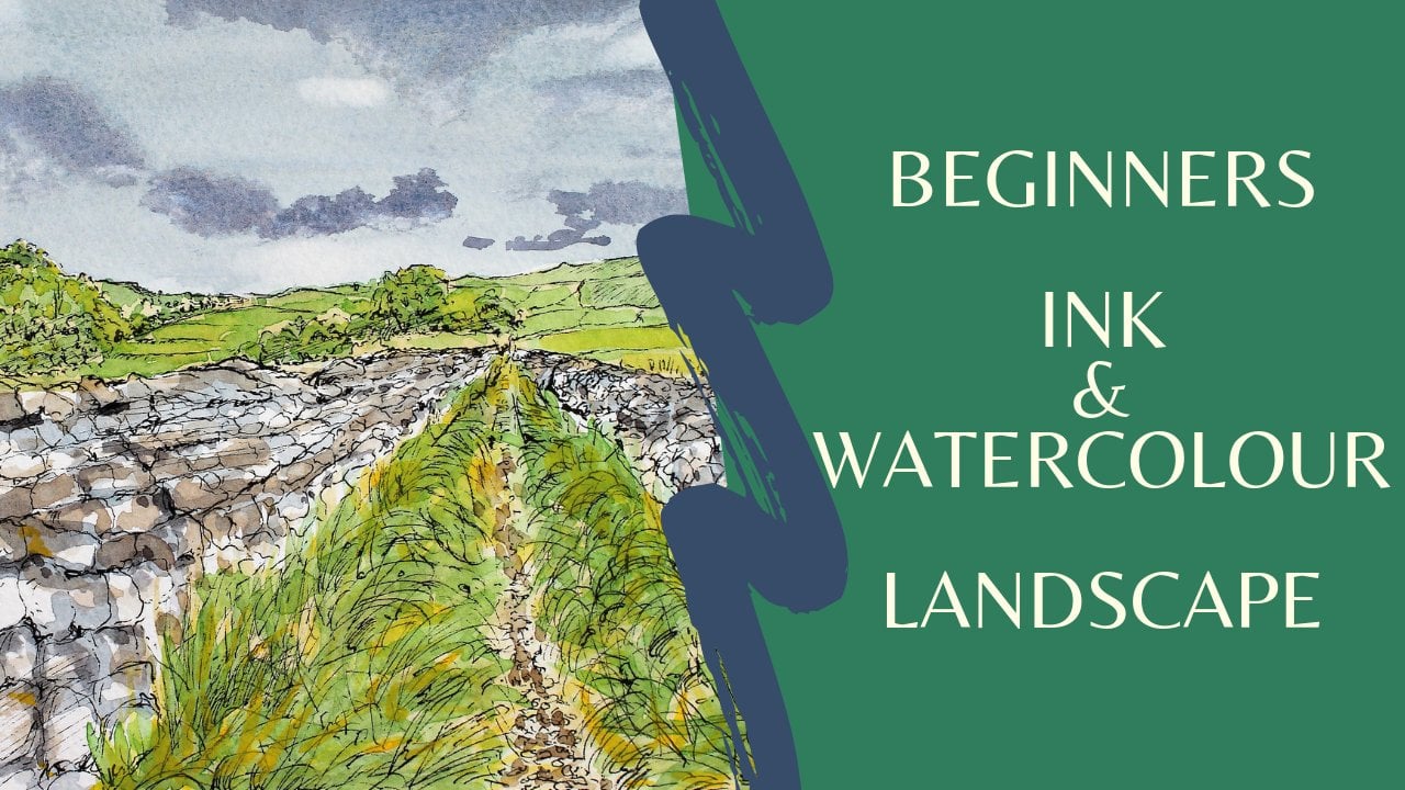
1. Introduction: Hello and welcome to my skill share class. I'm Cali and I enjoyed teaching beginners, painting and drawing. This is where six skill share class on all of the courses that I'm doing our own ink and wash or otherwise known as income water cooler. So Oldham, with a pen with putting some nice light watercolour, washes over the top. So today's project is going to be a blue tit. So we're going to be doing this. Loot it and I will pop the link to this in the reference section, and you can download this onto your own computer onto your tablet printed half located on your phone, which ever way you prefer to work. If you do work off your tablet, that's not a bad idea, because you can zoom in onto the detail on this is hopefully what we're going to be and, you know, with something similar to this just a small any for a nice little big Guinness project in a water cooler. I would also add some more photographs and lived, hits you to have a look up for you to have a bit of a practice that joined them before you commence the full project, I would recommend you actually watch the full cause before you start your own project. Quite often we made mistakes with water cooler on watercolors, quite a difficult media to learn to use, and the main thing about it is learning how to correct those mistakes is not very easy to control. Little with always, and I make mistakes, and we have off days on in today's project. Really, I did use too much paint. I shouldn't have put it on specifically, and I used too much water. Part of getting to know how much water to use with watercolor is getting familiar with your own materials, knowing how much water you brush holds knowing how much water your paper holds on how much you want to actually apply with you paint. So it's old practice, so I can't really stress that enough that the old way to get confidence and better when watercolors is to keep doing a little bit every day and keep practicing. So I leave all my mistakes in and all my corrections in so that you could learn from those . So don't be worried about making mistakes. The whole idea behind my skill Shaikh share classes is to give you some confidence to give you some ideas of things you might like to draw. But to really build on your confidence to get going with your painting and drawing, So this is a little bit different today during a bird. We've done some landscapes for those of you that haven't seen the previous courses. You might want to go back to the 1st 1 because in that one I talk a lot more in depth about the materials that you will need for all of these courses that I'm doing in ink. Watercolor. A swell is finding the photographs of the blue ticks in the reference section. You'll also find there a sheet of the materials that you're going to need. Don't feel you have to use exactly the same materials as may. You might have some slightly different colors. Just go with your own judgment and you some nice bright colors. It's a lovely little bright, but I want to use some nice bright colors today. So in the next section we're going to go on in practice drawing some birds, and this helps us to free up on lives in a part drawing and get warmed up for the day before we start doing our actual project on. I'll see you back again at the end when we conclude on, have a look at what we've done. Don't forget along the way, though, that you can ask the questions as you go along. You can reach me on Instagram by direct message. You can reach me by Facebook Twitter on my own website by email on here on skill shares. There's lots of ways you can get in contact with me if you want to ask me a question and please do load your project at the end for everybody else to have a look at on if you would like to have something back from myself.
2. Materials:
3. Warm up: to begin with before we even start doing the painting. It's a good idea. Usually toe have a practice practice of drawing the shapes, but also it can act as a warm up. So you may not have done any painting or drawing for a week or two, or even if you haven't done any since the day before, It is always a good idea to start your day with a little bit of a warm up. It helps get your eye into what you're doing. Helps me relax on. Your paintings will be less tight, so it's a good idea to practice the drawing first. So get some inexpensive paper, just a practice paper on inexpensive part and the photograph of the little bird that we're going to be doing. So this is one of chosen to do, but I will give you in the reference section another couple of pictures of blue tits as well. So when you do this practice sheet, you can have a look at those as well and do lots of different shapes of the bird. So to begin with, we need to look really at the shapes that the birds made up off and with little songbirds like this, it's actually quite easy because he's split into the shape of his head, which is more or less an oval circle. Then he's got his body here, and then we've got the wing on the tail. So if we look at those various components, that's what we need to be getting into this picture. It's much easier if he's straight onto the camera. We've actually got him at an angle here, So you see in the other side of his breast, as well as the front side here, and it's obviously got his head twisted as well. So I'm standing up to do this sketch, and I recommend that you do this. If you've got two knees, will have a go at working on an easel. The reason that I'm working flat is for the photography and the camera, so that can show you what I'm doing. But if you if you can, it'll get an easel and work standing up that way, your arms moving much more freely, you sketching much more freely. Well, when was sketching, you should be sketching from our shoulder and moving our our arm, not just moving our wrists like this when you work quite tightly and you're just moving your wrist and your fingers, you drawing becomes tight. We need to be moving our whole arm. Okay, So start by looking at those circles and like a sow. I'm just gonna do this one, but you could do a full sheet of lots of different little birds. Have a look. You could just get your phone out or your tablet out and scroll through some pictures of some little songbirds. So to begin with, this one, I'll just pop him to the side here. Well, look at his head, the shape of his head like so get your whole arm moving and get that head shape. There were just sketch in which is practicing and warming up. And then if we look at his tummy, it's sort of here and then the other side here. Okay, So look at all those circles that we're doing to get that shaped him and then his wing, and it might not be completely accurate the first time, but we're warming open, getting those shapes together on the length of his tail. And then we can look at where his beat goes, And then once you've got those ships and you can start, outline him a bit better. And where we put those two circles there, you can see that's the backside. And this is the one that's not breast that's nearest to. As you can see, the separation there were his breast bonus. You can start to think about the little bird underneath where its skeleton and everything is. And a lot of this here is just feather. No can put his feet in very loosely, very sketchily. You're just practicing. You just warm and open. You're getting yourself familiar with the subject before you start actually drawing him properly. You could look at where those mothers color in. Czar has got that nice little cap on the top of his head, and then he's got this black area here and underneath his big there, look at the position of his eye. This is quite a blunt pencil. I just wanted it to show well, for you. It's actually the graph. Itoen. I find these handy for sketching with on his wings up so split into two. She got the top wing here and then the one underneath, and it's going away from our solos lines. Look at the direction of those lines to go in that way, and then it's folding over on back. So I'm not really looked at the measurements. I haven't really thought about the measurements too much. We're just keeping it nice and loose and having getting a feel for the shape of that little bird and where everything fits head, body, wings and tail. So you fill your whole page. You could do the same one again, and you could do some smaller ones. You could do some from different angles, but have a go first thing before you start doing the rest of the painting that just feeling a rough piece of paper very quickly, quickly with lots of little sketches of birds, like So you could get plenty of images on your phone or your tablet to have a look at as well as the ones that I provided you with
4. Pencil guidelines: Once you've warmed up nicely with your practice sketches on, familiarize yourself with the subject. Then we can go on to doing the drawing on some watercolor paper, So the one that I've got is the daily brownie. It's a size a four on, Let me see. It's £169 so I don't usually buy anything less than £140 for working on. So that's a good tip. If you're a beginner looking for papers, look for one that's over £140 in weight. You might want to work bigger than an A four, but it's only a very small little bird. So it be quite nice to do him in a smaller size, and this is actually a mixed media paper. But you could use a watercolor paper quite like this one, or like how white it is on a like house move. It is for drawing on, so I've got a different pencil now, the other one. It was just for freeing myself up and having a bit of a practice. This one is more for doing a more detailed guideline for the rest of the drawing, but don't forget, we're going to be raised in these lines afterwards. So the one I've got here is a to be with a nice sharp point on it. So to begin with again, I'm going to start with his head, Bill it a bit more careful than I was before. But we've already familiarized ourselves with where things are fitting, so his head is less of a circle of more of an oval. And then we need to look at the size of his tummy and how far down it is common in compared to his head. So this side of him here, we've got this oval, more or less a novel on its side there. And then here again. Now this part. You can't see it, but it's still there. That's the other side of him, his breast there. And we can alter this as we go along and look at the measurements. So I want to start by getting that black line that he has going across his head there in, and that just gives you a guide to work, too. So it's sort of in the top half of his head. And then look at how far across his eyes. It's about here somewhere. And then the beak comes onto that line. But we're seeing a little bit behind here, big, bigger than you think, for the size of the bird. So this line he is going down. If you can see and don't forget, a lot of this is just feather. It's not. There's nothing solid underneath him there. That's just feather. And then we'll get this winging and look at the angle of that. Compared to where this line is here, it is lower than his big. It sets off. Here goes about halfway, just below halfway across that body. Look at the angle of that line. There it comes out. So that's sort of like the nearest wing tours. And then we've got the other one behind, which is folding over his tail on sort of envelope in it a bit there, and so look at the angles of those lines, but we don't need to patrol those lines in now. We can do those with our pen, then look at the length of his tail. I tend to work, just use in my eye and sort of guess in the measurements almost off using my eye to guide the measurements. If you want to, just check your measurements. So if we look here at the length of his tail, we've got that measurement there. It's similar to across there it's also similar. Let's have a look from the top of his head level with that where the two wings separate. So let's have a look at that. I've got the length of the tail there similar to that width across there. Can you see? I've got that Not wide, you know, if I've not got in fact, in off. And what was the other measurement that we did down from his I again, I've not got him fat enough, so he's not coming down far enough. Of course, we could have made the tail shorter there to make that more accurate. But I do feel looking at this that I've not got inviting off. That looks better on this angle. I don't feel is sharp enough either, so protect that off gain. Some of this here is just feather. Now we put their oval in to begin with. That was just a guide. We now need to look more carefully at the shape of his head and how that's dangling up there has got, like, this little blue cap on the top, and then it flattens off there and then round down. So this is the stage where we need to really start looking the measurements and angles of everything more so lying things up. So if we look at his foot where that is and you go, it's sort of halfway across his head just behind his eye, so that gives you a guide to where his foot should be coming out. You'll have more time than I have to. Just keep measuring these things. Take your time, keep looking. So this foot's going down a lot longer, that kind of angle. So look at the angles as well as the measurement. And, of course, you can put that branch in as well loosely so that you know that he's actually stood on something not entirely happy. I still think he's not quite true. Be enough. Maybe Maybe that's a little too when we get the colors, and actually cause there's a big, big area of yellow there, isn't there Here. I feel it wants to be more rounded down over this leg. That's better. So keep going with the guidelines until you're happy. Because obviously we can't erase pen. So once we start coming to put in the pen on, we cant alter things, then, Okay, so take your time with this. Get a nice firm drawing, make sure everything's where it should be before we start going on with the pen.
5. Ink drawing: the pain amusing today is a unit pin fine liner, and the size on this is not 0.5, it says on the side here, water and Vaid proof it's it really needs to be waterproof because obviously we're going to put in to be put in some water soluble paint over the top. But also you want your pens to be fade proof because you want your painting toe last. So always look for those when you're buying your pens. Now, before we start putting that detail. And we really want to look at the direction of the feathers because the direction of the feathers makes the direction of his body and gives us that feeling that he's got his head twisted and is looking back this way. So the going in all different directions, the ones on the top of his head going this way, some coming this way and then these air going around his little body on don't forget is a tiny little object. If you held him in your hand, he will be very light, so you don't want a big, thick, heavy pen, and you don't want to be doing lots of heavy drawing on him. You want to keep it nice and light, but at the same time get the feel of these fluffy feathers going down here. Like I said before this line that we've got going around here, his body isn't actually extending all the way out there is probably under here somewhere, and this is just feather and fluff. So really think about that, where you want it to be a little bit lighter and obviously leaves something this white where the sun is going to be shining number on him there as well, But but still get in that form. Also look at where it's very dark. It's very dark under there because his wing is casting a shadow on the top of his tail because the sun's going from this direction, so again, have a good look at him. You should be familiar with them by now. You've done those practice sketches. You've done your pencil guidelines, so we're really drawing him for 1/3 time now. And that means you've really familiarized itself with the subject. But on although you've done that, you're still really need to look. Don't make any assumptions. Don't let your brain fill in the gaps. Use your eyes and really look at where things are going. Okay, so I won't talk through the whole process. I'll be using lots of different little strokes on. Really, That's up to you. The style of how you work. I like to work in quite small little strokes of the things like birds. To get those feelings of feathers in, you got more control over your pen, then, as well as rather than trying to do one long line. So if you're not familiar with working with a pen again, have a practice with it. Get a rough sheet of paper and fill it, and you could put it in a grid and try lots of different strokes and ways of filling your paper up with your pen also vary the length of the strokes, but also very the distance between them, because that's going to make it look darker or lighter. So here, where is black? You might want to do them closer together, and that's going to make the area already darker before we even come to put the collar on with the paint and look and look at the shape of the feet the way that the curling around that branch, but also, if we look very, cook carefully at them that the very leathery and they've got these very distinctive shape to them, so look very, very carefully is short subject. Look at how these little feathers here crisscrossing a bit us, well, folding over each other, so this could take you quite a time. But concentrate. Go away from it halfway through and come back to it. Look at it with a fresh pair of eyes. If you getting tired, go and have your lunch. Come back, look at it again and take your time getting all those feathers going in the right direction . Here it's going around his body, so don't forget that he's a three d object. The feathers should be going around him is not a flat object. When we're putting a drawing onto a piece of paper, the piece of paper is flat. It's a two D objects on. What we're attempting to do is get a three D object onto a two D object, which is obviously quite a difficult and tricky thing to do. But that could be really helped with something like an animal by the direction of the for or the feathers Those feathers going away and around his body gives us that feeling that is round and a game because we set off without sketching By using our arm nice and loosely and getting those round shapes in, we're going to get that feeling of being a three d round object. Okay, so pops a music on while I continue to do the lines on here. I'll also draw some of these twig as well. I want todo with you by my side If you're in need me sweet only no travel So just say s choose todo ever comes with stars You don't need a way So you do whatever Just be brave Coming Get drunk on whisky on Tuesday night drinking relevant - way
6. Erasing: once you happy with your ink drawing, you can then go ahead and erase those pencil guidelines that we put in earlier, and you find this actually transforms it. Because as you've been going along with your pen, you've spent slightly correcting things that you perhaps got wrong with your pencil. But do make sure that that that ink is dry before you start trying to erase it. So although it Cezanne here that it's fade proof and it's waterproof, it still doesn't need those few seconds to dry and sink into the paper before you start going at it with your a razor. So again, just go away for a few minutes and allow that to dry before you raise it. Now have a good razor on. Have one that's nice and clean. Always make sure you set off with a clean a razor by just rubbing it on some rough paper to begin with and then very gently get rid of all those guidelines and you can see around there is little beak and his eye and everything. When I get rid of that pencil, it's a much clearer drawing, and we can see the form a lot better there. So take your time with this. Do it nice and gently get rid of those XX excess bits of rubber. Nice circular round motions. They're very gently going over the whole thing so that we don't miss any of those lines. And he's looking like a much cleaner drawing with a better form to the bird now that we've got rid of all those pencil guidelines. Now, one thing I did want to tell you about the drawing process as well. You'll notice I set off of the top on a work down. You don't want to be smart in your ink on you. It's, you know, tricky. It's much easier to work down. Then you're not. Go putting the arrest in your hand on pieces that you've already drawn. I think we've got all that pencil there. No, but because they take your time over that
7. Colours: Now we get to the fun part, and because we've already got a nice firm drawing with our pen, we don't really need to actually worry too much about the colors and making lots of different colors. We want to keep it really nice and simple, and let that drawing show through on. This is why water cause really lend themselves to working in this way because the nice and transparent we can allow that drawing to show through and just enjoy putting a few nice bright colors on the top of this little bird. So always have two parts of water. These are old jam jars, one for cleaning a brush on one for making your mixes up with. So to begin with, we obviously yellow is the most dominant color we've got there. So let's make some yellow up. So a nice bright cooler, a cadmium yellow and plenty of it, and try and make all your paints a similar consistency. So the next thing we need is blue, and I'm not sure which blew to use. I think I'm going to use this winds of blue, actually quite a turquoise blue. But if you look at him that's actually what he's like. I'm also going to make up a little bit of ultra Marine for some of the darker areas I don't need to much of the ultra Marine. So you work with the colors that you've got on def. You're not sure have a practice with them to test them. But like I said, these want to be nice and transparent anyway. And it's the drawing that matters. So we'll look at sea what all the colors we've got there, so actually on his top wing, there's a tiny bit of green. So we'll just mix some of that yellow that we use before on the blue and make a little bit of green up for on top of his wing there. Obviously this quite a bit of white, and then we've got black, but it's not really black on. I very rarely use black what I'm going to be using his friends, ultra Marine, quite a lot of it. Nice and sick with some burnt umber, and that makes a nice dark color that's like a blue black, because if you look at him, you can see that blue even on his feet. You can see that this some blue there if you wanted, you could use the black from u pon. I mean, the thing is, if you buy a set of water cause it usually comes with a black on, I don't very often use minds with tennis to get wasted. What you could do is get some of the black and mix a tiny bit of blue into that. So again, it depends what colors you've got available to you. A new the core I'm going to make up here is one for the brunch. That lovely bright orange, which I'm not sure what to use for. Actually, I think we'll use, um, new gumbos with a tiny church of the cadmium. Read into that to make that like you Nicola again, you could have a play around with your coolers and for the rest of the brunch, perhaps some of the burnt umber because we've already used it in here. So it's good to have a harmonious painting to use similar colors throughout. So we used the ultra Marine over here. But then we've also got it in this mix here and then this color the blue and the yellow. We've got in this green to try and use similar colors throughout, and it's going to make a much more uniformed paint. Him you made may need to mix more up as we go along, but for now, that's a good little start for us.
8. Painting the bird: now, once again, I'm standing up to do this part of the exercise. You do work in a much free away when you're standing, so it's a nice clean water. I'm going to cover the whole thing. Just the little bird to begin with not shall use a bigger brush for this part of the process. So this one is our size 10 I think. And that's around one. It's got a nice tip so you can get into those shapes there and do allow that a few seconds just to settle into the paper. Never said earlier. This is a mixed media paper. I do have a little bit of tape on the edge of the part just to tape it to the next page is down, which, if you put plenty of water on, we'll just stop it moving quite so much if you want to work in a very wet, painterly way, very loose, wet, in wet way, you might want to use a watercolor paper, but we're not gonna be using too much water here, So just cover the whole bird, even his little legs, and that wants to sink in a little bit. So it's dump. It's not sopping wet. This is any excess. Any poodles just lift them carefully off. And then the brush that I'm going to be used in now is a size I can't see. It's not got it on. It's about size for should say, And now we need to look at the coast. We'll start with that blue, and that's just here. So basically, you just drop it into where you can see the cooler, the sum of it here on the back of his, wearing a little bit here on his tail. And then I think, next we'll have a look at that yellow area. So look, but where it comes because you have Familiarize yourself with this when you've been drawing it. But just be careful. You're not going over another area. You've got that yellow Cohen right across, because when I said earlier that I didn't think I made him fat enough, Part of that is we need this yellow coming all the way across here because it's overlapping that wing there. Now, I'm not going to go over this because that's white. Quite a lot of white there. Can you say, How about yellow? Is blended in there with some of that blue, but that doesn't matter. That's all part of the feel of this little fellow and then the darker blue. So it's a little bit darker here on the tip of some of these rings on right in the center, here on the top of his head. It's a little bit darker. And then, at the end of his tail, just let those two blues mixed together on the paper. Okay, now the block Kula. So don't forget this wasn't black. It was ultra Marine with burnt umber, and we'll start with his little feet. You'll see how that's moved up into his body. Was this absolute? This side of his body is actually in the shades. You might just want to whilst it's there, just move a little bit with a dump brush and you can see some dark cause underneath. And then we'll look at this green. So, like a states over here mostly was actually a little bit of green down here and then the rest of this black. So it's important that these mixes air a similar consistency so they don't move out into each other too much and if you wanted at this point, you could leave it to dry and then come on with more detail with your pain. But actually, I think we should just let that those inclines do the work for the drawing. When this is dried, it will much more transparent at this stage if you feel you need it to be whiter community here, I've lost that white area there. Get a tissue on a dry brush. Just very carefully. Lift out any areas that you think need to be weiter a movies I from the little glint in his eye as well. Putting your brush gain. Lift out the areas that you think it's moved too far. But what we could have done and what perhaps should have done. And you could do this if you like. It's any areas where it's really, really white, like this area here. You could leave the paper dry so that the paint doesn't flow onto it. A tall, really have a good paper. It's usually quite easy just to lift out those colors when it's still very wet. This will depend on your paper, and sometimes it depends on the colors as well. Red is a very tricky color to lift out the app so I could die. But we're not using any red today, so it's making it much easier. It tends to be blues that are quite easy to lift out. So we've got a little bit sun catching the back of his wing there in a game right on the tip there. Okay, So what we're gonna do now is let him completely dry. Now that is dry. I do feel that this yellow needs to be brighter, and we've got quite a line of it across here, so you can do a little bit more drawing with your paint now just to get that form. So this is just onto dry, So paint the first layers there were wet in wet, allowing those calls to mitts together. And now we're going wet onto dry. And your style might There, you might want to do. The whole thing went on to dry. You might want a bit more control than I had with those first layers. So again, I'm just gonna put a little bit more of that green here on the blue because it's a lovely, bright blue. Let them touch each other. That's fine. When you were working over the top of other colors, just paint as if you're painting on glass. You don't want to be Reuben too hard and lift in those colors up from underneath to be very delicate. With this game, draw with your brush, get some of those lines and if the wings there. And this is just really to emphasize some of the form on the differences in these different areas, where the colors are these little capital there? I don't think that some of this son these dark areas are quite dark enough. So use the tip of my brush and see how much light to the paint looks once it's dried as well. The difference between the wet and the dry painted watercolors, usually dry about 50% lighter, made a bit of a mistake there. Can you see where it the blacks got into the darker color? Rather has gone into the yellow there, so I'm just going to get is one way to correct a mistake. I've lifted up that black and then I've got some yellow straight from the pan, which is much thicker to get that line because if we look at him here, it's quite a distinctive line. There don't to lose that form of him and again here. There's quite distinctive line coming around between that light and dark area there that's just gonna make a shape a bit better. But at this stage, I don't want to overdo it. I think that's perhaps enough now a little bit of that darker color in the center, and then we're gonna leave him, because at this stage you could overdo it and spoil him so we'll leave him on will go on to looking at this brunch. So I'm just going toe at a tiny touch of water to the branch. All over is feet a nice and dry. We've not touch those, so we'll just drop some color into here very, very loosely. So the two calls were made it with the brown of the branch. When you see how well, just allowing that to go into that water that's already there, not really moving around too much to keep this nice and loose and impressionistic. This brunch it's the bird that is the focus, not the surroundings on will pop that color in that we made up for the like and so not drawing the like. And we're not really painting, like in itself is such You might want to just break the edges now and again and allow those colors to mix on the paper Might even get some of that new gambo straight from the pound. Pop that in in places for that nice, bright orange color. Two don't like that. They were gone over again. Just dry your brush off and lift it out. And then I might pop some of this green in in places. You If you look at that brunch there, there is little bits of green. No, I'm not happy that this isn't white enough, but never mind. Try and lift some of that out with a tissue. Okay, so what we need to do at this stage is leave the whole thing to completely dry
9. Painting the background: Why don't you think it's dry? You contest it with the back of your hand. Never use the front of your hand to test if you papers dry because you've got little bits of oil in your fingers and that can spoil your painting because the the paint won't stick to that. So use the back of your hand to see if that's dry. It mostly. Is this just a little bit dump, but they're actually on. Then get your big brush. If you've got one dot where if you haven't, you can use whatever you've got on. We're gonna wet around the bird on the branch, but keep it quite loose and don't worry, view miss bits of the paper. Don't worry if you leave little gaps, that's going to give us a bit of texture and light coming through. We want this quite a sketchy kind of style, and everything that's behind is very much in the distance. And the focus needs to be on this little bird, and the background wants to be very, very light. An impressionist it. We don't want any detail in the background there. Turn the paper around. It's going to make it easier makes you've got no poodles and again allow that water just to sink a little bit into the paper there. And I'm gonna use the cause that I've already got. But colors that we will find behind there, maybe some green use a very light torching. Just drop it into the water that you've put there, and this is just a tiny hint of color. And like I said, this is going to dry so much lighter than it goes on a swell. A little bit of that. Like any cooler we've got the tree behind. Just allow them to mix together very, very lightly and gently and let them flow out into that water. Might put a bit of the cabinet amendments have forgot some sunshine. If you look at the actual pick painted, if you look at the actual photograph itself, got a lot of lines coming in this direction. So it's entirely up to you how much of that you put in. But don't overdo this. I'm not gonna put any green. Sorry, I'm not gonna put any blue in, but I will put a little bit of that Brown not just gonna give us a bit a variety of tone as well, and I think that will be enough will allow that to dry and sink into the paper. That's going to be enough for that now. I'm not happy with the way that I've lost the white on this bird to me, looks too dull. So I want to get some of that white back. What I should have done and what Hopefully what you can do is leave that paper dry where the white ist areas are. What I'm going to do now is a tiny touch of acrylic and do a bit of a cheat on this. Okay, so this is the Amsterdam on standard Siri's white acrylic, and I'm going to just pop a little bit in this palette here. Now, there's all sorts of ways you can cheat to get you white back. You could use a white crane over the top. You could use a white white ink pen, white dipping chalk. There's all sorts of ways that you can do a little bit of cheating, so I'm gonna put the twinkle back in his eye. I'm just gonna put one or two lines in here again. Don't overdo it with highlights. If you overdo highlights, you can end up making a mess. And don't forget you don't want to be covering over all your drawing. So this is very, very lightly. I'm very sparing just because I felt that I'd lost a little bit of some within their. He's got a little bit here. A new thing is around his I I feel like Jill Snead's ties, you know, for bit with this pain. It's very distinctive shape there, but again, we're in danger or I'm in danger of over doing things and spoil in it. So just don't overwork it. Just careful not to not happy with his. I sure why? Maybe that twinkles a bit too big or the eye itself isn't big enough. I think what we could do is wait for it to dry and then go over that with swimming. And I'm in danger of spoiling him if I'm not careful, Okay, so I'm gonna leave it at that. I might do some more tweaks once it's drained, and I'll show you the pictures up of that afterwards. I think really it needs more definition in this eye, and it needs to be a little bit larger, so mistakes that hopefully you won't make so allow the whole thing to dry, pop him on one side and keep having another look at him. It's good if you walk away from your picture and then come back with a few hours later, a few hours later with fresh eyes and then you see your mistakes and things that you might want to alter. I'm looking at him now. I'm thinking I might need a little bit to go a little bit darker where his legs were going out here and things like that. You might want to just make a few little tweaks, but go away from it now leave it and come back to it later.
10. Conclusion: now come to the end of the project. I'd just like to thank you for taking part in this course. Like I said earlier. Don't forget to upload your finished images so that I can have a look at them. And do load your practice sheets as well of those little birds that you did right at the beginning to be nice to see those as well as you finished project. As I've just said, there's one or two things I would do differently. I ended up correcting with the white. I didn't leave enough white in my picture. You could leave the paper dry there to keep those areas white. There are ways of restaurant that, as I showed you different ways of getting that white. But But if you want to be a purist and you want to keep it just ink, watercolor, the best way to keep your paper white is to leave it dry, Actually, which is something I should have said earlier. So learn by my mistakes. I also used to with water, and I ended up putting too much cooler on. We really wanted those lines of drawing to show through more, and I went a bit too strong with McCullough's, I Feel, and that was because I was happy with how the first layers of colors have gone on too much water and they got into each other too much and I ended up a little bit more day. So I was a little bit disappointed with the finishing the idea. It's so hopefully yours will be a lot better than my when you get to that stage of uploading them. To show May yours might be quite different to mine. You might decide to do a different background for different callers in the background. You could actually do it without a background. It would look quite nice just with the white paper behind. So leave that entirely up to you. I'm here just to give you ideas. I don't want you really to copy exactly what I do every time and also don't always copy the photograph graph Exactly. It's giving you inspiration. It's giving you a starting point. You just want to make the outwork your own. So once again, thank you very much for taking part on this skill share course. Don't forget the other skill share causes have If you haven't seen those already on that will be coming back and doing so more in the future. In the meantime, you can see me every week on YouTube. If you just put my name into YouTube, search by. You'll find lots and lots off videos there on various things. So not just income or tickle a lots of other media as well, but not as long as the skill share courses, which are obviously a little bit more in depth. But they just give you some little snippets and ideas of our projects that you might want to do. OK, so enjoy your painting and drawing. I'll be back again soon with another skill share costs.
 Cally Lawson, “Paint like no one is watching"