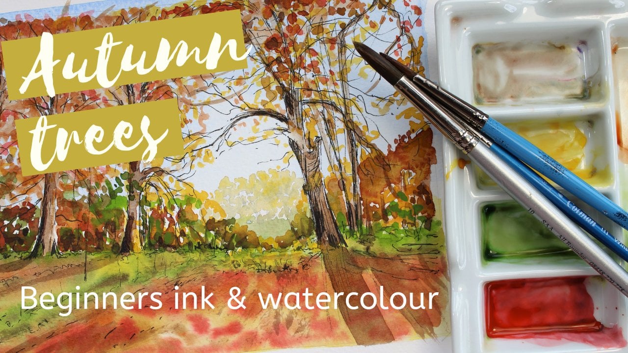
Transcripts
1. Introduction: Hello, welcome to my watercolor Skillshare course on color. And I weren't here
on my home studio, which she told the family
farm were incorporated, which is in the
northwest of England. In this particular course, regards to looking at painting
flowers in watercolor. I've chosen to do
apple blossom because it's out of the moment
and it's very pretty. You could use a little
flower if you would like to. Anything that's just
available there. The main thing is I
wanted to talk through virtually the drawing and obviously the application
of the paint. But with any flower, what you really want
to look for first is the overall shape
of the flower itself. Don't start with a detail. Don't start with
individual petals. Start with a shape
of a whole flower. Break everything down into
nice big chunky shapes. I'm really, that's how you
should start any drawing. If you were doing a person, you start with just
the shape of the head. You wouldn't start with
doing the detail in the eye. That's what we really want to be looking at with the drawing. I'm going to go through
it step-by-step, which will give you time to listen to all the
hints and tips. And I've got to
stay along the way. And I'm using very few colors. I've already used for
four or five colors. I think. I've just like I said,
to do the Apple Blossom, kept it very simple
composition and they're very loose light background just
to make those pop forward. I've also used at the end some pencil just to pick
out a little bit of detail, particularly on the
focal flower here. Which you can do as
well if you like. Don't worry, if you haven't
gotten any pencils, you can use either the
watercolor pencils that I use. So I could use ordinary cranes. And if you haven't gotten it, just use a nice fine
brush and continue that little bit of drawing
in detail with your paint. Perhaps make a stronger mix
of paint at the end as well. You've got some brighter colors. Okay, so we'll go ahead
and now we'll talk about the materials that we're
going to use first of all, before we go ahead
to the drawing. But before you do that, really do make sure that
you're comfortable. You got a nice
comfortable space to work in, plenty of room. You've got your flowers. Interval's quite a distance in front of you, at
least about major, I should say, in front
of you so that your eyes are nice and relaxed
whilst looking at them. If things are too close, do you tend to be
straining your eyes? And likewise, if
the farther away, such as try it out, whereas the comfortable
position for you to sit and maybe pop some
music on in the background. But let's go ahead and find
the materials that we need. First of all.
2. Materials : Before you begin collect together everything that
you're going to need so that you're not looking
around for it later once you're halfway
through your project, I'm going to be used in
this Bockingford block. This one is a £140 in weight
and it's not pressed. I always use either
a £140 or above. Anything less than
that becomes a bit trickier to
work with really. But definitely go for
over a £100 if you can. This is a nice size and it's
gummed all the way around, so I don't have to worry
about fastening it down. Of course, if it's not gummed, you would want to
tape it to a board. Then I've got a nice eraser. This is a DO on one. Do just check that you're using a decent eraser and clean it off before you use it on some
scrap paper or something, you want a nice soft one that works where you can
get some really cheap, awful erasers to
try and work with a good eraser and a pencil. So this one is just your HB. I'm gonna be pressing
on quite darkly with my lines so that it
shows up to the camera. You want to do your
drawing very lightly. So just have a light
touch so that you can erase the pencil lines later on. Then you're going to
need some brushes. Of course, I've got three
different sizes here, but you don't have to just
work with what you've got. If you've only got one, you want something in a medium-sized with a
nice point on it. And then you can get into
all the small details. So if you haven't
got a smaller brush, you want something that's
got a really nice tip on it. So this one is a size six, That's a size ten. And I think that's a three. So we've got a nice range there. You're bigger one for applying more water and these
for doing the detail. Then of course you're
going to need your paints. I'm using this
Janelia travel set. You can use whichever
paints you've got. Again, if you buy the
artist quality Ron's, you're gonna get better
results because they've got a higher concentration
of pigment. If you're using student
quality paints, there's absolutely
nothing wrong with that, but you might find that you need to lift more
color off the pallet to begin with in order to get that intensity of color
on your painting. I've got a nice palette there. This is a nice
heavy ceramic one, so it doesn't move
around on the table, which is really handy to have. But of course you can use
anything you could use a food container or a plate if you're using
something like that, do try to stick to
something white so that you call us show correctly
when you're mixing them. If you use a colored palette, a colored plate or something, your colors aren't
gonna be right to the eye when you're
preparing them. Then to two jars for
putting your water in. Just some old jam jars. And you always have
to or I always have 21 for washing
your brushes out with a one for picking
up the water to actually apply to your
paint onto your painting. You really need to
jars on the goal and swap them as
often as you can, clean them out and
put freshwater. And as often as you can, keep your painting
nice and fresh, always have your kitchen
roll or tissue handy. Not just for mopping
up spills if you make a mistake
or an accident. But also it's very
handy for lifting off some color where you want to perhaps light and
you're paying team. Today I'm going to be using these watercolor pencils on the top of my finished painting. Just around a little bit
of extra detail and color. But you don't need to have these if you've not gotten
and you don't need to go out and buy an
each justice was just a little added
bit of drawing on the top with these nice colors. But like say, don't worry
if you haven't got them. Once you've got
everything together that you think you're
going to need. The most important
thing really is that you make
yourself comfortable. You want to have a
nice comfortable chair and a nice seating position. And the flowers that
you're drawing, you want to put them a good
distance in front of you. Not really close
up to you so that your eyes are relaxed and
not straining too much. And you find it easier to measure and you'll find
it more comfortable. If you've got them a little
way in front of you. I can't actually do
that on this setup because I've got my camera
and the window right here. This is just how I
have to work for the camera to get
the best light. But for you, if you
sit at a table and put your flowers a good
distance ahead of you. I actually like to pop
some music on as well. Whenever I'm
working, I worked in music just in the
background quite quietly, nothing to too loud, but it's nice to have a little bit of something
going on in the background. And I think you relax
into your painting when half of your brain is
listening to the music. If you get everything
ready and we'll go on to the drawing stage.
3. Pencil drawing : Before you actually
begin your drawing, have a really good look at the subject that
you're drawing. In this case, it's
these lovely blossom. But really study it and have a look at it
and use your eyes and measure things just
visually, not literally. And maybe you might even
want to get a scrap piece of paper and have a quick go at doing some little
sketches of it first, just to get a feel
for it before you actually dive in and
do the whole thing. Especially if it's something
you're not familiar with, It's much easier to draw things that we're
familiar with that we see every day than it is something that we've perhaps not studied. And I often find my
sketches are better than the second or third time around when you've really got
into that subjects. Because the more you
look at something, the more little things
you notice that you might not have
noticed at first glance. If you can draw, do your drawing slightly bigger than the actual flower itself. That way it gives
you more room to work with your paints later on. So the size is
entirely up to you, but it's easier to
sort of either double or triple your measurements. And then you can just make it easy for yourself
rather than doing it by times 1.5 or whatever. If you just double
it, it makes it very easy to do your
measurements later on. So have a quick study
of your subject and also think about what
you're going to draw. Are you going to do the
whole thing with the vars? Are you going to just do one
little flower on its own? You're going to
include the leaves. Are you going to include every
flower or leave some out? You don't have to draw
everything that's there. You're doing a painting, you creating an artwork. You're not necessarily just doing everything that's there. So if there's something that
you perhaps want to leave out to make a better
composition then do that. This is the Punjab
picture is actually a very nice composition
just on its own. And I've had a look at it
from a few different angles. I've decided to do it as
I've got it here now. To begin with, don't dive in by starting off in
the central flower, the flower and doing all
these little details of the seats and things, break the whole thing
down into shapes. The shape that I'm
seeing the most at the moment is the
central flower. And I'm actually going to turn my paper this way
up for this one, looking at the composition, it's gonna be much easier. I'm going to have more
space to work if I turn it into portrait, the central flower, and I'm not going to do
anything of the vase. I'm just going to
completely ignore the vows. Fits inside a circle. So if you look at that flower is going to fit inside a circle. Again, my lines are
going to be darker than yours because I wanted to
show you the drawing process. I've got a central flower there. And then I've got another
flower of a similar size, but it's at an angle. So for angles, circles
would draw ellipses. That flower is going
to fit into this. So we're not doing every
petal at this stage. All we're doing is positioning
the individual flowers. I've got another one here
that's on a slight angle, but it's a much smaller flower. And then I've got
another large one. Again, an ellipse shape because it's pointing away
from us up here. And then there's a
little bit of a gap. We've got one down here. That's a complete
ellipse because it's sort of pointing downwards. That looks nothing like the flowers at the
moment, quite obviously. Now we can place the leaves. Again, we're just doing
the outline shape. We're not going to put
all that detail of the spines and everything in. If you look, I've
got that wrong. Me or not gonna
be seeing this at the exact same angle attack
I've got it at anyway, but these two line up here. So when you're drawing, look at where don't
just look at the shapes of the items of the
flowers and the leaves. Look at the shape of this, the negative, this is what
we call negative space. If you've got that
distance there, right? You've got the fact that that
gaps, that shape, right? It's going to all come together. You've got another leaf
going behind this one. Again, we're not putting
the whole shape in it. We're just not put in all the
detail in rather we're just putting this actually
a tiny little one in here and there's another
tiny one behind that. I'm gonna leave out. Gonna make it a much
easier thing to draw if we leave those tiny
little ones out there, not really adding to it the compositions metal quite
nicely with these ones. And then this little one
going off to the back here, it's nice to add because
it's just going to give us that extra bit of green
behind the flowers there. And there's one coming down here that I'm going to leave out two. So this one, look at
where the stems going. We've got a stem going
up behind that flower. This flower here has a stem
going up behind that flower. You can hardly see the stem. It goes in-between
the petals here. This is where we come
to put the detail in. We've got the five leaves there and we've actually
got five flowers. Yours might be
different depending on what you decide
to use our pick. Let's start with the first one. And in the center there we've
got these little seeds. And then if we look, they've
all got five petals. This petal is coming up. Look at it carefully down there. And it's all fitting
into that circle. Look at each line on its own. So this one. The lines going up there, but it's actually curved over and we're seeing
the underside. So if you just look at that
very carefully and it's going in and out because we're seeing the backside of
that petal lower, it's curled, then tips over
and it curls down again. We've got quite a gap
between these petals. It's nice and open. It has been flowering
for quite a while. Some of the petals are
closer together than others. And it's forming a cup shape. And again, we're seeing the
outside edge of this swarm. When you draw in your flowers, the not a 2D object. There are 3D object. If you imagine them as a cup, the petals are coming
around that cup shape. They're not just laid
flat like that, are they? So you need to try and get those curls in of
the petal coming up. And some of that
comes from getting these shapes in where they're
actually turned over. So if you can see that they're just do one of these ellipse
ones and then I'll go on and put all the rest
of the detail in here. And I'll obviously, once
I've got the details of the petals in and all the edges of the
leaves and everything. I will take out these
guidelines with my eraser. This is why you need a really
good quality, nice eraser. And also the quality of your
paper effects that as well. If you have a poor
quality paper, you will find it
isn't as easy to erase from it and sometimes
you can tear your paper, etc. If we look at this one here, we've got a little petal that's completely with its back to us. We've just got the
back of that one coming away from this
edge of this petal here. We've got one that
comes out and again, we're only seeing
the back of it. It's all fitting
into this circle. It's very different
shape to this one. We see in the back
of this petal. A tiny bit of the inside. We've got one here coming right down to the bottom
of the circle here. And again it's got this
lovely curly frilly edge. And don't worry if every
curl and freely isn't exactly as it is
in front of you. You getting a feel for the subject that wants to kind of copying
around like that. Then we've got another one that line's wrong there
just to test out. Another one. That's quite twisted
up this way. Again, lots of curls, lots of edges showing. And then one out the back here actually that goes slightly further out
than I've got it on. All these little measurements and the way that the
garden and everything, as long as you've got the
correct number of petals. And then looking at the
copying up and they're looking like the
blossom that they are. Don't worry if every little
detail isn't exactly right, because whoever is
looking at your painting later isn't gonna have that exact blossom
in front of them. What you're going to
be showing them is the fact that it is
an apple blossom. Did I say cherry
be flopped before? He's actually apple blossom? So once we've done all the
flowers at all the leaves, with the leaves again, make
sure you get those curls if you can see this
one's got a damaged bit. And of course if you didn't
want to do the damage, but you don't have
to put it on and you'd see in the back
of this one as well. So that's got a
lovely shaped down there where you see in the back. And of course this is gonna
be important later because those are very different colors
to the ones at the front. And I've actually missed
out now looking at it, I've missed out this little
board. We've got a bud here. I think it will be
quite nice to put that in because it's
a different color, because it's a bud, it's sort of all Titan.
Still very pink. So I'll do that in more
detail in a moment. Once you've got them done, how much more detail you
put in is really up to you. You might want to just
some little delicate veins in the flowers themselves, but you probably want to just
put those in with the paint later rather than drawing them all the same
with the seeds. Actually, you could maybe indicate where the
seeds are so that, you know, you've got
to paint them later, but it probably easier not to do too many pencil lines in there and just do that
with a paint later. If you're a bit more
confident with your drawing, I will carry on and do
this in detail and get rid of these lines and I'll come back to you when it's finished.
4. First paint layers : To begin with, I've
made up two colors. This is read with
plenty of water added to make it
very, very pale pink. And this is just some yellow. The leaves themselves are nice and summary and it's
a very yellow green. And so what I'm going
to do is choose, put this yellow all
over each leaf. What I'm gonna do with a pink is put it all over each flower. Now you'll notice this
is very, very pale. The petals and set the cells, although they appear white in places they're not really white. There are very, very pale
pink and this will dry much, much lighter than its going on. And that's going to provide
the first layer of color. You need to do the
whole thing or sorry, I should have said also that
I'm going to put the yellow in the centers of some of
these flowers as well. And it's not quite yellow. It's much more of a brownie
color in the center there, but I wanted to just
cheer it up a little bit. And those browns can come in on top of the yellow afterwards. And it just gives us shows us where those lighter areas are to begin with because this is
all going to be built up. So you're working from your
lightest close to your darkest as you go along
with your highlights, you could lift them out. If I'm looking at it now, there's very few areas where it's where
it's actually white, the highlights or
more of these very, very pale pink color. And don't forget when you
put your new town and it's going to dry a lot lighter. I'll go ahead now and
put that on and then leave it to completely dry. That's drying. Just a couple
of things to talk about. They're really, one is, you'll notice that my colors are run into each other here. I didn't wait for
the yellow to dry before I applied the pink. Now, if you want to avoid that, obviously you just
do one color at once and allow it to dry. If you don't mind these
running into each other, which I don't because I
think it's just given us this unexpected little bit
of light on the edges, some of these petals and even where the pink is
going into the yellow, don't forget, we're
gonna be putting more color on top of that. It's all gonna make it
a bit more interesting. You're going to have
light and more light and shade where you've got
these closed merging, etc. If you don't want
that, like I say, let them dry if you
do if you don't mind it like that and I
don't mind it like that. Make sure that your two paints
are the same consistency. If you've got one of them that's much more water than the other, you'll find you make a mess. So just keep them the same consistency and
that'll be fine if they touch. The other thing to say is
now that once that's dried, we've got the shapes
of the flowers. They're more because
we've put the paint on, we can do a little bit
more erasing and get rid of some of these lines
once that's completely dried. And there was something else
I was going to say, yes, do be careful that
you've got all your stems going to make it
look like it's attached. It could look really
silly if these aren't attached and if they're just
floating around in space. So get those stems in and make sure that
they're all going to essential point because
they're all actually fastened behind the
central flower. If you look at that little ball, careful of blossom there.
5. Leaves part 1 : Now I'm going to keep the leaves quite simple because really the focus needs to be
on the flowers and this central flower
in particular, they're the things that
catch your eye and not necessarily the leaves. Now in watercolor,
there are all kinds of ways that we can
get the highlights. And if you're looking
at this book and now some of the highlights or the lightest areas I should say, are they actual
veins of the leaves? Now, one way to do this would
be to put a wax resist on. Another way would be
to use masking fluid. The way I find the
easiest actually, if you're painting wet
on dry is just to leave that area dry because you
paint won't go onto it. If it's left dry. You can of course,
lift out as well. Some colors are easier
to lift out than others. I'm gonna do a little bit
of negative painting. So the veins, I'm going to leave yellow and
paint around them. If you haven't got
that patients, you might want to put
those in, like I said, with a masking fluid
and you can use masking fluid either first or before your first layer of paint or you can put it on top. That's absolutely fine too. Now I've got the green striped. I should show you. I've used this green, which is quite a bright green straight from this
little scenario set. And to make it a little
bit more natural looking, I've used the color on the opposite side
of the color wheel, a little bit of the red, which is the one we
used for the pink into that just to make them
more natural leaf color. Of course, we're
also having that yellow from behind as well. Because like I said, the quite
a nice light summary leaf, they're not too dark. This first leaf is probably
quite easy to do because it's looking straight at us and it's not really
curling over much. It did have a big
chunk out of it, but I've not done that. I've pretended that we've
got a chunk out of it. Now, again, how much
detail you do with the the veins themselves because they branch off
from the central one. And then there's more and more is again entirely up to you. So I'll do this stem a little bit down
one side and leave, leave a bit of light on
the stem because they're capturing the light
as they go around. You'll see when I was
painting this initially, you'll see the
importance of having a really nice tip on your brush. Here. We're gonna go leave that little bit in
the center and then leave a couple of gaps
all the way to the edge. This of course is going
to take quite a while. But it's a really nice
way of doing it and get that when you're
coming in with your paint, get that really frilly
edge of the leaf. They're just sort
of jiggle your hand about and let it do it itself. As you go up, you just put
in blocks of greening. And you might want to leave some extra little bit of the
branches that are going off. You're gonna have more
time than may perhaps to get every single little vein in. And I'll just do some of the other side of this one as well to make it show you where that central one is and then it's making
more sense what I'm doing. You could actually easily get
lost during this and make mistakes with a should've had a little gap there should not. Just a lot of patients required. Can you see where
I should have had a gap here for that
stem to join up. Or we need to do with a damp
brush is very, very gently. Lift that out. When you're lifting out. Use a dump brush, not a wet brush. Again, if you want, you could
use a little bit at tissue. We could really spend hours
getting all these veins in Mechanical going around the side of your
petals that you're not going on to where the petal was. So carry that leaf
on in a minute, but I'm just going
to move over to one of the other ones and show you. So here we've got a curling over the back of the leaf is much lighter than the
front of the leaf. So you're going to
want to get that edge there and leave this here. And I'm actually just
gonna do curly edge of it. It's going to help
define it a bit more. And it's got some veins
going up the back, which because they're on the back or actually
dot so that's the back. And then this in front of it
is going to be the green. We might come in
darker steel with another layer after
this has dried. Again leaving that little
bit where the veins are. This is gonna take
a lot of patients, especially where
things are curling. Whether a bit more interesting was that dries that
once put in there. I'll carry on now and do all the leaves just
in this one color. Like I said, we might come back and put more color on that, but we don't want to be too
detailed in the leaves, lead the detail for the flowers.
6. Leaves part 2 : Those leaves a
completely dry and I'm going to go ahead and
put some more color on those just because
there's quite a few areas where it's slightly darker when it a bit more light and shade. And you could carry
on doing that. And you could go
very, very detailed. And you can see the
importance of having a nice tip on your brush
to do those shapes. This isn't as detailed
as you could have it. I'm not a details person. I usually work with much
bigger brushes and I get bored doing detail to be
entirely honest with you. But you might be the kind
of person who really, really likes all that detail. So in that case, but
every little vein in and everything and you could
really spend weeks doing this. So you just building up
the layers carefully, one color at a time and
going darker with each step. Now one way to go darker is just to put another
layer of the green on. You can see some areas where
it's a little bit darker, where I've been a bit more
heavy handed with the paint. Or actually what
I'm going to do, I'm gonna put a little bit
of blue in that paint now, just to make them all blue-green and make that a tiny bit darker. So just the same same paint that we've got left
on the palette. So always make plenty of
color before you begin. This is the thing
about watercolors. Have your paints ready,
have everything ready. So if I look at it, I mean, I've gotten several
light source is so I've got shadows in
different places. Your shadows with whatever
you've got in front of you are going to
be different to mine. And if you're working
from a photograph, just really look at
where those darker areas are and some of those
are formed by the fact that the leaf itself is curling and Caston
shade on itself. So by adding those shadows, you're gonna get more
of a shape to the leaf. So not everywhere,
just in certain areas. And you've just
got to enhance it. Like I said earlier,
you really want the flowers to be the center
stage, not the leaves. But just adding this
little torture shadow is going to bring those out. And you could go on and on for ages getting every little detail and that's already
made this leaf better. This leaf, the first
one that I did, and I think this is the same
with a lot of things you do with your artworks. Tends to be first thing in the morning when you're
just getting going. You make mistakes and you
don't get it right first time. So the first leaf isn't anywhere near as nice as
some of these others. I don't think I'm a little bit freer with
some of these others. So it's got a bit of
a shadow up here. It's slightly curling
over on the top there. And you'll notice
I'm not going with every single shape and I did actually get a
little bit lost on this one and went wrong. It's casting a shadow
on itself there. Where it's curled over. The lightest area is the underside of the leaf
that we're seeing here. And it's dark down this
side because it's slightly twisted so it's casting
a shadow on itself. And you can see how that's
kind of bringing things to life a little bit more
and making more of a shape. The corps aren't
exactly the same as the coolers in front of me. Just work with the
paints that you've got. You could spend time mixing more colors together
to get those right shades. But I quite like
these greens are nice and fresh and light. This one's quite dark. It seems to be in shade
for mole of polar flowers, this one, it's quite
dark all the way around. Subtractive enhance the shape that you've
already got there. Don't obliterate
those early lines. Don't forget your
watercolors are transparent and those colors are going to be coming through. You still got that lovely yellow coming through from underneath, making a nice light
bright painting. I was wanting to avoid
doing anything too dark. You can actually
indicate some of those extra lines
with the paint. Then this one is quite
dark here because this flower is casting shadows. So you can see here we went, we the pink paint running
to the yellow early on, but now we can't really
tell that that's happened. It's much darker
down this side where it's again, it's curling over. Just be careful
around the edges of the flowers. In the urine. Hansen that shape you're not spoiling the shape that
you've already got there. And keep a note of the
colors that you're using so that when you come back to this painting in
a day or two's time. And you think something needs
a little bit of adjustment. You've got, you know, which colors you used. It's gonna be dark
under here because it's flowers and everything
else are cast in shadow. You can keep this color and put another layer on afterwards.
If you wanted to. Perhaps need to get
a little bit more of these curly edges to give it
more of a feel of the apple. Okay, I'm going to
leave the leaves, the leaves and carry on
with the flowers now. So let them completely dry.
7. Flowers part 1 : So now we come onto the
petals and actually the petals are completely
different to the leaves, whereas the width,
the leaves, the veins were lighter than the
rest of the leaf. In this case, the veins themselves are
actually very pink. So that's an easy thing to do. We can just do that with
the paint and we need it. Like I said, nice tip on there and we can just
put the veins in. Now, you remember me
saying earlier about the shape of the cups of these
petals. Look at the veins. The veins really make
the shape of the petals to whether the face and right towards you or away
from you, etc. And again, I'm not putting
every single warning. I'm just going to
give an impression. The shape, where the
going rather than every single one on that, helps build the shape of
the petal because they're coming around the
petal around and up, forming that cup shape and they branch off at the edges
as well a little bit. So I'll give you an
impression of that. Undo the whole thing, and I'm not going to carry on and do everything there with you because you'll get
bored watching me do that. But again, on the backside of the
petal, It's much pinker. So this little boat here. So this is also where
you're going to be putting some extra color in. There has a lot of pink, also, the backs of
some of these petals. So you remember when we were doing a drawing to begin with. So again, it's the opposite way round to the leaf
because with the leaf, the backside of the
petal was lighter. With the, sorry, the backside of the leaf with lighter
with the petals, the backside is darker, it's the pink of the two cars. So go ahead and do
that and then you may want to come on
and put some more on, as well as having the veins is little blushes of pink
here and there as well. So we might put those
over the top ones that's dried as well. I might even add a tiny touch of blue to this at some
point because it's a bit of a purply
pink that we've got there rather than
what I've got here. But don't worry too much about the accuracy of your colors. Unless you're a botanist and you want it to be completely right. I don't worry too
much about color. It's more about getting
an impression and a feel for the objects
that you're doing. In this case the flower there earlier on I made a mistake with the
drawing of the stem. It was behind or in front of it. And it doesn't matter
because as you come along, putting those colors on
and building the close-up, that all kind of fades away. So I'll carry on now
and put all this detail on and then come back to
you a little bit later on.
8. Flowers part 2 : I've just added a little bit
of nice violet to the pink. They're red, should I say? I'm going to put this in some areas for a little
bit more detail. Just carefully looking. This is gonna help pick out some more shapes
of these petals. Say Hey you where the
yellow came over before. It's not really a problem now. Darker in the center there. By putting it up again, start the petal, it brings up metal forward. Don't
put it everywhere. Just look at where is
the absolute darkest. Very sorry about the
hammering going on outside. If you can hear that, I'm
not sure if you can pay. And again, like I
said, with the leaves, It's really dependent
on you how much you put in of the detail and
the extra layers of color. Light should I say? Tone. Could really build it up by, he could do ten layers and just build and
build and build. And you'd have a
very, very detailed botanical drawing
at the end of it. That's all part of developing
your own style as well. In my style isn't detail. I do think maybe I'll have
more patients in 20 years time and maybe do some
very detailed work. But we'll see I'm not
a patient person. I've gone slightly
arrived with this one. I'm not sure I like this
little flower here. It's seems to have
lost its shape of it. Let's see if we can get
some of that shape back. This is only a tiny little
one and that's not the focus. Your focus is in
the center there. I think that's enough
color for those for now. I could say you could emphasize that if you really wanted to, we need to get the
centers of the flowers. And I've got a little bit
of background to that. But what I'm gonna do first
is do some background. Let this completely dry and then we'll come back
and do some background.
9. Background : Now although everything else
we've done is wet-on-dry, and that's a really
good way to build up detail and layers
of color and laser, layers of tone and
shade, light and shade. What I'm gonna do with
the background is do it onto wet paper with
a nice big brush. Wet just into the center. I'm not doing the whole thing. But you weren't really well. I went with this one too. Let the flowers look
as if they're still on the tree rather than an
inner vows in my studio. So choose carefully. And again, although this is a big brush, It's got a nice tip to it just carefully with some
nice clean water, probably cleaner than
mine if truth be told. Go around that central area
but not write out to hear how quick this water
dries is going to depend on how warm the room is, how warm the day is, etc. You might find you need
to reapply paints, sometimes reapply water rather. Now, I've still got these
colors left on here. So what I'm gonna do is make
it look as if we've got leaves and things in the
background and just drop. You're not really painting. Just drop in that color into that water that
you've put there. And don't worry if it looks
quite strong at this point. It's going to dry
lighter and you can always add a little
bit of extra water if you're worried about it. Being too bright. You don't just have to
use the green there. You could add some yellowing to get some nice areas of light. And just teasing around with your brush but
don't paint with it. You just drop in in color. You can even add a little
bit of the pinky colors. Just so maybe there's some flowers off into the distance behind it
on the next branch. Now that looks a little
bit messy at the minute, but that's going to dry. Lighter and we're gonna put more detail onto
the flowers here. Again if you want, I think did we have, you can
always paint in as well. Lecturer areas or lift out. So if you've decided
it's a little bit dark, I think maybe it's a bit
dark here while it's wet. Just lift it out. Or you could lift a
splash of light out as if it's a leaf behind somewhere. Okay, then just leave it alone. This is one of those
things where you could end up messing it up if you went on to far managed to get
a bit of green on here, I just wanted to tease
it up a little bit towards this flower and it's not looking quite so Apache there. That flower looks a lot more impressionistic now because it's set against that very
loose background. Leave that to dry.
10. Pencil detail : You can see how much lighter
that's dry behind there. And it just looks like there's maybe some leaves
and things behind. Even some of these have
actually made some leaf shapes. So that's a really
nice little technique just to make it look
a bit more natural, like it's Ines outdoor setting rather than its sat
here in the studio. I'm going to use some of my
pencils to make some detail. You don't have to do this. You could carry on with
a very small brush and do this in paint to that
absolutely up to you. And I quite like using these. And the reason I use
watercolor pencils is if you make a mistake,
you can lift them off. You can blend them
in with some water. You can make them a
little bit softer. With the brown one,
I'm going to put in all these little tiny
seeds and the kind of an oblong shape going in all different directions
out from that center. Some of them overlapping
where the petals are. Some not. You need to do
that for every one is, it has got some
kind of darker ones and then some lactones as well, which perhaps they're not
just as mature shapes there. This bottom one,
this bottom flower. With the warmth in
the studio here, it seems to have opened
up more than it was. And I think that's
where I was finding this little one tricky
before as well. The shapes change from
when I did the drawing. Two, when I've been
doing the painting, one thing you can do, which I would
recommend that you do is to take a photograph of your flower before you set off just with
your smartphone. And then if they open, open, if they change shape as you're going along
with your drawing. Especially if you need to come back to it tomorrow or whatever. If you take a photograph,
you can just have a quick look at that to
see how where things were. This lighter one,
I'm just going to put one or two large ones in the actual stems stocks as well. Because you can't
do this in paint. There's no reason why you can't. Some of these were actually a
little bit like drink cola. You might want to use the
relief technique that we used for the veins
in the leaves. I always find this easy. It's an easy little
trick to just do a little bit of
drawing over the top. I'm not gonna get carried
away with every little seed. Again. It's an impressionistic
feel altogether really. Behind here we've got some
little bits of green where obviously the flower is
attached to lack a bit of a, I don't know what
you call the back half of it where
it's come out from the don't like that green. Just erase that. It's very bright.
Can you see it? So I can, and I'll
sit acid green. I'm just gonna go for
this darker wall. You could do with
this width paint. Can you see how it's just
making a little bit more? It was shaped to the flower. Could use it for the stems. This little flower here, and it needs a bit more
detail in a little boat. Here you've got
the curly petals. Now everyone likes outlines. I like outlines alike,
making the shapes. But you don't have to do this. These are just ideas. Still don't like that a little bit. Let's get rid of that. It's really just these
tiny little leaves here that need the detail. I'm not going to use
this on any of these, perhaps just here
we need an edge. If you wanted to do
some of these edges, you could just pick out little bits of detail here and there where you
feel it needs it. But I don't want to
overdo it with the green. So now to the pink and I've not gotten
going to use this one. They scrapped purply color, but it's got a nice point on it. And just pick out
some of the shapes. This is a lovely
little board here. It's getting the shaping
of that's quite nice. Whoops. This central flower. I'm not gonna outline. Every single petal, I'm just pop in lines here and
there you can see, I'll outline this little
bit where it's curled over PECSA, these lines in. Not going to outline
the whole thing. You can correct things that you've gone wrong
with your paint. If you've painted over some way, shouldn't have
missed a line out, you can just do that
with these pencils. See how the whole thing
is coming forward now. So you could just put the focus on this one or not put
any detail on the list. I'm just going to put
one or two lines on, on these, but try and leave
this as the central guy. Where the detail is. This is a lovely petal
here the way it's gonna curled up by having this darker behind that
shows up more again here. And do you remember here we
went over with the yellow, so it's quite nice just
to pick that petal out and bring that
one to the four. It's knowing where to
stop at this point. You could do this for
every petal on every leaf, putting all this
extra detailing. Not really detailed so much as emphasizing the lines
that are already there. But actually if you do that, you lose your focus and I think the focus wants
to be on there, so I think that's enough
for the rest of them. Overall. I'm not entirely happy
with the leaves, especially this one over here. Can you see here it
looks a bit messy. And this 11 thing you could
do if you weren't happy. Just to make that
disappear a little. Because to my mind, my eyes go into this rather than here. Just pop very carefully. Don't forget, this
is completely dry. Pop very carefully, a little
bit of water over there. And it's just going to
soften the whole thing. That looks better altogether. And again, down here, I think those colors were a bit taken the eye
away from the center. Just soften it and make it
a bit more impressionistic. As if they're kind of molded into that background
that we've got. And that little bit of
light they're created. By taking that out just makes it look like the sun's
bouncing around as well. So if anything, I think
it perhaps needs to be darker in the center
behind all the way. It's a very open plans. If we look at it, the, there is a lot of light coming
through between those stems and leaves
and petals is quite open, but by having some
darker colors behind it would have brought the whole
thing forward a little bit. But like I said, don't
particularly like these colors of the two greens. They would need to
do that in paint, put some extra behind here. In fact, I'll do that now. If I can find my brush. I'm sorry if I'm rambling a
little bit now, but you know, Romain just getting those
darker areas behind that, he's gonna perhaps pop that
out a little bit more. I'm just going to go
with a damp brush, just touch the edges of those bits of paint
that I've done there. And that'll just soften it
off and it'll melt into the rest of that background
that we already put Tom. You won't really be able
to tell the difference. Now that's all completely
finished and dry. One thing I should have said is before you put your
pencil lines on, that, you could have arranged your original pencil drawing. You could do that
as you go along, as you build in your
paint layers up, of course, you're letting it
dry in between each layer. So at any stage you can go ahead and erase your
original guidelines. Minor hasn't completely
disappeared because I was very heavy-handed because I wanted it to show
up to the camera, but that's not really a problem. Yours will be a lot lighter, lighter touch than
I put on there. Now if you wanted it to
be lighter in places, when you get to this
stage are all kinds of things you can use to
get some white back. You could use white ink. You could use a white
crayon wax pastor or one of your white pencils. Chalky IV. And there's all
sorts of ways you could get some whites and light back
into that if you wanted to. If I did this painting again, I would have made my initial
wash of the pink, the red. I would have made it
a little bit lighter. But other than that
I'm over overall, I'm quite happy
with the drawing. I like these little lines
that we've put on at the end. I think that's lifted
the whole thing and brought it to life. So I'll be interested
to see how you do and what differences we have in the different
flowers that you choose to pick and draw and paint for us. And actually, I think you
could do what I've done and keep a very limited
palette if you think about it, we've just got a few
colors in there. All I used out of here, and I'll just show
you is this green, which is a very grassy
green, isn't it? We added a little
blue to that at 1. This is the red, and we added some of the violet at the end. So we've just got
those four colors, then the addition of the pencil. So that's kept at a really
nice simple painting.
11. Conclusion : I hope you've enjoyed doing that project and I really
look forward to seeing the finished results
when you upload your work and I will give
you some feedback on that. If there's anything
you want to ask along the way beforehand, just give me a
message on Instagram. That's the easiest
way to contact me. Of course, you can also
contact me through my website, through WhatsApp if you go onto their website or on
contact details there too. Just to conclude, there are
a few things I would change. I'm hoping that by showing my mistakes
and telling you how we do things differently
another time we're all learning from that as well. Obviously, as I've said
all the way through his portable a lot more detail and then I could've built
up a lot more layers. You could spend a month
on his painting if you really wanted to
import all those tiny, tiny little details in that
depends on your style. And really with all
of these courses, I don't watch too much
influence your style. That's a personal thing
and that's something which you will
develop over time. If you use your
watercolors every day, if you do a little bit
of sketching every day, eventually your style
will come through. And it depends if you're
a details person or not. And whether you like lots of color or whether
you're lucky, very subtle and loose. It's all very, very much a personal thing and I don't want to influence up too much. I just wanted to
give you the tools and the hints and tips that will help you do get there
if that makes sense. Okay, so the Horner's two things I would
change about this, like I did say earlier, I would perhaps have made the first initial wash
of the pink a little bit lighter so that the paper was shining through
that a little bit more. Doesn't really matter because at the end of the day
nobody is going to have those flowers next to
these paints in my new seats. The other thing is now
looking back at it. I've actually got this
leaf quite too big. Just dominates a little bit. It would've been better if
it was about here somewhere. And just little bits of things with the drawing
app wraps rushed. But like I said earlier, you've got time to sit and
do those measurements. I'm measuring person. I never measure anything. It's a bit silly me diction using you should measure things, but as you getting
going, I didn't measure things as a beginner. It is a good idea to measure just to
double-check those things. And it doesn't really matter
so much where the plant, because you're gonna
have some big petals, some smallest and bigger
leaves and small and these progressive do
that into a personal, something that the
measurements are really out of or into matter. If you're not confident with, you're just using
your eye and you want to measure them. Do so. Like I say, I
really look forward to seeing all your work, anything that's all
you want to ask, please do so I'll be back again to see you soon with
another Skillshare class. Bye Bye for now.
 Cally Lawson, “Paint like no one is watching"