Transcripts
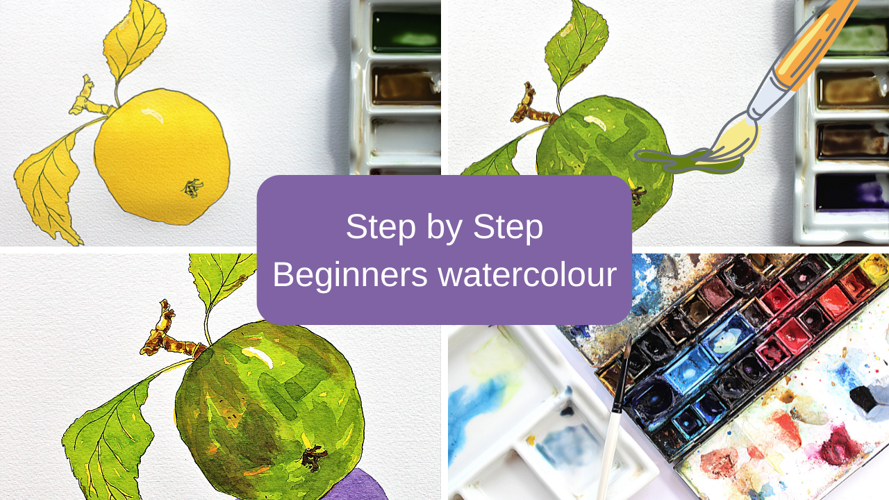
1. Introduction: Hello, welcome to my
latest Skillshare course. In this course, we're
going back to basics which really suited for
beginners to watercolor. And we're going to be painting
an apple step-by-step. The main thing is
that you really need to concentrate on is to allow every layer to completely
dry in-between layers. So if that means going off
and doing another job or going and having a brew
while the layer dries, make sure you do that. Don't rush it less. Every layer be completely
dry in-between. As a beginner, painting, wet on dry as we're
doing in this course, is a very easy way. Or a good way should I say, to get to know your materials, to get to know the
painting process we have with watercolors. And avoiding at
the accidents that can happen when we're
painting wet in wet. We're going to keep the actual
drawing very, very simple. A simple shape of an apple
with a couple of leaves. You could pick another
object as long as it's quite a
simple shape to draw. And you're not
going to be putting too much detail in there with your pen drawing as
beginners to watercolor. And this is something
that I've touched on before in previous videos, both here on Skillshare
and on YouTube, is the most important
thing really is getting to know your own materials and how much water
to actually use. Because the key word in
watercolor is water. So it's all about
the amount of water that you actually add to
your paints on your palette, the amount of water that your particular paper
that you use in, he's going to absorb the amount of water that your brush holds. So each one goes through in
this course is going to have slightly different results
depending on those things. And the fourth thing
that you've got to think about also is your environment. How warm is it in the
room that you're working? Is there a draft out those paints going to
dry much more quickly? And you'll find this
if you work outside, you're painting on
a dry more quickly. So by practicing as
often as you can, you're going to get used
to those things and adjust the levels of
water depending on how how quickly they're going to dry and how much water
to your brush holds, et cetera, that can make
a really big difference. Get used to knowing
your own materials. So doing a very simple
step-by-step exercise like this, which you could do
quite regularly because you could keep
picking different objects, allowing those layers to
dry in-between each one. You can get to really know your materials and
that's the main thing. So try and use a decent paper and a good brush if you can the best
you can afford. I always say, if you
can't, don't worry, just use whatever you've got an adjust your painting to that. But a paper, I would go
with something not really less than a £140 in
weight if you can. Okay, So go ahead now with this very simple
painting of an apple.
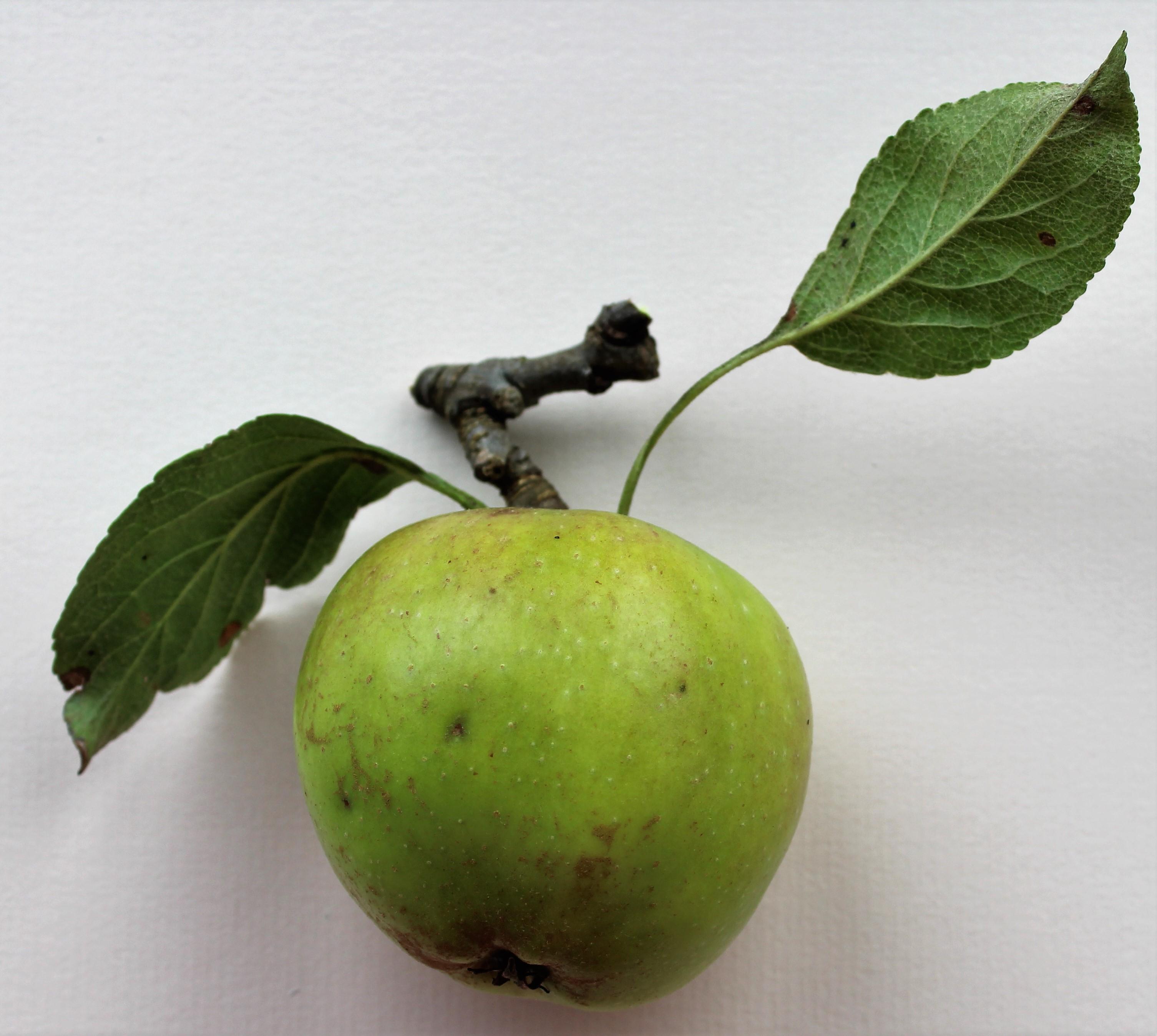
2. Drawing: As I said in the introduction, it's good to keep the
drawing as simple as you can with just a few lines. Don't over-complicate
it and don't put too much detail in just one or two things
to bear in mind. Although Annapolis spherical,
It's not just like a ball. There are some flat edges on it, and of course they're all
going to be different. This one was out of our
orchard and they're all, they're not quite the uniform shapes that you might
find in the shops. So just look carefully at
the object that you're drawing and see where
those lines are. But keep it simple. So when you go on with your pen, again, just keep it
as simple as you can. I've put some little
veins in the leaves, but I've not put every warning. There are also some
little bits of imperfections on the leaves and just putting those on gives
it a little bit of character. Whatever your drawing you
might not be doing an apple, you might want to choose a
tomato or something else. Whatever you've got to hand actually to do
your drawing with. Just look at the basic outline
of the shapes that you've got there and when you draw and that's a good
tip to remember, is think about it as
lines and shapes. Don't think about
it as an apple or a tomato because that's when you start to worry more about your drawing is when you're
thinking about what it is, just look at each line
and shape individually, and then you'll find that you're drawing emerges from that. So after I've done
the ink drawing, I decided to put some
highlights on using a masking fluid just where the light's catching on
the top of the apple. Don't worry if you've not
got any masking fluid, you could use something like a wax resist or you could
just leave that piece of paper dry where you
want that highlight to be, Paint Round it. The main thing to
think about with highlights is that you
don't overdo them. One or two is much more effective than having lots
dotted around everywhere. So if you're going to
use masking fluid, if you do have some, I've got use the Winsor
and Newton masking fluid. If you do have someone,
you're going to put that on, use an old brush. Don't use one of
your best brushes to apply masking fluid
as it can spoil them. So use an old brush
that you're not too worried about and wash it straightaway afterwards so that the masking fluid
isn't drying on there. Make sure that's completely
dry before you go ahead with the first stage of putting the first layer of
paint color on.
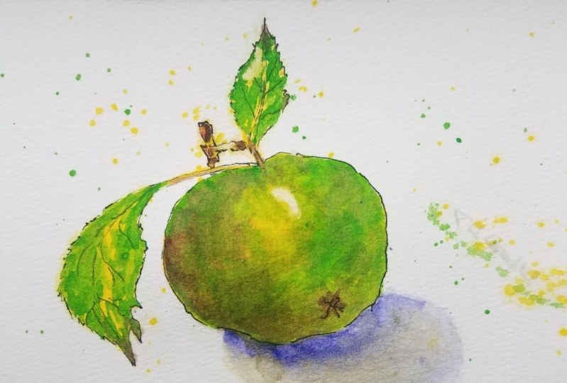
3. Layer 1: The first color that I
used with cadmium yellow, and I actually made
quite a strong mix. So by strong mix, more paint compared to water. I did this because I wanted a nice bright cheerful painting. If you want your apple to be a little bit more subtle and perhaps more realistic colors. You might want to use something
like a yellow ocher or a raw sienna of those to my preference
would be raw sienna. I think it's a much nicer
color than yellow ocher, especially when it's
layered on to other colors. But I'm sticking to the cadmium. And if you want to use that, I would recommend it because
it's something that probably most of you will have
in your palettes. So just cover the whole thing. Being careful around that masking fluid if you've used it, make sure it's dry before
you put your paint on. And just be quiet, gentle when you're painting over it there. Make sure that you load your
brush up nicely with paint. This will mean that
you don't have to keep reloading your paint brush. And it will be easier
to get an even layer. It's not great when you paint brush doesn't hold a
lot of paint and you have to keep dipping it back
into the paint to reload it. So make sure it's slightly
damp before you set off and load it up nicely with paint
and cover the whole thing, leaves and stem and everything.
4. Layer 2: For my second layer, I've got two colors. I've got, let me think. I've got a sap green and
I've got a raw umber, which I'm using on
the stem there. So again, don't feel
that you have to use exactly the same colors may work with what
you've already got. Don't go out and buy anything, especially you
might even want to make your own green up
if you've not got one. So a nice fresh green for
this nice fresh apple. And I'm just putting a
layer over that layer of yellow that we've already
got there that have cost is nice and dry. So don't cover every single
little bit of yellow. The idea is we want some
of that to come through. The apples, not perfect. It's got imperfections on, It's got little bits of light and little bits of spots on it. And the leaves, the veins are lighter than the
rest of the leaf. So just hearing that
as you're painting, leave bits of that
yellow to show through. And that gives us some secondary highlights as
well because we're going to have the highlight of the white
of the paper, but yellow. Afterwards, once we've
got all the greens and the darker colors
and they're going to work as little
highlights as well. So just jiggle your
brush about a bit and leave some of that
yellow showing through. As I say with all my videos, you're going to have a lot
longer to do it than I have. I rushed through a little bit
just so that I can show you the process and so
that I'm not boring you by spending hours
on the painting. So you might want to leave
more of that yellow. Like I said, my Apple has
little yellow dots on it. Again, it's going to depend
on what you're drawing, on what you're painting. But do leave some of the
original colors to come through. That's part of
layering up wet on dry in watercolor is that you're
building and don't forget, your watercolors
are transparent, so the colors below
are going to come through the colors
that you're applying. So as you apply that green, it becomes a yellow green, it becomes a nice, fresh, bright green because the
yellow is shining through it as well as the white of
the paper shining through it, which is what we feel about watercolors being
nice and fresh and crisp is because we've got
that lovely white paper shining through these
transparent layers of color. So don't just think about mixing your colors
on your palette. What you're actually
doing here is mixing the colors on the paper. So you're mixing that green
and the yellow and the white of the paper together
to make one color, which is nice, fresh,
yellow, green. Okay, so do the whole thing
again and then leave it to completely dry before we come
back with our next layer.
5. Layer 3: The third layer, I'm
using two colors. I've got a burnt umber to go
on top of that raw number, which is going to make the
stem a little bit darker. And again, like we said
before with the last layer, leave some of the
previous colors there. So each time we're
going to leave those little bits of highlights
and that's what I want to give more depth and a bit more of a 3D effect
to that stem there. The other color that
I've got is the green, which was still on the palette. And I've added into that
some Alizarin crimson. There is a little bit of a
pink blush to this apple, and I will put more
red on it afterwards. But adding that
little bit of red to a ready mix green can actually make it
a little bit darker. So I'm going to use
that for some of that, where it's more shadow to give the apple a little
bit more shape. And you'll also see
that I'm starting with that brown color with
the burnt umber there. I'm putting in that little I don't know
what you call them, the little bits at the
bottom of the apple there. I'm putting those
in as well without darker color and also
with the darker color. I'm just going to
put a little bit of a few nicks on the leaves. Because at this time of year, and obviously those
leaves have been on the planet for quite
awhile and they'd been bashed and
battered and you've got some little bits of rusty
brown bits and things as well. You'll notice I'm not putting an extra layer of the green, the darker green on the leaves. That's because the
leaves are much lighter in color than the apple. And again, this is going to depend for you what
you're painting. You need to look at
your own colors and the depth of color and
where the shadows are. So pay particular
attention to where the shadows are and where
the object is darker. This is gonna give
you like a bit of a 3D feel to your object. If you can get some of that
shadow in the right places.
6. Layer 4: To get the very darkest areas on the stem and on the base
of the apple there. I've added some French
ultramarine to the burnt umber. And adding a dark blue
to a dark brown makes a really nice dark color
that I prefer using two black and brown and
the blue together, it makes it a little
bit more richer than a black that you get
straight off your palette. So I've used that dark
color just to give, again more depth and more shadow to the stem there and bring the
whole thing to life. Because if you go nice and dark, it actually pushes your
highlights forward. In. Don't be afraid to
go too dark with your paint just in little areas. And the other color that I've mixed there that you'll
see on my palette is a very pale wash of violet. So it's actually Windsor violet. And I'm going to use this as a shadow just
underneath the apple. And by putting a
shadow on the apple, it makes it look
as if it's sat on the table rather than
just suspended in midair, haven't thought about
it now actually, we could have just left it like that because
we could have had it as if it was still
hanging on the tree. We couldn't even put a bit of blue behind for a
sky if we wanted to. But you might be doing a
different object to me. And if it sat on the table that you'll want a shadow
underneath to make it look as if it's sat on
the table and not just floating the object that
you've got in front of you. If you put it on a
white piece of paper, your shadows will
show up better as well because you'll have
different light sources. So take a look at where
those shadows are.
7. Layer 5: For my fifth layer,
I'm actually using slightly more water
in the mix here. And I've just got a little
touch of alizarin crimson. And this is just to give that
pink blush to the apple. So again, it's going to depend on the apple at your drawing that you're painting rather that you've got in front of you. But mine has a little
touch of pink, so I just wanted to pop
that over the other colors just to give a little
blush dare to the apple. I'm also going to just increase the shadow
underneath with the violet. So just using the same violet again on top of what
we've already got there to have the shadow closer to the Apple
to make it look like. We've got even more
dark under there. And that again, is going to
increase the idea that that's a 3D solid objects that's cast in that dark
shadow underneath it.
8. Final touches: Once you're happy with
your painting and you might want to add more
layers than I have, or even less layers than I have, depending on how detailed you want to go and how
dark you want to go, and what colors you've got in the object that you're doing. Once you are happy and
it's completely dry, you can remove the masking
fluid if you're using it and use clean
hands to do this. So make sure your hands
are clean before you wrote that masking fluid off. If you've taken it off and you decide it's too
big or highlight, you can always paint over
that paper and correct it. If you use the wax
resist for this, you would not be able
to paint over it again. So just bear that in
mind if you're using wax resist to use
it very sparingly. Now at the end, I decided
to have a bit of a phone and just put some
splatters over this. If this is something you
haven't done before, you might not be
confident about doing it and worried about
ruining your painting. So you might not
want to do that, but have a bit of a play
on a scrap piece of paper. So basically you're just
loading your brush with the color off your palate
and flicking your wrist. Like as I get to get
a scrap piece of paper and have a
practice with this, but this isn't essential. This was just a little bit
of fun at the end there.
9. Conclusion: Okay, so I hope you found that useful and that you
enjoy doing it. I look forward to seeing your work and I
will of course give feedback to those
of you that took load your work here
to Skillshare. If you need to contact me at
anytime to ask me anything, please do so here on Skillshare or all my contact
details are over on my website and you
can always get in contact contact with
me on Instagram. As I said in the introduction, you don't need to stick
to doing an apple or other objects that you could
do this exercise with. And if you're on something
a bit more colorful, you could go for a lemon or
a tomato, but then again, it doesn't have to
be fruit and veggie could do a nice
simple flower shape, just a daisy flower
shape out of your head. And practice building
up those colors and layers and going a little bit darker with each layer perhaps. And again, like I said earlier, it really is all about practice and getting to
know those materials. So the more of these
little exercises you do, the more confidence you
again with your painting. So thank you very
much for taking this class and I'll be back
again with you soon here on Skillshare and of course on YouTube as well.
Bye Bye for now.
 Cally Lawson, “Paint like no one is watching"