Transcripts
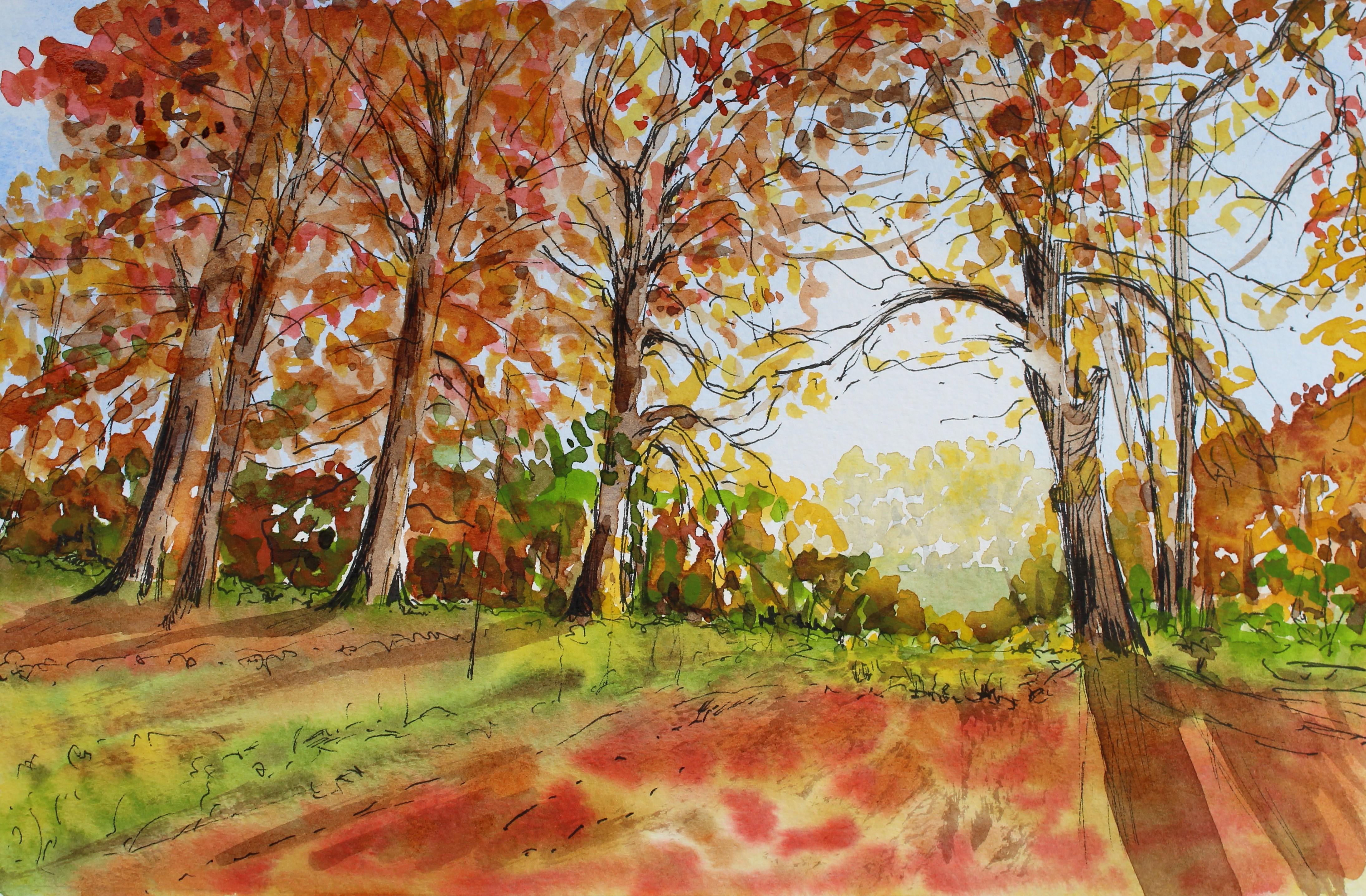
1. Introduction: Hello, I'm Kelly. I'm a mixed media out. It's based in Cumbria, which is in the north west of England. I enjoyed teaching McGuinness painting and drawing on here on skill share A teaching a series of classes in ink and watercolor in this class because every painting an autumn see with some trees so gonna be looking at a light and shadow on distance. So a few things to learn lots of tips along the way. So good working from this lovely reference photograph, enough out picks a bait, and you can find that in the attachments for you to download work from yourself. A home. It would be lovely at the end of this class if you could share your work with people, but also to get something back for myself if you like it so you could do that in the project section. Want to leave the class? Also, you can talk chapter may. It's any time by going into the community section if you want to ask me questions along the way. Also, please do feel free to reach out to want to do that. Message me on there. I get back to you with anything So you enjoy the rest of this class. Let me know what you think in the reviews are community taps on. We'll also let me know if there's any other suggested you might like to do next time. Mm.
2. Materials list: For this course, you're going to need the very basic watercolor kids of watercolor paper, £140 a pencil and a razor, a ruler, a palette for mixing your coolers, some kitchen towel or tissue removing the paint. And, of course, you paints and brushes. All of these materials show will be put in a pdf es. You can download that another print it off or just have a look at it on your monitor on. I will put a little bit more details about the materials there in the last skill share class it did, which was also on a landscape in income watercolor. I did go into very much more detail about the paper brushes and pens that you need to be choosing for these exercises. So if you do want to go back, if you haven't seen that previous course, you can have a look at that and those particular classes on choosing your materials, and it will go into much more detail for you. So before you begin your this exercise, make sure that you've got everything toe hand ready and you're not having to rush off and look for things halfway through it's much more enjoyable and easier to complete your painting. When you've got everything, they're ready to begin with a little bit organized. As I also said in the previous skill, Share costs don't feel that you need to go out by hordes and hordes of materials. You're better having a few well chosen, better quality items. Then you're having lots and lots of cheap about supplies. Just think carefully about what you are purchasing. If you do need to go out and buy anything but try and work with what you've already got.
3. Pencil guidelines: before you start your ink drawing, you might like to do a few pencil guidelines because obviously think you can't remove it if you go wrong. So it's good to have just a few pencil guidelines. So you get your measurements and initial drawing right before you start putting in that detail. So to begin with, I've actually made a margin. Just pop up, picture out of the way. And I've actually made the margin exactly the same size as the photograph just to make it easy. If you wanted, you could Scalea top or even scale it down, I probably wouldn't advise scaling it down because you leave yourself very little room to work. Then you could scare you, took by times 1.5 to etcetera. But just be aware that you're drawing is gonna take a lot longer if you make it much, much bigger. So on this pad, it was easy to make it the same size as my photograph in. Of course, it's really going to depend on on you whether you print the photograph off or whether you just worked from it from your tablet or from your phone or from your laptop you might just want to, you know, keep those dimensions to make it easier. So keep the dimensions between the height and the width, sir. So overall, I'm gonna leave the composition pretty much as it is not going to alter things too much because it's already a nice composition. And this is the thing about getting photographs from the Internet. You quite often get a lovely composition to begin with because they've been taken by a professional photographer. This one off picks obey. It was It's clearly a very good photograph to begin with. You don't need to be ultra in this composition. So the lovely thing about this is we've got lines going towards this focal point where the sun and the light is We've got this line of these weeds or whatever. They are here on the ground, going in this direction on the line down here as well, all pointing to this focal point of the sun here. And also we've actually got the trees on a slight tilt. So the way that the tilt inane also helps, you know, enhance this focal points of this area here. So this is what we really want to be making into our point of interest on Look at the way that this branches arching over. So, you know, you really making that oval shape there to keep that shape in mind as you doing your drawing that you want to leave that light there. So the guidelines that I think we're gonna be putting in a really are the line of this foreground ground which is covered in leaves further. But we've got some grass, but we need to get this line in it. So I'm gonna actually measure that, and you can do this too. So it's about four centimeters up where that line starts. As you get more confident and you do more painting and drawing, I wouldn't recommend that you always use your ruler and measure things. But actually as a beginner, it's a good thing just to give you that little bit of confidence that you drawings right before you start out in that pen to it. And then I'm gonna join those two measurements up. So it's going to go right down from one to the next and just do your pencil lines lightly. You will be Rubin these out later, but you know you might end up not needing to, because actually, your England they're gonna be coming over the top of those as well. So another line that I want to put in again, like I said, is this top line of thes weeds here. So if you go look there, it's about a centimeter down from here. So about here somewhere, going over to around here somewhere. And then the bottom line is coming right out to these corner, and that gives us a little bit of perspective for those of you did the previous cost. The previous landscape where we had a lane going away with a lovely stone wall that, you know, also gave us that perspective going to that focal point. So it's sort of again reiterating that way of drawing your eye to the focal point. We got another little line of weeds that just popped that lining. We don't want to be drawing too much of this background. If you look at this, you might not want to see it quite clearly on the camera now. But when you look at it on your own monitor, you can see that this is very, very light it's bleached out by the sun. We've got some trees here. We can see the trunks, but it's very, very light and hazy. If we start putting too many lines in there or any ink lines, that's going to make it come to the foreground. So I'm not gonna do any drawing behind this line. So the trees in the foreground are withdrawing. Knows that any trees or to growing behind this line here. We're just gonna be doing with the water color washes later on. If we start doing all this detail further back with pen and pencil, it's gonna really make that popped forward. So keep your detail for the foreground and just draw these. Let's count them. 123456 Trees here is actually drunk of another one showing there. But these six foreground trees is where we're going to be concentrating the line of our pens on. So with that in mind will just pop place them in. So we've got to quit up from here somewhere, actually angled that slightly more, maybe than it waas. But it's quite nice to have that on an angle and another one there, and this is just a guide. We're gonna reporting these in, of course, with the ink another one here just to position them. And then where these Which we'd stop here. We've got one. It's a bit straight to that one. And then the one on this side is coming on it on quite an angle on as a mention. We've got that brought brunch going over. So just indicate where that's going to bay and then a couple of smaller ones. It's actually one that split into at the base there. So that's all we need. As far as the pencil goes, that's enough guidelines for your pencil drawing.
4. Pen drawing: Now we come to the enjoying itself. Today I'm used in this pit pigment liner. Not size no 0.5. So it's quite nice. Size not too small that it doesn't show, but not too heavy either. So like I said, we don't want to be drawing much of this background while indeed any of this background we're not drawing anything behind this line to just keep that in mind. As you started drawing you drawing these foreground trees and some lines in this foreground leaves here. Now, when you do in your trees, don't get hung up on where every branches crossing on that every branch is exactly the right high. Took the tree etcetera because you would spend all day doing your drawing and you'd bet get quite frustrated. Unless, of course, you want to do a photo realistic drawing, which I'm assuming you don't. If you do in a line and wash little sketch, you want to keep it quite free. Just get an impression of those trees. So don't spend hours and hours looking at where every little twig and leaf crosses on. We're not gonna be drawing all these little twigs. We're not gonna be drawing every single leaf because some of that can come in with the paint, which is going to get the basic structure of those trees, I'm, you know, and a feel for the tree. So, depending on the assuming, these are all pretty similar as's faras, the species of the tria going. But you know some of these the way that these branches are swooping down a characteristic of that particular tree. So that's what you want to be looking at, not where every single branches, if you understand what you mean, you want to get the feel for it the way that they're arching down rather than worrying about where everything little twig crosses over. So anything else to say about the drawing is if you did want to put some shadowing at this point part of drawing something that's in autumn, you've got very high contrast between your lightest area and the darkest areas because of the low light in that time of year. So we're going to get some really nice shadows, and that's going to really make the cooler stand out as well in the light stand out getting that contrast in. So if you did want to go really quite dark in areas with the pen you could do just build up from cross hatching or some dots, whichever method you want to use to get nice and dark and get some shadows in. Just look at which side of the tree the light is sitting. So down here you want to keep it quite light and not put too many heavy pen lines. And down this side where we haven't got their lights reaching its very, very dark. So you could do that also with your pen, and he'll just save time later with your washes. You don't need to get any dark paint on. You've already got be shadowed there. So look at that and concentrate on where your lights coming from. The sun's it in this side of these trees. It sit in the back side of these trees here and keep that in mind the direction of the light and where the shadows are going on with this photograph. It's very easy because it shows very clearly the shadows on the ground, which we're going to put in later with the paint. So I'm gonna go ahead now and do the drawing out pops a music on while star do that and I'll come back to you in a moment to talk about starting, Put in the paint on, - Get some rest way. You have day way . Yes. Home. Don't. No way. Okay, - way .
5. Initial washes: for our initial washes, we're going to need two colors made up ready one blue and one yellow. Now, I use a very heavy ceramic pallets that I've got here. You can use whatever you've got to hand. You could use a plate if you've not got a palate. But I do advise using white because that way you can tell how you color is going to look on your paper. If you used to call it a color palette, it were very difficult. So the blue that I'm gonna use, I'm going to use some cobalt blue to begin with. So you say I've got plenty of water in there. This is why I'm using a larger brush to lift off the paint and apply the water into the palate to get plenty of watering. Not too much pigment to keep that nice and light, because it's a very sunny day. There isn't a lot of blue in the sky. It's quite bleached out with the sun and then for the yellow. I'm just thinking which one to use. I'll go with the cadmium yellow go nice and bright. Stop the frightened of use in some nice, bright colors because we're out in plenty of water to them, they are going to fade a little bit. And, of course, in the autumn we do have these very vivid colors. So let's make the most of using some nice bright colors. But if you haven't got cadmium, you just use one of your other yellows and the same with the blue. Use what you've got available to you. So a nice blue and a yellow there, and that's all we need to begin with. So for these initial washes amusing a one inch flat brush, use whatever you've got available to you but the biggest brush that you have available. Don't worry. If you've got a smaller brush, don't go out. Buy anything, especially for this. Just make do with what you've got. But, you know, be aware that it's much easier with a bigger brush. When you're a plane with a smaller brush, things going to dry out quicker because you're gonna have to keep stopping to fill a brochure with more water. So it's a nice clean water. We're going to cover the whole thing off dry. Finished with my drawing. I did arrange those pencil lines once the English dry. So just giving a couple of minutes to dry or go over it with the hairdryer. As soon as the ANC's dry, you can erase those pencil lines. Okay, so I've applied water to the whole of that, but it isn't sopping wet. It's just nice and damp. And if you want to see if you've missed any areas, just tilt your head to one side and look across the surface of the paper. And if you see any bits that aren't shiny that a dull, you can see that you've missed them and then you can go over them. Okay, so once you've done that and you happy that that's not too wet but that it's got a nice shimmer over the whole thing to see that it's all covered. You can then put these two colors on before we start this next bit a plane. Nicholas, it's important that you have some tissue handy, so just get one piece of tissue off ready screen Ishtar from pop upto one side, and then we will apply these to cause. So with the paper still flat, I'm going to apply the blue all the way across. Reload my brush go all the way across a gay. Now you can see here how it's pooling, so I'll just quite my brush in the corner how it's pooling where I had too much water on. To begin with, you must get rid of that by soaking shot with either a dry brush or a tissue. Otherwise, that paint as this drives will flow back into the sky. And now, because I've got that's what not to do. Sorry about that. That's what not to do, too. Don't you shouldn't really go back in with your brush into the whole thing. But I was just trying to lift that pool out because what happens is if you have an area that sweater on an area that's drier as it dries, the dry area will pull this wet into it, and then you end up with what we call a collie flower shape. So I will just careful to get rid of those little edges where it's a bit wetter and try and concentrate a bit more. Okay, I do like to leave mistakes in my tutorials because it helps you to see the I make mistakes , but also to show you how to correct them. Now you see, I'm going right over the top of the trees here. That's because in general, most of these trees are a lot darker than the sky behind, so that's not going to matter. The papers drain out quite quickly. So without wanting a hard edge on there just with a damp brush. Just saw from that off. A little bit of extra water, Thank you Can see have us making it. So we haven't got a hard edge. So if you papers going dry, which mine is, you can reapply your water. It's quite sunny today, so it's a drying quite quickly game because we don't want it to have a hard edge across there. So then get your yellow and go from the other end after, sir, no turning your paper over. I'm not going to allow them just to touch because we might end up with some green there. It probably wouldn't matter in this case, but you probably don't want green there. So again, I'm just gonna soak up the end there. I didn't get this tissue out for this job. I got it out for another job turnover. Get rid of some of this. And then I will get a new piece of tissue and show you what I was going to do with it. So I talked about earlier. We've got this highlight where the sun shining. So whilst this is still wet, lift out the area where the sun is and then carefully look at where else is very light. So it's very light across here and here and just dump some light back into the picture and some sunshine coming through here. Been about that as well, While was that? Don't worry too much about this line. If you've ended up with a line here like I have, because the paper was drawing up. Don't worry too much about that, because that's actually going to be covered up with all these oranges off the leaves anyway . But just be mindful that you paper could be drained quickly, and you may need to reapply your water. We've also got a line of sunshine coming down here. Okay, so you must do this whilst it is still wet. It won't lift off Azizi once it's dry without wetting again. Okay, so I'm sorry I made those mistakes as I went along on didn't explain. Perhaps is I should have done, but basically, we've two washes on the blue meat in the yellow, but not touching because we didn't want the mixing to make green. We have that dump in the middle so that the colors here aren't, you know, nice and hazy. They're not too hard a line on this is. Think of this as a bit of an undercoat. We're gonna leave. Obviously, some of these blues gonna be Quinn through for the sky. But the majority of this is going to be covered up with your other colors. So what you need to do now is when you're happy with the amount of light you've left there where your son is going to pay once you happy with that, leave it to completely dry.
6. Distance: to check and see that that paints now dry. Use the back of your hand and you able to tell if it still feels cool and it's probably still damp, and that doesn't feel cool. The reason we don't use the front of our hands is because we have oil in our fingers, and that could damage the paint surface there. If we put our your onto that, obviously, the water cause out on a stick to that, so just very gently with the back of your hand feel if that's still dump and it isn't that's nice and dry now. So the first thing that we're going to do now with the actual painting is to put the very background in so as far away as we can see, which is those few little trees here. Now, this is where you got to be. Careful with choosing your colors. We know that these tree trunks a brown, but the thing is, you've got to override your mind on what we know and use your eyes. Painting is all about using your eyes to look for those colors. The cause that were actually seen aren't Brownback here? They're very gray on the very pale because of such a long distance away. So don't automatically go for your brown paints when you start drawing drunks and things. So to begin with, I'm going to make a very, very pale grey to do the drunks of these ones that we can see in the background here to make gray. I used the three prime records, so I'm going to use the same two colors we have before a little bit of cobalt blue, some of the cadmium yellow just a tiny bit because it's quite a strong cooler. And then I want to add some a littering crimson to that again. Like I said before, you use which ever cause you want to from your own. As long as you've got the three primaries, they're still looking a little bit green there, which makes me think we need to have a tiny bit more blue. And don't forget blue receipts, so it's going to make it look further away if it's more blue than it is yellow or red. Now we contest that in the margin to see what it looks like, and that's a really nice pale grey that we've got there. So this is why you need a nice tip on your brochure. You can get some nice fine lines, so you want your brush to have a nice point, and then we'll just look back here to where those trees are. So I've got a little bit of graphs here and then right in the background. We've got some trees. We'll just put in a little impression of those branches and trunks there and again. Don't worry if it's not exactly the same shape as the tree that's on the photograph, because the person that's gonna be looking at your picture later on isn't gonna have this photograph in front of them. And this might not even be sure. Not very much to you at all, because it's so delicate. I'm fine. And don't forget, this is going to dry even lighter than it's going on. As you come to the tip of a branch. Just lift the pressure off your brochure that you get a nice point to it. You might want to put some extra little imaginary sort of bits in the bottom to give us an impression of some bushes and things as well. Okay and then we're gonna leave that to completely dry while substrate We're gonna make the next few colors up. So the other colors I can see in the background there are a very, very pale yellow. So I just used again the same yellow I used before. But I wanted to go further back, and I want it to be much paler than what we're gonna have in the foreground. So plenty of water. But I'm also gonna add a tiny tap touch violet or purple to that. Now, this is on the opposite side of the color wheel to yellow, so we'll make it a much more natural color on a much paler cooler. Then it would have been without it. Then that's gonna again make it go backwards. So when these have finished drying, we can pop that over the top. And I just looked to see what other colors I can see there. So I can see. Obviously, we've got this grass in the foreground as well. So when you use a green straight from the pound and the wall, I'm using his sap green. If you've not got to green, don't worry. You can just makes your yellow and blue together again because it's a little bit bright and unnatural looking. I want about a tiny touch of the Eliza into that Eliza ruin, or red is on the opposite side of the color wheel to green. So by adding just a tiny touch, you can make a bit more of a natural green rather than the one straight from the pump. And again, I'm just gonna to tiny Torchmark and a little bit more water cause we want that to be nice and pale. So this is where your margin comes in handy. Contest all your colors out again. I think we need a bit mark array, but more of a greeny grey. So I'm actually going to just use the one we've already got. Undoubted little bit of extra yellow on a little bit of extra red rather than mixups. Amar colors and waste what we've already got there just a bit of an extra cooler to give us a bit of variety in the background, but again, still with plenty of water. So I'm hoping now that these little trees here nearly dry and we cannot some cooler to those. So we'll start with this nice yellow. Just dash it around a little bit, as if we've got some leaves on these trees. And by laying it on top of this dry paint, we can still see the branch through their trunks because it's so pale, this paint, the underneath painting is showing through. So just dot and dash, use a bit of imagination and leave that white coming through. We still need the light there. Maybe brings him down as if we've got some yellow in the grass there. We have got a little patch of yellow here, but also leave plenty of the white paper to give us up feeling of light that we want throughout the whole picture. So go on to this grass now which comes across here on a cross here. If it's sort of going back into those trees and everything that comes in front of this is gonna have more pigment in a bit brighter, so it's gonna make it come forward, okay? And then we can add some of this extra gray color into some of these bushes and things and into that grass. Just give us a bit of variety. We're always gonna have some shadows in those trees, even though they're all the way about their So just a bit of variety. By adding an extra caller in places, I'm just gonna pick a tiny, tiny bit of company and open my brush from those that we had earlier that the one that used in the foreground and pop that into here. You'll see on the picture. We've got a lot of light popping through there, so I'm just gonna mix it in on a tiny touch in one or two of these trees just to brighten the whole thing up. But again, Still plenty water on that paper. And we want all that to fade back. So that's enough for that. We're gonna leave that to dry now, and then we're gonna come onto these mid ground trees on either side here.
7. Middle distance: for the mid ground trees. We need to mix up quite a variety of some brown's Cem graze from yellows and some oranges and some greens, and I leave up to you really, what colors you want to use, because some of us might want it really subtle and allow the pep to come through. If you look cooler and you wanted to be more vibrant and you want to add extra pigment, then that's entirely up to you. You've got to work to your own stale and what you like. So if you're a person who is naturally drawn to bright cause, then use some extra bright colors if you really want to. Plenty of nice bright yellows and it's a good excuse to do that with a in autumn painting, because we really do have some bright cause they look at these bright yellows, so don't be afraid to use plenty of pigment in these next cause. So I'm going to use again. I can use these same ones, but I want to up to them and not adding extra water to them because I want them to be a bit thicker than what we have already used So again, I want to mix the three primaries for this one this time. Want to leave it a bit more ready Brown rather than a blue color cause it's gonna pop forward a little bit more if there's more red and yellow in there compared to the blue, but more read such a nice sort of rich, ready brown. Then I'm gonna use a nice yellow into this world. No extra water but using that pigment that's already there so that it's not just cadmium. It's a nice mix, tiny touch of red to make it a bit more on the orangey side and again, some of that green, which is rather nice. The sap green. You could use an olive green and again, some Eliza ring crimson to make a really rich cooler and then a nice bright orange on my even put just cadmium orange as it is from the pump. Perhaps a little bit too bright that Wilders proper toe touch of blue into that a game because it's from the opposite side of the color wheel. It's going to make knock it back a little bit and make it a bit less bright. 10. Church more water. And then I think we need some brown straight from the pan in the form of some burnt sienna , which is a beautiful color straight from the pounds, so we don't need to mix anything into that. If you like things more natural, you could just use your earth cause. And you could use your earth yellows, your sienna or yellow ochre rather than using the cadmium. In this painting, you don't have to use a cadmium if you want to keep it more natural now for paint in those mid ground trees and shrubs and everything that we can't really see because it's sort of halfway covered by the trees here. We can't really see what's going on round here and here, so it's not of imagining it a little bit. Let's just let these colors mixing together from about this height somewhere they're going up slightly higher. I've actually made these a little bit too high, but it doesn't matter. As I said before, nobody's got your picture to be comparing it to photograph, leave some gaps, not only to let this guy come through, but also because we're gonna be going on top with some other things later on. Leave those trunks. Don't let these cause drought before you got some extra colors in. So do this wet in wet. So we're doing a combination today over what we call a wet on dry technique on a wet in wet technique. So just keep picking up different colors with your brush, letting them flow into each other. Use the tip of your brush to get some dots and dashes, and to leave the white of the paper showing through on the I believe of the sky. And can you see how this mid ground is now much further forward than what we painted about here? So what would paint about here is now nice and drives. We can go over the top of it. Just keep mixing those colors as we go along on the paper, and that's why we need them ready before we start. So have them ready in your palate before you start applying them. Get a little bit of this red orange. You know, we could have some really nice deep colors at this autumn time of year. Go a bit wild without coolers, very the height of where these air coming up to us. Well, just allow those close to flow together on the paper. Just clean my brush in for a little bit, united much of the yellow. Let's get some of the yellow in. And can you see how much thicker these paints our than that when we did to begin with, they've got a lot less water in them. And of course, when you're doing this, you're gonna have more time than I have. So you can think out about where you want your different colors and how high what all this to go. But I think that's looking quite pretty, just allowing them to flow into each other. And I think that's enough. You, at this stage, you could be tempted to carry on and put way too much in there. But I think what we need to do now is just to leave that to completely dry and then come back to do the foreground.
8. Trees: whilst that mid ground was drying, have made of piccolo for the trees. So this is burnt sienna with some of the cobalt blue. It's good to use colors that you've already used in the rest of your painting to make your darker colors. It just makes it more harmonious if you know in introducing lots and lots of extra cooler. So to begin with, I'm going to wet these trunks or just wanted to time, actually, because if you look carefully, you can see that the light is more on one side than the other because of the direction of the sun here. So the sun's coming from this direction. So these two trunks here, if we just drop the color into this side of the trunk and let it flow across, makes suicide a little bit lighter. In fact, have not really got it thick enough. I might come back and puts an extra layers on this also, what you could do. Another little technique is just to put the color of one side of the drunk very carefully. Actually, go lift the pressure off your brochure that it tapers out using that point of your brush on then you can with a dump brush, squeeze the excess water out of it and just soften it all the way down so that you've got the light on that side of your tree possum extra color into their I'll come back, actually, when that's a little bit Dreyer and add some extra. So again, try and hold you proof quite loosely and try and lift the brush to get some shapes. So carry on with your drawing, really drawing with the paint now as well as you were with the pen. And earlier we put those broken lines in because we're only seeing bits of these branches behind the leaves, and those leaves are gonna come out in front of them. So just put some broken lines and allow them to crisscross also. But doing that, it gives you the impression of some light coming through the trees. These ones don't really need any light because the light's green from that way. So this side of the trees, actually more or less in complete shadow, apart from just here, because the sun is actually shining on this area here completely, so that's a little well, some of that still wet. I'm going to get some extra of both those to cause without adding extra water to make that a little bit thicker. Plenty of the blue to make it nice and dark and thick and again at that to the side of the tree. That's the darkest whilst it's still wet. It just makes it so. You've not got all the same color going up the tree, looking to uniform and boring. And you could also use that dark color for a few extra branches, dots and dashes. And then you getting some variety in your tone. See how loosely I'm holding the brush. Make sure your branches go off the top of your picture nice and dark at the base here. Once again, you will have plenty of time to have a think about where all these lines are going. I'm doing it quite quickly for the purpose of the video. Okay, so I'm gonna leave that now so again about the same colors. But I've made them a little bit thicker of added extra pigment again on have also made up another green. So this is the same green, the sap green with some of the yellow in it. So now, with the tip of our brush, we're going to put these leaves on, and this is going to take a little bit of time. Just build up some tone and allow those callers to mix together. But don't obliterate your light and don't obliterate thes sky. Let some blue come through. Let some like him through, particularly in this area we talked about earlier. So I'll go ahead and carry on, put in this color on and perhaps popular little bit of music on now. - Now I've got some of those leaves and I'm going to get a darker color again. So they're saying, Wanna have before of the blue and the burnt Sienna and just pop a few little dip dots and dashes here and there of the darker color as well, because obviously the leaves of casting shadows on themselves and got some gonna have some shadows in there and some shadows under the branches and things. So just and if having your darker colors dark is going to make those highlights show people more so that feeling of delight is going to be emphasized by the fact that you've got the darts there if you're frightened to go to dark and you don't get those in than your lights are gonna be as dramatic so nice and dark and again just dot dash as if we've got some shadows here and there. Little dots of leaves gonna have some darker bits of leaves. You're gonna have some light and shade, so just very impressionistic. Really. Don't overwork in overthink it. Like I said earlier, we don't be looking at every little branch and leaf. We're just getting an impression in there. You see there have lentil, not with my hand. And you might want to just flick one or two little brown shapes up as well, but dont over paint it. We've got the drawing there already with the ink. We don't need to cook completely. Cover that up. They want not to be showing. Okay, so I think we'll leave that now for that little bit and we'll come on down to the foreground here
9. Foreground: So this area here is actually much more shadow than this here because it's under the tree canopy on. We want the focus to be on here so we don't want this to be too detailed on. We don't want it to be too bright compared to here, So he's still got the same colors there on the palate. And to begin with, what I'm going to do is get a little bit of a bigger brush again. Don't worry. If you've not got a big brush, it will just take a little bit longer with a small brush and just wet the whole of this foreground. Now, when you paint in or putting water over a color that's already there and I may have told you this last time, I'm not sure in the last. Of course that we did was to think that you painted on top of glass to be very, very delicate. Don't be scraping away the paper. Just think of it as you drop in the war, Theron and blind in its across your not scraping those colors away. Okay, so now that's all wet. We cannot the coolers in very loosely for these line of weeds or what? They might not be weeds. I don't know whatever they are, so more appear again. Don't forget you've already got that yellow underneath, so you probably don't need too much yellow in this area because it's not actually that yellow. It's much more orange orange in green, really the two colors that were seen in the foreground on the red. So use that watch on your palate there, that dark green as well. Just let the colors merge. This is working wet into wet. Let the coolers merge on that paper there. But leave those little bits of white as well. If you want to, to keep that light there and some of this darker cooler in amongst those grasses and things for some shadow, you need to work quickly while he working wet in wet. And don't worry if you do go wrong, because you can lift that off whilst it's wet with your tissue. Like we lifted this area off earlier, Okay, And then, in this foreground, we use this nice, earthy brown color that we had from before. So again, this was just the three primaries, and into that will have those colors of those leaves. So we've got the lovely read orangey red that we used in the trees and just dash that in and some of the burnt sienna, which I haven't got much of here. I'll just get some more when you work in wet in wet. The vital thing is that your painter of a similar consistency don't go out in extra water into this by making a very watery paint mix. You see, there isn't much detail in this foreground because I'm wanting the emphasis to be on here and on the trees rather than on the ground, which there isn't much happening on this ground. But it's nice to get these lines in a leading us to there. Okay on to leave some light shining through, and I will just pop a little bit of yellow in one of two places. Just Brian a top. We've got quite a lot of yellow on here, and then we'll leave all this to dry and come back with some shadows on those trees.
10. Shadows: whilst that was drawing a made a little bit more of the gray up. So this is again the three prime Michels, but with more of the red and yellow and to make it quite a brownie cooler. And I'm gonna put these shadows ing on the quite definite defined shadows. So don't be frightened to leave that nice and straight that line, because that's how it is. And that's what gives us this impression of this son being very strong in that direction. Here it's a bit more dappled. And then over here we've got it going away from these trees here like this. The old gives you the impression of where that the direction off the so now and again to make it a bit more dappled. I'm nearly running out of pain. But if you have a dry brush and you run out of paint, you can get some nice effects by just dragging your brush on its side to get some dappled light and shade There. Now we've done all that is a good time to take a look at the picture. Stand back, prop it up on the site, go away, have a brew, maybe and come back here and think about where you may want to alter things are at two things. To my mind, this isn't strong enough and dark enough up here, these kind of pieces quite heavy up here on. If we make them a little bit heavier, it's again going to make this lighter. Make this shop. So what I'm gonna do here is just get a nice wash of some of the colors that we've already used with a bigger brush and just Kovar some of this area with some extra paint. So it's still going to see those dots and dashes of the leaves underneath. I'm just making the whole area. They're a little bit thicker, you know, and you could keep going back and keep seeing things that need altering or need improving on. But just be aware that you don't want to overdo it and sport end up spoiling it. It's better to leave it for a day or so in combat rate than carry on working on spoil it. But I think that has just improved it a little bit to make that canopy a bit darker, which makes this area look lighter. So I think I'm going to leave it at that. There's all sorts of things we could do to change it if we wanted to, to bring my light back or to go darker in places. Another thing you could do is come back with your pen. I'll just get my pen. So again, if you think there are areas that are not dark, you know, if you could combat with your pen and get even darker, answer perhaps extra lines and things if you want you to. And you could bring some lines on top of this that we've put here, you know, such is because you finished your drawing earlier doesn't mean you can't come back and bought some extra lines on top. If you want to emphasize some of those, even you know some of these little ones here. There's all sorts going on in this foreground, lots of little leaves and things. So how much detail you put in is entirely up to you. It's quite nice to get some directional lines and things in there so you could go on and on , building up your detail on building up your shadow. So the main thing is to really allow that, like to shine through to do not obliterate all this light to go really nice and dark in places so that the light areas look even lighter.
11. Conclusion: now they have come to the end of the project. Would like to thank you for taking this class and joining me here on skill share. I hope you've enjoyed it as much as I enjoy doing it for you as a setting. The introduction. It would also be lonely if you did want to share your work. Particularly all the people concede you cannot compare because it's always amazing. How old is the same reference photograph and end up with completely different pictures, particularly if you've been a bit for you with colors, like said earlier. So anything else you want to ask, please don't hesitate to get into a tree. May I will try and answer any questions. You have a whole predict for everything. The main thing with this particular painting was to really look at the difference between those lights and darks. Don't be afraid to go really dark where those troops were incomplete shadow and to keep you really been like where those highlights are, where the sun is That way, you get a lot of contrast in your painting. Contrast is something that you need to know work to make it interesting to you once again, thank you very much for taking this class. I hope to be back again with one soon
 Cally Lawson, “Paint like no one is watching"