Transcripts
1. Introduction: Hello. Welcome to the skill share class. I'm Kelly on a work for my studio here in Cumbria. For those of you watching outside UK, come here is in the north west of England. And although I cannot wait to quite a lot of based and feel very fortunate that I do live in the most beautiful county in the U. K. I've been teaching out on YouTube for a couple of years now. We're teach quite a wide range of subjects and media. Here on skill share. I will be tailoring classes to beginners onto working in watercolor in ink. You may also have heard it referred to as line and wash our income wash wash for beginners . I think it's a great technique for building your confidence. With both drawing and painting on the application of your water coolers. Today's class is gonna be all about doing a landscape. This is a landscape of chosen. That's a view quite near to may hear that, Balakov. So there will be a pdf file for you to have a look at work from. I chose this topic because I particularly like painting landscapes myself. I've really got into them this summer when I've been doing quite a bit of walking locally on a home on paint. What? I've been seeing a water cooler. I also like painting while life. As you can see here, this is a painting in mixed media. But as you can see, we've got quite water technique going on. There were gonna be a little bit more controlled as beginners. We want to learn the fundamentals of drawing before we move on to free our work. If you'd like to see more of my own work, you can follow me on Instagram where portal dates of what I'm doing here in the studio. And you can also visit my gallery page on my website. So before we move on, that's just a couple of things I want to say. Firstly, please do ask any questions as we go along, I will get back to assumes that can on. If I'm not clear enough in my explanations, it's great to be asked live with that myself and teach you in a more coherent way. Secondly, the lovely at the end of the class, if you could take a photograph of your artwork loaded so we can all see each of us work. It's always interesting when you do something like this that everybody ends up with a completely different picture, even though using the same reference on the other thing, I want to say before you start is painting and drawing should bill about having for relaxing Please don't put too much pressure on yourself. It's all about learning on the best way to do ice repetition, trying to catch a little bit everyday and enjoy what you're doing. And don't be over critical of your own work. So I hope you enjoy this first class. It's all new to me as it is to you. ID. Let me know what you think. I give myself being back, and then I can improve the next time.
2. Choosing paper: the first supply. We need to talk about today's paper, and it can be a little bit daunting as a beginner when you go into an art supply shop where you go online and look at the supplies. Seeing all the different sizes, numbers and types of papers are not knowing what to choose. Broke it down like simply. There are three main types of watercolor paper. The 1st 1 is hot pressed, and this is the one that I use a lot in my own work. It's a very smooth paper, no one says pressed. That's the method of the process of making the paper, and you'll also see that they've gotta wait number on them. And that's also to do with the process of the paper making. So I use this ankle foot smell. This is my favorite one, Saunders Waterford. But they make the brand isn't as important as getting the right weight and type of paper for you to begin with. So as a beginner, I wouldn't use this one. The reason I use it is a hot pressed paper is very, very smooth, so you can get a lot of fine detail with you drawing but for May I love the way that the water call the moves very quickly across the surface of the paper. It doesn't sinking quite so much as it does with the other papers. And this is what makes Watercolor a little bit more tricky for beginners to work with when they haven't got as much control over the paint. So for now, doesn't you can get some of this and have a girl with it. But for now, this is not what you got to be working with. So you don't want a hot pressed paper. The second paper I'm going to talk about this is the wall that you will be using is a not press paper. Now, some people are so refer to this as cold pressed. So depending on the supplier and the brand you get you're looking for, either they were not all the word cold. That's the one that you need to be getting. Now we'll put a supplies list in a pdf for you as well to download. So all the supplies to talk about today will be written down in a handy pdf for you to keep so as well as looking out for the not in the cold on your paper that you're buying. You also want to look at the weight on the weight is in either imperial or metric. So it'll say £140 or 300 grams, and that is the one you're looking for. You really don't want to be working on something less than £100 in weight, so the reason for that is it won't have a lot of water, and it will book or quite easily. And then you'll have disappointing results. If you want to buy something over £140 that would be really good. However, it will be more expensive, So the one I really recommend for beginner to do this little project with is £140 or 300 grand's not our cold pressed. So the one I'm using is a blocking food world from state court puts male, but again use whichever brand you have handed to you. Now the other thing to say about the paper that you're going to be using is with this one. It is governed all the way around, so actually about water, and it absorbs water. It's going to local cockle a little bit like a door when the weather is bad and the door absorbs the water and then it swells on. You can open the door. That's what's happening with your paper. So it needs to be fastened around the edges so you can buy them that gold all the way around. And then when you finish, you just get your thumb under their appeal. That piece of paper broth and that's the easiest way, and I like to work like that. Other than that, you can use masking tape and take you aboard. So if you're using blue sheets of paper, you will need a board and some masking tape to take me on two. Okay, so the third. So that's one using on the 3rd 1 I want to talk about is rough paper, so you will see some paper labeled rough on. You don't really want to be using that this kind of exercise because your pen, the paper, the surface of the paper, it will be too rough to get a detailed drawing with your pen. It's really nice if you want to work with a lot of texture if you want to be quite expressive, and it might be something you want to have a play with and have a go with it another time. So the last thing I want to say about what Jenna paper you're buying is look, for once a tour acid free. This just means it's gonna be more archival, unless the longer you know, you have seen old papers weather going yellow on. That's because of the acid. You want to look for a paper that say's acid free.
3. Watercolour paints: the next supply, we're going to talk about a problem. Perhaps one of the most important is that paints themselves. You may already have some pain till he maybe wanted to go out and get some for this project so any watercolor paints will be final terrorists within your budget. So there's basically two types of watercolor paint student grade on artists grade. But the difference in them isn't the colors, which some people think they're not getting the same cause. If the by the students grade that the same pigments, it's just that the amount of binder on the binder is the thing that holds the pigments together. The amount of binder in the students quality paints is mawr and lose less pigment, so you need more pain to get the same depth of cooler. This is why artist quality paints are more expensive because they've got more of those pigments in, and you will also find that was a big difference in price between different cause. So pigments are much more expensive to buy than others, so it's worth looking on. It's worth perhaps buying a set to begin with. I use artist quality paints, and I bought these £2 sets, however, I often refill them when they felt live run out with tubes. I find it a less expensive way is to refill when they run out with the tube and just put that into the palm. These were Windsor Newton troops, and the first paints a ever use with the Windsor Newton artist pains, but have also got a Cinelli, a set here and sin Elia is a lovely set. The binder that they use is honey on. The intensity of the color is really nice, so I'll just pop these down a Z. You can see that one I have used an awful lot on That's the Windsor and Newton set on. You can put extra pounds in these ones here what we call a full pound on the little ones at the bottom of what we call 1/2 pan. So it gained. The half pounds will be less expensive than those £4 so just by £4 in the ones that I'm using, the most callers off don't feel you have to go out and buy all these callers. You really don't need a lot of calls to begin with as long as you've got your primary colors of yellow, red and blue, you could make a lot of your other colors. It's nice to have something like Sienna Brown for landscapes on a couple of choices of yellows in your old custom things and some nice blues. But don't feel that you have to have a full range of colors to begin with. This is a student quality sets, and this one is shrinky, and that's probably enough, and you'll notice there that there's no white there. And that's great because you don't really use whiting water cooler. We use the white of the paper, so a little set like this with you got a few yellows, some blues, reds and a couple of brown's. When a black is really all you need to begin with, you can make all your grey's under blacks on all the browns from your three primary colors . So don't go overboard buying lots of fancy coolers
4. Watercolour brushes: As with the paper, it could be a little bit overwhelming when you look at the wide range of Bush's available to you. But really, what you need is some nice round brushes, and you don't need to buy every size and every time. But don't worry too much about the brown, but I wouldn't recommend buying the very cheapest brushes by the best that you can afford. So I do like my animal head rushes my sable ones. This is one of my favorite ones. That's a size six round sable brush. You don't need to go out and buy sable brushes. The thing about the animal hairs is the Do hold more water, so you have to refill your brush less, and they have a really nice tip on them. However, you can get really nice qualities, synthetic brushes. So just look out for a nice point, A nice tip on the brush on all the heads together. That's what you're looking for, and I would go for something like this sort of size a size six, as a stake will want to have to begin with, you don't need to be buying every single size a size six. It's or something slightly above even is a good size to help this kind of exercise. When you're doing landscapes, you probably don't need a really small brush. You'll see here. I haven't got any tiny, tiny brushes. The only time I get those out if I was doing an animal or a person and I was doing the fine detail in the eye. But with something like a landscape, you're not really gonna need those very fine detail brushes, especially because we're already putting the detail ing with the ink pen. So the other brochure really would recommend you have. You don't necessarily need it for this exercise, But if you're going to be doing a lot of landscape painting on a lot of water color paint in the future, this is a warning. Flat brush. So with all these, don't worry about the make just something whatever is available to you where you live. But look for a synthetic round with a nice point on it around Number six on this one is a synthetic one inch flat brush. So those call round in that school flood, and that's all you really gonna need to begin with a good selection of round brushes
5. Additional supplies: apart from your paper paints and brushes and the pens that we're going to talk about in a moment for a few extra supplies that you may need all that you will need. So firstly, you need to water containers. This is just another jam jar on. That's what I use all the time, and you need two of those. You need one for cleaning your brushing on one for using the water to mix with your pain so that you're always using nice clean water to actually apply to paper on. Refill these regularly throughout the painting. Go on, take them out and get some fresh water. Another thing. You're going to need some kitchen roll. It's a tissue. Just this for mopping up spills the lift in paint off the paper and perhaps tapping your brochure to get rid of excess water. You're also going to need a pencil on a razor. You don't necessarily need a ruler, but it's hounded to have, and I quite often doing margin around the picture. Before I start that way, you contest your callers in the margin on Also, it makes it easy to frame on mount. If you did want to do afterwards, so it's a good idea to have a real Laura's well
6. Drawing pens: on the final supply, of course, is the pens. So you need a really nice drawing pen to do this exercise. I'm going to be using quite a fine one to get lots of nice, fine detail into this picture. I have a few different types. I use the Faber Castell Pitt pens. These came as a set, a black pit pen from Faber Castell. And there are lots of different shapes on the one that I'm going to be using today is one called UNIP in Fine Line. And this is a size no 10.5. As I said with the brushes in the paper, don't worry about the brand. Worry more about the size and whether it's going to give you got a nice tip on it and make a nice shape. So do you recommend that you practice using your pens before you go on to do your drawing? I did a little video off myself, making a great on trying out all these pens and doing some cross chapter in different ways of shading some dots. We could make some now shades and shadows of things by increasing the intensity of the dots . Very a pressure on your pen so that you can see what kind of lines and how dark it girls and how light you can get it. If you reduce the pressure, have a really good practice with them and make that griddle and you can keep it them for future reference. Even if you only have one pen, it's still worth doing that, and you can see what effects you can get with that one pen. So I would really recommend you do that. Don another. Pdf off that for you to just read through a few things there about testing your pens out So there's two vital things you want to be looking for when you're buying a pen. One is addicts waterproof because obviously we're gonna be painting across the top of it with water. Water soluble paints so it needs to be waterproof. Some pen say on the side. Waterproof. This one does some. What say like this water fast. So look for those two words, either waterproof or water fast on. The other thing is that it's like fast or light proof, so basically it's not going to fade over time, and it's gonna be archival if you have some pens already. Maybe you've had some given. Maybe you have some in a drawer for a long time and you know entirely sure whether the waterproof just give them a little test. Draw few shapes on a piece of watercolor paper, piece of scrap paper on with a little bit of water. Just go with top and see if it bleeds or not. But even with the waterproof ones, you do want to leave them a few moments to make sure that completely dry they will bleed when they're wet. So the ink once things dry, there will be water fast, but make sure it's dr First. You could always give them a blast with the hairdryer, or just go off and have a brew for a little while to make sure that's absolutely dry before you test it with some water over the top. So the most important thing for this exercise is that it's a fine drawing pen with a nice tip that's waterproof. Unlike fast
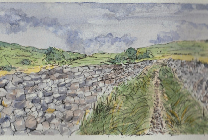
7. Getting Started: Before we start, there's one or two things you need to bear in mind. Firstly, make sure that you're comfortable. You're going to be sitting for quite a while doing drawings you want somewhere that's nice and comfortable on a position that you're going to be able to maintain. Measure. You've got plenty of light, natural lights, great for work. And where do you want to be? Near a window, if you can be when you do your drawing, but also make sure that you got everything toe hand you don't want to be halfway through and have to start going looking for things to get all your materials ready before we start this next part. So the first thing we're going to be doing is a few guidelines using pencil, you can see I've started by making a margin, and I've actually made this margin exactly the same dimensions is the photograph. As you move along with your painting and drawing, you're going to be altering compositions of photographs and things that you see and working from your own sketches. But for this exercise and because we're beginners, it's gonna be a lot easier if we just stick to the same composition as the photograph on a lot of the photographs that you get online because they've already been thought about by a professional photographer there, actually a good composition to begin with. So if we just have a bit of a quick look at the picture itself, we've got these lovely lines of the wall leading the eye to this point here. And we get that perspective going away from us and that this line of clouds here also brings our eyes down to that point. Ask does the line of this field here So we've already got a really nice composition, so we don't want to alter it. But the other thing about doing exactly the same size are the same dimensions. You don't have to do the same size. You could scale it to oppose scale it down, but do it the same dimensions so that it makes it easier to do your guidelines and your drawing. And you're not having to think too much about that whilst we're practicing on learning the techniques. So to begin with with the pencil, I don't want to put lots of detail in what I'm really doing is marking these points. So this point here, where the walls end the points here, whether we'll start And then, of course, the points where the hill start. So I'm not doing it all with a ruler or all cultures copy. And we're going to be a little bit freer when we put the detail of the Stones in, and obviously we're not going to look at every single last stone on do them exactly as they are on here. But getting these measurements right is all going to help us with that composition, so that's where we're going to begin. There are two other good reasons for leaving a margin around your paper. On that is it gives you space to test your colors, but it also if you do decide to get it framed or mounted at the end. It gives you a good lying to work to, and you're not trying to frame an edge so really plenty of space there to test our coolers . So I begin with this first measurement here because I don't exactly the same. I could just measure along the photograph, so that's 11 centimeters and we'll put that there and then this measurement here of seven. If you want to work in inches, that's entirely up to you, and you might not want to print the photograph off. It's expensive printing photographs off and using all that ink. You may just want to do this by getting the photograph upon your computer or phone or iPad tablet. The thing about working from a tablet is it's quite good because you can zoom in and out to your detail. So that's the mark of the wall there, and it goes right down to this corner here, so we need to find out now where it stops. So if we look at this here, it's about eight centimeters up and about seven centimeters in, so we go seven sent to me to say, and then about eight centimeters up. So once we've done that, we can put the line of the top of the wall and do this nice and faintly, because you will be erasing these lines later on. Once you've got that drawing in with your ink, the second line of this bottom line of the wall is here, and you'll see just how much of space this world takes up of the whole painting when you put that top line in there. I'm sorry. The bottom line of this wall, I was forgetting about that. So those are the two spaces of your wall and you've got the path in between there where your grass and everything is going to go. So the only other two measurements I want to do is this measurement here, three centimeters. We don't want to do too much with the ruler, but just getting those right. And then we know where the horizon is, and that's four centimeters up from there. It's gonna make us a little bit freer without drawing now to do the rest by I. So from the top of the field here, we've got a line of grass going off in this direction on what just put in the very basic lines in. We've got the path coming straight down more to this side wiggles in and out of it where the grass is. These guidelines don't forget. You don't want them to heavy. We've got a hill that's going more or less about here halfway down. So it's it's actually coming. So if we look in line as well, that's nothing you can see where this hill finishes here, where this slow piece is pretty much in line of where the wall finishes there as well. That can help you take your eye up from there. We're going gradually. So I've gone too hard because we're going gradually up to this line we've got there. So I need to take those top lines out. Was one of two little dips in No, but all that can be corrected with the pen afterwards with the more detail. So that's the line of that hill. We can't see exactly the line of the other hill because it's going behind some trees. But we will just put very straightforward lying down here and then across about here somewhere we're not gonna put the trees in That cannot be done with e ink, and we're not gonna put the fields in. So all these fields here, the lines of the hedges and things will do that all with e ink. And obviously we don't need to put this guy in just now. We're not going to do it. Any drawing in this guy that's all going to be done with paint later. Rome. So that's enough guidelines. So once you've got you two walls, a little bit of path, the foreground field there, the background fields on the hills in the distance, we've actually got another little bit of a field coming across here. Fine, and that is enough fear guidelines.
8. Drawing the detail part 1: Now, as we move on to the pen, this is gonna be the part of this exercise that's going to take you the most time. It really should take the most times. This is where your details going in the pain that we're gonna be putting on later is just to give us a little bit of color and texture on light into the picture. But it's not gonna be very detailed. The detail is going to become in wicked drawing with this pen. So this is where you need to be spending plenty of time on really thinking about what you doing. So does that earlier. This pen is a UNIP in fine liner, and it's a size nor 0.5. But whichever pen you're working with, that's fine. I would suggest some things on the smaller side, not something too chunky for this landscape. When I'm working in pen, I always started the back and work forward so that my hand isn't resting on anything and smudging what I've already done. And I usually in a painting as well. I was started the background and work forward to the detail because she wants a lot more detail here in the foreground. Then you're gonna have back here because obviously, if you're stood there, the camera tends to pick up a lot more information than our I. If we were actually stood there, we wouldn't be seen the masses amount of detail right back here, which could be a couple of males away. The detail needs to be in the foreground to make the picture more three D and give us that sense of depth. So avoid putting lots of fiddler details up here. Just give a little impression of where these villages in the distance with one or two strokes and put your detail in the foreground. Try and vary your lines. Try not have all your lines the same. Try and build some up a little bit darker and you'll see years ago along. How do that and with some cross hatching and things so that the trees obviously are going to be freer than some of the other areas. You might want to put some shadow in with your pen, but not all of it. Don't go. Don't go too dark and try and get the lines going in the direction of the hills the way that the comments. So when you if you put in some of these lines in here whether dips in the fields, try and get them going in the direction off the land itself to give us that feeling of it going down into the valley. Okay. So I'm going to start now with that I won't talk over as I'm doing it. But I'll come back later and talk about what? Of doom everywhere else to go. But But the summons stay. Be as reason. My feet was erected, Teoh. I wish I could say way. So what can I say The best way I thought I had shown the town. And that bring new well, wasin the stretch of road I wish I could stay away with lots of ways so bad What can I say ? The best that I can't wait. I hope that I could stay away a way What can I say the best way? No, I can't way No
9. Drawing the detail part 2: se or would be, like find And if way, way, way to miss Afraid way, How do I get to keep Wait way? I don't know. We've already Oh, no, I'm not that study. Don't Don't go for oh way. Wait, Miss Afraid sideways, up or down. When you get to this stage where you've got all the forming on all the shapes that you need in there, you and you think you're almost finished. You want to just sit back a little bit and think, Is there anywhere I need to go a lot darker and get some toning? Because we're not gonna be putting too much tone in with the pain. We're gonna be put in most of it in with the pen itself. So just look at this stage at your picture and see where the darkest tones are. So because this is in summer, we know it's summer because it's very overgrown with the grass. We've got a high lights, the sons from a both on the leaves on the trees. The treasury in full leaf are going to be casting shadows on the ground. So the base of the trees, it's very dark. So that's one place. We need it to be dark. Also the stones of casting shadows underneath. And so it's very, very dark under there on the grass is making it dark under here, beneath where the grass is, we've got one or two shadows on the hills cussed by these clouds. Such something else we need to think about. So this stage just have a quick look and see where it's the darkest on where you might want to put some extra shadows in. So just under the walls and things I wanted to have, these fields are covered with clouds. But don't go heavy handed on these shadows here, this little stone, we will do it way, way. Okay, so don't overdo that just wanted to shadows just to give us that sense of light and shade, and with it being a very sunny day, and I just used from cross hatching, you can use whatever methods you want to put your shadows in there. Doing little dots is quite nice sometimes as well, and then you can build them up, get them closer together, and that gives you a nice shadow shape. You'll see that on the grid that I did earlier. Okay, so that's enough for the ink. I'm gonna leave this now to completely dry. It should only take a few minutes to drive. But you really need to be on the safe side and leave it to drive for a little while. Because if we put water on it now and it hasn't quite dried used to going to make a mess, you can also. Then once it's dried it, raise those pencil lines. I'm not even entirely sure I'm going to bother. There's one or two here I might just erase, but you really can't see. The rest of them have disappeared under the ink on By the time we get the paint on the gonna disappear. Even Maher. So don't worry too much about erasing every pencil line cause they're not really showing at this stage anyway. So one or two things to say about the drawing itself look very carefully at the stones to get that sense of distance. Obviously, as we get into the distance, the stones need to be appear a lot smaller, and we need to get that line going that way. Such two things really get the perspective We need to get the line of the stone going in that direction, and we need them smaller at this end. Also, think about the way that dry stone walls are constructed. The stones at the base of the world a much bigger than the ones on the top. The ones on the top two seem to tend to be much sharper shapes because they used as a top stone to finish the wall off. The not always there, some of them may have fallen off these very round a lot of these stones very round because there will be used the ones that were there locally to use when they were originally made. The other thing about these walls up there are a lot wider at the base in the hour of the tops. They got the big stones at the bottom of the wider at the bottom. On in this one. On this side particularly, you can see that it's bowing out because it's wider at the bottom on the way to some there . So you want to get a few lines going in this direction as well, and you can always just come over the top and quickly pop a few lines. It's gonna help with that feeling of that being a round shape. So apart from a drawing of the walls with you, everything else you want to tranq it the not too detailed in the far distance on also, with most pictures, I would say, Don't have too much detail right on the edge of your pictures. Save that for in the center. I mean, in this case were really the focal point off. This picture is this shape of the path. So get some of those lines really emphasized. You might at this stage want to sharpen up one or two edges of the bottom of the wall just to make your I go even more towards that line, perhaps the edge of the path there as well. Okay, so we'll call that a day for the actual drawing. Leave it to dry. And then he raised those lines
10. Palette and Colour: Before you begin your painting, you need to be prepared with some of your calls already made up. You can make more calls or actually go along. But to begin with, we start with the skate the top and work our way down. We want some of those colors made are ready to begin, so if we look at the sky, it's quite a blue gray and that we've got there. So we're going to make up a gray and will make the gray out of the three primary colors. This palette here is a nice ceramic pellet. In the advantage of this is it's nice and heavy. It doesn't move a lot around too much on your desk, so either three primary claws to make a good grace. Oh, plenty of water to begin with. You'll see I'm using a bigger brush. Traction mixed my paints only because it makes it quicker. If you just got a small brush, she'll just take your little bit longer to lift your paint on your water and put get them in the palette, some beginning here with a cobalt blue plenty of that and then out into that some raw sienna now don't feel you have to use the same cause. You don't need to. It all you can even use already made grave you want on. We don't have to do the colors exactly the same as they are on the picture. We can use plenty of artistic license, and the thing is, with cooler, it's very subjective. We'll see. Cooler, different. All our eyes are slightly different. So what I'm seeing and what you see a scene will be two different things. So just be very free with your color, because it's a very personal thing to you. House you mix in. You can try your cause, either on a scrap of paper or on the margin as we talked about before. I'm looking up that now that's to green, which means I need less of the yellow in and more of the red and blue. So I should have said the red amusing isn't a leisure in crimson, so we're looking for a blue gray that's quite a nice blue grey. You'll see that's quite watery. We need a much thicker one now, so we need exactly the same colors, but with less watering. Sogang, cobalt blue rosiana on a littering crimson, so a similar cooler but a lot thicker will just make it a little bit thicker. So we're not adding an extra water into that mix were just at an extra paint pigment you can see now I've gone to read with that, so we need to add extra blue that's very, very blue. Let's just get a little bit more. It's a bit like baking a cake or something sometimes have a little bit too much flour, and you need to adjust that with more water or whatever. This is the same thing. You're adjusting your cause all the time between those three cause, and you can see just with those three calls how many different grades are going to be able to achieve. So I'll leave that for now. So, as I said earlier, we have two pots of water, one for washing your brush on one float plane, the paint You want nice, clean water all the time, so keep changing your water and I'm going to just make up some of the yellow. You see how that's a bit green because had that blue in there, So just ignore that for now. But we can use that will bear to use our afterwards get more of the yellow. So this is again the raw sienna. So it's what we call unearth cooler. We're gonna look about a lot more natural than using something like a cadmium yellow. But if you want to do a nice, bright, sunny picture, you could use cadmium yellow. Be a little bit more illustrative, A nice and sunny. So don't worry if you haven't got exactly the same causes may just use what you've got available to you and have a bit of fun with your color. It's a nice big wash of that yellow, plenty of water so you paint should be transparent. That's the whole idea. With watercolors. You want to let the white of the paper showing through and for the white, we use the paper. I'm just gonna have some extra watched that. I want that to be a nice loose wash. So for now that solar coolers I'm going to be using in the sky, I'm just using these two. I'm going to try and keep it much more simple than that is actually on the photograph, because with the thing with this picture is all the details in the foreground. We want this don't want this guy to detract from that
11. Distance and Colour: because we're working wet onto dry, we're gonna be allowing it to dry in between each stage. We're gonna have plenty of time to mix up the next colors when we need them. Like said, My main tip for color is that it is subjective and I don't want to dictate to you what colors you use because it's such a personal thing and that's what's going to make your picture unique to you. So if we look here, we've got lots of bright yellow in the foreground. I think there's probably some dandelions or something in this field here on the grass is very new and young, so it's got a lot of yellow in it and if we look further back, it's got much more blue because it's in the distance and it's bluer as we go into the distance, said that as well as its perspective. I talked about earlier. The colors are going to give us that distance, so make sure in the background you use more blues, more blue greens so you could even use a ready made green like this sac green. I've got here at a little touch of blue to it for these colors in the background to make them recede and go away. Blue is what we call a recess of color. It looks further away than it is. Yellow is a color that jumps forward, so if you put yellow right in the background here, it would make that he'll look to near to us. So actually come forward. Use less blue in your green and more yellow, and that's a very easy way to get that distance. So at some blue to green in the background and as you come forward at less blue and more yellow and really apart from your greens, there isn't much cooler in there. We've got a lot of white on that wall because it looks like it's had a shower and it's shining a little bit. So these areas on the picture, we're going to have to leave the white of the paper. It was a little bit of blue in there, probably reflected from the sky. And the thing is, if you bring the colors from the sky into the foreground, it gives you paint in a very coherent feel, to it makes it very harmonious. So that's something you want to think about doing. We haven't got much color in these little pebbles either. They're catching the lights, the pebbles of the actual path itself there. So we're not going to use in a lot. Of course, from Greys and some browns made from those three. Prime is they have to show you and some greens on some yellows made from mixing some blue to green, handsome yellow t agree, or you could make your own greens from your various yellows and blues.
12. Applying your paint part 1: Now we're ready to start the painting. We need a couple of pieces of tissue paper, toe, hand one. I'm going to fold up and pop to the side, and that's going to just be to doubt my brush on when my brush has got too much water on it . On the other one is to be lifting color actually out of the paper. So I'm gonna pop that to the side as well. Now, I've got a little tin of pencils here and I'm gonna prop my paper with that just that we've got a slight tilt on the pad there that's going to help the water flow this way rather than away from us. Before we start the sky, we need the paintbrush already wet before we picked the paint up with it because it meant it's much easier to draw. Paint it with a wet brush than it is with a dry brush. So we'll start with that color that we made up the gray of this sky, and we're going to put that all the way across. So start the left hand side, all the right inside. If you left 100 maybe you may need to reload your brush, depending on the size of the brush and then a second line. Make sure your touch and you go right to the edge. And obviously you need to do this before the paint above has dried, so you can't do one line and go away. This is all part of being doing water. Cause is that we have to be aware of how quickly they're drying because they will dry with a hard edge. And here we're gonna have to go with the shape of the hills on the tree that I was seeing some sky through the tree we got believes there to live a little bit of it. Why, where that tree is. But put some sky showing through the tree a little bit as well. So all the way across again, we got tree there that's showing a little bit sky through the leaves. If anywhere is wetter than any other area that stays, you might just want to suck some about with a dry brush. So what I mean is there you could go along, take some of the excess water and then just squeeze it out. Now, whilst it's still wet, most of his paintings. Wet Andre, as I said earlier. But whilst it's still wet, that's the best way to do some of these clouds with that next color, which is the thicker mix of the same gray on. As I said before, we want these clouds going towards this to make this shape. So I got some very wispy clouds, so just use the tip of your brush now see how loosely I'm holding it and let it riddle around how much bigger cloud here. And don't worry about having these clouds the exact shape that they are on the photograph. Because, of course, nobody's going to know when they look at your picture later exactly where those clouds were , So all this requires you to work quite quickly. That's why you need you paint ready and you need to be prepared. These areas where it's drain, it's actually not a bad thing, because we can get those little wisps on top. And whilst that's still wet, this is when you need to get your tissue and we want to lift out some of those white areas . You can do this with a dry brush as well a tissue makes a nice cloud shape. Just keep scrunching open, gets a little bits of scrunchie shapes that's gonna make you nice cloud shapes again. You'll see. It's not just the same as the actual photograph, because we wanted to keep it nice and simple and easy to do. I don't want to overcomplicate things. That's one way of lifting out to get back to the white of the paper. Another way is to use a dry fish brush. And if there's an area that you won't really white, very gently do little round motions on the paper and then lift out, and with clouds you can use them to your advantage to make directional lines. So that's to make lines that point down towards your focal point. So even if there isn't a cloud there, you might put an imaginary cloud in to give you that shape down towards your focal point. So just little gentle rotating movements and then adapt that out, and it is important that you dab it out because if you left the water on the paper that it will doesn't flow out in July, coolers of your grays and make a mess. Don't overdo this. We're not copying exactly the sky on the picture. We just want a feel of the grayness and of the light and shade of the fact that it's a change in weather that we've got some cloud there. How easy it lifts out really depends on the quality of your paper as well as anything else . Really. If you got good quality paper on on good quality paints, it lives out much more easily than if you're working with cheap materials. So have a practice with this on another piece of paper before, if you're worried about being able to do that, so I'm not gonna fiddle anymore with that sky, that's enough because, like said, the detail is in the drawing.
13. Applying your paint part 2: Now we're going to move down to the rest of the picture and with this yellow that we made up. So this was the burnt Sorry, the raw Sienna. We're gonna moral s cover the rest of the picture. And by having it propped up on that little Ted, this yellow that I'm putting on now is not gonna be flowing back up into the sky. But what you could do is allow your sky to completely dry before you start putting this yellow on. I'm not gonna come right down to the wall and just go over everything. Overall those lines, all that drawing, just drop paint. Sorry over the top of it all, even into that tree a little bit. So if you use your brush on its side, you can cover more paper more quickly That way did after worry about the paint drying out too much if you can get it done quickly. And that's another reason for having a go quality brush toe hold plenty of water. So even though this is a synthetic brush, you can see it's holding plenty of paint, and we can get quite away across the painting before we have to reload the brush. Mr. Bit There kick. Now I'm gonna come all the way down here. She into where that grasses as well. You some flicking motions of your rest here to its, um, those grass shapes as they talked about using the brush on its side to get coverage. Now you can use it using the tip to get one or two of those grass shapes there. That's another reason why we need a nice tip on the brush. A nice point. We'll go right over those little pebbles you could paint around them if you wanted those works. But we could just lift that out a bit with the tissue, which is going to give us some texture. As soon as we've covered the whole thing, they would go and whilst still wet, let's look for some lightest areas in this path and just dab a little bit out. Don't doubly all out. Just dab a little bit out to give us that sunshine on there. Actually, you conduct of a little bit of the grass out as well where the sun was captured on some of those here and now at this stage, what we need to do is leave the whole thing to dry. Whilst that was drying and made up some colors. I've got sacked green with some cobalt blue added to it. I've got sap green on its own. I've got sap green with some of the raw sienna ready to it, and then I've got some cadmium yellow. So to begin with that will use the one with the blue in to do those background fields and hills. And she was the tip of your brush to get one or two of those shapes of the peaks of the hills there and go to where they line of the fielder's. I'm actually gonna go a little bit over that tree as well, because the trees you'll see you're a lot darker than the rest of the greens that we've got that so we'll go over these a few times, and I'm just putting their own by Dr in and dash in wherever these with trees are. They could be much more complicated than this and use lots of lots of different greens for each tree, cause I've got different varieties of trees and things. The whole idea with Pen and Warshaw line and wash. Is that the details going in there with you? Penn. And that, actually is the pen drawing. That's the star of the show type of thing. That's the focus on Do you want your painting just to emphasize and enhance that you don't want your painting to be over complicated So we just put in these very light little washes on just to represent some of the cause that we can see there in the distance. Now, here where this village is, you want to leave lots of bits of white there is showing us, well, some white for the houses again. We want the distance here with these hills to use the tip of your brush just to get those top fields in on that one where it's in shadow from the cloud can keep using the tip of your brush so there will come down to this next color, which was just the green on it. So again, we'll fill in some of these fields. Don't forget all that line is showing through. So that shuttle that we put on your still and if you want at this stage, you can leave some bits of the yellow showing through as if we've got of light and sun shining on the field, especially here. Can you see in this field you've got a lot of sunshine on the rest of that hill. So leave some of that yellow poking through and again here with these little fields. We've actually got a bit too much paint on there. That's just sucks. Without you can leave some of that yellow and you'll see I'm not worrying about getting just exactly between the lines with this painting. So I'll just let those trees dry a little bit before I put any cooler onto them or let them dry completely so we'll come back to those trees. So now I'm going down to the green. That's got the yellowing to do some of these foreground fields that are much closer to us. So you see, we've actually got too much paint made up, but we can use some of that for the grass and that will do the grass now whilst they strives so that grass is gonna be a mixture of all these colors and just really flick your wrist. So hold you broke very loosely and use the tip to get some of these flicks and shapes, let some of that yellow shine through. Put the 0.1 on first, leave it to dry, and then we'll come back and put some of the others home so you can move around. You're painting. So while this area's dry and do this and then let this dry and come back to this rather than having to wait for the whole thing to dry every time. Because it's summer. It's drank quite quickly in here, so it's going to dry differently at different times of year. That's something you need to keep in mind that the temperature of your room is going to influence how quickly your pictures drying. I'm just gonna lift out that little bit there because we wanted quite light Where that vocal pointers. Okay, so this is drained quite nicely, So we'll come back to these trees and put some of these life to greens in and again just orbit around with the tip of your brush. Don't coverall that yellow up. Don't worry about the form because that's their with the pen. Whilst that strain, I'm going to get some of these cadmium and can you see here we've got, I don't know, some maybe Dundee lions or something in these fields making them very, very yellow. So just get some of that yellow in there. You'll see how well lying that on top of the previous close that we put on and that's the other colors still shine through. I want to use a tiny bit up here. In between these trees is a tiny bit of yellow shining through on these foreground fields, which is really gonna pop those into the foreground and make the other fields disappeared to the background. That's dry now, so we can put some more green on there. So put the green that didn't have the blue in. When you're doing graphs, either painting or drawing, make sure you going in all different directions. Grass doesn't just grow in one direction. It bends over. You need to be flicking your brush in various directions. As you do in this, I will allow that to dry now. So if we look to the trees in the background, I'm just thinking. Actually, I will pop a little bit of yellow on the top of that one. I don't know if you could just see that just looks as if the light is hitting. The sun is hitting this row of trees here on the top. And then I think once we've done that a little bit of yellow that we're gonna leave everything that side of the wall because that's enough detail in the things that are in the background and we don't want to detract from the foreground. So at this stage, we need to leave this to dry. So then we could start work on the wall.
14. Applying your paint part 3: so for the wall in in addition to the sky color that we used to begin with and the darker color that we had for the clouds I've made a brown, but this is made with exactly the same causes these two issues that has got more of the yellow on the red than it has the blue. So if you want to make a brown from your primary colors just out less blue and more brown, more yellow and red. So I'm gonna put a wash of this sky color over a lot of this wall on leave some white bits on some of the stones where obviously the sun is shining. So again, just hold your brush very, very loosely, having nice and filled with paint and just go very quickly and expressively over this, leaving these white bits showing. Now don't forget when you're applying. You watercolor paints that they dry around about 50% lighter than when you put the mom. So if you worried that something looks to colorful and too bright, just don't panic. It will dry a lot lighter, and that's part off. Watercolor is getting used to knowing how the color is going to dry. Just let your hand sort of shake and dot around a little bit as you go further back and then the same on the other side. And as we talked about before, this wall is going this way. So perhaps just use your paint to make that shape come this way. So I'm not actually looking too much of the reference photo when I'm putting the colors on that all came with the draw, and now I'm just having a little bit of fun deciding where to put the caller so they leave that now too dry. Whilst that's drain, we can put up a little bit more on this grass, so some of the yellow er cooler we got one or two sort of Mountie bits where it's much darker. You might want to make them more solid rather than just doing the shapes of the grass. When you're painting over the top of previous washes like this, be quite gentle. Someone once said to me, Just imagine that the painting on top of glass. If you start scrubbing at the picture, you're gonna lift some of those lines up from underneath Some of those previous washes of paint. Okay, now we need to leave both of those things to dry a little bit whilst we Sorry, actually, I'm just thinking Before we do that, we could just use some of this brown on this path and again use the tip of the brush and just dot a few little marks around gain. It's going a little bit too dark up there. That's lift some of that out, okay? And we'll leave that to drive for a few moments, and you can see at this stage that's although the on the photograph the wall on the sky aren't the same color. By using that same color, it really brings the picture together and makes it a much more harmonious painting. So that's a good tapers when you doing washing things like that is this guy usually reflects in there, So try and bring some of the cores from the rest of the painting into foreground, whatever you're doing. So now I'm going to get some of the brown that were made because I can see little bits of brown in this world. You can also see little bits of yellow where there are alike and things So at this stage, it's up to you how much detail you're going to be putting into wall with your pains. But like I said, I don't want to be close to be putting too much detail ing because the detail is there with your drawing. So here and there, pop some of the brown in full of some of those shapes of the stones. Follow some of the lines of the shadows, but don't be to hope on where every line is off the wall, because you will be here absolutely all day doing that. And because this Brown's made from the same few cause it's gonna all look naturally together. Gain. Imagine you're painting on the glass that we talked about. Don't scrub away with your hand the same down this side, not over doing it and making sure we leave some white. Still no need to leave that to dry. And while such drain we can come back to our grass, and now we're going to use that cadmium yellow on this time, we will try and do some nice fine lines with the very tip of this brush. Now that walls dry, we'll get this darker color. It started to dry a little bit in the pallets or just a tiny torture water to that, we want it nice and thick, so not too much water. And we'll just go with some of these little shapes in between the stones where the sun isn't getting that and a game. We're using the tip of the brush here and concentrate more on the ones that are right in the foreground, where we're going to get to be seen more detail. Some of these I did with the brochure there, but it's just gonna help make it a little bit darker. Made that bit more. Three D By getting those shadows in, you could put a lot more detail in this world, and I have done depends how patient you are. I tend to be not that patient, and I prefer things a little bit more impressionistic as long as it looks like dry stone wall. That's the main thing. And as long as we leave some of those white areas to give that shine on those stones, and in some place, he's gonna have all three of these cause overlap in, and that again is going to give us a variety of tone You just side of you brush to get one or two of the curves of some of these stones and then the same on this side again. I'm just following that line of the shape of the wall there. But at this stage, really, we're just on two finishing touches. So I'm going to get the power and I'm going to go straight from the palate now and get some of this yellow one or two more flicks of grass in the foreground for the nice, bright yellow right in the foreground. There, over the top of all of the colors and down here where we've got those sun shining on those grasses. And then lastly, I'm just gonna want to a little bit of yellow on the walls for that, like and that we've got there. And don't go too far back with this. Just the foreground that's gonna bring everything forward and push out backwards. So that's everything for the painting. Want it? You need to remember at this stage is when you think your paintings nearly finished. It probably is finished. Don't overwork it. Don't overdo it. Remember what I said about keeping those lines showing through. If you put more, more layers of paint on your going to completely lose your drawing and this is all about your drawing, don't forget once you finished, it would be nice if you took a photograph of your work and uploaded it so that we can all have a look at it. And if you've any questions, please feel free to ask. Of course, One thing I did forget to tell you it was at this stage. You need to sign your work. So when you sign and you work, find somewhere convenient, that isn't going to be too overpowering. Don't just put it in any corner. Put it somewhere where it's going to fit and look, look, show up but not be in the way. So I'm just going to sign it here. I always put the date on his well, so I'll put 19 so that we know it was done in 2019. Now, when you do sign a picture, use the media that you've been working with, don't you know? Then sign in, pencil off. Something else used the same pen that you've done your drawing with
15. Last few hints & tips: I thought I just finished today with one or two hints and tips on using watercolor in general. So the main thing is really get to know your materials used them frequently hears them every day. If you can use them the sketching and use them for practicing. The more you get to know the article is, the easier it becomes. You get to know how much water to add to your brush, so really, you need to know how much water you brush contains. How good your brushes, how much pay water that you paper absorbs and how much water you need. Toe attitude paints. So watercolor is all all about the word water. So really use them all the time and get to know how much water you going to be, adding how quickly they're going to be drained. That's the way you're going to get a handle on them and get that control that is so difficult in water cooler. Get to know you call us as well. Get to know which cause work well together, practice mixing colors and make a little chart of which colors work well together. Practice making grays and browns using your primary cause. And if you write down things that work, it's always handy to look back on afterwards. One tip I can give you with regards to mixing cause is never mixed, more than to all three of the most. If you start adding mixing for five or six colors together, all you're gonna end up with is a very, very moody cooler. Stick to very crisp, clear, caused by allowing the white of the paper to show through using plenty of water. Don't mix more than two or three. Be patient with the water cause allow them to dry. If you're working in a wet on dry method, let them dry. Go on, have a brew or use your hair dry to dry them. But dont ever be tempted to work on top when using this method. If things aren't dry because that's when you're going to end up with a mess, don't forget that you cause they're gonna dry mole at lighter than they go on, usually by about 50%. So you need to be thinking in advance about what things are going to look like once they're dry. That again comes down to practice and getting to know you materials. Lastly, always, if you can buy the best materials you can afford, and it's much better to have a small range of expensive materials than a huge array of very cheap supplies weaken very, very, very tempted when we're going. Shops that sell cheap supplies to buy lots and lots of things. The end of going Justine Accord that we never use if we bought a few expensive items were gonna be more likely to use them and at the same time, don't be afraid to use. And just because you spent a little bit of money on them, paper is there to be used and you're not going to learn if you don't use those materials, get stuck in on half ago. But most importantly, have fun. Relax. It is all about having fun and enjoying yourself. It's not a competition. Nobody's judging your work. It's for you and for you to progress, and you don't have to show it. If you don't want to show it, keep your own little diary on date. You work so that in a year's time you could look back and see how you've improved and changed. Keep notes of what's worked. View notes of what you enjoy doing the most on. It'll all come together with practice. I hope you've enjoyed today's lesson. Please do ask any questions that you've got. If there's anything I've omitted to tell you, please ask and I will get back to you straightaway. Also, please do upload your work. It's been lovely to see it and it be lovely for everybody else to see it and to compare what we've done. Thank you very much for joining my very first skill share class. I really enjoyed making it, and I hope you've enjoyed doing it and joining with May Please let me know if there's any specific subjects that you'd like me to teach a class on in the future. And hopefully I'll get time to do that for you. Thank you and goodbye for now.
 Cally Lawson, “Paint like no one is watching"