Transcripts
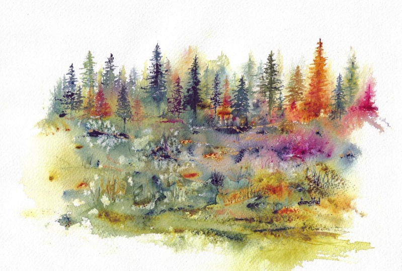
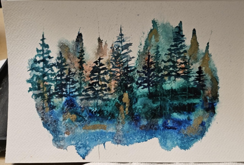
1. Introduction Palette Knife Abstracts Watercolors: Two abstract
watercolor landscapes. Hi, one. My name
is Kelly Chassi. I have been an
instructor here on Skill Share for
over seven years. I found something really
fun and exciting. I wanted to share with you. I'm sharing this
with my students in my Facebook group and
it was so much fun. They enjoyed it so much thought I'd make a little class for you. This is a really fun
way to experiment. It's very quick,
very easy and you can get some really
cool looking paintings. In watercolor very quickly. We're going to be
using a palette knife to create some
vibrant techniques, and this is all for beginners. So if you're ready to explore some fresh and playful ways
to approach watercolors, this class, we're going to dive into some palette
knife painting, a unique technique, I think, that really allows
that bold texture, the vibrancy movement,
and really gives an abstract flare to your
landscapes or your seascapes. So who's this course
designed for? Well, it's both for beginners, but it's also for people that are ready to try something new, maybe intermediate artists
that are seeking to break free from that traditional
technique and maybe loosen up the
creative process. And in this course together, we're going to
explore how to use a palette knife really to
manipulate the watercolors. You're going to learn some techniques that
are going to create that loose textured
effect that's really going to energize
your landscapes. And we will go over some tips to help you build some
confidence in embracing that imperfection and discover some creative freedom
along the way. So what you'll learn
in this course are step by step guidance. We're going to be layering
the watercolors to create that depth
and that vibrancy, you're going to learn how
to use a palette knife to achieve that textured
abstract effect, and we're going to
experiment with some techniques
that's going to help you really let go and enjoy the process
a little bit more. For your project at the
end of this course, you'll have your own loose and colorful landscape painting created with watercolor
and a palette knife. This one of a kind artwork
is going to reflect your newfound skills and
your own personal style. Let's get started,
gather your watercolors, a palette knife, some paper, and let's create something
amazing together.
2. Materials Needed for Palette Knife Painting: All right let's talk about
what we'll need for materials. This is just some sample
ones that I had done, and you can really
have fun with these. Mix and match your
colors so you don't have to have exactly
these colors. I started out with just using my Strathmore watercolor
card and I cut this into two pieces so
that way I can get two little five by
seven to practice on. We're going to start
with that. You will also need to have some type
of palette knife. Again, if you're using smaller paintings or smaller tests, use a smaller palette knife. If you're using
some bigger ones, which we're going to
be doing later, you can use a larger
palette knife for that. You'll also need either
a very fine liner brush or you can also use something like this with a nice tip on it. This is going to create some texture in your
painting if you're painting your tree lines. You can also use a script brush. This one is Windsor Newton, size zero, size one, size two. Anything that's going to again create some really tall,
little fine trees. If you don't have one of
these, you can use this. You can also use the
back of your brush to create some texture
in your painting. You can use the corner of your palette knife to create
texture in your painting. Going to use calligraphy pens, anything that's going
to scratch out, even a credit card, the corner of a credit card
or something will work, you don't have to have
all of these supplies. This one, this is a
1.5 inch Princeton. Really love the
Princeton brushes too. I have a dagger brush in this
that I love to use as well. Again, you don't have to
have these exact brushes, grab some brushes and
just play around. You'll also need some water. Usually try to do
two cups of water, one for clean, one for dirty. And then for paints, again, you can use any paint
colors that you want. I'm using the Rosa kit
paints and I will say my favorite colors are Quinacua
lilac, Quinacudon gold. Either pains gray or indigo is a good one and
then some type of turquoise, this is regular turquoise. Again, your colors can be
played around with start with two or three colors or two colors because
you're going to get a third color with that
anyway and some variation. Then you'll also need a
palette to squeeze out your tube paint highly pigmented and you're going to put this on your paper before you
add your water to it. You can use the pans, but I would recommend that
if order to get this type of deep color and pigment using
the tube paints for this. You'll also want a
spritzer bottle, a very fine mist. That is the key. You don't
want something too strong. Otherwise, you're going to
get splatters on your paper. Then I played around with this
one, which is really fun. This is rich gold, this
is by Sminka number 811. I also did buy some bronze because I
wanted to try that one too. This one is actually
pale gold, number 813. But for this one, I think I'm
going to use the rich gold. Now, this is a little different. This is a powdered form. And you do mix the
water with this. It's absolutely beautiful. It's like liquid gold. We're going to play
around with that in our final project. Again, this is not necessary. If you have gold paint
pens, you can use that. If you have gold metallics, just pan paints,
you can use that. I feel like you have to go out. This one is a little
bit expensive. Then I also have a large
sheet of watercolor paper. This one happens to be 30 by 11. All right, so we've got
everything we need. Let's get ready to paint.
3. Watercolor Pigment Control: All right. So before we
dive into this whole thing, let's talk about
managing the flow of your pigment and
why that matters. So water controls how the
pigment spreads on the paper. So a wet mix, which would be like
tea or coffee, is going to flow very easily. It's going to create
those soft edges, while a drier mix or heavy or heavy cream
or butter consistency of the paint is going
to stay in place, and it's going to give
you more precise details. So, for an example,
soft backgrounds or clouds are going to
require those wet washes, while sharp trees or branches or those details are going to
need some thicker pigments. Let's talk about that consistency
that water will create. So the term tea, coffee, cream, heavy cream and butter
is a great analogy, and it's a fantastic
way to explain the consistency of water and pigments in
watercolor painting. So these terms
really help artists visualize and control the
ratio of the water to pigment, which is going to directly
impact that transparency, the flow, and even the
texture of your painting. Alright, so let's
test these out. For the first one
I'm going to do, it's the butter consistency. Now, that is basically pigment
right out of the tube. There's little to no water. It's very thick. It's opaque. It's thick strokes
with very little flow. You do want to use
that sparingly in watercolor often for
experimental textures, which is what we're
going to be doing here or maybe some final touches. So it's going to
mimic that gouache or acrylic and its density. It can be really unique. And then we have the
heavy cream consistency, which you see here. It's minimal water. It's still
a very high pigment load. It's rich and it's bold
and it's semi opaque. So you can still
slightly see through it. This is ideal for adding details or accents
where you want that strong visual impact or maybe shadows
or focal points. The next one is the
cream consistency. This one is a balance
of water and pigment, and it's kind of like
the consistency of milk. It's vibrant but not too opaque, and it's a more controlled flow, so that you're going to use
that for defining shapes. Next is the coffee consistency, which is slightly less
watery, more pigment, light to medium transparency, and it's great for
initial shapes or stronger washers that
overwhelming the paper, and great to layer as well. And their is the T consistency. That's very watery. It's a
very light pigment load. It's very transparent and
it's for very pale washes. Ideal for, like, skies or backgrounds and it's perfect for building up layers or glazes. And it's going to
dry very light. So when you think
of water colors, we don't want to
think about adding whites and blacks like we do with acrylic paint or with oil paints
because you can see, I get a very light blue
with that te consistency, so it's all about the amount of water that you're mixing
with these pigments. The coffee is a
little bit darker. Creams a little bit darker. Again, you can still
see through it. The heavy cream is very dark, and then the buttery
consistency, again, is right
out of the paint. Uh, too. And again, you can choose many
colors for this and do this for all
your colors so you can see what you're
going to get when you place a certain amount
of water with them. Okay, so just remember
that water is going to control the lightness or the darkness of any pigment
that you're working with. Understanding how those pigments and that water work together are really going to help improve your watercolor paintings. Then in this next lesson,
we're going to talk a little bit more
about water control.
4. Let's talk about Water Control: We've just gone over
all the consistencies of your pigments and
your water ratio. So let's talk about how
they work together. So water's role is to act like a medium to dilute the pigment and control
the transparency. It's going to help it spread, and it's going to
help it soften. So the more water
equals lighter, more transparent washes, less water is going to equal darker or more saturated
colors, right? So the pigments role is
to provide the color. So the higher the
pigment concentration, the bolder the color appears. And the amount of water affects how pigments
settle on the paper. So more water is going to allow
the pigment to spread and flow while less
water is going to keep them concentrated
and more vibrant. So let's talk about
some practical tips when you are beginning
this process. Practice mixing your water
and your pigment amounts and just kind of observe
the different consistency. So I've got my heavy
buttery pigment here, and I've got my water bottle. I've got just a little tiny bit maybe on the palette knife, just to put a little test down there so you can see
what it's going to do. And I'm going to spray
my water bottle. So you also want to look
at your water bottle. You know, how much water
is it going to produce? You want something
with a very fine mist. You can see how that's
just moving around. The pigment in the
middle is not moving a whole lot because it's
stuck right to your paper. And you do want to use
high quality paper to ensure the pigments
interact properly, especially in those
wetter consistencies, like the tea and
the coffee mixture. And you can start with
the darker pigments. And normally, we don't do that
necessarily in watercolor. We usually start
with a light, but for this type of painting, you can start with
those darker colours because you're going to
add water and you're going to create
those lighter washes gradually by spreading out those darker tones or that heavier cream or butter
consistency of your paint. You are going to
be able to achieve some smooth gradients and
some blends by doing this, and I think the smooth
transitions between the colors require a good
understanding of how those pigments flow with the water because too
much water can lead to unwanted blooms while too little can make the
blending difficult. Just to remember that different consistencies
are going to create different
textures and effects. So these thin washes reveal
the paper's texture while those thicker applications
are going to provide that bold or texture
marks of the paints. You can prevent some
common issues like water problems like back runs
or streaks or dull colors. I usually will stem
from not understanding the balance of the water
and the pigment ratios. If the wash is too watery, it may dry unevenly or
create unintended blooms. Knowing when to use
the coffee area instead of the tea is going to help prevent some
of those issues. I also want to share with you if you don't have
a palette knife, you can use a credit card
you can use some spatula, you can even use
your paint brush. I'm going to go into,
again, that thick paint as thick as I can
get it, it's pretty thick. I still have a little
bit of water on my brush because it's not
going to be completely dry. But you can see
you can still get some type of marks
on your paper. You can even let that dry a little bit before you
hit the water on there. Because if this is wet, it's obviously going to spread more. Let's go ahead and
give this a sprit. Now remember this bottle
is very light mist. Is not a big amount of
water that it spritzes. L start light with it. You can work with your
water control out of this. If I do one spritz I've got a little bit of pretty movement. That was a heavier sprit. You can see I went
rightight down on it. Again, you can see I've got
some nice thick pigment, even though I was using my
brush and not my palette. But you can see wherever
I have more water, it's going to lighten. This is how you're going
to get those different values in your paintings. I love this just as it is. Look at the movement
that you get in here just by the way the
water splatters. I've got a little mist
of color up here. You can always take your tissue if there's an area
that you don't like and you can dab up
some of that water as well. This is the real basics. You can add more color to it. Let's say you want to
get a nice mixture. One color itself is
not going to do a lot. I'm going to wet my brush again. I pick up a thick. Let's show it to you. This
is pretty thick on here. This is more pigment,
there's not much water. I can again just add a little bit even
where I have water. You can see how much lighter
this is and you again get a variation in your pigments, whether they're
darker or lighter. Having a mixture of that in
these type of paintings, I think is really what makes it work. I'm going to sprit again. You can see where
some of this is going to blend now together. Again, let the paints do their thing. They
can move around. This is how you're
going to get those unexpected little
surprises in there. We're going to
practice some trees, so we're going to drag
some of that up later on as we start to make more of a picturesque painting and making something out of
basically blobs of color. Hopefully you can
practice this before. Do it on a couple
of sheets of paper, play with your
pigments, play with your colors and
see what you like. Remember, you can use any
colors that you want in this, but I would recommend using the tube paint if you have it. If you don't have
the tube paint, remember you're going to have to work those colors
a little bit more. For example, I have this
and this is already dry. I've got my water on here. I want to make a really
strong pigment with this. I'm going to have to
really work that a lot. I might have to add a little
bit more water to it. I don't want it
super watered down. I'm working right
in that pigment because I'm going to add
the water right to it. I want to keep it more thick. I have more of a coffee and I want to
make it more heavy cream. I love how I was
trying to come up with my own little version
of thickness of paint. I used to always
say house paint for my thicker paints or
toothpaste for my guash. But I really like the the
thought about having tea, coffee, cream, or butter. I've got almost butter here. There's nothing dripping,
nothing moving on here. Let's just add a little
bit of that in here. Again, you can get
that thicker paint. If I add it here
where the water is, that's not going to
be as thick because I've already got
water down there. It's turning that into
more of a coffee state. Again, more buttery,
more coffee, and that is how you're going
to get the variations. Again I'm going to
spritz this, we'll do a little movement in here. And I do happen to like the
chunkiness on some of this. So when you're working
with these paints, it's fun to have
the thicker paints, the buttery paints, the
heavy cream, the coffee. Having all of those
different variations are going to give you all of these different darkness and
lightness in your painting. I think having the mixture of all these things
really help your eye, and give yourself enough
texture and differences in your painting to really help move things along and just get it
exciting for your eye. I can maybe put a little bit more chunkiness
down in here now, some darker colors
so that looks more like maybe some rocks. Again, it's more illusion
and then you add paint on top of
that for movement, rocks, trees, you may want to dry it
because you can see up here, I've got some dry area. I probably have more of the
consistency of some tea here. It's really light. Going into
some of the darker values, it's mixing and mingling still. You may want to
wait for this to be dry and then add
details on top of it, you can see the paint is still moving here where it's
still slightly wet. That is another portion of Things I wish I would
have known when I first started watercolor
because you can see different things
are going to happen with different amounts of water. I think that's why this makes
such an emotional impact. The right consistency
is going to help convey mood, emotion, the soft, transparent washes feel
calm and ethereal, while the bold and
saturated strokes are really dramatic
and very vibrant. You can get super
moody with these.
5. Techniques and Applications - Practice Exercise Practice Exercise : Alright, so I want to show
you how fun this can be. I called this one fly fishing. I did fly fiishing one
and fly fishing two. The third one didn't get framed, and it's okay because
they don't all work out. So this is to show you how
quick and easy this is, and you can have so
much fun with it. So I'm just going
to start off by filling up my palette
knife with some paint. No, you're gonna want
to play with this, play around with it. I'm doing three sheets
at one time here. So I am loading this up
pretty heavy on here, and I'm going to go
with a light touch. So for the colors,
I think what I used here was Paine's gray, the quinacton lilac,
maybe it was rose matter and also
some quinacon gold. But again, it doesn't
matter the colors, play around with it,
have fun with it. I'm using my clean water now, just putting a little bit of
water down there and doing a little sprits I'm just going to go with a light touch
just dragging that over. Now, this might
take some practice. I'm using a very light
touch because I don't want to use all of
my paint at once. So you're just going to barely
skim it over the top of that water and look at that and try just
different directions. This is all about playing in practice and
having fun with it, just watching the
colors move around. I'm going to grab my little
spritzer bottle and you can see how fast this was and you don't want to
overwork it too much, but I do have a little bit of paint left on my palette knife. I'm just using that
in some of the areas. Now I do want to leave
white space for this. That is a very important part and you can also
tape these down. I just let them go natural letting the water run to
where they wanted to run. Now, some of them got a little bit more
wet than the others. So it did tend to
curl a little bit, and then once it starts to curl, it does tend to curl down. So if you are frustrated
with that, tape yours down. Feel free to tape it down. Now I'm just making some
little squiggly marks. It's just random. You know, I did not plan this out to be a fly
fishing painting. That's what just
kind of happened. I was looking at it once it
was dry and I was like, Oh, my goodness this kind of
reminds me of fly fishing, like an abstract fly fishing. And these would be like
the little lines from the fishing pole as it's
being cast into the water. To looking at it
this way, you know, I don't know what it's gonna be. I just I is what it is. And that's the fun part of it. And you can see how
fast I did these. And then I turned them
sideways and was like, Oh, my gosh, that's
what I wanted to be. Fly Fishing one, fly fishing
two. I mean, look at that. You can see almost
a pole in there. You can see the little lines, the linework for
the fishing line. I mean, it just
worked out really well. And then I framed it up. So, I mean, we're talking
like a couple minutes here, and that is how you can
just really have fun and loosen up with these
palette knife paintings. So have fun with this.
6. Palette Knife Watercolor Practice Exercise 2: All right, so here's
another quick. You can have a beautiful view outside and just have
that as your inspiration. So super basic. I was trying to go
with some blues and maybe a little
bit of yellow. I could have gone with
just some more blues and grays to doctor it up
a little bit more. But again, I'm starting
with that large wash brush, just putting some water
down in the middle. And then I loaded up again my paint palette
with some paint, and this time I'm just
dragging it straight across. I'm using some of the similar
colors I had last time. I think this is the indigo
and the quin acudo, and I've got a little
bit of that lilac, I think, stuck on
the bottom corner. Again, just very fun just to spread it around and see what the
paint is going to do. Again, taking the sharp point of that palette knife and just going up and down almost looks like a
heartbeat, doesn't it? But this is where I
decided I like the idea of maybe turning something
like this into trees, making that landscape, again, looking at outside our window. I was in North Carolina
at this point, so we didn't have a lot
of main looking trees. It was more of just water with some land mass
in the middle there. It's more of a marshy area. Then again, I just spritz it. It started to curl again on me, but I took a little paper towel and I just dabbed off
around the edges. While this is still wet, you can lift some of this
if you need to. But look at that.
It's just so fun just to watch it just move. This is pure imagination stuff
and it's just really fun. Here I'm wiping it off. Again, I could have dabbed it
a little bit more. I want to have a
little bit more of the raw edge, not
quite so straight. This is where I started to
just tap it out a little bit. Again, this is all
about practicing and playing with it
before you dive into, like, a massive or
larger painting. This gets you warmed up
and just lets you practice a little bit before you have
any pressure on yourself. And you shouldn't have
pressure because this is just very free and
very fun way to paint. So again, I'm just working on some of that paint that
I've got in there. I can smoosh it around, push and pull it and add a little bit more
texture up and down. So getting very simple, very easy, try a few of
these, just, you know, get it under your belt and
feel a little bit more comfortable as you try this, especially if this
is the first time. If you've got different
shaped palette knives, try your palet knives, see
what they're going to do. Different shaped
ones are going to do different things for you. A little tapping,
a little dragging, a little smushing,
all about fun. So again, these little lines are kind of like
the pier, maybe, or the tops of some of those boats where they
have some masks on there. Again, you know, it's all
about interpretation and, you know, what you see with your eyes or what other
people see with theirs.
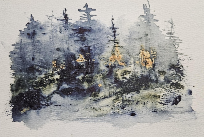
7. Thick and Buttery Experiment on Dry Watercolor Paper: Right for this particular paint, we are going to now add the paint onto dry paper and then add the water to
that to watch it move. So for colors on this one,
I'm using my quinoqudon gold. I'm using my indigo
and some burnt umber, and that is my
cottonon watercolors. So I'm starting out
with some very buttery, chunky paints on this one. You might be using a little bit more paints
than you normally would on this chunky buttery
style, but oh my goodness, the texture and the
interest that it creates on your paper
is really fun to watch. And this style kind
of reminds me of working with oils
because it is so chunky. You get all of that texture, and it's very organic when we talk about organic watercolors. I think this is it because
you are really working with the paint and the
flow of the water, and that's going to give you
that beautiful organic look. I'm tapping off a little bit of the excess water up on the top. Now, it's quite dark. This time, I'm going to use
my brush a little bit more. We are going to pop up
some of those trees, the tops of those trees. This is the number one. Liner brush. And I'm moving a little of
the quinaqudon gold up there, spritzing it again
because I want it light. Remember we talked about
having a lighter at the top, more like that t consistency. I'm going to drag some of this beautiful color down below. This one is appearing
quite dark, so I probably will lighten it. And I'm using my brush to
create the tips of those trees. Again, lifting out some of that paint because
it's just too dark. You're not seeing all of
those trees very well. So by taking a paper towel
and just lifting that, it's going to give you
a little bit more space to pop in some more
of the gold trees. So I love the fact
that I can just tap it out and I can put it back in. You can do that while it's wet. The nice thing about having
this pretty watery is that I can have a lot of
time to be able to do that. So nothing's permanent depending on what color you're using, some colors do stain a
little bit more than others. And if you tried out
your color chart, you might already have
seen that or noticed that. So once I have the colors down, I have the water down, I just get to play at this point and try to
make it look a little bit like a landscape or a seascape just by playing around with what I've
got down here on the paper. Now, that side over here
is dry and this edge is dry because I didn't spritz the water all
the way over there, maybe a little bit
near the bottom. But I'm trying again to capture more light in this
one because it is so dark. I think I'm going
to divide this up, give it a little bit,
a little brown here, and I bring this
across the center, it divides that
up so that I have a tree line above and maybe rocks or
reflection below that. So I'm going to go
ahead and dry it so we can add some vinyl detail
layers on the top of this. Alright, I'm back. It's dry, and now I'm just layering some
colors over that. Now, I do want to cover up
some of this darker blue. So I am popping in just a few of that lighter quinacuron
gold over the top. And the background
of this because it's so soft and lighter, it gives the illusion that those trees behind
there are further away. And now that I'm adding the more defined details
to the front, that's going to bring
these trees closer to us or bring it to the
foreground of our painting. So for these trees, I still
have a fairly dense pigment, but it's more of a cream. And because the papers dry now, you can see I get a nice
dark shade on here, even when I'm using a
little bit of water. So hopefully going
through this process, it will help you also realize your consistencies of water and pigment
ratios doing this. I think this is a much
better way or easier way to understand how they work
together in watercolor. And I think this is going
to really help you as you dive into doing more traditional
watercolors as well. Alright, filling out a
few more trees in here, a couple little lines
in the background, and we are calling
this one done. So, for our final one coming up, we're going to go a
little bit larger. I'm going to be
working on a 30 by 11. So once you are, you know, ready to go with something
bigger, just jump in. I mean, it doesn't
have to be 30 by 11. It could be something a
little bit larger than the five by seven that
we've been working on, but have fun with it. Just explore and experiment. And I absolutely love it. Like I said at the beginning, this chunkiness to this almost reminds me of an oil painting. But it's with watercolor. No new. For the next one, I'm just going to go
into some tips for a successful palette
knife painting process, and we're going to use some really bright purples before we do our large painting.
8. Tips for Success : Going to talk about tips for success in these palette
knife paintings. Try different colors because every one of them is
going to look different, and it's so much fun just to see what it's going to create
a reflection in this one. So for colors, this time,
I thought I would use the Kunacano lilac,
lavender and indigo. So I'm starting off
with the lavender. Now, this one is
a gorgeous color. So I tried to work with
the colors that are all very similar to each
other on the color wheel. So they're going to blend very nicely together
or they should. So here is the quinacano lilac. Now I'm going to add the indigo. So I just did a little bit
of the indigo on the top. Most of that's going to
be on the bottom because that's going to be
our darkest value. So while you're working
with this thick paint, timing is going to be critical. If the paint's too wet, then the marks will
flow and soften. But if it's too
dry, you won't be able to move the
pigment effectively. So you want to aim
for that shiny wet stage of your paper. So I'm going to spritz it here. You can see where
that's all moving. So now it's, you know, it's very wet near the top. Some of that water
it's really hard to control because you're
just spraying it on here, which is really part of that experimental fun with
these palette knife paintings. And now I'm using the
palette knife to experiment with pressure and a little
bit of scratching on here. The amount of pressure
that you apply is going to create those
subtle effects. And if you're pushing down hard, the pressure is going to remove a little
bit more pigment, and it's going to
make bolder marks. I'm using that pallet knife aa. I don't even need a brush. I can use a palette knife just to squiggle it back and forth to create the illusion of
some trees up there. And I'm just spreading
the paint that I have and create a little reflection
down below in the water. And remember, if I scratch hard, I'm going to leave marks
and indentse in that paper, and that's where the
pigment is going to settle. Do want to use high
quality paper. Texturing works best on a very durable
high quality paper that can handle the scraping
without tearing or piling. So coal press or
rough paper enhances the textures when you're working with these
type of tools. I do find, however,
for inexpensive paper, the Strathmore watercolor
cards do a fabulous job. You can get frustrated if you're using some
cheaper papers. ARSs obviously is one
of my very favorites, and that's what I'll be using in the last demo
that we do here. Blend and layer, create texture, and you can always apply other washes over
them once they're dry, and that's going
to enhance or give you more strong lines in here. Now, the top of this
paper is very dry, so I can get lots of detail in there without
it moving around. Near the center and the
bottom, I've got the chunkier, more buttery consistency, still, so that's going
to stay in place. And then in the middle, I
have that coffee Te state, so that's still moving
around, still blending. So while this is still wet, I'm going to add
some table salt, so we can look at that as another tool to create
some texture and effects and give it a
little bit of complexity and some more interesting
visual textures on the paper. I do want to make
sure that it's wet. And when you remove the salt, make sure that it's
completely dry. Timing is everything
with the salt. Obviously, working in
that thicker paint, I'm not going to
get much movement, but where there is
a lot of water, the salt's going to create
more effect in there. Now, I did not have a lot of water with this because
I had spread stuff out, so it tended to dry more. So I didn't get
the effect that I wanted quite as
strongly on this one. I'm going to use this again
in another demo coming up and it does bloom better because I do have the paper
a little bit more wet. But look how pretty that is. Be careful because you've got that thick pigment on there. It can get on your finger. So as you're removing the salt, just be careful that
you don't smear it. You don't want to
smear not the salt, but the paint that's
underneath it. So now we're going to
pair it again with a fine liner brush. So this is going
to create because I've got it dry, more
texture in here. I like to use the same colors
that I have been using, so this is the lavender. Again, you can see how
strong the pigment is. This is a more of a
heavy cream consistency. I have added water to that, and I'm doing the same
thing with the indigo. Blending a little bit of that together because it
is a little wet. Even though you have
the heavy cream state, you still can get some
blending in there. So I'm just kind
of peeking around. Again, I've got a little bit of that color here that
was fairly strong, so I'm going to add
some other color trees with the lilac. That's quin lilac. And then I just kind of
bounce back and forth. This is, again, more
of the lavender. And you can see, I can get a very strong pigment with my watercolors by
not using a lot of water. So that almost becomes more opaque because it's
a little bit thicker. So you can layer over some lighter washes and get
it to show up very easily. That's why they always
talk about working with lighter washes in watercolor first and then gradually
getting darker. But for the palette
knife painting, just a little bit
different where I start with the thicker
buttery paints first because I want to use that as my bloom when
I add the water to it. You can see where
on the outer sides, I get that beautiful
lightness around there, so it gives it almost
like a glow and then these darker values in the front are giving it all the details. So now I'm using that brush and I'm going to put some
little rocks in here. So you can see it's
so dark down here. I'm not getting a whole
lot of definition in this. So this is why I decided
to use some of the white. They come up a little higher
where it's a little lighter, so I can maybe see some of it. And down in here,
where it's light blue, I can make some squiggles
again just so it looks like water and maybe a reflection of some of those
trees in the water. In more of an abstract version. I'm going to come
up a little bit higher again because
I know I can get the rocks to appear
if I come up higher. Just analyzing it
like where I want it. The trees are not all perfect. You see that one is not
completely filled out. A lot of the perfect trees kind of make it not
look as realistic. So if you get a little messy, maybe some of these trees lost some leaves or some pines.
They grow a little funny. If you look out in the
woods, trees are not all like little Christmas
trees, little perfect trees. They are messy.
They are crooked. They are different heights. And that's going to
give you, again, a little bit more enhancement to your painting as far as looking a little bit more
visually interesting. I've added some of the
lighter lavender on top now. I couldn't get because
it was so dark, I couldn't get any
of those colors to pop in there for the rock. So what do you do? You
add light over dark, and that will create,
again, more texture. So because I use such a dark indigo on the
bottom and had so much of it, you can see that I need to now lighten it up a little bit more. So I am using my
bleed proof white. This is great
because it's already the consistency of, like, a heavy cream and
you don't have to add water to it like you
do with white guash. So I'm going to add just a few little highlights for the rocks, maybe a little side drag on the brush to give it a
little bit more texture. Then you don't need
to do too much. You don't want to go
too overboard on this. But again, just doing that little dragging
mark gives you some really nice
texture for rocks instead of all these lines throughout. And I
think that's it. I think we are finished. Maybe a little birch
tree back here. Again, just a couple
little details. It takes it from that abstract
look to more dimension. So, I mean, you know this is trees and rocks and reflections, but it's still messy, and that's part of its
charm, I think.
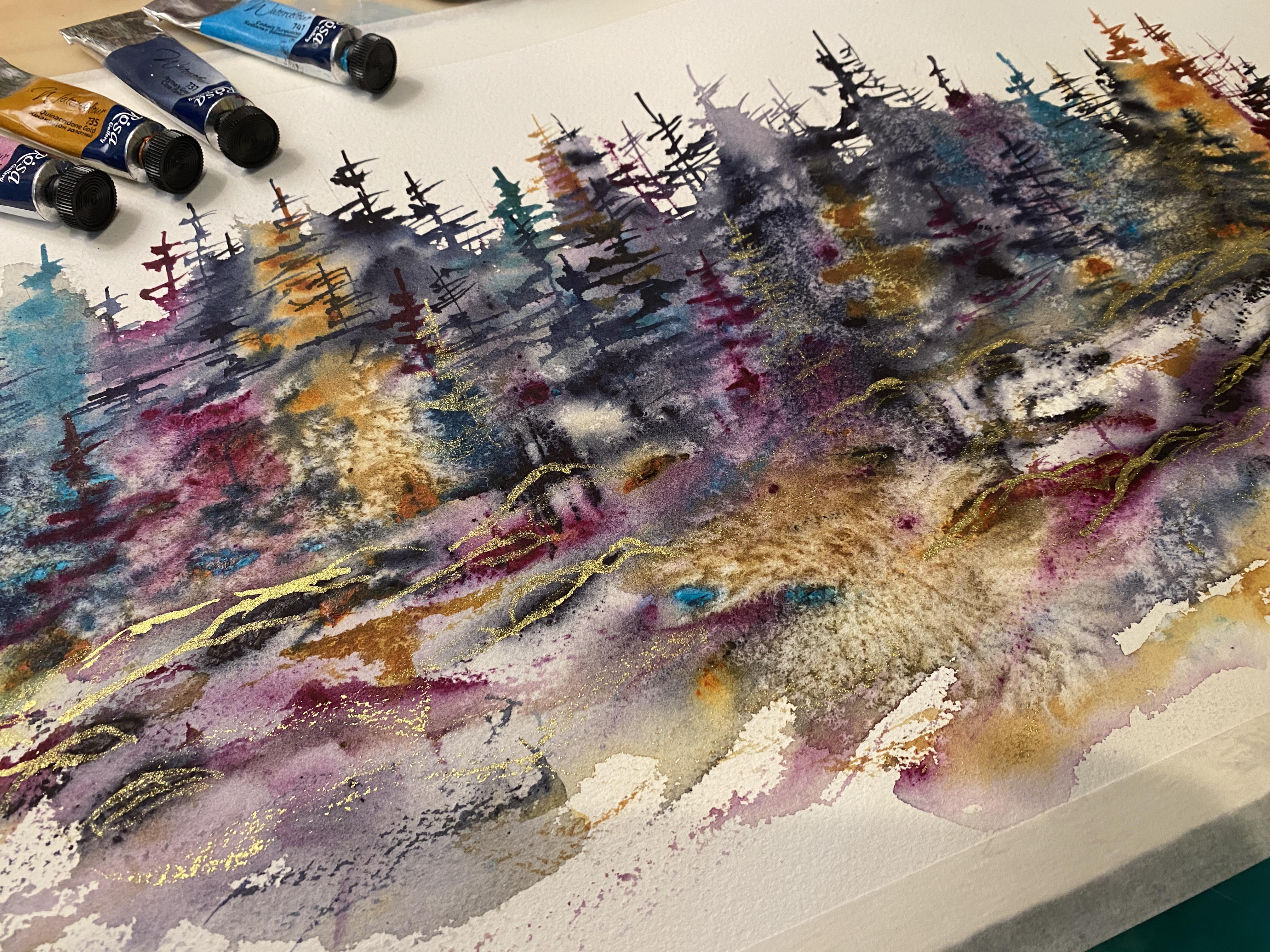
9. Get ready to Paint Bigger!: Right now we're ready
for our big project. So four colors, I'm using the same colors I
had used before. It is going to be the Paine's
gray or you can use indigo, the lilac Quinoqudon
number 727735, the quinoquaon gold, and I'm using the cobalt turquoise
number 741 for this one. I do have my full large ARSs watercolor
paper for this one. I've decided to go big. Again, you can go
any size you feel comfortable with and
I'm putting these in the palette tray this time and spritzing water,
like I did in the past. This time, we're going
to use two paints, and we're going to actually put it on our palette knife and then scratch it
onto the dry paper. And then we're
going to spritz it. So I do have my palette knives. Again, any palete knife will
do the smaller the paper, the smaller the
palette knife, FYI. And then I'm also using
a fine liner brush. Okay, so here is
this huge sheet. So I did the small
one, and I was like, Let's just go go
for a bigger one. So I'm using a little bit bigger palette
knife in this one, and I've squirted
out my Rosa paints. Um, onto my palette. And the trick to
this is because you want to have already
have that pigment, not watered down pigment because we're going
to add water to it. So you know that a lot of times I don't use
the tube paints. I'm usually mixing
water in my palettes, but this is what I
love tube paints for. But for this one,
I decided to add a little bit of
turquoise. Can see here. I'm just putting just
a few little spots. And remember, this
is totally random. We're going to see how this
works out on the paper. It does the painting for you. So I've got a little
turquoise and a little bit of rose in here, and I'm just putting
it down on the paper. Okay. Alright, here
comes the magic. I've got my little
squirt bottle now. You don't want anything
with a really strong mist. You want a nice fine mist. I'm just gonna sprits
and you can see those colors just
start to expand. This is what it's so much fun. You just kind of watch it,
and you go with the flow. This is a totally go with
your flow type of painting. So movement here, not a lot. Now, this paper
is 30 by 11 inch. It's rss paper, and it's
part of a larger 22 by 20 painting that I
just cut to size because I have an old
print that is framed. I'm gonna pull out, and I'm gonna put this one
in place of it. I'm going now to use the side of the palette knife,
and I'm just scraping up. I'm trying to give the
illusion of some trees. I'm just smishing some of the
colors, blending it down. I'm trying to keep this in
the middle, if you can see, I have two pieces of
tape on both sides. And that, again, is just
to frame it in the middle of the frame that I'm thinking
of putting this into. This is so much fun.
You're just gonna play. So again, little trees, maybe turn it sideways if you feel like you
want more color and smearing a little bit of that color that's down below. Right now, it looks
like nothing, right? That is, again, part of the fun. You're like, Well,
what's gonna happen? I'm gonna try to move
some of that turquoise. And you don't need to
have a lot of paint. You can see that what I put
down there was not too heavy. When I did this
first time, I did use a little bit too much
paint, but you know what? Even though it was
a lot of paint, I kind of liked
it because I had, like, these little
chunky parts that dried. Keep in mind if, you know, you want to put this behind glass or you want to
make sure that you seal those paints
because if you get anything with water on it, it's going to
reactivate and you've got a large clump sometimes. So just be careful
of that. So now I'm using the rubber tip. It was a whole little kit, and they had little scrapers, and they had all
these little tools for working with clay. And I found this
is really great. You can use this
with alcohol inks, too, if you work
with alcohol inks. And it does create a
little bit of texture in there. I love the colors. Now, if you find it your
colors get too messy, start with just two colors
because with the two colors, you're going to have three
or four variations anyway, or stick with three colors kind of that are close together on one side of the color wheel, or you can go completely
opposites of the color wheel. Keep in mind, though, a lot
of times will end up with some brown shades in there if you're working really
purple and yellow. So I always find
that if you're using colors when you first start out that are close
to one another, they're going to
blend quite nicely. Or if you use the same base with all of the colors,
that works, too. You will notice that I'm
working wet into wet here. In other words, I've got
that wet background, and I'm putting the paint
on over it where it's wet, so it's not staying
in place completely. This is still moving around, so I get a nice blend of
all the different colors, and I'm just hitting each color
just separating them out, or I want some lights
and some dark. I don't want them
all the same color. So I'll just pop back
in, add some turquoise, add some of the quinaqudon gold, maybe some of the lilac, all the same colors
that I have been using. I'm just going to make
those trees in there. These trees are very
loose at this point. So you don't have to worry
about getting it perfect. We're going to have this dry, and then once we dry it, we'll be able to add some
layers on top of it that have a little bit more detail or fine tuning enhancements
or definition. You can see up at the top
here where this is dry. I've got some nice
details in there. So I'm just using my
liner brush here. Again, I'm trying to do
some really loose trees. This is very similar to the one on ScotiPoint
that I had painted. I just recently got
some prints done of it. And I'm telling you, I think that a lot of folks now, the younger generation really enjoys the more abstract look. I noticed that on Etsy, a lot of my sales
lately are more the abstract or less defined, specific picturesque looking paintings that
I've done in the past. So I think this looser version is serving well, and
I really love it. I mean, my background
many years ago, when I first started
painting was abstract, more abstract. So this is kind of
going back to my roots. My mom is a very
realistic painter. So, you know, when she was
teaching me how to paint years ago, that is
what she likes. So whenever she was
critiquing and things, it was more based on
her what she enjoyed. And she still to
this day says she has a hard time
with more abstract. She just doesn't see it like
I see it, where, you know, I pick up little things, little nuances, and I can see things in the
paper and the paint. And it's really fun for me. Kind of really lets loose on my creative side and less
of that perfectionist. So if you are somewhat of
a perfectionistic painter, this is a great
way to loosen up. And not to say that
you have to be loose. I mean, I'm in a group, the Joy of watercolor group, and there are some people that absolutely love it not
looking like a photo. You know, they're like, Buy
a photo if you want a photo. And then there's
people that really strive for it to
look like a photo. So everybody's different. Everybody has their own
taste, and it's okay. Just go with um, you know, your
thought process and how you think things through. If you are a realistic painter, you get very frustrated, though, this is a great
way to get you to loosen up and just have
a little bit more fun. That's what I'm hearing
from the group as well, and I've got a lot of
folks in there that, like things to look
very realistic, and they're very
hard on themselves. So yeah. So this is fun. So I'm just continuing again with those
really loose trees, again, just a left,
right motion, very scribbly and kind of mixing those colors
so that I don't have all those had colored
tree next to each other. And you can see down the bottom, it looks like some type of
rock formation to me, which, you know, main and me doing my seascapes and
landscapes all the time. This is right up
my alley, and this is just what I enjoy
painting, what I like. So I think once I dry this, I can get a few more
details down in the front. But right now, I'm
just working on adding some color and a little
bit more texture in here. I trying to balance those. You can see all the
different sizes. I always say, Don't make
a tree all the same size. You've got it up and down. I could have gone
a little taller now that I'm looking at it again in the center just
to bring my eye up. And as it starts to dry, you can see I get a little bit more textures still moving. So it's one of those kind
of wait and see games. I'm always testing it, so
I'm always going back in. I'm like, Well, try
a tree here and see if this areas dry
yet. No, not dry. Alright. We'll keep
bouncing around. I'm trying not to
cover up all of the white space because I do want to have some
highlights in there, and I'm trying not to
go down too low, again, because I want to keep
all of this area in the frame open so I can see
white around the whole edge, so it looks like it's a floating island in
the middle there. So I'm going to grab my salt. Now, this is just
regular table salt. And again, it's
all about timing, so it's nice and wet in here, so I should get some movement in where it's
really, really wet. Some of the areas
are a little bit too dry and they're not
going to do a whole lot. And depending on when
I think about adding salt, I could get more. I did do a winter scene
where it was all really wet. I had planned to use the
salt from the beginning, so I knew I was going
to be using it, and it burst like crazy. It was just gorgeous. I
absolutely love that one. Alright, so that I had
to let it sit and dry. The key is letting it
sit and dry naturally. You can see in the
center, I've got a really nice bloom in the
center there down near the bottom and a couple
of little spots in the trees again where
it was pretty wet. By letting that dry by itself, you get more of that
bloom in there. So I did not use a blow dryer
to quickly heat this up. So I did have to have some patience there
and wait it out. So now I'm going back in again, adding a few more
details in here. I can get now those
nice fine lines down on the bottom
because this is all dry, so I can get a little
bit more detail. Alright, I'm going to speed
it up just a little bit here just because I'm going
in doing the same thing, just adding a few more trees, popping in some different
colors here and there. And now we are
ready for the gold. And this is the bronze. This is the paint that
I'm going to be using. So this is actually
in a powdered form. Look at that. And it's filled
to the brim here, too. I'm going to use
my palette knife just to scoop a little bit. I figured, why not use the
eggshell to mix it in. So you can see it's
in powdered form, and I'm going to use my brush and add just a
little bit of water to it. So it does it's very thick and I thought it was going to liquefy a little
bit faster than it did. I'm using a very small
brush. I'm dipping it in. You can see where it just sits
on top of the water there. You need a little bit more. It's really wild, but
you do have to mix it really well so you don't
have the dry pigment. So it's working its way, but look at that shine. Isn't that beautiful? Every
time I dip it in the water, it just kind of
separates a little bit. So I've got a nice little pile
going on the bottom here. And look at that on the brush. It's like liquid gold. It's so shiny and so gorgeous. It's kind of like,
you know, using the metallic paints that
I've used many times, but they are more opaque or this is more
opaque than what they are. So I really love it. It's almost like using
a gold paint pen with your like when I was
doing my alcohol inks, and it shows up
very, very nicely. But it's water based,
which is really cool. And I did add some water to it and reactivated it later on. So that was wild, so
keep that in mind, too. So if you are sealing your watercolors, seal
this along with it. So I'm just kind of giving the illusion of some
rocks down in here, doing a little dry brush drag
because I love the gold, and I just want to add a little bit more texture
down on the bottom. I don't want to
overdo it too much. I'm trying to hold myself back, but I'm just hitting some of those areas that are a little bit darker because the gold shows up a little bit better on. So again, the illusion
of maybe some rocks. You could also do blades of grass if you wanted
to here and there, but I do have the salt
texture in there, so there's a lot
going on already. I'd rather use it
less than too much. I can always do this again, add similar to it if I want to. I've decided I do want to
put a little bit of tree, couple of trees with
the gold as well. Again, I'm just
doing a little drag, so I have a little bit
of gold here and there. Again, I can feel myself just wanting to go
everywhere with this, and I've done this
so many times where I've looked back and said
I should have stopped. So I'm going to try to do that. Try to contain
myself a little bit. But the eggshell worked out
great as a little palette. And I didn't have to
worry about getting that gold pigment anywhere else because it will
stay in your brush. I did find that out, too. I used some Don dishwashing liquid and then really
had to scrub it in my palm of my hand and do it a couple of
times just to make sure I get rid of that gold because you will find it in
your other colored paints, even if you think
you got it out. So just keep that in mind. And you'd probably
want some fresh water. I probably separate my water, you can see again where it's
just floating in the water. You know, it doesn't
blend unless you're really moving
it around a lot. And it does still tend to
chunk up a little bit. So here go my little trees,
again, I don't have. I got a little bit
more water in there, so that is not super bright, but as I turn the paper, I can see that little glimmer, that little sheen that it has. This one's got a little
bit more of the gold. You can see the other one dried, and you can barely
see it on there. So keep in mind, the more
water you add to it, it becomes a little bit more transparent if you
want that really rich, bright color, keep
the water ratio low, just like you would with
any other watercolor. You know, the pigment,
if you've got a strong pigment,
you have less water. If you add more water
to it, it's going to lighten it up and make
it more transparent. Well, that brings us to
the end of this lesson, and I really hope you enjoyed exploring this technique and feel excited to keep experimenting
with your own ideas. Don't forget to share your
project in the class gallery. I'm gonna talk about
that coming up next. But I can't wait to see
your unique take on this.
10. Outro: Ready for your Project?: Alright, so for your project, you're just going
to grab that paper, grab your tube paints, grab your palette knives, and you're just going
to have some fun. Now, you don't have to
have a 30 by 11 sheet. Just start small
with one of these smaller five by seven paintings. Just going to add
the paint to it, sprits it with the water. Maybe try a little bit of that palette knife scratching for your tree shapes and
just spread that out. Then you're going to take a little brush and
create those little little trees in
there for some fun, maybe sprinkle a
little bit of salt for some extra fun and
just watch it try. I would love to
see your project. Please go ahead and post it here in our skill share group, and just have fun with it. If you have two
or three that you want to post, I would
love to see more. Grab yourself a mat or
maybe even frame it. All right, thanks so
much for joining me, don't forget to
have lots of fun.
 Kellie Chasse, Artist + Entrepreneur + Educator