Transcripts
1. Intro to painting Loose Watercolor Daffodils: We're going to cover loose
watercolor daffodils and we're going to
embrace that really fluid brush stroke for some vibrant daffodils
for the spring. If you've ever wanted to paint
daffodils in a very loose, expressive watercolor style, but didn't know where to start, this is a beginner
friendly class. I'm going to show
you how to paint that vibrant daffodil and we're going to use some
simple techniques and some fluid brush strokes and no prior experience is
needed. I'm Kelly Chase. I've been a skill share
artist and instructor here for many years. Today, I want to show you how to paint these beautiful, loose, expressive watercolor daffodils perfect for
the spring coming up. So what you'll learn
is how to break down that daffodil into
some simple shape, and we're not going to get caught up with
every single petal. We will focus on capturing
the flowers essence with some really loose and
some fluid strokes once we start to paint. We're gonna be adding
highlights, shadows, some soft background elements that's going to bring
that daffodil to life. This class is perfect for beginners who
want to learn how to paint florals without that
pressure of perfectionism. It's also for intermediate artists that are
looking to loosen up their style and maybe experiment with that expressive technique. And for anyone who just loves
watercolor and wants to create some beautiful florals
and gain some confidence. And be sure to share your final project in the class gallery. I can't wait to see your
beautiful daffodils. So if you're ready,
let's dive in
2. Let's go over the Materials: All right. Well,
welcome to the class. This is pretty much what
we need for materials. You're going to
need watercolors. Now, I'm doing my demos, I have a couple of
different ones. This is my little kit
that I have from Zenar. You can see it's got lots of
different colors in here. You would want to sprit
this before you start it because you can see
how dry out these are. And then I also
used another demo, another set this is my
Rosa Gallery paint kit, a little bit less. Remember, you can use any watercolor paints that you have. I'll be using the pan paints, but if you have tube
paints, you can use those. It's not going to matter as long as you have
some watercolors. Then I have a couple
of different brushes that I'm using in this one. You will need a number six
round and you'll also, you don't need to have it,
but this one is really fun. This is my dagger brush.
It's a quarter inch. This one is really fun working with loose florals
and I can give you those little smears
and little blobs very easy because it's a
tricky brush to work with. You have to get used to it. It's just smooshing things
around with this one. It just makes it
a little easier. It's a very soft brush as well. You can see how
soft and delicate these hairs are that are in here and this is
a fox squirrel hair. It's again, very soft,
very fun to work with. Then if you have a little
liner brush or a script brush, this is the number one
Princeton as well. Again, this can give
you those details and it's a little bit longer. Again, it helps you be a little looser with
your paintings. Any number six is going to do. I'm actually using my Kalinsky because I was
traveling at the time, this is my travel set. This is a very expensive set, but my goodness,
it is wonderful. You can see because they
fold up into each other. You do have to be careful when you're putting
it away that you don't stick it in there
and have a wild hair, but they go together like this. Again, great for traveling and it's got a nice point to it, so you can get some details. This one has a little
bit more of a snap. It's not quite as
soft as this one is. It's again, a different
way of doing it and don't feel like you have to have all of these materials, use what you have on hand. But most people have
round number six round. So that's for the
brushes, what we'll use. And then for then for paper, I always tell
people cotton paper is one of the best and
the reason I say that is because you can tend to
be less frustrated with it and you don't get the wood
pulp that comes through. This is the Strathmore
watercolor card. I love to use ss, but I know ss can be expensive. Legion, 100% cotton is
a nice one as well. But this is the Strathmore
watercolor card. You can see it's got
a little sema here. I love using these just because if you've taken
any of my classes, I'm usually using
these as my demos. But you can cut that
into half and then you end up with two
sheets. Nice paper. Five by seven, you want to use the side that doesn't
have as much texture. I noticed the newer version of the Strathmore
watercolor card have a little bit more texture
than the original. So this is the side that
you're going to want to use. If you can see the little
pattern that's in there. It's just a little
smoother. You get two full watercolor sheets five by seven if you cut
those cards in half. So if you want to do inexpensively and
you're just practicing, it's a great starter
way to work. And I've been teaching for
years and I still use these. So but use whatever paper
you're comfortable with. But try good paper because good paper is going
to really make a difference on how that water is going to
be absorbed onto the paper and you can get it's
so much more blooms. You can rework things
a little bit easier it without the wood pelt kind of coming through at
the top of your paper. Again, this is quick,
fast, loose florals. So if you have other paper, just use what you
have once again. For colors, I will give
you the PDF list so that you have that and I'll have the links in
there for you as well. All right, so let's get started.
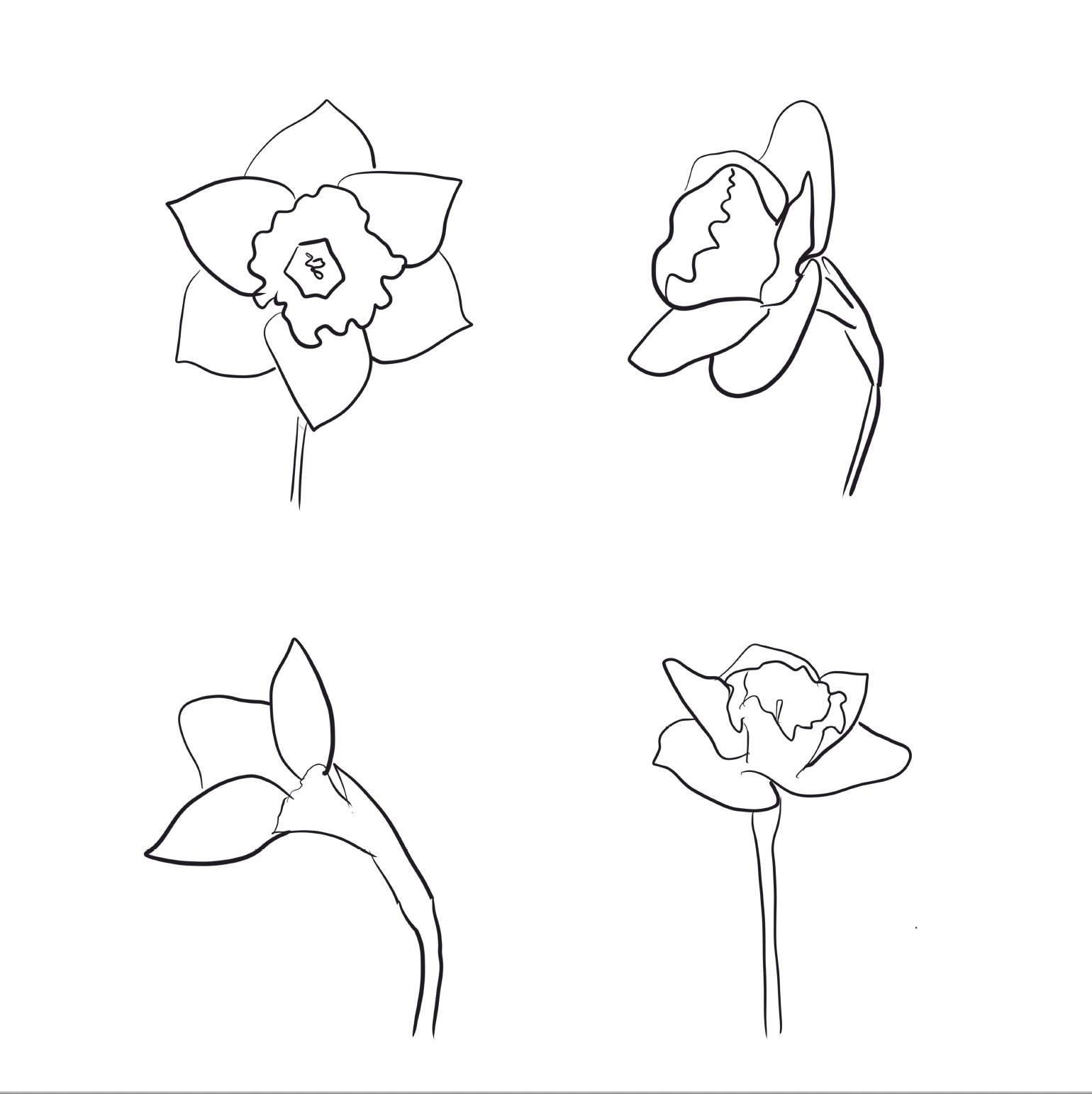
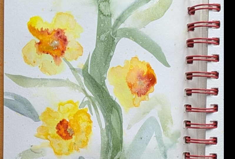
3. Sketching the Daffodill Shape : So before we dive in to
painting the daffodil, let's explore some values
through some practice. And we're going to start out by looking at the
daffodil shape, and I'm going to be using my
Procreate app just so we can sketch it out and see what
this flower is all about. They're just beautiful.
It's a sign of spring, and so I snap some
photographs of my first daffodils that I
grew from my Amazon order. I bought my little bulbs. I also got tulips, but
they didn't come in, unfortunately. So
I picked this one. The dog actually
knocked it over, so I didn't feel too
guilty grabbing it. So we're just look at this
and look at the petals. So we have six petals on this. Then we have this round
section in the middle. And then if I turn it sideways, you can see how it
just all changes. So now we don't see the fifth or the sixth
petal in there. So, you know, depending on
what direction you have, these can get really confusing. And I think this is why I have
a hard time with flowers. It's wait, you know, you
only see three petals. So I'm just kind of studying
this, taking a look at it. I did snap some pictures. I put it on my Procreate app, and I'm just going to just
trace this out to get my mind in the right place because sometimes you
just look at things and it just doesn't you don't grasp it until
you break it down. I've got that little
center area that I have little stamen is showing
straight down the middle. There's this little
pollen in the center. So that is the main
part in the middle. And then we look at our flowers. We have one, two,
three, that make this little shape that
come around here. These are the ones are upfront, and then we have three
others that are underneath. So we have the
fourth, the fifth, and the sixth petal down here. I'm going to come
to a little peak at the end or the
tip of it here. That really just
helps me take a look at something and break
it down much easier. There's a lot more
detail to this than there are to seascapes to me. Look at all these little areas. This really helps. If you have something that's very intricate, take a look at it,
break it down, and I think it helps your eye because
you're only focusing on one little section at a time. So again, we have
that center section. You can see where the middle
is, that little fold, and you have some
shadows underneath and then we have
these petals here. I can't find the six petal, so I see one petal here, and I have another
petal back under here. And I think that petal, that comes down in
the front there, right here. So that's
part of that one. And then we have this one
in the back underneath. This one in the back
underneath, and it's got a little curl to it. And this petal is really funky. If you look at the
shape of that one. Breaking down the shapes
makes it much easier. Now, this petal, you don't
see the six petal underneath, the way that that's tilted,
so we're not seeing that. And then we have the little stem here, and this comes down. And there's also a little
covering where it was covered when it was
just kind of blooming. Okay, so that helps
break that one down. So let's remove that image, and we can take a look
at what we have to work with. So there we go. That's the first image or the second image, this
is the first image. So by breaking it
down, I think it makes it much more simplified for at least for me for my brain and how a
flower shape is. So we've got two others here that we can do
the same thing on. Now this one again
has turned even more. So now I really only see three petals here,
one, two, and three. And then just a little peak
of that center of the flower, just kind of peeking out, not ignoring the purple
flowers in behind there. So you can have, you know,
really easy shape here. We've got the
second flower here, and then the third here. And you can see all those different shades
of yellow in there. And again, we have
little stem here. So that one's
really easy, right? Just three little petals. See, when you break it
down, it's much easier. So let's take a look
at that fourth one. This one is a little bit
more difficult again. I got your centerpiece here. If I come around this area here, it helps you bring
that focal point down in the center,
little stamen in there. You can see most of
the petals here, but very, very little
of a couple of them. We've got that big one here. We've got another where
does this one come? I think this one
is here. We've got this big one down in the front. It's got a little kind
of curl of the flower. We've got this petal here, and I'm not sure if
that one's attached to it or if that's the
other one in the back. We're going to put it
back there. All right. So we go one, two, three, four, five, one, two,
three, four, five. So again, you don't see it all. So not sure if it's
in there or not. So again, another shape, same flower, different area. And you can see all those
beautiful yellows in there and oranges. Right? So we have all four of those, and now let's attempt
to paint them.
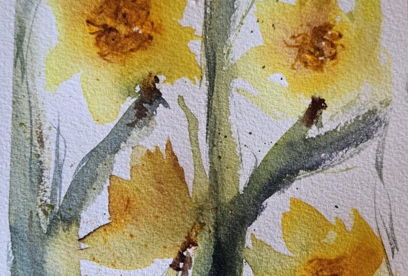
4. Daffodil Practice: I have the principal
PDF down below for you. Feel free to free
hand these like I'm doing here or
trace them and add your watercolor
paints to practice those shapes and
practice those values. So let's take a look. So I'm going to start with that
real basic star shape. I'm using a lemon yellow
for the first layer, but I'm going to add
a little bit more of this cad yellow in there, just kind of dropping it in and letting it
blend a little bit. Again, I'm trying to
keep this fairly loose. So I'm just going to
do this very quickly, that really quick shape. I'm going to have
that other one out on the bottom just a
little bit darker. As you can see, it's
got a little bit of a shadow on the
underneath of the petals. And then just a little bit
of the area in the center. We're going to do in a minute. I'm going to shape up
these flowers they seem a little bit bigger than
what I have going on here. So let's extend those out. Okay. So I'm liking that. Let's go ahead while
that's still wet, and let's work on
that second shape. Now, this one is
kind of sideways. So I'm trying to get
that big petal in there. This is maybe that center area. Again, bringing those
other two petals down a little bit more, really quickly glancing at it. Again, we're just
trying to get in just a rough shape of this. Okay? We know it's sideways. Again, putting a little bit of that cad yellow in here
for some darker values, and this is where that
centerpiece is going to be. Again, just kind of
scribbling it in there, making it very
light, very messy. Then we'll move on
to the third so you can see how fast
I'm doing this. A great for practice. This one just has basically
the three petals. I'm going to add in a little
bit of the darker colors. It's actually lighter there and you should have
been one on the bottom, should be a little bit darker, not the one in the
middle, but that's okay. But sometimes when
you're in it, you just don't see it right away. Sometimes it's good to go back and really study that
image a little bit more. And you can see where
you've gone wrong, where you've had those errors. So this one is upright. We've got those two wide
petals down at the bottom. Got a couple tucked
in back in here. Can I have that center? It's got a lot of
that yellow in there. I could put it in, but I
chose not to at this point. I'm going to extend
those flowers or those petals out on the
bottom a little bit more. Again, a very rough estimate
of where these things are. Now we can go back
in with a little bit of that darker shade
for the center. I'm just going to play with all of these now because
they're all still wet. I can still add some of
that darker value in here. Working with one
more shade down. This is my Zen art kit. So they've got a
few more colors in there than the Rosa kit has. You can see, I've got a yellow
and three different shades of the orange and
three shades of red, actually more than
that, one, two, three, four, five shades of red. A couple of greens here. So I'm just mixing in those
greens, tapping it in, again, it's still
wet, so it's going to bloom into some
of that yellow. Be kind of careful doesn't
get in there too much. And this one, the stem is coming from underneath and down. And this one has
a little curve to it and coming right around. I have a little bit of yellow in there as well. You can see. When I pulled down
on that, I brought some of the yellow into my stem. So a couple of really
super loose ones. Let's do a little brwn here. I've got that little
cover that is over the flower as it
starts to emerge. So I'm going to put a little bit of that in there,
a little brown. So really simple, right? I'm going to add another
shade in here again. It's kind of like orangy brown. So it's a couple of dots. I want to define a
little bit more where those darker values are
in the dark orange. Around the edge here.
Again, still all wet, so I'm just kind of
touching it very lightly. I've got a couple
spots on this one. It's kind of the brown that
goes in with the greens. I'm softening that just
a little bit there. Just kind of a shadow in there. I'm using the tip
of that brush, too, just dotting it very lightly. And as it starts to
dry a little bit, I can get a little bit
more definition in here. Alright, for our next video, we're going to be doing what I call dancing with daffodils. It's a loose painting,
and we're going to cover values and a little
bit more composition, putting into practice
what we've just done. And it's going to
be a very loose, very interpretive
painting of daffodils. And this time, we're going
to work a little bit more on that composition and
leave some white space, but still a more
cohesive type painting with some energy and movement. Also, I want to
mention that if you wanted to take these
little practice sessions, add a little B to them like I did here, a little splatter. And these are really
cute for framing up as little individual paintings. O.
5. Let's get ready to paint: Hello. Welcome back. I
hope you had a good time with some of these
practice sessions and we're starting to
pull things together. Today, I want to talk a
little bit about values, and we're going to again, continue to practice those
floral shapes a little bit. Then even though we're doing things that are more abstract, you want to keep in
mind the lighter areas are going to show where
the light is hitting your floral designs and where those darker areas
are might be where your folds are or the
shadows are being cast. We're going to do a
little detailing, not over the top detail, but just a little
bit to give more of an illusion of what
we're trying to paint. Still holding true to
that loose design. You'll see. Let's
get ready. Dive.
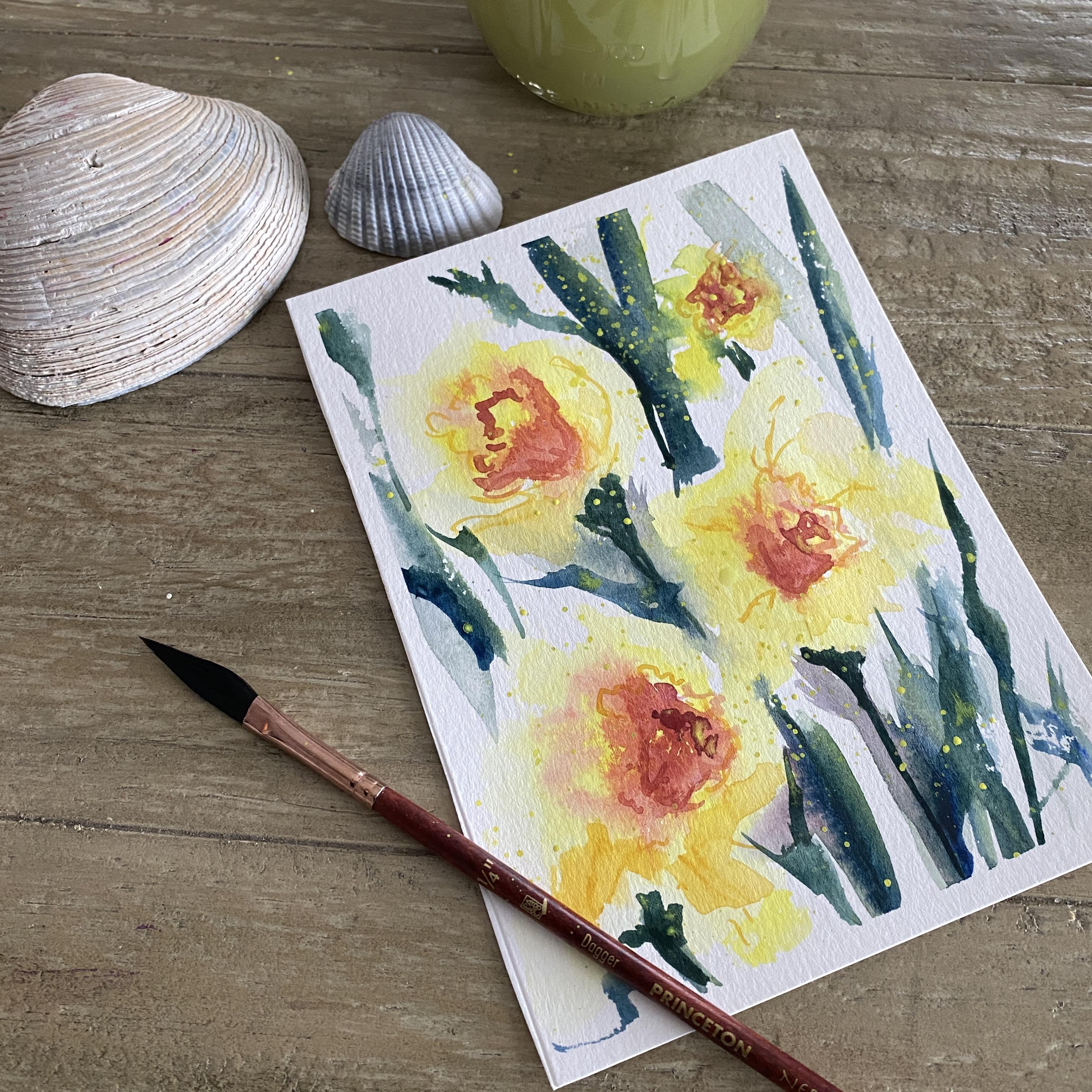
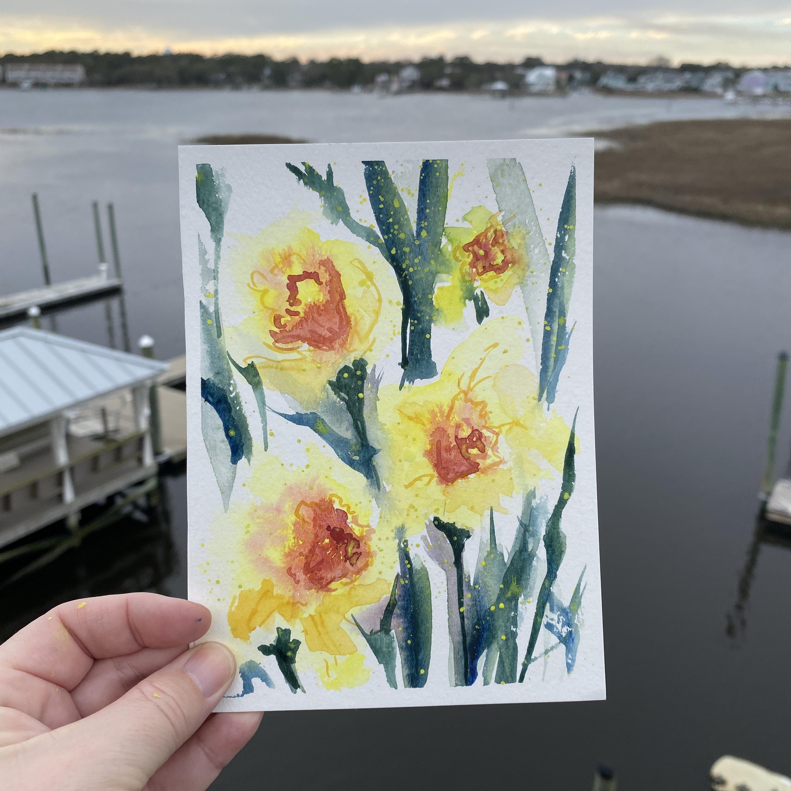
6. Dancing Daffodills: Okay, my friend. So we have
done a lot of practicing, and now we are really
ready to put a lot of the work in and start creating. So this one, again, is
a very loose painting, and we are just going to think about those images that
we may have just painted, but we are going
to go even looser. I'm using my dagger
brush for this. We're starting off with
some lemon yellow, adding some clean water, and I'm just going to smear some of that color
just to create that illusion once again of the best way to
say it is a blob. I'm going to do
another one down here. I'm trying to think
about where I want the flowers
as I'm doing this. So I've got three nice composition here,
spreading them out. It's very similar to the peach one that we had done earlier. And again, I am spreading
out that yellow. I don't know what that
shape is going to do. I'm going to look
at it afterward, and I'm going to
determine whether or not the flowers going upright
to left to the right, and let the position or let it tell me what
position it wants to be in. So again, I'm just
using that clean water and spreading some of that out. That's how I'm going to get
that high key color value, some really light
values in there. We've got our medium
values in here and now we're going to add a little
bit of another darker tone. I'm going in with a little
bit of that red orange. I know that the
centers of those have that bright orange
circle in the middle. I'm looking at this trying to determine I know it's
going to be in the middle, but what direction is
this flower facing? As it starts to develop, I am kind of feeling it out and seeing
what I want to do with this. So this is again, still wet, so everything is
moving around in here. This is part of the
fun. Your painting is not going to look
like my painting. It never looks the same, even when I tried
to do it twice. So it's again,
just about letting your paints tell you what they want to do and
where they're going. We've done some leaf practice. We're just going to
go ahead and put some nice green leaves in here. Now the dandelion
or the dandelion the daffodil has those
really nice ongated leaves. They're not a rose leaf shape. They have just these
nice long spindle, I don't know what you want
to call them. Leaf shapes. So I have got those in there
again, really light shade, and I don't want to mix in
with that yellow too much, so I'm just lifting some of that out and pop some
more down in here, get a little bit
darker value now. The underneath maybe where that bloom starts to come from. I think I have even
a little bit of red in here, a little sienna. It of a mixture of
everything on my brush. But again, it's okay. I'm mixing those
colors. I'm playing. I've got a little bit of
blue in that corner there. So I know it's going to
give me a darker value. And again, the composition
is, you know, that three. I'm trying to really
bring your eye across all of the paper.
But don't worry about that. You know, if you're
first starting out and you're just trying to
get those shapes down, don't worry about
your composition yet. But doing three kind of
staggered like this, you're never going to go
wrong because your eyes gonna go throughout
your whole paper. I'm going to add a
little bit more of that deeper green value again. So I've got that light in
there. I've got some dark. I'm not covering
every part of that, going around that yellow
because this is kind of in behind that one blossom. I don't want to drag
everything up in front because it will
cover my flowers. Again, it's okay to
do that every now and then because you're
going to have some leaves up in
the front as well. But again, we're keeping
this one super loose. And going with the flow
with this one, I decided, I think I need another one right in here. Could have
left it with a three. We'll just put a little
tiny one back in here. I don't know. Does it need
to be there? I don't know. Is again, okay. I'm going
to spread some of that out. Again, trying to be careful
because I don't want it to get into that green too much, but it might have some of
that hidden back in there. Going in with that
orange red shade again, going a little bit darker now. We we have all of those
different values, all of those different colors. And when I say different colors, you can get a little funny
about values because just because a pigment or color is darker doesn't
mean that the value is darker. So a great way to
look at your values is to take a photo of
it in black and white, and you can really see what paints or what colors
have what value connected to them
because sometimes our eyes really can throw us off and not tell us the
whole truth with stuff. So take a photo of the picture in black and white
when you're done with it, and you can see if you've got enough lights and
darks in there. If you look at that scale again, making sure that you
have at least five different values
in your painting, and more is even better. I mean, if you can get
ten in there, great. You're going to have a painting that's really going
to pop normally, as far as the color goes. I did give this one a quick
blow dry now I'm going back in with a very
fine line brush. Again, I'm adding just
a few details so that the eye gives the illusion
of somewhat shape in here, but again, it's not
an actual shape. You're just creating a few
lines and just giving yourself a few darker areas so that your eye really fills in the rest of that
information for you. Just get a couple little
squiggles where that might be. Going in now with
a little bit of orange and doing the
same thing, again, another darker value, a little bit darker
than the other orange. So we've got, again, a number
of colors here and a number of tones that we can
use, even darker here. So again, just adding a little bit more
detail in the center, so it's going to create
that little ripple shape that we saw when we
sketched them out. And this is looking really
pretty just as it is. I mean, it's really
loose and airy, and we are doing this
one fairly quickly. So I'm adding another
darker yellow, more of a cad yellow. And you can see that, again, it just gives it a
little bit more depth. And I'm not filling
in the whole thing. I'm just picking and
choosing a couple of little areas where some
darker petals might be. Now, you can tell this is even looser than that first one that we had done where
we basically got the shape of the flower. And that's a great
thing for you to try. If you want to work on a
new flower and you want that illusion of a
particular flower by looking at the
original photograph or by practicing drawing
some of those out, it really helps you then go into that loose mode where you're just kind of getting that shape. And even if you
squint at a picture of a flower as you're
trying to paint them or bring them way
off in the distance so you can't really
see the details, that can really help as well. So again, I've got
my liner brush. I haven't used the
liner brush much, that really fine line. I could use the tip of my
dagger brush for this as well, but I have a little
bit more control with this line brush than
I do with a dagger brush. So that's why I opted to do a little bit
of the line work. And again, we're
bringing up some of those leaves, getting it loose, holding that brush
closer to the end rather than near the feral or the base where that
little piece of metal is. And again, I'm just adding
some darker values in here. A little bit more green up here. I am now considering
doing the splatter. I love doing the splatter
for loose florals. I just think it's really fun. And if I'm ever frustrated
with a painting, sometimes the splatter is
just like the little icing on the cake or your sprinkles on your cupcake, however
you want to say it. So I just love them. I think they're a lot of fun, and they can really bring a lot of looseness to your paintings. So I'm going to use that
lemon yellow again. I'm going to use just
a little brush here because I want those
little tiny dots. The bigger the brush,
sometimes you can get bigger dots or
bigger splatter. So you feel free to play
around with that as well. See if you like the bigger ones, depending on how much
you feel like doing. So I'm going to go ahead
with a bigger one. I think this needs a little
bit more, a little heavier. So let's see what this looks
like with a bigger brush. Yeah, that's what I want little more, a
little bit heavier. A little bit of bright yellow, a little bit of white, totally different color,
like pink if you wanted to. I mean, it's all
part of the play. But I think that
is what it needed. That was the final little touch. I think it's gonna be
a lot of fun for you.
7. Outro: Thanks so much for
joining me in the class, and if you are ready for
your project, let's dive in. You're going to create some
very loose flowing florals. Now, if you want to
share your project as either the practice sessions for the shapes of the
flower, you can do that, or if you so choose
dive right into all of those final details and
share your finished painting. And if you enjoyed this class, please check out my other
skill share classes. If you're into florals and you want to practice
your techniques, you can join my
floral class where we dive into a lot of
these techniques and we do a little
card at the end. I just recently posted my brand new Hydrangea
floral class. Thanks so much for sharing
your time with me today. I look forward to seeing
you in the next one. Bye.
 Kellie Chasse, Artist + Entrepreneur + Educator