Transcripts
1. Intro Easy Loose Poinsettia Watercolor: Hi there. I'm Kelly Chasse. I'm a watercolorist, and I'm an artist and instructor and lover of all
things creative. In this class, we
are painting one of my favorite seasonal
florals, the poinseta. This bright, cheerful bloom
is perfect for holiday card, small art prints, or
if you just want to relax in the afternoon
painting at your table. We're going to
walk through every step from mixing your reds and your greens to layering those
soft transparent petals that give that watercolor magic. I'll also share a few of my favorite tips for
creating natural blends using some white space as highlights and
keeping your painting loose and expressive. This class is great
for all levels. Even if you're brand
new to watercolor, all you need is a
few basic supplies and the willingness
to play with color. By the end of this class, you'll have your own
beautiful point set of painting ready for frame, gift, or if you want to turn it into a festive card
for someone special. So grab your brushes, and let's paint a little
holiday magic together.
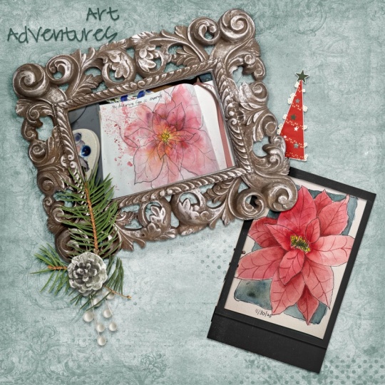
2. Your Project: Last project, you are going to create your own
watercolor poinseta. This can be perfect
for holiday card, even gift tags, or if you
want to do a seasonal print. And you can start by
sketching lightly with a pencil or you
can jump right in for a very loose
expressive style. GoTo Pinterest, check it out. S on Google some photographs or images of different
colors of the Poinsetta. It's really fun to kind
of play around with the different washes of
reds and greens and you can build up the dimensions
in the petals that way. And when you're finished, just snap a photo and share your painting in the
project gallery. It's such a fun way to see everyone's take on
this festive flower. And I always love leaving feedback and giving you some
encouragement for your work. So I cannot wait to
see your Poinsettas.
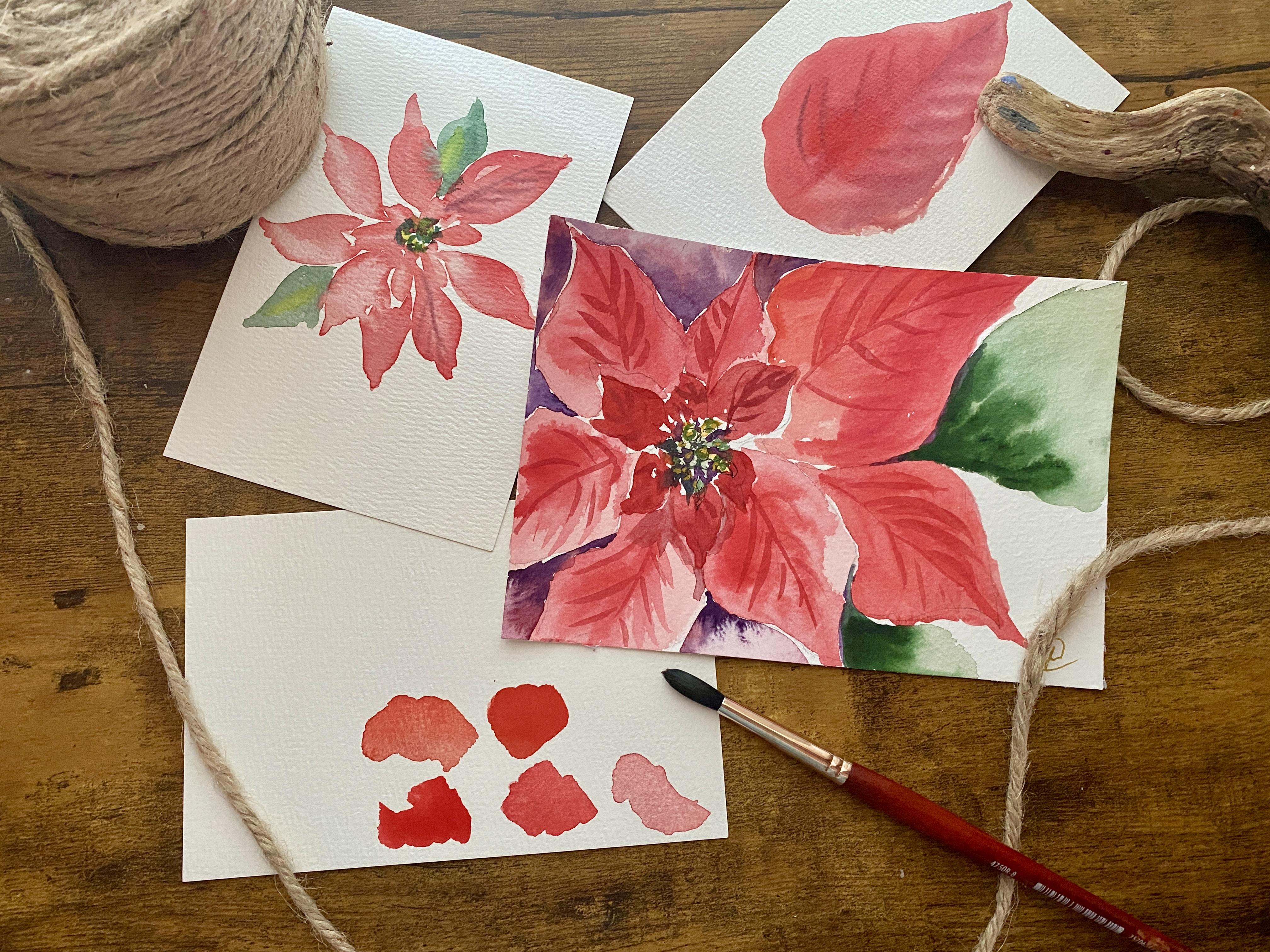
3. Poinsettia: Material Needed: Materials you need
some watercolor paper. I'm going to be using
fabriano paper. I'm going to be using just
one brush for this one. It's my Princeton Neptune
round number eight, and I have my Rosa
floral watercolors, I will give you a PDF list plus the PDF printable if you want to just
trace this one out. Okay, so what we
need for materials, any kind of watercolor paper. I would recommend 100% cotton. This is a Fabiano pad,
and it's a five by seven. There's 25 sheets in this one. I love this one only because I don't have to
tape around anything. I can just start painting
right away on this one. So five by seven, you can use any
size that you want. For brushes, I'm just going to be using
one brush for this one. We're going to keep
it super simple. This is the Princeton Neptune, a number eight, round, and you can see that
this does have a nice, lovely point, so you can get a little bit of
details in there. As well as using the belly
of the brush for the petals. So it's a good all around brush. And then for paint, you will
need obviously some red, maybe some orange, some greens, purples, and I am going
to be using my Rosa kit. So I kind of mix the colors, and I suggest that
you try this to try a bunch of
different colors and see what you particularly like. I like to use the CamenOange which is number
seven oh six or 705. I've crossed out of it. Now, I can't see
it. 734 flame red, 706 cad red light,
740 bright red. And I like a little
bit of pink in there. The matter red, 725 has
a little bit of pink. I love the Matter Rose. That's probably one of
my favorite ones to really brighten it
up. So that's 726. You could use operas. You
could use Magenta rose, you can use Quinoquinon
vile violet. I mean, you can kind of
play with those colors. And I suggest you do the
same thing with your greens, you can add either a little red or a little purple to your
green just to deepen it. I think I use mostly 711 green, and you can also use
the bright green, 739. And then some blues. You can use cobalt blue. You
can use ultramarine blue. Even burnt sienna to
darken things up, and maybe even a little bit
of black or black grape, you could also use some black
gouache, if you have that, or you can mix ultimarinblue
and burn umber, which is one of my
favorite blacks to make. Okay? So again, whatever
paints you have, I'm using my Rosa as I said, this is the floral one, and it does have a little
thumb thing through here, so you want to take that
plain air paint, you can. It's got a mixing tray here, and if you open it up it's got a second mixing
tray on this side, too, so really nice one. But the colors on this one, it's got so many different colors, as you can see, and they're
really fun to play with. They're very juicy. They're
very pigmented paints, and I love them. And the osak is made by, I think the company in Ukraine. So Again, use any
paints you have. You know, if you have two
paints, use two paints. You will get a much deeper
color very fast with two paints versus working with your pan paints because you got to do a
little bit more mixing. Got to a little bit more water. You got to kind of play
around with a little bit. So I always recommend that if
you're just starting out as a beginner for watercolors,
kind of learn that. And it's a very good skill to learn using your pan paints. You can use, like you
said, to do two paints, but two paints, I feel like when you're first
beginning with two paints, you might use a
little bit too much. So if you are using two paints, just a very tiny it tiny
little drops all you need. It's not like acrylics or oils, where you need a bunch of it
squirted out on your paper. Okay, and then I also I'm going to use a little GTEch
four. This is the pilot. This one is not waterproof, but I love the very small
point that it has on here. Make sure if you're going to be going back
into your painting, it's 0.4, so you can
tell it's really small. This one, like I
said, we reactivate. So if you have a micron pen, something like that,
test your pens, but you have a
black pens and make sure that if you
plan on going back in that you're not
going to reactivate your any your pen and ink
that you've put down there. And then I also have my
medine love this one. This is my little porcelain one. It's got two water, one for dirty, one for clean. It's very important to
work with clean water, especially if you want those
bright vibrant colors. So one for dirty, one for clean, you can also have
a blow dryer or heat gun if you want
to blow dry quickly. Alright, so we are just going
to dive right into this.
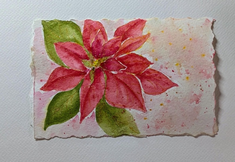
4. Poinsettia Practice: I thought we would do
a quick practice one. I've got a couple little
sheets of paper here. This is not great quality paper, but I just wanted to practice a little
bit before we begin. Now, with your reds,
when I first did mine, I didn't like the
color red that I used. It was just a little
bit too light. The Rosa calorie kit has
a ton of different reds. You've got cat orange,
you've got flame red. Cadmium red, bright red, madder red, madder rose. Then these lean more
towards the purple, which are very pretty as well. You don't have to have all
of these different reds. If you have a cad
red, you can add some yellow to it to get
it a little bit brighter. Play with your
colors and mix and match until you get a color
that you really like. Most Poinsettas are
pretty vibrant. But I want to just to show you how you can layer
some of those colors. But I'm going to go
with this brighter one. The first wash when
you're going to be doing your petal shapes, it's going to be pretty light. What's that mean?
When I say light, it's add more water. You want a very watery mixture. You can always test
it on your paper or have a little
scratch piece of paper on the side just to see maybe
what colors you've got, how dark it is, adding
a little bit more, going in with
straight pigment and you can practice your
colors that way. Maybe you don't like
that particular red. Maybe you want more
of an orange shade. So I can try
something like that. Again, test out your colors,
see how close they are. You can see all of
those are pretty close, but you have a little bit
of variance in there. Play with your
colors, and again, make yourself a little
color swatch of red, which is a great way you
can look back at it and see if you mark
all of these out, if you mix and match a
couple of different colors, you can see how you made that. I tend to just mix on my paper just because I've
been doing it for so long and if I don't
get the right color, I add stuff to it
while I'm painting. But if you're new, it might be a little bit
more intimidating. So All right, so I've just
got a little bit of red here. Again, if you feel like
you're running out of paint, mix a lot of paint
ahead of time, put a lot of water in there. You know, test out
again, your color, how much pigment do I need to get it dark enough to
the color that I want? Do I have enough? Maybe I
need to add more water to it. Of course, when you
add more water, it's going to thin
that pigment out, you might have to
go back in and add a little bit more pigment.
You've got to play with that. That's something that you get a little better at the
more you practice. So don't be too upset with yourself if you don't get it
right off the bat. Get a play around
and go to practice. It took me 20 plus years to
be able to do these things. When you're looking at a
poinseta some are really, really vibrant, others
are not quite as vibrant. That one's very red. They actually have
little yellow centers. I should look that
up. Some have red, some have green,
some have yellow. I guess they're a
little bit different. The shape of a petal, you've got your little
center in here, and then you have these
little petals that come out. This brush actually makes a
great little petal if you are just putting in little
petals as you go around. You may find that
it's easier for you to turn your paper to get
that little petal in there. Again, these are pretty dark. I might have gone a
little bit lighter, more watery for the first round. I'm just going to
add some water to that see if I can
get it lighten up. Those are the inner petals. Then as the
poinsettia comes out, they're tucked
underneath as well. But they come out a
little point like that. They're almost
long and skinnier. Behind here, you might
have another one, which you might have to work around that to get
that in there. Leave me a little white space. As they have that
nice little point and they get a little larger. Some of them are little
ripples because they curl. That one's a little bit
lighter, you can see. You get the idea where
they're just building up and then you have maybe
some green because these petals are
actually not petals, they're leaves and the
leaf just changes color. I think when it's in the dark, I think that's how that
goes. I could be wrong. I think I said that before. It's just this
nice little bloom. You have your basic colors of your first wash and you can
see they're not too vibrant. If I go in and grab a
little bit more red, again any color red, and I can drop some
of that in here and give myself that's dry. See how that's not blooming. I have to be careful with
that when I might want to just put the line down the center on that
one and go back to it. But some of these are still wet. This one again, look at that. That's where you get
your hard edges. That's where you get that dry. Dry dry, dryness. Again, it's going
to be different for everybody because depending on your weather,
depending on humidity. You can see where I dropped it in pretty much
covered everything. Some of these were too wet, some of them weren't wet enough, so I had that bright line. If you get that in there
and you just feel like, I just messed up because everything is
the same color again. You can wash your brush off, tap it off the excess, and you can come in here and just lift out some
of that color. So we can get again,
a variation in there. It's not all the same color. I'm lifting some of
that bright color out. I don't actually do
this in the demo one, but I wanted to show
you that as a tip or trick when you're working in watercolor because it
can get away from you really quickly and
then all of a sudden you've lost all of
those different values. There we go. If I couldn't get that center line in
there, I can lift it out. I can also lift out if
I wanted to some of those lines in
there. Lift, lift. When you're lifting, you
got to make sure you're constantly lifting and
wiping off your broche. Otherwise, you're
just going to put that paint right
back down there. See I can lift out
some of those marks. I could also go darker
and put marks in. I've little purp below that
so I can get it really dark. If I wanted to go deeper, I can do that and put
some wine work in there. This is a very tiny
little one and then the centers would be
yellows or greens. Let's just do a little green,
a little blue in there. This should be dry enough, but I can just go
very lightly in here, tap in just a few. I can even do a couple
green leaves here if I wanted to a
little bit more water. I have to be careful, see if I go around
there and it's wet. It's going to lift up
some of that color. You want to make sure
that they're nice and dry in between there
before you do that. I leave a little white space
in there and don't touch it. I could maybe get some in there. Again, I sometimes
those little things happen a little happy
accidents and they're pretty. That's the fun thing
about watercolor, watching it and
seeing what happens. You could do something
like this really quickly and do little gift tags for
the holiday if you want, we'll throw a little
bit of yellow in there. You can keep it super simple. A little yellow in there too. Something very, very simple. That is an overall general idea of what eight point
stic looks like. Again, we want to
do a loose version. We don't want to be too
uptight about any of this. Let's just do one big petal here so you can see
the shape of it. Again, it's elongated
on the top. Sometimes they're a little fatter here when they come out. They might be a little ridge because they tend to
ripple a little bit. Again, they look pretty
much like a leaf. They are a leaf.
They're a leaf shape. Mix in and get a
little bit darker, again dropping in
some other colors while that's still wet. So I can have again
some variation. I would say that that would
be not bright enough red, I might want to add a
little orange to that it looks too pink
to me, pinky red. Then again, we can go with
maybe a little purple, do a center line as long
as it's not too wet. You'll notice you'll get
some of it if it's too wet, it's going to move on
you, so you're not going to get any
of those details. If it's dry enough, those details will stay. That is the shape of
a point set a leaf. We've got a little
practice there again. It doesn't have to be perfect. We're just going
to be playing and this will give you an idea
where you're starting.
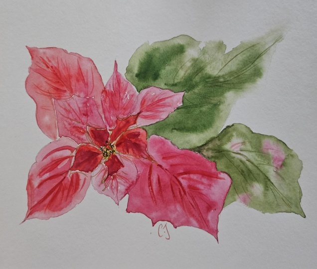
5. Poinsettia First Light Wash: Maybe even a little bit of
this, that's what I needed. A little bit of that Magenta
rose color in there. I think that's a good color. I'm going to go again, I want to go very light. I'm going to add some
water to this one. I don't know if that's
going to be light enough. I just want very watery I'm going to go in
and just fill in. Now this is a little bit more structured because I know
where things are going to go. This is where I talk about
loose versus not loose. I can go petal to
petal with this one. I got a nice little pink shade. Oops. Let's come
down into this one. I was supposed to be
dark, but that's okay. I'm going to go
over to this one. Again, it's all the same colors, doesn't really matter
if it all blends in. Now, I'm doing this fast again. I'm finding myself, I
just start to go fast. Instead of taking my time
around all those little edges. I just have I have a
hard time doing that. That's why I don't do a
lot of detailed paintings. That's why I don't
do flowers much because it's so hard for me to just go slowly in watch all these other YouTube artists and they're just so methodical. I'm like, Oh. How
do you do that? How do you have the
patience to do that? But you know it's a
good thing. Look, see, I'm still messy
even around here. Try not to go into it too much because if I
go into it again, it's going to leave a mark because it's
starting to dry already. I really don't have to worry about too much
because it's all red. I'm going to just
do a light glaze. I might drop in a little
bit of this dark color, let it blend, bleed
a little bit, let it do it naturally. While it's wet, I'm going to
try to keep most of that. Very loose. This is quite light. That's good. I want to come around here, I want to edge a little more. This is starting to dry. I've got some marks in there. Probably can get some
marks on this one. It saves me a
little bit of time, even though I'm doing a
little bit more detailed, I can get in a little bit
of definition in there. Not too much because if you start to do definition too soon, we tend to overwork, don't we? I'm also trying not
to let this area dry. What you don't want to do is you don't want to outline
your painting. You can see I'm trying to
keep this wet in here as I move around in bigger spaces. Again, I can drop in just
a little deeper shade. I'm just mixing, playing
around a little bit more of that rose in there
though. Magenta rose. I'm just going to tap it in. Let it just bleed.
Is it still wet? Yeah. You can keep
going back and forth, but again, you can save
yourself some time. Getting in a few details. Now that is dry right there. You can see that
that's nice and dry, but I want to keep it loose. That's all I'm going
to do for that. Let me come over here again. I lost my line work. Let's see how this one is. I might have to go in and
do another darker value on that or wait and see
as it starts to dry. I'm going to come around here. I've got a little bit deeper. Can leave a little white
edge on there if I want. Filling it in, keeping
this continuously wet. This one might have been green. These do have pretty
much a point. They do have a little ridge. They're not perfect, but they are a little
bit more pointed. I think I'm going to
make this one red too. Let me come around here, give it a little kiss around the edge. A little bit brighter, vary
those colors just a tiny bit. I'm going to come in here. I'm going to just
miss this little, get a little highlight in there. I need more pigment. Changed it up halfway through, going to let that blend
right into the other color. It almost looks like a heart. Give myself a little
bit of line work again. I can do the same
thing in this one. Well, it's still damp. Some of it might move, some
of it might stay in place. We'll see. Then I'm going to
paint the green in the center because
I'm going to let this all dry in
around here first. Now that's light in
the middle area, maybe even a little yellow. I was just going to actually probably more yellow than that. Rinse that out just
a little bit more. It's a little yellow in there and then drop
in a little green. The center, it's a little bit lighter actually
in the middle here. Just going to lift
some of that out. Just a tad. Let's get a little
bit more yellow in there. Keep it nice and bright. They do have that little center in there where their leaves
are just starting to form and pop out. It might be a little
yellow and a little red. Let's just do a
couple of them here. Just as that leaf is
starting to grow out, That's not quite
transparent enough. I want to lighten that
up just a little bit. The pigment is just
a little too dark. I'm just lifting and I'm
wiping off the excess on my towel here. That way I can get
some details in there. Maybe a few little
lines in there, maybe a little orange around it. Then I'm going to do let this dry do the same
thing in the center. I think I'll add some
green out here maybe.
6. Poinsettia: Background and Details: Et's just try loose. Dark green. Maybe I want to go
darker than this. We'll test it. That's
a nice shade of green. Let's do maybe another one here. Took it in, should
be dry enough. Okay. I don't need
to do a whole lot. I think I'm going to
go in a little darker. Let's see. Let's do
a real deep green. This is wet. Let's just touch it in there maybe it would
be really dark in here. I'm hoping that red is
completely dry as I do this. It seems to be. Let's see if we can
move that a little bit. See that nice organic look. If it's not wet enough, I can take a little more water. Extend that down a
little bit more. Let that move down in there. Like what this one's
doing over here. I think I'm going to go
with more of a holy red. Let's go with that
a mixture in here. I want to make it wet first. It's red purple. It looks like it might be a
little darker inter here. Let's just drop some
of that in there. A little bit more purple.
We'll make it really dark. I see I'm dropping it in. Trying not to work it too much. I'm going to let the
water move most of that. It'll be a little
darker in here and then as it comes out, it might hit more of the light. I can move some of it. I'm going to try and let
that go naturally. I think I might even keep
this white over here. We're going to do the
same thing probably here. Let's just do some purple again. We'll do the same thing
here, wet it first. Drop in some of that darker red, and drop in a little purple. Maybe even leave that
little highlight there. A little bit of
white around there. Same thing here. Looks like
I missed another petal. That's right. We're going
to just do it this way. I'm trying just
to leave a little white maybe for a highlight. Drop in that color. And then drop in
a little purple. You could do greens in this one. It doesn't have to be purple. I'm just going to let
that do it sting. I make little less
prominent with that white. There we go. Then maybe just the red over here
a little bit more red. To red. And a little purple tip. I want it to bring
out the petals. I don't want it too similar. There. I think that is good. This should be dry
enough down in here now where I can go in, probably that deeper red and purple right in through here. Just a little where
it's a little darker. I'm not going to do
a ton of detail in there and then back to our red, we should be able to
fill some of that in. We can change up that color a
little bit more if we want, maybe make these ones
a little darker, so a little less water. And we're just going to
touch it around here. You leave a little white space. There's something to be
said about white space. What I don't want
to do is I don't want it the same
color as this one, you can see where this
one barely can be seen. I want them darker or at least a different variation of color
than those other petals. While I'm in there,
let's go ahead and add a few more little
line works in here. This is my bet one. Following
again that same pattern. It's not super detail, but it's less loose than that
first one that we had done. So this side too. Then maybe a few little
dark spots again in here. Maybe in that purple, pops out all this stuff. Still a little wet. I like
what that did right there. I don't know if I like
all of that purple. Let's add a little bit
more green to that. Right up on top. Okay. I'm going to mix this one a little green, a little purple. We might have a few
more little buds sticking out through here. Again, not a lot of detail. A little more green, little circles right
around that yellow. I don't know exactly what that center looks like,
then a little purple, a little red, again, just some details slightly darker and a couple
of those petals. I want to say petals but leaves
I'm following that shape. Okay. Okay. There we have
I could continue on, do more with this, of course, but I want to keep it
fresh, keep it loose. I'm overdoing it a little bit, but I like the way
it looks. It's fun. You can do little raining
in here if you wanted to, in a couple of little areas. But I'm going to try
not to overdo that. I do like since it's
holiday festive. I'm going to use my
gold pen to sign. Maybe put since
we're into the gold, pop a little gold in there. Or the center.
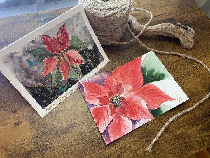
7. Gift Tag Idea: I just wanted to
share with you this quick little easy practice one. I'm going to make
this a gift tag, I'm just going to pop
a hole. Let's see. I do I want it this
way or this way? I could write Merry
Christmas down the side. Let's put
it on the corner. You can look and see what
you've got for space. I've got my little rope. You could use any kind that you might have. Pop
it through there. There is my little gift tags. I'm going to write Merry
Christmas down the side. Hopefully this goes well. I have a tendency to be
very messy when I write, so I'm going to try to
make this a little bit u. So this will be
where my Mary went. And this will be where
Christmas is spelled out. Alright, so if you're
like me and you're not the best writer, if
you make the lines, and then you go in with pencil
and do it very lightly, my penmanship is not great,
but if you have, like, calligraphy skills or
something like that, you could make this
probably beautiful. But I just like to
do the pencil marks, just kind of scribble
in my message, and I'm using my
NibalPen and then let that dry before I
erase those pencil lines. All right. I should be good. I just went ahead
and dried it with my heat gun a little bit, just to make sure
it was all dried. There in that way,
just keeps me straight because I'm not the best writer. Then of course, you could
always take your gold pen, you could add in a few
little funzies in here. I don't want to do everything, but just a few little added. Just for some little
a little gloss, a little glitter, it little bit more fun.
But how cute is that? So you can take your practice
sessions and just make little gift cards for your
presents over the holiday. And this is a Nibal pen in gold. You could use black, you
know, what have you. That's what you need for
that one. How cute is that? Once you get your
main painting gun, this can you your gift tag that kind of goes
with it, right? Look how adorable that is.
8. Outro: Class Wrap Up + More Watercolor Fun: Thank you so much for
painting with me today. I hope you enjoyed creating
your Poinsetta and picked up a few new watercolor
tricks along the way. And if you haven't already, be sure to upload your
finished piece or even if you want to put in your sketches
in the project gallery. I absolutely love seeing how
each student kind of adds their own personality and the color choices
to their paintings. Also, don't forget to follow
me here on Skillshare, so you'll know when new
classes are released. I do have more watercolor
projects coming up soon that will keep your creative flow
going all year long. And if you'd like to dig in a little deeper into
watercolor techniques, please check out
my other classes in the Watercolor
Affinity series. They are packed with step by step projects and
creative challenges. I'd like to see my loose
version of this one where I made a card.
It is up on YouTube. Thanks again for
spending time with me today and happy holidays.
 Kellie Chasse, Artist + Entrepreneur + Educator