Transcripts
1. Introduction: Hi, I'm Elizabeth and welcome to my class inspired by the
work of Andy Warhaol. We're going to be using the
method of collage to create different color
blocks to represent the imagery that is going to be inspired
by Warhaol's work. So he was doing screen
printing and creating these really bold
color blocks and layering on some really
graphic black lines. We're going to strip away
the black line unless you want to go there
and use color blocking in a collage method to use construction paper to represent the bold graphic
nature of pop art and create some really
fun portraits of made up pop art people
as we get inspired by Warhaol's work and find our own unique way to explore collaging
portraits or objects. You can go either way
because he did portraits, and he also did different
popular objects and common objects throughout his art making practice as we create really fun
pop art portraits. This class is intended
for creatives of all skill levels who
want to get inspired by artist and art movements
of the past as we look for new and fun ways to create
in the present and future. I hope that it is a class
that gets you inspired, has you exploring some art making approaches
that maybe aren't as familiar to you or revisiting some that perhaps you
explored in the past, and all the while
having so much fun, creating our own pop art a
Warhol, inspired artworks. Let's send it over to
the next lesson to talk about our class
projects. See you there.
2. Class Project: For our class project, we are going to be
getting inspired by the portraits and
imagery of Andy Warhol. We are going to be
looking at those for different kind of color
combinations he worked with and the bold graphic way
that he reduced down portrait imagery to create
really fun pop art pieces. And then we are going
to be designing our own portrait collage
by sketching out some ideas you're welcome to check out resources
that I've shared, which includes some more
background information about Andy Warhol's
life and art, as well as a PDF of
different aspects of characters that you
might want to put together to create your
portrait collages. This is a great resource
for anyone who's a little bit less comfortable with
the drawing aspect of this. You can absolutely just draw straight in
with the scissors, but sometimes it's
kind of fun to plan it out and sketch
it out in advance, and then you can also
take that sketch. Use it as a planning document to figure out what
colors you want to work with because we're going
to be color blocking in each of the parts
of our portrait. So definitely take
advantage of the projects and resources section
of class for this one. Then after you have
sketched out your idea for your project and done some planning for what colors
you want to work with, then we're going to
pull out whatever construction paper you need. You're welcome to also
use pattern paper, different decorative papers
that you but pop art is really about those bold,
fun, dramatic colors. So I recommend that you go with just solid color paper
for this project. You can always add some
other embellishments and personal aesthetic flair to your piece when you're
done collaging it. And then with that
construction paper, we are going to begin
sketching out and cutting out the different pieces
that we're going to need to assemble our portraits. Then we will be putting
that all together, gluing it down, making
it look fabulous. And if you need
to, you can add in some pen details or
marker details at the very end for some of those very tiny sections that might be a little
hard to collage. You're ready to
get started, let's head it over to
the next lesson to talk about the materials you're gonna need for
class. See you soon.
3. Materials: The materials for
our Andy Warhol inspired portrait
collage are very simple. I'm gonna be using a variety of different colors of
construction paper. I've got scissors,
I've got a glue stick, and then I like to use a
scrap of copy paper as my glue station setup. So I do all my gluing
on my scrap of paper, and then I can
transfer the piece of paper that I want to glue down to the area where I'm working. So you're going to want
to have whatever colors you feel like working with
because we're looking at pop art and Andy Warhol for a really graphic bold,
exciting imagery. We can use any fun
bright colors under the sun and we don't have to
worry about realistic color, but I do want to have
black as well as white because it just kind
is nice to have that as kind of a break
between stuff. I do also find that these really bold pop arty
collage portraits work better when you have
some color contrast. So kind of think about some
lighter and darker hues of color as you kind
of play around. But you'll see what I mean when we get into the class project. Let's head on over
to the next lesson to get into building up our Andy Warhol inspired
Pop Part collage portraits. See Son.
4. Sketching Portrait: We're going to create
our collage scraps. And one thing that
I like to do is I like to sketch out my ideas. So I'm going to go ahead
and grab my sketchbook. You can also do this on
a scrap of paper, too. It does not have to
be in a sketchbook. You could do portraits, like some of Andy Warhol's famous portraits like
you can see here. You could also look at
some of his other screen printed repeated imagery. You also don't have to play
with repeated imagery, but I will show you
in a bonus lesson how to go from one
portrait to multiples if you would like to repetition was a big part of
Warhol's process, but he also has a lot
of one off pieces, too. So either way you go, it's going to be really fun. But it is fun to play
with repetition. So definitely check
out that bonus lesson for that project. It's going to start the same
way that this one does, and then it's just going to
show you how you can create multiples once you've created the foundation of
your collage pieces. The first thing I like to
do is sketch things out. Definitely, takes
some time to head on over to the projects and
resources section of class. See the different imagery and background information about Warhu's life and his
art and his kind of journey during
his artistic career. There's a lot of amazing ways
you can approach pop art, and War hall did it in a
lot of interesting ways. So kind of look for the imagery that you
gravitate towards. Maybe it's more objects, maybe it's more the
pop culture brands, maybe it's certain celebrities from the past or the present, or maybe it's just
a generic portrait. I'm going to focus on kind of a generic idea because I think it's really fun to just kind of make up pop people and kind of leave it
open to interpretation. We're going to need a basic
shape for the head so I'm going to just kind of
sketch in a general shape. Now, because we're going Popper, we can think of the
traditional shape of a head and I am flattening it off because I know I'm going
to put hair up there. Then it's pretty fun to play with different hairstyles
when you do this. I'm very intentionally drying
dark and I really thinking about how am I going to create the separate collage pieces that I need to create this portrait? I'm going to have a
piece that's the face, a piece that's the
hair, any accessories, a piece that might be the neck
could be part of the head, that could be a single piece. This is also where you
get to stylize it. So maybe you have a certain way that you like to
create your people. It's going to come out in
this and that's really cool. Then we've got the body because we're going to
give it some sort of body, and then we can
figure out the face. Now, we're simplifying it
because we're thinking about the process that Warhol used for doing his
screen printing. I'm probably not going
to put a nose in because that's
complicated to do, but it is really fun to
play with lip shapes, and we can also think about the fact that Warh
was working through some very awesome time periods
when we think of style. You could play off of the
time period or some sort of vintage retro vibe in the way that you
style your portrait, or you could do
it more contempor or you could do
it more timeless, or you could go further back in history and do a really
cool historical piece. I love the era of Jane Austin. I think it'd be really fun to do a Jane Austin ask character
in this. Who knows? This could be something
really fun and a whole series that
you start to explore. Now I've the lips, I've
got the start of the hair. I'm going to go ahead and do
a bob, I think for this one. Just to get myself warmed up and that's going to be
a great big circle. Now, we do want to
think about where is the hair going to
overlap the head? So if it's something like that. Then I've got lips,
I've got things. The things could be
a separate piece. That could be a
separate piece that we cut out, that'd
be pretty great. We can also think about
how we can incorporate some different highlights
or whatever into the hair. That's a fun way to play with it and give it a
little bit more interest. Then the eyes are going to be whatever style
eye you want to do. I'm going to stick to the fairly standard
football shape and then I'm going
to give some irises, the colored part of the
eye and then some pupils. Then you can't see it, but I am going to include
a light spot in there. I might include a little bit of definition in the
lips. I'm not sure. I do also like to put accessories on my
portrait collage people. I think I'm going to give
this one a pearl necklace. And this is just a rough plan. We can absolutely
modify this as we go, and as you get into
cutting the paper, you're going to get
some new ideas. You're going to see how
you're going to need to problem solve and tweak
and revise things. But that's all part of
the artistic process. Now, if you are feeling
very overwhelmed by the drawing stage of this
class project, don't fear. I have created some
general people templates, and you can mix and match those to create your
collage people. Because what we're
going to do is we're go to go from the drawing to creating them to
scale on our paper.
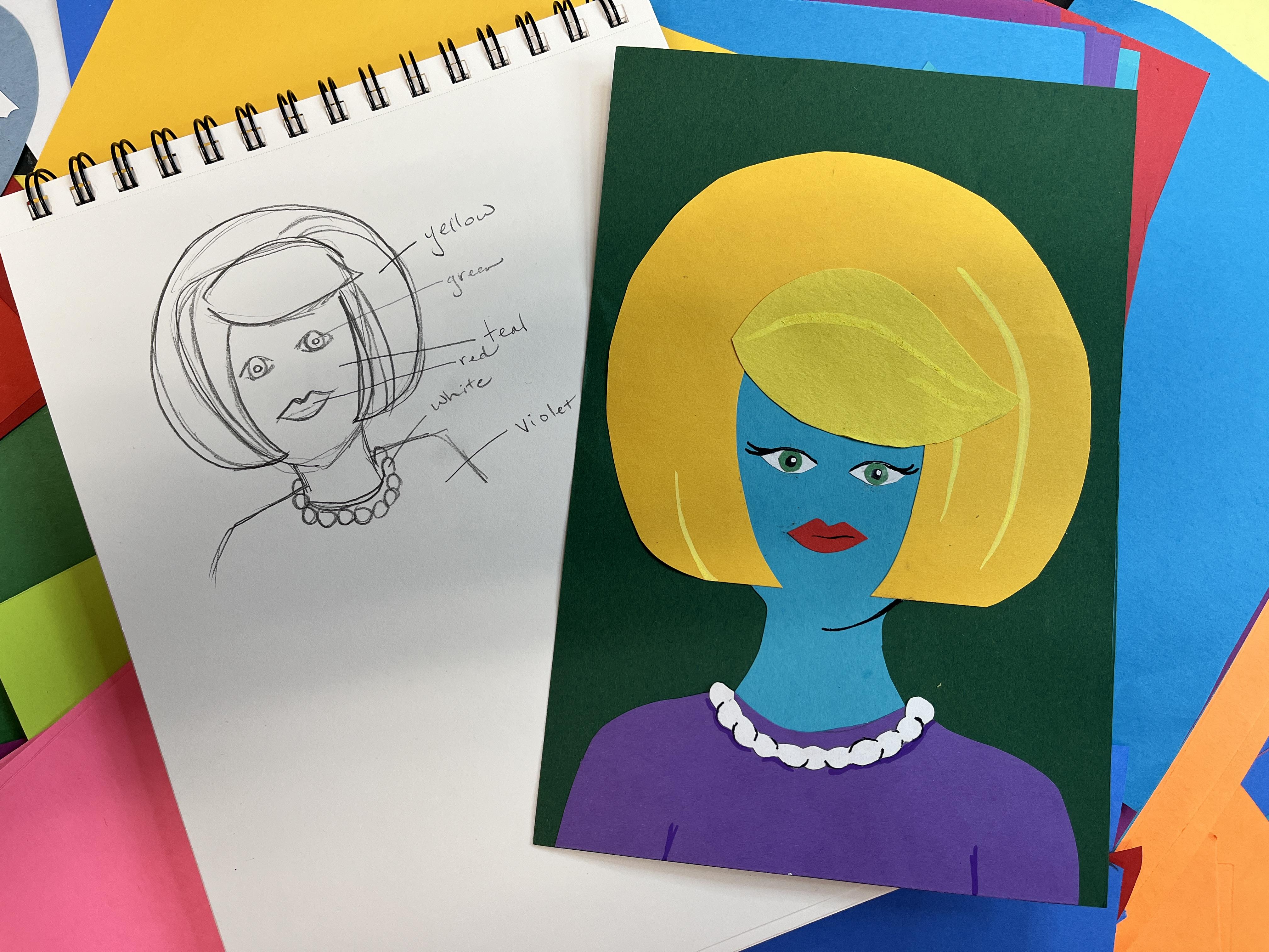
5. Collage Part 1: And then I'm going
to kind of think about what colors
do I want to be? I could plan this out.
I do kind of really like the idea of this
being a bold yellow. I do want the pearls, I think, to be white. I think I want I mean, you can really play around
with any color paper you have. I think, let's see, to
go with the yellow, I think I'm going to
do a teal for my face. And then I think I'm going to
do a violet for the shirt. And then I'm going to do a red. For the lips, and then I think I'm going to
give green irises. I might even have a non traditional color for
the white city eyes. I haven't quite decided. The pupils, I think I'm
going to keep black. So now I'm going to get
organized to create my Andy Warhol inspired
pop art collage portraits. I have a ton of
different color papers. I'm going to be working
on the medium side so that I can still have
some smaller details, but I don't want to get too crazy overwhelmed by
trying to go very large. You can choose whatever size you want to for your project. So I think the
background of mine is going to be six by nine. So I buy my
construction paper in nine by 12 inch sheets,
and then I cut it down, and this tends to be a size that I like to gravitate towards because it's big enough where I can get into some
intricate details, but it's not so big
that it's overwhelming, and it doesn't take a
lot of time to work on a project that's
on the smaller side. But then I have some other
sheets of paper that I cut down for some
other stuff nearby. This is also a great project to use your scrap
construction paper, especially if you're exploring some other projects and you kind of have
that on the side. I always keep some stashes of scrap collage paper around construction paper
and otherwise. You could also work with pattern paper for this if you want to. I really want to play off
the solid bold colors that Andy Warhol used in his
screen printed portraits. So that's why I'm going
with construction paper over printed paper for this. But these classes are
very much designed and intended for you to get inspired by the artists that
we're looking at, and then adding any of your own artistic
aesthetic sensibilities or preferences into them. So really, truly, this
is the foundation, and you can go any which
way you want with this, and it's going to be
really fun to see all of these brightly
colored pop art inspired portraits when everyone shares their project in
the student gallery. There is a great class if
you haven't checked it out. It is abstract Mixed
Media collage. That is not part of
the artist series. If you like collage and
you like abstract and you kind of like getting
inspired by paper scraps, I definitely recommend
checking that one. Going to start
with my teal head. So I've got some teal here.
I know that I want to do it. Oh, I haven't depicted a
color from my background. So I have yellow, green, teal, red, white, and violet. I want something that that teal is gonna pop off of nicely. I might just go with kind of a standard green.
Ooh, a dark green. This is gonna be
great. I'm going to use my dark green the teal is gonna show up
and the yellow are gonna show up really
nice off of this. So this is my base. So one side can be
your drawing side and the other side can be where
you kind of blew it down. But you just have to think about what the mirror
image is gonna be. For the hat, I'm not
worried about it. I want her to fill
up most of this. So I'm gonna cut
down my teal paper to the width of my green paper. This isn't necessary. I just find that
this helps me figure out scale when I'm doing
collage like this. And then I've got her body. So this is actually going
to go up a little higher. It is okay to have this be
bigger than we're planning on. Bigger is better because we
can always trim it down. We can also adjust it, too. So I've got the head shape, and then I've got the neck. So I'm gonna go ahead
and cut this out. I'm gonna go ahead
and let it be bigger 'cause everything is gonna get overlapped as we build
up our portrait. Right now, I'm just gonna
cut it straight up. Kind of like it's a big glass. So it's just giving
me more to work with. And actually, I should have probably made her face whider. But I'm gonna give her
some pretty big hair. So we'll see if it's okay. If it's not, I'll adjust it. She's going to be
more up like that. Now let's see if this
is going to work. I'm going to take that
golden rod yellow. Now, here's how we
do the next step. We have the face and
we have the neck. And we're going to
put this on top of what is going to
become the hair. Then I'm going to put
it in the middle. I'm just going to sketch
sketch out the shape. This is where I might have
to trim it because this is getting extreme for a hairstyle, but it's going to
be great for amis. I'm going to get the basic
outline of the hair. Then I'm going to trim that up. I have the hair sorted out. We have great big hair. I'm just going to just map in where the sides
of the head are. It's just a couple
of little marks and then the top so I
know where I can overlap. I need it to be
bigger than that. I'm going to inside that mark, I'm going to draw in the
inside style of the hair. And then I want to
get that sushi. I'm going to have the sushi
bang be a separate piece. For this one, I'm
just going to kind of I'm going to do it like this. Now, trim out the inside where I want the face
to peek through, and then we get to flip it over because we don't want our pencil mark showing through. Then we can see how this goes on our head.
It's looking pretty great. I'm pretty happy with
that. Now I'm going to use this scrap to create that
fang shape that I want. I wanted it to go
over and swoop. Then I want it to come now, I don't want these
pencil lines to show. I can erase them, but sometimes when you erase on
construction paper, it takes some of color out. It creates a ghosting. I'm going to actually cut a
little bit on the inside of those marks so that I don't have those
pencil marks anymore. If any of them sneak into the
piece that I'm cutting out, I can just erase them. I have a teeny, teeny bit,
but they were very light. I'm just going to lightly erase my marks. Now,
here's the thing. That doesn't show I could make this mixed media and I could do a little bit with colored pencil say to make
that darker or I could just pick a different color
to make it different. This depends on how
much variety you have in your construction
paper colors. I don't have any other yellows. I don't think unless this one is, this one's a little later. Great. Okay. So I've already
made the piece that I want. I just need it in a
different yellow. I'm going to go ahead
and trace this. For a shape that I cut out,
so it becomes my stencil. Then I can cut that out to make my new lighter bang
for this hairstyle. Race the little bit of mark I have there.
That looks great. It's just enough of a difference where I think it's
going to show up just fine. Fine enough. The other thing is, Andy Warhau worked a lot with
bold black line, so we can always add in some bold black outline
too to our picture. But first, we're going to
focus on the collage part, and then you can decide if you want to add black
outline or not. Before I move on to the face, I do want to focus on the shirt. Now I'm going to do the
same thing I just did. I'm going to scoot the
hair off to the side. The bottom edge of this is already cut to the
size that I need. I'm going to go ahead and
position this where I want it, and then I'm going to create
the shoulders of my figure. You can decide what
shape this takes and how many you can get into fashion
design if you want to. I'm going to keep it
fairly simple, I think. Then I'm going to mark I'm going to put my
pencil where I want it, but I'm not going
to touch so that I know I want to have
this scoop down. That is not very symmetrical, but we can always
do a little bit of cleanup when we get to the stage where
we're cutting out. And it doesn't have
to be symmetrical. So that's where that's
going to fit on there. I think that's going to
work really, really well. So now that I have that, I can start gluing things
together a little bit. This is where I'm going to
start to commit to some stuff. I've kind of figured out
where this is going to go. So then I'm going to
put a little bit of glue on the base of this and then glue
my shirt to my neck. Then I'm going to flip it over, and I'm going to glue the whole back so that I can attach
it to my background. Now, Warhol didn't work
a lot with pattern, but other pop artists did. So if you wanted to, you could absolutely jazz up
your background. I want to keep this one
pretty straightforward. So I'm just going to
deal with solid colors. Do color blocking for now. And then we'll see when I'm
done with the collage stuff, I might change my mind
and decide it needs more. So now I've attached
my head and my body. So I'm going to go ahead
and attach the hair next. So I'm going to go ahead and
flip it to the drawing side, and I'm going to put glues. All over the hair
shape because this is the next highest layer
in my collage portrait. You can always kind
of stick it and then slide it a little
bit to a point. Now I'm going to add the
swoopy bang. It's very tiny. I think I'm going
to make it bigger. That's the other thing. You can constantly be editing. So to make it bigger,
I'm going to lay it down on my paper. Where I'm working. I know
you can't really see this, but it'll make
sense in a second. I'm going to outline
away from it. So I'm following
the same curves. I'm just making it much bigger. Now I can cut it
out and see if it's too big and if it's too big,
then I'll just trim it down. So we're constantly adjusting
our shapes and our scale, but you're in complete control. So don't feel overwhelmed
by any of this. It should be really fun. So I
have two of the same shape, but this one's much bigger, and I like that a lot better. I know it's a subtle shift. I know it's very, very subtle. You may not glue that down.
6. Collage Part 2: Yeah, the pearls and eyes
and the lips left to go. I said I was going to
do red for the lips. Let's figure out
the scale of that. This is also where you can
do a lot of exaggeration. You can personalize the style of this as much as you like. So really have some
fun with how you create your person and what
type of person you create. I bold, bright pop art
colors aren't your thing, go with the colors that are your thing.This going to be
really, really cool. So now, as I'm seeing this, I think I'm going to change
my mind about the eyes, but I do want to commit to these lips because I
think they're super cute. Let me put the lips down. I love how giant her hair is. Now you'll notice there's
no jaw definition. I could absolutely add that. One way that I could do that by how we have the subtle
difference in the hair, I could take a little scrap
of a different kind of blue. And I could create
just a little curve. It doesn't even have
to be the whole way, just a teeny little bit of curve to create a tiny
bit of definition. I can do that same thing for
the nose too if I decide it needs a nose or it could be
just a little bit of chin. What I could do is I could
create a little cast shadow. This is your chance to really
play and try out ideas. This can be a start of a shadow. I'm going to hang out of this
piece and kind of decide. But I do like that idea. I don't think I'm going
to do that. But it was fun to experiment and try. Let's figure out her eyes. I want to do green
for the irises. One way to do this is to fold the construction
paper in half. If we're doing open eyes,
or anything symmetrical, it's nice to fold the paper
and then cut out two, or you can draw one and then trace it like we did with
the yellow for the banks. So for this one, I'm
going to draw it out. These are way too big, but they may look really cool. I'm going to cut it out and
then I'm going to trace it. I'm going to put it down. It's
tricky when they're tiny, but it's worth. Cut
out the other one. If you find that you're
having a hard time manipulating these small pieces, you can use the tweezers. Sometimes that's easier than
trying to pinch these teeny tiny pieces and
you're going to get a little messier with the glue. That's just what happens when
you're gluing small pieces. It's funny. Even when
you trace something, they still don't end
up the same size. So be careful if
you're trimming, they don't have to be exact. It's really not necessary. I'm going to cut these
a little smaller. I could have traced the
whites of the eyes. I can use my pencil
in a scoochem with the lead and put
back inside the barrel. It's getting pretty small. What you can do for the pupil, and for the highlight
in the eye, you can use markers because
that'll work great. I like the funky
shape of the irises. They got sloppy when I
was cutting them out. Here's another trick. You can
trace the white of the eye. This way, you know
how tall you need it. Then you can fold
your paper again. Because I want to be able to cut them out at the same time. This is definitely bigger than the white of my eye
that I created. I cut inside of that pencil mark that's on the outside
of that shape. I can get it back to the
size it's supposed to be. Then just go slow and gently rotate the paper
as you cut the scissor, and then you get your circles. We're going to
compare green circle to the green wonky oval. I'm glad I cut the circles
because now that I see them, the wonkiness on this one
definitely bothers me. I'm going to just commit and I'm going to put some glue on the white of one
eye and I'm going to put some glue on the
white of the other eye. I'm going to get them sort
of where I want them, and then I can adjust
because at the very least I want them in
line with the lips. You don't have to follow all
the rules of portraiture. I do want them to
be semi correct. I'm going to go
ahead and glue in one iris and another iris. If you're feeling like
you're up for a challenge, go ahead and cut out some even smaller black
circles for the pupils. I'm going to go ahead and
go in with a Sharpie. I just try to get them
as even as you can. Then I'm going to go in with I found a white paint
pen, a white pasta. I'm just going to
be very careful. I did not go where I
wanted to go. It's okay. It's really big. It's a
really, really big tip, and it's a really, really small light reflection
that I'm going for. So a elfin would be better. I could keep going with
mixed media details, but I really want to
stick to the collage. And I planned on white pearls. So this is really fun because we can do it as
one single piece, or you can do it as multiple
pearls if you want to. So what I'm going to
do is I'm going to do it as nice big chunky pearls. So I'm just going to create a chain of circles that touch, and then I'm going to cut out. I'm doing it down below
my collage because I want to be able to see where I want it to go up a little bit, so it overlaps the
top of the shirt. I'm going to go from both sides. I'm going to do a botus one
just to make sure I have enough to fill the
whole area that I need. Then I'm going to cut it out
and make sure that it is one single line of
connected circles. Details like this would be
easier to add in mixed media. So if that's something
that you want to do, go for it 100%. Or if you happen to have
some cool collage ephemeral, but I think it's kind of
fun to create most of it, if not all of it
in paper if you're able to because it's a really
fun artistic challenge. See how can I troubleshoot it to get the look
that I want to. And the great thing
is, if I mess it up, I can either create
another one or I can just kind of piece it back together since we're collaging. I get too committed to this. That's a little bit bigger
than I wanted it to be. But I have a trick for that.
So I can flip it over. I can just trim it up
a little bit more. So I'm going to
actually have my pearls end with this pearl. And then I may go ahead
and glue it down. I use drawing paper
for this part, so I didn't have any white construction paper
close at hand. So I do want to kind of erase
a little bit of my pencil, even though it's going
to be on the backside, just because my
paper is a teeny bit thinner than my
construction paper. Put the glue on. Ad. Pearls. I do want to give her eyelashes. I'm going to do that
with a fine liner. I'm going to make sure
that it's working. This I'm also going to use this to define her upper
lids a little bit. You don't have to do any drawn details if
you don't want to. I very intentionally wanted
to focus on this being a collage class because I know I tend to create a lot of
mixed media classes. But sometimes it's nice to have the option and it
works really great. Doing things like just
a little bit of pops. I have done everything
I planned on. I could give her just a teeny little indication of a nose, but I'm not going to Because
I have the black there, I could add a little
bit more linework. I'm going to go for it.
It doesn't need more. I just kind of want
to add a little bit. So I'm going to throw caution to the wind do a teeny
bit of jaw definition. Little bit there.
I'm going to do a teeny bit of pearl definition. Just like here and there. Trying to be super
subtle about it without doing too obvious repetitions.
Just a little bit. I could do a little bit
of lip. It's a teeny bit. Not sure I like that,
but it's there now. She doesn't have any eyebrows, but she also doesn't
have a nose, so I think that's okay there. I want to do something
to wear hair, but I don't know that
black is the right thing. I'm gonna try doing something
else with my pay pens. I have a yellow before I put it on there,
I want to test it. I want to see if it's gonna how it's going to
look on that paper. Like a teeny bit of then I want to make sure
I don't mirror it, want it to be its own thing. Maybe that's all
I do. Then maybe I can do the same
thing in here too. Different kinds of construction paper are going to be more absorbent than others
depending on their quality. This lighter yellow
is very absorbent. It's sucking in that paint pen a little bit,
but that's okay. I think it's working
fine. See? Now this is where you start to
go too far perhaps. I kind of how does
this gonna look? Just take my purple. Purple and purple. It's pretty great. Might just do, like, a
little bit of shadow. Just a little bit. Just maybe a little
definition to her arms. It's more so as, like, a unifying factor with what I did with the
lines in her hair. That's it. I'm
cutting myself off. The last possible thing
you might consider is a little bit of drawn in detail just to kind of really bring your
character to life. I'm so thrilled with
how she turned out, and I'm excited to
do more of these. I love the play of
the bold color. I love that it's kind of
an homage to Addie Warhol, but it's still very
much in my style. And yet, it's also
something that I wouldn't have created if I
wasn't looking to his work. These classes are
really an opportunity to stretch yourself
creatively and artistically and to kind
of see when you take your own aesthetics and your
own interpretation of ideas, and you weave them
in with some of the concepts of
different artists and ways that they approach art or even subject matter
that they explored. You can come up with some
really amazing things that are still very
much true to you, but are pieces that wouldn't
have come about otherwise. So let's head over to the
next lesson to wrap up the class and definitely
check out the bonus lesson if you want to see how to
go from one portrait or one pop art object to multiples. And I'll see you a S one.
7. Final Thoughts: I hope you had so much
fun exploring the work of Andy Warhol and
pop art movement. Please pop on over to
the student gallery on the Projects and Resources
section of class and share some photos of what you created. Tell me how it went. What can you see incorporating into your future art practice? And be sure to check out the work of your
fellow classmates. The classroom student gallery is a really fun place to see
what everybody's up to, get inspired by each other, encourage each other and
help each other grow. Also, please take the
time to leave a review. I really appreciate your time. At that you're spending on this class, either learning it, applying the techniques, and then reflecting back
on the experience, and sharing that
out with others. That's my favorite part about the review option on Skillshare
is that as a student, I love to share how I
process the information, how I applied it, ways that I can see myself using
it in the future. I love giving suggestions
about added to a class, and it helps others consider
taking the class and joining us on our pop
art inspired Adventure. So thank you so much
for taking the class. Thank you for leaving a review. I would love to stay connected on Skillshare if
we aren't already. So please click the
Follow button so you get notified about
future art classes, both from the artist
inspired series and other classes that
are in the works. I have so many fun things
planned for 2025 and beyond, and I would love to continue exploring all of that with
you in future classes. We can also connect
off the platform. I share everything
going on in my world artistically over
on my Instagram at Elizabeth Underscore Welfare. You can also share and tag
your work over there with me. I love seeing my
students artwork out in the wild beyond the
pages of Skillshare and connecting in all the
possible ways that we can in this amazing world of the Internet and all the ways that it brings all
of us together, no matter where in the
world we happen to can also keep connecting over
on my YouTube channel. I have a lot of amazing
content there already. I even more in the
works for the future. I show how I apply
and continue to apply the artistic techniques
and approaches that I share in my Scotire classes
through YouTube videos. I also take you on art
adventures with me. I take you and my sketchbook
out into the wild, and I share what
different things I'm getting excited about in the art world demonstrations
related to class. Otherwise, everything
I've got going on art related is on
my YouTube channel, and there's so
much more to come. So it'd be really exciting to see you over on that
platform as well. You again for taking
this class and exploring the work of Andy
Worrall and the ways that we can incorporate that and pop inspiration into our
own artistic practice. I hope to see you in class
again real soon Till then.
 Elisabeth Wellfare, Artist, Art Educator