Transcripts
1. Welcome to the Class!: Welcome to ski class
where we'll embark on a creative journey into the serene beauty of winter
landscapes with white colors. I'm thrilled to guide you
through the painting process of two enchanting scenes that
capture the essence of winter. Hello everyone. I'm tu ask a multimedia artist
passionate about painting, Rush educator and
an ambassador to White Nights vocals and
Dam stationers art store. You can find all about me, snippets from my studio life and my painting process in both
my Instagram accounts, Colorful Mystique
and Hound Mohan. In our first class project, we'll dive into the
tranquil world of a majestic snow cat mountain
based in cool shadows. From blending serene blues to crafting the perfect
snowy texture. This class is designed
for all levels, making it an ideal choice for beginners and seasoned
artists alike. Before we begin, we'll discuss all the
necessary art supplies, ensuring you're well equipped for this artistic adventure. Whether you're new to Aculaz or you're a seasoned painter, I've designed this class such that it is accessible
to everyone. Winter is a season of coziness and through the
magic of watercolors, we'll capture the
peaceful ambience of a snow covered landscape. Imagine the quiet beauty of a snowy peak bathed in shadows. A truly mesmerizing sight that we'll bring
to life together. The second class project is a captivating pink sunset
reflecting in the snow. As we explore the delicate
hues of a winter evening, you learn to blend warm
pinks against the cool snow, creating a breathtaking
scene that captures the tranquility
of the season. Winter isn't just
about the cold, it's about warmth too. The warmth of cozy moments, rosy sunsets, and
the joy of creating. Through these paintings,
we'll embrace the beauty of winter and channel that
feeling onto our paper. Whether you're a beginner
or a seasoned artist, or even an expert with Uacalz, join me in this artistic
expedition where we will bring the magic of
winter alive with Uacalz. Let's create something
beautiful together, and I can't wait to see your interpretations.
So let's get started.
2. Supplies You Will Need: All right. Now, so
let's have a look at all the art supplies that we will need for
the class projects. First of all, obviously
we need watercolor paper. The paper that I have used
in the class projects is basically from saunders
water Ford CP or not, which means it's
cold pressed or a medium textured paper and
the size is basically four, which is close to 12 by 9 ". It is 300 GSM and it
is 100% cotton paper. I would highly recommend using 100% cotton paper
for this class. But if you just have cellulose
paper or some other paper, the most important
thing that you need is to have a
cold pressed texture. A hot pressed textured paper or a non textured paper would
not be ideal for this class. Next, obviously you
need watercolor paints. I have used watercolor paints from various different brands, such as Seneliar, White Nights, Schmincke, Daniel Smith,
Windsor, and Newton, et cetera, which I have
prefilled in my palette here. This is my most used palette and I have all the colors set
up the way I want it. I always resolve to sticking to the colors in my palette
while I'm painting. Similarly, you might have a color choice
that you may like. You do not need to use
the exact same yellow or the exact same rose that I'm using for the
class projects. You're free to change the colors and go with
the palette that you have and create your own unique interpretations
of the class project. With that being said, obviously, you'll need a mixing palette where you will mix your colors. So this one is a
plastic palette, but you can use a ceramic
one or a metallic one, or whatever you have
at your disposal. Next, you'll need
watercolor brushes. So the main brushes that I have used in this class
are these ones, which is basically a large
flat brush like this one, which is the silver a
tailor hake size 20 brush. And then larger
size brush which is the silver Renaissance
series size ten brush, this is the size eight. So you can either just go with larger size brush to
cover the larger strokes, a larger flat brush to
apply water onto the paper. But it's absolutely fine if you don't have a large
brush like this one. Because you can even cover the entire surface
area of the paper with just a large round
brush that you have, medium sized or a
smaller size brush for the details that
we want to add. The one that I use here is the silver black velvet
series size four. And I absolutely love
it because it comes to a very minute small
point like this one, which is enough for me
to add in the details. But if you want, you can
go for a smaller size, such as a size two or
a size zero brush. It is also ideal to use two
jars of water because one of those jars would eventually turn muddy because you're
washing all of your paints. And then imagine picking up this water to apply
water onto your paper. That is why, ideally, you should keep another
one where you do not wash off your pigments
and this stays clean. You always have fresh water for taking up your fresh pigments or applying water
onto your paper. A pencil eraser and a ruler for making the rough
sketches in your painting. Masking tape to secure the edges of our painting and
to get clean borders. This masking tape is
one that I have been using for so long and
it's from Amazon UK. It's actually not
a specific brand, but if you'd like to have
a brand of masking tape, then I would highly
recommend empty shi tape. Then a board where you can
tape your paintings onto, you can also tape them onto
the surface at your painting, on, for example, the
table that you're using. But it is ideal and
highly recommended if you have another board or mat, or even a newspaper
that you can use. Because then it would
be easy for you to lift your paper from
the surface if you need to ever give gravity
for the water to flow down some white quash
for the lightest of the highlights and white
details in a painting. The one that I'm
using is designer squash permanent white
from Windsor and Newton. You can use any white, opaque watercolor or
white wash any color, titanium white, zinc white, or any other colors of
white that you have. Lastly, some clothes or a tissue that you
can use to remove the excess water from
your brush and to wipe off any excess water from
your painting as well. I normally use this microfiber
cloth for the purpose. Now that you know all the
art supplies that we need, let's get straight to
the class projects.
3. Taping the Paper: Let us have a look at how we're going to be taping
the paper at first. Here's the masking tape
that I'm going to be using. It's a normal masking tape
that I got off Amazon UK. It's 25 MM or 2.5
centimeters length. And I don't think it's the masking tape that's
going to ruin your painting. It's actually the paper.
So if the paper is bad, then the masking tape
can tear off the paper. Okay, So just get any regular masking tape
and make sure you get a nice good 100%
cotton cost paper. Okay, so here I'm just
going to tape the paper. I usually leave around half a centimeter width
for my paintings. That's what I like.
But you can go bigger or smaller depending upon what you prefer here. I've attached it at the bottom here with around 0.5
centimeters gap. Now we'll do the same
for all the four sides, and then I'll show you how we
can stick the paper firmly, which is very important. Okay. And now one more side. Now as you can see, we've
stuck all the four sides. But now what we should
do is make sure that none of our water
or the paint can seep underneath these
masking tape edges that we have applied
onto the paper. Okay, for that what
we need is any kind of flat object such
as this ruler here, which I'm going to be using. I'm not going to use
the pointed edge, but I'm going to
use the other side. If it's just a
normal other ruler, not the metallic one, it's absolutely fine.
It's actually better. Okay, all you've got to do is you've got to run along the edge like that and make
sure it's stuck firmly as I ran along the edge. Can you see that it formed
like a bubble there? This air gap was already there. Now what we're doing
is we're going to try and prevent it or like move it away towards
the outside of the paper. As you do it, you'll
notice that the paper is stuck more firmly on the
board that you're using. Okay? Keep going on
all the four sides. That's very important.
There you go. Now we've taped the paper, and let's get to the projects.
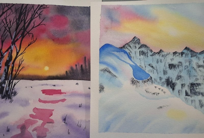
4. Class Project I - Blue Shadow Peaks: All right, let us start
and we're going to start with a simple
pencil sketch at first, to have a position of where
the mountain is going to be. We'll start around one by third of the paper,
which is around here. Okay? And that's where the rest of the sky
is going to be. Mark the position
of where the one by third of the paper
is going to be, then a little bit below it, because our peak is going to go towards that one by third point. Okay, there's a peak now that goes towards
the one by third point. I'm drawing very lightly because in the end
of the painting, I do not want to see any of the pencil sketch.
That is why I do this. Okay, here my pencil sketch
goes all the way like that. Then we have another separation here which goes like that. Hopes I'd like a bit
more angle here, towards the bottom like that. Now let's complete off
the mountain peaks. Okay, here we'll add some
more mountain peaks and let the mountain come down
towards the right side. Okay? And then you can add maybe some more random mountain
peaks there. That's it. That's basically the
pencil sketch in, and it's as simple as that. Okay? We're going to
paint the sky first. Let's not worry about
the mountain at all. Okay? All we need to do is go ahead and apply water
to the sky region. We're going to separate it. No continuous lines
or painting here, which is why this
is very simple. Okay, so here I'm going to
use my large flat rush, which is the silver a
talor hake size 20 brush to apply water to
the top region. And going around the mountain, I'm just using the edge to
cover the surface like that. Okay. And around
the edges there, that's how I'm
applying the water. And now we have applied an even coat of water
onto the paper. Then we'll start
with a first color, which is basically a little
bit of transparent yellow. Transparent yellow. We're going to apply here in the center where it is going
to be the lightest region. Make sure to apply the yellow, but leave some gap of
white right there. And observe how I'm painting. Do not point your
brush and do that, because that's just
going to create blooms rather than
strokes you want. Strokes. Always hold your brush at an angle and paint like that. You could rotate your hand in different directions as to how your strokes needs to be when painting
something like that. Instead of doing this,
I tend to do that. I don't know why
in different ways. There I've got
some nice strokes. I need a bit more yellow here. That region there is
going to be white. And I'm not going to touch it in case if some paint seeps over. You can always do some lifting. Lifting is basically where you wash off all the paint
from your brush, then run your brush
along like that, clearing off the
paint from the paper. Once you've absorbed that paint, do not put it back
onto the paper because this is what happens if you
put it back onto the paper. That paint that you picked up is still in the brush that's there. You've got to wash it off if
you need to lift off again. Okay, that's how you
do a lifting process. Now, once you've
done some lifting, I'm going to go
with a little bit of quin gold or quacrodone gold. This color is very easy to mix with a red and
a yellow basically. Alizarin crimson and
transparent yellow. And add a little pinch of brown to it and
you'll get this color. Okay, If you have quin gold, then go ahead and use that. And you can see it's this
vibrant golden hue color. I really love it a lot and
I have it in my palette. And I know that many
of you may not have. Which is why I've
given you the idea as to how you can
mix that color. Taking the quin gold
and applying towards the base here and along
the edge of the mountain. I guess I'll go a little bit upward as well
with the Queen Gold. That's it. Now I think I need
to do a bit more lifting. As you can see, some of
white is still going away. Eventually you could
add white paint, but leaving the white surface
of the paper is much, much better than adding
white paint onto it. Okay, here I've created
a nice white surface. Now, before our paper dries off, I can see it's already
starting to dry off, so I'm just going
to reapply some of the water using
this smaller brush. Okay, towards the edges. That's where it starts
to get quickly dry here. Now I'm going to add
in the next stroke, which is going to be this
just bright blue or low blue. Okay, I keep saying bright
blue because this used to be the bright blue from white
nights here in my palette. But it's exactly the
same as to blue. Okay, here, adding
some nice blue shade. But now you've got
to be careful. Do not go near anywhere of the yellow
shades that you've applied. Just going to go around Okay. And apply that bluish
tint onto our paper. Okay. Just a and
along the edges. Now, what do we paint? Along the area where it's
blue and yellow meets, That's where you're going
to add in pink or red. You can either use Alizarin
Crimson or Acron red, or even Quinacdone Rose here. I've got my Queen Rose here, and that's what I'm
going to be applying. Okay, I'm going to use that and I'm going to blend that rose. And I'm going to blend that. You can see how when the Queen Rose blends
with the golden color, it turns into an orange shade. Because it's basically
just a mixture of red and yellow, isn't it? It's just as if adding
more orange to it. That's basically it here. I'm just going to pick up
a little bit more blue. Oops, it's a little
bit more darker. I'll lighten it up by just using some water and running
my brush through. Okay. That's how you can adjust your stroke and then taking
some more quin rose. Adding that. Okay, here, adding that rose shade, you can see when the rose
mixes with the blue, it creates like purple shade. But not greenish shade if it were to mix with
the golden shade. Okay, let's go and keep
adding the purple. Not the purple, I mean, the queen rose creating that gorgeous sky. Okay, I think here I'll go with purple shade rather
than the blue here. I've just mixed it up along. Okay. As you can see, sometimes your paper may
have started to dry. And the way to keep
it wet is to just reinforce your strokes
with the paint. Okay. And introduce the
moisture back onto the paper. That way your paper will stay wet. So let me
just show it to you. The areas where I had
applied blue is now dry, but if I apply a
bit more blue okay, and then just blend it into the regions that
has already the color, then it's not going
to form any plumes. But just now, look
at this stroke here. I applied some blue there. Okay, that's a very
vibrant color. And I've just applied it there. But if I leave it like that, that's going to form a plume. And I do not want
that. What I'll do is I'll take my paint. And I'm just going to blend it. And I'm going to make sure
that I blend it to my pink. Okay. When I blend it, then the color or the amount
of water on my paper stays. Even when the water
on your paper is even then it won't form any blooms. Okay. That's how you can prevent any blooms from
forming on your paper. Here, I've got the pink shade and I'm going to pick that up. You can see I'm adding that. I'm blending it along. I can see that there is a separation here
between the two. Any separation or
any uneven strokes, just go ahead and blend it up and then you'll
see the magic. Okay, just adding
some more strokes. As you can see, I'm picking up the ping and adding
some more strokes. Obviously the white
region is almost gone. Another way to introduce
back the white region now is to deliberately
introduce the blooms. Here I drop in a
little bit of water. Okay, that is going to
spread the pigment. It spread the pigment, and it created a nice
white spot there. If you introduce more water, it actually spreads the pigment. But don't leave
that water there. Make sure once the
pigment is spread, just go ahead and
pick up that water. Okay. And absorb that region so that the white of
the paper is now pack. It looks like the sun as well. I use that opportunity
to create like a bloom and then make a
circular shape using my brush. See, now we've got a nice, beautiful sky there
and we've got some nice white regions
like we wanted. Okay, Since the sky
region is now done, let's wait for this
to completely dry, after which we can
paint the mountain. And trust me, then
this painting is done. It's as simple as that. All right, here you go. The part where it's joining
the mountain is dry. I didn't bother drawing
towards the top side because that'll dry on its own
whenever it's ready. So here we're going to be
painting this part here now. Okay? So for that here I am picking up my
halo blue color. Okay, We're going to
be taking a very, very vibrant, gorgeous
amount of helo blue. Let's mix that up. Okay? Before that, we
need to wet the mountain. Okay, here, I'm going to wet this side of
the mountain first. Okay? The other side, we'll
paint that later here. I'm just going to
wet this side of the mountain here and I'm
going to wet the whole side. Okay. This separation
that we added, that's what I'm
going to be wetting. In fact, you could go a little
over to the other side. It's fine because the
other side is basically going to be shadow and we're going to be adding that later. It's actually better if some of your paint can actually
bleed into that region because that way you won't
have a dark edge over there. Dark edges are formed when there is like two
overlapping things. For example, here we've
got an edge here. And then if we don't
put a darker paint, but rather we put another yellow paint or something there, that's going to create like a very harsh edge. We
need to prevent that. Okay. But since the color that we're applying
on the mountain over there is a darker
color, absolutely fine. Okay. So here I've
applied water now. First I thought
we're going to paint the other side and that's
why I mixed the thalo blue. Apologize for that. But
towards the left side here, we're going to paint
some different colors. Okay, for that I'm
going to pick up my cobalt blue. It's
a different blue. I know that many of you may not have two different blues,
but that's all right. You can just create a
little different version of the blue by mixing
some colors into it. For example, if you mix complimentary color of
the blue which is orange, but do not mix a
lot, just a tiny, tiny amount of orange
into your blue. It'll be a somewhat
desaturated blue. Use the desaturated blue for this cobalt blue that I'm using and the saturated version, which is the pure pigment
version for the other blue that you're using if you're just using a beginner palette. Okay, here, I'm just going
to start from the edge, here, we're going
to mark the edge. Okay, we need the edge. Very important here,
taking along the edge. Okay, got the edge. Now I pick the strong paint. It's dark. Okay, here going
with the cobalt blue. And I'm just going to add some lighter strokes like that and just pull along
towards the bottom. That's it. Okay, Let's say more cobalt blue from there and follow
along the shape. Okay? Because we need to show
that that mountain has got the peak there and
then goes like that. Okay? Something like that here. You can add those
strokes towards them. Okay. That bring it let's
bring it down some more down. Okay. This is the area where I said that it's okay that if it bleeds towards that region, then now like I said, this was a separate
part of the mountain. The strokes in the direction of the strokes is what is going to determine the direction in which the snow or the
peak of the mountain is. That is why I said in
here, go this way. Okay. Clearly show the peak. We'll reinforce that some more. Okay. Now, picking up
the cobalt blue here we have at the bottom start
and curve like that, towards this edge over here. Okay, that's what
we're going to do. Taking my stroke, curving there, see all of the strokes
curving towards that side, and that's how we're going
to create the stroke. Okay, then as you come
towards the right side, stop the curves and keep just adding towards
the right side like that. Make sure that the
strokes are like from the bottom towards
the right like that. So that there's like a streak at the end where
you're doing it. Okay. It may fill up up towards the end and then streak
towards the end, but bending on this side now that's done. Now we need some darker strokes. For taker strokes, we're going
to pick up more pigment. Okay, Of the ubalt blue, this time with very
less water in it. Okay, See here, The
pigment is more dense. As I pick it up, my brush
does not have a lot of water. It's very less water. And taking the pigment, we're going to add darker
strokes over the top. Okay. Another one like that. More pigment each time. You can add some random
places like that. Now as you're adding
over the top, do not go over the entire place where you did in
the first instance, okay, going that way. But as you can see, this
stroke extends up till here. See, stop and make smaller
strokes this time. If we were to start from here again, stopping halfway point. Okay, Don't go towards the end. That's how you capture like
a nice depth, those strokes. Okay, See, don't go towards
the end but stay there. Okay? Okay, it can be more lighter as you come towards the right side. I'm stopping there then going
to pick up a little bit more as I need it to be
more darker in this region. Just adding some lighter
strokes towards this region. I love the way
that's turned out. Now let's give some
subtle tones of the sky, the reflection onto our snow, that region of the
paper, because we've applied a lot of
strokes, is still wet. We're going to pick up a teeny tiny amount and a very lighter tone
of the Queen Rose. We're not going to
apply the yellow, but we'll apply some Queen Rose. Okay, just a teeny tiny amount. And add that teeny tiny amount to some of the lighter areas. Okay, that see
tiny, tiny amount. And the same over here. But as you apply here, again follow the shape. Okay, remember all our strokes. We're supposed to be
in this direction. Now, once that is done, you can pick up the yellow. But make sure to
apply the yellow in a very subtle and lighter tone. Only towards the pink
regions that you've added. Okay, oops, that's
a lot of yellow. It's too much. I'm just going to flatten it out and soften it. See now that's
very, very subtle. Okay? It's not even
visible that it's there. Once it's dry, it's going
to be very light as well. I've got a very bad paper, I guess, because it's
got a mark there. I apologize for that. I mean, I don't know
why I'm apologizing. It's my paper. It's my painting. That's going to
be bad, but Okay. I think this paper has got a bad sizing. Okay.
That's all right. So now we've done with the
first part of the mountain. Let's go ahead and
completely dry this up. Okay? All right here. This part of our painting is
now completely dry and we can move on to the thalo blue
mixture that we kept aside. Okay, so here's the thalo blue. Taking a nice amount
of the helo blue, I'm going to apply that now. We're going to go with
the wet on dry itself, which is basically directly
applying onto the paper, not bothering about wetting
the paper or any kind. Okay. Just go ahead and this is where I said
that it's okay that your paint is going to bleed
towards the other side because we're going
to be anyway covering it with a larger,
with another color. Okay. Now, the key thing about this painting here
is you're not going to have to show your strokes before your strokes
on the other side. The strokes that you've
already applied dried up. You're going to have to okay, add in the next stroke. Okay. There. As you can see, I'm adding in my next stroke. You see how I've got like a
smoother part of my painting. I think I want like a
bit more darker color. I'm picking up a little bit of indigo and mixing
to my blue there. Yeah, I think that's
a much better blue. That's indigo and
bright blue mixed. If you do not have indigo, you can also mix like
paints gray into your blue. Okay. Yeah, that's much better, I feel using that
paint mixture and creating that peak
covered up till that. Now let's fill it up. Bright blue and indico mixture. Okay, here again, like I said, we take that and we
cover up to the strokes. Don't bother about any edge or anything there.
Let's fill it up. Don't let your stroke, if it dries out,
it's going to be harder for you to
create even strokes. Okay? That's why you
need a watery mixture. Look at the paint
that here I'm using. Okay? This watery paint is
what is going to enable you to paint in a free format without getting
stroke marks. Okay? You can already see
how the mountain is looking gorgeous, isn't it? But this is not a
separate mountain. It's actually the same part, but it's got shadow over there. Let's create some
continuity here. Okay? Just creating
a stroke like that. And then this is going
to create shadows here. We have shadow region over here. Now on the top, we'll add that shadow region. Edge of it is going
to be in the shadow and this is what joins there. It's just some shadow regions. But that one, I think it's best. I want it to be darker, but I think it's best if we
can soften the edge of it. That'll make it look gorgeous. Just softening the edge. Softening. Be careful
that you do not go and touch your paint
over to this one, because then that will spread. But see how we've got a
dark shadow over there. If you want, you can soften
the top part here as well. It only goes harder
edge as it comes down. I love the way that turned out. Now let's pick up some more of the color
that we're using. I want to create another
shadow region there. I guess I'll have another
shadow region there. It's just part of the mountain
having some shadow areas, probably because of some rock
or something that's there. It's just the surface.
Okay. I want to soften this one
because that's dark, it's not like the other side. This region is what
we see closest, not following the rules
of perspective. Okay? This is because it's the
closest region the shadow is. So the sun area is
towards the back. Okay? And this here
is towards the front. That's why this is softer. Okay? It's got nothing to
do with perspective here. I love the way after
it's softened out. Okay. Now you can
see the separation between these two is gone. I'm just going to pick
up my cobalt blue and I'm going to add it there. And I'm going to soften
it again towards the top. See, taking my paint, softening that region, make sure you don't spread out the blue that
you just applied. But there now that looks
much better, isn't it? You can see the
clear distinction between the two mountain areas. Then once the blue
paint is dried out, we add in some details and
that's it, we're done. All right, there you go.
It's completely dried up. Now, we'll go with
the darker details. For that, I am picking up my dark paint which
is paints gray, which is what I always
use for darker details. Okay. We're going to just
add in some darker strokes. Okay? Adding some
darker strokes here, towards the edge where some of my yellow mixed with the blue to create a
very darker green. As I look closely on my picture, I can see that it's a
bit darker green there. I've covered them up with
these dark lines and strokes. Okay, then after that, you can just freely
go ahead and add in. And we're going to be doing a lot of dry brushing technique. Okay, Dry brushing is basically, hold your brush at an angle, make sure that all the water
on your brush is gone. For that, use a cloth or a tissue and absorb
all the excess water. See, there is literally
no water on my brush, it's just pure pigment. When you use pure pigment
and your paper has a corus texture,
that's very important. It needs to have a texture, which is why cold press
is the best for this. If you're using hot press paper, you're not going to get
this, okay, cold pressed. And then if you run your
brush along like that, you'll see that the
paint comes out so dry. And that is the dry
brush technique. Literally the dry
brush technique. It comes out dry. Okay, And we're going to be adding so many of
this at some point. You'll see that even when
you're doing the dry brushing, you're not getting the paint onto the paper because
it's become too dry. It needs to be
damp in that case. Dip the tip of your brush, little tip of your
brush in water, and then pick up the paint
again. When you do that. At first, when you do, you're going to get some hard
strokes like that. Then those hard strokes will soon convert into a
dry brush technique. Okay? If you only want dry brush and you do not
want those hard strokes, the best thing is to do is to, after dipping your
brush in water, go ahead and try it out on
another part of the paper. I mean, outside of your paper. When you start getting
those try strokes, put it back onto the paper, then you have the dry
strokes back again. See that that's dry strokes, running your brush
over like that. See, now I'm doing so much
but I'm not getting anything. I'm just going to dip my
brush and water again, pick up a little
bit more pigment. Okay, Now that is lot and it's giving me
hard strokes like that. But if I go a bit now, it'll start to get dry again. I'll go back to my paper and
add in dry brush strokes. Okay? It's okay if I accumulate some strokes
at some regions. This is part of
the amount and it needn't be perfect. Okay. All of these right side needs
to have a lot, basically. I'm just going to add
in a lot over there. Okay, now as I come towards this side, I want lesser dry brush strokes. So you can see I'm
going with very less. Now, you can also use
a smaller size brush. Smaller size brush
means smaller strokes. I prefer this. Okay. That's why I always also mostly prefer to paint my paintings
with one single rush. It, it kind of has a satisfaction that
you like where we're pushing the limits and trying out lots of new things with
just one single brush. How to get that
teeny tiny stroke. See, we've added some nice
beautiful details along that. And look how that mountain
is looking already. It's gorgeous, isn't it? We'll add some
strokes, not a lot. Okay, here, I'm just going
to place some rocky texture. Okay? Not a lot. Again, tiny, tiny amount. Maybe this rocky texture is what is causing
some of the shadows, but actually it's the shape of the mountain that's causing that a little amount
of darker stroke. Stop there, I guess
a little over here. I'm inclined towards adding a teeny tiny person over here. I also fear that I
would probably ruin it. But then if it gets ruined, it could be like a lone tree. Why not? Isn't it here? There's a teeny tiny person. Okay. Not bad. It could look like a tree or it
could look like a person. It's your call as to what
do you want to think. Okay. I'm just going to add
some random drops again. We're almost done, isn't it? Only thing I want to
do is I want to give a subtle change of color
over that mountain region. What I'm going to do is
I'm going to pick up a little bit of white
and I'm going to mix it into that blue
mixture that we added. Okay? The mixture of indigo. And this is almost
going to become like a gas painting when you
do this, but it's okay. It's just some subtle color difference
that we want to add. Okay, some white paint. I should mix it. Just
going to add that. See how we've got some
nice white strokes and I want to add that in
some other areas as well. Okay? Giving some
nice white edge. Okay. It needed to be
in all the places, just it's still
under the shadow, but then it different color
areas of the mountain. That's why we get this. Okay. When it dries out,
it's not going to be that visible either. It's going to be totally
different. I think that's it. I'm not going to add
anymore or I'm not going to do anything more to it. Just softening it out of, don't want it to be
too visible either. Okay, there you go.
And we're done. We're done with the painting. Wow. Because all of
the edges is dry. We're doing the
dry brush strokes. We're free to remove
the tape. There you go. There's the beautiful painting. I hope you enjoyed
painting this. Just a little note, I have two little dots there which actually was
the blue paint which splattered onto there. And I'm very inclined
to add the birds, but it's very difficult as well because we've
got the person here. If I add birds, then they'll be huge and they'll be bigger
than the person. So I'm just going
to ignore it. Okay? But I'm just giving you ideas as to what you can do if you haven't added the person
there and you want to add, cover up some mistakes or
some strokes in the sky. You can go ahead and add birds, then just skip the person. For me, I can't add the person
because in perspective, this person and the bird would somewhat be
similar in size. And I don't want to do that, especially because
it's so close. That's why if the bird
was somewhere over there, then it would have been fine because that's in the sky and this person is on the
mountain perspective wise, they would be far away and
they would have been fine. Okay, there you go. I hope you enjoyed painting this with me and thank
you for joining.
5. Class Project II - Pink Palette Snow: All right, let us
start. So first of all, we'll start with the
simple pencil sketch, where we mark out
where the horizon is. So let's see, I'm going to go for one by third of the paper
and a little above that. Okay? So that would be
somewhere around here. I don't want the halfway point, which is why I'm going for
the one by third position. Okay, so if you want, you can use a ruler
if you want to get like a perfect horizon line. I think it's best
if we use a ruler today just to get
perfect horizon line. Okay, that's slightly angled, I guess that's really good. So there you go. That's our horizon
line and that's the only thing that we need
to sketch at this point. So we can get straight
away and start painting. Okay, first of all, I'm going to apply water. We're going to paint
this in layers. That is, we're going to
paint this area first and then move on to
the bottom part. Go ahead and apply water to the top part in order to
get a flat layer of water. As in not to get
any pools of water because we're not applying
onto the whole of the paper. You can actually tilt
your board towards the top so that any excess
water would flow down because of gravity and
help you in maintaining the consistent level of water on the paper without any puddle or pools forming on your paper. Okay. As you can see, I'm going to go multiple
times because I want to paint the sky beautifully while
my paper stays wet. Okay. In order for
it to not try, go ahead and apply
multiple times. I don't know if I've
mentioned before, the simple trick is to let your paper dry for a bit after
you've applied the water, and then reapply it
then that second time. Or even if a third
time you're doing it, the paper is going to stay wet for a long duration of time. Okay, I'm laying
my paper flat now. Let's go ahead and apply. Keep applying now. We'll start with the sky. For that, I am going to start
with a nice yellow color, which is the transparent yellow. And I'm just going to add
it slightly over here. This is the area where
I want it to be yellow. Here, I'm applying the
transparent yellow. You can see how I'm
applying my strokes. I use the entire length
of my bristles to add. Do not do this.
Okay, never do that, because that's not going to
get the perfect strokes. Then I'm going to mix in a little bit of
Quinacridone gold. Quin gold I've mentioned before. You can mix it up
using Alizarin, crimson, transparent
yellow, and a bit of brown. Or any red, yellow, and a bit of brown
to that mixture. Okay? There applying
a little bit of golden color just because it gives that yellow
a bit more vibrancy. And if you know, then you must know that
how I love vibrant colors. Okay, we've added that. Next thing what we're
going to do is we're going to go for a
lot of pink shades. Okay, now here's the pink
shade and I'm going to start and add it into my sky. Okay? We're going to
add it starting from the right side on to
that yellow region. Okay? And on the other
areas as well, that region, there is the only place where there is going to be the yellow. The rest of it is going
to be different colors. Okay? Here I am going on adding
my pink shade. Okay? I think I want my pink shade
to be a bit more over here. Just going to some random
pink shades. Okay. Like that and dropping it. We'll adjust that later. For now, just go
ahead and add in those random pink shades
also up to the horizon line. Go ahead and fill it up
with the pink shade. Okay, this is quinacrodon violet rose from white nights
that I'm using here. It's basically the
PV 19 pigment. If you know, I'm just going
to apply that and make sure that the bottom part
is nicely covered. Okay. Now I'm going to wash off that pigment and we're
going to pick up some other colors to apply to
the top, that other color. What we are going to do is
we're going to mix in like a slightly grayish
tone but with starch. Okay? So here I'm picking
up my paints gray. That is my paints gray color. Okay? To that paints gray. What I'm going to do is I'm going to mix in a
little bit of pink. Now if you're mixing up your gray with the
primary colors, then just make sure
that you add in a little bit more red to it.
That's how you can get it. And then go ahead and
apply this to the sky. Okay, especially at the end. The pink that you mixed
in is going to aid in the blend because you already have those pink
shades in the sky, isn't it? Go ahead and fill the
rest of the areas. Okay, You can leave
some white caps. That's absolutely fine. Let this happen. What just
happened in my palette, which is basically where my
yellow mixed with the gray. So I'm just going to separate
out and move out of there. Okay, I think I'll
go over there. That's the paint scray as well. Then I'm just going to apply
and fill in all the gaps. Make sure you do this quickly because as you can see here, my paper has started to dry. But while I'm painting, I'm giving the
paper the moisture back because my brush
has got moisture. Do not pick up to dry paint, otherwise you'll not be able to perform the blends that we need. Okay, here I'm just
going to blend these regions and make sure that my paper has enough
water and paint. We do this by making sure to
keep applying the strokes. That's how you do it. Okay? Here, just picking up my paint, making sure that
it's a bit watery, a little bit of rose
to that mixture, and see adding
more over the top. Going over the top, I'm blending along now. Let's add in some towards
the bottom as well. Now as I'm adding to the bottom, I'm just going to pick
up paints gray only because there's already
those pink shades. Just going to pick
up only the paints gray because that is going to blend with the pink on its own. Okay, I'm going to have a larger chunk of the
pinkish region there. And I'm going to come towards this side and add those paints, gray strokes, and let
it blend with my pink. All right, there you go. You
can see how it's blended. Now we need to create
some darker effects. Okay, perspective, the
laws of perspective basically means that
anything that's further away is like faded. And anything that's closer to you needs to be more vibrant. The top and bottom
parts of a painting are actually what's
most closest to you. Okay, I'm picking up
more paints, gray, and I'm just going
to make sure that the top region has
more vibrant color. Okay? So this is just paint
screen now because we want to somehow
darken some areas. Okay, here I'm applying the
paint screen towards the top and making sure that we have enough darker areas
towards the top. Okay. And some areas at the
bottom can have it too, because there could be
darker clouds in the sky. Right. Maybe we should apply a little bit more pink because this thing
is going to fade. I don't want that to happen. Just going to add in a bit
more ping at random places. I can see that that region
has started to dry almost. I'm not going to add
too much paint on. Observe your paper clearly. Okay. If you see that it started
to dry, not apply again, because that's just going to
turn out in the wrong way. Okay? This is still
wet so I can paint, but this region here
has started to dry, so I'm not going to
touch that region. Okay? Because if I
touch that region, then it's going to be really difficult for us to prevent
the blooms from happening. Always look closely at
your paper and observe where is the region that you can still continue to paint. Okay. I really would love to
add more color there, but I absolutely have no choice. Because it's almost
started to dry and Well, it's not that you don't
have actually a choice, but you could just go ahead
and add more yellow and, you know, keep going over it. I just decided that let's
do it so I can show you how to work on it
even if it's dried. So it's not completely
dried, it's still wet. So I'm just going to
give back the moisture. So what I need to
basically do is, you know, work with
my yellow again. Okay. So you can see how that region is like
starting to bloom. But then if I pick up my yellow, and then after that I'll
go back with my rose. Okay, it's my rose. And then I add that rose back. Now, this region was
still wet right now. If I blend it together, See now all of the moisture
is back on that region. Okay. See how that happened. That's how you can bring back the moisture and blend
regions together. Now these regions have
already started to dry. Either you cannot touch
it and not go over there, or you can blend it along to an area where there
is already water. Okay, Blooms are
formed when you try to paint over an area and it
doesn't have enough water. But then you stay over there. But let's just assume
that this area has started to dry and
this area is still wet. If you keep painting over there, just there, then it's going to form a bloom and a hard edge. But if you paint over
there and then slowly blend and bring in your strokes
over to this area here, then it'll work
because you're like blending in the moisture and keeping the moisture
even on the paper. So those are different
things that you can do now about the bottom part. So as you can see,
this bottom region is still somewhat wet. So now we need to quickly add in the background strokes, okay? And it's absolutely fine if it started to dry out as well. So we're going to mix
in some nice color. So here I'm taking
my paints gray. And here what I'm going
to do is I'm going to mix it up with a
little bit of brown. It's like an absolutely
black color. Okay? Using this black
color and observe the creamy mixture to not add
more water onto your paper. You need your paint to
be almost like a dry, but very creamy with
minimum amount of water. That's how you would
get your strokes. Okay, let's do that here. I'm going to apply and you can see it's not spreading much, but it's still
softer at the end. Okay. We're going to
create the effect of some trees and some bush region, okay, at the base. Let it be a flat
line, it's fine. Then going and adding some, some things to the top, it'll act like bushy region with some of the pink
shining through. Let's keep cooing now. If I add more and I'm just going to create smaller
peaks towards this side. Okay, and going to keep cooing observe closely
as I reach here, there is more yellow
region there. That yellow region
needs to be painted. I washed off my brush and I'm going to pick
up brown instead. Okay, so we're going to start
with a little bit of brown. See, going to go with
brown at some point. I would like it to be a
bit more golden here. I'm picking up my quin gold. Okay, golden shade. We'll add that first. Okay, let's add the gold first. Okay, Up until some point. Okay, Maybe until there. Then we'll mix up the brown. Go for the brown at the base, because the base part
will always be thicker, so it'll be dense
and dark in color. Okay, to not leave the
gold at the bottom part. But now you can see
that like there is a golden hinge over there. And then as you approach
towards the right side, pick up the paints gray
again and go for the bushes. Okay, so again
towards the right, I think I'm going to add
some taller trees that's again with a mixture of
paints, gray and brown. Nice taller trees, it's just
basically now I'm using the pointed tip of
my brush and I'm doing this like up and down, up and down. Okay,
see like that. That'll create some
random strokes up and down, up and
down like that. And let's make sure that it gets taller and taller
towards the side. Okay? Something like that. Maybe it's like the starting of a very thick tree
region or something. Maybe a bit more to the left. I feel because I really
want to start it that way that much better. And now we're on with the patdown region
before the sky dries, we can actually go with
the foreground itself. We're going to do something
very interesting right now. We're going to paint some water. How do we paint the water? We need to actually
show the reflection. It'll be water because
it's the reflection. That's how it's going
to work. Okay, so what we're going to do is we're going to take a nice
amount of our quin rose. Okay? Because that's
the color that we used for the sky here. Nice amount of quin rose. And then we're going
to add it here. Here. I'm just going to, oops, that's a bit thicker site. So I'm just going to
soften it out a bit. Just going to drop in some
random lines that Okay, you can already see how this is forming into a beautiful
state, isn't it? These are the areas where it's
watery, filled with water. Then let's say we have some
more here on this side. As we come, we have more. Okay? Make sure they
have like nice edges. Needn't be any perfect, so don't bother about how
you're going to be doing this. All right, there you go. We've added, now we'll
pick up some of those pins gray and start adding it
to the ultimate bottom. Because you know the
top part of the sky is in the darkest shade, right? So you need to depict
those clouds there. Okay, There just using bits of ins and adding them
into the water region. The yellow is not going to be visible because it's
so close to the sky. And actually here is very further away from
that horizon point. Now that we've
painted this much, let's wait for all of
this to completely dry. After which we'll
paint the foreground. Okay? All right, there you go. It's completely dried up. Now what we're going to do is this is really,
really tricky. Okay? Using a large flat brush or the largest brush you have, you're going to apply
water to the bottom site. Yes. When you apply water, this pink is going to spread out a little
bit. That's fine. Because that spread
out pink will be like the reflection of the
sky on the snowy region. Only some of it is
going to spread. And Most of it won't
probably even spread. Even if you're using
like a round brush, it's absolutely fine. Okay. You will be
able to get it here. You can see I only have got a very subtle amount of pink
that's actually spread. Okay, It's fine. All
right. Now that's done. I'm going to add in
my snowy region. The snowy region is
basically going to be in a violet hue because the sky
is in a nice sunset sky. The sunset colors
that reflects onto the snowy region will
always be violet. Okay, here I'm picking
up my violet and I'm going to add it here. Can see how I'm
adding in my violet. But make sure that you add
in a lighter tone of violet. Okay, that's important that you capture the lighter
tone of violet. While you're doing
this, you can see I'm like literally
picking up very, very subtle and lighter
tone of violet. This is the base layer after which we'll add in the
depths of the snow. Okay, just go ahead and fill the entire region with
light violet at first, filling it up with a nice amount of the light violet shade. There you go. We've coated
it with the initial color, now we need to create
more effects in the snow. For that, we're going
to pick up more of the violet paint and start
adding, okay, the bottom. We'll obviously have more
darker colors there. Let's say some details in
the snow towards this side. Some more here. Anything that's towards
the bottom needs to be darker than anything that
you apply towards the top. Okay, here, any detail
that I've added then? I think we're going to have
like a hilly region here, some trees over here. Okay, That's where we're
going to be adding the trees. That region is going
to be slightly in a shadow because it's got
a lot of trees over there. Let's add some bushy
things over there. Just some line. Okay. In more details
as you can see, adding the darker color
towards the bottom. Okay, I'm just going to
soften out this bit here. I like the way it's turned out. We can see the reflection. We can see how all of
those colors are there. And we can see how there is water in the
snow region as well. We can finish off with adding the trees and the snow on it. Okay, let's go ahead and completely dry
this up. All right. There you go. It's
completely dried up. Now, we can go ahead and
start adding the trees. Okay, for adding the trees, I'm going to go with a mixture of paint spray and my
transparent brown. My transparent brown because I would make my paint spray a bit more like a
nice black shade. Okay. That's what I'm going to be using and watch closely. Okay. This is the
region that we marked for the snowy region
right starting there. Don't make like a
perfect bottom. Fill in and make a random base. Okay, That's what we need and then we'll take
the tree upwards. Now as we go up, the tree obviously
has to go thinner, but let's just make the tree
okay, any random shape. And this tree is going to
go all the way to the top, but gets thinner towards
the top. Okay, very thin. As it reaches the top, towards the base, we want it
to be a bit more thicker. Now we have it thick, fill up any things in between. That's one of our trees. Now like this, we need
to add so many trees. This is the point where
you could never stop. You could add as many trees, as many tree branches
as you want. But let's just add
a few more and then we'll stop okay here. I'm going to add another one, but this one is going to
be a little bit thinner, not as thick as the one
that we added earlier. There it goes. And
then let's say I'm going to have like a bend on it. I'll add the branches later. First of all, I'm just
going to put in the trees, okay, I want another
of my tree there. Both like that. But then let's say it bent towards
the right side, okay, It was all
right until then. And then it decided to
grow over to this side. Okay. Make sure that the
shape of the trees are even. Can you see what's
happened here? It's thicker there,
so we need to make the base a little bit more
thicker to match the shape. Okay? Because trees are always
thicker at the base. Okay? So careful about that. Another one behind, make
that a bit straight. Any kind of bend that you add to your tree is absolutely fine. Okay? Because trees
do have those bends. Okay? They're not perfect. I guess we'll add
like some more. I want this whole left side
to be having a lot of trees, so that's why I'm using a brush. I actually forgot to mention
that while I started. Okay. So it's a size for brush. Okay. I think just last one more tree and then I'll stop promise. Okay. We've added enough trees, but now we need to create
the branches of those trees. Okay. So here I've
mixed up enough of my pigment and
I'm just going to go ahead and create
enough branches. Okay? Now this is the point
again, like I, I said, it's really tough
to stop once you start adding these
branches because you could just go on forever and
keep adding many branches. Very tricky. And trust me, it's so hard to stop. But I guess just choose a point where you're happy
and stop, That's it. Okay? And make
sure that you have enough branches
overlapping your trees. Okay? You don't want them
to feel so unrealistic. Okay? As you can see, I'm adding as much as I can and when I'm
adding these branches, I'm using the tip of my brush. Okay. That's what
we need to use. So take your time and add this or depending
upon the time, stop whenever you want. Okay. I think that it just
needs a little bit more. That is why I'm going
on adding this. It just needs to look
like a bit more movement. And by over there,
because that's this, trees here are kind
of the focal point. So you can see how
I've placed that. Okay, it's on the one
by third from the left. One by third, almost
from the bottom, like towards the horizon
line where we placed. Remember we placed
the horizon line at a slightly above the
one by third point. This is now starting at
the one by third point. So you can clearly see how this is the focal point
in our painting. We're trying to capture that you can use a liner brush if you want to create
these branches. And it, I think it'll be much easier because with
a line of brush, it's entirely, very thin. Okay. One thickness up to
the bottom of the bristles. It's easier to
paint with line of brush than with a
brush like this one. Make them busy. This area needs to be very busy. Okay? You can see some branches towards
that side as well. Oh. Oh. Once you've covered
enough areas with branches and you've reached a point where you're satisfied, we'll add some more details
towards the bottom. Okay. So you can
see that the trees are perfect at the
snow level there. So we need to add in more
details, twigs and things. It's basically just
go ahead and like small twigs and any tiny
details into the snow. Okay? Which will make the
tree area look not so odd. Okay? As soon as you add these small twigs and
things at the bottom, you can see, now, see it's
not looking that weird. Okay? Small twigs and things
towards the bottom. Okay? Sticking out there
at the tree area. Now, that's much, much
better, isn't it? It's like it could be
dried up grass as well. We're seeing it as black
because it's a sunset time. Then remember we
add in a little bit of a depth here, the snowy bit. Go ahead and add like a bushy
structure there as well, some teeny tiny
details on the snow. Okay. You could add it
in other places as well. Some twigs and things sticking out you're adding to
these areas here, make them slightly bigger than the ones on the
other side. Okay. Could be some darker lines and details as well on the snow. Use the pointed tip of your brush while you're
trying to do that. Okay? See how you've got lots of twigs and
things sticking out? All right. We're almost done. I'd just like to add in some
more bushy things here. Okay. Especially, I want
them to like stick out, have like a bushy
grassy area there. So I'm just adding some grass
sticking out. See that? Okay. And another one here maybe just adding branches to the one that we added. Okay. All right. I
think that's good. Now we can finish off, but just not hit. There's something
that we need to do. We need to add in some of lighter tones for these trees because they're not
entirely black. They're kind of like
the birch trees where you've got some
white tunes in them. Have you seen them? So that's what we're going
to add right now. For that, what we're going to do is because this is a sunset, it's not going to
be perfectly white. So we'll pick up some
nice amount of lavender. And then if you have white gash or opaque
white watercolors, that's what we're going
to be using. Okay? So pick up some nice white gah, or opaque white watercolors. So this is gah paint which we the other class
project as well. Okay? Mix that with your
lavender and you should get somewhat like this color that we applied for the ground. Okay? Using that, we're going to create the birch tree
effect on the trees. Okay? Just along the edge. Okay. Go ahead and add in some lines like
that to the trees. Okay. Not entirely
but some areas and maybe like Strite stick to one side and create this effect. It's not the snow.
Okay? Trust me, it's not the snow that
we're trying to add in, but this is the color
like the birch trees. Okay? The effect of
the birch tree effect. In fact, you don't
actually need to stick to one side because it's the birch tree you
can paint on both sides. All right, mate that
one a birch tree. I'm going to do that
for some more trees. While you're doing that, make
sure that like for example, if you choose the right side, then make sure that none
of the black is seen. Okay? Because if it's seen
then it'll look weird. You can see how the birch tree is coming into
picture, isn't it? See, this is what I meant. So if you look at
this tree here, there's a thin strip of
black seeing through. So I'm just going
to cover that up. Okay. See now,
that's much better. Okay. For this tree. I want to take it all
the way towards the top. Okay. All right. There you go. You can see how that by tree is looking
amazing, isn't it's? Looking gorgeous. Isn't it? Just going to mix in
a little bit more lavender and try
and add some more. Okay. Okay. I think
that's good enough. And I love the way it's
turned out right now. See how beautiful
it is looking with all the trees and the twigs
and everything sticking out. So are you ready to
peel off the tape, And you can see how the
water is kind of reflecting the sky that we have painted
in the background as well. So now let's go ahead
and remove the tape. And there you go. This is how it looks. After you've removed that, they hasn't bled anywhere. And it's looking so
gorgeous, isn't it? I just really love
this winter landscape. I hope that you really
enjoyed painting this with me and thank you so much for joining along
this class reject.
6. Thank You!: As we come to the end of
our creative journey, I want to express my
deepest gratitude for joining along this
winter painting adventure. I hope these projects have
ignited your passion for water colors and brought the serene beauty of
winter to your fingertips. Remember, your unique
artistic voice is a gift to this world. And I'm honored to have shared this creative
space with you. If you enjoyed this
class and found inspiration in the winter
scenes that we painted, don't forget to leave a
review for this class and upload your class project to the class project section
Here in Skillshare, I would love to see
your interpretations, your unique touches, and the beautiful project
that you have created. Feel free to ask
any questions or share your thoughts in
the discussion section. We're a community of artists and your contribution
is truly valued. Thank you for
investing your time and happiness in this class. I hope that the
coziness of Winter and the joy of painting stay with you beyond these class projects. Keep creating, keep exploring, and until next time,
happy painting.
 Geethu Chandramohan, Colourfulmystique - Top Teacher, Artist