Transcripts
1. Welcome to the Class!: There isn't a single
person who doesn't enjoy looking at the sunset sky. But they use sipping a cup
of coffee or tea that is an undeniable uplifting feeling
in seeing those Colours, genes in the sky as the Sunsets during
the end of the day. Now, imagine having
the power to translate those breathtaking hues into your very own paper.
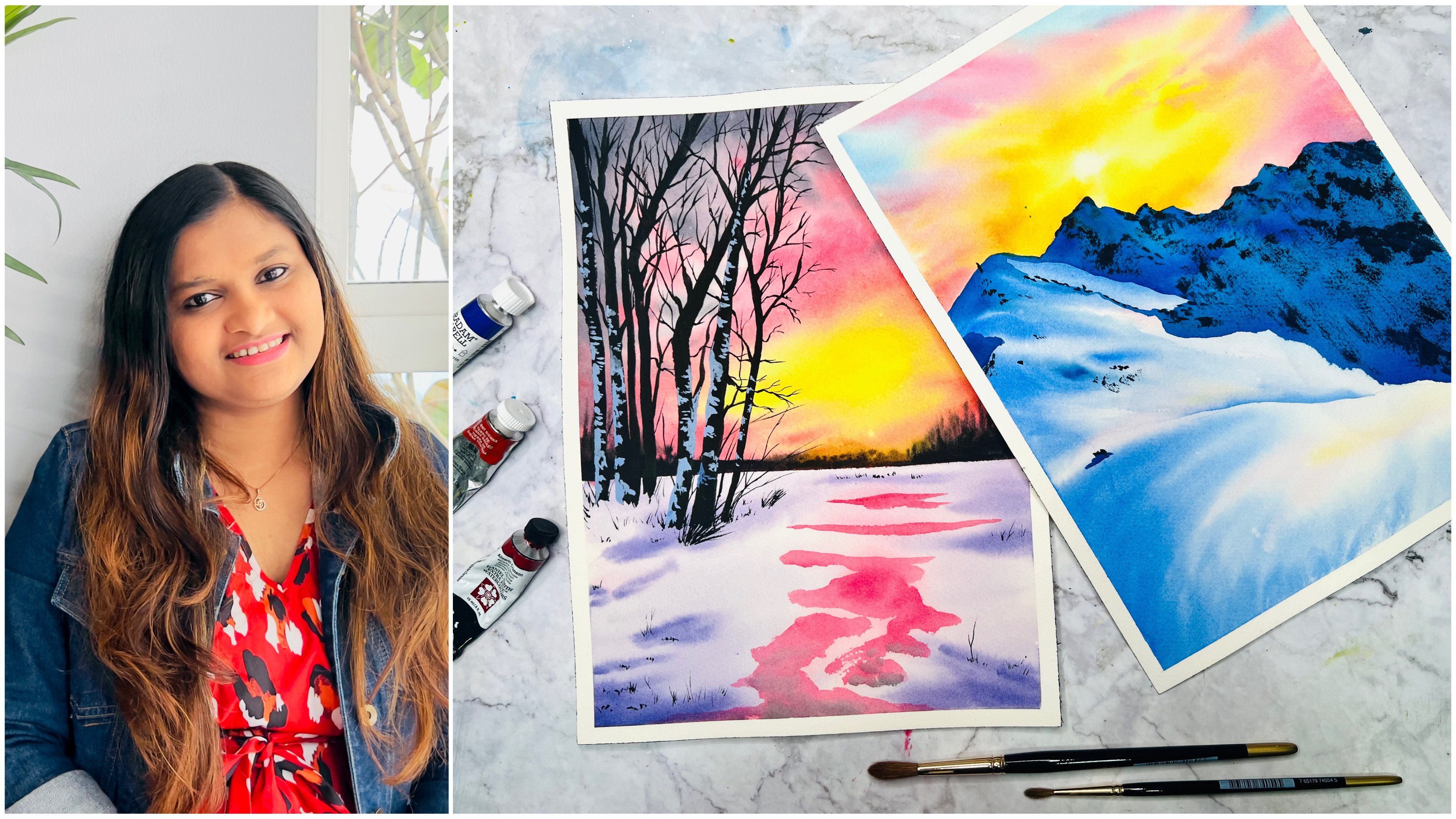
Hello everyone. And to a Skillshare teacher, silver brush educator and
Ambassador to White Nights. And see that I'm
stationers in India. I have been teaching online
for more than three years now and have conducted in-person workshops
and various cities. There's something
magical about Sunsets that I keep pulling back,
hand, painting them. It is one such topic
that I'd never get to it and get painting
them every now and then. Welcome to this
class on painting mesmerizing sunset landscapes
with watercolours and thrilled guide you through
the magical world of capturing these beautiful
sunset landscapes on paper. In this beginner-friendly class, we will embark on
a creative journey together as we explore the
Art of watercolor painting. Whether you're completely new to painting or looking to
refine your skills. This class is designed
with you in mind. Each class project will focus on a specific dominant
color of the sunset sky, from the warm hues
of yellow and orange to the vibrant shades
of red and purple. I'll be with you every
step of the way, breaking down the process into easily digestible steps.
But that's not all. We'll dive into the basics, including how to hold
the brush properly, master essential brush strokes, and most importantly, learn water control
with watercolours with a new technique that
will allow you to paint on most watercolour papers
without breaking the bank. I'll also share tips and
techniques that will help you to achieve that
perfect blend of colors, creating that all inspiring
atmospheric effect that makes sunsets
so captivating. Whether you're aiming to create stunning artworks to
decorate your space, or simply want to unwind and
tap into your creative side. This class is the perfect
opportunity to do just that. By the end of this class, you'll not only
have a collection of gorgeous sunset landscapes, also, a newfound confidence in your watercolor
painting abilities. So I ready to embark on this
artistic journey with me. Join along and let's start
painting those beautiful, stunning sunset master
business together.
2. Class Project: Hello everyone. Thank you so
much for joining this class. I'm sure you're going
to have a lot of fund painting along
with me in this class. But before we move
on to the techniques and the odd supplies
section about, I'll give a brief overview of how the class is structured. In the techniques lesson, you'll learn a new method of
painting with watercolors, which will enable
you to paint with most watercolour
papers out there. And not just the
100% cotton paper that I usually recommend. Once they confidence enough
with this technique, you can dive straight
into the class projects, designed to five class
projects as that, each painting will have a
dominant colour of the sky, such as red, orange,
yellow exit. And using that
dominant colour will paint the sky in a gorgeous way. Obviously, there will
be other colors, but this dominant colour will be the main focus
of the painting. The colors used in each
of the class projects are included as a separate video right before the
painting project starts, so that you can be ready with your color palette before
you start painting, which will also
aid in getting you focus towards the water
control of the paper, rather than you worrying about mixing your colors bid way. Most importantly, this
class is meant to be as simple fund and
relaxing painting session. So don't forget to upload your class projects to the
projects and resources section here in Skillshare so that I and all of the other
students can also see it. I can't wait to see all of the magical pieces that
you're going to create. I'll move on to the odd supplies section
where I'll tell you all of the Arctic
plays that I have used in each of
the class projects
3. Art Supplies: So let us have a look at all the arts supplies that
you will need for this class. First of all, obviously
watercolor paper. So in this class, I'm using Saunders, Waterford, CP or not, or fine-grain
or cold pressed. That's what TV is, 300 DSM, which is the
weight of the paper, or 140 pounds, or 140
LD is what it means. 140 pounds. So this is the paper that I'm
using in this class, but you don't necessarily
need to use a paper that is 100% cotton
paper like this one. Because I've tried and
tested many of the projects. Width. Another paper that
is not 100% cotton paper. So you basically,
all you need for this class is a
Watercolor paper, which has a minimum
thickness of 300 GSM. That is essential
because you need to make sure that your paper can
withstand the washes, heavy washes of water that we're going to give it in
the technique section, I'm actually explaining
with this paper, which is Canson 300 GSM, and it's not 100% cotton paper. It is cold pressed. I would
highly recommend using cold press paper because it
has a nice texture to it, or even a rough
surface to paper. But don't use hot pressed
paper because it's really smooth and not good for
Landscape watercolor paintings, especially for the techniques that I'm teaching in this class. I would highly recommend
a paper that's the only condition is that it needs to be Watercolor
paper obviously, and 300 years and that's it. Okay. Next is watercolor paints. I'll be using this
custom-made palette of mine. I say it's custom-made because
all of these colors are carefully chosen after so
many months of research. And I've come down to this
basic set of 36 Colours. I wouldn't say it's
basic. Obviously if part is X is a lot of colours, but there are some colors that are usually gravitate towards. This is my palette. So I'll upload a PDF
containing all of the colors in my palette in the resources section,
you can check that out. So this is actually made up of colors from various
different brands, such as a Shameek, a Rembrandt, white knight, Daniel
Smith, Winsor, and Newton. So I've just, after several months of painting
with watercolors, I understood which are the best pigments that are
alike and which I mostly gravitate towards
and which I like in my been things to be more
vibrant and colorful. So I've chosen those colors and these are the colors that
went into my palette. So you don't necessarily
need all of these Colours. The complete list of colours
that we actually need for this class is inside another PDF and the
resources section. So before you head onto the
class projects of this class, you can check out
that PDF to know which are the colors that
you would actually need. So the colours for the
individual projects are also mentioned right before
each of the class project, so you can check
that out as well. Next thing, of course, what you need is watercolor brushes. So these are the only brushes that have used in this class. Basically, it's basically
three more brushes. I just switch between
them as I deem fit like if I need a very
small pointed brush, I switch to this size 01. Sometimes it's size ten, sometimes it's, this is 20. But the most important thing
that you need to understand, as you need a
medium-sized brush, something that's in a medium
range of six to eight, and then you need a
larger size brush, something around
like a size ten. Nora's is 12 and you need
a smaller one as well. I could have actually
skip this one and then just use
this for the glass. But it's just my way
of paintings and that's why I've used it here. This one is size four,
brush from silver. So you can either
use a size two, Orange is four for the details. And I would say for
applying the water, the most important
thing is this one which is a very large brush. But obviously, I
know that some of you may not have larger
brushes like this one, and you just work out with
one large brush like this. And that's absolutely
fine because you can do it with this one as
well. Just as one. Just that it's going to
take you a bit longer. But when it comes to
painting and if you're enjoying the pluses
than there is nothing else that
matters, right? So this one is the
Silver Atelier size 20. These more brushes are the Silver Atelier
blend quill brushes. The one I have here
are the 010.20 sizes, but that doesn't matter. All you need is, like I
said, a medium-sized brush, a larger size brush
as well as as brush and a flat brush to
apply the water. You'll also need
white gouache paint for what of the class projects. So the white course
that I normally use as from Winsor and Newton, It's the permanent white
designers brush color. You can also use any
other gouache such as this idea in
white, which is here. It's the extra fine
gouache from White Nights. And this palette here is
usually where I put in my white paint just to separate
it out from my palate. That's it. Squeeze out my white band into
those are all the time. The next thing I would
recommend is two jars of water. Because when you painting
with watercolors and you repeatedly wash out your brushes
with the daddy pigments. One of them is bound to
get very dirty like this. So when you're trying to pick up fresh paint from your palette and your brush goes
into that one, and it's speaking up a
very dense muddy pigment. Then you're going to put that
pigment onto your palette and pick up a bright,
beautiful yellow color. It's going to fade
out because it's got muddy pigment in it. So that's why you
need a second jar of water which is always clean. So make sure that when you're
working with watercolours Try and get this jar
clean as possible. So always wash your beans
on just the same one. And then when you're trying
to pick up fresh pigment, try and dip your brush in this one so that it clears
out the pigment is, obviously, you're
picking of muddy water from here, clearing your brush. Imagine you've got somebody
pigments on your brush. So the process would be to
wash your brush obviously, and then drain the excess
water out like that. So all of the excess water, which contains the muddy
pigment, are gone. And then wash it here on
this side so that now it's just absolutely
perfectly clear water. And then when you want to take more water for creating
milky consistency, these are good, watery
consistency is of the paint. Use this water because
it's fresh and clean. So that's the process that we're going to be
using for this class. Along with the watercolours, you obviously need
a pallet to mix the paint to make sure
you have a good palate. So this one is a
plastic palette. You can use any kind of
palette. You can even use them. Dinner plate, which is obviously ceramic or plastic ones
are metallic palettes, whichever you have
at your disposal. Another important thing
that you need for this class is a
board like this one. So this is kind of like
an accurately board. So it's called acrylic Bueller
acrylic, acrylic sheet. I think this is around MM
or tea, three MM thickness. That's how you can find it. I highly recommend
using this because we need a non absorbent board. So when I say non-absorbing, it means it does
not absorb water. The problem with wooden votes is that it would absorb water. So the water that
you're applying at the backside of the
paper would get absorbed by the wooden board and that would decrease the
moisture on the paper. Which is why and non-absorbing any kind of plastic board would
suffice as well. You know, those Writing Board
that we have which are made of plastic that would suffice as well. So you can use that. Cardboard would absorb water, so that is not non-absorbing. I would highly recommend try getting an acrylic
board or like this. But if you're able to work really quickly and
you're confident enough, then you can go ahead and use a cardboard or even a
wooden board as well. Lastly, you will need our tissue or a tablecloth
like this so that you can remove the excess water
from your brushes and also clean out any edges of the paper or excess
paint, anything. So just like that. So when you have excess water
than your brush, you just wipe that
against the cloth. So that's why you need
a tissue or occlude, have this cloth
which I keep using, have this in various colors. So I just keep changing them and that's what I use
for my watercolours. Alright, so that's everything that you need for this class. You don't need any tape or
paper or pencil eraser and all those things
because we're gonna be directly painting
onto our paper. These are the only materials that you need for this class. The only most important things
that I would recommend is a Watercolor paper and
the board, that's it. So if you're ready, let's go ahead and check
out the techniques first before you move on
to the Class Projects
4. Techniques: Let us understand the
most important technique that we need to
know in this class, which is basically
paper stretching or applying water onto
both sides of the paper. Usually I do this with 100% cotton paper and I'm also using 100% cotton
paper for this class. But I want to tell you that
I have tried and tested it on non hundred percent
cotton paper and it works. So those of you who think that 100% cotton
paper is really expensive, which obviously, I know you can go ahead and use this
on any kind of paper. It just needs to have a
minimum thickness of 300 GSM because the paper needs to withstand the amount of water that you're
going to give it. If it's not that much thick, then it's going to warp
or it's going to tear off possibly one block
because you're applying it on both sides
and you're sticking it. So warping is not
the issue here. It's tearing the paper and
it might lose its sizing. So in order to avoid that, I would highly recommend
a minimum of 300 GSM. Gsm is basically the
weight of the paper, and it's usually mentioned
on the front of the block, the tube which is
your papers in. So it's gonna be there
somewhere on that sheet. So you can find that
information on that block. Now to paint, this is our
ganzen sheets that I have here. It's not 100% cotton, of course, it's a
cellulose paper. What I'm going to show you is the technique known
as stretching. Stretching is basically
where you give the people a lot of water, where the paper
eventually stretches out. That is because the
individual fibers are. What do you say? The structure of the paper expands a bit to accommodate
all the water particles. So you're giving it
water from both sides. When you actually
apply water for the wet-on-wet method in watercolor and you
only apply on the top, then there isn't enough water. But in this case you're
giving it a lot of water such that the
paper actually expands. Obviously going to
be able to see it with your eyes of course. But it expands and then, and then it stays wet longer. So that's the thing
about this method. It's really in highly helpful when you want to paint a lot of wet-on-wet
with watercolors. And even when the
top layer has dried, the underlying layer stays wet. Eventually, which
means that the more strokes that you
apply, it stays wet. I'm going to demonstrate this
technique here before we go into the project so
that it'll help you out. One important thing that
you need to note before we proceed is that every
paper behaves differently. This is because obviously
the manufacturers have used different processes
to make these papers. So they structure of
the paper is different, the texture of the
paper is different. So every paper has a
lot of difference, even for me when I've tried
it with cancer and cellulose. And the Archie's one, the Saunders Waterford, it
all behaves differently. So you need to keep that in mind when you're
trying this technique. So in order to understand
your paper at its best, you can pick up a sheet of
paper and try this and then practice it and understand
the way the beeper behaves. That is, your paper,
how it behaves. So I know very well
how the paper that I'm using and I'm
constantly using behaves. So I know how to adjust it. I can when I look at it and
I can see the amount of water on it and I know that
that area is going to dry. This guy is going to
dry and then I can then I also know how to
control the dryness. All of this because
I've practiced this technique a lot on
the paper that I'm using. Similarly, you'll be able to do the same thing so long as you try and practice
with your paper. So this here, as I said, is a cellulose paper and
the method is simple, so you need a large brush. It's okay if you don't
have a large brush and the maximum larger size brush is something like
this that you have, then I know it's going
to take a longer time for you to apply the
water, but then it's okay. You can just take
that much time. Although I should tell you
there is a second method for applying the water or for stretching the paper actually. So the second method is
to basically fill at dub or a bucket or something large enough to hold the paper
obviously with water. And then immerse your paper into that Doug for around
10 min, maybe. Five to 10 min most probably. And then take it out. Be
very careful because this actually loosens the paper
and it's gonna be very bendy. Then bring it back
onto your board that you're using and stick it firmly onto the board and then remove excess water
from along the sides. Just done the board
and the board at an angle so any excess water will flow out and that's it. So that's another
method to apply water. So those of you
who actually don't have a larger brush
to apply the water, you can actually
try that method. I'm pretty sure that it's gonna be really helpful for you. Because with a smaller brush and if you're painting
a very large painting, it's gonna be really tough. But if you have a
larger tab and you can just fill it up with water
and immerse it in 10 min. And while your paper is going
to be readily stretched So this is the
backside right now, which while I've been talking, I've been applying the water. Okay. So clearly,
just keep applying, make sure that it's
coated nicely in water. I mean, realize it's
not pools of water, but just make sure that
it's quoted nicely. Then once done. Now the next part is to take your paper started
towards the other side. That is towards the front side. Water onto the front side now. So this way your paper is actually sticking to the
board that you're using, which is why I recommended to use a non-absorbing surface. So imagine if you're using surface that is a wooden board. The problem with wooden board is that good, absorbs water. So it's going to
absorb the water that you already applied
on the other side. Whereas a plastic surface
will never do that. It's not going to
absorb any water. So the water stays there, stays on the underside
of that vapor. So now you can see
some air gaps here. What do you need to do
is you need to apply water towards the
front side and then use the pressure
on your brush or your hand to make
sure and press, Enter the paper firmly
onto the board. So here I go along this edge and I know that
this edge being fixed. Then I go along this edge. I know that there's no
air gap or anything. I see an air gap here. So we can fix that. If you run along the edge. Fix that firmly. There, you see that? So I know it's a lot of water
that I'm moving around. So first, we need that
amount of water at first. So just make sure
that your paper is nicely coated and ready. Having a lot of water. So those of you, if you're trying this, but the cellulose method, Here's what you need to do. Make sure that you absorb excess water from the
outside of the beeper. So here's what I'm
gonna be doing. I have a piece of glue that I usually use for
my watercolors. You can use either a tissue or another piece of
float like this. And I'm going to absorb all the excess water from
along the edges here. Absorbing all the excess water, that is an artifact
support around this paper. So I'm going to turn it and hold it at
an angle like that, such that all of that excess
water comes out. See that? I do this, but my hundred
percent cotton paper as well, because I usually apply more
water than I actually need. Because I like to be I like the paper to be really stretched and having a lot of water so you can see the
water droplets coming out. So these are the excess water. So hold it and angle
for quite awhile, let all the excess
water come out. So this is going to
make the paper wet because you're actually
pulling down the water. Then repeat this process
for one more time. For those of you who
are using cellulose, if you're using
100% cotton paper, then it's absolutely fine at this point and you can
go ahead and paint. But because this is
cellulose paper, Let's go ahead and apply
once more. There you go. Keep applying the water. So you can grab the
excess moisture also by using running along your brush like that and
then wiping it alone, the pillows or the tissue. But make sure that it doesn't have you don't take away
all of the excess water. Okay. So now let me show you the good thing and the best thing
about this technique. So the best thing about
this technique is obviously can be in the whole
thing with bedroom wet. And it's kind of tricky because there may be
places where you don't want to bend in my dorm
red and where you want to keep white or something. If it's a smaller area, go ahead and apply masking fluid and let it work its
magic on its own. But if it's a larger
area than just make sure that your paint
doesn't flow to that region. That's the only way you
can actually absorb out excess water or lift off
excess paint from that area. So those are methods
that you can try out. Okay. So in this, I'm just going to
quickly show you the magic of
watercolor is actually like this because it
spreads out loud. Maybe I shouldn't be
actually showing you this because it does this. The other way that
color spreads. This is one of my
favorite colors. It's quinacridone, a loop Lets out like that, whereas
as opposed to other colors, maybe I should show
you some other color so that you see the difference. What I'm talking about, I
get, so this is Taylor blue, another one of my
absolute favorite. Here, I applied halo glue and it doesn't move
out like that. So the pigment inside of this quinacridone gold
spreads out like that. And do you know what
that pigment is? Okay, wait, is this
a pigment class? No, it's just too
exciting for me. It's understand
user, it's PRA D3, which is alizarin crimson,
quinacridone gold. I have a SBRT, D3 and B15. We're just
transparent yellow. So the alizarin crimson is
what makes it look like that. So there's alizarin
crimson and this pigment, which is why it looks like that. Okay, So the whole point about this class is basically you
see how the paint spreads. You're able to do a
lot more with this. Because let's say
that you're trying to paint like a cloud or something. So you've got your paper. Your paper is like
real nice and wet. Again. You're able to work
on it for a longer duration. So don't worry that your
paint is going outside and some of the paint is
also going to go underneath. And you'll be stuck there. And it's absolutely fine. Let's make it green sky here. This is not part of the class as part of the technique that I'm trying to show
you how it works. Okay, So that's why I'm
just quickly or randomly making unnecessary
things up into my paper. So also, another thing here is when you're painting
on your paper, this brush stroke
that you're applying. So here I just picked up
a little bit of pigment. Your brush has water. So when you're
applying your paint, the first layer of paint, make sure that it
sounds a lot of water. This is because if you really
apply a very dry pigment, let me show you do so here. This is a very dry pigment. So this doesn't have much water. When your paint has
a lot of water, what it actually
does is, you know, the water that we
applied at first, you're reapplying the
water at this stage, your brush is giving
it moisture again. So then it's like the paper. If you think about the
mind of the paper, the paper was like, okay, I'm now going to
start to dry up. But then you give it
more water is like, Oh, no more water. Okay. Now I'm not
going to be dry. This is how it works. So there so you've applied
water so the first layer, make sure it's like in
a milky consistency. So let me just
quickly go through the consistencies
that I talked about. It's not such a rocket science. If you that is a watery consistency
because that's like literally a lot of water
on my palette. See that? So that's watery consistency. Now what is making consistency? That's like 50% water
and 50 per cent paint. This is like 25%
being done 25% water. I'll show you the
difference. So this has a lot of order c. That's not what I used earlier. I used earlier was
milky consistency, which is basically 0
pigment into this. So this now is like milk. It's a milky consistency
of the paint. See that? Okay, So that's
what I used earlier. Now there's another
consistency which is 75 per cent pigment
and 25% water. If you add more pigment to it, more, more and more and more, that the creamy consistency. See that that's very, very creamy
consistency of paint. But notice the more
paint you add, it stays wet longer
because you're reinforcing the
moisture on the paper. Then. Now there's
another consistency which is almost like a
dry creamy consistency. I might use different
words for it because it's what comes out of my mouth
naturally as I'm teaching. So here, if it's a dry
consistency than it means probably means a brush
needs to be a bit more dry. And then I pick up the paint. And if you look at the way the paint is
moving on my palette, you'll understand it. See that. That's like a very creamy,
dry, creamy consistency. That's more dry. See that it doesn't
have a lot of water. But it still says
that. So these are the ones that we're
gonna be using for louds and when you're
doing this second layer. So when you're adding clouds on the top and you want it
to not spread out a lot. So this is what you will use. See that, see how the paint
behaves and stays dark place. Whereas earlier on it was
just spreading out a lot. Even with the case of alizarin, It's going to stay in that place and let me show you that to you. So alizarin was going to
spit out a lot, right? But if you take it in a creamy
consistency, there you go, creamy consistency
and you apply, see, it doesn't spread out. It's still got softer edges, but it stays in one place. So that is the dry,
creamy consistency Of course, the next consistency is our dry brush technique, which everything should be dry. Brushes dry, the paper is dry, everything needs to be dry. So I guess you've understood
the point of this technique. So another thing to understand is little my hands
are gonna get dirty. Your paint is going
to seep underneath. So when you're painting is done, there'll be a lot of seepage and the back and that's
completely okay. Because who's concerned
about the backside? You're not right. You just need to
be bothered about the front side where it's
gonna be a beautiful painting. So I guess that's that
about this technique. So make sure that you cover up every inch and every area
that you want to do. Here again, I didn't apply a lot of paint here in this region. I kept on going over
the other sides to this area has a little
bit started to dry. But the point about this
technique is that all of the other areas are wet
and only this started to dry. So if I take a little bit
of pigment now and go over it and join it along any of the areas that
already has been. See that. Then I've reinforced
the moisture on that area. And it's not going to
create any blooms because it's already got water
along the edges. How our blooms formed, blooms, or the cauliflower effect
is formed when there is excess water on
your brush and you drop it onto the paper and the paper doesn't
have that much water. Let me just show it to you. No, I'm going to deliberately
create a bloom here. So this is just
water on my brush. And if I drop it there, that separates out the pigment and creates a
cauliflower effect. Can you see it's got a lot of water and it's separating
out the pigment, pushing it away and creating
a cauliflower effect. So if you don't want to create
the cauliflower effect, the first layers that you print should be
having more water. And as you go up the layers in wet-on-wet radios
the amount of water. That is why we start with the milky consistency
and then go up towards a creamy
consistency eventually to try or consistencies
for the wet-on-wet. When it's wet on dry,
you don't have to worry. You can just paint
with anything, right? That is now wet. But I want to show you
is I'm going to dry this up and then I'm going to show
you how we can re-wet this. So if you're using a hairdryer or a heat gun or
something like this. I use this which is basically literally hairdryer
to dry it up. Don't dry the underside. Apply the heat gun or the hairdryer such that
only the top layer is dry. You can just watch and see the
thing is still wet or not. And if it's still
wet, then you can go ahead and dry it up
a little bit more. But still make sure that your paper is stuck
onto the board. The moment your
paper starts to dry, it will start to
leave from the edges. We'll start leaving the board. That's when it is too dry. So we want the underlying
layer to be still wet. The top layer is what I mean. The the this side the front
side is what? It should be. Dry. Dry. Okay. So let
me just go around. See the top layer is dry. It's still going to be
called when you touch it because the water
underneath this cold. But then you can see that
you're able to paint wet on dry because it's
dry, don't bother here. There was a lot of
water here and I didn't bother trying it up. Okay. It's the balloon
that we created obviously, so I'm not going to bother. But the good thing about
this is like if you want to create another
layer on the top, maybe something like
a beach or something. You go and you paint over the top and you create
another layer of wetness. It's not going to
dry out quickly even though it's a
wet on dry stroke. That's because there's water underneath that's
preventing it from drying. But even then, when
you're applying, make sure that you apply
it in a milky consistency. So here my consistency of
paint is really flowy. See that? So that's like a milky
consistency of my beans, Ryan. I'm using that to paint and create a surface
like that. See that? Then it can go forward and add further details on the top with our creamy consistency
like there. See, Now that's a creamy
consistency of the paint. So it stays in one place. See that? So that's a creamy
consistency of the paint. But the point about this
is that it stays dry. And can you see this paper, this is cellulose and
still see how it behaves. Don't look at my stroke strokes. I was not concentrating. I was just explaining to
you and I've put literally lots of different amounts of water consistencies
on the paper. So it's not what you
should be looking at, but you should, what you
should be looking at is How this technique really
works on any kind of paper, so long as it's thick enough
to take the watercolor, obviously don't go for a hot press paper because
it has too much of a smooth surface and the paint doesn't have a surface
very against that alone. So use watercolor paper, but of any brand doesn't have
to be 100% cotton paper. That's my point. Now
let me show it to you after I quickly dry this up
and you'll see what I mean. If you look here, can you
see how it's starting to leave along the edges here? So it started to
leave from underside. That's when I know
it's like literally started to dry out from the
underneath area as well. So this is when you should
not apply any paint, tried to play into wet on wet on the paper because it's
not that wet underneath. Let's see. It's still got
a lot of water this side. Maybe it's got
water on that side. It's been so it's
still a bit wet. So now we've got to dry it up. So in this method, when you're drying
up your paintings, either naturally or either
using a heat gun or anything. You should try both sides. So your paper or
your painting is completely dry Only when
you drive both the sides. So see here, it's
still wet underneath. So what I usually do is because you can't
keep your paper back onto the board to dry
it up because this is wet and your pupil
will get that the, of course, I put my paper aside and then I wipe this
off using my cloth. Usually, that's what I
do. So here's my clothes. I usually wipe it off. And to be just super,
super safe because there might still be some water, which I don't want my
painting to be ruined with. I run my hairdryer
on this as well. So now I know my board is super dry and my
painting wouldn't be ruined. If I keep it like that, then any excess bit of water, like if there's any
too much water, I'll just go ahead
and absorb that. Then I'll try the backside. Now, if I draw the
backside side, front fungi, then it's
done basically right? So I'm not going to
waste my time and dry this out because
this is not a painting. But you get the point right. And those of you who
are trying this up naturally just take
this painting of the board because
obviously you might need the bold for the next
painting is this is probably going
to take more than around 2 h to
completely dry out. So take the paper out and
place it somewhere else, maybe on a newspaper or some
surface where it's okay that the underside get
to the D. So it's best on a scrap piece of paper, like some newspaper or
something, so keep it away, tuck it away, and then clean
out and wipe your board. Make it try and go ahead
with the next painting. That's what he can do. I was
just showing you my process. And for those of you who have
a hairdryer or this is how you can dry the painting
and use the board. Again, ingest next 5 min. I hope you've understood
the general gist of the techniques that
we're going to be using. Obviously this
glass carbons with the basic assumption that the basic techniques
that is wet on wet, wet on dry, dry on wet exedra. So just make sure that
you do know that. Because if you
don't and if you're an estimate super
ultimate beginner, then I have a glass
in sculpture itself, which is my ultimate guide
to watercolors glass. And you can go and refer to that class for all
the techniques. And you can come back
here to this class
5. Class Project 1 - Yellow: Colours: Welcome to the first
class Project. And this is the painting that we're going to
be starting with. The dominant color of this
painting is going to be halo, as is obvious from the
painting of course. But let me tell you some important things that
you need to consider. So this area here is the sun or the brightest
part of the painting, so that needs to be white. So make sure that your water or European paint doesn't flow
to that region too much. That said, basically, and then we have lots of
other colors as well. And a little bit of the foreground that we need
to capture in this painting. So let me tell you all the
colors that you'll need for this painting so that it can
be ready with those Colours. The first is obviously
a yellow shade, the one that I have used as
transparent yellow or in, in Yellow PY one-fifth. So the transparent
yellow, It's really good. Other than the cadmium yellow is and other realized that I have because it's really
transparent and gives a very vibrant
look to your painting. So yellow, that is
transparent, yellow. Then Indian gold or
quinacridone, gold, Alizarin, crimson, bright blue, sap green. Sap green for the
foreground here. Olive green, dark green. Payne's gray, burnt sienna, burnt sienna for
the road area here, and a little bit
of violet as well. And lastly, transparent brown. If you're ready, let's
get to this painting
6. Class Project 1 - Yellow: Alright, let us start. So as I said, we're not gonna be
using any tape. So here's my paper, and I'm going to turn it towards the other side and apply
water on the side. Now, taking nice amount of water on my large brush and apply water to the
whole of the people. Make sure that you apply the
water nicely and evenly. Ako time to do this because
we need the paper to stay wet and that's
really, really important. I think I've got all
the areas covered now. So I'm going to turn my paper and stick it firmly on to this accurately board
by just pressing along. And that's it. Because now
when we apply the water again, that'll stick it more firmly. There you go. I'm applying the
water and you can see that as I'm trying, the paper gets stuck onto
the acrylic board nicely. And that's exactly what we want. This method is known
as stretching, which have already told I'm just saying it once more
so that you remember. So take your time to let the water soak in
nicely onto the paper. This would give us a lot
of time to work with. And especially if you're not
using 100% cotton paper, make sure you do
it really nicely. So at the backside, like wait for 2 min, reapply water again and
then turn the paper. Okay? Alright, I'm good to go. But now what I'll
do is I'll take a piece of cloth or tissue
which are you using, and I'll go along the edges
and absorb the water. So it's not the water
from the paper, but from the outside
of the paper on the board here, I don't
know if you can see. So there is water
particles here. I mean, one dropped is here. So I'm just taking that off. It gives we don't
want that extra water to back into the paper and create any blooms
along the edges. So that's something
that can really happens hold Let's make sure
that we take off that. Once you've done that and if
you've accidentally touched any part of the people along the edges and the
water's gone off. Then you can go and pick up your brush again and just
brush along the edges. But this time making sure to not go outside of the paper
like I'm doing right now. Alright, I think
that's really good. So now let's get to
the painting part. Alright, so I'm gonna be
starting with my size ten brush. So don't worry about the size as you just need a
medium-size brush, which is at least a size
eight or as high as ten. So anything, what do you
have typically, that's it. And since our color is yellow, Let's start with a beautiful
transplant and yellow color. Here I'm loading my brush
with a nice amount of yellow. And I am gonna start
on the left side. And all the way to the
right side as well. Most of the sky here is
gonna be in yellow, right? So let's just do that. Try to make these
nice swinging motion. So let your brush be free. Don't hold it tight such
that you're doing like that. So if you hold it like
in freehand manner, that's the best
way I can explain that brush if you
hold it like that and then just a little brush,
swiftly, move around. I think you'll be
able to make this. And because your paper is wet, you don't have to
worry about that. It's going to dry out so
quickly. Oh, no, oh no. So that won't happen. So
go ahead and freely do it. Here. I'm going to leave a large cat where
my son is gonna be. Okay, so that's where my son, ideally, I wanted
somewhere here. Okay. So around that, I'm going to create some
nice yellow strokes. Here goes nice yellow strokes. So to this point, leave a large car
and then go around such that you creating a lot of yellow there. See what I did. So I have a large gap there
which is my son is going to be and then the
rest of the areas, you can go ahead with a
nice amount of yellow. So leave that and leave
that area as well. I'd like to add
some other colors. So you've already seen
the final picture, so you knew how it's
turned out obviously. Always when I'm
recording these glasses, I include the final
picture before you guys actually know
how the end painting is. And I don't at this point, it's really funny. Okay. So I think to go there. So the next color that
we're going to take is a nice Indian gold sheet. So this is quinacridone
gold or Indian gold. If you don't have that color, you can easily mix it by mixing Alizarin crimson and transparent
yellow or even just, you know, orange and yellow. Little bit of orange into a yellow should
make that color. So I'm going to take it
along the left side. And Philae. So let the center portion
be yellow here and here again from the right
towards the middle. Okay. Then taking some
nice paint again, and I'm going to have it and now towards the right side or towards the top left side
where we had left that gap. Can you see that? Here? I take it along the
to top left side and along the edges of my yellow. And here as well
on the right side, along the edges of all
my yellow strokes. Now let's wash that off. And here now what we're
going to do is we're going to create a
nice purple shade. So for that, here, I pick up my Alizarin. You can also use any Pink
shade if you want my Alizarin. And I'm going to mix a little
bit of my bright blue, so that creates like
a bubble shade. So here's my Alizarin and a
little of my bright blue. So that creates like
a purple shade. And we're going up that
purple shade at the top. Yes, it's going
to mix and create a slightly brownish
tone, but that's okay. But the reason why we put
that slide a golden color, is because we don't
want that violet or the blue to mix and
create and green shades. So we'll just write,
we put that violet. Now, let's make sure we
blend that a bit more. So here I'm taking a bit
of my Alizarin again. And I'm gonna go along the edge, the edge where we applied
the golden shade. Let's take it along that edge and make sure that there is something along the edge
and it doesn't create, I'm too much of a green color
or unnecessary colours. So this is going to get weird, lighter when it dries up because obviously watercolours
dry one shade lighter. So let's possibly give it
a little bit more color. They don't want it to be
going too much lighter. I want the color to be
visible once it's dry. The same with Alizarin. So I take my Alizarin
and added there. And now when you
take the Alizarin, you can just give
some random strokes. Not too much. It's just because
I don't want it to be entirely just yellow. Now I'm going back
to my Indian gold. Now, remember what I
said about there's no strict rule as to how you
should be painting this. Okay. It's it's just sky guys. Go ahead into anything and it's going to turn our lovely,
trust me on this. So here I've taken a little
bit of more of Indian gold. And I'm gonna just like stuff, extra colors in here. And you can see how it spreads. It's still going
to spread and it's not going to stay at that
point when it dries out. I'm pretty sure that it's
not gonna be even visible. That's the beauty of
watercolours when it's wet. But you can clearly see that this whole thing is a
lot of yellow, isn't it? And just some random other
colors at the top that said, let's make sure that we paint the bottom part before
it starts to dry out. So here I'm just shifting
to a one size up brush. So this is one, this
is 20 more brush, which means you can take
as high as 12 brush maybe. Okay. And I'm starting
with an olive green color. This olive green is what's going to dictate where land
area is going to be. We'll add more stuff
to the background, but let's just putting down the Colours first because
if you don't put anything, there were water
here will dry out. But when you put colour, there's already some water
in the brush which will reinforce the water there
and I'll stay more wet. And the same along
this side. That's it. So I'm going to
create a pathway. That pathway is going to be, let's say it starts from
this corner right side. Let me just get rid
of those hawks then. Yeah. That pathway, it starts
from there and it goes that opens up like that. The same way here. Let's see. It starts like that, comes all the way here
and creates a nice bend. Okay, I'm perspective. So when it comes closer to us, it's gonna be much bigger. Okay. That's how the pathway
is going to be. Now let me fill the
rest of the areas. Don't worry about the areas that you've already
put color like a you can see I've got
some bits of color there. It's completely alright, okay, don't stress about that. So let me just lay down
my color and make sure that I've got enough
moisture on my paper. So once I painted, then
there is moisture. So that's the reason why
we do it this way. Okay. And there so we've reinforced
the moisture on that part. We have some more
white area to cover. Let's do that with a
bit of burnt sienna. And while it's
mixture of benzene, there, more Valentino
and less of the violet. If you take it alone, can you see it's
already creating some harsh edges because that part of my people
had started to dry out. But as soon as I painted, then it's going to blend out with the Colours.
It's already there. And this is the advantage of when we have done the
stretching of the paper, okay? So don't worry about any colours are spreading at this point. We're just laying
down the paint. Our first layer where it's
not just with the hair, is just our first
patches on the paper. That's how it should be that. And make sure to follow
along the direction of the road here. And once it begins, goes all the way and make
sure you make it thinner. What's that side? You can already see how it's turned out. So pretty isn't it? So here I've shifted to back to my smaller
medium-sized brush. And we're going to
add some more things. So here I'm taking
my Indian gold, but then I'm going
to add a little bit of my Alizarin
into that mixture. I think we need more
of the Indian gold. I needed to be golden color, but slightly on the darker side, which is why I mixed a teeny
tiny amount of alizarin. And then I'm just going to add some nice strokes there into the sky to depict
some smaller clouds. Remember that area where we added some extra
bits of dark color. So the same way, I want to add some
smaller clouds. Now, I'm just using the
tip of my brush and then just running along in a
zigzag manner like that. So that I put some nice darker
shades in C that again, so that's going to
still spread out, but there will be a
darker shade when it dries out and that's
the beauty of it. We'll do the same somewhere here on the left side as well. Let's not go anywhere
near the white area. That is supposed to
be the bright sun. Now, another area
I would like to add is towards the top here. So towards the top here, make sure that clouds are
pointing towards the sun. The main focus is
here that I want to make my light the focus
of this painting. So if you've followed
along the reference class, which was my last class, how to paint from
reference images. I've explained all of this
and in this painting here, the focal point here
is gonna be the light. So let's just make sure
that everything we paint is kind of like
pointing towards the sun. Most of it works
that light area. I think that's good. Picking up a little
bit more Alizarin for this area here because
it's slightly reddish. And I'll make the red areas. You want to point towards
the sun I get again, and I think that's it. I don't want to do
anything more to the sky, but let's now give some
background mountains, again. For the bank or mountain, we're gonna be using
the same color with the Alizarin
mixture because we want it to be darker as we've already got
Indian gold here. But if we apply more
Indian gold in order to be able to see it
in a dark matter, It's good to mix in
a slight amount of alizarin steps what I've done. And it's just going to
be light mountain shape. As you come here, it needs to get lighter. Let's go from the right
side as well. Here. Just making sure I have
some mountain shapes. And I'm stopping as I reach like really the
bottom part of the light. And then I'm going to
wash my brush and pick up yellow now and try to
blend in that area. See that that area needs
to be really lighter. So in order to bring in
a bit more contrast, what you can do is
pick up a little bit more of the Alizarin and make sure added towards the left and the right so that, you know the area
where it's not let that's the furthest area
that's lit, isn't it? So that is like darker and it gets lighter
towards the middle. See how that stand out. But now the problem is we
have a clear transition between the background and foreground. We don't want that. So what we're going to do
is we're going to pick up our Indian yellow again and go over the top of the
green area that we painted. Let's not create any strict
transition over there. Okay. Just let it
be mixing together. I've gotten rid of
most of my transition. Now I think it's safe to
go back to the olive green and start blending it together. Okay, so here I'm blending
my olive green together. You can blend in
some olive green to that top region as well. So we'll make sure
you're slowly doing. So. This is why this method is so effective because
you can just keep on working for so long and still have your paper
really wet for you to work on. Now, once you've done that, let's start bringing in
the foreground to the. So I'm taking a bit
of my sap green, mixing it with the olive green that was already
there on my palate. It's okay even if you don't mix. And we start adding this green now towards the bottom eight, just bringing the foreground closer to us with those colors. If you, if you create
any clear transition, go ahead and get rid of it. Using the olive green
and Indian gold. Can you see how we've
made that? Now? I think we can start
adding the edge properly. So I'm gonna go with
my darker green now, need to get rid of excess
water as my darker green. And we're going to
create the edge. Okay. So the grass area here, it's like this thick. I mean, it's got the height. So when we're viewing
it from this side, this edge will have
the thickness, which will make sure that the grass does get
that thickness there. Okay, first, let's take
it towards the edge. Then, remember perspective Gonna get bigger
from here to here. It's going to have that height. And make sure to have
your edges like that. Don't make it as a line because
we need to get the edge. This is like the
edge of the grass. So that's what we
need to depict. See, now you've clearly
marked and hedge, but let's try to make
it more smoothened out. Here, a little bit more color. Then let me take my green and a bit dark green and start
adding some colors. And then I'll smoothen
it out with my brush. Then the edge that we've
marked needs to have volume. So here I'm picking
up my dark green. You can either mix it with
a little bit of indigo or Payne's gray.
Payne's gray here. And let's give it
a bit of volume by adding the darker
colors in between here. Alright. That'll
spread on its own. No, we need to do the same
thing for the left side. The left side is again going
to start thicker towards the bottom and then go thinner as we go
towards the inside. Okay. Now that's
gonna get really, really thin towards that side. So we'll make sure you use the
pointed tip of your brush. Okay, so now remember we did the road there but it's
kind of like vanished. Let's put back the road a bit. So here I'm taking
my burnt sienna. When I go back at now, I want you to turn again such that it's
pointing towards my light. Okay, So when it reaches here, It's gonna it's got a ton there. Like a zigzag. Can you see the roads
kind of done the bit? So we can make more
focus on the road again by bringing that
green edge to it. If you take the green
and give it that edge, make sure you go as ten as
possible towards that side. Now, we don't add it towards
this side because the edge, if on the other volt side, we only see the
light on this part. Here, we see the darkness
because the light does not reaching this part
of the bushes. Did you understand
why we did that? So I'm just sticking my dark
green and adding, you know, like and even grass shapes
because it's gross. It's supposed to be having
a lot of and even things. It's not grown rowing in
a Leica perfect manner. Remember the thickness on this
side and the uneven grass. Some more with the olive green and soft and out. Any unnecessary it. Now it's gonna, it's gonna
spread out by itself and, you know, create beautiful
effects on its own Oh my God, Can you see
how it's done out? Isn't it gorgeous? So honestly, let's just
go back and add in some details on the road because the road
is kinda like in a perfect detail without
any detail at this point. Here, I'm picking up
a little bit of my brown and I'm just going to add it onto the road like that. And because we didn't
work on the road, roads actually started
to dry out a bit. So I'm just removing the paint
and then I'm just going to blend it in a smooth manner. You can try to rewrite
it a bit. It's okay. But make sure that you re-read all the areas
to gather, help. You gonna get harsh and edges which we don't want
right here, some brown. And I'm going to put the
brown along the edge. This edge as well. Maybe like some
towards the bottom, such don't want it to be lucky, no clear, perfect food. It's supposed to be a dirty try. Remember, if you papers like
really dried out a lot, then don't go ahead. And that's the areas. And I think it's best to
just leave it as it is. Otherwise you would
ruin the whole thing. Okay, so here I'm now
going with a mixture of brown and paint scree so that we can go
ahead and add in some teeny tiny
details onto the road. Okay. Like, I don't know, rocks are some things maybe could also be the shadow. Not just it's also, it is part the shadow and
part of the darker details. Same along this edge. Gigo, thinner as you
go towards the top. Okay? Okay, I promise
we're finishing off with random Vox and
myths on the road. Okay. Let me just take up a little
bit of olive green and create a similar
depth to that foreground. And remember what I said, if you're papers like
started to dry out, don't do anything, let it peak. Don't try to work on it more. The best is to wait
for it to dry out, completely dry out, and then we apply water on
the top and paint. Just adding a bit more
of been seeing that at some places because I feel
like lighter in certain areas, this is gonna get way
lighter when it dries out. Which is why I'm just
putting more color. Because I knew how
watercolours buck, They're just going to dry out. And you'll be like, where's all the colors of light? Especially when you're
painting wet on wet. So when you're doing wet on
dry doesn't matter that much. But if you're doing wet on wet, and it just tries out a
lot, literally a lot. Alright, I think
we're good to go now, or we have to do is wait for
this to completely dry out. Okay? Alright, look at this now. So it's completely dried out. And can you see how already the colors have gone
one shade lighter? So this is why I said, when you're going
to be painting, you need to put in
really vibrant colors. If you need to have vibrant
colors at the end, okay? Because it's always gonna get one shade lighter than
what you put on the paper. But I loved the way to turn out, but can you even see
how faded all of it is? Now, we've got them.
One last thing to put in and we're done. Here. I'm going to take my
dark brown paint. Okay. And we're gonna
put in a small fence. That fence is here But I want to blend it to
the bottom into the grass. So I'm just going to take
my other brush and kind of like blend the bottom
along with some green. Ok. And now remember
perspective. So the next one is
gonna be a bit taller. Now, remember, these don't
have to be in any way. Perfect because it's it's like a been like daddy track and path. Right. Okay. So I've
kind of blended that in. I'm just using two brushes
because the other brush has found and I don't
want to destroy it. Let's add another one. So this another one
is kind deflect, bend at an angle. Okay. I don't know. Maybe some animals come and hit it or maybe it's a car that when by its just hit
it and it's done. Oh, no. Okay. He read some randomness and
try and blend it. And at the same time, I'm trying to give it the
cross a bit of texture so I create some upward strokes
so that whatever I blend, it looks as though it's
got the grassy shape. To my brown. Also remember distance. So this one's closer, this one's a bit further. Now the next one should
be a bit more further. So let's make it here. And I think that would
be the last one, but that would be again, taller than the previous one. Okay. I brown, thicker and closest to us right? Now, blending the bottom. Using upward stroke. For the Class C that we can have similar
towards the end. Alright, I think that's set. Let's stop there. And should we connect
it? I don't think so. I just like go head is now and I'm not going to
connect it and ruin it. And I think it's
safe to say that we're done with the painting. Yea. So I'm just going
to wait for it. Typically drive because we've applied water at the back side. It's gonna be wet underneath. Do you see that?
It's wet underneath? We've got to wait for the
whole thing to dry out and there'll be done,
completely done. So thank you for
joining me on this one. I hope you've
enjoyed painting it
7. Class Project 2 - Orange: Colours: Let us go to the
next class project, which is this one. So this is the painting that
we're going to be doing. And as you can see, the dominant color of the sunset is Orange, which
is what I have to use it. But the trick here is to have the blend achievable
between orange and the blue without creating much muddy
colors in the sky area. The colors that you need for
this painting, our Orange, cobalt blue, alizarin crimson, a bit of yellow. You can use any yellow in fact, but the one that have used
as transparent yellow, then transplant and
down and Payne's gray. So there isn't a lot
of colors in this one, unlike the first class project, but I'm sure you'll
have a great time. And remember, the trick is
to achieve those blends. So let's make this
beautiful painting together
8. Class Project 2 - Orange: Alright, let us start. So I'm going to turn my paper towards the other
side as usual and apply water to the backside
nicely and evenly. At this point, I'm not worried
that my water's flowing outside because high
will wipe it off anyway. So at this point, be free and apply really
good amount of water. As I've explained in
the technique section. The other method to do this
would be to show you a paper under running water or
like in a tub of water. For me, this is the easier
method rather than going and keeping the paper under our planning tap
or like, you know, even in a tub of water, that's like so much to do, like fill the I'll put
the paper and wait for 10 min and then removed
the water and all of that. This just makes it
easier, isn't it? But having said that, if you don't have a paper
that's like 100% cotton paper. And like I said, if you're going to be
working with cellulose, we just completely alright
for this class, by the way, then it's better to give it
a nice silk, I would say, okay, because that
would really stretch the paper and I would
really make it work. And then once you
bring it back onto your table, do this process. And it should really, really, really be
helpful for you, for the paper to stay wet
for a very, very long time. Do try it out and let
me know either in the discussion section or in the Project section
how it turned out. Now that I've applied
water at the backside, I'm going to flip it
towards the front side. And let me stick it back on applying along the front side. Running my brush
firmly that I get rid of the energy gap that
forms underneath the paper. Make sure that it really
doesn't have any air gaps. That's very, very critical. I know it helps to have a
larger brush like this. And many of you may not have
a larger brush like this, and you might be using
a smaller size brush. And it does take a bit longer to cover the
entire surface area. Been should that stop you
from Painting know, right. So you can see how
long I do this, because that's really
critical for our painting. Okay. Alright, I think
we're good to go. So let's go ahead and wipe off the excess water from
all of the edges. And actually, if you've got too much water on
your paper as well, like a lot of water. You can take your paper
and bednet like that at an angle so that all the
water is going to accumulate and DC how it's flowing
out at inefficiency. See that drop there
that's flowing out and it's like falling onto my globe. That's all excess water. In fact, too much indexes that. We don't want that much. Okay? So let it come out. That's what I'm
doing. So if you can see you've got a lot of excess
water that's coming out. These were like the excess pools of water that was on my paper, which I don't really need, which is why I let it go off. And now that's good enough. And like I said, if you accidentally taken off any excess water
from the edges, you can go and touch along
the edge of your paper now, but make sure to not go outside. Otherwise you'd have to repeat
the process of wiping it. Again. I think
we're good enough. So let's go ahead
and paint, shall we? So we're going to take
my size 20 mop brush And are color is
orange, isn't it? So let's pick up a nice amount of transparent orange here. This is spent and orange for which Micaiah that I'm using, but I'm pretty sure that
any orange will be fine. I don't know if cadmium
orange will be good, but it is a very vibrant
and bright colors. I guess it should be okay. The only problem is that cadmium orange when
mixed with blue, it's going to create
a very muddy gray, which is why I refrain
from using them. But it's okay if you have only that and you
still want to be in this meeting because there
are ways that you can get around to using
cadmium orange. I'll show it to Justin moment. So I'm going to start
with my Orange, and I'm gonna be at
drawing my first row here on the left side. Like that, starting there. And let's go all the way
towards the top right here. Then let's get going. Leave some white
gaps in between. I will explain about
the white gaps in just a moment when we get to it. So my gaps, some
white gaps there. Make sure to pick up really
vibrant orange guys, that's really
important, isn't it? Because you wanted to painting
step where you vibrant right here, left a gap. Another huge white gap. That smaller video
should be enough. Then some more here. Another huge area there. Then coming back here, a large chunk over there. Okay. So you saw what
we did right now. That was like the sky area. So now we need to repeat
this along the water area, which is going to be
towards the bottom. Okay, so let's assume
that this line is going to be the water line. Let me create a line there. Okay. So I'm just going for
like around one by third of the paper for the
best composition. Of course, that line
is going to be, my waterline will make
it much better in again. But now what we do is
going to mimic that shape. So my Orange goes over like that and then
it creates a gap there. Then I have my orange again. And it goes outward like that. Alright. Outward. So it goes outward. So means it needs to go outward
from the center as well. Yeah. There I know it's just a lot of Orange and
it's what is she doing? But it's funny because
you've seen the output. So shall we get to it then? Now? I've got to put in a bit of yellow
towards the center. So here I'm taking
a bit of yellow and I'm going to add it right there at that center region.
So it's got Supplies. Bright color. So nice, bright yellows, I guess a *****, more of yellow here. No, rest of the ureters. Let's go with Alizarin. Okay, I'm gonna put Alizarin
along the edge of my orange. Just along the edge guys. Okay. Along the
edge of my orange. I'm going to put alizarin and you'll see why
in just a moment. A bit. On the edges,
here and here. All of the edges and here. Alright. Alright, Alizarin, down. Now we're going to
take cobalt blue, cobalt blue and orange mix
kind of like a gray color. So in order to avoid that, we create the transition
with Alizarin. So when it makes us together, it's gonna be like a slight Why let rather than the
to muddy gray color, which is why we
pick that up here with the cobalt blue
going towards the dog. And along the edge. When it mixes with the alizarin, It's going to create a
subtle purple shade, which is completely okay. Can you see the
subtle purple sheet? That's okay when
you blend together, if you get some gray shades, That's okay because gray is also a color that's
there in the sky, in the sunset sky. Make sure to take fresh
been and if your brushes tainted with any grade and
make sure to wash it off. Can you see how gorgeously
that stand out? We will, we'll corrected and make it whole
gorgeous, don't worry. Right now let's just put
in the Colours at first. So yes, we need to
mimic the shapes now. So we have this one is
the closest, isn't it? That goes somewhere like that. And picking up the vibrant blue. Again. Don't worry, I know that
this seems a bit off. And if you don't get it in the first try, That's
completely okay. Alright. Let me pick up my
Alizarin again. And I'm just not going
to go along the edges of my blue shapes and make sure
that my blending is nice. And even. So it can make sure
that you've blended it. Eiseley with your blue. Make sure once you've done that, now you can go back
to creating blends. Like here I see that
there's a harsh edge. So I begin a little bit more blue and I start to
blend in the Colours. And here there's a
harsh transition. So here I pick in
a little bit more blue and start to blend in. Okay, we've, we've finished
laying down the colors, and now it's a matter
of blending everything. There. Once you've finished laying down the Colours,
that's what we do. We try and blending everything because there's
water on the paper. It's also going to
blend in by itself. Like do you see here, I just applied the
color and while I was applying all
the other places, it's just lend out by itself. That's the beauty of this. Now, wherever there's
a harsh transition between the Alizarin
and the orange, you can go ahead and pick up some more orange and
try and blend it in. Because we don't want
to ask transition with the Alizarin, the Orange either. Here, this is translation. So I'm going to
pick up my Orange. What did there right
next to the Alizarin, but don't go to the blue areas and create that transition C. So now, when the paper
does its job and blends We absolutely fine. Okay. Created the nice reflection. I see the eyelids I
didn't mixing allow missing along the edge
where the blue is. So that's why I
fill the Tin Man. I've taken a bit more blue
and try and create even. But we'll shade back a bit of alizarin and then back to the Orange for
mixing with the alizarin. That way, can you see now how
the whole thing is blended? And you have a lot of
blue shades in the sky and a lot of orange
shades in the sky, but evenly blended together without creating
any muddy colors. But that was the aim, isn't an easy, we've got it. So now it's the time before we go in to let the paper dry, we'll try to add in
some smaller clouds. Oops. What did I do? It predicts this
water somewhere. I did, but then it kind of blend together because
the paper was still wet. There was just lucky
thing that's happened. Saved. Alright, so now
I'm going to shift to a very smaller size brush, okay? So that I can go ahead and
put in a smallest strokes, whichever that I see is missing. So I'm going to take
in a little bit of my cobalt blue, again. Blue. And I see that this line
here is actually missing. I'm not sure if I add it right now it's going
to turn muddy, isn't it? So maybe what we can
do is this line. I missed it here. So if I like, create a gap by pulling off some paint, maybe that should help. I'm going to try it
out and if it doesn't work for me, don't do it. Okay, not bad. That walked bit that need always
adding edges. Okay. At least
that reflection is there on papers and
that's what I needed. No. Onto the areas
where I feel color is missing or is turning lighter. The thing with this is
that you wait and watch. This is going to turn,
we lighter all of these. And can you see how it's like a very subtle pigment area that's going to turn
very, very light. So that's why I am going to put in more color
into these areas. Here as well. Remember to make the reflection and the front exactly the same. More color here. Oops, I dropped into water
and see it's created a plume. Looks gain nothing
that become fixed. Okay. Now let's go for smaller detailing. Okay? Now for this extremely
smaller detailing, which needs to go
along the horizon, I want to pick up my
transparent brown. And then I'm going to mix
orange with my transplant. And there's my orange
transparent orange that's going to create like Golden brown color. See that? This golden brown and see the creamy consistency
of the peanut. It's not too wet. I've made it into a
very creamy consistency because if you put a lot of wet paint is going to
just print out a lot, which we don't want obviously. And now we will find the horizon line that's gonna
be along the one by third, that point there is a horizon. Okay? So just going to create some random cloudy
shapes into the horizon. So this, these are
the further of small local laws that go
into the horizon. Okay? So make sure you make
a straight line. And because they are clouds
and it doesn't need to like, you know, how be flattened out. You can go create
different shapes. These are supposed to be smaller clouds at
the horizon again. And because of that, it wouldn't have any
reflection as well. Because they're
like We really at the horizon and we're
missing out thing any anything anything
there? Okay. So you can go ahead, pick up your brown, mix it with you, Orange. And you know, go ahead and add in these subduct loud
around the edges. And smaller ones as well. Then let's make it makes them move them
a bit more darker. So I've mixed a little bit
more of my dark brown. And some of them along the
edge here will be the haka. And let's see some. He'll be darker. Let's put another
darker like that there. Some darker clouds pointing
to some area here. That is going to be our focus. Maybe you might have realized
by now when I made all of these clouds like pointing
towards this area. Because that's been my
one my focus point to be. So that's why I'm stopping
the Docker Cloud there. Let's add some
docker cloud senior, like pointing to
the bottom here. Okay. Anything that should do want to try and see
if I can put in a bit more yellow
to this region. Not going to be visible, but it will lighten
up the Orange a bit, okay, here as well. Alright. Now that's done. Let's wait for this to completely dry out. Alright. You can see how
lighter it's turned out. It's not completely dry it but I think the area where I wanted to be in right now it's dry, so I'm gonna go ahead and paint. The color I'm going
to take is my dark transcend brown color
or burnt umber. And then mix it up with a
little bit of Payne's gray. Don't want it to be
completely black, which is why I'm using my dark brown along with it so
that it's just like sepia. So if you actually have Serbia, that's the color you
want to be using there. So I've shifted to my size, four smaller brush as well. And we're going to
be drawing the boat. So let's say the boat
is gonna be right here. I know it's quite hard to
paint without a sketch, but we've got to
try having to eat. So there That's the boat. And then did I say
that's the boat? I mean, that's the
edge of the boat. And then we line like that. This edge Now let's fill it up. Do make some like
unevenness just to show some some things
that might be on the boat. That's what it means. It doesn't mean that
the edge of the boat is like a wonky shape. It just means that there are
some things inside, okay. Now to draw the
person, let's see. So let me get like
he's product cap. Then person is cleaned of like sitting like that. They're along the very edge. And then now he's gonna
have the row, isn't it? That extends out like that and
something out there. Okay. Let's have some more
things on the boat. So it's gonna be like
maybe nine there. So yes, it's the most of
the bow of the board, but it's not up. Just random, uneven stuff. Now what we need to do is we need to create the
reflection of it. Now, that's gonna
be a bit tricky, but I'll show you how
we're going to do it. So remember, our paper is dry. So what I'm now gonna
do is I'm going to wet the underside of the boat. Just the underside.
I'm going to wet. But now, when you went did
makes sure that you don't put too much water so that it
starts to show through. Okay. And if your paper is not completely dry, then
also it's good. It could be a problem. Okay. So I've just
wet the underside. Now we pick up the
same color again and going to add not a lot, but a very subtle kind
of reflection. See that. But it such that it should
be connected to the boat. Okay. And when either to fluctuate
at the person as well. So just make exactly as he is with the cap and everything, it's gonna be really subtle. The row makes sure that everything is aligned. And then this line. But can you see it's in
a very lighter manner. There. We've got the boat in. So now we're not going to
touch any of that areas, but now we'll put some
stones and things in the water just so that we could to give some subtle details that
point towards the boat. I think it's debris
or autosome rocks are some bland and things
in the water gets. But they are going to be such that the point
towards the Bulge, again, like that side. So I want to make some
of them like really big Okay, somebody doubts. But don't you think we
need to add reflection for each of these way to do the reflection is just wet
the underside of these rocks. And can you see some
maned actually flows down and you can even add in
a bit towards the bottom. Just wet the underside. There. I went to the underside. So some paint actually
close down, see that? It just needs to be very subtle. So we actually don't
need to do Art. And you can even avoid the
smaller ones. Actually. Hey, here you go. We're
pretty much done. If you want, you can go ahead and add some teeny tiny
birds in the sky as well. I'm gonna do that. I'm going
to take my paints gray, and I think I'm going
to add the birds in here on the orange side. So I know bots can be tougher. So let me just show
that to you closely. So it's basically these reshapes but in different directions. So you can either
do one that goes up or it can do one inverted, or you can do know in
different directions. So they, they are flat. It's not that they're flying
in different directions. They might be going along
the same direction, but when they're
flapping their wings, the moment the photo or
the painting is captured, their wings are in
different directions. That's why we see
them differently. Like this. Like that. And as they approach
the horizon, they should be even tinier. Okay, make sure that
you've captured that. And towards the top, they can be a bit bigger. But let's not make it too much. I think that should do as we done with that
painting. There you go. This is the final painting. I hope you like it. Thank you for joining
along on this one with me.
9. Class Project 3 - Red: Colours: This breathtaking view of the Stonehenge is going to
be the third class Project. So as you can see, the dominant color
for this one is red. So the red that I have used
here a is alizarin crimson. Although I know that
Alizarin crimson is mostly like in the
pinkish this height, but then you can still use that because it's got
that cold color. So in this guy here, I wanted to capture the
cool colors of the sunset. So the colors that I have used, mainly our Indian yellow or transparent yellow,
Alizarin, crimson, transparent brown,
Payne's gray, dark green, sap green, quinacridone, gold, and a bit of whitewash. If you do not have whitewash,
that's completely okay. You can also go ahead and
use white watercolours, but remember that you
might have to apply multiple layers in order to achieve the opacity
such as this one. So if you're ready, let's go ahead and
paint this one.
10. Class Project 3 - Red: Alright, let us start. So I'm going to
flip my paper and apply to the backside
of my paper. Lying water evenly, make
sure that you apply nicely. I know I repeat this
in all of my projects, but it is critical and it is
that important, which is pi. I make sure that
you do the same. Now I'll flip my paper to the front sight and apply
water on the front. Alright, I think
we're good to go. That was long.
What's going to hit? So now I'm going to absorb the excess water from
along the edges as usual. I think the water on
my paper is fine. It doesn't have any pools, so I'm not going to
bend it this time. I'm happy the way
it looks right now. So shall we start with
our beautiful red shade? Let's go do it. So the color I need is basically alizarin. I'm using alizarin
because I don't have a perfect red in my palette. What I have is the cadmium red, alizarin and I
conducted on rows. So I'm going to make my
red using the Alizarin. If you have a direct red
shade, you can use that. But I prefer the Alizarin
because it's adenine. Why just have a liking for it? Even though I know that it's
a very fugitive pigment and it fades away quickly, but I just love it. So I'm picking up
a little bit of my Indian yellow and I'm
mixing it into my energetic. There you see, it's created
that beautiful worksheet. And a bit more of my Alizarin, a teeny tiny amount of yellow that should give me
the perfect rigid. See. Now this is what I'm gonna be applying
into the mice sky. So I think I'll stop. This point here is where I
want my horizon line to be. I think from there, and I apply in a straight line. Okay. I know I might've
been that point, but do you see the alizarin? It's because of the
alizarin that the paint behaves this we
just spent a lot. It's very, very
strange. I don't know. It just looks like
that. For this one, I'm not going to leave
any gaps for my son. I'm just gonna go ahead and paint the whole
thing and then worry about the sun
later. Yes. I mean, it So here, painting alone, up till the home. Then now I'm going to pick up some nice yellow sheet that
is my transparent yellow. It's also known as Indian yellow in White Nights and
some other plants. So I think it's incentives. It is Yellow lake
BY E15 pigment. I just love PGY1. I don't think I can
live without B1502, my palette, I love it. Okay, now that I've got yellow, I'm going to bring that down, blend it along with my Alizarin. Okay. Like that all the
way towards the bottom. Now I think we're going to
need more of the alizarin. Hear more of the alizarin along. That be. Then as we pick up the Alizarin, I'm going to go along with
the Alizarin towards the top. Needs to be blending the
Alizarin along the top. This painting should have
been the first, isn't it? So I know that this is, it'd be really easy for you if you've mustered
watercolor blending. So you can use a flat
brush to blend as well. But I don't know. I kind of
proof Sometimes I prefer my brushes over other brushes when I'm trying to blend something because I liked the uneven strokes that
it creates for the sky. Oh me, when it creates
the perfect flat shade, I just don't like it. That's just me.
But if you like to have perfect perfect
shade, then go ahead. Okay. Don't worry about it. Remember to do Take your
time to apply the water. Okay, That's very,
very important. And have your paint blend into the yellow starts supposed
to be completely yellow. So just pick up your alizarin and make sure to kind blend it. Here. We just need that
suddenly yellow at the top. Now we're going to
paint the foreground. So for the foreground,
the color, I'm gonna be using, sap green. But in Rio, because
the sky is this red, the sap green is not going
to be entirely sap green. It's going to be desaturated because of the colors
of the sunset. So we're going to
desaturate it with red. You see that when you add red, it gets desaturated and
turns into a branch ID. So let's fix in a
little bit more sap green so that it is
not perfectly green, but it is desaturated. And this D saturated green is what we will use
for the foreground. But because we used the same
Alizarin, the desaturated, can you see it
doesn't create like a huge color difference
there. Okay. That's what we want. Sap green, alizarin. And as you come
towards the bottom, you can decrease the
amount of alizarin and bringing sap green
into your mixture. So got to tell you something, can you see how spread out
the pigments are here? It's just basically water. So when this dries out
as literally going to be nothing there, I mean, it's just going to fade out
and be so much lighter. But my purpose was to apply
water onto the whole thing right now and then worry about more colors
on the top later. Handout, later, right now, since I've already
done with filling up the paper with all the paint. That's because if you don't fill up your paper in
the first instance, then it's going to dry out all the water that you applied. It will dry off. So you
don't want that to happen. Once you play down the paint, you have some paint
already over here. And paint that you applied
will make the paper keep wet for a bit more
longer because the, of the water that you
had in your brush. So it's like reinforcing the moisture or it's like
re-wetting the paper. In fact, you didn't
read about it, but it's still got that
excess moisture there. Okay. So now, once you've done that
to the whole painting, we can go ahead and start
adding the details and extra bits of things that you want to be put in your painting. So now I'm going for like very, very intense and dark
alizarin pigment here. And we're going to be
adding on the top. And we're going to be adding
some nice cloudy shapes and details. But make sure it's
really, really dark. If you want, you can put in a teeny tiny amount
of brown as well, which would make it even darker. Or you could go for
a teeny-tiny amount of green which
would be saturated. So it's only a choice
which color you want go So the knowing which color goes in is all about color theory. So I put green because green is the complimentary
color of red, which will be saturated. When you say D saturate, it just means that it's going to turn into a brown or scale. So as I reach towards
the center here, let me begin a little bit broad. So as I reach towards
the center here, I make it like a line and maybe another line
that comes up till there. Then towards the I can
just go and create more. You can already see how it's
like started to fade out. You see that that's
why I'm making more brown into my mixture because I want it to be nice
color and not fade out. Things. Adding more
brown would do good. In. Mix it with Alizarin. And let's lay down
more cooked louds. Have a feeling that says that this is going to
look really pretty. Kids if that yellow there. It's like it's the
clouds of code like an under glow, isn't it? Speaking up a little
bit more brown. And then I'm going along in the center of those clouds
that we've already added. Love the way the
skies turned out. So don't worry about how you're holding the brush or anything when you're trying
to make the clouds, what you need to actually
do is you take up the paint or the pigments, what are we using? And then you're going to use the whole end
of the brushes, eat that she had done. And then you press down
the brush as you move. So that would create
better clouds. Then going and touching on the top and just
painting with the, don't do that. Okay. Now let's add some more. Here. I take my Alizarin
and two that I'm going to add in a little bit of violet and see how it's done. The bits like a
red, purple shade. And that's exactly what we want. A bit of red bubble sheet, which we're now
going to use to add some beautiful ground
mountain or details. Okay. Don't do anything in the center. Leave that there. Okay. Let's go back. Do have a green. But we need Alizarin D saturate. Our greens. Apply that nicely. More vibrant green
towards the bottom. So that's the sap
green pigment, again, making sure it's vibrant
towards the bottom, but gets desaturated
towards the top. Okay? So the saturated with
Alizarin towards the top. But remember to use dense, dense pigment because
this will turn light Okay, Now that
you've added that, we can go ahead and add
in some random details. Okay. And that would
be with black. I would the dark green. But I think I'll shift
to a smaller size brush. So I'm gonna go shift
to my size ten mode, which would be your
medium-sized brush. And I'll pick up my dark green. And you know what? My darker green into
some and don't places, especially in the foreground. Make sure that blend nicely. And that might be
Bruce got nice color. So making sure that I coined these strokes
towards the center. Okay. Alright. I'm happy with the way it's turned out. Just making sure I
spread these evenly. Now, we'll add some
background trees and little details so make
sure that the pain that you take is very
creamy and not watery. So you can see my
brush is almost dry. And I'm picking up the paint. And we'll put that along the edge of our
foreground. Okay. I think up until that
point should be enough. Then again, it's become
along this side. You can add some. Then you can put in some trees. Okay, So for the trees, you're gonna do
vertical strokes, but don't do it such that
you're drawing with your brush. Rather, what I do
is I tried to press my brush once along
so that it takes the shape of that
belly of the brush again and creates like
a pointed unique shape, but do that in
different heights. So that is the trickier. It's not just the trick. That is the difficult
part, I would say. But you can have some of them clustered together
then maybe one longer. Just a lot of trees at the back. I think that should be enough. I think we're done
with the background. Although you know
what, I want to create the glue of those
clouds a little bit. I hope it's not too
dry, it's not okay. So what I'm doing is picking
up a little bit of yellow, going over the edge of these
clouds there. Can you see? And giving it a bit more yellow to the edge
of those clouds. Okay. Now can you
see it's like really glowing the edges
of those girls. Maybe we can try doing that. Makes sure that you don't have a lot of water on your brush. Again, it should be dry. You can pat dry your brush, then pick up the
paint and do it. If you add some nice
yellow strokes. I think that's good to know. It's, it's, it's really
good to have it that way. And now let's try to, this is where the
sun is going to be. The area where the
sun is going to be. If you can just speak up your Yellow only if
you'd be Br2, right? If your paper is
dry, don't do it. But in some of those yellow
strokes in the sky, see that. So that it appears to be like
in a somewhat lighter man. And then we, when
we add in the sun, it'll all make sense. Okay, so that's done. Now let's wait for this to completely dry out so that we
can add in the foreground. So it's dried out up to a
point where I'm satisfied. Now let's go ahead and add in our Stonehenge details.
Okay, the rocks. So here I'm going to take
up my dark brown paint, mixing a little bit of Payne's gray so that it's like Stevia. I don't want black. I rarely use lag.
It's not good to use. I won't say good, but you don't see black in real black and
white doesn't exist In real actually they always
have subtle different tones, which is why I'm using a
little bit of brown mixed. Know, that's where the
sun is going to go and that's where our
Stonehenge are gonna go. So we're gonna do the shapes
with our brush itself. That is amazing, isn't it? So don't try to draw the
shape and then paint inside. Here's the whole
length of your brush, always when you're trying
to create different things. So here I mug something
of that sort. Then I use the entire
length of my brush to come down and create a shape. We can create a bottom
shaped like that. Okay. Then another one along the
same line would be here. Okay. Because they are rocks, they are bound to have
different shapes. So they needed to be perfect. That's what I'm I
needed. They Liu here. They are absolutely not perfect. And I think there are some random shapes along
them back as well. Okay. So just connect them
in the middle like that. Then there's another rock there. So it's like standing in
different at the back of it. Then after you
leave a little gap, There's another one there. You can refer my final
picture to paint this, or you can follow
along as it is. So here we need to create multiple rocks that
are standing together. We will create, tried to create a distinct line for each
of them in the end. But for now, let's just go
ahead and try to fill up. And we've got
another sheet there. Another sheet there, and
another sheet there. Then I've got one that's
like kind of separated out. Then we have another one
that's like kind of landing out a bit. Okay. That's kind of the end of it. Then on top of these ones,
there's another rock. Another one that's going
to flight get an angle. When you reach the
critical points like that, then you can use
the pointed tip of your brush to refine the shapes. But in general, try to
use the whole brush. Then we have like a huge
block enacting that one. Okay? Another one
connecting these two. And then we've got to add
towards the left side as well. So there's one there that's
kind of behind like that. Then there's another
one that's kind of sitting at the top like that. Then one that's below, along the same line as this one. Then, now the next ones
are separated out. And the height as small as well. Another small one there, followed by a larger one that
goes up to up to the end. Something on it stop Alright, so we've got all
the stolen shapes in, but it's really all
blended together and dark and lacks any shadows or highlights or
anything at this point. Let's go ahead and put
all of that right now. First of all, we'll
start with a shadow. Okay? So here I pick
up my dark green. Picking up my dark green, and we're going to put in the shadows there. And the shadow is
going to be towards this side because
the sun is lower. So the shadows are also going
to be towards the side, along the lower side
and make sure that you in the bodies along
with the shadows. Okay. I guess the green is
like literally too dark, so I'm just lightening it up. We use a lot of water
in our mixture. That should work. Anyways. Okay. The next thing that and the base of these
ones should be in shadow. So these ones like
literally towards the left that you can
see the edge of it. Okay. There you go. A shadow. I'm thinking there's kind
of like a small rock Yeah. That I've missed and another
along the edge here, which means that one, this one is okay because it's already got a shadow covered. This one needs to go in. Okay. Now that we've put
in the shadow, we need to go and put in
the sun and the highlights, and we're absolutely done. Okay, So for putting the, the sun and the highlights, what we're going to do is we're
going to use white paint. So this is a white quash that
I have and this is usually the ceramic palette
that I keep for my white paint and
it's in there. Okay, so I've just
loaded up some and we're going to take a nice
amount of the white paint. But here's what
we're going to do. We're going to mix it
with a little amount of yellow because we don't want our sky to be
perfectly wait. Another way that you can
do it as you can paint it white and then add
some yellow on the top. Okay, So let's see how
we're gonna do this. This is the sun, okay? But then the sun, the clouds
are going on top of it. Okay. So that would be, I've got to create, first of all, you need something
to create a nice circle. I think this is a good, or I can create a circle. I keep something there. But now look at where
your clouds are. So Mike loud, this line
is going like that. So the part of the sky, the sun that's visible is there. Okay. Do you see the
little ark that I've made? Let me put it back
in the same place. And then the
remaining goes there. I need to make this
slightly bigger. And oops, I covered the top. Let me weekly clear that up. So this is the mistake
that you or you can do easily and which I said
they should avoid. But what happened
was I was trying to correct the matching lines. And then I put over-the-top, taking a bit of alizarin and go over the top,
it should be fine. Yep. So back to my
white mixture and back This next part is there. And the remaining
goes over the top at tried to get a rough
shape, choosing whatever. It's harder for me to
shoot because I can't put my head right close to it because otherwise you'll
be seeing just my head. It's really difficult for me, but for you it's gonna be
easy because you just have to go and put your head closer to it and you can do the circle. So breaking up the yellow
mixed with the white. Okay. Go ahead and follow along and tap into white. Last bit at the bottom
and we're done. I tend to be silent when I'm
like trying to focus a lot. That was intense, right? But I can see my
circle is a bit wonky because I could not put
my head closer to it. So I'm just going to try and
adjust the shape right now. Okay? Yes, That's much better. Now I'll go ahead
and fill it up more. So this is kinda get way more
lighter when it dries up. So I think we might have to give another coat on the
top if you need to get it to you in a really
bright and shine up a lot. But having said that, let's go ahead and make
the other highlights. So picking up a bit more yellow, mix it up with the white gay. Can you see? I've mixed up
yellow with my white paint. And now we're going to
add several highlights. So remember I said that we need to add highlights
to many of these. So to the edge of these rocks. Go ahead and add in like
ready, subtle line. So it's kinda like the
light is shining on the other side and
hitting that rock, but we see the
shadow part of it. Can you see how
that's turned out? Okay, will do the same
for the other ones. So see how this rock
now is in front of the other one because
the other one is at the back because of that
highlight that we've added. Okay. It's amazing, isn't it? Let's go ahead and
add some more. So this one won't have a lot. It's just gonna be having
a very subtle line there because it actually
has a rock that's on the other side blocking the
light that's falling on it. So you won't see much
of that highlight. Whereas this one here, this rock here, yes,
it's in the front, but it's not too much in the front and so as to
block the whole light. But as this one is kinda like, you see the height of that
one is like all over the top. So it's really blocking
the light on all of it. Okay. There don't connect
all of the lines. Tried to leave some gaps here in there that would make
it really stand out. Again. You won't see much towards the other side because
the sun is actually here. You would see more
ones that aren't down the left, the whole game. So let's been that. And you, you'll in fact see the Guinness towards the
bottom than at the top. Mercury just going to get rid of one of the
highlight that I did. I don't think we need this
one because it's kind of like sitting really close together such that
there is no gap. The other highlights should do. We don't want too much on those. Okay? Then I can take up
the pained and when I give random subtle lines between not a lot, okay, That one was too much. So let me just blend that in. This is this is not
meant to be highlight. This is just to depict the
color changes on the rock. Okay, so don't mistake
it as a highlight. It's because when I add that
darker color on the top, it creates a color
change on the rock. And that's what I intend to buy. Okay. So we're almost done. Let me go ahead and quickly
dry this up so that we'll see if we need to give any
more darker colors on the sun area. Okay, Here you go.
Everything's dried out, but I think we do need to give a bit taller glow to some
of the areas of the sun, especially in the middle. So here I'm picking up just
my white paint right now. And I'll go along towards
the middle areas. You see just a middle areas. So I know it looks
all right now, but then we're going
to go back to our yellow and blend these in. It's not just yellow,
it's that it's the yellow white
paint, isn't it? And we take that
and we blend it in. So that'll make
the center part of the sun to be really
nice, glowing. So here's the final painting, but I'm gonna go and do a
really bonus part for you here. So if you're happy
with it and you're scared that you're going
to ruin the next part. Don't do it because
this painting is itself already beautiful. And I'm sure that you
did it the same way. And yours is absolutely
beautiful as well. So don't do it if you're
scared to ruin it. But this is just a one-step ahead that I'll like to show you how you can create a glow around the sun
with watercolours. If you're ready, let's
go ahead and do it. Basically, it's what
you're going to do is you're going to pick up
a little bit of yellow. Or in fact, I think
you can go with safely with Indian gold as well. So it's a nice golden shade. But makes sure that you have a nice amount of water
in your mixture. And using that golden shade, you're going to go around. Okay. Can you see
you're going around on top of the alizarin. It's okay if your beans
goes into the sun region, you can actually get rid
of it later on with white. The focus here is now
this gluey ring around. Once you've added
that ring, quickly, go ahead and soften the edge so that you don't see a distinctive edge
to your painting. And you can blend out the edge like that. But now, do you see the
little beautiful glow around the sun outward? So I can see that
my son is glowing. But now I need to just
go ahead and fix up the little white
mistakes that I mean, not mistake but the bleed
bleed through that's happened. And that's basically just easy. Just pick up your yellow and go ahead and convert
it to, that's it. So what do you think? And if you think you've gotten rid of your
alizarin in the process? Like I think I have. I'm just adding a
bit more there. So what do you think? I love the globe that
I have run my son. It it started orange, beautiful glow, isn't it? That said, here's
the final painting. And thank you for
joining me in this one. And I hope your painting
is beautiful. That's well
11. Class Project 4 - Purple/Blue: Colours: So here's your fourth
class Project. And the dominant color for
this one is mainly purple, but you can see that as an
equal amount of blue as well. So I included that as well
as the color option through this one because this painting is meant to be in an
analogous color scheme. So if you don't
know what that is, it basically means that
you using colors that are closer together
in the color wheel. Blue and purple kind of
sit next to each other. And that's what
you can see here. The analogues color scheme. So this sky mainly
focuses on two colors, actually, which is
blue and purple. But if you'd rather go
with a single color than the dominant
color, the Babu one. So the Colours using
this one is violet. Hello, blue,
transparent, yellow, orange, Alizarin,
crimson, Payne's gray. And the optional colors
that you can use, our cadmium orange
and cadmium yellow. I said optional
because it is for these lights here at
have mixed together, getting me alone cadmium
orange together to create a deep yellow
color which is opaque. But if you don't
have those colors, you can go with
your poster colours or gouache colors to get these tiny little lights on
the mountain settlements. But this is completely optional and your painting
is going to look beautiful, even if you don't
add that anyway. So let's go ahead
and paint this one.
12. Class Project 4 - Purple/Blue: Alright, so we'll start
by applying water to the backside of the paper. All along the back side. Take your time. Alright, now I'll turn my
paper to the front side, stick it onto my board, and then apply water again. These black spots are
actually coming from the ends of the paper here. When I store it
off from the pad. Let's go. So I think we're good to go. I'm going to absorb the excess water from
all along the edges. This one has a lot
of Louis water, so I'm going to have to bend my paper and absorb
all that excess water. And I'll just show
you in a moment when it starts to come on. See that. That's a lot of water, isn't it? It's always when you
look at your paper, you can judge by what do you see and decide if you
actually need Daniel, apply excess water or
do you need to drain excess water or do
you need to wipe out all of these things? You can clearly understand by
just looking at your paper. Okay? So here I can clearly see that there was
literally a lot of water. So I've taken off that
excess water now. My clothes like literally wet. Just going to make sure
that the edges are clean and has moisture
enough for me to work on. Okay, that's good. And we'll start. So I'm gonna pick up a
little bit of yellow shade. And I'm going to drop it here
into the edge of the sky. High. No, we said purple. Are we starting with yellow? Okay. And then a bit of orange. Okay, what am I
even doing, right? Whereas the purple, I
just thought that will lock in the positions of where I want my yellow tone to be. And that's their here
in this subtle corner. Along with some orange, orange, orange that goes
in to the corner here. And that's it. That's it. No more Orange. A promise. And so let's go ahead and paint
the rest of the sky. So I'm taking a bit of my
gorgeous bright blue, purple. And why should we
came upload here? Now I take the purple and
mix it with my bright blue. It gives kind of like
darker blue effect. But then we need that. Then we take more
purple and I blend it along towards the outside. I leave that blue mixture
there and I start, okay. So start with my well-being. It's not really
probably can see it's got a bluish tint to it, and that's absolutely fine. Then I go with my
blue tones and I start taking it to
words the top, okay. I've wash the brush. Now I'm gonna go with purple. You purple. Can see
it's fior, purple now. And I start going downwards. Okay, then we'll
pick up a bit blue. I'm going to use the blue
on this side because it's already old club crop
cluttered there. And here I take my
blue and I go down. So as we go down, it's all going to be blue. Here's the blue, the dark blue. And as I go down, because it's the ocean area, you've already seen
the final painting. It's gonna be blue all the
way towards the bottom. Okay. So fill up the bottom with blue
along the whole. But remember delete
that slight gap there. And that's for a
different reason. This left side is okay, and you can go ahead and put
in a lot of blues there. But you kind of need
that right side. As I said before, I like
my dreams to be widened. So I keep picking up dark blue, vibrant veins and adding
all the way up there. We can add liter or people are the top
right is drying out, so we need to be any quick going back with my violet shade, putting it in to this chi here. Taking this little blue shades, blue and violet mixture. In fact, going here, as you can see, I've
done my direction. Here was all towards the side. This side, I've done my
direction and observe. Whenever I'm using the brush, make sure that you look at how my brush is aligned and
how I'm holding it, and how, how much a gap between the brush
and all of that. That will definitely give you a guiding point as to
how you can paint. As I approach here now, I'm changing the
direction again. So it's a whole about different angles and how you
can change the direction. So here, going with the purple
and a bit of blue mixture, closer to the orange, but I'm going to not
touch the orange because we painted that Orange
and we don't want to turn into a muddy mixture
in that region, right? So don't touch the orange
and just go ahead and okay. It's a nice cloudy
forms and shapes. We'll see how they look. Now, let's pick up a bit of pink shades to give some
beautiful effects in the sky. With Pink, it's dominantly
purple, but something shades. So observe the movement. So it was like that, so that it gets a
twist in your stroke. So he'll see some
twisted shapes. And these ones can
be towards the side. See that. And maybe
somewhere here. That's it. That's it for the Pink. Now, go back to our purple and we start to increase
the color tone. Okay. Now, in the area as the
tab blank or white, we don't want white in the sky. We want it to be covered. So we're going to put
blue there, okay. In the areas that
you've left white, we add more blue
into those region. No white areas in this painting So anywhere that you
see those white, go ahead and add in
subtle blue color. Don't put too much glue because then it will
be blue painting. And remember to follow the direction of what
you did initially. So here it was like this. So I go that way. See, it's like this.
So I go that way. Too much color. So let
me get rid of that. See how we've created a
beautiful magical sky. Then breaking up
the violet again. Let's go ahead and
add more details. So some dark effects there. Okay, Then a bit of, I think maybe a gap and
darker fix their along the bank right next to the Pink. Go ahead and and in
some darker effects, always, always remember to
observe how my hand is moving. Okay? So mixing a bit
of the blue there, so that's making,
that's made the purple into a darker shade. Let's go on. And now we're going to add
more shapes into this guy. Okay, so I've added some there. Now. What's already some here? But I've increased it in. Now I'm gonna go remember
the direction always. Here, it's this side. So I've made it that side again. Okay. We're going to add a
bit more darker color here. Don't worry, because this will all lighten up and
that's a fact. So you're okay to
go ahead and put as much darker shades
you think you need. Because this is literally
going to light up, guys. Because it's going to light up. I think we should put more colors in other
places as well. So like this, blue
here could be a bit more darker towards the top. Always make sure that
things are darker. Cover-up white areas,
like I said before. Pick up more violet
if you need to. Remember, dominant color
needs to be violet. Violet or purple. That is that other right side, which we haven't been
doing it and it would be dangerous if we wait too long and I hope
it's not dried yet, which started to dry out. So what I've have to do is
if to make sure that I dry my brush and take it like that, then seek go with the orange. Supposed to be the reflection because this is water. Remember? Then you can go with dark violet reflection
as well towards the top. But they needn't be as strong as it is over
the top region. Okay. All right. Adding some more
here because I feel that really need some
darker clouds there. And here. And this one
and the edge here. Because when you add
those darker clouds, That's what depicts the movement and that magic that's
happening in the sky. Because otherwise this
is all just going to dry out into a large blob
and you'll be like what? Okay, I really liked
the way it stand out. Now the only thing
left to do is I wanna you see dark part there. Yes, it is the sky, but then
it needs to have clouds. Okay. So for that, we're going to go with Alizarin. Let me just clean up alizarin. It's got some green pigment from the right painting.
Here's alizarin. And you can put like
subtle clouds from there. Okay, Like on to the orange and some of them
to the wine it is, we'll see that. Okay. So the middle part
of the yellow is where we stopped
with the foreground. Okay. The other area is water. Now, once you've done that, go ahead and take your blue pigment over
to the right side. Okay, That's the
funny part here. Take your blue pigment where it's supposed
to separate out. So that should be
in the middle of the Yellow up towards
the left side. Okay. So you'll see
that it's lightened up, but then it also has
that undertone glow of those colors there. Okay. And that's
exactly what we need. Okay. So if you
take the blue oh, the way towards the left side. Like I said, the
left side is fine because we'll be adding some
something else onto there. It's the right side that Tez. And make the left
side as dark as possible because it's
covered up by darker clouds. Then on the right side is
where we need those tones. Whoops, I think I dropped in
a little bit of water there. Can you see those droplets? But like I always say, nothing that cannot be fixed. We have that undertone colours of the yellow and orange
and everything there. But I'm just going
to run my brush and remove those heads here. Let's make sure
your brushes dry. Then run the edge of your brush and
that should remove any extra hairs that
might have formed. Okay. So there were good to go. Now we can completely dry this up and go
with the foreground. Alright, Are main thing is
almost dry along the top side. And can you see how
the clouds are formed? Now, all of those shapes that
we did, isn't it gorgeous? So now let's go ahead and
paint the foreground. So for painting that here, I'm loading my brush
with bright blue. Then we use the same color. So I'm going to mix
it up with violet. So when you mix it
up with violet, it gets into a intends
dark blue color. See that? This Indian
stop blue color, we use it to make
the foreground. So it's just basically let, you can trace out the shape
of the mountain here, this point, because it's not important or not
important to them. It's not something that you can go with the whole
length of the brush, but once you're done, then go ahead and fill it up with the whole
length of the brush. Okay. So take your time to create these gaps
and everything, but then go towards
the right and it comes decreasing all the way
up till around here. Then start to fill it up So filling it up means
it needs to be in a straight line as here. Okay, very important
that you follow that straight line there. Now, let's spell it. Okay. We've filled it up as a slight angle to
this whole thing, isn't it? My horizons going to bend a bit? How can we solve that? I have a solution to solve that. Basically, we Anyways, need
to do that because there is some reflections
that we need to create. So I'm going to wet this region. Okay? You're going, you're
going to add it to, even though it's not bent, because we do need to create
the reflection, okay. Along the perfect line
above the horizon. Okay. Go ahead and apply a bit
more water along the bottom. Because now we need to create
wavy shapes and everything. The initial was the first
layer on that region. So now how I can fix this up is just basically by allowing that area to be the reflection. That's it. So now we will look as though it's
a blend of the reflection. Not the mistake. But then now we've got
to add in a darker that here and here, the base. But then as you go
towards the dog, start drawing septal lines, you can pick up violet
and bright blue mixture again and have larger wavy
shapes like that. No, to go towards the top, make sure it's light that I think that's enough. But now can you see at
least a codon root of the these slides angle
that I had because it's now looking as though it's it's just a
reflection part of it. But then we need to detach. Although even though
there's a reflection, there's always gonna
be like a land area in-between that is
there. For that. I'm just going to use my liner. And now is the time that I need to make sure
that it's trait. That is a straight
point, isn't it? So then I'm going to use
my liner and just create a gap there in between
the land, the water. See that, of course, it won't absorb the entire
color and that's fine. Okay. You just need a
subtle line over there. Isn't straighten up. It's
now gone on the other side. Again, I can make this work. I'll pull out extra bits and
then I'll paint over it. Alright, I've pulled out extra
bit and I'm going to use the same bright blue
and violet mixture. The problem is, you know why it bends out for me
because I actually need to bring my head forward and look at the painting straight because I've got a perspective view when I'm looking at it. So that's why it's making
all of these makes mistakes. But I've got no
option to do that because the camera is
like right on the top. And you guys otherwise
would be seeing my head. In order to avoid that, I tried to paint even with
that perspective distortion. So then it keeps
getting worse for me. That's my problem. But you guys do get
the point, right? Okay. I think not
bad at this point. Yes, I did it. Okay. Now we have that gap. We have the mountain. Just want to give a darker
tone to the mountain. So here I pick up my indigo. You can also go
with Payne's gray, again, a little bit of indigo. And I'm just going to like
along some of the edges of the mountain there. And we'll finish off with
some lights and some birds. So I'll add the birds will speak is the mountain areas still wet? Breaking up Payne's
gray for the birds. And I think with the
birds over the horizon. Sometimes when I used to paint, I used to accidentally purpose, but accidentally
my brushes default down on the paper and
agree the dark mark there. And you know, what I used
to do is to add a bird there and then few birds
along with it to that, that would cover up
my dark mark mistake. It's finding, isn't it? What's the horizon a little bit more bigger towards that side. And you can make it even bigger as you go
towards the top. So let me know quickly draw this region so that we can add in the lights and finish off. Alright, that region is dry. So for adding my lights, I'm going to do is
we're going to take some cadmium pigments
because they are opaque. If you don't have
cadmium yellow, cadmium orange, go ahead and
use a gouache means okay. Or your poster colors or
anything of that sort. Here. Picking up a
bit of orange now, and I'll mix it with
the cadmium yellow. I think it should
be more yellowish. So I pick up a bit more
of my cadmium yellow. Yes. So actually the
color I'm trying to read his can Yellow
Deep from Sennelier. I have it in my mind. So if you're using colors from Sennelier and you happen to have that cadmium yellow deep, then go ahead and
use that orange because it's really perfect. Didn't have to go ahead through
the whole mixing process. This is cadmium yellow
and cadmium orange and cadmium yellow deep is
somewhere in-between. So that's why I
keep mixing that, that cadmium yellow
deep from scenario is just amazing and
high love it again. So it's just basically lots of tiny little lights
on the mountain. It's a settlement there. So the dealer, that's it. Maybe somebody's
got a little house up top on the mountain. Another few bits here. Maybe like a long
set of light here. Let's make most of the settlement
to be towards the side. Oh, I love that. Because it's too tiny. It's not going to have any
reflection or anything. Okay. And we're done
with the painting. Oh my God, I think this
one is my favorite of all because I just love
this bright blue color, even though this is purple. But this area here at the
bottom is my absolute favorite. This color is kind of like my, I want it to me by
my brand color. So it's like I love this color, the bright blue and
the turquoise green. It's just amazing, isn't it? So there you go, guys. And thank you for
joining me on this one. I hope you enjoyed it.
13. Class Project 5 - Pink: Colours: So here is the last class
Project of this class. And the dominant
color for this one, as is obvious, is a pink sheet. So there are lots of
other colors as well. But as you can see, I've used been mostly for the sky ideas towards the right side on a little bit for the
water area as well. So let's now see all the
colors that have used. The first sheet, obviously
is quinacridone rose. Some brands call it
quinacridone violet rose at B19 basically. And wireless orange, a bit
of transparent yellow, Alizarin crimson, transparent
brown, Payne's gray, and a bit of white gouache, but it's completely alright, if you don't have whitewash, you can use lavender
instead because I've actually mixed
white gouache with a little bit of violet to create a color like lavender. But I went with the
more opaque version, which is why I said, it's better to have
the white gouache, but if you don't have it,
it's completely alright. So now let's go ahead
and into this one
14. Class Project 5 - Pink: Alright, let us start. So I'm going to flip the paper and apply water to the
backside. Of course. Take your time to do it. As always. I think that's good to
go on the backside. So now I'm going to flip
it to the front side. They go and let me just to get and then now while you
apply water to the front side, alright. Let's keep going. Make sure you apply the
water nicely and evenly. Alright, I'm happy with it. So now I'm just
going to wipe off the excess water from all of the edges and from my
table surface as well. Alright, so I've wiped
off the excess water. Now I'll just make
sure that I cover up the edges which I might have
accidentally taken off. So I knew even
though it's paint, I am going to start with yellow at first because it's
some area that I want to cover up
with a yellow shade and that would be along
the horizon line. Okay, so digging up a nice
transparent yellow shade, Let's just apply like
in a line and then maybe in a slightly slanted
manner to what that side. And maybe a little
slanted manner like that. Because every sky is different. And obviously we want
to depict all of those interesting colors
in the sky, right? And since we started
with the yellow, Let's just finish it
off by adding some more for the
reflection part, okay? Okay. I've made the exact
shape that I made, although it's absolutely
necessary unnecessarily, you don't need to do
the exact shape, okay? It's not at all necessary. But the next thing here, what I need is this sheet. So this is quinacridone
violet rose, B19 teen again. So quinacridone rose or might be called other
names and other drugs. This is basically B19 pigment, and that's what we need. Okay. And look at that gorgeous
being on the paper, guys. Oh my God. Okay. The
thing is, first of all, we're going to cover up all of the right side and everything. We need to have Pink
Sheets and then we'll add cloudy shapes on the top thing. And some more Pink here. But Pink obviously, when it
mixes up with the yellow, it forms into a red shade, giving a beautiful
subtle color there. And I need to have more being
shapes in that direction. Another shape here
in this direction. Then my brush will go off
towards the right side. So we'll have our Pink
up to this point. So let's cover all of that width link in
order to be vibrant, make sure that you pick
a nice amount of Pink. Because you know your
paper is going to lighten up in the end. Then the horizon line. So the middle part of this is
the horizon line, isn't it? So I need more thing
that region there. So my Pink can go all
the way down there. It's a lot of pink, isn't it? Let gorgeous? So they're being
all the way there, although closer to the yellow. I'm just going to
leave it out a bit. Maybe we can add in
orange, I guess again. So here's the pink shade there. Okay. So nice, sleek covered
on the right side. You know that these areas are somewhere showing a lighter, the white of the paper through
that those are the areas which tell us it's going to try out really, really lighter. Which is why I am
going and applying some more pink sheets because
I really needed to be nice and dark thing over there. I think now we can go with
a bit of orange or with my Orange is a bit discoloured. Okay, I've clear that
up and now I pick up my Orange and I'm
just going to go closer to my yellow
here, here as well. Then nothing I'll
make orange in. Middleware actually
separates out. Okay. So we've got some
strong colors here. More orange, where it actually
joins with the yellow. And we can kind
of like blend it. So see how I'm doing
that and do this so that it blends out
into my yellow there. Okay. Next, I can take in a bit more yellow to blend along
the orange because can you see it has like a distinct line where
my Orange has joined. And I don't like that. So I think my yellow again
and I blend it together again so that see
how it's changed. Okay? So now what things we can
go with the other colours, which is going to
be a bit of Babu. And we can cover up the top
so that purple is then going to mix up with the
ping and then just form some reddish purple shades, which is absolutely fine. So let it blend
along with the Pink. I was purple along
the top as well. So that's why we left
a large gap there. So I know it looks
really odd right now. And let's, let's take a
bit more purple and add here that there is gonna
be a lighter blue. And then you can
blend it along with your butt towards that
left region, it's yellow. So we're going to blend
that with Pink again. Yeah. Okay. But remember we're
coming towards the horizon and
towards the middle, so it'll all be subtle colors. Okay? So we've covered that area. So now we need to read
more Pink in order to blend this region because you
see it's got a harsh edge, which we don't like right? Anywhere. There's harsh edge
along with the purple. Get rid of it. So the purple
actually gives like a bluish tone to the sky. It's a very lighter purple. That's why it's giving
that bluish tone. And then it makes
us with the pink to give a red purple sheet. But the major chunk of it is going to be
both laughed at all. I'm sorry, Pink. Okay. Now we'll take some more purple and we'll try and
feed blends in the sky. Bit of purple here. Then I guess a bit
of purple here. These are going to be
very, very subtle. Okay. And oh, goes down this center portion
here where we have a lot of activity
with the clouds. So there's like lots of things going on with the clouds there. Don't worry, even if you put darker color like
this is just going to spread out and eventually
it does not lighter Picking up my pink again for blending along in this region. And since we actually need to go ahead and
cover up the bottom, Let's quickly go do it. So I've picked up
more orange here. The blend along in sky. It doesn't need to be
completely yellow, it just needs to have that
subtle yellow background that sets it's absolutely fine. And towards this right side, even though it's pinkish. So what we're going
to do is yes, we'll start with the
pink on the right side. You see my paper has
started to dry out. It's okay because even
though it's dried out, as soon as I apply my paint and try to join it with some area that's
already still wet. So all of these
areas where we've applied the paint is still wet. So now when I paint and I join it with the area
that's wet, it's okay. But if you'll be printed, if if it's not
allowable for you to keep blending in
all of the places, then you can't do this, okay? Because like for example, if it was supposed to
be a clear separation between some object and
then it's dried out. You can't do anything about
blending it again, okay. So it's a good
thing that this is, okay, and then you can blend it. Wherever you see there are gaps. Go ahead and blend it up. When I pick up a
little bit more orange and give it to you on this side. Okay, I think we've
made it nice and good. So let me pick up a
little bit more pink and try to soften some of these clouds and create a nice glowing blue thing
in the middle here as well. Okay, I love the way stand out. I feel that some of the colors here are like way too lighter. So I'm just picking up my brush, adding it a bit on the dark, giving some more pigments there so that when it dries out, it doesn't show up to
be really desaturated. Okay. Now that we've covered
everything up, I think we can go ahead and like refine how the foreground are a way that
things are gonna be. So we decided that along this edge of the oranges gonna
be the foreground, right? So yes, let's keep it that way. So I'll just speak
up a bit more orange and give it that nice
glowy area there. Okay, So this line is where our foreground and the water
area is going to be. Okay. Then I think we can
go ahead and add some small subtle clouds that would go into
the horizon region. I think we are good to go. So now what we'll do is
since we've done that, the sky region look
at the gorgeous pink, will completely dry this up. And then we can add in
the foreground details. Okay? All right, so you can see it's
completely dried up and I loved the way
it's till vibrant. That's because I added
indeed a lot of pink. If you have the
lighter areas of Pink, then they fade out
when they dry out. So that's why you need
to be putting a lot of pigment if you're going
to be using this method. So now let's go ahead and
read distinct foreground. So what I'm gonna
be doing is I'm going to be starting with
a nice amount of yellow. And I'm just going to make a line where my foreground
is supposed to be. So that's there. And it'll go straight like that. Okay. So I'm just doing
with yellow because it's very lighter shade
and it's very subtle. So that's why I'm using yellow. Okay. I hope I'm going
straight this time. Yes And possibly as I reach
towards the right side, since we don't need
yellow anymore, I think I'll go with the
Pink and fix that lineup. So am I straight now? Very hard to see with the
perspective distortion. Okay, I think we're good. Now. We need to quickly
get everything together. So here I re-wet the region. Okay, I'm gonna just
re-wet along with color. Here's my Orange. Orange. Okay, So we already have
that pink tone underneath. And now what I'm gonna do
is just going to mix up a little bit of
brown with my pink. It's like a brownish pink shade. See that? It's kind of darker
but brownish pink shade. And I'm gonna be adding
this now to the right side, so it already has an
undertone of Pink. And then we're giving it a bit more brownish,
undertone varnish. Brown and pink mixture. Can go all the way to the dog and join it quickly
to the area where you wet the paper so that
it's blend it out nicely. So now it's blend
out, but it right, you need to kind of
like blend it together and create good looks. So there you go. Blend that out nicely. Me, take it towards
the left side, kind of join it with
the orange again, such that you don't see all
those variations in color. Just gonna pick up a
little bit more orange and start from the left side. Try and blend it, okay, and get rid of unwanted
color variations. And that color shall go there. And this darker pink color. You can have it more
towards the bottom side. Okay. But then the
top side needs to stay in a more warmer tone. Okay. There. I believe we can still do
better for that region. So maybe I'll taken I think
I'll take Pink shade there. Okay. Taken Pink and I stopped
to put it along there. It's nice and dark
towards the bottom than it being Gish needed
to be more thing here. So I'm suddenly bringing the
Pink now towards this side. In a subtle manner. Bring things over
and we only need it to be nice and yellow
towards that region. Okay. I like it now, so
that's good, isn't it? So let me just take up
a little bit more of the Yellow and try and complete that line there. So you see it's lighter
tone, they're nice. Yellowish, lighter
don't over there. And darker tones towards
this right side again. And now it's time for us
to add in wet on wet, some C form shapes. Okay? So what we'll
do is we'll mix in that same color that we
did with the pink skin. So the whole thing
this painting has is a great deal of pink undertone. So that's why I'm
using thing here. But mixed it with a
little bit of brown so that I get like a
pinkish brown this time. And this pinkish brown
is what I'll use to create a lot of wavy structures. So the baby structure,
let's point it towards our focal
point in the sky. So it's not just add, it's good to have your elements all arranged together like that. Okay, so it's some lines, okay? Just some random lines. If you see what I'm doing. And actually, as you go further away because
of perspective, it needs to straighten out So have undue there, they don't need to actually go on further along. C. This is all possible because the paper underneath
is still wet. Even though the top portion
may have dried out, the paper underneath
gives it gives it still a lot of moisture for
us to do this kind of work. Okay. Now let's create
the foamy edge. So my lines are going
to be more words. The seed like that, okay? A bit more denser and
something of that sort. See that. A bit more
brown and pink mixture. And let's just read darker
effects on the sand. This area is supposed to be the sun that's reflecting
a lot of color. So that's what happening there. So just dropping a
lot of random colors. Again. We can have the C form shapes there as well. So it's still the sea, it's just a lot of rocks here are separating out
the waves and everything. Okay. Then we've got some
land area further away here. It'll make more sense to you when we actually
add in the form, so don't worry about that. Okay. So make that area
slightly darker like that. Okay. And next thing is you
can take some brown now. Yes. Just brighten know Pink or anything
because we're going to add in background
buildings and some things. And we start somewhere not
exactly in the middle, maybe like somewhere there. Hope that is the
middle. Okay. Fine. And go create something. I do it while my water is
still wet because anything can literally float down and that'll create
like a subtle shadow. Okay? Then you can keep going and sometimes create the
shapes of some buildings. See it's like a hilly region, but then it's got some buildings and things as well. See that. Alright. So first thing, actually what do you can do
is you can go ahead and do this to cover up that edge and then fill it up towards
the top to your liking. So any kind of buildings
maybe to tree. You don't know,
then maybe that's a building that and
then we can have a longer building maybe there then maybe like a tree
shape or something. And I don't know
whatever that is, but yeah, it's just there. See that. Now to make this
a bit more interesting, go ahead and add in like small towers and
lines in-between. It's like when you look at it, it's gonna be even
more interesting. This is literally
nice, isn't it? Now, we wait for this
bottom region to completely dry and we can finish off with the rocks and
the font. That's it. Alright, I've dried up
this bottom part here. So we'll go ahead and add in those rocky shapes that
as actually creating the, the area difference,
but that is actually creating the beach
along the water here. So that is going
to be at on here. Just go ahead and
create something with your brush and
some rocky shapes. You can see I just press
along my brush like that and create some random and
absolutely different shapes. That and it doesn't need to be in a
perfectly line as well. Because we're going
to have a lot of rocks and things that are like
I accumulated over there. So this could actually be just
rocks and seaweed as well. So it's just not rocks
itself again there. And then I'm just going to observe not motion
here now I'm holding my brush like that,
pointed like that. Then I'm gonna do
this with my hand. So it's basically
goes like that. And then I'm just going to
be doing random pressings. So sometimes the plasma
brush, sometimes they don't, sometimes I just run along, might dip and absorb the paint
consistency here as well. It's a really creamy mixture, which means that I'm just using it to the advantage such that sometimes
my strokes are dry, sometimes it's wet, and it's just don't bother about
how it's going to be. That's the point here. Here, again, a bit of my stroke, like that goes bad. So let's create like a zigzag
here and maybe another one. And you can see how dry the strokes are
and let it be dry. So it's it's like semi
dry or dry, some are not. So it's just trying to create a lot of uneven
texture over here. Okay. I'm just taking and trying to pull
over some of it. Okay. So now what we'll do is we'll go ahead
and take some white gouache. Now is the point where we
start adding some form. So taking a bit of white quash, I'm going to draw
along the edge here. The good thing about use
a really nice wet been, don't use too much dry. So it's kinda like a
creamy consistency. Something between creamy
and Mickey, I would say. Okay, and try and get some random shapes there. Then we'll have a bit of
purple mixed together. So take your white paint, mix it with a little
bit of purple. You would actually use lavender, but I'll refrain from
using lavender here. It's because lavender
is still too light. The white has a lot of opacity as opposed
to the lavender. So that's the reason why I'm
using that and using that. Go ahead and read
VV structure there. Okay. Leave, do leave some gaps and then go create
another wavy structure there Let's mix it up with a
little bit more of violet. And then what you're gonna do is you need a bit more white and try and pull it
in words like that. So we create a bit off
for me region there. It's gonna get lighter so it's okay that it's too
bright at this moment. Okay, even with this one, this is going to
get really lighter. So it's absolutely fine. What you can do is
you can create some, for me shapes like this
using dry strokes. So it's a dry brush
technique, okay. And you can see when
it's mixed with the violet, how it's forming. It wouldn't be perfectly white, which is why I mixed it with
a little bit of violet. Mixing it with violet, and go ahead and create some more dry or
semi dry strokes. Again. You can dry it off so that you'll get
some dry brush strokes. You can see how it's
already drying up. You can see how it's already almost gone and not
clearly visible. Now we're almost done. The only last thing for
us to do is some lattice. Isn't that interesting? So let's go ahead, have
a spare be brew here, which I'm going to use to cover
up the rest of the areas. Because I don't want
my splatters to go in any other place. So I'm taking nice brown mixture and the splatters are
going to go there. I know it's not visible, but I'd really have
to like hide out the other areas if I
want my splatters to just be on this side, I do my splatter like this, so I hold my brush. If you can see, I hold it with my second
finger and my thumb. And then my other
two fingers are kind of free but then it
wraps around, it. Freed. It's even doesn't
matter if it's three or none. And then using that, I am using my index finger. I tap on the brush so that the strokes are
a bit more controlled. Not the strokes,
but this platters are indeed a bit
more controlled. It's really hard, isn't it? Okay, Maybe I'll just place my paper there and I need
something over here. I'll use my hand for that PC. I've got lots of stratas in the sky. I don't know
if you can see it. How do I get rid of it? The answer is buds. To think so. Okay, this worked.
Although there are some, still, some spots, but okay. The splatters are amazing. Maybe some more you can do with your brush to where the edge is. See that last thing
before you go. We need to give some
surface to the wave, okay? Because it's, it's got
a surface, isn't it? So to create that surface
at it, you mean the shadow? Shadow gives its surface. So we go along the
edge like that, only along the edge where
it's facing this side. So if you notice here, there's a slight curve that
goes towards the light, so I wouldn't apply
that same along here. It goes towards the right, so I don't need it to
their on this edge. This edge, that edge, Sadat. And already, as soon as
you apply that extra edge, your wave has dimension. Can you see it's lifted
off a bit from the, it looks as though
it's lifted off from the paper and it
has a 3D effect. So always, always remember about
shadows that you have to. They're not one doesn't
need any shadows because it's all
ready towards the other already towards
the other side. But hey, we're done
with the painting. If you want, you
can go ahead and add some birds or anything. But I am literally happy with the way that
this is done lots. So we're done. Once this has dried up, you can obviously remove
it from the papers. I'm just going to let
it dry up naturally. And I hope you liked it. And thank you for
joining me on this.
15. Thank You!: Here are the five
class projects that we have painted
along in this class. I hope you enjoyed each of them. So we started with
yellow dominant colour, then moved on to orange, followed phi, red,
then blue and purple. Lastly, with the pink shade. Honestly speaking,
this one is my favorite among the
five class projects, although I love it All as well, even this one, because it's got those blue and turquoise shades. Of course, I want
to thank you-all for joining me along
in this class. I hope that this class has been super fund and relaxing for you. And you have created five
masterpieces which you can either use to decorate
your room or your space. Now you can find many uses for European things,
of course, isn't it? Or maybe you had so
much FUN learning this technique of applying water on both sides
of the paper. So let me know your thoughts. Don't forget to leave a
review of this class so that other students can
find it in Skillshare. Once again, thank
you so much for joining along with
me in this class. I hope you enjoyed painting all of the five class projects. If you're going to be posting your artworks and social media, remember to tag me in
Instagram as Colourful, mystic, and I'll be so happy to see all of
your artworks there. So see you all and Bye-bye.
 Geethu Chandramohan, Colourfulmystique - Top Teacher, Artist