Transcripts
1. Welcome to the Class: Spring is a magical time of the year when nature
awakens from its winters, slumber, and burst into life. The site of blossoming
flowers, budding trees, and dried green foliage can
evoke feelings of joy, hope, and renewal, and
are all signs of the beauty and vitality
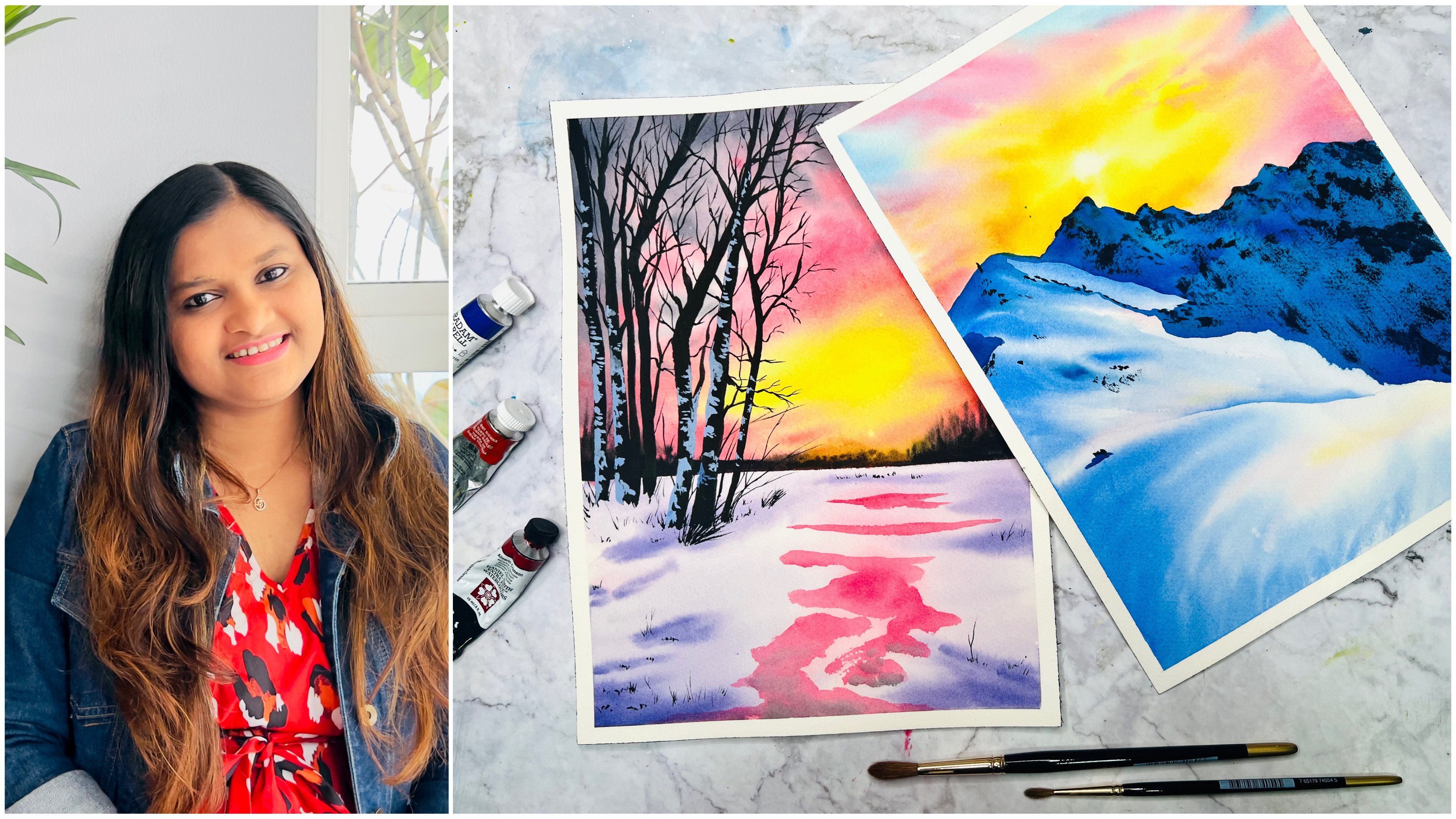
of the season. Hi I'm Geethu, an artist, a YouTuber, an aerospace engineer,
and an instructor who has been teaching online for
more than three years now. I'm also a Silver
Brush educator and an ambassador to White Nights and Sitaram Stationers in India. I have been sharing
my paintings online through my Instagram
account, Colorfulmystique, and have recently
started to share more of my little insights into life
revolving around an artist, and my thoughts on
creative processes in my YouTube channel
as studio bvlogs. In this class, we'll be
using watercolors to capture the vibrancy and emotions
of spring in our paintings. We'll explore a range of
string landscapes and flowers, from serene gardens
to peaceful meadows, and learn techniques
for creating dynamic, explicit and colorful
watercolor paintings. As we paint, we'll also
reflect on the ways in which spring can inspire us and
spark our creativity. Spring is a season of
growth and possibility. A reminder that we too can
grow a sense of possibility and explore the ways in which spring can help us
grow and bloom. Throughout this class
will also explore the inspiring and uplifting
qualities of spring. This season is a symbol
of hope and optimism, reminding us that growth and new beginnings
are always possible. We can explore how the season can inspire
us to be creative, open to change, and ready
for new opportunities. By playing with color,
light, and composition, we capture the essence of this beautiful season and channel its energy
into our artwork. Whether you're a beginner
or an experienced painter, this class will help you to
tap into your own creativity and express the joy and vibrancy of spring
in your paintings. By the end of this class, you'll have created a
stunning collection of 15 watercolor paintings that celebrate the joy and
beauty of spring. It doesn't matter if you're
an experienced artist or an artist that is just starting out with your
artistic journey, you can join this
class and enjoy the complete emotion
that spring can evoke. By joining me, you'll
have the chance to learn new techniques as well as
to refine your skills. Enroll in this class now, and let's embark on this
exciting journey together. See you in the class
2. Class Project: Hi, and thank you for
joining the class. In this class, there will be 15 stunning watercolor spring landscapes for you to paint on. The first-class project is already uploaded in the class, and you'll find all
the 15 paintings uploaded after 30 days of the published
date of this class, which means that
each of the projects will be uploaded
every alternate day. You'll get two days
for each painting, which I hope is more
than enough for you to complete the painting
in your busy schedule. Without any further ado, let's have a look at
all the art supplies that we'll need for this class.
3. Art Supplies You Need: Let us have a look at
all the art supplies that we'll be using
for this class. First of all, you'll need paper. In this class, I'm
using paper from St Cuthberts Mill
Saunders Waterford paper in cold pressed texture. You can also use a rough
textured paper if you want. The size that I'm using
is half of this one, this sheet of paper, I'm cutting it into two, which is a 10 by seven
inch size paper. That's what I'll be painting on. You can also paint the same
on an A5 or A4 size sheet. I would also highly recommend
that the paper you use is 100% cotton for
the best results. Next, you'll need
watercolor paints, I'll be using paints from various brands
such as Shoemaker, Daniel Smith, Winsor &
Newton, and White Nights. I have my pre-made palette
which I use mostly. This palette and all the
colors in it is uploaded in the resources section as
a PDF if you want to refer. This is the palette
that I mostly use. I said, you will need a palette
for mixing these colors. You can either use a metal palette or a plastic
palette like this one, or even a ceramic plate
for mixing your paints. Next, you'll need brushes
for painting, of course. I'll be using a large
brush like this one to apply water onto the
whole of my paper, or even a flat brush like
this one in certain projects, then you'll need a
medium-sized brush, so I would recommend a Size 6 or a Size eight
brush for that purpose. Then a smaller
sized brush such as a Size 2 or a Size 4 brush. Lastly, lighter brush is also recommended so that you can add in thin lines and details, as well as some branches
in our paintings. A pencil and an
eraser so that you can make the rough
sketch in your painting, two jars of water, one for taking fresh
paint and the other for washing off your paints and all the paint
from your brushes, which will eventually
turn muddy, so it's good to have another one always with
freshwater when you're applying water onto the whole
of the paper so that you're not using this muddy water
for mixing your paints. I'm also using a wooden
board like this one for taping my paper onto
so that if needed, I can lift it from
my surface that I'm using and tilt it around. You can either use a cardboard, an acrylic board, or any board for this purpose, and so there it goes without
saying that you would need a masking tape so that you can tape the edges of your paper. The masking tape that I am using is from a brand named MT. You can use any masking tape. From my experience, I
have learned that if the tape is tearing the
edges of your paper, it means that the problem is with the paper and not the tape. Some paper towels are a cotton cloth or some
cloth like this one. This one is actually a
microfiber cloth that I'm using so that I can
remove the extra water from my brushes and wipe
off any extra water from the edges of the paper or
paint or anything in general. It's good to keep a
little piece of cloth or some tissues at hand always. Lastly, a masking fluid, which we will use to mask
off certain areas for painting so that we can
paint the background freely. Now that you know all the art supplies that we're
going to use, let's jump into the next lesson.
4. Day 1 - The Flower Field: Let us start. Welcome
to the first painting, there's no pencil sketch. We'll just dive
straight into it. Let's apply water onto
the whole of the paper. I'm going to be using
this flat brush, which is the golden natural
blend series from Silver. You can see, it is
nicely flat brush. I'll use this to apply water
to the whole of the paper. Take your time for this process, don't rush through it
because it's very important. I'm not using my usual method of applying the water onto
both sides of the paper today as is obvious from the tape that I
have put onto my paper. That is because I knew
that many of you may not have the acrylic board to use that method and some of
you think that that is an advanced method,
although it's not. But also, I shouldn't
forget to paint like this. That's why I wanted to go
through this in this class. Here, make sure to
apply the water nicely and evenly onto the
whole of the paper. Cover the edges nicely, but make sure that there isn't
any large pools of water. That's very important. You can use a cloth or a tissue to wipe off
the excess water. Also make sure to apply multiple times because you need your paper to
be soaking wet, as in the inside fibers of
the paper needs to be wet. Otherwise, you are going to risk letting your paper
dry while painting. Also, if there's too much
water along the edges, that is towards the
outside of the paper, just wipe them off clean with a cloth or a tissue,
whichever you're using. Because this water can seep back into the
paper and then it will create blooms or the cauliflower effect or
the background effect. There are various
names for this effect. Now let's start. I'm going
to be using my size 8 brush. This is the
Renaissance CT brush. You can see the
Renaissance CTs brush. That's what I'm
going to be using. We will start to create the beautiful, gorgeous sky first. For that, I am going to be
starting with Taylor blue. Mix up a nice amount
of Taylor blue. This is Taylor blue
from [inaudible], but you can also use the bright blue from White Nights instead. Today's sky is
going to be simple. The painting is also going to be simple because we just
want to ease in to the class before we can
move on to tough projects. Let's start. Just apply the paint in somewhat
random manner. You can create any sky you want. Don't try to follow
exactly what I am doing. I am just creating some random shapes in the sky and leaving some
white gaps here and there. Those white gaps will be
like the clouds in the sky. Remember, darker tones
towards the top. Here, towards the top, I will pick up fresh paint and also the darker consistency. That will go over to the top. Then as I move downwards, I'll stop taking dense paint and start into a lighter tone. But obviously, I
will make sure to leave a lot of white spaces. That's a little bit dark. What I'm going to do
is I'm going to dilute my paint by using
a little bit of extra water and then I'll
go over to the bottom part. Can you see? Now as I
come towards the bottom, I need it to be very less paint. I've washed off all the
paint from my brush and I'm just going
to pick up what's there on the paper here, not even from my palette, but just from the
paper directly. I'll use that to create
some strokes and to bring out the
existing strokes towards the bottom. Can you see? That's really light. Now I just want to add a little bit more clouds
because I feel that the white spaces I have added
is a little bit too much. I'll just go ahead and add. Now, I want to create a
little bit more depth to it. I know I said that we're using lighter tones and darker tones, but I still want to
add more depth to it. For that, what I'm
going to be doing is I am going to pick up a little
bit of ultramarine blue. You can see the
ultramarine blue. That's a really warm version. The warmer because
ultramarine blue looks like there's small
red added to it. It's a bit darker than this one. I'm going to use this
warm blue and then I'm going to add it on top
of my bright blue. Careful where you
add, you just need to add more towards the top and lesser towards the
bottom because we are trying to create
that depth effect. You can see more
of the ultramarine blue and bring it downward. But as you come downwards, you want to lessen
the intensity of the paint and just blend
it into that blue there. I think we are good to go. We've created a nice sky region. I've just picked up a little bit more bright blue and I'm just adding some more
strokes but not a lot. Remember, the light factor needs to be there towards
that bottom region. Now, we don't need
the paint to be dry to move on to the next
part of the painting, we're just going to go ahead
and straight away do it. We're going to get
a smooth edge. Some paints are going to bleed into the sky part
and that's okay. That's because we want to create the illusion of depth
in our painting. If there's a hard edge, then it doesn't mean that it's an endless part of
the grasslands. We want to create
that endlessness, that is that large effect of it's going further away and blending in
towards the horizon. Towards that bottom, we
are going to start with a nice amount of cadmium yellow. Cadmium yellow because
it is an opaque yellow. If you don't have
cadmium yellow, you can actually go with
other yellows that you have. But I would really recommend
using cadmium yellow. It would be really
helpful for you. Otherwise, you can
use gouache also, but I don't know how
much you can mix those chalky gouache paints
along with watercolors. Here I am using cadmium yellow
and we're going to start. First of all, let's
mark a horizon or the end point where that
grasslands are going to be. That's going to be
somewhere here. Then I'm going to go
up slightly along this edge and there. I think I want a bit more
of my yellow region here. Let's try to create blends. I can see that my paper
has started to dry out, but that's okay
because we're going to add only paints
towards the bottom now. Nothing's there going
towards the top, so that's absolutely fine. Now I'm going to pick up green. That's my sap green. Taking a nice amount
of my sap green. I like this version
of the sap green. I think this is from
Winsor and Newton. It's not that vibrant. If it was vibrant,
then I would have had desaturated by adding
a bit of red to it. But this one is
not that vibrant, which makes it easier for me. Here you can see it's not that vibrant and I'm going to blend it along with that cadmium
yellow. Let's blend it along. You can see how I'm
blending it along. Let's bring it a
little downwards. See how my paper started
to dry out at the border. That's okay because
you're adding wet paint now and it will just bring back that moisture
onto your paper. Added that nice green effect. Now what I'm going to do is
I'm just going to pick up another brush and just going
to run along the edge there. Because as you may notice, it's started to form these
slight hairs towards the top. Actually, if you'd given
an angle to your paper, it wouldn't have formed and
I actually forgot that. Really I had forgot
that. But it's okay. Even if it blends with
the sky and forms a little greenish shade there,
that's absolutely fine. It's just going to look
like this green here. You can pick up more
of the yellow paint and add it along that edge. Then let's now try and
create a nice blend there, added a bit more of my green. Let's go back to adding a
bit more of the yellow. That better if you've
added those green, you can have a nice blend. See, I'm trying to create
a nice blend there, there is pool of my
yellow in that region, more yellow towards that top. It'll just look as though
it's the grasslands, but those yellow flowers that we're going to add
in our painting. In fact, we can pick up more of the yellow and add
it on towards the top. This is the reason why I
recommended opaque colors. Because if you're using
non opaque color, then it's not going
to appear on the top. I know, so this is the moment where you might
actually need to use gouache. We don't want it to be like
that vibrant yellow there, you can have sap green spots. What you can do is you
can pick up more green and add in to your
yellow regions, because we don't want it
to be strictly green. Now that you've added the green, let's give it a bit more depth. In order to give that depth, I'm going to take my dark green and I'm just going
to mix it along with that same that green
mixture that I was using before and we'll just add it. Now, when you're adding it, just add it towards the bottom because the bottom
is where we need the depth. Remember in a painting, the depth always goes towards the top and the bottom because the center portion
is the horizon which is the furthest
point away from you. That will be the smoothest edges and the lightest values
in your painting. It's a nice dark values, I'm just going to pick up a
little bit more sap green so that I can blend those values. I think I need a bit
more darker green in fact for this edge here. The more contrast you
build in your painting, it's going to look
back beautiful. I loved the way it stand out. Now what we're going to
do is we're going to add some splatters to depict those flowers that are
really in the background. For that, you will definitely
need another piece of paper because you don't want
those splatters to fall onto the sky region.. There you go, I'm going to
use a spare piece of paper and I'm going to mask out
my sky region like that. But before that, let's
pick up the paints. What I'm going to be using
here is my cadmium yellow. If you've been using a different yellow
that is not opaque, then I think this is the point where you can pick up
your gouache paint. Here masking off the
edges and I'm using my size 4 [inaudible] brush.
I'm going to splatter this. Let me see those
splatters everywhere. I love those splatters, I love those splatters, just look at it. These creates literally the
smallest flowers all around. Now that you've
added the splatters, we're going to do
something more, a little bit more beauty to
make this more interesting. I've switched to
my size 2 brush, and using this smaller brush, even smaller if you
can go actually. We're going to pick
up brown, okay. Make sure that it's
not too watery because we just want to
avoid too much water. I'll mix in a little bit of
my Payne's gray as well, along with that,
which will give me a very darker brown,
somewhat like Zapier. if you have Zapier you
can actually use that. Then make sure it's
a dense mixture, not too much water
very, very important. Then we're going to
create the little stem. Just that you don't press too much if you press to most then it's
going to spread a lot. You know these yellow
flowers that you've added to some of them, just go ahead and add
these brown spots. There'll be the bottom
parts of those flowers. Only to some of them you don't need to
do for all of them. Actually do it for the bigger
ones because those are the ones where you can
actually see the details. I'm skipping this
smaller ones and better I can see
there's a large flower, I go ahead and add it. You can add it
towards the bottom, you can add it towards
the center as well. It doesn't matter, you just need that brown spot somewhere
along that flat. But can you see now
it's already looking like those flowers are poking out in the [inaudible]. Like I said, not to all of them, just random is
completely enough. I love the way that stand out. Now let's switch
to a liner brush and add some lines for these. Here I am going to be
using my dark green. For the standards of
those last darker green. Make sure it's dark. We're going to just
add some nice stem. Don't add all of them
in the same direction. Just go ahead and
add lots of stems. Especially I think you
can add to the ones that you've added,
the brown spot. You can also add
to the other ones. That's absolutely fine. It doesn't need to go in
all the same directions. Then you can have some of
them go upwards like that? Just add a lot of them. I don't think I'm going to
wait for this to dry because I like that blended look
of those flowers itself. I'm going to add some
bigger ones now. Here I am taking up my paints. My paper may or may not have dried and back
to beauty of it. Some of them will be soft, some of them will be
hard. That's okay. I think I'll use a
larger one there. Then I'm going to have
a very large one here. So I've literally just taken up my paint and made a
large bunch there. Can you see that? Then I'll make another large bunch there. Another large bunch there. Made some nice large bunches. Obviously, large bunches means you've got to
add the brown to it. Here I've switched back
to my size 2 brush, and I'm going to
pick up that brown. We're going to add
it a bit on each of them somewhere
along those lines. It's mostly towards the bottom. Here's the bigger one. We just to add to the base. I think we've covered all of the major
ones that I added. Can you really see how those
slides are peaking in? I'm just going to
do one last step. You know that bigger one
that's in a single color now. We need to give it a
little bit more dimension because it's a larger flower. Here I'm taking a little
bit of my orange, mixing it with that
cadmium yellow. That's cadmium orange. I'm mixing it with that cadmium yellow and just going
to add a bit on it. Trust me, even if you don't do this,
it's absolutely fine. But then having that there, and when somebody looks
at your painting, they are going to notice it. They're going to notice the
subtle color difference that you've added
to the larger ones. Here see, some of
the larger ones, whichever one, very large ones. You need to add to the other
ones that you've added. Just some of the
very large ones. If you can go ahead and add in a subtle orange that is
going to go along way. It has these little things I believe that makes
your painting look really gorgeous because when somebody does actually
look at your painting, you could have stopped at
that yellow, but you didn't. When they see that tiny
part of the orange, that is when they realize
that you've worked on it, you've put a lot of
thought into that process. That's what makes your
painting beautiful and unique. I'm really happy with the
way this has turned out. I don't think I want to work
on this painting anymore. I just love the way it looks. We're going to wait
for this to now completely dry so that
we can remove the tape. There you go. It's
completely dried out. I am going to
assign my painting. Now let's remove the tape. Here's our final painting.
I hope you like it. The reason I used opaque
colors for this one is can you see how faded it
is even though it's opaque? This shows us the
clear comparison between watercolor and gouache. Even though the opaque paints in watercolors are
said to be opaque, but they fade away when
the paper dries out. We'll see how we can improve this in the next class projects.
5. Day 2 - The Valley Field: Let us start. I am going to start applying water onto the
whole of my paper. Let's quickly apply water. As I always say, take your time to
do this process. Don't rush at all because you need the
paper to be really wet. It does help in the
long run, that's why. Let us begin. For the sky part, we're going to go with
pthalo blue itself. Taking a nice amount
of pthalo blue, it can be darker because we want it to be nice and vibrant. Let's go ahead and
start adding the sky. Just like yesterday,
we are going to leave some white gaps where it's
going to be the clouds, but today we'll make
it slightly different. Here I've got some
nice clouds and I'll add now towards the right side. Observe closely as I
pick up darker shades, I applied towards the top
and towards the bottom side. I obviously want
it to be lighter. Now moving towards
the lighter side, I'm decreasing the paint in my brush and just using whatever is there on the paper and bringing it down. Now let me just quickly
soften out some of the edges. Wherever I feel like this densely too much
paint or something, I just soften out
some of the edges. Then you can use those
softened out paint to create some more
parts of the sky. You can see I
picked up blue from here and then I applied
it onto the other places. You can do the same.
Remember what I always say, you don't have to do the sky
exactly the same as mine. You can create your own sky. I think we can just take this as a process where we
can experiment on the paper and relax and
create your own beauty. Now that we're
done with the sky, we're going to create a nice, gorgeous gray shade
for the clouds. That's the difference. Let's start with
ultramarine blue. I'm going to create
my gray itself. I'm not going to
use Payne's gray. Here, taking a nice amount
of my ultramarine blue, that's what I'll start with, and I'll mix in a little
bit amount of yellow, which obviously would make
it to turn into green, but we can fix this. Let's add red, three
primary colors. I'm using alizarin crimson here. Now I can see it's turned
into a brown shade. Now to make this
into a gray shade, I think we'll take
a little bit of ultramarine blue and
start adding to it. The more blue you add, you should start to see it
turn into a gray shade. There, I think that's the perfect gray shade
that I was looking for. This is what we're going
to apply into the sky. Make sure that you don't have too much water on your brush. We start. Just start dropping in and
creating random shapes. You don't need to
add everywhere. We will have some
white gaps as well, so just add some of the
shades at random places. Then here, again, we'll
come down and add. Remember to leave white
spaces, very important. Here, I think towards the top, I'll maintain that white space. I'm just adding it mostly towards the inside
part, I guess. Some here and observe the very lighter
tone that I'm using. That's very important that
we use a lighter tone. I think that's enough. Let's move on to
adding the foreground. But I think this is the middle ground,
not the foreground. Something that's
behind the foreground. I'm going to start
with a darker green, and to that I am going to mix in a little amount
of Payne's gray. That'll create a darker shade. Something like perylene green. If you have perylene green, you are welcome to use that. There, I've got the shade. I just may need to
make sure that I don't have extra water in my brush. Very important when
I'm doing this. Then towards the back is
where I want to apply that. See, it's still too light. I'll pick up a little bit
more of my Payne's gray, a little bit more of my
green mixed together, and create that gorgeous shade and then go over to my paper. That is the background. I've applied some dark
green shade there. Now, I'm going to go further
with my normal colors. Here I pick up my dark green. I will add onto it. Adding that. Then I think
I'll go with my sap green. Leave a little gap between the clouds and the
mountain part. Let's pick up that a
little bit of green and keep some traces here
and there, some lines. Then let's go back with our sap green and
start to come down. Let's paint the whole
thing with sap green now. As you can see, my paper started
to dry out and I've also changed some mixture of the water and the
paint in my brush. As in we were using a
very creamy consistency, but now we need a lot
of water in our mixture because we need to reinforce
the water on our paper. Let's go ahead and do it. I like this exercise of not using the pencil
sketch and going directly with my brush and
then trying to figure out the shapes that I need
to add in my painting. I think it's a
really good exercise and flexes your creative muscles and just gives you a lot of freedom to change
things on your painting. Now here what I'm going to do is I am going to add a stream. Starting there and then I
think my stream can bend like that and then it goes over
to that side like that. The rest of the areas, this is the outside
part of the stream. There. Now, I'm going to do the same thing that
I did for my Day 1. As you can see, there's
got hairs forming, I will use my brush. I'm making sure
that I dry it up. Then I'm just going to pull
it along the edge and soften those edges so that you see those hairy structures are gone. Just a simple exercise to get those hairy structures to go. Now, let's create
the other side. For creating the
other side first, I'll start with my dark green, the perylene green that
we mixed and observe, I've gone back to that
creamy consistency. The watery paint is here and the green dark consistency
is here on the left side, which is what I'm
going to be using. I use that. I start with a nice darker tone, then I going to now shift to using the nice
sap green color. Here. Shifting to the
nice sap green color. I'm going to come down
and join right there. We have the stream now
the stream is going to bend over into that
mountain area, so here it's bend. Now as you come into
the foreground, it needs to get bigger. That's the shape of this
stream that I've created. Now let's fill up the
rest of the areas. I think I'll use a bit
of olive green as well. Don't worry if you
don't have olive green, you can actually just
mix a little bit of brown and yellow to green and you can get colors similar
to the olive green shade. A bit of sap green, a bit of dark green. Just use mixture of different greens
because you don't want to make the whole
thing look like a bunch of one
single green shade. Back with my small brush. Just softening that region out because I can see
these more hairs forming. The same along here. If you see any hairs, get rid of it. We've got that part now. We need to add more depth. Here now I'm taking
a bit of dark green and I'm going to
add in various cases. First of all, towards the edge of the stream
towards the bottom, the bottom part of
our painting here, just adding a lot of
greens, dark green, and blend that towards the top, you can see just
picked up a little bit more of my sap green and
blending that into the top part. I love the way
that's turned out. You can see the stream
bending and going there. Let's not leave the
stream as white. We need to just give
it some colors. What we're going to
do is, you remember that gray shade that we
made. Let's make some more. That's a bit of blue and a
bit of red should do as well. That's done in doing,
it would take a bit of yellow and blue
should do the trick. Then I've created a nice,
gorgeous gray shade. What we're going to
do is make sure you get rid of the extra
water from your brush. Then let's just add it. Here it's okay that your stream is dry and
the paper has dried out. We're just going to apply the
strokes in a random manner. These are just the
shadow areas in the water actually and
remember to apply in one single direction don't do zigzag or in
multiple directions, just choose one direction
and stick with it. I'm using the direction, as you can see, horizontally like that, almost horizontal. I have a lot of white
gaps that I'm leaving. That's like the lighter areas. Let me wash my
paints off because, towards the top of the stream, I want it to be
nice and lighter. I'm just taking a
bit of water now and blend some of the regions. We'll give a multi-shade
look. Can you see? I'll just leave it at that. I don't want to walk much on it. That's not the focus
in our painting. I think I'm very happy
with leaving it like that. Before this dries out, let's go ahead and add
in some gouache flowers. As I've already mentioned
in the supplies section, I'm going to be using the gouache colors from
Art Philosophy. I am going to be using this
lemon yellow and mid-yellow. That's just because this lemon
yellow is too greenish for me and this mid-yellow
is too orangish for me. I'm just going to
mix these two up to create the perfect shade
of yellow that I want. You're welcome to use
any kind of yellow, so don't be pressurized. Shifting to my size 4 brush, and I'm going to mix
those yellows up now. See, that's the yellow I want, the perfect mix of those two, and I'm going to make a nice and watery mixture out of fit. It means a lot of water, and of course, I am going
to need another paper. This time I'm going to mask
out all these regions. We need the flowers
only on the right side, and then we're
going to do the dab and let the paint
fall onto the paper. See how the flowers
have turned up. I think towards these
bottom regions, we can actually go ahead
and do it on our own. It's okay to have
bigger flowers so then you can clearly
apply the gouache paint. Then you can also
go ahead and apply smaller ones towards
the top randomly. You can do this entire
process randomly with hand and not use
the splattering method, but I always prefer the
splattering method. Just adding some more. Let's just assume that the
flowers are only there on this side and not
on the other side. Let's go ahead and
add in some branches. I will take the
green color using my liner brush and then try and add branches
for some of them. I love the way
that's turned out. Now what we'll do is let's
go ahead and dry this up. There you go. It's
completely dried out. But can you see how
faded these are? Remember our Day 1 painting? That's also faded,
but I think this is more vibrant enough. That could be the
yellow that I've used. But can you see gouache and the opaque watercolors
are just literally the same? But in order to
enhance this painting, we can actually do some more. What we're going to do is
we're going to pick up the gouache paint
and we're going to add some foreground flowers. Those would be vibrant
enough because we're doing it in the
wet-on-dry method. Let's load up the brush
with the nice paint. I've shifted to my size 2, silver silk, ultra-round brush. Let's add some flowers. Can you see how gorgeous
that is over the top? Because that's wet-on-dry. I'm just going to pop in and add so many flowers
as much as you want. It's better if you can create
the shape of some petals, but that's not necessary. Obviously, you can
go ahead and create a lot of dots as well. Those would be the
smaller flowers. You can go ahead and add as many
flowers as you want. Can you see how that
wet-on-dry method has made those flowers pop
out in the background? I think that's really
good, isn't it? There are more
advanced techniques to paint these flowers and these kinds of
landscapes which we will get into in the later stages. I just wanted to ease
into the process. I hope you liked this one. Let's quickly try this up and then we can remove the tape. The thing about gouache is that it dries out
pretty quickly. Let's go ahead and peel
off the masking tape. There you go. Here is the final painting. I hope you like it and thank
you for joining me today.
6. Day 3 - Tulips in the Snow Part I: Let us start. First of all, we'll do a pencil
sketch for this one, that is, we'll sketch
out the tulips first. Let's have our beautiful tulips. It's going to be pretty
easy, so not to worry. We just have to make small
cup shapes like this. Remember, it doesn't have to be perfect because these are flowers and they can be
any different shapes. It's not like building
where it has to be the perfect shape or any
perspective or anything. Visually, yes, there is aerial
perspective in play here, but not the other
kind of perspective, the linear perspective
one. There you go. I'm just going to
sketch out the flower. Let's see. This does
closing in on like that. Let's say there's
another petal behind, and that's one of the tulips. Let's add another one here. It's just beautiful, isn't it? These cup shapes. I love seeing these
tulips, in fact. Just don't make perfect
lines, like I said, so have some bends and curves, because we're trying
to capture the flower. Then you can have
petals behind as well. See there, I'm going to
mark the inside part. That's one petal. Let's add some more flowers. I think I will add
another one here. This one is a bit
smaller as you can see, and then we'll have another
one here that's pretty big as in the same size as this one. That's what I mean. I think that's it. Now, we need to add in
the stems, of course. That's very important, isn't it? Let's add the stem
for the first one. Notice how I stop there and
I'll just tell you why. I want to add in the leaf. It's just part of the
sketching process. You could add the
whole thing and then drop it off as well, but I just prefer to do
things this way. That's it. Another one right there. The best part about this is that it's sitting in this nose, so you don't have to worry about marking the
ground and everything. Just ignore them. Here is leaf sticking out. Another one and
let's add for this. I made this a bit fatter because we're going
to make it as though it's got a
bend. There we go. Now when you are
tracing out the snow, make sure that you
make it very roughly. We don't want that pencil marks to be seen at the
end, that's why. It's like in different layers
of snow, what we're adding. I think horizon line can be
somewhere there which is not 1/2 and not 1/3 in
this case either, but somewhere there. There's our sketch and let's now get to painting
this gorgeous beauties. There are two ways
to approach this. You can either use a
masking fluid and mask out these flowers and the leaves and then go ahead and
paint the whole thing. But you know what? For this lesson, I'm not going to use
the masking fluid. What I'm going to do
is I'll go around the base so that it's
easier for us because the main reason is
because these are like huge flowers and there's just a lot and it involves
a huge process. If the flower was one
single flower or something, then we could have used
the masking fluid, but in this case, I just want to skip
it right here. What I'm going to be doing
is I'm going to be applying water to the areas
outside of our tulips. Just go around like
that on each of those flowers and
apply the water. We only need to apply all
the way to the horizon line. Whoops, sorry, I didn't
mean that to happen. That's from a previous
painting that I did, the yellows, the
sticky on the brim of the water. Oh my God. Let me down that so that it
wouldn't affect me again. I've seen happy mistakes like
this happen all the time. Happy as in the sense, I'm going to be applying
yellow into my sky. Imagine if it was like
some other color, like maybe what if it
was blue or green, then my whole yellow would
have turned into green shade. Oh my God. Doing the sky
is to imagine lucky. There I go. I'm
applying all around. Since we only have the sky to make and there isn't huge part of the painting process
involved in which we need the water to stay wet
for a longer duration, I think maximum two
[inaudible] of water should be enough depending on the paper that you're using. I'm using Saunders Waterford
so I know what will stay and I also know how to
control the amount of water, the dye used by using my brush strokes as
in a shoe right away. Here I'm switching
to my size 6 brush and I'm going to be
starting with a bit of my Indian yellow. There I'm taking
my Indian yellow and I'm just going to
apply it into the sky. But what I'm going to do
is I'm going to create a huge light area there. It's like that. You see, and I'll go around. When I mean, control
the amount of water on my paper using my brush
stroke, it's this. You can re-wet your paper
always using the strokes. If you take a dry paint and
apply it onto the paper, then your paper is going
to dry out sooner. But if you start taking
more and more wet paint, then your paper is
going to stay wet longer. That's the trick. Now, be careful
around those flowers. We need it to be nice and
around not over the flowers. The leaves are fine because
they're going to be in green or yellow. It's absolutely fine. But I would skip the stem because I'd like to give it a dwell
color at some point. There I fill that
part with yellow, then note the watery
mixture that I'm using. Let me fill up the rest
of the sky first, there. Can you see it
started to dry there? What I'll do is I'm
just going to use water and blend that
thing. Can you see? As soon as I use the water, I'm able to blend it up. There, some more. I don't talk while painting
when I'm concentrating, when there's less
concentration involved, I go on talking. That's the case when you
see me like very silent, which means I am really concentrating into the
process that I'm doing here. I think that's that
got the sky covered, but I don't want it to
be in a single color. I want to add more depth to it. What we're going to do is now the next color which is
in gold in my palette. Adding that to the sky around, so that area there is the
lightest. Can you see that. Then we just go ahead and start applying the Indian gold around. The more strokes that you apply, it's going to stay wet. So see, I've just applied
the stroke there. That's now wet, now I'll
move over to the right side. Then when I come back
for the next sheet, it would still be wet
because I just read it. That's what you'll have to go in a flow or a
step-by-step process. Remember the areas that you wet. You actually don't
need to remember. You can look at
your paper and see. Keep an eye out for
all the areas of your paper to see where are
the areas that's drying up. I can see that the center
part is already drying up. But right now, I don't
mind because we've got our paints in their
proper and already. That area is supposed
to be white, so I'm not bothered anymore
that it's drying up. I believe I'm going to
give it more darkness. That means no more
Indian golds in a very dark consistency. I forgot to say so if you
don't have Indian gold, the color that you can go
for is a mixture of brown, orange, and yellow that should give you a nice
Indian gold shape. There you go. This is now towards the edge. See I broke my own principle. I said that I painted the
left side first and then I went ahead and added the second gold of Indian
gold to the right. But that's okay because
my paper were still wet. That's what I mean, that there isn't a perfect
rule or anything. It's just a matter of
observing your paper. I think that that's the key
thing to the whole process. I can see a distinct line here, which I'm just
going to blend in. See now that I blended it, it looks much better. Now we can see the glow nicely. I want to give more depth, very important that we
captured a good contrast. A good contrast in your painting is going to look
absolutely beautiful. Now what I'm going to be
doing is I am going to take this Indian gold and
then I'm going to mix in a little bit of my
transparent plan, so burnt, umber or transplant brown any brown that you have. If you actually mixed up your Indian gold in the
first place is in brown. Now add more brown to it, as simple as that. I still want it to
be golden shade. I think that's a little
bit of too much browns so I'll take in a little bit
more of an Indian gold. Make sure it's still
golden and not brownish. Then apply that. That's going over to the
left and the extreme right, which will give me
a nice contrast. Now, can you see
that distinct line that's formed so we
need to blend it. Here you can either use just normal Indian gold or just water and your
brush to blend that alone. That there is no
distinct line anywhere. If you go around with your brush and just blend that region. See that and now we've captured the debt and the light
in that extreme middle. Now it's time to go over and paint the snowy
regions. I don't mind. I am not going to wait for it to dry because there are
lots of areas that, it's okay even if my
yellow bleed through, but I'm pretty sure that that bottom part of it
has started to dry out. What I'm going to do
right now is so that we don't have to waste our time waiting for our paper to dry. What I'll do is
I'll just go ahead and paint straight away, but I'll make sure that my brush is not touching that point. I'm not touching any part
of the horizon line. Remember you have to
skip the flower and the stem. There you go. Now I think I have to switch to my other brush to go into
the areas in-between, so here taking my clean brush and I'll go around
and apply water. Again, don't touch the top. You stay away from that horizon line but apply
water right into there. When you finish
applying the water and you're mixing your colors
and you start painting, the edge should have lined
and will not bleed too much. Even if it bleeds a little bit, I think that's okay because
I've lately learned that when you're doing
watercolor paintings, sometimes these
little bleed throughs and runs are beautiful. It's a subtle things
that your eyes notice. It looks really nice. I mean, that's my
perspective, again. Art is like really based
on perspective, isn't it? Everybody has a
different perspective. Understanding what I feel. Just two more places
to go in here and there. Did I apply here. I can't even remember
and I don't see it. Which means it's either
dried up or I didn't. Done. Now, let's go ahead and create the beautiful things. That would be the shadows
plus the reflection of some of the colors from
the flowers onto the snow. Let me show you
how we'll do that. For the shadows we're going to use three different colors here. We'll start with a
nice amount of cobalt blue there that's cobalt. Blue and I'm just
going to add that. Because the whole thing
is in different layers. We add them in layers. I add a bit there and then I add a bit in that center portion. Do you see why the masking fluid would have looked
much better here? Because you could just go around and paint that whole thing. But I do like what I'm doing right now
because it gives a lot of brush control and it takes away the freedom that you have
for free brush movement, but then gives more control or gives more learning
for your hand. I feel that's very
important, isn't it? Now, I've taken violet, if you've noticed while
I've been speaking and adding the next bit of color and putting that on. See this is where, I mean,
it gives more control for your hand because
you're concentrating on to get it along
the shapes and stay away from areas
that are risky. I got to harsh edge here, which I'm going to soften out. Now, the top portion there, I want it to be lighter because we're having the reflections. Here I'll pick up a little
bit of my Indian yellow. A little too dark. But
that's what I mean. See a bit of the yellow. That's why we added that violet so that it creates
a nice separation. There's the yellow
now on to the areas. In fact, you could go
with golden shade. I also think into
some of the areas. We're going to stuff that in. Just a hint of yellow. That's all you need. I'm taking more violet
and everything. Because it's lighter color, I'm actually going
over the stem. Because it's a very light-color, it's not going to affect the greens and the color that I'm going to be
adding to the stem. If you had picked up a very
darker tone of violet, then you can do this process
that we're doing right now. See? It's okay that it's
slightly over the other color. The next color is pink. Now very important
because the pink is what is the color
of the tulips. That's now creating
that reflection. So let's see. We've got the tulip there
and dropping like you know some pinkish
sheets, just a little. It's like right under where
the tulips are and that's where you need to
do a frontier right there and then we've
got another one here. That's going to drop
in like some shadow. It's just because that
color is like very complimenting to the greens and everything is what is
contributing to the violet and then these troughs
and hills in the snow. Those both are
violet and the blue. But then this color
is a bit dominant and that's like stretching over onto the snow area
that's what's happening. A bit of that. I think
that's good enough. That was the first
layer of snow we'll add another layer
of snow to depict how the little troughs
and heights are. I think we're good to go
with that first layer. I love how we've
captured everything. I think now it's time for us to wait for
this whole thing to dry so that we can move
on to the next parts. There you go. I've
dried up everything. Now we'll mark in the
darker shadows of the snow bit first before
we move on to the flowers. So I think we'll start there and what I'm going to be doing is we need lighter colors still, but what we do right now
we'll bring things forward. Here, if I take in a little bit of yellow
and I'm going to go along the edge like that. Then I need the same
colors that you used. Here I've got a bit of pink, and I'm going to
use that pink to go along the edge a bit
more, I think of pink. See that? Then quickly a bit of violet before my
yellow dries up. It's just all of
those colors that you used and then just
blended towards the top. Can you see that? Just
blend it towards the top. Let it blend. Now, can you already see there's
a troughs on there? Although now I just realized
that yellow doesn't make sense at all because the lightest portion
should be at the top. Oh my God, what an idiot! [LAUGHTER] I mean myself. Here you go. I'm just going to cover it
up with my violet. It'll be a little glowy
area there if the violet. Not the glowy, but yeah, darker area there I think
you can use a bit of blue as well to mask
off that region. Then taking a bit
of pink and adding. This is really why I always
advise that you watch my videos once before
attempting the painting. That's because you'll
always find me doing silly and simple mistakes like these and then
saying, oops, sorry. I know you might feel that
I've ruined your painting. [LAUGHTER] Anyways, see, that's a nice transition
as it is now. We need to repeat that
process onto the other areas. Here, going with a bit
of violet and adding. This is why I said add a
very light pencil sketch, and that should help you. Here a bit of the glowy
pink and then it's nothing. Just use water to
blend towards the top. Here, it's good. It gives
its yellow at the top. See? A nice yellow at the top. Just use water to blend it. When it dries up, it
will be looking nice. Now you can see how the little troughs and
parts of the snow are. I want to add a bit of
a darker region here. That's why I'm adding a bit
more of the violet there and then I'll take in
a little bit of cobalt blue and blend along. Then just using water to
soften up that region. Now pink. Yeah. I like that base part. I didn't go all the
way over to the dark, which means I can
paint the next parts. Here I'm taking violet
again and adding here, we don't have anything
or any shade, so just go ahead and
soften towards the top. That's it. Can you see that? Then I guess there's here, this place and softening towards the top. I'm going to leave the middle portion
because I want it to be lighter itself because
that's where the light is. Can you see that? We
won't do much there. Although now here, this
bottom part is very light. We need to take care of that, which I'm going to be doing
by adding a bit of my violet. Then we'll take the pink
shades to drop in where it was and then blend
towards the top. See? Can you see as soon as
we added that we're getting different troughs
and areas of the snow. We're done with that. I think we can move on
to the tulips because these ones are like further away so we can get to the tulips.
7. Day 3 - Tulips in the Snow Part II: Now, here comes the
interesting part. Let's paint this
one in the center first because that's
in the light area. What we'll do is I am going to wet all of
the tulips at first. I mean, the whole
surface of the tulips. Let's wet that. I saw that
there was a harsh edge there, so I just tried to get rid
of it. That's much better. I've wet that region. Now, we're going to load our brush with a very lighter
tone of pink at first. Can you see? It's a very
lighter tone of pink. Let's add it on to the
whole of the tulip. The thing is, this tulip here is going to be
very light because it's under the direct
influence of the sunlight. Let's give it the
first tone of color. Then taking a bit more
of my darker pink now, so this is quinacridone rose violet that I have
on my palette. Here adding. You can see, now just adding that
darker tone to the base. Let's repeat the process
for the other tulips. Now, as I said, these ones can be
slightly darker because it's not in the
bright sunlight area. I didn't wash my brush. I just went ahead
because I realized that it's anyways pink
that I need to add, so why wash my brush and then apply water and then
put pink on the top? One more. I guess that center one is
now starting to dry up a bit. Now the top, yes, this is under sunlight, but you still need to
add darker depths to it because the side that we
see is away from the sun. Things to remember. Here I've taken a slightly
darker amount of pink and now because our paper has
slowly started to dry up, it's still wet but what
I'm trying to do here is add in a little darker
shade along the edges. Can you see that?
And the base of it, there. I like that.
That's turned out nicely. The next strokes we'll have to add it when it's
completely dried up. Now let's move on to
the other flowers. Here again, along the edge. This one, the water
has almost dried up, so I'll just use water on
my brush to blend that. See that? But make sure that the darker colors
are towards the bottom. Oh, can you see how
already the picture is so beautiful, isn't it? I mean, just imagine once we add in the stems as well,
how it's going to look. I think we'll go ahead
and add in the stems while these dry up. Stems, how are we
going to do that? We're going to give in
different shades of green. I don't want it to be like
a single shade of green. Here, I've got my nice olive green to which I'll add in a
little bit of pink. That's too much, a bit more of my olive green. I think that's great. Now, observe how I'm doing it. It's a bit tricky, I guess. Here I've applied my
olive green shade. Let me wash my
brush immediately. And now I'm going to mix in a green shade but see that
green is very vibrant, so I'm going to desaturate it using a bit of my
alizarin crimson. Now that's done in brown. That's too much, or green. That's the color I want. See I've desaturated it a bit. We don't want it to
be too vibrant green. It's like a brownish green but
not really brownish green. Then you're gong to put
that along the edge so that some parts of the stem are in a dual
color. Can you see that? We're still not done yet. I will show you. Here
I'm painting the stem. That other color that I mixed, I need it somewhere. Then taking a little bit of pink and I'm going to
add it in some areas. Also a bit of darker green. Guys, did you even see this? This flower was
still wet and it's, oh my God, flowing the green. What am I even looking at? See, I will get rid of it by adding more of my
pink at the base. Phew, saved. I should have wait
for it to dry. [LAUGHTER] Let's dry it up
then. It's completely dry now. Here I'll go with my
darker green now. That is where the underside of the stem because that
needs to be a bit darker. Then on towards the left side, because the light is here, and then the left
side is where we have the depth and
the dark regions. Here I will apply that and
now we're going to soften it. If you want you can switch to a smaller size brush if
it makes easier for you. I'm switching to my size
four brush and I'm going to use that to soften
that entire thing. See? Gives that side
a nice depth effect. Then I'm going to use my brush again to soften that
one of the base. Just adjusting the shape
of this whole thing because it looked a bit weird. There you go. I think now we'll go ahead and repeat the
process for the other flowers. Here, I'll start with that
green shade that you mixed. It doesn't have any
specific rule, guys. You just have to mix in all of those colors that we added
at random, like here. Then here I go for a little
bit of that olive shade. You can pick up a
little pink tone, which would make it
a little brownish. Then obviously
towards the bottom, I want it to be darker, so here I take my dark green. Like I said, right underneath that would
be darker as well. Here, you can skip adding the extreme darkness towards the left or the right because the sun is like right behind. See, these subtle things that
you can observe and note. Here in some of the flowers, you can even skip adding any of those other
shades as well. There is the dark. Dark here. Now, here, the darkness is
going to be somewhere towards the right and the bottom part. There. This is why I said see that underlying
violet is not at all affecting the way our colors are coming because it was
a very subtle color. Now if I take dark green
towards the right side, because that's the light source. See that. I think we've
captured that nicely. Now all that's left to
do are the leaves and then some teeny tiny
details onto our tulips. That's it. I promise. For the leaves, we are going
to do the same process. Let me mix up a
little bit more of my green and Alizarin mixture. There. Now for the
green and this one. I've added that. This one, the bend on the leaf
allowed once it's dry. Now we just go with that
one color all over. Even without one color, it's looking so
beautiful, isn't it? There you go. I believe
these ones are dry. While the leaf dries out, let's go ahead and
paint the tulips. What I'm going to be
doing is now we need a nice amount of the pink shade. There we have the pink. Then I'll load my
brush with the pink. I'm going to go along the
edges with the pink sheet. Can you see? Each of the edge with the pink which creates a harsh edge
along the separations. But along the inside parts, you need to soft it up. I've softened that region. Then I'll soften here on
the right side as well, but do not soft in the
left part of this one. Because that is like a
separation of the petal, which we'll let it be. Remember darker tones
towards the bottom. I think I'll adjust the
shape of the tulip a little bit because I can see
some white areas. You know what? To make this a bit interesting pick up a teeny tiny
amount of violet. Just a teeny tiny amount. I'm using a smaller size brush. Also remember that. Onto that wet region
that you just added, just use it to add a
subtle trays of violet. Can you see how
that's looking now? It's looking amazing, isn't it? Just at the base. If you add too much, you can blend along. It'll still going
to look amazing. It creates that depth at the bottom because of
the shape of the flower, the underside needs
to be slightly darker so that why it is going
to contribute to that. Let's repeat the
process for this one. You can either re-wet
it and do it or you can use the method that I used. Maybe I'll show you the
re-wetting method now. Now when you're re-wetting, you don't need to re-wet
the whole flower. We're only going to
paint these petals so that those ones there will look like as
though it's behind. You re-wet only the
one in the front. I'll show you the
re-wetting method. Just showing you
both the methods. You can either go for
the softening method or you can use the
re-wetting method. Whichever you use is up to you. But like I said, stick
to only the front petal, not even that one of the back. You can go along
the edge as well. But see it's forming hairs which I will adjust in a moment. We don't want this. Yes, I've created that edge to it, but then I need to
darken up the base. We're picking up. I forgot that this wasn't supposed
to be in a light. It shouldn't be as
dark as these ones, but then the bottom side
can be really dark. Then further darken it. We took the violet and just blending that. There. See how
gorgeous it's looking? See how we've got
that blue outside? But yes, even though
it's the petal behind, you just need to create
the edge for it. Now I think you need to use the softening method because you just wet the bottom part
of that flower is dry. Here what I'm doing is
just be created an edge with very subtle tone of pink and then I'll soften
it out. Can you see? Softening that out. But let's wait for
it to dry and then I'll show you the last
thing that's left to do. Let me wet this. Pink shade. The goal was just pink shade. Bit of violet for
the base. Blend it. Last one. here again, you've got front
petal and back petal. Careful about that. Nice amount of pink shade. Violet. Blending it along. I think now we'll go over
back to the leaves one. Here I'll take my dark green, but it's a bit too vibrant. Just taking a
little bit of pink, you can also use pink or add alizarin, either one of them. I'm going to add in
the darker edge. Just going to soften out the darker edge because I
don't want it to be too dark. Use combination of dark
and lighter colors should enhance the beauty of it. See, I've put some
more darker colors, but then it's got a
lighter, twisty down there. Just create more drama
with your paintings. I think that's what I
would always suggest. Then I'll just
blend these colors. I did all of that. I think what is
pending now, not much. Oh yes, that middle part, but I need my tulips to
be completely dry for that. I think it's dry. The thing that was left was
you need to give that inner portion a depth because that's
going towards the inside. Here what I'm going to do is I'm going to take in
a bit of my pink and mix it with my violet.
We're going to paint there. It's like right
there inside part. Again, not too much. Just up until that point
to create the depth. Then immediately soften using water towards the
outside. See that? But make sure that as
you get to the outside, it's very light
than what's there. Let's see now how you've
captured the depth inside. The same way for this part. But immediately go and soften
but when you're softening, the thing that you need
to remember is that each time you go soften you might
have to wash your brush. Otherwise you're pulling pigment all the way to the outside. I'm just going to
give a little edge to this one and soften it a bit. Maybe we'll do the same
to this one as well. Yes. I think we're done. If you want, you can use
your pink to add some lines. Although this is
absolutely optional. I'm just adding. Very
optional. Remember that. I don't think you should
add for all the areas. I've just made one
of them on this one. Done. There you go. We're finally done and
it's looking good. Yes. I know it was
long, wasn't it? Let's go ahead and
remove the tape. I forgot to sign the paintings. Let me just quickly do that. There. Here you go, guys. Here is the finished painting. I hope you like it and thank
you for joining me today.
8. Day 4 - White Magnolia: Let's start. The first thing that we need to do obviously, is to make the sketch
of our flower. Let's do that first
and remember, you don't have to have
the shapes exact. You just need to have a
rough sketch and it's okay to have curved edges and not so perfect corners and
everything. Let's see. I'm going to have
my flower here. I'll add one petal and let's say I'm having
the petal like that. Then from that base, another petal like that. Whenever I'm adding
extra lines like this, it means that there is a bend in the petal and that's
what I'm trying to depict. Add it like a flower there. Now, some underneath
part of the flower. I know that this looks some
tough and you're thinking, Oh my God, how do
you sketch that? But if you look at my sketch,
it's completely random. Just try to add flowers. I know that when
we were children, we used to draw flowers like perfect petals
and everything. But if you look at
an original flower , this one specificity. These are white magnolias. If you look at those
white magnolias, you don't need to have perfect
edges for any of them. Here I'm adding another
little branch shape. There's the branch
going downwards. Let me show that you closely. You can pause right here
and use that as reference. Now that's our main flower. What we're going to do
is we need to do add some background because
I just don't want this to be like the only
thing in the picture. We're going to add in
a lot more flowers, but right now when you're
adding these extra flowers, you need to make sure that
your strokes are very light because at
the end you do not want any of those
pencil marks to remain. It's going to be really light, that's what I'm making. When I show it to you, it
might not even be visible. I apologize for that in advance, but that's what I'm going to do. It's like branches
in the background. I'll add flowers as
well in the background. Just like this, we're
going to make petals that are random shaped ones. We will add a bad shape
here on that one. Add some flowers. I think
this right side I'll skip and not have too many details. But here you go. Let me show this to you closely. I can see it. Thank God, it's still visible. That's the sketch. You can pause right here and make
your own sketch now. We're going to do the
reverse process of what we did in the previous project. That is, we're going to paint the foreground flower first and then paint the background. That's interesting, isn't it? Let's go ahead and
wet our flower. You don't have to
do it perfectly. Just roughly the inside
part of the flower, wet it. I'm using my size 6 brush. When I say the sizes
of these brush, I actually don't mean that
you need those exact sizes. Because if you notice
sometimes I'm using my size 6, sometimes I'm using my size 8. It's just what's readily available in front of
me, I just pick it up. All you need is a medium-sized
brush. There you go. Here I'm applying water to
the main flower that we have. I think you can leave the stem, it's just a flower
that's where we need to add in. Let's start. I'm going to take a bit
of my Indian yellow. We just need a very
subtle amount right now. We're going to paint
that base part of it. What I'm going to do is just here at the base
part going to drop in a subtle amount of yellow. That's it. Can you see? It's just a teeny tiny amount to that base and let that
spread out a bit. Not spread out, but
just spread it out, that's what I mean. Now we need to paint the inside. The inside, it's supposed
to be a white flower. Then why are we
painting the inside? Because you need to
paint the shadows, very, very important. For the shadows,
what we're going to do is it's a white flower. It's a bright sunny day. What do you think the colors of the
shadow is going to be? It's going to be blue, isn't it? We are going to use
cobalt blue for that purpose. There you go. I'll load my brush with
nice amount of cobalt blue. But I think I should probably take a smaller size
brush for this purpose, so I'm switching to my size 4. I'm going to load my
brush with cobalt blue. There you go, and let's start. Let's see. Here at the very end, I'd like to add a bit and
somewhere in the middle. Whenever you feel that
you've added too much, you can go ahead and make it subtle and soften
it out. Do you see that? Here, taking the cobalt blue again I'll add for
this one here. There is no specific
rule as well. If you find out any reference
of magnolias or anything, you can use that or you can
just do whatever I'm doing. Remember that bend
that we added. Let's put that in a
bit of cobalt blue. Then I want a line and some
depth here at the tip. Just making sure that
I blend them properly. Then where else? Here the base. Some along here, and I think along the top
region of that one there. This one is really part
of the bend, isn't it? I'll take more cobalt
blue and I'll fill it. Oops, that's a
considerably darker color, so I'll just go
ahead and quickly lighten it up with just water. And here at the top. Added too many parts. Now I'm going to take a bit
of my Indian gold, which is right
here on my palette which was from the
last day's project. I'm going to use that
and I'm going to put a little bit of that on to that golden yellow
region that we added. Now, let's add in
the petal behind. For adding that petal, first I'm going to
take my olive green. Let's see. This part needs
to be in olive green. My paper has dried out because I did not
apply too much water. The water there has already
started to dry out. Olive green, then a bit
of transparent brown. I'm going to add that
to the tip of that olive green so that that thing has a dual color.
Do you see that? Just slightly blended
into the olive green. Then this dark
brown color again. I'm going to apply
it to this left one, which is the area underneath. That would be the dark brown. Then adjoining that, the dark brown is where
we need the golden shade. Here I'm picking
up the Indian gold and I'll go right next to the brown and join it there. You see you've added
part of the flower. Then I'm going to take my green. But since it's still saturated, just going to pick up a
little bit of my alizarin and desaturate that green or adding this one, this leaf part. Basically that's it for
that part of the flower. Maybe you can take a bit more of your golden shade and
apply it to the base. I think it deserves a little bit more blue
at certain places. Here I'm taking my cobalt blue. Here at the base is where I think it
should have been a little more cobalt blue. It's right next to
this leaf area here, so it's bound to be
a bit darker there. The middle portion is
anyways going to be darker because it's
gotten more depth because of all the petals
originating from that point, so that area is bound
to be more darker. Especially here, it's
going to be darker. That's the base part. Then if I take more blue, I just need to bring
this petal forward. The same with this petal.
I think that's good. Just a bit more and bringing
this petal forward, I mean, the bend of that petal. I think you could do the
same along this edge there. I think that's it. Now we're done with that. Let's go ahead. Now,
should we be in the stem? I think you can be in the
stem at the end after you've done with all
of the background. Yes, I think so. We'll
do the stem at the end. The flower was the critical part which we're done right now. Now we'll wait for
this to dry so that we can paint
in the background. It almost dried up. I don't mind even if it's
a little bit wet. Now we're going to apply water to the rest of our painting. The whole of the background. I'll tell you why we
painted this way. First of all, let's wet it
and then I'll show you. Here, I'm going to wet
whole of the background. This one now we have a nice amount of
wet-on-wet work to do, so make sure that you
wet your paper nicely. I'm using a flat brush
and picking up water and wetting my paper the
whole of the background. I still haven't come
closer to the flower yet. I'm just still working
along the edges and making sure that
it's nice and wet. You might need to give
multiple codes and everything. Now time to get near the flower. As you come near the flower, make sure that you
go around the edges. I think I need to shift to round size brush so we
can go around with it. I'm shifting to my larger size one so I can easily cover it up, so it's a size 10 brush. There. Let's keep going
around each of the petals. For this one, trust me, you really do need a masking fluid because you don't need to
paint in a free flow manner. When we are painting like sunset scenes or
perfect gradients, that's not the intention here. You actually don't need
to use the masking fluid. You can just use
this same method and paint the whole thing. Make sure you reapply water
into some of the places where you did apply but
it started to dry off. Always look at your paper at an angle and you'll
be able to spot it. Almost done. We're going to do now
is we're going to start drawing the
center portion. That is where the flower is
and move towards the outside. The reason is because we
just applied water there. Those are the areas that are prone to quickly drying
because there is a limit to which you
can keep applying water there because of those
confined spaces. But when it comes to the edges, you can always repeatedly go
around in one swift flow. That's why we're going to start painting from the
center portion. I think I've applied
water enough, and before it dries up we're going to
start from the inside. Here you go. Back to my size 6. I'm going to be
loading my brush with a nice amount of my bright
blue color this time. There's my bright blue. Let's paint the center. I think I'll start right there, and I'm going to put that
color. This is the reason. Now wherever you've
applied the water, you can go ahead and apply. This edge between the
petal here is fine. But there are areas
where you need to go ahead and paint the negative
painting technique. That is, you need to skip around the shapes
that we've sketched. We didn't sketch any shape on this side, so
that's pretty easy. Let me show to you
first. Let's go around and paint that area
first because there's shapes here which is easy for us to go and do the negative
painting technique. Here I'm painting that but I think I'll leave a
little bit of gap there. See, I've left a tiny
amount of white space. Then let's go and
you're going to paint. But now we're going to
paint with a lot of white spaces at
different places. Like here, I'll leave
some white space. You can have it as
large white blobs. This one went off. That's okay. Let's see, coming down here, closer to the petal. See. Leave lots of white spaces. Can you see, it's just
a lot of whitespaces as if you're painting
like bouquet lights. If you've done this
exercise before for some painting involving
bouquet lights then you might know
what I'm talking about. Even if not, it's
absolutely fine. You just going to skip those
areas and paint that's it. Now, as you approach
this bottom here, observe we had made
like a flower shape. Negative painting, you're
going to skip the area of the flower and just
add in your blue tone, that's it. Very simple. One thing is, do not do this
process close to the flower. That does do not end your strokes somewhere
closer to the flower because then it can have these hairs form and it
will go into the flower. Along the edge of the flower, just do swift strokes and when you want
to lift your brush, do it somewhere
outside. See that? Here I'm going to
paint along the edge and lifting process
somewhere outside. That way you do not have any of those your hairs spreading
in to your flower. See that? Now you've created
a shape of a flower. In fact, you can repeat this and create your
own flowers, see that? I created another one there, and because it's the background you don't have to worry about creating perfect
shapes or anything. It's just a lot of whitespaces
that we need, that's it. We've added that right side nicely and perfectly and I believe that's my left side
has started to dry out, so I'm just going to
quickly reapply my water. But remember, do not touch any of the areas
on the left side. Careful and avoid touching
there because then your paint and the water
can bleed together, which we don't want. Back to the blue
and what else here. Again, skip the petal. Now can you see the
shape of the flower coming perfectly on that side? This is also a flower,
so skipping that. It's okay then even if
your color goes over onto the stem because it's in a considerably darker
color it'll be fine. You know what? You can add some darker colors at some places I feel that like
the blue was too light, so I've just added a
bit more shade there. I won't go to the
top because I feel that it started to dry out so if I add more color now it might ruin that thing so
I'm not going to do it. I'm not going to risk
that and here as well, leave whitespaces at random. These whitespaces that you
leave are flowers which are like in the extreme
background so you're not seeing the perfect shape of it. Remember we added flower there, so you're going to
skip that as well, so here and remember what I said about where your brush end and how to avoid those hairs. There's the flower and I won't end my strokes anywhere near it. There's another one. Be careful around our flower, so I think we need to go around and paint our main flower now. See some of these areas
have started to dry, but as long as I join it to the areas where there's
water, it should be fine. See, it's fine along that
region and here as well. You can clearly see how
we've captured that. It's taking a bit more of
the bright blue and I want to darken some of the
areas around the flower, so that the flower
like really pops out. Good contrast is what we need. I know that this area
has started to try but one advantage is that
I have that stem separating this side and that
side so I can go ahead and paint this area once more without affecting the right side which has started to dry out. See, we've created a nice
contrast along that edge. Now I think it's time for
us to paint the branches. For that, I'm going to shift to a smaller size brush
branches and some leaves. For painting those leaves
here I'll load up my brush with olive green and
maybe a bit of sap green. I think we'll use a
blend of these colors; sap green, olive
green, and brown, etc. There's a branch there. Then I think something there in the background and this flower actually has a little
bit round spot there but since it's dried out, what I'm going to do is
I'm just going to apply water to this center
portion of that flower. Make sure you don't
touch any part of the blue because
then it will bleed. Then digging a bit of brown, I drop it there. Can you see, it's wet. A bit of golden shade as well to complement that region
in more of my brown. Now, we're going to do a
lot of wet on wet stroke. This is why I said, but you know it's easy to do all of
these wet on wet strokes so long as you knew how to keep your paper wet and in
control, that's it. Just adding a lot of branches. I think I'd have a petal
there or something. See these aren't
background branches, so pick up your brown nicely. Here this branch comes here
and goes out like that, and I can see it's
almost started to dry out so you need to do
this very quickly. This flower has got a
bit of the brown there and some golden shades to
complement its position. Then let's go ahead and add more of olive green branches
at random places. There's the bud one. Some of those white
spaces that you left out, you can fill that off
with olive green. But I think you also
need more branches because it seems like that olive green is like
in the air or something. It looks tough, isn't it? This field stuff, isn't it? Don't worry. So we've added
that flower, then, I think, a bit
olive green there. Some parts, it's
absolutely fine even if it has some bleed-throughs. I'm telling you it's
absolutely fine. [NOISE] Then I think
we're good to go. The only thing left is
that branch down there. So let's wait for this to completely dry
out because otherwise, this branch will spread out. I think it's dry. So now
I'm just going to darken up certain areas so that my
flower will suddenly pop. There is the Indian gold. Then definitely need more brown. Going to paint that branch. But hear me out, we need to give it
some extra colors. So here I'm taking a
bit of my olive green, and adding that on the branch, then I'll blend it
up with my brown. You just need a very, very subtle green stroke there. It's not even going to be seen, but when somebody looks
at your painting closely, that's when they see it. I always say this
for my paintings, these subtle, little
tiny details. So darker and darker because it's the
underside of the flower. There. I think we've
captured that really well. Now, once you are done that, and we've added all of those details,
now we can go ahead, and paint our flower a
little bit more nicely, but this is going
to be wet on dry. Here I am taking my cobalt blue, and now we're going to
add some nice depth. See that? Then, I did say wet on dry, but you do need to soften
the edges, otherwise, you end up with a
harsh edge like that. That's it, not a lot. You just soften up a certain
part of it, and here again. Do that edge, and you'll soften it. This edge is here is because
of the petal is bent, so you don't have to soften it. This one is not because
the petal is bent, so you do have to soften it. Understand the difference. I think that's what's
really important. See that one is not because
of the petal is bent. So which means you need
to soften out that blue. I think that's
enough. I'm actually happy with the way
it's turned out. I know that my blue is very
lighter at the moment, and the white has
not come out at all. There is a solution
for doing that. I just don't want
to go and ruin it. I work a lot more, but I'll tell you that in
case, if you want to do it. There is something here that I forgot and I just realized,
I'm just going to do that. That is, I'm just going
to apply some water here because I didn't
add a stem to that, and that stem has to
be in a dry format. Sorry, what am I even
saying, in a wet format. So that's why I've applied
water to that region. I'll take my brown, and make that. That's it. At least that flower is there, and the ones in the background, you don't need to add a
lot of branches there. The way you can make
this flower pop out is to add more blue
around the edges. If you add your light blue or your pale blue in a
very, very vibrant, dark color all
around the outside, then it'll bring out the
contrast of the white, and the blue a bit more. We did that for this side, but I think you should
do for the whole side, but I'm not going to do it
because I actually like the way this is looking. I would say it's like
a subtle painting, but if you're
looking for a bigger contrast between the flower, and the background, then
you can do that process. You've heard me
now, and if you're watching this first
before painting, then you can go ahead,
and adapt that. Since we're done,
let's go ahead, and sign the painting first. Let's remove the tape. Here you go. Here is
the finished painting. I hope you enjoyed
painting this. Oh my God, I love the way
this flower is looking. It's great, isn't it? Thank you for joining me today.
9. Day 5 - Pink Magnolia: The previous day's magnolias,
we're absolutely adorable. I decided to do another one
and that to pink one today, which is the one
that we mostly see. Let's go ahead and
sketch the magnolias. The previous one was
a bit more open. Let's have this not
as open as that. Also I don't want it to
be right at the center, I think I'll just move it
a bit to the right side, just for the
composition sake of it, and I'll sketch that one. I'm having a bend here
for that magnolia. Here is the base. We'll have the other
towards this side. As you can see,
it's not that open. I mean, the other one
was completely open. Another one the petal there. Just do more. I think that should
do, maybe like no part of it being seen there. Now for the leaf. Let's have a leaf right
in front of there. Then the underside
has some ring. Let's have this one
a bit bend over. Now is the interesting part. That is where we
add in the stem, the stem, this magnolia. Let's have it such that it's coming out
from the left side. Make sure that it's
thicker towards the left and then gets thinner and thinner
towards the right side. You can have breaks like this. You don't have to have it in a perfect
curve or something. I think you are busily
know that by now. Then at some point, you can go ahead
and add small buds. You will add like a leaf
or something there. Then let's have more branches. This branch is
coming from there, but then it goes to
the other side through the back effect there. It's another little bud. How about some more right here? Just adding many
branches, Not to worry. You can add as many as you want. I think I'm going to leave it at that then ones in
the background, we'll add that with
our brush itself. It's going to be
interesting today. Only these are the ones that's
in the main foreground. That's the only thing
we're going to sketch, the ones in the background. You're going to do
with your brush. Here's the final sketch in case you need
to see it closely. Let's get to painting this
gorgeous beauty here. Like the previous day, we'll start with the flower first and then go
towards the background. I'm just going to wet
my brush and apply water to my flower of course. To the whole of my flower, I'll apply water and
make it nice and wet. Here I have wet the flower nicely and we'll
start without being shade. I am going to be using my queen-rose shade,
Quinacridone Rose. But do you see how that
Quinacridone Rose it like too much of a rose shade. I need to change it into
a slight but we'll shade. You can either mixing
violet directly or you can mix in cobalt
blue or ultramarine blue. I think I will mix in a
teeny tiny amount of cobalt blue to that so that it
becomes slightly purplish. You only want it to be
slight, remember that. I'm just going to lie that
onto the whole of my flower. We do have to add the
details later on. But for now, let's
just work on this. You can see, I'm just painting the whole flower with
that gorgeous color. I shouldn't have
wet this region. It should actually be white. I'm just going to be
very careful and avoid that area and prevent my
paint from spreading. That's why I've kept
the gap there which I will fill when I'm adding
with my darker colors. Here, just added a line in here in the middle
through the petals. We'll add it with
more detail later on. I think it's okay to
leave it like that for now and there. That's done. We only
need to do the flower because these buds and everything,
we can do it later on. Now, let's wait for this
thing to completely dry up so that we can
paint the background. The flower is now
completely dry. Let's go ahead and
paint the background. I'm going to be applying water
to the whole of my paper. Here I'm using my
larger-sized brush and applying water
whole of the paper but avoiding the
flower, remember that. I'm just using the
larger brush for areas furthest from the flower. Then as I move in
closer to the flower, I switch to my smaller-sized
brush to get around it. Make sure to apply
the water nicely without forming any large
pools or blobs of water. I'll pick up my round
brush to add the water. Now, next to the areas, again, of the flower. Very carefully along
the edge of the flower, that's how we need
to apply the water. Make sure to reapply onto the other places as well
because you can let it dry out. You can see that I
took my sweet time to apply water onto the paper. You do take your time. Let's start. I'm going to
be using my size 6 brush. We just need a
medium-sized brush. That's it and we're going to paint a lot of things
into the background. I think first, let's start
with a nice amount of blue. That's my bright
blue or yellow blue. It'll be part of
the sky that's seen through all the
plants, the tree. That's why we have a
lot of nice blue tones. You can leave some gaps. There's a little part
of this guy here, and maybe a little here, and I guess a little here. Observe also that I'm
deliberately trying to avoid those foreground buds. The branches are
okay but try and deliberately avoid
the buds because it's better if you can
really avoid that and not have too
much paint on it. It'll be really
helpful in the end. Apply some nice blue
tones in the background. Then we'll go for the
next shade which is going to be my ring color. As I said, this green
is a bit too vibrant. I'll pick up a little bit of alizarin to tone it
down, and use that. We're going to
create nice branches and some grunge effect.
It's not grunges. It's leaves, some leafy effect. Nothing has to be in detail, remember that and that's why
we're doing it this way. Then I think we're now
closer to the flower. I have a leaf region there and I'll have some over here. Before we proceed with
all of those greens, I'd like to do something. The pink that we added, we need to create some
background flowers. What I'll do is I'll
pick up my [inaudible]. Here, we're not
going to dilute it because when we add
detail onto this one, it'll look like those
background ones. In order to create that
background effect, we're just going to add. Just go ahead and create
some nice shapes. Somehow, as you deem fit
to create the shape of those magnolias and randomly
create some nice ones, it's going to be with
a nice pink shade. I'm going to have one
on the left side as well and maybe another one here. As you can see, our pink mixes with the blue to give a
purplish tone as well. That helps, you see that? Now, let's get back to adding
lots and lots of pinks. I think the areas where
you haven't added the sky or the pink now you can go ahead and add in a
lot of the leaves. I don't know why I
keep saying branch. It's supposed to be leaves. At the moment, let's just fill it up. You need to work quickly
before your paper dries out. Remember that. The area prone to drying is actually
the one next to the flower. Go ahead and paint those
areas first, like here. Very careful along the edge of the flower but don't make
it like a straight line. Try and create some unevenness, mixing with alizarin
at random places. It would create these at different colors of
green all the time. Don't go with the
same kind of green. Try and mix and match. Sometimes you can pick up
the perfect sap green, and then sometimes you can
mix it up with alizarin, and maybe sometimes mix
it up with a little pink, or you can use olive green. Just try and use different
greens so that you capture all that green shades. Then some around here, then towards that side, I wanted to pick the tree bark. I'm just going to pick
up my yellow ocher. It's too light still, I need a bit more darkness. There is my yellow ocher and maybe that's the trunk of the tree that we're painting, but it's all background
and that's the reason why you don't need to paint
anything in a perfect detail. But make sure you
take nice dark colors because you need your
painting to be vibrant. Here, going back with the green and trying to fill up the areas. I think I'll dig
in olive green for that area so it's a bit of
a different green there. Add those colors,
but I feel that somehow my blue has lightened
up in certain areas, but I'm just going to go with my blue like for example, here, I think I'll put in more blue along the
edge of my flower. Remember, you can go ahead and paint once more over the areas that you've already done and
mix and match the colors. I loved the weight standard, but we're not done because this thing looks like
a large blob of green. We need to give depth. Even though it's the background, give depth, and that will
make your painting beautiful. Now here I'm picking up my
darker tone of green and dry. It's not a pine tree. Why did this look
like a pine tree? I'll make sure and correct that. You see it gave a
nice darker tone. Narrowly repeat the process. It's just capturing the
depth at certain places. We can have a bit of it there. When you look at it in
the bigger picture. Once we've painted the
foreground and everything, I think it will make
a lot of sense. See, just a lot of
bunch of details. Maybe you can paint the
underside of the flower. I guess you can have
more flowers there. A bit more depth and we're done. Here I'm just loading it
up with Payne's gray. I'm mixing Payne's gray with my green so that
it's more darker. I will put that, but we're not going to
use it in all the places. We only need it in
some random areas. We're good to go. Now
the only last thing is to add in some
background branches. Here, I'm switching to my size 4 brush and I'm going to be loading my brush with a nice amount of my
dark transparent plan. Here's my dark brown. Making that up. Let's go ahead and
add in a lot more of these branches and have them join the end of the flower. I think I'm going to
have a lot more here, As you can see, it's
the background. That's why we're doing
it in wet-on-wet. I think I'll have a nice
good one over here. This one goes to this flower. You can add smaller ones with
a lighter stroke as well. Just a lot of them. That one that we added
on the left side. I think I'm just going to
add in some buds on that. Here I take my sap green and
just going to add some buds. Because my paper is still wet. That's the thing, to
keep our paper wet. I know guys, it's very
tricky, isn't it? But with practice, you
will definitely get there. I've put some nice.
That's there. I think you can have the base
of these flowers once more. Then what does this missing? You take the brown. I'll just add it to where
the bud is actually joining. If you want, you can drop in some pink
flowers at other places. I think that should be enough. Now, all we need to do is to wait for this to dry out.
That was actually tricky. I said it was going
to be similar to the last days and then it
ended up being like this. Let's dry this up. There, everything is
now completely dry. Now we'll paint the
rest of the areas, that is the foreground. Here I am going to start with a nice amount of my sap green for some
of these foreground, but on this left side buds. Here adding nice green
shade over there. Then on this leaf here. I think I'll take some olive
green for the bud over here. That's now lighter.
Do you see that? Back to the sap
green for this one, I definitely do have to add in shadows and everything
for the buds, the darker details on it. But right now, let
me just fill it up. We have the underside
of the flower as well. But I think that one I'll
do with olive green. There. That's the underside
of the flower done. Where else do I have these? I have a huge leaf there. Done with all of that. So now I'm going to go with my yellow ocher and go
over to paint the branch. I'm starting with my
yellow ocher to give it a nice dwell color. As you can see, the top
portion of the branch, I'm painting with yellow ocher. Here I add yellow ocher
along the top portion. Then wash that off and go
with your darker color, which is your burnt
umber or your dark brown and paint the lower half. Now you're putting in
that dwell color and as you reach towards that
yellow ocher, blend it. Can you see how
I've blended that? Blend that region. I've only done for the
main branch right now. We'll do the other ones
in a similar manner. Again, here I'm assuming
that the light source is somehow from the
top of my painting, so that is why I've got all
of the light at the top. I've got to merge this. You can end up with an
almost half and half, but don't do that. That's the reason why you
need to create a blend. Don't let it end up
with a half-and-half. We just need to
have that subtle, lighter tone towards the top, that's why we added yellow
ocher at the beginning. You get brown paint again. There is the branch
joining there. The base should
be nice and dark. This one again, you can do it the other
way around as well. When it's going all the way
towards the top we can avoid some of the yellow ocher shade only if the horizontal
ones we want to be adding. Because like I said, the
light is from the top. Here again, this is
somewhat horizontal. That's why I'm adding it there. But since we've got
a separation here, let's not make it too much. Everywhere you just need that soft color different that is it. These ones here, you
don't need any at all. Because as you can see, your branch is going
towards the top. Here as well. Try and blend along the way. You're adding in your branch, don't let it start
from yellow ocher. You can see I've blended
this region and then went with my brown to add
that branch. Can you see? See how that's done. You can mix in a little bit of
Payne's gray if you want, if you want to create
an even darker edge to this edge of the branch. But again, as I said, don't let it be having
a half and half line. Go ahead and blend it
up using your brush. There. Now, we'll pick up
the darker tone and try and add the depth in some
of these new features. Added to that one and
hold to this bud. I think I'll paint a little
part of the bottom one. Can you see how I've
added paint to that once it dries up, it'll be fine. I'm joining it to the
branch, my green, I join it to the branch so that it looks one part of a whole. Then here I take my dark
green and I applied a bit on the top and maybe
like a bit on the side. Can you see how I applied
my dark green there? Probably do the same for here. It's just totally random guys. There is no definite shape. Just put some dark
green over there. It will be like
somehow the bud is twisted or in a different
shape. That's it. That's why I don't think of putting this in
a perfect detail. Here I'm going to
take a bit of my sap green again because that
one is with olive green. This one, it's tried to make
it like in a rounded shape. Here I'm painting
the base of it. Along the right side, then I'll try and blend
that into my olive green. Can you see how
it's created like a slightly rounded edge? I'll give it a bit more
depth at the bottom, at the very bottom, using a bit of dark green. If no one's got it, got like a rounded edge to it. Then the only thing
remaining is this one, which again, you can give
it in a random shape. I'm just painting somehow the right side of
that. That's it. Done. Now, the
only thing left is to paint the flower in detail. That's exciting, isn't it? Let's go ahead, pick up our dark pink within tiny amount of cobalt
blue into that mixture. Let's meet here go around that edge and put in the pink. I've painted that pink. Now we need to add in some
more details and depth to it. I'm going to load up my brush with a bit of violet this time. We're going to add
it over the top. We need this region to be
nice and darker slightly, so bring down your
violet from the top. That's why we wet it at first, but then we wet it with
pink. That's what we did. Here take that purple and bring it slightly
downward. Can you see? All of that purple there
is now at the top. You can dig in a bit
more, pink as well. Don't let it be
completely violet. Take a bit of the pink and add it so that it becomes like a purple shade,
and that's what we want. It's a blend of the
pink and violet. Now, that's one petal done and we've got to repeat this
process for the others. Here I take my violet and I actually just mixed
it over to that, but first, as you know, we have to paint it with pink. Here I go. I take my pink and
I paint my flower with it. You don't have to paint
with a whole perfect pink. As you can see, I applied pink and then I'm just
using bits of water, bits of paint and mixing it up. These are little things that its very hard to explain actually, because it's things that I
do in the process of it. There isn't a definite
plan as to be doing it this way or like that. For example, I applied the pink and then I
just decided that okay, I'll mix it with a
little bit of water and spread it around
rather than taking more pink and
applying the color. That's fun. I think
it all comes down to the the thought process
as I'm painting it. Then here, I've picked up
violet as I was speaking, and I'm going to now apply
it along the right side. There, along the right side, applying that violet
shade onto my magnolia. I'm going to apply like a
line in the center as well. Then let me go ahead
and spread it out. I will take in my violet and add over
the whole thing first, then take my violet
again and go for that line in the center, and darker details
towards the right side. Can you see how that magnolia is starting to pop
out in the picture? It's looking amazing, isn't it? That was the colors of
the petals outside. Now, these petals that you see, you're actually seeing
the inside portion within the flower because
it's facing this side. I think that you can have
it in a more pink manner. Here I'm loading my brush
with pink and I'll mix it with that violet over there. That it's a very subtle violet. In case you don't have a
violet there in your palette, like that, mix-in with a
subtle amount of palette. You see, this is what
I'm speaking about. These subtle things that I do, it's because if you
think about it, it's because of the
way my palette was. It might not be
the same for you. There's a lot of
things that will turn out differently in
your painting than mine, because of these
certain reasons. It is difficult. Here with my brush, and I've added that pink shade. I'm just going to blend it, but also as to make sure that
the colors that you would just apply to the other petal
doesn't flow into this one. Things to be careful about. I'm just going to make this
right side a bit lighter. What I did was to lift
a bit of the paint. Can you see I've created
a lighter shade there? Then I'm going to load my
brush with pink shade, and I'm going to add
a line in the middle. Not too much here. We blend that, but the line needs to be there. Then these two, I think can load in with
a little bit of purple. That was too much so more pink and with that little bit
of violet. Here I go. Then let's do the same with a bit pink shade, here and here. I'll take in violet
where there's too much. This violet is the vibrant, I always tend to take too much and applying
that onto my pink. The reason why I paint these separately is that because then those separating lines
between these would pop out, but I feel I should give it
a bit more darkness there. Here I'm loading my
brush with violet and I'm going to apply it
onto this petal here. This the petal that
we painted it first. As you can see, I've put in
a nice layer of violet now, which then I'll go
and soften the edges. I think you understood
that when I applied that violet that I was
going to soften the edges. That was pretty obvious. Now, can you see a distinct separation
between those two? I do the same for the
top portion there. I want like a bit more depth
and color to show off, or violet color to show off. Yeah, I like it. Same over here. Go ahead and soften any
strokes that you do. I think we're almost done, although you see this
perfect white there, it shouldn't be
this perfect white, because even that area has to
have like a subtle shadow. What am I going to do? I'm just going to
pick up a little amount of my Payne's gray, little as in, you've got to be making sure that it's
even very, very little. That little amount
of Payne's gray, I'll apply to one side, to the bottom side of that. Can you see now the top half is white and the bottom half has that subtle amount of
Payne's Grey giving it a [inaudible]
look for the flower. That's what we
wanted to capture. I'll finish this off
with a little amount of detail to that base thing
there, center line it. Dark details there. I think yes that's it. Almost done. Not almost, why do I keep saying almost? Its done. Can you see how we've captured the background and how this
magnolia comes forward? Because how you've
added that background. Because of how you've added
it to the foreground. Now let's completely
dry this up. There you go. Let's remove the tape. Here is the finished painting. I hope you like it. Thank you for joining me today.
10. Day 6 - Snowdrops Part I: Let us start. We'll make the sketch of the
flower at first. I'm going to have one
of the flowers here. These are known as snowdrops
because they drops and one of the first
flowers to come out when the wind is over and
it comes into spring. That's why they are
called as that name. We'll add in the petals, there's one and another one. That's one of the flowers, so we'll keep adding some more. I'll add another one
right here, still add some more in
different directions. Maybe another one behind
that one would look nice. Maybe another one away
from the main ones. I think that's good.
Now we need to add and connect branches. There's the branch of
this one that goes behind it and then it comes down under, it goes behind those ones as
well and here it comes down. Then let's see. For this one, let's have it facing
towards this side. That's the branch of that one. It's going behind like that. No, I think let's add a
nice separate branch for that because it might
look much better. I think this one
that we just added, it was too close to the flower. I think you just need to
have that drop really. Let's see there. That's the end and
how it's dropping. Let's say that flower it's going towards that
side and this flower, we can make it towards this
side so will make more sense. Here that's the drop then
there it goes its branch. Then we'll have the branches
separate for each one, although we have
another one here. Assuming that top portion
of this flower is there, a drop and there's the branch. Then we need to add
for this one as well, so here's the bend and
there's the flower. Now, we just need to finish
off with some leaves. The leaves of these
flowers are long alienated leaves and then comes
thinner towards the base. Do you see that? That's how
we're going to do the leaves. We'll have more
leaves, some there. Observe how I do it. I make some of the
leaves go behind, some in different directions. Going to have a lot more leaves. Add the bend between
the leaves as well. That'll make it look more nice. Maybe just one more on
this side from the base. See that safflower. It's looking gorgeous, isn't it? I am actually wondering if I should use masking
fluid for this or not. You know what? The project is every
alternate day. Let's actually go and
use masking fluid. Here's the masking fluid
that I'm going to be using. It's from Winsor & Newton and I know that
many of you may not have masking fluid
and you might think that this is like some
advanced technique, but trust me, it's not. It's good to have
masking fluid right from the beginning of your
journey if you realize the importance of it because
it's so useful to keep areas of the paper white and to
paint freely over the top. It's not that expensive. There are so many brands
out there which are good but yet very cheap. This one's from Winsor & Newton. One thing to remember about
masking fluid is to not use a good brush because
once you dip it into that fluid and put
it onto your paper, your brush hairs are gone. Here I'm going to use
the masking fluid. I'm just putting
a little bit onto the cap of it so
that I can use it. Keep a mug of water handy. If you're using
two jars of water, then this probability
this is the third jar of water that you'd need. I'm not going to show you that
cup because it's so dirty. Here I dipped my brush
in masking fluid and it's just basically going ahead and applying
onto the paper. This masking fluid is white
in color so you can't see it. I did use to have
a blue-colored one earlier but that's finished and so this is white but
it's basically nothing guys. You're just going to mask out all the areas of the
flower and the leaves. That's it. Very simple process. I use a brush because
it's so easier to apply. Just like you're
painting with some paint or coloring inside
your pencil sketch. That's why I use it. Otherwise, there
are several ways you can apply masking fluid, like using a toothpick or even a masking fluid applicator, so many ways but I
prefer this one, that is to use my brush. I'm painting all the flowers at first because that's the
biggest surface area. I can just go ahead and
do it a one big run, and then I'll focus my attention to be slowly painting
each of the stems. Take your time to
do this process. Now you might be
thinking good that every project is being uploaded
alternate days, isn't it? I mean, if you're painting along right when this class has
published, that's what I mean. I think I've covered
pretty much everything, so now I'm just going
to go ahead and mask all the leaves off our flower. My point is it just makes the whole process
very, very easy. You'll see what I mean when
I say it makes it easier. That is, when we
paint the background, you just really don't have to bother about what's going on or whether you have
to skip any areas or go around the shapes. Nothing, nothing at all. We just paint freely
over the top. I'm silent because I am focusing on bending each
of those old stems. I get silent when I'm really focused on my
painting process. I think I've covered all of it. Now, important thing, wash your brush immediately
so you can save it. I mean, at least some. You won't get all the hairstyle, but you can still
save some of it. Now is the hard
part because you've got to wait for it
to completely dry. Because you can paint over it
unless it's completely dry. Let's just wait. I think it's dried out. Just try touching
different areas and if it doesn't stick to your hand, that
means it's dry. Now let's go ahead and
freely paint over the top. I'm going to be using a very
large flat brush to apply water onto the
whole of the paper. You don't have to bother about any surface, just paint freely. There I have applied the
water so now let's paint. I'm going to start with
buy-side seven brush and we're going to print
a nice golden background. We'll first start with
a nice Indian yellow. This Indian yellow
shade will start adding here in the middle and we need to have a really
big light source there. Let's say that the light source
is going to be like this. That region is
going to be white. We are not going to
paint over that region. Then coming out of that region, we'll paint all around. You can see using my nice yellow and then
I'll pick up Indian gold. It's already here on my palette, which is what I'm reusing
and picking up more as well. Using nice golden shade, lending it up into that region. Remember, don't
touch the sun area, that's going to be
absolutely white, so we don't have to worry
about that region now at all. Then I guess more yellow and start adding
the words there. I guess I've put in
enough of the color. Now is the point where
we start creating depth. In order to create depth, I'm going to use a
different color tone today. We'll use orange and
brown mixed together. I already have brown
here on my palette, which is what I'll be using. Here is my transparent brown, and that's my orange. Together. We'll use that
in just some areas. We're just trying to create
a nice background effect. You can go and create that. Let's paint the bottom of the
first before it gets dry. For painting the bottom, we'll pick up a dark brown. We can see it's already
started to dry out. Let's apply the
paint so that you give it one layer of
water and paint there, which will stay wet a bit
more for us to work on later. It's just normal brown paint. It's my transparent brown. There you go. I applied
the paint all over. Now, back to that brown
and orange mixture. I mix it with orange because
it then turns it into a slightly golden brown
sheet and I liked that. See the difference
between the two colors. If you add orange there, can you see how
there's a nice glow? It's good for creating that
glow around the sun region. But can you see how a
beam spread and my sun is almost reduced? Oh my good. I'm just picking up orange because there's already a lot of brown my palette here. But when we move to the top, we will need to mix
in with the brown. Let's see. We're
just going to create like shapes of trees
in the background. There, you can use your orange mixture to
create nice ground, and keep away from
the sun region. Now I'll take one more brown mixture and
I'm just going to add on the top so that I make
some of them a little dark. Again, it doesn't matter
that it's like spreading or it's not perfect or
anything. Absolutely fine. You can drop in random lines and things towards the top as well because
this is the background, what we talking about. We don't need to
worry about that. Now, we need to capture
depth at the bottom because can you see how
light this brown is? This is going to lighten up
so much once it dries out, which we can't afford to do, so I'm just picking up nice
dark-brown to go there. Dense and dark brown, you can even mix in bits of beans gray for that bottom part. Now, that's really
dark, isn't it? That's the beans gray effect. Then taking more brown
and adding there. Now we need a bit of green. Pick up my dark green, whatever is there
here on my palette, and I'll start mixing in. That'll make sense with
the brown there to create like a brownish
green color. That's fine. We don't need perfect
green sheets, we just need subtle green tones in our painting. That's it. Dropping in subtle green tones. Can you see we've got a
lot of subtle green tones? Now, let's put in some not
so subtle green tones. That I am actually going to shift to my smaller
Size 2 brush. The reason for that
is we're going to add in background leaves, the one that's there already, but now we're going to add
the background version of it. How are we going to do that? By using this dark green
onto that background region. You remember how I said that these branches are
like really thin. We're going to make
brought in branches, but just using the
background defect. Can you see? Make it
rounded at the end. Don't go and do a
pointed edge like that. All you got to do is take it upwards then bring it back like a curve so that it depicts the background.
You know what I mean? Here, take it
upwards and bring it down like a brush. Adding lot more. Just add however much you can. Those are really
the background ones so you don't have to care. How's that? We've added some nice ones in
the background. I'm saying we should
probably add in some snow drops and the
background as well. For that, we are going to
need our white gouache paint. It would be hard
to paint it with masking fluid and then
to make it softer, so this is the
reason why I'm going with white paint at this point. Pick up bits of white paint. Again, make sure that it's not too much diluted
because then it'll spread out a lot
and you won't be able to create the
shape that you want, and I don't want it in
all of the places either. I'm just going to try out
like one or two here. We'll just create like an upward triangle
shape like that. Maybe here, another
one. See that? See the shape I've created. Let's just add the
stem to those, because that's not the stem. The stem needs to come
from the top of it. That's the stem, and I do that. That'd be like a snowdrop. Let's have this one
towards this side. I think that's good. That's the one in
the background done. You can see how my brush off
the background is standard. It's a spread here and there, and you've got some
white captured, the light capturing
at that point. I think we're good to go. We can completely wait
for this to dry up. Then we can remove the masking fluid and
paint the flowers. Here's something that
you have to remember. Do not use a heat
gun, or heater, or any heating device
to dry your paper when you're using a masking
fluid because the masking fluid sticks so
deeply into the paper that it's going to be
really hard for you to be lit off at the end. Please do not use a heater.
11. Day 6 - Snowdrops Part II: Here you go. It's
been a few hours, so let's go ahead and peel
off our masking fluid. That is the most
satisfying process, because it comes out like this. Take your time, don't rush, and slowly peel off each
of the masking fluid. Now, do you see what is
the use of masking fluid? Just look at that. You're free to paint this whole thing the
way you want it, and that's why I
love masking fluid. Let's go ahead and quickly paint this up and
finish our painting. Let's paint all the
three flowers at first, and for that, I am going to
be needing a nice gray shade. Let's use Payne's gray. But you're going to be
needing that Payne's gray in a very lighter tone. I'm just trying to
find an empty space. Oh my God, I should
clean my palette. I know guys, but I just know that I would reuse all of these
paints at some point, that's why I never keep them. Here I've taken up a very diluted
version of Payne's gray here, see this here. It's a very diluted Payne's gray and we're going to apply
it all over the flower. It can't be this perfect white because it's
a sunset scene, but then we need to
capture the shadows. But at first, we're
painting it in a very subtle darker tone after which we will
give the shadows. This is the first color that I'm applying before we
give in the shadows, just because it can't be that perfectly white, that's it. Basically, just nothing, painting all the
petals, that's it. After which we'll
start giving shadows. There you go, covered
all of the flowers. Can you see those
background ones? They're looking so
cute, isn't it? So I think that's been
done with that let's get to painting the leaves. Here I'm taking my sap green, a bit of alizarin to desaturate it and let's paint the leaves. I'm painting the leaves
because I'm just waiting for the Payne's gray that we
just applied to dry out, so while it dries out, you can actually
paint the leaves. I think taking a bit of olive green into
that mixture as well and adding that. The bend in the leaves
and everything, we'll add that later on. The reason why I mix olive green here in my palette with
the other greens is because I always like to give these subtle
color differences. I don't want the whole thing to be in a one single
shade of green. If I pick up some green over there and then I
put it in some sap green, it all looks like a good mixture of
different kinds of greens. See, a bit of dark green, a bit of sap green all of
them blended nicely together. Now as you reach
closer to the flower, be very careful also
because you've just applied paint over it. You can't afford to have your green spread into the flower so be very
careful on that. Now this flower over
here would need to be having the lightest stem because
of the light underneath. What we're going to
do is, I'm going to pick up a little bit of yellow, mix it into that
olive green shade so that it's more of the yellowish that's because this
light is shining through. Even though the light part
of that area is white, but it's just light, so you show it as
lightening of the colors. Here you go. I've
used a dark paint, then we'll pick up green and slowly blend
towards the top, but make sure it's not
towards that region and darker green as you reach
towards the extreme base. Here, blending that, can you see how light
that stroke there is? I think now we can go ahead
and paint the other ones. For painting the other ones
here I go with my sap green, but I'll surely mix in some
alizarin to desaturate that. We need to desaturate it because those brighter
colors that we see, we can't see them
when it's sunset. The reason being, if you
look at things at sunset, you'll see them almost
like a silhouette or black, why is it black? It's black because the light
is almost gone from it. It's desaturated,
so that's why when you're adding these
colors in sunset, you need to reduce
your value and the good way to reduce that
is by desaturating it. Desaturation means using the opposite color
in the color wheel. Green, opposite color is red, which is why I keep using alizarin crimson to
desaturate its value. Careful, as you reach
next to the flower, take your sweet extra time to
do it, green and alizarin. Can you see how this thing is already looking so beautiful? But we're lacking a lot of
shadows and you can see that. The painting does look gorgeous, but can you see it so
row because it doesn't have any shadows
or darker values, not even for the flowers
or even the stems. We're done with
adding basic colors. Now we'll go with
details and shadows. Here is my dark green picking a bit of
alizarin because I'm going to desaturate that darker green
as well and there you go. It's a bit duller green now, which is exactly what we want. We'll start with adding
the darker details. Here, just taking and we'll probably just
add the one side of the leaf and if you're intending
to create a bend here, I think I'll make the
leaf bend like that. What I did is I
painted like half of it and then I went and
joined it to the other side. Now can you see this leaf looks as though it's
slightly twisted. That's how we can
do. This leaf there, I'm going to darken it up,
but lighter towards the top. Basically, just blending
that green over to the top. Now let's create some more
twist in some other leaves. I think an added twist
with this one here. See, I started
here, for this one, I started from this
top edge along the curved end and then
joined it to this side. It's just basically do
it in different sides. That's it. I think I'll do
the same for these ones. Don't do it exactly the
same for all of them. I think for this one, I'll do on towards
the left side, added some dark color onto it, but then I think
I'll just blend it. Can you see how it's looking
beautiful once we've added several of
these darker details. Now over darker
details right here, like for example, these bell regions need to
create a shape of a bell. What I've done is I've
painted the base of it, then onto the left side and
then towards the right side, I'm just going to blend it. Then it gets a rounded shape. Did you see that? Let's
repeat the process. Here, due to the left side, then blend the right side so that it gets like
a rounded shape. Now for the stem, go ahead and blend
some of the regions. Even if you're just putting
your paint on one half of it. I think I'll add, do the base right here
because it's got some shadow from the shape of the flower and here as well. I think we're done
with the leaves and the flowers are
probably dry now. Let's go ahead and
paint those flowers. What I'm going to be
using is a bit of violet, just like we use
the Payne's gray but in a very lighter tone. Just like we use
the Payne's gray. While it is such
a vibrant colors, you have to be very
careful that you use it in a very lighter tone. Why violet? Because it's the shadow and
our color scheme is yellow. Complimentary to that is what
be adding that as violet. Let's start with this one. Putting a bit of violet
on to the flower and just blending
it up at the end. Can you see that? That's it. That's all we need.
We need it to be very subtle guys, remember that. Paint it along the edge
of that and just blend that same paint along this edge. I want to keep the
other edge where this is to the lightest. You can see, let's
just blend it. This one, I'm painting
the flower that's inside. Can you see that's the flower inside and the outside one is just along the edges and
the edge once blend it. As in soften it. Now, look at that one. Can you really see how
that petal is formed? Those two outside petals and the one where I've
painted the violet is looking as though
it's the petal at the back. See that? We will do the same for
this one over here. Painting the petal
that's inside. There, we needed the
one that's inside. Remember, concepts
of confined spaces. Make it a bit as in violet darker at the
point in the middle. Then let's go. Edge, weakly, soften the edge and then the other edge. Weakly soften that.
See how again, that's looking like
a nice flower shape. We only got one last one to do and that will do along the
edge and soften the inside. There. I think
we're almost done. Although I think this flower, I would like to
correct it a bit. Just making up a
bit of violet and going around the edge
and softening it. I think I'll have to wait
for that to dry on then. Now I need to make
sure that that while it is dry so that I can add in some green
strokes inside. This flower has like
some green color inside. In order to add
that, I have to make sure that my violet is dry. I think my violet is now dry, so here you go. It's just some green stroke. Don't do it at the end, do it like somewhere
in the middle. There. A bit here. This one it's a bit seeing through there
and for this one, the center is almost open
so you can see it nicely. I think we are done. I don't want to do like adding too many details or
anything and just ruin this. Why would we do that? I just spotted a little
bit of white region here and I thought
I'll cover that up. We're done. Since all
of the edges are dry, we just painted these little
bits and that's fine. I'm going to remove the tape. Here you go. Here's the finished
painting from today. I hope you like it and thank
you for joining me today.
12. Day 7 - Cherry Blossoms: Let us start. We're just
going to sketch a lot of teeny tiny flowers and then we'll let the brush
do most of the work. Don't worry, not a lot. I'm just going to have
a large branch of my cherry blossom going
to boom out like that. It's pretty large. You
can see it's very thick. There it goes. Make
sure you make it slightly thinner as you
go towards the outside. Then let's go ahead and
sketch some flowers. Just going to sketch
some flowers. Let's see. It's
not a round shape, but that's what's going to
be the inside of the flower, and we're going to have
different petals there. That's one. Then let's have a few more. I think I'll have
another one there. That's going to have petals. first of all I'll show you. Let's draw a flower with
four petals at first, and then you're going
to go and add petals to the ones in between C. That's how you're going to
add in more and more petals. I think I'll add one more
here and one more here. This portion becomes a
center part of that flower. Then let's say we add
some more, shall we? Don't need to go into detail. I think I'll add one
larger one here. That there is the center. I know these all
look really weird, so just try and sketch what
I am doing, and some more. I think that should do, and I think I won't
do much here. But what I'm going to do is even the projects I think we can do with our brush itself. Maybe we'll add another
flower here and you know, that's a small petal,
then large petal. Then we paint the other
side of the petal. Then we'll have two petals
towards the outside. Then few leaves. That's it. Then how about we
have a few leaves on this side as well?
Maybe some here. I know this sketch
looks really tough, so I'm going to show
it to you closely. You can pause right
here and then make your sketch. There you go. Let's get into business and
start painting this beauty. Right now what we're going to
do is we're not going to be bothered about any of
these flowers or anything. We're just going to apply water to the whole of the paper. Yes, I mean it. We
are going to apply water to the whole of the paper. Don't bother about any
kind of strokes right now. Just go ahead and apply
water to the whole, and I'll tell you why. There is a reason for it. We are going to do some nice, beautiful splatters to
create the background. Yes, you heard me,
right. We're going to do some splatters. We're going to be
switching to my size 7 medium-sized brush, and we're going to start with a nice, gorgeous pink shade. Here I'm using my Quinacridone
Rose violet B19 pigment, and what we're going to do is we're going to
do the splatters. Let's have our brush loaded
with a lot of pigment. Then here you can see
me do the splatters. Then you can pick
up your pigment, and we're going to
add in not more. You can add some bigger
ones at this point, we're trying to make it bigger. I guess you can have it
closer to the flower, but make sure that
it's not too dark, the color that you're using. You can see the pink
that I've got here, and I'm adding a lot
of these flowers. We'll add a lot and I think
we'll keep most of it to this right side here
rather than this on the left side because left have some other colors in there. I think I'm good to go
with the slide does. Show of that. Let's add in some leaves now
in the background. Not a lot because when these cherry blossoms
are blooming, there isn't a lot of
leaves [inaudible]. I'll pick up my sap green, this is my sap green. There you go, and
I'm just going to add little chunks
here and there. It doesn't have to be a
lot but you can go on and make few touches
here and there. I think that should do.
I'm not adding anymore. As you can see, because of
the wet-on-wet technique, our flowers are just
spreading a lot, which is exactly what we want. Now, the next thing
we need to do is to add in the center part
of many of these flowers. What I'm going to do is
I'm going to make sure that my brush doesn't
have a lot of water. Now we'll load our
brush with pink. Our paper is still wet, but we're going to load it
with a nice amount of pink. We're going to go ahead and touch the center portion
of each of these flowers. Can you see as you touch it, it's going to spread,
but that's okay. Here I touched the
center portion here. Here I touched the center
portion that's a leaf. I've only got four
floors. Oh my God. How about we create some more center portions but which are going to
be softer in the end. I've created a dark spot there. Let's create dark a spot
at some random places. How about I create
a dark spot there? Just in some places. Go ahead and put in
some dark spots. That's it. Now, we'll wash that off. We need to add some white
on white branches as well, so I load my brush. I think in fact I'll switch to my smaller size
brush at this point because I'd like to
have smaller branches. This is just exactly like we did in one of the
previous projects. I'm guessing you're familiar with it if you've been
following the class along. Here, it's taking a
little bit of nice brown, which is my trans brown, and you can mix in a little
bit of Payne's gray if you want to have really
got Payne's gray here, which mixing here, and we'll add into branches. I think I will go and start. Going to just make random branch shapes any way that you want it. It's absolutely fine to
your paints or spreading, which is exactly what we want because we're
trying to make it softer and have
that soft look. We need branches here
on this side as well, but make sure that it's lighter and if you feel that
your strokes have dried out, see, I just use my finger
to soften that out because it was
coming out very dark because that area
has almost dried up. It is my paper has dried up. I can't afford to have it
to dry, so that's why. Just using the tip of my brush and making some nice strokes. Here I'm softening again. I think that should be it. We're done with painting
the background. All we have to do is to wait
for this thing to dry out, which is, I know
it takes a lot of time to wait, isn't it? Here you go. It's
completely dried out. Now we're going to do something which we have not done before. Have a flat brush
ready in your hand. It's okay if it's some
other brush as well, but make sure it's quite large, which you can use nicely. Have a large flat
brush in your hand and a fairly larger size
brush as well for painting. I'll use my Size 7 brush. We're going to paint the
nice background right now, but how are we going to do it? We're going to use our halo
blue for this purpose. Really should be my palette
[LAUGHTER] with that space. That's okay. I'll find space. Here, I'm going to
use my pale blue, but I'm going to use a very watery consistency
of my fellow blue. Here, I've mixed in a lot of water to my fellow blue there. Now we're going to paint
around some of these flowers. I think I'll show you how I do it by starting around
this corner here. Here, I'm starting
on this corner, and did you see as you approach the branch
that you've done, what you're going to
do is you're going to wet your brush and you're going to pull your pigment,
the blue pigment. It might disturb some of
the underlying layers, but that's okay
because it's still going to be a lot softer
like we want it to be. Here I go back with my blue
pigment along the edge of it. We couldn't have painted
this earlier because we couldn't have gone around the flowers because the
whole thing was wet. Now you cannot use the
flat brush as well, and just use a normal brush, and see how I'm wetting. I think you may have to ditch
the flat brush after all, because you need to go around
the flower at this point. This second layer
that we're doing, we're going to go
around this flower. Now this process is tricky, isn't it? I know. I've reapplied some of the water and you can see what's going on. This is why I think
actually you do need two brushes because
as you reach this point, there's no point using a larger size brush there
because if you go over it, you're going to
disturb that drawing. In that case, I think the flat
brush is the best option. There's this catch. You have this branch
that you've sketched. You can actually just go right
up to that point and stop. It's like a split
in your paintings which actually acts in
a positive way for you. See I've reapplied the water and I've got to be careful
around the edge of my flower. Yes, then if I go and pick
up my blue and start, but I'm going to go around. Here I'm adding
around my flower. Now, we've got more things to take care
of because remember, we added splatters
and we added a lot of these teeny-tiny
flowers as well. You're going to have to put your blue in between
those places. It's okay that you
have some white spaces because the sky is
not just clear blue. It's going to have white
areas which are clouds. But don't let it be that it's exactly surrounding
those flowers. You just try and adjust your strokes to fit in between to vary the
color tone of the sky. This is interesting. I've never taught this technique
in any of my classes, so if you're a
students that have been following along
all my classes, then I'm pretty
sure this is new. In fact, this is me improvising
as I paint right now. When I started with
this painting, I had no idea that I could've
be using this method. [LAUGHTER] But I do really love and enjoy making
techniques like these. There you go. We've painted 1/2. That was already tricky. Imagine going through
the same process on this side, my God. I think I can make
this easy for you. Here we had a larger
chunk of blue, which made it easier for us
to start with the blue first. But I think what you can do
right now on this side is to go ahead and apply the water. Use your larger size brush, the flat brush and
then once you've covered all of the major areas, then you can go ahead and add
near or towards the flower. Just be careful. Do
not apply too much, and pull because that is going to disturb
your underlying color, which we do not want. That is the reason why I said that you have to make sure that the underlying color that
you've painted is really dry. Because if it's still wet, you're really going to
disturb that layer. That is why you have to
make sure that it's dry. I think I've covered
major areas. Now I do need my other brush
to go in-between. Add water. But again, as you're doing this, pick up a lot of water so
that it becomes easier for you to apply the paint. Because if you
don't have a lot of water and then you're running your brush over to make sure that you are
applying evenly, then there's a high chance that you're going to
pull the pigment. It's easier to use
a larger amount of water and do this process, and then to pull the
water slowly out. You can see me here. I've
got a lot of water on the paper and I'm using my brush to move
the water around. That will not remove
your underlying strokes, which is really helpful. I think I've got it good. What you can do at this
point is if you want, you can add more of your
pink strokes as well. If you pick up your pink, and you go ahead and add in some more laces like the
splatters, it's okay. But then it can really
blend with the blue, which is why I added
it in the first place. I just wanted to tell you the difference between
what's happening and why we did what we did. Here, taking the blue, and let's start going around. Make sure that you go around, closer to the branch it's
fairly going to be okay. Along the edges of
the flowers as well, make sure that you
capture them nicely. As I said, it's okay to
have a lot of white space. It'll just be the clouds. See how that one turned out. I actually like it. Now there's something that we need to do. You need to make sure that
your have your colors around each of those
line nicely because we need to make sure
that flowers pop out. So here's me ticking the blue
and I'm going to go around. There's too much paint. I can pick it up. I really need to make sure that I do put it nicely around
each of the flowers. There you go, I love
the way that stand out. Now we wait for this
second layer to dry out so that we can paint that branch and the
foreground lines. It as simple as that, isn't it? We didn't use any masking fluid either. So
just think about it. So let's wait for
this to dry out. There you go. It's
completely dry. I don't know if
you can see this, but I had a bit of accident while I was drying may paper, so I accidentally dropped
thinly tiny amount of water here and then
I went to adjusted and then it just created
these dark edges. I don't know what
I was thinking, but I should have realized because when the paper was
starting to dry and that extra water formed blooms and then I tried to
spread it out and then it created more blooms
and harsh edges. Lesson learned again. So I guess we can start and it'll go ahead
and paint the branch. So just like before, I'm going to go and
paint the branch by using a nice color of yellow ocher at
first to one side. Remember there are
some leaves here, so you've got to skip
that and go around. Let's go pick up the
brown and start. Again, skip the leaves because we're painting
the darker side face, so it's better to
skip the leaves. Again around the flowers. So listen, you don't have to
be perfect on the flowers. The reason being
these are flowers and there petals all have like, they don't need to have
these perfect shapes and perfect things around. So don't bother too much about taking things into
perfection all the time. Just try to make your
strokes loosened up and just about having fun and capturing that goodness
of the spring season. That's it. The branch, now I think it's time for us to go ahead and paint the flowers. So what I'll do
is, I'll shift to my smaller size full brush because the flowers are
quite small, isn't it? We're going to need
a lot of pink, but in a very
diluted consistency. So here I'm dropping
a lot of water into my pink so that I can use it and that's
still very dark. So I'm going to use
a lot of water. Do see spread around
on to my pink flower. I'm just rubbing a lot of paint so that I can paint
inside it properly. See, I've painted that flower. I need to do the same
to the other ones. I don't have to use the same
shade of pink throughout. So somewhere you can lighten
up by just using water. Somewhere, you can just maybe possibly leave it white, even. See some places I've left white. Here, I'm painting this flower. Let's see. We've got one more to go
in the case of flowers. So I know it doesn't
make sense because it's just raw flies now. We need to give the petals
dimension and everything. Did I say one more I
have missed this one. We had one hiding
right in front of me. There you go. We've covered
all of the flowers now, let's go ahead and fill
in the leaves as well. Here I'm taking my
dark green right now. We're going to paint
some of the leaves, which we had actually sketched and said would be
in the foreground. There's one, there's one
here, there's three here. Then how about we do some
more with our brush maybe? Don't want to add anymore.
I think I'm good with that. Before we go in and beyond the inside parts
of these flowers, let's go and add in a
lot of these branches. What I'm going to be doing
is I'm going to be loading my brush with a nice amount
of transparent drawn. Makes sure that it's a nice
creamy and thick mixture with not a lot of water. Just listened to these things which I'm telling
about right now. We don't want it to
have a lot of water. It should be such a nice and
creamy mixture because at certain times you're
going to need to have it don't dry when you're
applying it onto the paper. That's the trick. Let's see. If I were to add a branch, let's say if I have a branch. We're going to add in a
lot of these branches, when I have a branch, start from there, we'll
darken that area, but see some of the
areas are getting dry. We need that. Try and have your brush to break at times. Don't let it go on and do
these straight branches. Let me show that to
you clearly again. Here's my branch, I let my brush break off. Can you see how I'm
getting these dry strokes? This is exactly what we want, see, more of them. Let's see, I'm just
going to add in a lot more of these dry
branches. Let's see. We'll have just going to
fill up this area with a little bit of
darkness and death, then taking that
creamy consistency of my paint going to add. But can you see how
I've got branches that are in-between and they
don't dry my strokes. It's okay that they had
dry, absolutely fine. We're exactly trying
to make it do that. I think another one to this
side would be helpful. But remember, don't go over to the flowers and be sure
to break up at places. See added in a lot
more branches. Can you see how the whole thing is coming into
picture right now? It's looking a bit more
beautiful with these branches. Now that you've got
in more branches, maybe you can put in some
green strokes here and there. Here I take my green. What we'll do is we can add some bean strokes just to
fill in some of the branches. Some green leaves coming
out at certain places. You don't have to do
it in all the areas. What I'm doing is I'm
touching my brush like that so that it creates
the shape of a leaf. Don't do it too much. [NOISE]
Because I think I'd to have the focus on those flowers here. Now it's time for us to
paint those flowers. Here, thinking hat
being shade again, we're going to create a dimension to each
of these flowers. I know it's going
to be difficult, but hear me out. You know those petals
that we traced, what we're going to have
to make those petals pop. Here I've painted a little at the edge and then
you're going to soften towards the
outside so that, that petal pops out. If you do this process for
all of the petals in there, then each of them are
going to pop out. Here, I do one for
the one in-betweens. I'm talking about
the ones in between, like see, I did for that. Then there's here another one in between and another
one in between. I know it doesn't make
any sense right now, but can you see how
all those other petals that we've done,
they've popped out? You can have the same by adding some
center portion, by adding some center
lines like that. Can you see now how that
flowers really popped out? Here is an inside ocean
got to make it darker. In fact, you could actually
take a lot of time to carefully and perfectly paint
each petal and all that. But my intention is to
create loose paintings, which is why I'm not going into that detailing
with my paintings. But if you would like to make those kinds of detailing and
take your time to do it, then you can under
seeing that that's not my intention because
these are teeny tiny, loose landscapes that
were trying to paint. Can you see, I've painted
all of these petals and they suddenly pop out into
that foreground. Here again, I've painted along the outside and
then I soften the inside. That's what I'm doing.
Should we do it again in another flower? Here's another flower. I take
my stroke and I apply along the edge of each of the
petals that I know of, that in itself is uniform. That's all cherry blossoms. Then I go and soften those strokes towards
the center so that the outside of my flowers looks like it's got that pink
lining, can you see that? We're going to repeat this
for all of the flowers, so here, making the petals. Then I'm just going to go and soften out each of the
flowers in the inside. That's lighter
towards the inside and slightly darker
towards the outside. Got some more here, and another one over here. Taking just water to take those petals
towards the inside. I think that was a bit too much so we'll just lift
some paint off maybe. Then when we add in
the center portion, that might make more sense. Here I take in the center and make it slightly
more darker there. Now that makes more sense. I think this flower, I think the next thing to do
is to add that center thing. The center thing, pick up nice dark quantity of the thing, and then note some upward
strokes like that. Just like we did for this one. We'll do the same for here. This is dry not wet yet. Some dots and then
some upward strokes. Some dots, some upward strokes. That one's still wet. We getting there, aren't we? If you want, and
you've got time to kill then you can go ahead
and add in some more flowers, branches, and maybe
buds in there. How about we add in the bud? And I'll show you how
you can add in a bud. A bud is how you made those
leaves. Just like that. Add in point did
pinky like that. Let's do it at some other random places and then I'll show you. Here that is a pointed thing. That might be a bit
too dark, I suppose. Maybe if I do that, I like it. See I've made bad like that and then I
took off some paint. Now, if I paint like
one side of it, that's going to give them
a little extra dimension. I'll show you how I can add
in some flowers as well. I'm just scared to
put an extra flowers. See, I made the shape
of a little flower. But as you can see I
already did the outside, and I blend it with the brush
towards the inside of it. You see that? Now, using your brush, make some strokes towards
the inside of these petals that you
depict some dark area. That is still wet. My God. Now, once these
petals have dried, go ahead and pick
up a little bit of green because those petals
don't stand there alone. They need to have
a base attached. Pick up a little
bit of green and have them join any one
of those branches. Can you see, now
we've got two buds. Did I say it better. I meant buds. Now the leaves. They can't be all sap green. Remember shadows. Here making a little
bit of dark green. Here it's like facing the sky itself so the shadows and the
light is from everywhere. The sky is at the backs of the lights like literally
from everywhere. You can go ahead and apply the darker stroke of your green at anywhere,
random places. As you can see, I just popped in some green tone and
then I'm just going to blend into my paper at random. Now they've all got different
colors at certain areas. That's it for the shadows. We can add a lot more. You can use your olive
green if you'd like to add some more branches
at different places. I like to use olive
green because it gives a different color of
green because every time it's not always going to be the same green so you've got to put those different colored
greens in your painting. I think that's why I'm going on adding little strokes of olive green because we put
in a lot of sap green. I'd like this point to change that and put in a lot
of different greens. This was actually supposed
to be the green part. That's what I was
thinking there's something wrong
with that flower. There you go. That's a green. Now, that makes more
sense, isn't it? But the green doesn't
so we need to make more dark green and
just adding shadows. Adding shadows makes it better. Now I'd say it's done as far as I'm concerned
for my loose technique. This is still wet. I can see it. Let me dry that up so that
we can finish off with that flower. Finally dried up. Then take my dense pink and add in the center
portion of those flowers, maybe a little here as well. Remember, that was also
a flower we need to add in center portion. Now we're done. My God. I love the way
it's turned out actually. It's looking really
nice, isn't it? Although there is something that I just noticed
and I'm sorry, I know I said it's done and
then I'm going on painting. But these things is
something that I can not let go and that
is avoiding shadows. I just feel that in my tree, the branch, there's
only two colors right now and I don't like it. I want to make this
side a bit more darker. I'm just picking up my
dark brown and going over towards the center of it so that there is a little bit of darker
region captured. That's it. Promise
it's completely done. Let's sign the painting. I did forgot to sign one
of the older paintings. It's okay, we'll sign this one. It's done so let's go
ahead and remove the tape. Here you go. Here's the finished
painting from today. I hope you like it and thank
you for joining me today.
13. Day 8 - Poppies Part I: Let us start. Today's one, we're going to be doing it
without using masking fluid. First of all, let's go ahead and sketch some poppy flowers. Just follow along
my pencil sketch, which I'll be showing
you at the end. You can look for
reference photos of these poppy flowers
and sketch them as well. You don't have to do
it exactly the ones that I'm doing as well, just look for poppy
flowers in a poppy field or something and go
ahead and sketch them. I've got one and a stem. Let's add some more. There, and then the stem for that. Now we'll do it in
a different height. You can also change
the size of it. I think I'll do a little
bit more or should we do that with our wet-on-wet? No, I think it's better to add some more in the
foreground, isn't it? Maybe another one here. Then we'll have to add
some of it's burnt. I don't know if you actually
call it burnt itself, but, we need that. Of course, have them cross over to bring that
aesthetic beauty. Then some of them are going to be such
that it's like bend, and let's have this, select
going behind that one. You remember the snowdrops? Similarly and these ones
are going to be bent. It's very interesting
to draw that, isn't it? There. That one is bent. Then we have a nice leaf-shaped, can you see that's a bud. Let's add some more. I
think I'd have this one, crossover, and it's bent. We have a bud there. That's a bud. I think we can
literally have some more. I've had a lot now. You can either add more with your pencil or you can
do that with your brush. I'm going to leave it at that. Now let's go ahead
and paint this. What we're going to do is we're going to paint this whole thing, but we're going to
leave the flowers. We're going to wet our paper, but we're going to leave
the space of the flowers. Don't worry about
this stem right now, but just the flowers
because they are supposed to be in a
bright red color. Skip the flowers. Anything
other than the flowers, you can go ahead and
apply the water, even the buds, I think
that should be alright. Just go ahead and apply water. Take your time because you might have to apply multiple times. I've heard some of the students don't meet that their paper
dried while they were doing this method because
we're actually not applying on a whole even format, we're leaving some blanks
which makes it such that the paper becomes
prone to dry even quicker. You've literally got to
apply a lot of water. I think for this case, when you're applying
water like this, you can have it to have large blobs on the paper such that you can move it
along with your pigment. Just don't make it such
that when you turn it over, there's literally too much. But see, I've dropped in water and you can do
that here in this stage, because as I said, we'll use it to move
our pigments later on. I think I've done literally as close as possible to all
of the poppies right now. Then I'll go with my larger size brush and
go closer to the poppies. Here I'm picking
up my size seven. Did I actually skip this flower? I accidentally
applied on top of it. That's fine. I'll
deal with that later. Maybe it can be helpful
for us to know in the end what happens if you apply on the flower and then you paint with cadmium
red on the top. Let's actually see
that with this floor. I'd like to know it as well. That's a good
experimentation, isn't it? You know always these
little mistakes turn into experimentation
and you'll learn a lot about color theory and how pigments work and how
things move around. It's really very
interesting to know that. I'm very curious now
because I didn't intend to water that and I accidentally applied
water onto that flower, so now I'd like to know. Go ahead and apply enough water. Like I said, it's okay to have literally blobs of
water here and there, not all the areas, but just enough so
that it doesn't dry out that quick when
you're applying new paint. But having lots of water on your paper also
means that you will have to apply a denser pigment because this water is
just going to lighten up. Remember, you
lighten your values by adding more
water to the paint. If you have more
water on your paper, then it means that your pigments are going to be lighter when you apply it because
it's just going to spread around and be lighter. Maybe you can use your brush and try spreading things around and making sure that
the paper stays wet. I think I'm quite happy
with how things are. Now let's go ahead and paint. I'm going to start at the top and then we will move downwards. Towards the top region, I am going to go with a nice darker, denser
green, like here. You can see nice darker
denser green here. Again, don't paint too
much on top of the buds, etc, and also try and
avoid the flower as well. I'm just talking about
some random pigments that might flow into
it, should be fine. We should be able to
take care of that. Let me see. I want to dig in a little bit of yellow because I want to give a
bit of a lighter. Don't you see what I
mean? There's literally lot of water. See
that water flowing. Let's take it out, or absorb extra water
with a piece of cloth. Like here, let me
absorb that water, and now that region
has dried out, but if I quickly
apply my pigment, I should be able to
revive that, yes, see. Denser pigment
because watercolor dries one shade lighter, always remember that rule. The shade that you
see now will be even lighter once that layer dries
up and then you'll be like, hey, this is not
what I applied on the paper and it's lightened up. If you don't want
that to happen, just remember to put an
even darker shade than the one that you
intend to have on the paper so that
when it dries up, you will have your
intended shade. I'm just going around the
edges and being careful. Again, our vapor at the bottom
will dry up if we don't go ahead and apply
paint onto that region. I'm just going to
let this be because we've applied enough paint here. I think it should
hold on for a while. These regions should
hold on for a while. Let's move downwards. To paint that down,
wet the region, I'm going to pick up a
little bit of violet. Why Violet? Maybe bringing a bit of color, it's going to mix with
the green to create a slight brown shade,
completely all right. But remember to skip any areas of the flowers and also keep an eye
out on the areas that you've not applied the
water because you could always go with the flow and just apply over
the whole thing, which is literally
what we don't want. I'm going on this a bit. Put some violet shades in there. Then I'm going to
pick up a little bit more denser violet, that's a lot. I'm
going to apply it. But as you can see, I will only apply it
in certain areas. Maybe more around
the flower shape. I like how that has turned out. Then we'll go with sap green. Now is the time for a
nice, denser sap green. And yes, it's going
to blend with that violet to create brown
shade, but that's okay. Here, I'm going
around the flower. Remember what I said,
that you've got to have one shade darker than the one that
you intend to have. Remember that rule always, very, very important guys. I'm worried whether I'll be
able to see my pencil sketch after the end process.
Let's see how it goes. We didn't even add
any flowers yet, we've lot to do. Picking up my darker green, I'm just going to apply
more darker green. This darker green is
supposed to be like going towards where
those violet colors are. Literally there. I can't even
see now what's going on. Is there any bud there? Yeah, there's a bud there, so careful around that one. We awarded this flower as well. Shouldn't have any white
areas. What I'm I thinking? I'm avoiding the flower but then ended up
creating a white area, even outside the flower. What will happen when
I add the flour in the end? Silly of me. Bring down your strokes such that you create
these streaks of lines. Can you see that in between? All right, done with that. I think it's time to add
in some random detailing. What we're going to do is
let's pick up the violet. You can see it's a very nice dense violet
that I'm picking up, and we're going to
do some splatters. Yes. Interesting, isn't it? But even if it falls
on the flower, we should be able to wipe it off because it's going to
be that dry painting, if we need to take it
off, it should be fine. But let's go ahead and
add it as a splatter. Hey, how lucky is it that all of the splatters are not
yet on the flower? I've got two on flower, but I think that
should be all right, and these are
wet-on-wet splatters and see how gorgeously
it's turned out. I'm okay with how these
areas have turned out and there is a bit
of extra water there, which I'm going to take off
and put denser color instead. That should be it. I just want to make sure
that my paper doesn't have a lot of water because
if there's a lot of water, then I can't do what I
intend to do right now, which is basically to add
in some background flowers. We're going to be doing
that with cadmium red. Cadmium red is opaque, and that's the reason I use it. In case if you
don't have cadmium red or such an opaque red, you can go ahead and
use a gouache color, or I wouldn't say acrylic, but I'm inclined to say as well, you can try it out. There's no harm in trying. If it fails, it fails
and then you try again. I have never tried that before, but you can because it's all water-based medium, so not sure. Maybe create some random shapes and make sure they're
smaller as well. Don't make it too big because this is something
that we're trying to depict, that it's like away
in the background, so it can be really small. Here, another one there. Can you see how the
pigment moves off any color residue and we
get the nice red color? It would have been impossible
with non-transparent color. In fact, in this exercise, I can show you that. Let's take a non-transparent
red like this one. Wait, that's Alizarin crimson, it was just contaminated, I'm just scaling it up, there. If I take Alizarin crimson, what is going to happen
is it's transparent, so it's going to mix
up with the green and create a brown shade instead. Where shall I show it? I'll show it in
some end over here. It does come, but then it won't be as
transparent as this. But because if you mix up with that green over there in
the background nicely, you'll see that it ends up with brown shade,
do you see that? We're just going to blend that and make sure
that I don't have. I've got a nice red
tone in the background. Actually, I'm liking it maybe. How about you go and put some random reddish
tones in the background. I'm literally
improvising because I like the way that
it turned out. I thought that this is going
to look good eventually when we dry it up and this
thing becomes the background. But this is what I
was talking about. You won't get it as vibrant as this when you're using
a transparent red. Now, I think it's time for
us to go ahead and add in those background
dots and details. Not grass but the
background buds. I've switched to my Size 2, my smallest size brush, and I'm going to load my brush with a nice amount
of dark green. This time you want it to be denser because you're going
to be painting wet-on-wet. But then the next layer that
you're adding needs to be in a more creamy consistency
because if you introduce more water into your paper,
it's going to spread out. In order to prevent it from spreading and to get the
best wet-on-wet technique, make sure it's got very less water and
that it's very creamy, but we're still painting
wet-on-wet. Remember that. Now just go ahead and add
in lots of these branches. You can go ahead and
add in those bend ones. Then you remember the
bud shape we sketched, you can do that with your brush. Oh, I love that,
that's really cute. Now at this stage, don't bother in which
direction you're adding, here I've just
added a large bud. Then there's something
we need to do. We need to create branches for each of these
flowers that we added because they are right
now standing in the air, and also those flowers
were wet-on-wet. I need to add those here. Create a nice base for
the flowers somewhere, like at the bottom then go
ahead and create these lines. You see that? This one can go behind,
I mean, through that. How about we add some more? I love these bent ones
whenever I add them. It's like it just makes
it more interesting. Maybe you don't have to
add for all of them. But yeah, let's go
ahead and add in a lot more of these
branches that go upwards. Because they're just
going in the background, you don't know what's happening. There may be more flowers, there may not be. That's fine. You just need to capture them. Lots of stems. I
think we're good. Now, we'll end this with a bit of extra splatters to
make this interesting. What I'm going to do is I'm
going to add in blooms, yes, blooms on purpose. Here I load my brush with
water and I'm going to splatter water at random places. I think especially at the top, it'll make it interesting. You know what I always like to do is to actually use my hand. Because with the brush, you get like very
detailed and same size but with the hand you're
actually sprinkling the water and it comes off
in a different manner, and I just thought I will add some splatters
with Alizarin as well, especially to the
top, right there. This is my Alizarin
crimson and I'm just going to put some splatters. This time I don't
mind the flowers, mainly because they're
going to be red anyway, so it should be all right. Lots of splatters but yeah, I think we're done
with the background. Now what we're going to do is we're going to wait for
this whole thing to dry out so that we can add in the flowers
in the foreground.
14. Day 8 - Poppies Part II: Here you go. It's
completely dried up so let's go ahead and start painting each of the
foreground grass. For painting them, I'm
going to be starting with my transparent
orange at first. We're going to paint this in nice and beautiful
layer by layer. Here I start my flower with
a nice color of orange. This is transparent orange, and this is the reason
why I asked you to go around it because I wanted to use this transparent orange. Otherwise, you could
have just used a cadmium orange on the top and it would have
been absolutely fine. But if you want to use a
nice and transparent color, then you need to have
to go around it. That's unfortunately the case. Orange done, and I think that's done for
this flower as well. As I paint this, now this one is almost
starting to dry out, which means now I can go ahead
and add in the detailing, which I'm going to be
doing with Alizarin. Here, I pick up my
Alizarin crimson and we're going to add in
darker layering on the top. Start adding some
lines like that, but leave out some
orange. Can you see that? I'm adding little line shapes like that but leaving
out some of my orange. Then I think I'll
put in some more red there and then just blend
out this top portion. You see it's like a top
portion orange some streaks of orange lines and then red at
the base. Did you see that? We're going to do the same to the other one that
we just added. That is going to be there. Think of how the positioning
of the flower is. This one, the here detailing
or the stem was at the base. But here the stem is
actually going over the orange and joining in
that center point there, which means this is
the center point. You're going to have all your strokes go
towards that center point. Here and they get to
that center point. I think I'll add more there. Can you see how that
flower is turned out? Why I love it it's
looking gorgeous. Now that one's done
that one's done, we have this one to do. We have that one there, which is not going to work
because we've got color on it. But I think I'll just
go straight away with the red and see
how it turns out. We won't put orange there. This one, orange all over. But you know what, I'm
still going to go ahead and paint with my
orange on top of it. Because there are
some white areas there which we can capture later on to reveal as the orange part. But you see what's going on? It's turned into a darker color because of the green underneath. But you still have
that lighter zone there, which is good. Alizarin, and let's see. Alizarin, which is the center, that is the center
of this flower. We're going to be
creating shapes like these towards the center. Added that center part. We'll do that in a more detailed matter
once this is dried it out. I think in the
meantime we could go and paint the other things. What? Sap green for the
buds that we wanted to add. Here's my sap green and I'm
just going to add in the buds that we added with our pencil. You can see that my pencil
mark is still seen through. It's very helpful to
add in all the buds. It's okay to go over in the
shapes and structure that you have, there. That's another bud. But
let's put in shadow areas. Here I pick up my dark
green and I want to go over one of the sides. Just give it some color
and also on the bud, on one side, you remember
shadow is always important. Now I need to make
my buds lighter. For that, I'm going to
be using my olive green. My olive green here
is also a bit opaque. Now, if you don't
have an opaque color, let me tell you how
you can do this. Use cadmium yellow
and mix it with a green to dark green to
make it lighter green. In fact, I think I'll show
you to in the the next bud. First I'll use the olive green and for the purpose
of this olive green, just vary the cadmium yellow
that you're going to use. I'll show it to you in
right, the next step. Just give me a moment. Let me finish up with this one. Can you see it's really shown through and it's
there on the paper. Now for adding shadow and that's okay. Now for creating the
thing that I told you, mix up cadmium yellow, there you go picking
up my cadmium yellow. The nice consistency
of cadmium yellow. I like to clean my
brush because otherwise [LAUGHTER] my paint
will get dirty. Already my palette is dirty. Just imagine if my
paints were also dirty. A bit of green and
you see that color. Now, this is definitely opaque. Not completely, but better than the other greens
that you have. Then you can apply this over the top because you've mixed a nice amount of
cadmium yellow to it. In fact, you can pick up
more cadmium yellow and give it to one side to
lighten up while you take the dark green and
darken up the other side. See how that bud is turned
out. It's beautiful, isn't it? Now, let's go ahead
and pick up some sap green and finish off
adding each of those buds. Not done yet. Oops, I dashed the [inaudible] there. Where is it? There. It's growing over there and then it
bends over here to create that bud shape. Let me pick up a bit of olive green and drop it on the side. Now for the stems of the flowers that
we've already added, this one, the stem is
coming directly from there. This one is the one where we're supposed to
go over the flower. For that you can pick up a darker shade and see how
it's going over the flower. This one as well, you can just go directly. We have another one over here where the stem is
coming from behind. Now let's go ahead and
add in more details. We started with the detailing with alizarin crimson
on the flowers. Let's pick up more of the
alizarin crimson. There you go. Now, we need to darken it up, which means I'm
going to be mixing a little bit of
Payne's gray to that, which will make it
slightly darker. See that? Alizarin and Payne's
gray mixture. Now, we're going to
use this to create our second layer of
depth in our flowers. Over here at the shadowed tip, we're going to have
a darker area. I've added some streaks. Then what you can do is
you can immediately go and lend some of them here, so that it's not too bad. Now you see that shape. It's got nice dark edge. But also try and create
like some edge lines. See that? Then, the same here. This was the center. Remember what I told you? Then you're going to have
to have streaks like that towards each of the regions. Love that. No. This one.
We're not ready yet. We were waiting for it to dry, which it still hasn't dried even after I've
painted all of these. What I'm going to do is
I'm going to dry this up. Now it's definitely dry, so I'm just picking up alizarin
and I'm going to create a petal shape towards the inside and paint inside part where we'll definitely need
to capture more of it, which we're going to do with that darker alizarin
that we just took. Then we separate out the petals. I've got one there. Then you can have another
petal inside over here. We'll paint the
center in a while. But let's go back to
picking up alizarin and start adding some streaks from the outside
towards the inside. We'll make that look
interesting. See that. Some of them you can
have it slightly denser, but makes sure that all of
them are like little streaks and now we again have to
wait for that to dry, but we've got this to paint. Let's go ahead and do that. How is that going to be? We said we'd add darker areas to the bottom edge so that the
top can be left as lighter. Here I've added alizarin
and then I'll just spread it towards the top and soften towards the top so that we reveal some of
that orange color. Yes, then I'm going to
darken up the base. Here, picking up more
of my darker color mix. I guess it's okay now, at this point that it's
slightly brown. See I added a bit of detailing at the top and we have some orange
revealing through. That's This looking
like this, isn't it? Now more detailing. For that, I'm going to take my green and we have the
base of that lard to add. See that base. Oops.
What did I do? I'm just going to immediately
pick that off. It worked. Then. You see that and add that to the base. Then the other one is
where you have the base or the stem going in
front of the flaw there. I think we're almost done. Maybe I want to add in a bit more streaks
to this one here. Once it dries up and I'm pretty sure that we will make
it more interesting. At this point it's
just looking to roll those ones in
the background. I find the ones in
the foreground okay. A bit more lighter
done for this one, just to give it a dimension, but I'll soften it out. This stem was supposed
to go over the top, but it didn't because we have cadmium yellow there
which is seeping through. I guess that's it. It's looking really good. Now, we'll go ahead and add some white
gouache detailing. While it dries up, we'll do the detailing
with white gouache. Here's my white gouache paint. I'm going to load my
smallest size brush. This is a size 2. In fact, you can
go even smaller, but I think I'll just stick
to this size 2, there. That's size 2 brush. We are going to add in
little streaks again. That makes sure it's
not too watery. We need to use the pointed tip. It's going to be just small, teeny-tiny lines like
that from the edge. When you're finished with it
you'll see how nice it is. I always forget this thing
that I should start from the left side because otherwise, then my hands are going to
disturb the underlying layers. Here, I'm just going to add
small streaks coming out. It's pretty hard thing to add. Especially because you're adding with a big paint
to just gouache. It's going to be
very, very hard. Also there's another way to take off that
imperfect look of it, that is you take your gouache and I've got
a bit of orange here. Just mix it into that. You could also in fact mix
it with Naples yellow. Or the best thing to do is if you have Naples yellow
gouache to use that one. I do have Naples yellow gouache, but I'm not using it
because many of you may not have and I don't want to overwhelm you with
a lot of supplies. Here I've just mixed in
a little bit of orange. A teeny-tiny amount of
orange or Naples yellow, either one and use that. That is going to be
more interesting of the fact that it's not
going to be pure white. It's going to look a bit
more nice on the paper. Yes, this is a bit
time-consuming, but it is fun. Just go ahead and
do one of the sides of the buds and unfortunately you're
going to have to do it on the buds as well. Not in all the
places, but just see. It's like it's got,
what do you call? Thorns on it? I was looking for
the right word. Go ahead and just add a lot. I like my strokes to have these imperfections
and not to be perfect. But there are so many people who like to have perfect strokes. It all depends upon the way that you want
your outcome to be. You can sit there
and go ahead and draw each of those
lines so perfectly, but I'm not that person. I like imperfect strokes. I like to have my
brush marks shown. I like splatters and
all of those things. I tend to do this. This is the most
time-consuming part, isn't it? I'm pretty sure that
you are going to curse me right now
because when you started, you didn't expect that this
was going to be there. Few more to go. Maybe you don't have to add
for all of them. You can have a large gap
between some of them. Honestly speaking,
I'm getting tired. I can imagine your situation, especially when you're
following a tutorial. But remember what I
say, don't give up. 1, 2, 3; three more to go. The ones in the background, you don't have to
worry about them. Last one for me. Please tell me you're
enjoying this. Finally done. Did
I miss anything? Yes, I did. I missed the
left side of this one. Great. [NOISE] Now, time for the final details
to finish this off; that is the detailing at the
center of the poppy flowers. At that center, you need
to have a yellow region. Here I'm going to go
with a bit of cadmium yellow because it's opaque and it's going to
come on the top. Something like that
at the center. Can you see how it's turned out? Gorgeous, isn't it? I love when my colors pop on the top
and gives a good contrast. It's just amazing to see that. Then wait for that
yellow to dry. I know it's going
to take a while, but you've got to do it. Maybe in the meantime, you can add for the other ones where the yellow is not seen. For example that would be the case of this
one, for example. You can just use
your Payne's gray and add some nice
streaks in the center, and the same for this. This is still the outside, but then you're
still seeing some of the shiny reflection through. That's why we're adding it. With regards to
this flower there, the details of the poppy
are on the top because it's reversed its leaves. Again. I don't know
how that happened, but anything can happen. Then you're going
to add some streaks like that towards the top. See that flower? I
guess for that one, you can add a little bit of yellow to the base and
make it interesting. Maybe give a good
contrast because it's got a lot of darker colors
there looking interesting. Here picking a bit
of cadmium yellow, and just a teeny tiny bit at
the base. Can you see that? [NOISE] Mine is still not dry. I can see that it's still wet,
so I'm going to dry it up. Finally, it's dry. I'm going to take up my
Payne's gray in a nice, dark, dense, color. I'm going to add the detailing. It's supposed to be
from the inside, flick your brush towards the
outside like that and see, you're creating these
little detailing. For the bottom, do not
do it a lot because they are smaller with
regards to perspective. You're seeing the taller
ones on the other side. See the center, how it's
looking gorgeous, isn't it? You can't go more
towards the side. [NOISE] See how that's flaced and now it is looking
really pretty, isn't it? I need to add a little
petal separation on this one because it
looking one set. I've just added a bit
of Alizarin there. Let me blend it towards the top. You can also take
in the darker shade if you wish to blend that. Now we're officially done. See how it's turned out? I really love the
way it's turned out. You can just go on
adding more details. Remember these buds, you
can have a lot of them. You can just go on
adding and adding, but it's something that
you can never stop. Finally, let me just show
you a simple hack or a tip to maybe
smoothen some edges. This is just strictly optional, but I'm just going to
show you because it's an additional information
I'd like to share. Use a flat brush,
something like this. A flat brush, and if you run your flat brush along
the edge like that, it'll smooth out that
edge and get rid of this. You see this harsh line
along the edge of it, it'll get rid of that. That is something
that you can do but it's not necessary because
if you don't do it right, it can also pull off pigment
from the other areas. For example, if I
take my orange right now and reinforce the
pigment on that side. But can you see how now this side is different
from all the others? Because this orange there has got a smoother edge as
opposed to the other one. I'm just showing you if you've
got a lot of time to kill and you want to go and keep on adding more
details to this, these are little steps that
you can take; that is, use a smaller flat brush and go ahead and just scratch off along the edge so that you
get rid of that harsh edge. Then just paint slowly
along the edge to get a very softened edge to your
flowers. We're done here. Let's go ahead and sign the painting first.
Very important. Then let's remove the tape. Since we haven't
painted anything along the edges for a long time, [NOISE] It's safe
to remove the tape. [NOISE] Here you go. Here's the finished painting. I hope you like it, and thank you for
joining me today.
15. Day 9 - Tulip Field: Let us start. We're going to quickly start with
the pencil sketch. There isn't much to do. Just some few lines. That's it. I'm going to trace out
my horizon line now, which is going to be around
one by third at the bottom. Do not make it at
the halfway point. That's the best thing to do for composition when you're
doing paintings. Photograph was preferred
to have it exactly at the middle so that they get that, what do you say, symmetry. But don't do it if you want your paintings to be
looking more attractive. It's best to have it either at the bottom
side or at the top side. Here for this one, I'm going for the bottom so basically
just a straight line. You just need to
roughly mark that line. It doesn't need to be
perfect or anything. Then like a mountain
structure in the background, you can give it some
random beaks. That's it. See, that's our pencil sketch. Like I said, that was
very simple. Here you go. If you need to have a closer
look at it and observe how I mark my pencil sketch. It's very lighter tone, so that it doesn't pop out in the end and I like
to keep it that way. Let's get started. All we need to do now is to
apply water onto the paper. We're going to be applying
to the whole of the paper, which makes it
easier to paint it. I'm going to now apply water
to the whole of my paper. [NOISE] Here you go. This time, don't worry
about anything at all. Just go ahead and apply freely. I enjoy painting this like
when I didn't have to worry about going
around the edges or trying to
preserve some areas. Maybe that's why we should
use masking fluid more often. But the only thing
with masking fluid is that you just have
to wait for it to dry out naturally and I
guess I'm not that patient. But sometimes when I know that I have to do it to
get my work done, I do it, of course. I guess that's enough
water on my paper. Here, I've got my size 7 brush, which I'm going to
be using and I'm going to be starting with
a nice Taylor blue color. I don't know why but I just love this Taylor blue
color for the sky. Today we're just going to
go for really a vibrant, gorgeous sky and
paintings all throughout. Everything is just
going to be vibrant. Is my thing had shedding hair or did I
pick it from outside? This is from the other brush. Anyways, so here I'm just
applying at the top. Do not go ahead and apply
to the whole of the sky. You need to be careful. Right at the top then a
little at the bottom. Then wash that off because I'm going to be
switching my colors now. Now, I'm going to be
picking up a subtle blue, which is my cobalt
blue. See that? That's a different kind of
blue as you can see and we're going to be blending
that in to our bright blue. As you come downwards, it's going to be
the cobalt blue. Take it towards
this side as well. Blend it along with
here bright blue. We just want that
vibrancy at the top, which is why we
used a bright blue and leave some gaps in the sky, which is obviously
going to be the clouds. Don't bother about the
mountains right now. Just go ahead and apply. Remember to leave this huge gap over there, very important. Let me just pick up the blue
and blend that along nicely. Leave gaps wherever you think
it's nice to have the gaps. Remember water colors
dry one shade lighter. It's best if you can make sure that you
apply more vibrant colors. If you would like your
paintings to be vibrant, which is what I love. I don't know. I enjoy
painting vibrant stuff. Here, I'm just going
with a bit more color, bright blue towards the top
and making things vibrant. Do you see that? Let's do the same with
the cobalt blue as well, because this is ultimately going to become more
lighter. Trust me guys. It's going to be so
light and then you'll be like where is all the color
that I applied? Oh my God. The blue, remember, and serve the white areas
that you left behind. I guess that's good now. Now, let's go over to this side where we're supposed to be adding
the different colors. That would be my
gorgeous yellow shade, so that's like a sunset scene over there. Do you see that? Then we'll add some orange. Make sure that your
brush doesn't have too much water such that it
spreads to the whole area. Here, a bit of orange over this side. Don't go over to the blue side. Then alizarin crimson. You can let it go over
to the blue side. Absolutely fine because that is just going to
make some purple. That's it which is
absolutely all right. That is what is going to
mix with the blue region. Let that mix together,
it's absolutely fine. Just letting my alizarin
create the mixture. Don't leave any white
gaps in that region. Don't leave any
white gaps there. Now, if you want, you can go ahead and
adjust this a little bit more by picking up more cobalt blue and blending that region so that
you get a nice, beautiful purple end there
along with some cloudy shapes. The purple that you
mix together with the alizarin crimson
so here's my alizarin, and here's my cobalt blue. You get a nice
beautiful purple shade, which you can then use to your advantage to create
some clouds over there. It's all wet on wet so I know
that this is really tricky. But that's the thing; isn't it? It's the learning process. You can skip this
if you want and just have that normal sky there. Or you can just come out of your comfort zone
and try it out. It's all up to you. Here, have mixed that
up again and I'm just going to add more
towards this side. We've got nice blue tones there, so I'm just making
sure that I can add some nice clouds over there. I can see that that
side is like almost going to be dry so
I won't to touch. It's very risky move
if I touch that area. I'm just going to pick
up a little bit more of my yellow to make
that edge warmer. Can you see what's going
on in the sky now? You've got a cooler edge and
you've got a warmer edge. This warmer edge is a good contrast in
our sky; isn't it? You've already got
that nice contrast. Just adding some more shades of yellow there to
brighten that up. Can you see now it's
like more vibrant there. As I always say, vibrancy
is the key; isn't it? Guys, that is the first layer. We're done with the first layer. It's absolutely fine
if anything's like spreading out and going
towards the bottom, that sky is done so let's wait
for this to completely dry out so that we can go ahead
and add up the next layers. It's dried out and
you see what I mean? Watercolors dry one shade
lighter. Repeat it. I applied such a vibrant color
and it's already lighter, so this is the reason
why I say that if you need it to be
very much saturated, make sure you put one shade darker than what
you actually need. I like the sky to be
it's in the perfect, moderately need right now. Because what we are going to add next is the important
steps here. Let's go ahead and paint
that background mountain, which I'm going to start
by using a sap green. Here is my sap green. We're going to start
at this edge over here and as you can spot
some yellow bits there, those yellow bits are going
to naturally contribute to the lightness of that
mountain region. This region needs to be
light because of the warmth, so it needs to depict the
warmth in that region. Then as you go towards
the right side, it needs to get
cooler and cooler. We've got the nice warm region. Can you see some yellow peeking through because of the
yellow that's already there? Now, we need to get
cooler version. How do you make the screen cool? In order to make it cool, you can add the
same color mixture that you use for the sky. If you mix in a little
bit of that cobalt blue, your green will become
slightly cooler. Can you see? But make
sure to blend that in and don't have any
edges to your stroke. Let me pick up slightly
more darker stroke. I'm taking my dark green. To that dark green, let me mix in my cobalt blue. You can see how a cool green is what we are applying now
towards the right side, depicting the coolness of
the right side of the sky. Make sense? Yes. Green and cobalt blue. Let's fill that in. We've got that nice warmth
towards the right side. Now, let's go ahead
and add in teeny tiny details before
it dries out. Details, as in,
wet-on-wet details. For that, I'm picking up an
even darker version of green. But if I'm going be adding any details towards
the right side, I need to make it cooler, but let's do the
left side first. I'm just going to add random bushy structure
or things at the bottom. But I guess I want
that to be more warmer as I approach this
bigger yellow region. For that, I'll
pick up my yellow, the same transparent
yellow that I used. I'll mix it with my dark green, so can you see we get a very
beautiful sap green color and we'll use that there. It's slightly lighter. Then, going again towards
the dark right side, we can add some detailing at random
places on the mountain. Taking the dark green. Now as we move to
the right side, we need to make this cooler. Here's my dark green, and instead of cobalt blue, in order to make it cooler, you just use a darker version of the blue, which is indigo. If you use indigo, that'll make it cooler. Can you see how
that green is now a cooler green and you
can use that on the top. See, you can use that to create the bushy regions here. Some trees, I guess that's
what I'm trying to make. We've created a nice
beautiful separation between the foreground and background right now
and that's okay. Now, let's get to adding the foreground and we don't need to wait
for anything to dry, so we're done with the
mountain and we'll go forward. I'm going to start
with my olive green because on the left side
I need to make sure that it's lighter and shows that
lightness. There you go. Let your olive green
blend at the bottom. This is our horizon line, so let's choose a
vanishing point. For me in this case, I'm going to put it right there. A point there is going to
be my vanishing point, which means that all of the flowers and everything is going to
be from that point. That there is my vanishing
point up until here. I guess we need to
work quickly now. Picking up a nice
version for my olive green and let's apply
everything for now. Make sure that all
of your strokes are towards that region. You will understand towards this point is where all of
your strokes needs to be. Like that. I started
with an olive green. Now start making it reduce
the warmth in that region, so here I'm going
with my sap green. Starting with sap green, that was a mixture of sap
green and olive green and now it's just sap green. It's really a wet-on-dry
stroke, isn't it? Remember, from
this line outward. Then start making it darker
now towards the right side, that will be the mixture of
sap green and darker green. You can see that from
that point always. Then now we're extending
towards the right, as you can see, with
our dark green color. Just fill up that. That was our vanishing point. You can see that. Try adding your paint such that it is from that direction
towards that point. Just picking up a
little bit of indigo to mark the edge and some bushy structure
along the mountain there. Yeah. Well, I guess that's good. Even if you stop at this point, this painting is
really beautiful. But we're doing
spring landscapes. Let's add in some flowers. If you feel that you're already satisfied and you don't
want to add any flowers, I guess you can stop there, but this is spraying. It's supposed to be
a flower landscape, so I'm going to continue. I've switched to my
smaller size brush, remember your paper
needs to be still wet. Even if it dries out, it
should not be a problem, but it's best if it doesn't. I've switched to my size 2 and we are going to start
with cadmium yellow, opaque color on the top. If you don't have
cadmium yellow, you know what to do, gouache. If you don't have gouache and if you don't have
cadmium yellow, I'm pretty sure
that you might at least have white watercolors. Try mixing in your white, in a very nice consistency with other colors to create
the colors that you want. We said that this is
our vanishing point, can you see the dot of
yellow that I put there? From there, we are going
to create flowers, so let's first create the track. It always needs to
start from that point and go in a straight
line, there. So that straight line is where my yellow
flowers are going to be. I know it's tough, but you
just got to keep at it. Towards the edges,
It's going to be a lot of yellow flowers, so just make it concentrated
in that region. Can you see? It's really concentrated
in that region. There. It might have to
pick up a lot again. As you move downward, you can have it spread out. We'll add more with the wet-on-dry method as
well when this is dry. But first, go ahead and apply that nice wet-on-wet stroke. More of my cadmium yellow, and I'm making sure
that I have enough of it at the edge up to
my vanishing point. I'll add some more. I'm going to make
sure that from there, it's going to be in
a straight line. Now as you go outward, you can make it extend and have your flowers
really spread out. But always in a straight line. That line is again flowers, then next line, straight
line, remember straight line. It's as if, if you take a
ruler and from that point and touch another
point on the left way, you want your flowers to end. That would be it. See that? Now here, you can have it nicely spread out but in those regions, it needs to be really close. You see that yellow? Now I've washed it off
before it dries out. Let's go ahead to the next one, which is going to
be cadmium red. Picking up my cadmium red, I'm going to start and
the layer adjacent to that yellow is going to be
red flowers, can you see? Clutter together at the end, because they're all
so close together. But as you come
closer to the user, they can be spread
around and showing some green through, there. Maybe we can create another
layer from here in-between. See that? If you ever feel that your direction
doesn't match, you can always go
ahead and adjust. Exactly like I'm
doing right now, and here close up,
lots of flowers. In this one, I can actually see how it's starting to dry out. Oh my God. I'll get to
clustered flowers here. Then obviously starting
to spread out. There. It's looking
nice, isn't it? Shall we add some more? I mean, this is turning out
to be interesting, isn't it? I think I'm going
to add some more? So what I'm going to do is I'm going to pick
up my white now. Let me clean the brush from the cadmium red and then
I'm going to pick up my white gouache paint and drop in some white
flowers as well. That's going to make
it gorgeous, isn't it? So here, I mean, you can go with any number of
colors you have, like e.g. if you're using quash thing, you can literally make this like a mixed media piece and
experiment with other colors. Like you can have pink flowers in-between orange flowers
and between orange, I can still do with
my cadmium orange. I don't know why I'm
limiting myself. Maybe we should
put orange flowers in-between or maybe not. I mean, it's your
choice completely. But see how nice, gorgeous white
flowers in-between. Let me do some in-between
this, I guess. Oh my God, I love the field. I really love it. Now that you've
added the flowers, we actually need to
capture some kind of depth within where
these flowers are. The reason being, you see how
it's so flattened out and there is no dense look to these. So what we're going
to do is pick up some of your darker green, make sure it's not too
watery like I just did, and go ahead and create
a base for them. Like if you do a little bit of a greenish stroke right where
it starts and in-between, some of these areas showing how there's a lot of
shadows involved. I guess that's much better, but I can see that my
green is slightly slanted, so I'm just going to adjust
it and make it straight. Add it in a random manner. Do not draw a line and add. This is like we are trying
to put in shadows here. So try and add it in that way. Try doing the same
in areas in-between the white flowers and
yellow flowers as well. Just some darker green areas in between showing the
depths. Yes, that's good. Let's do the same on
this right side here. Now, here on the right side, capture like a bushy region
with an even darker green, and towards the left
where it's the warm, we'll capture that shadow
with a warmer green. So that would be more
with the sap green. So pick up this sap
green and kind of try adding little bits of detailing on the inside of the flowers. I guess we'll add some field effect with the the sap green on
this side as well. See that it's just
basically giving some Reina strokes
towards that side? Then you can go with a
mixture of olive green. See how I'm off with the angle. So if I'm starting
there then that needs to go all the way
up to the horizon point. Now what I'm going to do is, since I've added
some color, now, I will soften that up to the horizon so that it
doesn't look too odd. There I like it now. Oh my God. I like it now. Look how that stand out. Perfect. Now, all we need to do is wait for this whole
thing to dry out and then we'll finish off with just few teeny tiny flowers
in the foreground and done. Here everything is dry. Let's go back to the
colors that we used, which would be starting
with the cadmium yellow. Go ahead and fill in some of the flowers and make them
pop out in the front. So just over the top
of some of them. Don't make perfect round
shapes or anything, just like you can
do this in fact. See that? Towards the dark make sure that it's
like really lighter. See how that yellow
is popped out. You do the same. Where was the other yellow even? Oh, these are the yellow pits. So pick out the yellow
flowers from outside of them, and go ahead and add
as many you can? More towards the center. You don't need many. Those are like way
in the background so you don't need to add much. That's done with the yellow. Then the next color that
I used was cadmium red. Let's use the same. Oh my God, see how it becomes vibrant as soon as you do it
with a wet on dry method. That's the magic of the cadmium. The same on the other side and basically just
finish off with white. So it's my white paint. You pick that up in
a nice consistency. For the other side, I just let the white go over towards that edge
because it was so faded. But do you see that beautiful
line of white over there? Maybe we should do the
same for these one's. Not too much. Make sure
that it's cluttered and smaller towards that side. Just a white will pop out like a highlight in our painting
and make it look beautiful. That's it. We're done. I've got some edges here with colors, so I've got to make
sure that I dried up first before I can
peel off the tape. Here everything is
completely dry. So let's remove the tape. First time I'm removing
my tape like this. It just wouldn't
come off separately. Here you go. A beautiful spring landscape. Thank you for joining me today.
16. Day 10 - Hanging Fuchsia: Let us start. For this one, there is no pencil sketch. We're just going to do the
whole thing with our brushes. It's definitely going
to be interesting. Look, I cleaned my palette. It was actually for
a YouTube video. I just cleaned it
and look, it's good, isn't it? Let's get started. We're going to
start with a wet on wet technique and we're going to apply water to the
whole of our paper. We're going to paint
the background first. That's pretty important.
Let's just go ahead and apply water to the
whole of our paper. With this background,
try and do anything. Pretty much you can do anything you want with the background. I'll explain that in a while. You'll understand when you see what I'm trying to do here. I'm going to go with
my larger size brush. This is basically a size 10, which will cover a larger
surface area for me. I'm going to start
with my sap green. Here I pick up my sap green and just going to
drop it onto my palette. I really don't care
how I'm adding it. As you can see, it's
evident from my strokes. I'm just going to add
to the whole thing, in fact, the whole of my paper. Firstly, it's going to be
a background of sap green. Have fun with it. Any strokes you want. But it's not just
limited to green. You'll add other colors as well. But let's just get on
with this one first. As you can see, I've almost covered
the entire surface of my paper with this sap green but that's just
one single color. We need to give it more
beauty, more dimension, more color. Fun experiment here. Let's pick up some olive green. I don't know why I
like olive green. I'm going to drop
that in as well. Like random pops
of color in there. I'm guessing you're
going to love this experiment, trust me. Oops, that was a
bit too much water. Just using my cloth to absorb
that nice olive green. Then I think we'll go
for a dark green now. Here's the dark green. Now, the dark green. Just be wary of where you put it because
you don't want it to be in those areas
where you want to add the flowers in the end. Because it's going to
be hard for us if you do add it in the areas where you're going to be
having the flowers. So let's just keep that in mind. Or you could do in such
a way that when you add the dark green wherever
you want and then you go and paint the flowers in the areas that the
dark green is not there. Just don't cover the entire
area with dark green. That when you add
in your flowers, there is enough space
for you to add it here. Just sticking my dark green and creating some
darker strokes. I guess a bit towards the door. Then not too much there
because I really want my flower in those areas. Maybe a bit there. A bit to the corner, maybe, maybe we'll
have nice edge. A little at the base here. I'll have a flower
there probably. Just be careful of not careful, when you add in the flowers, you need to not add it on top of the dark
green. That's it. It's as simple as that. You don't have to
add the flowers in the exactly same spaces I am adding. Just
keep that in mind. Here I'm picking my sap green
again because some areas, I felt that it's quite
light and I wanted to give it more a bit of color, but not the dark green color. Dark green color obviously. That's why I'm going
with the sap green. Maybe a bit here. Yeah, I like how
that's turned out. But remember what I always say. Your watercolor's dry,
one shade darker. If you need things to be
darker than the way it is, you might want to add a bit
more color on the top, okay. If the dark color that
you intend it to be darker because the shape that you see right
now is what I want, but it's going to get
lighter once it dries out. I'm going to add a
little bit more onto the top of it so that
when it dries up, it'll be this color. I hope you get that. Lots of nice greens there. Let's get back to a bit
more olive green I guess. Adding some pops of olive green. Done with the background. That's the background for me. Do you want to add splatters? Maybe not. Let's give this splatters today. If you want to have fun, you can go ahead and
add some splatters, even just water splatters or just paint splatters.
It's totally up to you. I'm going to skip that because I love the way this
has turned out. Let's wait for this to
completely dry out. Here you go. It's dried up now. I used a hair dryer and see
how light it is. Oh my God. I had a bit of background here because I think
there was a lot of water on this side and as I was using my hairdryer all that water ran off to this area here where it was
already a bit dried, so it created a
background there. But that's all right for me because I knew
that I'm going to put up flower there right on
the top to get rid of that. You can see it's very, very light, isn't it? Oh my God. That's all right. Now let's
get to adding the flowers. For that, I am switching
to my medium-size 7 brush. We're going to be
using can you guess? Cadmium red, of course. If you want to get
something else, dark on the top of the
dark red on top of this. You're going to have
to use cadmium red. Otherwise, our colors such
as alizarin is just going to be going over on the top because it's a
transparent pigment. See the PUD of the cadmium red and
we're going to use this. Now is also the
tricky part where you have to add in the
flower with your brush. Yes. I mean it. Let's see. As I said I want to
have one of my flowers right there where I can get
rid of that background. You can place your
flowers anywhere. so see that. That's one flower. This flower is going
to be like that. Then some petal
thing in the middle. Another petal thing
towards the side. Like that. We will
add darker sheets. This is just the beginning
where you're placing the shape of the flower. Then something in the middle, and then a blob at the end. See that flower? That's how
the flower is going to be. As you can see, I've almost
covered that backroom there, but I can see a bend over there. I'm going to add in another
one of these flowers there. Make it such that
it slightly tapers, not a lot, but can
you see the shape? It slightly tapers
towards the top there. Then obviously it doesn't
taper towards the bottom. I'm just going to add it here. Then you have this little
petal shape in the middle. Then another thing down there and a line and a blob. See that? That is the flower that
we're going to sketch out. This really fun. Trust me, isn't it? Now you've
got to look at the spaces where you have the
lighter tones. I have a lighter tones here. I have a bit of
lighter tones there, I have a bit of
lighter tones there. Those are the areas that I am going to be
adding in my flower. Let's go on ahead. All of them don't go for the
perfect shape in the middle. You can have some not
so perfect shapes because like I said, this is a real flower
and you don't want to go into too much of
the perfection route. There you go. I think I'll have one that's going behind it. We will make it appear
behind using other methods. When we add in the shadow, it will make sense that
it's going behind. But right now just
add it nearby. Maybe another one there. Then dip, something like that. I think I have another one
more clustered together. There's the edge of that. You can already see
how it looks really nice in that contrasting
green background. But you know why this
picture is amazing? Because it's green and red. They are two colors that are
opposite in the color wheel. Which means it's going to create the maximum contrast and
that means more beautiful, isn't it? Let's get to it. I'm just going to add
another flower here, but I'm not going to add the extension because we're going to add probably a leaf that's
covering the top of it. All of it, like I said, don't go for perfect shapes. I leave it to there because
it's a darker region there. I'll go with my next flower on this side here where
is the lighter. This is the most lightest
part of this region. I'll go with my flower
in that regions, opens up like that. Some large glob in the middle. Then let's have it
such that there's another flower that's
crossing over here. We'll make it proper
with shadows. You can just have perfect
flowers and all the areas. That's why I want to just
have something clustered in that region and
another one there. I love that. Then
we had some here. Let's just add another
little bunch there. Just remember the
more bunches you add that many shadows
you have to add. Stop right here
if you don't have time and you don't want to
add in a lot of shadows. One last one for
me on this bunch. I guess that's it. Let's
wash that off now. We'll get to adding
darker details, shadows, highlights,
and everything. I think we'll go with
the highlights first. For that, I am going to switch
to a medium-size brush, which would be either
Size 2 or Size 4. I think I'm going to
pick up my Size 2 here. For the darker
highlights, there you go. Just going to start
with my brown pigment. I'm not sure that will
maybe instead of brown, I should try the violet. Let me try the
violet a bit first. I think the violet is much
better than the brown. Yes. [LAUGHTER] Sorry. Mix up that violet
into the cadmium red. Any violet that you have. Oh, my God, see the
gorgeous shade. The whole darker it gets with more red and
violet you add. You don't want it
to be more cool. You want it to be warmer
as in reddish violet, I'll get reddish purple
and not blue purple. More of the red in this mixture. Can you see it's reddish violet. I see that, you've got the
reflection of the light. Let me see if I
can show you that. See that color is what we want. Reddish bubble sheet. Picking up that and then
we're going to add that. But now we're going to add that in the sender. Do you see that? In the center portion, but don't just leave like a blob there. You've
got to blend. Pick up your brush and
let's just lend it. You might want to pick
up a little bit of red to blend it as well. See just a bit of dark
color at the bottom there, that's what we want. They're same with this one, all of them that's what
we're going to do. Well, some of them, you can just leave it at some
lines like that. You don't have to blend it. See. That one still wet, my red flowers still wet. Did I use a lot of
water, I guess I did. I'll come back to it. When I've finished with all
the other ones. I love these lines, strokes that makes it
look as though it's like a little adult thing there and this part of the
center is like going inwards. It makes sense, doesn't it? Now the next thing
is, we need to create a dark brown blog. I think maybe this is the point where we do need the brown, but I'm going to mix it
into the same thing here. You might see mixture
at the top here, because I'd like to retain
that mixture there. We're going to create like
the edge of the flower, where the flower is supposed
to be joining the branch. It's like a little
dome shaped like that. That's what we want to create. A base like that, then a dome at the top.
All of them again. I guess this was still
wet, can you believe that? But I like the blend of
that brown into the bottom. You really don't have to, but it's just nice, isn't it? It's a different
look, that's it. There you go. Three more. This is what I said at first. If you add more flowers, that means more
details at the end. If you don't have a lot of time, then you should have not added these many
flowers like me. Done with that part. Now bit of shadows here
and there, like I said. Here's the dark brown color. I'm just going to add to
that blob, not the entire, but maybe to the base of the blob or one
side of the blob. Just go ahead and add in
a little bit of darkness. That was easy to add. Now, as you can see, we've got the darker details
on not all of them, but yes, we do need to add in some
depth to some of them, like I said, to
make one side pop, for example, we have these
two sticking out, so here. Give this side a
bit darker shade, but that's probably too much. I'm just going to
mend that in a bit. See, it's got a slight
darker side to it. We shall do the same for
some of the other ones. How about this one?
The other one needs to go behind, there. Now you can see and
distinguish between those two. Maybe I'll add one
more of these, but as I add, I definitely need
to soften and blend them because I don't
want it to be like in a uniform look. Now after this, the only
thing we've got to add is highlights and
obviously the branches. Shall we get towards
adding the branches then? Yes. You can go ahead and
add with olive green, or you can mix up a color using cadmium yellow
and your green, because cadmium
yellow is opaque, or another option would be for you to use teal green light. Teal green light
is from Sennelier. It says on the tube
that it's transparent, but I've observed that it's not. Let me just show it to you, but I've just given you
three options for you to use lighter green color. Olive green I have
here is opaque. You can create your own
opaque color by mixing cadmium yellow and green together or a blue
together even, but I'd rather prefer
to mix it with green. Then another option is gouache, obviously. I forgot
to mention that. You can use gouache, or you can use this teal green light. Let me just show you
this teal green light. Where do I want some
lighter strokes here? Here, if I add, can you see? That's a lighter branch. This is my middle branch. I guess I am going to
use olive green here. What happens is
all of our branch is going to join
that middle one. Then you can have it
go all the way up. Some of them can be darker
as well. Let's see. This is definitely part of a single branch,
these three here. They need to be going
behind this flower. Let's raise it upward, there. I'm not drawing all the way up because we can cover
that with leaves. That's how long you do until that point. Now, let's add in
a lot of leaves. For that I think I would pick up my larger size brush again, because if you can do the leaf shape with your
brush, it's really nice. Why is my sap green so light? I think I'm not picking up enough pigment it's
all just stuck in there. If I take up my green
pigment nicely, and then I'm going to use
the entirety of my brush to create some nice leaf shapes. Can you see? This is just completely random
that I'm doing. It doesn't have to be exactly
the same as I am doing. You can go ahead and create
perfect leaf shapes, but see the ones
that I've created. I like the way it's turned out. We're going to be doing that. You can do that in different
directions obviously. You can adjust the
shape at random places. I'll add some here, but here for these ones I
have to make sure they go behind my red flower, the line of my flower. Do you see that?
Because of that, I probably have to add
in a little lighter. I think I'll go with a
lighter tone of my olive green and add some. Now to those leaves
that you've added, let's add in the middle vein. For that, I am just picking up a darker green; not too dark. I think let's start with
the ones that we did first. It can be just
really simple guys. It doesn't have to be
too difficult. See that? See the way I'm adding? I
think that's good enough. Now, while those leaves dry out, we can go ahead and add in
the highlights. Here you go. Here's my white paint, which I'm going to use to
add in the highlights. We'll start on the left
side and just along the right side because as you can observe for
most of those shadows, I've added to the left side. I think I forgot to mention
this while I was painting. I'm going to put in the highlights towards
the right side, just along the right edge if we can draw a line like that. But obviously, that
line is too dominant, so we're going to have
to soften it out. But I think you
already know that. Blend that in. I love that one. We're going to do the same
thing on all the others. I have to tell you something. When you're painting, if you have your
paper straight and you're sitting
where I am sitting, I know I can't show you, but
as you might already know, I'm sitting here, you get this thing known
as parallax error, where because your eyes is not looking straight from ahead of the painting or it's not almost straight face-to-face
with the painting, the lines or your strokes
come out a little bit turned or not straight. The one way to reduce
that is why artists lift their board at
an angle so that you're looking straight
down at the painting or looking at that painting such as to reduce
the parallax error. I was thinking that for me, it's going to be really
difficult because I am recording a class, and how would I do that when the painting is at an angle
like that in front of me, and how would I shoot? But then I found an easel for that purpose and I
think I'm going to be using that for my
next classes onwards. I mean, not this
one because I've already made this
one with this look. Probably for the next one, I'm going to experiment
with that one. I promise you, for you it's not going
to change anything, but I'm just telling
you how when you paint, it's good to have an angle or you're placing something
underneath your paper. Yes, I know that gravity
is going to act on it, but then it still reduces
parallax error a lot. If you don't understand
what I'm trying to say, you can google and see what is parallax error or parallax, and you'll know what
I'm talking about. As you may have noticed, while I was talking, I went ahead and added
two flowers, I guess. But I already told
you what I was doing. You're supposed to
add the highlights to all of the flowers
on the right side. That is also why sometimes,
not exactly why, but I turn my painting because
I feel comfortable to draw a line like that,
then like that. I think that's how
I've practiced so I know my wrist
movement like that. I'm more confident in that line. See how this one is much better than the other
ones that I've done. It's all about how we're
comfortable, isn't it? Also, a way artists use to reduce this parallax
error is if you have your head immersed on
top of the painting. But I can't do that
because I'm shooting and you would see the top of my head instead of the painting. If somewhere you feel that you've got too
much of the white, just add it back using the red. For this one, this
one was over the top. I guess my highlight can go
over to the one at the back. Can you see how all of these
things already becomes really nice once you've
added those highlights in? Because every painting you
need to have highlights, you need to have the shadow. Without the shadow
and the highlights, your painting doesn't
have any sense at all. Which is why I always
say you've got to focus on where the
light is in a painting. I've added for all of them and I really love the
look of it already. Let me turn it back. Oh, my God. We're not done yet
because as you can see, the leaves are incomplete and we need to add
some more leaves. My intention was to
make sure it dries out, but I think some of
it is still wet, so I'm just going
to quickly dry it up. I think it's dried now. I'm going to add
darker leaves now. Here I'm picking up my darker
green and I'm going to make it even darker. Let me see. Alizarin will be saturated. Not really great. Indigo will make it cooler.
That's my problem. That's why I'm not
adding indigo. Maybe Payne's gray would do. I think Payne's gray
it's much better. Add Payne's gray to your
green to make it even darker because indigo is
going to make it cooler. As in, it's going
to slightly change the color tone of it and I don't want that
in this painting. It's basically just simple. We're going to add
a lot more leaves. You can add branches
like that. Oh, my God. I was talking and
then I just used this fat tip of my brush
to draw that thin line. I don't know how I did it. Now we're just going to make big leaves on
them. Can you see? You see where this
branch is incomplete? I intended to put
the leaf there. Let's go ahead and do that. Make sure that we
do add the leaf. Observe how I added
those leaves. I added one to the left side. Maybe I should show you this in a different piece of paper. Here you go, this is a paper I
was practicing, so I'm checking out some colors. What you've got to do is use the whole belly
of your brush. I should have showed this to you when I was using sap green. Apologies. Here, start
from the tip and then you're going to press
the brush and lift it. This is a different brush, but most brushes would do
this, any round brush. You got to start from the
tip and then you got to press your brush
and then lift off. You get these leaf shapes, and if you want to
get a dual leaf, just do the same on top
of it again so that you get another side of
it so that you get, not a dual leaf, a fat leaf. That's what I meant.
I'll get to it. Keep adding more to that side. I guess I'm making this
one a big leaf over there. See how that's turned
out. I like that one. Don't make any leaf
standing in the air. Just add a teeny
tiny branch just somewhere along the
top. That's it. Maybe another one along here. I like how that's
going towards the top. Should I add a darker one
there? No, maybe not. Let me just add
in a small branch and maybe the center line of that one
because I can't see it. Maybe we can just finish it up because it's looking
gorgeous already and we've covered up all the empty
branches and everything. Although I'm still finishing up, but I just spotted something
and I thought I'd do it. Here I'm taking a dark green
and I wanted to add in a small leaf there and another there onto that. I guess that's it. Now
we're officially done. We've added in the highlights
in all the places. If you feel that you want to add in anywhere, you can do that. Like maybe to some of
the edges of these ones, you can add a highlight. Not to all of them.
Do some of them, but always to the right side, so this hanging thing, to the right side of it, but in a very thin subtle line and that subtle line is
going to bring it out there. Oh, yes, I like how
that's popped out maybe, but I won't add for all of them. It's just pops off highlights, like maybe a bit on that one. But do you see what I'm adding? Like if I add a bit and I
blended that with my hands, and I like the big standout. We're done. We've got some leaves
here at the top, which means I've got to wait for it to completely dry out. Let's remove the tape. Here you go, guys. Here's the finished painting. I hope you like it, and thank
you for joining me today.
17. Day 11 - Golden Showers: Hey, All right, let us start with the painting. This one was one of
the paintings that I had actually shared
bits and pieces in my YouTube channel and
many people wanted it as a tutorial with all
the instructions and everything so I thought, why not include
it in this class? Let's go ahead and paint some
of those hanging flowers, not like the ones we
painted yesterday, but these are oh, my God, at the moment, I can't get the name of it
around the top of my head. It's floss that is usually
kept in the Vishu festival. I know my language word for it, I can't get the one in English, but I'll obviously
find it out and add it when I add the name
to this lesson. Here I'm applying water
to the whole of my paper. We're going to be
having some fun today. Pick out your
larger sized brush, for me it's going to
be the size 10,1. I'm obviously going to create
a very dark background. Here I'll pick up
my green shade. I should probably
replenish that green. [LAUGHTER] It's almost finished well over there, but it's okay. Let me go ahead and create
a nice dark green shade. You can fill up some areas
with Payne's gray as well. As you can see I am mixing it along with my green to
get as dark as possible. Remember what I told you
about in the last lesson, where your shapes are going
to get one shade lighter. If you want it to be darker, you need to go for a color that's darker than the one
that you're actually seeing. You want this color right now? Then you got to apply it darker
because watercolors tend to go lighter as they dry up. They also tend to lighten up
if there's too much water on your paper because
that just means that there's less pigment on it. The more pigment that you
apply, it's much better. But can you see there's a
lot of watery regions there, so I'm just going to pick
up more and more pigment. Maybe I'll go ahead and apply some sap green towards the top. I just filled these
bands because it was [LAUGHTER] too light. Here I'm picking up nice versions of darker
green and adding. We need this area to be
nice and dark so you can go ahead and apply
some dark brown, some Payne's gray as well. In fact, go ahead and add any kind of
color that you want. Here I'm taking my brown, I am mixing into that and
you can see you get a nice, somewhat darker,
greenish brown shade. Let's put all of that in there. It's like trying to get different shades into your
background I would say. There, more green. I don't think we should
go for sap green there, let's just make the
whole thing even darker. I know that this is the
shade of color that I want, which means I've got
to apply more pigment now on the top if I want
it to be this dark. Here I'm making it even
darker, taking dense pigment. Can you see? I'm taking
more and more dense pigment and adding that. You can see how
[LAUGHTER] randomly I'm applying these paints. I think I'll go ahead with
some more of my dark brown, transparent brown shade
and fill it over the top. Just at random places. Maybe some Payne's gray. I'm trying to make most of the darker colors towards
the extreme bottom. If at all any light
shades are there, I'm going to leave it
towards the dark regions. As you can see here now, notice I'm making these
strokes by leaving some gaps in-between and
just some upward strokes. There is nothing that's uniform
about this whole process. You just do it in
your own instinct. See, I'm just picking up every one of those colors
from my palette. Clear out your pallet.
[LAUGHTER] That's the best way, just pick up everything and
just drop it there. Have fun. Now that we've done this, now we're going to move
into the exciting part, which is some of the
wet-on-wet details. I've switched to my
size 4 brush right now. That's my size four brush. I'm going to load it up with
a bit of cadmium yellow. You see that? It's going
to be slightly watery, not watery but creamy consistency. We need
the best wet-on-wet. But this is going
to be wet-on-wet, that's what I actually meant. We're going to do it wet-on-wet. Here, loading up my brush with a nice amount of cadmium yellow. What we're going to do
is you're going to use the entire length of your brush. The entire length of
your brush and you're going to touch in
some places like that and be like a string towards the bottom such that it tapers
towards the bottom. Do you see what happened there? We're going to do this at
several different places. See, got to pick up more paint if it
dries up, there. Let's pick up some more. Obviously it's going to
mix up with the green because you've got wet paint. It's going to mix up. You might as well wash
your brush in-between otherwise you're
going to [LAUGHTER] mix up green into that paddle. As you can see, it's already
darkened up a little. Keep at it. These are going to be very,
very lighter guys. These are going to
be the subtle ones. It's definitely going
to be very light. Don't bother too much about it. But just remember to
add it in a string of line towards the bottom. I think we're good to go
with the wet-on-wet details. This one has a bit
number of layers to do, so we'll dry this up quickly. Or if you're waiting
for it to dry, then yes, you have to
wait for it to dry. There you go. You see
what I was talking about? See how light it is. Oh my God. [LAUGHTER] This is what I said, you've got to apply
dense pigment. I guess these areas were
a bit watery and you can see how light it's turned out. Let's get to the
interesting part down now. Why did I pick up this size 10? I think I'll go for a
medium-sized brush, which is a size six or size
seven, whichever you want. We'll go for the next
layer of flowers. For that here, I'm picking
up cadmium yellow of course. But go for a slightly
watery consistency now because we're going
for wet-on-dry, remember. It's slightly watery.
Do you see that? This watery consistency of
paint, we're going to add it. We need to create
these petal shapes so it doesn't have
to be uniform. Just go ahead and
apply several of these petals like that
towards the bottom. See how it's hanging? The thing with when you're using watery paint is that this
is going to fade out. This is going to fade out, but that's okay because this is still another layer
of backgrounds. That's why I said we have a lot of layers to work on this. Just go ahead, keep adding a lot of these tiny layers
towards the bottom. The painting that I did earlier
was on a larger format. I think that was a four, so I'm just simplifying it. That one had a lot more details, I guess, and different
kinds of flowers also. This one, different
kinds of flowers. I had added petals in detail
to some of the flowers, which we don't need to do. We'll try to simplify it. I'm also using a smaller
size brush for this purpose. Here, using watery paint off my cadmium yellow and we're
just going to add it. Don't add all of them in
the same height as well. You can go some of them
like all the way down, and you know some
of them we can have them clustered out like that. See? I think this is also nice. You don't have to have all
of them in a same format. I think I'll bring this one
a bit downward. I like that. Let's keep doing this. This is I wouldn't
say hardest part, it is fun, definitely, but this is the thing, you've got to go ahead and add all of these teeny tiny flowers. But it's fun because you're
trying to get control with the shape of those things
that you add with the brush. See that? Yes, you can go over the ones that
you've already added as well. Don't worry about it. I'm just adding more and more. Some of them you can stop it
way over at the top as well. That's why I said don't have anything in a uniform
line or anything, just go ahead and mark and have fun like
in different lines. Now that's done, can
you see how each of these flowers are
somewhere not connected? Let's connect them and for that, you're going to use a green
that's going to be opaque. There are several
ways to do this. You can either use olive
green, which is opaque, I think we discussed this
in the last lesson as well. You can either use olive green or you can mix your
cadmium yellow with a blue or green to create another green
that's opaque. It won't be completely opaque of course, but you can use that. You can use gouache
paint or you can use the taylor green
light from sennelier, which for me is right
over here in my palette. Here in my palette. I'm
going to be using that. You have to actually
use a mix of green. Here all I'm doing is just
have teeny tiny lines. Don't bother, they're going to mix up and that's
absolutely fine. Just teeny tiny lines. You don't have to connect
all of them either. Just have some lines
connecting them. You see that. See my strokes. I'm not
doing a single line either. I am doing these little,
what do you see? Small lines such that many of
these petals are connected. Don't do a single line
all the way towards the bottom because there are so many branched out
flowers as well. Just do it like in a
teeny tiny line format. You see that? I guess
for this layer, let's go with a lighter color. Either mix up your cadmium
yellow or use a lighter green. The one that we added
in the background, it's okay that it's not
connected, but as you can see, it's barely visible,
but it's still there as one of the
lighter layers. All right, just a few more. You can try this in
larger format as well. You just have to use
a larger brush and to add some more detail into it. Some of these flowers
because now they're so tiny that I don't have to
focus on any of its details. But if you were going with
more larger format and you definitely have to add in a lot more details when
you're adding these flowers. I'll give this another one here. There, I've connected it, so already the
beautiful. Isn't it? Just imagine when we add more layers, how
it's going to look. Let's wait for this to completely dry out and then
we can add more layers. Can you see how it's lightened
up after it's dried up? This is what I was saying, like because we used
a watery pigment. So now for the next layer, you can go for a little bit
more creamy consistency and a bit less water than
what you use before. We just add one more
layer after this, I promise that's going to be it. This is a creamy consistency, the other one was a
milky consistency, which would be like 50%
water and 50% pigment. This is probably like 75, 25 ratio where 75% pigment
and 25% water maybe. It's more concentrated,
you can see. Then we're going to
do the same thing. But now on the top and give it a bit more detailing and
add those gorgeous flowers. Don't stop this layer on the height where the
previous layer was, like for example
this one ends here. I'm going to bring this one
to a slightly different. See that? Maybe that will work. Like I said, we're going
to repeat this process. Pick up more and more yellow as you need and
make sure that it's nice and visible over the top because it needs to be denser than the one that
you apply previously. Here, can see how this gorgeous thing
it's turning out to be? I think that's good
enough for that layer, maybe I should stop
right there and go add our greens lines for these ones. The lines for these ones
you can probably add in with a different color or blend in similar nice
things. Maybe let's see. I'll try blending in with
a little bit of pale green and cadmium
yellow in fact. That will give me
a lighter green. I guess that's a good idea. Isn't it? I'm going for it. Slightly different greenish tone that'll appear over the top, but not for all of them also, I am going to make sure that I apply different
greens throughout. I have that connected, then I'm going to pick up
a bit of my darker green. Can you see that? I'm
going to add that. I'm going to add
that to the same, but in several different
places, I get there. This one and then we added this. The good thing about this
is that when you connect it with cadmium yellow, it's going to slightly mix at the place that it
is and then create like a roar look, which I love. If your paint is still
wet, that's what I mean. Otherwise, or it can go over
and mixed at the top to create like a slightly
lighter greenish shade. This color now, just
trying to mix it up, I don't want everything
to be the same. Another one in-between
here. There you go. That's done. Now all we do is wait for this to
completely dry out and add one more
layer on the top. That's it. There you
go. It's dried up. Now we're going to pick
up the cadmium yellow. I think I'll go for the
creamiest consistency. There it is. That straight from
the well here. I'm not going to add any water. You can see that's
literally creamy paint. I know that this is maybe not be possible for those people
who are using pans. But there is a way. It's the amount of
water that you applied at first and now should
be different. That's it. Each time when you're applying, make sure that you bring
down the water content less. That way you're going to have more and more pigment each time. Yes, it wouldn't be denser
as much as this one is. It's definitely going to
be having a difference to the way your values
are on the paper, and that's what's important. I'm going to bring my
next one over there. Can you see how it's
popping up on the top? That's because it's
just dense pigment. In fact, I didn't have to
touch it on the palate because you could just literally take
up the pigment and apply. If you have not a
pigment like that. We need to do this at a lot of
different places. If you have poster colors
or gouache at this point, then you can also use that because they're literally
dense, isn't it? Remember what I said
about bringing it to a different height than
any of the others. I'll stop there. This one
is at a different height. Can you see it's all different, and can you see how each of those flowers pop on the top? I'm just going to add
a bit more flowers here towards where the top is
where you can see the ends. You can see the greenish
regions which I don't want. We'll add smaller hanging flowers there because I don't
want the end to be seen. Not entirely. I'll just go ahead
and fix in some more of the flowers
hanging once there, trying to get rid
of the roof part. Can you see an emptiness there and you can see a lot of
that green coming through. I'm just going to
get rid of it by adding some dense of
flowers of there. That's literally what I'm doing. Denser last towards the top, or towards the bottom. If you're not from, Kerala, I don't know if you've may have
heard about Vishu. It's like a festival that
celebrates the start of spring and it's an
auspicious day for us. I'm from Kerala in India. It's something that we used to enjoy as a kid
because we have a lot of festival things at home
and we cook a lot of food, then we wake up early and the we see this thing called kani, which is you put up a lot of things the day before
you set it up and then you see it the next
day so that it said that it brings auspiciousness
to that year. Then we also add these flowers and it's one of those flowers that blooms
at that point of time. It's really special
for me as well. There you go [LAUGHTER]. Let me wash off the pigment
from my brush and we'll just finish up with the last bit of detailing with the
green and we're done. Oh, my God, today it was
really quick, wasn't it? I love it when my painting is done out quicker
than I expected. Sometimes I think
that I'll come in and do something that's quick
enough for 30, 40 minutes, and I end up doing it for
one hour because you can never estimate the time that
you need for some paintings. It's just one of those
things, isn't it? If there's a lot of details, there's a lot of details and
you can do nothing about it. Lots of green. Mixing
the greens remember. Some darker, some light. Remember we added a lot more of these flowers to the top, so make sure you have more of the green lines
over there as well. Make sure that lighter
green lines as well. They shouldn't look
like the background. I think we're done with
adding all of that. But now before we finish up, what I'm going to do
is I'm just going to add in some leaves. That's very important as well because these
plants have leaves. It's very, what do we say? Unusual that the leaves are
not popping in somewhere. Let's just add in some
leaves, for example here. I'm adding leaf. I'm adding with this Taylor
green light as well. Just create some leaf
shapes around them. Maybe we can have a
branch. I also forgot. Just at some places like from the top have an empty
branch sticking out. You see that?That's
an empty branch. Maybe you can have a leaf
on it as well. See that? Doesn't need to be perfect, but it's just one
of those things. Some branch lines outward and some places go ahead
and add in these leaves. Trust me, if you don't add in the leaves,
it's absolutely fine. But when you do add it's those
things that I always say, someone comes and looks
at your painting, they're going to see all of
these teeny tiny details, and that's what
matters, isn't it? Add a little of these. Maybe I will add one
or two darker ones towards the top again. That's my dark green. I like that, how
it's turned out. Those darker leaves because it pops out on the yellow
background. Do you see that? Just basically some leafy
shapes with my size too. There guys, we're
officially done. I love the way it stand out. Let's go ahead and try this up and make him remove the tape. There you go. Let's
remove the tape now. Here you go. Here's
the final painting. I hope you like it. Here's the finished painting. Can you see how
everything is in layers? Those lighter ones are behind, those denser ones
and then you have even lighter ones like
they're in the background. See that? That's why we
adopted this method of using lighter colors first
and then going with darker colors over the
top in different layers. I hope you enjoyed
painting this one. Thank you for joining me today.
18. Day 12 - Apricot Blossoms Part I: Let us start. Today is, the flower shape is going
to be quite tricky, but I bet the painting process
is going to be easier. Let's sketch out the flower first and I'll show you
the method how I do it, so that you can do
something similar. I'll have one flower
here probably, and another here, and then
few buds in the background. Let me just quickly show you, do a circular shape which we will convert
into the petals. Once you've done that, so now we're going
to have petals from this sheave towards the outside. Don't need to have a perfect shape for the
petals. Can you see? I'm having different
zigzag shapes. Your petals are going to
go towards the inside. On the other side
now you're seeing the petals that are going
towards the inside. Again, that's okay. Then let's add more methods. These are the petals that
open up on this side. Oh, my God, I don't even
know how to explain them. [LAUGHTER] It's okay. We're just going
to do some random. The thing about this flower is that you don't need to have it in perfect shape or anything. That's it. I'll share the picture in the end so
that you can make yours. I'm combining these flowers from a different reference images. It's from different
reference images. Those reference images
that I'm using, I can't upload it because they're not from a
copyright free source, but the picture in the end, what we make because it's accumulated from
different references, will not be subject to
copyright or anything. Don't worry about that. I've made sure of that,
but that's the thing. I won't be able to
share the reference, so I'll share my
sketch at the end. There's one flower.
I'll probably make another one over here. You can actually see the shape. It's not quite bad, isn't it? You can see how I'm
tracing out the petal, it doesn't have to
be perfect at all. Then lots of lines
from the center, but we don't need to
do that in detail. I guess there you go. We've got some parts
of the flower done. This is towards the inside, and this is the inside
part of that flower. All of these are like
sitting on a branch. Made the angle of the branch
slightly different, there. That's our branch, maybe
we'll have some more buds. Guess we'll have some here, I'm not complicating
this anymore. That's the pencil sketch. Let me show this to you closely so that you can sketch the same. You can pause right here, and you can sketch it. Here you go. This is the
sketch that we need. If not this, you can
also pause it at the very end and then
sketch that as well. Now let's get to painting this. We can remember I said that
it's going to be easy. It's going to be easy
because we're going to do something that we've
never done before. We're going to do
a reverse process. Let me show you how
we're going to do that. First of all, we're going to apply water to the
whole of the paper, no masking fluid or anything, just apply water to the whole of the paper and yes I mean it. The whole of the paper, it doesn't matter the
flower or anything, you just go ahead and apply water to the
whole of the paper. This is one technique, I'm not sure right now, but I think I haven't
covered in this class yet. Let's just go ahead
and paint that. Here you go, I'm going to
start with my Size 6 brush, and I'm going to be starting
with my transparent yellow. There's my transparent yellow. That's the color of our flower in a very
watery consistency. You can see the watery
consistency I have here on my palette. We're going to paint
the flower. You can have more watery
consistency, I guess. Then we're just going
to paint the flower. Yes, and I know that
you're going to say, oh my God, isn't the paper wet? Isn't it going to
flow everywhere? Who cares, let it flow.
Trust me on this. I'm just painting along the inside of the
flower as you can see. Obviously, we'll go along
towards the outside as well. But it's okay if it
flows outward for you. But I'll just state somewhat
to what's the inside, as I said there are
some white areas at the end where the petals are. We'll do the same for
this one as well. Cover the entire
center portion and the petals and the
outside region as well. You know what? Remember
this extra line here that I've added which
looks as though that petal is slightly bent, let's cover that whole thing up. It's got over here as well, and there's one
over here as well. Anywhere where you've
got the petal in a folded manner, we
need to cover that up. This one, this one, and this one, the rest
everything is fine I guess. It's okay even if your paint is flowing outward and you
can see for these petals, the paint has already
gone outward as well, and that's absolutely fine. Here again, I'm going
to pick up my yellow. We're going to paint those
buds. That's the bud. There is the bud, and there's the other one. Now, let's add in. No, I don't want to add
in wet on wet right now. There's the bud and then
the flower here itself. Now, let's give
some darker colors to the flower while it's wet. Here I'm taking a bit
of my Indian gold. That's my golden sheet. Now we're not going to
let this flow outside. This is just for the
inside of the flowers. I told you that this was
the inside of the flower, just apply the paint there. Anywhere on the petals, just let it flow
towards the outside, but just stay towards
that inside region. The same here, along the inside. There, that's it. Then what else? Maybe on the buds, we add towards the bottom. As you can see, it's
spread out a lot and I see it's absolutely fine. We've painted the flower
and you might be thinking, oh my God everything
is just spread out in the shape of the flower
that we just painted. It's gone. Relax, let it go. Now all we got to do is wait for this to
completely dry out. There you go. My paper
is completely dry and can you see how
lighter my colors are? I should remember to keep applying darker layers or
give it that's alright. Now you can see it's
all spread outside, but you can still see the
pencil sketch that you've done. That's because you've
used a color that is very light obviously yellow. You can still see
your pencil sketch. That's what we're going to
use to paint our background. Pick up the largest
size brush you have. Because it's better to do
larger strokes, isn't it? I'm going to go ahead
with my size 10 brush, which is my largest size brush. We're going to paint obviously
[LAUGHTER] the background. Let's see how can we
do the background. I think I'll start
from this corner. I'm right-handed, so I just
started from the left. Let's start from the
left-hand corner. I'm going to give a very
nice contrasting background. I'm going to start with
my Taylor blue here. That's my beautiful
Taylor blue color. I'm just going to go ahead and trade away at lie my
Taylor blue color. But note here, as I reach
towards any of my bud, I'm going to go
trace it on the bud. You can obviously see it gets into a slightly
greenish tone, which is absolutely fine because you're just
going to be applying more green and other colors in a while so that
won't be visible. Just go ahead and use your pencil sketch
to apply the colors. There you go, started
with Taylor blue color. But now we're going
to darken this up. That's not my indigo. Then after that, I'm going
to be moving to my Indigo, which is a darker
tone as you can see. This darker tone of indigo, I'm going to apply
at random places. Is the bud. Just going to let it be
there right outside of my bud region so that green, it doesn't look like
a halo around my bud. Then just going to use
that to create the shape. Use that and go around the petal and you don't have to go
out on perfectly as well. Because remember we created some uneven shapes when we
were creating the petals. You don't have to
let go and sit and concentrate very much
to get the perfect job. No, you don't
because like I said, it doesn't have to be uniform. See how quickly I'm doing this. Just because of the fact
that you don't have to get those inner
perfect shape. Just follow along the
pencil sketch such that you don't leave any
pencil marks. That's it. Let's do the same
for these petals. Remember to apply your stroke such that your previous
stroke doesn't get dried. Can you see this area is
already starting to dry out, so I should weekly
paint over it. Otherwise, my paint is going to dry out and
create harsh edges. We have to prevent that. We have to keep painting in those areas and make sure that we don't
get any harsh edges. That's one thing we
need to be careful of. The thing is you can stop here and even if
it creates a harsh edge, that's fine because that's like part of the branch, isn't it? There's a harsh line there. It's going to be okay because
you have an object there. This around my other bud. I don't want to
cover the entire bud I want to give it
a different color, don't so I'd go back
to my Taylor blue and mixing it a little. We're just going to
do a blending process between these two colors. We're going to be doing
this wet-on-dry blending. As you can see, I'm blending, but then I use a mixture
of these two colors to gather to blend in and create my background.
Do you see that? This is something that
I've probably not done in this class. Or have I? I can't remember because
I practice this a lot in other paintings before I'm
showing you for the class, so then I seriously
can't remember if I did teach another or was
it when I practiced. Now I'm just going to create
some more background buds. Remember I said I was going
to do some wet-on-wet ones? Maybe we'll do that right now. Add some wet on-wet buds
in the background maybe. No. I don't know if
this is going to mix up and read like a dense screen. But let's see if we
can prevent that. Mixing up in random. I think Indigo might be
helpful around two Indigos. Definitely helpful. Like I said, I don't
want to be restricting to such dark color
around my stroke. I probably should
let go and let it be having a little green color. I think it should
be okay. Don't let it create a dark line. Rub your brush along and make sure you get
rid of any dark lines. Go with a bit blue now and
create that nice edge. You can see I pick up
a blended mixture of both the colors because we don't want it to be like
in a single color, as I said. Keep your brush in hand and just move it around
with both the colors. Sometimes I pick up
the bright blue and sometimes I pick up the
Indigo, that is it. That's what I'm doing here. Just remember to
have your strokes. Do not let dry out in this process because
we've not wet the paper. You can't go back
to this left side because it's already dried up. That's the disadvantage of
this method because you're taking your time to draw and
paint on the other side. That side is now almost dry. You're going to have to
endure that. That's it. Have I told you how much I
love this Taylor blue color? I think I might have
a million times. If you've taken all of
my other classes before, then you definitely
know this about me. I'm only reapplying
the colors to the area where I can see
my paint is still wet. If you see that it
started to dry out please don't go and reapply. Well, I'm just trying to soften this up a
bit because I see that there is a
blue bright yellow and I don't want that
yellow to be too bright, so I've just lighten that up
a bit and probably will see how I can manage and add some darker
colors at random places. Getting to this side, I stopped at big data
because there was only like a very teeny tiny
corner there in-between my branch and I'm
actually painting on my branch right now.
I'll skip that region. That was supposed
to be my branch. I'll stop painting there
and get to the underside. But in fact, what the underside, I'd like to go with
another color. I'm just mixing up a bit
of my olive green there. Let's not create like a dual. But uniform color. That's why. Just picked up my olive green and in order to lighten it up I'm going with
a bit of my yellow there. The reason why I'm doing that is because
this branch here, it's got a highly contrasting
blue towards the top. If you want to bring out that
branch to the foreground, you need something that's going to contrast
it at the bottom there so that it seems
like the branch. Otherwise your branch
just going to just get out of focus, I would say or in-between
two dark colors. In order to avoid that,
that's why I'm painting that with a light olive
green color here. Look here I just added that olive green color and because I wanted
it to be light, I went and added some
yellow tones here. Put in some yellow and then when this
whole thing dries up, we can add in the branch. That effect that I told you about where
you're going to see the two dark colors simultaneously is better when
you add the branch here. You'd have to add some white on top of it to bring
out the highlights. No wait, there is thing
in between there. Let me get that done. This area in-between is supposed
to be blue as well. Now all we have to do is wait for this thing to
completely dry out. Now that it's all dry, that's the background that dry, can you see how
it's a contrasting? But you can see
that the flower is not done yet and we've
got lots to do it. Let's go ahead and paint
that branch right now. For that I will pick
of my yellow ocher to add in a bit of
a nice highlight. Again, there at the top
where it's joining the blue. Just to bring out that
little highlight. It's not going to
have that Taylor there because it's
got the flower, so it's going to be very, very darker in that
region. Remember that. You will probably get in a bit of a highlight on this region, but a yellow ocher is not that opaque to come
on top of Taylor blue. That's okay. That's a
mistake that I actually did. I had to paint sketch but then I painted the Taylor
blue over the branch. Here, the next color,
I'm going over, dark is my fancy it now, as you can see, just took up my fancy and you can see it's a very subtle yellow
highlight now. Each time you add, you're going
to reduce that highlight. Then the next color I'm
going to be taking is my dark brown color and
that is the ultimate color. Not ultimate. I should
use Payne's gray as well. I don't know why I keep
seeing these things. That's the next color or
the branch, as you can see. You can see, now we
go to trace it around the pattern that's
there for this flower. Remember to let your colors blend in together
towards the top, the yellow ocher or any lighter colors
that you added will contribute to the blend and
create those lighter shades. That's what the purpose of
those colors is can see how still it's got that
lighter tone towards the top, but we still need to add in
darker contrasting color and that's where Payne's gray will come into the picture because it's going to create a nice, even a darker contrast
at the bottom there and you're going to need a darker color towards where this flower
is joining as well. Because like I said,
that flower is going to cast a shadow onto our branch. It's definitely going
to be darker there. See, it's darker in those regions and then
just blending the color. We've created that branch, yes we need to do
now more branches, the other ones that we
sketched out. How was it? We can see my pencil sketch, so I'm going along those pencil sketch
now and where was it? This was the other one. Can you see how you've
got several branches? Those ones are in the
background so you don't need to add any branch. But let's add other
branches here from this tree on to the lighter
region that we made. There I've created
broken branches and all that's absolutely fine. Then we've got, oops, I dropped in a large drop
of water onto my flower. Thank God, it's
not wet. It's dry. Then, oh yeah. Those branches for that, I'm going to mix in a
teeny tiny amount of my Alizarin aim to my brown and do you see the
beautiful color that you get and we're going to use
that to paint this branch. That was Alizarin and transplant brown mixture and you blend that in
and you create that gorgeous reddish brown
shoes there and we'll probably add in a bit more with the Alizarin and brown mixture. Become a bit more of
my Alizarin error and that is what is going
to go at the underside of our bud as well and our
bud getting have like little branches and you can have some branches
coming out from there. I guess I have a branch. These are just with my brushes, so I've added that
in and I guess it's going to be really good
if you take up the Alizarin and add on this side as well, because it'll show up on that nice yellow,
green background.
19. Day 12 - Apricot Blossoms Part II: I guess we're good enough. I think one of the brown paint that we have applied is dry now. I'm going to move
on to this flower. Or maybe we can actually
do this flower first. Painting those flowers are
going to be really simple. Simple as in, there's a lot
of things for us to do. We have to paint
its petal by petal, but trust me it's
not that tough. Just observe the
positions of the petals. This one is a petal
that's on the outside. I'm going to take up
my Indian yellow, mix it with a bit
of my Indian gold. I want it to be a
warm yellow tone. I'm picking that and
I'm painting into that. Can you see, I've painted that at over in all of the areas
of the outside. Let's do that. Here is one, then this one. Then there's this one. These are the areas
where the petals are bending. Can you see? Now as you've
already added that, you can see how
it's given a bit of a form to that flower. Can you really see that? How this has got a
really nice form? Actually let's do that
for these ones as well so that it becomes quicker for us. There, that was
an outside petal. Then this one was another fold. For this, unfortunately,
that's all the folds I can see in my petal. There's a bit of old heap there. That's the only fold that
I've made in my sketch. That's the only thing I can see. Now, I guess the other
areas are almost dry because I didn't apply
much wet paint or anything. I'm going to take clear
water and now we're going to create the petals and
how they separate out. Here I'm just going
to apply some water, not at the center, this petal and don't go
towards the outside as well, just along the inside. We're going to take
the same color and we have to apply this
in wet on wet. That's the reason
why I said don't go towards the outside and don't go towards
the center as well. Here, just apply a bit of
yellow tone to that petal. We're going to do the same
thing to the other petals. But in order to create the
separation of the petal, here's what we're going to do. Let me show you with
this one first. Can you see that I've
got two petals here. This one is below this one. The one that's below
is going to have a shadow or more color because
of the one on the top. What I will do is I will apply water to the one that's below, tracing along the
shape of my petal. Pick that color and
apply it right there, which will then create the
petal difference for me. Can you see how now this
one is lifted because you've painted some color
onto the underside of that. Sticking a bit of that warm, I'm making it warmer by
adding Indian gold and you just add it onto
that red region. Now that petal is lifted, you're going to do
this process for variable petals that you need
to lift up onto the top. I can see that this one and
this one has a separation. Maybe there are two ways
that you can do it. You can apply or paint and
then soften it, obviously. Or you can wet that region
and then add the paint. Now you can see a separation
between these two. I think watering
method is much better. Here there's two petals
that I want to bring out. I apply the water and
there's my Indian gold and my yellow mixed
together is to be very subtle so don't
mix too much as well. Can you see just applied a bit, but make sure to spread
it out, and there. Now, I can see already
how that flower is, it's gotten this shape and
everything. Can you see that? I guess we just applied
water there so we'll let that dry before we
paint in the center part. Let's go on to this flower now. This flower, same procedure. This petal is like
protruding from here. This is like the petal and
this is like the bottom petal. Let me make it that
bottom petal by applying water and adding nice
shades of yellow there. Here's my yellow and if
I add it to that region, that's going to pop out and
I'll do the same this area. All right. But don't go towards
the outside. Don't go towards the edge
of any of the petal. This petal is now
what's the outside. I'll take my Indian gold
again and apply along the edge of that one and bring it not it forward. I actually let it go downward is the correct word
to describe it, isn't it? Because you letting it
go under the other one. See that? How each of
the petal is lifted. Another thing to note here, I applied, or onto
the top petal here, I apply the color that was yellow and it didn't
go with mixture. But then now when I came
to the bottom again because I wanted it to
bring it more downward, I applied Indian gold there. Direct Indian gold without
the mixture so that it's a bit more denser in color.
That's what I've done. I'm going to do the
same for this one here. I want to make it go
downward a bit more. I'm taking just Indian
gold and applying there. Add it there. As you can see, that petal's gone downward. Then like I said, this was the center but
then I need to bring in a bit more color like we
did there at the center. Here I'm just applying a teeny tiny amount
of water there. I applied a bit of water to the separation of
the petals so let me just take that off only
towards the center here. I'm not going
towards the outside. Taking my Indian yellow and just adding some nice
colors towards the center. Then where else? This metal is coming
from the inside again. I need to darken up the
base so that it shows that it's coming from the
inside and has the depth. Think of regions where it's
supposed to create the depth. When there's something joined together, let me show
you with my hand. If something is
above on the top, this one is on the top
and this one is below it. It's going to have a
shadow on the top. Can you see it's got a shadow? This part here, because
this one is on the top, is going to have a
slightly darker color. Whichever region
you want to create. If you look at this petal, you've got these other
petals on the top, which means that bottom one, it's got to have a little
bit of darker yellow color. That's what I'm doing with my golden shade right
here adding that golden color at the base so that that petal goes under. Then obviously you can just
blend it towards the outside. You won't have any shadow. It's obviously lighter
towards the outside, but can you see how
it's darker there at the place where it's joined
and especially this end here, it's got a lot of elements there that's
going in together, so it needs to be nice and
more darker, I would say. Can you see, and
that's why I apply darker Indian gold there. Then here we have another petal separation where that outside petal is
on the other side. I'll just pick up a mixture
of Indian golden yellow there and add which will bring out my other
petal in the front. I guess, that's it. While we've done that, the other side is
white and also let's go ahead and paint
the buds a bit. Here I'm just applying water to the bud region because I'd like to bring
more colors into it, give it a rounded shape. Here I'm taking my Indian gold. It's just going to paint one side and the base
just to one side, and the base nicely, just a base, give
it a darker color. That'll give a slightly
rounded shape to it. Now, once you've done that, let's get back to the center portion that we talked about. This here is the
center of portion, so the ultimate center portion of this flower is right here. I'm just applying a
bit of water there. Then we're going to
pick up a little bit of rose shade. There you go. A bit of rose shade
but I'll add in a teeny tiny amount of violet to that just because I
wanted to make it cooler, and another reason is
because when you've got yellow already there, it's going to turn into
an orange shade so in order to avoid
that if you add in a bit of violet,
it'll become pinkish. See. Just a bit of violet and red and create
these strokes. Red nicely towards
the inside and then some lines towards
the outside like that. Oh my God, I just love how this flower is coming
into the picture. Then we're going to
do the same here. This is the center
portion of this flower. This right here is the
center portion of this one. Wherever the center
of portion is, we use the same one. We now crude on red or
rose plus a bit of violet. We put that in the
center there again. Like I said, create some strokes towards the outside. That's it. Now we'll wait for this to
completely dry out and add in the center part of the flowers
and we'll almost be done. Wait, I just noticed something. Let me know if you've
noticed as well. Remember I told you
that this petal was below and you've got
to paint a darker? Look at these two petals. We've got a petal here and these two are below it
to wet the shadow. Don't forget shadow ever. Here, just writing that. Let me write this one as well. It's going to have nice
and dense shadows. Taking my Indian gold, lying it right below
there. On this one, softening it towards the outside because you've got to
have gradual colors. You can stop. Denser shadow color. Now, can you see these
two petals there? They have a separation and I've drawn it such that
this one is below, so when this dries out, I'll
bring this one forward. I guess I just have
to wait for it to dry then to add in
the center once. Let me go ahead and bring
this one forward a bit. I'm taking a bit off
Indian gold again, and I'm going to
apply right there. As you can see, I
painted it wet on dry with a dense color and then I'm going to
immediately soften it out. That will make it turn to
that dense color there and pop that petal downward. Can you see? Because
it's got the shadow. Now that's definitely down. You've got this one below
then this on top of that, then this on top of that, and then these other petals
are on the other side. But can you see how
we've captured lots of shadows and everything
with this technique? I guess I'm seeing a little
bit of unevenness here, as in I'd like to bring
this a bit more downward. I'm just painting a bit more of my Indian gold in wet
on dry consistency, and then I'll just
blend it outward which will take those downward. This is basically
softening method. That's it. I like
that better now, now that it's gone down. But since we didn't paint
anything in the center, we can go ahead and add
in our center areas. That's going to be simple. Let's shift to a
smaller size brush. I'm taking my size
2 brush right now. For painting those center drops, we're going to need a
lot of Indian gold. If you don't have Indian
gold, you can just mix it up. This is quinacridone gold, Indian gold, you can
call it anything. In fact, a mixture of
alizarin crimson and PY150 or transparent yellow should give you a nice
golden color like this. Taking that Indian gold shade, this is the trickiest
part actually. Wait, before the Indian gold, actually let's do it
with the white paint first so that you know where to add
in those drops. Otherwise, with the white paint, then there'll be
difficult at the end. I'm sorry. Let's start with
the white paint first. This is a nice amount of white bean to go
ahead and pick it up. You can also use a liner
brush if you want. You don't have to use the
same brush that I'm using. The liner brush might be
convenient for you if you want to draw
very thin lines. I'm just going to
stick with this. Using that, you are going
to add in a lot of lines and that would be from the center towards the
outside like that. Can you see? This is
the center point, where we added that quinacridone
rose and violet mixture. You're going to do that
and you're going to add a lot of white color there. But don't stop there, you can have very
tall ones as well. Some of them can be like really tall and some of them
can be smaller as well. Add at the center. For this one, let's add the same thing. This is why I said you can use
a liner brush if you want. I know if it's helpful for you, you can still draw a thin line. I guess that should be enough. Once you've got that done, now we'll get the Indian
gold that we mixed up. The dense Indian gold. In fact, these ones at the top in Indian gold
is not going to work. First, let's do it with cadmium yellow because you got to paint it big over the top, remember? What you're doing is just adding a teeny tiny blob
at the top of the white. I've added that and I love it how it's popping up
on the blue background. Then what we do is
you'll use a mixture of cadmium yellow and the
Indian gold if you can. If you can, it's okay
if you don't and if you use Indian gold,
that's absolutely fine. But if you can and you
use a same mixture, that would be in a great color, and go ahead and add in
dots to all the end, you need more of my Indian
gold to make it visible. But, do you see I'm adding
this color to the top of everything
wherever I have that? Oh my God, it's looking
beautiful, isn't it? Do the same to these ones. I guess we're done. You know that when
I say we're done, there is something always
missing, isn't it? I just noticed you need
to create a separation between those two buds
and it's very easy. Pick up a little bit
of the Indian gold, add it to the end and
just soften it out. There, added Indian
gold to one of them and I just
softened it and there. Now, you have two separate buds. That was very simple, isn't it? Officially done. Oh my God. One thing I
want to tell you about this painting is that you
can do a lot more of this. Trust me, you can sit and
paint each petal by petal, add in teeny tiny details, make it look literally so good. I've omitted lots
of shadows here. For example, you can see this one is coming
from the inside, this one is coming
from the inside, there's this one coming
from the inside. All of them can have shadows. I just wanted to make this
as simple as possible, and take the denser shadows
here and added that. There's a lot of things
that you can do to this, but I haven't done it because I wanted to make this class as
simple as possible. But, let me know if
you would like to have a very detailed class on
painting florals and flowers. Now, work on it some time. For today, I hope you
enjoyed this one. Let's go ahead and
remove the tape. Guys, there you go. Here's a finished painting. I hope you like it. Thank you for joining me today.
20. Day 13 - Globe Amaranth Part I: Let's start. We'll sketch
out the flower at first. It's going to be really simple. Nothing really fancy here. It's just several large blobs. It's not exactly a circle, but somewhat like an oval shape, not an egg shape, but oval shape. There's one. Then it'll have a leaf in its side and then it's branch where it's attached. We'll have a few
more along the side. There's another one. I've added another bud. It's not a bud. It's a
different flower, I would say. I don't know the name yet, but I'll find out the
name before uploading. That one's really close and maybe I'll have another
one that's really tall. It's at the top over there. It's got its leaf in a different shape and
somewhat larger blob. Some more onto this
side, perhaps. I guess this should
be a bit bigger. I'm just trying to
make it a bit bigger. That looks much better to me. Probably another one. This one can be smaller. It's going to have several
of these branches. I guess I'll add one
that's crossing over. We've already done several of
having branches like this. I guess the snowdrop was one where we had
a lot of branches. I guess that's enough
for the pencil sketch. Let me show the student loosely so that you
can sketch it out. There you go. That's
the sketch I've made. Nothing fancy. It's
very simple, isn't it? Now let's get to painting
this. Let us start. Once again, we're going to
skip the areas of the flower. Basically, each of the flower pot is where
we're going to just skip. You don't need to skip the stem. Just a flower mainly. Here I am applying water. I'm first using my
larger size brush, and I'll apply to as much
larger surfaces as I can after which I'll shift to a smaller size
brush to apply water. I guess I've covered
as much as I can. Now I'll shift to my
larger size brush and cover the rest of the areas. Here's my size 10. I'm going to go
around my flower. Just a flower, don't
bother about the stem. Right now it's okay. The
stem is perfectly fine. There I'm going around. Let's keep adding.
As you can see, I'm going around
each of my flowers. I know it's a hard task, but we've got to do
what we've got to do. Oh, my God, I think that's done. I've covered around
all of the flowers. Now, all I've got to
do is make sure I re-wet any regions where I see that it's
starting to dry out. I think all of it looks good. I can see that it's
nicely covered. Now let's get to painting this. I'm going to be
basically starting with nice yellow shade. You can pick out any yellow. I'm just speaking out
whatever here is in my palette and I'm going to
mix a green shade with that. There's my yellow. Do that. I am going to mix in a little
bit of ultramarine blue. That will create a green shade, as you can see, but it's
a very lighter green. I've only mixed in
a little amount of my ultramarine blue. Here's the color. I knew it
was reflecting the light. We'll apply that color at first. You can go ahead and apply that color to the base regions. Like I said, don't bother too much about
the stem right now. Let it be. You can paint over the stem area,
just keep the flower. That was my cadmium yellow. You can also use
any other yellow, aureolin, or anything. Maybe not transparent yellow, because that's a very
warm yellow and you might get to a warm green. In fact, this is a warm green, but you know what I mean. I've added that, but now before I add in towards
the top regions, I want to add in
some other flowers. That's going to be pretty
to add some flowers. Here's what we're going to
do. We're going to pick up a little bit of the
quinacridone rose, but make sure that it's in a very very creamy consistency because we don't want it
to spread it on too much. I need a space for mixing
it up. I know what I'll do. This is already like an
alizarin crimson mix. I can get rid of that. There you go. Now, let me
get my quinacridone rose, and a little bit of violet
perhaps to that mixture. There you go. Can
you see? That's quin rose and a tint of violet
just to tint it down, and now I'm going to add
my buds at random places. One perhaps there,
one there perhaps. If you're thinking that your
paint is spreading too much, you can go ahead and
mix it up again. I've made it into a creamier consistency because
I felt that it was spreading a bit. There, I made a
large blob there. Just go ahead and make large blobs at several
random places. These will be the subtle ones. Remember, don't space them
all apart at one go as well. Try and have some
things together also, and some things
out of the frame. Some of them can be
close together as well. See, it turned into a different color because
I applied it onto the green that we mixed.
I think that's okay. One advice would be to
don't go over the stem. Leave the stem of
any of the flowers. That's good if you
can just leave it, because that stem, I intend
to have something there, and to paint it in
a different manner. I'd like to leave
that blank for now. When you're painting the
flowers is what I mean. You can have so many
flowers clustered together. I guess I like the
way that's done. Now, I've added many of these
blobs at several places. Now, let's go ahead and
mix in the green again. That's my cadmium yellow. I'm washing my brush
because I don't want to contaminate my ultramarine. Here's my ultramarine,
mixing it up, a bit more of my yellow, I guess, and I'll use that. I'm just going to
add over the top. I've got no choice to run than to contaminate my
ultramarine at this point. What now you're going to do is, you're going to add the
same color all throughout but without touching the flower and the wet on wet
flower that you did. It's just going around every one of those
strokes that you've done. Keep mixing the paint
as much as you want. The good thing about when
you're doing this mix is, each time you mix, you'll never
get the exact same color. That's going to be
a slight variation, and even if you do get the same color, it's
absolutely fine. But then that's the
beauty of mixing colors. You never tend to get
always perfect shades, and that's what I want
with this painting today. I don't want to get
the same mixtures. I'm just trying
to mix my greens, and that itself is a
wonderful exercise, isn't it? Just mixing my greens
with ultramarine, and if you find that any of your regions that you've already painted are starting to dry out, go ahead and re-wet them again. I'm just going over these areas that I've already
painted as you can see, because I spotted that there
was starting to dry out. Now, another thing that
I'd like you to do is, these large blobs
that you've added, try and see if you can leave a little bit of whitespace towards the top of each of them. I didn't manage to do for there, but maybe if I do here, and see, I managed to draw a little bit of whitespace towards
the top of that one. As much as you can, leave a little bit
of whitespace. Maybe a bit here.
Yes, I managed. Not towards the bottom, towards the top of them. Go ahead and keep trying. Yellow and a tint
of ultramarine. I've got to be careful. I'm too quick in doing
my brushstrokes, and it's going to touch some of these flowers sometime
soon if I'm not careful. Oh my God. I've got to be quick, my other areas are starting
to dry out and I can see it. I really have to be quick. That's the thing
with this painting. Another tip here, if your paper is not drying out, then you got to make sure that you are applying
a really wet paint. If you apply a too much creamier consistency
of your paint, then it's going to
dry out quickly. So the more water there
is in your painting, then it's going to stay wet. See, I'm just re-wetting
some of the regions that I have spotted
is starting to dry. Now, we've got only the large blobs
of our flowers empty. We've covered the
rest of the regions, and now we'll mix
different greens. That's the trick of this one. Here, taking up cadmium yellow, and a bit more
ultramarine into that. See, now that's a slightly
different green, isn't it? We're going to apply that. But now, the thing is, we're going to apply it
in different places, and make sure that you try and skip the region of
the stem of these plants. Now is the time that
you try and skip. But even if it goes
on top of the stem, no need to worry
too much about it. Don't stress that, Oh my God, I've painted the stem, oh no. Nothing like that. It's okay, I'm just trying my best to try
and skip it. That's it. Here, as you can see, I've tried my best
to skip the stem. Some of it might spread, some of it might not. It's absolutely fine. But you can see I've got a somewhat nice
yellow-green color there. Let's do the same for some
of the top regions as well. Oops, it's starting to dry out, I've got to be faster. The thing about using
ultramarine blue is that, because it's
granulating, there is a possibility that it
will granulate out, and that is also beautiful. Now it's time for
a darker colors or more ultramarine blue
into the mixture, and can you see now
it's a bit more cold. This one, I'll only
apply more towards the base when the
ultramarine blue. You can use that to
create the stems, but it doesn't have
to be perfect. Can you see that? Just use
that to create the stems and also the leaf part under each
of these, not all of them. It doesn't have to be uniform. Like I said, just try
and get it. That's it. Just trying to add a
flowery thing below. Trying to add a stem structure, you don't need to
add for all of them. Just like random bits, and you don't even
need to go and complete it all the way
towards the bottom. That's also one thing.
Do you see that? Can you see how softer
these flowers are? I liked the way it's turned out. Now, what we're going to do is, we're going to wait for this
thing to completely dry out so that we can go and
add in the next layer.
21. Day 13 - Globe Amaranth Part II: All right. Here you go. My paintings now
completely dried. Now we're going to do a step that's like really difficult, so hear me out. I bet you're going to need
two brushes for this purpose, you can either use
two large brushes or you can use a flat brush and
a large brush like this one. First of all, what
we're going to do is we're going to apply water to the base regions. That is not a stem. You're probably
going to still see your pencil sketch off the stem that you have. I'm
dropping water. I'll start with the
left side here. Here I'm just applying
a bit of water. In fact, you could
do the step with just your brush if
you're confident enough. Let me show you how. Here, you're going to mix
your green again. Let's mix it in a nice quantity
because you don't want to waste your time mixing while
you're doing this process, because it's very
important that you do the softening before
it dries up on the paper. I've got enough yellow there. Let me pick up nice
ultramarine blue now. We need it to be darker. It's definitely going to be
more of my ultramarine blue. Nice, and dark. Even darker, more
ultramarine blue, come on. Well, I've got to clean up
my ultramarine blue ones are done with this. I hate to see my palette
genomics with other colors. I've got no choice and I
don't want to waste paint by washing my brush each time. I've got a darker mixture.
Can you see that? That's a fairly nice and
dark mixture, isn't it? This dark mixture now, we're going to apply
onto the paper, but onto the areas
that are not the same. This is why I said, you need
another brush and quickly, go ahead and soften it out
where it's not the stem. It needs to be
really softened out. Here, this is
another of the stem, if I paint alongside that, and for this flower, it's meeting in the middle, so it's absolutely fine, but the other ones will
have to deal with it. See, I'm going to soften it now. I'm going to soften it outward. Just leave it at that. We're not going to spread that
color towards the outside, but can you see how there isn't that darker color towards
that top region there. Let me show it to
you on this side. If I pick up my
darker color and go along the stem and leaf, just that, I think here along
there is the stem as well. Now I'm just going to quickly
soften out this color. Where's the edge? To soften out quickly again, because I've got a
flower over there and I can't have the
green over my flowers, so I just use my water to
blend that, do you see? This is definitely a
different technique. You got to be
careful when you're applying that green
over there again, don't go over to the flower. Here I'm spreading it out and see I'm getting
a harsh edge there, but we really don't want
a harsh edge and we don't want it show where the edge of those
green strokes are. It's just basically
spreading them out. I got a little bleeding in there because I wasn't careful, but I think that should be okay. Let me do for this side. As I approached the flower, I will start to
spread this outward. Just using water. See, it's just water on
top of my wet flower, and it gives it the edge. Spreading that with clear
water towards the outside. There, I have spread that with clear water towards the outside. This is the problem when you've haven't spread
it out evenly, you get stopped to get
these bleeds in between, which is something
that I don't want. I'm just trying to soften it out along
towards the center. Another alternative
that you can do is, like I said, you
can apply water. Here I'm applying the water. This one is easy because
it's like inside for me, the way I've sketched it. Here I apply paint. I think I need to get
it outside as well. See, that's the thing. Now I will spread that
towards the outside such that the green that I'm
adding is not even visible. You just got to spread it
outside using your brush. What happens when you
do this way is that you see the stems of those
flower, they pop out. Like I said, go ahead
and spread it out. I have covered the darker
areas on the right side and now a bit on the left is left. Spreading it out and over to the left side
because there isn't any flower. You can just apply some water and have the green
go over to the top. You have to do a bit more
of it towards this side. You can do so by applying
a nice amount of water and re-wetting
those regions. I know that this is
quite difficult, but you've got to try it. You can make it even
darker by picking up just ultramarine and adding. You can see a bleed here over my flower and
I'm going to get rid of that just using
water and taking it upward outside of the paper. There we've got some
nice dark edges. But let's test this thing. It's too dark here
so I'm going to go ahead and try and put in a bit more color there adjacent to that and
then spread it out. That's much better. Now, all we got to do is to wait for this to
completely dry out. Once your paper has
completely dried, the next step is to go ahead
and paint these stems. For that, I'm going to switch
to a smaller sized brush, maybe like a size 4 brush. What I'm going to do is
now I'm going to use a very different green from what we've applied on the paper. So that green that
we applied was ultramarine and cadmium
yellow mixed together. I'm going to use the phthalo
green from Sennelier, but you can just use sap green or hookers green
or any different green. If you're mixing up your green, try mixing it with
a different blue so that you'd get
a different green. That's the whole idea of
this thing. That's it. Starting from the
left, here I go. Here, I paint those stem. You can also go ahead and bend
those leaves if you want. Again, not if you want, yes, you've got to
paint those leaves. Your green will have
that underlying tone of that lighter green that you applied and that's a
good thing, isn't it? Even if you skip or accidentally don't make
the perfect stroke, then it'll still be
green underneath. But this way, you're covering up the stem and it pops
onto the background. Because when you added
it in that color around, did you notice that it
was like it went all the way back because you put something right adjacent
to it and it was like, hey, it is gone backward. But now when you add this, it comes forward again. Remember, you have to
add in shadows later on. Let's just do this process. This is why I said
that even if it's spread to my stem on this one, it's okay, I'll work it out
because hey, see, it's gone. It spread, but it's
fine, isn't it? The whole thing won't look
nice without shadows. So right now it's going
to look like, hey, it's just one color and might
not look that interesting, but when you put in the shadows, it look much more beautiful.
Trust me on this. There you go. Finally
I've managed to add in all the green
shades that I wanted. Now, let's move into
the shadows, shall we? Here for the shadows, I am going to take in
my darker green now. It's a lot of different greens and this is the
reason why I mixed in my greens at first and not use the green that I have
directly on my palette. Because I wanted to use these
greens for when I'm adding the shadows and
for other things. Here I'm adding a darker stroke, starting from the top towards the bottom and then
we're going to blend it downward into that lightest area and onto the leaf as
well you can have the green stroke on
just one area, so here. That is the leaf. My stem is going to be slightly
greenish towards the top. If you want to blend it, you can pick up a
little bit more of that green and just blend it. The light is from the top, and this is why the stem
is darker towards the top. That's why we left some
highlights at the top. Remember when we were painting
those background flowers? You've got to add the
light from the top. The light is from
the top, which means the shadow will be right
underneath the flower. The flower is like that and
the stem at the bottom, will have the darker just because light is
from the top of it. All the darkness towards the top and then as
it goes downward, you can just blend it. Let's do the same here,
the center portion. Then as it goes downward, it just gets blended. Add it, it's a
nice darker shade. I'm going to do that for all the other ones
and now the leaves. Hey. Now we're almost done
with this painting. We just need to add
in the flowers. That's going to be easy. Remember that color we mixed the Queen Rose and the violet, it's got to be the same color. Queen Rose with a
touch of violet. More of the Queen Rose, please. Let's make that gorgeous flower. Let's start from the left one. What you're going to do is, but now you've got
to make sure that you do leave the
highlights at the top. Have it such that you leave
some white areas at the top. You can just blend it and create some softer
edges at the top. Or you can leave a harsh white
edge at the top as well. It doesn't really matter. What matters is you
add in shadows. Here I've picked up a
little bit of extra violet, mixing it with that
blue Queen Rose shade. We're going to put
that at the base. It's going to be
darker at the base, but lighter towards the dark. We're going to repeat this
for all of the flowers. Here I'll show you one where I'm applying with the wet
on wet technique. Again, if I like that, I'll do that for the
rest of it as well. Here, I'm applying water. I think we did this for
one of the lessons, I do remember that
wasn't the tulips one. I think so. Again, here applied water. Then we go with the Queen Rose. You can actually go and paint
with the Queen Rose all over, at first. Here's the Queen Rose, remember, dark area needs to have a white highlight region. Bottom region needs to be
darker so here I pick up the violet and I put it at
the base where it's joining. Because this is
allowed to flower, what we're going to do
is we're going to add in lots of drops violet because that's how
this flower is structured. It's going to be
a lot of drops of violet onto the pink region. Now, let us repeat this
for all of the other ones. Here's my flower
taking my Queen Rose, leaving a little bit of white at the top
for the highlight. Picking up my violet and adding that to the base and lots of drops of
it towards the middle. In order to give it
a bit more depth, you can actually pick up a
little bit more violet and make the bottom really
darker, I guess. That'll make it
pop out even more. See how that one popped
out, I love that. Depth guys, it's always the depth that makes your
painting look amazing. See, I'm putting a darker violet towards the bottom and we'll
make that one pop. Just 1, 2, 3, 5 more to go and we're
done with this painting. Here, I apply water. I do like the applying
the water method. That's much easier
than softening for me because then
you don't have to be like rub along and
try and soften it. I prefer this method. There you go. Pink at first, all the way up with
leaving some highlight. Here, you've got to be careful. The highlight is
going to be here because the light
is from the top. Even though this
flower is at an angle, you've got to note that
the highlight will be always at the top. See that? This is the highlight, whether you put your flower in any direction won't change because the
sun is not changing. The light source is
not going to change. See that? Now, we take that and add in
lots of teeny tiny drops. The base is pretty dark. Repeat. Last two. That was a lot to do, isn't it? Now about those two
because they're sitting together, note. Here, I paint the first one and leaving the
highlight at the top. Actually it's just the same, it's going to have the
white at the bottom, that's it, just like
all the other ones. The violet, right there. The violet, and there
was lots of drops, and violet at the bottom. But now if you want to
paint the other one, you've got to wait
for this to dry out because if it doesn't, then you're risking this paint spreading out, so
it we'll dry it up. That happens, maybe
you can go ahead and adjust anything else that
you see, for example, I'd like to bring some more
depth to some of them. Add in violet at the bottom so that it becomes even more
prettier, I would say. I'm just painting it
towards the top. See that? Yes, like that. It's still not dry, so I've
got to wait for it to dry up. Now that it's dry, I can go ahead and delete that one and get this painting done. While at the base, teeny-tiny drops,
and we're done. Oh, my God, I can't believe we're done. Since we haven't painted
anything along the outside, I think it's okay for
us to remove the tape. There you go. I love the granulation of
the ultramarine blue here. Did you see that?
It's just beautiful. Although I know that
some of these edges are not as perfect as I
thought it would be, but I still enjoyed this painting and it was a whole different
amount of techniques. I love the softer flowers
in the background. That's the most important
attraction to this one. Then how these ones pop on the background because of the shadows and the
highlights that we've added. There you go. Thank you
for joining me today.
22. Day 14 - Daisies: Let us start. We'll quickly
sketch out some flowers. Only a few of them are going
to be in the foreground, the rest are going to
be in the background. It's going to be quite easy. Let's have one of
our flowers here. Create the center portion, which will be a small
oval or dome shape. Then all of the petals are going to be outward
from that one. We have to put in
perspective as well. Here, I'll show you, there's all of the petals and some of them can be overlapping
towards the inside. Like here, if I
add a petal here, then I can have another
one towards the inside. Then here another one. Now, perspective
comes into play for the petals on the other side because they're further away, they have to be
foreshortened or reduced. Smaller in size. Which means, see, just add them slightly
smaller in size. One towards the
right and towards the bottom can be
of larger size. It doesn't matter. There.
I've added one flower. I know it's very
light, I'll show it to you loosely when I'm done. Then I'm going to add in
the stem of that one. Just start from some point. It doesn't have to be from
any particular petal. Then let's sketch out
another one here, in fact. Again, here, another oval shape. I'm going to do
the same process. Smaller petals towards
that other side. There, and another little
stem for that one as well. I think I only want
these to be in the focus because
my composition, I want it to be shifting
towards this side. Let's actually
leave it like that. Now, the rest of the flowers, we're going to be adding
it in the background. There's a lot of
brushwork involved, so let's get to that now. They're going to be a
lot softer as well. It's quite tricky. Don't worry, I will show you how
we can paint that. First of all, we're
going to apply water onto the
whole of the paper. Here, I'm going to be
using my flat brush and we're going to apply water
to the whole of the paper. Skip these flowers. Except for those flowers, everywhere else we'll
apply the water. I know I'm using a
smaller flat brush, but it's going to take
time. That's okay. We don't want too much water, which is why I'm using
this smaller flat brush and I'll avoid the
area of the flowers. You have to be very,
very careful about that. At the moment, I'm not going
too close to the flowers and putting any water
in that region, just applying to the other larger areas
surrounding those flowers, like the rest of the
paper because it's quite a large surface
that we've left blank, without any pencil sketch. Now that I have
applied the water, I'm going to go and go
around the flowers. Here, I'm switching
to my size 8 brush. Now, slowly you've got
to go around each petal. The easiest thing would
be to use masking fluid. But lately, I've been trying to avoid the use of masking
fluid and try to push the boundary and my limits and try to
improve my brushwork, which is why I'm refraining
from using masking fluid. But if you want to
use masking fluid, you are okay to go
ahead and use it. I just realized I told
you I'll show you the pencil sketch, but I didn't. There you go. That's
the pencil sketch, and you can see the water that
I've applied on the paper. Let me get [inaudible]
applying the rest of it. Slowly getting there. This is the hardest
part in a way. When you're applying the water, it takes a long time
because you're going around and that's the easy
process with masking fluid, you could just blindly apply water to the
whole of the paper. Oh, my God. That's
really easy, isn't it? Just keep adding. As you are adding, if you find any area of your paper that's already
started to dry out, go ahead and quickly
reapply the water. If you look at your
paper at an angle, you'll be able to see the areas where it
started to dry out, so go ahead and try and
reapply water in those areas. Like here, I'm going to
go ahead with my brush and just run around
and apply the water. I think I'm good to go now. I'm not applying too much water. I just need a sheen
of water on my paper. That's one reason I'm using this method because
if I was using masking fluid and I apply water to the
whole of the paper, there would literally be a lot, and I don't want that. Now, I'll start painting. I'm going to start with my Indian yellow or
transparent yellow. I keep saying Indian yellow, this is transparent yellow. It's from the old name of the old brand that I had with
me and I keep saying that. What we're going to do is
we're going to add like, you remember those oval
shapes that we created, we're going to create
that in a lot of different random
places. Let's see. I'll create one there, then another one there. Make sure you create it
in different directions; it's very important that
you do that because you don't want all of
the flowers to be in one single direction. Don't create any uniform
patches as well, try to make it as
irregular as you can. There is one, I think another one over there. Then you can go ahead and
make smaller ones as well. There. I'll go with the
larger one over there. That's a lot of yellow
patches at random places. You might be wondering
what is going on. I'll just show you in
a minute. That's done. Next thing we're going
to do is I'm going to pick up a little bit of my dark brown and I'm going to mix in a little bit of my
Indian gold to it. That becomes like a
slightly golden brown color and we're going to apply that to the base
of all those teeny tiny oval shapes
that you just did. That color to the
base. Can you see? Just to the base part in whichever direction it's
facing, it doesn't matter. Down with that, now, let's get to painting
the background. That's what's going to be
fun, painting the background. Now, you've got a lot of brushwork to do, so hear me out. All of these things
that we did are the center portion
of the flowers, which means now you're going to do negative painting technique. That's what I literally
wanted to introduce in this. Negative painting is
basically where you're going around the
shape or some object. You've got to be
careful. You've got to keep mindful of the fact that what are the shapes
that you're going to be doing, it's a flower. It's exactly these kinds of flowers so you've
got to keep in mind, perspective, shape, and everything in mind
when you're doing that. I'll show you with
this one first. Let's say for this
one we're going to do the exact same flower. First of all, what you can
do is you can go ahead and create a nice shape. The flower petals are going
to be within this circle. Then you can slowly do the negative painting and create the petals
of the flowers. See that? When
you're doing this, make sure that you don't have too much water on your brush. If there is, then it's just
going to spread out a lot. But can you see we
made a flower there. I know it's not perfect, it's going to have blurry edges and that's exactly what we want. It's absolutely fine to have
blurred and blurry edges. Here's another one. You don't have to paint
it like that as well. You can already at the
initial stage itself, go ahead and just try
and sketch it out. You see, I did not make
a perfect shape there, but I'm leaving out a
flower in that region. Then the rest of the areas go
ahead and apply the green. We're going to be doing this for the whole of the painting. This is very important; as a negative painting. Usually people do
negative painting with a wet-on-dry method. How cool would it be to draw the negative painting
with the wet-on-wet, which is what I'm
trying to do here. All of them don't go for
the perfect perspective. Some flowers can be
facing towards us, which means that it can
have equal petals and all the sides. Let's see. Then the rest of the area
I'll cover up with the green. This is sap green, I think
I forgot to mention that. But yeah, sap green color. Like I said, sometimes
have to do a bit faster, because your paper
will start to dry out. But even if it dries out, you just have to make sure that your previous stroke is near to the next row that
you're doing then you won't have to worry
about your paper drying out. I've sketched out some nice
flowers, I'll get this one. See that? Some of these look like eggs to me. Like when you open an egg into
a pan, if you've seen it. These areas at the bottom, see how it's dried
out, oh my God, I got to paint quickly and see the area towards
the left has started to dry out so now is the time and I'm going
to be painting closer to the flower that we sketched
and I have to go around. Do that. Because that area of my paper started to dry out. Any area that you've
already painted would stay slightly wet, I suppose, but you still have to
sometimes go ahead and reinforce your strokes
unfortunately. We were supposed to have
some larger ones here. Of course, here you
can see how hard I'm trying and quickly trying to cover up
all of the regions. I know that when
you're following the tutorial it's
more difficult, which is why I always
suggest that you watch the tutorial once before so that you know what's
coming up next. Otherwise, you end up looking at the screen and back
to your paper. Then you spend a lot of time doing this process and
your paper just dries up. It's always better if
you know what's coming up ahead in the tutorial. That's one recommendation that I always give to just
watch the videos once before so that you know what's going to come or what is the process that
needs to be done. See, that's much
better, isn't it? I've added. Now, you
can go ahead and start adding darker shapes
at random places. I'm just using the same
green that I applied. I'm trying to fill in
and put in some lines, you can use dark, in fact, and even darker green. Try adding some shapes
next to each other. In fact, you could
also try even the, like this flower it's
literally gone, isn't it? I should probably use the
lifting method to now lift off paint and create
that white region. I'm going to do exactly
that when do lifting. Use a combination
of both the lifting and the negative
technique to apply this. Oh, that's gorgeous. I love the way it stand out after
I've lifted off paint. I think you can do the
lifting technique to create an even more shapes too
with the petals. See that? Then another thing
that you can do is you can just drop water. That will also move the
pigment away from your flower. See if I drop in water, it moves the pigment away, but make sure it all
absorb the water. Otherwise, you're just going
to create a lot of blooms. This one literally all
a bit has just gone, isn't it? The white area. Back to adding darker strokes. Oops, that was too dark. I can just go ahead and
soften up my strokes and add in at random places. Here I've got hard edges. Just going to use my
brush to soften them. As you can see, some of them
turn out like harsh edges. But I guess it's fine so
long as you're creating some beautiful green strokes in the background
should be fine. Too dark again. But nothing that you can't
spread with your brush. Now, I'll show you
another beautiful thing. You know those natural
things that you've created with a negative
painting technique, then you can also use some
fresh white paint and add. This white paint is never going to give the
whiteness of the paper. You're going to get
a dwell tone soon, which will affect a little bit of shadow element
to your petals. How cool is that? Let
me just show it to you. Oops, I don't even have
enough white paint on there, so let me just grab that. I'll show you too for
this one, for example. If I were like tracing on, it looks too right
at this moment, but then it's going to fade out. That's what we're looking at, because the white is going
to gradually fade out. It wouldn't be as bright
as the other ones. Or it could be the
other way around. If I apply too dark and it could be more
brighter than these ones. But either way, we're going
to have different tones in our painting because of
the white color that we applied. Do you see that? I love the way this
is turning out to be. You can see how I'm
doing those petals. None of them are
like perfect shapes. I try to go about in
different directions. I think I wouldn't
do anything to that one because I
didn't want it to be ultimately literally softer. Don't do for all of them. Try and leave some
of them as it is. I'm going to leave
these three as it is. I'll probably just add some petals on this
side for this one. See that? That
one's a mixture of both and nothing for those. I think here we're missing some. Oh, I'm loving the way this is turning out. Look at that. You see how when we've
added a mixture of both the white, it's looking gorgeous. It is, isn't it? I think those background areas
have now dried up, so I literally can't go ahead
and add any dark details. I've got to leave it like
that, unfortunately. Now, to add in a bit of a shadow element
to some of these, go ahead and pick
up a little amount of cobalt blue and try and mix it up with your white
and dropping at places. Or if you've got white
already on the paper, you could actually also just
pick up the cobalt blue. Not a lot, just a subtle amount and give it to some places. Just a subtle. Do you see how
that subtle effect is going to create
the effect of shadow? I think that's enough. Now, we have to wait
for this to dry. We can add things more properly. The foreground, that's it. Now we're done with
the background. I wish maybe we'd stayed were lower enough for me to add in more darker effects in depth. Maybe we don't have to do that. Maybe we can let it dry and then probably add that and dry. Let's see how it goes. I'm going to let
this dry out now. Here you go. It's completely
dried out and you can see how all those whites
have like really faded. What I was talking about. You've got them
brighter ones here because of the negative
painting technique. Then you've got the
white ones here, which is like a
little dull manner. I don't want to add any more to the background
and ruin this. But also I hate thinking of
whether I should or not. But what I'm going to
do is I am going to give it a try and see
if it works or not. If I paint like a bit
of a dark tone there, and then what I've
got to immediately do is soften out all of the edge area and makes sure that it's
softened throughout. Yeah, I managed to put in a
slight darker line there. I'll just show you
what was that. I was imagining the stem of that one and then
I applied paint. Now I'm going to paint
the other side, again, imagining the stem of
that one and apply the stroke and then
I go ahead and immediately soften it
to the background. Do you see that? Soften it such that it blend
into the background. But now you've created like the unique shape off the stem of that flower.
Can you see that? If you want, you can go ahead
and repeat this for many of the flowers and create
that beautiful effect. But, if you think that that's too tough and
you're scared to do it, then you don't have to. I'm just going to give it
a try for some of them. Here is one. I've applied like a stem shape. Now, in case I applied
on both the sides, I applied on both the sides, because I was confident
enough that I can quickly do it and soften the thing out. If you're not confident enough, do one side first and then
slowly move to the other side. Here, soften that out. Once you've softened
out, then you can just use your brush and your cloth to absorb and there, I've got two stems there. The stem at the background, I'm adding them as lighter tone, which is why it's like that. Shall we paint these
foreground flowers now because the
background is anyway dry? In order to paint the
foreground flowers, we go with the same yellow. The center part is
going to be nice and a beautiful yellow shade. See that. Now, don't just leave it as a perfect round shape. Try and give it a
bit dimension by adding a little
perforation like that. Then we'll mix the
same color tone that we painted for the center, which was the brown and the golden Indian gold mixture
and we try to apply that. Now when you apply, it's going to be wet on wet
and more towards the bottom. This one has a lot of water
in so it's spread to the top. But see, I was able to remove. Now for these ones we'll slightly give it a
more darker color. So I'm mixing in a little
bit more brown and applying that darker brown to
the extreme base. See that? Now we've got an
even more darker color. Now let's give in
the subtle shadow. For giving in the
subtle shadow picking up my cobalt blue, just a subtle again and we're going to be adding
this cobalt blue, a very lighter tone
of cobalt blue. Here I'm mixing it
on my palette with extra amount of water
and it's just a simple. We add in some random shadow lines. If you were using masking fluid, then this would have been
an even more perfect. But I am not aiming
for perfection. Which is why I went
for this method. Probably looking for a bit
more loose and abstract style with focus on the
negative painting method. That was my intention here. Then I'll just paint
the stem of those two. So the stem is obviously
nice and dark. There you go. Now that you've
added the flowers, now we need to make each
of the petals stand out. So that would be by adding shadow to the petals
that are underneath. This petal is underneath
that other one. If we add in a bit more
shadow there and can you see how immediately it
went over to the top? Same for these ones in red
on this petal over here. This petal has a
bit of a shadow. I'll soften it out. So now next thing, if you want to give in a bit more highlight to any of the white flowers,
you can do that. So here I've taken
up a bit more of my white paint and I'm
just going to try and make maybe some of them
like a bit brighter. But you've got to go through
the same petals that you did earlier and also probably retain some of the bluish tones that
you applied as well. Can you see how
it's popping out? I want to add for this
one as well because it's so close to the foreground one. So just don't want to
make it look weird. I think this one as
well because that one's the one that's been most faded. I think I'm adding a second layer to almost
all of the flowers now. All the flowers that
I added white because I felt that it's too light. The greens like literally made the rest of it into
a very faded look. But I'm letting that
underlying white to shine through so that it looks
as though it's like a double layer when I'm
adding those petals. Yeah, I think that's
better. I didn't do for those. This one. That's much better, isn't it? Looks much better when the
white is literally shining. Though otherwise it was giving a slightly greenish appearance and it was looking
weird. Don't you agree? The good thing about it is that the center portion of each of
these flowers are so soft, whereas these ones are in the foreground and it's
so hard. Do you see that? Now I'm just going to pick
up that dark brown that we used and now make some dots on my center
flower, the highlights. Sorry, I meant the
foreground one. I'm just going to
add a few drops, dots like that and there. Now we're done. My God, I just love the way it looks. The green is so vibrant and the white is
just shining through. Since I haven't painted
anything towards the edges, we can safely remove the tape. I got a bit of bleeding there. That's the first time
it's happened for me in a really long time. There you go. That's the
final painting. So happy. I just love these white
flowers, especially this one. I don't know why I love it. There you go. Thank you
for joining me today.
23. Day 15 - White Hibiscus: Let's start. For
today's painting, we're going to be having just
two flowers a little bit, not exactly at the center, but possibly a little
towards the side here. One of them is going to
be nearly like a circle, while the other will
be a bit of ellipse. I'll show you how we
can easily sketch that. If you roughly outline a circle and then have another
ellipse-like structure, adjacent to that circle. Those are the two flowers
clustered together. Now let's draw the flowers. We'll have a center
of the flower, which doesn't need to
be in a uniform shape. As you can see, it's a
very irregular shape and then the pattern. For the petals again, don't draw a perfect line. Have your hand keep shaking. What would happen if your
hand was constantly shaking? That's what you're
supposed to do. Again, you don't have to
follow along the line as well, just keep doing that
shaky movement. Sometimes go out of
the line and sometimes stay within the line
and just shake. See, now we'll make
it into petals. Just draw a line
from the center and join it somewhere on
your irregular shape. This one there and this
petal can go behind. See, we've created roughly
the shape of a flower, but now we need to
make it as though it's bent inwards. How do we do that? We give it a little dimension. Whoops. That was
towards the inside. I guess that should be
towards the outside. That's the petal starting
from the inside. Then if you have another
layer of the petal there, now that seems as though
that part is bent. We'll do the same for
some areas of the petals. See if you add a bend
there, then where else? Maybe we can have a petal
that's overlapping. Slowly we'll rub
off some things, so this petal along there, and then let's say we
have another petal there. But then behind that
is another petal. Can you see how now I've
turned it into a flower shape? Now we've got the oval
shape to fill in. For this one again so this
will be the center portion, some irregular shape, and then we again go
with our shaky hand, not following along
the exact shape of the ellipse that we've done, but sketching
somewhat irregularly. There you go. Now let's go ahead and try and make
this into a flower. Let's say I'm going to
add in a petal here, but then this petal, we can make it such
that it goes like that. This petal then goes behind. Can you see? This petal is on the top and this one is behind. Then another one there. Wherever there are joints, you can actually rub off
the area in between. Here there's a petal
coming in so that means I want this petal to be going behind and maybe a
little bend over that area. This one can be a little
bend. Then where else? Maybe we'll add a bend here. I love the way it's
done. Now we'll add some leaves to the bottom of it. Just a long leaf. Then something
towards the bottom and maybe some more
leaves towards this side. I've made the pencil sketch. I know that it looks tough, but if you follow along the simple steps that I told
then it'll be easy for you. Here you go for having a closer look at how it's
supposed to be sketched out. Now let's go ahead
and paint this. I guess all we need to do first is obviously apply the water because
we're going to be starting from the background. Here I'm starting with my large flat brush and I'm going to
be applying water towards the background. On the left side, I can
mostly freely do it, but when I get closer to the flower, I need
to be careful. I'm not using any masking
fluid or anything because it's a white flower and I
think we can manage it. We've been doing this for
so long now, isn't it? So many days and we've completely
avoided masking fluid. In my case, the times where
you would apply masking fluid are when you want to get even background a perfect blend, and things like that, but I don't want
to get that here. Our background is going to be somewhat in a different manner. We're going to have so many
shapes in the background. In that case, you don't have to apply the masking
fluid because it's such a waste of time
if you are anyway going to avoid going around and painting in
different shapes. That's what I meant to
say. Here switching to my medium-sized brush. Now we're going to
apply, carefully, the water around the shapes of our flower at the same time keeping rest of the
areas wet and nice. Done with that. Bottom region. Take as much time as you
want to apply the water. You don't have to rush
through this process at all. Take your time and simply
enjoy the process. You can even find joy in the way that you
apply the water so long as you're very
careful with it and you watch where
you're applying. Watercolors are just so
much fun. Don't you agree? Luckily, I've been painting
with gouache a lot and I've started to
admire it as well. [LAUGHTER] But someone
told me that I'm actually cheating on watercolors
with gouache. Maybe I am, but it's just
so much fun as well. I have gotten into this habit of exploring
different mediums and I find that so much peaceful
and joyful, I would say. It's just giving me a lot of fun experimentation
and learnings as well. I'm just going on blubbering. I'm pretty sure you don't
want to listen to this. Then reinforcing some
of the border medias, you've got to go back and
forth to the area that you've already done sometimes because while you're doing
the other areas, it might start to dry out. Just keep an eye. You can tilt your head and look at it and
you'll see what are the areas that you're missing
out on and just go back. When you go back next
time because it's water, you don't have to
reapply entirely. Even if you drop a
bit of water there, that's going to flow and spread to the areas that
there's already water. That's why reapplying
the water is easy. There you go. I've
applied the water. Now let's go ahead and paint the background. Shall we start? I'm going to start with
a nice sap green color. Starting with a nice sap green, and I'm just going to
put it at random places. Here maybe I want another
extra dark green here. Maybe a little here. Well, I just love how
vibrant this sap green is. Maybe a little bit here. That's it. Now we'll go
with the dark green. Here, picking up my dark green, I think I'm going to
use it straight from my palette and we're going to fill it up in areas. You've got to take the
dark green and add it more over the sap green areas. We need the background
to be darker so that the white of the flowers
reflects through a lot. You're going to need
a lot of green for this buckle up and pick
up a lot of green. Also make sure that
you're applying it in a very dark consistency, which is why you can
see I'm picking up directly from my
palette and applying onto the paper and not
mixing in my palette here. Because when I start
mixing it onto my palette, it'll loosen up the pigments
and lose that vibrancy. I need my background
to be very dark. Just put that lighter
green at first, that is the sap green
at first to create some lighter tones in between, but we're going to go
even darker again. Because, you know what I say, watercolors dry
one shade lighter, so the darkness that
you see right now it's going to look even
lighter. Just imagine. Negative painting here.
Avoid the leaf go around. I can see these
areas have dried up. I've got to be very
careful when I'm applying. To make sure I don't form
any blooms or harsh edges. Long as it's the background
and it's not too focused, you're absolutely
fine to do anything. In fact that's the thing.
You can do anything. Covered up that region. I thought I was done with that left region.
Turns out we're not. We still have some areas left. I'm going to come into here and then we'll move over
to the right side. See how it's
lightened up because I think there was a
lot of water there. I know you're seeing a lot of reflections because of my light, unfortunately I'm
shooting at night, is nothing much I can do. Sorry about that. Maybe I should show this to
you at an angle. But if I put an angle, all my paint is
going to flow down. Or maybe I should put
the camera at an angle. No time to experiment
in between painting. Good. Coming back down to the areas that
I may have missed, not missed I stopped and went to the other
side, didn't I? I love using dense pigment
right out of my palette well, because it just
makes it so vibrant. You can clearly see how
this area has dried up. But even then it goes on and it doesn't
hurt our painting. Mainly because if you see I'm continuously
applying the stroke that is touching the previous
stroke and applying it, so it doesn't actually hurt us. Just a bit more to
go and we're done. Not exactly what the background because we've got some
darker colors to do. You better paint this quick [LAUGHTER] I'm using 100% cotton paper and also the weather here
is not that dry yet, although it is going to be dry, you see what I mean,
summer's coming. But then what you can do to keep your paper wet is to apply
what are multiple times. I know that it can make you impatient and it's going to
take a lot of your time. But unfortunately, that's
something that you have to do if you want to create
such beautiful paintings. I'm done with that. Let's go ahead try and apply
some more darker tones. Here I'm picking up
a dark green again. I'm just going to go and try
some negative painting here. I'll show you how we can
do that negative painting. I'm going to pick up
paint Payne's gray now. Yes, Payne's gray
and I'm just going to apply that on
top of my green. It's dark and using
that Payne's gray, I'm going to make leaf
shapes. Here it is. Then if I go, maybe
this can be a leaf. Like that, and another
one here perhaps, so something like that. It's just shapes
in the background. But those shapes, so
when I say negative, this here is the leaf in
the background. See that? The one that I painted
with my Payne's gray or the dark black
color is not a leaf, but the area of blackness
behind the leaf. Does it make any
sense? I hope so. Try to make your leaf where
the area of the sap green so that your leaf gets in a dwell color. See
what I did here. Remember we applied the
sap green and dark green. Then when I made the
negative painting technique, I made sure that my sap green
is included in that area. Then it looks like
a leaf there with a bit of a different colored
tone. The same here. We can do. There. Just
painting along that region. See how there's a lot of black areas there and yet
there are leafy shapes. Like I said, it
doesn't have to be perfect and it's
okay even if you can make these negative
painting strokes and yours turned out to be completely
different than mine. It was just worth a try. That's all. Don't stress too much about it if you
can't. That's it. I'm coming over to
this right side. I'm trying to apply the
denser black color very much closer to the flowers
because we live in it's white, it will be highly contrasting, so you can see that
already the flower is very much
contrasting, isn't it? Because of the background, is dark and also the flower is just going to be almost white. But we do have some details
and everything to add. But then you can clearly
see how it's going to be. The only thing area is here, which I definitely
want to apply, but it's right up and
I'm just going to try it out a bit and not
the whole area maybe, like just in this area. I know that it's probably
created a bit of a harsh edge, so I'm going to try
and soften it by using a very dry brush and using
the softening method. Using the softening method, make sure that you don't
add too much water because then your
softening can not work. I guess that worked. Now I love the way the
background stand out. Now all we need to do is to wait for this to
completely dry out. But while it dries out, I guess we can go ahead and
paint that center portion. Why not? It's all right. You can see how the
background stand out. Let's go ahead and dry
out this up completely. The background is
now completely dry. Let's go ahead and
paint the flowers. I'm starting from the left
side because I'm right-handed. I'm just going to apply water in the inside
part of my flower. I've applied the water. I really need to find
a space on my palette. [LAUGHTER] I'm going to take a lavender and mix
it with Payne's gray. I find a little spot of here. That's Payne's gray, so
that's why I'm going over there, and Payne's gray. I need to switch to a
smaller size brush. I'm switching to my size 41
and I'm going to use that, so that's lavender mixed with Payne's gray and
that's the color, but we needed it to be
in a very lighter tone. Let's see. Here, we need to have something
there towards the center. Then let's see another idea. Leave a little gap here over that petal region
for the highlight. Then again, go over
towards the center. Let's see something here. Yes, we applied water, but for it for it to be soft, make sure that when
you're painting this, your paper is not too wet. That is, the flowers
should just be enough wet for it to get the shape
but not spread out a lot. Otherwise the shadows that
you're adding right now can backfire and it can spread
to the whole of the flower, which we don't want to happen. The other method that
you can use is obviously the softening method where
you apply the paint, and then you soften it on the areas at the
edge of the flower. Like what we've done here. Here, I'm painting the
underside of that petal. But can you see
this forward petal? I have left it completely blank. Now, this was the base
layer of the shadows, so now we'll give it
more shadows afterwards. Let's go ahead and bring
the other one right now. Here I'm applying water. Again, when you're
applying water, try and not go over to the
entire outside region, just stay towards the inside. Don't go towards the edges. Because if you want something
to go over to the edges, you can paint it with your brush rather than when
applying the water. Again, lavender and Payne's gray mixed together. Let's go. Then towards the center, and this region should
[inaudible] nicely all the way up to the edge. I guess another large here. Leave white areas at random. While our flower dries up, let's go ahead and
paint in the leaves. What I'm going to do for
painting in the leaves, I'm going to mix it up, but using a very lighter color. I'm going to start
with cadmium yellow. Here, I'm mixing up
cadmium yellow and to cadmium yellow I am going
to mix in my sap green, so you can see it's a very
nice lighter green here. You can also use teal green
light from Sennelier. That's one option
that you can use. This lighter green is
what we're going to use for our leaves. We'll paint all of the
leaves and then we'll try to add in darker tones
and color variations. You can see how when I'm adding these lighter color
toned leaves, it stands out in front
of the dark background, which is, first of all, why we made dark background and now we're using this for
the foreground leaves. Added that, now I'm going to add some subtle
color variations. I'm going to start
with a bit of yellow. I want to go even
lighter at first, so more yellow, I guess. I need to add that in
just at random places there. Just added
some lighter details, now we'll go ahead for
the darker details. Here I pick up my sap green, the same colors that
we actually mixed for creating those darker green. But make sure that when
you're adding those, they're not a lot, just in some subtle
areas and maybe right below this leaf region because it can be darker there, but let's soften it. I think it can be even
more darker right there. Here for the stem, I can go from a darker
color to a lighter color. You see how I blended that. I added in the darker
color then I picked up my cadmium yellow and blended it again so that it looks like that the stem is coming
from underneath that leaf, which is protruding this side. That's how you make all of your different color variations. I guess that's it. I don't
want to add too much. I'm happy with the way
this has turned out. I think this is still a bit wet, so I'm going to wait
for it to dry it. It's dried up now. What we're going to
do is we're going to paint the center portion. What I'm going to do is, I'm
just going to apply water only towards the center
region where we did. Just at the center
because at that center, we need to add some things. Here, I am going to dig my alizarin crimson and drop it at the center and
let it spread outward. That's why we applied the water. Did you get it now? That's why. Let it spread outward,
don't touch it, just touch it at the center and let the water
spread it outward. Same here, you can see how
it's spreading outward. I'm only touching at the center because this water spreads towards the outside there. Oh, my God, I love the way it's turned out. Now we're going to wait
for this to dry out. There you go, it's
completely dry. Once it's dried out, we'll pick up the alizarin
and from the center, you can start adding thinny-tiny lines
towards the outside. Remember we let it spread then along the regions of
where you let it spread, add these thinny-tiny lines, but make sure that you
start from the inside and go outward so that your lines are tapering
towards the outside. Do that for both the flowers. Then because you know, that's why you have to wait for the Alizarin to
complete the dry out. We're going to pick
up cadmium yellow, and we're going to
mark the center. Cadmium yellow
because it's opaque. If you don't have
the opaque color, then go for gouache
paint at this point. This same here. Observe closely. I'm going to tell you
some theory here. This flower is
facing towards us. This thing, which is actually something that's
coming out of the flower, we see it like that. But with this one, this flower is facing that way, which means that this thing
that's protruding out of the flower should be
along this direction, which means we need
to make it longer, not some blob in the center. The blob that we're
going to do right now is what is actually
there on this flower. But because it's facing
us, we don't see it. We only see it as a blob. Here, see. This is what it's supposed
to be on this flower. We do it like that.
[NOISE] Done that. Now, we'll finish off. We're just adding some more highlights and details
on our flower. For that lavender, same color, we're just adding it
in different layers, and a bit of Payne's
gray. You can see that. [NOISE] Then let's
go ahead and add. Where shall we start? I think I'll start
on this region. Some extra. Those
folds in the petals that we talked about,
let's add them. There was a fold here, then is a fold right there. Then now we'll try to bring
in the shadow effect, so this pattern is above this, which means we need to bring in the shadow for the
petal underneath. There. [NOISE] Then
immediately soften it out. This is the yellow flower
where we painted, remember. There was a lot of
petals [NOISE] where we had to bring
each petal forward, so you can see as
soon as I added some shadow and softened it. This petal here is
now on the top. [NOISE] We need to repeat that for a few
[LAUGHTER] more petals so that each petal appears to be on the top of each other. The thing that we added first
was the general shadow. Now we're adding more of a shadow to bring
each petal forward. Can you see now, that's come
forward a bit. Let's see. This one now and this one
is underneath already. There. Then with this better, I guess it's also underneath. Don't go in a perfect line. Try and bring each petal
in a different manner, [NOISE] like this one. We're almost done
with that flower. We just have lines
to do at the end. Let's add in the shadow
bits for this flower then. [NOISE] Some of my cadmium [LAUGHTER] nearly spread out,
but it's okay. I guess you know
some extra colors and the flower won't hurt me. This one, don't
delete underneath, so there it goes. Shadow, and so it's this one. You can see how we've added nice petals and bring each
one forward and backwards. Now some last bit
of lines to do, but we have to wait
for this to dry. I know that there's a lot of
drying involved, isn't it? Maybe you can go ahead
and add lines to the leaves now, maybe. Here, pick up a darker green. It's not through the center. It's somewhere along the sides. Don't try to make it
perfect and continuous. Try and add in just a subtle amount of
lines. See what I did there. I don't even know what kind
of detailing was that, but it's very subtle and
that's what matters. Maybe for this one, you can have there. This is not a single
leaf or anything. I think it's a bunch of leaves. That's how I understand it. [NOISE] Let's go ahead and
paint the detail lines. I'm using detailer brush. This is the ultra mini
brush from silver. But don't worry, you
just need a liner brush. This is what it was
just lying on my table, so that's why I'm
using this now. [LAUGHTER] The lines
are basically from the center and some from
the top of the petals. There are lots of
bends on the button. Try and add some of these lines from the
bends towards the inside, and maybe some of
them from the bottom. But don't go and
join any of them. That's not the point
here. You don't have to join anything. Again, it's okay
if those lines are nice and shaky
lines in fact. Oh, I love the way it's turning out. For this one, make sure that the line
starts from below where the petal is folding. See how that flower stand out. Isn't it gorgeous? Let's do the same
for the other one. Don't have all the lines
in the same length, some of them can go
all the way down. Some of them stop at the top. [NOISE] Love the way this has turned out. We're done. Basically done, [LAUGHTER]
literally done. You don't have to go and
add too many details. I just love the
way it turned out. Now let's go ahead and
remove the tape since we've done nothing
towards the outside. [NOISE] There you go. That was the last
painting of this class. I hope you enjoyed it as much
as I did. You know what? I think these one's my
favorite, [LAUGHTER] always. It's like you save the
best for the last, isn't it? There you go. Here's the finished painting and the last
painting, of course. I hope you enjoyed this, and I hope you enjoyed joining and painting along all of these flowers with
me in this class. Thank you for joining
me. There you go.
 Geethu Chandramohan, Colourfulmystique - Top Teacher, Artist