Transcripts
1. Introduction: Hi, My name is Vince Found and I'm assume at the Newcastle University School of Architecture. Now my aim with this course is to deliver something to you that I wish I had when I first started on Struggled with rendering in photo shop. So I've made the class is clear and concise as possible. All waas keeping around an hour long to be respectful of your time, you will be learning the foundational skills you need to get started and closer shop as well. Some more advanced features which empower you to create some great and artists Grampus So in order to do this, you should watch a class right through to the end taking any moves that you need then using the drawing provided or one of your own. Have a go yourself. Then If you find yourself stuck, revisit the video. Look, see if you can figure out and if you find yourself really stuck, please give me a common. I'll do my very best to help you. Okay, The former at this video will take is as follows. So for the first part, I'm gonna show you how it set up your board and find images Then for the second part, I'll be showing you how to use basic as well as some more advanced shortcuts. Info to shop to make your work flute smooth on effortless. This will really save you a lot of time on frustration. Believe me, Andi, lastly, actually, the really fun part, which is at interior textures, shadows people or thinking about composition balance, another different qualities that make a really good rendered. So please get your notepads out. Enjoying me for the next hour. Thank you for listening.
2. Part 0 The Setup: So in this part, I'm going to show you how to quickly set up your board and get ready to stop. So we're going to go in for to shop, creating you. So for this part, I'm going to be showing you how to set up your board and get started inferred shop. So if you had creating you, we're going to use in a four for this video and you will give it a little title and we can hit create great. So here, which is going to get to our during and just simply drag and drop it and you Okay, that seems to fit the edges perfectly. Said there were you That's the during set up. Now to get images, we're going to go up on Google Google images. Andi, we've just going to type up something concrete textures on. Look at what these sections you have. You're going to go on something you can right click and you're gonna save image. We'll say you can go to something like Pinterest. Look up for things that concrete seamless. This will give you a texture which in theory will join perfectly at the edges whenever you duplicate and put them side by side. In terms of organization, you have your Texas file set up in a way which is very organized. Half caste agrees for it. Andi. Within categories, you should have more category. So furniture I have two cats agrees already on This will build up as you go along. As much as I'd love to shame my library of textures in my collection, I can't because of copyright reasons, So I'll see you in the next part.
3. Part 0 Shortcuts: so this part of the video be focused on short cuts. I'm teaching you these to make your workflow smooth and efficient, so I'll go through in detail how they work for out the project. You'll see me using them on. You'll get sense of how they work and how they can best be used. You will see my keys come up on the top left hand corner of the screen. Every time I press a key, it's going to come up there, so that should help you as well. So with this page right here, I'd like you to print it out. I've made it in the four, so it's most convenient for you. And if you can't print it out, you don't have a printer. Whatever reason, Please take a note down. Just copy it all down and always keep it next to you. The first week. Two weeks of using first a short on. After that period, these will become second nature T. Now that the minutia have been dealt with, we'll dive straight in
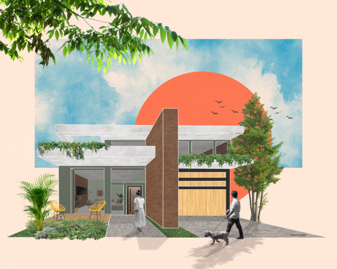
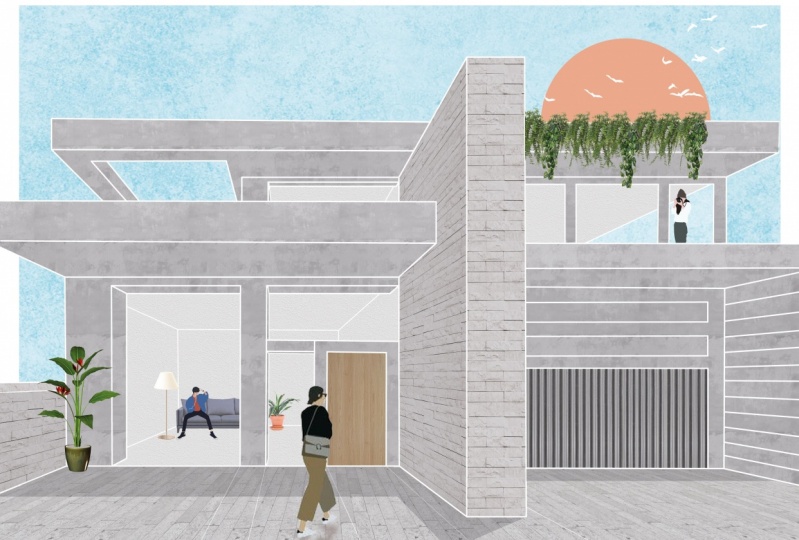
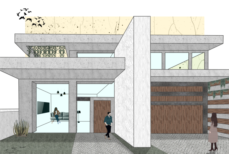
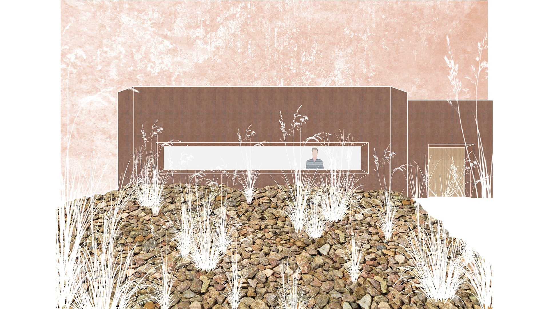
4. Part I Adding Material Textures: part one adding material textures. So here we're going to add some concrete textures to stop us. Quite modern buildings. I'm going to give to my folders have textures. I'm going to get into the concrete. I think this concrete is really nice. Pretty smooth. Doesn't to industrial. I see the grain is quite big on this one, so I'm going to make it a little bit smaller. Sweet. Okay, Now we're gonna want concrete. In a way. These areas here say something we can do. It's first of all, we're going to rast arrays this concrete layer down here. Then by hitting control way, we're going to make the selection of the whole screen holding down. Oh, clicking and dragging and then controlled the to this de select. We've now double duplicated this concrete in the same layer. Say, I'm going to go control a on I am just going to paste this concrete across the entire during on to speed this up are being control a again just to select all the concrete. I've already placed whips, and that's it. If you get something wrong, just controls that and get back. Okay? Perfect. Now to see the drawing I just want to reduce the capacity of this layer. We can reduce this over here in the A pass ity by bring it down. Or we can also use a shortcut keys for rapacity. So it's all the keys between one and zero. So, for example, if I hit five, the apply city is going to be set 50 eight on 80. If I hit eight and five in quick succession, is going to set the A busty to 85 zero being 100. So I'll hit two on Bring the capacity down. So I mean to click on the drawing layer using the Magic 12 So by holding down shift, we can Manson things to the selection like, sir, So all these areas, I'm going to want to be in concrete now that I've got the main areas that want to add in concrete texture. I'm going to go if it's the concrete there and hit this little button down here on the bottom, right on to lay a mask. So what this is done is it? Had has added another layer on top, which is black and white. The white areas of that layer is where the concrete will show through on the black areas is where everything else is just gonna be muffled out, covered up like a blanket. Almost so I actually want to add a couple more areas of concrete. So we're going to go into drawing layer and we're going to select these areas of concrete like this one. This one now toe, add this to this mask selection. We're going to paint this mosque white in the areas that we've selected to be Click on the mask on. We selected White down here on with haute I'm back space. We have painted those areas and white and you can see but they're concrete has shown up on these areas. So now here I'm going to add, like a slate texture. I quite like this white slate control Plus giving you that zoom into the same way we're going to rasa rise control way and we're going to copy him. Taste like sir. So again, we're going to select that on DeLay a mosque. Perfect. This here is going to be something a bit more challenging. This is because this fall loses perspective, so we're going to have to have the stones. Following that perspective of why is simply not going to look realistic at all. So again, quicker, more drag, reducing the capacity on We're going to do the same move. We're going to Rast Arise First control a clicking drug across So brilliant. Okay, so if we hold shift whilst using the move toe, stick it to that so we can move it up or down. Great. So now what we're going to do as we're gonna do control T, and whilst holding the control button, we can start moving it. Sit, fits perspective control. Plus to see the zoom. No, this looks a little bit stretched. So by holding control on this one Yeah, I'm just going to make it now. That's it. With this process, it's really just a matter of trial and error on. You don't need to get it right the first time, but I think that's pretty much perfect. So I'm going to about to drawing layer, hit the magic wand on the slate wall on apply the mask. I'm going to go and do the same with the slate over here. Well, uh, I forgot to add the concrete to these areas. Will go back. Uh, concrete. I'm going back to the concrete layer. We're going to point, and we're just painted like, sir. Okay. And then we'll move on to the interior textures. I'm pretty going to go with this. Stuck it here. Great pasteurized control way holding the shift If you just wanted to go across for the interior spaces that we're gonna have this this render across, okay, that's looking really cool. Can also going to add a bit of paving across the front. So again, I'm going to repeat this process, control T and then using control here again, stop moving the paving, like, sir, trying to get to behave how we wanted to like so. And this here is really just that, um, exercise of constant rejigging just to get it right again. Our little exercise I like to do is turn the drawing off on. We can see the different elements of the building coming up. Now. Don't worry about the fact that there's not too much contrast between the building the interior just yet. That's we're going to be resolved later on
5. Part II Adjustment Layers and Organization: part two adjustment layers on organization. Okay, so now we can see that we've got quite a few layers building up. So what we can do is highlight with these letters, clicking this one holding shift and then heating this one. And to put it into a group, we're going to control G. Now, we might label this group building materials great. And we can also go in on give it a little color as well. So let's give it the orange color. Then we can find the building materials on their win here can go in the relabel, these things if you want, but more or less the building materials. Oh, here. Now I'm going to add some materials to the doors. I quite like this corrugated metal sheet for the carriage. So using the same technique as earlier, if the control way drinking and drugging across, highlighting it on making a little clipping mask. Okay, great. Thanks, sir. On. I'm going to do the same here on the other door. So I'm going to get this metal. Great texture reduce in size. Wrote tear like so, Holding shift down locks of rotation. Great. So now we have the door on the carriage door? No. As we can clearly see these far too dark on, Do they stick out way too much. So I'm gonna put them in the same layer. You're in school doors on our probably give in. Make it a yellow color. Great. So something we can do is for this corrugated metal door fest. We cannot an adjustment layer, so hue and saturation. Okay, Now, if we change issue in saturation here, it's going to change everything in the document. So what we're going to do instead is we're going to with the saturation layer above the layer targeted layer. We're going to go control O G. And you can see this little arrow. And it's linking this adjustment layer to this layer here case. And now when we change the lightness, you can see it only effects that. So I think we're going to bring the lightness up quite a bit. Maybe toe 50. Well, sir, And this is just going to give ah lighter effect to this carriage door here. We're going to copy on do the same here. Andi, with control G. We have linked it to this front door. No, I think as a front door That's a little bit too light So we can go in here double click this Onda We can change the the lightness again. So that's it. There's really interchangeable. Andi can change things. Nothing is set in stone. I think we're going to give in on change. Brightness and contrast is well off this of this late war here. So if we want to find this layer, we hold control and click it and it would take a straight to that layer, you see, So I think here we're going to do a bit of brightness and contrast Adjustment layer on again control or G to link it to that slate war If we play around with the brightness and contrast a little bit if we bring the brightness down maybe two. 20 and we play of the contrast as well keep the contrast down So that ca minus 12 Now you can see the difference. This stone is much more visible in this layer as it is here. So we're going to copy the brightness and contrast on Do the same for all of these Slate. What was really so here control G and not forgetting this late war here. So trying paste control, g great. So now we have it. I think I'm going to give in on change. A couple of things, perhaps, sir. I'm going to go back and make these doors a little bit later because they still pop out of it too much. So pregnant for the lightness. Up to 55. Get here and do the same for this one. Maybe 50. Yeah. Perfect. Now I like to tend the drawing off now and again. Yeah, that's looking much more in keeping. I read like this. This is looking really cool. I'll see for the next part.
6. Part III Bright Skies: part three bright skies. So in this part, we're going to be adding a sky. If you could have guessed that, So we're going to get I've really got a little blue selected. You can get around looking for different kind of colors on Go for Blue. Somewhere around here would look quite nice with haute backspace. Feel the entire canvas hit to reduce e apostasy just so you can see and then going on the drawing layer with the magic wand, we'll add all the areas to the selection that we want sky. These areas here is the area of sky we're going see through the windows, so we're going to get to the layer and to mask case, just bring the A pastie like eight. Now this is looking nice labor. This is sky blue. It's looking very nice. We'll make a new folder. I'm label it a sky neighborhood. It's blue Cool. So this guy's looking very nice is blue, but it doesn't really look realistic at all. Sky is never just a single color smooth color, so we need some texture. My folder here, I've got the miscellaneous textures on. You can use different ones, too, given the fact maybe like a smoke or some crinkle paper. Looks nice sometimes, but I'm going to go for the grunge texture today to drop it in there. I'm just going to just like, sir sit covers the entire canvas. So with this one, we want to add this grunge textures to the same areas that we have sky blue. So there's a short cut for this. We can click on the mask, right click, and then add mask to selection. Go to the Grinch texture. Andi, create the mask. Now we're going to use a blend. Note these things here I usually like over they think overly looks pretty cool. Onda. We can reduce the A pass ity of this and that. And I think we're probably going on make this darker as well. You know what? We're going to go and make this just a little bit darker, like sir Oh, backspace again. Okay, I think that's looking really cool. Um, I'm just going to reduce the a fast you bitch. So it's not so strong in your face. Okay, That's looking like a nice texture. We've got maybe some in the indications of clouds here. Some some dark spots is variation, but it's not too much in your face. Now, I just had quite a Kuwaiti. If some compositional elements I think if we have a white border around here, it will look really special. So with this, the marquee tool we were just make a selection right about here, and I'll try and get it even on the sides. You know what? I'll do that again. Maybe like this this time, Like sir getting even on both sides. Okay, Wicked. And then I'm going to hit control shift, all right, to select the inverse. So a with the opposite of what we selected before, I'm going to go to the sky blue. Start with and then I'm going Teoh, select black over here so we can go to D switches black and white and an ex switches east to around like we showed in the short cuts. And while selected in the lay a mask, I'm going to get control. Sorry. Oh, I'm back space, and that's gonna fill it black. It's just gonna hide everything behind there. I think that looks really cool. Compositionally if we switch off the drawing like, say, it gives it a really interesting effect. Because here it gives a very dynamic composition to this piece where it looks like these are just flying out towards you, and it really shows it highlights that perspective. No, I know it's not looking particularly realistic right now. We still need to add shadows and so forth. But just before we do that quite like to add something up here, Maybe maybe some birds. So I'm going to get everyone back. Hasem on the moves, and I have some birds. Perfect. So we have the magic 12 I'm with the tolerance set to about 15. No, we'll set the tolerance about 30. It's going to highlight all of this. In the end, we need to rast arise this layer on delete just left of the birds. Perfect. No, I'm going to reduce the size of these birds. Maybe like that, And I'm also going to right click on flip horizontally. Quick matchy increased the size of these birds a little bit. That looks really, really cool. I find that quite interesting, the way these birds overlap into the white and it makes it a little bit more dynamic as a piece. Okay, I'm very happy with the way this is looking, So I'll look forward senior in the next part
7. Part IV Shadows and Creating Depth: part four shadows and creating depth. So of course, this looks really flat at the moment. So we need to add some shutters again. We'll stop a new group on labor. The shutters, I think. Here we need Teoh. Yeah, we need to have it is great suit for shadows Elect Have couple different layers of shutters . So if we do sh other one or if we say light and then if we make another layer shudder medium there's also going to be the ground shudders which is reflected by the sun. Great. Okay, so for the light shutters So the's elements facing towards us, it's going to be ah, light kind of shudder. So what I like to do is by hitting d, we're going to reverse this to black and white over here on X to scroll through these down here. So the black we're going to fill by backspace and we're going to bring it down to about 12 . Okay, and then the same as before. We're going to use a mask to select all the pace is that we want to be that particular shudder shudders medium. I'm going to repeat the process and set the capacities of 18 I think around 2018 dancing on . Then I'm going to go to find Yeah, yeah. With these places goingto have this dark each other tooth. So okay, we have these two layers of shadows on. We can see that it's already given a really cool effect. Maybe more. Reduce the shadow light. Maybe we'll go back down to 10. And they were. And yeah, I really like the way this looks. Maybe we'll go up here to 20. So this is going to give us quite a cool distinction. Will keep it 18 and 20. So 18 on 10. But you can experiment and get it just how you like it. So we're also going to do another layer shudders interior? No, for artistic effect. I want to do a different kind of shadow for the inside here. So again, by painting this kind of split, Andi would just make it invisible For now, we're going to get to the drawing, laugh and select all the interior. Now the interior selected will just make a mask and I'm going to go into blend modes. Andi, I'm gonna play a round of these, but I think soft light. It's pretty interesting now if we turn the drawing off and then we can see the difference. Yeah, that looks pretty cool. I said. It's about 70. Well, that looks really good. I'm very happy the way it's coming out so far. So now we're going to add some ground shudders. Now I think the sun's going to be coming up from the top, right hand side, aunt slightly from behind the building. So that's where there's some shade here and so on. But maybe the sun's just cresting the building, so it's coming from quite a high up angle. So if I get a line to great, I'm just going to make this visible again. I'll put the line on its own kind of there. Maybe I want the same coming in this kind of angle here, sir, on the ground shudders there. I'm going to paint. It'll black again. Andi, for the moment, I'm just gonna set a really low capacity on using the lasso tool, which is short l I'm going to give in here, Andi, I'm going to more or less follow along this and get a really cool shudder effect. So here we're going to follow to about there, and I'm holding shift just looking this to about here. So this isn't the area that I want to mask, so I'm going to hit that. I just need toe remove this here because I made a little mistake. That's cool. Everyone makes mistakes on for thing about phases. Shop is you can just go back and change them. You have to live of your mistakes. Great. Can't switch on that. So So Okay, that looks pretty cool right now. I think I think I'm just gonna move this shutter forwards a tiny bit because this overhang here, it's it's pretty big. So it comes Or the way to here getting back to ground shudders. Yeah. Brilliant. That looks pretty pretty cool right now. So they were going to come across likes. Yeah, and we're going to add that to the selection. Now we can go and delete or hide this line. Now, if we go and look without the drawing on Yeah, there's shutters. Really cool. Just gonna go in in here and fix this thing. Ready. Quick. Great. Really happy with how that's looking so far before the shutter is at it. Uh, but there's a couple more things that I want to do. So the shutters really hard at the moment. So we're going to get to the ground. Chuck, who's layer? We're going to go up to filter below coursing blood. I think if we bring it down to about 2 27 did that effect? Yes. So you can see if we zoom in. I don't see the difference here that's more realistic of a shudder. Maybe even. Yeah, that's that's brilliant. I really like this effect. So it makes it a little bit of a soft each other. And also, these birds are gonna have a little reflection as well, so into its a sky going to select these birds. If we hit control J, it duplicates the birds on. We'll put the birds into the put the buds into the shutters. So now the birds are copied. What we can do is we can control t. We can flip vertically and we can flip horizontally, just basically. Okay, So, like this, we're going to also give it some distortion like this because the angle of the sun being about like that perfect and I were going to drag Onda. We might see some birds around here, like sir free him. Okay, Andi, if we reduce the capacity of these birds so they match the the other shadows like that and we're also going to give these birds photo another Gaussian blur and that's applied that Blair, if you can see there. So that's looking really realistic or she that again So se no Ebola on with the So that's perfect. There's one last thing Now that I'm looking at this If the light spots on the sun is on this side then the brightness of the sky here just looks a bit off So we'll go to the sky Going to the grunge texture on If we hear unlinked here perfect best yet and then control teeth and will flip horizontal Wow. Can you see the difference already If I change that back for you? See now this really looks like the light side and this dark side, Andi while so happy of this, I'll see you in the next part
8. Part V Furniture and Foliage: part five. Furniture and foliage. It's a funny Tyto. I'm going to be adding some furniture in here to create a little room. The living room. I'm thinking, Andi, We're also going to add some some plants about the place because his building looks really nice, but it's looking a bit too ordered. We need a bit of chaos that comes from plants, so we're going to go to furniture. Start with, I think, putting a safer down the coolest thing. So we have these two sofas, but I'm going to go for some here. Untested, put into new layer is that you start in your group is. Or for that Fannie chair, make furniture read, we're going to Rasa. Rise it like always, and then we're going to just delete just going to go and delete with shadows. Perfect. So now we have the sofa on. I think we will reduce in size like this, and then we'll have to zoom in and have a closer look case of this furniture. This sofa, it's just looking a bit too big right now, So if you do it like that, considering that it's gonna be sitting in the back of the room. I think we could do that a little bit bigger. Like, sir, I think that looks really cool. So I'm just getting Teoh use store here and just find where it gets hidden control shift. I select the inverse. I mean, the mask it case, and that's are so for there. Next, I'm going to find a standing lamp quite like this one. So we're going to use this one. I see him out, make it much, much smaller, like so. And we want you human again. Rest arises. Slough. I think we need to reduce the tolerance. It maybe 15. Yeah, we can go for you and just delete these elements of the lamp. Um, if you see here, it doesn't quite fit the perspective when we have it. So I'm going to use this tool. I think so. Control T just holding shift. Just gonna flat in the bottom of that. Maybe even a little more, actually. Right. Put it behind the sofa. I'm gonna have to reduce in size quite significantly. Fantastic. No, A TV. So we want this TV to be up on the wall or so we're going to have to change perspective and remember experimentation. Keep trying things out until it works, and that's perfect. So now we're going to want to reduced the saturation little bit so they don't take up too much attention. I'm actually going to do this separately to the different elements. So, so fat. First, copy and paste. I don't want to touch a lamp as much. I'm going to leave it pretty similar to how it waas and then the TV. I want to change quite a lot because it's far too dark, like so fantastic. Now I think what's missing is layer of window something to reference a window, at least. So I'm just going to make a new layer. What I like to do if this is paint whole kind of swiped, set it down to 10% and going back to the drawing. I like to I like, oh, these areas. Which window Andi you can see just adds a suggestion of some kind of pane of glass between us, even 12 labour. This is window Now. If it's implants, I think we could put a potted plant somewhere. Yeah, I really like this one. So I'm getting Teoh right click color range with fuzziness about 30. Go and delete Well, rather asteroids this layer on to delete. No way Rid off most of the white here. Or at least a noticeable amount of the way we can just put this plant here in the corner. Fantastic. That looks great. And it's pretty in keeping move off color range of this building. So I'm happy of that on. I think maybe we can have some sort of ivy or something, just a balance. So a good rule of thumb is if we have some, some green and some village here. We should have some on this kind of side just to keep the visual weight to this image. So for the I V, I'm going to actually make a new group on going to score that ivy. Just because with Ivy read like to labor on, that gives us a lot off layers to work with. So what I'm going to do here, some I So I like these two because we can lay them quite a lot, So just get this. Would you sit in size? I'm going to right click color range. Remove with the white to leave that here for now on. I'm just going to control J on. I've made several copies of these. Great. Now I'm going to the hanging ivy small. And this will really allow us toe have some contrasts and shapes, forms, colors that's gonna make the plants look much more realistic. And again control J make some copies. Okay, so get start on favor here by controlling clicking. I'm gonna put this one here. I kind of want an overlap here. Suggests a growing from the roof on this here really just becomes a process of experimentation. And Andi layering different IV's together. I find this really fun. I mean, here, I'm going to make the selection control shift. I I'm just going to add a mask to this one. So it looks like it's growing from behind this element right now. This sticks far too green at the moment. It draws the eye just too much from this piece. So the hue and saturation control o g bring the lightness down. Bring the saturation down a tiny bit. Soon it's 10 in saturation. Maybe like 15 here. Fantastic. I'm also going to put something on this potted plant is well like sir, very happy with the way this is looking. And so join me in the next part on. We are going to add some people to this.
9. Part VI Adding People and Inhabiting Spaces: part six, adding people inhabiting the spaces. So for this one, we're going to again start nuclear making your group on. Cool it, people. It's given nice color as well. Five. Cool. So I can envisage about three people here. I want somebody in this kind of area a person sitting down here. Andi, maybe someone up here gets like a nice triangular composition to the peace of the people. So we need to get to my textures into two people standing at first, I'm again into the for somebody like this guy. Perfect. So this guy here, it's going to be walking into the scene like, sir. Now it can be a bit hard to figure out the right perspective in size. So if he was here, just like to match up with a couple of things, he be this big, Okay, that's about it. So we'll put him here. I just entering the scene like that. Cool. So with just going to reduce his that will keep him as he is, we're going to give him a cool shadows, will control J to duplicate him. We're going Teoh a couple of things. So you guys flip him vertically like, sir, we're just going to skew him to the side. That's a bit like that. And also compress him. Because of the time of the day, the shadow is gonna be coming up from above. Right? Put this underneath on we go to hue and saturation on. We're just control. G Make him black. Completely cool. Probably had another adjustment layer. Here is a brightness and contrast. You can just reduce the brightness. Make it pretty dark as well. Great, sir. His shutters that came bit like this. You want to kind of match it in shades? Maybe like 25? Yeah, about that I think I'm going to make him a little bit wider or his shudder a little bit. Why they released? So, yeah, that looks really, really cool. Something else we're going to do is we're going to give it a blood. So I'm going to get to left. It would seem the maybe give him a blur of life. You can see down there. It's changing as we do. Maybe a blur of four Cam. Very happy with the way this looks right here. I'm just going to to hyun saturation on that guy. They can. Tiny bit lighter, like sir On. Also, I want to make this bag a little bit lighter. So look at what we're gonna do. We gonna do another hue and saturation. Andi, we're going to select the mask. Well, sorry. That bag tro shift I when you see how this mosque is white right now we're going to paint everything else block so that and he changes that we make here. I ain't going only going to affect the color of his bag, you see? Pretty cool, right? Uh X, yeah. I really like that. That's that's pretty cool. So that's a guy. And I'm gonna do the other people really quickly. Okay, now, rumor pointing these scenes together Look for a kind of story in that. So, for example, maybe this guy's a brother coming home from school on his sister's up there doing a painting. Um, that make this pretty subtle. - Okay , so now that the people are in place in this, we just need to bring the windows up, like so, so that we owe part six and we have finished piece. We have a little story going on with the people here. We have the materials in place and foliage. I'm very happy with the outcome of this
10. Closing Video: well done for committing till the end. You're already a winner. Now, remember that students that get the most benefit from this class, other ones that engage and take part. So for that reason, have a go yourself using the drawing provided in the resource section or one of your own. I'm genuinely so excited. Can't wait to see your results. So please share them with us in the class when you don't be courageous with these renders. Here's when I did have a stormy night using the same drawing. So please subscribe as I'll be showing you how to make this one in the near future. Yep. You learn some more advanced for two short techniques which will help you progress even more. If you enjoy this class, please take face. Seconds. Neither of you down below. It really helps us out a lot. Thank you for sharing your last hour with me. For now. Goodbye
 Vicente (Vince) Baum