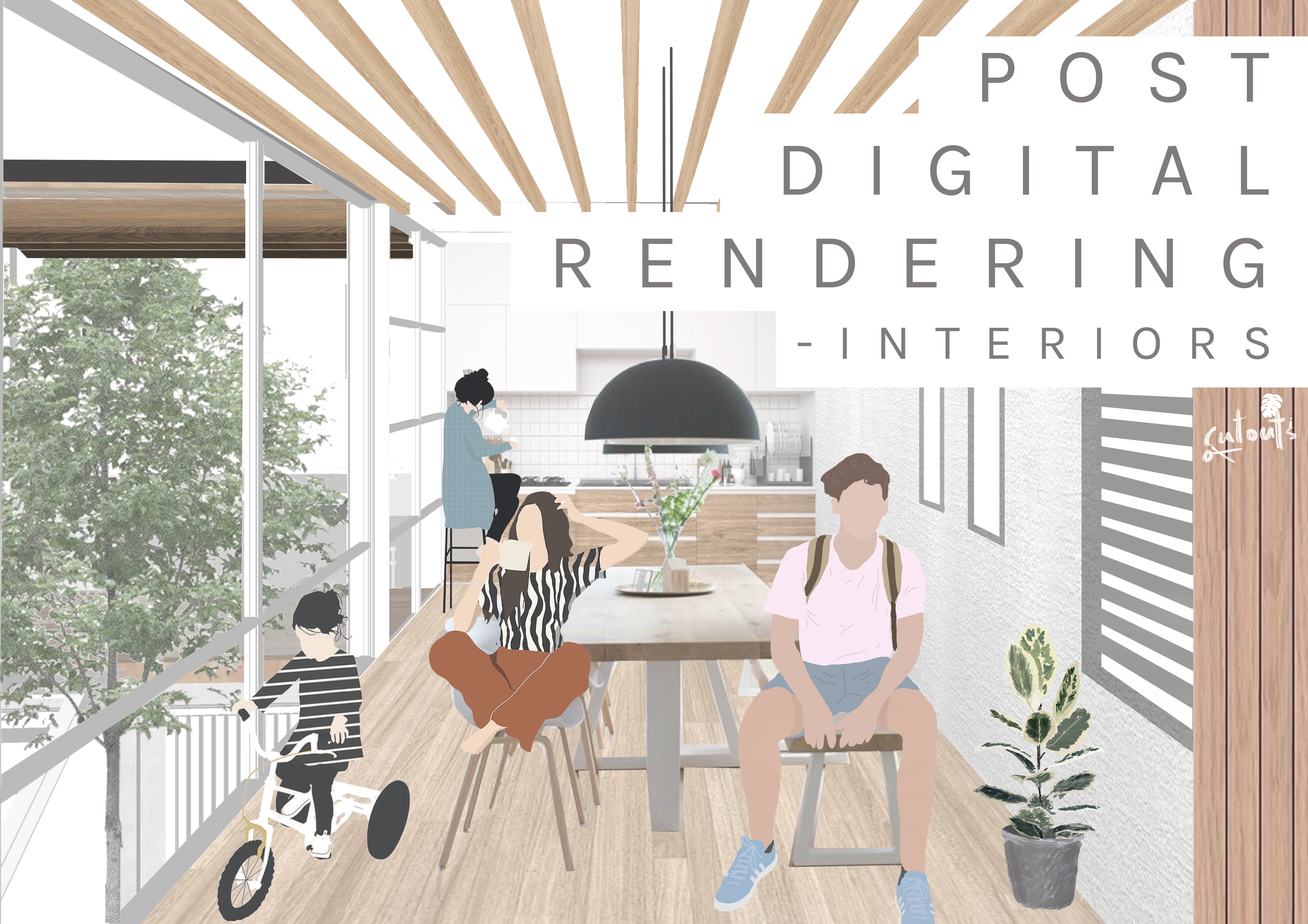
Transcripts
1. Intro: Hey, I'm Vince bound, and this is architectural rendering and Photoshop visualizing landscape. I'm on a mission to teach you everything Island. During architecture school. In this video, you'll be learning how to create a render really innovative landscape, giving a sense of scale to the view and seriality and atmosphere to the piece. This class is for anyone who's interested in using pert shop to create awesome architectural images. That can be a student or a professional or a hobbyist looking to enjoy some educational downtime for this class, It's a good idea for you to be familiar with some of the basic features of those who shop. That didn't worry, I'll be walking you through the process step-by-step. After completing this class, you haven't forced and render that you cannot achieve a beautiful image. You can choose your friends and family. Like I think your grandma is going to be particularly proud of you. You're going to be a favorite grandchild at the seamless, so talented.
2. You Will Need...: Along with the license of Photoshop, you didn't need the drawing up a building to work with, to follow along with me. You can find my drawing in the project section with this video. Feel free to use your injury. In fact, I'd recommend that as it makes it even more unique. Remember sprint off the command shortcut keys found in the project section below. This is going to make your workflow so much more smoother, addition, much, much faster. Keep that next you print it off. Have it on your phone, anything like that. Just keep referring back to it. Good-quality textures we're going to make or break your Photoshop rendering. So it's important for you to get the highest quality tax she's worked with from the very stuff. You can go these up on the library so that you learn to look for new ones every time you want to do Niepce was, Oh, I'd love to share my texture library with you. I can't do this because reasons, so you're going to have to find them yourself. But don't worry, I'm going to show you how to use some tools in Google images to find the very best quality section. So now I'm going to show you how to get really good quality textures for your renders. So in Google, you might look up the texture that you're looking for. So we're going to look up for a grunge texture. We're gonna go to images. Now. Here we have images of varying different qualities. For example, this 1600 by 350. This one a little bit larger. The bigger the number of pixels down here, the higher-quality the image is going to be. So in order to filter out these images by quality, we're going to go over size and click large. This is going to give us a grunge textures that have the highest number of pixels, 3000 by 2000. This high-quality means that when you stretch it, when you make it bigger on your Canvas, it's not going to pixelate as easily. Because as more information, as more pixels, It's a higher-quality. This is going to make your renders significantly better than.
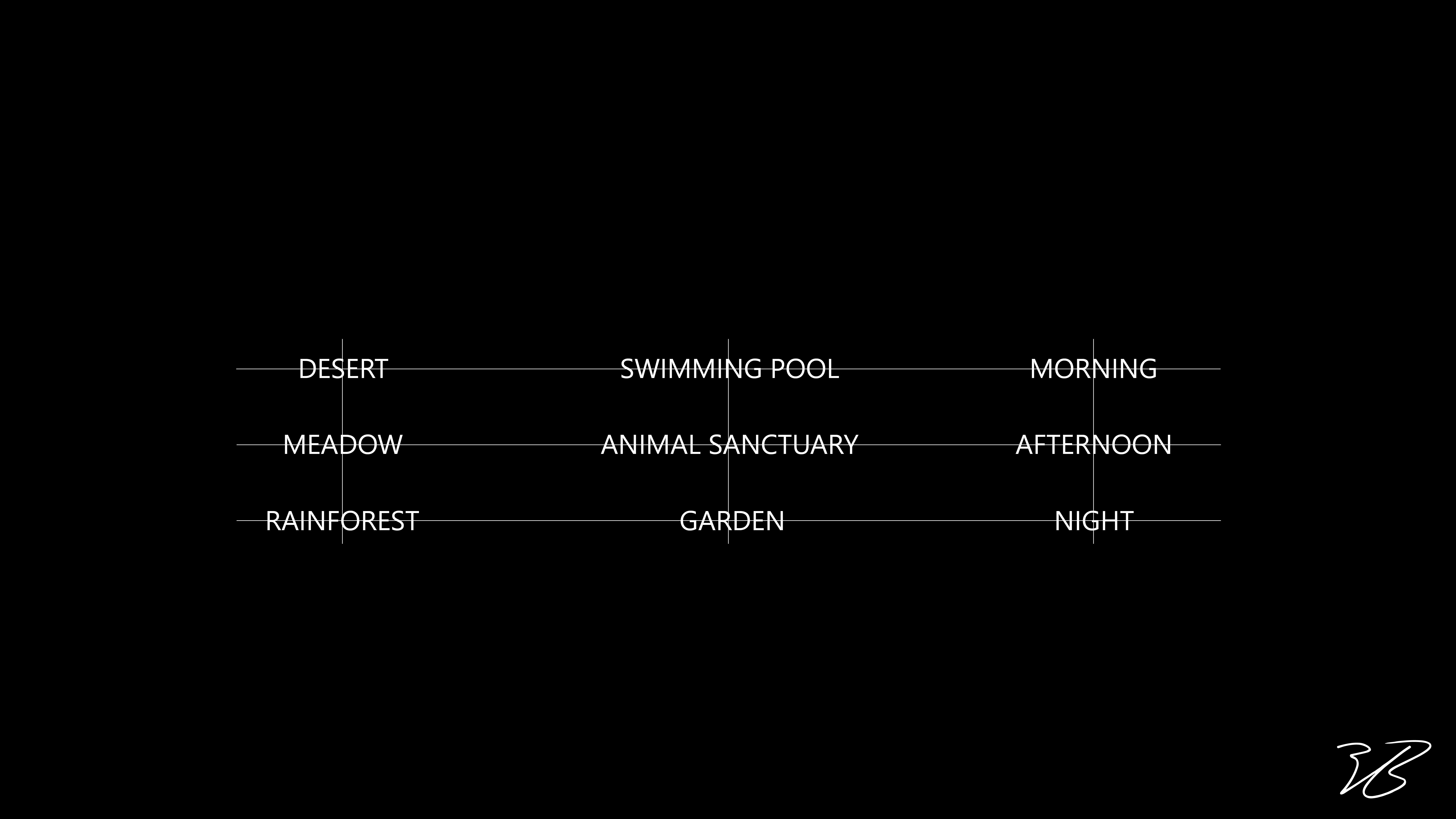
3. Your Own Project.: So for your project, please follow along the process on screen to get results similar to this. However, I encourage you to be neat. Try different textures, try different themes for your collage. Play around with it to give you some ideas, I put together this matrix of climate, activity, and time of day. So for example, you might choose to use swimming pool in a rain forest in the afternoon, feel peace. So before you do anything else, Let me know in the comments below, what combination of climate, activity, and time of day are you going to choose to your render? Remember, students that participate in these kinds of activities make progress ten times faster than the ones you done. After you have a good girl creating random, please post it in the project section Builder is an opportunity of each inspire your fellow classmates and an even better opportunity, EGF feedback on what's working well and what could be improved on.
4. How To Guarantee Success: Have you ever noticed that sometimes you have all the right information to become masters at a new skill. But we still don't seem to make any progress. I need to be honest V, and designing new skills doesn't come easily to me. I often find myself frustrated at the results and giving up along the way. I want this happened to me either. I want to get you some serious results quickly. But don't worry, I'm not going to sit here and let g on persistent and hard work. Instead, I thought I'd share with you some of my first run this I didn't, there is a shops and the hopes of giving you some motivation to get going. You're going to see that they went the best. You're gonna see in these pieces that I worked on over a month as I was getting into know Photoshop that a lot of them are missing the final details, most of them are incomplete. I think what's quite evident to everyone is that I wasn't having any fun was doing. I was really lost. There was too many different information sources. I didn't know where to start. I didn't know where to go. I didn't know what projects to set myself. So this is why I've built this class with projects, with tips that everything for you so that your journey isn't so frustrating and it isn't so painful. I have seen my old work is motivated you to start a more hosted me to keep going. In this new skill. If you take one message away from this whole section, is patients don't expect too much from yourself. They're very judgmental when you self and finish each piece. Even if it doesn't look good halfway through, you might be really surprised at the end result. And completing this piece gets you like that tick and then blogs and it's a number 1 and it builds momentum p to keep going. Anyway and get strings first shot now.
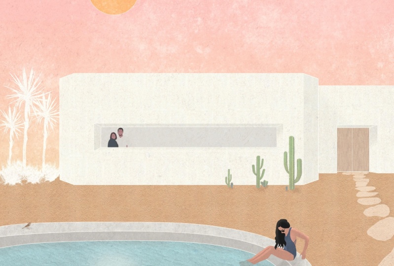
5. Photoshop Class. Building Materials: So the first thing we're going to want to do in Photoshop is to start new canvas. So by doing that, we're gonna go to create new print view all presets. And we're going to go for A3. This is because this is what most portfolio sizes are. We're gonna go to landscape orientation and we're gonna go ahead and give it a title. We're going to leave all the other settings as they are. Control H gets rid of these grid lines, should you happen? So the first thing we're going to want to do is to pull in the drawing. I'm going to open up our files and just click and drag in pressing, Okay, I'm going to hit Enter. We're then going to want to move it to the side. And we might want to re-scale it just a little bit bigger. So by pressing Control T, we can increase the size of that by about this much. Now, this is a landscape render, so we're probably going to want to have more landscape than we have Skype. That seems like a pretty good composition. Start with, the first thing we're going to want to do is to pull in the material textures for the building. To again, to again just go into the textures, dragging and dropping them. And because we're looking at the building from this kind of distance, the texture should be much smaller than this. Because we're not going to see that much variation from this far away. That seems about right. So again, we're just going to finalize the selection either by pressing the tick or by hitting Enter. Here can move around texture. That first, I'm going to show you something. Notice how there's a kind of gradient with this texture. It's lighter here and it's darker on this side. It just means I'm not going to match very seamlessly. 1 we'll copy and paste and loads next to each other. So we're going to want to zoom in and delete the light side of this just so we get a better match. So by holding out and zooming in with the scroll wheel, we get a better view of it. And giving you a two layer section, we're going to rasterize the layer. Next using the marquee tool, which is this one, just a second one down. By pressing M on the keyboard, we're going to select the light part of this texture. About this much. See how this is quite consistent in this side. Eye pressing Delete, we remove that side. And by pressing Control D, we're going to remove this selection here. By pressing Control way. We've selected this to work with. We've actually selected the whole canvas within this layer, which is just this here. By holding Alt, clicking and dragging, we've made a duplicate of that texture. By holding shift, we're going to lock it to this kind of horizontal moving plane. And we're just going to let go of it. We can repeat this process to about there. And by pressing Control D, we've deselected all of it. But we're going to want this texture to be the size of the building here. So what we're gonna do is we're going to repeat the process control a holding O. And we're just going to repeat that. Although like search. Note that if made a little mistake here, he says a white line showing I didn't overlap them or not. So I'm just going to press Control Z and undo that. Just again copy, but just leaving little bit more overlap this time. I'm going to repeat the process all over to the other side of the canvas here. Control a to highlight the whole thing again. And it just makes it a little bit quicker. And we want lots of overlap here. As he gives us a lot of room to work with. Now, we're going to want to see the building behind so we can go and reduce the opacity. Over here in the bottom right, can just bring it down a little bit. That's good. It doesn't have to stay like this for the whole time, but at least we can see the drawings underneath. Another way it's changing capacity is by pressing the numbers along the top of your keyboard. So for example, pressing number three is gonna take it down to 30 percent as C. C pressing seven is 70. But if you want 75, for example, you're going to press seven, then five in quick succession. See that? 0 is a 100. Anyway, I would just take it down to 50 so we can work with it. So clicking on the drawing layer, we can get the magic one tool, which is also selected with W. And we can press this part of the panel here. Everything that we want, the texture to show up, we can go and select by holding Shift, clicking. Loved that part of the panel on the selection. So here we go onto the steel texture again. And we're going to press this button here on the bottom right, the mosque. See its mass out, everything that we want, that texture and left everything else out. Now, this is broken down into this layer here, which is the texture. And the layer mask. On this layer mask, you can see that there's white and you can see that there is black. Everything white means that it's going to show up. The texture beneath. And everything in black is going to mask out so you don't see it. So if we want to show more of this texture, what we can do, we can go back on to any kind of selection tool. So it can be the Rectangular Marquee Tool. And let's say we want the texture to appear here as well. So we can select that. And we can paint the mask white so that it shows up. Over here on the bottom right. You see that we have black selected a moment, but we want to paint it white. So what you can do is you can press X as a shortcut to switch between these two colors, seek. Pressing D also resets it to black and white. If you should be in any other colors like red or blue, so on. And by pressing O and blacks backspace, we're going to have painted this white showing up the texture beneath them. But that's just an example. And we can undo that. Fantastic. So now we can bring the opacity up so we can see what we've selected. Turning off the drawing on and on again, Usha, you, the white lines left and three. I really like this effect and I think it makes it so much cleaner and keeping these black lines on. So the next lecture we're going to add is wood for the story of the hair. So again, we're just going to repeat the process. I'll break it down for you one more time. So again, I'm going to go into our folder and drag the texture into our workspace. And we're going to resize it down. Because if you think about it, we're not going to see each individual not in the word from this far away, right? You might get some impression of texture variation. But we're going to rescale it down so that each texture that we're working with is roughly the same size as plank of wood. And we're going to look at the size of the door and we're gonna kinda gassed up right? After this. We're going to duplicate each texture again by pressing Control 8, holding out and clicking and dragging. Here, we're going to go back in and see the drawing layer. And I'm going to use the magic one tool, shortcut M to select the parts of the door and then going back and apply a mask to that selection. So now we're going to want to organize the files here. So by clicking any layer, we can hold shift and click again, select another layer. Excuse me. So by pressing Control G to group these two layers together. So by double-clicking on the name, we can rename to building materials. And by pressing this little arrow, we open up the selection again. You can right-click on the I here and we can give it a color. I say, that just keeps a file nice and organized for us to work with. Then after this point, we're going to want to add window here. Now I want to make this a really light gray window. Let me show you how we can do that. We can first hold O and the press Backspace on that layer. And that paints the whole canvas black. But don't worry, that was just in that layer. So the next thing we're gonna wanna do is reduce the opacity here. I like to go for somewhere around 5%. So you can bring the opacity down here and a slider like so. Or you could do, like I showed you before, is to get 5%. You press 0, then five, and in quick succession. So now you see that it's again painted the whole canvas and we don't want that. So we're going to want to go back to the drawing layer, a boy again. And by pressing W, we get the magic one to highlight this part here. And just mask layer again, like so. Now if we turn the drawing off, you get this really nice effect. And it's looking pretty snazzy already. So there we have it. The building is complete with its materials. We're just missing some shadows and things like that to work with the early that for later.
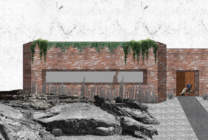
6. Photoshop Class. Non Linear Landscaping: So now we're going to map out the landscaping here. And again, I'm going to drag and drop a texture and I'm going for this graph over here. Now. Believe it or not, some birds really like Nassim between gravel. They make a little burrow in the ground and put them estimate between the rocks. This is really environmentally friendly as you can use boding wastes like bricks and so on, to make it really cool and innovative, eco-friendly landscape between this rock, some, some grasses will grow from, from the, from the dust and from the bird shit that is built up over time. And so it becomes a really interesting landscape. Something really different, and something that you don't see in a lot of places. It goes beyond the traditional grass and so on. So by looking at this rock's texture, we're going to want to change some things about it. Again, there's a gradient from the photograph where it's too dark on the top-left and it's light on the front side. By getting a Moscow and he again by rasterizing the layer. Pressing the Mask button. I see the mask is a white men, which means everything is going to be showing through. So with a brush selected over here on the left, or by pressing B, we can change the color to black. Again by pressing X, switching the colors over here. Everything that we paint black is now not going to show through this layer. So we're going to want to make the brush a little bit different. We can right-click and we can change the size here, and we can change the hardness. How soft the ages. Another way of doing this on a little bit quicker, I'm making it look a lot more professional just by pressing Pope, right-clicking and dragging right and left skewed to increase or decrease the size. And dragging up and down is going to increase or decrease the hardness of it. So we're going to want about 50 percent hardness. And we're going to want a brush about this big to stock so forth. So I just painting big sweeps. We can get rid of these dark areas are going to be much too well. And we can come over and do the same over here. Leaving early these kinds of rocks in the surface here on the foreground. And now the annoying part with this kind of process, we're going to zoom in. Change your brush size again. I'm against want contour these rocks like so. Just so that they blend little bit better when we layer of the textures. Now, you're going to want to do this with a little bit more care and attention than I'm doing it for the demonstration in this video here. But you can go through like this and just contour. This is going to make the rocks blend a lot better. So I'm just gonna go ahead and do that and speed up the process. But feel free to keep on watching. Throughout this process. I'll be changing the brush sizes as you're gonna see. Working with organic textures like these, or say textures that I'm very clean lines. But what I'm showing you here is how to work with these touches. A manipulated in a way so that you can use them in your work. So by pressing V again, takes us back to this Select tool and we can move the texture around. We can see that we've missed. So again, by pressing B, select them and in black, I can just quickly go back and settings. Now it looks a bit naff at the moment, but we're going to play around a bit so that it fits off project quite nicely. So the first thing we're going to want to do is we're going to want to save this because this here is our base unit texture that we can just copy and paste it. But to be done to repeat that whole deleting versus every time that we want to use a gap. So to duplicate it, we can right-click and we can press Duplicate layer like so. Or another way of doing this is by pressing Control J. And it's just copy that again. So we can rename this small gravel stones. We can rename it to base layer. Then we know it's kinda stuck for teach to a grid. And we can hide that so we don't touch it and we can just leave it to cool up later on. So now we want to duplicate these rocks all over the canvas. Unlike before, when not going to be pressing Control a. This is because we have the image and a mask. And so we're just going to hold Alt and dragging click will leave the canvas, really fill it out. You'll see here that we have so many copies. Now we did this because of the masking and we don't want to be working with this many layers. So again, by holding Shift and pressing out, we can select all of them. And just, we want to merge these layers so they're all on one layer together. So again, right-clicking, we can press Merge layers. Now we're just working with one big layer, like so. The next thing we're gonna wanna do to make this look a lot more realistic is to have big stones at the front and smaller stones at the back. So that gives that perspective. Wiki, say by pressing Control T, we can move this around. You can play with these corners here. So normally clicking this is just going to resize him. Okay? But what we want to do is we want to hold control and we can skew it like so. See what I'm doing. It's going to make the back smaller and the front is going to stay the same size. Like say, that's cool, the ski feature. And we can keep playing around with that. It gives the impression that we have smaller stones at the biggest stones at the front. Pressing Enter will confirm that selection. So again, like before, with the building materials within them, one to Moscow as graph what the front. So we're going to reduce the opacity and let's whip, I'm going to press eight, bring it down to 80 percent. And starts he knew mask for this scene B. I'm gonna make that brush bigger again. Remember by holding out right click, tracking left and right sides. I'm just going to real quickly take the mask roughly where I want it to occupy the campus. You're going to try that again because that didn't work so well. Now I'm going to achieve increased the hands here, which again, smooth that out later. Yeah, we're going to want about this much by zooming in, picking the brush smaller niches, that's hard. We can go through and follow the contours of each. Now, I'm not very happy with the coloration and the quality of the stones. It doesn't fit our aesthetic. It looks a bit too dull and I'm muted down. And that's okay. Because we're working with textures that we found online. It's not like we're setting up loads of rocks, taking pitches how we want it. So we have to work with what we have. You're going to have this problem too. So we can go into the adjustment layers and we can change some of the colors to it. So for example, we're getting to one to add levels. By pressing Control O G. We've linked this adjustment layer to only work on this layer below, which is I grabbed who sent. If we didn't do that process, every adjustment that we made with affect the whole piece. So by pressing just here and this little graph, it takes us into the adjustment layers. Now you're going to want to play around with these three slides here. So for example, moving this one up and make it darker. This one that will make it lighter. But moving this one around here is really change a lot for us to see. This is a lot lighter now. Quite like it. I'm just going to leave it as it is for now. And we can always come back and make some more changes to it right? Now. Again, it's still looking really at the moment, colorless and lifeless. So we're going to want to play around with the hue and saturation. And again, I'll Control O G to link it just to this layer below. We're gonna wanted to play with the saturation and then know how it changes the color here. So if we go up to the plus 15, mickey can see the subtle difference it makes. So it really changes the piece which may be bringing the lightest edge to Lecture. See, it's made the o bit more colorful. Became quite happy with this rocky landscape for a moment. So we're just going to go back and organize files again. Selecting, grouping, and labeling it landscape and give it a color. Young shoots up.
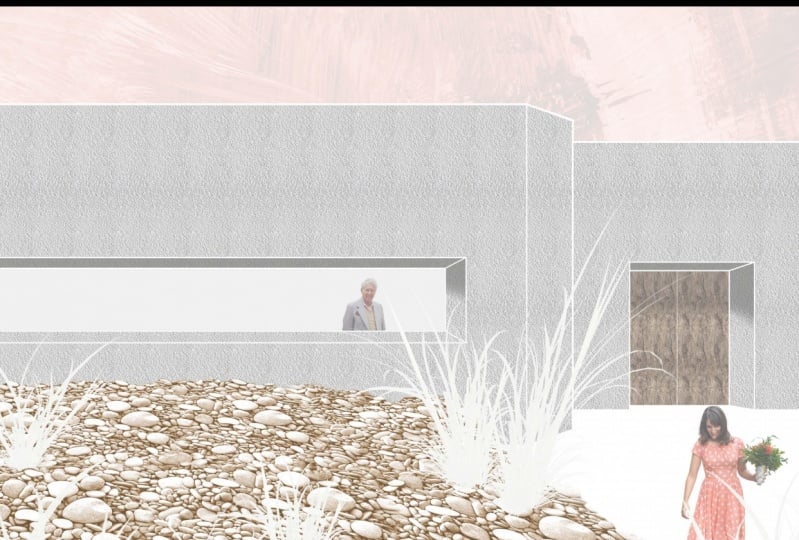
7. Photoshop Class. Sky and Scale: The next thing we're gonna wanna do is add the sky. So again, going over into our files and dropping a grunge texture is always makes for quite a nice sky and we want to resize it. Now. I just want to increase it in a non-uniform manner so I won't stretch it a little bit. So to do that, we can hold Shift. I can just drag and resize like so. Pressing a K for that. And we can just bring the opacity down and just take a look at something. So with the shadows in these rocks and it makes it look like the sun is coming from the top left. You see how the light side of the rock is here, and then the shadows on the plus one, right? So we want to make sure that the sky matches. The sky looks lighter on the top-left and it looks darker on the top right. This is correct. If it wasn't, we could press Control T right-click and we could just flip it like so. But we're not gonna do that so fine. Again, rasterizing the layer. And we're going to want to mask it out. So we're going to bring the opacity right down. And we can make this selection. To make this selection, we're going to want to choose the polygonal lasso tool, just going to give us some straight lines. Also, you could press L to get this. So we're going to zoom in, click and holding shift. We can get locket to those straight lines. Sorry, locking, it's the horizontal or vertical. And by holding space and dragging with the left mouse. We can plan across the drawing like Sir. See. Now here we can overlap the stones a little bit and we can go in and change, have assumed. Oh, scroll wheel, we can go and make this final selection here, double-clicking to finalize it. Pressing the mask layer here. To make that selection with the sky. Want to delete some of this here. So again, brush to fill a black by pressing X. Just didn't meet some of the sky texture here. Spacebar. Dragging. That's looking good, it's in the right place. But now we're going to want to play around in the sky, but I wanted to make it orange juice, it fits for the overall aesthetic. So again, like we did before with the rocks, we're going to want to play around us and the human saturation. So again, I'm going to click that and I'm going to show you what happens if you don't press Control O G. The change, everything for the whole canvas. That doesn't suit us, Not one bit. So Control G is going to lock it to the sky down here. By personal colorize, we can give this grunge color and increasing the saturation as well. I can see that it's moving around and so on. So I'm going to go for about 20. I'm going to make the saturation just a little bit higher. Up around 65. I'm going to leave the lightness as it is for the moment. It's looking a bit faint because of the grunge texture, hair being a low opacity. So maybe we'll take it up to 40. As looking at lot cooler. I like that PC. The difference between the gray and then the orange, they're much more in keeping. I think I'm eating an eraser up to it. A bit more colorful. Fantastic. Now we can see this line here a little bit better than once, make it a bit cleaner. So again, we'll go back to the mask, choose the brush. Just paint it a bit closer. And toxic. So that's looking really cool now, we'll make some changes throughout the process. This is the moment. So again, we're going to just organize these layers, label it yellow sky. So by taking a look at this random enough and there's some things I want to change. For example, the sky looks a little bit too dramatic. Want to dial it down a bit. So again, to add another adjustment layer, this time I want to add brightness and contrast Control G. I'm just wanted to reduce the contrast. Down a bit. So you see the higher is, the more thus the distinction between the light and dark. I just want to fade that down a bit. Maybe not so much, maybe about here. So again, I will just hide that. To show you the difference. It's subtle, but it really makes all the difference here. And I'm going to want to play around these stones as well. So here's a tricky if you want to find out which layer these rocks are and you can just hold Control and just click it. And it's going to take you to the layer that we're working with. Now. I think if we go over to the levels, make these rocks little bit lighter by bringing this down here. And it's looking at a lot nicer. And it just makes the whole thing to look a bit more in keeping another level change. I want to make these rocks hit really bothering me. I just wanted to refine the selection a bit so it looks a little less smooth and a bit more rocky. So again, with black selected, I'm gonna go over these down. Fantastic. That's looking a lot rockier. Quite happy these changes. And now we're going to add a little person inside the building just to give it some scale. And dragging these people here. I say horizon. I'm worried, I'm gonna take this guy here. So we can make this selection, selects this, but we want to delete everything else that we can do. Control shift I. And that selects the inverse, set, everything else except for what we selected. Just press Delete. Now with the magic one tool, I can click. And you have this nice cuts out here. Now, let's, let's get this man the right size. So we're going to press Control T and his head. If the building starts here, this head is going to be somewhat like so looking out the window. So we can put in here. And simply if we can just delete the bottom part, we can just cut them in half. Quite cool. But it has to be done. So and now you remember that there was a window on the inside as well. So we can just bring this down underneath the building materials. And it's going to put him just behind that window. That's looking really cool. Now the last step is to just the grasses.
8. Photoshop Class. Shadows and Vegetation: So now we want to add some grasses onto this composition, so we're just going to drag it in. Hit Okay, magic one tool by pressing W polar range. I'm going to select the DACA policy, this. And we're going to move up the fuzziness until the whole background is white for the image at least a little bit further. And delete. Not forgetting to rasterize before. So now we've removed about Chrome there and we're gonna do the same for the other grass. Fantastic. Now we have these two grasses and we'll put them into their own folder, labeling of grasses. Let's give that little color to organize it as well. Okay. So I don't intend on leaving green and then a play around with the colors later on and just fits a little bit better. For the moment. What we can do is we can select this one and we can start making some compositions out this. So having this one in the corner here, it's going to look really good because it falls in these little seed pods, falls into the composition, looks nice. Or control-click this one. Control T, we can scale it down a little bit. I think this one should be a little bit lower. And I want to flip this around. So remember, right-click, Flip Horizontal. Fantastic. So these are like sir. And now we can duplicate some of these. So Control J and we've duplicated this one. So we're just going to play around with it. A good trick here is to constantly re-size them, skew them a little bit and play around with the proportions. Flip them around just so they don't look like you've just copy them, paste all the grasses together. Say it gives it some variety. For example, with this one, if kinda have that in the corner. It works because we then see this side over here. Draw 3D. Take this one. And we can stop playing around with them like so. And copy again, we can just hold O replace mound. Going to flip this one, make it a bit smaller. I think placing these in groups three is going to look really nice. And something I do want to do is to kind of frame this guy here, remembering that they're going to look a little bit smaller the further away they are to kind of fit in the composition. Little bit smaller half. And we can frame this guy over here by just having plants getting around him. So I think if we take one of these two ones, again, control click it and drag. We can put this one. And it just frames that mana little bit and makes it look pretty cool. So this one Control T, you're going to make it smaller. Horizontal. I think arranging them in groups of three is going to look pretty nice. So you can use the arrow keys just to move it tiny amounts and serve. Just repeat the process until it. So we're looking at now I'm quite happy with this arrangement and I'm going to try out something. A not liking this green so much on this composition. So what I'm gonna do is I'm going to add a hue and saturation control over g. And we're just going to turn up the lightness. Look at that does not look spectacular. Now we have a really clear color scheme for this whole piece. Oranges. From the corten steel, we have the orange and the grunge sky. You have this kind of Sounds stony, yellow, orangey thing for the gravel and the rocks. And we don't have the green kind of contention with that. And then the dash or the blue here is kind of contrasting color to the orange. And it leaves out man, really well-placed. And though I could put a texture here on the right-hand side by the ground, something like concrete or some paving slabs. I think leaving it white makes a really strong compositional statement because that empty space leads you to the front door and the way it guides the eye. Something else I do want to do those for some finished. She is will be reducing this man's capacity to make him a little bit more theory on the solid. Because people are always moving. You have to remember that. And collages, even a person stood still a diagonal move as there's always moving range and associate it with, with, with them. So we're going to do that now. So remember, we've put this man just here. We can bring him down like so. Now look at the difference. C. Now he's not in contention with the rest of it of the piece and I think I'm going to bring him down even lower to fund something like a 50 percent. That's looking really, really cool. Let's add the shadows just to give it that final 3D effect. We could do shadows and in black. But I think we'll look a little bit nicer, is if we just pull out some of these darker orange colors here. This is something the impressionist did back in the 1800s. It makes a piece much more vibrant, as opposed to black, which tends to o the colors. So gave for like the Docker end here by pressing I and getting the eye dropper tool. Start new layer. Make sure we put this layer behind the grasses and everything. So you should remember that in Photoshop, layers on top will show up on top, right? So it creates like a hierarchy. So we're going to go for, for this doc kind of color from the steel here. I think we will do the eye dropper tool again and we'll just bring up the opacity if I take something like that, lovely and bring it back down again. So we can fill the whole canvas with this color here. That's the shadows. Interesting. And we're going to make a mask. And let's just paint the whole mask black for a moment. Then we can go and pick out certain things like the cells, for example. Let's get the drawing backup forgot about one. K is now we can just select areas like this holding Shift. So the sun is on the top left, so the shadows, I can be here and here. Maybe not so much on this one, but we'll change that in the little lip. And then we can just paint this mosque color there is hide the drawing for now. And now we'll reduce the opacity. Here we want select the part of the shadow so that we can take it away by painting the mosque block. This allows for the overhang of the dollar. So still going to be some shadow here, not much, but a little bit. Just paint them white plastic. And we're going to rename this to shadows, light. And I'm against duplicate the layer. And they've let shadows lighter, I suppose. Then in the shadows light to what we're gonna do is we're going to paint the mass black so that they don't overlap when we can answer them, light each other's somewhere else. We're going to be using this light shadow layer to give a shadow river door. We're going to use the lasso tool. Select it. I'm painting that mask him, Wyatt. We're going to play around with the capacities until it suits him with a brush tool. We can make it quite big. Reduce the hardness. We can just come in here and soften this edge, holding the Shift key, logs of brush through horizontal. That's looking much better. We're going to repeat the process of softening the edges for the other shadows that were made. So there we go. Our render is all done and it's looking really cool and so different as well. The white grasses really make it look something special. And now it's your turn.
9. Outro: Congratulations on statements over the end of the class. You already had so many people. Now, if you enjoyed this class, please remember to pay back with neighbor and lever be. Always makes me so happy reading your comments. This project should take you somewhere in between one to two hours to complete. You have to promise me that when you start this piece nature, you see it through till the end. After you finish this project, please post it in the project section down below. No matter how crap you think it looks, it's a great opportunity for you to get feedback until later improve your work. This is called an iterative process, and it's the only way of getting better. Nobody gets it right the first time. I understand it can feel a bit daunting posting your project in this section for everyone to see. So if you feel uncomfortable doing is you can send me a message on Instagram event and scroll down, go to Design. And we can have a conversation now about it work and how to improve it. More than happy to do that. Thanks for listening and keep safe until the next class, where I'll be sharing how to apply these very same skills by creating a larger scale via this project.
 Vicente (Vince) Baum