Transcripts
1. Intro: Hi, I'm Vince bound and this is architecture postage. So collaging Photoshop, creating a mass part. I'm an architect on emissions, teach you everything that I learned during our school. So in this video, I'm going to show you how to take an axonometric drawing from SketchUp on the eager yourself and create a really nice overview visual of your whole project. It's going to show the context, the buildings around the landscape around your building, including your design proposal. And it's going to make a really great grounded image that will lead the way in folk earlier. And this is going to be a walk-through video sharing my workflow in first shot, where I'll be integrating over the top of the tips, techniques and different tricks to make really good. Although we're going to be using quite simple Photoshop tools and techniques that we've learned in the videos before. The scale of this project means that you're going to need a little bit more confidence in bed shop to get a good results if you haven't already, please go check out some of my previous videos. That way you can build up your confidence simpler, it's a shot, and then you can tackle bigger project like this. But anyway, we'll get straight into it.
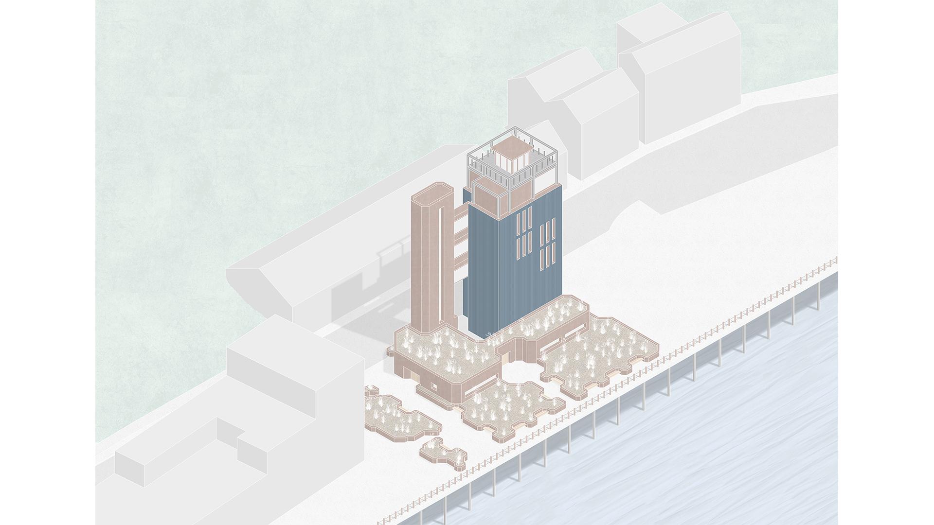
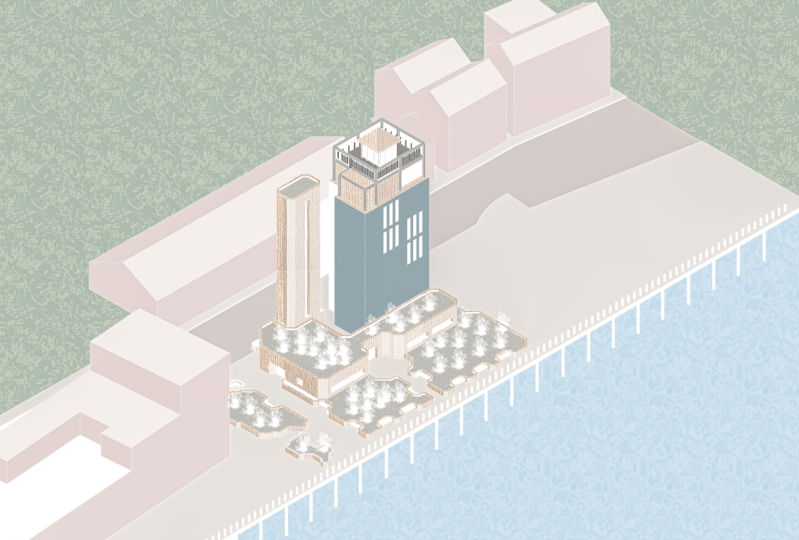
2. Setting Up: In SketchUp, we're going to rotate around the model and look roughly where we want to take the view from. So I'm going to be taking it from this top left-hand side. And then you're going to make sure to go to camera and click on parallel projections. This is because we want to be working with them. Excellent metric drawing, not perspective. Then you just click on the little ISO button at the top. If you don't have this, you can right-clicking toolbar. Click thieves. When moving around the mandrel. Now make sure you hold down Shift and use the middle mouse wheel to pan around and zoom in and out, set the scene. What you don't want to do is change the viewing angle by orbiting the camera around. I'm going to set the view up around here and somewhere a bit further away, the more I actually want to in Photoshop. This is because of the dimensions of the screen is quite long and horizontal, unlike an A3 piece of paper. So you're going to have to give ourselves plenty of space to work around the composition. And very sharp. To save this, we're going to have to go up File, Export, 2D graphic, and we're gonna make sure to set the bottom to PDF. This is gonna give us a crispy drawing to work with. If you have a model to work with, you can go up to Window 3D Warehouse and you can browse a range of different projects and people have made already. You can look at the search bar where you can go through some of the feature community models to get something to work with there for something that seems to have a lot of context to it, sir, a building that's in Situ. And then we have a drawing explore. You can take the straightens first shop if you want. But I've gone further away extra step of taking it into illustrates it, cleaning up a lot the lines and adding some more details. For example, like the PS structure and the bottom where you see those little columns. You see those guardrails I added stopping people from going into the river or what's going to be a ribbon or read, or at least this is a good way of making a model go a long way. So therefore, you don't have to model every single detail. You can just add it to the drawing later on.
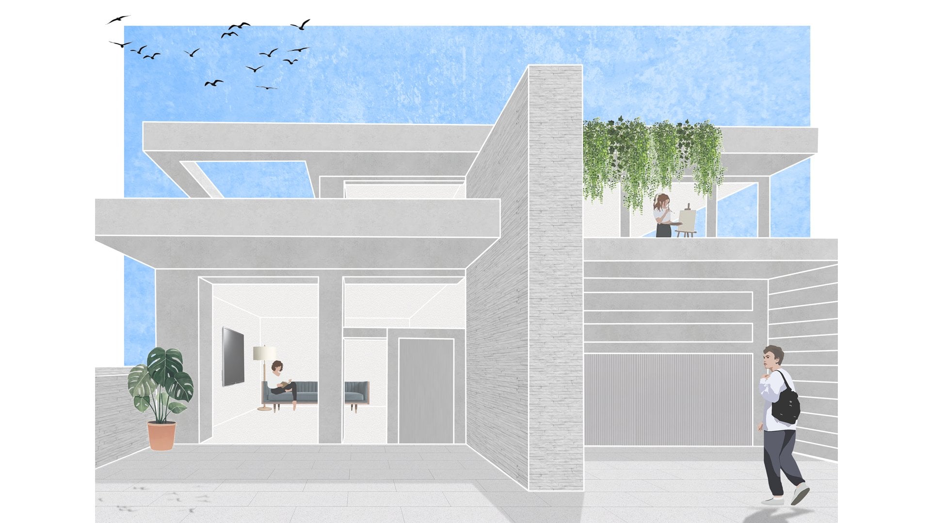
3. Photoshop. Building Materials: So in third shop, again, we're going to set up Canvas in A3 landscape and we're gonna give it a title and create. This A3 format is the usual size book portfolio, and it lets his image sit really nicely. As a way to communicate your whole project. We're going to import the drawing by just dragging and dropping in. And then we're going to play around to get the composition looking right. Now, this is going to involve a lot of judgment from yourself. Your project might be different or you even using my one, you have different opinions and so on. And I usually like to go for a couple of rules of thumb. So I'm centering the project more or less within the page. I'm looking how elements are cut off. I don't want to leave things like, for example, this pitch roof in the context buildings in the background. I don't want to cut that off in this one, I want to show the whole building sure. The topologies around it. So yeah, we're just going to play around and you're gonna make judgments and if it doesn't look okay, but you can always move everything around later until. So the first thing we're going to do is to click and drag textures in to fill out a design proposal. So the first thing is to rasterize this layer when you bring it in. And then after this week, we've talked about this gradient and this texture, but in the video before. So I'm gonna take out the light part of the texture just so when you copy and paste it and duplicate it, it becomes more of an even shade as opposed to having a lot of variation and contrast. We're going to rescale it so that the texture isn't the appropriate scale. We're not going to see loads of detail, for example. And then by pressing Control way, holding Alt, clicking and dragging. We're just going to copy this selection to fill up the whole campus. We're going to duplicate this texture layer four times. And we're going to number it 1, 2, 3, 4. And let me explain to you why. In this axonometric view, we have four very distinct side of the building. So we're going to be masking that material off accordingly. It just makes adding shadows and any effects later on in the process much more efficient. Start off, we're going to mask off all the texture and facing in the direction of one that I highlighted earlier. So in the drawing layer and using the magic one tool shortcut W, holding shift, we're going to add all those faces into that selection. And we're going to click on the Create Mask button after that. And open way if you miss any sides like I have, you can always go back and selection. That's probably very likely if you're using such a big drawing like this, there's a love sides and paste this process. So after the selections down, we're going to create the mask. I'm going to rename the layer just so it's nice and organized and it's very descriptive. So we have material and then we have the number afterwards. After this, we're just going to repeat the process of selecting the magic one tool and masking off each one. So right now we're doing them too. And then we're going to do sign them with three. And side number 4. Throughout this process, I'm going between the layers and back and forwards and adding to each mass by painting white. Just because undoubtedly you're going to miss out a lot of the selections. So by this point, I've added all the materials into the orange steel kind of section. One, working on a large project like this in Photoshop goes organization is going to make your workflow much faster, smoother, much less frustrating. So we're going to select the fourth layers and we're going to group them by pressing Control G, and we're going to call them building materials. After this, we're going to select these vortexes again. I'm going to group them again and call it orange steal. This makes a little subcategory because we're going to have lots of different building materials. Then we can just give it a color by clicking on the little eye button. And I'm going to get the orange constantly throughout this process. I'm going to be turning the drawing off and on again and just seeing how it's looking with the white line in such. Then I'm just going to go back into these layers and just add more parts of this orange steel that I missed out. Again by just going into the mask and painting that wide. Now we're just going to repeat the entire process for the different materials for our design proposal. So I'm going to pull in this blue cladding that the first thing I'm gonna do here is pull it into the building materials folder. I'm gonna create a new subcategory and we're going to call it the blue cloudy. So I'm going to speed up the video at this point so you can still follow along with me without wasting too much time. But I want you to see as much as possible. At this point, I just gave back to the orange steel material and I add into these windows here. This is something I missed out before. And as I said, and I keep saying, you can always go back and change it. This is a very malleable workflow. So when nothing is steel texture, you're going to see me using a combination of different tools from magic wand to the lasso tool, and then also to using the brush by just painting over the mask layer. There are some smoothing consistencies with my drawing with this steel frame at the top. And so that's why we have to go beyond the magic one tool and we have to play around with how we made the selection. And like I said before, using the Lasso tool and the brush. And this is just a way of making it look at exactly how we want it to. So here we're going to use the skew feature on the free transform tool to give the right perspective to the stones. So by holding down Control and clicking and dragging on these individual point, going to line up the texture so that it fits perspective that aligned. So you can, you can just use the bordering lines on the steel frame and so on to give you a kind of guide as to how to adjust this. Using the Lasso tool. We're going to make the selection to mask off in a second. You're going to see that I'm overlapping over these little posts. And, but as a quick way to remove this from the selection later on, it just makes it much faster than tracing around each one of these posts for the moon. So let me show you how to remove that selection. Now. We're going to go and find that layer. And we're going to right-click on the mask and click mass to selection. Then going back to the mask of the stone paving, going to click on the mask layer. And then we're just going to fill it in black. And you see it's removed that area from this lecture. At this point, I get a mask in the steel frame. We're at points. I forgot to add the n. This is just a little correction measure that I'm doing the end. Ideally, I wouldn't have been going through this process, but that's how it goes. You make mistakes and you forget some things in new ways, go back and change that. So for the Windows, we're going to paint a layer black and we're going to reduce your opacity down to about 6%, is gonna give us a really light gray. After this, we're just going to mask off all the windows into this layer. For the wind was remember to make the grain of the wood very, very smooth because you really wouldn't be seen this great detail from a file. Then just simply mask off the doors like he did before with the other textures. But remember to leave a duplicate first he is later on for the benches. This will save you a bit of time so that you don't go through copy and paste again. For the wooden benches we're gonna need to liaise. This is because the texture is going to run in two different directions. Because of this view that represented with we mask out the bulk of the benches. And then later we come back with a small brush set to white reader into that mask. And we just start painting over these really thin strips. As you can see that by clicking, holding Shift and then clicking at another point, you're going to set the brush to make a straight line between those two points. That's what I'm doing. Unlike my previous video where we were very meticulously rubbing out each stone, we're going to be very creative. This one, I'm going to use the eraser tool to just rub out the outside of this texture which is quite dark. And we have less variation. And we're just going to make it really small and just fill up the whole canvas with it and masculine. So to put in the grass is next going to pull in the texture. And then using the magic one tool, we're going to right-click Color Range, click on the background and holding shift, we're just going to click around the Make sure we get all the colors of the background to be erased. Them, we're just going to press Delete. We're going to copy and paste textures at random him, and we're going to make our best effort to make them look different. So we're going to flip them, we're going to rescale them. And we're going to keep shaping around just so it doesn't look like we've copied and paste the same grass Asia all over the place. Of course, that's what we've done, but it definitely doesn't need to look like that. At the end here, we're just going to make all these grasses white. So to do this, we're going to put a new adjustment layer over the top of the grass is for the control G. We're going to link it to just affect that grasses folder. Then we're just going to turn up the lightness all the way to white. And it gives a very consistent color scheme throughout the piece. It looks really, really good.
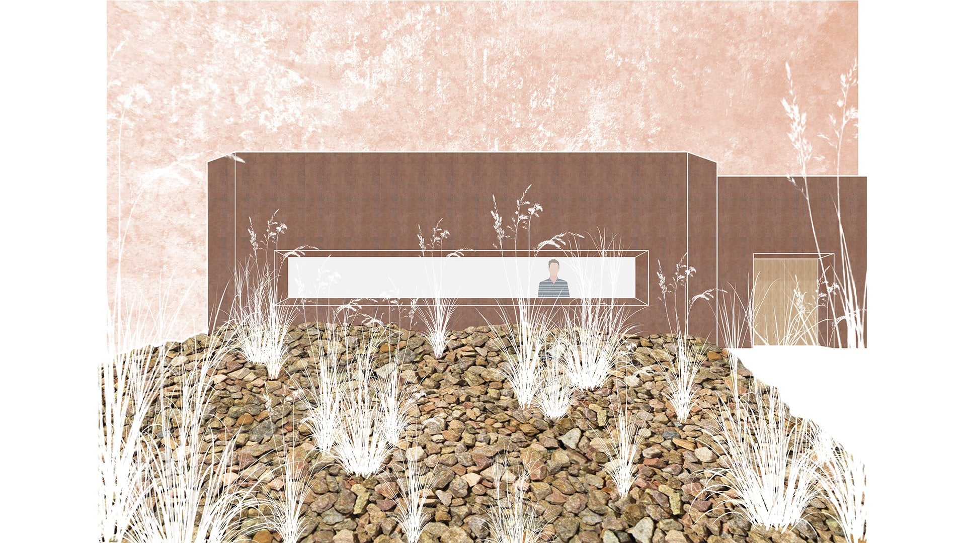
4. Photoshop. Context: So to kick off the contexts, we're first going to be adding the surrounding buildings. This gives us an impression of everything that's around our design proposal and really helps inform it through these, I like to go for different shades of gray. This gives us the impression that the form of the buildings and also scale also. So having a reduced color palette and textural quality, which really focuses in our design proposal. In order to do this, we're going to create four layers of black. And we're going to number them in the same coordinates with our numbering system as before, just to create the different shades and tonalities of these buildings. And then we're going to play around with the capacities. We're going to play around with somewhere between five and 10 percent just to create different gradients of shade. At this point, I realized that I missed out part of the selection. So I go back and just add that in. At this point, I go back and play around the capacities to get it looking just right. Again, this is a point where you're going to have to use your own decision-making, your own judgement. But just keep playing around, keep picturing by the sun's coming from. And keep working at it until you're satisfied. And it doesn't have to be at this step. And it can be at the end of the piece that you keep making changes and refining. Up. Next, I create a new folder to bring in this ground texture. Now, the ground around this building is made of concrete. So for that I get this stucco texture. It's a white render that has some small variation. And it looks quite concrete like when you make it quite small. So again, like the process before duplicates it, cover the whole canvas and mask off the different areas. You'll see here where the drain doesn't quite fit the size of the canvas. I use the angles Small my judgment just extrapolate the drawing and carry on that row texture. I do this with the Magnetic Lasso Tool. And this is something, again, that you are going to have to use your judgment. But you're going to be surprised that you can really maneuver around certain shortcomings in drawings or models and so on in Photoshop. It's not covering up, but it's building upon what you already have. To give some variations to this ground. I add a new blank layer just to overlay maybe a 10 percent pasty block on top of where the road lies. Roads are usually made of tarmac and it makes sense for it to be a bit darker. It gets variation and it shows where people can walk and where Kazaa and the error just go through the process of again, overlaying a little bit of black. Just suggest this retaining wall here on the side. I'm Max, I repeat the process of adding the orange steel, duplicating It's fill the whole canvas and then masking off to the little guard rails that will go in between the walkway and then stopping people from dropping into the river on the bottom right-hand side. By painting the canvas black and then masking off painting the mask. Ok. And then with a brush set to white, really, really thin brush, I'm paying the steel cables that go in between these posts. Again by clicking on one side, then holding Shift and clicking at the endpoint to make a straight line between them, I reduce the opacity so it's not so visible. And that's looking really nice. After this, I get the steel texture in and repeat the process to create the steel structure that goes beneath this steel platform that with the buildings built on over the river. Up next is working on the natural context. So these are things like grasses and the river and so on. So further graphs, we're going to use a grunge texture. Now if this grunge texture, it has quite a dark border to it in a way. So we're going to select the middle and have control shift I. We're going to select the inverse and just press delete after rasterizing, of course. Then we're going to duplicate this. If the place organizing the new layers into context natural. After this, we're going to use the Spot Healing Brush to just clean up these straight lines and just get it all looking a bit more blended and bring the opacity down. And again, a mask off the selection. Here I go back into the grunge texture mask and with a white brush, I start painting over, over this building just to give the impression that it's partially submerged and buried underneath this grass that it goes hillside. After this, I right-click on the Layer Mask, add masks to selection dough into this building's shading. I'm paint it black just to remove the building from underneath. To finish off the grass, I add another layer of green on top and adding the mask of the grunge texture to the selection. I mask off the green as well. And then play around with the capacities until the texture and the color look correct, or at least how I want it. For the river. I repeat the same process of adding texture and then adding color on top of it. For the river, I get this crinkled paper texture and it has all these really nice lines to work with. Again and duplicate the texture. It's fill the space required. And then using the spot healing brush, I smoother over with the edges and also go over the texture just so it's not so sharp. Eye line the texture up with the line of the river. So it looks like it's flowing in the right direction. I overlay the blue and play around with the capacities like the grass. I like to keep these quite think other so they don't dominate the piece and really drill in bringing attention to the design proposal.
5. Photoshop. Shadows and Refinements: The last part of creating a master plan is to add the shadows and add all the refinements and adjustments in color and so on. So we're going to start off by creating a group and cooling shadows. We're going to give it a little gray color, seems appropriate for, for the shadows. And then the first step is to add the shutter underneath this kind of structure. So using the last sue tool, we're going to mask out like this long block of color. Then we're going to go into the mask layer for the layer of the columns. And we're going to add that to the selection. From here, we can go back to the shadows layer and just paint that black in that mask layer. This way, the shadows are only going to appear behind the columns. After this point, we're going to want to add a shadow to the actual columns themselves. So using a soft brush, that is a brush with the hardness, put down quite a bit. And then full black, we're going to start a new layer. And we're just going over the edge of each column. Doesn't matter if it goes over the line and the columnar. Because again, we're going to add the column mask to the selection and just mask off and show the shadow on the actual column. Then we're going to soften up these shutters so they didn't look so crisp on the edge. So using a soft brush, quite large brush for this one. In the mask layer, we're going to paint it black, just save this edge, just smooth that out. But we're going to repeat the same for the communists as well. So it's create the cast shadow. I always start a new layer and with a red brush, I create just some guides. These are two red lines that are going to show the rough angle of where the sound is going to be casting the shadow. After doing this, I get another soft brush, start new layer painted black, create a mask. I'm from this point, again, I just go and create the shadows. I repeat this process for each one of the pages. It's time-consuming, but it looks really affected. So the next thing after this is to resolve two issues. We have the shadow is overlapping, and then we have the shadow is overlapping the columns. Well, so first off, we're going to add the shadow under the PIR gains and that mass is selection. Go back into those shadows that we were just working with. Paint it black to my Sim offering our area. This stops overlapping. Then you're going to go into the columns, go into that mask layer. And that to the selection. And you go back to the shadows that we're working with. And again, paint that mask black in that area. And that's going to resolve both those problems for us. And it's going to look really perfect. Sonata mixing. And we have to do is create the shadows behind these guard rails with the orange teal. So again, I'm going to copy the shutter guide, move that over into position. Then I'm going to create a mask layer and create that shadow in the same way that created the peers before. However, there's so many of these little guardrails, he said that we'll call them The I'll be duplicating by holding Alt, clicking and dragging the shadow. I'm just putting it behind each one. Later on I'm going to go in and merge these layers together. And that's going to save us a lot of time, saves us using the brush every time to create or their shadows. You see that I'm not being served precious when duplicating each one of these shutters. This is because the year isn't gonna see them up close because it's so far away on this piece that it is so miniscule. So there's really no point in spending so much time getting it looking perfect. If nobody's going to see it in the first place, we have other way to be doing during this time. Octet score is a busy place to use your time efficiently. And like I said, hey, you're gonna see me merge these layers together just to make it a bit more organized. To add the shadows to the building. I'm going to create for black layers. Again like we did before. Then I'm gonna go back into all those number 1 building textured materials. So we set up in the first part of this lesson, I'm just going to add them all to the selection. And then I'm just going to mask off the shadow according to each side. C, I said it would save us a lot of time doing it like this because otherwise we'd have to go over and make the selection to each side of the building all over again. But now it's all prepared for us. I finish off with the shadows and then I add another mask layer with white just to add some highlights in some very small places. At this point, everything in our design proposal is looking a bit faded. So I gave back into the building textures and I just increase the opacity just to make it a bit more vibrant, standout little bit form. I also keep messing around the capacities of the shadows until I'm satisfied with how the overall aesthetic looks. Again, another place that you're going to have to use your own judgment and don't be scared to just keep changing around until you're satisfied. And if you're not sure, ask other people and ask them, how do you think this looks good, the shadows and correct, and so on. Not being quite satisfied with the capacity of this gravel, we go over to the layer and I just increase a little bit. So it's add the cache shadows. I'm gonna go back to the shadow guide line drawing. I'm going to align the output the corners. And then using the Magnetic Lasso Tool brush to never kind of tools. And I'm just going to mask off where would these cast shadows coming to. This process does require a lot of your own decision-making in your own judgment. So do it by I have a look how the shadows look and keep playing around until it looks right to you. Adding the cache shadows from the tower onto the road and the buildings behind this by far the most difficult bit. Now, this doesn't need to be exactly accurate. It just needs to portray sent the shadows going on to it. I'm not going for a photorealistic render. Did so with trial and error and try and Marion trial and error, we eventually got somewhere that looks pretty good and pretty reasonable and somewhat believable. And that's, that's what we're getting for him. But you're gonna see me working through this process. I use a lot of back and forwards back. Adding bits, removing bits of shadow until it looked correct. At the moment, the shadows looking a bit too sharp, normally they become a bit blurry when passed onto a surface. So for this, we're going to select the layer. We're going to go up to Filter blur, gaussian blur. And we're going to go for something around four pixels so that it looks somewhat blurry, but it's still holds its form. So there we have it. We have our final Master Plan rendering, and it looks really good. It shows materials, chose compositions, and it gives a whole sense of scale to the whole place. Also, you might want to add people, vehicles, and so on. But that's up to you.
6. Outro: Thank you for saying until the end of this class, I really encourage you to have a go yourself. That's where 80 percent of learning is going to happen. Then Shae, wherever you can get some feedback and really inspire your other classmates. In the meantime, make sure you on Instagram, and it said mints underscore bound to a design that you can see some of my works and inspiration. And we can have a conversation. And I love hearing from you guys. But for now, keep well, until next time. I'll see you later.
 Vicente (Vince) Baum