Transcripts
1. What's In Store For You: Enemy or Japanese cartoons
hold a special place in my heart as they bring back
cherished childhood memories. They were my first
inspiration to pick up a pencil and express
myself through. My artistic journey began with copying characters using
pencils and overtime. I ventured into the captivating
world of watercolors. Now, I find immense joy
in creating fine arts, designing my own characters, and bringing them to life with the fluidity and
vibrancy of watercolors. Hi, I'm beyond pollutes
GI, but Angus Philippines. And I'll be your teacher
for today's class. Throughout his grave session, we will embark on an
exciting journey of crafting our own unique anime character and bring it to life
with watercolors. Are process starts with
crafting a mood board, creating reference images to set the tone and style for
our character's design. Then choose the appropriate
facial features. Discuss the proportions
of the face. Create thumbnail sketches
and color study, practice different
watercolor techniques, and then paint our artwork. Allow me to share this
simple workflow I've adopted for designing
enemy characters. Before, I've hesitated, degrade Fan Arts or invented
my own characters. But this I broke down the
steps into manageable actions. The process became a
delightful experience. By the end of this class, you'll be the proud creator of your very own unique
anime character, reflecting your personal
preferences in color, costume, and overall appearance. When some experience in both pencil and brush
handling is beneficial. Beginners are more than
welcome to join in defined. This class is meant to be and enjoying and enriching
experience for all. So let's embrace ourselves
and enchanting or Lyft enemy. Grab your materials
and let's get started.
2. Class Project: Our goal in this
class is to design, draw, and paint our own
animated character. For your reference,
please download the class guide in
the Resources tab, which contains
different inspirations for the facial features. The phase proportion guide, scanned copies of the sketch and studies and the
finished artwork. This class is divided
into four major parts. Character design, where we will decide
on how our character looks and the facial features appropriate for drawing phase. Where we will create
small studies and finalize the sketch. Watercolor techniques,
where we'll practice necessary techniques in rendering
the character in color. And finally painting, where we will bring the
character into life. Here's what your lead to
prepare for this class. An app like Pinterest or
Canva for our mood board. Pencils, one heart and one soft. I use to H and six B. Eraser. A sketchpad or sketch
paper transfer paper, backing board, masking tape. Watercolor paper. Watercolor brushes. A small and a big
round brush will do. Watercolor paints. The colors will depend on the palette that you
will decide on later. While they're jar. And a rag or paper towel. And watercolor pencils or colored pencils for the outline, though these are optional. So download the class guide, prepare your
materials, and let's create a mood board
in the next video.
3. Character - Inspiration: In creating your own character, it is helpful to reference a real person or another anime character
as an inspiration. For me. It wasn't my
daughter loved the shape of her eyes and the
fact that she was born when the first rain
of summer cord down. So when you create a mood board, please give this things in mind. You can either use
Canva or Pinterest and any other image
editing software. Or if you want to go for
the traditional step up, then print out their
reference photos for the character's pose. Important facial features. The color palette that you wind. Elements are markings
like in my case. These clouds and rain drops will help me define and shape my cat. Once you're done setting
up your mood board, Let's get into the next video and discuss facial features.
4. Character - Eyes, Nose, Mouth: The shape of the face determines if your character is feminine, masculine, or a young wine. Usually female characters have a marker V edge and the features are
closer to each other. While the opposite is true
for masculine characters, where the jaw is really defined and the chin
has a sharp edge. Eyes are farther to the nose compared to
the female version. While, when dealing with young characters or what
legal GB characters, cute version, we usually
have rounded shapes and the features are
really close to each other and the eyes
are really big. Enemy eyes are generally
big and expressive. And more often than not, the color of the eyes also tell us something about
the character. Black and brown are
the most common. While red eyes signify power. And blue ones are generally
used for happy characters. Purple is considered mysterious, while green is
associated with nature. The shape of the
eye also gives the character its unique look. You can go for something
as complicated as this, or as simple as this one. Whichever design you
choose, make IT personnel. And remember that the eyes
are the window to the soul. If you're a character
doesn't have a dominant or a weird nose, then this creature is
the simplest to draw. You can even leave it out
in the face will still make sense since our brains
can fill in the gaps. If we see a set of eyes here
and the mouth over here, we automatically issue
that these characters nose is somewhere around here, even if we cannot see it. Here are some of the
most common nose shapes you can see in anime characters. In anime characters, the
lips are not really defined. A couple of broken
lines will do. But for my style, I love using Manuel characters
lives as a reference. The shape of the mouth greatly
depends on the emotion you want to portray is your
characters are prized, trying, happy,
upset, or oblivious. Here are some of the
most common animal lifts that you can use for
your own character.
5. Character - Ears, Hair, Etc.: Ears often used to tell us something about the
current thirst race. Most of the common ones
are elms and cat ears. You may also go for a rabbit's ear or show this feature if you
wanted to showcase unique earrings that
could be used to identify a character
from the others. Female characters usually
have smaller ears, while male lines have
bigger and sharper edges. Whether it'd be a scar, a gym, or tribe markings. These additional
elements can further define the character
that you are designing. Scars signify battle experience. Hence, strength. Gems can be used for a celestial beings and tried markings to identify
unique group of people. Anything is possible when it
comes to animate hairstyle, which makes Gosling a
lot more challenging. From the shape of the hair to
the collar and accessories. You can go from really simple,
too extravagant, once. Just remember to match it with all the other facial
features that you decide on. The clothes are costume
of your character greatly depends on the
style that you're after. Are you drawing a school girl, a princess, a villain, fairy, or other rural dB? Whichever you decide on. You can add reference photos in your mood board to serve
as an inspiration. In my case, I use this
rain drops as her halo, this clouds as her background. And a symbol just for
a rain god is look. We're now ready to design
our own character. See you in the next video.
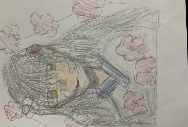
6. Character - Sample Designs: Here are some of the
characters that I designed. This is Rhea. She's inspired by the
bougainvillea flowers. Here are the images
I use as reference. I also use a limited palette
and decided on red eyes. That gave her a sort
of vampire vibe. This is Keiko, inspired by
the forget me not flowers. I don't want this chest over
the details of the eyes, so I just had her eyes closed. I use a different
painting style for her. But you can see
that the reference influenced how she looks. This is the one that I'll
demonstrate in this class. As mentioned before, she's inspired by my daughter
from the eyes, the rain halo and the clouds, her clothes, and
the color palette is a personal preference. They are proof that designing a character doesn't
have to be complicated. Once you think of a person
to use as an inspiration, all the ideas will start
flowing from divine post, features, costume
and color palette. In the next video, let's discuss basic
facial proportions
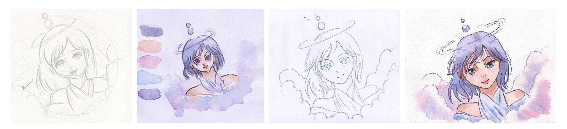
7. Drawing - Study: I have already made other
studies of my character, but I am leaning
towards this look. It's simple, charming,
fit for my character. Now let's discuss the
proportions of the face. Using a to H pencil. I start with a circle divided in half horizontally
and vertically. I'm not really too concerned about drawing a perfect circle, but also making sure that it is not lop-sided or egg-shaped. Then cut out a bit
on the sides for the ears and draw a line just below the
circle for the chin. Using the lines for
the ear is a guy. You can then connect this
to the chin and jaw, the jaw of our character. The horizontal line at the
center is for the brows. And in-between that and the chin is where
I'll draw the nose, the ears from the brow
line up to the nose, and then the neck. You can then plot
the brows and refer to them later for the
width of the eyes. In between the nose and
the chin. Draw the lips. Now for the eyes, you may design
them as big as you want or as small as you prefer, as simple or as complex
as you need them to be. This is the base
proportion that I follow for my female characters. Once you're satisfied
with the guidelines, you can now switch
to a softer pencil. I love using six B and
finalizing my sketch as it glides down smoothly and
produces a dark enough mark. For the final drawing. I also draw the hair. Once I have switch
to my softer pencil, draw the hairline in-between the brow and the
top of the circle. Now, all that's left is retracing the
features on the face, adding details on the
eyes and shadows. I love to add
shadows on the nose, lower lip, upper part of the
nose bridge beside the eyes. And you can also add some contact shadows where
the hair touches the face. Don't forget the
ears and the neck. Finish it off by
completing the hair shape. I've dusted the
scholars ahead of time. I don't really like how
the character turned out. There's just too much here. So let's try again. I love using a limited
color palette to avoid what they call
the fruit salad effect. Where all the colors on your palette are present
on your painting. I'm creating a quick
thumbnail sketch on the character following the facial proportions
that we discussed earlier. Again, starting with
a harder pencil and shifting to a softer want
to finalize the sketch. It's a simple post with her head slightly
tilted to the left. And she's surrounded with clouds and rain
drops on her head. Following the theme that
I decided on earlier. On your palette, make sure to
include a skin tone color. Mine is like read, along with other
colors for the hair, eyes, loans, and the elements that they include to
develop the character. At this point, I'm not too
worried about creating a perfect painting as this
is just a columnar study. We're only testing the
color combinations and see if they work together. So I suggest spending only
10 min or so in doing this. I'm also using a student
grade paper here. So there's a little bit different with the
final painting. But again, what's
important in making this study is deciding
on your colors. I find it really hard to change the colors once I have
already started painting. Just because I did plan
my color palette ahead. And more often than not, I end up with a messy painting. So I strongly
recommend that you do a quick thumbnail and
scholars study too. I'm also guessing out watercolor pencils that I'll
use for the app lines later. Let's scrape or actual
sketch in the next video.
8. Drawing - Character: Since I don't want to draw directly on my watercolor paper, I'll draw on a
sketch paper first. I'm using Oslo and
transfer later. If you are doing the same, remember to draw the actual
size of the character. But if you prefer, using a drawing
pen and tablet to sketch digitally and print it directly on a
watercolor paper, or even using a lightbox
to transfer your sketch. Then please do so. Maximize whatever resources
are available to you. Let's get started. You'll notice that I
checked the size of the sketch paper and
watercolor paper earlier. So give me an idea on how
big the character should be. The beauty of this approach is that you can draw and paint the same character over and over again using a transfer paper. So if in case you
didn't like what you create on your first try, you can transfer it again on another watercolor paper and paint to your heart's content. Be mindful though, to take extra care of this sketch paper. You can repeatedly use it. If needed. Scan this drawing first so you can recreate and retrace later. I'm using the same
approach as I have demonstrated on our
thumbnail sketch earlier. Starting with the circle, drawing the guidelines for the facial features
with a hard pencil and then switching to a softer line to
finalize the drawing. You might have
observed that I almost have to touch the eraser
to make adjustments. This is only because I have drawn this characters
so many times now, starting with a quick studies
to decide on her *****. Then do the thumbnail
sketches for the color study, and now for the final sketch, put simply, this is not the first time
that I am drawing her. So now I'm more confident
in sketching my character. I hope you are
experiencing the same. I'll see you on
the next video and let's transfer this drawing
9. Drawing - Transferring: I've always struggled before
with a messy drawing done directly on my watercolor paper because I didn't
have a light box. Glad I have this covered, this affordable and generic
graphite transfer paper. Be sure to test it
out first to find out which side is the correct
side for transferring. Use this. Simply secure your watercolor paper on any backing board
with masking tape. Place the transfer
paper on top of your watercolor
paper and secured to the nato under drawing and fascinated
with masking tape, apply just enough pressure
when retracing the lines. I like to use a
different colored band when transferring
my drawing as it is easier to see which
parts were already traced. You can check whether
the pressure you use is enough or not by carefully lifting up the drawing and transfer paper and taking
a look at the sketch. Continue tracing and
checking from time-to-time. Like what happened here. I thought I covered everything, but I forgot to draw
the face shape. I should've used a writer Ben
for MRF is involved marks. There will also be times
when you'll need to retrace some lines
to make them darker. Just be careful in lifting up the papers so they
will stay in place. I prefer taping
the transfer paper at the left and right sides, while the sketch paper at
the top and bottom parts. Using a kneaded eraser. I would like in some parts
aren't too dark to my liking. And now we're ready
to graph this different watercolor techniques
in coloring our character
10. Watercolor - Wet on Dry: This technique is useful when
layering the first wash, adding the shadows and
painting the details. The technique is pretty
straight forward. Your brush is wet, the paper is dry. Hence the pigment will only spread where it is
intentionally painted. So for example, I wanted to do the first wash on the face. All I need to do is wet
my brush loaded with pigment and carefully paint
on the area I want covered. You may want to lift up some
excess water like this, as it might produce looms later. So what you can do is
grab a paper towel, back your brush dry, and use that to lift
the excess paint. One thing that you
have to consider though when doing this
technique and all the other watercolor
techniques that I will demonstrate is the
size of the brush. So for example, if we use a
brush bigger than the size, it would take mastery and experience for you to be able to use just the right amount of pressure to cover
the intended area. On the other hand, if you use a brush that is
smaller than the size, then it would take longer
to cover the shape. Since you will run
out of pigment and water and you will need
to reload your brush. You can also use
the same technique with two or more colors. For example, I want
this braid of hair to have a gradient that
changes from blue to pink. So what they'll do is paint the first half with
blue, rinse my brush, tap the excess water and
load it with a second color, and immediately paint
that on the hair. Now, what you really want to practice, painting thin lines. For example, I have
to paint the bands. This character will have to apply light pressure
to achieve thin lines. This looks symbol
as I am doing it. But I've been painting with watercolors since
then, the team, so I have enough experience
and I know how my brush work. I know just the right
amount of pressure it needs for me to be able
to paint the thin lines. And from time-to-time, you
should also change from big brush to small
brush or vice versa, depending on the shape and the size that you want to cover. That is wet on dry. In the next video, let's discuss about wet on wet.
11. Watercolor - Wet on Wet: In contrast to the technique
discussed earlier, both the paper and the brush are wet for this technique to work. This works well when adding a blush on your
characters cheek, or a hint of color on
the nose and lips. But it is harder to control where the pigments will spread. But there are factors in play to make this technique
work for you. First, you can use a smaller brush when
adding the colors. The smaller the brush is, the easier it is to predict how much the
pigment will spread. For example, I am going to color in the base
color for the skin. And then I will switch my colors and add scarlet
lake for the blush, and a hint of red on her
nose and on her lips. So using this brush, I will call her in these
areas we'd skin tone. It's pretty easy to
determine whether your paper is wet or not. Just look at it on
an angle and it should have a shine like that. Now, to add a blush, we'll switch to a smaller brush
loaded with scarlet lake. And carefully drop my color. While it's still wet. You can sort of manipulate
how that shape looks. So I can make it bigger, but it is harder to
make it smaller. Okay. And just a
teeny tiny bit on her nose and a bit on her lips. The second factor is if your paper is lying
flat or in an angle. Of course, if I'm working
on an angle, for example, like this, the pigments will travel downwards faster
depending on the wetness. And that happens, you
can just grab your brush and lift up the
color to correct it. As mentioned earlier, the
size of the brush matters to, for example, I'm going
to color in her lips. And I'm using the same
brush to load it with scarlet lake and paint the lips. It will spread farther and faster since my brush
is pretty much loaded. But watch what happens when
I switch to a smaller brush. This is so much easier
compared to earlier. I can just dab with the tip of my brush and the pigments don't spread farther and faster
then what's happened earlier? Another factor is
the consistency of the paint you are applying if you want more
control than add less water and vice versa. So here we have started
lake into consistencies. One here has more water. Well, this one has more paint. So let's see what happens when
we use both consistencies. I'm using a small brush but see how far this pigment spreads. So this one has more water. Then since I want to control
how far the pigment spreads, on the second example, I will just dab my brush on my paper towel to get
rid of the excess water. Then again, we apply paint. So this is So much thicker now and carefully
paint the shape. Now I have more control
where my pigments will go. Lastly, you have
to observe how wet the paper is by looking
at it at an angle. So the, whether it is, the farther the pigments
will spread and vice versa. You can, by the way, use clean
water as the base color. You can see how shiny
that is, right? There's also a pool of water
at that part of the eye. Now when I grabbed my brush, pick up a color,
it spreads easier. But then let's try to dry it by lifting up some
of the colors. You can now look at
it at an angle and see that it is less
shinier than earlier. Now when I add a
thicker pigment, this is what happens. Of course, I use more
pigment this time, so it is much brighter. The pigments also don't get
too far compared to earlier. That is wet on wet technique. In the next video, let's discuss how to
layer watercolors
12. Watercolor - Layering: Watercolors, dry, lighter, so layering technique is useful when you want to add shadows, redefine shapes, and make
the colors more intense. You can use the same color
to add another layer. For example, I use light red for the base color or my skin tone. Then I can use the same color just with
less water this time, and veins and my shadows. You can also use
another color and the color will work
as an underpainting. For example, this blue hair
I want to layer it with, let's say pink and the seat. What happens? Since watercolors
are transparent will still show some of
the colors underneath. Which I think is
unique to this media. Of course, this will produce
a different effect if you mix your colors directly
on your palate. Here's for comparison. As always, the size
of the brush Mathers. For example, this braid. If you want to add another
layer but with smaller shapes, then you can switch
to a smaller brush. You can also add another layer by using
the wet on wet technique. For example, on this line. I'm going to re-wet the whole area would
clean wonder first. Then I can now go
to the same color I used here and drop
it in the same area. So this time instead
of a hard edge, we get softer edges. Depending on the type of
watercolor paper you are using. You can add as many
layers as you want. I have a painting where I use
around ten layers of paint, but it looks good. That paper is made of 100%
cotton and from a known brand. In the next video, let's talk about how to
soften and control your edges
13. Watercolor - Softening Edges: Edges in the painting
are important too. For instance, some
shadows have soft edge, while some have hard ones. You can easily
control your edges with watercolor by directly painting on it so that one
has a defined or hard edge. Or you can soften or kill an
edge by using a clean brush. Grey sample, this one
underneath the eye. Instead of leaving that, I will rinse my brush, get rid of the excess water, and slowly, carefully
soften that edge. To demonstrate more. Here's another one. Example. This is the shadow. And they want this side
to have a hard edge, but this side to
have a soft edge. So what they'll do is I
rinse my brush again, get rid of the excess
water and use the tip, touch that edge to soften that. This is also useful on features of the face that should
have a soft fail to it. For example, the lips. I can kill the upper part
to give it a softer look. It takes practice to
master this technique, especially if you
want to play in just the right brush
to do the trick. So you've seen me earlier
using the same brush, both to paint the hard
edge to soften it. But you can also grab another
brush to soften the edge. If you still don't
know which brush works best to soften an edge, then I suggest a
loving some time to find out which brush is
perfect for the job. In the next video, let's discuss how to
correct mistakes.
14. Watercolor - Correcting Mistakes: Just like any other medium, accidents can happen
with watercolors. Some common mistakes or looms. Painting outside the shape and accidentally drawing thick
lines instead of thin ones. Let's start with this one. I have intentionally
painted over this shape. Now to correct this, I will use a flat
synthetic brush, wet it with water, a paper towel ready? Carefully. Frog that area that I want to reactivate and read
my paper towel dry. It's Dr again on this scholar
and this one is carved Bezos violet and it is more
staining than my cobalt blue. So you can see
that I wasn't able to lift up all the
colors perfectly. But this is better than earlier. It also depends on the
pigment that you are using. Now. This one is on
the second layer. Let's try if we can
correct this mistake. Looking closely, I also lifted
up some of the base color. I think it's better
to just let this go. Another one is accidentally
painting thick lines. This happens when
you are not familiar with the brush that
you're currently using. And you are not used to drawing
thin and thick lines yet. For example, adding
eyelashes and you accidentally added more pressure
than you intended to do. You can correct this by immediately lifting it
with a paper towel. If it doesn't come
off completely, then you can use the
technique I showed earlier. It isn't 100% erased
since the color I'm using is neutral tint and
it is free the staining. But it is so much
better than earlier. Now we have to wait
for this to dry before drawing another
set of lashes. Another one is blooms. So looking closely,
you can see that I accidentally created
blooms on this eye. It looks great. But if you did not want
that effect on this part, you can use a clean, damp brush and scrub
over the area and tried to erase the blooms or
the cauliflower shape. Then add and drop the same colors that you
used or near for the eye. Or you can let this
dry and then add another layer for the
fact that you are after. To cover up the mistake that
we did earlier on this part, I'm just adding another
layer of shadow. And then this one, since this has dried completely, we can paint the
eye lashes again. Of course. The last and most
important technique in correcting mistakes
with watercolor is to just let it go and let it be a part of
the final artwork. I'm so excited to get started on working on our character. See you in the next video
and let's start painting
15. Painting - Skintone: I like to start painting
with a base skin tone color for when not sure where the
color that I have mixed. I will paint the small
area on the paper first. Adjust my color by adding either pink or yellow to
the brown mixture. Then try again. One satisfied with the
color combination. I will cover the whole scheme
area except for the eyes. If my recommended color palette
is not available to you. You may also try other colors. It's just burnt sienna,
John, Brilliant, or burnt umber, depending on the skin
tone that you are after. Or test by mixing
three primary colors, pink or red, blue, and yellow to achieve brown. Now with a thicker
and darker mixture, I will paint the shadows
on the ears, eyes, nose, lower lip, contact
shadows from the hair, neck, and contact shadows
from her clothes. I also switched to a smaller
brush for more control. It's time to apply the watercolor techniques that
we have discussed earlier, such as wet on wet, wet on dry, and
softening the edges. The work on the shadows. Make sure that the shadow is darker than the base
skin tone color. To make it believable. Let's continue painting her hair and clothes in the next video.
16. Painting - Clothes and Hair: Well, I think the skin
area dry completely. Let's work on the other
parts of our drawing, like her bubble halo. Beginning with bank and living out a small circle
for the highlight, then dropping purple and
blue to vary the colors. Next, I'll work on the
clouds surrounding her, making sure not to touch
the skin and the clouds. I will paint the clouds with clean water and use the
wet on wet technique. Loaded my brush with bank and drop the color on the
bottom parts of the clouds. Vary the tones when painting the background to achieve
a more interesting look. While still wet, I will jump blues and violets and
blend them together. But using the tip of my brush, you can use the same technique
on your own character, or just let the colors
blend naturally with a clean brush and softening some edges while
that is still wet. I've done the same on the
clouds on the left side. Now, I'll paint Haroche loads. I'm mixed with my blue and
violet to achieve this color. And from time-to-time,
L Drop pure blue or violet to make it
look more interesting. At this point, I'm
only focusing on painting triangles for the
shadows on the clothes. Next, I find that too hard. So I'll soften some edges
on the shadows using the lifting technique with a
damp, flat synthetic brush. Scrub the areas you
want to soften and immediately paddock
jive with paper towel. I've added more water on my blue violet mixture as
the base color of her dress. It's time to work on the hair. Just like what I did
in my color study, I want to achieve a
gradient starting from purple to a dark blue color. Feel free to share from
big brush to a small line as you work on Tinder areas
like the tips of the hair. Please observe your
paper carefully before painting the hair
or adding another layer. Make sure that the
skin tone colors have dried completely first. Or the hair color might bleed accidentally
on the face area. It could look messy, or it can create
happy accidents. Either way, it's
always best to check your papers wetness first
before adding another layer, like how it did with our watercolor
exercises are in here. This is starting
to come together. Now, let's work on her facial
features in the next video.
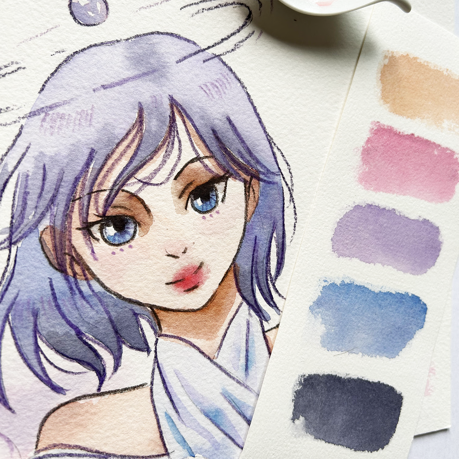
17. Painting - Facial Features: I only use a combination
of watercolor techniques to work on the eyes,
nose, and lips. Starting with direct painting
for the base color of the eyes and dropping blue at the bottom part for variation. I also left a small
circle for the highlight. But if it is too hard for you, you may also paint the
whole shape for the I, let it dry and later use pure white paint or
gouache for the highlight. And then adding a darker
color for the bill. I mentioned earlier
that wet on wet works well with the lips,
nose, and blush. So that's what I'll do now. With clean water. Wetting the area
surrounding the lips. Just enough wetness for your
pigments to spread a bit. Thicker red veins, start
dropping the color carefully. If you make a mistake, use a paper towel to lift up some colors or use your brush, clean and damp and let it
absorb the excess paint. I'll keep working on the
lips until I'm satisfied. Now with the same
color, scarlet lake. I will bring her to life by
adding blushes on her nose. And under the ice. These blush is also a
personal preference. So if your character has a different vibe than
you may skip this step. Let's wrap up this painting
in the next video.
18. Painting - Final Details: But first, I plan to use a small brush to paint the
outlines of my character, but that might take too long. And to give you another option, I'm going to use mixed media. This is a watercolor pencil. I'll use three colors to
outline my character. Dark violet for the
hair and clothes, dark brown for the
facial features, and light violet for the clouds. Oh, and one more thing. Outlining is purely optional. But since I'm going for the
traditional enemy look, I think these thicker
and darker lines would give her that
this thing, right. Please check if you're
painting has dried completely before using a Ben marker, pencil or other leave
you for the outlines. Using a brush for
the outline is also challenging and
time-consuming for beginners. But if you want to take this
opportunity to practice your brush strokes and
get more brush mileage, then please feel free to do so. I also use these pencils to add finer details
like hair strands, eyelashes, and some
lines in her ironies. In the next video, Let's discuss what
we can do from here.
19. Sharing Your Work: Share my work. I just usually scan my
paintings, crop, then post. Another effective method is to create the flattening
presentation, where you arrange your art work alongside the color and
some nails studies. This not only
showcases the amount of effort you put
into the project, but makes it more
relatable to the viewers. Additionally, I encourage you to share your project in
the projects gallery. It's an opportunity to share
not just the final piece, but also the story
behind your character. So please include a
short description, your inspiration,
and even their name. Let's celebrate each
other's great DVT and appreciate the unique
stories we've brought to life. Furthermore, I
value your feedback and would love to hear
your honest, Glasser view. Your input helps me improve and better tailor future
classes to meet your needs. Throughout this
class, we explored the process of designing
our own characters. We started with the mood board and then mixed and
matched facial features. Learned about
facial proportions. Thumbnail and color studies have this rendering techniques. And finally, brought our
characters to life with paint. If there's one key lesson that I want you
to take away from this class is the importance
of making your artwork. Personnel. Base your decisions
on your own preferences, whether it's the
choice of colors, the Bose expression, or other elements that
define your character. Remember, this doesn't
have to be done thing. It is indeed an
achievable tasks. You've witnessed some
of the studies I create that didn't make it
into the final artwork. But what truly made
this journey enjoyable? What's the process itself? So I'll be waiting for your own animated
character design. I'll see you on
my other classes. And together, let's make
this world a little bit more colorful
with our art dorks
 Bianca Luztre, Watercolor, Productivity, Color Mixing