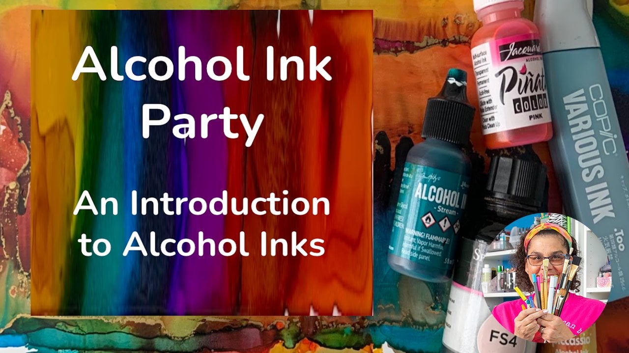
Transcripts
1. Introduction: In this class you will
learn an easy way to create a pumpkin with borders
using alcohol inks. Having some control over where your inks flow.
Hello, beautiful. My name is Trina Brandon. I have a passion for color and a passion for helping others. That's why I'm excited to be teaching here on
Skillshare with you. I have many identities, including illustrators,
service designer, and a mixed media artist. I am also a founding
contributor of the alcohol ink society. I just love coloring. My favorite supplies is
whatever I have in my hand. And in my hand for this
class are alcoholic drinks. Alcohol inks are fun, bright medium and have
become popular worldwide. If you've used the inks before, you know how fluid they are, the after party is targeted
to those of you who want a more controlled way
of creating with the inks, you'll find this class valuable. If you have never used
alcohol inks before, I recommend you watch the alcohol ink party intro to alcohol inks class
here on Skillshare. But you don't have to you don't have to go
to the party first. You can just come straight
to the after party. I will cover the basics
of alcohol inks. In this class, I will cover how to safely use the inks and what to be aware of how to
create a border for your inks. How to fill color without
going over the border. A controlled way to add links to your artwork exactly
where you want them. Also included is a pumpkin
image to trace and a student handout with a
summary of techniques as well as a link to
additional resources. Creating vibrant and
interesting artwork with the ink is fun and easy. For the class project, you will create a greeting card. And the reason I suggest
greeting cards is they are a great size to test out new techniques before
applying to a larger surface. Greeting card can be
a nice GIF or you can keep it and add joy to
your own creative space. When you participate in class, you'll see how easy
it is to get control on this beautiful fluid medium. Each piece will be unique and it will be fun to see
what everyone is making. So let's get started. I'll see you in the after party.
2. Your Project: Hello, I'm glad you're here. In this project video, I'll tell you the steps to
making a greeting card for your project and also why I
chose this for our project. I chose a greeting card
for this project because it is something that is
functional and beautiful. A greeting card is a way to let someone
know that you care or display it as a
piece of artwork in your own space to create joy. If this is the first time you are trying to
use this technique, the benefit of trying out on the size of a piece of paper, the size of a greeting
card is that you can practice the technique
on a smaller scale, which can easily then be
applied to a larger scale. So let's talk about what you'll need to make a greeting card. You'll need acid
free glue or tape, scissors or a paper
trimmer and a piece of card stock cut to the
size of your base card. Your art piece will fit
on top of your base card. I used a five by seven inch
size for my art piece, which is a common size for
greeting cards in the USA. If you want to layer your card, you'll need a complimentary
color card stock. Once you finish your art piece, you'll trim it to fit
your base card and adhere it with the glue
or the double-sided tape. If you are giving it away, you can write a message inside. I do have a bonus
video included in the alcohol ink art party
class here on Skillshare, where I demonstrate
how I assemble my greeting cards and add a little details to
give accustomed touch. As well as I share several tips on assembling
a greeting card. You can check out my Skillshare
profile for the link. And there's also a direct
link in the student handout. Also in that bonus lesson, I share how I organize
my alcohol eggs. Please take photos or scans of your creations and share them in the class
project gallery. If you have any questions, please post them in
the discussion area. I'll be checking it often, as well as one of your
classmates may have the answer. So let's get started
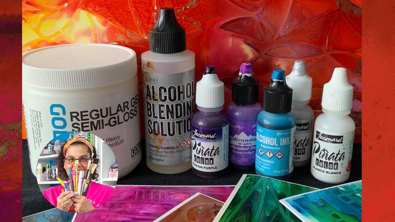
with our lessons. Safety and supplies is
up next. See you there.
3. Safety and Supplies: Hello and welcome
back. In this lesson, I will be explaining
that supplies used in class and
safety practices. The supplies and products
that I'll be using in class are listed in
the student handout, which is located in
the class resources. The smell of alcohol can
sometimes be strong. You'll want to work in
a well ventilated area. You can open a window or
have a fan in the room. The inks are very
pigmented and will stain. You'll want to wear old
clothes and definitely gloves or cover your hands
with a barrier cream. Cover your work surface. I use a reusable craft
mat for large projects. I also place an inexpensive
plastic tablecloth underneath which I can reuse. Never put the inks
into a spray bottle. There's resin in the inks that you don't want in your lungs. They should not be airborne. Do not use them with
things that come into direct contact with
food and beverages. The ink is flammable. Be mindful of these
safety precautions, so you'll be safe
when using the inks. Here's a tip. When it's warm enough, I set up a table in the garage with a garage door open to allow
for lots of fresh air. So to get started, you'll need alcohol inks. There are many
brands of the inks. I'll be using ranger
and Kenyatta. You can use whatever you have. Banks also come in a variety of metallic and fixative choices, which I love to
use in my artwork. They are quite thick. Depending on the technique, I will use them straight
from the bottle or use a diluted mixture for more
subtle look, here's my recipe. I start with a ratio of
five drops of ink to two-thirds rubbing
alcohol in a bottle. The size bottle that I use is
0.5 fluid ounces or 14 ml. Test to see what ratio you like, you can easily add more drops of ink or more drops of alcohol. If you want to know more
about the different brands, please check out my alcohol
ink party intro class here on Skillshare. Here's some tips when
using your inks. Since the nibs are so small, you can leave them open
while you're working. But if you're not going to use them for a long period of time, I recommend that
you close the taps. If they do get clogged, use a stick pin to poke in the top of the
nib to clear it. I also like to color
code my tabs so that I don't put my black ink top
on my yellow ink bottle. I put a little Jess our white
acrylic paint on the top and then just drip some color
on that after it dries. Next, you'll need some
isopropyl alcohol, also known as rubbing alcohol. The alcohol makes the inks more transparent and
helps them to flow. The alcohol comes in
different percentages. For the techniques
I'm showing you. They will work best with
rubbing alcohol over 90%, I'll be using 99%. If you're not able to
find that percentage, you can use whatever you have. Just be aware that the ink effects may result
in a different outcome. A few tips for working
with alcohol to have more control of the
alcohol when I'm using it, I pour it into a small
battle with a small tip. I also pour some in little cup. Both have airtight tab so the
alcohol will not dry out. I also use alcohol for cleanup. You'll also need some
UCO watercolor paper. It is a popular
surface for the inks. You can use the
front and the back. It's in the papers
section at the art store, but it's actually a plastic. This is one of my favorite
services because it's very forgiving with the inks and
the blending is lovely. You put comes in
different types. I will be using white
paper and I'll also show an example on
translucent paper. Whichever paper you
use will produce very similar results with
the blending of the inks. You'll need paper towels
or a rag for cleanup. To draw your border. You'll need color
pencils or markers. They come in a variety, such as waxed base or oil-based. I'll show you how to create
a sample reference with whatever supplies you
have for my project, I'll be using a Sharpie
oil-based marker and a Posca pencil. You'll also need a small
paintbrush when we get into controlling
the ink flow. You also may want a little plastic stick to
help move your ink around. You have the option
seal your art work. This is a personal preference
To steal your artwork. You'll want to use a
water-based sealer. I will use a varnish, Graciela. Some optional supplies
you may want to use. It may be helpful
to have a piece of scrap cardboard slightly
larger than your art piece. The reason I recommend
cardboard is it's heavier than
you pulp paper. And we'll hold your art piece
so you can move it around. That way you can pick up your art piece without
touching the paper. This is helpful when
you want to move color or see your artwork
from a different angle. A stencil for shapes. This will be helpful
when you are creating a reference card or want to create
shapes and make sure that you're
closing your border. Another tool I like to
use is the color wheel. The inks blend per
the color wheel, so it's great to have it handy when you choose your colors. If you're not familiar
with the color wheel, there are many great intro
classes here on Skillshare. If you find you like the control technique that
you're learning in class, you may want to have
a pallet with wells. Here's a complete
list of supplies. I'll say which colors I'm
using during the lessons. Or I'll add a photo of
the links are used. If you have any questions, please post them in
the class discussion. We have a very sharing community and someone may be
able to answer. I'll be jumping in quite often
to check the discussion. In the next video, I'll show you a technique for creating a border for your ink. See you in the next video.
4. Technique for Creating a Border: Hello and welcome back. In this lesson, I will be
explaining how to create a border to constrain
the ink within a shape. I have a piece of five by
seven inch tuple paper. Here is where you can practice that technique and create a
reference for your supplies. As I mentioned in the
safety and supplies video, you Paul paper produces nice blending results
with the ink. If you have just one pencil, you can draw many circles and practice with
different colors and size circles or whatever
shape you decide to draw. In order for the ink to adhere
well to the pupil paper, it needs to be free from
dirt, dust, and fingerprints. I will give a little
cleaning with a paper towel and alcohol. We are basically creating an
outline resist for the inks. You can use a stencil to know
where you begin and end. For my reference sheet, I'm going to use
this tensile so I know where I begin and end. When drawing the design, you want to be sure
to close the shape. Press hard with the pencil. Or if you're using a marker, be sure to allow it to dry. Draw on a hard surface so
the lines will be solid. Press firmly. I have a few different brands
I have here in my supplies. I'm starting with a
white Prisma pencil. I pick a circle size and draw firmly and make sure
to close the shape. I will make a note of
which console this is. Next. I'll use a white fabric Estelle polychrome OS to draw my
circle and note the brand. Next is a white posca pencil. And note that I also have this fat
pencil from by Tombow. It's called the
mark making pencil. So I want to try that. Next. I'm drawing with a Sharpie
oil-based markers. These markers come
in different sizes. Be sure to shake, pump and test it before using. Here's a tip. Take the top off away
from your artwork. Otherwise you'll get
some splatters which you may not want to be
part of your art work. I tend to draw slower with the marker to get smooth lines. This is a medium tip and I
can see it well on the paper. It is thicker than
the pencil lines. The Sharpie marker
also needs to dry. In the next lesson, we'll add color
inside of each shape. See you there.
5. Technique for Filling in Color: Hello and welcome back. In this lesson, I will
be explaining how to add color inside your shapes. I have my gloves on, I have protected my surface, and I have a window open. I'm going to open all the
battles at the same time. So once I get started, I can keep going and
will not have to break to open an ink color. As we do this technique, the main things to
keep in mind to get close to the paper and drop
a very small amount of ink, not too close to the border. Depending on the color of
the ink will spread more. The lighter colors
have more alcohol or binder along with the pigment and they will spread further. I will wait to see how much that color spreads
before adding more ink. Then I can add another color
and see how fire spreads. This is the hardest
part of the technique. Patients. When I first
learned this technique, it took me quite a
bit of practice, only trip a small
amount and then wait. You'll see the ink is going
right up to the edge. The lines, which we
also called the border, will act as a resist to
keep the ink inside. Once it stopped spreading, I can add a little drop
of alcohol to help spread the color all
the way to the border. I'll start with one drop. I can see I need to add another drop to encourage
the ink to continue. Here's a tip. If it's not spreading in the
direction that you want. Tilt the paper slightly or use a plastics music to
help the ink moves. You are building color
within the border. That is the basic technique. Small drops close to the paper and wait to
see how it spreads. Add more ink or alcohol. Remember in small
amounts and be patient. It takes a bit of practice, especially if you are used to dropping a lot of
ink at one time. The inks do drive fast so
you won't have to wait long. If you find that the ink is
coming out too fast or it's a challenge for you to
get into a smaller space, drip some ink into
a small container. Here I'm using a plastic
cap from a bottle. You can use the
paintbrush to drip the ink into the
area that you want. You can see where the color is spreading when you get
close to the edge, you may want to try this option. Later I'll show you
a technique for really controlling
where the ink codes. I'm using a light color. As you can see, it
spreads much further because it has more
alcohol or binder, which makes it more fluid. Since I have just a
little space left, I'll add a darker color because I know it
will not go too far. I'll continue adding color and other circles to practice
and see how the colors move. Small drips not too
close to the edge and a little alcohol. Filling in. I'll use the plastic stick
to encourage mingling. Since I know the
yellow is very fluid, I'm going to drip right in the
center of the next circle. I'll use the paintbrush
to help get to the edge. The clean your paintbrush
between colors, use alcohol. I just pour some onto the brush and wipe
it on a paper towel. At the brush is really
saturated with the color. I'll use my little cup
to rinse out the brush. Then encouraged that
ink to the edge, as well as add some drops
of alcohol with the brush, like I mentioned
earlier, with the ink. When you don't want
to add too much. The last circle is the one
with the Sharpie marker. Continuing with the same step, stripping small amounts of ink, allowing it to spread and
adding a drop of alcohol. And now I have a reference card of the
different supplies that I have in my stash and I've been able to practice with
the different colors. I created card earlier and I want to show you what can
happen with the inks. Here's an example of where
I tried to use a glaze pin, but it was dry and create a little valley
instead of a border, so the ink spilled in the
Valley and beyond the edge. In this next example, I use too much alcohol close to the edge and it pushed the
color over the border. Here I dripped too much ink and it spread beyond the border. In this corner, I did not close my shape when I dripped ink. It did not have a
border to stop it and just spread beyond the
shape that I wanted. This one is to show
you that you can use colored pencils other than
white for your border. I use a black pencil here. And it held the ink perfectly
so you don't have to limit yourself to just the white
pencil or a white marker. I really encourage you to try whatever supplies you have in your stash and create
that reference card so you'll know what inks work well with what markers and
pencils that you have. I also wanted to show you how forgiving you Paul paper can be. If you get spots on your paper, you can clean it
off with alcohol. Just put some alcohol on a cotton swab or a paper
towel and clean it off. Do note some colors stain like a deep red
or a deep purple. You will be able to lighten it, but may not be able to remove that pigment
is just too strong. A benefit of using the
Sharpie oil-based markers on the pupil paper is
that you can draw your design with a
light colored pencil. Sharpie marker will
cover the line. That's something to
keep in mind later when we get ready to work
on our projects. Up next, I'll show you how
to draw the pumpkin borders. See you there.
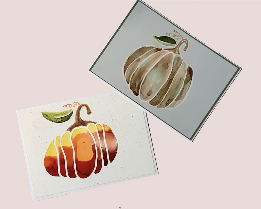
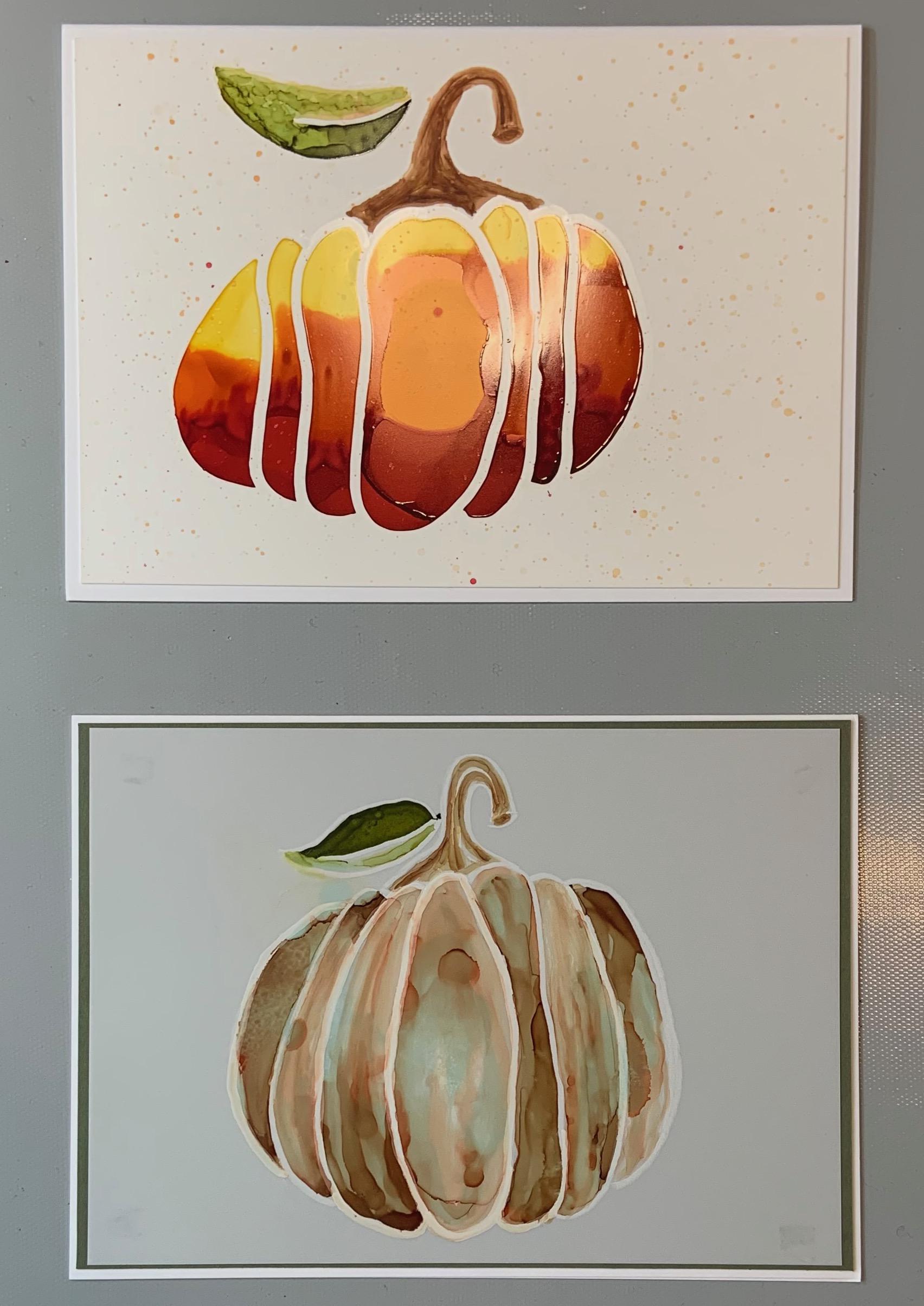
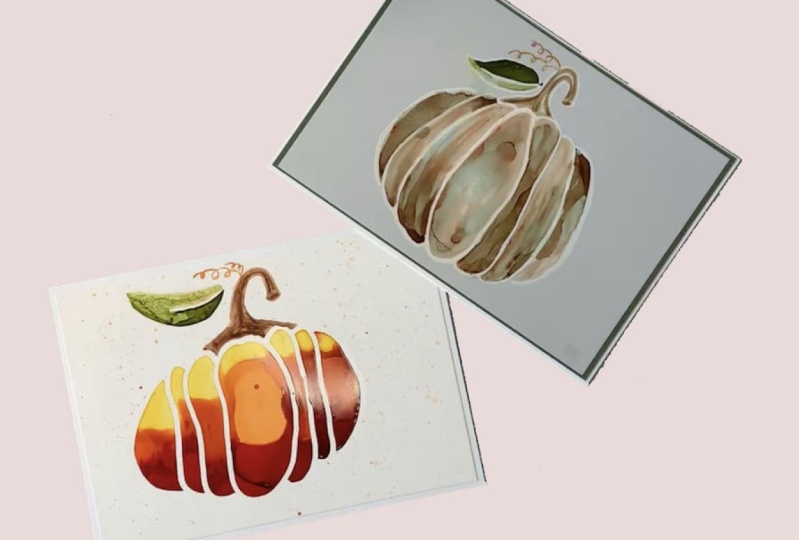
6. Create a Pumpkin Border: Hi, welcome back.
In this lesson, I'll show you two ways that
I drew the pumpkin border. I chose a pumpkin, but of course you can choose whatever you want
to for your design. For this technique, the idea is to capture the
shape. Take your time. In the case of the pumpkin, it does not need to be perfect. Pumpkins are nature. No two are alike
and each is unique. Like you. I've cleaned
up my youth wallpaper. And here I'm using a reference, as well as the image I
drew from the reference. Both are included in the
class resource section. Feel free to draw
in your own style. For drawing the pumpkin on
the white tupled paper, I'm using a Sharpie
oil based marker, which will create thicker
lines than the pencil. It's a medium point. As I showed in the
previous video, with an oil marker, you can use a light
colored pencil to draw first if you want to. I'm going straight
in with the marker. It will not look exactly like the image and that's
okay for my style. I use a reference as an idea
not to be exactly like it. I realize you may not be
able to see it on camera. However, when you are drawing, you will be able to look
at your paper and from an angle you can see
where it's drawing. Remember to shake
it up and pump it. Take the top off
away from your art. Using my drawing or a reference, I draw slowly and make sure I'm closing each border, each shape. And picking up the paper
to make sure I closed each shape so the ink will
flow inside the borders. I will allow the marker
to dry before moving to the next step or the stem, I'm switching to
a passcode pencil to create thinner lines. You don't have to use the same
tool for or your borders. You can mix it up. I like to use different tools to give a bit
of an interest to my art. I'm adding some
detail to the stem. Of course, use your
artistic license for how much you want to add. Using the image for inspiration, I'll draw my stem and add inside lines and
also draw the leaf. Tilting the paper to make
sure I close each shake. As another option. If you don't want to
draw a free hand, you can trace the design using translucent you Paul paper. Make sure you press hard on a hard surface and
close the shapes. All the steps for adding
color are the same, whether it's the white paper, the translucent paper, and the
results will be beautiful. In the next video,
we'll add color, the most funniest
part for you there.
7. Fill in Pumpkin Color: Hi and welcome back.
In this lesson, I'll show you how to add color inside the borders
of your pumpkin. My favorite part, I have
protected my surface, put my gloves on, and my window is open. I have my art piece
on a piece of cardboard so that I can pick it up without
touching my artwork. I'll be using Ranger crimson and lemonade and pin yada
tangerine for the pumpkin. I have a plastic
stick, a paintbrush, a little bottle of alcohol, a little cup of alcohol. I'm ready. Thinking back to our
technique lesson, we want to make sure that we
drip small amounts of color. I'm going to start
on the left side of my paper because
I'm right-handed. This way. I don't risk dripping ink in areas that
I've already painted. I'll start in a large
part of the first area, not too close to the border
and see how it spreads. I'm being mindful of how much ink I'm dripping
within my border. Next I'll add a little
pin yada tangerine, and let it spread. For any parts that do
not spread by one, I have my paintbrush
ready to fill in. I'll continue to the next
section, dripping and waiting. As I need to, I tilt my board slightly to help
the colors mingle. The hardest part
is being patient. As you can see, they
eventually come together and blend
nicely on the road. Moving to the next section, it's a larger area so I can
add a little bit more ink, giving them
encouragement to mingle. This center section
is very large, so I could add more ink. I'm still being conservative, being mindful of my borders. Since this area is very large. In the center is where I'll add a drip alcohol to lighten this section and also
add more color virions. The advantage of being
patient is that you do not add too much liquid and then you go over the border. This may take some
practice as you learn how much alcohol to drip in different colors and see how they spread.
Hang in there. It took me awhile also overtime, I have collected several
alcohol ink pieces that I can use for collage. I love the effect
that's happening. The red is still spreading, but not enough to fill in. So I'll add a tiny bit more red. I'll use my paintbrush to help the ink fill in completely. It's still blending
inside the border. The next section
is much smaller. So I go back to tiny drops
of ink and watch them move. I'll help with the
blending a bit. It's such a small space left. Add a tiny bit of it. I'll continue into
the next section. Oops, I tip the
red ink a bit too quickly causing splatters
over the whole piece. I've decided to ignore it for now and focus on the pumpkin. Once I finish, I'll decide
if I wanted to clean up those splatters or incorporate them into the final design. One of the many things I
love about creating with inks is the surprises you get from the
features and blends. Sometimes you come up with a whole new technique or design you never could
have envisioned. Now, onto my last section, feeling more comfortable with the colors and how
they each spread. I'm going to finish the
top of the pumpkin and men decide what to do
about the splatters. I'm going to let this
part dry a few minutes. In the next lesson, we'll add color to the smaller areas with a
more controlled method.
8. Controlled Coloring: Hi and welcome back. In this lesson, I'll show
you how to add color in specific areas and how to have more control
with painting your inks. While the ink was drying. I put the top on the ink bottles are
used for the bottom of the pumpkin and pulled in the colors for the
stem and leaf, which are ranger
sepia and letters. Here's a tip. Turn your papers so that you are working on
the part closest to you and not coloring over that area you've
already covered. This reduces the
chance of dripping ink onto your beautiful
finished piece. Moving from left to right, I'll start with this Tim. To paint the stem, I'm going to use a paintbrush. I've put a few drops
of rangers CPI in a plastic bottle top and
let it dry out a bit. I also have my little
cup of alcohol. If you find you like this technique and
you'll use it often, you can use a plastic
palette to put your inks and since they are
reactive with alcohol, you can use them over and over, just add more drops
of ink when needed. When I tilt my paper, I can see my design. I've already added
a drop of alcohol in the dried sepia
and then tested it. I can see it's still a bit dry. So I dipped in the alcohol
to dampen my brush and then pick up some ink and
start to paint my stem. I want to paint streaks
in the stem on purpose. I love the texture
and wanted to show the different sections
of the pumpkin stem. I dip directly into the ink and create some
lines in the stem. Since the ink is mostly dry, I can control where it's
going with the brush. It doesn't remain fluid and flow in areas that I
don't want it to go in. Fill in the stem completely, then pick up ink to
create some darker lines. The leaf, I added a drop on the bottom of the leaf
and let it spread. One of the cool features of
the lettuce color is how it naturally lightens as it
spreads thinner. So pretty. I wipe the paint brush
off on a paper towel and dipped in alcohol to
clean off the previous brown. Next I painted the top leaf. I'm just playing in the
area to blend the ink into the alcohol and creates
lights and darks. I get a bit carried away
with creating texture on the leaf and went over
my little border. I can clean that up with
alcohol or just leave it. Since I have a light background, it's really not noticeable. I wanted to add a
bit more green, but I did not want to drip it in as the area is pretty wet. I added a tiny bit to my palette and smooth
this out with my brush. I took a moment to
look over my piece and decided that I
wanted the leaf to be a little more
blended on the bottom. I just can't help myself. I'm having such fun play
with the color and texture. It's good to know
when to say when. I love the contrast between the text her top in
the blended bottom. After some thought, I decided to embrace the splatters
and add more splatters. I put a drop of Kenyatta
tangerine onto my palette, dip my paintbrush and alcohol
to make it even more fluid, and tap the brush
around the pumpkin. In the next video, I'll show you how to seal
your beautiful artwork.
9. Seal Your Artwork: Hi and welcome back.
In this lesson, I will be showing you
how I feel my artwork. Please note, you do not
have to sell your artwork. It's up to you. I find if I'm making
something that will be handled often than
I want to seal it. To seal ink artwork, you want to use a
water-based sealer. Spring varnish is a great
way to produce even results. Be sure to spray outside. You want to read the directions on the
can and follow them. You can set your
painting upright or flat and spray
three light coats. And the reason you want
to spray light coats is to reduce the
chance of pooling. Starting off the piece, I spray, let it dry, spray, let it dry. And one more time
spray and let it dry. I also included a
link to a video in the student handout for
how to sell your art work. Be sure to let it dry completely
before you handle it. Up. Next is the summary video.
10. Summary: Congratulations, you
have finished the class. I hope you enjoyed the
techniques and had fun. We covered safety using
alcohol inks and supplies. Preparing the tuple paper by cleaning it with alcohol
to receive the inks, drawing a border, making sure to press the pencil firmly
and close the shape. When adding color, add
ink in small drafts allowing color to spread
before adding more patients, patients, patients,
we covered using a paintbrush to move
color into small spaces. Adding alcohol in small drops to help color spread and blend. How to add the inks,
controlled manner with dried inks
and a paintbrush. And finally, how to
seal your artwork. If you haven't already be sure to download the student handout, you can use that at anytime
in the future to help remind you about the all the
techniques that you learned. It has a summary of the steps, the list of supplies with
links and additional alcohol. If there's one thing
I hope you take away from the class is seeing how easy it is to work with the
inks and a controlled manner. If you like the class, kindly leave a review
and follow me here on Skillshare so you can hear about my upcoming class opportunities. Thank you so much
for joining me. See you next time. Take care and stay positive.
 Trena Brannon, advocates kindness inclusion positivity