Transcripts
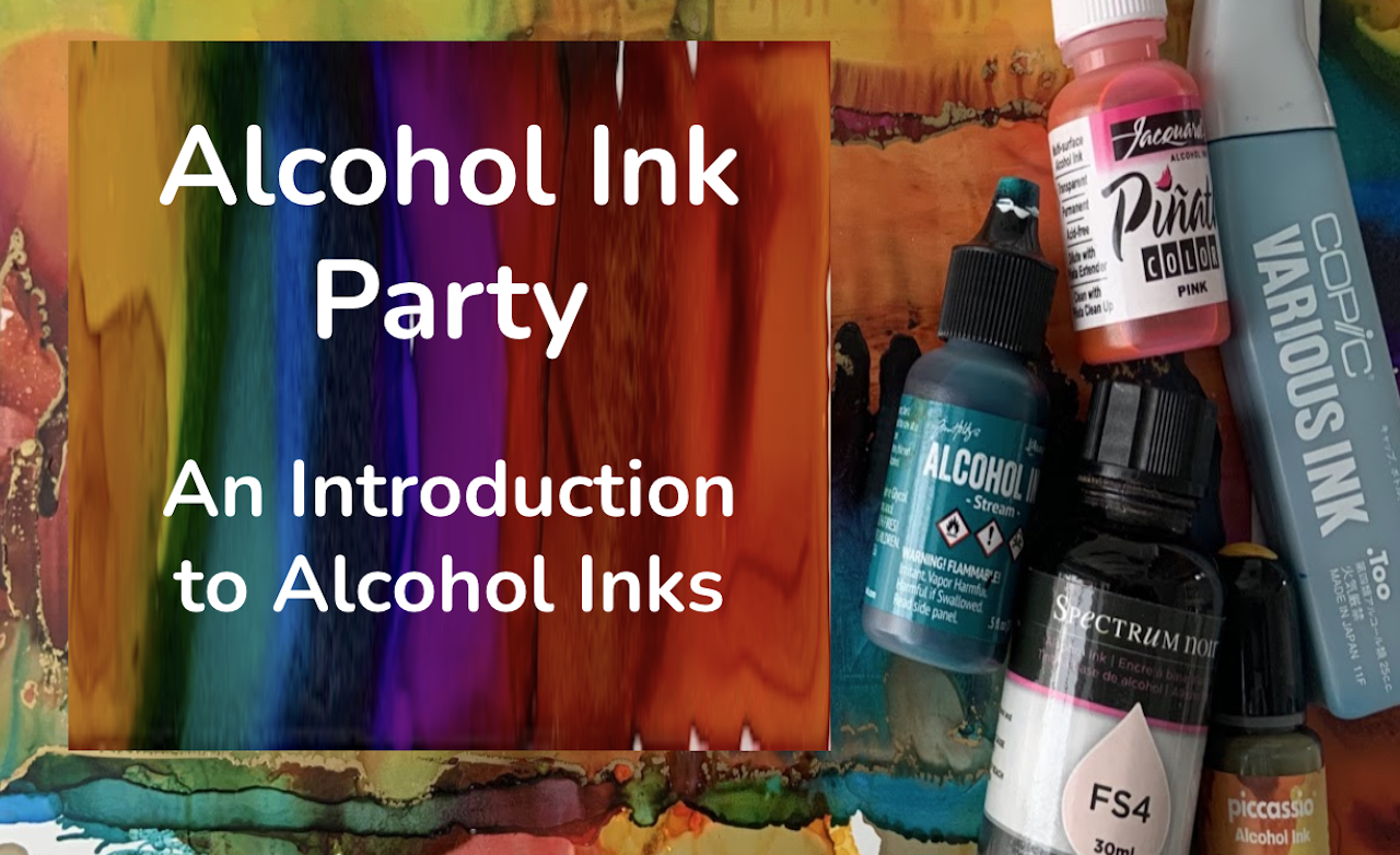
1. Introduction: Do you like rich color and creating vivid designs? Would you like to learn about painting with alcohol? Getting to know the features and create beautiful small or large pieces of art. Hello beautiful people. I am Trena Brannon and I have a passion for color and a passion for helping others. That's why I'm excited to be here with you, teaching among my identities. I am a mixed media artist and I love creating. My favorite art supplies is what I have in my hand in this class and teaching you about. I've been creating with alcohol inks for over 7 years. I'm Copic marker /ink certified. I have taught classes locally as well as I am a founding contributor of the alcohol eat Art Society. This class is at the introductory level, targeted towards those of you who have never used the inks. It may also be attractive to those of you who have played with the inks and would be interested in the techniques and tips that I share from my own experience. Once you get to know the basics for possibilities of how you create with the ink and the techniques you can use are wide open. You don't need a lot of supplies to get started. Just a few inks, a non porous surface, wallpaper or a ceramic tile or acetate. I'll go over all the supplies as well as what to be mindful up around safety when you are creating with the ink. I'll be showing you demonstrations of how I use the inks and talking through each step of my process, sharing tips and why I do certain steps along the way. Let me tell you exactly what I'll be sharing in the class. How to safely use the inks and what to be aware of the features of the ink. I love how rich the colors are and how they blend beautifully. Are also talk to you about what kinds of results you can get with different surfaces, how the inks work together and with different mediums. Basic techniques using simple tools to create gorgeous, vibrant, colorful pieces of art. How to create texture, how to seal your artwork. You'll also receive a student handout with a summary of the techniques, as well as links to the supplies I use in class, and also additional resources. For the class project. You will use any of the techniques you've learned in class to create a greeting card, pick your favorite technique or a combination of techniques to produce a design. You can display your card as a piece of art in your home or office, or write a note inside and give it to someone special. I'll also be providing a bonus video where I'll share how I assembled my greeting cards and add little details to give them accustomed touch with the techniques you learn. You can apply them in a variety of size pieces to display in your home or give as a gift, your art will brighten the mood of any room. Please take photos or scan your creations along the way and share them in the class project gallery. If you have any questions, please post in the discussion area. I'll be checking it often, as well as one of your classmates, you have the answer. This is a sharing community. Also, I started working on my next alcohol in class. It will be the after party. So be sure to follow me here on Skillshare if you want to get notified when it becomes available. Because of the features, beautiful blending of the inks, each piece is unique. It will be fun to see what everyone is making. Let's get started. I'll see you in the first lesson of the alcohol party.
2. Your Project: Hello and welcome. I'm glad you're here. In this video, we'll talk about the project. I'll tell you the steps of making a greeting card. A greeting card is something that is functional and beautiful. A greeting card is the way that you can let someone know you care. Or you can display it as a piece of art in your space to bring you joy. By the end of this class, you'll have a stack of designs to choose from. Or you can make a new design. Depending on the size of the greeting card that you want, you will need to trim your art piece, keeping in mind that if you plan to send it through the mail and we'll have to fit in an envelope. You will glue or tape your ink painting onto a piece of folded card stock. I do have a bonus video where I'll share how I assemble my greeting cards and add little details to give them a custom touch. As well as I share several tips on assembling a greeting card. In that video, I'll also share how I organize my alcohol. Please take photos or scan your card and uploaded in the project gallery. So let's get started with our lessons, supplies and safety is next. See you there.
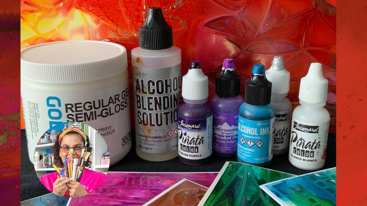
3. Supplies & Safety: Hello. In this video, I'm going to tell you all about the supplies used in class and safety practices. We'll look at brands, mediums and surfaces, and a few other materials we'll use in class. The supplies and products that I'll be talking about are in the student handout, in the class resources. So let's jump in. Safety first, the smell of alcohol can sometimes be strong. Make sure you work in a well ventilated area, open a window, or have a fan in the room. The inks are very pigmented and will stain. I use a reusable craftsmen with an inexpensive plastic tablecloth underneath when I create larger artwork which I can reuse. You want to wear old clothes and definitely gloves or cover your hands with the barrier cream. Never put the inks or blending solution into a spray bottle. There is resin in the inks that you don't want in your lungs. It should not be airborne. Do not use them with things that come into direct contact with food and beverages. And be mindful that the inks are flammable when it's warm enough. I like to set up a table in the garage. I learned that from my neighbor. She and I both loved to work with alcohol. There are many brands have alcoholics. My favorite for the techniques that I'll be showing you in the class are ranger and Kenyatta. They both come in a variety of beautiful colors, offer metallics, and come in small bottles with small openings, which makes them very convenient for the techniques that I use, pin yada. Large 40 ounce bottles or two different starter packs with the smaller bottles, and have 27 colors including metallics. Ranger comes in individual bottles or in three packs. They have over 80 colors in several mix. And even pearlescent colors that add a really nice sheen to your artwork. As I said in this class, I will be mostly using Pinyin Anna in ranger. In some of the examples, I'll also add coping, which are read incurs for markers, and they come in over 300 colors. A little bit choices if you weren't a lot of different colors. Spectrum noir is another brand that is a refill for markers, and they come in several colors. And I'm also including Picasso in this class just to show you another option, if you'd like to have a lot of colors and don't want to make a big investment. They come in a pack. There are two mediums that we'll be using. Ranger blending solution, which has a resonant it and should never be put into a spray bottle. And also isopropyl rubbing alcohol. Now this one is okay to be put into a spray bottle. It comes in 70%, 91 percent, and 99 percent. I'll be using 91%. I also have a little container to pour alcohol. And for some of the techniques. There are a variety of surfaces that alcohol inks can be used on. In this class, we'll be using ceramic tile. You can wipe up with rubbing alcohol and reuse it. You can usually find them in a hardware store, Home Store, or arts and crafts store. For really inexpensive price. Acetate is transparent and offers a really nice results to your colorful design. And then there's UC 0 paper. You can find it in the watercolor papers section at your art store. The surface can be used on the front or the back. It's basically a plastic. This is my favorite surface because it is very forgiving with the inks. They blend lovely on this surface. It can be a bit pricey. I tend to buy them in packs and cut it down to the size that I need. Other things that you'll need are a piece of cardboard or something sturdy to hold your paper on. When you move around the ink, sometimes they can get on your fingers. And so it's just a nice to have that barrier between yourself and your substrate, your surface that you're working on. Canned air for an ink blower. For safety, do not use a straw. You may see videos or some people using a straw to blow the ink around. You do not want to accidentally inhale and get that resin in your lungs. And we'll also use an eyedropper and little container with alcohol for some of the techniques. And inexpensive paintbrush. And then other tools you can find around the house. Paper towels are good for some of the techniques that we'll use, as well as clean up textured fabric. You can find around your house for some of the techniques that we'll use, something that creates some type of intent or print. Also other items that you may find around your house for mark-making. For example, a cotton tip swab, also called a Q-tip. For your greeting card. You'll also need a piece of card stock or heavy paper, a tremor or some scissors to cut, and some type of glue or double-sided tape. The other tool that I use is a color wheel. It's great for having a visual of how the colors relate to each other. I'll also talk about sealers in the class. Some artists do not seal their work, but I will use a gloss medium for a spray. And when I use the gloss medium from liquid techs, I use a foam brush to spread it. To get started. You do not need all the colors. Although I will tell you you might find a lot of joy creating with the inks and feel the need to get more colors. And that was my experience. If you want to try them out, I recommend just getting a few colors. You can create beautiful paintings with three inks and a metallic, if you'd like metallic in your artwork. And one of the blending mediums, either alcohol or the ranger blending solution. Also a substrate, you can use a ceramic tile, you Bo paper acetate or something that has a slick surface. I would recommend the nature walk and dark side picnic from Ranger. Basically, it gives you primary colors and you can blend to make the full color wheel. If you have any questions, please post them in the class discussion. In the next video, I'll dive deeper into the features, how they blend, and how they work on different surfaces. See you in the next video.
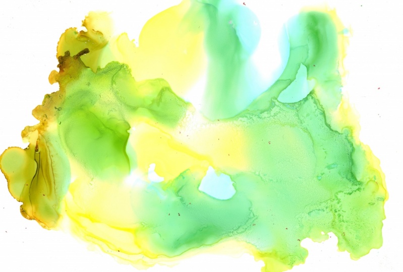
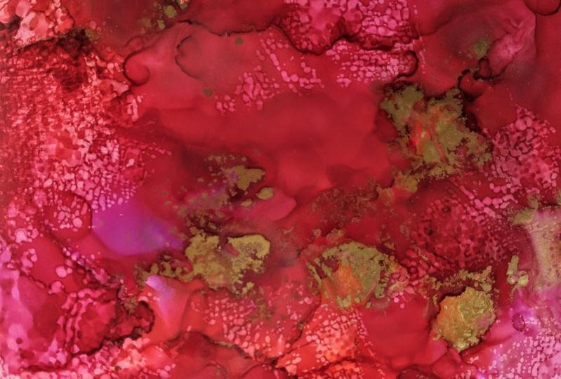
4. Ink Basics: In this lesson, you will get to know the joy of the inks, their properties, and how they move, how they react to each other and to different mediums, the different surfaces to use the inks on. I will drop color, allow it to blend and mix, and you will get to know the joy of the ink. I have my gloves on surface enclosed, protected. My window was open and I'm ready to get started. Let's start with what our alcohol inks. Alcohol inks are highly saturated and diabase. They can be applied to a variety of services, including glossy paper, strength, plastic, and glass. Non porous surfaces, slick surfaces use their best features and will be best used for the techniques I'm using in class. They are permanent, fast drying, transparent. These inks can be intermixed across brands. They offer unique effects and techniques that are just gorgeous. The inks dry quickly depending on how much ink you apply. For example, a thin coat may drying 15 seconds. Once they are dry, they are waterproof. However, they will move if you add more ink or mediums. I have here a piece of UCO acetate and ceramic tile, which I cleaned with rubbing alcohol. Here's a tip. Be mindful of how you handle the surfaces. Fingerprints and dirt can get in the way of your ink adhering to the surface. That's why it's a best practice to clean off your surface with rubbing alcohol before you use it. Your lighter colors have more alcohol in them. And we'll move more. They'll spread more on the surface. Darker colors of more dye and less alcohol. They do not spread as much when you drip one color into another. It pushes out the first color, creating a border of darker color that newly drip color takes over. Alcohol. Inks are a bit pushy. They make a decorative border, and I really like that technique. As you can see, the colors to mix based on the color wheel. Here's a tip. I like to have my color wheel handy. Visually being able to see the relationship of colors. There are two types of mediums. Blending solution, which I'm going to be using the ranger brand and rubbing alcohol. Remember, do not put the blending solution in a spray bottle. The alcohol can be put into a spray bottle and we'll use that spray buy more when we talk about creating texture. The purpose of the mediums are to help move and blend colors. The colors will reactivate when the ink dries when you add mediums. The difference between rubbing alcohol and blending solution is that the blending solution has a binder in it. It helps the inks adhere or stick to the surface. Alcohol does not. Think about this when creating your artwork. What type of surface will you be painting on? Be mindful not to use too much rubbing alcohol with inks or glass as that could impact the ink sticking to the glass. Even after the inks have sat on the surface for awhile, you can add blending solution or alcohol to reactivate them, as well as adding additional inks to come into your design. It will create a really pretty effect on this piece of pupil. I'm using pin Yara pink. And you can see how when I add the blending solution, it helps the color move. It makes it lighter and just moves across the paper. I'll add in a little metallic and you can see the effect of the metallic kind of push it out the pink and also creating this beautiful sparkle in the piece. Here I'm adding Copic, which is another brand of alcohol ink. And you can see, even though it's a different brand, it blends beautifully. Next, I'll drop some color onto acetate. So this is Picasso fuchsia. And I'm adding Ranger watermelon. To just show again how across brands they blend beautifully. Here I'll add a little darker color to the mix. And you can see depending on what color you add, they will move a little differently. I'll drop in some rubbing alcohol and you can see the alcohol pushes away the color and creates these beautiful cells and also helps it blend. When I slide it out, you can see the transparency of the colors. One of the features I love about the axes, how beautifully they blend and respond to each other. No, to are alike. Each piece will be uniquely different. Here's another tip. When I put too much alcohol onto a surface, I always have a piece of paper or a piece of acetate available to drip that ink on. So I can start another art piece. I can use this as a background. Isn't that a beautiful color that the two colors created, that was Ranger indigo and Ranger dandelion. Another thing I really love about these links is they just blend so beautifully. Now let's talk about sealers. I use two different types of sealers, a varnish and a spray. The varnish that I use is painted on with a brush or a sponge. The thing to be mindful up about it is it will lead paint brush strokes, which I like that sometimes I want strokes and my art, depending on what you like. For no brushstrokes, Kramer spray works really well and it needs to be sprayed outside. I usually use three light coats. When you are playing with your inks. I encourage you to focus on the process of fun of experiment and the element of surprise as the colors blend together. A good result is looking at something that makes your heart smile. Here's a tip. Take notes, and create a little sample of what you like about what you're creating. Write down the paper or service that you use, the ink, the colors, and the techniques or your steps in your process of how you created that. And then you can save this as a reference. You will not be able to recreate the exact painting, but you will be able to repeat the process and colors with your notes to create a similar art piece. Over time, you will get to know the characteristics of your different colors and the surface you are working on to create a more expected results. Don't let the critic within steal your joy. Just keep learning through playing and experimenting. Now it's time for you. Rabid tile a piece of paper or acetate and just start dripping color. I recommend you create at least five paintings or drip any race five times on a tile so that you get to know your inks, how they move by themselves, how they move when med rubbing alcohol or blending solution. Please take photos or scan your creations and share them in the project gallery. If you have any questions please post in the discussion area, I'll be checking often. In the next video, I'll show you a very simple technique to move color around. I'll meet you there.
5. Drop, Tilt, Blow: Hi and welcome back. In this lesson, I will be showing you an easy technique to create beautiful blending and also how to move the color around on your surface to create some cool effects. I have my gloves on. I have an int blower candy or a variety of inks, blending solution, rubbing alcohol and a little container and an eyedropper. Remember for safety, do not use a straw or blowing little blending solution down first so that when I drop ink that equal move more freely, I'm dropping spectrum. You are POP3 ink to get some color down. Look how pretty that is, see how it spreads. Because the blending solution was put down first. Then our add some pin yada sapphire blue, and tilt and blend. Letting the colors get to know each other. I can create some interesting effects with the ink lower. See how the ink is moving out and creating some natural dark borders. I'll tilt a little bit more and then add blending solution so that equal movie even more. As you can see, the color is being pushed out from the blending solution and the ink is moving more freely. Here's a tip with so much ink on my tile. I can drip some onto a piece of paper to start another ink painting. To move that color, I'll use canned air for yet a different effect. At this point, I'm just experimenting and having fun getting to know how the inks are working together, how they move with the mediums in each other. Oops. I'm glad that happened because occasionally when using the canned air, the straw will blow off. Just all that pressure of the air just pushes it right out. Just stick it back in and continue creating. One time it landed on my art piece and create a cool texture. Happy accident. Next, I'll drop a little Ranger metallic. Be sure to shake your metallics. There's a little ball inside to help mix it. Do a little bit more blowing. And then I'll add a little Ranger dandelion, a yellow color. In my artwork. I really like to have contrast. I think it makes the piece more interesting. And with alcohol inks, it's easy to create that effect. Here, I'm adding range of snow cap, which is a type of mixer to the mixer tubes are little bit more opaque than the regular alcohol. Here I'm blowing it around some more just to move the ink and see what happens. I created a cool effect with the little cells and all that layering. I just think that's so pretty. So I'm going to stop for now and work on some acetate to try something different. I'll drop IQ from the edge, starting with ranger watermelon. Just putting little drops around me edge. I'll add some ranger wild plum, and then some peak. And I blow it towards the center to see what happens. Next. I'm adding a little Ranger gold. I can't help myself. I love adding metallics. So again, I'm just adding at the corner. And we'll continue blowing the colors around to see how they mix together and the effects that they make. So at this point I'm just practicing and experimenting, looking to see what I wanna do next. If I want to add more color or add, in this case I'm adding more metallics. And then blowing. And just looking for a piece that's interesting. Still getting to know my colors and how they blend together. I decided I wanted to add some more wild plum and continue blowing. A really like how pretty that wild plum is. You'll notice that the color does not move as far when you'd have not added blending solution. So now I'm adding some blending solutions so you can see how the color moves a bit more freely, as well as it lightens the ink colors. And we'll create an interesting layered effect. Here you can see the contrast of where the inks and blending solution pushed each other out, as well as created this interesting and cool dark borders that form naturally as the inks mingle. After it dries, you can reactivate the ink with more inks, basically a wet and dry technique, blending solution or alcohol. It produces yet another effect. Here I'll add some more silver and some blending solution and gently tilted around because the ink around the silver are dry, they will not mingle as much. And they will create these little silver cells with little borders within the layers of color. So at this point I'm going to stop with this piece. The hardest part of being an artist is to know when to stop, right? For me, I get to the point of, okay, I look at this piece and it makes my heart smile. So I'm going to stop. Going back to my ceramic tile piece. I'm dropping rubbing alcohol into the dry to see how it responds. Look how it pushes the color way creating circles. I'll drop some silver metallics in just because I love how it looks. Look at the beautiful cells that is created. And also naturally creating a contrast because the rubbing alcohol lightens the colors as it moves them away. Here's a tip. If your ink tips clog, use a straight pin to unplug them. This is common with the metallics and fixatives, as they have Micah powder or additional materials to give them those pretty effects. Or if you leave your top off for too long, the pin will loosen up that dried ink near the top and then you'll be able to continue creating with them. Your assignment is to have fun getting to know that eats, create three to five designs, dropping color, tilting, and blowing your ink around. If you are only working with the ceramic tile, take a photo before you erase it with rubbing alcohol to create your next design. Please post in the student gallery so we can all see the beautiful colors and designs. Each one will be unique. Up next, I'll show you a very simple technique to drip color once and create two or more designs for the kiss. See you soon.
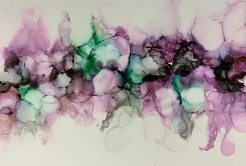
6. A Splash and Kiss: Hi and welcome back. In this lesson, I will be showing you a quick and easy technique to create multiple designs from a little splashing of color and a little kiss. This is also a great technique if you accidentally add too much ink. I add a generous portion of rubbing alcohol onto you Paul paper to make sure the inks have a nice base for a lot of movement. I add Copic, be 0, six. Ranger, purple, twilight, picasso, turquoise. And range are snow-capped to brighten those darker colors. As I add color, I tilt my surface around, not too much. I don't want the colors to mix too much, but I just want them to mingle. As I look at my colors, I decide I want some more snow cap for a little bit more brightening. And I also would like a teal color, so I'm adding range or stream. And at this point I decided I'm not going to mix my colors anymore. I have quite a bit of ink on my bottom layer. Now it's time to add a piece of paper on top for the kiss. While the ink is still very wet, I lightly pat down that paper and pull it apart. You see that there's a mirrored image. You can leave the two pieces of paper as they are, or you can continue to work on one or both. I decide to blend the color a little bit more and realize I still have a lot of IQ. So I can kiss again and get another design. Ooh, look what that created. One of the things I love about this technique is the surprise you get when you pull apart the two pieces of paper. Up. Next, I'll show you how to add some spice and sophistication to your design with metallic. See you in the next video.
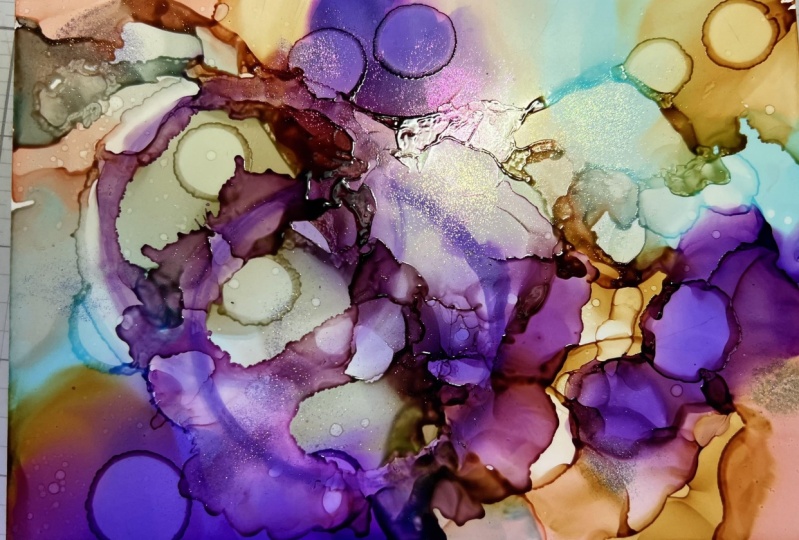
7. Spice it up with Metallics Part 1: Hi and welcome back. In this lesson, I will be showing you how to add some spice and sophistication to your design using metallic. In earlier lessons, I have added metallics wet in wet. This lesson comes in three parts. Parts 1 and 2. I will share different wet in wet technique. And in part three, I will introduce a wet-on-dry technique or more controlled application of metallics. I'll be using periodic copper and gold and range are silver. For my first design, I'm starting with some more neutrals are new goal. I have one large piece of UPA that will catch any extra ink. With that larger piece of UCO where I catch all the ink out, create an art piece with all that luscious color that drips. As you may have noticed by now, this is one of my favorite techniques, spicing up my artwork with metallics. I have Ranger Black, 59, y are 0, 4 and Ranger caramel. I'll be using periodical this, my material. I start spreading the color costs the top of the paper. I want all the colors to blend. Then I tilt the paper back and forth, adding a little blending solution to help the colors move and blend more. It will also lightened the colors just a little. I want even lighter areas, so I add a lighter color. Another technique is to fill in color around your paper with your finger. Just be mindful if you are using a clean finger or one that already has ink on it, I put my finger into the wet ink and move it into the white paper. I add in some more light color. See how it is naturally forming peaks and what looks like openings. I then drip the metallic gold across the top and let it drip down. Continuing to tilt. I tap my art painting onto my couch paper to encourage the metallic to come down even more. Here's a tip that will help move the color in the direction you want. You can see how the ink is forming, what looks to me like the inside of the cave and then goal Glisson's on the cave wall. So pretty. I use a paper towel to remove some of the excess IQ from my gloves. I don't want to transfer the colors onto my next painting. If I do get a lot of ink onto my gloves, I will change my gloves. For the next piece. My colors are ranger, wild, plum, watermelon, and Valencia. I chose periodic copper from my metallic. I noticed some drops of ink on my ceramic tile. So I'll just sprayed rubbing alcohol on there and wipe it off with a paper towel. Basically, I scribble the EEG onto the tile in tilted around. The reason I scribble it is I want to spread out the color all around the tile in different areas. I like to use light colors, a mid-tone and a darker color, and then drop in some metallic and add more color. At this point, I really want to help the inks move around. So I'm adding some blending solution so that it does lighten the color a little bit and help the ink move around. I need more metallic, put some more drips in. Basically just looking at my painting and decide what I want next. I tap it onto my catch paper to help encourage the ink to move in the direction that I want. Can you see how pretty that metallic is? At this point, I really want to add a big contrast. So I'm dripping in some black and I add the metallic right into the black. I continued to tilt and I want to fill in color in certain areas so I will tap into the wet and pull it into the white. I don't want to cover up all the white because I really do like that contrast of the warm colors, the black and the white spots. So I'm being mindful of some of the things I want in my design. As I'm working on it. Now I see I up too much. So I need to change my gloves. Will continue. In the next video, I'll see you there.
8. Spice it up with Metallics-Part 2: Hi and welcome back. In this video, I am continuing with metallics. This is part 2. I'll be using Ranger sailboat blue, sapphire blue, Ranger snow cap and range your silver for my metallic. And also Kenyatta passion purple has a lot to say. And I'll use alcohol from my medium. Add rubbing alcohol to a piece of paper. A generous portion of rubbing alcohol because I really want my inks to flow and blend. Starting with a blue color in each corner. And then tilt my paper around, including kind of folding it and allowing the heat to run towards the center. Tapping off any extra ink onto my sketch paper. Next I add a purple. Just some drips, tilt it around and let it mingle. I had a third color, just tilting around and letting the colors mix together. Now I want to lighten. So I'm going to add some snow camp in there to lighten the colors and add some more contrast. At this point, I'm just letting the ink Stewart they want tilt around and mingle time for metallics. So I add that in various spots and continue to tilt. I really like the formation that it's creating naturally. The tap off when I need to see these natural formations that are being created by the ink, the borders, the darker borders. I think that is so pretty. Without much effort, you can create a really interesting design. So I'm going to stop telling myself stop right now. And next I'll use a piece of acetate. I see that it has some EQ already on it, but I'm not going to clean it off because I'm going to continue using these blues and purples. So I spread some blending solution and just start dripping color onto the acetate. I continue dropping in different spots. I have an idea for this piece that I do want to leave some openings. So I'm being mindful not to put in every single spot dripping in white. And I decide to go ahead and add some copper to see how it flows with these colors. Just looking at how it blends with the purples and blues. Tapping off excess. I'm going to let these dry so I can show you the wet on dry metallic technique. Meanwhile, I'll create something interesting with all this rich color on my couch paper. I'll start with adding blending solution to reactivate the so I can start to blend those colors. I'm adding in range of snow cap to brighten it up and create some color blending opportunities. I really dig the little windows that are being formed with all these drips. And that's happening because I'm tilting my paper in all four directions to allow the heat to flow down. I would have never picked out all these colors to be on one piece, but I like how it's coming together. The ink search is gorgeous. I'm going to add some silver metallic. You can mix and match metallics. You can do anything you want with these colors, whatever your heart desires. I encourage you to explore different colors together. Trying all these techniques together. At this point, I want to move that metallic. So I'm going to add some blending solution to help it move around. And to help the color spread, I'm going to use my finger to pull some of that wet into the white areas. There's quite a bit of ink on here, so I can easily pick some up and move it to a whitespace. As I mentioned, I like contrast so I don't want to fill the areas completely still leaving some white space. As I continue to tap off the EQ in the white space, you can see that it naturally formed some contrast. In areas where I want more EEG, I'll just drip a little more ink down and continue tapping for areas that are very wet that equal fill in. But in other areas where I have just a little bit of ink on my finger in it dries quickly, is still leaves a little bit of texture, which I really like that look. So I just continue tapping around the area. When my finger gets really dry, I add some blending solution. So it reactive that and makes it wet. I'm going to leave those windows here because I really like that. Look. At this point, I'm working intuitively, just adding a little color and doing a little dabbing. Still leaving some white space where those windows are. I'll use this piece for greeting cards. I will cut it up into four pieces and each will be a cool abstract on its own. In the next video, I'll show you the wet on dry technique. See you in the next video.
9. Spice it up with Metallics-Part 3: Hi and welcome back. In this video, I introduced the wet on dry technique for more controlled way to add metallic to your ink paintings. After the ink paintings have dried completely, I'll use a small paint brush to apply the metallic exactly where I want. The technique sec shown you so far have been more fluid. And we get a nice surprise with our ink paintings. This is a control technique that I add a little bit of metallic onto my little palette, which is the top of my alcohol ink hello container. And then using a small paintbrush, I simply apply the metallic where I want it. Here I'll add a piece of paper underneath so you'll be able to see it a little bit better. I'm working right on the edge of that purple ink. But you could also apply it directly over the EEG. You just want to be mindful of only using a little bit of the metallic so that you don't reactivate that in below. You can also paint multiple layers of the metallic ink, just like that first layer dry and then come back in and paint over it again. And here you can see that thin line of the silver metallic ink or a control technique. Here's some close-up photos so you can see the metallics better. In the next video, I'll show you how to add texture to your designs. See you in the next video.
10. Add Texture to Your Painting: Hi and welcome back. In this lesson, I will be sharing some ideas for how to add texture to your ink painting. First, you need to allow the ink to dry completely before you do these techniques. If the paint is still wet, when you try to get a push rubbing alcohol, the colors will fill right back in. First, we're going to create some texture by splitting the color with rubbing alcohol in a spray bottle. Move anything you don't want to get spritz out of the way, splits across it in and wait for a moment, you will see the colors start to move with a spray mist fell onto the EEG. If you want more texture splits again. On this one, we'll use a piece of textured fabric. You can also use a paper towel. You can see the pattern here. This is actually a packet from my husband's all genes. You get your art and craft supplies where you can bind it. Move your ink painting aside and lightly spray or dampen the fabric piece with rubbing alcohol. You don't want it dripping wet, just damp. Lay the fabric onto the ink painting and lightly press it. The longer you let it sit in the color, the more color is pushed out. You can see that texture from the fabric is now on the ink painting and set it aside to let it dry. It will spread just a little further and tell it's totally dry. You can use other tools to apply rubbing alcohol like a cotton swab, also called a Q-tip. You can make a design within the painting. You can see where the cotton slab dampened with rubbing alcohol, pull the color out. You can go over it multiple times to pull out even more color, almost getting back to the white of the paper. You can also use a small paint brush to draw, make letters, doodles, and more. Look for things around your house. I can craft supplies are everywhere. You could also drop rubbing alcohol on the dry ink painting and watch it push out the color. You can create really cool designs like space or underwater scenes with easy to find tools around your house. Here's a tip. Use rubbing alcohol to create texture and save your blending solution to use when you need it for the binder for your art piece. As rubbing alcohol is usually less expensive than blending solution. In the next video, I'll talk about sealing your artwork.
11. Sealing Your Paintings: Hi and welcome back. In this lesson, I will be showing you how I sell my paintings to seal. You're in paintings. Use a water-based sealer. What I like to use on my greeting cards is liquid techs clause and varnish. It leaves a brushstroke and I'd like that in my artwork. It also adds extra gloss which I like to apply. I use a foam brush. Here's a tip. Use a small piece of tape to hold your ink painting in place so it does not slide around. I pour a small amount across the tip, the brush not too thick. It's a good idea. For over your art painting. I lightly brush across from edge to edge and move from the top to the bottom and check to make sure there are no bubbles. If I see any bubbles, I smooth them out with my phone brush. You can see the brush strokes when you tilt. I think the burst strokes add a texture to show the original painting. It was hand painted. For a painting where do not want a brush stroke. I use a spray varnish. I spray it outside. I basically follow the directions on the CAN, setting my painting upright, and then spring three light coats. I spray, let it dry, spray, let it dry. And one more time, I spray and let it dry up. Next, please check out the short summary wrap up and also see the bonus video where I'll share how I make my greeting cards. See you in the next video.
12. Summary: Congratulations, you have finished the class. We covered everything from learning what alcohol inks are, to working with them safely, and some simple techniques to create beautiful pieces of art. I hope you enjoyed this class as much as I enjoyed sharing it with you. If there's one thing I hope you take away from the class is that you get comfortable with the inks and see how easily they blend and have fun with them. There's one more video, a bonus video, where I show you how I make greeting cards and share lots of tips with you. I'll also show you how I organize my apes. Hopefully it will give you some ideas. Please take a photo or scan of your greeting card and share it in the gallery. If you liked this class, kindly leave a review and follow me here on Skillshare. See you next time. Take care and stay positive.
13. Bonus - Greeting Card and Ink Organization: In this video, I'll show you how I assemble greeting cards with a bit of customization to make them special. And some greeting card assembly tips as well as share with you how I organize my eats. I will have several tips that I share. They are all listed in the student handout. I have my card stock. The ink painting that I chose, which is from the splash and a kiss video. I have an envelope, some glue, and a paper trimmer. The first thing I will do is cut the card stock so that it fits in the envelope. Here's a tip for common sizes that I cut. I make a little mark on my trimmer. I'm cutting USA letter size paper, which is 8.5 by 11 inches in half to make it four and a quarter inches by 5.5 inches, which is also referred to as a2 size. I've been folded over so that I have a front to place the ink painting on an insight to write a note. I press it well. You can also use a bone folder if you have one or the back of scissors, anything that's a little heavy that will give you a nice crease. I position my inpainting over the fold and turn it different ways to see what part of the design I like best. I like the brightness of this corner and want to make sure I cut the painting so that it fits on the card. I cut and then trim it to fit on the front of the card. Here's another tip. If the incus thick turn the design piece over and trim on the back to help keep your trimmer blade clean and sharp. You can clean your trimmer blade with rubbing alcohol after cutting alcohol in pieces. Next, I glue it to the front. Here's another tip. Lay the card on a surface with a different color to easily see how to adjust placement of your design. When using glue, the advantage is you have more time to position your IEP painting in place. Be mindful not to put too much glue close to the edges as it will spread when you press it down. I also add a little glue in the middle. Here's another tip. Use a piece of copy paper to cover your ink painting when you press it down to protect the painting from dirt and oils on your fingers. Ok. Now we convert lovely design on the front. To customize this card, I like to carry the design forward inside. So I will glue a piece of the design to the inside of the card. I like this piece of the design because it matches that right corner. I add glue to the bottom of the inside right? Not too close to the fold to allow for the car to still close easily. I close the card and then press I'll use my scissors to cut up the extra piece. I have my card and a nice little lovely piece inside. If you have a die cutting machine, you could also cut a dye shape of your design or cut a shape with your scissors to add inside. The last thing I do is to sign the back. Sometimes I add the date. You could also sign the front of the card. After all, it is a little art piece. I plan to send this greeting card. So I'll write a note on the inside and place it in an envelope to male. Next, I'll quickly share how I organize my inks. When I get a new battle of being, the first thing I do is mark the top with color. The reason I do this is that I do not want to contaminate my colors. I do not want to accidentally put a black or dark blue tab onto my yellow bead battle. I clean up the tab with rubbing alcohol and then use a cotton swab to add white just so. Or you could also use white acrylic paint. After it dries, I directly drip a little ink onto the top. I store my inks and clear plastic multi-level nail polish organizers. If you only have a few inks, these containers come in a smaller size. I pick this one up at my local Dollar Store. If you decide to use this method, be sure to get the nail polish bottle size, not the lipstick sides. The battles will not fit in the lipstick size. You may want to take a bottle of ink with you to test it when you go to the store. The other way I like to organize my ink is to create a color chart. I actually do this with all my art supplies. It helps me to know what colors I have. I use a mixed media journal and prepared the page with white just so I use white just so because it dry and provides a good surface for the color of the ego, the mixed media paper will absorb the ISS and not give the true effect that I would see similar on you Bo paper or acetate or a tile. I've been stamped several circles with the black ink pad. After it dried, I dripped ink in the circle. I dripped enough ink so it would spread and blend with its neighbor. This gives me a sample of how they blend with each other. At first, I tried to keep them in the color wheel order, but as I added inks, it didn't matter. They are just all together on one big happy, colorful page. I hope this gives you some ideas for organization. Thank you so much for joining me. Please be sure to share your artwork in the student gallery so we can see how beautiful all these pieces are. Take care and stay positive.
 Trena Brannon, advocates kindness inclusion positivity