Transcripts
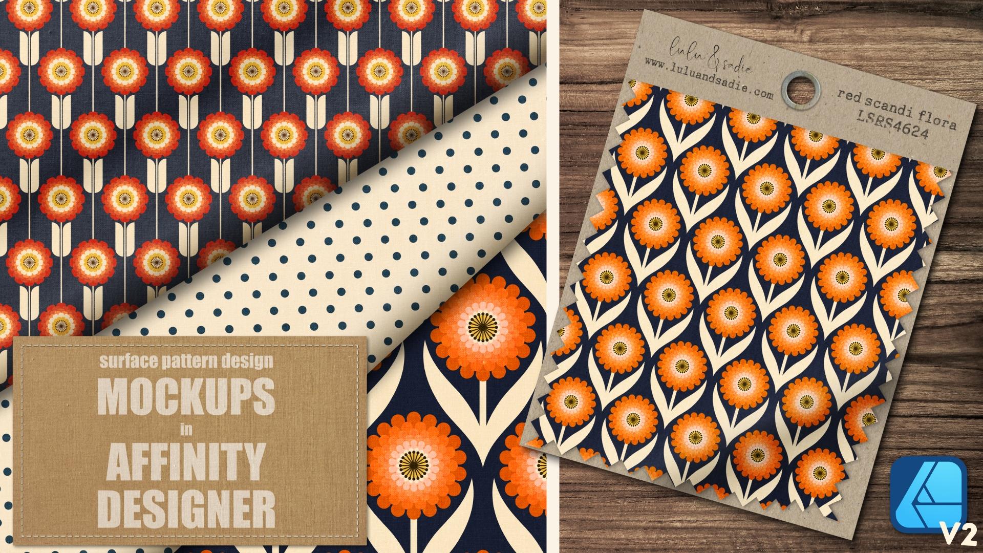
1. Welcome to Class!: Have you noticed
there aren't a lot of mock ups out there created
in the Affinity suite. For the Affinity suite. And while mock ups created in that other app using
smart objects will work, sometimes it takes tweaking and time to get them to work
the way they're intended. So let's change that
and make our own. Harry I'm Tracy, an artist and educator from
the Chicago area. Designer and the rest of the Affinity suite are my go
to set of applications for everything from surface
pattern designs to illustrations and other
graphic design projects. I enjoy sharing my knowledge
and love of these apps, and I've had the
privilege of being named an online educator
to watch by Serif, the makers of the
Affinity Suite. In this class, I'll show you
how you can use designer to create realistic mockups for your surface pattern
designs from scratch, using vector shapes
and free textures. Mock ups are an integral part of the surface pattern
design process. They allow you to share single
designs or collections on social media in your self
sheets and online portfolios. When you create your own
mock ups and designer, not only do you get
exactly what you want, no more, no less. But you know with certainty, they'll work in all
of the affinity apps, designer, photo, and publisher. This is the first in a series
of classes I called mock up workshop where we'll
be starting with the basics and creating
three mock ups, a full canvas swatch with
multiple realistic gathers in different directions that are great for sharing close
ups of your motifs, a swatch card with gathers
and realistic warping. And finally, a three
fabric stack complete with realistic folds so you can easily share a small
collection of designs. By creating these
three mock ups, you'll learn how to create multi directional gathers using a combination of the gradient
tool and appearance panel, how to add realistic texture to your mock ups using no cost
images from the stock studio, and other free use image sites, how to create realistic
fools and fabric to create a stacked effect
using the gradient tool. And finally, how to work non destructively and
save your mock ups as reusable templates that
can be used time and time again quickly adding new
designs for maximum efficiency. Plus, the process and tools you learn about in this
class can be applied to other projects
that you create in designer from illustrations
to graphic design. Now, I'm going to be using
the iPad version of the app. However, if you're on
the desktop version and you know where the
tools are located, you should be able
to follow along. Just note, I'll be
utilizing tools that can only be found in
version two of the app. This is intended for
intermediate users, as it does assume
some familiarity with the layout of
designer for iPad. So if you're new to the app, I recommend taking beginner classes that will
walk you through version two's user interface and give you an
overview of the tools. So are you ready to
dive in and create your own realistic mop ups with some simple vector shapes
and beautiful textures? If so, let's get started.
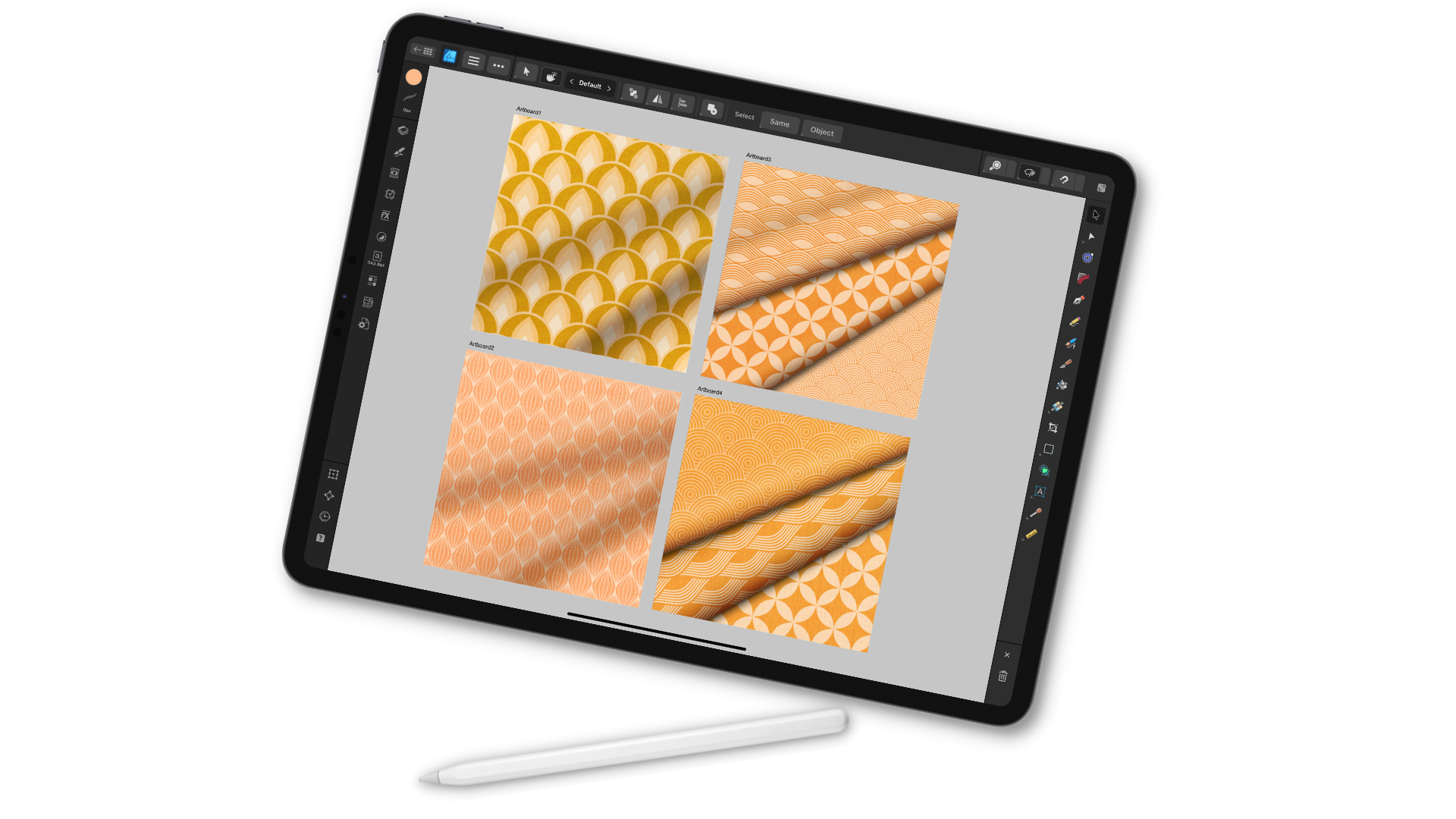
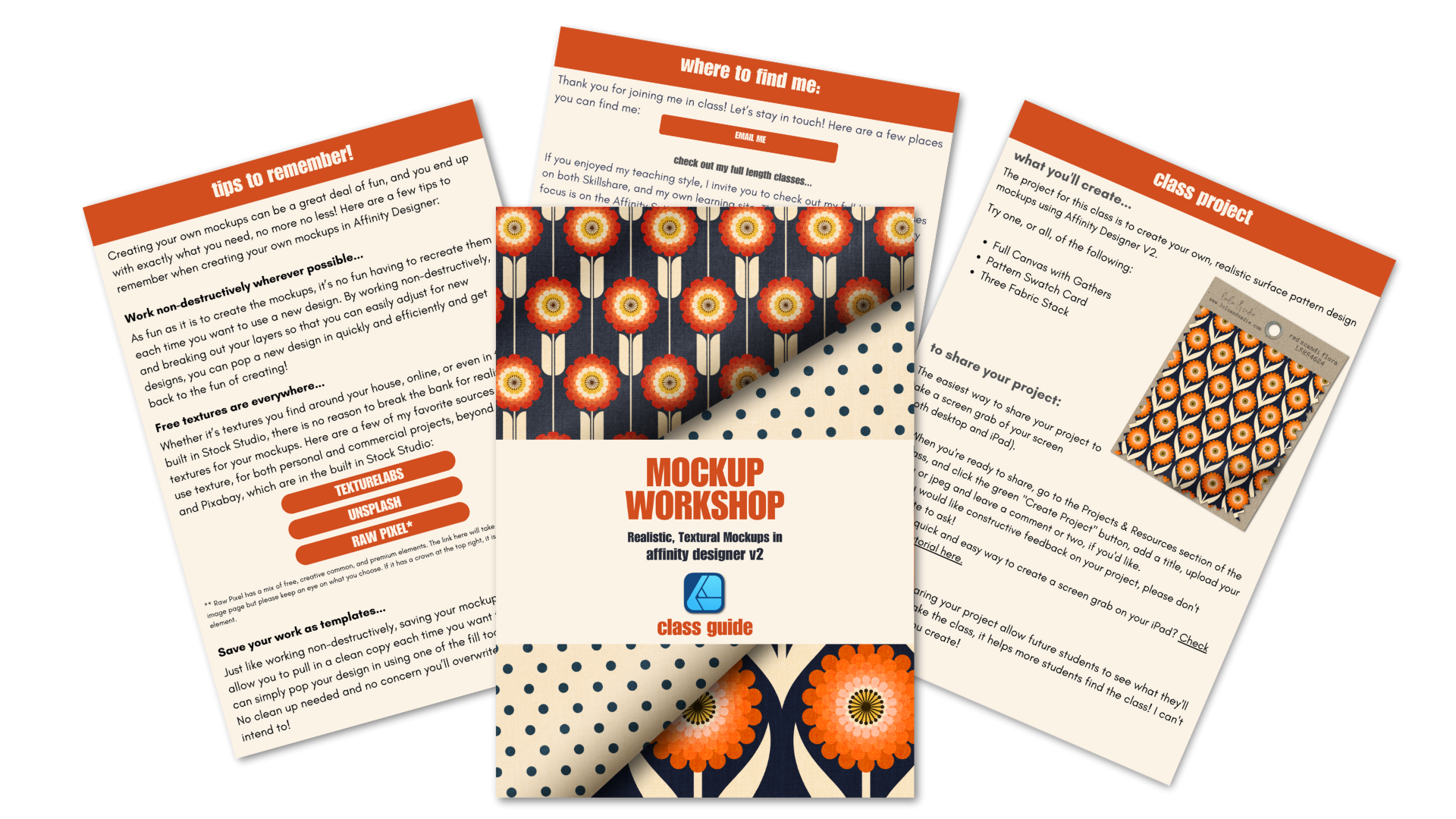
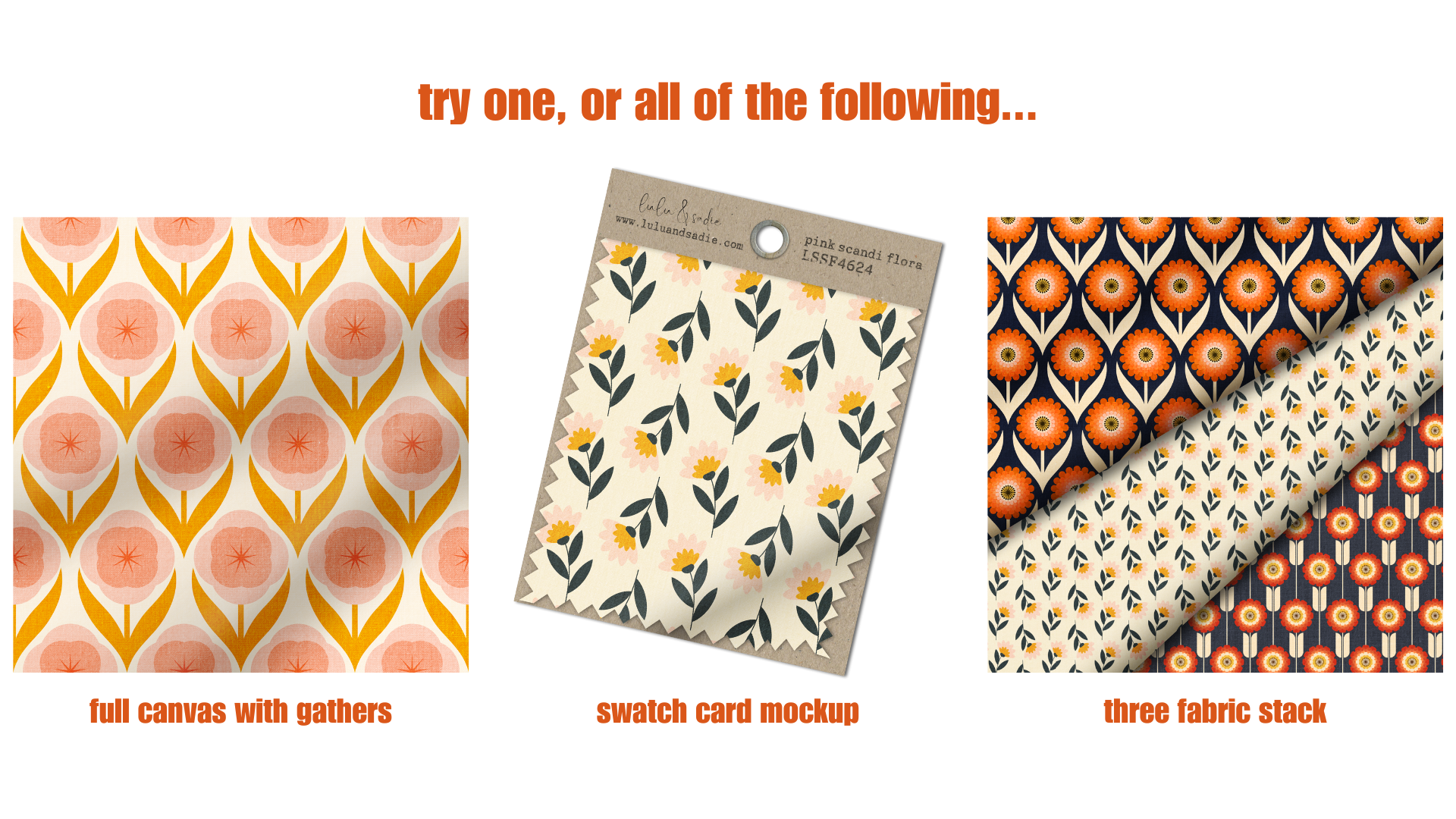
2. The Class Project: The project for class is to create one or all of
the following mock ups, the full Canvas swatch, the swatch card, or the
three fabric stack. Have fun with your mock
ups and use the basics you learned to create something that works well with
your design style. Okay. I'd love to
see what you create. And of course, sharing
your project allows prospective students to see what they'll learn when
they take the class. So please consider sharing your project here in the
projects and resources section. The easiest way to
share your project from the iPad is to take a simple
screen grab of your mockup. Once you're ready to share, click the Create Project button. Create a cover photo
title when prompted. Upload your screen grabs, add any comments you'd
like and hit publish. I can't wait to see
what you share. Next up, we'll take
a look at how you can create multi
directional gradients on a single object using the appearance panel.
I'll see you there.
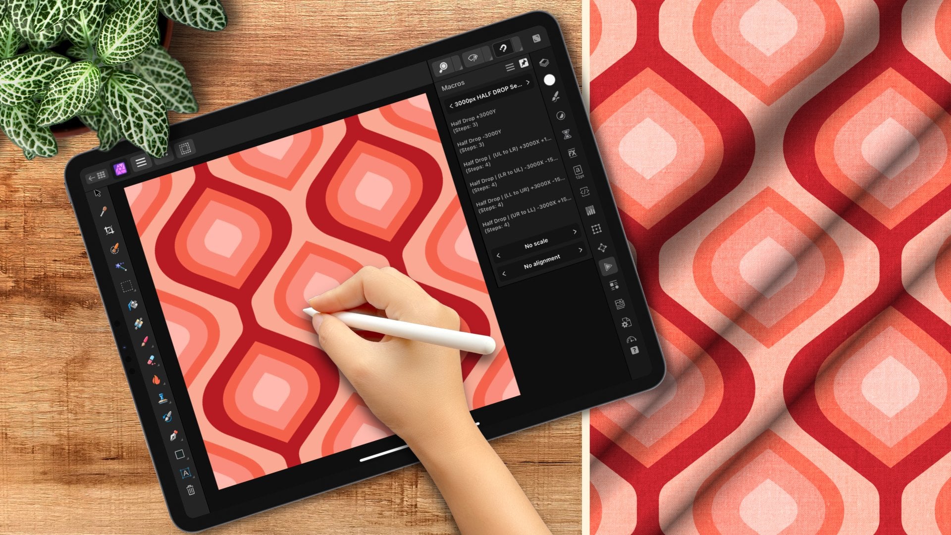
3. Full Canvas Mockup Part 1 | Appearance Panel & Building Layers: In this lesson,
we'll take a look at how to create folds
in fabric with multi directional
gradients using a combination of the appearance
panel gradient tool. By the end of the lesson, you'll have a swatch mockup
that's perfect for sharing close ups of your motifs.
Let's get started. This is a mock up I
created previously, and while the
difference is subtle, it has folds tilting at slightly different
directions created by multiple gradients
at different angles. Now, in the affinity
suite at a base level, you can only have
a single gradient per object in one direction. This is a rectangle
that I created, and I've already dragged
out a linear gradient. As soon as I add a second one, even though it's at
a different spot on the canvas and a
different direction, it knocks the first one out. For the mock ups, we'll be
creating in this lesson, we're going to use
the appearance panel to add multiple fills
to a single object, in this case, a rectangle. And use those to add multiple gradients
at different angles. Before we get started,
let's take a closer look at the appearance
panel and how it's laid out as well
as how it works. The appearance panel is located on the tools
side of designer, and the icon looks like
a box with an eye on it. Now, if you ever
can't find a tool, just tap and hold
the question mark at the bottom of the screen and
these labels will pop up. I do want to note my screen
is flip for a left hander, so your tools might
be opposite of mine, but of course, everything
works exactly the same. Now, the gradient tool needs something to add a gradient to. So I have two rectangles here, the bottom layer that's
bringing that gray color, and then my second one that has the actual gradient on it. If I go to the appearance panel with that gradient selected, you'll see I have a
fill and a stroke, and you're always going
to start out with one fill and one stroke. If I select one of these, you'll also see these
three dots at the top. This is going to allow me to cycle through the
blend modes for that particular fill or the stroke if I
had that selected. And that's something
to take note of. We're not going to be using this particular
feature in the class, but the appearance panel allows you to treat the stroke NFL separate from one another and change the blend mode
of each individually, which is something
that you can't do on the overall layer level. You'll also notice two
plus signs at the top. One is the outline of a circle and the other
is in a filled circle. These are going to
allow you to add additional fills and strokes to your shape and then treat
each one of them separately. As you add a filler stroke, it's going to add the new one
on top of the existing one, but you can drag them in
any order that you need. Now, as I mentioned,
you're always going to have one fill and one stroke. But as you add additional ones on top of the existing ones, you'll notice this
trash can pop up. And that's going to allow you to select them and delete them. Now, it's really important
that you use that trash can to delete and not the
one down here at the bottom, because that's going to
remove your entire layer. I want to add my
second gradient. But again, I can't just
add it to this fill as it is because it's going
to knock out my original one. Instead, what I need to do
is with that layer selected, go to the appearance panel, and I'm going to
add a second fill. Just make sure that you
tap it with your pencil. That's going to engage
that fill layer. With my gradient tool, I'm going to drag out a new one. And at first glance,
it's going to look like it deleted
the other one. But it's simply
because this one is fully opaque and it's
sitting on top of it. If I turn that off, you can see the other one
is still there. I just need to adjust this
one so that you can see both. So again, with
that one selected, I actually have a swatch setup for Mgradients. I'm
just going to tap that. And now, if I close this, you can see both gradients are showing up in two
different direction. Now, as I mentioned, you can use the appearance panel to change
blend modes at each level, no matter how many fills and
how many strokes you have. And that's a handy tool, but in this particular class, we're actually going to
do it at the layer level. So if I wanted to adjust this, I could go up here and just
change the blend mode. I could change the opacity and I can control both
at the same time. Now, for this lesson,
we're going to be creating two separate layers. We're creating a
layer for our shadows and one for our highlights, because while you can adjust the blend mode of
each fill separately, I do find having the
shadows and highlights broken out a much more
flexible approach. So let's go ahead and
create our base mockup and then begin to add some of the shadows and highlights
using the gradient tool. We're going to be saving
the mock ups we create in this class as reusable
templates so that we can pull in a clean
copy whenever we need them and quickly
add our latest design. So we want to think
ahead how we might use our mock ups so
that we can create our initial canvas to be
as flexible as possible. So, for example, I've
set up a 3,000 by 3,000 pixel canvas at 300 DPI. And the reason I've
chosen this is because I'm going to
be adding textures. And that gives me the
option of printing without any issues
should the need arise. Now, I can always export at a lower resolution for screen, but starting with
that higher GPI means that I don't have to worry about pixelation from
textures if I do print it. I've also set my
color space to RGB, because for the
most part, I will be using these on screen, and the printing companies I use actually use RGB over CMYK, but you can always export with a different color
space if you need to. I've set up an artboard because I like the flexibility
of being able to add additional artboards and
take a single mop up and make variations that I can
see across one canvas. But it's entirely up to
you whether you want to work on a regular
canvas or an artboard. So go ahead and think about
how you're going to use your mop up and set up
your canvas accordingly. Now that the canvas is in place, I want to begin building up my layers so I can
add my pattern fill, texture and my shadows
and highlights. So I'm going to create a
series of four rectangles. I'll start with
my rectangle tool and just use this light fill. I don't need a stroke on it. And I'll just start
dragging out a rectangle. I want to duplicate
this three times. So I'll just use my
quick menu to do that. And I'm going to go right to my layers and start
making changes to these. So the bottom most layer is going to be my
pattern fill layer. I'm going to change
the name of that. Everything is going to end up being clipped inside of this. And I'm going to keep
it that gray color. It doesn't need to change. The top layer is going to be either the highlights
or shadows. It doesn't really matter which I'm going to make
this pure white, and I'll change the
name to highlights. The second one is
going to be shadows. I want this to be mid tone gray, and I'll explain when we get into the shadows
and highlights why I specifically choose pure
white and mid tone gray. So I'll tap that, and you can't see it because it's sitting
beneath the highlights, but I'll go ahead and
rename this shadows. And then finally,
for the texture, I'm actually going
to be replacing the fill there with
the actual texture. But I'll go ahead
and make this black just so that there's a
difference between the layers, and I'm going to rename
this fabric texture. So I want to turn off
these top three layers. I'm going to turn them on as I add them so that I can
see the layer beneath. I'm going to select all three. And again, I want to clip them inside the
pattern fill layer. Our layers are in place, and we're ready to begin adding some texture and dimension. We're going to do that
in the next lesson. So I'll see you there.
4. Full Canvas Mockup Part 2 | Texture, Shadows & Highlights: In part one of this lesson, we created our canvas
and then built up our layers to get them ready for the shadows, highlights,
and texture. So let's start adding those
beginning with our texture. I'm going to go ahead
and turn that layer on. As I mentioned in
the previous video, I'm going to be replacing
this with the texture, and I'm going to use the
gradient tool to do that. This is going to allow
me to easily swap the texture out with
a different type of fabric should the need arise. So I'll make sure that
layer is selected, and I'll go to my gradient tool. I want to choose Bitmap. So I'll just engage
the contextual menu up here and find bit Map. Now, mine are in my files, but you can pull them
from photos as well. I'm going to be using one of my favorite fabric textures
from texture lab.org, and I've linked to
that site in the PDF. These are free textures
that you can use for commercial and personal use. So I'm going to go
ahead and tap that one, and it's automatically
going to replace that black fill
with that texture. Now, you can see the
lines because it's replaced it at the
size, it's downloaded. So I'm going to scale this
up by using these sliders. And I also want to drag this over to the
right a little bit because I know there's these
little poles in the fabric. This is actually why I
like this particular one. It has those tiny little details that lend to the
realism of the mock up. I'll go back to my layers, and I want to change the
blend mode to overlay. Now, the thing
about using overlay is that it can
adjust your colors. It can actually lighten the
colors of your pattern. So what I want to do is add a non destructive curves
adjustment so that if the need arises whenever
I put a pattern in place, I can either darken it
or lighten it as needed. So with the fabric
texture selected, I'm going to go to the
adjustments and just tap curves. I'm adding this directly
to the fabric texture, so it's going to
lighten or darken that rather than
my pattern layer. You'll see this
little box pop up, and you're going to notice
that this is automatically clipped inside because the
texture layer was selected. This is a completely non
destructive adjustment. So if I don't need it,
I can turn it off. I can reset it by
tapping that icon, or I can just go right into the spine and just
make any adjustments. So I'm actually going to
leave this as is for right now and only adjust it if I need it for the
pattern that I pull in. All right. With our
texture in place, let's start adding
some shadows and highlights beginning
with the shadows. Common thought in
digital art is that black set to multiply
is perfect for shadows, and that might be the case
in individual scenarios. But in some cases,
a black gradient, especially set to multiply, can be a little too harsh. It's also not neutral enough
to be able to organically blend into a wide range
of colors across designs. For these mock ups,
we want our folds, our shadows and
highlights to be subtle. Mid to gray set to either
multiply or linear burn, which I find I use
the most can be a more neutral
alternative because it varies well with just
about any color, and you may just
need a few tweaks to the opacity and luminosity. And this is the
reason that I set the shadow layer
to mid tone gray. Whatever color you start with is the color
the gradient tool is going to pick up and then create the two initial
color stops out of. Now, before I add my gradient, in taking a look at
this with the texture, I'm actually going to go
to my pattern fill layer, and I'm just going to make
it a little bit darker. That's going to help
us see the difference between the shadows and
highlights a little better. I'll bring that too out there. And I'm just dragging
down on the color dot. I'll engage my shadows, and I want to bring this
above the highlights. That's going to help us
later when we add those. We'll be able to see
where our shadows are at. So again, this is set
to mid tone gray, which is one of the swatches in the quick colors. You
said at the top of that one. I'm going to grab
my gradient tool, make sure that
layer is selected, and I'll just drag out
my first gradient. Whenever you create a gradient, it's going to start
with two color stops. The first one, which is
the lighter one is going to be the color of whatever
object you're placing it on. So in this case, mid tone gray. The other is within
the same color range, but a few stops down
on the luminant scale. It's always going to
go light to dark, but you can always
swap its direction up here in the contextual menu. Now, I like to use
the HSL slider to adjust my gradients
because most of the time, I'm only adjusting the
luminance and opacity. And to do that, you'll
just tap on a color stop. It's going to become
the larger of the two, and then you can make whatever
adjustments you need. I want to add a color stop in the middle of this gradient. That's going to become
the shadow itself, but more on that in a moment. I'll just tap to add one, and that's going to add it mid range between the
two existing ones. And I can adjust all three of
these as much as I need to. The other thing
that you're going to notice on the gradient, are there are these
small handles, and these are mid range sliders that are going to allow you to control one color versus the other between
two color stops. And as you add color stops, additional handles
will be added. These are going to
come in handy with our shadows and highlights
because they're going to allow us to create
smoother gradients on either side while also
controlling their depth. I want to adjust these three
color stops along with the midpoint sliders until I have a shadow I feel
comfortable with. Now, I've done these
enough that I have some numbers I feel
comfortable dialing in, but adjust yours as needed. For the darkest one, which is
going to be in the middle. I'm going to tap that, and I want to change the
luminance value to 50. So again, I want that
back up to mid tone gray. Remember, it
automatically adds it mid range between the
two existing ones. I'm going to bring the
opacity of that one down to about 70%. I might change it,
but that's a start. For this top one, I want to bring the luminans up to 100%, so pure white and the opacity
all the way down to zero. So that's going to pull
that texture through, and now you can see beyond it. For the one on the bottom, it's going to be
slightly different. I'm actually going to
keep the luminans at 50%, but I'm going to bring the opacity all the
way down to zero. It's a subtle difference, but if I bring the
luminants up to 100%, you can see it adds
a lot of white, and that's not what I want. For this particular shadow, I want it to look like it peaks and then it has a nice fold. Remember, you can also adjust the opacity and blood mode
of the overall layer, not just your color stops. So speaking of which, I'm
going to go to my layers, and I'm going to change
this to linear burn. I find most of the time that actually works better
than multiply, which kind of gives
it a gray cast. Now, in this case, because
I have gray underneath, multiply is working better. I don't actually have a color, but just play around with the two whenever you
add a new design. There's really no right answer. You're going to adjust these
color stops, blend modes, and opacity until you
like the shadow that you've created and feel
it's creating a nice fold. So I'm going to change
this back to linear burn. And just bring the opacity
down to about 60%. I also want to adjust my
mid range sliders here. I'm going to pull this kind
of tight to the shadow. Again, I want it to
look like a peak, and then I'm going to pull
this out a little bit. I think I'm going to
bring this one down. Now that I've done that, I feel like the opacity could come down a little bit
more to maybe 40%. These are all non destructive. They can be adjusted
at any time. I want to add my second shadow
in a different direction. But of course, I can't add it to the existing fill or it's
going to knock this one out. So I need to add a new fill to that layer within my
appearance panel. But here's the thing. The gradient tool will
remember the colors I last used within the same fill
or across two objects, but it's not going
to remember it across two fills on
the same object. I don't want to have to
start over again, though. So what I want to do is create a swatch out of my original one. Before I do anything
with this one, I'm going to reselect that
I'll go to my layers, and I want to make sure
that my move tool is engaged so the entire
layer is selected. I'm going to go to my swatches, and I have an application wide palette setup here that has shadows and
highlights in it. I'm going to tap
the burger menu at the top and choose Add
current fill to palette. You can also use your quick
menu to do it as well. So now I'll go back to
my appearance panel. I'm going to tap to select that fill. You
can see the dot there. Grab my gradient toll, and I'm just going to
drag out my gradient. Now, you can see I've dragged
it out top to bottom. So it's actually going
to create this flip, but I'll show you how
to take care of that. I want to go to my swatches
and I'll tap that swatch. Now, because I drag
top to bottom, it actually reversed
it from this one. And I want my shadows going
in the same direction. So what I'm going
to do is go up to the contextual menu at the
top and just choose reverse. And now all of my shadows
are in the same direction. So all I need to do here
is adjust the placement, the overall angle, and maybe
adjust some of the settings. But even if I have to
make minor adjustments to the opacity and luminosity
values of the color stops, it's still far better and more efficient than having
to start from scratch. So I'm just going to make some adjustments to
my placement here. Maybe I'll move
this one like that. I think I like the
depth of both of these. I'm not really going
to touch those. I might make that a
little bit less deep. So just looking at
this, I like this. I may end up changing it after the highlights
are in place, but this is a good start. So with our shadows in place, you can begin to see the
dimension and the fabric, but we're missing
the highlights where the highest point on the fold would have
light hitting it. So let's go ahead
and add those next. We're going to follow
the same process with the highlights as
we did the shadows. And again, I've added them on
a separate layer because I want to use a different overall
blend mode and opacity. These are just going to
be subtle highlights at the peaks of the fold just to give them some
added dimensions. So they're not going to be
as strong as the shadows. Then that's part of the reason I want them on their own layer. So I'm going to
engage that layer. And the reason
again, that I move the shadows up is so
that you can see where those are placed because I want the highlights sitting
at the very top of them. I'll select the layer,
go to my gradient tool, and I'm just going to
drag out a gradient. And this time, I'm purposely
going top to bottom. So just like with the shadows, I'm going to tap to add a
second highlight there. I want to change that so
that the luminance is 100%, and I'm going to bring
the opacity down to 65. I may end up changing it, but I'm going to start there. For the top one, I'm going to
keep the luminans at 100%, but bring the opacity all
the way down to zero. And then for the bottom one, I'm going to keep
the luminans at 70%, which is what was automatically set when I dragged
out the gradient, but I'm going to bring
the opacity down to zero. The reason that I did that is
it keeps it slightly gray. Because these highlights
are going to be sitting on top of the shadow. Having a slight gray tint there is going to help it blend a little bit better
into the shadow, so it doesn't look as harsh. Now, obviously,
this is too much. I'm going to make
some adjustments, and then I'm going to
go into the layer. And change my blend mode. Just like with shadows where
multiply is the G two. With highlights, the G two
tends to be screen or ad, which works most of the time. But for this purpose, I actually find that soft light is a better,
more neutral option. So I'm going to change
this to soft light, and then just take a look at
where we're at. All right. So that knocked it back nicely, but it's a little too heavy. So I'm going to bring the
opacity down just to touch. I don't want this to look shiny. Again, I just want to
give the impression of the light hitting the
top of that fold. Now, once again, I want
to add my second one, but I don't want to have
to start over again. So I'll select the
overall layer. Go to my swatches, and I'm going to save
this one to my palette. I'll make sure that's engaged, and I'm going to
add the second fill and make sure that
it's selected. I'll grab my gradient toll
and just drag that out. I don't need to add
the color shop. I just need to go to the swatch, and it's automatically
going to add it for me. And in this case, because
I knew I wanted to go top to bottom, I don't
need to reverse it. I just need to make some adjustments as
to where it's placed. The amount of depth you have in both is going to determine
how high the folds look. In this case, I actually
like the height on this one. This would work really well with a lighter pattern so that
you can really see it. But again, with each pattern
design that you add, you may end up adjusting these. And that's why it's great
to have these broken out. You can just go right in, make sure you have
the right fill for your highlights
or shadows selected, and then just make any
adjustments that you need. So, my shadows and
highlights are all set. My texture is in place, and I want to save
this as a mock up. But there are a few final tweaks that I want to make
before I do that. I'm going to stick with
two folds in my fabric. You can add as many as you'd like in whatever
direction you'd like. You can also try some of
the other gradients like the elliptical or radial if you want a slightly
different look. But for the purposes
of this one, I'm going to call it done. Again, I just want to
make a few final tweaks. The first is if you feel
like the shadows and highlights are still
a little too intense, even with using the midpoint
sliders to feather them, a gcianm blur can
help with that. So I'm going to start
with my shadows. I'll select my shadow
layer and go to FX. You don't need to have a
particular fill selected. You just need to make sure
that the entire layer is engaged by using
the move tool. I'll tap to turn
on Gusciumblur and then tap the name to engage it. And I'm going to bring
this up to about 30. It's a really subtle difference. That's a little too much, but
you can see it's knocking back the harshness a little bit while maintaining that gradient. So I'm going to bring that down. I might actually go to about 40. Now, normally, you can copy an effect and paste that
effect to another layer. But for some reason,
when you have two fills on a layer, that
actually doesn't work. I find that it actually knocks
one of the gradients out. So I'm just going to start
over with the highlights. I'll select that layer, make sure my move tool is engaged. I'm going to turn on my
gaussianm blur, and again, I'm going to bring
that up to about 40. I'll step back, maybe
make it a little bit smaller and just take a
look and see if I like it. Now, one thing I do see is that the gaussian blur is making human pull
away from the sides. So I'm going to go back
into my VAX studio, and I'm going to
engage preserve Alpha. That's going to snap them
to the edges so that any of those gradients aren't pulling away and you don't
have an empty space here. The other thing
that I want to do is to turn on scale with object. If I were to scale
this up and down, I want those effects
to scale with it. So I'll go back to my shadows. Go back to that other layer. And I want to do the same thing. I'm going to preserve Alpha. And I'm going to turn
on scale with object. You may not need to turn on
preserve Alpha, but again, if you do see where your shadows or highlights are
pulling away from the sides and you
have an empty space, you can turn that
on to prevent it. The second tweak that
I want to make is to decide where I want
my texture layer to sit in the layer stack, whether it's above the shadows and highlights or below it. If you have the
texture layer above your shadows and highlights
in the layer stack, the texture is
going to be applied to those layers as well. So you might get a
slightly different look than if it was beneath them. When it's on the
bottom of the stack, those shadows and
highlights are going to sit right on top of the texture. And while it will show through from beneath, in some cases, depending on your design, especially when you
have a lighter one, it might end up
looking a little fake. I try it both ways on any new design just
to see what works. So all you're going to do is just grab that fabric texture, go to move it forward twice. And you can see It shift
slightly when I do that. So the textures being
applied to both. In this particular case,
I like that better. But again, if I add a pattern where I feel that's not working, I can always change that. Now that I have
everything in place, I want to save this
as a blank template. So I'll head up to
the documents menu, which is the burger
menu at the top, and I'm going to choose
port as template. Just name this,
however you want. I'm going to call this
two gathers diagonal. If you hit save, it's going
to ask you where you want to save it and it works like any
other export at this point. Now, I've already saved this, so I'm not going
to do that here, but just follow the
steps just like you would exploiting
any other document. Now, whenever you pull this in, you can make your
adjustments just by going in selecting
the pattern fill. In this case, I
would select that, select my gradient tool, go to my assets, and just pick whichever
pattern I want to add to this. And then from there, I can
just make my adjustment. So I think I'll pick
the one from earlier. And if I feel like
the shadows and highlights aren't
working well with this, I can move them around just
by going into each one. I can change the opacity
of the texture layer, if I feel like it's too harsh. Again, because all of this
was done non destructively, you can make adjustments
to any of it. Once you're done making your
adjustments to your design, you can follow the
normal export function, either by going up to the
documents menu and choosing export or by using
the export persona. It works like any other
illustration or document. In the next lesson,
we're going to take a look at what we've
learned in this one and create a swatch card mock up complete with pinking shear
cutouts. I'll see you there.
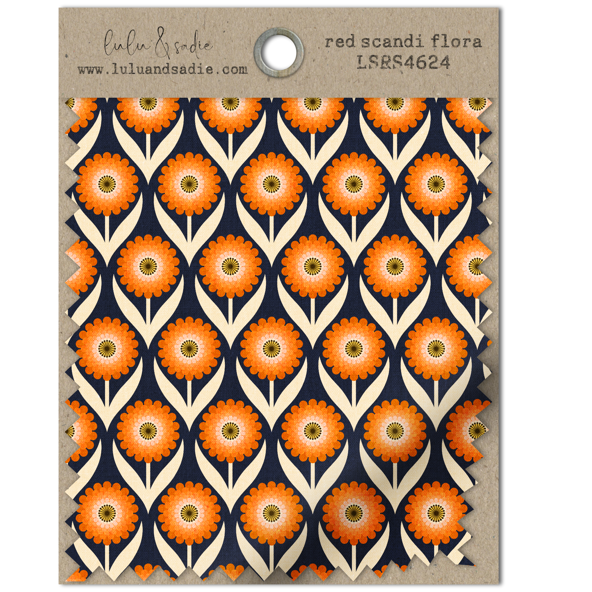
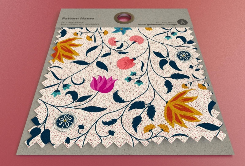
5. Fabric Swatch Part 1 | Building & Organizing Layers: A swatch card is a great way of sharing a single design on social media or your
online portfolio along with your design
and contact information. In this lesson,
we're going to non destructively create
a chipboard pattern spotchhlder with editable
type so you can swap out your designs and update their info
quickly and efficiently. Now, just like the
previous lesson, I want to ultimately save
this as a reusable template. So I want my initial canvas to be as flexible as possible. So I'm going to create
a canvas at 3,000 3,000 pixels at 300 DPI. That's going to allow
me to print this without any issues with
pixelation from my textures. Now, if you know you're only
going to use it online, you can certainly use a
lower DPI if you'd like. Once again, I'm working with
an artboard so that I can create variations of this and see everything in one place. But again, it's up to
you whether you want to work on an art board
or a regular Canvas. You can always change your
mind and add an art board by going up to the documents menu and choosing art boards. Now, I am going to export my template with a
transparent background, but for now, I'm going to leave the standard white
background in place. Now, just like the
previous lesson, I want to create all of
my flat shapes first. Then I'll begin adding my shadows, highlights
and texture. It's much easier to keep
track of what you're doing when you do them
in a certain order. So I'm going to start
with the backing and the top holder. The color of my
shapes don't matter because I don't plan
to use blend modes. The texture is going to
completely replace the color. If you do want to use blend modes with the
color underneath, then just make sure that you're
choosing your color here. So I'm going to grab
my rectangle toll. And I'll just use
a sort of light. Gray, I guess. And I'll
just drag out a shape. And that looks good
right about there. I'm going to center this up, and I'll use this to
create the top card. So I'm going to hold my
finger down and duplicate it, and I want to make this
a little bit lighter. We're not adding any
shadows or highlights yet, so you can't see the
difference unless you change the colors
at least slightly. So I'm going to drag this up. Now I can always adjust
this if I need more room, but I think that looks
good right there. The next thing I need is the
shape from my fabric swatch, and I'm going to use this
back shape to do that. Again, I'll duplicate it, and I'll change it to
this mid tone gray color. Now, instead of sizing this
down using the move tool, I'm going to use the
contour tool instead, because that's going to
allow me to maintain the aspect ratio very easily so that I'm not
wasting any space. I'll grab my contour tool and I'm going to tap and
just drag to the left, and you can see it's
just sizing down. Now, I don't want to
go too far because the pattern design is
the star of the show. Everything else is
background information. So I don't need a lot
of space showing. I'd rather have more
space for my design. So I think that looks
good right about there. Now, one important step with the contour toll is that you make sure that you
bake this in place. So we're going to
convert this to curves by tapping
at the top here, and that's going to
set the corners. If you don't do that, as you scale this up and down, you're going to end up having different contours created
as you size up and down. Now, I could leave
this layer as is, but I actually want to
create triangular cutouts on the sides and the bottom as if this was cut
with pinking shears. Now, I've actually
done this previously, so I created an asset that
I can just pull in set on top and use as a way
of subtracting that. But I'll show you
how I created it. I'm going to turn off
this top layer for now. I'm just going to use a series
of triangles that I power, duplicate, and then use
the geometry functions. So I'll select my triangle. And I'm going to use I'll just use black
so that we can see it. I'm just going to drag
out a small triangle. And I want to rotate this. So I'll just rotate clockwise. And this is a little too
small or big rather. I'm going to move a
little bit smaller, and I'll just pop it up
into the top left corner. And now that I'm
backing out, I think it actually was a
good size before. So I'm just going to
drag it up a little bit. Now, normally, I would have a bluetooth keyboard attached to my iPad so that I can use
a keystroke to do this. But I'm going to
power duplicate by two finger tapping and dragging
to get that first shape, and then I'll use my quick
menu to get the rest. Okay. Okay, don't
worry if it goes past. I'm actually just going to
select all of these shapes. So the first one selected, and I'll two finger tap
to select the other. And I'm just going to drag
this up and pop it into place. So I don't want
multiple curve layers. I actually just want
one curve layer. So I'll go up to my geometry
operations and choose ad and that's going to create
a single shape on the side. Now, I need to duplicate this and flip it
to the other side. There's a really quick
and easy way to do that. So I'm going to duplicate it. And I'm going to select
that fabric layer. I'll go up to the top and I'm going to choose flip horizontal. That's going to
automatically flip it and place it exactly where
I need it with no dragging. So I need my last
shape on the bottom. So again, I'll duplicate this, and I'm just going to
rotate this clockwise. Now, this is too big, but I'm going to place
it where I want it, and then I'm going to use my node tool to select
these end nodes, and I'll just delete those. And then I'm just
going to center this up where I want it. Right. So once again, I just want one shape
because I want to use this to subtract these triangles from
my fabric layer. So I'll go up to the
top and choose Add. Now, at this point, this
is what I would save to my assets so that anytime I'm creating
something like this, if I need to create
shapes like this, I can just pull it in, place it and use the
geometry functions. But now I'm going to go ahead
and select both of these. It's important that the black
triangles are on the top. I'll tap the geometry and choose subtract,
and I'm all set. Now, finally, with my
main shapes in place, I wanted to create a
hole in the top with a little metal grommet as
if it could be hung up. Little touches can go a long way in making a mock
up look realistic. Don't be afraid to add them. Go to grab my donut
tool for this. And I'll just drag
out a doughnut shape. I'm going to hold my finger down so I get a perfect circle. And I think that looks
good right there. I might just bring the whole
radius down or up a bit. So what I want to do is
first center this up. I'm going to select
my top piece here, and I'll just use my
alignment options to align center and middle. And I want to punch
a hole out in the middle of this so you can see straight
through to the back. When I add shadows, if I place anything
underneath this, like a piece of wood grain
that's like a table, you're going to see straight
through to the bottom. I'm going to use my shape
builder tool to do that. So I want to select all of my shapes because
I want the hole punch through all the way to
the white background layer. I'll go to my shape builder
tool and I'm going to select the subtract and all I need to do is just
tap in the middle, and that's going
to punch that hole out in the middle of
all of those shapes. We have all of our
shapes in place, and we're ready to begin adding our texture shadows
and highlights. But before we do
that, I want to do some final housekeeping things specifically in the
layer studio here. So, I want to rename
everything, of course, but I also want to
make some copies of my fabric layer for my texture
shadows and highlights, as well as clip some things
inside this bottom layer, which is going to become
our pattern fill. I'm going to start with
renaming this guy. This is going to be the Gromet This curve layer is going
to be the top of the card. I want to take this one, which
is going to be the fabric, and I'm going to
duplicate it three times. There's going to be
one for my texture, one for my shadows, and
one for my highlights. So this one is going
to be the highlights. I'm going to start
with pure white. And I will change
this to highlights. And I'm going to turn that off. This one is going
to be the shadows, and this is already
set to midtone gray, so I'm going to keep it
there, but I'm going to rename this layer shadows. This one is going
to be our texture. Again, I'm going to be
replacing this with texture, but I'll change this to
black for right now. And I'm going to
change the name of the layer to fabric texture. I'm going to turn these two off, select all three of these, and I want to clip them
inside of my pattern fill. I'm going to rename
this one. Pattern fill. And then I want to take
all three of these and clip them inside
the back of the card. We're going to be adding
a drop shadow to this. And in order to prevent the drop shadows we add to
these from spilling over, I'm going to effectively keep them inside by clipping
them in the back. So let's name this back of card. So we have the back of the card. We have our gramt top card, and our pattern fill. And I want to make sure
that my gramts on top. I have the top card, and
then the pattern fill. So I'm all set to start adding the texture
shadows and highlights, and we're going to do
that in the next video. So I'll see you there.
6. Fabric Swatch Part 2 | Adding Texture, Shadows & Highlights: In part one of this lesson, we set up our canvvas
built up all of our shapes and then made
sure to name our layers, clip things into place and make duplicates where
we needed them. So we're ready to start
adding our shadows, highlights and texture,
and we're going to start with all of our
drop shadows first. When adding shadows
for realistic effect, you want to think about what the real depth of the object would be that
you're adding them to. So, in the case of this
top card, for example, this is a very thin
piece of chipboard, probably about 2 millimeters. So the drop shadow here, just above the fabric
would be really minimal, just enough to show one. So I'm going to make sure
the shape is selected. I'll go to my FX studio. I'll toggle on outer shadow and then tap to get my
contextual menu. And I'm going to go up
to the top here and just start to drag down
slightly. Just a touch. And then I'll bring
my radius up. Now, again, I've clipped this inside that background
so that anything on the sides doesn't add additional shadow
to the drop shadow I plan to add underneath this. I really just want
it above the fabric. Now, I may end up changing that once I get a
pattern fill in place, but for now, I'm going
to call that done. I just want enough that
you can see a shadow. I'm going to skip
the drop shadow under the fabric for right
now because we're going to be creating some warps in this and adding
some deeper shadows, and I don't want to add
that until that's done. So let's go ahead and add the
shadow under the grommet. I think I'm going to change
the card or the color rather, though, to this maybe
this lighter gray. Now, technically,
all I really need to do is grab the top card. I'm going to copy it. Select the gramt and paste of X, and I can just adjust
this as I need it. So the offset on this is
actually incorrect because I want all of my shadows
to go the same way and I plan to
create my drop shadow, so it's down into the right. So I'll go into my FX, tap to engage it, and I just want to
bring the offset over. And now that I'm
looking at this, I feel like the radius on both of these isn't
quite high enough. So I'm going to go
back to my top card here and just adjust the radius on that
as well. All right. I can always bring it
down if I need it, but I think that looks good. Again, I'm skipping
the fabric one. I'm going to add the drop shadow behind the back of my card. So I'm going to go
up to this layer. Now, this is going to be
a much deeper shadow. For the most part, you
want to think about what the actual thing would
look like in real life. But this mock up is
going to be seen at either a small size on social
media or on a website. Or in the context of
something you print. So adding a slightly
larger drop shadow to the largest part is
going to give it a little bit more
depth when you're viewing it at that smaller size. I don't want to go overboard because this still
isn't that thick, but I do want it
to be a bit more visible than the drop shadow
under the other pieces. So again, I'll engage
the drop shadow. I just to make sure
the layer is selected. I'll grab the contextual menu, and I'm having my shadows
come down into the right. So I'll bring it to
right about there, and then I'll bring
the radius up. Oops, I just changed the angle. So I'm going to two
finger tap to bring that back. Bring that back down. Make sure that radius is
on, so I'm going to tap. And I'll just bring
that up. And let me just back up and
see how that looks. I think that's good
for right now. Again, I may end
up adjusting it. I may adjust it further if I use it with a
background of some sort, but for right now,
that's a good start. Alright, With the
dropshad in place, one final thing I want to do
before we move on to adding the texture is to add a three
D effect to the garmet. I'm actually going to
make this a little darker because it'll be
easier for you to see it. Let me just bring this down. I'll make sure that layer is selected and go back
to the FX studio. I'm going to toggle on three D, and I'll tap to get
its contextual menu. And what this does is add a
highlight to the outer edge. And if there's a
hole in the middle, it's going to add it here
as well on the same side. And then it adds an
opposite shadow. The problem with this is all of my shadows are running
down into the right, and I need everything to match. So I need to change this angle, and that's called the Azmth. You can find that
in the contextual menu at the bottom here. Just tap until you see Azmth and I'm just
going to drag this up. Until I see that
highlight on the left, here and here, and I see the shadow on the
right, here and here. And may end up adjusting it once the metal
texture is in place, but for now, I'm going
to call that done. We're ready to begin
adding the textures. And just like previously, I'm going to use my gradient
tool for the most part. Again, that allows me to easily swap out textures
wherever I need to. Now, I mentioned earlier, my texture is going to
replace the fill completely, and I'm not going
to use blend modes. But this is the
point where if you add texture and want
to use a blend mode, To have both a
color and texture, make sure that your shapes are set to the color that
you want them to. Mine doesn't matter, though. So I'm going to go
to the top card, grab my gradient tool, and I'm going to pull a
texture from the stock studio. So there's a particular
one I like, craft paper. And I'm going to pull it here
from the Pexels gallery. With the gradient tool selected,
I'm just going to tap, and it's automatically going to add it to the shape
I have selected. Now, I need to scale
this up a little bit. So I'm just going to
pull this handle up. And this is actually really off because of another fill
that I created earlier. So I'm going to unlock that. If you ever get this, just
unlock the aspect ratio. I can drag this handle in Lock
it again, and I'm all set. I'm just going to
drag these two up. I want the texture to be seen. I can go ahead and grab the back of my card
and do the same thing. I'm just going to tap
to add the texture. And once again, I just
want to make sure these handles are roughly
at the same spot. And I'll just drag up. So the
back of the car is all set. Again, I don't need to make any adjustments to
the blend mode. I'm going to go up to the
top here to the grommet. I'll make sure that's selected. With my gradient tool, I'm going to go back
to the stock studio, and this time, I'm
going to type in metal. And I like this one right
here because it has some nice grittiness
and texture to it. And I actually like
how that laid it out. But let me just drag
this up just a bit. I'm just going to unlock
this side. All right. I really like that.
And in looking at it, I think that the three
D effect is still fine. I don't want this to
look rounded at the top. So if I made this softer
or brought the radius up, it would actually make
it look more rounded. This is something that
would be rather flat. So I think that
the three D effect I have in place is just fine, and so is the drop shadow. Okay, I want to add my texture
to my fabric layer here. So I'm going to turn
that on and engage it. And I'm going to use
that fabric texture from texture labs. So with my gradient tool, I'll go up to the top
and choose Bitmap. Go to my files and select
that texture 1202, and again, just drag this up. And I want to make it big enough that you can see
those little poles. And I'll just move this
over a little bit. And again, I want to change the blend mode of
this to overlay. And then I'm going to add a
non destructive curves layer in case I need to adjust
when I place a pattern. So with that selected, I'll tap to add curves. And I don't need
to adjust it right now because I don't have
a pattern in place, but that's in place and non destructive so I can
adjust it at any time. All of our textures
are in place, so let's go ahead
and add our shadows, highlights, and our
non destructive warp. In the original lesson where we added slight gathers
to the fabric, because we worked at the
full size of the canvas, we didn't see the edges
of the fabric swatch. So the shadows and highlights
alone were enough. But here, we're seeing the
edges of the fabric swatch. And since that fold implies that the fabric is
gathered or bunched up, we want to add a slight warp to the fabric to
lend the realism. Additionally, we're
going to want to add more intense shadows at
the highest points where the folds would
create deeper shadows and add them to the very
edge of our fabric. We're going to work
completely non destructively so that
you can pull these in and easily duplicate your artboard to adjust the direction or
amount of the folds, as well as the warp without having to
start all over again. In the interest of
time, I'm going to stick with a pretty
basic shadow. However, you could
easily adapt whatever we cover here to create
more complex gathers. I'm going to create
a fold that runs diagonally from the
right to the bottom, and I'm going to do it the same way that we did in
the first lesson. In fact, I'm going to
use the two swatches I created for the
shadows and highlights. I'll turn on my shadow layer
and grab my gradient tool. I'll just drag out
a shadow here. Go up to my swatches and I'm
going to select this one. No, this is not quite
where I want it. The first thing I'm
going to do though is change my blend mode to linear burn just so that I can make adjustments
and see what I'm doing. And I think I'll drag
this one out just a bit. Maybe feather that
up a little bit. And the next thing I'll do
is turn on my highlights. I'm going to bring my shadows above that layer so I
can see where I'm at. I'll select that layer. And again, I'm going to
drag my highlight out. Go to my swatches
and tap to add that. So I want to drag it down
to about here. All right. I'm going to change this to soft light and bring
the opacity down a bit. All right. So I want to add An effect to both of these, just to blur them up a touch. So I'll turn my
gaussian blur up. And again, I'm going to
bring this up to about 40. And I'll do the same thing here. So, these gathers would
imply that the fabric at the bottom corner here is
pushed up or gathered. So with the shading in place, we want to use a non
destructive vector meshwarp to push this corner
up into the left. So I'll go to my layers and select the pattern fill layer. So that's going to
include my shadows, highlights, and texture. And that's why I wanted
everything in place first. So that's all included in
this non destructive warp. I'll go to the top
and I'll choose mesh. That's going to
create this grid. Now, since I'm
going to be keeping this group in place and leave the mesh warp non destructive so it can be changed
at any time, I want to go into my layers
and rename this pattern fill. Now, this mesh warp provides this basic grid with these intersections that you can use to create your warps. Now, in this case, we're
keeping it pretty basic. So the mesh grid provided
is going to work just fine. But if you needed to, you could add additional
intersections by tapping anywhere on these
vertical or horizontal line. Sometimes that's
handy when you want to create a really
detailed warp. In addition to being able to
use the lines themselves, each of these intersections, known as junctions have nodes, and those nodes have handles. So I'm just going to take this one and start
dragging it up. And I'll use this
handle to pull this in. And I'm being really careful to not go overboard with
this because I don't want the triangles
or the cutouts to get too warped because it's
not going to look realistic. If you ever find you need
to start over again, remember this is
non destructive, so you can just bring it back by tapping this icon to reset it. So I'm just going to continue
to push this up just a bit. Again, using the
handles to move it. Maybe bring this up
a little bit more. And I'm just going to back
up. I think that looks fine. Again, this is completely
non destructive. So if I need to, I
can adjust it more, but this is a good start. Once you're done
creating your warp, whether it's using the
meshwarp or one of the others, you have the choice
of maintaining that warp group so that it's non destructive and can be altered or reverted back
to the original state. Or converting it to a curve by tapping convert to
curves at the top. But that's destructive,
which means you're no longer going to be able
to make any changes. Now, we want the
ability to either make changes directly
to this one or to create duplicates and set the folds in multiple
directions and strengths. So I'm going to leave this as a non
destructive mesh warp. So we have one final step
that we want to take, and that's to create our
drop shadow under a fabric. I'm going to start with
the actual drop shadow. So I'll select the
pattern fill layer so this entire mesh group. And I'm going to add a
drop shadow to that. So I'll add outer shadow. And just bring this
down into the right. And this is the other
reason that I made sure to do this after so that I could kind
of see where this is at, especially because
we have that warp. I'll bring the radius up. And I think I'm
going to bring the off set in just slightly. And I might bring the
intensity up a bit. So the next thing
I want to do is to add a deeper
shadow where this is gathered because it would be much much darker at
these two points. I'm going to do this by
grabbing my pen tool, and I want to select
a dark gray color. I'm using a stroke, not a fill, and I'm just going to
tap here and here. So I'm following the
line of my shadow. I want to move this down underneath by
pattern fill layer, not clip it inside, but
have it underneath. And I'm going to first make sure that the width of it
is all the way up to 100. I can always go
higher if I need to. I'll go to my FX studio, and I'm going to add a
gaussian blur to that. I also want to change
my blend mode. That's going to be a little bit easier to see what
I'm doing here. So I'm going to change
that to linear burn. This doesn't need to be obvious. I want it to be
subtle because you wouldn't just have a
shadow just laying there. I just wanted to
give a hint of being much deeper than
the rest of this. Let's just see what happens
when we key in one 50, just to make it a
little bit thicker. Okay. I like that. So the
slider only goes up to 100. If you want to go
higher than that, you can just tap and key it in. While I'm here, I'm
just going to see what 1205 looks like. Alright, I actually
think that looks better. And I might bring the
opacity down just to touch. Again, this is completely
non destructive, so I can always change
it if I need to. But let me just back up
and see how that looks. Okay, at this point, we're ready to begin adding
our editable text. And we're going to do that in the next lesson. So
I'll see you there.
7. Fabric Swatch Part 3 | Adding Editable Text: My swatch card is almost done. My textures are in place. I have my shadows
and highlights, and I've created that non
destructive mesh warp. One final thing I want to
do before I save this as a reusable template is to add the information at
the top of the card. Now, in the interest of time, I've already created the text, and I've placed it
in a group that I've clipped inside of
the swatch card. So this is just an SVG of
my logo that I've placed, and then these three were created with the
artistic text tool. I've kept these two
pretty high level and not specific because again, I want to save this as
a reusable template. I've grouped everything
together, including the logo, so that the effect that I apply next is going to apply
to everything at once. And that way, if I
make any changes to the text add anything
or remove anything, I don't have to start over because everything is
at the group level. Now, it's really important
for this next step that this group sits above the
texture layer that you want to pull from because
what we're going to do is pull the texture from this craft taper through the lettering so that it
looks like it's stamped on. I'm going to do this
using blend ranges or options as they're
known here in designer. So I'm going to make sure that that group layer is selected, and I'll tap the three dots at the top of the layer stack. On the iPad, you're
going to find the blend options
at the bottom here. For those of you on the desktop, you'll find blend options under the cog icon at the top
right of your layer panel. This left graph is for sources. This is the layer or group
that we have selected. So if I wanted to pull
either the dark values or the light values
out of the source I have selected, I
could do that here. Now, I have no light value
here. This is pure black. But if I drag down on the left, you can see it's going
to get rid of that. I don't want to use that here. What I want to do instead is use the destination
chart because I want to pull the light or
dark values from that texture beneath
through the text. Now, one note, blend options are completely non destructive, which means the text can remain editable and we'll still get the effect that
we're aiming for. If you wanted to, you could
take this into photo and add additional live filters like displacement to add to
the effect even more. But since this is going to be
used at such a small size, I'm not going to get
into that much detail. So with this destination group, what I want to do is
start by pulling some of the lighter parts of that
texture through my text. So I'm going to go
to the light side. And I'm just going to
start dragging down. And let me zoom in. As I do that, you can
see that the text fades, and you'll see the
texture coming through. Now, I've done that, but
that's also knocked back the amount of the text
that you can see, so it's pretty faint. What I want to do is bring back some of
the darker values. So I'm going to go back
to my destination grid. I want to take the
dark node here, and I'm just going to
drag it to the right. Until it looks the
way that I want. So you can still see
the lighter parts of the texture coming through, but I'm darkening
up the text a bit, so it still has
that same effect. Obviously, if you
zoom in really close, you can see that this isn't an ink texture because it's
too perfect at the edges. But again, I want to
keep this editable, and at a small size, it's really not going to matter. But if you did want
to, you could use the live displacement filter in photo to add an edge to this. One final thing that I'm going to do with this group layer is I'm going to try out either
the multiply blend mode, or linear burn just to see if either of them
make a difference. So I might just drag
that down to about 85%. So the great thing about this is because this is editable, if you want to change the
font that you're using here, you can certainly do that. So I could just go in to
the group and I could select my artistic text tool and maybe select
pattern name here. And if I tap in here
to select everything, I can go in and choose
a different font. And as long as I
keep this editable, I can do that as much as I want, and that blend option that I just applied is going
to remain in place. With everything in
place, I'm ready to save this as a
reusable template, and we would follow
the same steps as the previous lesson. So we'd go up to
the top here and choose Export as template. When we pull this back in, when we're ready to use it, all we want to do is go back in. We're going to find that
pattern fill layer. Remember, this is
the warp group. So we want to add our
pattern to this one. Grab the gradient tool, and I can just add
my fill there. Remember, the texture has
that curves adjustment on it. So if you need to adjust
it at all, you can. And then I would just
go up to the top and adjust my text however I
need to and export it. Now, if you want to export this without the
white background, so you're going to
save it as a PNG with a transparent background, make sure that you
go up to the top and choose Canvas and
transparent Canvas. That way, you can
use this on top of another background and
that white isn't in place. In the next video,
we're going to create our third
and final mop up, a three fabric stack
that's perfect for sharing a small collection of
designs. I'll see you there.
8. Three Fabric Stack | Creating Folds With Gradients: In this final lesson, we're going to create a three
fabric stack that allows us to share a small collection
of patterns all at once. We're going to take the same approach to adding our textures, shadows and highlights as we did with the
first two mock ups. But in this case,
we want to create our shadows so
they're curving under our shapes to give
the appearance of the fabric being folded.
Let's get started. So once again, I want
to be able to save my final mock up as
a reasable template. So, I need to start
with a canvas. It's going to be as
flexible as possible. So I'm creating an artboard at 3,000 by 3,000
pixels at 300 DPI. Again, if you prefer to work on a regular canvas or you want to set yours to
a different size, go ahead and set
yours up differently. We're going to end up
with three layers of fabric and our final mock
up just like this one. We're going to build
up our shapes, but we're going to
start only with our top and bottom most layers. Once the shadows and
highlights are in place, we're going to duplicate
the top shape and move it down with a slightly
different angle to create the middle fabric. This is going to save time and allow us to work
more efficiently. So let's go ahead and
start building up our shapes so we can begin adding our texture
shadows and highlights. The bottom most layer is
going to be the easiest, so I'm just going to drag out a rectangle across
the entire canvas. And I want to duplicate
this once for the texture. So let's go to our layers. This top one, I'm going
to rename bottom fabric. And this one is going to
be the fabric texture. I want to clip this one
inside of this one. And while I have that selected, I'll go right ahead and add
that curves adjustment. Again, it may not be needed, but it's there just in case. So, the bottom is
done for right now. I think I'm only going to do is turn the texture layer off. I want to add my top layer next, and I'm going to do that
using the pen tool. I'm not going to do anything complicated with the pen tool. I really just want to use it to create out a polygonal shape. So I'm going to go to my pen tool and choose a
slightly lighter color. Than that gray. And I'll start by tapping
outside of my canvas. And I'm just
creating a triangle. Now, you could get
creative with this and create some folds by dragging
the pen tool as you go. I personally find
that keeping this as straight as
possible makes it a little bit easier and less distracting ultimately
to create the shadows. I like to create my folds and
stuff in the fabric itself. So I'm going to go ahead
and set that fill. And while I have this selected, I want to duplicate
this three times. In this case, we
need to shadows, highlights, and texture layer. So let's make our
adjustments to these. This one's going to be white, and this will be the highlights. This one's going to
be mid tone gray, and it'll be the shadows. And then finally, this
one, I'm going to change it to black. Again,
it doesn't really matter. I'm going to be swapping
it out with the texture, but I'll change it
to black for now. And I want to rename
this fabric texture. And then while I
have it selected, I'll add that curves adjustment. I want to turn these three
layers off and select them, and then I'm going to clip them inside the bottom most layer. This is going to
become our top fabric. You can name yours
whatever you'd like. I just recommend that you
stay as organized as possible because especially if you start adding more, it can
get out of hand. So stay as organized
as you can up front, and it's going to
make the rest of the process a lot easier. Alright, I have my layers
that I need in place. So I want to go ahead and
start creating the shadows, highlights and texture,
beginning with the textures. I'm going to add the textures
the same way I did in the other two lessons by
using the gradient tool. Again, that allows me to easily swap them out
whenever I need them. So I'll start with
this top fabric. Turn that fabric texture
on and select it. I'll go to my gradient tool, and I want to use the bit map. I'll add that fabric 1202, and I'm just going to
scale this up a bit. That might be a
little bit too much. I think that the fabric texture is a little distracting there. So I'm going to bring that in. And while I have this selected, I'll just change this to
the overlay blend mode right away. All right. I'll go to my bottom
one. I'm going to turn that on and select it. And I'm going to follow
the same process. So again, I want a bitmap. I'll grab that fabric, and I'm just going
to scale this up. Right about there, I think. And I just want to make sure that the same poles
aren't showing. That's sort of a give away, that it's a mock up. And while I have that selected, I'm going to change
this to overlay. I have my textures in place, and I'm ready to begin adding
the shadows and highlights. We'll go ahead and
start with our shadows. Now, you've seen me
create the gradients themselves for the shadows and the highlights. So I'm
not going to do that. Instead, what I'm going to
do is drag out gradients, and I've created swatches from mock ups I
created previously, and I'll walk you
through how I set those up once they're in place. So I don't actually need to add anything to the bottom.
It's actually done. I'm not going to create any
folds or shadows on this. If you did want to
create a slight gather, you could follow
the same steps that were covered in the
very first lesson, but that's totally up to you. So I'm going to focus
entirely on this top one. I'll go to my shadows
layer and turn that on with my gradient toll, I want to drag
from the top down. Remember, when you
create a gradient, it's going to go light to dark, and I want the darkest part of my gradient to be
at the bottom here. So I'll just drag this down. Now, I may end up having to
adjust it with the swatch. We'll see what happens.
So I have that in place. I'm going to go to the swatch,
and I'll just tap that. And in this case, it did
actually reverse it. So what I want to do,
If that ever happens, just go to the top
and reverse it. And I'm going to drag this out. This is going to give me plenty of room to feather things out. So what I have in place here is a very dark color stop at the very edge where I want it to look like it's folding under. So if I go to my
color studio here, you can see that I have that
set to aluminans of 13%. It's roughly about 13 to 15%. And then my opacity is all
the way up that may get adjusted depending on the design you pull in, but
that's a good start. This second one has
two responsibilities. The first is it sort of the
gate keeper for this one, and I have that
set to illuminates a 100% and an opacity of six. I also have the mid range slider between these two pretty
close to the edge, but I might actually bring
that out just to touch. And just a quick tip,
when you zoom in, you get a little bit
more control over the slider here as you
would if it was out. It's actually going to
jump a little bit more. So if you ever find yourself getting
frustrated with that, just zoom in and then you're
going to find finer control. This one's fine. This one
is actually going to create a slight very faint gather
in this top fabric. We're not going to need
it for the middle one, but I wanted to have a little
bit of dimension there. So, this particular
color stop is actually set to 71% for the luminance. And the opacity is set to 79%. I may end up having
to adjust that. But what I want to do right now is so you can see how this looks with the
blend mode change. So that's multiply. In this case, multiply works
nicely because it's on gray. But again, I'm going to go
with linear burn because I know that I'm going to end
up using colored patterns, and it's going to
work a lot better. So I have this feathered
out pretty nicely. This is coming out this way. This particular one
is set all the way up to 100% and all the way
down to zero on the opacity, so that the fabric
shows through. And this one is allowing fabric
to show through as well. But again, it's
creating a nice blend of this particular one. Now, one thing you might
notice if I tap to deselect this is sometimes you might get a harsh
white line here, whether it's the shadow
or the highlight, and that's because the shape for the shadow and the
highlights are flush with the shape
for the actual fill. So what I tend to do
is take my layer, grab my node tool, and I just drag those two
layers away from the edge. I'll do that with my
shadows and I'm going to do that with the
highlights while I have my node tool selected. I go back to my shadows
on my gradient. That's also going to allow me to pull this
out a little bit. To make it a little less harsh, and I'll just feather that up. So if you ever need room to move, you can
do that as well. Again, if you zoom in,
it'll make it a little easier to drag. All right. I have a little finer
control that way. Now, this still doesn't
look quite right, and that's one because I
haven't adjusted the opacity, but two, there's no drop shadow on the fabric layer
right below it. So let's add that first before we begin
changing any opacities. I want to choose the topmost layer here and I'm going to place a
drop shadow under that. That's ultimately going to
sit on that middle layer. I'll go to my FX studio and
toggle on outer shadow, and I want this to be relatively deep because remember
this is a fold. It's not a flat piece of fabric, and you always want
to think ahead to how deep that might be. So with that selected,
I'm just going to drag out my offset. And it's at about 90%. I'll bring my radius up. Kind of high. I want
it to feather nicely. I have it to about 100%. And in this case,
I actually want to add a second drop shadow. So I'm going to tap
that plus line, select the bottom most one, and I'm going to pull the
offset of that one in And bring the radius down. Whenever you have
something deep like this, there's going to be
a really intense shadow at the very edge, and then it's going
to feather out. And designer makes that really easy now that we can add
additional drop shadows. I think I'm going to feather that just a little bit, though, and maybe bring the
opacity down a little bit. One final thing I want to do is add a gussiu blur
to that shadow. So I'm going to select it tap
to turn on the galciu blur. And I'll bring it up to
about 50 pixels, I think. Now that I've done that, I
feel like the drop shadow is a little bit to the radius
is up a little too high. So let's go back to the top. Again, there's no
hard and fast rule on how to do any of these. You're just doing
it until it looks the way that you
want it to bring that in a little bit and
bring the opacity in. So I'm just toggling
between the two, and I think I might
bring the opacity down just a touch of that drop shadow. All right. So I want to add my highlights, and I may use some
final adjustments before I duplicate this and
create the middle ones. W to turn on that highlight
layer and select it, grab my gradient toll and
I want to go top down. Go to my swatches
and I'm going to select my highlight swatch
here and just drag this down. I'll change the blend
mode to soft light. Again, I find that
works best with these for these fabric mock ups. Now, just to take a look
at the color stops here. This particular one, I
actually have this up to 40% for the lumines because
I want to create a slight highlight here
where I have this gather. So it's very minimal,
but it is there. If I turn this off and on, you should be able to see it. So it might not show
up on the video, but there's a touch of
highlight right there. I'm going to drag this guy down. And this particular one
is actually set to 73%. I feel like I want to bring
that up a little bit, though, and bring
the opacity up. Again, I'm going to
blur this a little bit. Just to touch with
the gaussianm blur, not so much on this one as
I did with the shadows. I think I'm going to
bring it to about 20. Now, again, I don't need to start all over again
with my middle one. I'm just going to grab this
top fabric, duplicate it. I'll grab that second one, and I'm just going
to drag it down. And just change the angle
and the color a little bit. So I want to size it
up because I want to make sure it doesn't
pull away from the sides. I'll just tilt it a little bit. Now, the great thing about
having all of these on separate layers is as you
create your mock ups, you can always adjust
them if you want the bottom showing more
or the top showing more. It's totally up to you. So I'm going to
back up for just a second and take a look at these. I want to change the name of
this one to middle fabric. And I'm going to
change the color of that layer to slightly darker. While I have this open, I'm going to go up to
the drop shadow again, and I think I brought the radius down on that top
one a little bit too much. But I'm going to bring the
offset in a little bit. And I think I will bring the radius in on this and the offset
all the way in. So for that more intense line, I have the offset
all the way in, but the radius is providing
the actual shadow. All of this is going
to really depend on what design you
have in place, so you're probably going
to end up changing this. But what I want to do is
just make sure that I have my opacity set
on each of these. I feel like I could probably bring this down a little bit. The same with this one.
This one's all set. I think the only thing I
might want to do is just change the drop shadow on
this just a little bit. Im bringing the offset in
a touch. And the radius. One final thing that
I want to do is with this middle fabric layer, I want to adjust the fill
because I sized it up. I sized the entire layer up, which means it sized the
fabric texture up as well. So I'm going to with
my gradient tool just drag that out again. Again, I don't want my fabric
texture to be distracting. I want it to show,
but I don't want it to distract from
the design itself. So I'm going to move this
around a little bit. Now that everything is in place, I'm ready to export
this as a template, and I'm going to follow
the same process I did with the
other two lessons. I'll go up to the
burger menu and choose Export as template, rename it, and hit save, and
I'll save it to a file where I can access
it from here and designer. When I put it in as
a clean template, all I need to do is select
the layer I want to add my design to grab
my gradient tool, and in my case, I have mine
saved in my assets panel. So I'll set that as a fill, and I can make any
adjustments that I need to each of
the three layers. Once I'm done, again, I'll just go back up to
the top and choose port, and I can export it in
any format I'd like, or I can use the export
persona if I choose. In the next video,
we're going to wrap up class with some final
thoughts. I'll see you there.
9. Final Thoughts: We're at the end of class, and I thank you for trusting me with your time
and creativity. I hope you enjoyed creating your own mock ups for your
surface pattern designs. I'd love to hear your
thoughts on the class. So please consider leaving
your review as it lets me know what I'm doing well and where I might need to improve. And leaving your review and
sharing your project not only helps future students see what they'll learn when
they take the class, it helps more students
find the class. If you share your
project on Instagram, tag me at the handle on the screen so I can share
your beautiful work. In addition to my
skill share channel, I also have a Tube
channel where I share short form tutorials that compliment my suite
of classes here. You'll find the link to it in my profile and in the
class guide provided. Speaking of my profile, I have lots of classes in the
works here on Scale share, including many more in the
mock up workshop series. So if you're not already, be sure to hit the follow
button on my profile, and you'll always be kept
in the loop on what's coming up and when new
classes are published. And finally, I
welcome you to join my free community for digital creators the Creator collage. We're a group of creatives
of all skill levels with experience at a wide
range of digital applications. You can ask questions,
share your work, learn new tips,
or share your own all in a friendly non
judgmental environment. Find out more at the link in my profile or again,
in the class guide. If you have any questions about what you learned
here in class, don't hesitate to
reach out to me, either in the discussion below
or at the e mail provided. Again, thank you so much
for joining me here in class and happy creating.
 Tracey Capone, Illustrator, Photographer & Designer