Transcripts
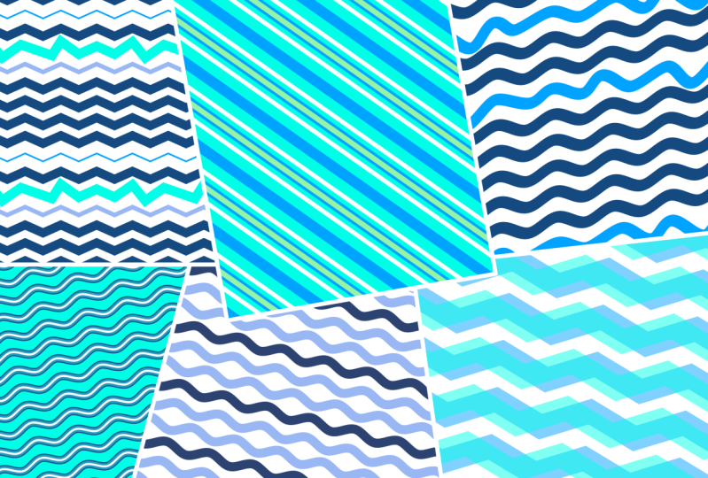
1. Welcome to Class!: Horizontal and vertical
lines, weighty lines, sage zags, abstracts,
multicolored lines, diagonals. The variety is endless, but every linear pattern begins with a simple
straight line. But how do we take
that single line and turn it into a beautiful
geometric pattern? And designer, let's create
some together and find out. Hey everyone, I'm
Tracy, an illustrator, photographer and designer
out of the Chicago area. Welcome to the next
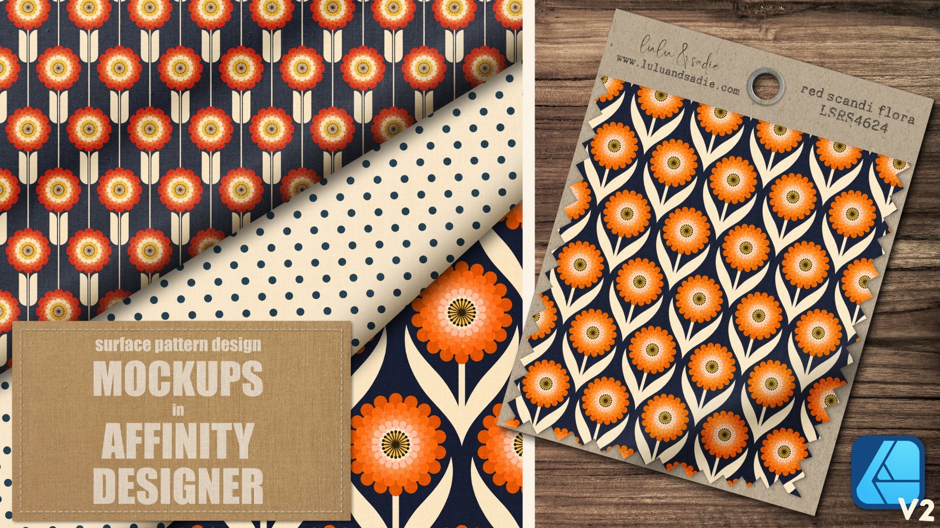
installment in my surface pattern design series called the Pattern Tool Kit. In this class, we're
going to start every pattern with a
single straight line. I'll show you how to
use affinity designer to quickly and easily turn that line into several
linear geometric designs. They can be used
on everything from fabric to your favorite
print on demand product. We'll begin by creating a simple horizontal
or vertical pattern. We're going to
start out creating a single solid pattern
just to cover the basics. From there, I'll show you
how you can quickly and efficiently create
variations of that pattern, from the line width to
adding multiple colors. Next, I'll share my
best tips and tricks on creating a successful
diagonal pattern. Every time. While it may seem
like it's as simple as changing the angle
of a basic pattern, you can run into issues if you don't keep a
few things in mind. And finally, we'll create both a wavy and a zigzag pattern. While these patterns are
created much the same way, there are a few key
steps that you need to consider with each in order
to make them tile correctly. Throughout the class, we're
going to use a variety of designers efficiency tools
like the pen tool grids, snapping and node tools. By the end of class, not only will you
have new patterns to add to your portfolio, you'll have a better
understanding of how you can use those tools to
create future patterns. In designer, I'll be using designer version
two on the desktop, but ipad users you can
easily follow along. With the exception
of one key tool, the move data entry feature, which is specific to desktop. Everything else
works exactly the same where there are
some differences. I'll jump into the
ipad and show you exactly how to accomplish the
same task as the desktop. Now this class is intended for intermediate users of designer. Well, you're welcome
to take the class as a beginner in order to
get the most from it. I do recommend some familiarity
with designers tools and interface as we won't be covering
either in this class. So are you ready to take a
single line and turn it into four fun linear designs?
Let's get started.
2. The Class Project: The project for this
class is to create your own linear geometric
patterns using the techniques we cover in try one or
all of the following, the basic line, the diagonal, the wave, and the zigzag. The easiest way to share
your project is to take a screen grab and load it in the class project and
resources section. Next up, we'll dive into
creating our first pattern. Taking a look at the basics
of linear design with a simple horizontal pattern.
I'll see you there.
3. Basic Linear Pattern: In this lesson, we're
going to start out with a single straight
line pattern to talk about the basics of
creating linear designs. The principal steps shown in this lesson are the
building blocks for the patterns and the rest of the class. Let's take a look. I'm starting with a 4,000
pixel canvas set to 300 DPI. I find that this size suits my needs for the
various print on demand companies I use without
worrying about quality. Now, I haven't created a
pattern preview window, and I'm not using a template
because the nature of geometric patterns
and how they're created don't really warrant it. Because for the most part,
we either stay within the bounds of the canvas
or where we don't. Repeating the same motif
over and over there isn't that uncertainty that you
would have where you're placing multiple sized
motifs like florals. I have created a
pattern tester artboard which we're going
to use along with the gradient toll to test
our pattern once it's done. Now if you feel more
comfortable using a pattern preview or using a template, please feel free to. There are several ways to create a simple linear
pattern in a designer. The most popular
being that you create two large rectangles that sit within the bounds
of the canvas. And each rectangle is half
the size of your canvas, either along the x or y axis, depending on whether
you're creating a vertical or horizontal. Because nothing sits
outside the canvas and there's nothing to
duplicate and offset, you can just take
this and scale it, and you'll have your
linear pattern. However, to create the
scale that we want, we would need to take this and duplicate these multiple times. Popping them to the four
corners of the canvas over and over until we're
at the scale that we want. I find this to be time consuming
and not very efficient. Instead, I'm going to
show you my method for creating them
with a single stroke. Which allows you to not
only create the scale that you want without a lot
of additional work, but as we'll see in
the next lesson, add multiple colors either to the line itself or across
the pattern in my mind. One of the most important tools in designer when it
comes to creating linear patterns or really any geometric
pattern is the grid. Especially working in conjunction
with snapping together. They're going to be especially
helpful in creating all of the linear patterns
in this class on both desktop and ipad. On the desktop, I can
engage the grid by using the keyboard chart
cut command apostrophe, or I can go up to the top and
choose View and Show Grid. I can also go down here to the bottom and
choose grid in axis to pull up the dialog box that allows me to
change my grid. For those of you on the ipad and the contextual
menu at the top, you're going to see what looks
like a windshield wiper. If you tap the icon, it's going to engage your grid. If you want to
access the settings, just tap the box to the side. And you can choose grid
settings down here so that your contextual menu shows
you your various options. Now the default on
both the desktop and ipad is for an automatic grid. So the first time
you open a canvas, if you engage your grid, that's
what you're going to get. This one actually changes depending on the zoom
level of your canvas, which I find distracting. So I usually use
the basic grids and adjust my pixel
settings to my liking. This also keeps them locked in. Now I have a 4,000
pixel canvas and I want to create a
grid that's going to be evenly spaced across it. So I need to pick a number that evenly divides into 4,000 Now, because I know that I
want a tighter pattern, I want to create a grid
that's about 200 pixels. So I'm going to
change my spacing to 200 for those of
you on the ipad. You can also set
up a basic grid. But I do want to note that
it actually only goes up to 256 for the spacing. This is a known
thing and has been as far back as version
one of designer. I'm not sure if it's something
that's going to change, but if you want to
go above 250 pixels, you can either use guides
and snap to the guides. Or you can use the automatic and just keep it at a
regular zoom level. Ultimately, you also have
the option of creating a smaller grid size and
simply skipping lines. Now that my grid is in place, I want to go up to
my snapping options and make sure that
snap to grid is set. So I'll go up to the
contextual menu up here. I can see that snapping is engaged because it's
turned on there. I'll click this dropdown box and I can make sure that Snap
to Grid is turned on. I don't need snap to baseline
grid in this case because I don't have any divisions
between the main lines. So this is just fine. If you're going to use guides, you'll also turn that on here. We're going to be
using the pen tool to create our initial strokes. In this class, I find
this approach allows for the most versatility when creating the
linear pattern. Because working with
strokes means that I can easily adjust the width of my stroke to change the look of my
pattern very quickly. I'm going to select my pen
tool and zoom in here, because I want to show you one of the reasons I like working in the desktop version with grades and snapping
with that on, if I hover over the
vertical line here, you can see that when
I'm on the line, it shows me a green dot. If I hover over the
horizontal on the X axis, it gives me a red dot. Once I hit an intersection
between the two, you can feel it snap. And I get a yellow dot. So I can know that I'm laying my node right on
that intersection. Now on both the
desktop and ipad, you can easily adjust
how that snaps by going back up to your snapping options and changing your
screen tolerance. The higher you go, the more
readily it's going to snap. So I'm going to change
this to something like 19 when I hover. As I start getting closer, it snaps much more easily. Now keep in mind this is going to impact
snapping overall, not just when
you're using grids. I tend to keep mine at three. And I find that works just fine for those of
you on the ipad. If you're on one of
the newest ipads that has the hover
feature available, that same thing is
going to work for you. You should be able to see
the exact intersection. For those like me who are on an older version of the ipad, you don't have the
hover capabilities. But I do find it with grids
engaged and snap rid on. It's a rare occasion
when I don't hit the mark when I'm
laying down my nodes. But if you don't
remember it's a curve. So you can easily switch to
your node toll and you can either drag it and it
should give you lines. When you have snapping
on or with it selected, you can go to your
transform studio and move it from there. Now that we have our grids
and snapping set up, let's begin creating
our pattern. Because we're working
with the pen tool and ultimately strokes, we can easily control the
scale of our pattern, which includes the
width of the line and the density of those lines. The easiest way to create
this pattern is to start with a stroke that evenly
divides into your canvas. So again, I have a
4,000 pixel canvas, and I have a number of options that evenly divide into that. I could work with 250 pixels, 501,000 The larger the
stroke that you start with, the less lines you'll need
to create your pattern, which means you have a
larger and less dense scale. The smaller the stroke
that you start with, the more lines you're
going to need, leave me with a smaller,
more dense pattern. I'm going to show
you two examples so you can see the difference. We're going to do
the two extremes, 250 pixels and 1,000 pixels. So I've selected
my pentel and I'm going to choose 250
pixels as of my width. Now there's a few
other things in my stroke panel
that I want to make sure I adjust if necessary. The first is that I want my
stroke aligned to center. That's going to
allow me to easily offset my strokes and make adjustments to them
when I need to. The other two options
aren't going to work. I also want to make
sure that I have scale with object
turned on that way. If I do scale
that's up and down, the strokes will scale with it. And then finally, I want to
make sure that the cap of my stroke is set to
butt cap and not round. In the case of this regular
basic linear pattern, it's not going to matter. But rounded caps can
cause an issue on things like diagonals where
you might end up with a gap. So I suggest getting in the habit of always
checking that. All right, I'm going
to tap out my line. I want to hover
over the left side here until I see it snap. And I get that yellow node, letting me know I'm at
an exact intersection. I'll click to add a node. I'm going to hold shift down, that's going to keep
my line straight. You can see that yellow
line there until I get to that other node and
I'll click and add that. It's important that
the two starting nodes on either side are at the
very edge of your canvavas. If they're not, if they're
inside a little bit, you're going to
have a gap that's going to make its way
into your pattern. I want to start my first line halfway off the
top of the canvas. The easiest way to do this, because we have the set
tool line to center, is to choose my move tool. And I'm going to,
with it selected, go to my alignment options. And choose a line
vertically to top. That's going to set it
in the exact middle of the stroke because of
how we have it aligned. And then I can create the one at the bottom that's
going to complete it. These are the only two offsets that you're going to
have in this pattern. So I'm going to
select that line. Since I'm on the desktop,
I'm just going to hit Enter. It's going to give me the move, Duplicate Dialogue
in my vertical, I want to choose 4,000 again
the size of my canvas. I don't need more
than one duplicate. And I'll click okay. These two lines are going
to complete one another, and always need to
remain exactly the same. Let's create the
rest of the pattern. So I want to select
this top line again. I'm going to hit Enter to
engage the move duplicate. I'll go to the vertical. Now I want my lines
evenly spaced. I have a 250 pixel stroke, and I want 250 pixels of
space between each one. Which means I want to go on
the vertical 500 pixels. I'll click on Duplicate. And this time I'm going
to click and drag to keep duplicating that line until I complete my pattern. And then I'll click Okay
to turn the grid off. Let's back up for a second
and look at the math here. 250 divides into 4,000
evenly 16 times. Which means I should
have a total of eight of the orange lines and eight
of the off white lines. The top and the bottom
here are one line. I have 2345678 orange lines, and I have eight
off white lines, which means this
should tile just fine. So I actually have this
pattern in my assets already. I'm going to click
my pattern tester. I'll select my gradient tool, and I'm just going to click
on this pattern here. And I will scale in. And you can see it's
tiling just fine. All right, let's take a look
at the difference between this and using a
1,000 pixel stroke. With my pen tool selected
and the width set to 1,000 I'm going to go from the far left
side of the canvas. I'll hit Shift and create the line exactly the same
way as I did previously. And again, I want to move this up to the very top
of the canvas, so it's halfway in
between the stroke. I'll choose a line
vertically to top. And click Apply. I'm going to select that again
and hit Enter, and I want to Duplicate
this down to the bottom. Those are going to
be the two offsets. So I'll key in 4,000
and choose Duplicate. And click Okay. Now I can
create the rest of my pattern. Now just like with
the 500 pixel want, I want this to spaced evenly, so I need to take into
account 1,000 pixels for my stroke and then 1,000 pixels of space that
I want between the two. I'm going to select this
top one and hit Enter. I want to move this 2000 pixels. That's 1,000 for the stroke
and 1,000 for the spacing. I'll click Duplicate.
And you can see I only need one to
complete the pattern, and there's a lot more
space between here. So again, I already have this in my assets to test this out, I'm going to go ahead
and click this, and I'll turn the grid off. And if I scale down, it's scaling just fine. So I have a much larger
scale pattern that's a lot less dense
than the other one. Now technically I
can get this pattern to the same as the 250
pixel stroke with, but would require duplicating
this multiple times and shifting those duplicates into the four corners of the
canvas over and over. And that would take
several passes it to get it to where I want. By working with strokes that are set to a particular width, I can more easily control
the scale right from the start without having to manually scale
down the pattern. I'm working more
efficiently this way, giving me back a lot more time. I've brought back the 250 pixel
pattern because I want to talk about adjusting the stroke width at the most basic level. Now that my lines are in place, I can easily adjust the look of my pattern simply by
adjusting stroke size. Because all of my strokes
were aligned to center and the offsets were based
on that center line, not the overall
width of my line. I can easily adjust the width without upsetting
the pattern itself. So I can go in here and I
can either select the group overall if I want to change
all of my stroke width. Or I can go into each of the individual layers and change them to
individual stroke width. The only thing that
you need to keep in mind is that the top and the bottom most lines always
need to match one another. So let's say that I want to change the size
of this overall. I have my group selected. I can just use my width
slider to make that change. I'm going to bring
that back to 250, but I can just as easily
make sure that I'm selecting anything but
that top and the bottom. Or again, if I do that
I change them both. I'm going to select
this second line and then choose every other one until I get to the bottom. And then just change these. I very quickly
change the look of my overall pattern just by
changing the stroke width. Now, what if I want to add additional lines to those
I've already created? For example, I want to
add some thinner strokes in between these 1,000 pixel
strokes that I have here. Again, I need to make
sure that the top and the bottom
strokes always match, but these act as buffers
for anything in between. I can add a line anywhere
in between these two, and the pattern is still
going to tile correctly. I'm going to open this up
and select this first line. I'm going to command
J to duplicate it. And I'll change its
stroke color to pink. Let's also change the
stroke width to 500. Now I want this to be in
between these two lines. So I'm going to select it. Hit Enter, and I
will go down on the vertical 1,000 I don't
need to duplicate it. I'm only going to add one line because you don't actually have to match on both sides.
And I'll click okay. Now for those of you on the ipad anywhere I'm using the
Move Duplicate dialog box, you can use the Power Duplicate
and transform studio. So I already have
this in my assets here so that you can see
how it's going to tile. I'll select my gradient tool
and my pattern tester here. Let's go back to the Assets, and I'm just going to
click to add this. And you can see that's tiling just fine because
anything that I add between these two buffers is automatically going to work
the same as any other line. So this is the
benefit of working with strokes rather than fills. I can easily adjust their size, I can vary them, I can add additional strokes. I can even remove strokes
between these two without having to worry about causing issues with
the overall pattern. Or worse, having to
start over again. As long as my strokes
are set to a line to center and or space the
way that I want them, I can create a number
of different patterns by starting with a simple
base layer of strokes. Now that we've
looked at the basics of creating a single line, in the next lesson
we're going to take a look at how
we can quickly add additional color to that line to create a totally different
pattern. I'll see you there.
4. Multi Color Basic Linear Pattern: Working with strokes to create your lines rather than
large blocks of color fill, not only make it easier to create the scale
that you want, it also allows you
to more quickly add additional colors to your lines and change your overall pattern. Let's take a look. I
have a linear pattern here that I created with
a 500 pixel stroke. I'm going to start by adding
some additional colors. I've grouped up
all of my strokes, and I'm going to command
J to duplicate that. I'll change the stroke
color, because remember, these are all strokes
not fills to pink. And I want to change the
width of that stroke to 350. That way the orange underneath is peeking
around the back. And I have this pink line. I'm going to do that again. I'm going to command J to
duplicate it, that pink line. I'll change the stroke to the
slightly darker red color. And then I'll change the
width of that stroke to 200. All right, let's do
it one more time. I'm going to create
a pin stripe. I'll duplicate that group, change it to off white, and then change
that to 50 pixels. So I started out with a pattern that was just a
bunch of orange stripes, but by adding different
layers of color, I was able to easily change it. Now I could make additional
adjustments to this. Let's say that I want
to make this stroke, instead of 500, I can
make this, say, 600. I could turn one of these
off and see how it looks. I can swap things out, maybe change the colors. But the point is I
can get a number of different combinations simply by making changes to the individual
groups that I create. This is the benefit of creating variations on your
original line this way, rather than say creating them on the appearance panel where you're stacking strokes up on top of one another
on a single stroke. Each of my strokes is
in their own group. Not only can I quickly add additional lines, I
can make changes. I can create multiple patterns, and I don't have to worry about disrupting
the pattern itself. Had I done this using
the appearance panel, I would have to start
over from the first line. Because once you
create your pattern, you can't make changes to individual strokes using the appearance panel
on multiple lines. In the next lesson, we're going to take the basic line and tilt it on its head to create a diagonal pattern.
I'll see you there.
5. Basic Diagonal Linear Pattern: In this lesson, we'll take
what we've learned and turn it on its head to
create a diagonal pattern. Now it may seem
as easy as simply rotating an existing horizontal
or vertical pattern, but there's a much
more foolproof and efficient way to approach
it. Let's take a look. So I've pulled in the
standard horizontal pattern, so I can show you why simply changing the existing
angle of a pattern isn't necessarily the best and
most efficient approach to creating a diagonal one. I have this 250
pixel stroke pattern from the first lesson. And I've gathered all my strokes up into a group which I'm going to rotate to 45 degrees. Now the first thing
that you're going to notice is that we have large gaps where these strokes don't go outside the canvas. Now I can grab this handle, hold command down,
and just drag out. But I'm still left with these large gaps which are
going to cause a problem. When I go to tile this, I'll open up my layers
and I'm going to select this top layer
and duplicate it. And I'll just drag it up to snap it into place right about there. And then I'll do the same
thing with this one. Now this may seem like it's
going to tile just fine. I actually have this pulled
into my assets already. I'll go ahead to the pattern
testure and pull that in. If I scale down, you can see that I'm getting
this weird box around here. And I had these little
bow tie shapes, and that's because there's
nothing in the corners. Diagonal patterns require very specific spacing
of the lines, as well as two very
distinct spots where you have to have lines
in your final pattern. Let's clear this canvas and start over from
the beginning. When creating a
diagonal pattern, the very first step is to create your beginning stroke between the longest point on the canvas. In this case, it's either the diagonal from here on the top
left to the bottom right, or from the top right
to the bottom left, depending on what direction you want to create your diagonal. That stroke is then going
to be duplicated and offset both up and down
on either side of it. And because it's the longest
point that ensures that all lines stretch beyond the canvas on all sides
so you have no gaps. I'll grab my penol
and I'm going to use a 250 pixel stroke that's
set to this orange color. I'll start at the top
left corner again, I'm making sure that I
hover until I see that dot. And then I'll go down to
the bottom right corner. And again, I'm going
to wait until I see those cross hairs and click. And now I have the longest
point created on my canvas. For those of you on the ipad who don't have the
hover feature, when you place your first line, it's not a bad idea to check
the placement of your nodes. So with your node tool selected, just zoom into the corners
where you've placed them. In my case, the top left
corner in my transform studio should show 0.0 for
the x and the y. And then the other
side, the bottom right, should show 4,000.4 thousand
and as long as I see that, I know that mine are correct. You can also with snapping on, kind of grab them and snap them into place and visually
see that they're okay. Once that line is in place,
the others are fine. As long as you're careful
how you offset them. I want to point out something about the ends of the stroke, because these go off the
canvas at the corners. They're snipped at
the top and the side, creating a point both here
and on the other side. That's going to
become important in a bit when we
complete the canvas. When you're creating
a diagonal pattern, there are several
things to keep in mind. The first and most important
thing to remember is that unlike the lines in a
horizontal or vertical pattern, every line in a diagonal pattern has another line that
helps complete it. If one of those
lines is missing, you're not going to have
a complete pattern. And this is going to become really important
when it comes to adding additional lines to your canvas after you
create your base, which we'll talk about
in the next lesson. Second, your stroke width should be evenly divisible
into your canvas. This is just like any other
geometric pattern where repeated motifs
that aren't evenly divisible into the canvas
aren't going to tile correctly. The third is that
your final tile should always have lines at the furthest corners opposite
of your original diagonal. If you don't, these are
going to form little gaps. So I'm going to go over
to the pattern tester. I have one in here. You can see that
there's nothing in the far corners which are going to help
complete this shape. So if I scale this down, I get these little bow ties
here that are creating a gap. For the rest of
this, let's get into the canvas and start
creating a diagonal pattern. So I've changed my
stroke to 100 pixels. Because when it
comes to creating thinner diagonals like this, the only additional thing you need to keep in mind is that your offset should be a number that's equal or greater
than your stroke width. As well as evenly divisible
into your canvas size. So I have this 100
pixel line here. Which is evenly divisible
into my 4,000 pixel canvas. Because my original line is going off the corners
of my canvas. I want to duplicate
this and offset this both to the right and up, and then down and to the left, because this is like
any other pattern. If your motif goes
off both sides, you're going to need
to duplicate it twice. In this case, we're
simply moving it twice. I have this line selected. I'm going to hit Enter. For those of you on the ipad, you can do the same thing using the transform panel
and power duplicate. Now I want this to be evenly
distributed and again, I want to use an offset that is a multiple of my
100 pixel stroke width. So I'm going to go with 200. I need to move this to the
right on the x axis first, so that's going to be plus
200. I'll key that in here. And then I need to move it up -200 That number is
always going to be the same. And I'll hit Duplicate. Now from here, if I just click on Number of
Copies and drag up, I can copy that same
offset to the very edge. If I zoom in here, you
can see that I have that little point
right there that's going to help create or complete rather the gap on this
side. I'll click okay. Let's go ahead and
select this again. And this time I want
to go down into the left on the horizontal. I'm going to key in
-200 because I'm going down on the y axis and I
want to Keen plus 200, so again it goes down. I'll hit duplicate.
And I'll complete the pattern until I see that little point
on the very corner. And I like to zoom in when
they're small like that, just to make sure there's not
even the tiniest little gap there. I'll click okay. I'll pull this into
my assets here, and then we'll test the pattern. So I'm just going to
click on this to add it. And if I zoom out,
you can see it tiles perfectly.
There's no gaps. I don't have any of
those little bow ties. I can zoom in and move
around, and this looks good. So let's talk about
thicker lines now. I've found through creating
numerous diagonal patterns, that when it comes to creating
thicker lines like this, your best bet is to stick with that stroke width like 250, 500, or 1,000 And stay within canvas sizes that are multiples
of those like 1,000 2000, 3,000 4,000 and so on. From there, the same rules
apply as thinner lines. Again, the distance you offset your duplicates should be equal or greater than
the stroke width. So this is a 500
pixel stroke width. So I would go with an offset
of either 500 or higher and stay with one that
divides evenly into my 4,000 pixel canvas. Again, that leaves me
with 501,000 or 2000. Just like with the
horizontal on the diagonal, the higher the number, the wider the gap
between your lines. The lower the number, the
more dense your pattern. Again, I have this 500
pixel line here and I need to duplicate and offset
it to the right and up, and then to the left and down to complete my pattern
until I see my corners. So I'll select my
line and hit Enter. Now again, I could go with 500, or I could go with
1,000 or 2000, I'm going to go with 500. So I'll key in 500 on the horizontal to
send it to the right. Now you can already
see right here, I did not change the
cap on my stroke. I'm going to hit cancel
and bring it back. And do that, remember on
diagonals that can cause a gap. So make sure that you're
changing this to a butt cap. I'll re select that and enter. I'm going to key in 500 on the horizontal and negative
500 on the vertical. That's going to send
it to the right on the x axis and up -500 on the Y. I'll click Duplicate. And then I can just click
and drag to complete it. And you can see I have my
little triangle there. That's going to complete
the gap right here. I'll click okay. I'll select
that again and hit Enter. This time I need to go
to the left and down. So I'm going to key in -500
and then 500 on the vertical. I'll click Duplicate
and finish that off. Now it's important that you use the same number
going up as down, because remember
what I mentioned, all of these lines have a complimentary line
that helps complete it. You need to make sure
that they're all spaced the same way. I'll click okay. And
now my pattern is done. I've pulled the pattern
into the pattern tester, and you can see what
this looks like. It's scaling and
tiling perfectly. Now I want to show you
the difference between this 1,000 pixels and 2000. So this is 1,000 pixels, you can see it's much less. And then 2000 pixels
is even more so. And that's the power of
starting with a stroke where you control the
offset and the distance, you automatically
control your scale as well as the density
of your pattern. Now that we've created
our diagonal lines, let's take a look at
ways that we can make variations on this
original base pattern. I'll see you in the next lesson.
6. Variations on Diagonal Patterns: While creating diagonal patterns can be a more complex process. Making variations in those
patterns is relatively simple, so long as you keep
a few things in mind while making them.
Let's take a look. Let's go ahead and create another diagonal
pattern together just so that you can
watch the process again. And then we'll
make variations on that diagonal base pattern. I'm going to select my pen hole, I want to make sure
I have no fill. And I'll grab this
orange, red as my stroke. I'm going to change this to 250. I'll start at the
top corner again. I'm making sure that I get
that cross hair there. I'll click and then go to the bottom corner and
do the same thing. And I have my initial line. So my stroke width is 250, which means that my
offset should be 250 or higher And a number that divides
evenly into my canvas. So 250, 501,000 or 2000. Remember, it has to be both. So even though 250 actually
divides into say, 750, 750 doesn't divide evenly into 4,000 So you want
to make sure that it's both greater
equal to your stroke width as well as evenly
divisible into the canvas. I'm going to select the
curve and hit Enter. And I want to go to the right, and let's go 500. I'm going to make a
more dense pattern, so I'm going to the
right on the x axis 500, I'm saying positive 500
And on the vertical, because I want to
go up, I'm going to key in negative 500. And I'll click Duplicate. I think I'm going
to change that. Let's go ahead and make
it even more dense, 2250 and minus 250. It's much closer together. I'll click and drag
until this is complete. And you can see I've got
my little triangle here that's going to complete that
over here. I'll click okay. I'll select that again, and
I want to hit Enter again. For those of you on the ipad, you can do the same thing by using the transform
panel and power duplicate. I used 250 here, so I need to use 250
on the other side. This time I want to do
-250 on the horizontal, positive 250 on the vertical. I'll click Duplicate. And then complete the
pattern by clicking and dragging to add my
copies. And click okay. And I have my little
triangle here, so I know I'm not
going to get that gap. Let's turn the grid off. Now that I have
my base in place, I can easily gather these up and make the same
variations in stroke width, as well as adding additional
strokes and colors as I did with the patterns on
the horizontal or vertical. One of the easiest variations
that you can make on a diagonal pattern is to change the size or color of
all of the strokes. Once you have a base
pattern in place, now I'm not going to demonstrate color because that's
pretty obvious. I can just collect
all my strokes and change that up here
in my Swatch panel. Let's grab this group. And this time I'm going to
just change the stroke width. So I'll make this 100 instead, because we're working
with a center line, a stroke, and the original
offset is based on that. Again, making changes are easier than if I was
working with a fill. So I can select all of my
lines and I can change this, and this will still
scale perfectly. But what if I want to
change the width or color of some but not
all of my strokes? It's actually pretty easy, so long as you remember
one of the rules that we talked about
in the last lesson, that lines on this side of the center line help complete lines on the other
side and vice versa. I've adjusted the
pattern a little bit and changed not only
the stroke width, but also changed my center line and these two points
to a darker red. Just so that we can look at the anatomy of this
tile more easily, remember that these two points
help complete this one. This is technically one line. These are all considered
part of the same line. The remaining lines are completed
by their counterpart on the opposite side in the order that they go
up from the center line. If I want to change
this line to pink, I need to make sure I'm
also changing this one. Because if I don't, I'm going
to get a weird color gap. I'm going to end up with
something like this. Or if I scale down, you can see that because I didn't change this line to pink, It's still orange here. In my final tile, it changes to pink and
then goes back to orange. Now this technically
tiles seamlessly, but this isn't what
I'm aiming for. I actually want this
entire line to be pink. What I need to do is take
that line right there, because that's two lines
up from the center, just the same as this one, and change that stroke to pink. Way, when I go back over
to my pattern tester, it's automatically going
to fill in those gaps. And I have a
multicolor line that doesn't have any weird
color blocking to it. The same thing applies
to stroke width. I can change the stroke
width of certain lines, leaving others as is. But I always need to ensure that I change the width
of the counterpart. In this case, I changed the
stroke width of this one, which is one up from the
center line to a smaller size. I would need to make sure
that this one in red, which is again one
up from the center, is the same size. If I don't, what's going to happen is I'm going to
get something like this. Which is going to give me a
gap where I have this one set to this stroke and this
one set to this stroke size. In order for this to tile correctly in
the way I intended, I need to make sure
that this line is set to the same stroke. So this one is set to 100. I need to change this
one to 100 as well. Now if I tile this pattern, it's going to correct
that initial issue and it tiles just fine. We've talked about
changing existing lines, but what if you want
to add new lines to a diagonal pattern
base like this one? Well, just like changing lines, you need to remember
that every line has to have a counterpart on the
other side to complete it. So when you add
one to this side, you have to add
its counterpart at the same offset on the other
side for a complete pattern. Additionally, in order to ensure that your lines
are the correct length, I recommend starting with a duplicate of your center line. Remember, this is the
longest point on the canvas, you can make any
adjustments to it that you want changing its
color or stroke with. But by starting from this point, you'll ensure that you
don't have any gaps. I have one of my
original diagonals here, a 500 pixel stroke, which is offset by
1,000 I want to add an additional thinner line between these two
existing strokes. So I'm going to start by
duplicating this middle stroke. You can see that
here in my layers. And I'll change the
stroke to pink. I'm going to change the
stroke width to 250. Now I want to move this
halfway between these lines. I'm going to select it and hit Enter to get the move
duplicate dialog box. I want to go down
and to the left. Let's start with the horizontal, because I want to
go to the left. I'm going to key in -500 because I want to do half
of the original offset. Since I want it halfway
between on the vertical, I need to go plus 500 because we're going
down on the y axis. And now I'm halfway in between. And I can hit, okay, if I were to leave this
as is where I only create the one line and don't create the complimentary one
here between these two. Because again, it needs
to be the same offset. I'm going to end up with
something like this where I have a break because I didn't create the
line right here. So let's go back to
this pattern now. I don't need to start
from the center again. I already know I have
the right length. I just need to duplicate
this one and offset it. I'm going to hit Enter to get the move
Duplicate Dialogue box. Now I want to move or duplicate this one and move it
between these two. That's a total of 2000. I'm at 500 here, this is 1,000 and then another 1,000 This time I want
to go on the horizontal. I'm going to the right,
so I'll key in 2000. And then on the vertical, because I'm going
up on the y axis, I want to key in
-2,000 And that's going to put a duplicate in the exact spot
where I need it. So if I go back to
here and pull that in, you can see it completes that line because this
line is in place. Let's take a look at
that one more time. Let's add a line here
and then make sure we add the complement
on the other side. I'm going to select this
line and duplicate it. Let's go with a
different color stroke. This time I'll choose
this darker red. I'll make it 250 as well. Now I want to move it halfway
in between these two lines. I only need to move 500. I'll hit Enter, and I'm going
to go to the right 500. Because I'm going on
the horizontal axis, the x axis to the right 500. And I need to do -500 to send it up on the Y axis.
And I'll click okay. Now again, I don't need to
start again from the center. I'm just going to select
this one and hit Enter. I want to move it
here because that's where I'm going to end up
completing the pattern. Again, I have about 2000 pixels I need to move because
there's a 1,000 pixel offset, I'm already at 500
here to move it, another 500 would be 2000. I'll key in -2,000 because I'm going to
the left on the x axis, I'll go plus 2000 on the vertical and click
Duplicate And okay. And now my pattern is complete. I can select this and drag
it in to my Assets panel. And as soon as it's in place, I'll go ahead and test it. So I can just click on this, and you can see
that that's tiling perfectly because I added the two lines that complete one another on both sides
of that center line. One final note about adding lines to your diagonal pattern. While the offset of
the initial strokes that make up this base
diagonal pattern should be evenly divisible into your canvas to ensure that you have the
shell of the pattern. Anything else that you add
beyond that can be offset to any point as long as you make sure that you add its
counterpart on the other side. So let me show you what I mean. I'm going to select
the middle line and duplicate it with command J. I'll change the stroke to pink and we'll just
change this to 250. So I'm going to offset this 675, which does not evenly divide
into 4,000 I'll start here negative 675 and then
positive 675 on the vertical. Because again, I'm going
down on the vertical. And I'll hit okay. Now I need to add the counterpart
on the other side. So I'm going to select
it and hit Enter. And I'm going to need
to move it up here, which is an offset of 2000. Because remember my original
base canvas is offset by 1,000 I'm going to key in
2000 to send it to the right. And then -2,000 to send
it up on the y axis. So I need to hit Duplicate. So I have two lines there. I'll go ahead and select
the pattern Tile. And pull it into my assets. And then as soon
as it's in place, I'll go ahead and test it. And it tiles just fine, even though I didn't
use a number that's evenly divisible into
4,000 Because again, once your base is in place, you can add lines anywhere as long as you also add their
counterpart to complete them. In the next lesson,
we're going to take our straight
line and bend it, creating fun weighty
patterns. I'll see you there.
7. Wavy Line Pattern: Over the next two lessons, we're going to move away
from the straight line into the realm of the
wavy and zig zags. These present their own set of challenges when we're
creating a pattern. Let's start by taking a
look at the wavy line. I've created a 500 pixel grid
on my 4,000 pixel canvas. Because I want to use the
pen tool to create a stroke. And then my node to, to add additional nodes
at exact points along it. Once it's in place again, I'm making sure that snapping is on and snap to grid is set. So that when I do hit
the intersections on the x and the y axis, designer will let me know
where to add my nodes. I'll select my pen tool and I'm going to set
my stroke width to 150 pixels and aligned to center. I'll
click anywhere here. I'm just going to hover over
and remember you'll get a yellow dot when you're
at the exact intersection. You can also see the
green and red line that I get when I'm
where I want to be. I'll click to add
the first node. And I'm going to shift
click to add the last one. Now I want to add
nodes in between. I'll select my node toll. And when I get to
those intersections where I want to add my node, I get a little yellow dot and I'll just click
and add them. Now for those of you
on the ipad, again, those of you with hover should get something similar to this. Those of you who don't, again, do not find it to
be a problem to add nodes along
those intersections. As long as I have
snapping on you can always check and make sure they're where you
want them to be. Once you've created the nodes, now again we're creating
a wavy line here. And right now, all of my nodes
in this stroke are sharp. And you can tell that
because they're square. That's not going to allow me to create nice, smooth curves. So what I want to do is,
while this is selected, I'm going to click and drag across to select
all of my nodes. Go up to convert here in the contextual menu
and choose Smooth. The most important
thing to remember when creating both the wave and the zigzag pattern in the next lesson is that in order for your pattern
to tile correctly, your two end nodes always have
to meet at the same point, because they're going
to become a part of either the wave or the zigzag. We're about to make
a selection of nodes and drag them up
to create the wave. When we do that, we either
need to select both of these or leave both
of them de selected, so that they either stay in
place or get moved together. I'm going to select
every other node starting with the second one. And there's a couple of
ways that I can do that. I can select the first one and then shift click to
select the rest. Or I can hold option
down and click and draw around the nodes that I want to select until
all four are selected. For those of you on the ipad, you can either click and hold your finger down on the
canvas to keep selecting. Engage the shift key on the
command controller to do the same thing or use option on the command controller,
just like I did here. And click and draw around the nodes that you
want to select. With those nodes selected, I'm going to go to one of them because once
these are selected, if I drag one, the rest
are going to follow. I'll hold shift down to keep them where
they're supposed to be on the y axis and just draw up and I'm not
going to go too high. I find that when it comes to these wave patterns,
the deeper you go, when you pattern them, you get an almost holographic effect that can be guided distracting. So I usually make mine deep enough that the
wave is obvious, but shallow enough that
I don't get that effect. But go ahead and experiment
and see what you like best. Now that the first
line is created, I want to begin tiling it. And I need to start
up at the top, just like we did
with the horizontal. I want to bring
one up to the top and have one at the
bottom. That completes it. Now, we use the
alignment options to do that in those videos, but in this particular one it's not going to work
because it's a wave. So what I want to do is make
sure that snapping is on. I'm going to hold shift
down and just drag up until it pops to the
center of that selection. So you can see it. I get the
red line and the green line, and basically you want
the middle dots here to be on the corners
of your canvas. So now that I've
created this one, because it goes off the canvas, I need to make sure
that I create one at the very bottom
to complete it. So I'll hit Enter, and
on the vertical type in 4,000 because I'm
going down on the Y axis, I'll click on Duplicate. And then, okay, I'm
going to move to my layer stack and switch
the order of these. We're going to use
these two key layers to help align the rest of the waves once we put them in place using alignment options. And the order that you click them matters when
it comes to that, I'm just going to make
sure that my bottom is on the bottom layer and the top one is on the
top of the stack. I'll select that bottom
one and I'll click Enter. I'm going to go up
-500 on the vertical. Now, because I'm going
with -500 I should be able to tile this easily without having to
align it later. You can see it's
following the grid. I end up with a total
of eight copies. I'll click okay. Now I can test this to make sure
that they're aligned fine. Visually, they look great, but let's just check it. I'm going to select the
bottom layer and shift. Click to select the top, I'll go to alignment options and just choose
a ligne vertically. And actually they were
all slightly off. So it is a good idea
to check that just to make sure that everything is tiling the way that you want. The topmost and the
bottommost wave matter the most in this pattern. Because they complete
one another, it's important that they're always at the exact spot they're supposed to be so that they
can effectively do that. But anything that you place in between can be placed
however you'd like. So I made sure that these were aligned vertically so
that they were spaced, but you don't really
have to do that. But let me show you an
example of one that doesn't have the top and the
bottom aligned correctly. So if I grab my
gradient toll and I zoom in or out rather, you can see that because I
didn't have those aligned, I get that weird little break. I actually want to have it completed so that I
have something like this where I no longer
have that break because the top and the bottom were aligned the way
they're supposed to. One other example I want
to show you is this one where the mill waves
aren't evenly distributed. This works just like the
regular horizontal pattern, where if a line is missing
or they're set differently, the pattern will
still tile correctly. So long as that top and bottom one are where
they're supposed to be. It doesn't apply the same way
it does with the diagonal where you have to have a line on one side
completing the other. This works just like the
regular horizontal pattern. So let's test the pattern
that we just created. I'll grab the pattern tile and I'm going to drag it
into my assets here. Once it's in my Assets, I'll just click on it
with my Gradient tool and you can see that
everything looks good. Now, just like the horizontal
lines in the first lesson, we can add color to
each of these lines in the same manner once
everything is in place. So I have them all selected and I'm going to group them up. I think I'll change the
stroke to something like 250. I tend to keep below a certain stroke width because I find that
the larger you go, you end up getting these
weird sort of puffy lines. And I don't like the
way that I look. So I'm going to change
this to X goes 200. Now I'll duplicate that group and I'm going to change
it to a different color. I'll pick this pink.
I want to make sure it's a pink
stroke and not a fill. So I'm going to turn
that fill off and I'll bring this down to 150. Then I'll do that one more time. I think I'll go with
the off white stroke and make this something
more like a pin stripe. So 50. Remember we're
working with strokes that are aligned to the center and the offset is based on that. So you can make changes not only to the color
of your stroke, but you can also
change the width of your stroke without worrying about causing issues
with your pattern. Now I can bring this into my pattern tester and it's going to tile just
fine because we didn't make any
adjustments that would otherwise change the layout
of the pattern itself. So I'm going to skip that. I've brought this back
to its original state, so I can show you one additional adjustment that you can make. In addition to adding multiple colors or changing
your stroke width. You can also go into the
individual lines and play around with their nodes to get a slightly
different pattern. Just make sure of two things. The first is, be careful
not to move the nodes on either end of the
canvas separately so that they remain exactly
matched on either side. If you move one, you
need to make sure you move the other one exactly
so there's no gaps. And then of course, make
sure that if you make any adjustments to either
the top or the bottom line, you make the exact same change to the other because they
complete one another. Let's go ahead and stick with
some of these inner lines. I've selected that one and I'm going to shift click on this one and I'll drag to
select these two. And maybe grab my transform handle up here and twist these. I can grab these two and I think I'll turn that off and
just drag these up. I can drag these two down. I'm just being
random about this, but you can make any change that you normally
would with a node tool. Again, as long as you keep those two things we just
talked about in mind, this pattern is just
about as forgiving as the horizontal and vertical
one from the first lesson. With those few exceptions, as long as you
keep them in mind, you can have fun
with the patterns and see what you can create. In the next lesson,
we're going to create the last linear
pattern in the class, the zig zag. I'll see you there.
8. Zig Zag Pattern: While similar to the wave
pattern and how you create it, the zigzag pattern presents
a new challenge and an additional step because of its sharp nodes.
Let's take a look. Once again, I have a
4,000 pixel cannabis, and I've engaged
a 500 pixel grid. I've used the penthol
to create my stroke, just like I did for
the wave pattern. And I've added nodes at every intersection between
the first and last node. But here's where we have
to add another step. For the most part, the zig zag is created the same
way the wave is, with a few notable exceptions. To create our zigzag, we're going to be
working with sharp nodes rather than smooth ones. So we're not going
to convert these. Remember, in order for the
pattern to tile seamlessly, the two nodes on either
side need to match up. There can be no gaps. I'm going to select
every other node, starting with the second
one and start dragging up, just like I did with
the wave pattern. And watch what
happens as I drag up. I get a gap here on either side, and that gap will end
up in the pattern. Once I have this in place, just like with the wave pattern, I can begin adding my
nodes all the way across. But because I've moved
these two outside, I'm also going to need to add end nodes here to the
sides of my canvas. So I'll just click
until I get those dots. Add the nodes all
the way across, making sure that I add them
to the very ends as well. Now if you remember
with the wave pattern, I started with this node, I started with the second one. But if I do that, let's just click this one
and start dragging up. It's going to begin to create sort of a straight line there. And if I change the join to pointed so that I have
an actual zigzag, you can see it's very distinct. I'm going to bring that back. I'm going to change my join
before I do anything to mitre join so that I get
points rather than curves. Instead of selecting this one, I'm going to start with the very edge here.
I'll select this. And then again shift and
I can select all the way across or I can hold
down option and draw across. Now that I have those selected, I'll hold my shift key down, drag up again, I'm not
going to go too high. And you can see that these two
will meet up exactly where they're supposed to and complete each other
in the pattern. Now I can add the rest of
my lines exactly the same way that I did with
the wave pattern. I'll just select this.
I'm going to shift and drag it all the way
to the top until it pops to the middle
of the selection. Just make sure it's right
where it's supposed to be. I'll select it and add its
counterpart on the other side. So I'll key in 4,000
and duplicate. Now I can add all of
the lines in between. And just like with the other, I don't have to have
them aligned evenly. I can add them however I want. But I'm going to go ahead and first make sure that this
one's on the bottom. And then starting with that one, I'll hit Enter on the vertical, go up 500, holding
down Duplicate. And just go all
the way up again, It may visually look
like they're aligned, but it's always a
good idea to check. So I'll click and then shift, click the last one. Go up to my alignment
options and choose a line vertically
to space them. In this case, it was perfectly
fine, So I'll click Apply. As far as making any color and
stroke weight adjustments, the same thing applies here
as the other patterns. You can make your stroke
weight adjustments very easily because everything
is aligned to center, Therefore, it'll tile correctly
no matter what you do. The main thing that you
need to remember is that the topmost and the bottom
most complete one another. So any changes that you
make to one have to be made to the other
in order to have your pattern tile correctly. You can also play around with the depth of some
of your zigzags, the way we did with the wave, making some deeper than others. Again, anything you do to all the lines in the
pattern will be fine. Whatever you do to single
lines in the middle is fine. You just need to keep
in mind again that the top and the bottom lines need to complete one another. And then finally, of
course, make sure that your two sides are
always meeting up. In the next video, we're
going to wrap things up with a few final thoughts.
I'll see you there.
9. Final Thoughts: We're at the end of
class and I thank you for trusting me with your
time and creativity. I hope you enjoyed
this installment of the Pattern Toll kit series. I'd love to hear your
thoughts on the class. So please consider leaving a review as it lets me know what I'm doing well and where
I might need to improve. Plus, leaving a review
and sharing a project not only helps future students see what they'll learn when
they take the class, it helps more students
find the class. In addition to Skillshare, I also have a Youtube
channel where I share short form tutorials that
compliment my suite of classes. Here you can find
the link to it in my profile and in the
guide provided with class. Speaking of my profile, I have lots of classes
in the works here on skill share including many more in the pattern
Toll kid series. So if you're not
already be sure to hit the follow button
on my profile. So you're always kept in
the loop as to what's coming up and when new
classes are published. And finally, I
welcome you to join my free community for
digital creators. The creator collage. We're a group of creatives
of all skill levels, with experience,
and a wide range of digital applications. You can ask questions,
share your work, learn new tips, or
share your own, all in a friendly, non
judgmental environment. You can find out
more in the link in my profile or in
the class guide. If you have any questions about what you've
learned here in class, please don't hesitate to
reach out to me either in the discussion below or
at the E mail provided. Again, thank you so
much for joining me here in class and
happy creating.
 Tracey Capone, Illustrator, Photographer & Designer