Transcripts
1. Intro to Create a Half Drop Repeat in Affinity Designer: Hi guys and welcome. My name is Dolores now
sprint and I'm coming to you from sunny,
Manitoba, Canada. I'm super excited to
bring you this project. I've been wanting to do
this for quite awhile, and I finally have the chance to show you how to create
a half drop repeat. In Affinity Designer. I've shown you how to
do this in Procreate. Procreate is really not the
ideal program to do it in. For one thing, when you
move around a motif, you don't see how it affects the other tiles in
that repeat pattern. This way with the techniques
that I'm showing you. If you go to move a motif, you'll see how that affects
all of the pattern tiles. So you're moving and
working on that one tile. And then in the repeat, you're gonna be seeing
how the movement of that motif affects
the overall pattern. We're going to start with
researching the project. I'm going to show
you some ideas and some inspiration from artists that I know and really admire. Then we're going to go into Procreate to do a quick sketch. As that's the program
that we're all most comfortable
using at the moment. Eventually I'm gonna
be showing you how to do this right in
Affinity Designer. But I figured that this
excellent opportunity to show you a different
way of doing it. Once we have that sketch, we're going to ink it
right there and procreate. We're going to take that
eight finished illustration and vectorize it
using Adobe Capture. I just want to reinforce that. I know we've done it
in another class, but there are some
techniques here that will help us in the long run when we're doing our pattern. I've got it in three layers
to start out with so that there are different
dimensions to our pattern. And things like the stems can be separate from the flowers. So all of that stuff
will be revealed in class as we go through. Then we're gonna
do a bunch of work to enhance our pattern. Starting with changing
the colors and just thinking about ways that we can make this pattern
more interesting. We perfect absolutely
everything in this class so that it's
ready for the next class, which is going to be
adding a bunch of embellishments to our motifs. So all of this is
in preparation. And I know that as
a three-part class, you want to have some
really interesting stuff to do in each class. I've tried to organize it in such a way that you will
be able to go through all of the steps and gain
a bunch of knowledge and techniques that you're gonna be able to use moving forward. Does that sound good? Now if you haven't
done so already, please hit that follow
button up there. That way you're
gonna be informed of any of my new classes as I post them and anything that I send out as opposed to all
my followers here. Also, I would suggest
that you get to my website and Azure named
my mailing list there. I send out all kinds
of announcements from there as well to
do with my school. And that's where
I generally have all my artists resources that
I either sell or give away. So it's good to have
your name on both lists. So you're ready to get into it. Let's get to it.
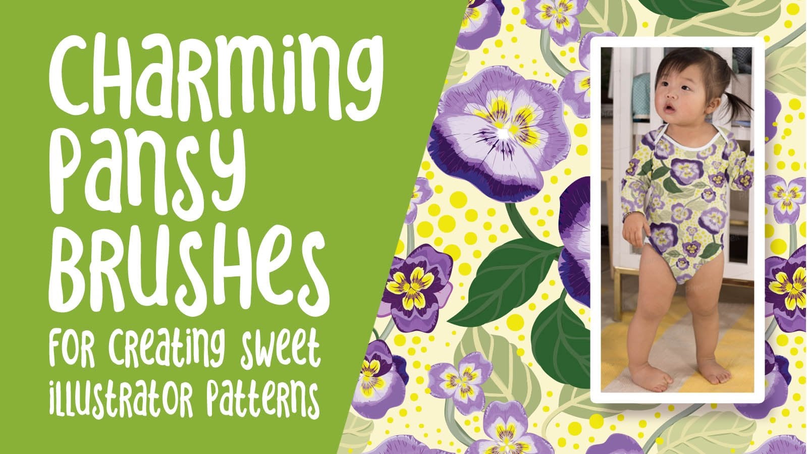
2. Lesson 1 Overview and Examples: Hi guys, welcome to lesson one. Lesson one here I want to do a little bit of
research with you. What we're gonna be looking at specifically are really
layered designs. I want you to just kinda
know what there is out there and the kind of
things that you can do. Of course, you're
gonna be trying to think of ways that you can make your design a
little bit more unique. So we're gonna be talking about that as we go
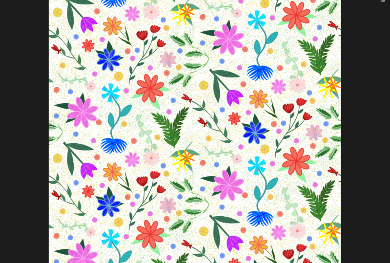
through the lesson. Let's get to what we've been talking about, pattern design. And I know that the only pattern design
template or layout that I showed you here in Affinity
Designer is a grid repeat, and I'm really
excited to be showing you how to create the
half-drop repeat. Now you might be wondering what the heck is a half drop repeat? And what's the difference? Who cares? Why do it any differently
than what we've been doing? And there is definitely a place for all
different repeats. But the half-drop repeat or
the half brick repeat are two that are most commonly used by
professional designers. A diamond repeat pattern
like what you see here is way up there too. And of course, you've got
the specialty repeats like the OG and stripes tossed
patterns, that sort of thing. Now we are going to
focus today on doing a half-drop repeat
and it's going to be somewhat of a tossed pattern. And what I mean by
a tossed pattern is a pattern that can be seen
in more than one direction. So if you're a sore, you be completely aware of what that sort of a repeat,
why it's important. So that Toss Repeat is a kind of repeat that no matter which
direction your fabric is, it doesn't look wrong. If you were to do
something like this, which is a floral that
standing straight up and repeats exactly
the same way. It doesn't change its position, then you try to use this one sideways or upside down and
it's going to look wrong. So that's what I mean
by a toss repeat. I'm not sure if it'll
be 100% toss repeat, but we'll see when we get to it. Now the other thing I
really wanted to focus on is creating a pattern
that's got layers, layered colors on it. So I was looking here for
tutorial and patterns. I found a few that I
think would be excellent. And I've got an example sheet that I'll show you in a minute. But to start, you
might want to just look at people like Helen. Helen designs are always richly layered and I want to
focus on this type of repeat because I think it'll
be a good exercise for using the pencil tool or
even the pen tool. We're going to continue this particular design from start to finish
only with vectors. I don't want anybody cheating. And using the paint tools
or the pixel persona, I think that we should challenge ourselves to try to create a pattern with all of its layering done
in a vector format. I pulled up this artists here. She was the one that
WHO site we were just on showing us the different
pattern of peace. I pulled up her patterns because I loved the way she
lives, her patterns, her colors are always
super interesting and I've seen her stuff pop up in just general searches
that I do or in my surface pattern design
board on Pinterest here. And I think brilliant the way she uses her
colors and layers. It's stuff that you just don't think of doing like here's
a really good example. Like, I would never think of this color combination,
but I love it. So this is the kind of work that I'd love you
to take a look at. Now this is a different artists
here, Serena or Chetty. But the kind of layering that you see here
is what I'm talking about. I think the big
challenge is in keeping the color palette
to 10-20 colors. I think that it's doable. A lot of fabric companies, when it comes to the actual
printing of the fabric, we'll even limit you
to ten or 12 colors, so you can even challenge
yourself to that. I can't remember how many I've used in the pattern that
I've practiced width, but I think it was more
like 16 colors here. So this is the kind
of thing that I want you to just
study a little bit and you can go to my surface pattern design board again and check out some of the layered
patterns that I have here. I've got one here called
Paint detailed patterns. To forgive me, my Internet
is not very good today, my husband did a
firmware upgrade on our modem and I find that
whenever he does that, it takes a few days for. Everything just start
working normally. So this forward, even though some of these
might be hand painted, is also a very good reference. Here's a beautiful one I love. And this one is hand painted, but when you take a
look at it really, everything is tone
on tone like radon, pink, brown on gold. Looking at these will give
you some great ideas. Now this one was a
hand painted one, but all once you see down here seem to be vector patterns. There's a really
simple color scheme, four or five colors. And I think anyways, two blues here, and then there's light and a dark
pink and then the red. So I think it's like 55 colors. Isn't that gorgeous? How that has turned out? This is kinda thing I want
you to be thinking of. And I'm going to be
showing you a bunch of different methods
to achieve that. Now this is Rachel, again, Rachel whole
local colloquial. She's Australian and
she actually has a really great website
and does a lot of teaching to do with
pattern design as well. She's not on Skillshare
or anything, but I have seen that she's
got a lot of courses. But look at something like this, even just tones and again, really simple, very,
very few colors there. So take a look at
that board that I have and you'll find
definitely Helen dark. She has cropped up so many times for me
when I'm researching. Different finishes are
different things I wanna do. Here's another one by her. So her website is
orange. You lucky. And it would be a great
place for you to go to find ideas on how to
do some of this stuff. Now personally, I think
a lot of this I could do with strokes, thin strokes, and you can add a little bit of profile change onto the strokes to make it look like
it's hand painted. I know that Helen does hand
paint all of her stuff, but then obviously converts
them to vectors to be able to be used for
printing fabric. Not that, that's
always a prerequisite, but I've seen a lot of her stuff and that's
what she does. Think about the color scheme
that you want to use. Try to keep it simple. Here's a gorgeous,
gorgeous pattern and I love the use of
different tones of blue. So this is something
that looks like it could be done with
strokes as well. Like that person
has used strokes to create this highlight
area and the darker areas, and probably then expanded and added them together
so they become one shape and then
drop them into the shape of the leaf
here to clip it. So I think that's great. This little piece right here that's drooping flower, I think. Absolutely perfect. As a vector. It's amazing how much detail
and color tone change. You can see there. This is a kind of stuff that I think would
be great for you to research and create a little bit of a mood board for yourself. I did that and I'll show
you the one that I have, how it turned out. It's just four pieces. And there's something in each of these pieces that I
particularly liked, which is why I saved it. So this one here I thought, again, all could be
done with strokes. And I think what works with this one is the consistency that these strokes are pretty much the same thickness on
all of the different pieces. I also liked here how some of the pieces
almost look like they have a bit of an outline or
a shadow like this one here, I guess it's just because of
the solid area in behind. I like here how there's been a bit of a release
between the petals. So rather than inking an outline or drawing
an outline here, it looks like possibly with these petals that
they're just made, each a little bit smaller to
have that gap in-between. That gap is usually
called a release. So I loved that one
for that reason. This one here, I liked how simple the idea was with the
highlights and shadows, e.g. with a leaf like this
to simply cut in half, which can be done with another function of
the geometry tools, which I will show you. You can draw a line and then divide the original leaf and half and color the two
halves separately. So that one I thought was really attainable,
really doable. Now this is a Helen
dark pattern. And what I love about
this is how much of this, it's put into the background
and not just the background, can see that she's
added a lot of detail onto some of her motifs. That could be a
possibility where you have your flower
or whatever it is you're drawing and
then add little bits of texture with
repeating patterns. I would do these in vector, but I think that that's something that you
would be able to do. And then on this last
one here, of course, there's spots where
there are tonal changes, where there's two layers, the pink and the red, e.g. but these are also little patterns like I think this one here
could have been created as a vector pattern
and then used and applied to different motifs to
do the same thing almost as what helen does hers, but to add texture. And then the other thing
I thought was really, really pretty with this one was these dotted lines like who, who would have thought, right? And those are added on enough of the motifs to
really tie them together, but not all of the motifs. So this is something
that we could also do. I can teach you or show you how to make dotted lines so that you might want to use that
to enhance your motifs. Four or five different
things that just from here that we can
use as inspiration. And besides setting up the
template throughout the class, we're going to be
really talking about all the different aspects of creating that half-drop repeat. With the first lesson, I'm probably going to be going through it
fairly quickly with a time-lapse of my planning
process and procreate. Then the second
lesson will likely be vectorizing what I've
drawn in Adobe capture. By now, you may have figured out which method you like
best whether you like Adobe Capture or vector Nader or using an
online converter. It doesn't matter one
way or the other. As long as we get
the vectors that we need in SVG format that we can then import into
our affinity document. As long as we have
that, we're good to go. So I'm going to try
to squish those into the first couple of
lessons so that we can spend a little
bit more time working on adding this
interesting detail. Alright, Enough, chat and I'm gonna hit
you in the next lesson. So I'll see you there.
3. Lesson 2 Design Process for Half Drop Repeat: Hi guys, welcome to lesson two. Lesson two here is all
about the design process. We're gonna be doing a sketch in Procreate to help us
out with our layout. Let's get to it. I wanted to
show you the steps that I take when I'm just
in the process of planning a half-drop repeat. So I am here in Procreate because that's where I'm
gonna do my sketching. You can totally do this on
paper if you would prefer. Either way. There
are a few things that I wanted to point out
when we're doing this. So I'm going to just quickly
start drawing out a pattern. I am going to use a pencil
and what I wanna do is turn My Do Not Disturb for a few
minutes so that I can get through this without having
a bunch of stuff that I have to stop myself
from reading. Because of the nature of the
pattern that we looked at. I want to keep my
motifs quite bold and I want to be
able to fill them in with a lot of that
detail like we saw. So I'm going to
be, first of all, just quickly sketching
out some of the flowers. They're gonna be
really simple flowers. You can draw them
whichever way you feel the most
comfortable, you can do. Little wireframes
are frameworks like this to easily keep them, the petals contained once you have a shape that you think
you might want to reuse, then by all means,
cut and paste. Have a copy of it. So we can duplicate and have
a couple of copies here. And I can make changes by
repositioning and resizing. And I could take
the work and just basically change it
so that it doesn't look exactly the same
as the other one. I just flip that one that
doesn't really look that great, but I can work with it. So you can use warp or
you can use Distort. Distort. You're just pulling
each of the corners warp. You can do a little
bit more in the way of a variety of adjustments. I've even been known to use Liquify in a pinch
when I want to, way too big, when I want to
just make slight changes. Let's say e.g. that pedal, I don't really like too much, but I'm not going to be
using this as my final art. I'm going to be
rethinking all of this. So right now, it's
all about just trying to fill up the
space to figure that out. I like keeping those on
separate layers because then if I go to draw
another flower, let's say like this one here I'm thinking maybe here I would have a cup of flour, a tulip. Remember that this is
going to be half-drop, so this will end up being
down here on the next one. So it might want to avoid
having it right across. What will end up
being right across. So you could do
something like that. Maybe it's not quite this one and this one on the same
layer, believe it or not. So I'm just going
to cut this one. It doesn't matter
that a little bit. It'll be cut off because you want I'm just
going to backtrack. It will be just
easier to cut and paste this one and then move it. So this one could be
moved independently. So I'm not really doing
anything on this side. So at the moment, the fact
that this is top to bottom, obviously going to have
to continue up here. I'll deal with in a minute. I'm thinking another
sort of a daisy with long petals would also be a
good flower to have in there. And I'll figure out, let me put this on a new layer so I don't have to do
the cut and paste. I'll figure out the length
of the petals and all that. Makes sure that it kinda works. And I'm going to
duplicate that one. This would be a nice filler and I probably would need
to move that one there. But I'm going to
show you how to deal with this one is not separate. I'm going to show
you in a second here how to deal with
making sure that you've got everything
working as far as the continuation of your
design from top to bottom. Like I'm thinking this
one is going to be right about there and
see from the grid. And so this one will probably continue somewhat like this. I know I'm going to have
to make adjustments here, but this is just to get the
idea of the basic placement. And here I could probably
do another one of these, maybe this one I'll flip and work to look somewhat different. When I'm at the inking stage. I can also make
slight adjustments. Overall. I'm just trying to
have like really nice bold flowers that I can really work with to put those
other texture layers on. I know we're going to
need something here, but what I wanna
do here now is do the repeat so that I can just see how this is working out. So my fastest way
of doing it is this four corners now have what you would call
a registration mark. I can put all this together here in a group and I
can move this entire, Well, let me first copy it. That I can move this
entire pattern to the halfway mark and then I can see the space that I'm
dealing with here. Right? So I was pretty close
with that one there. I'm just going to add
a layer on top to do some of this correcting. And it's so rough. I get it. It's really rough, but it's exactly what I would need to do my inking stage and looking at the way my stems
are all going here, I'm thinking that
I wouldn't mind something in this
direction here. So maybe it would be
this one here that I could add a stem to and pull down here so that I can
have some continuity. And we know that that's right where the seam
is going to be. So that way there's
nothing really obvious. We don't have anything. You're running
straight across here. We haven't stopped
everything here and then there's another half that
I have to deal with. Little stripe of obvious
repeat on both edges. So a time like this,
we can decide, do we want to take and move some of these elements
within what we've done. So this could move,
turn that snapping off, and you can see that I'm really just dealing with top-to-bottom, not really worrying about the sides here because I
think that's something we can wait and do when
we're in Affinity Designer, obviously this leaf
would have to continue, but it can't continue straight across because it's
going to drop down. So I'm going to duplicate this
flower and use it in here. And then maybe from this group, I'd want to duplicate
this flower and I had put that on the same layer, so I'm going to cut and
paste it and then I can duplicate it and bring it over here and maybe flip it. And I'm just going to pull that over to the side because I think it's gonna be alright
for what I'm doing next. I still feel like there's
space here that I could fill so I could redo these leaves so that
this go back to the top here so that I can maybe
have two sets of leaves. Or what would work too would be another stem here
with a little flower. This one might work better if the leaf is a little
bit more angled. So that's the
continuation of that one. And I think what I wanna do now is the side-to-side repeats. So here is where I've got those, a couple of those little
edges or corners on. So I might as well just
erase those nice and big and see if I can
locate the other ones. I'm going to delete this one. Delete that one. I know there's
gonna be something here. I'm going to have to figure out. But right now what I wanna do is I think in this case
I'm going to flatten it. So I'm going to group it all
and I'm going to flatten, and I'm gonna get
that posca again and just make my little
marks in the corner. And in this case,
what I want to do is increase the
size of my canvas. So I'm going to
double the size of it with y's and that
must be pretty close. I'll go to the
settings and I've got it so close, so close. And I'm guessing you
guys already have figured out what
I'm gonna do next. So again, I'm going to
duplicate this layer. I'm going to put snapping
on and magnetics. And I've got three copies of it because what I
wanna do is this. I'm sliding it halfway up and I'm doing the
same thing here. So I now know what
it is I have to do. I have to fill in this
space from side to side and I obviously didn't match up that very well, but that's okay. This is what this planning
stage is all about. So I'm going to group all
these and flatten them, erase these little
things everywhere, and just go ahead and starch. It's my pencil and
start just roughing in those little things
that are going to make it seamless from
side-to-side as well. So you can see from
side-to-side that this flower and this flower
are going to conflict. So what I would do here is
select both of these and slide them over a little
bit so that I can just finish this
and I'm so rough. I know that this is not like I feel like I'm not
setting a good example, but this is all you need. You don't have to
get too wrapped up in it and try to be perfect. Because what we're
gonna do next is we're going to redraw our ink these so that we have them ready for doing our auto trace. So I think side-to-side, We're kind of okay here. I feel like this has to
have something else. There's definitely
some space here that needs to be accounted
for or fixed. Maybe what I'll do here is
get rid of this half of this flower and then
we'll take and enlarge. This, ends up being
quite a bit bigger. I think we'll stop
this lesson for now. Then I'm going to show
you the next stage, which is the inking. We're gonna do a couple of little things here
before we inked, but we can do that all
in the next lesson.
4. Lesson 3 Inking of the Artwork for Auto Tracing: Hi guys, welcome
to lesson three. Less than three here I'm
gonna be showing you how I go through and ink illustration to separate
the layers to make it easier for ourselves once we
get into Affinity Designer. Let's get at it. Okay. I did a couple of things
off camera and nothing major change the
angle of that leaf. And I was toying with
the idea of changing out this Daisy for something
like this instead of leaves. But I think I'm going to
stick to the daisy here. And really all I need
right now is to now make or ink all of these
different motifs that I have. I want to do them so that
they're all in one piece. Like I don't want this one to be half year and a half there. So at this point, I'm going to go and
crop my canvas again. I'm going to bring
it back to here, to the ten inch mark, which would be 3,000 pixels. Because we're just
inkling at this point. I'm going to hit done. Then I'm going to
go back into that. And I'm going to
make it big enough that you can just eyeball
it at this point. I just want to make
it big enough that I can actually don't
need too much width. But I want to cut this one off and
put it here so I can ink it all in one piece. And I think this one
here connects to this. So those are really the only
two things I have to do. So I don't really need a ton of extra space and really
none on the sides. So I'm going to hit Done here, grab my selection tool and
select this cut and paste. And I can bring
that up into here. I guess I didn't need a
little bit more room there. That's okay because I can just move this layer down a bit, so I just need that to connect. So I have a really
good drawing guide. And then this one here
I want to add to that. So I probably could have done that without
cutting and pasting, but I'll show you
this way so that it's just super obvious and
what you have to do. And I'm obviously
going to have to ink this whole flower in this. If you want to, you
could cut and paste. Because that connects
to this over here, which I could do without
having to have that guy. But I'm doing it
this way just so you totally understand
my process. So this flower here, I think I can do spy. I'm going to actually
make a new layer. I'm going to actually
group these, flatten them and
reduce the opacity, make a new layer. And here you could do a whole new pencil sketch where you're just a little
bit more careful, where you're really
deciding on the shape. A lot more clearly, really tempting to make
a change like have this, like this, but It's
likely that I did it in this direction and this size because it was fitting
with something. So you have to kinda stop
yourself from having too much licensed at this point
because the positioning that you did here
was for a reason. Remember when you're
drawing a curve that you can hold it when you
get to the bottom and adjust if you want to get a nice consistent thickness. I mostly do that when
I'm at the inking stage, but I'm actually
thinking that I'm going to ink those solid anyways, so I don't think I need to even show any thickness
on them at all. I have a little fern that I added when you weren't looking. I thought that would
be a nice one to have just kind of LinkedIn and vectorized because
I think it would be a good filler if I need it. One reason to do it this way and to vectorize it from something
that you've hand-drawn, Is that your finished pattern
ends up looking hand-drawn. It's not going to
look as though you created it using
the symmetry tools. I mean, if you do, it's
not that big of a deal. I'm sure it'll be
great in its own way. But this is the look, I'm kind of going after
myself at this point. So I'm wanting to have these so that they
aren't absolutely perfect looking usually works because
you are handwriting these. That's why I always
take a little bit of a fence to people who think the computer is
doing the drawing or doing the work because needs
to be an artist to do this. Even if you don't consider
yourself an artist and you're able to follow along
and do all this stuff. It's still more than the
computer can do on its own. And you're just in training, you will be eventually
doing all of this drawing and stuff without thinking
about it too much. And if you don't really have
any ideas for your motifs, than do a lot of research like go back to
Pinterest and have it open and just kind of use it as you are
doing your sketches. You don't want to be
copying somebody exactly, but unless you're tracing them, it's unlikely that you're
going to be able to get it to look absolutely exactly
like they did anyways. So full disclosure,
usually I don't need to do this second sketch. I just usually go
straight into the inking, but when I do it, when I do take the
time to do it, I'm usually pretty
glad that I did because I do end up saving time, I think in the long run. And the cool thing
about it is we know that we've basically got our half-drop
repeat figured out. I'm not sure about that stem. I don't know what that leads to, so I'm just gonna
leave it for now. I can always draw that in later. Now we can turn
off the sketch and see how much cleaner
this one is. So this one is a lot
easier to follow. I'm going to do the
same thing though. I'm going to reduce its opacity and I'm going to be using my, you can use whichever
inking pen that you like. If you want a mono line, you can go into the
calligraphy set and grab it. You can use the pen
pressure brush, I think I've given
you several times, and the Posca paint marker, if you want your lines to
be all same thickness. This is something for
you to take a look at when you're looking
at those examples. Some of them have lines that are thick and
thin or they vary in some way or
another and others are one solid thickness, the same thickness throughout. I'm going to do this one and I'm even going to enlarge this. Now. It doesn't matter what
size we really do this. And I think the bigger
we have this inking is the nicer are finished,
vectorizing will be. So this is a reason
why I always reduce that opacity because then I know when I start and if
it's still gray, I'm on the wrong layer. And you know how often
that happens for me. What I'm gonna do first
here is I'm going to go through and remember that I'm going to have these a solid, they aren't going
to be outlined. So I want to go in and do
all of the shadow areas, areas that are gonna be inside
or on a different layer. I'm gonna go and do these first. So this is the point at which you need to think
about that like how, when you are adding
together these vectors, how are you going to want
to have them constructed? And I want all of
these to be solid. I don't want any outlines
on mine because of the idea that we have for
adding that extra texture. So I am making all of these solid and I think
that's it for this. We've got all the centers,
maybe not this one. And I'm going to go and
fill the first one and then I'm going to continue
filling with re-color. You need to take the little
cross hairs that you see as tick them in
one of the areas. And then you'll be
able to just tap. I remember when I learned
this and I thought, Wow, that's a great idea. So now I've got all of
that layer done so I can either turn it off
or reduce the opacity. I think I'll just
reduce it for now. I'm going way low on this one. I'm going to add another layer. And I think on this one I'll
do all my leaves and I want them to be solid so I don't
know why I was drawing the second line there because
all I need to do here, of course, is just have
my thickness appropriate. So I can go pretty thick here. And I'm using the pen
pressure brush that I have that if I press harder, it makes a thicker line. I'll go through
and do that first, do all my stems so they
are fairly consistent. That could be the same plant. I'm going to leave it
separate because just in case I want to move them
apart or something. And I might as well
do this little guy. In this case, this whole plants
or branch will be there. So I'm gonna go a little bit
smaller on my brush here. And then I'm going
to go through, and here's where
he asked yourself. Now what do I want those
kind of rounded ends or not? If you don't, then go with
a much smaller brush, you're still going to end
up with a solid shape, but you can then get that
point a little bit better. And sometimes it's better
to not be at the point when you're starting
that line so that you can swing back in. And your point is
a little bit more defined because it's really
hard to line that up again. So I'm going to do it. I'm making a point to
not overlap anything here so that I can fill easily. What's really funny
being in that line, but that's okay because we're
filling it just makes sure that you close your
shape entirely. So I'm going to move
that one a little bit so that when you go to fill, it's not going to fill the
whole background as well. And these guys,
so with this one, I'm gonna do these leaves. Just want, I'm going to
not do that leaf there because I can add that
later if I want it. But at least this
way, this plant will be independent of that one. And then you can also
take the time to look at some of your stem ends. And then maybe you might want to square them
off a little bit. That's totally up to you again, that's a stylistic choice
that is not closed. So I can do this and continue filling with
re-color in the crosshairs to one of the areas I'm trying
to fill and then I can just tap it all the way through
enlarge if you need to. And I know that this did
not feel completely. My pen was pretty small, so I'm gonna go a little bit
bigger and just fill it. And then you can go ahead. And if you want to clean
things up a little bit, the cleaner this is, the better it'll be
for your tracing. The auto trace often will pick up little
things like that, little notch that's there, that's going to
easily be picked up. So I might as well take
the time now to fix it. And then the last
thing is the flowers. I'm going to do
that a time-lapse just so that I don't
have you watching. Every little thing I do are
listening to me breathe. And at the end of the lesson, I'll show you what I want to do to prepare this to go
into Adobe Capture. So make sure you add a new
layer for the flowers. And remember that that shadow is actually going to be
the top of the flower. So you don't have
to be too perfect at the top because
that's going to end up being defined by that Phil
that's there for the back. At this point, you
might want to turn off your sketch because it
helps you to line up your inking when you need to be prepared to turn it
off and on if necessary. Okay. I'm turning off my sketch
at this point just so that I can get
a better look at everything I've
drawn and make sure that it looks the
way I want it to. And overall it does. I'm making a couple
of little corrections to some of the petal shapes. I'm not going to spend
too much time doing that. I can always make
adjustments if I need to infinity
designer as well. So I've got what I need. I've got my three
layers that I can use for the auto trace. I could maybe go in here
and into my gallery, select it and duplicate it. So I can go in here and
delete the two sketch layers, knowing that I've got that
on the other document, if I ever was to need it. So before we do anything else, I think what I
wanted to do is set up that half-drop
repeat template. So let's do that in the next
lesson. I'll meet you there.
5. Lesson 4 Setting Up the Re Usable Half Drop Template: Hi guys, walked less than four. Before we do anything else, I want to create the
template that we're going to use for laying out our design. We're going to be importing
the inked version. I also want to
make sure that our reminds you to save
that template, save a duplicate
of it immediately. That way, you will always have that template that
you can use for creating a future half-drop
repeats. Let's get to it. So this might seem
a bit challenging. I think it's not as bad
as you would think, but we'll get at it and I'll explain everything
as we encounter it. So let's make a new document and I'm going to stick
to my hand by tens, so I'm switching
that to inches here. Then I'm going to type in ten, then I'm going to
put it at 300 here. It's just almost just habit. We aren't going to be using any pixel related decor or
enhancements in this class, but I may at some point to that. So sometimes I even put
this as high as 600. Maybe I'll change
it now just because I don't want to
forget about that. The higher it is, of course, is the bigger the document is, which means you
pictures were bigger. Whatever you add, pixel-wise, is less likely to pixelate. If you enlarge it just a little bit, you're
still limited, but it's better the
higher the resolution. So I thought maybe I'll just because I know my other
template is only 300s, so I thought it would be good to have high resolution
one as well. So what happened there? And
I'm going to hit okay, here, we're going to have
just that single page, which means that we have
just a single art board. What I want to do though
is inserted art boards. So here, as soon as I hit that
art boards selection here, as soon as I hit that is
Context Menu came up. And in this context menu, you can add additional
art boards. I'm going to do that. So that's the first
one, that's ten by ten. And then I'm going
to do a second one. And then this one, I want
to make it double the size. So let's go into the transform
studio and we're going to change this to 20 " by 20 ". So this is exactly what
we've done before. I'm actually going to move
this art board to this side. That's the way I prefer to work. You can do it whichever
way you like. You can even select both of your art boards by holding down your single finger
and you can go to Alignment and align the tops. It's probably not important, but it's just have it. Alright, so now I want to insert a rectangle here or a square. If you put your snapping on, you can snap it right to
the edges really nicely. And let's just go in here
and make sure that we're on ten by ten or that we have ten by ten and that
the position is 00. So that's important because we're going to
create the symbol. And from that symbol, we're going to create
the repeats over here. So now that we've created it, Let's go over here
to the symbols and we're going to add
symbol from selection. Alright, so now what we need to do is duplicate this so
we can duplicate it. I've showed you two or three
different ways you can, with your move tool selected, you can start dragging. You can drag with two
fingers held down. I'm going to just duplicate it and move that one into position. And as long as you've got your snapping on,
you should be okay. There was that red line and green line that showed you
that you are on-center. But you can always go here and check to make absolutely sure. And it looks like we're good. This is 100 and
everything is good. So this one, the Y
position is 10 " down. If you remember that from our other class,
that's what we did. Now for the next two, we're gonna do something
a little bit different. So we're going to
duplicate this one. I'm going to bring it
into position here. And of course that would end up being a grid repeat
if we left it there. So what we wanna do here, go into the Transform palette. And with the y measurement here, we want to put minus five and you see how
that just pops it up, 5 " in this case up, but it means it's a
drop repeat, right? So now we can
duplicate this one. Let's just try it this way. Yeah, it worked this time. See, I don't know why. Sometimes it doesn't work. That one we've popped
into position, Let's just check
10.5 is correct. And then from that one there, we can also drag to
get our next one. So it doesn't look
that much different. But if you select over here, you can see that you've got your initial motif or
your initial pattern, and then it'll be duplicated
cross and halfway down. And you see how you
get that drop effect. And that's why it's
called half-drop because it's dropping by half. There are tons of other repeats. You can do one-third, you can do one-quarter, you can do whatever you want. But in this case,
this is going to be what's called a
half drop repeat. So now let's just
give it a little test to see if it has worked for us. So let's draw something. I'm just going to use the pencil tool and
I'm going to draw. Now you can't see it because
of course it's drawing it with no fill and it's
just a light gray stroke. I'm going to change the fill. Let's have a red hearts and
a man, it's not working. What's going on? You guys are so smart, you know exactly why? It's because we don't have
it as part of the symbol, so that's the initial symbol. So now if we take this and
we drop it into the symbol, is going to repeat everywhere. So of course, my
little example here, I did not close the shape
so I can switch and close. Now it has closed it. We do have an extra point here. I would just get rid of and why am I fixing
up this heart? There's absolutely no
reason for me to do that. But now you can see it's
half-drop repeat, right? So this is ready for
you as a template. I would delete that. It doesn't matter what
color you've done this, if you would prefer to
have it so that it is in slightly more visible color, you can definitely change it. Now, when you do that, you'll probably notice
and you're going to get what looks like a gap there. But you can see that
as I enlarge it, it's not exactly there. If you're worried about
that or if you ever have issues with it printing for
some reason it's not working. Just fill it and stroke it with the same color and the stroke doesn't
have to be very wide. It's only at 0.1 here, which is probably a pixel. You can increase that a teeny
tiny bit if you wanted to. It doesn't really matter. The art board itself
is how I usually crop my pattern designs to export a swatch and it'll
be completely fine. So now you've got this. Repeat, alright, back
into your gallery here. Make a duplicate. Make
sure that you save it with a really suitable name. Here. Go to this three-line
menu and hit Rename. And I'm going to
call it drops 600, 600 pixels or whatever, whatever way you
want to rename it. And maybe put the word master or main or something like that. So you remember and this tells me that as soon as I
see the word master, that I don't want to use that one because it's
gonna be my master. Let me just actually
delete this one here. What I would do here is duplicated and you can
see as soon as I do that, that's the original over here and this is the one
that is the copy. So it has copy. And generally what I do is I'll go in and
rename it right away and I'll call this one whatever the pattern
happens to be. I think this one, I'll just
call it mixed flowers. And say, okay, so now
I know that this is the one that I need to be
working on for this project. So now what we'll
do is we'll get that tracing done of my
flowers, the SVG graphics. We'll import it and we'll
start working on our pattern. Okay, so I will see you
in the next lesson.
6. Lesson 5 Vectorizing and Importing the Motifs: Hi guys, welcome to lesson five. In less than five here
we're going to be doing the vectorization
in Adobe capture. I'm gonna be showing you
the technique that I used for this and the ways that will make it easier for
us when we get into Affinity Designer
eventually will be sketching right
in this program. But this is the most
comfortable workflow for me at the moment. And I'm sure for you as you've been using Procreate so much. Let's get started. Okay, so I want to show you
real quick why we can't export the file the way I
have it there in procreate, I have selected here, I'm going to go to files. The one I just did was
called Art for class. And you can immediately
see the problem. Everything is merged
into one layer. So that is going to be a real issue for us when we
get to Affinity Designer. So let's go back to procreate, and let's set up this
file so that it's easy for us to do the
conversion that we want. So I'm going to just
in case I'm not sure if I'm going to need
these were not for lining up. I think this is a fairly
simple pattern, but it wasn't. What you would do is put marks on the corner
of your artwork. And this is simply going
to be to line up each of the parts of the pattern when we get it to
Affinity Designer. Now, the fastest way
would be to actually do that on its own layer and
then duplicate it twice, add it to each of the layers. So this one I'll put on top, that's when I'll put in-between and then will just merge down. So each of them individually has these little corner marks. Now we'll go into the
Canvas, crop and resize. And we need it to be three times the width so that we can fit
them all in there. So that's probably
going to be big enough. I'll go a little bit bigger
just to be sure we get those crop marks in there,
I'm going to hit Done. And then we can move each of these layers so that they
are literally side-by-side. So I'm going to
put snapping on so that they do stay lined up, which is not 100% necessary, but definitely could
prove to be helpful. So that one is a little bit tight so they can remove
this guy over a little bit. I'm going to have
to make my canvas just a little bit wider. It doesn't want to. So I'm probably at the
maximum that I can be at. So rather than do that, I'll select all three, reduce them down slightly. And now I should be able to move that guy over
there still lined up. I'm going to move this
one over because it's literally touching
that one there. So that gives it a little
bit of breathing room. Now we've got all of our parts. So let's save this document out. And I'm gonna do it as a PNG. I think that might be
better quality than a JPEG for what we're doing
and save it to Files. I'll call it art for class
and hit Done and save. And here's my correct version. And that's got the three you can see here barely, but it's there. Let's bring it in. And now you can see we've
got the three parts here. So it looks pretty good to me. I'm going to hit, Okay. So it's pretty rough here, so I'm going to put
some moving on. You can see that that's
improved it quite a bit. Not sure if this Refine
will make any difference. And I think this is what I
will use as my final one. It looks pretty good. There's gonna be some
little things that we may have to change or fix. We can always try a different converter if
we don't like this one. I showed you those other two in one of the previous classes. I'm going to hit Save. It is going to be
exporting it as a vector, as you can see here. I'm going to
temporarily put it into my graphics folder here. Then I'm going to
select this one and I'm going to export it as an SVG, save it to my files into folder that I'm
keeping my art in. This time I'm going
to call it flowers, vector, hit Done, and save. And now I'm ready to go
into Affinity Designer. So before putting it into
my half-drop template, I'm actually just
going to import it. So open from Cloud flowers
vector because I want to separate these and get them ready for what
we're going to be doing. So before I align these up, I'm going to group them. So I'm selecting each of the
groupings and grouping them. So we've got the three
separate groups here. And what that helps us do is align them so we can
select all three, go into the Transform palette
here to the align options. And here you can align horizontally and
aligned vertically. So that gets them into the approximate position
they need to be. I can see that there one of
them is off a little bit, but that doesn't
matter because we're going to be bringing this into the other document and colorizing it and we're gonna
be moving things around. So all we really need is this. Now we can copy it. So I'm going to copy and go
into this other documents. So here I can simply paste and we've
got it here in position. And now we know
that we can reduce. They don't want to grab
this group separately, but you can go into your folder here and you'll see that either still grouped. It's hard to know what
the exact size here until we put it into the symbol. We're still only going
to be kind of winging it because we have a
lot of stuff we need to do to make it work, but we can at least somewhat
figure out the size here. So I'm kinda looking at this one here and it's going to fit into that space there side-to-side that looks a
little bit tight there. So maybe I'll go a bit smaller and I think it's
going to be alright, so we're ready to
basically start fitting our pattern and re-coloring it and doing all the
things that we need to do. I'm going to change
what I just did there. And instead of putting it right into that rectangle because
that was clipping it, I'm going to put it
of the rectangle. So basically I'm just dragging
it into the symbol itself. And you see that leaves
the rectangles separate. And that might help me a little bit more because then I can see that a little bit better side-to-side is
still not fantastic. But that's probably more
to do with my positioning. I'm gonna go a wee bit
smaller because I think I can fudge and move things around
a little bit more easily. The next step that we take is to actually go through
and take them out of their groups and make
each of the flowers themselves or motifs
themselves their own group. So I think that is going
to work just fine for us. So just ignore the
fact that it's not necessarily fitting
completely or perfectly. And we'll go through
and do the next step, which is doing some just
a basic color on each of the different layers so that we can see what
we're working with. So I'm gonna do that by
selecting the individual group. And in this case, I can just work with one of the swatch pallets
that I already have. I'm going to change the color, not the stroke at the color
of that layer to teal. You can see it has changed here and that's not the one that I want because I actually want
the leaf layer to be teal. So this one I'm going to
just fill with orange. Then I'm going to
grab this group was not the one with the leaves. Yes, it is. So that one I could fill with the teal and then our last layer with a slightly
lighter orangey color. And let's reorder this. So we've got those in behind and you can see how
this is going to work now. And that's always just
so nice seeing it. Okay. I'm close, I'm getting there. I know what I have to do now. It's just nice
seeing it repeated. I just love that part. I find that so satisfying. So we're going to go through and group each of these in
its own flower unit. Alright, so I'll do that
in the next lesson, and I'll see you there.
7. Lesson 6 Grouping and Arranging the Motifs: Hi guys, welcome to lesson six. To make everything
easier for ourselves, I want to show you how to individually group
each of your motifs. Let's get started. So to do that work, to get that all into
individual groups per flower, I'm going to just take them
out of the symbol for now. And we're gonna work on separating each of
these elements. So as I'm about to do that, what I want to do is
get this order correct. So I'm going to put that
set of stems behind. And so we've got everything
technically correct here. Just a little adjustments
we're gonna be making. But what I want to
show you here is that, believe it or not, now we
have to ungroup all of these. And it's a scary sight when you start seeing all
of these layers, strikes fear into the hearts
of every graphic designer. But we have a plan here. Like I said, we're
going to group each of the flowers into its own unit. And the reason I ungroup hit is that then I can
select like this, and it'll select
all of the layers. So you can see here it's
selecting all of the are those. There should be three of them. Forgot to ungroup this guy and see that when I selected it, with it being grouped, it didn't select the green. And now you can see that
it did select a green. So it's selected each layer of our registration triangles. So I'm going to delete
those, of course. And one of the
things I've noticed, I'm not sure how it happens, but when I delete this one, it goes and select
something else. But I want to just do
this methodically. Now here it's selected
that which is great. So that speeds me
up a little bit. And like I said, I want to do this
fairly methodically. One of the things you want to do here is when you're selecting, you want to drag over
the entire motif. Nothing else will
add to selection, which is different
from Illustrator. Because if I did this, this stem would also be added. But I liked this because
it isolates and just gives you only what's within
your selection rectangle, which is fantastic because now we take that one
and we group it, and we take this one
and we group it. And you'll see that one didn't
select because I didn't go far enough to have
selected the entire shape. But now I have so
I can group it. And so far so good. Sometimes this is
really hard to do because when things are
squished like this, selecting, I mean,
that's gonna be an issue and I think probably this one's going to be an issue, but these little
ones aren't too bad. Now this background
I can temporarily locked so that I'm not
accidentally selecting it at. Let me just follow
through here with these. Again. I'm doing the easy ones first. The ones that I know, hey,
I just locked this guy. The ones that I know are
easy to enclose within. Sometimes it's good
because then you kinda get rid of certain ones, get them out of the picture. In this case, what I would
do this one is already done. So I would just temporarily
lock that one and then I can make it into its
own group. Do that one. Let's flip this guy back in. Moving that when
a tiny little bit to get it into position
and you know what, that's in the wrong layer. So it's behind and it
needs to be above. So I'm bringing it up here. I'm not sure if that's
the exact right position and they can see a
little flaw here. So we want us, we'll deal with that first and then
get rid of it. And one of the things
we will be doing is a little bit of touch
up on things like this, where the shape is
a little bit off or where the angle might
be a little bit off. So I'm not going to
start that now I want to follow through
with this process. So now it's these big
ones that we want to do. So I'm trying to
select just this, which is a problem. As you can see, this is what I made about it being
a little bit frustrating. The other way you can do it,
it's just sort of identify. Okay, That's, that's
the right stem. That's one of the curves. So this, and this, we could group right now, Let's move this up a ways and we're going to
have to reorder it. But this way I can figure out what things
need to be added. So this needs to go in, that oval needs to go in. And I don't think I have this
oval here and that needs to go in and I believe
that's the whole thing. Well, I didn't get it in there. Again. That's the whole group, so
we've got that one done. Why don't we missing we
don't have this one. So in this case, it's probably
just easier to hold about single finger down and
select both parts of it. Actually there's that
little inner circle to, well, let's do these two first. We'll group them. And here it is, down here. It does already have
this circle because I had already grouped those two. So I don't want a group within a group that could
cause issues later. So I'm going to pull this into this group and then pull that one out of that double groups. So it's just a single. Okay, so now we've
got this group. Let's see if we can
select the whole thing. And yes, we are able to
so we can group that. And then we'll just
have to figure out what's happening
with this one. So this is, this
belongs to this, I'm going to unlock it, put these two together
and group them. And this, and this
are likely the two. And it gets easier
once you get to this point because there's
not that many left, right? So these are the ones
that will go together. So group that and this needs
to go with this group. So slide that in there and change the order
so that it's behind. And if I fix that other one,
yes, it looks like I did. So now I have all of these in groups of their own,
which is great. It's gonna be a lot
easier to move them. And what we can do too is
take all of these now. This one, That one's okay, so we can drag all of these
now into our symbol layer. Okay, I did not drag it
into the symbol layer. So let's make sure that we do. This is the symbol here. It's kinda confusing
because you see the rectangle there and you're like, okay,
that's where it goes. But no, it's got to go
right into this one with that yellow edge there or
that orange indicator. And do I have everything no, I missing these three. Slide those in there. And now we have everything
that we need in the repeat. And the beauty of this now is that any of these
that we grab and move around will move around on all the
repeats of our symbol. We haven't duplicated them and put them on the other
side like we need to, but that's okay,
we're gonna do that. And I might as well save
that for the next lesson. I want to do some
moving around to figure out if I've got enough motifs here to fill out my pattern. And yeah, we'll do that
in the next lesson. This is the fun part. I get so excited when
I get to this stage. It's like doing a puzzle, right? If you've always love to
do puzzles, like I have, we used to do thousand, 2000, 5,000 piece puzzles
with our families. Just a great big table. And all of us would sit
around and do the puzzle. Sometimes it would
take us a couple days. Sometimes. I mean, it's
amazing sometimes how quickly and my grandson
who was here yesterday, I watched him do one and
I can't believe for a five-year-old that he could
do it as fast as he could. So I guess it maybe
runs in the family. Anyhow, I'll meet you
in the next lesson.
8. Lesson 7 Altering Arrangement for Best Design: Hi guys, welcome
to lesson seven. In this lesson, we're
going to be doing anything we need to alter our layout to make
it work really well now that we're looking
at it in the full repeat. Let's get to it. So I'm sure at this point
you know exactly what to do. And that is to repeat some of the elements that appear
both top and bottom. As you can see, the top of
this flower is missing, e.g. so what we're gonna do here is work with this symbol here. And we'll select flowers that are on the edges
and repeat them down. Now something like this one will need to be repeated here, but it will also need to
be repeated over here. Do you remember what size
our document was here? If you don't, then
it's pretty easy to remember by just selecting your symbol and going into this transform area
and taking a look. And this is the area that we need for doing all of this
movement that we're doing. So I'm going to
start with this one because I think that's
going to fill this whole quite nicely and it's
going to help us to start visualizing and making sure that we have everything
the way we want it. Open up your layers palette, select the flower or grouping
that you want to move, then go into the Edit Channel. So this is edit. You're going to duplicate. So it's sitting right on
top of the other one. Then we're going to go into the Transform palette
and we're going to change the y
measurement here. And I'm sure you remember this, but we're going to hit plus ten and that's going to move
our duplicate down here. So you can see that
we've got what we need as far as
the repeat goals. Now because it repeats
on this side as well, we're going to
duplicate it again. And actually we can grab
this one to duplicate, or you could have just used
the one that was selected top one because I
think it'll be easier for you to visualize
the movement. So we're gonna go 10
" to this corner, so it will be minus
ten and then we're going to go plus five because we wanted to only move
it halfway back to the transform studio. I always call it a
palette, I know. And here we're going to change the x coordinate
to be minus ten. So that brings us over here, 0 to not duplicate. Okay, sorry, miss that step. So minus ten here. And here we're going
to do plus five. And you can see as we're
doing this, you know, everything is starting
to repeat over here the way it needs to know. I'm a little worried
about this not lining up. I think possibly one
of my symbols here has dislodged and moved a little bit because these should all
be lined up perfectly. So there's something wrong there which we can address
in a minute. And it's good that
this stuff happens in class so that you can see when you have
an issue like that, what it is that
you have to do to resolve it, It's very easy, but we'll tackle that after we've got these other things
done that we want to do. So let's go back into here, and now we want to repeat this one and this one
and move them across. And this one is going
to have to move down. And so this one we
could have done at the same time as this
one, but we didn't. So now we're gonna do it. So that's this one. I think this one, no. I mean, in a perfect world
that would have taken the time to label all of these. But since I didn't, we're just going
to deal with it. Okay, here we hit Duplicate and then we go to the Transform. We're going to move
them over and up. So we're going to move
10 " so plus 10 " this way and -5 " this way. So you can see we've got
most of that flower now. And the reason we don't
have it completely is because we didn't repeat
it in this direction. So let's get that one
again. Duplicate it. Take that duplicate
and move it minus ten. And now we've got
that whole flower. And we can see here that
this little fern is probably going to need
to be re-positioned, which we can wait and do all
of the repositioning later. Or I can just do it now. And it's not just the
most amazing thing. Being able to just
move it without worrying and trying to figure out just by
luck or by golly, whether or not it's going to work like in procreate
where you're basically guessing and trying
to make everything work. Now this one here we
don't need that was good. I duplicated when I did that. And what are the other flowers I see that's in the
way as this one, but let's just do all of this stuff first
and then we'll go back and make any of the
corrections that we need. So this little flower here, I need to repeat
over on this side, so I forgot to do that. And which one was that? This one here. So let's
duplicate it and we're going to move it 10 " over, so plus 10.5 " down. So plus five here. Okay, so now we've
got that whole flower and is that it shall
be bought at all. I think this scam, this flower here we need to do so it's really just
the stem parch. So let's find it. That's this flower here. We could duplicate
the whole flower. It doesn't really matter. So hit Duplicate here and we're just going vertically minus ten. For that. Okay, so that's
extended that perfect. And it looks like everything is okay except for the
positioning of our symbols here. So let's just go through
and quickly check those so we can close
that up and we can start, let's start with the
top corner here. We know that this one
needs to be zero-zero. So we'll go in here and
that one is correct. So we'll grab the next one down. And these are not currently in the right order,
but that's okay. It's pretty easy to figure out. So this one should be at
zero for the x coordinate, because that's
this line here and ten for the y-coordinate.
And that's correct. Well, it's one of these
little scoundrels. So this one, can you figure
out what that one should be? This one should be minus
five, so it's correct. So I'm baffled here as to what occurred because these
appear to be all correct. 10.5 and then our last 110.15. So these are all correct. So the problem with this one is not
immediately evidenced, so let's redo it. We're going into
the symbol here. Let's just figure
out which one it is. I think I'm just going
to get rid of these two. So these two this one and that one on the side,
just trashed those. And I have another duplicate
here. It looks like I do. Yes, I do. So I'm going to trash
the bottom one here and this one will duplicate. We know we have to
go plus ten and then we can go back
to that original one. It doesn't matter. You can do it from this one, but we can do the duplicate. And when it repeats down here, it's a little confusing. So that's why I usually
go back to the original. So I'll demonstrate
that instead. So we go back to that one
duplicate and we're going to go minus ten and plus five. So that hasn't
resolved that issue. And I see that I'm having
a couple more here, so I'm going to take
a minute here off camera to figure out what
the heck is going on, and I'll come right back to you. I think that I have
figured it out. I think I've got this within Threat angle
which is causing a problem because it's treating
it like a clipping mask. I want to take it, I took all of that stuff and it's
in the symbol, but now the rectangle is
separate at the bottom here. And I had noticed that
it was off a little bit. I think that's what was
causing the problems with the alignment and
now it's all good. Everything is lined
up perfectly here. So now everything will work
exactly how we need it to when we want to start
moving around our elements. Plus, when it was in the group, I couldn't double-tap
to select it. So I just did that wrong within the rectangle and it was
needing to be in the symbol, but not within that background. So it's all worked out now. And I think in the next lesson, what we'll do is we'll just really make sure that
our arrangement is good. And I definitely think
I'm going to be needing to add a couple of motifs
to fill in some of this. I mean, sometimes you don't, after you start rearranging
things, it all works. But I'm thinking that some of the things like
this flower here, e.g. once I move it, it still seems quite large
for the space there. And what we can do to start
thinking about color. And if we change some of these motifs a little
bit, it might work. You might be able to put them in different levels or whatever. And I know your design is going to be
completely different, but I just like showing you everything that as a designer, you have to do when it
comes to problem-solving. Alright, so let's meet
up in that next lesson. See you there.
9. Lesson 8 Color Adjustments for Perfecting Layout: Hi guys, welcome
to lesson eight. In less than eight
here we're going to be doing any of the
adjustments that we can to the color
to really perfect our layout when it comes to
rearranging the pattern. Now that we've thought these
repeats on the outside, I try to really stop
myself from moving those. And I tried to just move
the ones that are within, like completely
enclosed within here. Of course there are instances
where you have to move it. So then what you'd have to do
is eliminate the repeat of it and then go back and
duplicate repeat again. So because it's that
much of a process, I kinda tried to avoid it. But of course he
never say never, sometimes you just have to. So this is where we start
making decisions about whether we need to add
multi-use to fill the space, or whether changing color is
going to make a difference. Changing sizes of certain things like this one here because it's completely within the
square or rectangle. I can make it
smaller and move it around and make
decisions like that. In a case like this where
there is a lot of space here, I might consider
duplicating some things. So maybe even this one here, I will just duplicate
and then move it into the remaining
space that's there. So sometimes you have to
move a couple of things. And of course, if it
goes off the side, needs to be repeated down here. I'm going to wait
a bit until I have done a little bit more
rearranging here just to figure out whether
or not I want to move it or change
its color first. Now something like this where
we have the duplicate here, we could select both of them
if we need to move them. And then as long as
we're moving them, the exact same amount,
it'll be okay. So I'm not sure whether
it went back down or up. I'm thinking down here. And I think also that
one of these guys, maybe this flower or
this flower here, would be a good
one to duplicate. It'd be made quite
small and still be bold enough that we're gonna be able
to do that next step, which we want to do, which is the adding of
detail on our motifs. So I think that kind
of works there, but I don't like the
color being the same. And I think also I
just want to make an adjustment on this petal
and I hadn't duplicated it, so that would be something
to do at this point to now, one of the things
I also like doing is at this point
before I do too much, is to do a little bit of correcting on
some of the motifs. Now in a case like this,
I'm going to hit smooth so that I can eliminate
some of the points. And I just don't like
this, that square. So I'm going to delete a
couple of points here. I guess that was the
duplicate I was moving. So I had been smart
enough to do that. My goodness, I'm
doing this honestly. Sometimes I don't know
how I forget things, But I do point to delete all of these extra points so that I can easily make that adjustment. And same with this one. I think I'll just
leave that center one thing on this one here, we can just move that
over a little bit. I hate it when there's
too many points, I find it's so frustrating
to deal with the shapes. So really I just moved
my rectangle I saw, I'm going to lock
that sucker before it goes anywhere else. So make sure you're on the rectangle and then go in
here and lock it because I do not want that to move to so much easier to adjust
when you get rid of all of the extra points
there emphasized a lot of times they do
distort a little bit. That one I think is okay. I'm at it. I might as well do this one. So smooth it, get rid of a few of the points
and then I think I can delete all but four to make a nice clean oval stroke when there wasn't really extra
batch, I've removed it. You really just need those two and then you can make
a nice smooth oval. I think this can
now be pulled in. And of course, you're looking
at this and thinking, oh my God, do I have to go
through every single symbol? And you don't, I
mean, you want to do anything that you see
immediately stands out. By. A lot of times. You don't want to get too much of the character out of it. So be careful of over
adjusting and perfecting. Because a lot of times then our motifs will
start looking to, to mechanical and for these
kinda do the same thing. In this case, I think
I'll move one over here and one over here. And with these, what
I like is to have a little bit of that
yellow are lighter color showing through around the edges to make it look like that flower
is a little bit. At this point to check your stems makes sure
that they're all even. You could go through and
fix things like this. This might be better to
have one of these as a sharper corner point
so that you can bring it in and you don't get that
flow a little bit better. Think about these, the
basis of your flowers. You might want to make sure that they're all sort of consistent, that their shape the same way. I kinda like mine to
be a little bit flat, but I don't want this
sort of a thing. So how we go through
and do that, less points you have also on your long sweeping
lines the better because you can get them a lot smoother and control the
thickness of them a lot easier. So take some time to just look at everything
at this stage. And then the next
thing you want to do is start thinking
about your colors. Let's go into our swatches here. And this was the group
that I was working with. That's my background color. And then I chose a couple of different of these
orange colors. But at this point,
I really want to diversify a bit and add a little bit of a
lighter color in here. So I'm thinking that maybe this one here would
be a good candidate. So I would do that one. I want it to be somewhat
like this, but even lighter. So what I've got, I've
got that selected, That's the color I have in here. I'm just going to
sweep up a couple of times until I get a
lighter color and I know it's perfectly matched or
part of this set just simply because I've lightened
a color that I already have in
this set of colors. This center dot on this one
maybe I would do in a green. I'm just trying to think of ways to make things different. So possibly this one as well, or I can even take this one here now and make sure that it's in a group and duplicate it and then use this one
elsewhere as well. So that I've got a little bit of unity happening
because I'm adding. And the nice thing about adding a different color like this is I could do things like overlap, as in putting it over
one of the other leaves. If I chose to. This one here I think might
be a good candidate as well. We'll leave that one for now. And I'm thinking maybe
with the stems that if I got a different color
on a couple of them, so maybe this biggest
one here I would do in a slightly
lighter tone like that. And maybe this one here in
that same color or lighter. I need to isolate that, makes sure it's the one just the one that
I'm grabbing there. So I've got three different
sort of green happening. And I like that. I think I'll go through and
do a little bit of this. So I'll touch up
some of my shapes and I will do some
color changes. And I'll come back to you
in the last lesson and we'll talk about what it is
that we're going to do next. So the next class that
we're doing in this series, we're gonna be
adding all kinds of detail to each of our motifs. I'm going to show you a finished look at this because I've already
done this one once. And I'll also explain to you things that you
can prepare or think about before the next
class starts. Alright? Okay, so I will see you
in that last lesson.
10. Lesson 9 Additional Advice for Finalizing Your Pattern: Hi guys, welcome to Lesson nine. Less than nine here is all about finessing and perfecting. Let's get to it. Okay, so I think I have everything the way
I want it so that I'm prepared for the next class. There are things that I might
still consider changing. Maybe the color of
this flower here, I like the color, but I think I might go
a little bit lighter. So you can make changes and corrections like
that as you see fit. So go through and to
prepare for the next class, tried to perfect
your colors that you see here and your shapes. Amongst the things that I did
is I shortened the stem on this flower here
so that it wasn't overlapping on this flower. I've created a couple
of the leaves. I didn't go crazy, but I did do some of
those little things. Also, other colors, you know, that I've made some
changes for this flower and more on the
yellow ones there. I've changed the center on a
lot of the flowers so that I could just get what I consider more of a
balanced pattern. I'm liking it so far. I don't know about
you, but I think that it's working quite nicely. I like the sort of sweeping
lines that have been formed by the stems and leaves. I like that there's variety. I've tried to not have
too many things of the same color together unless there what I would
consider fillers, I repeated this flower and anything else that
was on the edges. I made sure that
the duplicate was there so that the entire pattern was perfect and lined up and
all of that kind of stuff. I could still go and
then make adjustments. I don t know. Some of them. It's something as
simple as taking one of these and flipping. It might make a difference. I did flip, I think
this yellow one. So it wasn't exactly
like the other one. And now I want to show you what we're going to be
doing in the next class. So the next class
is going to be all about embellishing our motifs. So here's an example. This, I don't even
like this pattern as much as the other one now, I like the other one
that I did today better. But this does show you all of the little things
that we're going to do to add interests. So that should remind
you quite a bit of some of these inspiration
pieces that we have. It's a good time to
revisit those and take a really close
look at how e.g. a. Two tone flower would lock or maybe adding all of these
little lines on there. This is where you really, to start putting your own
stylistic choices in motion. This one here has a ton
of really cute stuff. I'll lift this up
a little bit so it doesn't get the
light through it. But you'll see all of these little fillers
that are put in between. So that's something to consider. These are things
that you could think about the preparation for. I don't want you
to necessarily go ahead and do that
because I think there's a lot that we can discuss
here before you get started and I can show
you some shortcuts. So next class, that's
what I'm going to do. This class is
definitely long enough. And I think we've done
a really great job of getting our pattern ready
for this next stage. Like I said, I like this
layout so much better now, I know that this is going
to be the one that I want to consider as my
final hero pattern. So this being our
hero pattern and getting all of those little
embellishments done. We will prepare us then for the last class and the last and the three-part series
is going to be in producing coordinates
for this collection. So we're going to end
up with a collection. It might be a mini
collection maybe for patterns or
something like that. But I think that
once we're done, the next stage here, adding the little extras that will make all of these
looks super interesting. I think whatever we do
there is going to help us with the production of the coordinates,
if that makes sense. That was a lot of explanation as to what
we will be doing. And I think really
at this point, you're perfecting your
motifs more than anything. So go in and make changes,
make corrections. Take a look at things,
find inconsistencies. If you see that on a
flower like this, e.g. all of these are at a
specific distance away, then make sure that
they're all like that. This is the kind of
little extra stuff that the professionals do. This is what you do at
this stage when you are designing a pattern that you are going to submit
for art licensing, you don't want to have somebody take a look
at it and think, Oh, that's not really
quite finished. That needs this. It needs that. You're hoping that whatever
you do at this point is really showing what you
can do as a professional. That's exactly what
puts you beyond a dabbler and into the
category of a professional. So not trying to scare
you or anything, but this is really exactly
what happens and this is exactly what I do before
I submit something. You'd be surprised at
the little things that a customer will pick up on and you don't want
you to adjust. So why not do the best
you can at this point? Be sure. I'm going to show you
something like this is something that happens
in the tracing process. I know I had that as a
very nice sharp angle. So some of the settings, something that I did has
caused this to happen. So this is something
where I would make that, I think I'll delete that point. And actually in this point here, and then this one here, it is already a sharp points, so that would work
perfectly there. So I would go and make
these kinds of adjustments. And I'm looking at
every single motif. I never go without checking
every one of them closely. Little things like this are
so easy to fix at this stage. And I would definitely do this before going to the next stage, which is going to be
adding a bunch of detail here on the top of this flower. So I don't want to add all that detail and then
think to myself, Oh, why didn't I fix that or this needs to be fixed and
then I would have all of the little
things that are on top to have to fix as well. So I rather do whatever I can at this point to save myself
the heart ache later. I'm really looking forward
to seeing your patterns. One of the things I love seeing is when you start applying color to your patterns and then how your color
scheme works with this. One of the things I do miss about Adobe Illustrator is that there is a really simple way to select something like this, our pattern square and
then do a re-color on it, keeping the original
the way it is, but also having a
recolored version. Most of the time when I am submitting fabric
designs are patterns that could be used for
either fabrics or for some other surface
pattern design application. I tried to submit two completely
different color ways. So something like that, we'll explore the future. And I think that
you'll notice when you are re-coloring and trying to make changes that having a smaller set of colors ends
up working in your favor. It's much easier
to change and it's much easier to make the
pattern look really cohesive, especially within a collection. And a lot of times when
I do a second colorway, I make sure that I
use at least some of the colors from the
original one. I might e.g. keep the background color
the same and go in and have mosque greens instead of these two hormones
that I have going on. And then I would change all of the oranges to be maybe
pinks or something, whatever it is that I do, it's a lot easier to keep it really looking like it works. And really making it work when you have less colors
to work with. And yet, you know,
keeping some of the same colors in
both of the colorways. So these are all
things that we'll discuss at length in the future. And I'm just so excited that you're at this point
now where you've got vector patterns because that's where you're going
to really notice the possibilities have
really opened up. And I think that's it. So I have nothing else to say. And I hope that you get your
pattern prepared beautifully and ready for the next
class in this series. I guess that's it
for this lesson. And I will meet you
in the wrap-up. Bye for now.
11. Lesson 10 Closing Thoughts and Wrap Up: Well guys, we've made it
to the end and we now have everything that we need for the next class
of this series. In the next class, we're
gonna be adding all of those little
embellishments that we talked about at the
beginning of class. This would be a great
time for you to do some additional research
and look at some of those artists that we talked about at the
beginning of class. A good example would
be Helen, Darn it. Go and take a look
at her blog where she really shows all
of her artworks. And if you go way,
way, way back, you'll see the progression of how she has learned
the technique, I guess you'd say, or how her process has
evolved over time. It's really neat
to look at all of the different little
things that she puts into her patterns. A lot of times it's more
than just lines and dots. She has all kinds of different
shapes that she uses. So it's a good time for
you to just kind of sit back and think about how you want that pattern to
look in the long run. I would suggest
you go through and do a ton of research
here at this stage, check out my boards
on Pinterest, especially at the surface
pattern design for it, that's called Paint
detailed patterns. From there, you
can probably find all kinds of other
inspiration as well. Now if you didn't do so at
the beginning of class and he liked by seller while he
liked learning from me, then definitely hit that
follow button up there. That way you will get all of
the new classes that I post and all of the posts
that I sent out about all kinds of
random stuff here. Don't worry, I don't
stand out too much. I would also suggest that
you check out my website, get your name on there. And if you're really
curious about my work, definitely check
out my portfolio. I have work on Behance. And if you go to my website, you can link to my
portfolio there to see my work or just
Google my name. And I think you'll find
me on a few sites. I know that I'm currently on wayfair.com and I
Canvas sites like that. I'm really excited about the second class in
the series here, where you're going to be adding some of those embellishments. So I guess I'll say bye for
now and I will see you then.
 Delores Naskrent, Creative Explorer