Transcripts
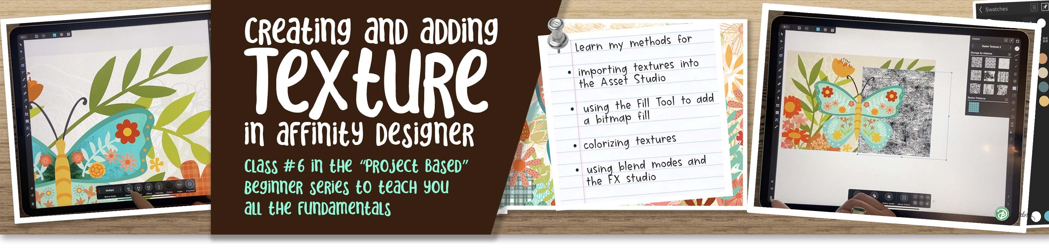
1. Intro to Affinity Designer 6 – Texture in Affinity Designer : Hi guys and welcome
to class number six in the Affinity
Designer series. This will be the third in the series where we are creating a dimensional and reflected
symmetrical layout. In this class, I'm
going to show you all kinds of different
techniques to add texture and interests to your motifs that you've drawn and add it to your
assets folder. So you're using your assets, but you're gonna be doing so in such a way that they won't even look like the
assets if you've used them in other documents. I know it's early
yet, you probably haven't been using
your assets much, but you'll find that
as time goes along, you're gonna be wanting to
reuse a lot of these elements. And adding texture
is just one of the ways to make them
look really different. There's some great
techniques here. These are techniques
for doing things like adding bitmaps and overlays, and adding gradients and all kinds of other dimensional
textural finishes. So I think that moving forward, these are all great techniques. We'll just add to your ability to create designs
that you visualize. So I'm excited for
you because I really think that at the
end of this class, you will have really
added a lot of interests to that layout that you've been working on for two classes. The great thing is too, that once you have these
techniques between creating the assets and the templates
that you can reuse. I think that you're
gonna be much more efficient at creating more
and more of these pieces. And that will help
you to create these efficiently so that you can start really
making money at them. If that's your goal. If that isn't your goal, you're just producing the
art for the sake of art. I think that you're
still going to love all of these techniques because you will be able to apply them time and time again. Now, I've also included in this class a set of textures
that you can import. These are free for you, and I will have them
in the downloads so that you will be able
to access them easily. Are you ready to get
this show on the road? Alright, let's get to it.
2. Lesson 1 Reviewing My Document for Ideas: Hi guys, welcome to lesson one. Lesson one here, I want
to give you an overview. And I'm going to show
you the example of the finished piece
that I created. It's not the piece that I'll
be working on in class, but it'll give you
a really good idea of all of the different things
that we'll be able to do. Let's get started. I thought that a
great way to start this class would be to
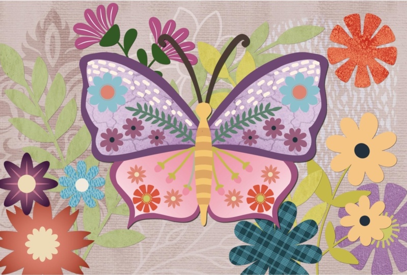
show you one of my, what I would consider pretty much completely
finished illustrations. I did some different layouts
as far as the flowers go, because like I said, this is something that I could possibly use for art licensing. So I'm creating a
series and you know, the one we were working
on and then there was one that I had done originally. So we've got quite a few
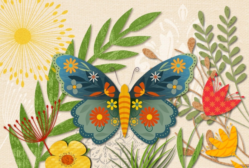
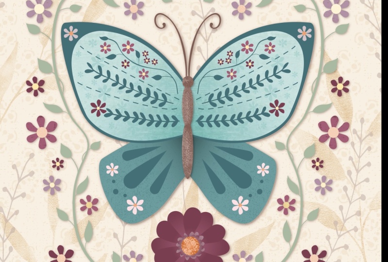
different ones going on here. This is the flat one, just with the flowers and
really no texture added. I think this one
with a gradient here and a couple of these flowers already had a little
bit of detail in them. So this is the one that you and I were working on together, are completely
different than the one on this particular butterfly. Chances are what LD even do is change colors on one of these so that two of them could be in a series and not be identical. But I thought opening
up with this to show you all of the different
little things that I've done. And mainly it's in
adding the textures. So I've got all kinds of cool different textures
going on here. Some of them I brought
in from one of the royalty free sources
here, Pixabay or Pexels. And I'm curious if you have
Unsplash, just let me know. It's funny. I swear it was there before. So again, I got to
go and figure out if I've changed some settings somewhere and now
I'm not getting it. Nonetheless, I've found
enough textures there, plus I imported a few of my own. So something like this one
here is one that I imported, I created in Procreate, I think, and then imported it here. And like I said, a
couple of the flowers already had some of this
sort of detail on them. But this is really
your end goal. This is what you want
to try to do with your work that we've
created in class together. So at this point in this class, it's going to be all
about creating, saving, importing, adding all
the different things to do with textures
that I can think of. So you're going to
have category here. I've got mine here
called patterns. So we did this one or add a little bit to it in one
of the first classes. And I've got a few
other things that I've added that I could
use in this final. And of course,
throughout the class, we will create a few. So that's the plan
for this class. I have given you a texture pack, and that texture pack contains a bunch that I have
created myself. So for that, you could import and put them into your
own Asset Library. I'm going to show you all the
steps involved with that. And I would really like you to go a little bit
of experimenting. And you could use Procreate, you can use Photoshop. You could even create textures that you
photograph and import. This is an example of creating some textures that you
can import yourself. For this, I just plopped down a little bit
of acrylic paint. I spread it with
a credit card So it was dry pretty
much instantly. And then over top of that, I just did either
brushstrokes or well, yeah, they're pretty much all brush
strokes like this is with a really old house paint brush. And overall, I've created a bunch of different
textures here I could use. These would be
something that you could photograph with
your smartphone or you could scan if you have a scanner and if you don't have anything like this
or you don't have the supplies to do
something like this, then full round the
house and just look for textural items that you
might want to bring in. Something like this, which
is a basket that I have, could be scanned or
photographed and would end up being actually
a really great texture because it has a
lot of contrast. If you're into art journaling and you have something that you can shoot from inside
one of your journals. Stephen, a texture
somewhat like this, which I also I think did with a smearing of a credit card. You could just go and buy
one tube of black paint at your local dollar
store and be able to create a nice
assortment of textures. Some of the textures
I'm giving you, our textures like this
that I've created. And then another idea would be to go out with your
camera and just shoot a bunch of different
textures in your yard. You can probably go right outside your front door
and find 20 of them, just like the concrete
on your steps, the siding on your wall, the texture on the
floorboards and your house. All of these are different
things that I have done to add to the texture pack. This is a flooring sample from Home Depot and
you can pick these up, usually the front and the back are actually
kind of interesting. This one has a nice texture, kind of a pattern, but this is a kind of thing
you can take in. And you could do all of this
Adobe Capture by the way. And you can either keep it as
a raster image if you do it with a photograph
or take it into capture and turn
it into a vector. And there you could really
work with the contrast, really bump it up
so that there's really light areas and
really dark areas which seemed to work the best
when you're applying it in this sort of a project. Another thing you can
consider doing is taking a picture of some kind of a printed example like this was an envelope from the merchant
class that I was in. We got these before each module. They all came at the same time, but you weren't
allowed to open it until he got to that module. So that was a really
fun kind of a thing. So you can find
textures really easily. Just look around your house, look in your closet, look on your shelves, look outside your front door. And I bet you, you could easily do 20 textures. I'd love to see you, you a little bit of
experimenting like that to add to the variety of textures
that we're going to use. Either through Pixabay Pexels, through the built-in
textures that are here, the asset pack, the
siesta textures also, this you can see is from a
site called pixel Buddha. So that would be a spot
that you could also go look and find textures. So I will challenge you, I'm gonna give you some, but I'm going to
challenge you to create, let's say five or
ten of your own. Alright, So I'll meet
you in the next lesson. And there we're going
to really talk about different things like
importing the textures and preparing for the stage that
you're going to be going through for finishing this gorgeous illustration
that you've created. Alright, I'll see you
in the next lesson.
3. Lesson 2 Importing My Textures and Adding More: Hi guys, welcome to lesson two. So I created a
texture pack for you. And in this lesson, I'm
gonna be showing you how to import it and use it.
Let's get started. After you've downloaded
the zip file for the texture pack, you're going to find it
in your downloads folder and you're going to click on it, which will open it
up and unpack it. So all of the textures
will be available here in your downloads folder. You can move it right then and there if you wanted to
or just leave it there. Then when you're in
Affinity Designer, you can go to Place image import from cloud and locate it. Now, personally, I like
moving whatever it is that I've just unpacked into
a folder that makes sense. So I usually go to my
iCloud and I've got the Affinity assets folder that I have created and I
will just drop it there. Now I've already got one called raster textures here somewhere, so I'm not going to replace it. I'm going to keep both
just so that I know. And so it'll be this
raster texture is two. So then when I'm in
Affinity Designer, it's easy for me to find
because I just go to my Affinity assets and I find that folder
raster textures to, and then I can import, and as soon as I import it, I can place it. And of course you're
going to want to place it as large as possible because you're also going to be adding this to your assets. Now I created it at about 10 ", so I don't want to really
enlarge it bigger than about 10 " and I know my
document here was 12, so I would just have it
about like that and then I'd go into my
assets folder here. Personally, I like adding
a new tech, new category. So I'm going to add the category and I'm going to
immediately name it, rename it to whatever
that makes sense to me. So in my case, I'm going to call it
raster textures too, so that I remember
that it's four that are from that folder
roster textures to, and I'm gonna hit okay here. Now I can add a subcategory. I don't necessarily go in
and change the name of that, but you could if
you had a variety, most of these are just
grunge textures like this. So in this case, I might
rename this to grunge by Dolores or something so that
I can remember that it's different than any other
grunge textures that I import. And I know that I have at least
one that isn't a texture. It's actually applied. And so that might be
something that I would do. Another subcategory
that would be raster, but it would be a plaid or
a pattern of some sort. So here now I can
just add asset. It's added here. Now
when I created these, I didn't do them with a
transparent background. So that's something
that makes it show up a little
bit better there. As opposed to those are to ones the artist to ones
are vector textures. I think they have a transparent background
or they're a PNG. So that's something to
keep in mind as well. So I'm gonna go to
Raster textures to, and I'm going to continue
to add them sold six steps with the
same every time Place image import from cloud. I'm going to go
down the line here and go to my category here
at Asset From Selection. And each time I do I can
actually get rid of it. So it's not crowding
out my document here. This one that I'm
about to bring in is that plaid one
that I talked about. So for that one, I might introduce
a new sub-category here that is raster patterns. So just keep in mind that
now that you've oh, shoot. Add that first. Now
that you know that these assets are only
about 10 " high, try to remember that
because you don't want to be enlarging them
when you're using them, chances are it will be
reducing almost all of them. Because look how small most
of our elements are here. I liked this one because
it's like that salt texture. When you use salt on watercolor, when you're done here. And you've got ten textures
that you've now added from the texture pack that
I have provided for you. Now, you probably have
your own images that you have either photographed or that you like and
you'd like to add, and you will just have to go through and locate
those textures. If they were photos, you can place your image
right from your photos app so I could go in and find
anything that was textural. Actually, this might seem a
bit weird, but I bet you, I will use it and
that's got some text. This was actually a
picture of my grandson in the paper and I happen to
take a picture of it because, believe it or not, that's
the second year that he is in the paper
with that picture. But the newsprint might
be something that would be fun to
have as a texture. So I could add that
as a new category and call it that I do new category actually wanted
to do a new subcategory. I'm going to go back
to my palette and add a subcategory
that's just random. Delete that and I'll take a look if there's
anything else now, I should have planned ahead and had a bunch of these
right at the very end. But you'd be surprised when you look through your old stuff, what you can find, there could be
textures like this, which were journal page
that I had created. So within here, this could be a great asset
that could be added. This could be the
entire background of this illustration, e.g. I'm not going to use
that one because I would go and crop it and do
that sort of thing first. But go through and take a look at any of these
old patterns that we created could work or even something like this
tile texture of that. I've taken a picture of, I would have gone in
and crop it first, of course, if I was using it, but you get the idea, so you just go to
your place, image, import from photos, go to
your photos gallery and scroll through until
you find something that you think could
possibly be useful. I think that one
could be useful, so I will definitely include
that in my random here. So that's basically
how you build up this super usable asset studios. So I want to encourage you
to go ahead and do that. Get a few of them in there
before the next lesson. Alright, I will meet you there.
4. Lesson 3 Applying Chosen Texture as a Layer: Hi guys, welcome
to lesson three. So this is the first technique
I'm gonna be showing you, and that's to add the
texture as a layer. The beauty of adding it as a layer is that you
can use all kinds of layer effects on it.
Let's get started. I'm gonna be showing
you a variety of different ways to add texture. And I think the first
one I wanted to do is kinda reminds me of this
idea here where a texture, like a full texture is
placed within a shape. So I've left this big flower there specifically
for that purpose. And I think the one I want to work with first is this one. So first things first
I want to insert it, then I'm going to
roughly resize it to the scale that I think
will work with that flower. Next, I want to
locate that flower. So it's the bottom one here, and I'm gonna drag until
it is directly above it. Then what I wanna do is clip it. To clip it, what I
wanna do is drag it halfway down the word curve. So the title of
whatever that asset is, I don't want to do it over the actual thumbnail because that's a different
function altogether. I want to do it
right about here. And you can see that upset immediately right to the shape. Now this is completely
non-destructive. So you can see here
that my asset is exactly the same
as it was before. It was in there and you can easily be pulled out if
I don't want it there, I could possibly duplicate it and use it
elsewhere if I wanted. So again, you can continue to scale it and get it exactly
the way you want it. Now the other thing
is, I could work with the layer blending modes here to create
different effects. So let me just move that over
to the side so you can see, and you remember that my flower was actually
a peach colors. So you could scroll
through here. I'm going to make it
about that size so that I can some of the
other color here. And you could just
quickly scroll through them to see if there's something that
you might like now, I somewhat like that one because it works with
some of the other colors. I have, that soft
light and I sometimes, I'm not even looking when I'm choosing when I'm
scrolling through. And I often end up with
either soft light or overlay. So those are just, I don't kinda go to
is I guess you could also affect the
transparency here. So if you don't like that,
It's that contrasty. You could change it to be
a little bit less opaque. And the other thing is you could change the color
of that original. So we could go all the
way back and change, isolate it and change its color. So if I would have preferred
to do something neutral like a cream color and then
apply the texture in there. So you notice when I first
moved out with moving the entire layer,
which I don't want, I want to just move
the patterns so make sure that you select the
actual pattern itself. So now that that's the
base color has changed, I could go back into the layer options here
and scroll again. Now you don't have to scroll. You can go through by just
clicking on these arrows here. I bet you anything, I
still end up on something like soft light. I'm
going to go back to it. And this one's a
little bit light, but you could see that the base color really
made a difference. So I personally preferred
it at in that peach tones. So I'm gonna go back
and change the color. And last time I showed you, I went and backtracked
to change the color, but you can do it without taking the pattern
overlay off of it. So you could just do a little bit of experimenting
in this way as well and feeling like the
rusty tones work nicely. And the reason I think
I liked that so much is because that makes the butterfly stand out a little bit more. So that is one of the main methods that I
use for adding texture. So while I'm at it, I'd probably go through and
do that with more than one. So let's say grab
this big flower here, and I'm going to locate it here first
so I see where it is. Once I've selected it, I'm going to insert an asset. And I want to try another
pattern on that one. So I'm gonna go to my
patterns and insert this one. Now with this one, I only had the one repeats. So it might not be an ideal choice because I
would have to duplicate it. So I'm going to get
rid of that one, maybe add this one is dead. So this one has a
lot more going on. I think it's a lot
more interesting. Kind of roughly in position. And because I had
selected that first, now my pattern is
directly above it. Slide that in so
that it's cropped. And then I'm going
to go immediately to my layer options here
and scroll through. And I find this faster than clicking the
arrow personally. So I just wanted
to show you both. Let's try overlay soft light. So something like
that works nicely. And I think I would go
in now with my color. So go back to the actual layer, click on the curve itself. And here, do a little bit of experimenting with whatever
the background color is. What I'm looking
at here is to have it maybe less contrasting, that I can have those small flowers showing up a little bit better
in front of them. So this is the thing I like to really spend a
lot of time on, and right now, I'm just
demonstrating it to you. So I'm showing you
some quick methods. I don't really like that
now that I've finished it, so I think I would go and locate that in my layers palette
and delete it and go back. And I think I am going to go to the new patterns that I've done and insert one of these
textures instead. So this is a completely
different thing because now we have a
texture that has no color. I'm going to drag that in there. And again, I'm going to
go apply a blending mode. And I'm thinking that what's
going to happen is it's going to be a little bit
too dark for my liking. So another thing you can do with the texture itself
is colorize it. So you see that if you
have that selected, so if you're in your layers
palette here and you have it selected when you go
to your color wheel, right now, it's
got no color here. You can go through and
apply a different color. That's good to note because
that means that any of your black and white
textures that you have maybe collected
from other sources, maybe you bought them or
you have access to some. You've either created yourself or are going to
create for yourself. Now, you have those and you can take them and apply
a blending mode. So here I can go into
my layer options and scroll through and I haven't got that clicked
or do I let me see? I don't have it clips,
so I'm going to clip it. But now I can go
through and go to my layer options and scroll
through until I like art, until I find something
that I like. There's so many different
ways to affect this and to change what is happening
as far as color. Because you can
change the overlay, you can change the
underlying color and just kinda keep playing with it until you find
something that you like. I like Multiply because it shows through completely with
what's underneath. So now I think
that I can go into my layer itself and
make some changes here that will be giving
me more of the color that I want to have going on
in my overall illustration. So there are other
methods and one of them is going to be using
our fill over here. So I'm going to be showing
you that in the next lesson. I'll meet you there.
5. Lesson 4 Applying Texture asa a Bitmap Fill: Hi guys, welcome to lesson four. This is another technique
that I'm going to show you for importing your
bitmap textures. Let's get to it. So the next texture that I
want to show you how to place our next method is to
use this tool over here, which is the fill tool, and I don t think we've
used that before. So the fill tool, remember you can always go
to the question mark here in the lower right-hand corner to see the names of
all of the tools. This is the one that you can use for things like
gradients and whatnot. There are choices here. You see that that as soon as
I switched to the fill tool, might context menu
down here and change. So let's select a shape, which one should we do next? I'm going to close
this Layers palette and I'm thinking, well, let's stick with
these larger ones just so you can see the effect. So this is the one
I want to do next. So double-clicking on it
like that has selected it. Now I want to go down to
the type of fill here, and you can do the
gradients here. Maybe we could use this
before because I think we did the gradient at one point. If not, I know some of
you have discovered this because I've seen a lot of
your flowers with gradients. I want to go until I hit bitmap. You see here it
changed to bitmap. So that's what non-solid
linear gradient. Obviously that's a gradient, that's a gradient, a gradient. But the last one was bitmap and that's why
it's open this up. So here I would go into
my Affinity assets and I would go into whatever, wherever I've actually
got them saved. It could be in those
raster patterns. This is my original
raster folder, not the one that we
just worked with. So I could and I
think I've got these already because I've
imported them previously, but that would be how I would
go about inserting that. Now here you've got controls
where you can change closer, you get to the bottom. So that bottom circle there, the closer you get
these two that is, the smaller your
pattern will be. And this is really
neat because you can change the angle of it. Now we could have changed
the angle on this as well. And that's something I
didn't point out because it wasn't really
relevant at the time. But to change the angle
there, of course, you're going to
need your Move Tool selected and you
would change it, dragging it to whatever
position you want it. But in this case,
you can see that you can make the adjustments
just by rolling through, changing it, by
dragging it around, or enlarging or
reducing it based on the position of that dot. So I'm thinking maybe
something about there. So the one thing to note
about this is that now it's on a white
background because that was the color
of my patterns. So what I would have
done or would do, would be in this case,
duplicate that shape. So I'm going to select it. You can see it's selected
there and hit Duplicate. Now, I've got a solid
here that I can change this to be solid
color and change the color. And I could move it below and change the
blending mode on that. Or I could leave it on top layer that you're
trying to effect, makes sure that
you're on that layer and set your blending mode. Now, I don't know what
weirdness is happening. Oh, it's blending, of course, with this background or
everything that's below it. So you might even have
to do a third shape, will duplicate that again, bring it below and take the blending mode
off, make it normal. And then you see what kind of an effect
that you can have there. So I quite like this one too, as just an alternative, a different thing
that you can do. And of course,
remember that you can go in here and affect the color, change it to whatever you want. It's got a stroke on it right
now, which I'll take off. But depending on
what you have here. And remember I've got it
on multiply, you can make, make it into a color
that works with your design and thinking
that's a bit too dark, but I'm going to leave
it for now because I've got definitely other
things I want to show you. One of the things that you
can do with that bitmap fill. Let's go back to that. We're going to go to, It's a little bit
unnerving when you get your scrolling
through here and then you get to bitmap
and it just kinda opens up without giving
you any warning. I'm not sure if
that's normal or if it's a bit of a glitch. But I just wanted to
show you a couple of other things with
this context menus. So I've got the ability to change the direction of it here, but you can also
rotate it, reverse it. So that's kinda rotates it
automatically reversing. The aspect ratio allows you to stretch it one
way or the other. So in this case it's not
something I would do because that is supposed to be a really symmetrical pattern. But that's just to show you
that that's a possibility. And then one last
thing I want to show you here is that if you
brought in a bitmap, I'm going to put none for the moment and then
go back to bitmap. If you port brought
in a single flower like let's say this
one right here. You could use your, I'm going to switch back
to a regular aspect ratio. And I've only got
one flower there. But if you want to, you can use this control
to repeat and create a pattern just from a very
simple and single image. This is something
we're going to explore later at some point because I think this would be super fun to use when we are
creating patterns. So we'll table it for now. We're not going to add it
to this particular class, but I just wanted
you to know that that's one of the possibilities. Now, I'm going to go through and add a bunch of other
textures here, of course. But this is just to
kinda give you an idea of the different
things that you can do for textures in order to really start beefing
up your illustration, why don't we look back
at this other one so that you can see some of
the things that I did do. So in the next
class, next lesson, what I want to do is show you things like the gradients
to and how they can be used when you're working
with the textures to give you Effects like
what I've got here. And I want to show
you also how to add textures to the overall image. So I'll save that
for the next lesson. Alright, I'll meet you there.
6. Lesson 5 Gradients with Texture and Blend Modes: Hi guys, welcome to lesson five. In this lesson, I
want to show you how to use a gradient in conjunction with your
textures. Let's get to it. For this lesson here I want
to show you the technique I use to give the wing
this sort of a look. So it involves both a gradient and the overlay of a texture. So let's go back to my flat looking document here and let's work on
that a little bit. So I selected the fill tool
and then went to a gradient, which is a linear gradient. With the linear
gradient control helps you to position and angle the gradient
the way you want it. And it also allows you
to change the colors so each of these nodes
can then be changed. So this one here I want
to have actually very deep and this one quite light. And you can even click to add additional points
in the middle. So let's say you wanted to go to a different sort of a tone, maybe a blue or blue or just something
to make it different. You can do that. And of course, it can
be moved around to control where you get
that light and shadow. And I'm trying to do it so
that I'm eventually creating a shadow around the body to help make it look
like there's depth. So that's my intent with kinda dragging them out a little bit closer
in this direction. And then that kinda
gives a highlight there, which then makes it look like
it's a little bit closer. So that's just the first step, That's just adding or having
a gradient as a background. Now let's go back here and you can see that I've
got two layers here. This layer here, or this layer could be filled with a texture. I want to fill this
one, I think so. I'm going to actually
duplicate that one. So you're going to your edit
menu here and duplicate. It's currently the exact same. But what I wanna do now is added texture and in this case, just for something different, let's go into our stock
images here and I'm going to type in or write in the word texture and
hit search down here. And of course, all those
textures come up again. I'm scrolling here
and trying to find something that kinda
goes from light to dark to really reinforce that goal that I have of making it look
three-dimensional. This one kinda
works kind of like this one because it's got a
lot of actual texture to it. So I'm going to insert that one. So just remember, a long
hold will bring it in and I want to clip
it to that shapes. So I'm going to drag
it right over it so that I see that line
that's going to clip it. And now I can move it around. So grab your move tool, make sure you're on that shape. And I'm going to change the
angle and the size of it. So I kinda like that. I mean, that's without any
blending modes or anything. And you can see that definitely
goes from light to dark. So at this point,
that layer itself, we can either colorize or we could try a blending mode without even changing the color. So I think I'll do that first. So I'll grab
blending mode that I know is going to show through. And I mean, luckily,
it's just by a fluke, but it is actually a pretty decent color for
this particular application. I don't mind it. I also want to show you what we can do as far
as changing its color. So as long as you have
that layer selected. So I want to make sure that
I'm on the image here, not on the curve itself, but the image I can
now go in and affect its color by moving around
here on my color wheel. So I think I need to be
into the bluer tones. And here I can
lighten or darken it. And I'm still getting
that gradient a look because of the image itself
going from light to dark. So that's kinda
what my goal was. I quite like that. You can also
definitely go in here and change the percentage, like the opacity of it
so that it's lighter, it's showing me be a
little bit less texture. I kinda like it really grungy
like that really gnarly. I want to go through
and do that on all of my different motifs. So there's tons of them here. I'm definitely going
to have a challenge. It's going to take a little
bit of time to do this, but hey, that's what
it's all about, right? So at this point, I've showed you
different methods for adding your texture. There was just having it as an overlay for this
one and this one using multiply to blend or
whatever blend mode works. This wine we used bitmap fill, and then this one we used
a bitmap overlay as well, but with a gradient underneath, you can still go to
your underneath layer. So that's this one here. And you could make
changes to it. And it's also possible
for you to take and put that one on top and
make changes to it. So different
blending modes might affect it differently when it's actually the topmost layer. So try things like
multiply works great, but definitely darkens it. So you might want to go into
one of these categories, which is more like an overlay. These are all kind of overlays
like that one's not bad. And then remember that you
can still go in and effect that gradient if you wanted to change things up
a little bit now, you might want to take this
one and really darken it. You can see the difference
that, that can make. I know I'm giving
you so many ideas, it's probably going to be
really hard to focus on one, but I want you to try all
of them so that you have a really good idea of
each of the things that you can do to add dimension. I'm going to be going through and adding all my textures to this and we'll take a look
at it in the last lesson. But before I do that, I want to also show you another way that you
can add dimension. And this is gonna be
overall dimensions. So that's going to be in e.g. creating a drop shadow on this part on the butterfly
so that it stands out. Let's go back to this document so that I can show you that. I don't know. I didn't point it out, so I
don't know if you noticed it, but you see here I've
got a drop shadow on the wings so that now the whole butterfly
looks like it's really standing in front of, or flying in front of these
images in the background. Then I also went through and
I put smaller drop shadows on some of these others to
also give them dimension. I haven't even gone through and added texture
to all of these. That's something that
you might want to ask yourself if you
want to do or not. So in the next lesson,
I want to show you adding the texture
to the background and then adding some of these watermarked
images that are here. Okay, So I would say
take the time now to add textures to all of
these foreground items. I'm going to show
you the background. So you might want to do that before you add the
texture to these. It's all up to you. You can do this in whatever order
that you'd like. You could stop right now. Don't do anything
to the background. Just add your textures to your butterfly and your flowers. Or you can wait and do
that after you've added the texture and these light
images in the background. So let's meet in the next lesson where I'll
show you how to do that.
7. Lesson 6 Background and Effects Application: Hi guys, welcome to lesson 66. Here is all about
the background. I want to show you a little
bit of organization and we'll import some textures to be used on this independent layer. Let's get to it. I
thought it start this lesson by showing
you my structure here in my layers so that you understand how all of
this is work together. So the group that you
see here is the one that contains the symbol that gave us the reflection on
the butterfly itself. I've got a bunch
of separate pieces here that are actually
part of the background. So this whole grouping here, I would probably select all of this, including the background. And I would group
them together so that here in my layers, it looks really
easy to understand. This is a great lesson for you because I remember
working when I was working with animation
and I had to pass my artwork onto
someone else to work with, to add backgrounds or whatever it was that
they were doing. And I was chastised
for not having a organized structure in my layers because
the next person that then has to go
and work with it, it has to figure out what
the heck you're doing. What, what did you have in
mind when you were doing this? This makes no sense. So it's something you
just learned to do. It's something that
you have to do, especially if you're
working with a team. So I want to bring
this grouping now I just kinda group
this outside stuff and I want it to be
under the butterfly, but I don't want to put
it right down here to the bottom or below this one
because it makes no sense. So if somebody is
looking at this, they would have no idea what it was that I was trying to do. But now it's organized. This could go in there as well. I'm just going to move it
there for now and then open this group and put it in there and do the same
thing with this one here. So I know that this is looks or can be very confusing
when you're looking at it. But what you want
is to have it so that when you have everything
blows up, it makes sense. So we've got our butterfly here. This could be
labeled foreground. You could do a
separate folder that's midground and then you
can have your background. So whatever we just
try to be organized. Now, I want to the
reason I did all that was to be able to isolate and turn off all of this other
stuff here so that you can look at my folder that
makes up my background. So having all of those, we're in the same layer, it would make it
easier because then I'm only having to close off one layer or two layers instead of 50 different layers
if you get what I mean. So get in there
you, There we go. So now when you look
at this one more, I've got that off. And what that's doing
is just allowing me to show you what's left
in the background. So I've just done that all on camera for you so that
you would get it. So here are the different pieces that make up my background. And the reason that they're on a separate layer is because we don't want any
reflection happening. So if they were in the butterfly group or anywhere
else, it wouldn't work. This is what you want, is just one flat
background layer. It makes it a lot
easier to work with. What I did here is a rectangle, that rectangle i filled with an image that gave
me the texture. And these are different assets
that I've brought in and recolored and possibly
change the blending mode on. I think this one is a
group because I've got all these different parts
here to make up that shape. I have these all
separate so that I can use them separately. And you'll see that in the other document
that I have done that. Now we've got a
really tidy document here to work with and
we're not using it. We're gonna go into this one. So just take the time to organize your gonna be
really glad that you did. So now, here in my background are different
things that I've placed. So I've got, I'm
going to turn off my butterfly layer and I'm
going to turn off these. And so all I'm left with is the two things that I currently have here
or my background. So the first thing I wanna
do is add a texture to this. I think I'm gonna do
that here as well. So we're going to go and
look at the textures again. Make sure you hit the search
bar here and you're going to get all of the textures
from these companies. So there's Pexels and
pixels and Pixabay, and I don't know what your
look is that you're after. So you will have
two experiments, something like this might
be kind of a neat one. So I'm going to just
tap and hold and this could give me a
really handmade look. That would be one possibility how that's on a
separate layer so I can go in and I can just
leave that there temporarily. Let me drag it down
closer to the background. And what we can do is right
now select these three and make that group and
we could even rename it, which is something I would
suggest that you do. I don't do very often, but you could rename that. That's up to you. So I'm going to just Turn that one off and
let's take a look again at possible ideas for texture. I don't have to type that in
again, it's remained there. And I think what I wanna do is somewhat what I did
in the other ones. So I'm going to look for a
Canvas, texture, hit search. And here we've got all kinds
of really nice weaves. It's really hard, I think, to fully be able
to decide because the little thumbnails are so small and I think that
one's way too big, so I'm not even going to
bother with that one. I'm going to look for one
that has a finer texture. So maybe something like this. No, I don't like that either. And it's got some kind of a
tie on it which I don't want. Maybe this one,
that one's not bad. So here I'm going to
reposition it, resize it. And now we can think
about adding that in, either blending this
one in or adding, or putting the texture
or color on top. So I'm putting it right
into my group here. Let's go into the blending modes and try something like screen. And actually that's quite nice. So screen, light and usually these in this grouping
work best for that. So I liked the screen,
the bass, I like that. It's just a really subtle. Now with this image here, then I could decide whether
I would like to blend it. So right now, it's
got no blending mode. It's a group, but I can still apply a blending mode to it. And I might also go to something in that
category lightened. No, that's not going to work. And the advantage of adding a blending mode is that then it shows
through the texture. Without that, it didn't
show the texture. It's just a flat image. So I like that. I think the position
is probably good. I shouldn't even change
it because I think I'd already positioned it
the way I like it, and then now we can
add other assets. So I had flower, kind of a large flower from my own hand-drawn flowers
you've seen before, and you probably have a few, this one here, this collection. So I would go in and maybe grab one of these
really nice outlines. I like this one, so I'm
going to insert it. Now. Remember, I made all of my
assets kind of a cream color, but you can go in here
and you could change the colors so I could make it
pure white if I wanted to, or I could use a blending mode. At this point, you might want to turn on your other
layers so that you have a better idea of the positioning
of all of these items. And that curve came
in above that layer, so I got to drag it down. And so at this point, everything that you're doing
is going to be very subtle. It's going to be
in the background. No, I've got it too low. I'm going above that, but it's still enhances. It really adds to it to add those extra little things
in the background. So that would be, your
next move would be adding those additional
motifs or anything that you think might work
nicely in the background. And here's a couple
of other things. I have them in the wrong
layer at the moment, but those were things that
I had originally added. I will delete that one. There's part of
that same sort of skeleton or the mask pattern that I have is just
one part of it. And that was one of the
assets I had that I added in. And then I have this
grouping of flowers. And I know it's super subtle. You probably can barely even
see it here on my screen, but I think it
really adds to it. And it's really good for, let's say Philly, in
an area like this. So you see how it's just there, but it's really subtle. And then you're adding, you can add any of your
other little motifs that you had there just to
help add interests. I also told you I was going to show you how to add dimension to your overall shapes that
I would do using the, I'm going to use this
motif here because you will be able to see it
really well when I'm doing it. I want to go into
the effects studio. If you're not sure which one it is, It's here with the FX. Or you can hold down your
question mark here and find it. So I want to use
the layer effects. And on this you
could add a shadow. So I've got that on and
as soon as I put it on, I have to click on it. But then I get this context
menu at the bottom. So this menu, it's already got multiplies a blending mode, which I think is
probably pretty good. You could change
the color of it, but let's just move it a
little bit so you can see it. So as you drag, you can make it bigger or
smaller based on dragging upwards for bigger and
downwards for smaller. So I'm gonna go just
a little bit and then I'm going to offset
it so you can see it. So that's out about 50% opacity. You can make it more
opaque or less opaque, and you can change
the color of it. So if block has a
little bit too harsh, you might want to go
in and change it to something like neutral brownish, I know TO poor beige color. That might work better
with your background. And then just decide on how
much of an offset you want. So the further the offset is, the further away that it
looks from the background. So personally, I did just a little bit on all
the background items, but on the butterfly
wings themselves, I went a little bit bigger. So let's offset it first
so that you can see it as I'm working on it and you can see that it applies
to both sides. But the cool thing
is, I've got it on this side so that it looks like the light
is coming from here and it's doing it correctly
on the reflection. So that's kinda neat. Then you can feather it a little bit more
so softened it up. But the further
you have it away, the closer it's going
to appear to you. So that gives it more adapt. It stands out a bit more
against the background. And even though these
do have a shadow, is definitely looks
like it's closer. It's casting a deeper
shadow onto the background. So then decide on which of your motifs that you
want to do that with. You might not want to
do it on all of them. And the neat thing
about this kind of a drop shadow here is that
it's non-destructive. So in other words, it hasn't changed anything
about your layer. If you don't like it, you
can just simply turn it off, turn it back on, brings it back. There's a lot of other
really great ones here that I know through time. We will eventually work
through and learn how to use. If you were creating shadows from the solid image
like we do in Procreate, the Gaussian Blur would be
what you'd want to use. But right now, this
is simple, it works. So that's the one I would
definitely go and use. So I think I have covered
everything that you need to know in order to finish up
your illustration here, I'm going to take some
time now off-camera to add everything that I want
to with this artwork. So to finish this
artwork so that I've got a completely different
piece than this one. So it's gonna be kinda cool to compare the
two afterwards. I think, especially
that they basically are the exact same artwork and I think they're going to
look quite different. I actually drew these
little bits of grass there. If you're wondering
how those came about, I don't have them as one of
my assets and that I did really easily just
with my pencil tool. So if you wanted to add something like that,
you definitely could. I didn't find that I
needed it for this one. Who knows, I may end
up adding it anyways, but I feel like this one looks so different from the other one. I will meet you in
that next lesson and I can't wait to see what you
guys have done with yours.
8. Lesson 7 v2 Conclusion and Wrap Up : So we're at the end of class, and this is the wrap up. I hope you've really learned a lot from these three classes. I can see that moving forward, you're going to be
able to use most of the techniques that
we've reviewed here to add lots and lots
of interests to any of the illustrations
that you create. Vector programs had a bad rap for not allowing for
a lot of texture. But Affinity Designer
has blown it out of the water here with all the
different possibilities and techniques you can
use to add that touch that makes it looks so much
like a raster based program. We didn't even touch on brushes. That's going to be
something that I will cover at some point. But I wanted to show you all of these what I would
consider simpler methods. I really hope that you'll take a look at some of the
illustrations that you have and consider adding some texture to them to
make them more interesting. Or even just take some
of the assets that you have and individually add textures to those
and then reload them into your Asset Studio
for use in the future. I'm sure that 1
million different ways you can apply all of these different techniques
that you've used. So I hope you've
learned a lot from these classes and you'll continue to follow and
learn along with me. In Affinity Designer. This is such a robust program. You're gonna be surprised
after a few classes, the kind of illustrations
that you can produce. So I guess this is Bye for now, and I will see you
in the next one.
 Delores Naskrent, Creative Explorer