Transcripts
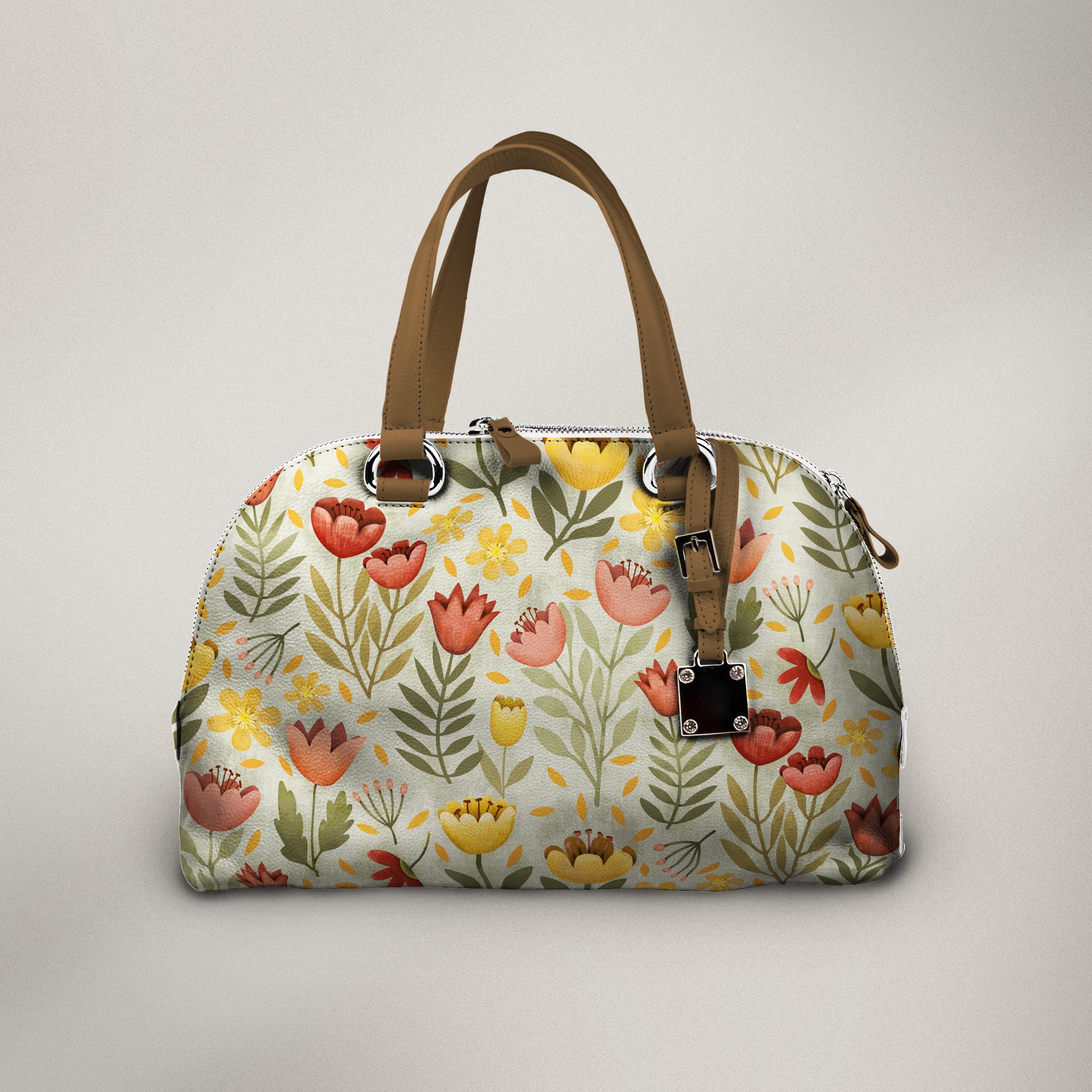
1. Intro to The Pixel Persona Adding Raster to Vector in Affinity Designer : Hi guys and welcome. My name is Dolores
NASTRAN and I'm coming to you from sunny,
Manitoba, Canada. A few years back, I would've
been hard-pressed to even consider using another
vector-based program. Besides Adobe Illustrator. I was a diehard Adobe fan. I had the whole
Creative Suite and basically I just stayed
within that area. I rarely use any other
software besides it. But then I got an iPad
and things change. I decided I wanted to explore
the Procreate program. So that was the first one
that I ventured into. It didn't take long to
realize that the buzz out there was all about
Affinity Designer as well. So of course I had
to check it out. What are the things that made it a little bit less painful was the fact that the program
was so inexpensive to buy. I thought, well what the
heck, what is their Deleuze? I purchased Affinity
Designer for my iPad, and I started to really
explore the program. I took lots and lots of classes. And today, I can honestly tell you that I actually, on my iPad, use Affinity Designer
much more than I do the iPad version
of Adobe Illustrator. Why? Well, the main reason is
that Affinity Designer has a pixel persona that allows me to paint very much like
I do in Procreate. So that was mind-blowing to me. I've been using
Affinity Designer a lot for surface
pattern design. And lately I've been
exploring the idea of adding texture to my motifs
using the pixel persona. This class is all about that. I'm gonna be showing you all of the things that I
have figured out. Well, maybe not all
of them, but a bunch of the stuff that
I've figured out and I'm going to show you how to
colorize surface pattern. Repeat. There's lots to learn and lost to know about
the different ins and outs of the program when we combine the two
different persona's. So we're going to take
a really good look at that in this class. So are you ready to get started exploring the pixel persona? Alright, let's get right to it. I'll meet you in lesson one.
2. Lesson 1 Overview and Pattern Prep: Hi guys, welcome to lesson one. Unless a one here I'm
going to give you a bit of an overview and we're going to start prepping the
pattern document. Let's get to it. I'm gonna be showing you
relevant examples so that I can explain the process that I'm going to be
using in this class. We're going to be taking
a vector pattern. We're actually going
to put a quick one together so that we've got
something to work with. I'm gonna be using my
layered flowers to do that. And then I'm going to go
in with the pixel persona. So those originals
will be vector parts. And then we're gonna go in with the pixel persona and
add some shading. So I thought this one
wasn't a bad example. It looks like it could have been drawn with vector
parts, so to speak. And then that some
of this shading from dark to light that you
see in the petals here, in this area on the bottom of this bud that looks
like it could have been sprayed by an airbrush or some really nice
blending techniques with a pixel based brush. This might be a
little bit clear here because this is
showing the stages of this particular
flower being completed. So if you see below here, there are all the different
steps, so to speak, before arriving at, I
guess something like this, which would be pretty close to the finished flower with all of its highlights
and shading. So I thought that these were
good examples just simply because you could see if one of the petals
as isolated here, the airbrushing that
would have been done in this can be
done with any texture. It definitely doesn't have
to be done with airbrushing. I'm gonna be showing you with more texture brushes just simply because that's what
I want to produce. That's the finished pattern
that I want to have. I am definitely using
this for pattern design. So I'm gonna be taking
you through all of those steps as we embark
on this little project. Just kinda keep this in mind. And that's a matter of fact, what I'll do is I
will make sure that I include this link so that
if you're really curious, you could actually go
and check this out. And this is a long project. I'm sure there's a
lot of details here, but it's just, it's sometimes
nice to break it down, take a look at it and see if it's something that you might be interested in producing in the future as your
skills improve. So this is the beginnings
of the document that I'm gonna be using
for this project. And I am using
assets that I have in this layered flowers
and stems category. Let me show you the file
that I produced and this is the one that I used for the
title slides for this class. And as you can see, there
is a lot of detail. I'm using the same
sort of brushes, by the way, the layered ones. And each of these
has its own layers, pixel layers that
have been added. So if you look in the
layers palette here, they are identified
as pixel layers. So when you break it down
and take a look at it. Now in a case like this
background piece here, let me just hide this front end. This piece is right here. I have done the airbrushing
are not airbrushing but the addition of the
textural brush strokes. And then I have taken
those and actually apply them to so that the
curve acts as a clipping mask. So you can see I can actually
move this piece around. So that's the shading and
it is clipped by the curve. I know I've shown
you how to do that, but of course I'm
going to be helping you and reminding you
about each of the steps. I guess I should turn
that other layer back on, but you can see the
same thing here. So the curve is here. This is the texture that I've applied and it is
really textural. It's a really rough brush. And I've done a really
simple scumbling from a very light
color in the middle to give the highlight
and then getting darker as we move on to
the outside edges. So this is the kind image that you're going
to end up with. I decided to create a completely new one just so
that I have a new pattern. Might as well kill two
birds with 1 st, right? Let me just show you this is
the one that's on the title. So this is on that mock-up of the thermos cup,
the wind thermos. And in this one, I've just gone and
changed all the colors. I don't know why. I just felt like I wanted
to see this one in yellow. So the neat thing about
that was that I could go into the individual layers, go to that pixel layer, and then I was able to make the changes using
recolor adjustment. If we have time today, I will definitely talk to you about the
re-color adjustments. That's something
that we find here in our adjustments studio. I've been doing a
bit of experimenting with that and I'm
actually really pleased with how you can recolor
images quite easily here. And the cool thing about it
is it is non-destructive. So if I wanted to, I could just eliminate
that and that flower would go back to
the normal color that was on the other document. So you can see the
same thing here where I've got all of these, what we're blue flowers. I've had the recolor
adjustment applied to all of them to change them
to this orange color. If I wanted to, I could
just switch that layer off or eliminate that completely and I would be back to normal. So these are amongst the
things that I'm going to be explaining as we work our
way through the class. I started here with my
two layered flowers. So what I did was in search
whichever parts I wanted. And I know you don't
have this set, but this is something
that you could always make for yourself. These are really simple assets and you can see that I've got the flowers that are kinda
have a curve downwards there, kept downwards and then there's the ones that are upwards. And those are the two
parts that usually go together to create the flower. So if I wanted to, let's see this one which is
the one that's right there. Let me use another one. Actually,
I'll use this one here. I just hit in search. It comes in, it doesn't
matter what color it is. We can change the
color to something in our color scheme and
then see that's kinda kept upwards so that I want
to grab one that I think would work with it that's
kept in a downwards angle. So that's how it ends
up looking Open. Let's go to the color
scheme that I'm using here. I'm going to use kind of
a yellow for this one. I'm using light yellow or the front part and
a darker yellow. Maybe I'll even go darker
for the back part. Flip those two together and
you've got a complete flower. What I do is I immediately go in and take the two
and group them. I'll do these at the same time and group them and then
they are ready to go. So I think that's
going to pretty much give us enough flowers. I will decide on the stems
and get those ready. And then we're ready
to get started in adding some of the detail
with our pixel persona. Maybe at first, we'll
do a quick arrangement of this to make it look
like a repeat pattern. And then we'll get
going from there. Alright? So I will meet you
in lesson one. I will meet you in
the next lesson.
3. Lesson 2 Resolution and Raster vs Vector: Hi guys. Welcome to lesson two. Lesson two here I
want to explain about resolution,
document resolution, and also a little
bit of an overview with the differences between
vector and raster formats. Let's get to it. Okay, so I've talked a little
bit of arranging here. I've got a few
different motifs added. By no means a finished
pattern here. So don't judge, I
am simply trying to create a pattern that at
some point I can finish. It may not be in this class. One of the things that I want to explain is that this
is a vector file. In order to add the pixel data, what I need to do is change
to the pixel persona. There. It just explained that
I have now switched and I was actually just doing a little bit of a test
on this little image here. And I'm going to actually
delete that layer. Now, if I was to start painting, you're going to see that it adds a layer automatically within the group that I'm working with. As far as choosing your brushes. Of course, there are
hundreds of choices here, which is awesome, and these
are all just built in. I think I've only
added a couple of little things myself,
some pixel brushes, but for the most part, these are all built-in
and there are some really great sets here. These pixel shader brushes, I seem to go back to
more often than not, and they're really
great for blending. And you can get a variety of different textures from
a really dense one like that to a really
noisy one like that. Okay, so we are going to
definitely be experimenting with a few different brushes
as we work our way through. Remember though that you're
now switching or you're adding this pixel data
to your vector file. So it's a completely
different file when you're done, e.g. the thing to keep in mind is
that it always depends on your end-use as to what kind
of pattern you produce. If you are producing
swatches like this for Spoonflower or a POD
site like Society six, this type of file is completely usable just because of the
printing process they use. However, if you are working for something like
fabric manufacturer, you may have some
limitations put on you when it comes to how much
pixel data you can use. They would definitely
be included as your total number of layers or your total
number of colors. I have kept this one to a very small selection of
colors just for that reason, because if this was to be picked up by a
fabric manufacturer, they may either
completely eliminate the pixel layers or that goes into the total
count of colors. It's a really difficult
thing to explain, but just suffice it to say
that it is different and always check with your end
use before you get started. So as you can see, as I started painting, it
added a pixel layer here, and it'll do that wherever you are situated in your layers. So if you wanted to work
on this particular flower, which is this one here, I would go to that group
before selecting your colors. And as you can just click the hadn't
even started painting, but it gave me an
additional layer here. Let's just see if it put it in the right place and yes, it is. So you can see here, well, two things I'm
going to point out. First of all, it's
currently not clipped. And secondly, if you
really enlarge it, you can see that the quality of that particular pixel
brush is quite pixelated. So that would definitely give limitations as to how much you could
enlarge your pattern. Now when I'm setting
up a file like this, generally, I will set it
up at a high resolution. So let's just say I'm
setting up a new document, go into the new
document setup here. And I wish I prefer
working in inches, so I would change this to my standard ten by ten
that I always use. And note this here, 144, I'm trying to
enlarge, silly me. 144 pixels per inch is not much. That's a fairly low quality. I usually optimize to at minimum 300 and at times I've
even gone as high as 600. So just keep that in mind. Now, I'm not going to be using
this document because I've already got one set up to get rid of anything that you
don't want to just go to the three-line menu there. And if you hit Close, it will eliminate it. Now this is the one
that I'm working on. And if you ever need
to take a look, you're already in your
document and you want to figure out what
your resolution is. You can go here to the
document menu and go to re-size and your document
information is here. So there is the pixels per inch, and indeed my
document is only 144. So this was one of the standard pattern repeat the half-drop pattern
repeat template. And this is the one that I've
been using and it doesn't matter about the resolution
when I'm working in vectors, but because I'm wanting
to add a raster, a bunch of roster details. I do need to have it at
a higher resolutions. So what we can do here is my measurements are
still what they were, which is the ten by
ten main square. And here I could resample it. And at this point, because I have nothing actually on here, I'm gonna get rid of that
little texture there. But because I have
nothing on there, I can re-sample
it and hit Apply. And now all of my textures will come in at that
higher resolution. So let's just switch them pixel persona and grab
that same pixel brush. So that was the noise brush. And let's take a look
at the quality here. And it's still quite pixelated, but it's better than
the original one that we were looking at. The quality has
definitely improved. So just to caution, make sure you set
up your file with at least 300 pixels per inch. So at this point we're
really ready to get started. And I want to talk
a little bit about the color choices here. So even though I have been
sticking to this palette here, I am going to be
definitely using my color wheel to be able to give me different
tones of that color. So let's say this is the color
that I want to work with, which is this color here. I would sample that color, or I would select
that color here. But then I would go back into
my color wheel to be able to grab something a little
bit, Let's say darker. In order to do my shading, I'm going to pick a more
dense shading brush here. And can you see that right away, that the color is, even though it was
the same color, actually let me go back. I'm going to actually
select that same color. I'm going to switch back
to the vector persona for one seconds so that I
can select and fill, know that that's the color. So this is the color here, the one in the very center. And then now I'm going to
switch to my pixel persona. And you can see that
when I'm painting with this exact color,
you're seeing nothing. However, if you
look in the layers, you will see that I did
do some painting there. So what I'm gonna
do is go back to the color wheel now and
just darken the color. And as I spray now
you're going to see that that is building
up on the color, but with a completely new color. I guess that's the main thing
I wanted to point out was that here you're
adding new colors. So if you were working
with somebody that said you have a
limit of 20 colors than that new color would then be an additional color to
what you're already using. I know it seems confusing, but I just wanted to make
sure that I mentioned that. Now I usually stick with it. I've I've sampled that color. I know that was the color I was using and I like to stick to those colors when I'm doing
my shading and so on. So you can see here that those colors coordinate
absolutely perfectly. Now the other thing I'm gonna do is I'm going
to explain to you this little context menu as we work our way
through the lessons. So in the next lesson we'll
do is start that explanation. I'll see you there.
4. Lesson 3 The Context Menu: Hi guys, welcome
to lesson three. Less than 31 of the
things I wanted to do is cover the context menu. Let's get started. Alright, Just to
continue on here, I want to explain it a
little bit more detail, this context menu down here. So if I am not on the brush, let's say I'm on the eraser. You'll see that there is a different set of
controls that come up. So basically these
controls are like your brush studio in Procreate. So let's switch
back to the brush. So I've still got the one
of the pixel shaders. I'll go to a fairly
dense one here. How dark that would be, and you can see the size of it. So this control here is what controls the
size of the brush. And you can click
on it and then type in the size that you
want right up here. Or you can simply drag, and you can see that as I
drag to the right or up, that increases the brush size. And if I drag downwards
or to the left, it reduces the brush size. So now my brush is
quite a bit smaller. If I wanted to
reduce the opacity, which I sometimes do
just simply because I like to build up the
shading a little bit more. The same thing goes,
the higher you have it, which is 100 right now, you can click on it and
change your percentage. Or you can simply drag
downwards to reduce the amount opacity
downwards into the left. So if, let's say you wanted
to go to 50% approximately, you can see that has changed
how intense the color is. Now flow is what controls the
amount of paint going down. And so it almost works in the same way because it makes
your brush look lighter. But it also, you can see that as you apply pressure or
as you build it out, what it does is it actually
controls the amount of or how fast the color
builds up under your brush. You'd have to experiment
a little bit with that to fully understand
how that works. You can also control the
hardness of the brush, sorry. So that would be with
the hardness at 100%. And let's try it
with the hardness at about half at this point
for this particular brush, you can't really
see any different. If you had a brush
with a hard edge, you would probably notice
quite a difference there. Now, this little category
more will open up the what compares to the
brush studio in Procreate. So there you can make
other adjustments. I'm not going to get into this one too much in this class. We'll table that
for a future class. But you can control
the general settings, which is what you basically
see in that context menu. You can control all kinds of
different things here like the hue, the
saturation variations. Again, the flow, the
shape, all kinds of stuff. This is what I use when
I'm building brushes. And then for the texture, in this particular case, this is the texture
that was used so very much like
the brush studio. So I don't want to get
into the depth of it right now because we don't
need to in this class, but I just wanted
to show you that that's where the controls are. There are other controls
here as well which don't apply to
anything we're doing today except maybe
the stabilizer, I guess if you're
doing the background, you're doing big areas. You might end up wanting to
stabilize your brush a bit. So that would be useful if you're painting outside
edges and so on. And you want to keep them
really nice and smooth. I won't even likely use this
today because my motifs are small enough that I can
easily control my movements. Okay, so back to business here. Now, what we wanna do
here is decide on how we want to colorize or
add detail to these. I'm going to first of all go
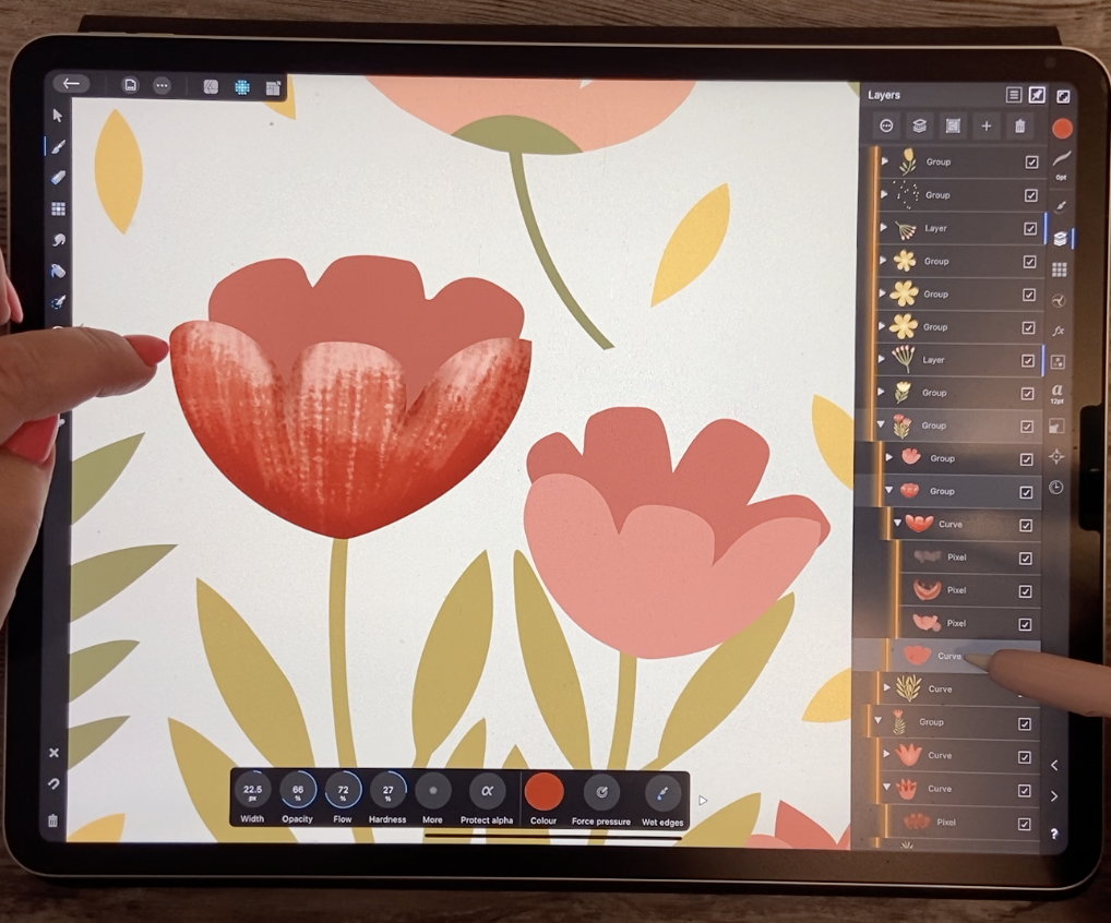
through and do this sort of basic contouring or basic
shading of my motifs. So for the most part, I'm going to have my
opacity set fairly low. So I'm gonna go to
about 30% because that allows me to build
it up a little bit. So you can see that
as I'm painting here, I'm aiming towards the outside. I can make my brush smaller to go into these tight
little areas here. So I'm building out kind of a dark edge that's maybe a
little bit too light for me. So I'm gonna go to
more like a 40%. And you can see that
it's building up. And I like to do it this way, like to build up the dark
first, right around the edges. And then I go back and do my lighter color to
bring that back to, I guess what you'd say,
the overall color that you're going to end up seeing
this being in the end. So I'm going to
switch to that color, which is that middle color. I'm gonna go back to the color wheel here and
I'm gonna go a tad darker. And so you can see that
what would happen as I start painting back
with this color. So what I'm doing now
is I'm kind of almost canceling out what
was there if it was too dark so I
can make my brush smaller when I get to
these little detail areas. You can see that
for the most part, I'm then erasing a lot of it off by painting with that
lighter color over top. So you're going to figure out your own preference as far
as how that shading works. I've got basically the
purest color here, which is the basic overall
color of the flower. But with that really dark
color in the background. Now of course what I can
do is think about things like adding more texture
or adding some highlights. So this is a process, believe me, it takes awhile, but once you get the hang of it, you're gonna go through all
your flowers quite quickly. Let's say adding all the shadows to the ones that are the same. And then going back and adding the next level and then working your way
down so to speak. So I'm going to now switch to a brighter version
of that color. I'm going to go a little bit deeper as far as the
opacity and I'm going to go a little bit
bigger and I'm going to dial back the opacity and I'm going to get
that brush even bigger. And you can see
here that I could very easily form highlights. What that does is it
brings your plane, the plane of that
particular pedal forward while keeping
the shadow back. I know that seems
really complicated, but you're basically
working from dark at the edges to
light in the middle to make this light area
look like it protrudes. So I'm going to go
to about 30% now. I've got a smaller brush size and I'm going to go
even smaller than that. And then you can see
how that's too small. You can see how adding
that highlight in the middle can make that whole flower look
more dimensional. I feel like I'm really choppy
with my painting today. Remember that you can
always go back and go to your previous color
and build it back up. So that's why sometimes
it's best to work with lower opacity because
then you've got that control when you're
doing something like this. And then you have
to decide to do you want that to be
perfectly rounded? You want the highlights
to go up on the petals. There's so many factors
to be considered here, and I would definitely
recommend that you take a look at some reference
as you're working on this. Now I find that my dark
shadow is very choppy there, so I would probably
go back and then just do a much more smooth
job of painting that on. And then working my way back
as far as opacity goes. So I'm kinda smoothing out
that shadow a little bit more and let luckily my last
few swatches are right here, so easier to work with. And I think it'll help
quite a lot to what my overall flower looks like once I start working on
that background as well. So I'm looking at these
as if these petals are falling a little
bit towards me, which is why there would be
a shadow underneath that, the top part, as
well as of course, all the way around. And then let's switch
to that back curve. And you can see here
that the pixel layer was added specifically
to that front shape. So I'm going to
select that shape. And that is one of
my darker colors. And you can see that
as I start painting, it just has automatically clipped it to that
particular shape. So I'm gonna do like the
tips of this back part, pretty much the darkest part of the darkest color
from this front part. And then I can gradually
start shifting a little bit darker as I'm building up the shadow down in these
deep areas of the flower. And slowly that flower is
starting to come together. Now you can go in here every
time to change your color, or you can actually
even just pull downwards on the
color swatch here. And that will also
serve the same purpose. You can also do the
same thing here, actually on this context menu. This is where you
can actually go in and change your color. And remember that it's
called the eyedropper. So you can also sample colors. Once you get into this further, you're going to find
that that's very useful. So I'm gonna go one last
level of darkness here. So this is really, really dark. I'm going to reduce my opacity because I want to
build it up slowly. I'm going to reduce my brush
size and I'm going to leave my flow at both
three-quarters, so 75%. So now you can see that
I can control this a little bit more by
just now building up, because I've got my opacity down and my flow
down a little bit, it allows me to build
that up slowly. So I'm kinda scumbling, I guess would be the
technique that I'm using. I'm going round and round and lightly putting on the color. And as I get down
here in these tips, I'm going really dark. So that really suggests
depth in there. So what do you think
for the first one? Not too bad. I'm getting
kinda warmed up. So as we move our way through, this is going to get easier
and I'm going to have more stuff that I can throw at you in the way
of information. Alright, I will meet
you in the next lesson.
5. Lesson 4 Applying a Texture: Hi guys, welcome to lesson four. In lesson four here
we're going to do a bit of a review on texture. I'm gonna be showing you how to recolor the texture easily. Let's get started. There's so many ways we could
go with this right now. And I think I want to show
you what I would do to add another level of interests to my pixel-based part of
this whole pattern. There's two ways to do it.
There's either you import a texture or you use
the built-in templates. So let's just say, I want to apply a texture
to this flower here. I have, and you will have this two because
it's built right in, is a grouping of textures that are called
artistic textures. And these are PNG files, so that means that
they're raster based. What you can do is
select and insert one. And it's going to come in
and absolutely humongous, which is great because the
quality is going to be better if we can
then reduce it down. So let's just do that
and I'm gonna get it to the approximate
size that I need here. And hopefully it slid
it in where I need it because I was
selected on that. No, it didn't, it
didn't texture. And even though I was
selected on that flower, no biggie, this is
the grouping here. So I'm going to slide
that down here. And I think this is the one. Yes. So this is a flower that
I would be adding it to. So I'm going to add it
to the front part here. So what I do is I
grabbed the texture, I take it up to that
particular layer. So that little curve layer, you can see that as I
add or go to add it, I want to see that
blue highlight, which will then clip it. So we're going to do that. And you can see
that it has clipped it into that shape,
which is really awesome. It's such a great and
easy way to add things. That's one of the
reasons I prefer Affinity Designer
over Illustrator for creating clipping mask because it's just so quick
and easy in Illustrator, you actually have to select all the different
levels and go into a menu or have a
shortcut and specify. And it's really not as
easy as this, trust me. Okay, so now we've got
that texture in there. And of course it's
not the right color. So let's think about how to
change the color on that. So you can see that there's nothing that comes up
here on the context menu. There's no way of
actually just directly changing that because it is
a raster, it's not a vector. So for that reason, we have to make a couple of extra steps in order
to make this work. One of the things to do or to note is that you can go into the layer options here and you can reduce
the opacity of it. So that might be one way to
do it and just reduce it to approximately the
color that you want. That is not
recoloring it though, that's still keeping it in gray. But as you reduce the opacity is taking on more and more of
that background color. So that's one of the
ways you could do it. I'm going to keep it at
full opacity because I want to show you
another method. So this is where we're gonna
go into the adjustments. So you see it says
adjustments here, if ever you're wondering how
to find any of these things. Remember, you can
always press down on that question mark and it's
going to show it to you. So the one that
we're in right now is the adjustment
studio, this one here. So here for this
particular thing, what I wanna do is recolor it. So I am going to hit
the re-color here. Now it's re-coloring everything, so that includes the background of that particular pattern. And what we need to do here
then is to work with hue and saturation to get it to
how we want it to look. So if you reduce the opacity, you can see what's happening is just the background that's
being changed here. But if we increase
the lightness here, what that does is it applies the color who, the actual block. So we're changing the color
completely at this point. Here in the saturation
or hue and saturation, you may want to make some final adjustments to get it cohesive with
your color scheme, we could even reduce the opacity
of it a little bit more. This reduces the opacity
of the re-color. It doesn't reduce the opacity
of the layer just so that, you know, that's something
that we'll adjust as well. So I'm leaving it at
about 77%, likenesses, about 63, and saturation is fully saturated
with that color. That's something
you can tone down. Like if you want it
to be less intense, you can definitely tone it down. I'm leaving it fairly
bright, fairly deep, because I'm gonna be
using blending modes for that particular layer
in order to make some additional changes.
So let's do that. Let's go into the layer
adjustments here. And you can see that
as I adjust this, the changes that are happening. So this is just what the
normal setting here. So this is definitely
an experiment. And what I would
do at this point is to go through and just experiment with the
different blending modes to see if there's something
that would work here. Thinking, I'm thinking
I'm going to leave it on screen here and we're gonna
make some other adjustments. So if we reduce the opacity, you can see what happens. Let's go back to
the layer itself. And just so that, you know, you can actually click on that color adjustments and the controls come back up here. So this is where you could then experiment again based on, now we have a new blending mode. You can experiment
with these settings to see if there's something
that appeals to you. Now, just so that
you know, also, you can paint over this. So what we can do now is switch to the pixel persona again. And let's see what
brush I've got chosen. Let's go to the pixel
shader brushes again. I'm going to grab number three. I don't want to do it right
on the Recolor adjustments. So I'm going to add
a pixel layer here, so it's right above the
texture and the Recolor. And you can see here that I
could then go in and paint, basically do all the same
things as I did before. So the cool thing about
this is that it is completely separate from
this whole texture business. So if I was to turn
off the texture, I would still have the pixel layer that I'm
currently working on. So I'm going to work
on this exactly as though I exactly like I
did on the other ones. So I'm just kinda painting
in sort of a mid tone here. Here I can switch
to a lighter tone and perhaps a bigger brush to just kinda view
a later section. And I'm going to
reduce the opacity and the flow so that I have a
little bit more control here. And then I'm going to
switch to the darker. Again, I'm reducing my flow and my opacity just so that I have a little bit
more control here. At this point, we've
completely lost a texture, but I'm gonna be showing
you how to bring that back. So let me just make one
more pass at the dark. And then what I'll show you
here is that we can then go into that separate
pixel layer and also go into the layer options and experiment with the
different blending modes. And you can see that you can
bring that shading through. And I think you're mainly
going to be sticking in areas like overlay or the screen. Possibly multiply, That's
not too bad actually. And again, you can adjust the opacity of your
overlay on that texture. So for this composition, I likely won't be
using that texture, but I just wanted to show
you the whole process. Alright, so I'll come back
to you in the next lesson. I'll probably have
that taken out and we'll take a look at the
next step in the process. I'll see you there.
6. Lesson 5 Using Real Media Brushes: Hi guys, welcome to lesson five. Less than five here I want to cover the real media brushes. And we're also going to
be touching on things like adjusting the brushes and blending modes and
things to do with layers. Let's get started. One of the things
I find very robust here in Affinity Designer is the choice of
pixel-based brushes here and the brushes studio, you can see all of the
different categories. But one of my favorites is
gouache because it kinda kills two birds with
1 st or painting, but we're also adding
a ton of texture. I really liked this
dry flat gouache. And let me just give
you a quick look at what that texture looks like. So you can see that it's
very realistic looking and all the same adjustments
are available here for you as in the previous lessons. So you can see that you can easily build up your color here. And instantly, you also
have a ton of texture. So that's what I like about
these gouache brushes. So I actually go and
use them quite a bit. So you really quickly produce
something very appealing, just using this and not even worrying about importing
a bunch of textures. So personally,
that's what I would recommend and that's
really my go-to. Now the other thing I
want to show you is the ability to use blending
modes for shading. Much as we did in Procreate, where we use Multiply, we use only one color. So let's just grab that standard peachy color
that I'm using here. Now what I did here was, of course, have been
automatically created. I'm going to
actually delete them and we'll get a new
fresh one here. And then what I want to show
you is using that color, but changing the blending
mode here to multiply. So we've got the exact
same color and you can see how that works for
adding your shadows. Now if you wanted
to add highlights, I would again add a pixel layer. And in this case, I would set
the blending mode to add. There's a bunch of
different ones you could use and you definitely
should experiment. But this is what
happens when you add. You can see that that is
obviously way too extreme, but I just wanted
to show you that that's all with that same color. So the other blending
modes at work nicely. Lighting is one of them. Screen and you can see
what they each do. They can each do a kind
of a different effect. I've been using AD. But then what I
do is I go in and I reduce the opacity
quite a bit here. You can actually reduce the opacity also as
you are painting. So that's one of the ways
that you can go about adding texture very
quickly and easily. Now, it's not to
say that you can also go in and combine
different brushes. Here, I would go back to my
pixel shader brushes here. And let's grab a mid tone, a look, and make sure that we go back to the multiply layer. So that would be the lower one, the first one that I did, and I'm going to go
quite a bit smaller. You can see that that
same color is on there, so it is a darker color. But if you wanted
to go even darker, what you could do is add
an additional layer. Let me go into my
layers, add a layer, make it a pixel layer, and let's just paint. Let's just paint
the color on first. So that's just a little bit
of shading around the edge. Remember it's the exact same original color,
that peach color. And let's go into
the blending modes and see which one
would work for that. I usually end up in
multiply or Linear Burn. So that's linear burn, that's multiply
if you want it to be a little bit more subtle. And then of course you can still reduce the opacity of it. So all of the same
techniques that you used for adding depth to your
shadow you can do here. So at this point
you could switch to darker tones of your color. You could do that here or here. And you can go smaller with your brush size to add more
depth around the edges. So in this case, I would have to pretty much
go to extremes in order to get the depth of color or shade that I wanted. Again, I can reduce
the size down if I wanted to get into some
of these areas here, then let's switch
to the background here, this black curve. And I would definitely make some adjustments to
the vector image here. In order to do that, what
I would do is switch to the vector persona than
I'm right back into it. And this is definitely one
of the huge advantages of working in Affinity Designer
to do this kind of work. Because if I was doing this with the Procreate
Illustrator workflow that I often work with. I would have to go back
to procreate in order to make changes to
anything raster base, but then into Illustrator to do any of the vector-based changes. And then I would have to
re-import whatever I produce. Into the main document and it sounds like a nightmare because
it really is a nightmare. You know, you can't,
you can't make the changes like
this on the fly. You do like the whole vector bit and you do the
whole raster bit, and you definitely don't want to be going back-and-forth
very often. So let me also change the foreground while
I'm in here because I thought that I would want
to curve this somewhat like that so that this is actually blending in
a little bit better. And then you can also do things
like go in and straighten out anything that you noticed on your assets that you may
not have noticed before. And then just as
quick as can be, you can switch back
to your pixel persona and get started with some
of your shading and stuff. So now just instantly that
layer has been added here. So I've caught my dark
color a little bit bigger, actually, scumbling
some of that. I think I'm going to
add the texture to the entire thing and keep
going in darker and darker. And I think I'll even go
down to almost full black, smaller brush just down in these little
tippy corners here. So you can see how wonderful
this is going to be for creating your patterns and having them look
really painterly. I loved the effect of that one. And I think what
I might do is go through and do all of
my flowers this way. I can easily add it to the
one that I already have, but that's something that
I would go through and do. And obviously I'll do it off
camera and come back to you. And then there's gonna be
probably a few other things I can do here to give you ideas on how to finish this pattern to look
very painterly. For now, I want to add some of that texture to this back area. So I'm going to switch
back into my gouache set. And should we try
a different one? Let's try this almost dry
roll and see how that looks. That's just giving some
really cool texture, almost looks like when you
add salt to watercolor. That's what that reminds
me of a pullback with that dry gouache
because I just want to add a little bit
of that texture. And you know, what I think
I would do is even add an additional pixel
layer here so that I could dial back the opacity
of that a little bit. Rather than doing it here, I can do it as it
is on the layer. And here, you can see that
it's going to work in exactly the same way as if I hit dial that back on the brush. Sometimes it's just
easier to do the overall, get it all painted and then go back and make those
little changes. I think we could also go
in with a brighter color. So something like this. And maybe a little bit
smaller on the brush. And let's just brush
in a little bit here. And in this case, even though my layer has been
reduced to 30% opacity, I'm still finding that brush
a little bit too much. So this is also dialed back. I'm gonna go to about 74
and just add a little bit. So it's almost like a
highlight at the top here. So that's at 73. If I go to full opacity now and go a little bit
smaller on my brush. I can just add some
extra brightness right at the edge here. And of course I can also bring my color backup so that I've got some real lightness here. And if you want it to
be really highlighted, then add another layer or another pixel layer and
bring your color in. I'm just doing a little bit
kind of at the very top here. And I'm gonna go into
the blending modes. And you can experiment here,
lightened screen, add. All of these can work. I'm gonna go to lighten
and then I'm going to just kinda reduce
it in opacity. But I think that
works really nice. I love that texture. I'm sure that's what
I'm going to do for most of my
leaves and things. So I will meet you
in the next lesson.
7. Lesson 6 Painting Small Details: Hi guys, welcome to lesson six. So I didn't do the really
small details in vector. I decided I wanted to go
in and paint them really spontaneously using a real
media brush. I'll show you. So I wanted to show
you a couple of other strategies
for colorizing or changing the values
within one of our motifs. And specifically
with one section. Of course, you know that
in the vector persona, this is still the
vector persona. I'm back in there again. You can use the gradient
tool to give yourself, let's say light to dark. So you can vary the gradient. You can change different spots on the gradient by just adding additional dots
and then changing the color of that
particular section. You can move that up
and down to control. But I want to show you
something completely different, really kind of radical. And at this point, I'm going to be showing
you sort of a combination of the rest of the raster
and vector persona's. And what we're gonna do is
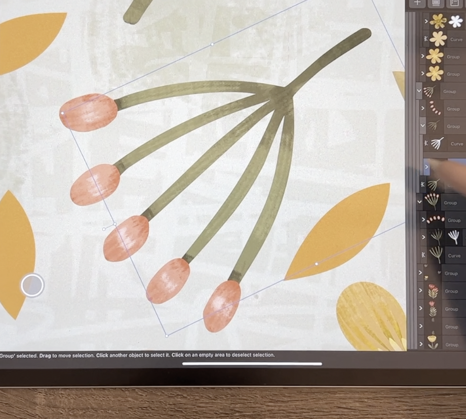
work on adding some details like the stamens and the anthers that come
out of this flower. So let's actually go right
back to it being plane. And then let's look
at our layers here. I'm gonna get rid of
that pixel layer. I'm going to switch to
the pixel persona here. And rush wise, I am going to look for my favorite incurring this software and that's this
Comics pen, comic, G pen. I don't know what the G stands for, but it's a good anchor. It has variable, variable width based on how
much pressure you put on. Let's add a pixel layer here. Actually, I'm gonna
get rid of that. I'm going to add a pixel layer. And I'm making sure
that it's between the front and the back
of the flower. Here. I'm just going to draw, I'm going to make them nice and long so that you can see them. But you can see that as I'm pressing harder or more softly, I'm getting variable width here. So it's very much like my
tapered pen pressure brush. And you can see that
it's a raster brush because the difference
between the edges on that you can see the pixelation
here as opposed to the sharp lines that you get on the edges of
your vector layers. For now, I just want to
kind of follow through here and show you
some cool things that we can do here
with pixel layer. So I'm just drawing
it nice and bold the and basically full
strength as far as the colors. So it's nice and deep. I'm making these
quite bold and chunky because the whole design
is kinda bold and chunky. And I want to make sure that you can see what I am
about to do on this. So let's just say
what I would like to do is add some
highlights and shadows. First of all, using just a darker version
or a darker color, I'll go to a really dark brown. And what we need to do here
is add another pixel layer. I could start just
coloring on this, but you can see that I'm
not bound by the edges, so it's not like
a clipping mask. I want to definitely add
another pixel layer. And then that pixel layer, I am going to clip it. So I'm dragging it
halfway down on the word for that
layer, the word pixel. And then now you can see
that as I'm drawing, the background is protected, but I am able to color in adding shadows just with my same brush. So I'm using, still
using that inking brush. Now that's kind of a hard edge. So that's one look
that you can go for, so that's not too bad. And you could also go in and do some highlights
in the same way. So we could go to a lighter color and we
could do highlights. And those are sort of like a cartoony highlight, very bold. And once you scroll
back down to size, you can see that
that worked ideally as showing the
highlights and shadows. If you found that that
was just a little bit too sharp on the edges, you could go in
and apply effects. So we haven't talked
too much about the effects panel here, but I would use
the Gaussian Blur. Make sure you turn it on here. As soon as you turn it on, then you'll see that you've
got different controls here. And believe me, for the
size that we're doing, you need a very, very
small amount of blurring. So I'm moving up and I'm
only at 2.1 pixels there. And you can see how
lovely blending is. Remember that you can click on that circle there and you can type in your
own measurements. So let's say 1.5.
Sometimes it's hard to slide down to just a
teeny tiny amounts. So you can see that
that has worked ideally for adding a really
soft looking texture. So you can use
this also as a way to do it much more
efficiently by, let's start from scratch here. I'm going to delete this layer. And what we can do
is add a layer, and it can be a pixel layer. And one of the
ways you can do it that's really quite fast is to just keep yourself
sure your brush, make sure you're on the
pixel persona and make sure your brush is a
good, solid brush. I am going to add
another pixel layer. I don't know what it is. That one doesn't seem
to be working for me. Oh, I got to turn that
protect Alpha off. So I could have also protected
that original layer. Let's just do it
that way. Hang on. I'm going to show you a
different way to do this. So here on these details, what I would do
is protect Alpha. And when I paint, you can see that I'm painting
directly onto the layer, but that's another
way to sort of limit where your
brushstrokes goal. I personally don't
like that method as much because I like to have the freedom
of making changes. So I'm going to turn that off. I'm going to add a
new pixel layer. And this time I'm
just going to do three sections, maybe four. And at the top here I
think I'd go with a light yellow and it looks
like a mess right now. But what we're gonna do here is apply it to that pixel layer. So I like this
better because then this can be completely removed. If I wanted it to
be absolutely gone, I could get rid of
it and I would still have my details there. And then what I would do
here is go into the effects, go to Gaussian Blur
again and click on the word or the label
here, gaussian blur. And then I would
slowly apply the blur. And so at this time I'm
going to about nine points. And I think that gradient
is really pretty. It's exactly what
I would've wanted. And what I can do is still because it's
a separate entity, I can still move it
around within here. So those are just
two little methods that you can use for
doing gradients. So you might want to even
go through and apply that to a bunch of your
flowers before starting. So you could go into add
a pixel layer above this. You could do some
painting Sherman, my pixel persona
and get the brush, take the brush really large. So I could have done
it, say that big hint, just three or four shades here. Then I could bring
it into the shape so that it's a clipping
mask and then go back into the effects to the
Gaussian Blur and just blur it until I have basically what I want for my gradient within. So that's just another
method that you can use. I just wanted to show you that because you can
go through and do your entire image just
with these gradients and you would have a
beautiful job of your art. You can see here I
started on my leaf here, and that was just a simple
gradient to start out with. So I'm trying to show you all the different
methods here so that you can then decide what one
would work best for you. And I think on this
particular flower, I would go to add another pixel layer above
the back section here. Then brush starting with a very dark color that's
not even dark enough. I'm gonna go like
pure black there. And then just kind of move
up color wise until I have kind of lighter yellow
here along the top. And then that I would apply
the Gaussian blur tool. You can do it before or after. It doesn't really matter. So as soon as I have the
blur the way I like it, then I would go and
make sure that that is applied right to
that curve by just dragging it on there until
I see the blue line. Now, with that pixel layer, remember that you
can always go in and reduce the opacity so that your original color shows through. So you can do that. And you can also go in and experiment
with blending modes. And I find, like I said, for some of these darker areas
that multiply and darken this area in the layer options
and in the blending modes. It's the one that I usually go for, for this sort of thing. I think I like that. I mean, I do love
that color burn. We're getting out
of the color range that I want to be using. So I would probably end up
settling on something like darken and then just
kinda fooling around with the opacity setting here until I got exactly what I wanted. Okay? So here's just a couple
of other options for you for when you're starting to do your colorizing and painting.
8. Lesson 7 Ideas for Background 2: Hi guys, welcome
to lesson seven. Less than seven here
I want to touch on some ideas for backgrounds. Let's get to it. I wanted to show you a
couple of quick things for ideas, for your background. I want to import a texture, but the one thing
I have it here, but I'm going to show
you the whole process. But one thing to keep in mind is that this is a half drop repeat. So if I were to
bring in a texture that has not been designed for a half drop repeat than when I do apply it or put
it into my symbol. You're gonna be able
to see the edges, of course I would line
it up and everything, but you would be able to
kinda see the join there. This one's not too bad, I guess, but I think it's a
little bit obvious like right here that
this dark section, e.g. doesn't line up to a
dark section over there. That's just something I
want you to keep in mind. Normally what I do when I import the texture like this is I also clip it to that
background rectangle. So that way I can resize it and have the assurance
that there is no gap there. So right now that looks
absolutely horrible. But of course we're
gonna do a bunch of different things to
experiment with this. One of the very first
things you can do is go in and show to your layer options
here and just check out how it might look with
different blending modes. So something like
lightened or screen. Those are, I would say my gotos right there are
lightened and screening. They'll show through
to the background. So that works quite nicely
and actually really quite like this texture
in behind here. You can of course, reduce the opacity
of it as well. So your background
is going to show through and you might want to then go in and actually adjust the color of
your background. Or you'd go back to
the rectangle here, and you could possibly choose to fill it with
a different color, maybe a different green. And I don't like any of these, but that's the kind of
thing that you could do. You can actually also, let's go back to where
it was, black and white. You can also apply color
to this texture itself. Now, it's a pixel textures. So even though I'm not
in the pixel persona, this is definitely
a pixel layer. And of course it
would be affected by things like your resolution, just like anything else when
you're working with pixels. You can also colorize this. So as long as you
have it selected, you can go in and choose
one of the colors in your palette and apply that before you do
any other work to it. You can also go in to these adjustments and
you can re-color it. So you could use
the re-color tool in the same way to apply color. And here, if you were to adjust the lightness
and darkness, you can get those black
areas to change color. Then you can also of course, use this as your means to get it into the right
color families so to change the hue of it and even
the opacity of the color. Once you've done that,
you can still go in and play with your
layer blend modes. So you could use it in the
same way as you did originally and make adjustments to the
lightness or darkness of it. Let's try something
like multiply. And I'm not really liking
any of those four options. I just wanted you to know about that possibility that you
can bring in the textures. You can make adjustments to them and apply them to get some
really great effects. So I'm going to insert a
file here that doesn't. For some reason it always
goes to art board too. But this one here is a
good one for not showing, even though it's not
a half drop repeat, it does a very good job with the seams just simply
because it's just a bunch of scribbling so that we
can put right into the layer so that it gets clipped and you can
barely see the seams. I think it would be
actually pretty hard to tell a duplicate of it
there for some reason. So what I wanna do with
this one is to simply use it to add a texture
to that background. So I am going to
make sure you're on the actual pattern itself and
go into your layer options. And, well, first of all, let's just move it
to one of these. I think lighten looks great. Layton or screen, they look
almost identical to me. And then we're just going
to reduce the opacity. So this, the effect
that I was looking for, I want it to be almost like a basket weave in
the background. So that's one idea. That's one of my favorite ideas for adding texture
to the background. Now the other thing
I want to do is to think about ways of adding
dimension to that background. So let's take a look
at my original pattern here so I can give you some
ideas on some of these. I have a shadow in behind and around this side here I actually have a bit of a glow around it. So those are things
that you can do. And you can see here that
I've applied a ton of texture using gouache brush. And I think that's
the technique that I really want to have
in the background. Let's go back to our document here and think about ways to. To accomplish that, so
we've got a ton of texture already just by having
added that texture. And I'm going to put
it fairly light. So you can see as I build up some background here
to give it dimension. So let's go back into
the symbol here. I'm going to add a new layer. It's gonna be a pixel layer. And let's actually
bring it down to be below all of our
different images here. So for this one here, there's a bunch of different
ways that we could do this, but I think that what would
be easiest would be to go straight into the brush
texture that we want to use. So let's go back to
the pixel persona, where to get that brush. And I'm gonna go straight
to my gouache brushes here. I'm going to grab
this smooth textured. Let's just check the
texture on that. Let's go a little bit
darker so that you can see, well that's a
fairly nice texture without being too crazy. If you would prefer something a little bit more like this, which has quite a bit
more texture to it. And by all means go for it. So I'm going to
probably use this one and I'm going to
choose a green because my overall phone that I have going on here is
more into the greens. So let's grab, I think this
was the green that I've been using on a lot of
the leaves and things. And just double-checking
that I'm on a pixel layer. And let's just add
some darkness. So I'm gonna go a
little bit darker. So I'm on the color here and I'm just kinda
pulling downwards. You can see that it is a lot darker than the
leaves themselves. I'm also going to go
quite a lot smaller. I'm going down to about 60. I'm reducing my opacity
to about halfway, so around 50, and I'll
leave the flow here, it happens to be at 60. You could also go in
here to the brush itself and adjust things like
the size of the texture. So if I was to
click on that one, I could scale it right
now it's at 100%. I could scale it down to, let's go maybe 75%. And same thing with this one. Well that was it about 75, so I'm going about 60 on
that one going to hit Okay? And you can see that
that's sort of more in keeping size-wise with
what I've got going on. This is a way that we could
go and add some texture. And what I like to do is
to just lightly scrambled. So I'm painting,
but I'm doing it in circular, circular strokes. And I find that that is a really great way
to make sure that your textures will end up
blending quite nicely, I think because we have that
textured background too, it's also very forgiving, so it'll blend in quite nicely. I think I could go even darker. Maybe I'll just go straight
to block here too. And in some spots, I'm going just a little bit darker as one of the
things we are going to do is reduce the opacity
of this once we're done. So it ends up blending
with the background. And depending on what
blending modes you use, you can end up with really
cool sort of an effect. So just to skip ahead to that, Let's go to that pixel layer. We're going to go to
the layer options here, and we're going to
reduce the opacity. So you can see that
it's blended in, it's blending in quite
nicely with that background. I'm going to put
it at 100 again. And then let's go in and
choose a blending mode. It's gonna be hard to
see the difference. That's color, burn,
darken, multiply. These are the ones
that you're pretty much looking at here. Now for some reason not
all of them are changing. So I am thinking, I guess it's the block, the pure block isn't really changing with those blend modes. The colored one is. So I don't know, maybe I'll go back and just take that block away and continue with the
coloring, that actual color. What you'll find with
anything like this when you're first
learning is that the first few times that you go to work with
something like this, it seems to take a long time. But the more you do it, the faster it goes. And I find that when I'm
first learning something, I'm being really precise, almost too precise
with two perfect, just trying to
figure it all out. And then by the end of it, I'm a lot more casual
with what I'm doing. And a lot of times the finished patterns really
look better for that. I don't know what it is,
but I think it's just, you loosen up and it ends up looking better
for your final art. So here let's take a look
at this blend modes. And there was something
about color burn that actually quite light Linear
Burn and color burns seem to be the nicest the color bird is maybe adding a little
bit too much color. So I'm gonna go with
the linear burn and then I'm going to
reduce the opacity. And you can see here
what's happened is that it now just kinda know
I'm only at about 32%, so it's really not
very dark at all, but you can see how it makes
the flowers stand out, the ones that I
haven't shaded yet, it doesn't look that great because the tone is too similar. But when you see
the ones that are a little bit more
finished, like this one, in this one, I think that tone around the edges
looks really good. I think the combination of
that texture along with that background is
also very appealing. Now evening, it's just
about dinnertime, so I'm going to have that and
then I'll spend the evening doing my painting and texturizing of each
of these motifs. And tomorrow will
be the next lesson. And I will do some debriefing, let you know what it is that
I've done and come up with. And I think I'll probably have a much nicer layout as well, because I'll really work
with that pattern to make it very balanced and so on. So I'll see you in
the next lesson.
9. Lesson 8 Review of the Finishing Touches: Hi guys, welcome
to lesson eight. Less than eight here I
just want to show you all of the finishing
touches that I've done. I will review the
layers in the document. Let's get to it. Alright, so I wanted to
walk you through all of the little changes
that I have done here. I am recording now in Florida, so my backdrop probably looks
a little bit different. I didn't realize I hadn't recorded the last
lesson of this class. So here I am. Okay,
so let's take a look first at
these flowers here. I wanted to show you that
I did a combination of vector and raster in here
to add some details. You can see that Let's see which flower is it that
I'm currently affecting? Okay, so if I turn the
layers off and on, you can see which ones I'm
actually working with. So in this case here, you can see that I've drawn
just some vector lines. Those are just done
with the pencil tool. Not super consistent,
but I think they worked quite nicely for adding just an
extra little bit of depth and dimension and
interests to that flower. Then you'll see that I
also went in and I'm painting with my gouache brushes to add a
little bit of texture. And then these are just
different levels or layers of color that are in the background to make them
look more interesting. Now, my arrangement didn't
end up changing too much. So it's very similar to what
you saw in that last lesson. I added a bunch more of these
little leaves as fillers. And then on each
of these things, I actually went in and
did some paintings. So for this one here, again, you can see that's
the vector path, the vector shape that I drew. And then I'm not sure where
those painted details are. They must be on a
different layer. So the painted
gouache texture is just in the same way as I showed you where I did
some light areas, some darker, and I actually add that even a little bit
of dark right here where the little pods join
onto that particular platform. Now you can see on this particular flower that I've done a couple
of different things. I have of course gone through
and done all of the guy. I have done here, a combination. I did a course that
you saw originally, my little anthers and stamens. But what I wanted
to point out here was the addition of these, I think this is
layer, this layer. Here we go. Sorry. The addition of just some painted singular
lines on there. And I just kinda like that
effect and it's something that I've been doing in a
few of my patterns. So I thought just
too as a whole, make my pattern collections seem a little bit more cohesive. I have added that detail
there and I think I'm gonna go through and add
it on these as well. You didn't see that
with all of them. I've gone through and added that additional kind of
gouache finished to them so that they all
go together really nicely. So really simply, very much like what I explained
by light shadow, maybe an additional
highlights somewhere else. Here I've got
highlights on the end. And you can see that my painting is kept very primitive looking. I'm trying to keep it looking
as natural as possible. So we've gone through
on every one of the main motifs and added some additional detail just
to give it some dimension. So that basically wraps
up everything that I've done and everything that
I wanted to show you. And I just really invite you to take time to add some
of that detailed to even a pattern that you
already have existing just to see how much interests
you can add to it, how much more depths
that you can show and how much more hand painted
that it ends up looking. Alright, so I'm gonna
meet you in the wrap-up. I'll show you this
pattern on a couple of mock-ups and yeah, we'll just wrap it
up for the day. See you there.
10. Lesson 9 Conclusion, Mockups and Wrap Up: It's always fun to get to
the end and just be able to take a look at your whole
pattern in its entirety. I always like putting it
on mock-ups just to get a real sense of whether
the pattern works or not. This is also a great way
to decide on scale and all kinds of other
considerations when making a repeat patterns. I hope you've enjoyed learning this a little bit about raster and the pixel persona here
at, in Affinity Designer. I know we're gonna
be doing a lot more about this in the future. And I've got some great plans for projects that I think
you're going to really enjoy. I want you to get so comfortable
in Affinity Designer that you can do a
lot of the stuff that you would normally
do in Procreate. Combining vector and raster
is still so powerful. And give the next
series of classes, I definitely will be
trying to figure out ways to get you really
excited about it. Whatever you do, make sure
you share your projects. I'm so glad that
we have this time together today and
that you've learned more about the combination
of raster and vector files. I think in the future
you're going to be using this more and more. I guess that's bye for now and I will see you
in my next class.
 Delores Naskrent, Creative Explorer