Transcripts
1. Intro to Advanced Floral Pattern Design; Raster to Vector: Hi guys and welcome. My name is Dolores Nazca and
I'm coming to you from sunny, Manitoba, Canada. The class I'm
bringing you today is that advanced pattern
design class. And even though we end
up in Affinity Designer, that's not the way we start. I'm gonna be taking you
through my entire workflow, starting with the actual
drawing of motifs in Procreate, I've developed kind of an interesting and
different techniques. I've never seen it before. It'd be be out there, but I personally haven't been
using this until recently. But I've developed
a technique where I can do the inking in a particular way in Procreate so that the
lines come out clear. In other words,
the background of the final pattern
is what ends up being the color of the internal lines on
each of the motifs. That sounds a little
confusing, I'm sure, but if you pick this class, everything will become leader. But like I said, we
started out in Procreate. I'm actually going to be
tracing photographs that I took myself of flowers
in my own garden. Then we're going to
be doing that drawing technique so that we get the lines to be clear course at that point we
need to vectorize. So you're going to see me take
it into Adobe Illustrator. That's my program of choice
for doing the audit tracing, you can use whatever program
you're used to using. So if you have perfected the workflow using Adobe Capture by all means use Adobe Capture. There are online converters. There are apps like vector
Nader that you can use. It's up to you. You could go back to
the other classes that I've explained these
techniques to you. Whatever suits your fancy. Then what we do with those vector motifs is
saved as an SVG file. Svg file can then be imported
into Affinity Designer, and that's where the fun starts. So I'm going to take you
through my whole process. So you're gonna be watching
me as I kinda figure things out like color schemes and
arrangement of my pattern. I don't necessarily land on the same color scheme by
the end of the class. But you'll see that it's
all part of the process. Now if you haven't
done so already, I'm going to suggest
that you hit that follow button up there. That way you're gonna
be informed of any of my classes as I released them. Also, I would suggest you add your name to
the mailing list on my website because I send completely different
things from there. You can find that at
Dolores Hart dossier. So I hope I haven't
scared you off. If you're ready to go,
let's get started. I'll meet you in less than one.
2. Lesson 1 Inking the Florals in Procreate: Hi guys, welcome to lesson one. As I mentioned, we're gonna
be starting in procreate. And I'm gonna be
showing you that new technique that I've developed. Let's get into it. So I thought that for
starting this project, it might be helpful for you to see all the steps that I took. So this is the mandibular
or rock trumpets, floral. This was the original
tracing for it. So I started to ink this kind
of the traditional ways. So I was trying to
figure out, Okay, I want these lines
to actually show through to the background layer. And I was laboriously
inking like this. So I would do my sort of
main shape kinda like this. So the next piece I would
carefully try to avoid in Qing into the areas where I wanted to actually have a space. So I'll add a bit of a release. So this is how I was doing
it and it didn't take me long to figure out that
that was a terrible way. So I would fill these areas
and then I would like go in here with my eraser
using the same brush. And I was like going in
and trying to correct these lines and I was finding it just way
too labor-intensive. So I thought, well,
what's another way that I could get that
release in there? So the way I ended up
doing it was to have the actual lines on there
afterwards or paint them on afterwards or even
before using the white line. I know that sounds confusing
the before and after things. So I think the best way to show you this is to demonstrate. So I'm going to
turn everything off here and let's start
by importing a photo. So I went to my photos and I have a bunch of these
that I had photographed. Whoops, well, that's
not the one I wanted. Here they are. This is the mandibular
vein here too. So I would bring in the picture, it's on iCloud and have it in there so
that I could trace it. So these are photos
I took myself. These are not copyright
protected, nothing like that. So I would strongly
suggest you do your own photography or go to a site like Unsplash or Pexels and find a
royalty-free image. So this is the way I did
this whole operation. So I kinda screened
it back a little bit, change the opacity to
about 88. I don't know. Sometimes it was more,
sometimes it was less. And sometimes at the end I
would still bring it back up so that I could really
see some of the detail. But essentially what I
did was added new layer. Then I started with black. We'll actually the
way I backtrack here, this is what I'm gonna do. I'm gonna show you
write from square one. So the first thing I did was to trace this out with a pencil. So one of the
advantages I think, of doing it this way is that
you can take a little bit of artistic license and kind of change your tracing
if you need to. If you want to simplify it, this would be the time
to start simplifying. If you wanted it
really detailed, you could have that reflected
in what you're doing. But this is just a really
good way to create the sketch that will guide
you for doing these lines. I think eventually, after
doing this for awhile, I would probably be
able to just kinda go straight into the inking stage. But right now I'm still wrapping my head
around this technique. So for me it was just
easier to do this. So I'm somewhat simplifying
it as I go along. And I'm putting some of the
detail lines in here just so that I remember what I'm doing
when I'm doing the inking. Sometimes it's really
hard to tell like this. It's really hard to see what
it is that I'm wanting to, or needing to praise. But I think I'm just going
to simplify it like that. This looks to me like that
whole edges fold it in. So I'm kind of figuring
it out as I go along. So pretty some of those
little details and folds in here because I think I want
to add those definitely. I think this one should
be a little bit more curved to look proper, and I think this gives me enough information so I
can turn off my photo. And now this is what I would use as my guide for the inking. So again, I am going to
reduce the opacity of this. I'm going to add a layer, and here I'm going to
start with the black. So I'm basically make sure
you're on the other layer. How many times do I
make that mistake? Honestly? Oh my goodness. So I'm going to use
my favorite brush there and I'm pretty
much going to go around the whole
contour of it here. And just right there, just this one step here. You can imagine how
much faster this is than when I was trying to go around all of those little lines or the divisions
between the areas, making sure my black
is truly black. It really helps, by the way, to have the background have
a little bit of color in it. I had gone right into
my background layer here and changed it
to a light blue. You can do whatever
color you want, but I use the light blue. So now I've basically
got the whole contour. So the first time I tried it, what I did is I filled the
entire flower and then I tried bringing my
sketch to the top. And you can see the
problem right away. I could change this to blending mode that
might have it show up, but really it didn't. That wasn't going
to work for me. So what I did is instead I left the sketch where it was and
I decided to use white, not the eraser, but use
white paint, right? White ink. Ink. My lines in. What I'm doing is I'm
just basically going to do all of the detail
lines here in white. And if you want it to actually break the outside line here, you need to go right past it. It seems really weird because
you think to yourself, well, how can, how
can that work? Because if I'm tracing
this next in capture, Adobe Capture or
Adobe Illustrator, isn't it going to trace all
around those white bits? And it actually doesn't. It recognizes the white
as if it was transparent. So it's like a white, basically looks
like the paper that you would have drawn this
on if you had inkjet. So in most cases, I'm breaking that outside border line and sometimes it's tricky in a spot
like this. Okay. Now where, where's that
line supposed to be? But I'm going to go
kinda like this. You'll see that once I
fill this with black, you'll see kind of
what happens there. Now here I had a little gap which would have been a problem. So I'm just going to cheat
a little bit here and bring that line from that gap. Because when we go to fill, believe it or not, the white acts just as if it was black. And I know that
all of this sounds like super confusing
at the moment, but just hang on a second and you're going to see why this has turned out to be a really cool technique that
I've never seen before. There might be other artists that are out there doing this 90% of the time when I think I'm the first one who
has done something, I end up finding
somebody later on who's actually
done it before me. So I hate to say I'm the only one that knows how to do this or I'm
the only person. But as of right at this moment, I am the only person that
I've ever seen do this. Okay, so I've got that all he inked and little things
like that are not gonna be a problem because
now what I'm gonna do is go through and fill
this all with black. So I'm going to take
that and I can increase the threshold to
make sure that it's filling in as much as possible. Check here because I know
I've made that mistake before where I think we
had spilled really well, but it hasn't and it looks like it has done it
absolutely perfectly. So now I'm going to
continue refilling. And the thing is with this too, is that once you let
go, you can do this, continue filling with re-color, move your crosshairs to another area and
then you can tap. Now that just a second ago? Yes. You can see why that did not fill and that's because I
have a little gap here, no matter I can now
just to fill it. And I've got my
beautifully inked flower. Oops, I guess I better ink that block If I
want to fix it up. And from what I can see here, it's worked out perfectly well. So all of these lines that I've brought out to the end are
now breaking the edge. So that means that
when it traces, its going to trace it so that these little shapes have a
nice clean edge to them. If you don't know what I'm
talking about, stay tuned. Next lesson we'll
take this into, I'm going to take it
into Adobe Illustrator, but you can take
it into Capture if you don't have illustrator and, or vector Nader or whatever
your preference is. And I'm going to do an
auto trace of that flower. So I'll see you in
the next lesson.
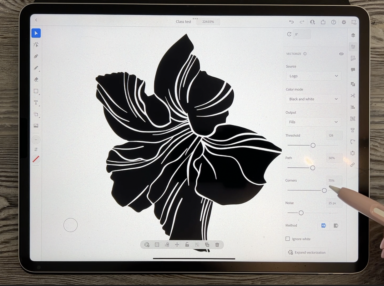
3. Lesson 2 Auto Tracing in Adobe lllustrator for iPad: Hi guys, welcome to lesson two. In this lesson we're going to
be doing the auto tracing. I'm gonna be showing you how I do it in Adobe Illustrator, but you can do it in whichever
program that you'd like. As long as at the end you've got a nice SVG file that you can import into
Affinity Designer. So the next step for me
here is to take this into my vectorizing program. I always like to do a quick
double-check and just kind of myself up a little
bit and take a look at the overall finished flower. So in this case, what I don't like is that these are all ending
at the same spot. And I think that I could change a little bit about the way
the details are on here. So this is your chance to make the changes because you'd
rather do this now, believe me, than when
it is already a vector. So I'm going to pull a couple of these lines all the way down. And I'm going to add a couple more while I accidentally switched
to black there. So I'm going to add a
couple more here and there. And I need this one to come
down a little bit further. And the nice thing about this
tapered pen pressure brush is that I can apply
more or less pressure. You get different thicknesses
or something like this. I might want to actually
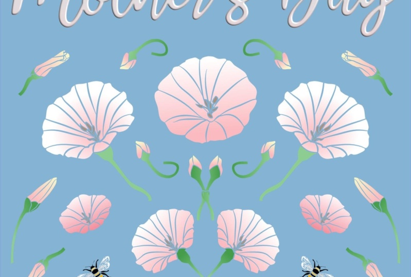
pull that line down. Have you ever seen these plants? This is a really
gorgeous vine and it has really nice
dark, glossy leaves. And my daughter, one of
my daughters gave me this for Mother's Day a
couple of years back. And I love this one so
much that it's one that I will take into the
house for the winter. So it is a pampered
princess, this one. So really gorgeous. Deep mine is a deep, deep, deep, deep pink. I think they'd come
in different colors. I think you can get
them like in red, e.g. like the maroon color, I think on this one I might
just do something like this. If you make a mistake anywhere, you can go back with
the black instead to pay for some of your lines or
generally fix anything up. I think I like this a lot better with some additional
lines in there. You can also on the outside, use the eraser and
double-check some of these types of things
like where you went off the edge to make a line. You want to make sure
that those are fixed up. Now, if possible, there
will be some fixing up that you will do when you are
in Affinity Designer. I mean, there's always
something when it comes to these kind of things
that you auto trace, there's always little
things that don't quite look the way
you want them to, so you do end up
having to erase. And I know this seems weird, like I'm leaving this whole
thing on the outside, but believe me, it
doesn't matter at all. So I feel like this area
needs a little bit too. And this is why I always
kinda leave my photograph here because then I
can go back and see. So this is the way the brain went to go was kinda like that. You can see the lines in there. I'll bring this up
to full opacity. And so you can just kind of vaguely make out
those lines there, but they all converge over here. So that tells me
that with my inking, my white line, make
sure that's pure white, that these lines
would go like this. Now, I also went through and I traced a lot of
other stuff in here. So you'll see that
when we get into our tracings so you can get rid of these things now you're
not going to need them. If you would prefer
to keep them, then absolutely keep
them and it's fine. It'll still be fine
when you take it into Adobe Illustrator or
you're tracing program. But you can see all the
different ones that I did here. And the cool thing is, now
that I've retrace this, it actually does look quite
different than the original. I think this may have been
the original, I'm not sure, but now I have an
additional flower if I really needed it. So I'm turning on
all my layers here. It's not absolutely necessary. Next step here will be to
share it as a PSD file. And the reason I'm saving
it as a PSD is that it will then be still in layers, which is what I need for
tracing in Adobe Illustrator. So I'm going to, I accidentally did
just save image, but I want to save it and put it into my pattern design folder. And I have a folder
already made for it here. And I'm going to just call this one class test
and hit Done and save. And now I've got that
layered file that I can take into Adobe Illustrator. So let's pop into Adobe
Illustrator here. Like I said, you can do this
in Adobe Capture and I've showed you techniques for
doing that in other classes. One of the things that
I do when I'm using capture would be to do corner marks and
that sort of thing. So you need to go back
to the other class to get a full explanation
of capture. I prefer doing it in
Adobe Illustrator. And the reason for that is, well, you'll see it in a minute. I'm going to import and open, and I'm going to
click on class test, and it takes a minute
to convert it. We want this one here. We want to convert the
layers to objects. You don't have to hit Import hidden layers
unless you want to. I think it does anyways, like I think it'll
import my photograph and import my background. We'll see in a second. Okay, so it didn't
import the photograph, the imported the Outline, so I still have my tracing there and I
have this background. I'm just gonna get rid
of those because I don't really need them. And so now each of my
layers here is individual. So this is the way I generally do it is I
turn everything off and then I start from the
top and do one at a time. I want these to be separate because then there'll be grouped separately when I take them into Affinity Designer, by the way, you could do all of this in
Adobe Illustrator as well, especially if you have
the desktop version. I personally don't do
much pattern design in my iPad version, but I definitely love it for doing this kind of
thing, like the tracing. So once you have
that layer exposed, you either click on it over here or click on it over here. And you'll get this
contextual menu here. And you want to click
on this first one, which is image trace. And you can see that it does a quick and really
awful tracing. I actually rarely
use sketch anymore. I go straight into logo here. I feel like I get much
better tracings and it'll disappear for a second here because at the moment
it'll come up as a color, Color Fill or doesn't disappear. Okay, cool. I will switch it to
black and white though, because that's all I want is
a black and white tracing. And I don't know
if it's because I have been using these three
settings quite a bit, but they always seem to come
up about there anyways, which is basically my what I would consider
really good tracing. You can continue to tweak it. You can play with
the controls here. Generally, the only
thing that I would really affect is this. The amount of corners and paths, corners tends to help you keep the point on things
a little bit better. So that might be
something to consider. I find that really
it's pretty much okay by just leaving it at
the settings that come up. So take note of the
ones like right now I've got 120-87-0190, 3.25. You could write down those numbers and then
you could use that for all of the rest
of the tracings. The other thing you
really wanna do is ignore white because
you don't want it to actually trace the
whole white background. And the cool thing is really when you're
looking at it here, you don't even see anymore
that those were white lines. It's totally interprets
it as paper. And so now it'll just show through the hit
Expand vectorization. And I've got my vector tracing. So you can see here that the way it has done it
is exactly what we want. It has a solid black background and whatever was in white. Now see-through, so it'll show through anything
on the background. So that's the steps I take. So let's do just one more here. I've got this all done already, but what we'll do is
we'll hide this one, will show this one. Click on the layer,
it's now selected, so you can choose
Image Trace here. So this is the one I drew
with you guys in class. So click on Image Trace,
it takes a second, it comes up logo, it takes a second to process, maybe 5 s to process. Those settings look
pretty darn good. So you take a look at it though if you see something like this, okay, so something must
have, oh, I know what? I've got this on
color, so I have to change it to black and white. There we go. And now it's all good. I had it on color. What it did was
interpreted some of the bitmap edges as grade,
and I don't want that. I want it to be a solid block. So it's all good. I like these settings so you can take note of those 12,850.75, not much different than
I just showed you. Get ignore white and then
expand vectorization. And there we go. So I would go through and do
all of these, every layer. And the next step we'll
be exporting it as an SVG file that we can
open in Affinity Designer. So let's do that in
the next lesson. I'll meet you there.
4. Lesson 3 Exporting and lmporting the SVG File: Hi guys, welcome
to lesson three. So I'm going to show
you this pattern as I developed what I did do some
tests with a color scheme. And I want to try a completely
different color scheme in Affinity Designer
because there's no really easy way to do different colorways
as you can do them in Adobe Illustrator
on the desktop. So the method I'm gonna
be showing you will end up having me do a
completely new patterns. So I'm definitely going
to be arranging it differently just so that I
have an alternate pattern that I might be able to use for either a different collection
or a coordinate in the same collection.
Let's get started. So I'm going to quickly go
through here and do all of the different layers. So I have them ready
for the next step. Okay, So I've got them
all vectorized now. So this is where I would
then of course, exports. So probably every vectorizing program that you're going to use will have the ability
to export this as an SVG. So in Illustrator, you go to the sharing icon
at the top here, you need to go to
Publish and Export. You can't do the Quick
Export and go to Export As and in
the format here, what you wanna do
is save it SVG. Now, I've only got the one
art board so I can leave it, I can leave it on
all art boards. I'm going to hit Export here. I mean, it's just so simple. And I know that
this is a program that is expensive to buy in the sense that
you have to sign up for a subscription with Adobe. But I think at this
point you can buy just the subscription
for Adobe Illustrator. You might want to
consider it if you're gonna be doing a lot
of this sort of thing, because I just find it's so much faster and
more efficient to do in Illustrator and just makes more sense to me than
Adobe Capture, e.g. I. Find with Adobe Capture, you gotta do all
those extra steps to be able to separate your layers. So I know tough call in my case because I already subscribed
it's part of my bundle. So I'm making sure that I
save it in the right folder. Normally I rename it here, but class test will work for
me today, and that's it. Now I'm done with Illustrator, so I can close out of that. And now I'm going to
open Affinity Designer and I'm gonna go into my
pattern design category here, and I want to import that. So I'm going to hit the plus
sign up here in the corner. And in this case, I'm going to open
it from clouds. So it's in my files that I have saved on my Cloud, the iCloud. And it's gone right
to this folder only because I was already
just in this folder. So I want to open
up the one that says class test art board. So that's the original
and then this is how it has saved it for me. And it takes a minute. And you'll see that it
imports flawlessly. It looks gorgeous. This checkerboard in the
background shows me that all of my lines are transparent
exactly like I wanted. And you can see here that every
one of my layers is here. So all of my flowers are already separated into their
individual groups. And let's just turn
everything off. We'll just do one at a time. And I want to just do a
quick initial colorization. Select the layer that
you want to color. I've chosen this palette. It was originally peach and
meant, I guess it still is. It's got a few other extra
greens and things here, but I'm just going
to use this and I'm going to select the flower. And let's just make that one that color
to start out with. Go back to layers. We can, maybe I'll just leave
it on because I think I'll maybe sort of roughly
start resizing. I see in here this
particular one, for some reason everything
was turned off. Okay, so this is a really
interesting issue. So if you wonder why this background is
here the way it is, It's because I accidentally
on that particular layer, forgot to hit ignore white. So what it's done is it has
done a whole background here that it was
originally white when I brought it in and I
turned it pink Just now, I'm going to have
to delete that, but I want to make sure
that I keep all of the actual flower there. So the only thing I'm
deleting is this white, what was a white background? And now you can see that my entire image is
there, so that's good. And I can change
the color of it. And I'm just going
to line them up. They're not going to be really in the form of a pattern yet. So that's that one. This one is already showing. Let's make that one
alternate color. And you see as I'm
going through here, I'm selecting the layer. I can assign a color to it. And it fills the whole group, which is really great for this initial step here and
leaves, Let's just do that. Kind of a greeny color for now. This is another one
of those little buds make it a different
color from the original, from that one there. They're really similar,
but you can see that the inner lines
there are different. When you're selecting them. You can do it by either highlighting the
layer like I'm doing here, or you could, if it
was not selected, you can also double-click or single click on it
and you will get the selection the
way you want it will be going through
and we're gonna be individually re-coloring. Some of these will do that. Maybe once we've got the
pattern kind of arranged. So I've got, I'm probably
going to end up having to resize these a little bit
to work for this pattern. And for sure, I'm going to be recoloring sections
of them like e.g. on these, there's the stem. The stem obviously is
going to have to be green. Okay, So at this point, I'm ready to take
what I've got here and put it into a
pattern repeat document. So I'm going to use
the move tool here and I'm going to just
drag so that I've got absolutely
everything selected. I'm gonna go to Copy here, and I've got a blank
half-drop repeat here. You can see that I've
got the template that I normally use and I'm going
to put it in art board one, so I'm selecting that for now. You can see that
there's assemble here. In fact, I'll just
paste it first of all, and it's not in the
symbol at the moment, but as soon as I drag
it down here into the symbol and I'm
not dragging it onto the square because
that would clip it. I'm actually choosing to
put it above the rectangle. That rectangle forms
the background. And what a beautiful
pattern said, no one ever. First attempt. Okay, So at this point, we're ready to start doing our
arranging of the patterns. So I think we can
start doing that on the next or in
the next lesson. Alright, So I will
meet you there.
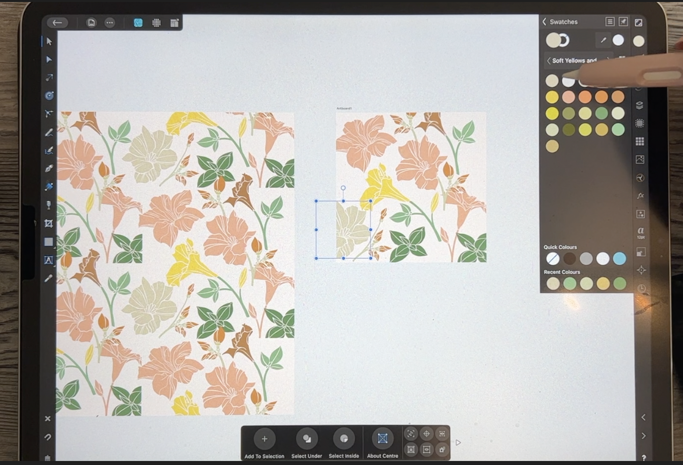
5. Lesson 4 Creating an Alternate Color Scheme: I know I talk a lot about the merits of different
software programs. One of the things that is missing in Affinity
Designer that I do have on my Illustrator program on the desktop is the
ability to re-color. So I was just thinking
as I was off camera, rather than do this
whole thing in the color scheme
that I used before, I'd like to try this in an
alternate color scheme, and I want to do it in the
colors that I created, the titling for this class. So I thought the easiest, fastest way, we'll see, I guess we're going
to import or place one of the title slides that
I have from this class. So I've gotta go to my Skillshare folder
and down to this class. And you could do
this with any image. So you could grab an
image from the Internet. You could source it from color schemes
that you've collected. I'm going to just do
it this way because for me it's just fast to do, tend to do it this
way right now. So I'm importing this
and I'm going to use these colors to produce
a new color palette. So let's go into
our colors here, and I'm going to go
into the swatches, but I want to add an
application palette and I add an application palette
so that palette will remain available to
me at all times. And I think this one,
I'm going to call it soft yellows and say, okay, and then in order to
sample the colors here, I'm gonna go large. And what you need
to do is just drag your eyedropper to a
color that you want. Click on it and it'll
pop over to this side. This is selected at the moment, so it's going to
recolor everything. But what I can do is
just Back off of that. But I've already got the color added, if that makes sense. So I'm going to do that
with another color here. So let's go with this
nice green colors here. But that's okay because
I just want to add the current field to the palette
and then I'll just undo. And I will keep doing this
until I build up my palette. So I'll just time-lapse
this for you. You don't need to
watch the whole thing. So this happened because
I hadn't clicked on here to switch that over to
the actual color fill. But that's okay because I can just click on it and delete it. So make sure you click here. It'll put it here. Then you can add your
current fill to palette. Two-finger click will undo, and then you can keep going. Another thing that
you can do is you can select the color, switch it over like this, but then you can go into your color wheel and
slightly change the color if you think you want
to add a couple of additional colors that
aren't in your picture. So I'm just going to
undo and go back to it. First of all, I'm going to
go to my palette to add it. And I need to add this
little grouping here. But I really think that I want to change this to be a
little bit prettier. So I'm going to go onto
the color wheel here and I'm shifting that over a
little bit to the reds, which will give me
that peachy color. And then back to my swatches. Add current fill to palette, you see, and then
I can go in here. And instead of working
with this from now on, what I'll do is just add a
couple of colors from here. So I'm just changing this, going a little bit lighter, a little bit brighter,
kind of peachy. Go back to my
swatches at the fill, then I can continue to go back
here and make adjustments. Go back to swatches, add current fill,
and you can see how I'm building up my
palette this way. I think I need a lighter
version of that. So I'm going to go quite
a bit lighter here, maybe a teeny tiny
bit peach here. And I've think I've got
enough to get me going. So this I can now just delete. And now we can go through and make the changes
to our colors. So for this one, I'm probably gonna
change them all, I guess now to be colors
that I have here in my swatches because I want to just experiment and
have a different, first of all, it's
gonna be a completely different pattern because I'm not going to be looking at
the other one to do this. And it's going to have a completely different
color schemes. So it's gonna be a
really good alternate. It might end up being second hero pattern or a
really good coordinate. So let's just work
our way down here and re-color these things
based on the new palette. I'm not thinking
about it too much. I'm just throwing in these other colors
and you don't want, I might end up going back
and changing so that I have kinda pure yellows here because these
are kinda grainy. So in a case like that, I would go into the palette
here and maybe move a little bit away from the green
here on my outside wheel. And it's kinda moving a little
bit more into the golden, orangey, yellow and try
something like that. But I'm gonna go to the
swatches and make sure that I added so that
I've got it there. I might want to color more
than one thing in that color, so I want it definitely
have it added here. Continue with peaches, so easy to lose track of
which ones you've done. So I would suggest you
work your way down. That's what I should have
been doing and I want it to be the colors from
this new palette. So you can do more
than one thing, like more than one motif
in the same color. And I think I want a
based on this color here, but this one here, I think I want to make this
even more sandy colored. And I think there's
just this one left. And I think that's it. So I've now recolored
everything. Big shift in what
I was going to do. But now at least everything
is in the colors that I want. And then this is the
fun part for me. This is like the puzzle-solving
challenge is now to create the pattern out of all of this
in the next lesson. And what we're gonna do is
start doing the rearranging. And usually at this stage two, I decide how many but enough motifs and whether I want to possibly
duplicate something. I'm pretty sure I'm
going to duplicate this leaf grouping here, and I'll do all of that
in the next lesson. So I'll meet you there.
6. Lesson 5 Filling Out and Initial Arranging of the Pattern: Hi guys, welcome to lesson five. I've got all my motifs and now I want to just kinda
start working with arranging the pattern in a pleasing way.
Let's get started. Alright, so I think I will
start by duplicating this guy here and then
making some changes to it so that it doesn't
look exactly the same. I want to change the
shape of it somewhat. So I think this is probably the easiest way to do it
and that's using the shear. So you can see that
that's distorting it. But I want to make sure that I don't distort it so
that it looks really weird because you can easily
go too far and something like that looks really
distorted, kind of skewed. So I'm going to just do it a little bit and I think
that's pretty good. The other thing I'm gonna
do is just flip it. And that makes a difference to so you can flip it both ways. Decide which one looks the best. I think I like that one, so
that's alright For there. And now I'm just gonna
kinda do my initial sort of exploration of how I want
to arrange this pattern. So I'll show you the
one that I did do. This is the one that's complete. And I like this color
scheme to it's kinda fun. Very unusual, almost has a
Christmas Eve vibe to it. I'm wouldn't say
purely Christmas, but definitely having that red and green together
suggests that. And like I said,
in this program, there's no really easy way
to do your re-coloring. There is a filter that you
can go to for re-coloring. I plan to do a class
on that at some point, but it's not like doing the re-coloring in
Illustrator on the desktop. So it's kinda fun
that I can now do this and create a completely
different color scheme, even just looking
at them here in the thumbnail view of them, you can see how different that
coloration is going to be. Now the other thing
I should mention is that generally I will delete this initial
layout of my pattern. But before I do that, I really liked to add a new
category here to my assets. And then I go in and I individually saved
the asset so that I would just select and then
go into the category itself. So this one I would rename, of course, let's
rename the category. I'm going to call it amanda Villa because that's
the kind of flower. Click. Okay? And then I can add
a subcategory. Within this subcategory. Now, I can add the assets. So I would go through
and individually select each one and add it until I have the
full collection there. So I don't generally throw away the file until I've done that, but that's one of the
things you can do to also help fill out
your asset gallery. You may be able to
use this again, if this was a pattern that you created and you didn't license, you could definitely
do all kinds of different versions of it in different colors and
different arrangements. I don't know if I'm gonna
sell this one or not yet. I like just covering, covering all the bases. So I'm gonna go
through and do some arranging here and see
what I can come up with. It's interesting. In some cases, like this
particular one here, I have in yellow at the moment and I think it
would be better in green. So I can go ahead and do that. And another thing
that I like doing is adding additional color
within each of the motifs. Maybe I will just continue
with the arrangement for now. I'll do that first
and then we'll talk about doing some changes
with the coloration. This is one of the
great things about having everything grouped so nicely is that I can
just individually grab, move each of the motifs. Now in a case like this, this could be a part
of this plant here. So what I would do is go in
and recolor just stamps. So you saw that when I initially double-click
or initially clicked on it, it highlighted the whole motif. But if I double-click, I can just individually
select one of the pieces and I would
recolor it the same color. I'm not going to add them
together at the moment, but that's something
that you could do. I just wanted to
make sure that I get all my sizing and
everything correct first, I think that would
be a good one to duplicate and use elsewhere. So as I'm going through here, I'm slowly building up. In this case, maybe
I'll try flipping it, but I'm slowly filling in
and building up my patterns. So here, maybe I would
line it up about there. I'm looking at this stem here. First of all, I'll move this
and then this dam here. I would also recolor to match. So I'm slowly going to be
adding to my design here. And the great thing about being able to preview it here is seeing how everything will
work overall with the design. So I'm thinking you can see here that this little guy is going to conflict with that, with the positioning
of other things. So maybe I would move that down. And this is one of those. Buds that I don't know if you took a close look
at the photo or not. But that's what those
little things look like. So I think I've only
done two of them, but you can get
them all hooked up together and they can be kind
of motif from their own, or you could add them to one of the stems
from the flowers. I would probably go back and draw a few more so than I would have more of a
variety to work with. This is that
grouping right here. Actually, what I
would do on this one is pull that one over a
little bit so we can see it. But I go in and color
all of these m bits. So that would be probably
all of this stuff here. So I've got one finger held
down here and it's allowing me to select multiple parts. And I believe that would be
all that would be green here. And actually, if you
really look at it, it was it wasn't
even fully green. It was more like almost
like an off-white color. Let's look back at that. But you see there's just
a super light green. And it actually even
Kinda blends into a lot of the huddles what
will become petals here. So that's something to
keep in the back of your mind as you're
working on this. Maybe in the end, we'll do some really cool
stuff with the coloring. I think I'll go What
color was it, that one? Yeah. But I like that. I think that's a really
pretty little addition. And again, that's one of those things that
you could duplicate. It could grab this whole
group here and duplicate it, had only one thing selected, so I'll duplicate again. And then now that duplicate
could be something that I add to one of these other stems. I don't know what I grabbed
there to make that shear. Over here, I can move
it into position. And then now this one here, if I changed it to this
color or that color, now, that looks like it
belongs together. Here we go. Now the other thing I
would do here is to take that grouping and move it
into this flower is grouping. So at the moment
it's on its own. And if we close
all of these off, It's one thing I wish
it would do is just close these off automatically. This is probably a trick
that I don't know. So that would be
this flower here. So if I move that
into this group, then now if I move this, it's all going to move together. Now, I keep moving that square. So what I would probably
do is go in here and go to the layer options and
just lock it temporarily. I can always go back
later and unlock it. Now this one has this kind
of a little stem here. So maybe what I'll
do is all three of these parts and rotate it
and get it into position. And that one's already
in the correct layer, so I don't have to
worry about moving it. So all of this is together. You can see now one of the things I might
want to do here though, is have it separate so that the stem itself has not
connected to the flower. And I didn't do that when
I did my initial tracing. So I'm going to show you how
to make that little repair. I think we can start
that as one of the extra little
things that we'll do, and we'll do that
in the next lesson. There's a few steps, so I'll
save it for the next lesson.
7. Lesson 6 Correcting and Intricate Fitting: Hi guys, welcome to lesson six. We're still doing the
arranging of the pattern. I'm gonna be doing a little
bit more intricate fitting. And then I also want to explain things that
I do like repeating motifs or retrofitting things
to attach differently. All kinds of different
techniques that I use overall when I'm
designing a pattern. So it's all about
trial and error. I think. Let's get to it. Alright, so I want to separate this part of the
flower from the stem. I could do it all green, but I think it would look
better if I could keep this part matching the flower. I think I want to
do the same thing on this part of the stem here. And you can see where the
how I did the other ones. I got this little spiky
thing going on here. And I think I want to carry
that through on these two, but at the moment I can't
because it's all one shape. So I want to show
you how I do that. And it's surprising how often, even though I think that I
am perfectly planned ahead, I'll miss something like that. So it's something that
I could go back and correct in Procreate and retrace
and all that rigamarole, but I think it's just
easier to do it this way. So your first step
is to break it. That's going to give you
that separate point. Okay, So these are
now separated. I'm going to do the same
thing with this one here. So you can see that
that is now separated. And then now if you select and it's kinda weird
because they're filled, let me just break
this first again because because I
dragged it back over. As soon as you
drag it back over, your actually
reconnecting it again. So I had to break it and you
have to keep them apart. So I'll do that
with this one too. Once you break it, you can see that you've got
that opening there, but this doesn't have a path, so I can't do any sort
of adjustment here. So what I wanna do first of all, is to close it. So if I hit close here, you see how it draws
a line across. And if I select this one, and you see when I had it just selected with the move tool, that context menu didn't have
the information I needed. But as soon as I went
to the node tool, it's switched to this
and I can close it. So that's all well
and good you say, but what now of course, though, it's just straight. So in order to make that
zigzag that I want, I need to add some
additional points here. So it's super simple here. All you have to do is
literally click on the line and you've
added your points. So I am going to
something like this. And then for this one, I want to do the same thing. I think I just have to add
the same amount of points and then I can drag that
down and add it here. So it's really that simple. You think to yourself
k has got to be something more to it,
but no, there isn't. So in this case, this is
going to work just fine. You could get all fancy and do them separately
if you wanted to. Take a little bit more work, I think this is
gonna be adequate, so I need to do the
same thing here. It's things first,
I'm going to make sure that I don't run
out of power here. And then I'm going to break, break these apart, close, close. As my new points have to do a little bit of
readjusting here on the shape. And then on this one, I also need to add the three points. And then it's gonna be
somewhat like this. I guess I really
didn't need that one. I'm going to take that away. And the only thing
to be mindful of here is to keep that
thickness consistent. So right now you
can see that that's a really fine line
separating everything. So I need to really
exaggerate that. So that's more in keeping
with the rest of the design. And let's check this one. And I think this one
seems not too bad. The other thing I
could do here too, is I can select both
of these parts. So I've got both
of them selected. I can go up into this
menu here and add. And now it's all in one piece. You might want to, before
you do that, take this. Here, are all of the parts to this that was harder
than it needed to be. And these icons, you can see
they're all spread out here. I can group them so that
they're all together like this. And then I could
duplicate this group. Or what I could do
is just go into my assets here and as
long as it's grouped, I can add it and then I've got that branch there if I wanted
to add it somewhere else. So now I'm gonna go
back and select this and go back up to
this menu and add. And then this one is
all in one piece. So that's one little
repair that you can do. And now this flower is
altogether and movable. So I'm going to continue
with arranging here. I'm always looking at the
flow of the pattern and looking at how these
different branches are adding to the overall look. Let's go back to
the other one here. You can see that there is
method to the madness. I have, first of all, space, everything
really consistently. And I've tried to balance sizes. So I've got these
big open full ones like this one and this one, and this one quite
separated with a bunch of these smaller side view
flowers kind of in-between. So this isn't at
all like this one. I've got something
completely different here, but I'm still trying to
keep that same look going. So you might need to do
some things like rotate. And at first it's a little
bit hard to visualize because you've got these
pieces here that are cut off. These needs to be repeated in order for them to
work properly here. But you gotta kinda just guess. There's no other way to say it. You just gotta guess
and you're basically just trying to make
a judgment call and decide on what's
the best positioning. Now, here's an example of
where the two parts aren't together in the layers and it makes it harder to
move things around. So here's the piece. I'm going to stick that
into that group so that now this whole flower
can be moved as one. As I'm going through. I'm really tidying up my layers and keeping
them very organized. This one here is at the exact same angle as
its copyright there. So I think I'm
going to flip this one and see where I
could position it. And it actually doesn't
even look bad there. You can see that
what would end up happening is they would
be close together, but that position is
actually quite good. Or I could put it maybe up here. So at it helps to clean out
this area a little bit. Now, I'm going to keep
that angle like this I think because I really
like that on this design, all these stems are feeling like they're going
the same direction. And now this one, I think, needs a little
bit of adjusting. So I'm gonna make it a tiny bit smaller and move it
up a little bit. And I know we're going to
have to do some work here. So maybe what I can do, I'm kind of glad I kept that one separate because I can sort of move it on its own so I
can make it smaller e.g. and get that
positioning nice there. And then I can just go in and make some changes here so
I can delete a bunch of these extra points
and then I can still select these two
and add them together. I'm going to put them into
the same layer first though, that will make it easier. So we've got this
has hit right here, and I want to put
it into this group. And sometimes what I do
is I will go through and group all of these flowers are, the flower is separate
from the stem, but I'm not gonna do
that in this case because I can lie that in there. I'll leave that open
actually for a second. And now I can select the
two parts that I need. This one, and this one is
select by sliding to the right. And now I can add
those together. And now they're all
part of that same layer so that group can be
moved in its entirety. Now here's one that
needs to be situated. Where else? Basically, that's
what I'm doing. I'm going around kind
of experimenting, trying to figure out my spacing. This is where that, that
part of you that loves to solve puzzles
really gets to work. So I'm going to keep working
on my arrangement here. I'm thinking that I'm
going to need something else in this open area here. So I'll try to
figure that out and come back to you in the next
lesson with some solutions. Alright, I will see you there.
8. Lesson 7 Adjusting the Pattern Components: Hi guys, welcome
to lesson seven. Less than seven here. Not only am I going
to be continuing with that motif arrangements
and making changes, I'm also going to be
adjusting my color scheme. Let's get started. Okay, so I've been trying to manipulate this
corner a little bit and I thought I should just
bring you along for the ride. This is a little bit tricky. I'm trying to figure
out what I can do that's going to balance
everything out. So you can see that I've kind of MacGyver, another flower scam. So something that I think fill out the space
a little bit better. You can see that this is
a duplicate of this here. I'd probably make some adjustments to make
it look different, but I'm just right now
working on the positioning. I want to just stop for a second here and talk a little bit
about self critiquing. So at this point I'm not done. But one of the things I like to do when I'm getting close, I'm just about there. So just stop and really
think about all the things that can ruin a
pattern, in my opinion. And one of the very first
things that I noticed, especially if I squint my eyes or buy back
up a little bit, is that there's way too much of a prominent line formed here by the repeat of these elements
that are just too close in size and it's the positioning that's really bothering me. So I think that I
would move probably this one here and maybe
maybe somewhat like this. I'm trying to just kind of think about how I
could rearrange this so that I don't have that real straight
line occurring here. And of course, as
soon as you move it, then everything else
has to be factored in. So here I'm moving this, but then it kind of makes
this one not quite right. And there's gonna be a lot of manipulating too,
correct the issue. And of course, this little
guy is what's in behind here. So that would have to be moved. So it's going to have to come
probably some somewhere in here that can be
worked out afterwards. But I'm thinking that these are some of the things
that I would have to do. This one here, I could
definitely make smaller and sometimes just
making something a little bit smaller works. And I know that I'm
gonna be doing a lot of changes with the
colors. At this point. I just kinda dropped
any old color in there, my palette so that I could just have something
to work with. So I think I like this with a little bit
of an angle to it, straight up and down just
wasn't working for me. And I think that
that can be pulled in a little bit more here. We need to see how that
would work over here. So sometimes what I do, I'm not gonna do the repeat yet, but I think what I could do is just move it
there temporarily. So I'm going to use the same
method that we would if we were duplicating it and filling out our
pattern completely. I'm just going to add ten. This is a ten by ten square, so I'm adding ten to
move it over here. And I'm subtracting five to sort of get a glimpse of what is
going to happen in this area. So the reason I'm not
duplicating it at this time is because
I know that I'm gonna be doing things
like changing the colors. However, that said, I'm thinking that it actually
would be good to do that. Even if I have to redo it again, I'm gonna duplicate
it and I'm going to do the plus ten, minus five. And then I'm going
to duplicate again. And this time I'm going to
move this down, so plus ten. So I went to duplicate
it and it did the duplication right at the distance that I had to
move that original one. So in some cases like that, what I do is I copy and paste instead and then I
can make the movement. And so now we've got all
of our duplicates of that. That's how many times you would
have had to duplicate it. I'm going to put them into
a group so that I can then move them all
at the same time. And I think the positioning is going to be fine
and I'm going to wait until I am working on color to make some
adjustments here. Either that or I am
going to actually remove that extra little branch that I thought was
going to work so well. And it didn't. So sometimes that's
exactly how it works. Like you think it's gonna
be perfect and it's good thing I didn't
actually take the time to add it to that original
stem because in the end, it's just not likely
going to work there. So I don't know, maybe I won't even get
to use this elsewhere. So it could kind
of fit in there. So you can see how much
it really goes into trying to figure out how
something is going to work. So this could end up being
tied into that other branch. And that's gonna
be hard to grab. Now that it's off
the image area. Good thing we have
them in groups. So what I could do
here just to make it easier to work with,
I'll put it down here. So I'm just gonna
do the plus ten. And that makes it a
little bit easier to get to when I'm
working on it. So I think for now, I will leave that there. I'm not sure about this one. Whether I'm going to tie it in. I might have to do this
kind of a positioning. I don't like it right
above because I think it's still adding to that illusion of a straight
line there in the middle. So it's something like that, make it a little bit smaller. The other thing I could do
is because I don't want this particular
combination here because it's exactly like this and
it's gonna be really obvious. I could maybe get rid of this one and instead
duplicate one of these. So I would group all of these, duplicate it and eventually fix this bottom
part to work there. So I like that better. So it doesn't
really look as much like this one over here. And I don't know if this one
is just not working for me. I think that might be
better somewhere else. And we can always
go back and change the colors like this might be better in a different color. And maybe in here, I would just extend somehow get another one of these
little branches here or extend out from here that
is yet to be determined. So I think I would
like to take some time off camera and really
perfect this pattern. So I think the
other thing is that I'm going to maybe change my color scheme a
little bit here, just to go a little bit softer, I'm looking at this. And the more I look at
it, the more I think a really muted palette might
be easier to work with. So I'll go in now and just
make some slight changes. I'm thinking maybe more of this peachy tone and maybe some that's a
little bit lighter. So maybe I'll just
kinda temporarily put, put these two software
versions of themselves. So one of the things you
can do is if you choose a color and you're kind
of okay with the color, but it's a little bit too dark. I would just swipe up here
until you get it to about the darkness that you
want and then add it. So make sure that
you add this one to your palette so that you
have a version of it here. So that was actually really
similar to this one. So maybe I'll go back
and change that. And then this one here, I will just delete. I want to go to a really,
really soft green. I think the darker
they are is like the more difficult I'm finding
them to work with. So I've got a couple of
different greens here. Very light. My lighting in
here just completely changed. We've got some kind of
a storm rolling in and it's like pitch black outside
even though it's only, it's only about 01:00, but it seems really dark. Now this little guy here
I added with a stroke, so I move that the one that was kinda never
finding its own home, I found a home for it.
I'm putting it here. And so right now this
is just a stroke. So what I'll do is go in here and expand the stroke so that I can select it and select
basically all of this. So I'm just going to
select it like this. I'm going to drag these two right into that
same group though. So that'll make it a lot easier. Let me close this one
and move these together. And I'll bring this down into
the greens from that group. I'm going to actually move
this whole group to be below all the yellow and then make sure all of
the green is in there. And then I can select
the top yellow 1.2 finger tap to have the whole group selected
in the neck ungroup it. I really like having my layers
neat and tidy like this. So when I open this one now, I'll have the yellow in one group and the green
in another group. Actually, I just got a slide
that back into its group. There we go. So you can see that
if I turn that off, everything but this one is in
there now, it's altogether. And that makes it really easy for me to change
the screen now. Which green do I want? I'll go with that
later one for now. So I'm going to take a
couple of minutes off camera to do the rest of
these color changes. And I'll come back to you with the document that has all
the corrected colors. Alright, So I'll meet
you in the next lesson.
9. Lesson 8 Finishing Touches Before Completion: Hi guys, welcome
to lesson eight. So not only am I doing this
kind of finishing touches, I also am experimenting
with my color scheme and different ways that I can add multiple tones to
each of the motifs. Let's get to it. Going to be a bit surprised
at how this looks now, I have drastically changed my
plan on the color instead. Another design that had
yellow and stuff in it. I've really
simplified it so that the color scheme centres more around the
peaches in green. So I've basically remove
the yellow completely. So I would probably
have to change the name of this color palette and
take these yellowy green. So I probably would
eventually take out all of the
ones that I am not using if I wanted to use this particular set for
creating the coordinates e.g. one of the things I did want
to show you here though, is what I might do with
this color scheme. Now that I've decided on it, for the most part, I think I'm happy with the colors here, but I think what I'd
like to do is show a little bit of variety
within the flower itself. So I would choose sections
one at a time, but say, well, maybe I would choose, let's say the sort of middle
ones on those two petals. Maybe this one as well. And see I'm holding down
my single finger there to be able to select
more than one. And then I'm just
going to swipe up a little bit here so that I have a lighter
version of that peach. I also generally go in and add the fill to the palette
just so that I have it there for making changes anywhere else so that
I'm not getting too, too many colors going here. So now I might then go
and take one or more of the parts of the
buds for that flower. And that's where I would
go in and then use that swatch to color it
rather than just swipe up. Now I know that I'm using that same color and I'm using
it consistently throughout. And that's important
in the end when I am actually preparing this
swatch for a manufacturer. Or if I am outputting, you don't just kind of
a color swatch group to go with this. I want to make sure that I'm
using the proper colors. Yeah, like I said, I would
definitely go in and I'm going to delete
these right now because they're absolutely
not gonna be used. I can tell you right now. And I'm also I don't
think it'd be using well, I'll use some of those
other ones there. I don't think I'll use this
green or this one here. And generally when I am
creating a pattern or a fabric, I tried to keep my colors to about between 20
colors right here. I've caught now 58, 17 colors, 5101517 colors. And that's comfortable for me. I know that that will end up being not too many colors
and not too few colors. So I'm gonna go through and make some of those
changes throughout. So again, double-clicking to isolate one of the shapes within a pedal and holding down one
finger to be able to select. And here I would possibly go in and just select
one of the colors, one of the peaches,
let's say that I already have in my palette. I don't know if
you noticed, but I did change this flower. I put that kinda similar center
to the other big flower. I didn't do that on
camera because that took a lot of kinda taking away of that background shape in order to make this one fit. And I had already showed
you that concept. I didn't feel like I should take the time to show you that again. So this is my slightly
darker shade. I've put it in there. And you don't want
a case like this, you could also darken it a little bit more
if you wanted to. I think I'm not gonna do that. I'm going to try to stick
to what I've got here. I still plan on adding
textures and things to these. So I don t think I'll be
doing that in this class. I'll do a follow-up
class for this one showing the addition
of the textures. So I'll just plug away here and continue with KU
some of my colors. And another thing I
wanted to show you here was in a case like this, where this is all
one great big shape. What I might do there is to, I've got the pencil
tool selected. And I could something like
this where I draw new section. I know it does not fit. It's not exactly the same. I'm going to close it. And in a case like this, what I would do is to take
that particular shape, Let's make it lighter just so that you can
see what's happening. So I've got it lighter here. I've actually got it right above the layer that I
want to clip it to. And what I'm gonna do is drag it right on top of the word curve. And can see here, instead
of putting it below, I'm actually going right
into the middle of that. And you can see a
blue line there. And when I let go,
you'll see that it actually is clipped
to that shapes. So that's allowed me to
make that change without. Affecting that
overall big shape. Here, I think I would just do something
like this so that, that color goes
all the way down. So that's one of
the ways that you can work around the fact that you've got that all
in one solid shape. I think this one, I will
do that darker shade. So I'm being pretty
selective about this. And you can see how just making
those slight changes has actually done quite a bit to give some variety to the motifs. This one here, I may
eventually go in and widen all of these lines
because to me on this one, they look a little bit narrower. Too narrow, I think
just maybe because I reduce the size of that
flower at one point. So another thing we can do here, so let's go into this
shape or this flower here. Clicking on it will ensure
that when you draw the shape, you're drawing it as
part of the group. So here what I want
to show you is also a way to darken
parts of the flower, but not all of it. So maybe I would include
this little bit here, but I also wanted to
just kind of go along here so that this section
here could be darker. In order to close the shape, you can use your node tool and place it right on top
of the original point. And that color, I think it
was this was this one here. If I wanted to go
slightly darker, I could do this, wipe down on the
color swatch there, or I could have picked one of my darker ones because obviously
these are darker here, but they're not quite
right, are they? So let's do this one. We'll make it darker. We'll add the selection
and de-select it. I'm going to actually
delete this one and this one here because I don't know if I'll
leave it for now, but I don't think I'm
using that one either. So now let's look at that
sheet that we just drew. So that's this piece here. Now, remember that our flower is in a bunch of
different parts, so we may have to
duplicate this to get it into all of the
parts that we want it. So e.g. has to go into there. And even if we
were to select all of these and group them, I'm not sure that we
could get this to work. So I'm going to select this one first and drag that
into that group. So you see now how
it's cropped it, but it's not in the
other ones anymore. So I think we have to do that. I'm going to duplicate it. Grabbed the next one, and drag it in.
Duplicate it again. And this is the next
one, drag it in. You see how it's working here. So you can see that that
could be time-consuming on something that's really
personal to off like that. Let's see if we
can figure it out. Another way to do this. So let's bring this one
back up to the top. And I'm just
wondering if there is a blending mode that might work. So the reason it's difficult
for this to work too, is that you can
see that it's also interacting with the background. So I don t think a blending mode would be a method that
we could use either. So I'm going to
duplicate this again, and this time I'm going
to drag it into this one. I'll drag this one into here. And this one can
just be changed. If I wanted it to be the darker, I can just change it to be
darker and this one as well. And that just leaves this one
here that we didn't do yet. So I would duplicate this again, locate that and drop that in. So I've created that darker
section as part of that. This one here I can just change to be the
dark, darker color. And I can always
still access these and make changes if the angle or something
doesn't look right. For this one here, it might be good to have this
one dark as well. So maybe really that
whole little strip there could be darker. And you can see how that's just starting to make
it a little bit richer. Looking overall. I'm thinking this one, this whole group here, I could change to that
slightly darker color. I think I'm going to add a pH
that's kinda intermediate. And I'm gonna get
rid of this one here because it was a little
bit darker in my opinion. So just lighten those two up and I can't remember
if I did that one. Same. I think I did, so I'm making that one
a little bit lighter. And this is what I would
do now I will just go through and make all of
these little corrections. Then I'm going to start
thinking about what I'm gonna do for the textures
that I wanted to add. I think I'm actually
going to wrap up this class now with
this lesson here, I'm going to continue to do these slight tonal
changes throughout. I will bring you back
in the wrap-up to show you what my finished pattern ended up looking like
as far as colors go. And then we'll talk
about next steps. Alright? Okay, see you in
the wrap-up them.
10. Lesson 9 Conclusion and Wrap Up: Hey guys, welcome
to the wrap up. I wanted to show you the finishing touches
on this pattern. And of course show it to you on a couple of
different mockups. I've even done a coordinate here because I think
that this will help us to really think about
different ways that we can go back to that hero pattern and
make it more interesting. I definitely want to
add texture to this. I don't even consider
this done at this point. I think I'm going to
consider producing another class that
shows you how I think about and plan and then execute adding different textures
to my final pattern. Sometimes it's even
interesting to just keep a copy of it
completely plane and then do the one with the different textures and
have that kind of comparison. So you could look back and
decide, like, Did it help? Was it an improvement? Does it make the
pattern more appealing? Does it make it easier for
me to add blender prints? All of these things are
questions that I asked myself all the time when I'm
doing my pattern design. I'm hoping that you have
really gotten a lot out of this class and
that it kind of makes it a little bit
more clear to you how an actual pattern
designer goes through the process of
developing a pattern. Now if you haven't
done so already, I'm going to suggest that you hit that follow button up there. That way anytime I
post a new class, you'll be the first
to hear about it. Also, I suggest that you
get on over to my website, you can check out the
artists resources there. There are a ton of free
products that you can download. You can check out my discounted
artists resources there. And of course, add your name to the mailing lists there
because there are always new and different
things coming out from my website than in all of
my other regular posts. So get your name on that list. You don't want to be
the one that Mrs. out. So thanks so much for hanging
out again with me today. I hope that this is
going to give you a little bit of inspiration for maybe taking something
that you already have and changing it or starting
from scratch and designing. And the same way. I think that this is a really interesting process
for you to learn how to do. I've kept everything on the iPad at this point
so that it would be easier for you if that's
all you own. It's an iPad. I personally do end
up taking just about all five patterns into Adobe
Illustrator for finishing. And the main reason I
do that is because then I can really experiment
with the color ways. I'm gonna be covering
more of that in classes as we progress through all of these different vector-based
pattern design classes. I'll keep you posted. So I guess that's
it for today and I will see you next time. Bye-bye.
 Delores Naskrent, Creative Explorer