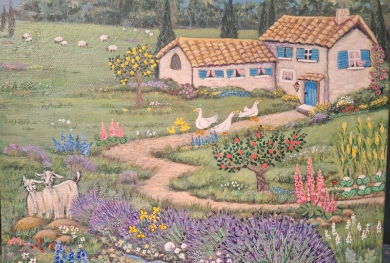
Transcripts
1. Intro: Hi, my name is Linda
Vine and I'm an artist living on the
south coast of England. I have a background in
design and illustration. First of all, in the carpet industry designing
patterns of carpets. I then went into color
separation for textiles, then into the greetings
card industry where I stayed for many years. Before going freelance. I've seen many of
my illustrations print for different companies. But in 2014, I really felt
like I found my passion, which was creating landscape
and seascape paintings. I hope by doing this class, U2 will feel really
inspired to go out into the landscape and find
your own sense of wonder. I portray that on
your own campus. I'm gonna go through
it step-by-step. So it's easy to
understand from choosing a surface to you how to
prepare that surface. The brushes that you'll need, the types of paints you'll need, and what to look out
for in acrylic paint. I'm going to go through
basic color mixing. And I'm also going to
show you to finish off your painting
by varnishing it, appointing the
fixings on the back. I really want you
to relax and enjoy this class knowing that I'm going to go through
it step-by-step. So get yourself a
nice cup of tea, and let's get started. Are you ready?
2. The Project: For the project, I'm going
to show you how to paint a loose, impressionistic
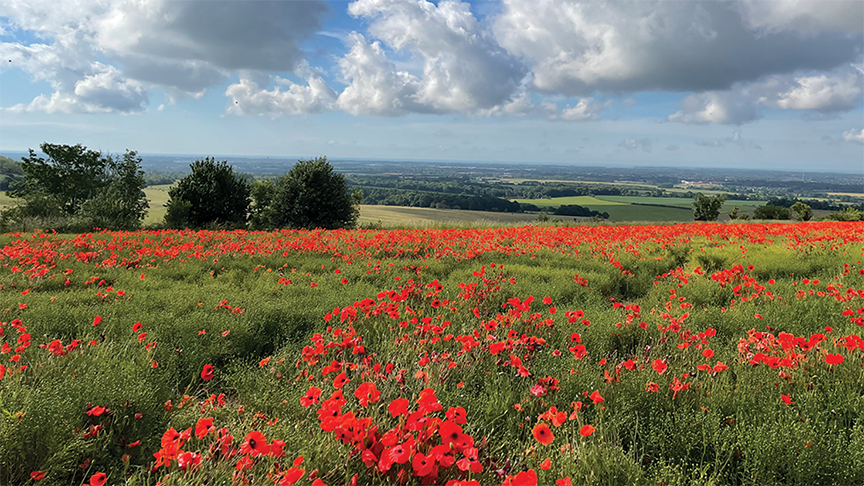
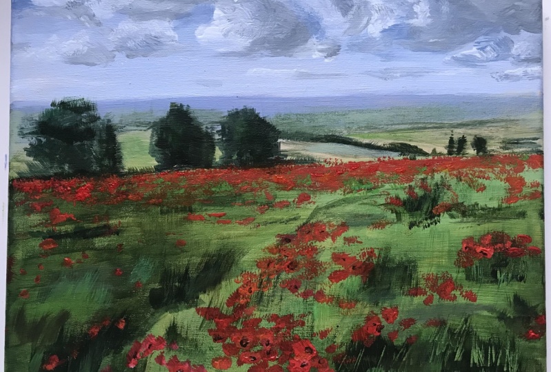
style landscape. When I was out and
about last year, I came across the most
beautiful poppy field. So that's why I'm using for my reference for this project. But it poppies aren't
your thing, that's fine. Go out into a landscape
near you got really inspires you because that'll help so much when
you're painting it. If you actually love
the subject matter. And then it goes through
everything you need to know to start painting
with acrylic paintings, even if you've never
used them before. Now the goal of this class
is not necessarily to have a picture that you
want to hang on your wall. Give you the tools to paint a loose impressionistic
style painting. I don't want you to get
worried about what you upload, what people will
think is to help you to experiment
in mark-making, in how you paint and how
you use a palette knife. I would say that the process
is far more important. I hope you enjoy this project. I'd love to see what
you've come up with, so please upload it
and I'll take a look. And also, I'd really encourage
you to say something positive to your fellow students because that'll make
all the difference. So enjoy the class
and giant painting. In the next section.
3. Materials: In this section we're
talking about materials. Don't worry if you
don't want to go out and buy two blues, two reds, two yellows. If you've got a
yellow, blue and red, and a black and white, you're good to go really, but it's just you
might want to add those other colors that will help in your paintings
at a later stage, also just use student
grade acrylics as long as they're not the
cheapest of the cheap, that will put you off
before you start. That's fine. With the brushes. You don't need to
be the exact size that I'm sharing here. But I'd encourage you to use as bigger brushes as you can for your painting within reason. Because a lot of people, when they start out with painting, these are tiny brushes and they get all caught
up in the detail. I usually just wanted
to feel a bit freer, particularly with the
impressionistic painting. I would just be
careful that you don't get brushes where the hairs just drop out all the time into your painting because
that is highly annoying. So let's get into the materials. So now we're gonna go
through the materials you need for this class. First, you'll need a pot of jet. So this one's made by Golden, but you can also get them by
Winsor and Newton Galleria. Jackson's art was other
brands that you can use. So maybe don't go for the
cheapest of the cheap, but just the middle of the road. Jesu, a selection of acrylics. Now there's all
different brands or different price points are different qualities of acrylics. And I just wanted to talk
about that for a few minutes. Now as a beginner, something like system three
acrylic is absolutely fine. A student grade
acrylic or something like Winsor and Newton Galleria
are also a good brand. This one is a professional
brand, golden acrylics. Now it has a higher
ratio of pigment in it, and so you'll get less color
shift with these ones. But it's not
necessary if you just beginning out in
acrylic painting. This one is cadmium
yellow light. A cadmium yellow hue. Cadmium red medium
process, magenta, ultramarine process ion,
titanium white, and Mars Black. Now this one is a
golden Open Acrylic. These ones are more slow drying, which you might find
useful when you're doing a sky in clouds to blend it in. But you can also get
mediums to add to your normal acrylic paints that will make them
more slow drying. We'll also need a pencil, something like two or three dB. You'll need a palette knife. A two inch flat brush. This one's by lung, nickel. You can get sets of three
of these from places like Hobby craft or maybe
your local craft store. And might not be
exactly the same brand, but it's just a flat
two inch brush. Smaller brush. This is a size ten, but it doesn't have
to be a size ten. It could be something slightly larger or slightly smaller. This is a square ended brush. This is a filbert brush. You'll see it's
got a rounded end. And that's just personal
preference really, as you practice, you'll
see what you prefer. This is a smallest
square into a brush. Or if you prefer a little
bit, use a filbert. And here we have a small
rounded brush that's just for very fine detail if you want finer detail
in the painting. Also a little water
Spitzer, it's very useful. You want a large pot of water. This is a paint cattle for mixing paint in
that you just get from your DIY store
and a smaller jar. Now, when we're painting, I need changing from one color to another and using
a different brush. Just keep your
brushes in the water. Because if you don't,
they'll go rock hard. Always keep your brushes
in the water when you've been using them until you're ready to go and
wash them properly. So this is to take most of the paint off and
this is to take the remainder of the paint off before you go on to
a different color. Another thing
that's very useful, our baby wipes, I'm a
very messy painter. Paint can go everywhere, so they're quite good for
just mopping a little bit of paint off the floor or yourself. Some kitchen roll. That's very useful just
for maybe wiping a bit of excess paint off
your brush if you want to do certain effects. Now for palate, you can either
use something like this, just a plastic palette, round plate, or a paper plate. You can also get things
like these tear of pallets, which are very useful. You just lay the
colors out you want, you can mix on there as well. And then when you've finished, you just can tear off
and throw it in the bin. So they're very handy. If you want to be
a little bit more environmentally friendly, you can get a glass palette. Now they do sell glass
palettes for artists, but they tend to be
a little bit more pricey than something like this, which is a surface protector. I can see that the
edges a smooth, you won't get cut or anything. And it's got rounded corners and it's very heavy-duty
and won't shatter. Now, I would stay clear of
using glass from a frame or something because obviously
that will shatter easily and it will have
sharp edges and corners. Make sure it's something
safe for you to use. Also, that's
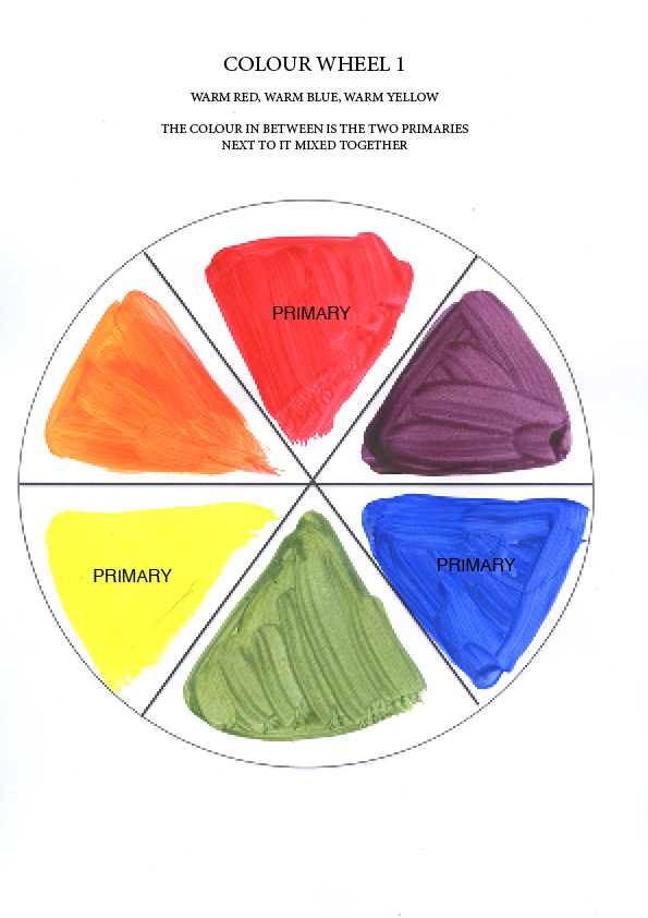
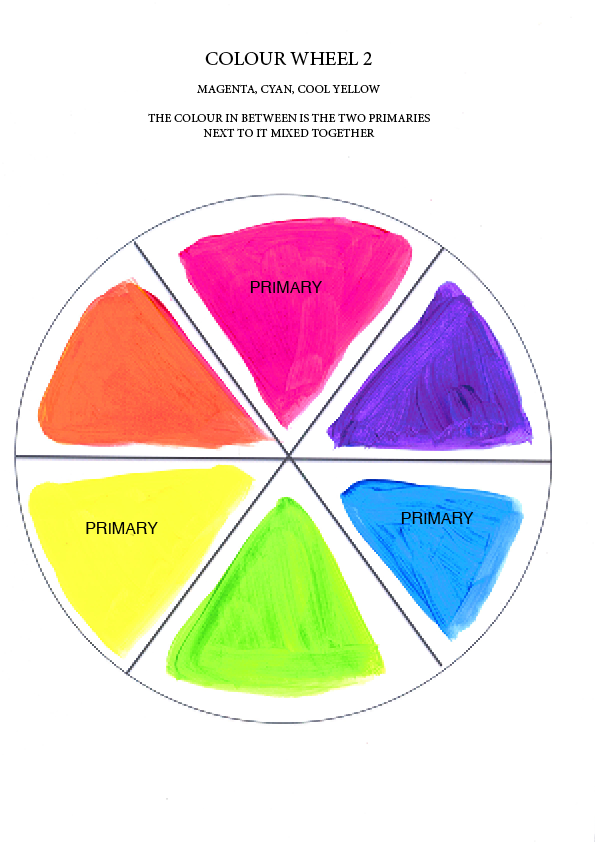
something that's very useful, is a color wheel. I'll explain more about
that in color mixing later. You can download something
like this from the internet. And that's all you're going
to need for this class.
4. Choosing your surface: In this section we're
gonna talk about surfaces. Now you can paint
with acrylic paint on so many different surfaces, but there are a few that I
would say the most popular. Just encourage you to try different surfaces
because there are some that lend
themselves more to certain paintings
and two others. And you know, you
might prefer to use a smooth surface or
a textured surface. And that's all
personal preference. So just have a go and
see what you prefer. First of all, you can
use watercolor paper. This is a 300 grams, so it's quite heavy duty and
this one's from hobby craft, has got a slight texture to it. It's very useful for
things like just practicing or doing
small paintings. You shouldn't need to
stretch it if it's a really thick watercolor paper. But if you need to,
There's plenty of tutorials on stretching
paper on the Internet. The other thing you can
use is acrylic paper. Now this one's from WH
Smith's, but again, you can get them all
different places, art stores, craft stores online. And this has a very fine
texture to it as well. So another good option
just for practicing on. You can also get Canvas bolts, which are very popular. You can get these from
places like the range hobby craft online or
wherever you live, you'll be able to get them from your local craft
store, probably. This one's Winsor
and Newton and it's 14 inches by ten inches. Now is pre primed. But as with all the campuses, I always add another
layer of primer. So that's a good option. You can get it. You can get square
ones, rectangular ones, very, very small ones,
enlarge cameras boards. Now this is a deep
edge stretched canvas. It's about four
centimeters deep, and the canvas is stretched over a wooden frame and stapled on. So you might prefer this. I mean, it's got a nice
little bit of given it, but you don't want too much good when you're buying
stretched canvases, especially they
have crossbars at the back that the
larger canvases. Because when you're painting, if it keeps banging
against the crossbar, you can imagine you get
lines down your pain, your painting, and
it's very annoying. So make sure it's nice and taut, but it got a slight give to it. So that's a square
edge to Canvas. Or you can get standard
canvases and this, these ones are about
two centimeters deep. You can also get these and all
sorts of shapes and sizes. What I would say is don't get the cheapest
of the cheap but middle of the road sort of
price bracket should be fine. Always check the corners to make sure they're
not gathered. And just check it for
dinner. And dense. Just have a look round it to make sure it's not
torn anywhere. And you should be good to go. So choose what kind
of surface you'd prefer or try a few
different surfaces. And I'll show you how to prepare the surface in the next class.
5. Preparing your surface: In this section we're talking about preparing your surface. Now this can make a
huge difference in how your surface feels
when you paint onto it. Especially when you use the cheaper variety of
Canvas or canvas board. So let's get into it. So most campuses or Canvas
boards are pre primed. But you'll find when you're
trying to paint with them, sometimes they've got slightly shiny surface and I don't know, the paint just doesn't
go down very well. That's why I like to give
them another coat of Jess. So I've got golden gesture here, but you can use other brands. There's things like Winsor
and Newton gallery adjust so which is fine and plenty
of other ones to choose from. A potter just so a two inch flat brush and
just some water to your brush and I'm just going to wet the brush and take
the excess water off and dip it in the Jess. So just give it a nice coating, not too thick, necessarily. Gonna go down. Get it into all the texture. Then I'm going to go
across nice and smoothly. You can also use gesture to add texture to your paintings, which is another great way to
add more interest into it. If you've got any little
particles in there, just take it out with the
corner of your brush. Make sure it's nice and smooth. No pooling anyway. When you're doing the
stretch canvases, just make sure there's
non dripping down the sides which there can be just scoop them up
on the sides like that. Then I would suggest you
put your brush straight in the water and go and wash
it out as soon as she can. Meet this overnight to dry. So it's as simple as that. That's how you just
so your canvas.
6. Tonal Ground : In this section we're talking
about turning your ground. And this can be a very
effective way of getting rid of those sort of grainy
white bits of the canvas that
can show through. If you look at some paintings, particularly if people
are just starting out, it can get rid of that
scary white canvas feel. And it can also create atmosphere and it can
unify your painting. I do leave part showing through. Some great portraits are
done on a gray tonal ground. I've seen people do their terminal ground
fluorescent pink and it can look very effective. So just try different colors. Think about what
atmosphere you want to create with your
painting and have a go. We're now going to add a
tonal ground to our Canvas. It can give a more
professional look and get rid of that
scary white canvas. Now you can use any
color you want. Think about the overall effect
that you want to achieve. A toned canvas can add
atmosphere or drama. If you leave part
showing through. Today, I'm going to
use yellow ocher. You can also mix yellow ocher
by mixing together yellow, a little bit of red, a tiny bit of blue. And then by you can add white to that as well if
you, if you need to. I'm going to squeeze a good
amount into a plastic tray. I'm also adding a touch of
white and a bit of water. I'm going to mix it
with my two inch brush. You don't want it
too thick or thin, just the sort of
creamy consistency. So that needs a little
bit more water. So I'm just going to
add a touch more water. You can also add flow medium, which actually helps
it to glide on the Canvas easier as well. And saves on paint a little bit. So you can see that this
sort of consistency, that it is just going to add another drop of water just
to loosen it a bit more. I'm just going to paint really
quickly across the canvas. It doesn't have to be perfect. You just try and cover
up all the white. So I'm just going
to paint really quickly right across the canvas. If my brush gets too dry, this out a little more water. Then just go across again just
to smooth out a bit more. Most of this will be covered up, but you can have parts
showing through as well. Being taken up a
nice glow showing through maybe in the
sky or something. I'm also just going along
the sides and the corners. Just catch any drips
and also yeah, just make sure you get in the little creases in the corner. Just check that all around
and leave it to dry. If you really
impatient, of course, you can use the hairdryer
and that's how you do tonal.
7. Mediums & paints: So now I want to go through some different mediums that you can add to your acrylic paints. The first one is
made by Liquitex, and it's called natural sand. Gives a medium
grade sandy texture and it's non yellowing. Or you can put this straight
on your canvas board or canvas just as it comes out
the tub and leave it to dry. You can also make some of
your acrylic paint with it. So that's the one
that's mixed with pain. Obviously. You can
also add it to your Canvas and just
leave it to dry and then paint on top.
Once it's dry. I'm not going to try some
golden crackle paste. You can put it straight
onto your canvas. The thin you spread it with the new cracks
will be a thicker. You put it on, the thick
of the cracks will be I'll just try
to thin 1 first. You have to leave it
to dry for a few days. And then you can paint over it. You can add a little
bit of pigment at this stage, but not too much. We're now going to try
some structured gel. You can get more of
an impostor effect with your brush strokes and your palette knife
marks will show up more. Some people really liked
that thick paint effect. Just mix it in while you'll see how it becomes a
lot firmer and stands up. Now this is matte
medium and this increases flow and transparency. When mixed with your
acrylic paint on it provides a matte finish. You can use this instead of water if you'd like to do that. It's also fluid retards. Now if you add this to
your acrylic paints, they won't dry as quick
and it'll give you more time to blend
in your colors. This one is Liquitex and
it's a heavy body acrylic. You can see the difference. This is great for giving
interesting textures. Just moving it around
with your palette knife. You can see the lovely
textures that you can get. Or you could also do
that with a dry brush. These ones are high flow
by golden acrylics. Squeeze it back out, just goes on really
smoothly and thinly. And also we have acrylic inks. I love using these.
They're really vibrant. Now. I will just shake it gently because the pigment sometimes
goes to the bottom. But if you shake it too hard, you're going to get loads
of air bubbles in there. So just gently shake
the bottle around. They can use the
NPS to make marks. We can use a brush. You can see what an interesting
effect that can give. You can squeeze the end bear little bit more
if you want some more. This gives when,
when water is added, you can have a lovely
watercolor effect with this. There's lots of scope,
lots of textures. You can do lots of
different ways of painting, known as the right way. So these are just the
different consistencies of acrylics you can buy. I hope that's been helpful. We'll come back to
the crackle paste a bit later when it's dried. Okay, so now we've come back
to the golden crackle paste, and I've put it on
quite thinly on this board and left
it for a few days. And then I put it on thicker and left it for a
few days again. Now you can see with a
thicker you put it on, the larger the cracks are and
the more obviously effect. So it depends what
you're after really. Now I'm going to try just
putting some quite thin. Then down acrylic paint. You can either add
water or add a medium, just a gel medium. Let's try this one. I'm also going to try it
when you rub it off as well. A little bit. Just stays in the cracks. Just gives a sort
of washy effect. That's quite nice. I guess you could paint over
it and gold actually wash that off and you get lovely
gold cracks as well. So that is quite a
nice effect really. You could use that in
landscapes or anything else. Now let's just try
the thinner one. You can also mix your paint with the crackle paste
before it dries. But I think the more
pigment you add, the less crackly it goes. So you just want a tiny bit of pigment added
in paint antigen. So it's quite a nice effect. To try out. There. We have it
golden crackled paste.
8. Mark Making: In this section I'm
going to talk about how just use palette knives and brushes for your painting. But if you want to
add more interest in certain types of paintings, I just wanted to go through a
few ways that I've done it. Now. Just encourage you to
write this kitchen cupboards. If you have a
garage, the toolkit, anywhere where you can find something that will
make a good mark. Maybe the recycling bin, all sorts of packaging has
really interesting textures. So go out there,
have a good search around. Let's get into it. Now. I'm going to
just go through some tools and things from
around the house and around the studio that I've found
that I can make marks with. I've just painted half of this piece of paper
just to show you different effects on an
already painted piece. So say we want to do a texture with the scrambled up
the piece of paper. I've added that orange. If I go in with a lighter color. Just add a bit more
too. If it's Tuesday. You could, you could do use this in a foreground
or something. Just ignore the color
of the foreground. Something. You could
use this as a texture. Just looks more
interesting than maybe just painting it
with a paintbrush. Just adds more interest. Rarely. You can also use bubble wrap and
things maybe don't make it look too obvious
that it's bubble wrap. So you could do some with bubble wrap and then maybe
paint over parts of it. I know a lot of
people use this type of thing, abstract painting. That's not obviously
bubble wrap, but it gives a texture. Maybe merge a bit in. And you can obviously scrape
into paint when it's wet, which I really liked doing, especially for grasses and
things at the foreground. You can also get these
catalysts, wedges. So I can add a different effect. This is just, I don't
know what this is, to be honest, but it's got
a little texture in it. I'm just going to darken my paint a little bit so
you can see what I'm doing. Brighten it up. A nice pink. I like that one. That's
a lovely texture. Don't ask me where I got it
because I can't tell you. Can use things like sponges, rollers. Is it a tape I've got
with the texture on one side and it's like
policy on the other hand, the DIY store, not
sure what it's called, but you could get something
similar. I'm sure. This was just some packaging. It's another
interesting texture. You might get paint more watery. Draw with sticks and things. That's far more interesting. Maybe then a paintbrush
mark on certain landscapes. One of these tools, I did go into the garage, but I thought my husband
might not appreciate me using all these tools for a
paint demonstration. Fork. Perhaps. Get these little spongy
things have not used. This actually before. Was quite nice on
the pink actually. You see how that
looks on top of that. Sponge to pink. It
gives a nice effect. Credit cards, point,
points cards. Maybe you doing a boat and you need to get a straight
line in there. That can look more natural than just trying to draw a
straight line with the brush. Can use a bit of tissue. Kitchen roll to give
subtle effects. Let's just go on
to page a minute. I'll just try that one on. As I've shown you before, you can use these acrylic inks. Can also use them like this. Please wear an apron. See what else I've got here. This is just an old dry brush. I haven't got a
toothbrush, two hands, but you could use
something like this. I'm sure those two techniques would look good on a seascape. Just put some paint on here. That's wet on wet, but
just scratching along. You can also do
nice drip effects, which are really popular
actually in abstract paintings. I saved, we get maybe
some paint here. You can tell them a very messy
painter can just do that. I'm like It's a lovely effect
going down the painting, not necessarily through the
green, but you get the idea. I'm back to my other one. Well, that one's drying. This is a graphite pencil. You can obviously draw
into the landscape. Different pencils, oil pastels, anything really normal pastels. You can also cover things with different mediums so that they don't smudge and things like that before
you varnish them. What else have we got here? This is another, instead
of maybe a catalyst wedge, you can use something
like this, a spreader. Please excuse shy
those little pull, pull sounds coming
into the studio. She's wanting some attention. Well, things like this. She wants to be in the video. Think all the filming
is getting too ahead. I don't think I've
ever used this brush. It's like a soft It's
like a blush of brush. Though we have different tools, techniques that you can use. I often think it adds a
lot more interests when you use things like
pencils on top of acrylic or a
different consistency of acrylic on top as well. That looks nice. You see
a lot of things just come about when you experiment. I wasn't, hadn't really
done that before, but that looks really nice. Effects that you
try you won't like. But it's all part of the
experimentation, isn't it? This is an old tin-pot, not just found in the garage. I didn't buy it. I think it's my my husband's from a
plant store but he did. I can always wash it
off, so don't worry. There we go. Textures and mark making with acrylic
paints and inks. So get your paints out, go searching for
some tools and just have a bad enjoy yourself.
9. Palette knife and Brushes: In this section, we're
gonna go through how to use a palette knife or the
different kinds of brushes that you can
use a new painting. And also the amount of water
that you should add to your paint to make
different effects. Quite often in my paintings
I use a dry brush effect. So I take the excess
water off with a kitchen towel and then
it gives a nice texture on the edges and it
softens things like clouds or hills and
things like that. So it's a very useful technique. So again, just experiment
with a palette knife and with your different brushes and
see which affects you like. Let's just have a look
at the palette knife and different brushes
that you can use. Some people do the whole
painting with a palette knife. But you can just do
part of it obviously. It could you use a thin wash on the background and
then do this on top? And that would look quite
nice in a foreground. Can use it as I'll
be doing later. Just for little flowers
that you don't want it to look really realistic. We just wanted to give
an impression of them. Any part of the palette knife. Then obviously scratching
into it as well. You can use brushes, dry, can use a lot smaller square
ended brushes obviously, to get different thicknesses. Can use brushes that you
have wrecked in the past. Hopefully not too many. Can use round brushes. And depending on how
heavily press down, get thicker or thinner line. Can you use been brushes. You can also use
filbert brushes, the ones that are
rounded at the end. I don't think I've
ever used this brush. It's like a soft It's
like a blush brush. So that we have
different brush marks, palette knife marks,
different size brushes, and just have a go.
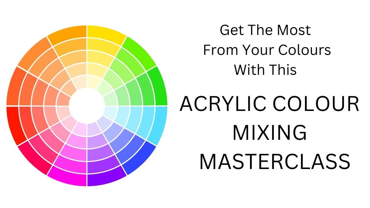
10. Colour Mixing: In this section we're gonna
talk about color mixing. You only really need a
few tubes of color to make hundreds and hundreds
of beautiful colors. It just takes a little bit
of time and experimentation. In this section, I'm going
to give you a few tips to create some lovely
natural greens. You can also check out
my class on cityscapes, and I'd go into color mixing
a little bit further. I'll also upload some more
information on color mixing, just so you can have a
read of that and study it further to get yourself a nice cup of coffee or
drink of your choice. And let's get into this section. We're going to start
off trying out our color mixing by
having a dollop of ultramarine here and your
cadmium yellow light here. So if you take your
palette knife, take a decent blob of yellow. Just put it next to it, then add a little bit blue. So there we can see we have quite a sort of acid, the green. Now just lift some of that off. A bit more blue. Left a bit of that off. And add another bit of blue. You can go on and on with this. Adding small amounts are larger amounts and get all
kinds of different shades. So once you get the
hang of color mixing, it's really handy and
you don't have to keep buying new colors
of acrylic paint, but you can mix your own. Let's just leave it at that
for demonstration purposes. I'm just going to wipe
that off my palette. Knife. You just tip
your brush in water. Just take her square and
did brush like this. I'm going to paint it out on here and write down
what the colors are. And this is a really
good reference point. You know, when you deciding what kind of green you
want for a painting, you just go back to this book
and you can see what shade, how to make certain shapes. This is just a sketch book. It's a 150 grams. So this is fine. First of all, I'm just going to paint a little square
of the ultramarine. Wash out your brush on the yellow at this end. Now you might want to do
more shades and I've done, I've just done a few today. But it's good to see all the different shades
you can get to take the excess off if you need to in the
other jar of water. So I'm just going to write
on here what these are. You may also want to see
different shades of that, so you can add some white. It's quite good to
get a large tube of white because you
go through a lot, lots of system three
tub of white paint. So I'm just going to add
some white to these. Again, you could go on and on, but add a bit more white. Outside of that,
I'm going to put, I also want to show
you that if you're green is too bright and acidic, you can tell it down with the opposite color
on the color wheel. Rotate the color wheel
and have a look on here. Green. The opposite color
to green is red. And that's a really
good thing to know with any color mixing. If you put a tiny bit of
the opposite color in, it will dull down the color and give you some
really nice colors. So let's try that. I'm
taking some cadmium red. You don't need to touch because obviously that's a
very strong color. Probably put a little bit
much in there actually. You can see what I mean. You got it takes the
acidity out of the green, gives you a lot nicer shade, rarely would, depending
on what you like. A little bit more white. So
look at the difference there. All of the green. A touch
more white in there. So you can see the
variety that you can get. I want to show you another
way of mixing green, which you might be surprised
at all. You might not be. You take a yellow, a black. Let's take a touch of black. I can see now it looks green. Lovely, olive green block here. So there's a lovely, lovely shades of green. Then again, you can add
some white. As you can see. It's never-ending. Go on and on and on. It's kinda mixing. I'll do one more shade of that one. I'll just add another
one of those as well. I'll make that slightly duller. Some white and get some
lovely neutral colors. So in some ways they
look a lot more natural. I really liked those with black and yellow
mixed together. And obviously you can
do a lot more shades in between is to give you
a quick demonstration. So try out color mixing and mixing the other
yellow with the cyan. And obviously you can mix it
with cadmium yellow light. There's never-ending
possibilities. But the main points
I want to make our, There's so many different
shades of green. If you'd prefer a
more, a brighter, more vivid green, then you'll
go for certain colors. If you prefer a more
neutral natural green, then you'll tend to
go to the other. So it's a matter of
knowing what you like and recognizing what
you like in a painting. There you go. Have a go at color mixing and
just enjoy yourself. I'm just going to continue
writing on here what I put.
11. Clouds: Okay, I just painted in this
sky and I just want to show you a couple of things
you can do with clouds. So I'm just going
to dampen my brush, take the excess off, go into the white paint
and just get it all over my brush just
by turning it over. Then just gonna go
in straight away. It's not really,
really way you don't want it just pooling
all over the place. So I'm just gonna
do a general shape. Little bit more paint. Also, any doings guys, although I haven't
done that on this one, just take notice
about the background. Is it sort of darker
blue at the top? What color is it
near the horizon? Just have a little study of your photograph or your
scene first of all, and take note of
these kind of things. When I dry brush
that you can see it makes the Cloud
Edge really lovely. And so that's a
really nice effect as a kind of dreamy
look about it. Like clouds or three days, there's gonna be lots of
different shades and they're usually go in with
thicker paint. Just to accentuate certain
parts of the Cloud. You might have a
nice yellow ocher coming through the sky. Or you could do a glaze, which is a thin
layer of paint over the whole sky to
give it a nice glow. There's all sorts of
different techniques you can learn as you go
along with acrylics. Now I'm just going
to different brush. I'm gonna go in with
a bit of a shadow. So I'm going to take a bit
of ultramarine brushes. I'm just going to try
this brush out of it. Then I'm going to add a
little bit of yellow. I could find my palette knife, I'd use that icon, so it's going to add
a little bit yellow. Don't do this at home. You said those off a bit
and then a bit if read, you've got a nice shadow color. You can also combine techniques. I've done a wet, wet on wet, and also the dry brush around the edge and then
that's still wet. I'm going in with this now. No hard and fast rules. You can make up your own rules. I'm sure there's hundreds
of ways people do clouds and none
of them is right. Do you know everybody has had to have a go and see
what suits them. I'm going to just blend
that in a little bit. Some more contemporary
paintings, they might want to
not blended in, but just more obvious than it might just go in with a
palette knife or something. I'm gonna go even darker. Because I say, you use
your palette knife. It's just because it's
disappeared for the moment. So I'm using the brush. But obviously like colors going into all my different
paint colors now, which is not a good
example. I know. Now this is even darker. It all depends how hard you press your brush down as
to what effect you get. So just be aware of
what you're doing with your brush that you're pressing down hard
or very lightly. And just take note of
the different effects. I'll give you. Really smooth effect. Little bit start with the nail. That is one example of
a cloud. You gave me.
12. Trees: Not just going to show you a couple of ways
and come to a tree, although there are numerous
ways that you could do it. First of all, I'm just going
to mix a very dark green. I'm just mixing a black
and yellow together. Extremely dark. There was some paints,
it will dry a little bit darker as well with a
student grade acrylic. Just going to dip my
brush in the water. I'm just going to go for the
general shape of a tree. Sycamore tree. You can leave some little gaps coming through because when you're
actually doing your painting, you will have a background
color in there. But I'm just doing this to
show you different techniques. So you could do that
with a little bit of a background coming through, whether it'd be the sky or the sort of
yellow ocher color. You can go straight on to that. If I mix a little
bit more yellow, I can just do wet on wet. Just going to go
a few shades that that's not really lighten it. Why? In a bit more, you let the knees are slightly smaller. Brush can use it on its side or you might
have a squaring did brush. This one is a filbert brush. I'm just doing this
sort of mid tones. You might have to play around
with your color of it. Because obviously it needs
to be some difference. Then I'm going to
go even lighter. You can use any bit
of the brush you want because you just want
it to be loose looking. As you're going through
a very realistic love which is completely
different wave plate. And then I'm going to
add a little white. Just highlight a few areas. When you have it. That's the loose
impressionistic style tree. And then if the other one, I'm going to add dark color first and then I'm
going to let it dry. And then I'll show you
a different technique. So say I'm sometimes pushing harder on the brush
and sometimes I'm hardly pushing down at all, just depending on how much paint I want to put on the canvas. So I'm going to
leave that one to dry and come back to it. Remember to just
put your brushes in the water evaluating. Now I'm going to try
the dry brush effect. So I've added a little bit more white and
yellow into my mic. Just a very small touch of
white brush into the water. I've just dipped it into the
paint and then I'm going to just take the
excess paint off. So this gives a lovely effect. Let me just show you
down here first. It gives a nice
texture to effect. This can be a very
good Technique just for softening your edges. If you're not into sort of
hard edges on your paintings, be clouds or trees or flowers. You can use this on any
subject matter really, and it just blends it in
a bit and softens it. Just lighten a bit
and then I can do a highlights of the tree. You just go gentle on the
pressure you put on the brush, depending on how much
texture you want to show. Maybe go very lightly
on the edges. Leaves, so form these
so small clumps when you're looking at
it from a distance. So if you close your eyes, close your eyes, it's totally obvious anyone see anything. But if you have closure eyes, then you will see these clumps of leaves and it just
makes it a bit easier. So you can see that's quite
a nice effect as well. Then of course you could try a palette knife and see
if you like that effect. I'm just going to add in
the trunks of the trees. So I'm going to take a bit Fred, little bit of yellow
and hope for the best. It's really funny when you're teaching instead
of just doing it, because you just have
to just good thing, well, how to mix brown
where you usually just makes brown and there
wouldn't be a problem. But because you're
showing somebody else, you just suddenly think,
how do I mix brown? This is adding a blue
bit more blue, I think. Cloud a little bit of water on the brush and take surplus. Or I'm not just looking for perfectly
straight lines or anything, it's just a loose style. And again, you can
either go wet on wet, just add a little bit of white. Another bit of yellow depending on kind of color
your tree is that you're going from
add some highlights. Now should mix the
color with your brush. You can just twirl it
around to mix it in more. Obviously without one,
he can wait for that to dry and do the dry brush
effect if you want to. Again. Now we have our trees, two different techniques,
but obviously there's numerous techniques
that you could use. So just have a little
go at doing trees. You can do a real watercolor
effect if you'd like that. By using acrylic inks are the ones that are
more free flowing. You can add different mediums to them to get
different effects. You can use palette knives. You can use scrunched up tissue to bring a texture to a tree. So yeah, just have
a go and have a go. What takes your fancy really?
13. Blocking in: The next four sections, I'm going to go through
the process of painting this poppy field now
broken up into sections. So it's not so long. And you don't have to do
everything all at once, but you can do it in stages. Now when you're painting a
painting, it's really good. Every now and again, every couple of hours
walk away from it because you get totally
immersed in painting. You stop seeing things
really as a truly, sometimes it's great to
walk away, come back, and you'll see
your painting with fresh eyes and a
new perspective. That can be really helpful. Because it can, It's easier
to see things that need improving and things that
will enhance your painting. So I'd encourage you to do
that on a regular basis. If you're the type of person
that wants to do it all in one go and you're full of
enthusiasm, that's fine. But I would encourage you
after you've finished to leave it overnight and
come back the next day. And really be honest and assess your painting because that is the most helpful tool you can have to grow as an
artist to look at your painting with honest
eyes and say, Is this good? Can I improve it? What would improve it? And continually study other
paintings and works of art. Look at the way they
do their skies. Look at the way the paint
the trees, not to copy, but just so you can see what
makes things look better. Sometimes I think, are more subtle like look much
better than a clear, crisp line on the horizon. These are things that you
learn as you go along because you look at your
painting and you suddenly think, Well, it doesn't look quite as nice as the one over there. Not to compare yourself, but just to improve. It's also good to look at your own paintings that you've
done maybe in the past, and you'll see your
own improvement. It's not great to compare yourself and feel bad
about your own painting. That's not the purpose. Because when you compare your painting with bonds that you've done maybe
a few years ago, you'll see a vast improvement. Or if you haven't done
any before you look at your paintings in a year or two. And you'll be amazed at how much improvement you can make. But often with art, people think either you're
gifted at it or not. But a lot of art is practice. It's hard work and practice. And year after year after
year you will improve. So yes, some people might have
a natural and head start, but it still means
that the majority of people will have to practice
and put in the hard work. Of course, if you love painting, that hard work is a joy
as well. Be encouraged. And let's get into
these sections. So now we're going to look at the poppy field
reference photo that I have and I'm gonna go through it sort stage by stage high. Think about it. We have this guy,
obviously there's a lot of clouds in the sky and then we have the puppies and more
blurred in the distance. And then the ones
in the foreground. We also have the hills
in the background. I'm going to kind of
think the three sections. Now, you have to decide
really at this stage, what you want to
make the most of the clouds or the poppy field. So today we're gonna, we're gonna make the
most of the poppy field. I would say. We want the horizon to be sort of around about a third of
the way down the canvas. This canvas is 30 centimeters. I'm just going to draw, I'm just going to
feel benefit really. I'm just going to draw a horizon about ten centimeters down. Obviously, I'm not going to
make it as just like a very, very harsh straight line.
Just put it in loosely. But then we've got this other section or its narrow at this
side than this side. That's made up of
slightly paler colors. So I'm just going
to put that in. It's enough to be exact. We can always amend it later on. So what I'm going to do is I'm
going to block in the sky. If you look at the photograph, the sky's darker at the top and then it goes lighter
towards the horizon. And I might, so I'll do
that on the first layer. Then I'm going to do
this lightest section. Then I'm going to go
on to the foreground, which I'm probably going
to do a mid green. Because sometimes I go for the darker shade first I'm going to do a mid green and then I'm going to flip the
darker shapes and I'm going to put the darker trees in after this section painted. I'll put the darks in there
and then we'll go from there. So first of all, I'm going to Sky color. So it'll need
quite a bit of white. So I'll take some of that white little bit
of ultramarine blue. As I said earlier,
there's the open, even though I haven't got
opened on my palette room, they open acrylics
would be quite useful in this kind of scenario where you want it to
go from dark to light just so it doesn't
dry so quickly. But I'm presuming most
of you won't have that, so I'm just going to do it the way I would normally do it. If you don't want
a very bright blue and you would dial it down
with a sort of orangey color, just a tiny bit. But if you want to at this stage you can use
black, that's fine. I'll just add a little bit
of red touch of yellow. Just so it's not
such an offbeat. Bright blue colored. Very good. Now, obviously this
guy is a bright blue sometimes I don't want
a really vivid blue. So personal preference really isn't there. At the
end of the day. I'm going to add a little
bit more ultramarine. Like it slightly stronger. Right? I'm gonna go
with that for moments. Got my two inch brush here, which I can use for
the time being, just for the stopped
starting point. Now at this stage,
if you want to, you can leave a bit of that
yellow shining through. That can give a nice effect. Or you can go back in and just wipes and other
offer the cloth. That's another way of doing it. Obviously, if you don't
want yellow coming through, you would do it
slightly thicker. And I'm just going
to quickly go along the edges as well once
I've got that color mixed in the corners. Now I'm going to add
a little bit quite, quite a lot of white just
for the horizon part. I'm going to just
go over that again. Slightly thicker paint. And again, just remember that acrylics are very forgiving. You can keep going over as
many times as you want. I still think it needs to be a touch lighter at the bottom. And also maybe because we want to do that a bit better, you can use your palette knife. I'm just going to
apply a lighter part. And most are any blue. I'm going to use a
small brush actually. Well, that's completely dried. I'm going to add to this blue. I'm just going to
add some yellow. The light yellow,
the lemony yellow. This gray blue, bit more white. Ultramarine. Wanting to get that sort of dusky gray
color meets the horizon. So I'm just going to
add a touch of black. In this case. A bit more ultramarine, little bit more white. You just have to keep mixing until you get
what you want to. Really. I'm just going to
go in that section. There. Doesn't matter, it's not as straight
as the ruler line. I wanted a more blended
in look anyway. Going to add some more yellow. Just get a paler green
color a little bit, Fred. A little bit warmer. Now for the bottom section, I'm going to mix a nice green, quite a vibrant green, but you don't need to have
it as vibrant as I said, it's all personal preference. That's quite blurry green. Maybe you prefer that. Make it a bit more yellowy. A little touch of red. I think that'll be a good
base color to go with. It does get lighter. The further it
goes back as well. Just very slightly actually. So you want to kind of
creamy consistency. I'm just going to
add a little bit of a lighter green can
blend that in Arabic. Go around the sides. Also depends what you're
doing with the Canvas. Afterwards. Once you get good and maybe you want
to sell your paintings. Well, we just decide what frame you're
going to use her now. Determine what you do
with the sides as well. Probably made that tiny
bit on the thin side, but it's no problem. You can just go over it. Okay. I can either work wet
on wet at this stage and just put put those dark
greens in or you can leave it to dry if you'd prefer to do that and work on them.
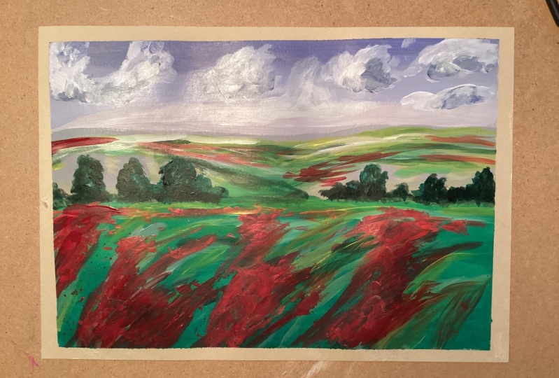
14. Blocking in Dark Green: Before I need a bit
more ultramarine, I'll just pick some up my screen for me. You can also do it
with black and yellow. You get a nice dark green. I'm just going to go in here
and put some of the darks and now you can do it like
I'm doing now, wet and wet. Or if you don't want it to blend in so much you can go in
after it's completely dry. You just half close your eyes, you'll see where the
darker areas are. I just blend it down the side to make a big who hire
about the side. But I do blending the colors. So we've got a line of trees
along, they're very dark. I'm just going to make
a mix a little bit more. The dark green. If you go back to thinking about how you want to do trees, we're just doing a rough
shape at the moment. Now if you do them
on there too light, it's probably best to let it dry off and then go on top
of them with a darker, I'll just do it like
this for a moment. A bit more dark down here. So yeah, just how close your
eyes and you'll see where the darker tones or just
go in with your brush. Don't be scared to
do that and just, just lightly put them in. Now there is a
slightly darker tone. In the second section. I'm going to put that in there. You might think, gosh,
that is a huge brush for doing those details. But to be honest, I like using a larger brush as
much as I can send. You don't get too much
into the detail when I want a more impressionist
style painting. I do also like scratching
into my paintings. I'll just show you that as well. While that's still wet. You can scratches and aggressors and we actually
call it you've got to hand really.
You might do that. I'm going to cover
a bit over again. Use your palette knife.
Just talked a little bit scratched in detail in that. It's too much, you
can just rip it in an obscure parts that
you've done that you're not keen on before it dries. You just want to hint
at some scratches. Okay, that's fine.
15. Mid greens and Clouds: I've got that color,
but Brian, any face, I'm going to have to look a
bit dark color the gray gray blue tape, the excess off. Just going to gently
go in with that. So again, you can
close your eyes and see where the light areas are. Actually, I might
add a little bit of that gray green in
the foreground. Now you might not
actually think, well, it's not much there, but you can add, you know, bits and pieces to make like a bit of the
sky color coming in. It helps the painting tying
together a bit better. So you can add a touch
of this here and there. I'm just going to knock
it back a little bit so it's not really standing out. Now I'm going to add a bit more blue to the top of the sky. I'm going to add a touch of ultramarine to my
gray blue color. If you look at a sky often, it's brighter at the top, and then it goes paler
towards the horizon. Obviously there's all sorts of Sky's the change every day, but on this particular one is
bright and blue at the top. And then it goes lighter
towards the horizon. Just blend that across the top. And just remember to go
along the sides on the top of the painting at
the same time while you've got that
color on your brush. Now I'm just adding a
bit more titanium white. One's a little bit so
I can go in there. And then I'm just going to
blend that into the top color. If you go gently with your
brush to blend it across, then a little bit more white. I'll take it down
to the horizon. Ok, now I'm going to
start to put my clouds and got a little bit too
much white on my brush. I'm just going to take
it a little bit off. So Blend easy to begin with. A little bit tiny bit of
sign in there as well. Obviously the clouds get smaller the further away they
are towards the horizon. And larger towards the
top of the painting. This stage, I'm really sort
of plotting where they go. I'm not want to stand out so much at the beginning just so I can see where I want my clouds. And then you can start
adding tones on top of that. I'm just adding some more
highlights into the top. Obviously clouds, they are 3D. They have different shapes
of grays and whites. Then you'll highlight why
it should come at the end. I'm just taking the excess
paint off than just blending the edges with
a drier and drier brush. Obviously, you don't want
harsh lines on your clouds. I'm just adding a
touch of black, blue gray just to make a
slightly darker shadow. That's probably a
little bit too dark, lit bit more white. And then we're gonna give them some shape around
the bottom of the cloud. I'm still kept it quiet, subtle at this stage. I'm going to add a touch of ultramarine into
that mix as well. That's a little bit strong, so I'm just going to
blend in those edges. I'm just going to add, I'm now I'm just going to
make another green. Because I do believe
that the dark greens needs to be even darker. Just go over green
already got that and just make more contrast. I think painting that has
more contrast and it is more interesting when I first started painting a lot of my tones, you still say me. So now I start to
look out more for the contrast when I'm
taking photos and things, you want a lot of
variety in there, not just all the same. Now I'm just adding some
more yellowy greens. Just give it a bit
more interest as well. It's all a matter of just
playing around with your paint, just having another look, waiting till it's dry and
seeing how you tones dry. And then going back over it with colors to give it a bit more
or a bit more interest. And you're constantly assessing your painting as
you're going along. Non-important,
some paler greens. Right knee, the
horizon at the back. Then I'm also adding some paler
greens to the foreground, again to get a bit
more variety color. I'm still keeping
it extremely loose. I think it's very light. It's right next to the horizon. Because the further
you are away, the lighter they'll become. Obviously you can use
your palette knife instead of the brush if you
want to do it that way, just keep your marks loose. Now just going to add
some dark tones of green to my little bushes at these pathways through
the puppies as well. Just to give them more depth. If a line just becomes too
harsh, you can just take off, I live with your brush
or with a cloth. Now I'm going to add
just some lighter greens in the distance. That's a bit harsh. Little bit of white
in that green. Just want to add the field
behind the trees to stand out. So I'm just putting a bit of
a light green behind them. Just to add a bit
more contrast there. Then a touch of yellow
and more white. It's going to bring that along. So there's more contrast
as well between the front grass on
the mid section. I'm just adding
some finer detail. Just an impression
of the detail. Just before we get
to the horizon line. Just going to put
some light grasses in the foreground here. Add a little bit warm fire. Then I'm going to
bring that color into the rest of my painting in various parts of the painting
just to give it continuity. Now I'm going back
to my clouds and I'm going to put some
highlights in them.
16. Adding Bright Green & Poppies: So now I'm going to add a
bit more bivalve whom I'm mixing up a brighter green
with my yellow and blue. So I'm putting up
quite watery wash over it so you can still see some of the tones throughout. Something I'm very gentle
touch to the back. And then just blending in
so it's not too bright. You can see how it
instantly lifts it. This is how a painting goes
backwards and forwards until he got what
you're happy with. It's not that you're
doing things wrong. It's just feel you're
assessing it as you go along. It's not mixing a
pale yellow and just adding a slight touch of green, a nice yellowy green. Then just put some loose
brush strokes and blend them in to touch to the distance as well. About a lighter green is just ready to get
the impressions of the fields further back. I'm just washing my brush out. And then I'm going to
make some nice poppy red, but as it goes back in the
field, it'll become paler. So I'm adding a little bit white and a little bit
of yellow to my red. And then you can just
gently move your, get some paint on your
palette knife and just gently rub it against
the grain of the canvas. You can try it on maybe
his bare canvas first. So just very gently so you get some of the canvas
showing through as well. You can do with your brushes
with a dry brush as well. The jacket Jen E over this
surface is start at the back. And then as we
move to the front, I'm going to mix a slightly
deeper red, the brighter red. And that'll be for
the foreground. You can blur the
puppies a little with a cloth or a way to make them appear further
away and less in-focus. And I'm just going
to add a few of the paler tones to
the foreground. Puppies. Still think the green
is a little bit more. Finally, I'm now adding some more white
highlights to my clouds. I'm just going to
finish off with a warmer green that's in-between the darks
and the lights.
17. Assessing your Painting : After leaving the painting
to dry last night, I just left it and then come
back to it the next day. And I think that's a
really good thing to do because often
we get so involved in the painting that
you don't really notice things until the next
day or even a few days. So just leave it, walk away and then come back to
it at a later time. So now that I've seen it, that there are things
that I want to improve. I just want to give
it more at the front if that's a proper word. And also add some more
highlights to the clouds and just and make the horizon
just very slightly lighter. Does a few things. So
let's just have a go. I'm going to add a few more
puppies in the foreground. Now I'm going to add a touch of white, tiny bit more. Sometimes reds can go
a little bit dull. I'm also going to add a
few little black centers. Not to all of them,
but just do a few. It looks a bit contrived, just blend in a tiny bit. I'll just poke it with a
palette knife or the brush. You don't want things
to look very contrived. Most are going to add a few
more lighter ones here. So a little bit more white, a little bit of yellow actually. Maybe you do too
much just backend. Well, it looks a
little bit too big, so just take out with a white I'll take part of it out. So obviously it a
go further away, the poppies go smaller. Just remember to go over
those edges a little bit. Otherwise, they'll just stop straight it just
before the edge. And really odd. I'm going to add just a
little bit lighter green because there are a
lot of puppy heads that haven't come out yet. Take a yellow block
and another bit white. If you find this easier
to do with the brush, just do that total. Totally your choice. Just practice on a spare piece of paper if you like, first. Might just turn my palette knife the other way and
do it like this. Okay. Scratch into it as well to
fade nor the grasses are. Just gives it a
bit more interest really in the foreground. Little bit light apart. So I'll just take my finger. And then I just wanted
to add a bit more of a yellowy green into here as well. Particularly this part. I usually find it a lot
easier actually to work on an easel rather than like this. But obviously I'm just doing this for demonstration purposes. But when you're working
on an easel, it, it's a lot easier to see the painting and see
what's going on. Even if it's just a table easel. Just kind of merging
it in a bit more. Scrape it like a probably best. Obviously waiting
until you poppies a dry before you do this, which I haven't because I like to live dangerously. Yeah. A lot happier with something, a bit of cyan to my
ultramarine just to put the, the sky at the horizon. Can either touch more white. Was not a touch
more. Why was it? I'm just going to blend it in. Might want to
soften that horizon just with your finger
before it dries. So it's not a harsh line. I also wanted to add a little bit more detail just underneath
the horizon line. Because you can see
just a tiny bit. It's just a hint of a field. Starting a little bit too warm, the chair maybe need
to cool it down and see when a color is
a little bit fresh. Just as tiniest bit of black, just to dial it down or the opposite color
on the color wheel. So this is just right
underneath the horizon. And also want to make this tree on the left a little bit bigger because it will look
much the same size. And it's actually
going up the horizon. I just wanted to make this
a little bit here a bit darker because about half close my eyes does stand out a little bit more even though it's
in the distance, it's a bit darken. This a little bit here, needs a bit more
shadow in there. It's good to have quite a bit of contrast in your painting. As I said before. Otherwise
it begins to look a bit Samy. I'm just going to
add a little bit more highlight to the Cloud. Just to touch really. I mean, the thing is you can
go on and on as well with the painting and then end
up just overworking it, which is worse relieved
than leaving it more loose. So that's the other
thing. You just have to be a bit careful of knowing when to put your paint brush tool
and say that's enough. I think I'm going to leave it
there. So there we have it. A beautiful poppy field and
an impressionistic style. And obviously you
can leave it again. And if you see something
you're not keen on, you can go back to
it, but just be careful not to overwork
your paintings. I've seen something now. Just when I've finished. There's a big sort of line
here which I'm not keen on. I'm just going to try
and take that out. If it won't come out,
which it won't. Of course. I'm just going to add
a little bit more green in there just
to cover that up. Simple as that. Now we have it.
18. Fixings: I'm not going to show
you how to finish up your canvas and put the
D rings on the back. You can hang it up. Now
often when you buy a canvas, you get these wedges
that you put in the corners and
these are the canvas at some point goes a bit slack. You meant to be able to
tap these in a bit further and stretches the canvas again. I'm never really
have to do that. But you can put them in. Anyway. When I first got
these, I thought one. But it is quite simple. If you look the
slots at the back, look at the lowest slot
and put that one in first. So the lowest slot is here. And if you get your
straight edge, and a straight edge is away from the slot, this
one at the end. And the straight edge there, it goes along the side. So you just put it in the
little slot, then push it in. Then you do the
same for this side. So you've got your slant
the end near the corner, straight and away from
the corner and straight and it should slot in there. Well, that one's not going to
cause because I'm bit here. Let's try this one. I have to just push that down slightly and I'll look
at it in that slot. We go right to push
it right to the side. And then in, that's how
you put the corners. And now the D rings. You can get single
ones like this. You can get double one's more heavy duty
ones like this and that obviously that
depends on the size of your picture and
how heavy it is. These ones will be
fine because this is quite a light Canvas. So these would do the trick. So I've got those two screws. I've got my All, which will make a whole
and make it easy to screw them in my screwdriver. And then I've also got
some of this picture code, different thicknesses
as well of that. So that depends also on the
weight of your your painting. First thing I would do, this one is a blank canvas, but check that you've got it the right way
up because it's very annoying if you think
you've got it the right way up and then you do it and
then you realize you haven't. Now, I usually put it
maybe a third of the way down or slightly up. Not quite a third
of the way down. Sometimes I just
guessed to be honest, so let's do it about here. Make a little mark. Chatter a little
bit further over. And mark out here. I'm going to find that mark
with a hole of the D ring. Now if it's very
heavy, It's also, you can tilt them up very
slightly in that also helps. This isn't so I'm just gonna
do it straight like that. Like little hole. Can see that the very large paintings, I've often use actually two
of these on each side and very thick chord or you
can use wire as well. Picture why. I did try that at the beginning, but I just didn't
like it very much. I'm personally, it's
personal preference. Also. This dips in slightly. So the bit that dips
and will go on the top. You can get these from
places like there's a website called Lion pick, which is lying than PIC, that sells all sorts
of framing things. And then you can probably
just buy them on Amazon or get them at your local art store if
you just want a few. I'm just going to
measure out my code. You have enough room. I do do it doubled, but I know
you can do single as well. Now I haven't got any scissors,
which is a bit silly. Just wait there. You'll also need a
pair of scissors, preferably sharp points. So now I'm gonna
take my two ends. Threatened both through one
side, pull through the loop. Fred them both
through that side. Pull tight, is tight
as I can get it and I hold this piece here so
it doesn't loosen off. Well, I'm just going over
and under pulling it tight. Then I go over and
under that way. Now, if I could remember, I'd remember what
kinda not this was, but it's a very secure one
that can't come on down. I go over that way. Is there a reef not I should remember that I
was in the guides over this way and under that over
this way, the opposite way. And under it, if you can
do it a few more times, have you want to make
string bit longer? Now I'm going to add a little
bit of PVA on the ends. Just cover the ends and then
a little bit further up. You felt completely dry. When it's dry, you just
get a bit framing tape. This won't stick properly
because it's wet now, but I'll just show
you how to do it. Then. Squeeze it around the
cord and tightly wrap it. Just pinches off nicely. Like that. That is your earrings,
cord and corners. That's it. Finished. Ready to hand.
19. Varnishing: I'm not going to show you how
to varnish your painting. Now you might be at the
stage where you think, I couldn't care less
whether I finish my painting and you're just practicing and that's
absolutely fine. But there might be a stage at the road where you're really pleased with the
painting and you want to varnish
it to protect it. So I'm just going to show
you what you need to do that I've got some
Galleria matte varnish, but obviously there's a lot
of other brands that you can use and you can have it mapped. Or you might prefer a satin with just a
very slight sheen or a gloss varnish depending
on what kind of painting you do as well and
what suits that painting. But I would say Matt
is a popular choice. I've got a plastic container. I've got four wooden block. These are really handy just
for lifting the painting of the surface while
and varnishing it. So I'm going to put
those under each corner. Obviously cover up any table or anything because it's
a messy business. These just help it
not to stick on all the edges to your surface. I'm going to gently
shake my varnish. I'm not going to
shake it vigorously because it'll get
air bubbles in. Just sort of go up and down
and swirl it around a bit. I'm going to put a
good amount in here. Can always pour it
back in the container. I've got my two inch brush, so I'm just going to
give it a little stir around that plenty on my brush. You don't add anything to it. And you have to work quite
quickly with varnish. I'm not trying to go over the
same area too many times. Especially when it's
on its way to drying. I'm going to just go
down quite quickly. Tried to get it
nice and level and getting all the texture
of your Canvas. You can go over it straight
away when it's still wet. But as I say, it's when it starts to dry, it becomes a problem. Then I'm gonna go across try and have a look in the light really while
you're doing it, you're getting all the areas. But you can give it a second
coat, you don't have to do, but there's little
areas are uneven. You've got some shiny bits. I'm just going to very quickly, while it's still
wet, go over that. Then I'm just going
to go up the sides. Don't have too much varnish on your brush but just
enough to cover it. Because then otherwise
you'll get drifts down. When you've done it, just look at it from different angle. Make sure there's no pools of varnish before
it starts to dry. I think at this stage
I would just leave it. You can quickly get it out. Soon as you've done
it, that's fine. But otherwise, just leave it to dry and then assess
the situation. So that's easiest app really. The main thing is
to work quickly and efficiently and just
try and get it all level, go one direction than the other. Then reassess it after it's dry. Again. Wash your brush out straight away because that will
go hard on there. So I usually do is
put the remainder of the varnish container. If I'm not gonna give
it a second coat. And then I'll go and
wash my brush out.
20. Final Thoughts: Well, you've made it. I really hope that you've
enjoyed this class. I know it's a lot
to digest at once, but you can go back to
different sections and watch the ones that you
need to again and again. I'd really appreciate it if you could leave a review and also upload your project in the
project and resources section. It'd be great to see what you've created. Thanks for watching. I hope you've enjoyed
it and been inspired to start your own journey
into landscape painting. See you next time. Good bye from me. And it's goodbye from this other little budding artist here.
 Linda Vine, Fine Artist - Linda Vine Art