Transcripts
1. Colour Mixing Introduction: Hello and welcome to this class. Today what I'm going
to do is a deep dive into color mixing and values. I've talked a lot about
this in previous classes, but we haven't
really gone right to the foundation to really help you understand how
you can make your colors, how you can get harmony
in your painting. So they really come together. And it really makes
a big difference. Once you understand how
the colors work together, how the color values
work together, and how you can use just a few paints to get
amazing colors from them. You don't have to buy a
huge amount of colors. And I'm going to show you
with the color mixing, how you can vary so many
different tones and values from just using three
colors and black and white. It's going to be a very
interesting class and I'm sure it's going to
be helpful to you to really take your paintings
to the next level so you satisfied and happy
with how the coming out. So without further ado,
let's get started. I'll show you the
materials that we're going to use and we're going to have some fun inspiration
hopefully in this class.
2. Colour Mixing Materials: The materials that
we're going to use a really very simple
for this class. I want to make it as
simple as possible. Basically, we're going to use the three basic colors of
red, yellow, and blue. Whatever acrylics that
you've got with those now, there are obviously many
different combinations. I've got here a lemon yellow. I've got a lovely
sort of rose red. I've got a cobalt blue here. However, you can also try with all different
kinds of combinations. For example, this one
is cadmium yellow, this one is ultramarine blue. This one is alizarin,
sorry, cadmium red. And then another
combination could be, this is yellow okra, this is alizarin crimson, and this is a Persian blue. All of these are going to make wonderful different
combinations of colors. If you've tried this already
with water combination, try it with another. Because you're going to be
amazed with what happened with your chronemics is I
just wanted to show you here before we
start, for example. Here's one that I've done with ultramarine blue
and literary and crimson and cadmium yellow. And I've got a wonderful
range of colors from here. And it's fantastic
when you start really understanding these
column exists because basically you
don't need so many colors. If you already
done some of this, then try colors that you
haven't used before. Because it's the most wonderful
experiment that you can really do that will serve you forever with your,
with your painting. You can never actually
doing lots of fees to extend and expand
your paintings. And the beauty really, because you have such subtle
tones and values going on, because you're aware of how
the color mixing works. 2s the palette that you want, plus the fact you'll need a white and you'll need a black. Those are the colors
that you'll need. I'm also going to be
using a wet palette. Now you can do this
in different ways. I've found it very simply here. Basically, I've got
some cooking paper on top and underneath here I've got some cloth which is really, really wet or you could use kitchen roll,
whichever is easier. And I'm putting the
paint on top of here. Now because the rag is very
wet all the kitchen roll, it's going to keep your paint
from drying out quickly. And it's also wanted,
you've used this, it's very easy to change
it when it gets too messy, you can easily change it. So I've got some
roles of the kitchen, cooking paper, and then I can just change
it when I need to. I've obviously got
my sketchbook. And actually what
I'm using for this, because I liked the sixth paper. This is actually a
watercolor block, which is a 32042
by 28 centimeters. And it's a nice summarize, hadn't paid for it 300 grams. So on using this block, basically that's all you need. And obviously some brushes, you can use some flat brushes. I've just got this nice one. And some other flat
brushes which are nice, nice to do your
little squares with. Those are all the
materials that you'll need for this, for
this exercise. Let's get started. Get decide on what colors
that you're going to use, which rights, which
ellos, It's blues. Then when you get
you locked together, your paper right on the top, the colors that you're using. And then there are reference. Because if you don't and
you come back to it later, you might have forgotten. If you're going to do different, these different
combinations of colors. And it's important to
know what you've mixed. Let's get prepared and start and into this whole
wonderful process.
3. Colour Mixing Blue and Red: Let's start. I've put
my paints out here. The colors that I've
decided to use, the cadmium red, the
ultramarine blue, and the cadmium yellow. So I've got those
all ready to go. And obviously my
black and my white. So what I'm going to start with, I've also written on the top of my page the colors
that I'm using. So that's really,
really important for you to do because you want
to be able to remember. This is a really fun thing to do when I have a look at some of
you already know the time, but a great fan of Paul Clay. I just found this picture
on the Internet to one of his acrylic
studies of colors. And he was very well-known
for his shapes and colors and color value and how he
worked at it was wonderful. And we'll do some
play with this one. We've done the exercise, but you can really turn it into something fun to do and
even frame if you want to. Let's make a start. What
I'm going to do here. I'm just going to take some
of my some of my blue. I'm going to actually put it under where I've got
the ultramarine blue. I've seen the real color is saturated color from the tube. I'm just going to
take another brush just to get a pure yellow, sorry, the pure red. And I'm going to put
that under the red. These are the two
that we're gonna mix to start with together. The most strong
colors. Really lovely. So what we're going to
start with is 5050. Then we're going to do
interesting things with it. I'm going to take my red, then. My blue. I've got a really nice
deep violet color. We're going to put
this under here. Really lovely, lovely,
lovely, deep, deep color. Now if I continue
putting blue in it, selfishly going to go much
darker, the different tone. And that's the thing that you
want to be thinking about. Let's go on. Subtly. You might not be
able to see this on camera, but when you do it yourself, you will, you will absolutely
be see what happens. Then if we say, put more red in. So I'm gonna take
this down here. I'm going to put more red in it. I'm going to put that onto here. Again, a subtle change. Then go further and
put more red in. Here. What we can do is
change it again. If I wanted to go back
to the blue here, then I wanted to add some
black, really subtle black. And if you just use
normal black and white, It's quite flat. When you mix your black, particularly if you're
using these colors. If you mix your black
width with these colors, It's going to have a lovely, lovely harmony and it doesn't
look flat in your painting. Let's try this one here. It's very, very dark. Again. You probably will be able
to see it on camera, but it really looks
very different. If I was to take that color. I'm putting a little
bit of white with it. Beautiful, lovely violet color. I'm going to put that up here. See how lovely that is. Really, really pretty. Then carry on. Let's put a bit
more white in that. I'm going to go
really nice, violet. Shade lighter. Go again with white. Beautiful and see how they harmonize with the
darker colors. So when you're doing a painting, if you want some nice contrast between your dark and light. Hey, we are. All you've done actually is
used three colors, including the white,
which is great. Now let's see what
would happen if we added black to this mix. We're going to get really subtle gray changes again, the tone, you'll see it
when you do it yourself. How interestingly,
those tone changes. Now I'm going to add
more black to this. Come down here. It's a lovely gray, really warm, lovely gray. Again, let's go to black. See what happens. Again, darker,
lovely, warm gray. It's fascinating
how, how it works. Now, if for example, there I'm just going to
take this exit Sophia. Whilst with playing
with these blues. Let's go back to this one and
put some more blue in it. Let's see what happens there. We're going to get a
nice bluey gray tone. She's beautiful. Really nice. I mean, if we added a
little bit more blue, Let's see where that takes us. Very nice, soft blue and see how their heart all
harmonized with each other. This is the thing that I want
you to be thinking about. Well, just seeing
the color mixing but see how they relate
to each other. Because in a painting that comes together,
everything relates. You want to really get the
feel of this now I could carry on adding white or black, adding more blue but overbook. But this gives you a really
nice start to begin with. Now let's have a play. We will happen if we add different things to
the red on here. I'm going to go back. I've got
the road still mixed here. I'm going to add a
little bit of white to that and see how
beautiful this is. Really nice, kind of rose red. Then let's go again. So obviously I'm
going to be going pinker and pinker as I do this, but it's so subtle
and interesting. Come here. Really lovely,
really nice color. That's just finish off
with a little bit more white, bit lighter again. I've got some beautiful
tones just from the red, using a little bit of the blue, black and then adding the white. Now let's have a look what would happen if I put some
black with this. I'm going to get a lovely
groundwater, put it up here. Not too dissimilar to
this one with the blue, but it's subtle, but it's a
lovely subtle change with it. Then if I go and add
it little bit more black to this other one here. That's going to be
again very subtle. Little bit more red to it. Touch. And see what happens here. Lovely tone. Let's add a little bit more red. Remember, we're still
got some black in this. You see how these are
coming together and really, really lovely combinations. Subtlety that if you're
doing a painting, you can make these subtle tones. Fantastic difference to
your, to your painting. Now, let's see what would happen if I wanted to just
take a bit of this off. Let's add some white to the mix. See where that takes us. If you have a look at these
tones that beautiful, That's just using the black and white in different
varying degrees. You can see how far that can go and how beautiful they
are. Lovely. I love it.
4. Colour Mixing Blue Yellow: Okay, now let's go to the the blue yellow tissue here. Was going to get greens. See what happens. I'm going to take my event
to put yellow up here. We know the real color. Then if we take the yellow, then some of the blue, more or less 5050. Stupid Mobley going to get a
really nice rich dark green. Let's put that here. Look at that. Nice. If we kept adding blue to that. Let's see what happens. A much darker it will do. You know there were
so many shades of green you only have to
look outside to see that. I can't remember, but it's in the thousands of
colors of green. Isn't that lovely? It's really beautiful. Now, let's see for this one, what will happen if we add
just a tiny bit of white to see what happens to that. Any fraction of white. Beautiful kind of
petrol green color. It's really, really nice. Let's go again with
some white with that. Obviously it's gonna
go a bit lighter. Then light is still
what we might do now is add some more white. Let's do that. Really loved the county on it. And I'm gonna put
a bit more whiter because it's such a lovely, lovely to come to here. A bit lighter still. Now
what I'm going to do is I'm going to then add some
more yellow into that. Let's see what happens then. You guys get carried
away with this. You can be doing this.
What will happen if? What will happen if it's not confusing because you
only got three colors. It's really cool. Okay. This
is now a bit more yellow. It's warmed it up there.
I'm going to take a bit of this paint off my brush. I'm going to add a bit
more yellow to that. Let's see here. Really nice. Yellow was still how that is. You can see all these
tones developing. It's really beautiful. I'm gonna go even
more with the yellow. See how that comes out. Getting a deeper
tone than that one. Take some results here. I'm going to go yellow. Again. This keep going with
the yellow because I was green is nice. No, actually another
lovely combination is what we'll, we'll
try that here. Black and yellow make
them really nice. Green. I'm just going to add a little
bit of white to that now. Let's see what happens
with that difference. Oh, nice. Great. You see how it can
come together. Now I'm going to go Y2 still gonna be a really
kind of Paley green. Let's come up here. Lovely. Now let's go the
opposite direction. To take this off. I'm going
to add some black to that. Let's see what
happens with that. We'll get a lovely gray green. Put here not quite the same as that because it hasn't
got quite so much blue in really kind of soft, lovely gray, lets out a little
bit more black to that. Now, let's do something
extraordinary with it and add, go back to putting a
little bit of blue in it. See what happens there. We'll kind of get a
bluey tone to it. Be subtle. Let's go a little bit more blue with still a tone of green. Just changing it up. Really nice. Blue, gray, green. Lovely. Now let's go
back and put some yellow in to see what
happens with that. Cc. All these amazing
combinations. Lovely. Let's go back a little bit more with
some more yellow in there. You can see how we're
progressing with this. I can carry on and carry on, but I think what we'll
do now is we'll do the yellow and the red. I could do a lot more with this. I could be adding
some more black. Haven't done a lot of
adding of black in here. But you can see how that would work and how you can have
really good fun with that. You might do a whole page of just the two colors and see
how many you can get from it. That would be a really
interesting exercise. And you'd have them
three pages of all the combinations of color. The possibilities here. Seriously endless. You can really achieve so
many wonderful hues and tones and values and subtleties that you
can use in a painting. I've got rid of that. Let's have a clean tissue, clean this off. Now we're going to use
the red and the yellow. I'm first and we're
going to take some of the yellow down here. I know the red is very strong, so we're going to have a beautiful,
rich, lovely orange. This color. Look at that. Isn't that fabulous,
really, really rich. So we added a little
bit more red to it. Even more rich with it. Even darker. Lovely, isn't it? Then let's go the
opposite direction. Let's take some of
that more yellow. Let's take a nice big
bit of yellow here. See how that changes. Nice. Even it up a bit. Now with that color, Let's take a bit of it off here. I'm going to talk a
little bit of white. Have a really nice light. Orange. Great. Let's go a bit more. Going very Paley color now. Flesh color. Let's go a bit more. Yeah, cool. Now let's pop a bit
more yellow in. It. Goes lovely. Okay, now let's go
the opposite way. Let's take this off. A little bit of black in
and see what happens. So let's come back to this one. Black. Probably added
too much black. Let's go back and put
a bit more red in. Put some more yellow, I'm going to go very rich. Oxide orange, that isn't it. Really nice. We can do touch more black
and go back into this one because there's more
black in a little bit. See how that goes. Really nice combinations. Then let's go back to this one and then add a
little bit of white to that. That's going to change
it considerably. Isn't it cool? I love it. Let's put a little bit more
yellow in rail playtime this. Let's see how that works. Now let's see what we
could do with this one. I bought this right here. Let's do some kitchen roll. What would we do
without switching? The role of business
I'll be raised me should be able to
get general business. Let's put some yellow into here. That really nice,
rich pinky color. What I want to do is to add
a touch of black, tiny bit. See what happens. Let's put some yellow in. See what fun it can be a, how you can really
experiment with this. We can put some white
in the yellow of that. That's really beautiful. You can see now really from just doing those few
little exercises, all the possibilities, mixing your real basic colors
of red, yellow, and blue. And this is literally
basic ultramarine, cadmium red, cadmium yellow. And just from that
little experiment, what we can do now, I'm just wanted to talk to you a little bit about harmonizing. Because obviously all these colors are
harmonizing together. Why is that? It's because we've, we've mixed little bit of
everything with it. I had an example which I
thought was really funny, but correct if you think that
you're the mother paint, so say you want to create a color and you've
got the mother color, then you make the child color. We've got the mother
color as mother, but we've got a little bit of our mother and father in US. You could say if I
put the red with a little bit of blue and
a little bit of yellow. I'm creating a new new
beating her new color. Let's just have a go with that. So I want to just
show you an example. Take this off here. If we put, take the
tiny little bit. That's what color
should we make say we're going to be mixing a blue, the ultramarine blue, but we've got the ultramarine blue here. But actually it's kind of sticking out a little
bit because that's straight from the
tube and it kind of hit you with a bit flat. So let's make it part of, I'm going to put
the blue in here. But at the same time, I'm going to make that blue
with a little bit of the red, sorry, little bit of the yellow, little bit of the red. This, if you like. These are my other colors. Three colors mixed together. Don't need very much of it. I wanted to take him to get off, but there's a little
bit on there. If I mix this with the blue,
it changes dramatically. Look at this. Too
much paint on that. Let's just have a
look how that works. That works because you've, you've mixed in the
three colors with it. Now let's see what
would happen then if we put a little bit
of white with that. See how rich those blues
are. Those for tin. So much more than this
dose from the tube? Let's go a bit whiter. Still. Then you can play again by
doing this with each color. Take them up the color that
is all three together. Then tiny little
bit fractional mix with either your red or
yellow or your blue. And see what happens. You can add some white to it, add some black to it. Let's see if we go
a bit lighter here. But these, these are
all blending with that. There isn't something
that's out of sync. If you were playing
a piece of music, you made a mistake and
did a sharp with it, you kind of jump. This is kind of getting rid
of all the sharps. It flows. You can see how that works. Isn't it lovely? This gives you a lot of time to go
and play with it. Taken morning, a few,
couple of hours. And really kind of see how many colors you
can get out of it and then have a play
with the mother color. I'm just going to
do one more here. Just to finish off the page. I can have that as
a reference myself. It's even lighter here. Fantastic exercise. And it's more than an exercise. It's going to enhance
your paintings dramatically because they're all going to be in harmony
with each other. I'm just going to
show you now some of pool clays pictures. I've got them on my
back called here, but I'll put them on camera. You can see some of the tones and how he
uses these colors. Let's come back to this one. We've had to look at earlier, how you can play with it. And it would be
such a fun thing to do to actually design
a picture from it. We might have a go with that in the next video just to
see what might happen. Going to talk to you
then about the values. Have a play with this. It's a fantastic project to do. And you really gain a tremendous
amount of understanding and knowledge plus having lots
of fun using this method. Taking you three colors. These were just the
basics, as I've said, cadmium yellow, red,
and ultramarine blue. Try it then with
the other colors. Try it with yellow or CRA Alizarin crimson and
Prussian blue, whatever. Cobalt blue, and see all the different
color combinations. So hope you enjoy that. And let's move on
to the next video.
5. Colour Cards: Another way of doing
this lovely exercise with the colors is to actually due to some cards. This is really helpful
when you're doing your painting because you
can hold the piece up, the color up to see how
it's going to work. Show you what I mean here. So this is one of my first little things that I'm playing with, for example, now if I've done this a
lot with warm colors, I want some variation so
I can sort of hold up different colors on here
to see what might work, what my int and it hits. It's a great way to play around and see what's
going to work in a painting. It's really easy to do this
using some cartridge paper. I get some paper
and then I cut it up and do my, do my colors. So it's a really great way
to use your color swatches. And it can be extremely
helpful in our painting. Now at the things
that we'll want to consider about color, basically, we've got five
points to think about. The first one is value, which is the light and the
darkness of the color. Second one is saturation. How saturated the color? How transparent is it going to talk to you
about that in a minute? The temperature, how cool
is it, how warm is it? And then we can go back
to our color wheel. See where a warm colors are, where our cool colors are. So when you're looking at your
color wheel, you're warm. Color is going to be yellow. As it moves round. It's going to cooler. You go to your red and then
you go to your violet, which is part of
the cooler colors, coming round, the most cool. And then as you add some yellow into your greens,
it becomes warmer. You can see your warmer colors
and your cooler colors. Then also this helps us with
how to organize our colors. The next thing we want to have
a look at is the harmony. We've talked about
that when we were doing the other exercise. How to harmonize
your, your painting. Then complement. Again back to the color wheel. Looking at the
compliments opposite to the yellow is the violet. Opposite to read as your green, and opposite to blue
is your orange. Then when you're actually
doing this little exercise, and the other thing
I must remember to tell you when
you're doing it. Always remember to write on the back what you've done
because otherwise you'll forget what we can look at
different ways of looking at how those complimentary
colors going to work. You could have a
very dark green, for example, in a very dark red. They're both very
saturated colors. However, we could
go to have a look at something that is a
little bit different. You can see the warm color here. They obviously the
yellow is very warm and the green
is very much cooler. It helps you to get some interesting contrasts into your painting because
as we've said before, the eye goes to your contrasting areas,
your focal points. So if you had it sort of all, I will say taking these colors, these are all sort of quiet. Similar. They're not going
to be of interest, particularly, your eye isn't necessarily going to go there. But if suddenly you throw
another color into it, like the opposite of that, more or less the opposite, you've got an
interesting contrast. This is saturated and
this is translucent. It's fascinating how,
when you're doing this, how you can actually,
you can put a painting together
by using your cards. Which again would be a
very interesting exercise, but it helps you to evaluate your focal points
and to see where your interests point in
your, in your picture. I'm going to show you a
little bit more of that. We'll do a little
exercise before we come to actually
doing a painting using these color mixing specifically to develop
some understanding. So let's move on to that
and get started on that.
6. Building Layers: Now let's actually haven't
experiment and see the different things
that we can do with the things that
we've been talking about. Particularly in
relationship to saturation and translucency because it's interesting what can
happen with that. So for example, if I'm
doing my free drawing, just got an acrylic pen here. I'm doing some free
things going on here. Maybe some of it I want to
keep and some of it I don't. So let's let's just see
what will happen with this. I'm going to go over this with something that's very opaque. So I'm gonna take
this lovely blue. I can paint over this and I'm not going to see that
line there at all. However, I can make
it translucent obviously by if I wanted
to add some water to it. So I can come down here. You can see now, I can actually see through it. I can do lots of
things when it's, when it's very watery. If I want to make it run, for example, I can use a spray. I can, I'll do it this way and then alternately
other way round. I can make it run. I can make it run and do some interesting drips
and that kind of thing. With that blue color
straight from the tube is completely
saturated and opaque. You're not going
to be able to see through it when it
is thick like this. You can do some other
interesting things. I cannot use the end
of my brush if I want, and I can draw into it. I can also do some
things with my scraper. So I can, I can scrape into it. Again, getting
some nice effects. I can draw into it
with the scraper. And if I wanted to, now if I had another color
onto there, once it's dry, I can I can show you that color is obviously
going to come through. That's what happens when we're, when it's completely
saturated out of the tube, then you get to
very opaque color. But if I change over now, let's change this over to
change over to this read. All right. This is an Alizarin crimson red. This is transparent, so no half, no matter how thickly
I've put this on, it's going to
remain transparent. Which is lovely. I mean, that's
great and it helps us know how to
develop our layers. Now, what's interesting is we can make this as
watery as we live. I can add water to it, changes up completely.
It's lovely. Then if I go over
this, over the blue, for example, I'm
going to be able to see that color underneath. It changes the color. You can see how
this blue here is completely changed because I've put the translucent
color on top. You can see that a bit
more clearer here. You can really kind of
build up the layers. I'm going to pull
that blue down. So I have now mixed it, which is also really exist. You can see how you can
build up layers of color. And we're always
very interested in doing layers to give the
painting some depths. And again, I can do
interesting things with it. I can scrape into it and get
some interesting effects. Then I can go back over and paint over it and
I can do whatever I like. But it's worth experimenting
with the difference between the opaque color and
the translucent color. Then obviously if I was to
add white with that now, the white again is very opaque. So I'd be able to go
mixed with a bit of pink. I can go over that
completely and it will hide it completely because
the white is so opaque. So I've now got some
different textures. I've got translucent,
I've got opaque, and I've got some
contrasts between the two. When you're actually playing. Have a look at how this can work and see what happens when you do the different
things together. On the tools that you might
use for experimenting. I love using this. You can get some really nice
interesting effects again, by going over with
the different, either opaque or
translucent to see what, to see what might happen. Things develop. You get nice backgrounds. And then once you've got that, you can then go into it. Look how interesting
this has become. I've got some really
nice variation and different textures, but I've still got the
paint underneath it all. It's all a matter of trial
and error and seeing what happens if but
knowing the opaque, you're not going to be
able to see through, but the translucent you will. Some of the colors I've
done with that red, but that was a translucent red. But you, and you
will discover just clean and solve to get
a different color here. For example, if I was
to go with orange, orange is very much more
translucent from the tube. It's not, it's not opaque. We'll be able to see
my drawing behind. The same would
happen if I was to put mixed up with some yellow. I'm going to see
the line behind, you might say to yourself, Okay, what are the lines that I want
to keep out of my drawing? On? What are the lines that
I don't want to keep. So if I want to cover
that up, this area here, then right here, I can
cover that with white. Or another color that is opaque. Can you see how interesting
it starts to become? Different? Things start to happen. And it becomes really,
really, really interesting. And it's the start of
putting a painting together. Then you can go
back to your cards. See what colors might
look interesting, what, what, what might look good, how are we going
to harmonize it? But seeing how you can use your opaque colors and
your translucent colors to develop your design is a really interesting thing to
play with and to discover. And what you could, what you can get, the different effects
that you can get from his hope that's helpful. Now let's, let's
move on to doing some specific little paintings
with our color mixing.
7. Warm Colour Painting: In this little exercise, what we're going to do is just experiment
with warm colors. What I've got here on
my palette is I've put out some cadmium yellow, some ultramarine blue, and I put another color here that
I haven't used very much, but it's really nice. And it's called some magenta. It's translucent. So it's gonna be an
interesting experiment. We're going to see
what's going to happen. We want this to be
all warm colors. Hawaii, look at our
looked at color wheel. It's going to go
around this area. We're going to
have a try and see what happens with
our color mixing. And see how many values
that we can get with it. See how to harmonize it, to see what we know
the temperature, because it's all going
to be the warm colors. We're going to experiment and
see what will happen. Then. What we're going to do to
bring it all together. I don't know what's
going to happen, but it'll be an
interesting exercise. I'm going to start by mixing magenta with
some of my yellow. Let me get that off with the knife and then it's
not gonna make a mess. We're going to get obviously a nice orange,
really deep orange. This. I'm just gonna try
and see what happens. Just gonna put some
of these marks down. We're inspired here by Paul
Clay and I've shown you the pool clay pictures,
so yeah, interesting. Now, what might do
with this then is to add a bit of white to it. Going to change. Really kind of
thinking about this. It's, this isn't the
left-brain particularly. Gone even whiter here. You kind of discover lots of interesting things that might happen with doing it
this way as a painting. Now I'm going to actually make
some more yellow with it. Which kind of really
neutralizes it with the white light that come together. I didn't know what We'll see. Let's put a little bit
more yellow with that. To change it slightly. When you play with this, just kind of be interested
to see what will happen with just using
very warm colors. To begin with. I'm going to
put some white with that now. Go to yellow. Change it up a bit there. Red mixed with it.
But that's okay. Interesting to see what
the result will be. More white, beautiful, fleshy color. Really nice. Spring something over here. Let's go. I'm going to
go back to the right. It's going to take some of this. I'm going to back to
the original mix of the yellow, the red together. I'm going to put some
white with that. Quite pink. Different kind of often hear. So very subtly, don't
like that idea. Let's see what happens
if we put some old gosh, I haven't got any blackout. Let me put some black. If we add a little bit
of black to the mix, we're going to get
some nice contrast and just put some
blackout on here. Got to do that. I'm going to add a little
bit of black down here. Put a bit more flat. Going to put a tiny bit
more yellow with that, just to harmonize it
if it's such fun. Really good experiment. Let's do something
here with this. See how suddenly
we're going there. Let's put something here. Then. Let's put some white with that. I've got a really
nice violet color, but it's still warm because
we've got the yellow in it and put to put a
bit more yellow in it. Something here. Kind of pretty. Let's change the shape a bit
to make it a bit different. Then let's put some
white with that. Interesting, it is going to change brushes and go to a different bit of
a different size. I'm going to go back into my yellow to put some
white with the yellow. It's going to go very light. I wanted to create some
really interesting contrast. So we'll put that next
to this very dark color. I'm going to come
across here with it. Fascinating, isn't it? From just using these
colors, what happens? Let's go even lighter. Let's put even more white in. Bring that over here. It's going to be a very
interesting painting. Let's drop the tiniest bit. Well, let's drop the
tiniest bit of red in here. Just touch, touch, touch. Let's put up here a little
bit of the magenta in it. Let's bring that over here. Fascinating. I'm going
to clean that off. I want to come a bit
darker red as we go down. To take the red. I'm going to drop a tiny bit of the orange into
it just a bit. Let's bring that too. Over here. You're
looking at this, notice where your eyes going. At the moment it's
going to some of these contrast, high contrast, which is the whole
point of this exercise, is to bring it in here across. Obviously. In all in squares at moment. Now let's put some
white in that. Gonna go really nice
pink. That's lovely. Look at that. Let's
bring that here. We could bring it over here too. It's all harmonizing. Can you see that
smoking is interested? Now, when we doing this kind of stuff in
an actual painting, I mean, this is an exercise that you could turn into
something really fascinating without
no, let's wait. Let's put a little bit
more white in there. Going already pink. Let's bring that down here. If you look at that, now I'm going to put
some yellow in there. Let's see what happens if we've
dropped the yellow in it. Put this here. This is just all our lovely warm colors. I'm going to bring
it over here too. Let's put some white in that. Let's put a bit all yellow. You can bring that into here. We've got Liza, some darker
tones going on here. So naturally, it
would say we need a little bit lighter
tones to then bring that up because we want to each
time enhance each color. Bring it to life, Don't worry. But whilst I've got this,
I'll go back over it. I'm going to put
something in here. We've got a lot of
interesting combinations. Let's put white in there
and I was going to go quite peachy, I think. Quite as steep choose
the other one. Let's put that in here. Then I think I want to go back to doing some red underneath. To go back into here. Let's put a bit more yellow in. Nice deep color. White to that light. Some contrast here. I wanted to go to
this bit more orange. Let's change brushes. Let's have a look. A
bit more orange now, so I'm going to take that. So interesting pictures be had by doing this
little exercise. Just colors. You can try it with
the different blues and different yellows. See how that's coming together. It's really pretty. And let's put some
white in there. Let's put back here. Interesting. Let's see. Take that. Then drop tiny bit. Orangey. See what happens here. Let's see for here what
we're going to do. We want to go lighter, I think with this peach color. Let's go to that. Put that in here. What do you think guys?
An interesting exercise. Bring that up to here. All our warm colors
are three, pretty. You can see what
you can do by just using two of the colors. I've used, cadmium
red and magenta, some white and a
little bit of black. But it's looking
quite nice, isn't it? Have a little play, do that little exercise
and we're going to do one then with the blue and red. And we might do
one with the blue and the yellow
because I think it could make a really nice
little series of paintings. We can make pleased with that. Okay, don't be good. Let's get onto the next one.
8. Red & Blue Painting: Okay, now let's try one
with the red and the blue. See what happens. See what happens with that. Which brush will allow
you to have a look. I'm going to use this one. Again. I felt my
color palette up. I'm going to take some of the
magenta, some of the blue. This is ultramarine blue. Let's see. We go to with this might be considerably
darker that denote, Let's start in a
different place. I kind of feel I
wanted to do this. I'm going to add
some white to that. See how that changes color. Let's come over here. Subtly different. Some more blue to that. White. Blue. Let's come up here. Gonna be really interesting. This one is come down here. Let's come here. Just says play, really good play with this lighter one. Interesting, isn't it?
To see what we can, what we can get from it? Sound a little
more blue to that. Very different. Let's go over here. I can see I'm going to be using a lot of white for this one. Come here, change this up. And I'm just going to
go with blue saturated, that's really just
ultramarine blue on it. With some white paint to change. Up here. Let's go lighter. Still. Put something over here. Very interesting. Let me join doing. I hope you all kind of interesting to see how
you can really stretch that color out to do different, different
interesting things. Even lighter over
here like that. So tempting to put yellow in it. But I don't want to do that. I want to color keep this going because it's so fascinating. Gonna change brushes. To do the same thing I did
with that, with the magenta. I would have the real sorry. We'll go in here. Let's draw something here. Most magnificent color. I think we'll go up here. Now let's see what happens. I put some black into that. See where that takes us to dock. I'm gonna go even darker. We going to put
something up here, which will give a
very good contrast. Let's drop some white into
that and see what happens. Fascinating. I hope you are enjoying
this as much as you know. There's a lot to be
learned from it. It's fascinating how
it works together. Who would have thought? Let's see what
would happen if we put a load of blue in there now. A bit more blue in. Put some white dressed. Lovely to play just to do these little things
as exercises too. Just to see what
the colors will do. Let's go very black again. Let's put black into that
nice sort of gray color. Let's drop something in here. Incidentally. I think we could come in here. We're still getting
some nice contrast. Even though we're just
using these colors. If we, we'll compare it
with the orange one in red, one in a second. Then let's go really
white into that. Gets a nice light
gray, hopefully. See down here. I think Paul Clay would be
pleased with us doing this. I think he he did prove
I'm loving this color. I wanted to do a bit
more of that some way. So I'm going to just
clean these brushes out because we're
getting too many. Think that needs to be some
way that even though it's just access to the experiment
and trying these colors, you can still use very much
composition and design. Nice. Seeing where our eye is
going to make it ready. Very interesting because
anything goes, doesn't it? We're allowed to do
whatever we want. We give ourselves some
direction like this. It's very helpful to be aware of these things
that can happen right now. I'm gonna drop pink, some white into that paint. I want to go very light pink. I think we'll go excuse me. We'll go here with that. Excuse me. Now. Let's put some black kids. Yeah, great. I wanted to put a
thin line in here. We'll put a thin line down here. Just to make it interesting. Let's now just watch
we put down here. I think we need to
go a bit darker, so I'm going to put a
bit more black in that. Note. Let's add a little bit
more white to that. Let's put something in here. Takes our eyes down. We won't have something. Yeah. I think that's all
blue and red. One. Lovely exercise or enjoy doing, but see how interesting it is, all these wonderful colors just from those two colors
and black and white. And I'm going to see if
you can see on the camera. Just move that out away for a
second and I'll bring them, see if I can get them both. The two of them together. See that great little exercise. So now we'll do one with
the blue and the yellow, and obviously they
will have greens. But it's a wonderful thing to do to just experiment with your, with your color mixing and get familiar with it and do some
nice paintings as you go. You get prepared
and I'll come back.
9. Yellow & Blue Painting: Now we're going to do
the blue and yellow. Let's see how we
get on with this. I hope you are enjoying
these little experiments, but we're making
some nice paintings. It's great fun, but I'm going
to take some of my yellow. I'm just going to put tiny
bit of blue with that. To start with. Blue is very strong. Ten or into a really nice green. Now, let's see what we're
gonna do for this one. Let's do something a
little bit different. Let's go this way. Let's come down here. He can do what you
like with this. So just having some
fun play with mixing. Mixing our various colors
together, seeing what happens. I'm going to add some
white with that. I'm going to make
some blue with that. Make that a bit darker. Let's come down here. We're going to discover
some interesting greens. This one, already looking nice. Let's go a bit darker. Ready? Dark? Green. Let's come up here. Interesting shapes. Let's put some white with that. More whiter. Think. Bring this nice green to yellow with that
and see what happens. Lovely seeing these tones. I'm really enjoying looking
at what's going to, what's developing from it. It's fascinating. I'm really hoping that
you getting the benefit from this because it's such
an interesting thing to do. I'm going to go back with this one and to
have a clean brush. This one with the yellow, tiny bit more white. Want to put something in here? If something here. Interesting way to be painting, isn't it very different to being free and seeing what
happens when we, we've seen what
happens with this, but it's a little
bit more contrived. Do this here. I'm going to
turn that into a circle here. Different. Let's see. Exercise. If we drop a tiny bit
of black into that, that's going to change. Let's put it here. With some of the black. Let's go get more black. Change the tone a little. Something up here. Now then let's put some
black into this one. Amounts, not a huge amount. Very honestly green. Now, let's bring
something up here. Down here. Let's put white in that now. See why that goes. That's really nice. Gray, green, lovely,
lovely color that Let's go darker. Let's put a whole load
of blue in there. Petrol. Greeny blue. Let's come here. Nice. Looking for a nice contrast now. And I think we're
going to put that in here because it gives
us a nice contrast. And let's go back light up, let me clean this up. This one. Let's go with yellow. More yellow, some yellow, white, tiny bit of
blue. Minute skill. We've got some contrast
going on up here. Let's put this up here. Let's go even, Let's
go even lighter. Still. See how tell you
what we're gonna do. I'll just draw it with this one. This one little circle in here. We'll put some small
lines in here. I hope you're enjoying it. Now then let's see what happens if a little
bit of black in there. Now, let's call it a
different gray again. Let's put something in here. I think we're going
to go a bit more back to the blues now. I'm going to take some blue. It's called a tiny bit. Obvious barking. Sorry. Let's put some of
this dark blue here. Let's contrast. Let's go even darker. Yeah, it's coming
together, isn't it? Let's put something down here. Now, then let's
go back from him. Then. Add some white
to not be different. Again. I'm looking off to my
son's dog at the moment. My dolphin, him. Just enjoy all playing what they enjoy making
lots of noise as well. I think we need a bit of
a stronger something. Let's go back to just
sit low on its own. I'm going to put a tiny bit
of the white with the blue. Let's change the tone
up a little bit. Something here. That's nice. Interesting. Drop dead PLO into that. Finish off down here. We've had some fun doing these. Seeing all the wonderful
things that can happen with just with the TVC. Same. Then I think we
should let our hair down and do something. Do something crazy. Now we've done this. And let's go into black, hit into that blue. Let's come right
down here with this. I think I'm going to
turn that into that dog. Go over that again. I will not to be modest. We've done the three of them. I think that's gonna really
interesting fun exercise to be playing around
with mixing colors, making them into a painting,
looking at contrasts. You know, they make lovely
little pictures as they are. So I think that you're gonna
have some fun with that and enjoy messing around and saying what's
going to happen. Now we're going to have
your head down and do something a little
bit more crazy, I think now with the most, uh, come back to teach shortly and we'll make a start on that.
10. Let's Get Creative: In this video, I'm going to put together all the
things that we've been doing throughout
these exercises. So I've got a limited palette. I've put myself phthalo blue. I've done the lemon
yellow this time, and a cadmium red. I got myself some big
brushes for this. This is a nice flat brush and a couple of Gesso brushes here. I'm also just sort
of digging around in my toolbox and I've
got a few things here. I've got my and
lovely rubber spatula here, which is great. I've got my scraper. I also found this, not sure whether I'll use it. It's a window cleaner,
squishy thing. Just kind of have a play. I want to do
something completely different to what
we've done before. And really this is to
encourage you to do something completely
different to to just be free with it. I didn't know what's
going to happen. It would turn out
to be fantastic. It might turn out
to be exhaustive, but nothing is a disaster
because whatever I put on here, I can always cover it
up with something else, but I thought it'd be nice
just to have some fun and do some kind of free things using the limited palette
mixing of these colors. So we can get the tone values, we can get the saturation, we can get the temperature, the harmony of the picture, and see what happens. So let's carry on. So the first thing
I'd like to do got my acrylic is not listened to do three drawing on top of this. To get started. I just want something that may be then where it's translucent. The sum of the lines
will show kind of a, an easy just to stop. What I'm actually
painting on here. It's, i've, I've
got somebody say cartridge paper and
stuck it to this board. And I've given this a coat
of ghetto as an experiment. Let's see what's
going to happen. The other thing that I
have got a couple of things from the
kitchen, just to mix. If I want to have a little
bit bigger place to mix my to mix my paint, which I'm going
to kick off with. I'm just going to
put some in here. I want I want quantity
to go to one. That's how I see you
and I'd like to start. Let's see. Most beautiful color of blue. I love the blue hands a lot my trip. So we're going to
let the drip strip. You can see the translucency dad because the lines are showing, then I'm going to
make a little bit Yellow River it it's
obviously going to go a bit more than that. This is taped my knife in here. See how it happens. What I do feel I
would like to put in background because obviously all this is going to
be the background. Some orange. I'm going to make some
good in my lemon yellow, my cadmium red to
get a nice orange, I want to be able to myocarditis whatever
preconceived idea. But I like the feel of having the complimentary
color of the green, which is the red. Ready? I want the orange
in the background. I've got a lot on my brush
here with a lot of realtor. I'm going to put some
in in various areas. Just so when we're painting. Over the top, I'm
going to be able to hopefully some of this
through just in areas. Totally different tool of
kind of quite like that. Dry off. And then we'll be
able to go over it. See what might be done here. I think what I might do is
I'm going to do this tissue. Rubbing this tissue. We can experiment with
all kinds of things. Just see how this already, because this is
drying off the bed, getting some pale layer. Come back to a little
bit more yellow. You can see how that
layer is working. Here. It's really nice. Together. Once you've
got it to this stage, you can let it dry and then continue getting a nice yellow. We want to experiment
with the textures, with the opaque, with
the translucent. The tone values. Which obviously at the
moment we're just layering on the lemon yellow together. Water on this nice round. Obviously getting a
few shapes in it. Just a little bit and let
it dry and then come back. You can see this.com
told me she's nice. Nice variations coming on. Exhibit. If you put some will try to drag. You can see how much free time doing it this way then
we learnt before. Okay, interesting
stars, isn't it? Let's go justice. While I've got this
yellow in here, that's quite a bit darker down. I'm just gonna do one thing. Let's just see few of
the strip scaling. I think that's a nice start. I think it's kind
of come together. So much freer and experimental. So let's see, Let's let
this dry and then we'll, we'll carry on a little bit
more and see what happened.
11. Onto the Second Layer: Okay, so now this has dried and I've been
having a look at it. I'm thinking that would be
a really interesting idea, which I'm going to
show you to look at our values, our turn values. One of the things that I've
got here is the grade scale. Now, I'm showing you this
before in previous lessons. Not actually includes
this and the downloads, but it's really an interesting
exercise to do yourself. To figure out you'll
turn values of your colors starting
from the palate. So it would be white
right through to black. In ten stages, I shall
include how you can, probably can't see the
white one so much. But I'll include that in the downloads for
you to have a look at. But it's a really good thing
to actually do it yourself. Now, what I thought
would be interesting, seeing that we've been doing all this color mixing is to see how far we can
take all colors. I've done this in C
that in the colors I hope I've used the lemon
yellow and the phthalo blue, adding white and
then adding black, adding white, adding black. And you can see all
the various colors. Hopefully you can
see them there. It gives us an idea then how we construct your or painting
with our time values. It's not full saying
the tendency is for us to have all the tones
are very similar color. So it's good to actually
have some knowledge, not essential to have some knowledge of how auto
loans are going to work. So if you were looking
at this at the moment, we've got some darker tones
here, a little bit here. But all these turns
of fairly similar. In order to make it come alive and be a really
great painting, we've got to think
about tone values. And then the other one
I've done is looking at, if you can see this one
that's a bit clearer. I, I think this is the lemon yellow and
this is the phthalo blue. This is adding the yellow as we go all the way
through to the yellow. Of course, you're
a really good idea how many greens I
can get from using the lemon yellow and the phthalo blue colors
you decide to use. Do that little exercise first. Because it will really give you some knowledge of the
colors that you're using, be very helpful
with the painting. So again, this is a sort of
an experiment to try it out, to see how you go with it. So if you preempted it
with those exercises, with the calmness
that you're using, you'll find it really helpful when you actually
come to do the painting. Most paints rubbing
on my palette. I'll go to little dishes here, warmer with the
yellow and the blue. I'm going to see
what happens with this to-do painting
really quickly. Not what we're about. We're about exploring
and discovering how I want to hopefully
show you how you can use what we've
been doing with the color values in a constructive yet still
keep it creative way. The color values
is on knowledge. Once we've attained
the knowledge, then we can move into that
very much more creatively. And when we all creating, if we've got that as a
foundation for painting, then it gives us so much more ability to actually pay the
pictures that we love. But I'm not setting out here
to paint a masterpiece. I am, but don't mean I'm setting out to explore the
possibilities and see how I can make
the best painting that I can from using these
exercises to show you. Without further ado,
let's get started. I've just got all my
things here ready. And I will try and
explain as I go along. If not, then I will
go to microphone. Sorry, I'm just
writing this here. Gone to my microphone
because I need to come see. It's quite difficult
to do this and concentrated towards
the same time. I'll see how I guess so. Bear with me at the time. When I'm looking
at this picture. Sorry about that. When I'm looking at this sort of saying how I
wanted to take shape, where I want my dogs to be, wherever my lights to be, how I want you to flow. It's got a lot of
interesting things going on. I want to use some of the opaque paint and I want to use some of the
translucent paint and water and just see how
it progresses as we go. But it's a spray bottle. It's a nice foundation
to start with. And we'll see how we go. I'm actually going to start
with coming into my dogs. To begin with, if I've
got my dark setup. As we go, then it helps us to then structure the light parts, lighter parts, and
the parts in between. Now, one of my
wonderful mentors who I loved looking at the
work is Nicholas Winton. He talks about the
loud conversation, the quiet conversation
in a painting. I've talked about it
being a focal points. And quiet areas are soft areas to get a balanced so we know what
we're going to be looking at. I'm just kind of have a
little start with this now. How much you're going to
do is add a little bit of black to that as well. To make this really dark. It's going to be opaque and some of it's going
to be translucent. So I feel it needs to have then they can get
more going on here. You can see immediately
looking at that. And what's interesting is that you can still see some of the, still see some of the paint behind some of the
things with their hands. Interesting, hey, we've
kind of let this unfolds. Let me go into it more. That's a lot darker. I don't want to put
some darker in here, so we've got some nice
variation of the translucent. We can see things going on
behind and above the opaque. Then we can change it up. What I want to change it up to, here, this is a bit of white. So now I know with the white
is going to be opaque. I'm going to cover up
what some underneath. But that's not to say I can't
leave some areas behind. You've got the nice
contrast of the two again. Now I might go even more
with some water up here. I want this to run down and then I'm going to put
some yellow in there. I'm going to take it make it look really interesting. I want to go lighter on the top. Take this down here. Still. Not to drip down. Just show you that. Let me go look some tissue at the
bottom here to catch it. So if you're doing this
in the kitchen at home, you don't want it
to go on the floor, then just sort of protect
it with a little tissue. Another habits have some
movement happening here because. It's all going in one
direction at the moment. What's interesting
here is I've got some nice things happening
going on behind that. I can century back to highlight something really
fascinating happened. Now, take this over here. Now I want to go into
the green a little. Now, going to take
some of the yellow. My knife, a knife won't go
a little bit more green. I'm taking the yellow change brushes. Not going to mix
the color of too much because it will mix itself. Only. Paint on the paper. Let's see what happens. It won't, but even lighter. Mixing up with some white guys can see my controls happening. Changing the texture. Interesting. So
everything is kind of want to make it interesting. We don't want it
just all the same. We can do interesting
things with it. So go oldest going on behind, going to spray it a bit more. Moving. Now we go a little bit more already, want some dark areas to give that lovely contrast. Maybe it's coming together. It just takes time. And we'll see a lot of light going on. Here. Still have that
orange underneath. This kind of finding
a point of interest. You can still see
a little bit here. You can see a little bit here. This is why it's so
interesting too. It's so interesting to
have lovely background. Might just be as simple
as that for now. So let's just analyze
what we've done. We've got some nice darks and
lights and some interesting contrasts to how the
paintings working. We've got some opaque, we've got some translucent. We've got some
nice graduation of color from the dark through
to the spectrum, the greens. And then this just a little complimentary of the
orange to the green, which gives it a spark. Now, what might be interesting, and I'm always
talking about this. That's just see, why not turn it upside down and see what
happens with it that way. Could that be more interesting? And what do you see
happening in it there? I need to sit and look at it and once it's dry and
I'll be able to do that. But I really want you to
experiment with this, really sort of push it and
take it to the next level. See if you can do those little exercises with
the colors that you're going to be using and see
what you come up with. I hope you found that helpful. I'm going to this
conjugate of this and see if I might do
something more with it or if I might leave
it once it's dry. And really I want you to explore this possibility yourself
and see how you get on. And we've covered a lot of interesting things
about color value and some things to really think about to give your paintings
sort of new depths. So you're not just being random, you being structured, even
though you're being creative. I hope that's helpful.
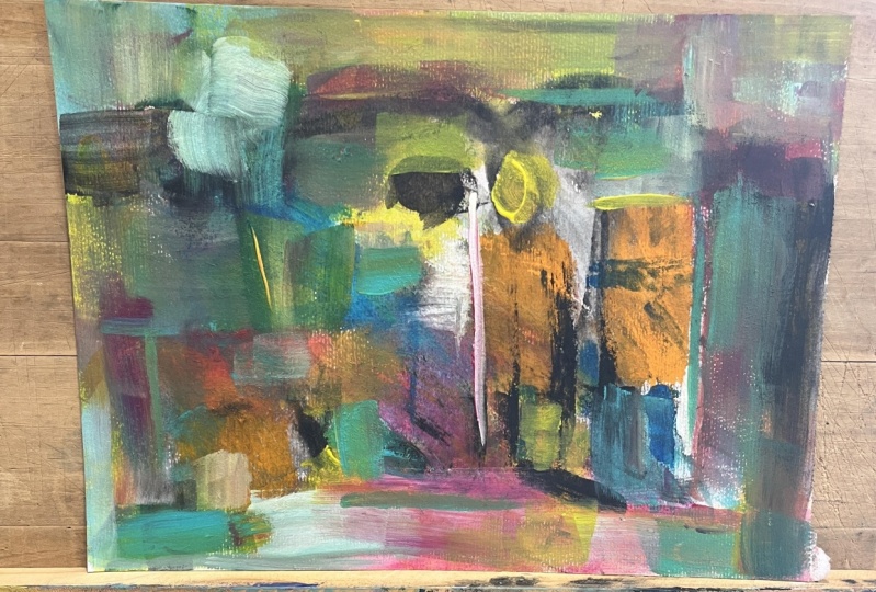
12. Critique and Finish: Here's the finished picture. After I'd finished before, I again took a little bit
of time to go through it, have a look at what
was happening. I've just added a
few little details. Talking about focal
points of tone values. I just wanted to clarify
a few different areas. I don't know what and
see it as clearly as I would have hike on the camera. I've added a few
little just touches. I've put some lines in here. I've strengthened up
some of the yellow, making sure that I've got some interesting contrasts
as you might be able to see. I don't think you can see
the orange too much here. But in flat, there's quite a difference between
the orange and the yellow. I don't know whether
you can see it clearly. Just takes a little bit of time. You need to sit on it and look and observe of where
your eye is going. My feeling now is your
eyes actually going round the picture
and you stopping it. Interesting areas here. There's a nice little bit
of orange coming through, which is contrasted
with the with the blue. And the strength of the
yellow here coming through, but more yellow down here
next to the straight line. So we've got some straight
lines and soft lines. Again, those are
points of interest because your eye will
go to those areas. I've got another straight
line in here and then here, a two here. So it's time to, once you've think
you've finished, go back and really look at it and see where
your eyes going. Again. Take photograph of it, turn it into black and white. Have a look at your contrasts. So obviously this big
contrasts here with the dog, the dog and the dog. But in the flesh. It's interesting the
tones of the darkness. This one is actually
the darkest here. Taking your eye up, coming round, coming into here. When you are looking
at your picture. Just kind of squint
your eyes and see where your eye is going. And then the other tip is
to put it quite far away. You are looking at it from a distance and see what
springs out at you. That's always a very
interesting exercise. You know, if it was if it was in a gallery and it was in the window and you
were driving past, what would catch your eye. That's kind of the impact
that you won't have. Really try and do
that self-evaluation. I know it's tricky. If you've got somebody
that you could ask, ask them, you know,
where is your eye going? Because when we're
involved in it, we've gone through the process. So it's kind of a
bit more tricky to do that self-evaluation. So if you've got someone to ask, do that, you can always
put it in the projects. Because then you can ask for some feedback when you when you put it there and
I can have a look at it, which would be wonderful. I'd love to see
what you're doing. If you want some
some help with it, then please do put the put all of the
pictures in the projects. It's always great
to see them and I really enjoy looking at them and hopefully can give you some
constructive critique. I hope you've enjoyed doing this whole exercise
on color mixing. It's fascinating and
there's so much that we can learn from using our colors and then using that
within paintings with our tone values
and our focal points. And there's a little extra
to help you with your color. I have a little e-book here, I hope you can see it. It's called five
great tips on color, which you can download
for free on my website, which is a joy Fe artists.com. You might find that
helpful to run alongside with what we've
been doing in this class. So, thank you again and look
forward to seeing you soon. All the best. Take care. Bye for now.
 Joy Fahey, Joy of Art