Transcripts
1. Acrylic Landscapes Introduction: Hello and welcome to this acrylic landscape painting course. I'm Joy Fe and I'm an artist and teacher. And I've been painting a teaching for many years. And I'm really happy to share this acrylic landscape painting course with you. It's going to be in two parts. The first part is going to cover all the basics that you'll need to know, particularly if you're a beginner and you're just getting started, it's a little bit confusing of, you know, what to do and how to do it, how to use the acrylics, how to do column exceeding what brushes to use, what to paint on. So in the first part, we're going to go through, do these three paintings that you can see here. And I'm going to take you literally step-by-step, stage by stage. So you'll know exactly what to do and how to do it. So I'm very excited to share this with you and have some fun painting beautiful landscapes. It's the follow on course rarely from what I've done with the abstracts. And quite a lot of people have asked me, they would like to expand their learning from doing the abstract painting. And this helps you to give more structure and understanding of your composition, your turn value, and how to put a landscape painting together. So without further ado, let's get started and do these lovely landscape painting. So I'll see you on the other side. Okay, Bye for now.
2. Materials You'll Need: Okay, so now I'm going to show you some of the material is old, all materials that you will need for the course. Now, you know it's important to really get prepared and have the right the right tools available. In a, it's very difficult to put a screw in the hall if you haven't got a drill. And it's very frustrating to get an effect in your painting if you haven't got the right brushes, It's important that when you get set up properly. So let's talk about the colors to start with. Now I've got basic colors of cadmium red, ultramarine blue, and cadmium yellow. But I've also got some interim comes with I think you'll need this is a civilian blue. These are magenta and green to red and Mrs. answering crimson. I've also got a lemon, yellow and yellow ocher. And I've got an orange color. We can make orange, but it's easiest if you got one and white, we use a lot white, so you need a hint white. And then I have an extra colors. I've got a sap green. Sometimes we use it, sometimes not. A burnt sienna. And also I've got a phthalo blue. So you can see I've got all victims here. You don't need have, you know, get the big tubes. You can buy lovely little sets. Here's one from a set that I've got from Amsterdam. You can get your basic colors and then get a few extras if you need to. And I've got various makes here from liquid tags to Amsterdam, Goya. You know, it doesn't, doesn't really matter if you mix them up, but try and get the first quality as you can. Good student paint is absolutely great. Get the artist's wall even better, but you don't need to. But you've got student parents particularly I think out of Sudan there very nice pigment and that does make a difference. And third, pigment isn't strong. You have to use a lot more paint so it sort of counteracting if you like. But you can see I've got a different collection and that that's fine. But you don't have to spend a lot of money on getting your good selection of paint. Now let's have a look at how brushes. So an palette knives, I've got an array of brushes here. Again, you can get these insets and they're not too expensive. I've got here some flat brushes ranging from big to small. And I love these soft bristles and they're really lovely for acrylic painting. Then I have some round brushes, different kinds here that I like using. These are a lovely shade and really nice to use. And these are fine for more detail and more details still, which is a brilliant brush to have, is a rigger brush, which has a lovely long brush here that you can do all kinds of branches and interesting things with flowers and stems and grasses and things. The wonderful fine brushes, fan brush is a brilliant for highlights and grass again, and wonderful things that you can do with fan brushes. And then I have some flat brushes here. These are very stiff that painters brushes actually, you know, decorators, thick bristles. And they're great for stippling and doing all kinds of great things. Very, very cheap to buy or get them for a dollar, a couple of dollars. And then the same flat brush but in more nylon, softer. So those are all brushes. For a nice collection of brushes gives you the ability to do all kinds of interesting techniques. Now, again, you can get sets of palette knives. These are my favorites that I use a lot. I love these, these ones. The reason I do is if I'm doing the bark on a tree, I can use this edge really well. If you haven't got that, you can also use one of these which will be familiar. But again, you can get these insects, you'll get them in your local store, or you can get them on Amazon. And then I have a small one too. So. Nice collection of palette knives. Then a lot of people ask me about mediums and what to use. And, you know, it's debatable to me here because I live in Spain and it's terribly hot. My acrylic paints dry extremely quickly and they can be very frustrating because no sooner if I got them on the canvas and the drive. So I do tend to use some mediums. I use a fluid medium. Again, you can get these indifferent makes me cause I'm in Spain. This is a Spanish make call, Valais. Whoa, you need to get, but the Liquitex do one, Winsor and Newton do on Golden do one. You know, you'll get different makes. So you can have Saturn, you can have Matt, you can have gloss. I tend to use satin or, or mat. Then you can have a retarded. Now, this is like a gel and this helps again the drying time on acrylics. And again, there are different makes it you can get on this. I'm fairly restricted here in Spain unless I have it sent. But for you Probably it's easy for you to go and have a look and see the different makes. And then I also sometimes use glaze. I love glazing in some of the paintings that it's just the drying time of this takes time if you're glazing, you have to leave it till it's really dry. But as we go through each project, I'll tell you exactly what I'm using. But this is our kind of, our basic paints are basic brushes and our palette knives and our various mediums. Also, I have a spray bottle essential for me here. It's great to keep the the paint's wet. And obviously kitchen roll or all paper towel. Brilliant. I have then different sketch books you can get to my small pocket sketchbook, which can fit in your bag or whatever you can take around with you. Or you can have a big one. I use this for different things. And then let's talk about then what we're actually going to paint on. Now, the wonderful thing about acrylics is basically you can paint on anything provided it's primed and ready to go to prepare for it. So the main thing from preparing, whether it's Canvas or boards, or even cardboard and paper. You can use gesso, again, very easily available in your stores or on Amazon. Then I've got various campuses here for the projects that we're going to do because we've got quite a lot to you. I'm going to be using a 30 by 40 centimeter Canvas. So I've got a few those rhodium lined up. You can use any size that you want to. I just find this good size for the start in on because it's not too big, not too small. And it looks lovely on the wall. So those are, those are the sizes of characters. You can obviously use big ones if you want. Also, you can use MDF board. Again, this is a, you know, you can have them cut size and you combine them. Again, I'm restricted to what I can get here, but and I tend to cut my own, but you can unify all different sizes I've just dropped and form here what I'm showing you, this is a little more on the TI did. This is a landscape that we're going to be doing. And this is onboard. And what I've done, I've put a frame on the back. You can actually buy framed boards already made. But I had this piece of board and I made it myself. But they do need priming, so you will need the gesso to prime your, your board if that's what you're going to use. And then you can choose whatever size you like to paint on. You can also use your card and hit a card that here. You can use this card. This is very nice because then Gesso it and then a competition, a frame, mechanized series of those. So you know that thing, the wonderful thing about acrylics is that they're so versatile. You can paint very basically on anything. Now the next thing, you need something through extra faint, so on. And this is a painting palette. You can again get these in different sizes. It's like wax paper. Or you can use what's paper. In the next video, I'm going to show you how law, if you're in a situation like me where it's very hot, how you can keep your acrylics usable. And you can take them overnight because if you leave them on a pilot, unlike oils, they will dry and then you can't use them again. So I'll show you that in the next video. But this starts you off, gets you prepared, haven't already, you know, you'd ads are so you don't have to buy these big tubes. You can buy a nice little set. Set here. This is a little Amsterdam set the time hall, you know, the tubes are a good size, quite enough paint and very inexpensive. So no longer have to go spending a fortune. But get prepared before we start because we're nothing more frustrating and to get started and then find that you haven't got what you need. So I hope that covers everything that OK. So you need some jars of water. I've got some jam jars here, the TI you. So that will start you off to get us ready and prepared for everything that we'll need in the course. Okay.
3. Keeping Your Paints Fresh: Okay, so now you have got everything ready, your paints and your brushes and your pilot light, and we're ready to go. Now I want to show you how you can keep your acrylics usable overnight or even for a few days. And I've got a few different versions to show you. All easy to do. Very DIY. But I never start off with showing you something that I've had for many, many years. And a bit of a state, as you can see, to It's a palette to keep acrylics wet and usable. And I'm going to show you how to do DIY version. So what I've got here is a white cloth underneath or you could use, and I'll show you some kitchen towel. I've got some wax paper, and then I've got my paints on the wax paper over the kitchen roll and then it's sealed when I put the top on. And just for an extra caution, I put another wet on the top. But I've had this little palette going now the colors two to three days, which has fantastic. Because we have an interesting dilemma with acrylics. They're fantastic because they drive quickly, but they're a nightmare because they drive quickly. You cannot just leave them on the palette overnight unprotected because then you won't be able to use them and you'd be wasting an awful lot of paint. So let's do a DIY version of this. I'm not quite sure what it's even called, but I'll see if I can find it and put it in the information. Because I'm sure you could buy them and then you get this special paper that goes with them. But I've had this for so long. I can't remember. So let me show you how you can achieve this without having to do that. And that is if you get, are just got a small version here. If you get some tapeworm, see if you can get a really big on from the store. And what you will need is some paper towel or a cloth. Cut it to size and put it into your top. We're spray it with water. So it's nice and white. Cut the size of the white paper. And what? I've done all this over, making sure that I've got the shiny side on the top and the shiny side on the option. And then you can put that in your, your takeaway. And then you can put your paints on here, like I've done with that one policy. If you've got a big one, you can put all the paints that you need. So cheapen cherry, easy to do. And then you can see that. And you can keep your paints usable. What Paul edges actually, but you'll be using the painting. He keep adding to it, changing the wax paper over. And it's really DIY version of what I've got. Now. Also, I have this. Now. This is because when I'm working on big things, I don't want to keep putting one paints, help putting my paints out. So I have the site, it will flatten box, which is again very used as you can see. And I have these compartments, so I put my paints in here. Excuse me. So the key and I've got a wet rag, I put that on top and then it's sealed. So that's another alternative. There are different. If you go exploring in the I shop or the dollar shop or wherever, see what you can come up with. Anything that sea level and will keep the trapped inside will work. So that gives you lots of different options. But it's important to do that. So you don't waste your paint and you can keep using it. Day off today or adding to the paint is you needed to her back gives you a good idea. And now we're going to stop using the paints. And so I see you on the next video.
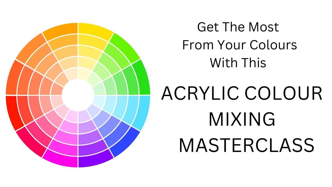
4. Colour Mixing : So what I want to talk to you about in this video is color and how we mix colors, what different effects that we can get. Now, the first thing that I would really suggest you have is a color wheel. Now you can buy less and your local store, art supply store or you can get it on Amazon. I like this one. It's called a guide to mixing colors, the color wheel. And what's great about it is it gives you your primary colors. Obviously are red, yellow, and blue. And then it gives you your complimentary colors. So for example, if I'm looking at this, I see orange here. My complimentary color is blue. And I can turn this around and it will follow through. And these are your triad colors, your enhancing colors, if you like. So you've got the different shades. That's really helpful. A color wheel. But then we come actually into practice. And there's nothing like actually doing it ourselves. But this is so handy when you're working because it's got all these different values and tones, which is great. But here I have got setup here, which is, I would say a basic palette and ones that we're going to be using throughout the course. So I have here titanium white and civilian blue, ultramarine blue, lemon yellow, yellow, ocher, cadmium yellow, burnt sienna, alizarin, Chris, craftsmen, crimson, sorry, yeah. Magenta and cadmium red. So basically our basic colors. So what would be really interesting for you to do as an exercise is to play with these and see what happens. Having a look at your color wheel, it will give you an idea. Now, obviously, if you're looking at this, if you're mixing, for example, and yellow and blue, you're going to get green. If you mix red and yellow, you're going to get orange. So when you, if you, if you make some magenta with ultramarine blue, you're going to get violet, purple. So those are obvious. Water, water isn't obvious, is that if you mix the complementary colors together, you get some really subtle, interesting colors that are wonderful in a painting and gives you different kinds of subtle grays and mu two terms. So it's really worth your while playing and seeing for yourself what you can achieve. So for example, if I was to say, let's go to this blue. We're always really in blue bar here. So if I was to mix the blue and it's very strong list blue. And for the sake of this, I'm going to make a tiny bit of orange. What was out here, but let's have a go with that. Because the red is so strong that streaming yellow first and then see red. So we've got orange. Oil is see how strong it is. A bit more yellow. There we go. So if I'm going to mix the orange with the blue, I'm going to get a really nice muted green. Okay? If I mixed a bit more red with it, see what happens. So you've got kind of Night Alive, sort of muted color. By adding some white with it. Makes it look more blue. You can see the subtle color that you can get from mixing your complimentary colors. Okay? And it's fascinating what can happen when you do that and the different colors that you use in a painting. If you're say, using a lot of your complimentary colors to break the painting up. If you mix those together to have your Your grades, your intro. You've got some lovely subtle things going on and it's helpful for your terms. What I'm going to do is I'm going to include in resources and the inflammation a value, a value card going from dark to light. But obviously haven't got black on here the moment. But whatever you mix, if you start mixing it with black, it's going to go darker as you start mixing it with white, it's going to go lighter. But also if you start mixing it with some of the other colors, you can get different tones. And that's fascinating. It's so difficult to explain. A theory is a massive subject. Really the only way to know this is to do it. And the first painting that we're going to do, I'm going to show you some very simple ways of doing that. So you start to experience it with painting. But to play with it is really what I recommend. You know, what's going to, what's going to be the difference? For example, if I make civilian blue and yellow okra, I'm going to get kind of nice greens, more fat. So that's cerulean blue. And then what would happen if I was to mix it discourses. If I was to mix ultramarine blue with some okra. See it's an, a different, completely different Chang. See the subtlety now in a landscape that can make all the difference. Now let's see what would happen if we added a bit of white to that. And if we mixed a little bit of white with this font, you're going to get different, different tones. If I then added a little bit of the tumbled, she's very, very strong, very, very strong red. See what happens? I'm going quite brown. So when, once you just stop play and you start learning, you start to get the hang of it. And then you can make really he like your own little in your sketch book. Mark down what you've done. So markdown, I've put civilian here with yellow okra. I've put out marine with yellow or CRA. Let's see what would happen if we put, for example, cerulean with lemon yellow, that nice green. And let's have a look at if we put out a marine very strong with lemon yellow, see the difference. Different cities. So you start to build up some lovely colors and especially that landscapes are a lot of green. You've got look at all the different terms of green that you've got going on. And that's basically from four colors from civilian, from ultramarine, lemon, yellow, and yellow okra. So when you start to play around like that, you build your confidence of knowing what colors to use. And the more you practice it, the more familiar you'll become. It'll just become natural. You'll know what to do, which colors to use to get what effects. And you'll know that if you were to mix cadmium red with ultramarine blue, It's going to be very, very heavy. If you're going to mix magenta with ultramarine blue, It's going to be very much more violent. So you aren't really, what I'm asking you to do is to try this for yourself and play with it. And certainly get your color wheel. You can make your own color wheel just off the colors. The reason why I like this is because it's got all the terms. So if I was to look at this, for example, let's go over here. This kind of yellow, green. The complementary color of that is it's lovely. Bright violet here. And if I was to put that into a painting, it brings it out. And one of the rules of thumb would be 80 percent your main color, you are dominating color and 10 percent TO complimentary color. So if we were to put that here, let me show you real. I'm on the second. So we run off green. And I can show you. Okay, So on our lovely green here, we've got our violet here are interim colors here. So this is blue, violet, and this is red. So it helps you struck to your painting. Obviously these are all the warm colors and these are all the cool colors. So again, that helps with getting our balance of our picture. So I hope that helps. I would strongly recommend that you really practiced, Have a play, you can create some nice paintings from practicing. And then in the next, in the painting that we're going to do, I'm going to show you some of this. But make your own color wheel is great for learning what to do. And then if you can get hold of this one, you won't regret it because it's really very comprehensive and helpful. I'll see if I can find a link for it on Amazon. And then you'll be able to perhaps find it. But it's not, you know, it's very, very popular. And most art, art stores, supply stores will have it all. You can be able to order it.
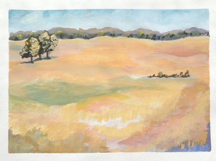
5. Introduction To The 3 Trees : So now we're going to actually start painting a picture. And the first one that we're going to do is a very pretty simple little painting which I've called the three trees, which is here. You can see it's going to help you learn about layering and how to do your skies and the background and the foreground. How you can get some depth and distance into a painting. I've actually done this one on on the cart at really nicely card which have Ghetto. And you can do it on a canvas or on a board, whichever you feel you'd like to. But remember you need to get so at first to give it a good foundation. So let's get started. And may I suggest that you either watch the lesson all the way through or dive in straight away and follow me with what we're going to do. So I'm going to go and get my paints ready and so we can begin.
6. Painting The First Layer : So when we start this paint team, these are the colors that I'm going to be using. I've got to titanium white, cerulean blue, ultramarine blue, lemon yellow, yellow ocher, cadmium yellow, which is causal, a band tambor, and alizarin crimson. So these are the colors that we're going to be using for this painting. So let's get started. Okay, so we're going to start off first little exercise by doing a very, very simple landscape using these essentially are flat brushes. So I've got a couple of large ones here, and I've got the medium-size worn and the smaller ones. So I'm just going to start with the flat brushes to begin with. And We're really good exercises because it'll show you how you can start your layering. Acrylic painting is all about layering. If you just do one layer, it's very flat. So you need to use a lot of paint and do a lot of layers. So we'll start this and you follow along or watch it first and then have a go yourself. It's very simple little painting. And you'll enjoy the process of it because it's easy to follow and you'll get some great results. So what we're going to do before we start is I'm just going to do a tiny little outline of where our horizon line is going to be. So I'm going to put it approximately here. So it will just give us a guideline. Okay? So the sky is going to go above and the fields are going to go below. That just kind of gives us a starting point. Okay? So the sky, again, to make it a very soft sky with a little bit of cerulean blue. And I'm going to put the white out first. And then I'm going to put the blue. And because of lives very strongly can see how strong that is. Okay. And then I'm going to add a little bit of water just to soften it up a bit. So basically what we're doing is we're just going to fill in the sky. Okay, it's just our first wash to start with. Now the thing about skies, and if you have a look outside, if you've got a blue sky above you, the sky is going to be a darker blue and as we recede into the distance, it becomes a lighter blue. So what I've done here is I've just added a little bit of water. Not very much. Remember, this is just our beginning. So we're going to put layers on top of this. I need to add a bit more white here. Hey. So you can see it's darker at the top. And as it goes to the horizon, it's lighter, which gives us a lot of deaths. Okay, so that's really the desktop beginning first wash, kind of blending it in a little bit. It's drying very quickly. As I mentioned, it's very hot here. I'm not using any medium on just using a bit of water. So that's our first wash for the sky. Now, we've worked our hills and mountains at the back. So I'm going to do with that is I'm going to add a little white again and a tiny bit of ultramarine. You can see how quickly that was really strong. And I'm going to put a tiny bit of magenta, not very large K. And then I'm going to add a little bit of the yellow ocher. Now this will just gray down a little. I'm going to talk about color mixing. Well, I just want to get you started painting. Before we get to that stage, can you see how that's grayed down? Let's go bit grayer back in there. So that's kind of a very dusty color. Now if you put complimentary colors together, you will get different tones of gray. So I've used some ultramarine blue bit of white and the yellow or craft. So it's that very muted gray color. But because it's got the blue in it, it takes us back. So I'm just going to put a little line in here, just very gently. Why either the mountains might be just make them Hegel difficulty, you don't want them all the same. Okay, so that lays down our first wash for the three very distant hills. Now, we could put a tiny bit more blue in just, in areas that just to give it a little bit of depth. Not very much. You can see it's nothing it back and just adds a little bit of interest and shadow to the mountains in the back. So blue takes us back, a cooler colors, take us back, the warmer colors bring us forward. So that's good to remember. This taking out of the brush. I'm going back into here and just laying it back on just to see just to give a little bit of depth to the to the mountains. The back, pushing his right back. Now we're going to cover a little bit further forward. So we're going to go back into the ultramarine, back into the CRA. And you can see how much that is now darker without without any of the white. I'm going to put a tiny little bit of magenta and a tiny little bit of yellow and blue together. Don't want it too dark. And a little bit of white, right? Yeah. Right. So we've got some hills in front of the mountains. So you can see here now that's a little bit darker, but it's still muted. So these can be trees and whatever little bit more blue in there. Just so it pushes it back to to to dock. You don't want to to light either. And it will dry and they can lighter. Some little bit of shadow going on. Just kind of gives it a nice atmosphere. And of the background. I'm going to take that off. And I'm going to get back into the FY21. Go get light is still. So you see I'm just playing with basic colors with the flat brush. And you can see already that there's some nice things going on with that. It's not too dark. But it feels as if it's in the distance. And you get the kind of a real atmospheric view. I've got this view from my apartment over to the hills. And really the change all the time with colors. So again, we're just, we're just going first sortie washes. So now we're going to change ALL together because we're going to come through with the landscape. So we're going to put it in now. Some white and a little bit of all CRA not too much, you don't want it too dark because we are writing the background. This is going to come all across. So again, it does give you paint is quite thick here. And actually, I what I didn't tell you when we started, which I should have done. Sorry. I'm painting this on a piece of gesso card, the type Gesso. Right? You can see now the time just I'm locking this in with the outcry. So I'm now going to very tiny little bit miniscule because it's so strong. The burn timber just a little bit attend to it. I mean, hardly a saying. Just to give the breakup the occur a little. You can see that tiny bit more kinda goes quiet. Orangey mix for the FFCRA. We just want some variation. Kinda come right the way through. Now I'm going to go a bit lighter and some white. And I'm going to drop in a tiny bit of lemon yellow just to change it slightly. So you can see. And because the paint is still wet, blending it into little or not, I don't want to blend it too much. I'm putting the paint down quietly sit cleaving itself or swash that this is just to help you understand the nature of food brushes. This is all with a flat brush. One flat brush. So one brush can go a long, long way. Okay. So back into the old CRA. And I'm going to put a tiny bit, not hardly any of several alien too much, too much. Don't will not alter the moment. We will come back to that tiny bit of the blue. And let's come down here. And a bit of yellow and some white. And that's going to be mixing a bit with your crops. So you can see that little bit of grain coming in. Not much, just a little. Just kind of blending it into your code, just breaks up that foreground as it's coming forward a little bit of gray, you can see very little green around me. Very dry here. Water in here, it's drying very quickly. So just continuing through to here. I need some more white. It's just an interesting up here. All right. Okay, so we're going to hear a bit more. And now I'm going to add a bit more lemon yellow. I'm sorry, this down. Can you see how that changes? Because we're coming down to the foregrounds, are pushing back. I'm coming down. I'm going to put a tiny bit of this right? Now. Just a little bit. Make it interesting. And a little bit more. So you see the blues take his back. The warm colors bring us forward. So you can get the feel of that. And you can see how he's kinda changing. I'm just blending that color in. So it's got a nice feel to it. Ongoing. White, yellow. And I'm going to put a bit in the reading. Hello, strong. Okay? So this is just to begin with. I, you can play when you're doing it, you'll get the feel for yourself, how that scaling. So now I'm just doing a bit more texture in it because we're coming weekend to say a bit more texture because it's in the foreground. And I'm going to put a little bit of white into here. Just for some lights. We think about the light coming from the right to the left because I'm going to put some trees in and you'll see that more distinctly occurring here. So you see I'm just kind of playing with it. Letting it unfold as he goes. Yellow light up here because it's catching the light. Green up here. So I want a tiny bit human skill to make green, very soft green. Just blending that in. Really gone quite. Come back against. You see how you can just blend as you go. It's such a lovely, simple little painting to do. That gets you started very easily. So we're going to let that dry and then we'll come back. Once it's dried.
7. Adding More Colour : Okay, so now this has dried. We're going to do the next stage. And again, very simple to using the flat brush. And you know, it's going to be a lovely little painting when it's finished. So what I'm going to do now is I'm taking the small flat brush here. And we're going to just do some extra little details on the on the mountains. And then we'll do a little bit more with the sky. But first of all, let's do the mountains. So they still need to be a little bit more hazy. So I'm going to just take the white again. Paint onto here is dried a little bit. That's okay. And a little bit of the old CRA. And I'm going to do a tiny little bit of yellow. Just a little. So let's have a look. Today's video to really say it just takes a little bit of time to get the right color. But slowly but surely, aid comes straight off. Sometimes it takes a little bit of time. And when you're dealing with just tiny little bit, misspelled it up. Slowly, but surely that's better. Okay, so I'm just going to add a little bit of extra little bits into, into the back key. Say it doesn't make a huge difference, but it makes some difference and points of interest. And to make it just feel more realistic, interesting what the eye does. It answers out for itself. In many respects. I think it's fascinating. I always think how it works. You know, we put 22 together in our, in our lives and it happens oscillating. So I'm going to put a tiny little bit, I might take it out. But just a little bit of yellow. Not very much. So subtle highlights. And just kinda brains the painting alone not doing it everywhere, just in little sections. So light's coming from the right. The light is going to be hitting those those hills to so that's, that's what we're aiming for. Now. Then we're going to do the same on the tree shapes here. But I think before we do that, I'm just going to go over some of them again. So we've got the blue and just want a little bit of the craft or that just to green it down a bit. Here we go. Pushes it back. And you know, those two complimentary colors. So it's a nice dark grayish color just in little areas. We're going to use this little brush just for a little bit of extra definition. Not very much. Again, come back up here a little. You know, you have a look at the distance and the tree's shadow patterns in different things going on. So this is just adding a little bit of extra any trust is concentrating here. And we'll get more into here. And then I'm going to gray out down a little bit more on that to add a bit of white to much more of the old crap. Here we go. So you can see, you know, when you're playing with the color, how, how that comes together. Just a little bit of time. In the distance. There's nothing to take you to a defined. And we're looking at shapes to softening those straight lines. Or either little bit more why? It's very, very soft. Don't want too much paint on the brush. Just very softly. Taking it down. So hazy and the distance and you don't really see any detail. And that conversation you can have going with yourself all the time. And I talked a lot, does it look like? And why do you get the opportunity? You know, same field self outside. Don't really have a load. That was what's happening. And will always surprise. Let's take this down and it'll make it softer. And the distance. And that's a tiny little bit at why, but it's mixing in with the other colors. And just kinda get that feeling of distant trees and whatever going on in the background. Don't want straight lines just a little at a time. So you can say I'm reading using just a little paint, hardly any at all. And just helps keep everything nice and hazy. Phi there we go. Now then come back to the actual land itself. In a way you really look into the distance. Three little color, not too fat. So what I'm going to I'm going to make the back here lighter. So how are we going to do that? I'm going to take my white tiny bit of all crafts. Really not very much at all. Very, very, very light. This light in here, just up to the edge here. So very little to ski consumed already that it knocks it back again. So that's what we want to go for. We want this to be as far away as possible. And just lightly my line up a bit. Lady helps and I'm going to bring this down a little. Wanted kind of varied. We don't want it all the same because there isn't all the same as if it's Gary's itself. Maybe add a tiny bit of yellow separately. And just again, gently may not scrubbing attain you just basically laying it on the top. Just a bit subtle. And every opportunity that you get, don't have a look outside. Just spend some time looking at the colors of the trees and the landscape. And if you've got hills or distant trees, see if you can get a measure. I'm adding a little bit of blue here. And more than adequate a tiny bit of ultramarine. Just literally a little bit. Just to dial it down. That won't take bright. It will mutate. So it's kinda quantity. I'm going to gently go in here. Might be bit dark, but might have to take it down a little bit less. Okay. So I will just put in your little bit in. I'm going to blend that out. Kicking it off my brush. I'm going to blend it out with the light. So you can see here, see what happens. You still got that little bit of color underneath because you're going over the top of it. It takes it down. So you can have a little play with the message, the wonderful thing about acrylics. You know, it's far more difficult to do lab with oil finishes with a chronic, close it all blends together. You have to wait till the layers to dry. Just here. Let's go. So you can see I'm just having a play with the lights at the back where it says subtle changes in the landscape. Very subtle. See how that works. Okay, so I'm going to come down to here. So again, I'm going to take some white, tiny bit of that red miniscule. Many skills off too much, not so strong color. And, and that's because why backs off with a nice cuz it's great to have a dynamic, sadly, the start of the trial. But we got there in the end. Try again and again in yellow. So this is kind of becoming down to here. So we've got those colors in the background. And this is, this is coming through, the light's coming through. I will go because we've got this nice base going on. We can, um, scumbling it across the top for some, for a bit of extra texture. I want to get some extra light coming in here because the light falling on this area and it'll just catch. And I wanted to go a little bit darker. A little bit darker here. So strong electric field crash with it. So I'm going to be blending these two into this area because we want to have some interests. So can you see this? I'm I'm just blending it in a bit. So we've got a feel of texture. I'm now going to feel crummy. Can see what's happening. Just causes some interests. You know, it's a landscape is just one color, or it's a combination of colors. And ask for coming down into, right down into the foreground. Then it increases in depth and darkness. So we want to kind of capture that down here. I don't see how that's looking now. So we're going to go a bit darker into the right and to the corner here, it's going to go quite bluish. And that's really quite dog. And then we'll blend that out a bit. And I'm going to integrate and locked. I'm going to add a bit of water. This is going to come down here and we're going to blend it out. I don't want it too strong. Push off. The yellow bit more white, space out a bit. Still go back to our companies. Just gives us a little feel of what's going on here. And then I'm going to blend. Again. Lovely, lovely saying about the critics as many times as you want. And you notice he's kind of building up the layers. You can see how this begins to work. A little bit of the girls say you don't want to worry if you make a mistake, just let it dry and carry on because some things came to home it. I want to go live. And the yellow, white. What kind of light coming through here? See how different outcomes really interesting will happen. He's not how that works. Nicely, lights coming. I'm still a little bit of the dog come up for us. So it's nice how it, how it kind of link those together. Partly color. So just capturing highlights of the sun's highlights of the sun again. I want to go darker then into this area. And we can put the trees. And then we'll be finished. Let's go into this other corner. So again, a little bit of a dog in here, which is a blue or red. And it's interesting how to put a bit of this dark in here to how this happens. Now, we haven't talked about composition yet and we will do. I just kinda wanted to get you started painting and get the juices flowing before we got into composition. But if we look at and the paintings, But one to bring the eye into the picture, we don't want it to go out. And a way of doing that is through. If we have our corners a little darker, then it keeps are in the picture. That's what we're aiming for here. He's keeping all eyes on the picture itself. Coming through, I mentioned a little bit of a dog coming through. You see how this is landing. And the further you come forward. Now you start to see a little more texture with some flowers and that we won't do that now and do that on another page. And then if you have a look here, I've got a complimentary color to the lilac. So it gives it a nice little boost. I think that more definitions and not out. So you can see you just exploring all the possibilities and these color combinations and lovely crazy lemony yellow. And the light's catching the paintings and deaths because they've got those layers haven't way underneath. It helps us when we come into layer on top because we still see some of the things that term the nice, lovely weekend as well. I'm touching it around and say, why? Don't wanna go too much writing because we're not careful. Hi, I'm keeping it. Real crowd. So you can see how we've got a really good distance scaffolding with the painting strong colors at the front, but they like the colors at the back. Putting a few highlights here, laughter for the sun. And I'm using yellow and white rather than just whitest. White gives all the light. Really more yellows and pinks that give the light rather than whites itself. And then there isn't pure white to nature is everything is a reflection from the sun. So if you bear that in mind, then you'll avoid doing white only for four selections and light. See how that yellow fix up some. Okay, now, now let's put the trees in and gives the painting and extra field of interest, which is light coming through here. Completely DO capturing light and be catching light down here. So homework is to go and have a look. Maybe take some photographs if you can find some, some pictures of shadow patterns, shadows of the trees. And then really have a look at the color of the trees. You know, everyone, Let's assumes that they're green. But actually when you start looking, there's quite a lot of other colors going on in nervous blues is right. And all kinds of interesting things going on. So when you go and have a look nice sink, how many colors of green? There are hundreds of columns of green. And there's not just one green. And you have a look at the shadows. You have looked at the light, the brightest light, the middle light. And it's fascinating. And unfortunately, are we taking French across? It's great. Take photographs. Photographs. However, you don't get the whole range of colors from a photograph. Okay. Print to leave that for now.
8. Final Details : So now we're going to get to do trees and a little bit of shadows on the trees. And then just bring this over a little bit. So I'm going to take a little brush and just have a look what I've got here. And to show you. Yeah. So I'm taking this little brush here and we're going to put, we're going to put three trees in here and put a small 12 other medium size warms. So to start with, it is going to go for a dark color. So we'll go to ultramarine. And the red. Not all give us a nice kind of learn color. And I'm going to promote better all clarinet. So this is really delicate. And you don't want too much paint on your brush. So I'm going to put the first one just about here. Tiny second one, just a little bit behind. And the third one here. I'm going to put it a bit closer. So they're not just evenly spaced. We just got a little round brush here, just a little one here. And so I'm going to say that these are like olive trees really. And what we're going to do is just give a nice outline to them before we actually do in the color. Now with the trees. Rule of thumb is to go from dark to light. The darks in first. Then let's do the other ones. Quite a lot bigger than that one. And that's going to be behind. So I'm again using the flat brush. And then let's do the next one. So I've done these in sort of a dark, dark sienna color at the moment. But that can all change when you'll say. Okay, so that's just the base. While stops drawing. What we're going to do is we're going to put it a little bit of interest here. Now when I was talking to you about composition, we want to be, have something interesting to look at. So she's coming in. We wanted to kind of go round. So he put something here. If we put something in here, it will make something interesting. So these could be these could be little bushes, like little trees and whatever you will drive him to be. So I'm going to get pretty dark green on here. So is ultramarine blue and cadmium yellow. Now I don't want it massive. Just a hint of what it is. I don't want too much on my brush. So just very gently decide where it's going to go. File it's going to go. I don't want it on the same level host of the trees. So it could go bit higher or we could go a bit lower. So I'm going to go just about here and just gently put some marks in. Fairy hazing, justice kind of inferring something nice with a grove of trees. And then we don't want to just kinda be floating. Detail some of the paint off and add a tiny little bit color and sort of hazy hazy grains. So let's just spend to go underneath. So I did that. Is that green and added some more intimate. Now, can you see how soft it is? Really soft. Just intimating. Color again with some white gives us our beautiful, kind of hazy, lighter color. And just gently, which is a little bit of that down. Now with the same color. Although we haven't sorted the trees out yet, I'm going to do the same under the tree. So hazy color. Again. Now we could make that a little bit darker. So let's just add a little bit to that. Keeps coming out here. And it's coming out here. Going on phyla tree. I didn't want to heavy. There was nothing about his paintings have a very gentle What's going on under the tree. And then we might describe a little bit of light. Just a bit on these, I'm just dotting it on just so we know that the light's coming from here. So now let's go back to these trees, right? Go back into making some darker green. So I've got this pillow and a tiny bit of the cadmium. The dark is going to be kind of underneath the tree. So we'll put the dogs in. The dark is coming under the tree. Here. The tree. So you can, you can see it's going to kind of graduate up to being a little bit lighter. So I'm running a very small cadmium yellow and blending into into that. So let's do this 1 first. Let's do this one. Here. We can add the lights and trial for. Now. We're going to make them interesting. I'm going to take the cadmium yellow. Now we go right to the light's coming here. So we're going to have the light happening to this train and this trays in front of the other two. Can you see me directly what's happening? It's catching the light. So we've got a light coming on to this one. And I would call the light onto this one. So you can see how the taking shape. You can see the light and the dog. We're going to go one step further. And I've added a little bit of white to this. Now, this is going to be even lighter. And you can see how the shape of the tree starts shaping up. Because it's really light, really hitting the light. That's the effect that we want. And I'm just dotting it just very gently and is still going to be capturing light, but not as intense as the same. The same with the top of this tree. Because that's going to be catching the light. And then obviously this one. So you can see how you can build those trays up on how you can get to apply. The sun shining. This is our mid-tone. So put a bit of the midterm back in here. Now we want to go, I'm going to go into and make it extra dollar. So you've really got the feed and depth of the tree. This one, K. See how you build that out. And that looks really interesting. Let's just put a few more lines from that. Let's take some little bit of time to get it absolutely right. Patients. Patients. This is just the yellow. And a little bit of why I'm putting a bit more on here. If that is true. I go back into that tendon second. Now that is also going to be just touching your trunks of the trees is very, very small brush, but a tiny little brush here. And with that yellow. Just a bit. Okay. So tiny, tiny bit of highlight on the side of the tree just kind of gives the illusion that the light is hitting. And then what we might just do. I don't know. I think it's actually quite nice. I think. Shadow underneath. Let's just do that. So I'm going back to the smaller brush again. I don't want it too heavy on the feel of how that works right now, then the only other thing I feel that we need to do to this, a little bit more to the sky. I feel is Kaiser, but it needs a little bit of extra long coat on nasa. That Cisco back to that. Brush is clean. I'm gonna take this flat brush and I want the white dry. It just gives us some of the light. Blue. Yeah. Okay. So just very gently into here and if you want to make few clouds, make it a little bit buried, then go for it. It's kind of quite nice How sky can just something to add some more white allies again, kind of blending in. Sky. Might be a few hazy clouds looking around. So we can put some of those. And if you want to Skype at all depths, materialistic, everything lives up to our imagination. About more white. In here. You get the feeling is clouds, but we just have a look, see how it feels. You know, you can always come back. Make adjustments later. But I would say That's a good start for a first painting. And I think if you followed along, you are live enjoyed that using the flat brush. And I'm just looking at it now. I don't like this white area here. So I'm going to change that bit. It's just a bit hitting us. All right. I want to take it down a little. So I'm going to go on a little bit of white. Here. The challenge is that the hate to light. We've got a few little mice terms going on here. Not too much. Just come back into here. And I wasn't happy with that. Scared about it a bit sooner. Because it's building up the layers. It gets easier and easier. Yeah. That's better. So you can see, you can just have a little play around with it. Really happy with some coming out from the tree. Next speculators net. Right? Okay, so I hope you've enjoyed this first lesson on a very simple, pretty little landscape. And that's going to give you confidence now to build up to the things that we're going to do. And we've done it 99.9% of the time with the flat brush. So good luck with that, and I hope you really enjoy it. And I'll see you on the next video.
9. Inspiration And Composition: So in this video, what I would like to talk to you about is why you get your inspiration from how to set about Dewey's, your paintings. You know, it's all want a good learning how to pang, of what are you going to paint? And this is the key point for any cell. I want to talk a little bit about where to find those in. And then I'm going to go on to talk to you about how to do your composition and composing paintings. So we'd get our inspiration from all kinds of things. When I first started painting many, many Helsinki, my idol, and who remains my idol to date is William Turner. William Turner is one of great Britain, is most famous landscape artists and watercolor and oil. And he was my inspiration. And my teacher at the time used to say to me, which I've stayed with my entire life as an artist, is, if you are studying art, go to the master's, go and see the true master painters and look at their paintings, study their paintings. And in those days, he used to say to me, go and copy turn. Well, that's an impossibility to say to the date, but it was a really fantastic exercise because it showed me how he was putting his colors together, his tone values. Here's a conversation where the light towards the reflections, the shadows. It was a fantastic thing to attempt to do. And it taught me a tremendous amount about painting landscapes. And obviously, you know, we're out and about in our landscape, wherever you might live and you know, you could be anywhere. I'm living here in Spain in the area and the time in at the moment it's quite dry and desert that a hub, beautiful hills and mountains and stretches of land where I was living before it was very much more green, lots of woods and forests. In fact, this painting you can see the hind limb was one of the woods I used to take my dog for walking with a beautiful pine trees. So obviously you can be inspired by your own landscape V8 in a city or in the country, no matter. But what you want to kind of be looking at is really looking, looking at nature, looking at trees, looking at, wow, looking at shadows, looking at color. And we tend to just think about, you know, trees being green, sky being blue, grass being green. But it's a multitude of colors. And when you go and have a look at the masters and you see how they have interpreted their landscapes. It gives it a tremendous insight and scope to explore and experiment ourselves. Now, for me, when I was living in London, I used to be very fortunate to be able to go and look real life paintings at the Royal Academy, at the Tate Gallery, the National Gallery, and all other exhibitions. And if you get the chance, and if you're in an area where you can actually go to a gallery and look at real life paintings of the masters, then it's really worthwhile trip. If not, you know, the Internet is amazing and we can go and visit galleries on the Internet. So go and have a look. And then we're tiny. Do is some of the paintings that I love. I then print off and put in folders. I've got, I don't know, dozens of folders. My inspiration of other artists, of photographs, of things that I've seen myself. And I keep them as reference and use them as inspiration. So that's what we're really thinking about, is inspiration. What inspires us. What is it that we want to do this course for? Because we loved landscape. So it really, being an artist in this way is fantastic because it opens our eyes to look and to see things that we would normally just kind of glaze over. So this is a great opportunity to go and have a look at the masters. I'm going to show you, illuminate some of the master painters that I love. I'll show you, and I'm going to show you about composition. But go and have a look, see who you like. You know, why do you like Manet? Why do you like bang golf? Why do you like constable? Whoever it is? Why is it? What is it? Is it the color? Is it the atmosphere is romanticism. It could be numerous things. And what do you want to embrace into your paintings? So use the Internet if you can get to galleries, fantastic. Get doing some folders of your inspiration and then you'll never be short of subjects to paint. And you can look and senior or I can put that in here. I can put that in there. And I'm going to show you now how you can compose with composition, those, those inspirations. So you get really lovely paintings. So let's go and have a look at that now. So basic composition, It's really very, quite, quite straightforward. And the easiest way to look at it is to think about it as what's known as the rule of thirds. What's the rule of thirds? Well, if, for example here we just showing you how I do it in pen. So you can really see it. I've got the outline of my picture here. Just going through it. I've got things underneath there. I'm going to show you, but I'm just showing you on top here. So here's our picture. And we're going to divide it into thirds. So I'm going to have a line down here, line down here, a line across, and align across. So we've divided it into thirds. Ok? Now, what we want to be thinking about is our composition in relationship to this. So these could be our focal point, so our interests points. Okay? So what we're, wherever we're going to be placing something in a painting, we don't want to plunk it right in the middle. That is a tendency is to go for the middle. The reason why this works is that it wants to take our eye around the painting. We just, we don't want to go into the painting and out. We want to go into the painting and take a trip around it. So we could choose this area to make our main focal point. And then we could have other little interests in the other areas. But we could start coming in here and taking ourselves around a picture. So when you're thinking about any painting at all, think about your rule of thirds and your focal points. Now, I, for example, took this photograph of my landscape and outside. Now, I did this one deliberately because this tree and this bush is dead centers have composite compositionally. It's not terribly pleasing to the eye, bit boring. So if I was going to use that knows a reference because I liked the land and our lightness sky and light, the background, the foreground. But I could change this around. So I could move this tree over here. I've got artistic license to do that. I've got another really interesting tree here. So I could put that one in here. I could move it. I'm still using the photographs as a reference, but compositionally it doesn't work like it is. So we can change it around. Okay, when you've got this as a reference, when you come to do your sketching, it's going to be very much more helpful for you to decide how painting is going to be laid out. If you've taken whole load of photographs and you wondering what swapped, then this is a really good way to start organizing it. So it, it becomes easier to paint and very much more pleasing to the eye and composition in the correct. So that's, that's number one. Number two is then 23 thinking about where your light is. Because if you know where your light is, then that, That's also very helpful. So say for example, I've got two boxes here. Just outline so you can see them. Right now. I don't want just a bland light. I want to know where the light is coming from. So for example, on this one, if I said the light was coming. From here into here, if I was to draw a tree. So let me just hang on a second terms round. I'm going to draw a tree here. And another tree here. Okay? So Roman trees, my light's coming in from here. So all my shadows going to be on this side. It's going to have a shadow here. Shadow here, shadow here. Okay? And if I'm thinking about my rule of thirds, which is here, this one, I haven't put it in the middle, I thought a little bit of space in between. So it works like vice versa. If I was to have the light coming in from this side, then it's going to be the reverse. So always no way your lighters. And compositionally where your main point of interest is going to be. Now, we've just done this little painting of the three trees. And if we haven't looked at this, you know, our interest is coming up to here. We're coming back because we've got another point of interest here. And because our corners of dark, it keeps us in the painting, right? So composition and it works. Those trees variety in the middle, all you can look out was the trees. But as a tears, you're coming in looking at these three trees, which is taking you over here and down here and around the painting. So it works. Now then I talked to you a little bit about master paintings. I've got a fantastic book here that I use. All the impressionists, if you can see now. And I've just chosen a couple out of here. Let me see if I can open into the right page. Okay. This is a Amman, this one is a Monet painting. Now I just have to look at the composition here. See, see how that's working. Scott, his focal point here, but he's got a mother interests coming over here. You can see how beautifully that put together. Yeah. Now, even on this form, you've got a pair. There's the lights right in the middle. But look what's happening on, on the other side. You've got this nice focal point here and a reflection going on here. So when he is felt and go and study the masters, you can see how that's working and use that as inspiration. It's this one here. This such an interesting one to be inspired by the do this with different trees, different colors. But you could use that as your composition, as a kickoff to start with and have a very successful painting. Let's go on to something else. This is a little bit different, but again, you have a lovely focal point here in this, in this picture. Right? You've got interest here, but you've got it coming up. You got to pay interests on here. And then the lovely sky and the sea. So it's keeping you in the painting the same, the same on this side. So when you start looking at all these different artists, they can really give you some fantastic guidelines. These to save land. Form this up for you. I'm a great fan of Cezanne. Well, I loved, loved them know. But anyway, you see how this works. You've got focal points. There's nothing kind of dead center. You've got something interesting taking you all the way around the painting and these beautiful trees here and the landscape in the background. So really what I'm saying, go and have a look at master painters to get inspiration. Even I even advise coffee and some of them, because it's really, really helpful to do that. And then when you come to your sketches, be take some time to sketch out your pictures. Where's the light coming? You know, you might have your horizon line here. The light's coming in this way. So if you're doing your trees and you've got things happening, you know, your shadow is going to be on this the side. On this side. If you've got some bushes going on here, the shadow is going to be on this side. And then your light is going to catch all the edges. So make sure that when you do your sketches, you make sure that you've got your thirds going on. And you've got things happening in these areas that are of interest. Don't go dead center. It doesn't fit. It works with abstract painting for sure. But it doesn't work with landscape painting. And you want to whatever photographs you're taking or picture looking at, adjusted. So you're using those areas as your interest and focal points. Know where your light is. So you'll know where your shade is. You'll lower your shadows are, and you'll be on the road to success. Right? So now let's carry on with our next picture, and hopefully that will all make sense. But I get very excited about talking about art and you know, this kind of thing because it's so inspirational. And I hope you found that inspirational. Okay, let's carry on.
10. Countryside Painting: So now the next painting that we're going to deal with and to broaden our techniques and broaden our learning. And this is the painting that they're going to do next, this lovely landscape here. So we've got beautiful sky and the distant mountains, which we did in the first painting. Coming through with the fields and some nice trees and flowers. Looking at the lights and shadows. I'm going to take you stage by stage through this painting. And we'll have some fun doing that. So I'm going to go and get prepared, and let's get started. So today we're going to be working off this sketch that I've done. It's a little different oh, different way of approaching it. And if you're out and about and you've got your sketch book, then you can do something similar. So this is a kind of seen antibiotic to and we've got some different kind of trees and fields here. I meant to put some flowers down here at live in the foreground. So it's going to be in a different interesting way of working from what we've done before. So with that in mind, I've got my canvas here. And what I'm going to do just for a little reference is I'm going to just painted in very gently the basic outline. I'm probably going to paint over it, but it'll just give us a little bit of guidance. So I've got my distant hills in the background. I've got then some trees and bushes in various things going on here. And I've more or less got my horizon line here. Okay? I've got a very big tree happening here. And of course, once we start painting, another one here, we'll go over this, but it just kind of starts to dissolve. Things in front here. And the landscape comes down here at an angle. And then the path is going to wind around here. And here. Just going to come around here a little bit in the middle. And there's going to be some shadowing in here. There's some fields going on here. And we've got a big tree here and here. And then two, sorry, three, lovely vague pine trees here and here. So that kind of gives us a starting point for, for the painting. And as I'm going to put the sky unfair, so I will go over this, but I just wanted to give you a different way, a different approach of doing the painting. So we're going to get our base layers in to start with. And then we can build it up. So we'll start with the sky and haven't done much on spies. And we're going to have a few clouds. And so I'm taking my flat brush here. Just dump it off a little. And I'm going to take a little bit of civilian blue and some white. So again, we're using the same, the same colors as we've, as we've used before. And see here I've got them on the palette. So I've got alizarin crimson and phthalo blue, cerulean blue, ultra marine blue, lemon yellow, cadmium yellow, and yellow ocher. So the colors that we've, we've, we've already got, so we're going to use, so for the sky, I'm going to mix some of the white and a little bit of the blue. Don't want it too strong. You see how strong that cerulean blue. So when we're looking at skies about, as I've mentioned before, the upper part of the sky is where it's going to be the darkest. And as we fade back into the back ground, it goes lighter. Now, I'm. I'll sort of go round and little bit of these trees, but I'm not worried about the detail. And I'm just basically laying my first my first coat because we're going to go over edge of this of this mixture. It doesn't have to be too thin. But we're going to build a tower. It's nice to get a good layer on. And then it gives you a nice foundation for the rest of the painting. So as I come down, I can work into this a little bit more. And we can get sort of lighter as we go down. Just add more paint on here. You'll be able to get the feel of it. So we're going to be working down a little bit more with the y, with the y to color into the background. It fades. See how that's working. So that's kind of like call base. And what we can do is sort of started intimating a few clouds. And again, we can build this up. Then just whistling the brush. But just the intimation of clouds with that into building up layer by layer. May use your imaginations. How the clouds are fading away and learning through the sky. So it kind of gives us a little bit of an idea of why LB, which we come back to later. So we've got our sky in right down to that line. It's going to be a bit why behind here? Because it's saying the distance, light behind here and distance. Okay, so that's our start. Now we've got our hills in the background. So we're going to change from the, excuse me, the civilian blue, the ultramarine blue. So it's a cooler color. The ultramarine is much cooler than the civilian. And so we're going to put a little bit in our 10 and a tiny bit of ultramarine with a tiny bit of alizarin crimson. So it's got a slight kind of Laila t field to it. Sorry, I hope you can see that here. So I've put some ultra marine, obviously the white and a little bit of alizarin crimson. Just gently in the background. We'll just go into my knee. Males at the back. A much wider tree. So and then I might just add a little bit more white to it. And you got some intimations there, which again will build up as we go. But it would just kind of blocking in at the moment to get the feel of where everything is. This will be covered with the trees, but now that's fine. And it might just come slightly, slightly darker foreground here to get the feel of it. Okay. And then coming down to this first level of trees, and I'm going to do the ultramarine blue again, a little bit of lemon yellow and a little bit of that mixture. So ultramarine lemon, yellow and white. And we'll just putting the trees and bushes. I just want to get a coloring to start with a towel. Now, in this picture, the light is coming from the left side down. So light is going to be hitting on the sides of the trees so that these side of the trees are going to be darker. So that is one of the most important things that you need to establish when you're doing your sketch was the light because the light will make all the difference in the world to your painting. And if you don't know where the light is, it's confusing and it tries it out. If you've got the light, you know why the shadow is. And that makes the whole painting come together. So let's just add a little bit more green to and to put a bit more blurry mat to come here for some of these bushes. And again, this will change. But we just want to get some background. And again, it'll for the trees. So stay with that. My dark color. So our tree shape. So it's lighter on this side because of the sun. It's going to be lighter on this side. And then we look at this tree. Now, it's coming here. It's going to be hitting slightly differently because you're going to get the light also on the front of it. So this is coming down here. Again, paint. And then on the third trees. Similar. Obviously we're going to do all the different tones. Once we've got the base color in settlement's coming down here, coming down here, down here. So we've got our basic shapes and where our light is going to be a k. So now we're going to come into the land. So this part of the line, we're going to go a little bit more to towards some yellow ocher. So I'm going to make some yellow ocher and some white. And just listen here. Might come across to here. Now we're going to graduate into more of the green. So I think some of the ultramarine and the basic lemon yellow. This nice tone, dusty green 1010. We're going to be putting this one in the background and shadow in it as well. So what we shot as in a minute. So again, just blocking in a bit more related to that. And we'll go to this side. So you can see I'm just putting an ice first layer on to give us a guideline of what we're doing. And this helps you structure the painting. And then when we have a look at the converse, what we wanted to lie. We talked yet too much about composition, but I will do now. And I've just added a little bit of cadmium yellow to inspect here. This is going to be automotive little flowers. So when we're looking at our composition, the easiest way to look at this in a landscape painting is what's known as the rule of thirds. What does that mean? The rule of thirds is if you divide your Columbus into thirds. So I've got a third here, the third in the middle, and a third at this side. And then if I divide it again, I've got a third here and a third here, where those lines cross. So more or less here, more or less here, here. And here are what we call our focal points are points of interests. So we are going to deliberately put some accents to enable us to walk around and feel into this, into this painting. I shall put a little roll out. I'll draw it out and put it in the information. So you can see dynamic symmetry is another way of looking at composition, but it's far more complicated. But it's about allowing the eye to stay within the painting. So you want to get the feel your eyes coming round and exploring the painting. And I don't want to the complicated because it can get very confusing. Color theory is a massive dysfunction linked. And it's not something that I'm covering here. But needless to say, we need to have some idea of composition. So at the moment our composition is coming through here. Here. So we want to say what the Cloud, so now our eye to come back round when we put some interests down here. That's what we'll be able to do. So, so just for the time being, we're blocking in and finding our shadows and all light on this game to put a little bit more up here, into here to here, to here. And really when you're doing any painting, what you want say there are your, your shapes. What are the shapes? So we can see auto basic shapes are here and what our shapes are here. And that helps you to simplify putting together any, any painting that you like really. And when you have a look at the trees outside, just have a look for that shaped. What are their shapes and the triangles are the cylinders of a half circles. Just be kind of having a look at what the shapes are. So nowadays just put a few of those and shadows. So I'm putting a few shadows in the back tree here. It's going to have quite a lot of shadow underneath here. And it's going to be a lot of shadow here and we'll go, don't call it that. Once you get to the actual painting, painting is going to be a lot more shadow in the background here. And then there's going to be some shadows on here. Shadows here. For me this week going from dark to light. So we'll be able to make this a really interesting trees with an IMC already you are getting a feel of why the light, the light and the dark is obviously called shadow over here. Well to shadow and it's going to be in a quite a few shadows on the here so he can we can fill those in now. We're not doing closely. You can see I'm just tapping your desk gives us a feel of different things going on. In our got some shadow coming down here. So I'll put a few shot and patterns. And here the shadow patterns in here, just to kinda break the piazza. And then we're going to have all the CFE and shadows under the wild grass is odd, but we'll work on that as we go on here. So that kind of gives us a good starting point for the painting. So we blocked everything in our, everything's going and it's giving us a little bit of a plan. And it's lovely to work from the sketch. Were also taken up with doing stuff from photographs. But actually, you know, working from sketches in using your imagination. There's nothing quite like it really. It's a wonderful way to really expand your art and your understanding of how Ofwat's lot. So I'm really would suggest that something that you, That's something that you do. Because it will help you really observe what's going on outside, rather than just looking at photographs. Go out and actually do a few sketches. It's lovely to do anyway, you sitting outside and enjoying the whole thing. So I think it's a lovely way to paint. Now I'm just going to put a little bit of color in here for the path is going to be quite light. And as you probably remember, we're going to use for that some of the white and some of the yellow okra that comes in to here. So everything's then it's got a nice foundation for us to to work on. Now notice I'm not using that stippled brush at the moment. I will do, but just using the flat brush for this one. Okay, so that's all nice foundation of the beginning of this painting. So I'm just going to let that dry off a little and then we'll come back and start doing some more detail.
11. Adding Shadows And Light: Okay, so now let's try it. Now let's hop back on the sky. It's top, which in the second layer, I've got my flat brush here. I'm going to use this blue and white sought. Don't mix the colors up. And so we're going to go back into the Iridium, knew the client. Well. So you can do the same. We'll start again at the totals. The lovely thing about it is when you've thought limited palette like this, you can easily find teal colors, again, important that, you know, you know what kind of CPUs. So I keep stressing that because you need to have the palette that you can easily find again. So when you're doing this, if you haven't gone to China inch. So you can see I'm just darkening up top. I've got quite a lot of paint to my brush. Not worry too much about a child's times. Zeta. So I'm just coming around these trees in their toe. And then we'll end with some of the light to it and see how that changes as we go. And if you go outside has happened and you've got some blue sky outside, don't have a look at what the color is. What the colored race, I love you. And then what a colored rays and the distance. Because you'll see how much stronger when the line, the distance, sorry, looking at files. And then you'll see in the distance how that changes. So it's a nice, interesting subtle change. All of these kind of blending this individual down here. And no osteopaths like you can you can do this. Not any opens. Just coming down my tech. And because he knew Denise, it's going to come through anyway. So and I'm blending that backend. It's going to be doing that. So you can see how that works is as these Iridium below, thanks, beautiful sky kinda fading into the background color that I really get into here to here. And that's blending back into dark blue. See how that works. I know got a nice wiring of the sky. Nice field. Okay, so I'm going to change the financing. So I'm just going to go into my wife's tiny, tiny bit. It might pick up with me, which is fine. And we're just going to dab this in. I'm because the paint is still wet, we can get some nice we can get some nice edges, soft edges. I mean a 1D, have a look at the clouds and kinda whiter middle and they are on the outside. So again, it's your observation that will help you very much with the clouds. And you can see how they work. Because little dots around where each way the winds blowing. It's wonderful. I love line clouds. I think I need to be long-term TO as psi.com, the top lighter in the middle. And then you get a feel of density of the clouds in the middle. Fills this out. I'm just twisting around with the brush. So you just get a feel right. Now, let's move to the mountains again. This time where ultramarine blue and light green. To get that nice tone of the skies, I've done mountains, hills lack. Which is what makes so that's ultramarine blue on the terrain, Heisman, Iverson, and white. So just gently again, going strong. I am just gentry hearing and the child. These these hills and the guest. White at a nominal dependent on what your landscape itself, but a lot of hills and mountains around me. What inspires you why Neil King outside? What? Mortician the landscape, maybe it's buildings. And that's another lesson altogether. These in here. And say you'll see them. And k3, the back, the back here. But it's covered up by a stolen. So and obviously we've got light forming a moon, so shadows and lights, and let's put a few more shadows in. Thank you. Slightly darker areas because he had an old kind of multi pickled analyzer. The hills. And also you've got the shadow patterns from the clouds. Yeah. Sun's coming this way. So you came to have patches of light on the top. And it's wonderful to me, about 80. Writing makes you look on your outside. We don't take it for granted. You just go and look. But that fluorescent lamps just so wonderful thing about painting is that it rarely makes you really make sure you watch it's doing. Yeah. Okay, So now we're going to come down to the second layer. So that's how this will ultimately really added a little bit. In fact, tiny, tiny time you get to the little part. Just to give a talk for neutrals. I was just coming into here. We go home and practice that and not be seen trees. Imagination of what's going on. Here. It's teleconferencing, shatter my paintings. It's kind of reading correctly. Isn't quite right yet. Okay. Okay. So now let's just go into a bit more on these trees that stomped over here. So we've got yellow, lemon, yellow and a shadow. Just take your time. You don't have to rush this in any way. What I've got on here. So you can see here, and that's some interest to the painting. It's not all going to be a weekend activities week arrow. I'm going to bring this down a little bit. Same with the swan. So this is kinda like a nice mixture of ultramarine is contained tonight. Yeah. I'm adding some more out to the side. I just want you to come into this second in my God. Just finding that now. And I didn't get anybody texts. It's all fetus is NetLab the light is and it's healthy Esquire. Shadow is. So I can just kind of fading away through it. And it'll tell me quickly, go and shadow. Okay. You can always come back to it. Just not too much. Streets coming into the home. And then once I've got this channel, can, I'm going to go into here just for the ticks is tree. And I'm going to bring this one down a little bit more too. You can see how you can slowly but surely build the tower. Such a lovely price. And I will highlight some sections. Let's go.
12. Structure And Shapes: So this is kinda come, coming here. Maybe just a few little branches that you might just see how the shadow is going to be coming here. I'm going to be behind. These factories. Cuts out the shadow. So he can say, how do you make a difference to how a painting is working? Can you see the variance in the trees and grazing on the LOD catching? We might put another sheet, highlights on later. Give us an idea of what to do with these, with these bushes and trees here. So I'm going to get back to this smaller brush. And I'm going to go right to green highlighted here. So even at the moment, so the light catching. And then we'll have seen dark underneath coming in different directions. It's important because it gives you then feel all of what I'm talking, how you yourself think about what's going on. That's the point of the exercise. At least he's kind of abstract t, impressionistic. But you still want to read correctly. You don't want to be looking at the shadows. On the toe. That conversation. Self definition. It's still get it totally. And detail. Just do tiny little bit. Oh, yes. Yes. Brush. Hi Max. You can feel it. Gaba also neutral. We want see how it's reading. I can see you just never know you have to just be swapped. And it's not quite right. You can come back again. Let's take some patients. Can catch a few of the highlights on that. Makes it really nice. Again to see if it's hot, right? Take it out. Let's work through. Now. I'm still getting used to make treaties. You can just add some of that lemon yellow to it and see what happens. Fill these out. How it works. All right. Some of it's going to be coming round because this is just for only a GAS. Suddenly the trees aren't just flat. On the heat is on. It's straightforward painting. Composition is joint a mess. It's interesting. Now let's kind of work and a little bit on these shadows here. We want to go really dark. Shadow. I'm mixing. Now. You know, some, some ultramarine blue and some of the yellow shadows to be quite dark in here. And because it's underneath the trees, so we can start ration shapes here of what might be going on behind. So it's going to be lights and different tone values of this. But essentially it's quite, it's quite dark come to here. And you only have easy shadows that are coming out or tables. You will pertain with the process. I want to kind of get the feeling that it's really dark under here. And then we came to that little door. The lighter still dark. You see Tommy? Still dark tones in it. Then this isn't this kind E-flat. And you'll be able to put some highlights on on the shapes. It's not all going to be just one. And that's maintenance a little bit dark behind here. That has some shadows coming out from here, which we will. However, when we do that cross that just you and intimate it. And I'm going to go back into the lemon yellow and slightly lighter again for capturing some of the fail of the shapes of the pushes into here. So you don't get the feeling that it's just one big doc. You probably feeling of this continent and pushing things going on. It can heal or at it. And that's what asymmetric dark in here all are assets. Yeah. You can put some here. I guess. So.
13. Completing The Painting: So now we're just going to do a few finishing details and I had a little bit more legato majority on down. We just take it a couple of steps. And here's the time when you can experiment and have fun with it. So one, i'm, I'm looking here. I'm seeing I'm seeing the sun coming through here. So we need probably some more light on here. And I'm actually a little bit more job. I'm just going to pretend a few mole doc fields here. If we, if we have a look at that, we've also thought the light on there. So we need to generate some more light on the top of the ocean. And what a field of that too. And not, not a huge amount, but just neutral. Because we've got the lights and darks makes the painting really, really interesting. So what you can come a bit lighter here, because that's coming folate to the light. And Anita, maybe a little bit here. And an end. It helps us add a few extra shapes wage with the painting. So I'm kind of looking through here. I also feel as if I would like to put some more, a few more highlights from trees. So this is just white. And it's just adding a little extra to align it on the trees. And helpful when you just do a little bit more time to take that tree up and it'll give you a bit more shape at the top. And we're going to have a bit more lived here for why the sun is shifty. I'm also going to have a bit more light and in the grass area because that's where the sun's catching. So I'm just going to dab in a few areas coming through here. And then a close you've got a mild with the dog again. So it's always lovely contrast. And the contrast makes the painting and really interesting. I, as we've said before, you know, this cross is not, it's not flat. It's called lots of things going on with it. I might can do the same on this side because the sun's coming through here. So we can put a few streaks of light coming through on this side. So you can see suddenly it becomes more interesting and a bit more energy in it. And it shows the contrast between those lights and those dogs. Can maybe personally yeah. Why this is going on. And then let's have a look at the back here because to me that still looks a little bit flat. So event, take a bunch of the old crowd, some of the yellow mix and have a little of it. That'll really help crest. So again, just brushing, eating heavy, just to give it a little bit moles, what I called it had sounds. I think it's a bit darker as it comes round. And then let's have a look at this power of lights and darks. I've got minus combination of both. Just springs and interpretive character. I'm going to go with my rigger brush and just have a little play around with the dogs here. Just into the, into the edges here. Next, kind of makes it interesting. And to be really quite dark here in front. And we can just play and see. Let's have a little bit. Just to emphasize, maybe take some of that out into. Anyway, it's just a little tracks and getting a feel of the land and what's happening. A bit dark orange. Yes. Want to, this journey threads coming true? It's quite, it's quite beautiful to have a little bit of shadow coming in here. So we can have unlimited shadow is in here. Let's have a look and salary is disappearing. The edge costs shadow onto this. Right now. You know what's happening? It's showing us the direction that the policies scouting in. We could add. That tells the brush. I look at that it is red. Lights and shadows. Not by much. Gives us a nice hint as full kinda going through. And I liked that he can play with the details in South as you know, as he going. Necessarily straight lines. I haven't. Polytheism is auto supply tone that we can, we can add some touches. Aaron, that Yeah. Just to get a sense of yeah. You should guide the light's coming through here. And to hear. What I feel is we need a little bit of from dogs coming through here and Mitchell. And how we're going to do that is I can do that with all like a brush. So just a few places where you can go back release. I want to put small y to know anyway. I just did a little bit of a hint of different color. And we felt that our Cronkite going on and some sheep just LCD you run details. It's going to be a bit darker in is Colonna. And it can do some nice things with this rigger brush. We can live in a sum them up with the, with the white milk or not. To keep the brush very light. And we're going to see in some of the shadows. I'm grading that as well. More or less finish now. And I hope if there has been different from the other ones that we've been doing. I think there's a lot of learning that we've done in all of them. You know, different kinds of landscapes that you can, you can achieve. Different brushes, can view all the different sorts of effects. And I'm thinking but enough to be playing with it and getting home with. And down here neutral. This is not allowed to agree. So change that TO some of the dogs. How do you get a nice feel? This butt a little bit long text in it. It had to be true. And I really want to take and how. So all the white cell again, I'm using the new, just the kind of doxy around here to give us a feel of some nice light clouds. This a lot with C drive into that Dhaka, which is fine. But you've got something going on underneath, which is really nice. I'm then the eyes taking ends up. So whether sheeting the distance here, don't want them all to be saved us all along the belongs. This case is a nice feel. And then a mosque, it's called the white. Nice little highlights on entrees. Just kinda run a little bit of a buzz. See what does just a few deaths from the hotel? I have Alliance radiating. Some trial was a bit darker, but this gives us an ending. And chats to this ray Night Cafe sign to the distance. The tendons going on us, the grains. And it's just kind of getting some nice effects. Where the sun is going to be on a tree down the side of the trunk. And then that's going to be here. Similar thing, just kept chain. We can actually achieve the night. And then what we want to do is just to put a shear, a few branches and things in here, set line, it just kept coming through here. You might see in a couple of just too intimate, it may be true. Brings that truthful with electro side. You've got light on that side. So it's just a central details that journey I really interesting, maybe just one or two times she's giving up here. Just gently. Hold on. Just a hint of something happening. Yeah. Let's say it's more or less than enjoy it. Yeah. Yeah. So let's just have a good day. Let's have a look. If we have coming in from here, what are we going to travel to? Your owl is taking it here. It's bringing his back into the painting. So we've got some nice points. In this painting. We've got some nice Chang values. Bit more dark on this side. Hints of some branches up a bit. And it gives us a feel of going through the countryside. She's such a lovely thing to do. And you don't enjoy that. So when you are, when the old looking at yours, just have a look at how that aligns folly. Alter the term values. I want stark against the light and feel your way through it. I think it probably needs just a little touch of light on here. Just to give that a little bit of a shadow. Not very much, but just a bit because it's catching the light. It's in the dog, but still you get seeing light. So we can shape in here. I put down here and paintings.
14. Introduction To Reflections: So our next painting is going to be very different. I thought we'd go on a different journey for the next painting. And talking about reflection and how we get reflections into water. Because it can be really beautiful and very effective. And so we're doing a very lovely, simple little painting for this font. I'll show you that this is what we're going to do. Sunrise or sunset, which had been like very pretty kind of terroristic guy and the nice reflections in the water. So this is our next project which is contrasting to the other ones that we've done. But really pretty. And I hope you're going to enjoy doing this picture. And I love doing these. These are kind of some of my favorites. So let's get started on this one. And you are reflections.
15. Blocking In The Colour: The painting we're going to do now is going to be on reflection. So it's a nice, simple, lovely, pretty painting to do. And what we're trying to do with this is with bent, give it an undercoat. And I put some commas here on my palette. I've felt some white and some magenta and add some cadmium yellow. So we're just going to go nice, a nice walk. I'm summing up the canvas and give, to give it up to give us a nice warm background. Painting. Sediment Shirley, just on your canvas. You just only to play along. And it doesn't have to be given to humans and mice are really soft. Property landscape, landscape of reflections. Sort of a bit abstract to you really, I guess you could call it. She's bit different to what we've been doing, but it's nice to have some contrast. In Excel. I'm just hurting someone with different cutoff. Song has to give us a nice base, my base color for what we're doing. And it's a very simple painting as shown in the process, but you'll find it very easy and enjoyable. I loved doing the reflections and once you know how to do them, you can do them in all different ways and enjoy it. So just putting a nice face, some dry and then we can start with what they want. And I'm just using my flat brush here. It's a good coloring. C will be painting over this. Just see some ice. And then I stopped talking to me today. Try. And then we Chan I guess to my covering of those lovely colors. I'm okay. So I'm going to let that dry and then we'll come back to it and we'll get started. I'm going to do now is I'm going to put some type of legal level line. So it's going to get about dyads insurance. All right. This is just masking tape and that's the trick. So you can have a Skype PEA, and water down here. Okay? Um, what I've done on my palette, I've just added some iridium blue. And I've got small y to the initial patch of orange stroke and we'll probably make thrilling January. So we're going to start off and come down and this unit, some sunrise and sunset, whichever you prefer. And it's going to be your lovely, lovely, soft. William. Famous phrase, beautiful skies. Tests, wonderful. Said were dispatched to start at the top. Some of these quite a bit a blending of the colors. We'll just start off here giving us a ground to begin with. And then just gently introducing some other colors. We can go ahead with a lot of different times. This is a little bit of the magenta using a tiny little bit of the orange mixed with some white underneath color coming on the top as well. I'm just kinda, kinda play with it till the lovely sky in the morning or in the evening when you've got those beautiful colors coming through in the sky. It's just, it's just beautiful things going on here. Kinda quiet, Redman and take is met when white paint. You can design your own lovely sky. Going on on my rock. You can see how the extra, extra Come on up. Behind us, can come down and come back and a little bit yellow. Can we just kinda playing with it until we get to where we want to? We don't have to worry about having straight lines because we've got one for you. Okay? Green. She said my sky. It's quite quick to do this. You can get inspiration. Same time. I guess. You can say I'm just blending it with white and interpret it or not very much, Just to follow paints in Latin is not digitally to do. Sony difficult. I may try. Sorry about that. Recently these two you've got down into challenges and 2008 conveying more time. That's how I'll first bit. I think I maybe chocolate. Thank you. Now have a look at what we want. And then the colors that we're going to do. Trees and foliage waste. So I feel that some tedious be a little bit off center here. So what I'm going to do with that, I'm going to take my flat brush and influences on the one hand. We're going to take my smaller flat brush. I'm just with my white to solve only place where the sun. So I'm feeling it's going to be about here. Oh, by ten. And it will just give us an idea of where it will be nicely placed. So now we want to go back to our little flat brush. I'm going to use some agentic total. Ultimately. We want to talk and that's fine too. That's our basis for everything basically. So we can have a pilot with our flat brush. We're going to make a ultimately and undeserving crazy. So have a nice dark color, which makes the ultramarine and the Alizarin crimson together. And very generously with this brush. Just taking the tip, solve it. We're going to challenge me on cameras, just making some shapes. Now, I'm going to actually trace in that. I'm just going to do something like this, come up a little bit more. And to go back over this, but this will just give us a start. And we've got make it tough as you go along, how you would like this to be. And using this little brush gives us a really nice idea about who we want to do. Just giving an outline to start with a moldy small detail in a minute. Just gently. Actress she got with a tape because that's coming off. Anyway. I'm on the brush will kind of speak for itself. You don't have to already just gently make getting some bits of space in between for different kinds of shapes that you want. Your workplace and your trade background trees and began to put some more detail in it. Let's ask the air. Speed can see it's just tenancy toppings will dock and I'm going to fall behind. In context. As we know. Let's proceed on to these. Ah, I'll base on test cases a nice way to begin. Again. And it'll make sense in a minute. Say it does affect tapping. You can see the tongue tapping very, very, very lightly, just to get the color on our knowledge and give us a grand total. We're going to do next. So I'm just kind of I've just got a little bit more paint on here. You estimate it a little bit more dog in a debate. Before variation. Now, you might decide to do is in dark gray. You don't have to do it in these colors. These are the circles, the TI, prediction, dark greens if you wanted, you could praise. You can decide what she would like to do. And you might try different ones. On this side, the light reflections again to be on this side of the trees. This side the light reflections will be on my side to do that. Well, we've done a lot of tax and then we'll add some detail on this kind of tight, dry. It dries very quick tan and we don't want to do. Now, I'm going to take my rigger brush. So some detail. This one, remember? And a width, a speaking gig. Lots of lovely, lovely, lovely thing. Again to, for example, I'm going to present some challenges. A nice barrier into what we're doing. One of the things to remember is some reason in paintings you have to do full. Together. We need to do five or six. I would have some metal trays happening that triumph a little bit. Let us make these and actually get more of a shape. So I'm just going to kind of make it more like a tree. So you can do this from this lovely brush. You can do details of the shapes. Your desktop. I actually am trying to see how effective each resting. It's coming up. Yeah. It's it's it's it's it's it's it's you can see how gentry I'm just tapping it. And that's going to be on this side. Let's say some sheets ready. She's really nice. Maybe we've got some trunks. These trees in the background. Not go on. Yeah. Okay. Now we're going on yes.
16. Creating The Reflections: Now we can take the tables. What we've got on the child, all the Boston. It's Chow. And I'll wipe down the bottom. So just the process in reverse, actual y. So again, we're just going to play with. But trying reflex is not absolutely as near as we can to what we've done. So we say first, just cut some of that color, coming through quite a few layers of the song before we having some of the color yellow. I would watch it. Just a nice layers. And to make that helps. Because I said it's a lovely virtual banking or joy. 0, 0, 0. Why? I think once you do then is do this one upside down. And just while this is drying, you can get yourself brush here. And with a little bit of the white. White. You want to just visit. She makes light and it's going to try bit darker, but she'll come out of a sonic at lights trying to sell a sky. I'm going to approach this bit of yellow in the sky, in the sun. Just individual. To take it down through 1003 white. There's just a little bit of the yellow coming in here on the top. And then I can just take our connection. It's wonderful to watch the sunrise or sunset. And you see all those changes in the skies to segments. And so we're going to do something similar in water. Reflections just a few. And we'll come back to you. And just very gently, hardly touching. Just to get back to you Lee. Usual, we actually do the problem. Just a little bit. Just to get my brush. Not very much. Okay. What we want to do then is to come on, don't rush again our flat brush and do what we've done a little reflection to rats. So again, I'm going to see misery prime xm and the moraine. So gently can just trapping in cost. And I am on the second page, I'm green down here. Coming down here. Animal the detail and the other brush to just get the basic shapes start with and then the talin gently. So this is how you do reflections. Big trees all housing his own, whatever it might be. This is how you do the reflections. Come to here. To here. Actually, He's going to have some reflection image in a minute. Hey, it's already taking shape. Isn't that same process controlled and sucrase lovely 22 and paintings. Rigger brush, same process. You get more paint. Brush. Gently. Use reflection here. And again. Here. Yeah. Yeah. I mean, actually here doesn't have to be exact because it won't be a CIDR of x. You can see how we can. Okay. Yeah. Oh, yes. It's kinda like yeah. I can yeah. Just as to give us a call. Yeah. I anyway. Yes. And then we'll update these tests. Oh, it's after. I've already taught you. Because you can see in this slide Tom Mitchell, southeast, which visual Bates extra. So I'm going to do that with some cadmium yellow, some white. If I wanted to add some highlights. Just paint some high hats. My note, I want you to be on specular highlights here. Actually, my son. He's hitting literally, actual yeah. Yeah. Yeah. Yeah. I literally touched on that side. So that your competition is nice contrast, right? I'm not sure backs scattered back. With this. See how you can experiment. Just see stuff that became to the right-hand side because Santa is really catching. Sadder. Okay. Now then 19. And shadow to shadow in dogs. Thank you very much. And we'll do the objects of it. Just sounds like ADA anyway. Right? Now what we can see, again, gene is off. And I'm going to finish the pure white brush. What we're going to show you ready a little bit of white paint to emphasize this. I just write it out between and the shadow already. Thank you. Yes. See how shy? We'll see much difference between reflection. Now we're going to go. So I'm taking a brush. This one. Some are in Java. I'm going to take y. We did this ones. We're taking tout recente. Just gently reach out, can go out and the trace, and it's all just taking out the light energy and entropy rule. It's coming down. Yeah, it's happening. I wanted to just let it cry. Okay. Now what we're going to do now is get our sun god. And we're going to do some things across. So I'm taking some white on the edge of the brush here. Let me just stroking. I don't want to be pushing. I intend. I'm just stroking your tongue top. Can you see justice gently? Just to get that seal? Are able to pick up some of the brush. Look, yes. Very much. So. Just get that. Hurricane Sandy. Oddly, anyone here you've mentioned on the tenement? Yeah. Shadows are neutral. That's tools. Shimmery effect, fintech sheet. I think. I lovely, beautiful resections. So have fun with that. I said we have said Yeah, right.
17. Congratulations! : So congratulations for finishing the course. I hope you've really enjoyed it. And you've got some great paintings that you've started and you know a little bit more now about what to do and how to do it. Please, please, please put some of them up in the projects and I'd love to see them. It's great to to see what you've been up to and I really enjoy looking at them. So now we're going to move on to part two. We're going to see these two paintings here. Little bit more complex in sounds, a bit more impressionists, that one's a little bit more abstract. T. Take you again to the next level and give you lots of confidence and know-how. So you'll be able to really produce urine, might be less landscape paintings. So thanks again and I look forward to seeing you very soon and how the painting and take care Bye for now.
 Joy Fahey, Joy of Art