Transcripts
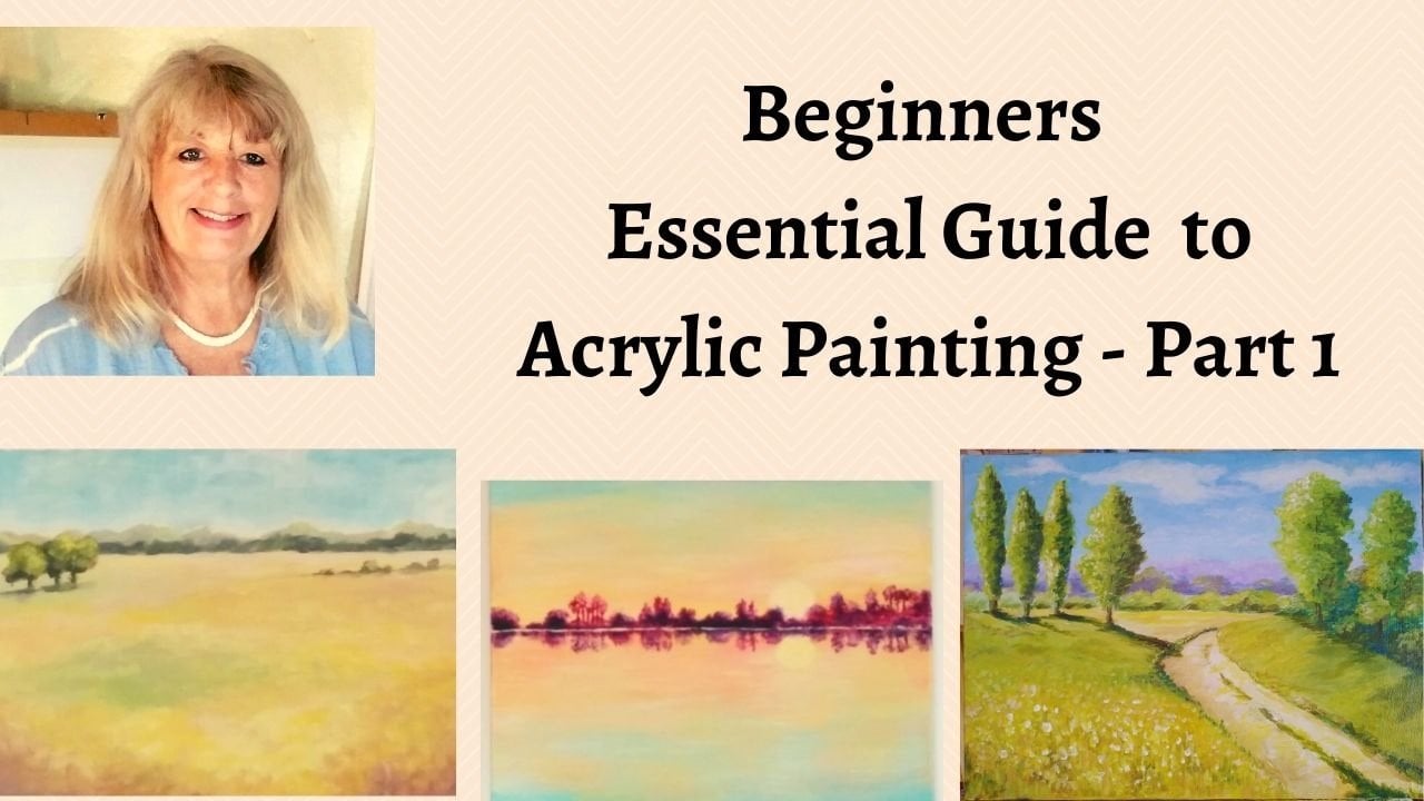
1. Essentail Guide to Acrylic Landscapes for Beginners Part 2: Hello, and welcome to part two of this Essential Guide for landscape painting and acrylic. Now, if you're here for the first time, I would strongly suggest that you go and do part 1. First. In part 1, I go through everything that you need for this class, all your paints and materials, your brushes, etc. And we gradually increase our skills and techniques to come through then to do these last two paintings, the five in all. And it's a lovely progression through the whole range of increasing your knowledge and skills in landscape painting. So in this class we're going to do these two. This is more abstract t, This is more impressionable impressionist painting. And again, it will increase your technique and confidence and know-how so you can launch yourself, yourself with your own landscape paintings. So without further ado, let's get started and get painting these two great pictures.
2. Moonlight First Layer: Okay, so in this lesson I want to do something again, a little bit different. Sort of expanding your learning and having different options to experiment with them, work with. And I was going through thinking would be nice to do an evening scene because they've done everything kind of bright and sunny. So I came across this painting. This is a painting by wonderful landscape artist, a Russian artist called Isaac Newton. And it kind of is nice and loose. It's interesting, but it's what a lot of different tones value, and it's a limited palette. So I thought we would use this as a reference for this lesson because it will teach us a lot about a limited palette and getting the different tone values. So I'll put a copy of this and the information so you can have it for yourself. But this is a different way of learning. As I've said before, it's always good to actually study the masters. And this is a master painter. What's different to what we've done before is, is it's quiet, quite a lot looser than what we've done, and that might be of interest to you. So you've got the ability of both to do something more accurate, something more impressionist. And then this is very much more kind of loose abstract T type thing, but it's a lovely painting with beautiful colors and a limited palette. So what I've done here is I've got a few colors together to show you what we're going to work on. Basically what I've got there is a limited palette is phthalo blue, cadmium orange, cadmium yellow. And I put the yellow ocher over here. These are some of the mixes that we can find just from using those four colors, sorry, and white. So we can get very dark black colors. And obviously we can go to the whites and you probably can't see that too much. But anyway, it's white with a tiny little bit of blue. And then we've got the various tones and when then we can mix the green. So when you have a look at the color palette and the picture, you can see how that works. And this is a good idea to do when you're looking at your things that inspire you. You know, what colors are there. And see if you can find those colors, mix them, and see before you actually begin the painting. So this is what we're going to work on now. And have my Canvas already primed. So we're going to just put in the, putting the sketch on, straight onto the, onto the canvas. And if we take this and if you can print out a copy or you can just watch me, it's fine. Then we've got an idea of our direction that we're going in, in. So if we just take, I'm just going to mix a little bit of this, just a little bit of the, the blue. So we've got this amazingly dramatic sky, which we will do as we go. But our horizon line is basically coming across here. And then we've got this area here, this lovely part in the middle. And then we've got this dark area which is more or less coming here. And then we've got this going on in the foreground, which we will put in as we go. But it would just reference it here a little. And then obviously we've got, we've got these nice trees coming, coming here, which again will do as we go. But they're going to be coming in up to about here. And here and here. No, I don't necessarily want to copy it directly. It's just going to give us a reference. And the thing that I want to focus on really is using the limited palette and seeing all the different terms that we can get from it. And you can see, if we have a look, we've got the lights. Usually the lightest tone is in the sky. So we've got the lightness in the sky and obviously the Moon here. The reflection here. So when we looked at compositionally, you can see this if we look at it on our, on our rule of thirds that this is sorry, this is coming right enough area. And again, in this area, but you've got some interests coming on here with this lighter color. Here are the reflection and some lighter green. So it works with everything, which is what the master painters were masters at. So we're going to use for this are stippled brushes are nice brushes that we've been using, might use different sizes of that. That's the large one. One. But mainly this, this brush. And then for the detail will use, will use maybe the rigger brush or a smaller one. So let's get started on the sky. And our basic kinda for the sky is obviously our phthalo blue and white. So we can make span all different tones of that. So I'll show you here. I've got that started off here. So let's just dive in and have a go. So let's put this in here. We can add as we go. And as we get to making your blending, as we go, as we get to each section. So this is all kind of base color. And you can see the time just being quite free with this. And it's a lovely, lovely color. I love phthalo, blue and white together. It's really, really nice. As we come down. I'm just adding some white to this line that up. We haven't talked too much about tone. So this is a good, a good painting to kind of get to grips with that. I'm going to add some character to this. Once we've got this down, comes in very dark, then I'm adding a little bit of water. Not too much, just to kick us off with a with a foundation. And little bit more, I'm going to add tiny bit of orange to that. Just to have a slight changes for you. How about changes? Subtle. But this is sort of like the have a look here. Sort of like the cloud here. I'll see you when I actually edited if I can put this in the corner so you can save yourself, but that's kind of difficult to do as we're painting. Yeah. So bringing this all the way across here and blending this in here. Very light. Sounds nice things going on. And then width, width, because we've got that color already on the brush. We're going to get some nice effects anyway. And it's a lovely kind of dramatic sky. And we haven't done this kind of evening sort of sky before. So it's nice to do. And then, you know, someone you're living. It might not be such sunny, sunny climate and landscape as it is here. So it's nice for you to, to have some variants. Nice for me to have that. Now we're going to add a little more dark up here. We'll let this dry and then we can, we can add some more of the darker detail in just getting an idea of it. To start with. Why coming along here and ended up so nice and loose. We're not having to copy it per se, we're just getting the feel of it, but it's nice to have a reference and use that as a, as a base. And you can see when it's wet, you can do all kinds of. Nice things with it. The horizon. This is going to be covered by trees anyway. That's our base for our sky looking at in red. If we come to here, we've got this dark trees or whatever that might be in the distance. So bringing this across here, again, keep it nice and loose. Spending in quite a lot to the sky, but that's okay. Okay. So now we're going to come down into this area, slightly changed from the sky because there's quite a lot of white in here. So we'll add some white to that blue. And so you don't need a lot of white for this painting called seem right or left. And make it interesting, I'm just going to cross. That's also not going to take huge amounts of time to do this painting because it's quite loose. And we don't want to put any detail in the beginning. We're basically just kind of blocking in colors. Now there's some nice variance and in the landscape feel here that's coming down. So just going with that direction. Adding a little bit of white to it as we go. And it's a nice, a nice sort of abstract painting. I mean, you know, it depends really on what you like if you like the traditional paintings or if you like shit of more abstract t. And you know, you're going to have the choice of doing any that you like. So hopefully this will give you a nice idea of how to go about doing that, which is the main thing. And there's a few tiny hint says darker blue. And we'll put a few years I was in. Not very much just to see how that just breaks it up a bit. Coming down here. And then it's very dark in here. Can we can do it again? And you can be adding water or you could be adding some medium, whichever you feel like. It's abstracted to you. You know, you've got lots of licensed to do how you want it to be. Oh crap. Child, just put in a tiny bit. See how interesting it is. Excuse me, you know, because it's complementary, it's going to work. And that's obviously going to come in a little bit down here. You can see how I'm using the brush. I'm just kind of getting on the flat side. So we're not betting a huge amount of paint onto the, onto the canvas, just using the flat side. And it does gives you some nice texture. With the painting. It's gone a bit kind of grainy in that corner. So I'm adding a tiny little bit of cadmium yellow over here. See how that works? Just a little. And if you've got the picture in front of you, you'll see this more clearly here. Now, let's put this really dark area. So for that, I'm using and the orange is going to be really dark. And then we'll go back over it with some of the other terms later. But this is a very, very dark turn down here. See how dark light is. And that's the phthalo blue and the orange mixed. And we'll have texture in it, but we just want to block that coloring. So you're getting a real sense of the terms here, which is what we wanted. And when you're looking at your, your own paintings and photographs or your inspiration, see if you can then see what your terms are. More paint and your shadows. Now the foreground, the background, the midground. We don't want any detail, but just staggering it to give us that feeling. What's happening? My do is just bring this out into Texas. Okay, So it was a nice start. And shapes locked in our sky. And you can see how those tend to work in that she's really, really interesting. Right? So we're going to leave it like that to dry. And we'll come and do the next stage.
3. The First Layer of Details: Right now I'm going to go back into the sky and put a little bit more detail in there. We've got a really nice foundation for it. So we can just let me carry on from where we are. So back into the phthalo blue and the white and some variants of those colors. Guys, it's quite dark up into this corner here. So following what we've got, but I'm just going to enhance it. So it's a lot darker up here. So now we've got this foundation. It's nice to be able to add a bit more detail. So we've kinda much Doll coming here all the way down and you can see that we can blend out in Agile. Again, I'm just using the flat side of the brush just to keep it nice. And quite a lot lighter here. Last night. I tend to I don't want to copy it exactly how to get on my own. She learned it and you'll get your own shame in it, but just quit as a guideline and to be having a direct. And when you look at the masters and see how they put that paintings together, what direction they gone. It's always, it's always interesting to see that it's quite a lot of dog into here. And here. And here. My challenge that I have that so hot here today, inside my paint dry. Very quickly. Shout out. So maybe you don't have to tie habit moment. What I notice here is that there's a little bit of, Oh, well, I tend to, when this atom look at that moles first. And then add little budget, say, Oh, credit score breakdown and much more. Play with it. See what happens when people start with and then when this house. All right, feeling of that cloud, we can see how blending this brush is getting harder adjacent texture. What we're doing here, it's kind of coming out tonight will go down. Just really want to be playing with it to you and you're happy with it. And on the right, right. Feeling. During this year, discovering your own style. How do you really want to paint? And how he talked very much about that. But this is a great way of discovering your own style and finding what you love to do. A master's in saying that really helped that along the way and see what you lean towards? No, that's the main thing. What is it that inspires you? What excites you and gives you a bus. And that bus that will lead you in the direction that you want to go. You know, I love teaching and therefore I do lots of different kinds of styles of painting to help students with their work to see what they want to do. And I can't help. Paintings style comes into it. And I want to find yours not to copy. Ceremony. I come during the early finding out and observing how they checked my composition and turn value alive. How that works really kind of gives you an idea of finding your own way online. So you can see by doing this method from underneath, a nice slides and dogs have home. Yeah. Aspects coming down. I don't want it to be exact. I don't want to get the ceiling. I'm talking to myself. Which is what you get very good at doing when you're painting. I'm very good at talking to myself in a way as the scattering, how's that working? And Cloud happening here? Put a little bit about color in it. Through here. Okay. I don't want to be messing with it forever. But I think you've got, you've got the idea. Now around this area with cyber craft. Now these could be mountains, cloud. I think I just want some cleaning the brush or more pure white. Ghetto. Come in and do. How do we feel about that? Not quite there yet. Just takes a little bit in time. I think we've got the sky. Just a little bit. Okay. All right. Let's come back to again. And I'm going to put a tiny bit of orange and white, similar color to the sky. And the vector that just by blending and true, I'm just gently touching surface events and putting little bit at why tone. Just to blend. Some of that. Sky. And we're getting there. Now. I have how to just blend and get back. You don't want it just to get some of this texture going in it. And rarely light here. So I'm going to happen men coming through there. Okay. Let's come back into another, another code. So again, the failover. And literally I'm just going to go over this is to give it a little bit more depth. It's caught there. And you know, you want to be looking at the shapes. Always look at the shapes. You don't want to be looking at what you think it is. What we want to be looking at, the shape. It's always going to be saved. And that will help you tremendously with everything that you do in your painting. Looking at shapes. Rather than saying, What are you doing a landscape or whether you're doing whole trait or whatever it might be. See the shape of it. And you won't go wrong. You've got the shape and you'll get the painting. Okay. Right now, back into this area. Kind of bought, I think really. So. Again, as you come a little bit more paint actually play out. Sorry about the noise. It's just me on my palate. So quite a lot of white. I'm well, I like how this is going. So now you've got this main underneath. It makes everything and it's coming down. How it works. And to bring this down because now we won't get hard edges. K2, flat brush. I want to put a shadow behind these trees. Nice shot on top. And musical details that we will do. One Smith. And I'm just going to lose some of these edges up here. I'm just going over the top of its slightly hard edge. So I'm just gently touching the edges here. The hard edge. Right? Now. Then let's say a little bit more with this, and then we'll start with all the details that are going on here. So back into our phthalo blue and orange. And we want to kind of get a texture feeling. So I've got all our paint to my brush. And I've got a little bit in the dark on one side, and then just the phthalo blue on the other. So you can see we can start getting some dark textures in. And it's not just flat color. We don't want flat, just flat color. Scott, and some orange tinges in it, which is really nice. Maybe that's too much to start with, but it'll, it'll darken itself down. Gives us the tax base, the blue, and then the mixture of the blue and the orange. And it just shows up. I don't know whether you can see it on camera setups and I stuck it, change color in it, which makes it really interesting. And it's not flat. What would be interesting to do is when it goes job with you or not quite dark, dark, but nearly go and have a look at the color and the landscape. Because it would seem just see if you can find color on it. And I'm absolutely certain us okay. Kind of gangrene needs come leeway, some of the orange in it and may not flat special. Now let's work on this area now. I'm just going to get some more paint on my palette. And then we'll start here.
4. Adding Second Layer: Okay, so what I've done now is I've just put a little bit of green on my, on my brush. And if we have a look at the picture, it's sort of blended in here slightly. I just wanted to start with it's very subtle rooms, hardly any, really quite a lot of blue in it. And if I add a little bit of white and not very much, I'm just going to stumble. This intellectual sort of comes out here as a fuel. And I've got a little old lady out. And it's coming right down into nice food to the dog cat. So subtle. And it's a little bit coming on here yet. It's teachers relying on laying on top of the blue. And then I'm going to go back with the blue and come back onto here. See how that's just blending in. And again, he has. So just kind of gently mixing these colors together just to give us a seal. I guess. It's quite a bit of yellow going on towards the tail, which we will do in a minute. You can play around with this until you feel it, but you've got it. How you want it. Avoiding hard edges. We don't want a hard edge of any kind. It's all very soft. One color blends into the ABA. So that's fine. Just gently touching this. This is coming out. And then it's darker blue underneath. That. I'm going to take more action. Another interesting colors going on here. So just gently building it up. You get the feeling of the water and shadows in the water. If you remember what we did with the reflections, just kind of gives it the field. And when you have a look at the picture, just see how that little bit of orange going on. And so I'm going to just add. Let's go to Orangi okra color. So I hope I've got too much on the brush. So again, little, stout little and then you can build it up here. Some of it's coming up. Summing up the essay, don't need too much. And then just bring the brush tool just to get a feel of the reflection. Lights coming on now, which we'll put in. And then this is kind of blended together here with the dog. So who put that on top? You can see how that works. Let me put a few little highlights in here. So again, what some of the brushes hardly NA, but it's a nice kind of field to get some of those subtle highlights in terms and to the back. And it's been a little bit lighter in little areas. So I'm just starting a little bit of this in a bit of yellow. On the tip of my brush. Just little dots. See how that works is a little bit on here. Coming up here. It's minimal. I meant to put him they highlighted alone in a second. Let's get this happening first. And again the same with the okra, just dabbling each in alleging. So terribly soft. Launch again, what I'm going to do that if you really want to smooth it out. You get your kitchen. Towel. Town to muscle weakness here and it's a little bit of white on here. Okay. I'm sorry. Yeah. I'm just getting rid of those NGS. And how you got the shadow coming down. Again, just tiny bit on the brush. Minute. Just soften the edge. Darker. See, I'm just doing it very gently. Build it out. You don't want to put a lot of pain tongue here. Just a natural thing, isn't it? How it works? It's playing, it's finding out how you can get the effect. And, you know, there's always an ending process. I never stop learning is always something. It's never ending. And it's wonderful because the more you practice it, the more you can experiment is that since q experiment an experiment, you get to a point where you know what will happen. And that's the point. Now these pleasing and you've got quite a few different things happening here. Again, she is of hair, my dog. Yeah. Quite frowny. Actually zone can add a look a bit at the orange. And that will give us a nice tones. These hard edges here wanted to dark and just literally touching in. Okay, so now time for the trace. So what I'm going to do with that and thank you. Yes, my rigger brush. And we've got a few nice trees going on here. I'm going to use the failover for the tree chunks. Literally I'm just going to bring it down here to saturate this a bit more. Drawing so quickly. And we've got some lovely little trees happening here. Just see the trees that you like. Sale would be nice. Suggests the reference. So we're just using Hess's Law. This is quite covered by Saturday defined. So now I'm going to my little flat brush for that same medium size. So just getting the shape of this again, very dark orange. And it's coming right out to here. Disclaim to get New again. Because it's night time. No, not going to have a lot of lines on these trees. We're really just going to say no the silhouette. And I'm going to add a little bit more of the orange to that. Just for interest's sake. We'll catch them the moonlight and literal, which we will do. Now we'll call quite anomalous things going on here. And it goes very blurry lens. I'm going to go back to the blue digit y with it not too much. And it's coming around here. And then the soup on in the background here. And I know this is kind of quite fuzzy behind. So going back to the blue, white and it's quite a dry brush. So just sum the sum here. Come back a little bit more definition. Common cases that field stuff going on behind what's being intimate. His VM as kind of fuzzy nascar normally be trays and stuff behind. Kind of abstract t again. So I'll just say like blue and white. That on a fairly dry brush. I don't want it. That wanted painting. How launch it, rough cells. It's not too locked in. Coming on, not yet. Go back in and put the chunks and again, and it's coming where the dark again down to here. Let's just play with it and seeing what might happen. And mixing those colors because we've got such a limited palette, It's not difficult to do. You can keep going back to as communists without a problem. So I'm mixing orange with the, with this failure. As I'm coming down here a bit. Hey, thanks, I'm going to put a tiny bit of lights on the tree. Just going to make some failure with white again, but make it a little bit lighter on the edges. Not too much, but just a hint. So I can get back cover. Flight, go over it again. But to me it just looks a little bit too heavy. So I'm going to just gently put a few bits, break it up with its own mind, the hard edges. Now go back into it with the dog. Just want you to write that up a little bit heavy. Thank you to the dog. Well, you could say with nearly done, I often go back again in it. Now go a little bit more texture as a chanson. So I need to go in a little bit darker here. I think I'm going to use the same brush and just intensify this blue little too much more. See once you've got it going and it'll give you an idea and you can see, you know, what needs to be done as she gave us it tries. And your alterations. Okay. I think we're getting that nearly that. So now we want to put the moon and then some of the reflection, I think we could say, start enjoying it helpful. So now let's have a C. Which brush? I think when you use a small flat brush for the moon. And take some of the white. And we might just have to build up the color. So if we can say it's about here. So yeah. Doesn't have to be absolutely exact, but let's go for it. Okay. Let that dry and then we'll go back on top of it. Now is a little bit going on. Now with the reflection. She's about here. And it's got a bit of yellow in it, but I want it to just be white. And then we'll add some of the yellow. And then. A little bit of lightness coming on here that we haven't put in. So I'm using a little bit at the okra and a little bit of cadmium yellow and the white. Just, I'm going to just try it and see how it goes. And then we can take it down if it's too, right. So first of all, it's a little bit going on here. And it's interesting when you look at this for composition wise, where focal points are and our points of interest. And this is probably a little bit light and it will dry darker. So we might just want to leave it a little just to see. I'm just literally touching. Just to get that feeling off. Light coming through. Yeah. Yeah. Brightness coming on here. So I'm just going to have a step back and have a look. Quiet. See it saying, yeah, that's not so bad. I still maybe think this is a bit bright, so I'm going to take it back down. How do we take that down and use a little bit of the opera. Add a little bit as a blue gray it down a little too much but a little bit. And just type in the top coming out of LA. So isn't that an interesting thing to do a study and see composition, to see how it's come together. And there's a lot of learning because you really have to observe and look and see what's going on. I'm okay with kind of Kolkata too little. But that's okay because there's so much learning involved with it in doing that. And then you'll be able to translate that into your own painting. You're learning all that tissue on cable news understanding of that. So that's the reason for this, is to kind of give you the opportunity of really studying a master artist and see what they do. And it's really, really helpful. I hope you find it helpful. And it's fun to do What's more. You know, it's, it's interesting. It's a nice way of building your confidence and seeing what you can do next on your wall. And you can feel pretty proud of that. Run out to the other. And then we'll go back and learn again a little much, just a touch. I want to touch it in here. And this will buy it in here just to balance on top of it. So I'm going to step back and have a look at this in a second. And then once I've kind of absorbed it and seeing what sport, there might be some corrections or the might note. But when you're working on top of it, It's always good to take a break and then come back and see what we've done and see if you're happy with it. We're going to let that dry off. I want to put a little bit of oh no, it's going to say that I want to wait till it's dry. Before I do that is take a break and then go meditate on it and then come back and see if there's anything else we would like to do.
5. Final Touches: So I've had a chance now to have a little look at this. And I'm not very happy with this. I feel it needs to be a bit lighter. And I feel that this shadow here is not my dogs barking, sorry. So I'm going to just add a little bit of light into this area here and just redo it. I wasn't really happy with how this is going. We've got animals all around me this afternoon. I've got the cat and the dog. I feel as if it should sort of reflect the sky a little bit more. So I'm going to just bring this down and it'll just scumbling. You know, it's going to go in this direction. But I feel it needs to be softer and lighter. And I'm not getting that feeling from it. So I'm just doing a little bit, not too much with DOT. Always the way isn't it? Just undiscoverable some of this blue into it a little bit more and soften it up a little. I feel that that will make a difference. I think, you know, this is the thing about, about doing acrylic painting. You can just keep going until you're happy with it. And it wasn't massively happy. We've been looking at it wants you to door drive. Taking a step back. I didn't feel I don't know why she's barking. Just a little bit more blue in here. I wanted to reflect a little bit more of a sky was doing and touch behind him Not much. Keep it in balance. I think that's looking and, you know, we don't have to watch that before. We didn't have to have it completely the same as the picture. Just a little bit more willing, coming down or realize home, dealing with dogs and cats. And a little bit of dark here. Not too much. Just a methyl here. I feel like those fit better now. Seems to be a bit more in line with the sky. I might even just draw a tiny little bit of the yellow ocher into it. Because of this area of the sky. I think that what is nice. And it gives it a bit more of a feel. And then this part's very light. Take that off the brush and I'll just go back into the metal. And it's why the moon is shining through anyway, so we can put a little bit more light in here. And you know, these adjustments made all the difference to finishing a painting. Down. We feel about skies little bit brighter. Coming right down to the trade. Feels a little bit more like it to me. It's not like when the sun shines on the water, It's a different kind of reflection. We would get some feel of that blue. You know, you can play with it until you feel until you feel it right. This is just a little bit of blue on the top. Just to break it up a little. I'm hardly touching with this scumbling on the top. That feels better to me. And then some of this is coming on it down into here. So you're going to get more of that on the brush. This is not much on it now. So it can come down into here a little bit as if it was in two halves that's having very much to dry. And that's okay. It all just kind of, you know, these finishing touches make a difference to a painting. And then obviously the shadow. Again, I want to do it very gently. I think it was too harsh before. And it's sort of coming out just a little bit from here. And then just coming in and white. When you're looking at yours, it's a really good idea to take a step back and reassess. And you come back to it with fresh eyes. And that's what I've done. I think when you write on top of it all the time, It's really difficult to get the right perspective on it. And then when you come back you can look at it slightly differently. The other thing that's really interesting to do that's better is to look at it in a mirror. And that's something that really works well. Because you, again, You see it the other way round because it's reflected. And you get a different perspective again. Just a little bit more of this in okay, and then I want to just do something with these trees. So I'm going back to my my flat brush, but I still want to use this one. I wanted to add something into here. So I'm going to go back into the blue again and into the orange. And I'm just going to crank this up a bit. We've got some nice textures on it already. I feel it needs to just be a little bit more intense in value. But it still didn't, you know, slightly different value to this. This is obviously the darkest value. And we've kind of gone through the scale of values in this painting. Very light and then our mid-tones and then going darker and then really, really dark into here. So we've got a nice lot of things going on, which does make a difference. Yeah, that's better. And then I just want to tidy up here a little bit. I'm happy with that. I'm going to just take a step back and look. Yeah, I think that works. I'm going to go into the yellow walk. Growth is not too much, just a bit and quite dry again. They wanted solid. So it's a nice kind of little areas here happening. Just take a little, a little bit. Know all these things make a difference. Some kind of color here, which is nice. And you getting the feeling that the water is close to you here. So this is very dry, it's not solid paint is I've taken quite a lot of on my on my paper towel here. So it's just a little just kinda intimating. And it's coming right down into here. So we can do that too. I don't want to lose the light. We want to just kind of talk a bit more. These finishing touches, you know, they can take some time. T you feel as if it's absolutely right. A little bit about code going on in here. Hint brings it to life than that. So you remember what we did last time, stroking across and down. Let's go back into the blood. Just be patient with yourself feeling to it. Let's continue to live and change it again. But it's always kind of process of saying it's difficult to describe it. You know, when you're actually doing it. I'm sure you'll get what I'm saying. So you can see for yourself what's happening. And it's continental, lighter here. Just hear it. At the next way that the shadow is. Some variation here. I think I'm just going to tidy this up. Again. We want to get it right, so it's worth spending the time on. So I'm makes the orange and the blue here again. And then come down here and select this texture. Some interesting bit here. Okay? I think we're there, guys. Know we're not. We want to put a little bit to Volker around. Thinking of earlier forgotten. What I'm going to do to achieve that. So we don't have to do a huge amount. Is going to temp brush, clean, damp brush. I'm just going to dampen the area around it. So we've got something to work on. So it's just done. And then I'm taking some of the okra. But literally a bit mixed with a little bit of white. And I'm just going to test it on my paper. Test it on a piece of paper next to you because we don't want it to go. So I'm literally just a little bit around here. Maybe a little bit much. So there's just a bit of that glow around the moon. Do you get around the sun as well? Kinda makes it very interesting. And the y is going to go down because it's right. I want to just get back home. And I'm putting a bit of water on here. Just to blend this in. I come stove and the stoke. So I'm ready, Sorry. No, she's barking. Right? It's distracting me. And disco back into some of the blue. One little dog wanting attention at Cisco back in here. And that'll have a go. So I just wanted to let you just got a little bit of a Christian, which makes it interesting. And glaring. You see how you can do that just gently. So he told Maurice together. And you've got that oh crap. Just around 10. Right? I think we should say today because I could be here all day otherwise. Looks very subtle and interesting. And we've got a little bit of shadow going on here, a light coming on, and here it's got a little bit of yellow or Kroner on it. Interesting. You may be a few little lines here. Just dosage. Again, interest. I want to do too much. Okay, I think we're there. So lovely painting, little bit different to what we've done. My city, it's midnight to midnight, moon or moonlight to evening or whatever you might like to call it. And something a little bit different too, to play with. So I hope you've enjoyed that. And you found It's an interesting experiment. Okay, so there we are. A nice painting of him in light.
6. Dusk Landscape Introduction: So now we're coming to the last painting of the course, our period or resist arms, if you like, Evan. And I wanted to incorporate this with some of the things that we've been talking about throughout the course of using your imagination and your inspiration. So I've got my inspiration for this painting. First of all, my landscape here, which is, you know, as I've mentioned to you before and I've shown you a few pictures. It's very dramatic. But I wanted to have something really spectacular in the sky, a real dusk sky with all the beautiful yellows and pinks in it. And I was looking through my folder and I came across this picture of this picture of turners and I love the sky. So that's given me inspiration for the sky. And then I think I showed you in the book when we were looking at the impressionists book, the picture of suzanne, this one, I just printed it off. And I wanted to use this as an idea for composition, how it was going to compose it. I'm not copying it. I'm just using the ideas to put my painting together with my landscape that I have here. So I've done a sketch and hopefully you can see this. So the sky is going to be the dramatic sky here, the horizon line. It's a bit lower than we've done before. And then I've got the button. And for the land, dramatic trees, I want really dark reason, lovely land coming down. So that was the sketch. And then this is the painting that we're going to do, which you can see is dramatic painting. You've got this lovely sky, hope you can see the colors in it take to bit closer. And then a lovely background goes back miles to the grayish, bluish mountains. All this land going on, very dramatic trees and a foreground of this wonderful grass and field. So that's for painting that we're going to finish with. And hopefully it's going to incorporate all the things that we've covered through the different paintings that we've done. So let's get started. I'm excited to do is picture. So I'll go and get prepared and we'll start.
7. #1 Dusk Landscape Getting Started: So we've seen inspiration for this final painting. And we're going to just put some are small indication of where our horizon line is going to be. So this is very different to what we've been doing before. Our horizon line is going to be lower this time. So then to come across here. Okay, So we're going to have this whole area here as the sky. And we still have some fun. We've got just a few mountains, hills in the back, in the background. And then we've got land here and we're going to put trees in. But we want to make this painting really blow and be inspired. So which we've been talking about all the way through this course. So to begin with, I'm going to take my nice flat brush and I'm going to put a wash on the top. Now, the sky is really kind of quite light underneath. But I'm going to put a wash of ultramarine blue and white mix together. So it's going to be pale, pale blue GPC now here. So we're just going to roughly do this Walsh in to begin with. It's a nice option layer to the foundation. So when you do this, just make sure you've got a nice, a nice layer of the blue, which will obviously evaluating cover later is pronounced in the sky. So just roughly putting it in North China. In 2002, particular chapter, my sporty to Harbin on the remains that we are going to be on. Mixing them in a little bit of water flows a little easier. And it's really common cause of synchronous logic. Okay, So that's kind above foundation for the sky. We'll come back to. Now let's do the foundation for the land. And what I'm going to do with that is going to drop in a tiny little bit of Alizarin crimson to some yellow ocher. And a little bit of white because it's a nice sort of deep color underneath in there. And then it's just a wash. And I just really want to give ourselves a nice base to work on. So it's a simple painting, but it's got quite an impact. And spent a lot of time on the other paintings. Really looking at details, wanting to show you four different ways you can approach landscape paintings. And you know, if you want to do it the traditional way, if you want to do it in an abstract way, impressions way, hopefully you've got some nouns and ideas of all the different things that you can try. Say, flaps off our foundation for the land. Now let's just put the foundation for our mountains in the back. So those are going to be very much more blue. So I'm mixing that blue into what I've got left of this color with the yellow ocher. Just to emphasize nice mountains at the back. So let's just gently put this in and it will give us a base to work on. And What's nice about using this brush is that we know we can stagger the edges. They don't have to be absolutely dead straight. We've got some interest. Really goes right along. Let's put it right along behind what was going to be the trees. Okay. So that's our foundation. So let that dry and then we'll come back and start putting all the other things that we want to do on top. So now I'm going to start with the sky and we can have some fun with this. We did a little bit of this in the, in the reflections painting that this is going to be more specific in its clouds and light. So what I'm doing here, because we've got this, I want this color, lovely, warm color in the sky. I've now makes a little bit of yellow or CRO, a bit of cadmium yellow and some white. And literally we're just going to fill in some of the areas where we want this color to come. Now, we're going to be layering. And this is kind of like off underneath field just to get our shapes of clouds are used while we want everything to be. So much just kind of putting the thin gently, I'm just kind of rubbing Newton, adding a little bit of water with it. So we've got some movement with the paint. Will want to fill some of that blue to becoming through. So I don't want to have this as very, very thick paint or perhaps the kids off a bit later. But just at the moment, we want to kind of get that feeling of this very dramatic sky. How it's Gallery and you can have your sky, how, how you would like it to be. And you can kind of go with your intuition on it a little and see how you feel. I'm going to, that's what I'm doing. I'm just kind of feeling my way into it. See how I feel about these very dramatic shapes and an clouds that are gathering at this sunset. You know, it's fun to do an interesting and you'll get some wonderful impact on it. Now you can see how I'm softening the edges to blending it in to the other color, yellow with color. So again, try with your, with your brush. Experiment. See what happens. This sky can be as dramatic as you wanted to. There's no hard and fast rule about it. See how it's coming together. And I want to maintain some of the blue at the top because if we said before, now the stronger color is going to be at the top. It's above us. And there was further away we go into the distance, it becomes more pale. But because the sky, I want it to be a really dramatic. We can kind of go to town a little bit on the color of anything this yellow down here. And it's going to have that reflection of the yellows into the land in here. So we can afford to have it, so it's quite strong. And then I'm going to just add a little bit of the gray that we used for the mountains. I'm going to drop a tiny bit of that in. So it gives us a bit of a distinction, a term you see that makes it really kind of interesting. And it put a fit of that up here. And literally just touching it in a while, the paint's still wet. You can get that interesting effect here. See how fascinating existed. Put a little bit of that up here. So it's really tiny bit of that kind of gray blue mixed with the FCRA and white. I'm going to add a little bit of blue back into here. Just for emphasis, you can see how that's working. And you know what we've talked about before. We want the corners a little bit darker to keep our eye in the painting. And you see how that's, that's blending into the yellow and the yellow okra. And Maybe some more touches and white. So if we can play with it just to get that feeling of really, really dramatic, dramatic sky. I'm going to bring this down here in Islam to lose any hard edges because there aren't any hard edges. And as you go about the sky and if you've got the opportunity to see some beautiful sunset, you can take some photographs of it. You'll bet that you'll get the idea some of that color happening. And sometimes the color can be really, really strong. It can surprise us. Now I'm going to take this strong color up into that corner and gives us that brings us back into the painting. And maybe a little bit of this gray that we used on the other side. Just on top. I think Turner would be happy with this. And he was a genius at doing his skies. It's quite amazing how he managed to achieve. And it's kind of feelings in the sky. So we've got this happening. Now as we're coming down to the real background, I want to be quite daring and again, to see what happens, if we add just a little bit of magenta, pink, strong, buffed, we tend to blend this in because this is going to kind of reflect up from what we've got in blind. And it could be interesting to see how that happened in the blended Chen again, I want to walk much paler. As we reach mountains. It's a lovely, lovely color. Now let's blend some of that into the yellow. Suddenly lose the edge. Let me see, because recall that the building behind we've got some kind of reflective color. And behind it mean a love tank in the sky. Sometimes it's just stunning, isn't it? I mean, sometimes you kind of have to take to to really appreciate the color of it. Because sometimes maybe if you tried to do the real color, it would look a bit chocolate box. We don't want that. We want kind of like a really subtle field to it, right? We feel about that. Does that give us what we want? To soften this a bit here and see how that's faded now not think but it's still there. So got it there and it's going to be a little bit lighter just above the mountain to give us the feeling of distance. And I'm just dropping a little bit of white in. It's blending in. But it's still where the mountains, but it's got a nice feel of it. Pushing, pushing back. Well, I think I'm happy with my time today. Pangaea touch more of the left, the yellow. So always still, I was still wet. We can plan our telomeres. Long name, I love it when it changes from the yellow into the speech. You can see it's already got an impact. And we really just started on the sky. So I think that'll be fine for now. And let's see how that dries off. Now let's do a little bit more with these hills. I'm just going to clean my brush off. And so the hills here. Okay. So either I think they're a little bit gray, I think they need to be a touch more blue. Not too much, but a little bit more blue. And of course you've got like the blue and the yellow are opposites to each other. So let's have a look. Yeah, I caught my act. And what we might do is as we go touch on the brush with a little bit of white and black to the blue. Kind of like a combination going over the blues and the white. And it's not going to be solid, solid color. And it softens. It. It says a feeling of being a little bit misty. Tree is coming in front of here, so don't worry too much about the lines. I think this needs to go off in the distance. A little bit more. Hail, little bit more pale. Here. You can see what I'm doing is just gently putting our team, but I think that blue is my seven Justin Gray. And I might just put a little bit of light back into it. Possibly. Maybe a little bit now. Just a little just for a little bit of texture on top. Okay.
8. #2 Dusk Landscape Progressing: Okay, So at this stage now, okay, So this stage now what we're going to do is to go back to the sketch. So I'm done. What I wanted to do was to do the background first because I really wanted to get this lovely sky. And now we're just going to gently, just with a little bit of ocher, is to just use our sketch that we did earlier as a, as a reference. So if I have thinking here now my, my first little trees going to be about here. Let's kinda come all the way down. I've got a smaller tree in the middle, and then I want a really big tree coming up here. So it's just really to give us a guide. And it's going to come all the way down here till it comes to this power that you might not be able to see it because of the dog here. Coming down here, let me go a bit darker so you can see what I'm doing. So it's coming down here. And part is what? Division is coming all the way down to here and got a line here for the shadows are and then they land is going to come down here. And we've got a little bush that's going to be happening here. So I'm just going to put that in a little. So it gives us a reference here. And then we've got some of our landmarks happening in the background to give us some distance. So I'm just putting that in a little so you can see. Okay, so we've gone back to the sketch. So now we've got everything down and then we know where everything is going to be. Okay. So we're going to start with the shadow inner ear lobe, what the shadow in here. So we'll start with the shadow. I want to make that really DO. And I'm going to use this flat brush to do our shadow. And for that, I'm going to mix some of our phthalo blue and, and little bit of the magenta red. Want to make it really dark and a little bit of burnt umber. So basically where sunset, so the light is coming through, so everything here is going to be pretty dark. It's going to catch the light in areas, but the trees and everything, you're going to be quite dark. So let's just sort of start putting some of the darks in. Here is coming all the way down. And obviously, you know, there'll be graduated a little dust. Let's get some shape of the tree is coming all the way down here. We'll put shape into this as we go. But we'll just put the dark in sewing it. Really know where we are. I could actually go darker than this, but let's do this first. And smaller tree here. And it's just a little bit of difference to what we've been doing with the with the others. Night See, you know, dusk scene where everything is going to be darker. It's kind of a little bit more impressionistic if you like this picture. So this is going to be dark all the way down. I need a bit more paint and make this even darker down here. So don't be afraid of this because it will have lights on, on top. So it's really kind of fun to attack it in this way. And then the light against the dark is, is lovely. Light happening behind. So have a little bit of fun with doing less. Because we've got this color of the land. It really helps us with the background. So I'm just going to bring this down here and little. And I'm going to even miss offer little here. So you can see it's really dark. So that's great. That's what we wanted. That's what we were looking for. And it'll really kind of gives the painting a lot of depth. Let's thank mystyle current tibia and then dark current here. You can see it's already got another metacharacter hasn't found when he did it like this that are coming out here. And then we've got this very dark. Now look at how we've talked about this with the composition. And now you've got a focal point obviously. And then in interests which is going to take us into Islam and this magnificent sky. So it's all kind of working. Well. It's going to be quite dark down here. It's just putting a bit of Latin. And the land is going to be coming down. So we're going to make it a little bit of green. So with that phthalo blue that I've got going, I going to put some cadmium yellow in it. Little bit of grain coming down. And again, we're going to have some textures to it. Color behind. So it really works. And of course we could do this with the stipple brush if we wanted to. But moment, let's just do it with this, with this brush. So once we've got that green on the go, I'm going to dry. Quite put a little bit of this dark green. Just drop something in to the trees. Obviously the dogs behind. And we'll put some lights on it later. But you can see hopefully that starts to add some interest into the trays with this other green, with the real dog behind. Really nice factories. And other bit of grain on this side, let's go a bit darker. So we're varying the terms a little. And obviously this painting has got a lot of very strong terms because we're using this really dark grains tiny bit so we allow in that coming into here. And we want it really dark. And give this painting such a great atmosphere, coming together really nicely. And you'll be really pleased with this picture because it's so dramatic coming out here to here. So we've got a little bit about live behind, which is interesting. And then a little bit of this green on the top here of the Central, which is coming down. I'm going to add a few other things to it. While. But I think you get the, you get the feeling of it being really dense, greens and that light against it. So the sky really comes alive and the trees really come home five. So we've got kind of a bit of both happening here. We could add a little bit lighter, just little, not too much. Not going to see this too much. In the dark. A nice feeling of the tree shapes. Just take your time and play with it a little. Not liking this bit here. We can add some items back in. I will put a bit more of that green, dark green into here. My title, a little bit of red into that, because it's right in the foreground. Just giving it some shape. Dry off a little. And we'll come back to the next bit.
9. #3 Dusk Landscape Details and Completion: Okay, so now we're going to work a little bit on the line and the grasses going right back with simple shapes in the background. So I'm just going to put a bit of grass into here. And it's still quite dark. Mixture of bit of phthalo blue, bit of ultramarine blue and cadmium yellow. So we're going to put a bit of that into here. And because I've got different colors on my brushes, ringing out a little bit of texture with it, which is nice bit of water and put some of that green just in here. It's not too thick this. And I'm going to just add a bit of it and critique it. And we've got this nice color going on behind. So nice combinations of grains and this color underneath. Let's come in behind bush. And you can see that the color behind it gives us a lovely foundation for what we're doing. Right up to here. And then we're going to go right into the background. So I'm going to add a little bit of white to that. Push it back a little. And it's going to be sort of varied of different land. And we got this color going on behind, so helps and so we can now very that you can go with blue with it. So you can see how that's happening. Stone because it can meet the hills here. Bringing that down a little. You've got all different kinds of things going on in the background. Put some blue in there to really wanted to kind of push back. So we're varying it a little to get that to get that feeling. It, It's not all the same in even leave some flat color of the 12 because it's so strong. And, you know, just kind of getting a feeling of it, being cautious, going right the way back. And I've got a lot of this in my landscape. Here. I am, stretches for miles. And you can see variation that you can't see anything specific. So I'm going a bit lighter here. And it will occur in that shift back. And then we'll put some of the dividers with Bush he is in trees and whatever. But I'm very much like this in my landscape is that you can't see too clearly, but you just see these huge stretches of land as he kinda right back to still play with yours is right. See how that changes how it works. And then we'll put in to change brushes and go to my little rigger brush. So I've got my rigger brush here. I'm going to go into the blues, dark, soften it up a little too heavy and ingest some of these areas. Got things going on. It just splits up the Landscape, trees and all kinds of interesting things. I'm adding a little bit of ultramarine blue. And you play with it yourself. If you've got some reference for this. I've got some reference from outside. And obviously I take photographs of this. Just little bits going on in the background. Just playing with it a little bit more of the change brushes again. Just swapping in and out of different brushes to see what you want to do. And that's why when we first started saying, Let's get prepared because it really helps you in here. I think is what I'm getting at is to really push it back. So you can really feel landscape going back. And if you remember from the Cezanne one, how far back it goes. And it's brilliant to get that training in a painting at the depths and the distance in it. See for miles. That was one of the things about China is that you can literally see for miles and miles how he achieved it. Fantastic. Tiny bit lighter still here. And the Tim with that paint that's already there underneath say, really helps us to that. Sorry, I'm just concentrating. Difficult to Tolkien concentrate. Practice, practicing. These are some indices a little bit more. Let's define this a little bit more here. And you know, the more you practice, the better you get. The idea. Let's put a bit of the green onto this one here. It might take it down. It's just flat. And hopefully know you've been out and about really looking at shadows and colors and have a skies working. So lovely to see and to observe. I'm always doing that. I think I'd probably annoying dry this. I slowed down dab a look at the landscape. What's that doing? How does that work? How's that mountain looking? But I do take my dog for a walk. Can I take my camera with me? And sometimes I take my sketchbook and sketch some of the scenes. Keeping an eye on the dog. Just want to step back a bit and have a look at that. How's that looking? Yeah. Okay. I think it's still a little bit red. So I'm going to take that down the middle with some yellow curve and some white light back. So now I'm just laying the pain tone. I've got the layers. It's possible to do that. Helps you build it up. And you can do as many layers as you lie, is nothing stopping you from doing that? It's sitting on here. Okay. I think not so right now. Whoops. Too much on that and let that dry off a bit and then go back over it. So let's come down to here. I'm going to put some reflection of the yellow and here. So going back to my thicker brush, and we'll make some shadow. Because the corpus color underneath it's not going to stay this bright. Bright to start with. And then we'll we take it back down. And some of the other colors on top of it, you can see already it's fading. Some of this green underneath. Texture is coming out into here. We're into that. So we've got some nice things happening with the land. You to hear. A light blue and cadmium yellow, and you'll get a little bit darker, darker green on that too. Now we can play with it. None of it's going to be kind of even color. And we want to go really dark into here now. See how it makes a difference for the corners. Being darker. It really helps you to push the painting backwards into the distance. Because these trees is so dark, it's very dramatic. I'm just really texturing this. Let's bring some less nice green down to here. And we've got the C, unless it's coming, it's coming down here. I think. The darker green into here. My feeling is this needs to be a little bit gray or blue. So I'm tabulated, go with that. Needs to be taken back a little interesting how that's going. We just sort of do the top. So I'm just cleaning my brush off. I'm going to take a little bit of the ultramarine blue with quite a bit of water with it. Touches white. Not very, very much. But if you can just see just gently on the top button, it'll take itself down. Because it sorry. Let's not sit back and just added a little bit of yellow to it. Just with the blue. Slightly different to what it says in the foreground. Data taken place down. You can use the glazing medium. And that certainly will help. I'm just putting a little bit of this on top. Okay? Now we might think about is putting wanted to kind of interest points into here. And I'm going to take my small brush, smaller, small one. Just drop in. Now I've got little houses in things going on in the background at all has I think I've mentioned before thinkers. So we could just kind of intimate. Just a few ibuprofen it. Over here. Hole in the distance. You can hardly see. This kind of adds a little bit of extra to it. But it's for one or two highlights in. I'm going to put a little bit more highlight on the tree. A bit. Just see him in the distance. And then a little bit of the roof color. And you can play again using your imagination and really just have a little bit of a hint. Something going on in the background map. Right in the distance. We could put another one right back in the distance there. I've got a village right at the top of the mountain. And you can, sometimes, you can sometimes see it. Add some little highlights. What might be going on. Quite like that to you. I will put some will put an intimate her door or window where you won't be able to really see it. But it's just kind of quite like these little highlights in the background. Again, it pushes it back, makes it really interesting. Absolutely startling sky. So, so k two, a few of the highlights on its reflect, it's a color is meant as we've said before. So we don't have to shy away from that little areas. Not sleeping for a minute and see this drying my brush tilting, take some of that off. And it in a bit. You can play for plain old day, sorry. Okay. Let's put a little bit of definition on that house. My new clay. I'm using a tiny little brush here. Really not going to see very much. Just catches the light. So let's give it a little highlight on the trees. And then I think we're more or less done. A separate cover. Look. Yeah. You've enjoyed doing this. I certainly have brush. Let's go to take a brush is not too much because they're not rarely going to see that massively because it's in the shadow with lights behind. But literally just a few little highlights. Just a little hardly anything but in something. Anyway, it's going to be that much lighter on the edges. And what might do with the rigor brush again? I've put it we'll do it with a fine brush instead. We just want a little bit of definition in the trees. So I'm using some of the van timber and some of the blue, nice deep brown and just intimate branches coming out. You can hardly see it but you can see we'll just give it an impact and give you a feel of, I don't know whether you can see that. I hope we can, because it really makes a difference. Rather than than just the blocks of color, you can get a feel that this actually a tree trunk going on, going to make this one a bit thicker. And just some way the light is, you can see, let's go a bit darker again. Let's see if we can make this one a little bit more. Coming through. Yeah. I hope you can see now, I'll see if I can do a close-up. Moss. I've got the fan brush. We can do few different shapes in here. Give it a bit more depth. Makes it will say interesting. I love it. It's great when it comes together. And you know, just spent time you just need a bit of time to have patients with it. I think we could say that's done. So we've had a lovely time doing this painting, our last painting, or sort of incorporating a lot of the things that we've been covering through the course. And I think this is sort of like arpeggio resistance. I think you should be very happy to put that on your wall. A very dramatic scene. So I really hope you've enjoyed them. In the next video, we'll go through all the ones that we've done to round everything off. I hope you've enjoyed this video.
10. Congratulations 5 Paintings Completed! : Well congratulations for completing the course. We've done all these five paintings and I really hope that you've enjoyed it. We've covered a lot of ground. You know, starting off with learning how to do the layering on that first very pretty little landscape picture. How we did the reflections in the water. I'm putting together a nice impressionists. I'm painting here. And then of course the moonlight won and dusk painting here. So you've now got five lovely paintings under your belt and you know, you can frame them and put them up on your wall. So I really hope you've enjoyed it. I really enjoy sharing it with you. And it would be wonderful to see some of your paintings in the projects. So please put them up and share what you've been doing. And if you've got any questions, just put them into this in the discussion and I'll be very happy to answer them. So thank you again, and I look forward to seeing you soon. Happy painting and bye for now.
 Joy Fahey, Joy of Art