Transcripts
1. Intro Inspired by nature Seascapes: Have you ever wanted to paint the
sea but you just lack the confidence
to have a go? In this class, I'm going
to show you how to paint an impressionistic
style seascape with a looseness about it. I'm Lynn Divine and I've
been a professional artist for around 30 years
in the design, illustration, and
fine art fields. For the last six years
I've been painting mainly see and landscapes which
you can see behind me. I want to to show you step-by-step how to paint
a credible seascape. I'm going to show you the
different surfaces that you can use and how to prepare them. We're going to talk about paint and different colors
that you'll need. I'm going to show
you the brushes and the tools that you can use to create a more
interesting painting. I hope by the end of this class, you'll be more confident in the future to approach
this subject. Let's get started. I'll see you in class.
2. The Project: [MUSIC] By the end of this class, you will have completed a loose, impressionistic seascape. I will walk you through
exactly what you need, the surfaces you can use, and how to best prepare them, the acrylic paint
colors you'll need, the brushes that you'll need, and the other mark-making
tools you can use. I'll talk about the
composition techniques that will help you achieve
a pleasing result. I believe when you take part
and complete the project, it will give you the confidence
and the knowledge you need to progress on
your artistic journey. I'd love you to share your
project in the gallery and also give any positive feedback
to your fellow students. Let's get started. I'll see you in class. [MUSIC]
3. Materials: Hi, in this section, we're
talking about materials. I'm going to go through
the different types of surfaces you can use, the different size brushes, the different grades of paint, and all of the information you need to get started
in this project. You'll need either canvas board. This is one I've got here and
it's made by Winsor Newton. This is a 10 inch by eight inch, but you can get smaller
and a lot larger. Or, you can use
stretched canvas. This is a 20 centimeter by 20 centimeter stretched canvas. You'll see at the back it's
got a wooden frame and then the canvas
is stretched over it and fixed at the back. Now, the good thing about
stretched canvas is that you can use it and hang it. If you really liked
your painting, you can hang it on the
wall just like that. Whereas canvas board, here's just a little things to think about in the beginning. Canvas board, you can't hang
on the wall just like that. You'd have to get it framed. So that's just something
to keep in mind. We're also going to need
a white gesso primer. Now this one is Winsor
Newton Galleria. You can get a lot
smaller tubs than this, you don't have to get this size. Although those canvas, the stretched canvas
and the canvas board, both say they are primed, I always like to add a coat of my own primer and sometimes I like to add
texture in it as well. It just gives it a nicer
surface to work on. Some of the cheaper
canvas boards have a slight sheen to them and the paint sort of doesn't
lie on them very well. So that's why I tend to put
my own primer on which I'll show you in the other section. You'll also need some brushes. You don't need loads of
brushes and you don't need expensive brushes that I'll show you what I'm
going to be using. This is a two-inch brush. This is called a flat brush. So you'll need a two
inch flat brush. A medium-size brush. This is about three
quarters of an inch and that's a smaller brush but you don't need a really small brush. This is a size six, so you could use a size eight
or something like that. A palette knife. That's great for just trying
different techniques. Also not familiar
item, a toothbrush. This is a very good tool when it comes to
doing cityscapes. You'll also need a
pallet to work on. Now this is hobby craft
tear-off palette. All sorts of companies make tear-off pallets
and they're very useful. Although I have now gone
on to a glass palette, which is actually a
kitchen surface protector, it's not actually sold. It wasn't actually sold
as a paint palette. But sometimes there are a lot
cheaper doing it that way. I wouldn't use glass
out of a frame or anything because
the edges should be made safe in some way and
that's just not appropriate. A smooth chopping board or a surface protector are
fine to use because they've already taken those safety
measures into consideration. But anyway, you can either
use a tear-off palette, a glass palette, or you can use paper plate or
polystyrene plate, that would be fine. So just set that up on the
side that you want it. You also need a jar of water and probably
another big container, like one of the
ones that you can mix household paint in,
they're quite good though. A really large size, it can wash the
majority of the paint off in one of those, and then you can
use the jar just to clean your brushes further. Paint [LAUGHTER]. What paint you'll need. Well, I would say there's two
different grades of paint. There's a student grade, and there's also a
professional grade. But for this project, you'll just need
a student grade. But I will explain
the difference. The difference is, a
professional grade paints, acrylic paints, have more pigment in them and they are a better
quality paint. But you get a great result
with the student grade paints. One of which is
the system three. That's a good quality
student grade paint. The other one, I think a lot
of people use is Winsor and Newton Galleria
acrylic. That's fine. I would veer away from
very cheap paints because sometimes it's sort of oily and they just don't
go down very well. A part of people
before in my workshops use them and they
just haven't been pleased with the result
and it's being more to do with the paint than
actually their talent. So the colors that
you'll need for this class, a process black. That can be system three, just to show you that this is the professional grade acrylic. This is golden acrylics, which has a very
good reputation. The other professional
acrylic that I use is Winsor and Newton
professional acrylic. So they're great paints as well. But we'll stick to the
student grade for this class. So process black
or a paint gray, process cyan and ultra marine. A process yellow and
a cadmium yellow hue, a cadmium red hue, and a process magenta, and a titanium white. Now let's say that most
of these are essential. You could probably get away with not buying the cadmium red, but this is maybe you want to do more paintings
in the future and this is good little basic set of colors that gives you
warm and cool blues, warm and cool yellows
and warm or cool reds. I'll show you why that is an advantage in the
color mixing class. So you also need a pencil. I think that's about it. So that's all you
need for this class. I'll see you in
the next section.
4. Surfaces: [MUSIC] In this section, we're talking about the
surface and how to prime it. Although you'd come by
canvases pre-primed, which is what I use, I still add another
layer of gesso and sometimes I add more texture to it to give it more interest. Now we're going to
prime our canvas. Now, as I said before, these are already primed, but I like to put on a
final coat of primer. It also gives me the opportunity to add any texture
that I want to, and it just gives it a
nice surface to work on. If you take the two-inch brush or one and a half-inch brush, whatever you like or roller. I'm going to work down
it like this first, just put it on really quickly. [NOISE] Just go over a few times and then
I'm going to go across. I'll just go over it again and might be a little bit of
overflow on the side, so I'll just go
up outside there. But I don't generally
prime the sides as they are already
primed and I don't know, just tend to do the top surface. That's if you want
a smooth surface. If you want it to
be more textured, for instance, if you
had a really wild way, if you could add the texture with the gesso
underneath the paint, it saves you on paint
if you want a lot of texture in it and also it's just a really nice
effect to work on. Can also use other tools or implements to put
different size textures and have a tape that I use sometimes that's
actually like a grid. Some DIY tape. Sometimes press that
into the texture. That also gives a
really nice effect in my landscape paintings. Still I have fun with that. You can see that texture, hopefully in the light. I'll leave that to dry
overnight generally. Before I go, with acrylic
paints and also gesso, just remember to always wash or put your brush in
water immediately. Don't ever leave
your brushes out because they'll go
as hard as rock, and I've ruined many brush, forgetting to put
that in the water. Although some people
might not agree with me, I can generally
leave my brushes in the water while I'm
working during that day. But I think it's
probably better to rinse them out at night and not leave them in there for weeks, which some people have
been known to do. Because then the metal part
of the brushes for a start, begins to go rusty and you just wreck
your brushes quicker. But obviously sometimes
when you're in a rush, it's not really a priority. But yeah, generally just rinse your brushes out properly. If you get acrylic on your
clothes, whatever you do, wash it out immediately
because once acrylic dries, it's very difficult to
get out of anything. [MUSIC]
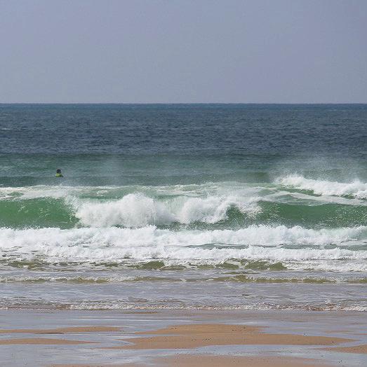
5. Composition: [MUSIC] In this section, I want to talk about the
horizon line and the focus. If you look at this
painting behind me, I want you to focus
to beyond the waves. There wasn't really much
going on in the sky. You'll notice that I've
put the horizon line about 2/3 of the way
up the painting. Maybe you've got a
scene that inspires you and the beauty is in the clouds, in the cloud formation or
in the colors in the sky, and you want to emphasize
that in your painting. Well bring your horizon line down 2/3 to make more of
the sky than the sea. These are things
just to consider before you actually
start painting. Now to encourage you just
to maybe spend a bit of time looking at the paintings
and seeing how it works, where the horizon
line is and what you prefer before you start
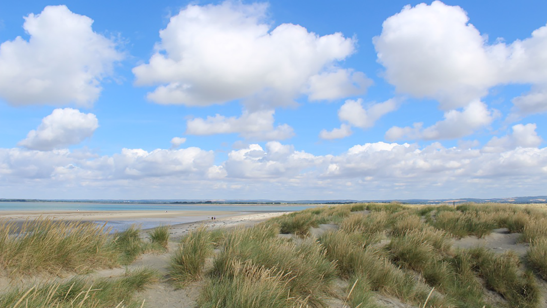
your own painting. I've provided a couple of reference shots
that you can use, one of which I've
used for the project. But I'd also encourage you to go out and get your
own reference, maybe you're near the coast and you can just pop out and get some great shots that
you actually love. Or maybe you've got a favorite holiday spot and
you've got photos of that. Just find something that
really inspires you to paint, and I think you'll
get a greater result. [MUSIC]
6. Colour Mixing: [MUSIC] Now in this section, I'm going to talk about color. I'm not going to get
really over technical, but I just like you to
spend a little bit of time looking online at
what colors inspire you. Some seascapes a
very dull colors, some are bright and vibrant, some are more leaning towards aqua colors and
some towards blue. What inspires you
because that's going to be better for you to
use in your painting. There are different shades of blues and different shades
of yellows and reds. These can make a big
difference in your paintings. There tend to be warm
blues like ultramarine, cool blues like cyan, or cerulean blue, warm yellows such as cadmium
yellow hue, warm reds, cadmium red hue or pyrrole
red and cool yellows such as process yellow or
cadmium yellow primrose, and cool reds, process magenta and
quinacridone magenta. Now you might think, well, why do I need all those colors? Well, it'll just
make your life a lot easier when you're
doing a painting. If you mix an ultramarine
and a warm red together, you're going to get this
murky looking purple color. Then if you add white, thinking that will
make it brighter, it will just go a lighter
murky [LAUGHTER] purple. Whereas if you mix together
a cyan and magenta, you'll get this much
richer purple and if you add white you'll get
this lovely lilac color. As you can see, the type of
blue and the type of yellow, and the type of red that you use will give you completely
different results. I would just say have a go at practicing mixing the
different colors. I'll give you an example. You can practice
just adding white to colors like this
cadmium yellow medium. I've just mixed white in
with it to see what it looks like as it gets lighter [NOISE]. You can also do that with
the blues and the reds, and then maybe add
a little bit of yellow to the cyan and
see what color you get. Then here I've added a
little bit of magenta because I was trying
to get that sky color, and I wanted to see the
difference when I added magenta to the ultramarine
and to the cyan. Obviously, that's useful to
know because some skies do have quite a lilac tone
just above the horizon. I'll just say practice
mixing your colors together and it will give
you more of an idea. I mean, a lot of my color mixing I do without even thinking
so I've had to do this to really think about
what I'm doing to show you because I've been painting for years and I just do it without even thinking. I'm not saying I
always get it right, but I don't tend to follow a
logical process if you like. But if you're more a
logical process person, you'll find this
exercise very useful. The other thing which
is very useful to know, even though I'm not
getting into the whole color wheel thing is say you have, probably you've seen
people starting out painting and they do
their grasp very vibrant, bright green and
just doesn't look natural in the slightest. Well, a good thing to
know is if you print out a color wheel from the
Internet, this loud to them. If you're painting a green
color for the grass, a handy tip to know is if you
paint the opposite color, if you add a tiny touch of the opposite color
into that green, it will dull it off and
it'll look more natural. Also, black and yellow
actually make a nice green. Obviously, you
don't need a tiny, tiny bit of black, but that makes some
nice greens as well. If you want to dull
off an orange, you'd add a tiny bit of blue. I hope you've enjoyed
this section on color, and I just really
encourage you to spend a little bit of
time color mixing, getting used to the
paint, the consistency, but also what you need to up to what to get the desired result. When I was at college, our
illustration lecturer, he's to make us all do this exercise where we get a
photograph from a magazine, and alongside it, we'd
have a piece of paper and we'd have to
match every color on the edge of that magazine. That was such a good
exercise to do, to get used to
knowing what to add to what to make it
the exact color, and also know about what
the color shift was when the actual paint dried to see if it matched the
magazine photograph. If we have time, I'd encourage
you to do an exercise like that and become more proficient in your color mixing. [MUSIC]
7. Mark Making: [MUSIC] In this section, we're going to talk
about mark making. There are so many
things that you can use to make marks in a painting. From toothbrushes
to points cards to sticks that you
find in the garden, your imagination is
your only limitation. Let's get started.
Now, obviously, depending on how much water
you add to your paint, you get different effects. Here, I've just mixed
some cyan and some white, and I've just added a tiny
bit of water and made it into a cream consistency
like single cream. That just, with not
too much water, it gives a nice consistency. Now, there are different types of thicknesses with
acrylic paint. You get heavy body acrylics and you get just
normal acrylics. The heavy body acrylics
can be good if you're wanting to add a texture
into a painting, or you can also add different types of mediums that you can buy
for acrylic paints. Some of those are like
pastes that will make your paint thicker or thinner or in such a way that they won't dry as fast and
give you more working times, all sorts of different mediums. But for this class, I just wanted to keep it quite simple, so we're just going
to be using water. Now, that's with a wet brush. What happens if I
use a dry brush? Remember to put the
paintbrush in water, which I nearly didn't do, and that would have
been dried like a rock. Now I'm just going to use
the paint without any water. Then you see that it gives
a really nice texture. That's like a dry brush effect. I do actually use that effect
a lot in my paintings. Also, once that first
layer has dried, that's the great
thing about acrylics, is the drying time as well because that will
dry quite fast. Once it's dry, I can just do that texture on top of there, and that will give
a lovely effect. You don't have to wait
for hours and hours for your paints to dry. If you're very impatient, you can even use your
hairdryer to dry even quicker. Let's try out some
other textures. You can also use a roller. [NOISE] gives a nice texture and, obviously, different
textures with different amounts of paint
and different drynesses. Or if you press hard or lighter, we get a different effect. Also need to wash it
off quite quickly. You can use things like
corrugated cardboard, that will give a lovely texture. The thing is with
acrylic paint is not to worry about it at all because the fact is you can go over it, and you
haven't ruined it. That gives another
type of effect. You can use these fan brushes. I don't really use
these very much. Let's have a look what
effect this gives. That would be good
for sea spray. I think I've used it a
couple of times for that. Can also use just things that
you get out of the garden. This is an old stick and I just sharpened it at
the end with a scalpel. You just get interesting lines. It's often better to use
something like this and a very thin paintbrush
if you're wanting a more impressionistic style because when things are too rigid and they look
like a paintbrush mark, it's just not as
natural looking. Now, I don't know what this is, but I'm sure that will make an interesting
effect as well. You can use things
like points cards, things like this, just
plastic bachelor type thing. You could also go into it with a palette knife. Scrape it out. That just gives you an idea of different kinds of
effects you can get. Also, nearly forgot
my handy weapon. Unfortunately, this one has
gone a little bit hard. So I shall have to
purchase a new one. But this gives different splattering effects, toothbrush. Look at that. That's
great for sea spray. That should give you a
few ideas to work on. You can get many
different textures. You can find things
in your garden to make textures with; leaves, sticks, plants,
anything like that. Objects around your
house, DIY objects. Your imagination is what will determine how many
marks you can make. I'll see you in
the next section. [MUSIC]
8. Your Palette: [MUSIC] The colors that I would say are essential for this project, I know I've added a
couple more colors as a general basic kit. But the ones you'll need for
this project are process black or Payne's
gray, ultramarine, process cyan [NOISE],
process magenta, process yellow and titanium white and I can use quinacridone
magenta if you wanted, that won't make a difference or cerulean blue
instead of the cyan. Now I'm just going to lay out
the colors on the palette. You just need a
little bit of black, ultramarine, quite
a bit ultramarine, cyan or cerulean blue,
[NOISE] process magenta, a little bit of that, yellow [NOISE] and I'm just going to put quite a lot of white there. [MUSIC]
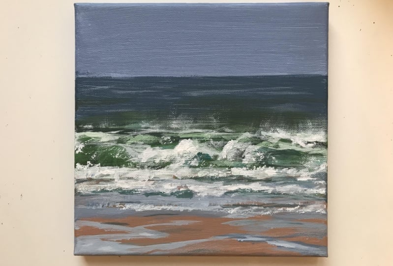
9. Blocking in Layer 1: We're just going to
mix the sky color. If you look at the photograph, if you are following
along with the reference, this guy does have a
slight lilac key tone to it and it's dull as well. It's quite a dull sky and you don't have to do
it exactly like that, but I'm just going
to follow along with the reference at the moment. I'm going to get some cyan, a tiny bit of the magenta, and a tiny bit of the
black coat paint gray, and I'm going to
add quite a lot of white and see what
we've got there. A little bit more magenta. Just using my palette
knife to mix, it needs dulled off a bit more. Don't worry if you put
too much black in, you can always just take half the mixture and then add some more white and
maybe add a bit more color. Don't panic if we
do something wrong. I'm going to add more
white because remember when you are using the
student Grade acrylics, they do dry a little bit darker, so just keep that in mind. This might take a little while. You don't have to
get the exact color, but if you want to, it just takes a little while to color mix and come out a little bit of
ultramarine as well. Just a little touch. Then, I'm going to use the
rest of that white actually. Put this on sea. It's quite a decent consistency, so that will give good coverage. Also I'm going to
put some water on my brush which will
help loosen up. You might need to dip your brush in one more time, just so it flows on easier, and then I'm just going
to paint my top brush, and see what it looks like. While it's still wet like that, I'm just going to
paint down the sides. You can do this afterwards, but to be honest, when
you've got your color mixed. It's a lot easier just to go
along above point in time. Rinse your brush out and then I'm going to go for the
mid-tones in the sea color, and an up that before
this is completely dried. You also need a little
bit of kitchen roll, just wire your palette
knife on things. What I'm going to add to
that is some ultramarine. Move up a bit so
you can see that. Small cyan, a little bit of yellow, and some blob
of Payne's gray, see what kind of
color we get back. Just keep turning
your palette knife over to mix the
color in properly. Think about a bit
more ultramarine. Good thing about mixing with the palette knife, I do use the brushes sometimes, but you are not really wasting as much paint because
it's not getting stuck at the top of the brush. Still think a little bit
magenta. Take more white. Tiny bit more black. Go over that edge because I want to
self-blend that in a bit. Now, say with horizon lines, I generally soften them
with my finger like that. Because I don't really
like a harsh line. I'm just going to go up again. I think if you might horizon
just a very stiff line, it looks very unnatural. Just go to the sides
again like that. You might show the meet, the horizon on the front. You can either do that with your finger or, the sky is a little bit damp, so it's just smooth
and better to be honest. You can do
it very lightly, and if you put your
brush and paint, brush most of it off. It's a dry brush and
just very light. Go for that to
soften the horizon. As I said before in the
mark making section, the dry brush effect
is very useful for many different
aspects of a painting. I'm just going to
dry that off again. Obviously, I've got my head dry well away from any water, and then I'll come
back and we'll fill in the bottom section. For the sand color, I'm going to use yellow, a bit of a magenta. Now, you can see
that's very bright. I don't think you'll see
much sun as bright as that. I'm going to put in, let's
just think about this. Let's look at our color wheel. To dull off the yellow,
it's a bubbly color. Obviously, a little bit of magenta and a
little bit of blue. Just a tiny amount. Then we're going to add quite a large bit of white and see what
kind of color we've got. Now, the sand in that photograph is warmer, thought a
little bit more magenta. That's becoming more like it. Just a tad more white. See what that looks like. I think it could still do
a little bit more magenta, a little bit more. Just needs to be a
bit richer still. As I say, when you've got the other
colors on top with this, this [inaudible] tones going on top of that
and also white. It will start to build up and you can adjust
things as you go along. This is just to give
you a basic idea of where you putting the colors. That's yellow, magenta,
and a tiny bit of blue. There we've got
the light to sky, the mid-sea tone, and then the sandy color, and then we're going
to work on top of that in the next section.
10. Painting in the darker tones: In this section, we're
going to talk about painting in the darker tones. We're still going to be
using our large brushes. If you look at your image
with half-closed eyes, you'll see more clearly where your darker and
lighter tones are. I've just gotten
back to my original [NOISE] palette and
I'm going to mix up the mid to dark green
there, so some yellow. Add a little bit of
ultramarine and cyan, it doesn't match if we go
over the blue that you mixed earlier because I
will mix in as well. Then to do a lot of green off, I'm going to
add a little bit, it's a magenta which is
the opposite color to the green, red or magenta. Then I'm going to add
a little bit more white and then a
little bit of black. It needs more yellow,
so you just keep on adding until you get
the right color. A little bit more
of blue, I think. I'm just going to get
one of my flat brushes, one of those slightly
smaller ones and I'm going to show you that's
still a bit bright now. See even up to many
years of color mixing you still have to
adjust things as you go along. Then we're just going to put in pocking where the green
shades are going to go. I'll just go to the sides. Now, when you're working on
a smaller scale like this, is quite hard to be as free
as when you working on a very large-scale seascape when it comes to all the
mat making everything, so feel free if you want to do this on a much larger Canvas, it might be easier to try
all the different mat making but I didn't want
to overwhelm people, especially at the
beginning is an acrylic, just to give you a smaller
Canvas to start off with. So that we've got
the greens in there. If you look towards
where the sea foam is on the photograph, underneath is two
rolls of sea foam. This is more olivy green. Actually now it's a cooler
green, I would say. I'm going to add a little bit of black and a little bit of white. I'm just going to
add some of that in. Just wash your brush out. [NOISE] I can just work
on wet if you want to, with paints, that can be fine or you can wait
for that layer to dry. I'm just going to go
ahead and add some deeper Dilla green at the
bottom of that wave. We look at the shape
of it [NOISE] and just I can either use a palette
knife or the brush. Then I'm going to
make it even darker on the right-hand side. It goes up. It doesn't have to be
exact because we will be going over that with
some of the white paint. At the bottom of this section, we're going to make it darker and just fit on the bottom
of that section as well. During the process
of doing a painting, it will look really bad. So don't worry about that because it all
comes together in the end and some slightly
darker tones in there, that's very dark along here, just having a bit of
black into the green. In the middle of that part, there is darker as well. [NOISE] So I'm just going to
go and dry that off. [MUSIC]
11. Painting in lighter tones: [MUSIC] In this section, we're starting on
the lighter tones and we're going to use a
slightly smaller brush or you can start using
your palette knife to dry my brush
off a little bit. I might keep mixing a bit
as it gets too bright. We can also use the palette knife if you'd
like to at this point. You can tell off slide you
the tiny bit of black. This is off. Slight
a bit but not as light that's coming
on the top of that top piece of the waves. I'm just going to put that in. I'm just going in
very lightly with the brush at this point. [NOISE] I'm going
to let that dry. Then I'm just going to put a
bit more detail in the sea. I don't want the detailed
stand out too much. I don't want that to be too
much contrast in the sea behind the wave because the main emphasis
really is on the waves. I'm just going to mix a
few tones of the sea. Marine, cyan, a bit white, and a bit of black. [NOISE] Tiny bit of yellow. Let's just see what the palette
knife looks like on that. Just run it along
on its soft side. [NOISE] I think for me, I feel is going to be
too much contrast, but you can do that
and then you can blend in with your
finger a little bit. I think for this, I'll draw the use. My brush actually. Just lightly go along. Since impressionistic, you just don't need
to worry too much if every brush stroke
is in the right place. [NOISE] Then some darker tones in there. I'm just going to
make it darker. Hello, it's sine
ultramarine and black. Brush really flapped not help. This is softer reach there. Then just behind the
green part of the wave, there is a darker part. [NOISE] I'm going to go even darker. Just for a few little bits. Hardly touching the
canvas with my brush. Just very, very lightly. I've got some smooth interface. I'm going to leave at the
moment, may be come back to it. Now I'm going to go to the
darkest tone of the sea foam, which is greeny
gray, I would say. I'm not really bothered
about having not blue on my palette knife. I'm going to add
some more over here with what's left with
the blue on my knife. Little bit of yellow
and a bit of black, [NOISE] gray, green. Try it out I think. Maybe
a little bit more yellow. I'm going to block in
the sea foam areas. Just look at the
shape of these pots, how the wave forms. You can take a bit of your brush if you've
got too much paint on. Let's go very lightly in there. Remember the dry brush effect, you can do that
in certain parts. [NOISE] Can go light to that
where it breaks up a bit. Then on the top of that
wave come down there. This bring that in a little
bit since sections line up. I'm just going to
go on top there, where it becomes a
little bit lighter. Just do the general
shape because we will be going over
it with the white. Just try and leave some of the shading of the
waves in there. You might want to use
your palette knife. Or you can use your palette
knife for the white, which would give a nice effect. [NOISE] These two lines silver
of that white sea foam. Can make it tiny bit gray. [NOISE] In some of the paint
off my brush and just lightly just stroke in the surface just to make
some of that spray come up. Just very gently. There's hardly any paint on it, but it just gives up misty
effect above the waves. Notice that is not bright white. Just bring little
bit up here as well. Doesn't have to be
exact, remember. That's a good basis
for the waves. We'll support a little bit more. A little bit's coming down here, you can use the top of
your brush as well. I'm going to dry that off and then we're going to
go onto the white. [MUSIC]
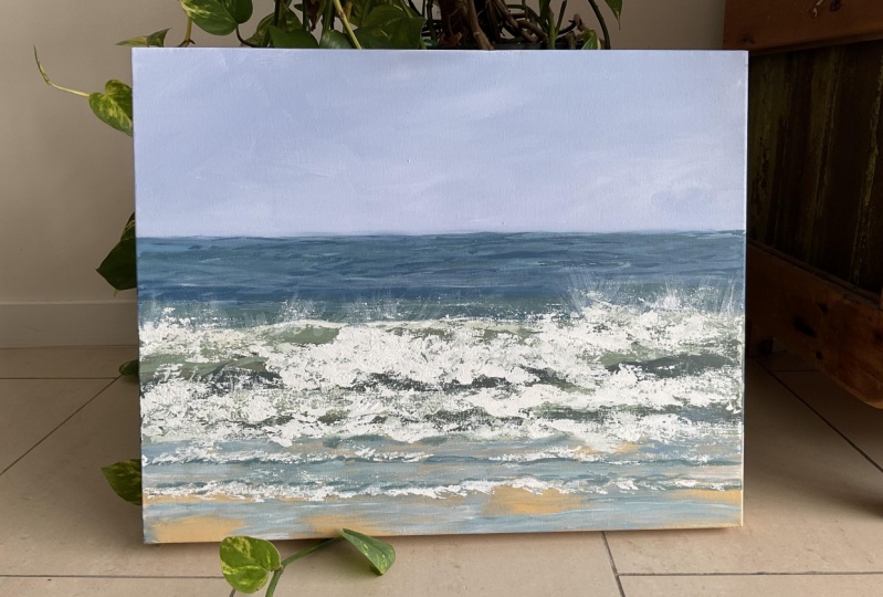
12. Final Details: In this section, we're going
to do the finer detail. Now I'd encourage
you to just try and loosen up with this
part and have fun. You can use your toothbrush to splash on little flux of water. You can scratch into the surface and use
those other tools that you collected beforehand to make into a more
interesting painting. Now I'm just going
to go on with the white onto the sea foam. [NOISE] I'm just going to do it
quite dry so I've got some other nice little parts
and little bits coming in. [NOISE] Now, if you find this too hard to control with the palette knife, feel free to use a brush. I'm going to also use a brush. [NOISE] Also scratch into
this to give it a little bit more
interest in movement. Could the movement of the
water coming down like that, and then some little
bits coming off it. That one's around a shape. Maybe your brushes in different ways just
give different effects. Make sure you try and leave some of the shadow coming through. You may want to go
on a little bit thicker with a palette
knife as well, give it more texture. As I say, this is probably
a little bit easier on a larger canvas is not quite
so easy with this size, which is to give you a taste of how to go about, this Skype. [NOISE] These little bits
coming down that, but they're not
quite as obvious, so you can just
match them in a bit. I'll add a bit more yellowy green tone
in there somewhere, just give it a bit of life. These are things that
you'll see as you go along. [NOISE] Something
that I'll give it a bit more of so to speak. I can add it in and it will feel those
places elsewhere as well. You can scratch
into that break up. I'm going to add blue
at the foreground. I'm going to get a
magenta, ultramarine, little bit cyan, some white
and a touch of black. I'm just going to quickly run. Doesn't have to be
exactly like graph. I'm just going to run those
across where I want them. Then they may want to put some
of that color in the sea. While I've got on my
brush, might be too light, but we'll see you wrap it in. Memorial, blend
into the sea color, I think it's a bit light,
but I'm just going to use it very lightly on that to
bring a bit more detail. Now as you can see that
stand out too much. I'm just going to
go over it with a damp brush and just blend in a bit more exclusive
of the tissue. I'm going to add a little bit of white really to the sea foam in the foreground. [NOISE] I'm also going to make
the sand slightly darker because I'm not totally
happy with that color. That's the yellow and the magenta and a
tiny bit of blue. [NOISE] Now, I'm just going to add a
little bit more of green in the sea at the back of the wave because the
more I look at it, the more I see it is
a bit more greeny. I'm just going to lightly brush
that green over like that [NOISE] and then just
blend it in. [NOISE] Now, add just a
slightly light tone of it in through there. [NOISE] Now, if you wanted to add a
bit more of a dynamic color, you can add little bits of cyan mixed with white and things like that
just to give it, you don't actually have
to be in the photograph, but sometimes it just makes it a bit more vibrant if you add a few little bits of hints
of color going through. You can make it look a
little bit more contemporary looking as well [NOISE]. Now, we're going to use the fan brush and
the toothbrush. [NOISE] We're just going to add a little bit more
white to the pale green. Take some on my tissue. Just re-add those in. [NOISE] Now, this toothbrush has
gone a little bit hard. My goodness, it's
gone very hard, but I think I can still use it. You know why that
is? Because I didn't wash it out [LAUGHTER]. I'm just going to flick
some white bits on there, this gives it a little
bit of energy, really. This bits that goes on that
you don't want them on, [NOISE] quickly wipe that off
and might go too high up. But just be careful you
don't smudge them all. [NOISE] It is parts of it that you want to think need a bit extra, something like there
is an olive green at the front of the sea foam and I think that needs
an extra something. [NOISE] I'll say also, when you're doing a painting, just leave it overnight
after you've finished it. Don't think that that's it, but come back to it the
next day and often, you'll think it isn't actually quite finished when you thought you'd finished it, you come back and you think, now it needs a little bit
more work and that's fine. It's best to have a break
from it and then come back. I'm just going to add a
little bit of blue into the bottom of those
waves as well. I think the sea needs a
few darker tones in it. I'm just mixing small blue and adding a bit of black to it. What I'm doing now is
I'm going to wrap them in just to match
them a little bit. I'm being very light with
my brush at this stage. I'm just going to add a
little bit more blue in the foreground and then
I'm going to leave it, because you can also
overdo paintings. Now we have an
impressionistic seascape. Well, I hope you've
enjoyed this project and I really look forward to seeing
your work in a gallery. Also, just take a moment to encourage your
fellow students. Thank you. [MUSIC]
13. Varnishing & Fixings: [MUSIC] In this section, I'm going to tell you everything
that you need to know to varnish your
painting, to protect it. Also, I'm going to
show you how to put the D rings on the back of your canvas so you can
hang it straightaway. In this section, I'm going to show you how
to varnish a painting. Now, leave it to dry
overnight at least, but it's better really
for longer if you can. Now, the varnish I'm
going to use today is Winsor and Newton
Galeria matt varnish. You can also use
gloss varnish or silk varnish if that's
what you prefer. I'm just going to not shake it vigorously and get loads
of air bubbles in, but just gently turn
it a little bit. Then I'm going to put some of it in just a plastic
clean container. I've got a wide brush, just a nylon brush. Just make sure you
haven't got any dust in it or hairs that are going to come out with
the brush into the varnish. [NOISE] Just make sure there's no bubbles in the
varnish as much as you can. I'm going to go down
the ways first. Because this is a
small painting you can do this all in one go. Some of my largest escapes I'd have to do in
sections so I tend to do the sky section
first and work it down in sections that will
be the least obvious. If for some reason you could see that it
was done in sections, I do it in a way that
is not obvious at all. [NOISE] I'll do
the sides as well. [NOISE] Before it has a
chance to dry at all, I'm going to quickly go across. Then you can hold up to the light and make sure there's no spots
that are missing out. I discourage you from going
over and over it again. It's better to leave it. If it's still very wet and you think you've missed a
bit just quickly go over it. But I would say as much as you can don't go over it because it'll start going funny after a little while
when it starts drying. Just look into the light, make sure it's all covered. If you have got any tiny
hairs or anything like that, you can just very quickly remove them
with either a pair of tweezers or a scalpel blade
or something very thin. I'm going to leave
that to dry overnight, preferably longer. You can add on a second coat if you'd like to once it's dry. Also, please remember
with the varnish, like the paint or the gesso you must clean your
brushes straight away, otherwise, it'll go hard. That's how you varnish
your painting. I'm now just going to
show you how to put the fixings on the
back of a painting. You'll need a ruler, a
bradawl, a screwdriver. These are called D rings. I'll put it on here you might
be able to see it better. You should be able
to get these from your local art shop or
on Amazon or something. You might have to get a
set of 10 or something. I'm not sure if you
can buy them singly. First of all, I'm going to measure it down probably
about six centimeters. Just put a little line there. I'm going to see where
I want to position. I'm just going to position
these just above the line. You'll see there's
a little curve in there and the other side is flat so I'm putting the
flat side against the wood. Then the little D ring
just hangs over like that. I'm going to make a little hole where I want the screw to go. Just make it easier to be honest and on this side as well. Then you just want
to screw in these. [NOISE] I'll mention this,
it's very important. Make sure your screw
isn't too long. You don't want it coming out the surface of the painting, that would be a disaster. [NOISE] Screw those in. [NOISE] You then want some picture code. Again, you'll be able to get
it from your local art shop and hopefully buy the
meter or something. I'm going to measure
about double an extra. I'm just going to do it like this so you know how to do it on a heavier
painting as well. Put those through there
and then through here [NOISE] and through underneath
and through the other one. Pull it tight. Do it first not
keeping it tight. [NOISE] Then I'm going to
go over and under. Pull it. Then from this side,
over and under. I'll just do a few because
it is a very light painting. But if you are doing
very a heavy painting obviously you'd make
this a bit a lot longer and do a lot more knots. That should be enough. Then
to finish these ends off, I just tend to put a
little bit of PVA glue on the ends and that just
prevents them from fraying. You can also put a little bit of framing tape round
here once that's dry. But at this stage,
you won't need that. But just along the road, you might want to do that. Then you can just hang it
up from a picture hook. That's a fixing. [MUSIC]
14. Final thoughts: Congratulations on
completing this class. We've covered everything from materials to how to
hang a painting. There's one thing I want you to take away from this class, is just enjoy painting. Acrylics are very forgiving, and if you make any mistakes, you can just paint
over it and start again. Just give it a go. Please remember to upload your completed project
to the gallery. I'd love to take a look. Also, if you can take the
time to leave me a review, I'd really appreciate it. You can also follow my profile if you've enjoyed this class. Thank you once again, and see you next time.
 Linda Vine, Fine Artist - Linda Vine Art