Transcripts
1. Impressionism: Paint Like Monet, Introduction: Hello bonjour. Welcome to my new course. Impressionism. Paint like Claude Monet. My name is Isabella and I'm an artist painter from
Edmonton, Alberta in Canada. It is my pleasure to introduce you to the painterly technique of the great French impressionist
master Claude Monet. I have chosen three
masterpieces of his. First, or the water lilies. The second is one of
his amazing landscapes. And the third is an image representing venues
to paint for you. While painting, I
will provide you with step-by-step
instructions to help guide you through the process of painting your
own masterpieces. In matter of seconds, beautiful masterpieces will come to life in front of your eyes. And all of it by discussing more or less color palette, compositions,
mark-making, texture, and all the possible
painterly tricks of the trade that to make such an amazing
and unique master. By the end of this course, you should be able
to recreate three of his masterpieces
and beer either to create your own
paintings in style of bone that you can
use and reference, as well as subject matter. Since moon there was a
very versatile artists. For your convenience, I
have included supply list. Please feel free to use any additional color you
have available to you. This course is divided
into sections, each providing queue
with a specific set of information to guide you in
your own process of creation. And don't worry,
the instructions are simple and easy to follow. So without further ado, let us begin our artistic
journey. Have fun.
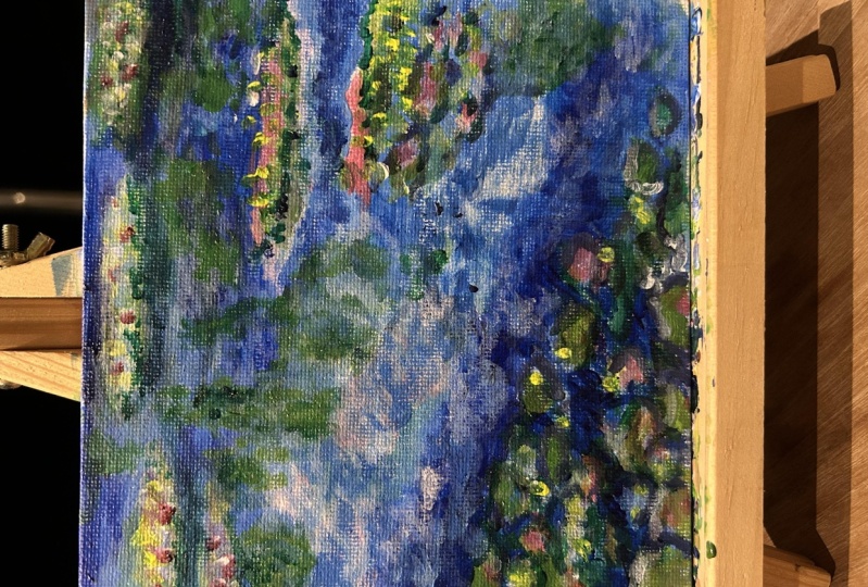
2. Project 1 (Water Lilies), P1, Primer & Sketch: We'll begin with
application of our primer. For this purpose, we will use blue color and
then blue will do. For example, you can
use Sergio Leon, ultramarine blue or
even tale of law, makes sure that you
dilute the paint with water and apply it
on the surface of your canvas with a white brush without paying attention
to visible brushstrokes. The purpose of the
primer is to cover the white surface of the
canvas and nothing else. Then we can move
on to sketching. We will use the same blue color. This time we will not
dilute it with water. With the pointed small brush. We will start creating
the outline of the water lily pads or leaves in terms of
grouping them together, will be not concerned
about victim them exactly. This can be changed. Why continue painting
more details?
3. Project 1 (Water Lilies), P2, Water : To paint Walter, we
will need to switch to either field bird
shaped or blob brush. This size, I also change
to a medium width, for example, half an inch up to three-quarters of an inch. Remember that we can
use the brush in its full length or sight of it. Week, use two different
kinds of blue colors, such as, for example, ultramarine blue
and cerulean blue. Or maybe if you prefer, ultramarine blue, paler blue, and mix it with different
amounts of white to achieve various tints of
those two blue colors. We don't want to get the same tone of blue applied all over the
surface of the water. Instead, we will
vary those tones. Depending of the placement. The paint should be applied with horizontal brushstrokes of
one to two inches, blank.
4. Project 1 (Water Lilies), P3, Tree Reflections in Water: To create a reflection of
the trees in the water, will need to switch
to green color. For that purpose, we can use
the log green mixed with some yellow color and y or
amacrine available to us. The trick is that we have to mix it with some white and maybe even some of the
oxide yellow color to give it proper opacity. That means when we will apply the green color on the
surface of the canvas, we will not see anything else, but this particular green color
that we mixed beforehand. The strokes will
vary from vertical to horizontal and
the length as so, we'll switch between one to two, even four inches in length. The trick is to mix
the paint wet on wet.
5. Project 1 (Water Lilies), P4, Lily Pads: Time to switch to painting
their water lily pads. We'll use variety of green
collar, but most importantly, we can reuse the grid
color that we used to paint reflections
of the trace in water. We also are some of the purple
color mixed, of course, with tiny bit of white to
get the proper opacity and recreate the oval
shapes of the lily pads. Then using green color with more of the white mixed
or blended with it. We'll apply the paint to this surface representing
the empire leaves. For the contrast. We will also add
in some places and light pink color and work with some additional
yellow colors. My strokes, as you can see, a very loose, they are
not following exactly, just approximately the shape of the lily pads that were
created during sketching. What I pay attention to is
to create a nice contrast. When I talk about contrast, I mean the complimentary
color contrast by using pinkish or
in this case say, kinds of light reddish color, alkanes, green color
of the lily pads.
6. Project 1 (Water Lilies), P5, Water Lilies: Once the lily pads
are established using green and light green
and light pinkish color. We can then move to
painting water lilies. Just a remark. To give extra edge
to our lily pads. We will use purple, mostly underneath of them to give a little bit more
volume and contrast. The water lilies
can be created by using first a little bit of the green color
representing this time. And then flowers. How we do them well by
using some yellow color, some pinkish Scala, as well
as white in some section. Now, when I talk about pink, I'm talking the color that is in a very nice contrast
to the lily pads. It's a darker pink with some
addition of white pink. And why?
7. Project 1 (Water Lilies), P6, Water Light Reflections: To bring my own life
to our painting, we will need to include some lighter reflection
in the water. This time, we will
use a light pink. Even in some sections, white collar apply with
horizontal brushstrokes. Specifically there,
where we have some green color
reflected in the water. It's important to have the pin. So here we're playing with two different aspects
of successful painting. One of them is to create
temperature contrast, having quorum color of the pink and the
cool color of water, as well as reflections
of the trees and leaves. But the second as equally important contracts
is the contrast of tongue. We have the light colors
versus dark colors as the reflections of the
light in the water at, in contrast to the
dark blue collar or medium dark blue
color of the water.
8. Project 1 (Water Lilies), P7, Details: We will be moving now to the
details of our painting. We pay attention to creating a nice contrast if in terms of their use of dark
and light tones, as well as playing with the
direction of the strokes. This time, they can be
horizontal as well as vertical. The most important is to bring this beautiful
contrast of water with its reflection to the groupings
of the water lily pads. Since this is an
impressionistic painting, we want to make sure that
the colors that we use are bringing the brightness and happiness to the entire image. And that we also, with the brush strokes,
create this effect. Almost like a drops
of rain hitting the surface of the
water that we can see. Each of them separated, but at the same time, those strokes create a
unified composition. So there's vibrancy created with the use of colors that are
in contrast to each other, as well as with
the brush strokes, then bring more energy
into our painting.
9. Project 1 (Water Lilies), P8, Water Lilies Refinement: We are almost at the end of
completing our painting. We add some contrasts. We add some new
colors by looking and the entire composition to make sure that the
painting is colorful. That brings the vibration of the colors through
the use of strokes, either horizontal or vertical. That we also bring a little bit darker
color underneath of our lily pads to create a contrast and to also let
them sit on the water. As you'll notice,
they're lily pads and flowers that are placed in the back or in the
space after I present, the back are less refined, is just even more of the
impression of the flowers. What we want to concentrate
in terms of giving more of their shape or details. Or the water lilies. On the first plane, the one that we can see
in the lower left corner. Where do we use a
little bit more of the yellow and pink
colors to represent them. But at the same time, we can't forget about the beautiful settings
and groupings of the lily in the back dose
without specific details, but with using the contrast
can so beautiful at, to the entire block
of our painting.
10. Project 1 (Water Lilies), P9, Water Reflection Refinement : At this final step, we want to have a good look at our painting to determine
what still needs to be added or maybe what needs to be covered with
a new set of paint. We have to have a strong clock on our composition to see if the groupings of
water lily pads are correctly introducing our
viewers into the space, then we want to see if the water lilies are creating contrast to the
leaves and water. And again receiving bag, they should just show us the grouping cup flowers
without any specific details. And of course, to unify the
empire colors composition, I like to call it and see if nothing is coming
out of balance. We have to adjust the
reflection in the water. A little bit of civilian blue
attach of ultramarine blue, sometimes mixed with tiny bit of white or just with cerulean, will give us the proper
contrast between the lily pads, water lilies and the reflections
of the trace in water. The stroke that
we'll use should be either horizontal or vertical. This way, the
painting is complete. The last look at it. And evil are satisfied. We can put our brush down.
11. Project 2 (Le Grand Canal), P1, Primer & Sketch: We begin our second project, lead crown canal, by applying primer to the surface
of the canvas. I'm using pink color because I want to create
an interesting contrast, having blue and green colors applied on the surface of the water and
buildings. Later on. Notice how I apply the paint. I do it with the wide
brush without being very much concerned about
direction of the strokes. Because later on, our
smooth the surface by moving the brush
vertically and horizontally. Once the surface of the canvas
is covered with primer, we have to let the surface dry. After that, we can proceed with a sketch using green
and blue colors. The most important feature
of the sketch will be the line that defines where is the water and where
the buildings place, as well as the beak wooden pole. We can use green color such as Yellow Crane while
moving to the buildings. They're preferable color will be blue color, the darkest one. Therefore, by using acrylics, will want to make sure that
the blue paint will be diluted with water to
get a lighter tone. We start with the big domes. The first one, the closest
one to the wooden pole, and then the smaller one. We are not worried
about defining every little detail
at this stage, this will happen later on. Why applying more
colors will then define all the shapes of the architectural structures
by working from outside, for example, on the sky, as well as from inside, adding the colors and shapes
inside of the things. We also have to consider. The real things work consist
on two different planes, one facing the water and the second one that will
represent the side. These planes have to be created with slightly
different color combinations, which we will work on later on. Another important section is the one on the left
side of our Canvas. There's even less refinement or details to present on
what you want to have. There are indication of the older buildings
very far away, as well as some of the wooden poles receding
back into the space. This time we can
rely on the use of blue collar as a base
for the wooden poles. Now, those wooden
poles should not follow just a vertical line. They have to have
this organic cloak of the polls that have been
immersed in water for long time. And therefore, they can be slightly placed under
the diagonal line, al-Assad receding
back into the space. Those wooden poles have
to become slightly shorter as well as narrower.
12. Project 2 (Le Grand Canal), P2, Water & Sky: First Layer: Moving on to painting. Our water. Of course, the water won't
be completed in one layer. So therefore, we
have to think what will be the first layer and then which colors will we use later
on to create the effect of water with reflections of the things in water
that is moving, water that has vibrancy
and live in it. Therefore, as a first Karla, we will use Naples and white. If you don't have Naples color, you can simply mix white
a little bit better, a little bit of yellow ocher, and some of the
cadmium yellow light. The stroke should be short. It could be quite
wide and horizontal. Then we'll move on
to painting the sky. This time, we'll be using
quite mixed with blue color. For that purpose, you can
use ultramarine blue, cerulean, or even paler blue. But in the super small amount, then our strokes will be skinnier or narrower in
comparison to the strokes. We are applied in
section representing quarter and the direction
will be diagonal. We don't want to
create the same poem. It's all over. We also want some of the
primer color coming through. So therefore, not every
inch of the surface of the canvas has to be
covered with paint. Remember, there's a
reason why we use primer and why this primer
is of the pink color. We want to show it so
that we can create even more interesting
contrast among colors applied on the
surface of our canvas. We can also add or tone up Beth ignition and color
definition to our wooden poles. And then move to
painting or refining. The blue color on our buildings. That blue color that we want to use could be ultramarine blue, pale blue, or even if
you have cobalt blue. Now, we will concentrate with the application of
slightly darker blue on one part of one
side of our buildings. The blue, of course, will be prevalent in all
parts of the buildings. But the main position of the blue collar
should be placed on one side of those two sites represent, think our buildings.
13. Project 2 (Le Grand Canal), P3, Buildings & Water: Blue & Green Layers: We are moving to this stage
in which it is important to divide various planes on the
facades of our buildings. We have to make sure
that there will be a dominant color on
each of the planes. The one that we chose presently, the plane facing water or canal, will make sure to use blue collar at different
than cerulean blue. The blue collar
has to be darker. Either ultramarine
blue, cobalt blue, or even fail or blue
will do the job. The strokes are
approximately one to two inches long, skinny,
narrow. Mostly. The tone of the blue
is medium dark. In some places for
greater axons, we can apply the blue
in its full strength. At the same time, we can also bring some of the light blue cerulean
mixed with lots of white or even
ultramarine blue or cobalt with a gain
greater amount of white. And with diagonal strokes, we can apply the color in the sections
representing our sky. The far south, covered
with predominantly blue, is the plane facing canal. For the other plane of the
architectural structures, we will use another
dominant color. It is always important
to differentiate them. Otherwise, the 3D effect
won't be achieved even though the structure can be well drawn in terms of
lines and perspective. At the same time, when we have a right color, we want to add
reflections to our water. So we have green color and the blue collar as
present in our walls. At the same time, we strengthen the blue
collar in the wooden poles. Of course, as reflections of
the buildings in the water, especially the line that
divides water from the sky. And buildings, needs
to be emphasized with strokes of darker blue
and darker green color. So again, the facade
of the buildings that phase the canal needs to be emphasized with the use
of blue as a dominant color. Green color as well. At the same time, will pay a close attention to
developing some structures. In our buildings. This doesn't need to
happen right away, but with each additional
stroke apply, we will get the structure more detailed or
more characterized.
14. Project 2 (Le Grand Canal), P4, Yellow, Red & Pink Colour Application: In our next stage, we are moving to defining the second plane
of our buildings. This time, we will
rely on the use yellow ocher or oxide yellow
color and some pink and red. The yellow ocher color. It's a very warm, earthy color that
is very opaque and therefore nicely overs the
surface of our Canvas. We will not see true the
pink color of the primer. Therefore, if you plan to let some of the
primer be visible, make sure that the entire
surface of the wall of facade, representing the second
plane of the buildings, is not completely covered with yellow ocher or
oxide yellow color. This trucks will be most of
the case, applied vertically. Well be skinny, approximately
one to two inches long. At the same time
while working on the buildings with
yellow ocher color, we also apply it in other sections of
our painting so that we have an overview on the
entire work in progress. The oxide, yellow or yellow ocher color in
the full strength, all with addition
of white would be also applied to the
surface of the water. This time, the strokes
will change direction. Two horizontal,
one on the poles, stake in the water, so that partially we
will be able to see green and blue coming true. However, the dominant color will be the color of the wall. And you can see that
this addition of a little bit of burnt sienna
mixed with yellow ocher. But we should not forget that the dorms of their architectural
structures have to be also covered with the lighter
colors to represent the plane on the buildings
that is kept in line. Read will nicely
suit the roofs of our buildings at the same
time creating nice contrast. And of course, the
color has to be repeated in our wooden posts. Then pink, well nicely
complement yellow. Yellow, as well as
the green color that we can still see in the windows. And at the same time the whole structure becomes
more and more defined. The strokes that were applied, our body diagonal when
it comes to the sky, vertical when it comes
to the buildings, and horizontal when it comes to the treatment of
the water and wood, the pulse, depending
of its position, if it's vertical,
strokes will be vertical and give the poll, leans towards one direction
or another, will be diagonal.
15. Project 2 (Le Grand Canal), P5, Back To Light Blue: We are going back to
the light blue to apply it on the sections
of this guy in the water. This wireless, and mostly on
the facade of our buildings. We already use darker blue. Some of the grain
on this section of the buildings that is
kept in the shadow. And now it's time to bring a lighter blue with the
skinny short strokes, we need to feel the energy. And how can we achieve it? Well, by applying shorter, not too long, skinny strokes, one next to another. In some places. In some places some of those
strokes overlap each other. And of course, the texture, we shouldn't be no
cheap on the plane. We want to apply it a
little bit heavier. So this way, we will
create our soft texture on the surface of the canvas that
will have natural shadows. And you can see that painting
becomes more refined. Each of the strokes that you are applying refined
particular shapes. For example, it
gives us this sense, where are the reflections of the building is
placed in the water. It helps us to feel where is the right position
of the windows, as well as the shy of the DOM.
16. Project 2 (Le Grand Canal), P6, Creation of Contrast: At this time to work on contrast creation
in our painting, we achieve it by using different tones as well as colors of different
temperature. The contrast can be
achieved by implementing complimentary color contrast
using purple versus yellow. In our case, we are using column such as ultramarine blue being pose to the Naples column
created by the use of white and yellow ocher
or oxides yellow color. The same is with
red that is mostly applied on the roofs
of our buildings. In contrast to the sale of green collar use to create
plans of our buildings. So these are very important ways of creating contrast
in the painting. To spice it up, as I like to call it. And we'll play into
it all the time. Attention. Similarity
to more mad dog, use the complimentary
color contrast extensively in his paintings. As you can see here. There's the use of
the word and fall of the blue color contrasting
with burnt sienna color, representing the regular
color of the world, which again can be
treated as orange color. All of it allows the objects included in the paintings
become more vibrant. And as you'll notice, I constantly add plain, making the surface thicker. And the reflection in the water. It's a nice contrast to
the water by itself, represented with the yellow, Naples, yellow and
pinkish colors. This guy, of course, has this nice feel
of light blue, light purplish color with some of the pink coming through. That's helping to create
even stronger contrasts. Now, I can afford at
this stage to define to the greater detail
different elements included in our painting. So for example, the dome smell
have the nice 3D effect. And this is done just
by using the line, but also by creating this very interesting
contrast between the darker tones and the lighter tones on
both separate sites. Similarity stories
with our wouldn't pose the colors that
we have as the base. Now, our emphasize by some of the darker colors being in contrast
to the basic ones. I am, the water
constantly adding horizontal strokes of
lighter and darker colors. Gouache keeping some of the pink color being
present there.
17. Project 2 (Le Grand Canal), P7, Defining Planes: Time to define planes
in our painting. That means we have to use more precise strokes as well
as manipulate with colors. The way that we can clearly see which side of the
building is, which. Now we change of cross strokes direction will
change the colors, will create the tone now, complimentary color,
as well as color, temperature, color, contrast
to achieve those effects. So the precision at this
stage will be important. We have to make sure
that the facades of our buildings are the cup. That we don't have the buildings leaning towards one
on another side, like in case of our wooden
poles stick in the water. This is the regular process
of corrosion of time. But in case of the things that would be impossible
to be happening. We also want to make
sure that you can see the chimneys
on the buildings, that the dome structure
is strike that the top of it does
not move it in one or another direction, but it's perfectly
placed in the center. And at the same time
that the Windows, rows and columns follow the
proper direction and scale. We constantly work with the cars by applying
layer upon layer. And the best way to work is by working with technique
cost wet on wet. And since we are using acrylics, we tried to paint quite
fast and apply the paint with heavier strokes
so that even when we come to particular
place in our painting, 23 or even five minutes later, we still will be able
to bring our mix, the new color onto the old one. This can only happen when the paint underneath
is still wet or not. Try. Refinement is very important
because the refinement allow us to see clearly the
structure of the buildings. Which plane is the one
that faces canal or water, and which one faces the site. And we do it by working with also the
direction of the sun. One side is Lee Tuan by the sun. So therefore, we use
lighter colors on it. Then on the other side, we use darker colors
and different tones. As you can see, the sides of the
buildings facing canal is created with blue
and green colors. It doesn't mean that, that the only colors used in this particular section
of the buildings. Now they add the domain that and actually the blue
would be the dominant. And the second one will be the green with addition
of other colors. Why it's there. Facades of the buildings. The exterior wall
facing this side, o painted with
strokes, Brinkema, colors such as yellow
Oxide, red and pink. And even in some places, we can see the use of
burnt sienna color. It's important that the colors will not perfectly
blend with each other. Otherwise, the effect of this
thinking Kali will be gone. We want to see separate strokes of tones
and values, colors. We want to feel the thickness
of the pain by observing the separate strokes of
paint applied the surface, that texture is also
an integral part of the process of painting
used by Claude Monet. I'm still on the lighter colors. Actually I'm working
with both the darker and the lighter ones. I'm emphasizing the shadow
a little bit underneath of the roofs of the buildings
to give her better contrast. Even though I'm busy working on the architectural structures, I'm still adding the
colors that I have on the brush to all the
parts of the painting. Since in my opinion, they tell us on nicely
fit the other sections. That's how you do it by painting or by using
the technique of loan that you dance with your brush on the entire
surface of the canvas. The painting, which
color do you have on your brush will
bring their change, is the direction of the
strokes of your brush.
18. Project 2 (Le Grand Canal), P8, Finishing Touches: Time for the last
touches on our painting. I'll, what they have
to do is to look carefully at our painting
and make the decision. If we need to spice it up a little bit contrast
here or there. Or if maybe one of the building structure needs to be straighten
up a little bit, perhaps one of the domes
need to have more of a vertical plane and place its top or peak exactly
in the center. We also can low if Bechtel or composition is perfectly
ways and if necessary, we can always change
the tone or even color to adjust to the color scheme that we used in our painting. We can also look if some of the windows need to
be straightened up. If the planes of the chimneys
are correctly stated. And if necessary, add some
extra lines here and there. The reflection, as you notice, don't look as strong as they
used to have the backing and that it's happening
when you have more time to apply
more of the colors. Somehow. Some of those
colors blend with each other and some of them just super only leaving on the top. So this way, the painting
gets nice to refine. We are in control of its slope. And that also happens
when we use color or specific color on the
entire surface of the canvas. Even though we decide to print, for example,
buildings, we still, if we think that this particular color
that we just applied on one of the facades of the buildings will fit
the water right away. We apply the color to
the water as well. As you can see this painting, the primer Tala is feasible throughout
the entire painting. Sometimes we had to strengthen, that needs to reapply some of the pink in number of sections. However, we also left enough of that uncovered surface
to let the primer shine. I call it our painting
comes to completion. I hope that this will be enough information
for you to pick up your own canvas and working
on this particular painting, learning the tricks of the
trade of Mr. Claude Monet.
19. Project 3 (Wheatfield), P1, Primer & Sketch: All begin our third
project the same way as we approach
the first two. That means with the application
of their primary color, I have chosen color called burnt sienna and dilute it with water. If you don't have burnt sienna, I would recommend to
use either orange, which could be the mixture of red or yellow or red orange
color or venetian red. You will apply it by using wide brush and don't worry about the direction
of the strokes. At the end, you can go with another layer of the paint
and smooth the surface. The sketch will be
done with blue color, and I would recommend to use ultramarine blue and
small pointed brush. You have to indicate
where the horizon line up like couple of outlines
for the trees, mountains. And that's it. You
don't need to put more.
20. Project 3 (Wheatfield), P2, Sky: We were biking pink application
with approaching our sky. For that purpose, I'm using a blue color mixed with white. You can use colors such as ultramarine blue
mixed with white, cobalt blue mixed with white, or even paler blue. The most important thing that you'll mix the blue color with white in different amounts depending where you want
to apply the strokes. Notice the way how I apply the paint I use
for that purpose, A-flat brush that is
approximately half of an inch. You can also use
trick quarter of an inch or even one for. You can also use the side of the brush if you want to
create skinnier strokes. Strokes will go diagonally. And also the direction
would change of the diagonal lines in some places moving
from left to right. Why India orders following
from that right to the left? I use Y to indicate
some of the clouds. However, as you can notice, some of the primary
color is coming through. And even there are some
sections that are not even color with that
mixture of blue and why I've done
it on purpose to create so-called
complimentary color contrast, helping the blue of the
sky become brighter. Remember we're still
go back to the sky. So this is our first, the most important layer
that will be later refined.
21. Project 3 (Wheatfield), P3, Field: We are moving to
painting, our field. As you notice, there
are two parts of it. The front one or on the first
plane that is more greenish and the one in the bag that
require us to apply orangey, yellowish, and red colors. At this stage, I
made sure that they apply quite heavy
layers of paint. I use horizontal strokes, very short and heavy for the top part on the
field in the background. And vertical short
strokes to indicate the height of the
grass and whatever is growing on this
part of the field. The field and the
foreground has to have more of the
green color apply. I'm using here the
thaler green color. You can use any grain that you think will suit your painting. And of course, I mix it with y and some of the oxide yellow. It's even better to
use Naples color. That is actually the mixture of white and yellow ocher
or oxide yellow color. Strokes I applied similar way as the one in the upper field. They are short and vertical. Of course, a mixture of Greenland wide and
some of them Naples color is not enough in this field to make it
looking interesting. You have to also bring some
strokes of the colors used in the upper field into the lower field to create
coloristic balance. I also made sure
that the tones of the green paint applied differentiate depending
of the position. For example, the upper
part of the Greenfield, since we want to create so-called complimentary
color contrast by using dark green versus the red color placed
in the upper fill. In the lower part
of our Greenfield, we will be using
more of the light green, yellow ocher Naples, as well as yellow, green colors to indicate
that differentiation between what is in the
folder grab and what is in the background
of the green field. When we move to the upper field, we want to present the
difference between the vertical and the
horizontal plane of the top of the field. Therefore, not jars by using the horizontal strokes
in the upper part and vertical or very steep
diagonal strokes indicating the height of the grass or whatever
is growing there. But also with the darker colors. Different cuts, of course, not just in terms of the tongue. Red, orange, as well
as dark yellow will be the right colors to use on the vertical plane in the
upper field in our painting. Now I'm still adding
heavier layers of paint, especially in the
horizontal plane of the yellow, orangey field. Because I want to almost like physically present that
there's lots of going on. There's variety of different
flowers or grasses. And that we really
can feel them by even touching with our fingers.
22. Project 3 (Wheatfield), P4, Trees Details: We have to move to our trace. We already have nice blue color applied on them while
working on the sketch. This time we'll move
to the application of dark green color that will be created either by
mixing black into the payload grain or simply
mixing yellow with green. The blue in such a
mixture has to be the dark ultramarine blue or tail of the strokes have to follow physicians
of the branches. So when you have cypress trees, those branches would
be diagonal and short. To paint them, we will be
using pointed small brush. If you prefer, a little bit wider brush
than the filbert shape, will be the best. Now, don't forget that even
when you paint the bushes, you still have to
apply heavy paint, especially because they are
placed in front of the trace. Some of the lighter
green has to also go on top of the cypress trees
as well as on the field. In the folder ground. There has to be
connection between the colors that you
use in your painting. To strengthen the
contrast in our trees, we need to add additional
layers of the blue paint. But the way how we
do it is to fill the gaps between the
darker green strokes. The blow pain can be the
same we use on the sky. However, the tone has to be
at least three times darker. We also need to add hills
or mountains in the back. We don't need to mark the
mountains too strong, only needs to be
impression of them. Therefore, the tone of the mountains for which we
will use the blue color will be maximum two tones darker than the tone
used on the sky. Some of the blue,
the darker one, has to also go on the line dividing our upper
field and the trace. This way, we will
create an interesting tonal as well as the
complimentary contrasts, since we use orange or similar to orange color
and the upper field, hello on the line. The trees on the right
side don't need to be as pronounced as the
trees on our left side. If I paint them with the
same strength and details, then the painting
could be boring. Also, the size of the trees
has to be differentiated. The trees on the right side are shorter than the trees
included on the left side. We add some smaller branches to make sure that the
trees look natural. Of course, we only want
to create an impression. If you prefer to add some
of the purple in the trace, that will be fine. You can also add some of
the purple, but very, very light tone of it onto
the field in the folder. Grab. This way you will connect the colors within
the entire painting. Check at this stage, if you need a little bit heavier paint application
here and there, especially on the top of the field in the
bath or the upper one to create this nice division between the sections
in the painting.
23. Project 3 (Wheatfield), P5, Field Details: Time to move to our
field again to add additional colors that will
unify the entire painting. As you notice, some of the colors in their field
or not the local colors. That means the colors that
you can see over there, such as the greenfield, the variety of
different green colors, yellowish green, and blueish greens are sight
of those colors. We added light
blue, Naples color, purple color, and even a
couple of dots of red. We've done it because we wanted, I call it spicing
the colors to create some intense variety that would help the
viewer gets excited. Similarly, they felt on the top has variety of colors
included in that. A site of the Naples colors, we have yellow, red, orange, as well as some of the
brown and light blue colors included in it to make it
looking more interesting.
24. Impressionism: Paint Like Monet Conclusion : Hi again. I hope you had fun by watching the videos and now
are added to create your own masterpieces
in style of the great artist,
Mr. Claude Monet. As you have noticed already, it is not a difficult task. You have to know
are the tricks of the trade of this
specific artists. You can recreate the
same images I painted. Or you can right away, begin with your own creations using your own reference images. And also don't forget that we want to have fun
while painting, because that's what
it is all about. If you're enjoying my
style of teaching, I have more videos posted on Skillshare
educational platform. Among the courses that I offer
are the painting technique of the great Dutch post
impressionist painter van gag. That technique of
policies and as well as methods and techniques of painting mountains and flowers in
impressionistic style. I also plan to complete
a series of videos on how to create a
realistic portrait, as well as portrait in
expressionistic style. So just wait for them. They will appear on the Sign. In the meantime, I
wanted to thank you very much for
taking this course, and hopefully we'll
see each other soon. So for now, thank
you and bye-bye.
 Izabella Orzelski