Transcripts
1. Intro Video: Hello and welcome to class. I'm delighted to have you join me in today's acrylic painting class. We're going to be focusing on painting a bird in today's lesson. My previous class was about the background, creating that blurry background, and I did show the painting of a bird, but it wasn't in as much depth as this lesson will be. If you're interested in really honing those skills on getting texture, color blocking, sketching, and understanding your tools and how they will help you do all those things. Then join me for this class.
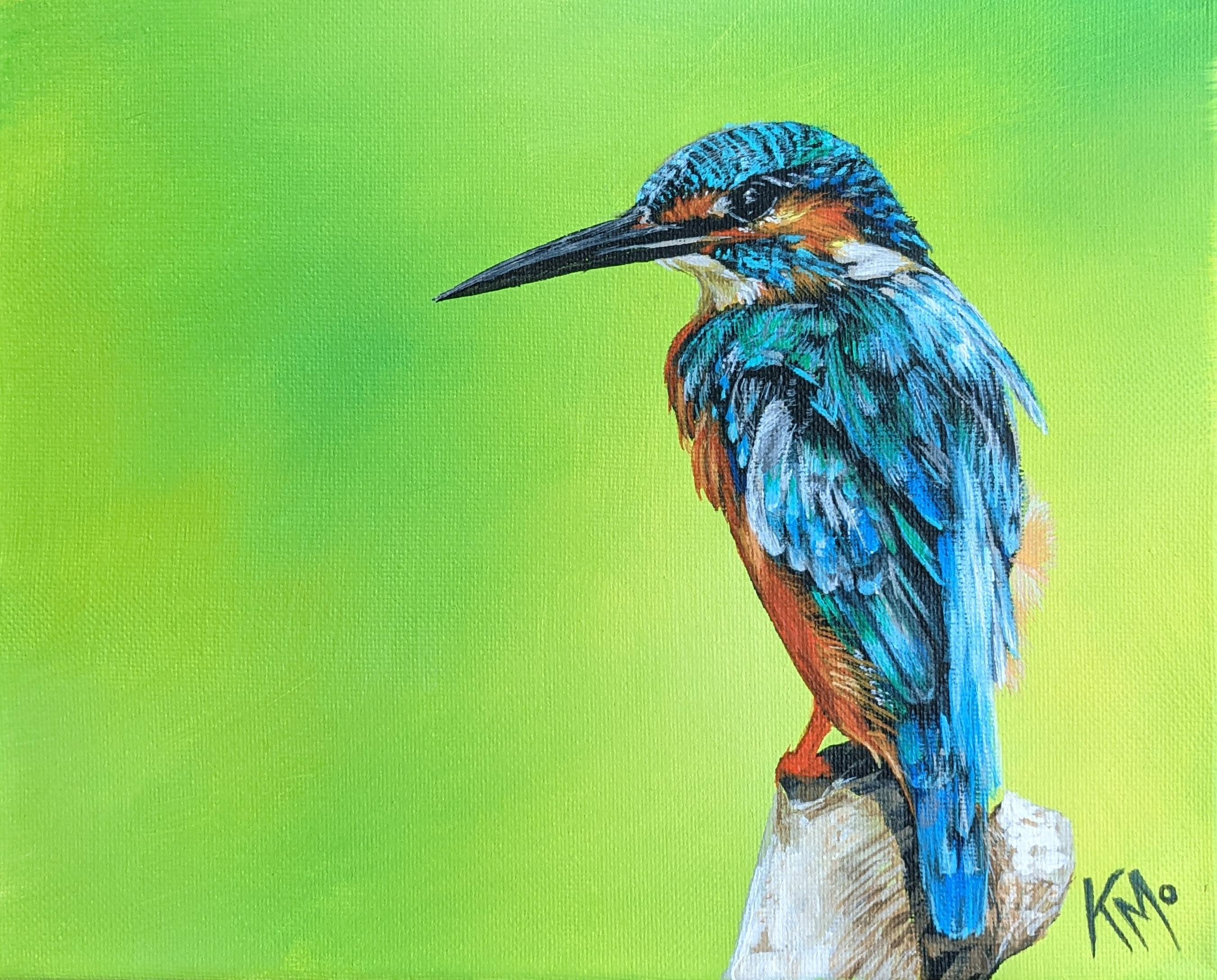
2. Class Project Video: I decided to do this class thanks to one of the students that took my previous class about blurry background. Thank you for your suggestion. Today's project, we will create a bird painting. It's similar to our last project, but this time we're focusing on the actual subject, the bird. We'll be sketching in our sketchbooks so that we have familiarity with what our picture is. This will help prepare you to do this part where we're sketching onto the canvas so you're not as nervous about that, you have more confidence getting into that step. Once a sketched on, you'll have even greater confidence in getting the first layer of paint on your canvas because we've already painted the background, so I can understand the nerves that come with trying to paint over top of something and not ruin what you've already done and accomplished and you are happy with. Some suggestions would be to get your materials altogether and ready to go right near you. Don't squeeze out all the paint that you're going to use onto your palette at this point. One thing you want to do is just open up the paint that you're going to use at the time. If you're going to be mixing some, open up those colors together. But if we're just blocking one color at a time, just bring that color out and put that onto your palette. It's not necessary to have all the colors out. With acrylics, they dry quickly, so you don't want that. Now if you need to take a break, stop or whatever was going on, you can take a wet paper towel or damp paper towel, put it over your paints. It will pick up some of the paint, but then put a saran wrap over top. Or if you're using a Tupperware, you can just close the Tupperware. The other thing I'd like to do is you have a little spray bottle on hand and mist some water onto my palette if I have a bunch of paints that I don't want to dry, but you just don't want to spray too much. You don't want to dilute the colors and have the acrylic lose its bond and strengths. Now, in this video, we're just showing a quick time lapse of it. But as you go through the lessons, we'll go slower so you can do a step-by-step process and not just a quick things. We're focusing on painting our bird. Note that the background should already be painted before this lesson. Go check out my previous lesson about how to make a blurry background if you don't know how to get started on that, or just do a solid color background. Okay, so let's talk reference image for a moment here. If you're a beginner, I suggest following along with this same image. If you're intermediate or advanced, find your own image, maybe even take your own picture. But whatever image you do use, make sure it is one that you're allowed to use. Somebody took that picture and make sure that you're allowed to use it. So whether you get permission from someone that's taken a photograph of a bird, or you're getting it from a site that shows that this picture has already been selected as something that is commercially allowed or whatever you're ending up using it for. If it's just for your own personal use, it's not as big of a deal, but I do suggest to my students to not just copy an artist or take something and then use it as your own. This is not my photograph and this was taken from Pexels, which is a site I like to use to find images that photographers, maybe there are newer or they just want to share their work are giving people the opportunity to access those there, which is awesome. I do suggest going out there and getting photos of your own if you can. So much fun to do, and it's so much more rewarding to find something and create it from start to finish and say, hey, I didn't make that bird, but I painted it. I took a photo of it. I really captured it, and nobody else will have that. That makes it even more special. Are you ready to dive into our first actual lesson? We're going to do some paint swatches. So get ready. Here we go.
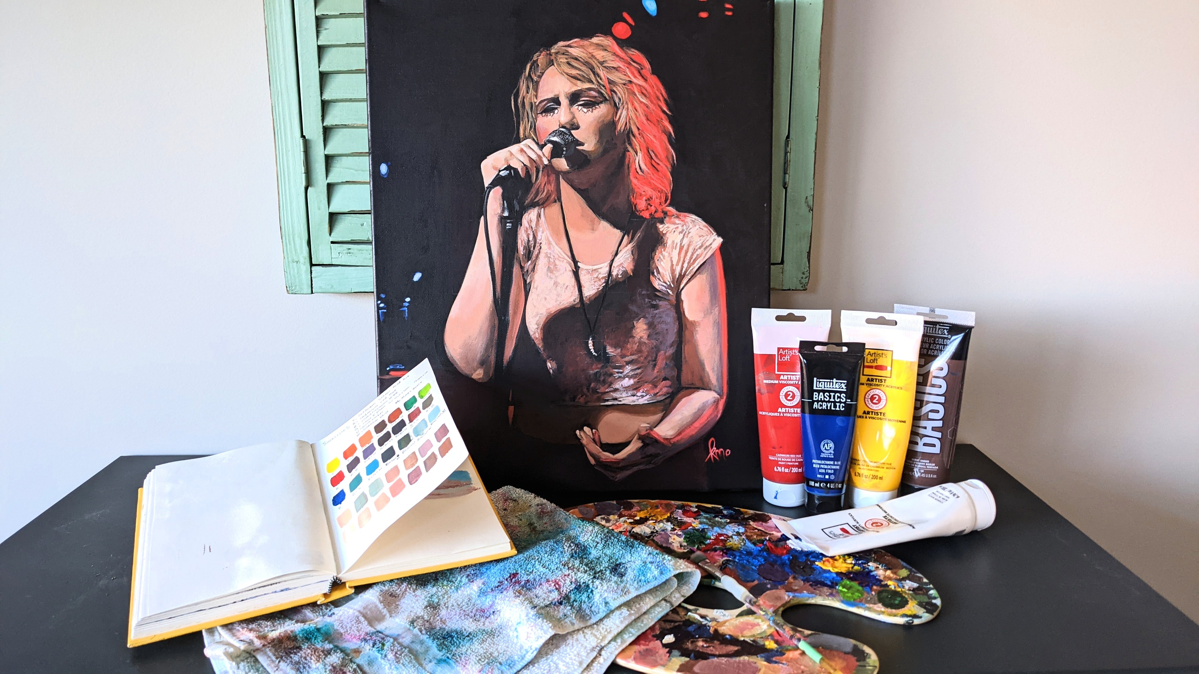
3. Swatches Video: Let's swatch it up. We're going to do some acrylic paint swatches. If you've never done this, this is like cataloging our paints to see what they actually look like when you put them to paper or to canvas. Keep in mind, we are going to be painting this on canvas, not on paper, but this gives us an idea of what paints we have and how they differ from each other, and our whole color scheme of our painting. I'm not going to do this with all my paints, but the paints that I'm going to be using for this piece. So these are all the paints I use to paint the bird, this kingfisher bird. I'm making nine blocks because I have nine paints that I'm using. Make them nice, a good size. They're about an inch by an inch and a half or so. I'm just making it rough. You can make it fancier or nicer if you want. Make sure you put down not only the name of the color. If there's a number next to it, I put that down as well as the brand so that if I have two raw siennas from two different brands, I know which one I've used in case there's any differentiation between the two brands. Writing them all down, and I'm trying to have it in a nice order. I'm starting with a titanium white, and then going in through the warm tones, and then I'll end with the cool tones, and lastly, the black. I'm just labeling all of them, getting them all around me. I'm using a pen that has this India ink in it, it's a micron pen, and these are really nice, and I believe I'm using an 08, so it's a good size. You could also use an 05. I wouldn't go to too small, but it's really up to you. Any micron pen like this would be really good. You can use a regular pen or pencil. Just use something that's not going to bleed into your colors. That would be important. A ballpoint pen might bleed, a sharpie might bleed, but you could try it, see if it does. You don't want something that's going to smudge right away or doesn't dry right away. These microns are great for that. Really love them for sketching as well. They're not about investment there. You can buy them in a set, as well as individually. Once I've got all of my squares, well, they're not quite squares, rectangles, drawn out, and I've titled everything, you can even write the date on this, I didn't put the date, but that would be a good idea, you could squeeze it right onto your brush or right into the square, I think onto the brush is a bit easier so you can see how much paint you are putting on, and then I'm just using a flat, small brush that fits about the size of the rectangle shape. Wash your brush. I have two jars of water. One of them is my dirty water, one of them is my clean water, starting with my dirty, going to the clean just to make sure it is fully clean, and then I wipe it on my somewhat clean rag. That's not wet paint that you can see on there. I have my pain palette there, but I'm not really going to need it because I'm just putting the paint right onto these little swatches. Again, wash that brush really well. Feel free to use the brush that you're planning to use for your piece. That just gives you a little extra time to practice with your brush, and it doesn't have to be perfect. I'm certainly not worried about it being perfect in there, but I know some of you will want it to be perfect. That's fine. You can do it however makes you feel comfortable, have joy in your work and your painting. It's your sketchbook, or whatever you're using this on. I'm using this in my sketchbook, and I like that. I really love this red color that is coming out right now; so fun, so brilliant, really gets those pops of that king fisher color that I really want. Feel free to wash out your water, switch it out so that it's not dirty through this process. I'm just making sure it's really clean in between so I'm not getting any mixture of colors, and that's why I have the two jars. You can even do three jars if you're really wanting to get it clean. But I feel like the two jars just pretty well. If my clean water is staying fairly clean, then I know it's pretty good. I'm getting to the end of this beautiful blue color that I love, this turquoise. As you can see, I'm having a hard time getting it because I'm right near the end of that container. But look at that beautiful turquoise. I love it. Might have to get more of that one just because it's so beautiful. You can see that I'm using a variety of paint brands. Do I have a favorite? I really like the Liquitex paints, and I'll just buy it if it's on sale, or if I just really need a color, or I see one and I'm like, ''I love that color.'' Totally depends on my mood or what's going on with my projects that I'm working on. There are so many different colors. This would even be great to do with just your blues; have a whole page of just your blues or get a poster and make a poster of all your colors. I haven't done this, and I would really like to, and just to even compare the different blacks you have, the different blues, the different yellows. You'll be surprised how different even a black can be from another black. Do this so that you can get to know what it's like, so that it can really help you make good choices for your painting. All right. Up next, we're going to get to know our brushes a little bit better. Let's go.
4. Brushes Video: Let's get to know our brushes that we're going to be using. I'm actually only using this one brush for this painting, the background I used different brushes but we're not focusing on that. We're focusing on the bird. The same page that I documented my paints into the paint swatches, I'm documenting if you have room, go ahead and use it there or get a new page is fine. You can do as much practicing as you want or as little you can create more activities than what I'm showing you here. I've written down everything that's on the handle of the brush, as well as sketched one out very quickly with my micron pen, so that I can paint over it. Then we're going to choose two colors. Any two that you want to use. Maybe I would just say not black just, so you're not painting right over the micron color but I shouldn't stop you. You can use black if you want. I'm going to actually use that bright aqua green that I love. Well, I love all the colors, what can I say? I'm getting my brush ready. I always give my brush ready by wetting it and wiping off the excess water. It just preps it to get the paint and be able to be movable and usable. Then when I pick up the paint, I get it a little bit on the edge of my brush wiping it on both sides. That's how I paint on, as well. You can see how I'm holding my brush, getting the outer edge and then filling it in with the sides of the brush. We're going to paint the little brush picture, as well as some shapes. Do as many shapes as you want. I'm just going to do a square, a triangle, and a circle and it made them quite small. It's actually pretty challenging to do it small like this. I'm not worried about it being perfect but I'm practicing both line and fill right now. Making the line of the shape and then filling it in. You can draw it first with your micron if you want. I was just challenging myself in a different way by just creating the shape as I painted it. It went according to the size of the brush that I was using. I really like an angle brush for some of these practice techniques that we're doing because it's hard to get a nice thin shape with some other brushes that I have like a round brush might work if it has a nice tapered tip to it. Now, I'm doing the outline on these shapes which I found to be pretty good, not too difficult. The circle one is hard, so that one is worth practicing some more. I shouldn't do that good of a job on either of this circles. You'll find that this brush might not be the best for me, in a circle maybe I should be trying a different brush. Let's also practice writing out your name. I feel weird saying writing when you're using a brush. We are really painting it out but it's still writing. We're writing with a brush and I have a long name. If you have a short name, maybe you can do your full name for more practice. You can choose a font for a greater challenge. Find a font on Pinterest or just online and try to mimic that font if you want. If you're not sure what style you want to do, I did all capital. I'll capitalize letters and similar style to how I use my letters for my signature which is not a bad idea, as well. I just use my KMO, Kristina Moyar signature on my paintings, just my little KMO on there but you can do your full name if you want. My full name is so long, it just feels like it's too much on a painting but it can work, I've seen it. This is the style that I use for my pieces. I'm just going to do my first name. I'm still using that same color. I just felt like I needed to make that S a little bit thicker to match the other letters, as well. Now, we're going to take another color. I'm going to take my rosian to give it really an opposite color from the color wheel. I'm still going to use that same brush and I'm going to fill in the bristles of the brush for that painting. Then a mini painting of the brush. Then I'm going to go create a little outline. I'm doing the opposite effect of what I was doing before. Now, we're going an outline around these shapes and then we're going to fill in the shapes on the right that are just an outline. You'll see actually how much easier it is to make a shape and then do the outline afterward than it is to do an outline and then fill it in. To me that's a bit of a lesson on painting technique, when you're painting an object, painting in the actual part of it first like the body of it, is easier than painting the outline of something and then painting, trying to fill in that outline. Drawing something and then trying to fill it in is a little bit more challenging than filling in the body and then getting the details in afterward and if you have an outline you need to do during the outline. Now that's just how I feel. But in this practice you'll see what you prefer. It's good either way to practice both because you're going to come across situations where having both abilities will be useful to you. For the most part, I'm using a fairly light amount of pressure when I paint. That's the norm. Pressures aren't usually meant to be smashed down onto the page or canvas. I'm also creating a 3D effect duplicating my name, trying to make the shape again, which is another challenge that you can face. Feel free to do this. Add more to this project, practice, do more shapes. You could even grab a coloring book and try and paint in a coloring page if it's a thick enough paper. This paper that I'm using is fairly thick. Some sketchbooks are quite thin. You might find that there are papers notwithstanding the strength of the acrylic paint. I hope you enjoyed that practice. Next, we have some sketching practice, so get your sketchbook and pencils ready.
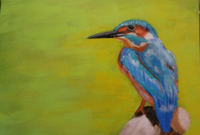
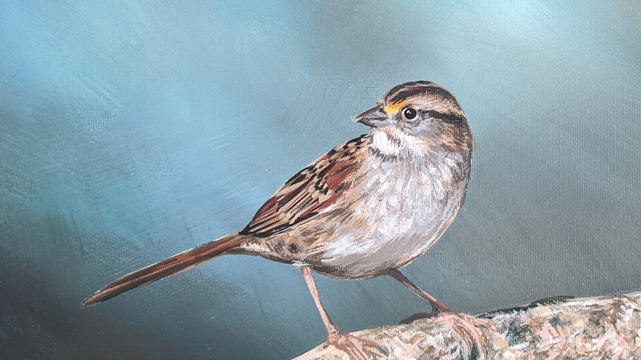
5. Sketching Practice Video: Get out your sketchbook, your pencils, your sharpener, erasers, blenders, and your reference image. Whether it's printed out or whether it's on a digital form, that doesn't really matter. I like to begin by getting some of the main shapes that send out to me. The beak with the head is the focus for me, so I started there. I'm just creating light, some people call them hairy lines, I don't know, that's not really the technical term that I know of. But they're just sketchy lines that aren't permanent. I'm just trying to find the placement in relation to each other, so I look from top to bottom, wherever I place the eye. Now, according to that, where should the wing begin? Where should that curve begin? Where should it end? How long should the body be according to how big I've made the head? These are always to make the proportions accurate, which makes our picture more realistic in the end. We're looking at angles, we're looking at forms and shapes, try not to focus too much on what you're drawing, but how it looks in accordance to the other shapes that you're drawing. I did make my bird a little too big for the page that I was working on, so if you can, try to get it to the right size, I didn't do that very well. Just after I get my outline, I'm just still working on getting the correct shape, I'm blocking out the colors in my mind trying to find out the angles using the pencil. If you hold your pencil flat, you want to make sure your pencil isn't on a weird angle, but hold it and copy the angle from the image, and then hold that in place and bring it to your image and then draw that angle. That's a really good tip for getting angles in images, especially when you're working in perspective. This one doesn't really deal with perspective, but the angles still count. Is it a 90 degree angle or is it a 30 degree angle? You could even use a protractor if you want, but I just like to use my pencil to verify that and in accordance with what I'm drawing. Now, after I start to get those areas blocked in, I'm going to even start shading it just to make it a nice image, first of all, in my sketchbook, but also to familiarize myself even further with the textures and shading and highlighting within the image. If I know what my tonal values are going to be when I go to paint them and I'm using color, I'll still be able to refer back to this picture and see, this is where it was really dark. Because in a pencil we're just using gray tones and lights and darks, not any color at this point. So we're visualizing our image in tonal values rather than in color, and once you add the color, you still need to keep that in mind otherwise, you'll have a really flat image if you don't get any tonal value differentiation in there. We want to make sure we see what are the darkest parts of the image. If you're really struggling to see that, print the picture in black and white, and that'll help you to see it better. The top of the head isn't quite the right shape, so I'm just working that out. I'm getting my dark, darks more solidified, pressing a bit harder on the ones I'm more confident in where those areas are. Up to this point, I haven't been pressing hard. If you're tense in your hand, then you're going to press probably a bit too hard, so loosen up a little bit, stretch out, relax, put some nice music on that makes you feel relaxed, and have fun with it. Drawing can be frustrating if you're not getting your image quite right. But that's why we have an eraser, that's why we have a pencil and this is why it's called a sketchbook and practice, and that's why we're doing this before we go onto the canvas. Now when we go onto the canvas, we're not going to do this level of detail with a pencil or pastel, in fact, it'll be very sketchy looking. It's just to get my shapes in because I'm going to be painting a silhouette, to begin with on the painting as you've seen in the project time-lapse that you saw quickly. You'll notice some areas are trickier than others. One area that I thought was interestingly tricky was the top of the head. Those angles are misleading, the way that they curve around. Are they going down to the right or down to the left? They're curving down to the left, but they have an angle down to the right in some ways. Some of these lines are tricky, try and look at what you're seeing, use your pencil to verify the line and go for it. It's okay if it's difficult, you can give it a try, there's no harm in trying in your sketchbook. This won't be seen for the whole world, could be just your own eyes, unless you want to do a sketchbook tour. Push yourself to refine it further than what you feel. I find sometimes in painting, it's easy to overdo things, but in sketching, you have to, at least for myself, push myself further to get it more and more accurate. So the further I go feels like the closer to more accuracy I end up getting. Feathers are quite interesting to see where the areas of shading are and the shapes that they create in certain areas where there's blocks of bright color, and then other areas where interesting in textures and curves that come together. Don't worry if it's not fully accurate, just do your best and try and get the shape of the bird somewhat accurate that it looks at least like a bird. This is your practice, this is your learning, so give yourself a break. Doesn't have to be so perfect, but have fun with it and push yourself to improve. Another good thing is to take a little break, so step away from your piece for a bit. Come back to it with fresh eyes, see what's wrong, refine it, have fun with it, get those shadows in more deeply in areas as you have more confidence in where it truly is. I apologize, I should have just put my brightness timer on longer, my reference image kept fading away. I do love these birds that are perched on a piece of tree or a log or something, they're just perched. What are they thinking? What's this bird thinking? Is it chilly now? Is it seeing something? It's interesting to think about. I also like the difference in texture that the wood or bark brings to the piece. Even if you had some that had some leaves on the image, that might be nice too. As you can see, I just continue to add lines, and now that it feels quite fulfilled, I take my blending tool and I start blending to get those areas of shade, and actually helps to differentiate the tonal values, create more tonal values in areas, and just to blend into this textured paper that I'm using. In this sketchbook it is quite textured, so unless I use a blending tool, it stays really textured, this adds a smoothness. You can see more tones now, I'm extending my tonal value chart. Then after I smudge, we'll be adding more markings where the blending tool does take away some of those markings, those individual strokes with the pencil are removed, so we need to add some of them back in afterwards. The blending tool is not going to get rid of all of them unless you blend just over the whole thing. This is intentional blending tool, I'm looking for areas to extend the shadow and create more of a smooth transition in other areas. Keep in mind that this is a painting class. This is just to get us more familiar with the image, so don't expect it to be perfect looking. If you haven't sketched much at all, this might be a great challenge for you and maybe you need to do more sketch classes, I have a couple available. After I've done my blending tool, I'm going back in and using the eraser as well. So it's not just a one-step and done with each tool, you need to go in again and again, different layers and sketch, blend, erase, sketch, get those final details in with both the eraser and the pencil. Because that eraser can help us in those areas that we blended to get some highlights back to the mix and those fine lines that come with feathers make a really fun textures all throughout this piece. I hope you get to a point where you're at least pretty happy with the shape that you've created so you have confidence in going into this next part where we sketch onto the canvas. Here we go, let's get onto the project.
6. Sketch on Canvas video: Now get your canvas that is pre-painted and completely dry, and we're going to sketch onto it. What we've done up until this point is really important to get us going more easily and with more confidence. I'm going to use a pastel, but you can use other drawing tools I've mentioned in the materials list. It's totally up to you. Keep in mind, some of them will bleed into one another and some are not easy to erase. You might have benefit from one or the other. Pastels will bleed into the color, like blend in and mix, so that part's not great, but if you use a color that blends in well with your color scheme, then that works. Unfortunately, that also means that it's harder to see what I'm sketching. It's a little bit harder to see what I'm sketching, but I'm really just trying to get the outline and just marking things in a little bit that are going to be for the different colors, so areas where it's just blue or areas where it's going to be orange or just white, blocking those out in the sketch. I'm just going to lightly find those areas. Remember, we're using the angles. You can use a tool to figure out the correct angle moving from the image onto your canvas and practicing that. Make sure you don't make it too big. My sketch in the sketchbook was a little big. Just try and keep it the right size. That'll take some practice. You can even do a transfer from your sketchbook right on to your canvas, which I don't have experience using transfer paper really. I've always just sketched onto my canvas. Maybe that's something I can practice, and research, and bring it back to you, guys. Then we can have a go with the transfer paper because I've seen there's some excellent results that happened with that. But I'm just here practicing, visualizing where things are using a tool in my hand and my head onto the page, making a grid in your own mind. We've done grid work before, so use some of those concepts just loosely in your mind and keep them in your mind to work at it. I'm almost done here, and then once we do this, we can move on to our next step, which will be getting that paint onto our canvas. Seems like it's taking us a while to get to that point, but don't worry, we're getting there and these steps are important. Thank you for joining me in that class, and I hope you had fun and you're ready now to paint the silhouette.
7. Silhouette Video: All right, let's paint. We're going to choose a color that makes sense underneath. I was initially thinking, I'll paint it blue because there's so much blue. But as I was looking at the lines and everything, it felt like you have this underneath color of black throughout most of the piece. So I thought, you know what, it'll be easier to paint blue on top. So I'm starting with a color that makes sense for this image. For me, the black makes sense, and in areas I'm not going to paint black. But for the most part, we're going to be doing a silhouette of this painting, and this is where we make those decisions final. If you make a little mistake, that's okay. You'll see me here early on make a little mistake with my outline, or just didn't feel like it was quite right. Have a secondary brush on hand, ready to dip into clean water, use it as a damp eraser. So you just carefully line it, take away some of the line a little bit at a time. It's kind of like when you're [inaudible] you have to be careful if you were to spill some ink or something, and then your [inaudible] can really spread it. So just make sure you're just pulling it a little bit at a time, cleaning your brush if you have any errors that you need to fix. You don't have to start drawing where the eye is and that kind of thing, but I'm just giving myself an extra little practice before I finalize those markings, and it's a good way to practice because it's going to be all black in there. So you can paint within, and paint the outer edge at the same time so you don't have to just go around first and then paint within. I like to do a mixture of the two depending on the space. Like this wing area, made sense for me to visualize it as this elongated triangular shape. It's up in this head area where I don't quite get it right, and then I'm going to fix it. Also, I used a chalk pastel with my sketch onto the canvas, which didn't give me a very strong line to follow. That's the negative of it. Here I'm taking that brush and as you can see, this angle was not that great. I will be doing a different angle next time because some of the detailing and my brushing is hard to visualize with the angle of the camera, I do apologize for that. You can see, you have to be careful not to let it bleed into the background. So I'm dipping frequently, wiping my brush, going back in with clean water, wiping again, to get the right shape that I want. Don't worry if there's extra, if you use chalk pastel and you have extra chalk pastel hanging around on the canvas, after it dries you can go in with a dry brush and brush it off. Or even if it's fully dry, you can take a damp rag or something and carefully wipe and the pastel will be gone. That's another reason I like the pastels. For just filling in areas here, I fix the top of the head and I will be going in again to clean up the line because it's not fully cleaned up at the top there. So working it. Feels good? Feels a little scary maybe? That's okay. It's kind of scary. Drawing, painting black right onto your finished background. So if you have any hesitations, I understand you could do a practice run in your sketchbook first if you like. We did do some brush practicing, so just use some of those skills to remember how you're holding your brush in certain areas. If you're trying to make a nice thin line, light pressure, clean the brush. Make sure it's not globbed on paint because then it's impossible to get a thin line with bigger glob of paint. Then I'm carefully reaching my edge instead of just painting a lined edge and then filling it in. I'm finding the edge. It's better. It's a lot easier to start smaller and then add a bit bigger than to just go wild and big and then having to erase a bunch because acrylic does dry fast. So I do caution you to be careful and make well-thought-out processes before diving in and do more practicing if you need it. Also, just have fun with it too. Don't stress out too much. I know it can be stressful when you're getting to certain parts where you feel like you're going to easily ruin your painting and that's the end of the world. There's always a way to make it better, even if it isn't going to be the way you thought it was going to be. That's like life. It's not always going to be what you think it's going to be, but that doesn't mean it's going to be bad. So it can make it something you're going to enjoy, even if the end result isn't how you imagined it to be in the first place. But let's not go there yet, so we're just starting out here. Let's have a little more optimism and have some joy in this painting. So now I'm getting in that foot, marking it in. I do love this angled brush because I can just make little stamped marks and it's not too big of a brush. So for this piece where I have small markings, I feel like it works quite well. If I was working on a larger scale, I feel like it would need a larger brush for sure. But these quiet little brush strokes are nice for working in this way where your lines aren't fully established at this point. I keep my reference photo right there. Even though we've practiced drawing it, even though I've already sketched onto the canvas. If I used a really strong line, so I'm going to sharpie or something to draw onto the canvas, then I could probably just paint the whole thing black. But I am going to leave some areas white or another color though that we're going to use for the blocking because if you look at it, that area with a little stump that this bird sitting on is very light. Those are some of my brightest tonal values. So I'm going to leave those. I'm not going to paint those black because they don't have an undertone of black under any of that. The shadow part I've painted black, but that's something to keep in mind. You don't necessarily have to paint the whole thing black, depending on the bird you choose. In my background video that I created with the blurry background, I didn't use black on that one because that particular bird was mostly muted brown color. This one has more vibrant colors more. You've got these dark shadows under the wings, and in the eye area and all throughout. If we painted this blue, it would be quite the challenge to get those shadows accurate and all the detailing. You'll see when we start adding not only the blocking of the colors but the adding the texture and details. You're going to see why doing this, this way is so much better. If you're doing a different bird than this picture, then you decide, is there an undertone or overall feel that it should be this particular color, what makes sense? If you have a hard time with that, that's okay. If I was to choose the blue and then work backwards, it could work. I can see how there'd be challenges that I would be facing at certain points. So I'm just establishing the back part of the bird trying to get those feathers in. I have left some of it light because there are some of the blue that's really bright and doesn't have the black underneath. Then here I decided, okay, that part is going to be that orangey-red, but I am going to do the black under it as well. We're just about ready to add color, the color blocking section. Make sure this layer dries before you go on to the next section. You can take a little break, make sure you wash your brushes thoroughly, change out your waters, and here we go. Get ready for some color blocking.
8. Colour Blocking Video: Continuing with our painting project, we're going to start color blocking. I'm using that light gray color, that warm gray, and I'm painting in this section. This is going to be like a medium tone, and then we're going to add highlights and low lights to it. We're doing this first layer of paint color, like what we did with the silhouette. Only we're using other colors as well. We're also going to block in color onto the bird with blues, we're going to use our red colors, and so on. We're not getting into the nitty-gritty details, but this is the first layer and you do have to keep in mind where you're placing your paint. There is some thought process happening here as we do so, especially when we're starting to paint over top of the black. That will feel more like doing detail and texture, but it'll be more the first layer basically. Just coloring in these areas feels like it's coloring in, because I've already established where those areas are. But I can notice that I can fix the areas if they need to be extended or paint over the black a little bit, because it's dry. We've waited till its dried. I'm blocking in my light tones, these are the brightest whites. I will fill those in. I'm just imagining where they are in accordance to all the practice that we've done and in relation to other shapes within the painting and silhouette that we've already created. I'll even go in up here using sometimes just the tip of my brush lightly with very little pressure. Make sure your brush is wet but not too wet. You don't want it dripping. You want enough paint to water ratio, that the paint isn't being too diluted. Because acrylic paint, when it's too diluted, it doesn't keep its strength and then it's not going to last as long. It might peel or do all kinds of horrible things that we don't want. Brushing in these light feathers. With the feathers, imagine the lightness of the lines that are showing up and the direction of the feather. I'm moving my brush in those directions, using at the tip to keep it a nice line. Almost like drawing. I feel I'm drawing at this point still. Let's add in some of that beautiful sienna color. We'll start with the sienna. Even though this is going to be really bright, this will give us a good base layer to add that extra brightness to it on top of that layer. This is just still establishing where those areas are going to be with the orange, and giving us a good starting place. That's what the color blocking really does. It really establishes where things are going to go, so that when you're adding in the subsequent layers that will be highlights and low lights and texture in detail, that you've already set yourself up for success in those areas. This is really an important area and step to make sure you're getting things in place where you want them to be. Because once you've put them in those places, adding the layers of detail is just really fun, because it's already going to be in place. You know where everything is at. You can start to see the bird emerge. Especially when I got that eye in there. Just that little bit of highlight and just a little tiniest line under the eye, really made it appear for me. Just keeps going further and further until it feels there's this real bird right there, which is really exciting. I love the colors in this bird. They're really fun. Reds and blues, this orangey red, I guess, put right next to each other, really compliment each other, make each other contrast and stand out. Which makes for really nice dynamic painting. That's fun to paint as well, because it's fun painting different colors and making it bright and vibrant. Start with these layers. Don't worry about getting the vibrant color yet. Get that placement in first. If you've set yourself up really well, the fine tuning section, which is our next lesson after this section, will be really fun and you'll find less frustration. Don't worry. If you need to add more black in areas, this is the time to do it. If you need to switch up where you've placed certain things, do it now. You might have some challenges if you're trying to make the beak smaller or something like that, that would be a hard thing to do right now. But if you need to make it a bit bigger, you could do that or round the curve line above the beak or around the head or something like that. You can do that now. As you can see, I am going to add a little bit more in there to still with that raw sienna. You'll notice how interesting it is to see a color on top of another color versus a color just on your sketchbook or just on the white, it's different. Another practice we could do, maybe in another lesson, is practicing painting our various colors on top of other colors. Maybe having a white and then a black and then some other colors, and seeing what happens when you paint a layer of your paint on top of that. Will it actually be opaque or does it have a transparency to that color? You'll find out through practice. You're going to check that in your sketch book as well. But you'll notice how the raw sienna on top of the black isn't as strong. That's okay for what we're doing right right now, anyways. Now we're going in with the blue, that fun aqua color. We're painting in the lines. Here I want to keep my blacks still. This is why I want to be mindful of where I'm placing all my blue. It's almost like little stripes, but they're not exact stripes. Careful not to make them exactly striped, or else it'll look fake. You want it to look, what are you seeing? Try and mimic that from your image, and it's nice to be able to use your reference photo in hand where you can zoom in on a digital device. I really find that helpful or if you've printed it out, I really like that as well because then your screen isn't going dark and you're not getting messages and distractions and things on there. It doesn't have to be 100 percent exact. You can go for that. That's not my style. I don't know maybe it's just I don't have the patience for it or I don't find it's necessary. More of a representation rather than an exact duplication, that kind of thing. But I do want to try and get the correct angles. You don't have to get every hair exactly correct. But if every feather is in the correct direction and you have mostly the right color, tones and everything happening, you're going to have that correct illusion. As much as you could spend hours and hours getting the exact every single line the same as what you see in your image, which is fine. You can do that, there's photo realism. But I prefer to work in a representative way rather than exact. I can really show that image and you know what it is, but it's not every single line and it takes a fraction of the time to do. You do want to try and get the right amount of color in certain areas, but yeah, you don't have to draw every single line and your brush has lots of lines, so you can do multiple things with a brush like that. I try and keep some of my lines showing to create that textured look even in this first layer. This is the first layer with color blocking. I'm just getting the color in the correct places. Part of that is the angles, part of that is the amount of paint in the area, and I'm using a very light hand. There's not a lot of pressure happening with my hand to brush. Again, I do apologize that I'm covering some of my brushwork, that is bad on me, but I will improve that with my next video and have the correct angle with my camera for those parts where you don't see really how I'm using my brush onto the canvas. Just as right now, it's difficult to see what I'm doing. I'm just continuing what we've practiced using just a light touch and the line edge of my brush onto the canvas. Make sure you charge your brush frequently. That means to add paint onto your brush so that you're not just dry brushing with barely any paint on the brush. You won't get as strong of a line. But sometimes it's a good thing. You might want a light texture happening by using the canvas, which isn't completely flat, it has texture to it. By brushing over top of that with a brush, light hand and a brush that doesn't have a lot of paint on it, you can get this faded texture look. It depends on what you're going for in each section. But for the most part, I'm keeping my brush fairly well charged. As you can see right in here, I'm following the directions that I'm seeing in the image, the direction of the feathers, the size of them. Those are all important things that I'm thinking about, and really thinking my process of placement before I place. Measure twice, cut once, the same thing. I'm thinking a couple of times, maybe even practice brush before I actually brush right onto it and then placing it. I start with an area that I'm more certain of and then I can use that as something to measure from. As you can see, you're starting to understand why the black is the one underneath. As we're adding just this first layer, remember, this is just our first layer with color that we're able to already see the feathers coming to life. You can see that the subsequent layers of fine detail are not going to be very challenging once you get these in place. I just really love this blue that gets more brilliant in areas on the back and down to the tail. This does feel like drawing in a way. But you want to make sure that your brush has the right amount of paint. Frequently, re-establish onto it. Like I said, charging your brush, making sure that you're using a good amount of pressure. If there's an area that has a thick amount of paint in that area, it's not fine lines with separation of block in between, you could feel free to press a little bit harder there. You can get these feather looks like I'm doing right here. It worked out really well with this brush. Getting just one or two strokes really made it look like the feathers without having to draw every little feather line. We're starting to establish our areas of tonal differentiation. Getting in this side wing area, it's interesting to take a closer look at an image and see all the directions of the feathers, and they're not all in one direction. They are coming all over the place in different angles. You become more observant of things in the world around you when you practice this. This is the same technique used in painting, pretty much anything. This is how I paint, so it doesn't have to be a bird. It's the same method of looking for the colors and blocking them in. Then you add your details on top. If I tried to do all the detailing right now, I wouldn't be successful because you need to layer the paint to get strength and opaqueness and the opacity. We're just about done in this area and then we're going to the details. So excited to see what you guys have come up with. Now let's jump right into the texture and details. Let's go.
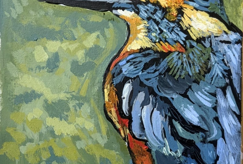
9. Part 1: Let's continue on and add in the last bits with the details and everything, the layering of color to add highlights, low lights, and the texture to refine it, refine our lines, all of those things that we're going to do. Right now I'm increasing the highlighting with the warm gray using white. I'm just using white. You can use a mixture of the warm gray and white or you can go really white, which is what I did. I used the titanium white. Now, let's zoom into the base here and you can see that color blocking, and now how we're adding in texture and the highlighting to make it look real. If we just left it, that one color block, it wouldn't look real at all. We're going to use our brush almost like a pen to make line markings, but also to fill in spaces if you use it on the side of it. You can even use the tip of it to make little dot marks, so I really do love this brush. Now we're going to go in and add some low lights with a bit of a mix of raw sienna, a little white, and some of that warm gray mixed together. As you start to add in these details and textures, you're going to be mixing colors more. You're going to want to transition at times, colors, from one color to another, and then other times you're going to want to just use the straight color to make it bold. But right here, it's a medium tone, it's not really dark or really light, so I want to blend it a little bit. Now, when you blend things with white, you're going to notice it really changes it, it really shifts it. Just like if you blend black with a color, it's really going to shift it quickly. Use it softly, carefully, so mixing just a little bit at a time to achieve the colors that you want. Feel free to use your sketchbook to practice mixing those colors before you put it onto the page, but it will look a bit different once you put it. Like I said before, the sienna on top of the black is going to be a bit different. But as we add some white to it, it's a little bit different than the areas you can see where raw sienna was just placed directly onto the black without mixing it. This is mixed with some white, so it has a different effect on top of the black. It's a little bit more opaque. I'm just going into the areas to create some warmth in this color, so it has more of that nice warm brown color that I see in my reference image. I still want to maintain those light parts. Make sure you leave the lightest of hearts light. Leave them untouched and then you can add more white if you need to add more white. I like to take things slow and be more cautious. That's just my style. You're going to find you will have your own style. Maybe yours is more exuberant, and quick working, and bold with blobs of color and that's fine too. This is just my style. Don't worry if it's not exactly like mine because you want your speed unique for you. But take the tips that I gave in terms of using your brush and creating tones and colors and then make it your own. How do you want it to be? How do you feel it? The Canvas almost speaks to me like a story, and I think that's how writers see their stories as they come to life for them. For me, it's a similar feeling for art. It's like it's telling me where it wants to be and you're working with your intuition to discover that. Some things can be taught, like how to use your brush properly, and how to mix colors properly, and perspective, and all these tips, but some things are intuition. I want you to try and be open to that. You can see I was just cleaning off a little spot that came into the wrong place. I didn't want it there. Just working in various tones, mixing. I'm not really washing my brush unless I need to really shift colors. If I need more of a strong color and I have white in my brush, I might need to wash that out so that I can get more of a vibrant color in there. As you can see when you look up close to a painting, maybe it doesn't look very impressive, maybe it doesn't look like much, but as you step back, the colors, the way you've blended things actually does work if you are painting what you see and if you're using these techniques to obtain the image as you see it and as it is. Now, I'm going back in with the white where I might have lost some lines to make sure I have some sharp levels of texture down there. You can see it. It gives that roughness that we see on wood. Whether it's been been carved or, who knows what the story of this piece of the stump really is? It's intriguing. When you're painting, and you're relaying that story, and also creating a story of your own, as you make markings that might not be the exact markings that should be made or following that intuition. Sometimes you might decide, "Oh, I'm going to leave this part out of my painting," and that's fine too. It depends where you're out with your learning. If you're on your early on in your journey of artistic achievement interaction, you'll probably want to follow more closely, and that's okay, but still feel free to expand it on your own. Here I'm adding more texture, so I'm letting more of my paint rest on the canvas without blending it in. If you want a strong bold color in a certain area, the more you blend it in with other colors, it will mute it. Make sure you leave it bold. It doesn't mean it has to be a thick layer of it, but I just like that it creates this additional texture feel by adding the paint a little bit more thickly. For me, that's not much because I really paint quite thin. It almost looks like a print when you look at my paintings, many of them, because I paint very thin layers. That's just my style, like I said. But now you can see on the right how that really made it look more textured and fun. Right here, I'm using a cream colored, peachy tone, which I've mixed with my white, and raw sienna, and a little bit of the brown. Let's make this red pop. I'm using straight up that red that we have, that we've looked at in the color section, and I'm just really just straight on with that. Then now mixing a bit with some yellow, because just the red needed to pop a little more. In this area, there has a bit of a yellow tone. It's almost like this fire right here. Again, if you mix a little bit of white with it, just a little bit at a time to achieve the right color, you'll see how it really makes it pop on top of other colors. Especially if you're trying to get a lighter color on top of a dark color, adding a little bit of white can help you establish that. I've seen some people, they'll actually paint white first, and then paint their color. It's almost like when you're getting your hair colored and you have dark hair, and you need to bleach it before you can obtain another color. It's the same idea. I'm sorry again that my hand is covering my brush strokes here. So frustrating. I had a math teacher that would hide her responses. She would hide how she did the whole equation, and then she would move onto the next equation, and this was great 12th math. I was very frustrated, I felt lost. Now, I'm adding some white highlights into that section. I like to see the brush strokes in this a little bit as in leaving those lines, keeping it very linear rather than blending it into one block of an area, because we're working with little feather details here, so we actually want those lines. Maybe if you're painting someone's face that was a young person that didn't have any wrinkles, you wouldn't want that, but right here it works perfectly for us. I think this is really great for someone that's in the earlier stages of their artistic career or for pleasure. Again, I'm just adding more highlighting, more lines, looking at my image again, seeing what looks different, making it blend into that white area or transition, I should say, transition into that white area more seamlessly by creating some bits where the white is coming in and some lines of the yellowy orange is coming in. The transition isn't just a strong straight line. There's feathers that are going into the bluish area and the black. Try and be as observant as you can to your reference image rather than trusting in what you already know about birds or this particular bird that you're painting. I'm always recharging my brush. Feel free if you're working for a long time to wash your brush, and just to get any paint that's starting to dry on your brush. If you're working for longer than 20 minutes with the same brush, the same color, your paint is drying on your brush. So wash it if you're working quite slow, be careful of your paints drying as well. Those will start to dry and so make sure you're only opening up the paints that you're using at the time, if you're working quite slowly in this. This does take time, so just pull out the colors as you need them. I just squeeze out just a little tad bit like a pea size at a time, depending on the size of my painting. This is an 8 by 10, so I'm not using a lot of the color and I don't want to waste. I'd rather squeeze out more if I need more than to squeeze out too much and then waste. I hate wasting paint. One one of my pet peeves when I'm painting. Sometimes I will actually use a color based on what colors I have on my palette, not based on what is needed for the piece. I do that all the time. Right under this blue area we're getting some feathery lines, so I'm just keeping my brush in the direction, using it perpendicular and lightly coming away, so not pressing hard the whole time I'm bringing my brush. Think of brushing with a feather. It's very light, it's very soft. That's a similar way you're going to use your brush to create those soft lines. If you want a really sharp line, make sure your brush is wet enough with the paint. Let's get this front belly part more vibrant. Look at how it really makes it come to life when we add these details. That first layer, that helps to give it more depth. If we just went in with this layer, we'd probably have to do an extra layer anyways, but that other layer we had just done with the color blocking, it gave us not only that primer type of layer, but also more depth because we might see some of those colors still left behind in the background, potentially. Some areas, yes, some areas we'll cover completely. I just really want this to be really vibrant because of the bird that it is. If you're working on a different bird, yours might not be as vibrant, but use these same principles. See when I add a bit of white to that, how it really pops. Just continuing those brushstrokes under the chin area and the neck area, recharging my brush constantly. It's almost like sharpening your pencil frequently to get the strong lines, fine detail, we need to recharge our brush frequently. I'm just refining under the beak, making sure I'm happy with that line using a bit of that warm gray tone to really make sure that I have that depth in there, the blendibility of the transition and subdued where it needs to be subdued, highlighted where it needs to be highlighted. You're not going to have a black line around the whole thing. Let's continue that bright red color down the leg. I feel like it's more orange than red. But that's just how I feel. Technically it's a red, but it's that orangey red. Some reds have that more blue, toned red. This is more of an orange red. At this point, I hope you're having a lot of fun, not feeling frustrated because we already blocked in all of our shapes and colors and areas where we needed to put the paint. Now I'm still hanging on to that reference photo, keeping it close by because I'm referring to it. It's called reference photo if you're constantly referring to it. Making some changes to the areas here and there, but for the most part, sticking to the lines that I've set out for myself and the blocking. Certainly there will be some marks where I need to know what direction to put my brush, especially this underbelly near the leg, the direction of the feathers was a little different. I'm recharging, filling in where I need to fill in. Most often using my brush perpendicular to the canvas, sometimes on a little bit of an angle, and then when you're trying to cover a larger area, I do put it on a steeper angle, but for now it's close to perpendicular. Blending in those colors all the way throughout. Finding the direction of the feathers, trusting in the image that I'm looking at over my own preconceived notions of what a bird should look like. When focus in, zoom in on one area and just focus in, I get lost in the space where I'm just looking at shape, line and color and tone, all these things, all the principles of art, instead of, this is a bird. That's really hard to forget in your mind, but I do my best to do that and trust in the image that I'm looking at and hoping that it was a good photo. It's hard to work in this method from a photo that's not in high definition or is somewhat blurred. I like those feathers at the bottom, how they come almost horizontally. Thought that was neat. I'm just trying to achieve the correct level of hue as well as tone within that hue. If you have ever been a dancer, that kind of thing, I used to dance and teach dance. Part of that is, there's so many things to remember at the same time while you're dancing. You can't just think of one thing and that's the same thing when you're painting, there's multiple things to remember, and as you practice, those things will come as second nature rather than at first feeling very frustrated trying to remember everything, having to remind yourself of things. Make notes if you need to, about certain things like recharge my brush or how am I holding my brush? What is the pressure of my brush? What am I looking at if you're thinking bird, bird, bird, and then just imagining in your mind versus looking at this image, what do I see? Of course, if you're just painting from your mind, that's different, you don't have to think that. But in dance, you'd have to think about your posture, your face, what's your face doing? You can't just move your body. You have to really be thinking about your presence, where you're looking, where you're standing, if you're in a group. All kinds of things you have to remember, you have to remember the moves, you have to remember all kinds of things. They all work together to create something beautiful. I just love how so many things relate together like that. You have art and dance and all the arts and I'm sure in all other areas, but I'm most familiar with the art, so I can see how those relate together.
10. Part 2: It's really important when you're doing these fine details like write around the eyes, and things like that, that you really focus on the selection of pressure point, and where you're placing it. Placement is so important, and the quality of a line, because around the eye I haven't used a strong, heavy line. It's actually very light lines that are achieving this like really strong eye. You don't have to use a strong line to get a strong presence, and achieve something strong. This beak need some highlighting too. It's not just black. There's a planned, highlighting in there, and you can really make the beak shine here, I'm using almost a feathery approach to my brush stroke. When I'm doing highlighting over black like this with a very light white. I also make sure not only is my brush wet with paint, that sometimes I need to dip it in water, and wipe it, then remixing the paint. That's also recharging it. Not just dipping it in the paint. Because it will start to get gloopy is the word that comes to mind. I did just these tiny little details that really make all the difference working in these white. I'm looking in the areas that need a little bit of stronger punchy dots of light highlights that are glimmering from the light. This side there is a bit of this orange popping out. Now, I didn't do the same color background as the reference image. I just did a fun line, green background. This part right here didn't really pop the same as it would have if I had done the same color was more of than orangey brown background, and so this would have popped more. Right here, it's almost not even visible. But there are these creamy orangey, peachy feathers that are fluffy are coming out the side. I'm just working out those, and using a mix of the browns, and oranges with white. You can always add a little bit of brown to mute it down so the brown that we have, the sienna. Now, that one's quite warm actually, if you wanted to mute that, I would probably use something like a burnt umber actually, I'm just refining that so that area is complete. That's that warm gray. You can go in with another layer of the warm great in areas where we had done it like just to mark in our place or color blocking, and now we want to make those areas pop, bring it to life. Some areas will be more obvious where I need to place it, and other areas will be, you need to really focus with my reference photo, and make sure that I'm making the correct marks, and it's up in here. There are these kind of but there's a come out the side and an interesting way. Not how you see a bird when you're younger or just in your mind you say drop bird. You don't necessarily think of all these directions that the feathers are moving in. I wonder about the story of this bird, how it's perched, and the feathers are fluffed a little bit, and if you've ever watched any of those animal planet type of shows, and makes you wonder, what's this bird looking at? What's its story? How does that affect the way that the feathers are displayed for us in this moment that's been captured that we're now representing on a canvas, and paint. You can see that I added more of this warm gray to create more detail of what the feather fully looks like. It's not complete in those areas because I need the blue also. But now I'm going under on the backside to continue that. More highlighting up here, and those highlights create the detail that we need to show that it's out in the sun. There's things that are reflecting onto the bird giving it life. Hope you're having a fun time right now painting your bird that you'll let all frustrations leave. Have fun with this except where you are in your artistic journey, but push yourself to be better. I love that there's these feathers that ruffled up, causing these really strong shadows as well. That helps to make it more dynamic painting if you select an image that has more dynamic levels of tonal value. Once we add in more blue, you're going to see it pop. Now much further. I just wanted to really make sure I had things in place with this lighter tone. So just basically the warm gray. You can see how the warm gray, it's almost like using a white, but if I were to use white, it would be too bright, and too stark of a contrast. This one blends more in with the colors that are already there. In some ways I'm creating outlines to some of the feathers, and that's just because that's where the highlighting impresses onto the feather, and the image. This will help me when I add the blue in. Then I can always add more highlight on top. This is really going to make it pop. It's going to be brighter than you think. You think, oh, it's looking good. Then you add the blue, and you're like, yes, this is going to be good, and you'll notice this back part of the bird is almost like a block of blue. You're not seen a lot of black underneath, which shows the detailing of the feathers, and that's okay. That's just that section, and I'm just trusting in my reference image right there. I'm just going to add these light blue tones throughout, some of them I'm creating new lines, and some of them I'm going on top of the lines I've already created to enhance them, and make them brighter. Whether that was intentional or not in the beginning, having mini missed certain areas or just being more cautious with adding the lines with the gray, and the blue previously, and I'm still taking big step at a time. I'm not going to bold all of a sudden. I'm trying to transition myself, and build confidence in my markings as I go. I really love how the tail really just like tapers at the end, and you see these waterfall cascading layers that are really beautiful. Let me add some of that blue onto those feathers on the side that will help it to pop. I really loved how it had these tips of bright blue. Again, layering, almost cascading layers. It's like a theme throughout these cascading layers that could resemble as stripes as well. I like to think of them more like a waterfall feel. Just brightening up. Those neck feathers. Just feathers. Probably more chest and neck at that point because this neck is squashed down a bit. I think it's so interesting that the male birds are usually the more colorful, bright ones. I love their ways, their little rituals for finding a mate. So fun. All these things might come to your mind as you're painting, but quite often I'm mostly focused on the image, but it depends to what I'm working on. I will think about the actual subject that I'm painting and maybe their story in some way you do think that that is important to include, but it's also dependent upon where you're at. If you're earlier in your journey, then I think that you're thinking more about shape and line and getting it accurate than you are pondering on all these other questions about the subject. But now as I'm looking at myself painting it and creating commentary and instruction, those things do come to my mind. I think that's a beautiful thing after you've made something and it's up in your house or you're looking at it when it's finished. I like to look at them a lot and criticize myself and make different judgments and things so that I can improve myself. I think it's quite fun to then hear the story of this animal or whatever you're painting. See how this blue is really making it pop. It's bringing us closer and closer to the finish line. We did have multiple different blues for the most part, I've been using that turquoise color and now I'm using that green aqua tone. It's hard to see the difference in this image and in life, it's more obvious, but I also want transitions that are a little more seamless. I don't want it to be blunt. Just getting those final details in, adding a little white to make certain areas pop in front of others. At this point, you're probably looking at it and thinking, am I done? But we still have more. There's still more details that we need to add in. Stay the course. Do not give up. Really make sure you feel that it's done. But we are getting close and you'll find that this part is hopefully enjoyable for you, but it can also feel like okay, I'm almost done. It's like when you're almost there, you're so excited to be there that maybe you skip a few steps. Don't do that. Make sure you really feel competent and happy with what you're doing. Take a breather step back. Make sure it is going in the direction you want it to go in. I personally like to take breaks when I'm painting. I don't like to try and do a full painting in one session. I think it's healthy to step back, take a breather and come back to it fully refreshed and with a new mindset. Sometimes I think it depends on the painting, but for the most part for me I like to take, this one was two or three if you include the background. Just a little thing I like to do. Working with your complimentary colors side-by-side really does make them pop. Just don't blend them while they're wet because that will make him brown. Remember that's how we can make a color more subdued is by adding a little bit of the opposite color on the color wheel. Again, I'm hiding my work. A little surprise. Bringing up just that jaw and neck area. Not really changing the lines, just adding more on top to brighten it up. With many of these markings and almost creating a stamp effect not just stamping hard on it so I don't want to wreck my brush, but that's lightly tapping. Sometimes just with the corner, if it's a small circular mark and then if it's a more of a line, using the whole edge. Print your right. Put the lines a little more distinguishable. Keeping that effect that still makes it look blended and not too, in your face cartoony. I have nothing against cartoons by the way. Just a reminder, are you washing your brush? Here and there, are you adding water to it? If you're using the same color, you don't have to wash it, but are you getting it wet. Removing those globs of paint that might start drying up on the upper part of your brush that doesn't usually touch the canvas much, if ever. You're not scraping your brush on the canvas. Keep referring to your reference photo and seeing how it's progressing for you and how much brighter the highlights need to be. I'm making them brighter now. You can see as we've added these layers on the top of the head, it's really made it stronger at the top, but it's still somewhat subdued because we've created that layer of not just black and blue, but also just those bits of gray in-between. Now we're going in with that deep blue and I've mixed it a little bit with my other blues. Because it is a dominant color, it will take over a little bit, but that actually the bright green that aqua, if you get that color, it is pretty strong as soon as you mix it. It's almost like adding white to something that does have that opaqueness to it. Don't add too much of that, but I want that that royal blue color to shine through in areas to create a low light part of the image. Again I'm looking at my reference photo to see where these areas are that need that royal blue, deeper blue tone. It helps transition to the areas that are shadowed. Some we don't want a super smooth transition. We want a stronger line to brighten darkness. Sometimes you need that, like in the areas of the wing. I just love this royal blue. It adds that layer of depth that was needed. We're getting so close to the finish line. I'm just going to add a little bit more of this blue here and there. Not in every section that I have blue but following my reference image and my intuition as well. I could get a little crazy because I'm just loving how this blue looks next to this other blues and adds that layer, that royalty, velvety blue. That's just luscious. So lovely. You are so close to the finish line. I'm so proud of you for making it to this step, to make it through this. Let's go get those final steps. Almost there.
11. Final Steps video: You did it, congratulations. You've finished the bird painting. How did it go for you? I'd love to hear from you what you enjoyed about this class in your review. Anything I can do to improve and make it better class or something you want to focus on and learn about, let me know. I'd love to hear from you. Please share your image to the gallery and I can provide feedback as well if you'd like to know how you can improve on your piece or what I think about it if you want my opinion. I'd love to connect with you. Don't forget to sign it and you can also paint in edge if you'd like to give it a little bit of a clean look. Some people tape it and I just like to use a steady hand because when you use tape, it gives a rough edge some times. I just use a steady hand and paint the edge to give it that finished look, if you want. Thanks so much. We'll see you next class. Bye now.
 Kristina (Moyor) Choy, fine artist