Transcripts
1. Introduction: Hello and welcome to class. My name is Christina Maria, and I'm here to teach
you some techniques for intermediate
acrylic painting. Today we will focus on the sky. How do you make an ordinary sky? Extra ordinary? How do you add dynamic elements? How do you blend colors? How do you choose colors? There are so many colors choose, there are all kinds of brushes. You can get lost pretty quickly. I'm here to help you. So I'll take you through
some exercises so we can learn how to
create a composition, how to choose those colors, how to make those dynamic
elements happen for you. Maybe you look at a photograph
and you think I want to do that in the painting
form, but how do I do it? I'm here to help you do that. I've been painting since
I was a little girl, drawing, coloring, all of that. It's just my passion and
I love to also teach. And so when you have something
you love and then you can share it with other
people through teaching and helping them
build their skills. That's just that's extra. Thank you for joining me. Let's get started with what
you'll need for this lesson.
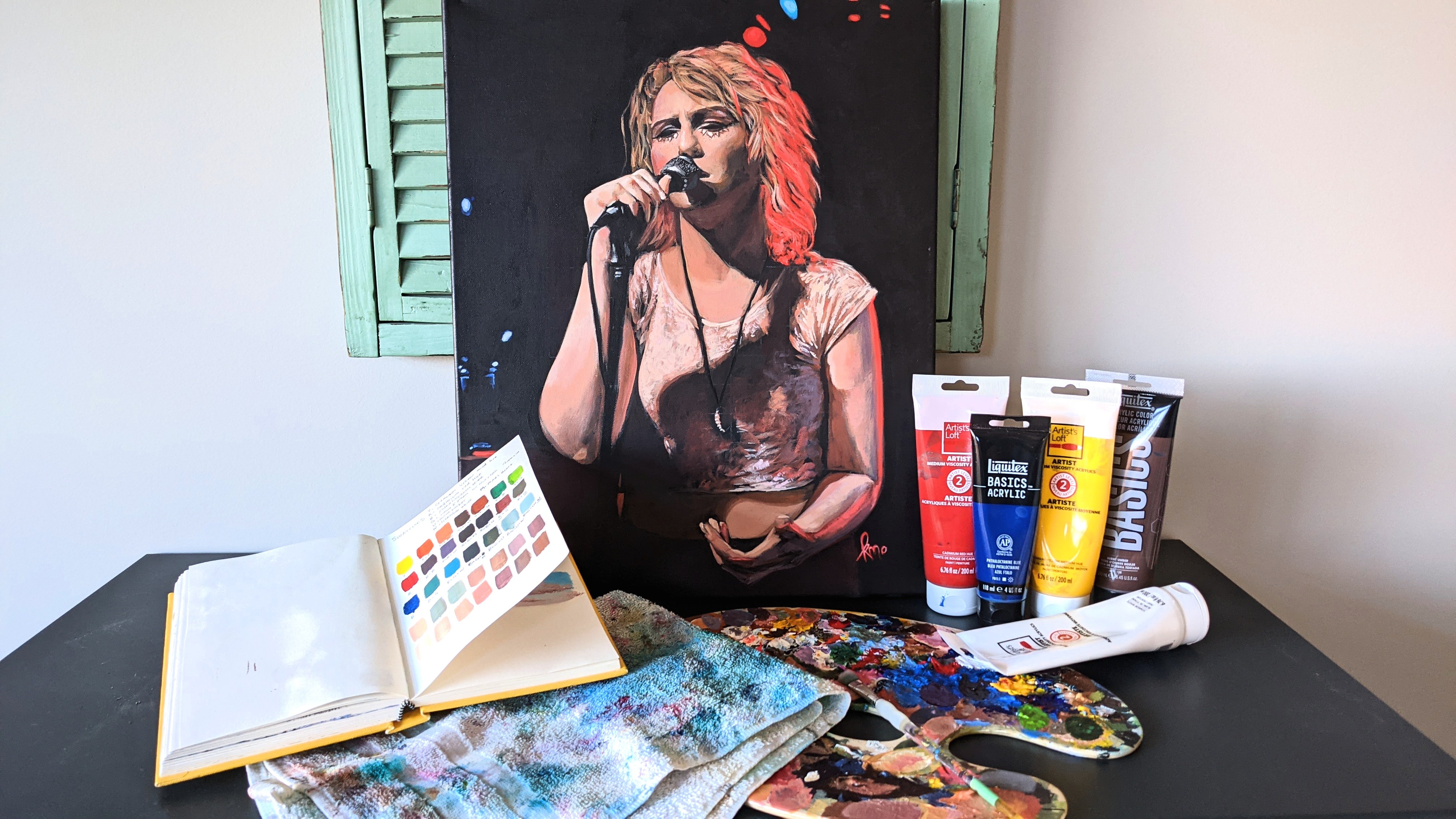
2. Let's Talk Brushes: Okay, Let's talk materials, what you'll need in this class, as well as just some examples of higher-quality
versus lower-quality paint. And just where you can save your money and maybe
where you should consider spending a little bit more
or investing so that you can just have a better
experience painting because it's
frustrating when you can't get the outcome that you want because you don't
have the right quality. This is my little brush holder. I have lots of other brushes, but I keep this one
for my favorites. And also just so when I'm
doing a planar painting, I have something
to carry them in. And it's also great to have something like
this so that they can dry. So it's not a must,
but it's something. When a brushes drying
you don't want it. It's best to dry flat, not up like this or upside down. Just keep it, lay it flat. So having one of these is helpful if you want a place for your paints to dry
paint brushes. I have a variety
of paint brushes, so you don't have to have every kind of paintbrush
to do this class at all. You can do often when I'm teaching a Paint class or
paint night type of thing, if you have something
that is multi-use, like this one here, it's kind of large. I'd say medium-sized brush. It was only $5. Part of
what makes it not great. Maybe where the $5 comes in is the handle here is
a little wobbly. I don't particularly love that. But this is really great
because it comes to this tapered point here. And that allows me to make
a really thin mark as well as press down further
to get a wider mark. This is a good multi use brush. If you don't have any brushes and you're looking to buy some. I mean, if you've
painted before, this is an intermediate class, I'm assuming you do
have some brushes, or at least you've painted
in a class before. You're gonna find that
you like what you like. Everybody has what they
like for different things. I like having a flat brush. It helps when they're a bit, maybe a bit larger to cover more surface area if you're
painting on a larger scale, but if you're just painting
smaller paintings, you don't necessarily
need a super big one. You can get. Kind of, this is
also kind of flat, but it's like an oval
shape at the top. It's actually
called an oval MOP. And I think when
it's a bit softer, it can be really good for blending and
watercolors as well. So this is another mop brush. So these are two
are mop brushes. And this one, we
don't really need. You can definitely use mop
brushes in this class. And I might find myself using it for creating some of
those dynamic elements. Like if you're adding in some
clouds, that kind of thing. So it can be fun. I think this one was
about $5 as well. Look for sales,
look for buy one, get one look for coupons,
that kind of thing. Especially if you're just
starting out and you don't want to spend
a ton of money. I don't usually like buying
the kids unless they're really good kit because it often just has this one I
think was a kid one. And it had so many of the same one just like
slightly different sizes. And I find that that's not
super helpful unless you're teaching a class or something and you just
need a lot of brushes. I do really love having
some stiffer brushes. You kind of wonder, well
why do I want a stiff one? Will help to give more
texture like this one's good for if you're
doing some dabbing and you want some
textured marks versus doing something like
that with this one, you can still do that. You just have to do a lighter touch and it's
not going to give you the same look up texture. You can get yourself
a fan brush. I love using my fan brush. I can use it for
making thin lines. I use it for blending sometimes
and also just for adding elements that I might need for
having this kind of shape. Maybe a rent. You'd see
people using this for trees, like an evergreen treat,
that kind of thing. Let's see. I also
love an angled brush. So good angle brush. I feel like I get the best
control for making lines. Like if I want, if I'm painting architecture
or things that have straight lines that I'm having to repeat
throughout a piece. I find that this is a
really great tool and it also can mimic the flat brush. I often find myself using
this at different sizes. I have one that's quite small. I think it's a half-inch and this one's three-quarter
inch or actually, I think that one might
be a quarter-inch, the other one I have, it's quite small and I
really love it actually. Is it? Strangely not in this pack. We recently moved, so all my stuff is a little
bit out of order. You can get flat tip, round tip, and then feel
the different bristles. Do you want more texture?
Do you want more smooth? You want more smooth stuff. That's kinda like how
you like to work, then look for something softer. Your brushes, but it's good
to have a bit of variety. So if it's most
economical for you to buy one of those packs of
brushes, then go for it. But I like to pick and
choose one at a time. The ones that I like.
3. Other Materials: But brushes are
fun and important. The next most important thing, and probably actually the most important and where
you're going to spend the most money as well is paint. There's all kinds of paint. There's craft paint. When it comes to acrylic paint, you have kind of like flow acrylic Artists Loft brand here. These ones are great
for if you're doing like a group of painting, like a paint night
kind of thing. But I'm gonna show you the
difference between these. After we go through
all the materials, got red and blue of
this flow acrylic. So it's kind of very fluid
and you don't have to mix. Actually, I would suggest not mixing any water with these. They're not as concentrated
in their pigments. They lose their
strength quickly. So that means when
you're mixing, they're not as strong
when they mix. This is a higher-quality. This was the highest quality. This one's a pretty
good quality. We have 123 typically from
this particular brand. I found that I do like this. Number two for my pieces, it's worked well for me. I kinda like a
medium flow acrylic because I like to
add water and I like to work with thin layers. If you like, thicker layers, go with something
that has less flow. We're going to mix these
two and compare these two. We got brushes, we got
paint. What else do we need? Well, we need something
to mix our paint on. There's so many different
things you can use. You can use a plastic plate that you can reuse and re-watch. You can buy would palette. My wood palette is
pretty much filled, so I've been using these
because I just inherited them. My grandma was an artist, so I inherited some
of her things. You need a rag to dry off your brush and control
water content in it. And we also need some water
to clean your brushes. I like to have two jars. Glass ones are
easy to clean with acrylics and I fill
them only partway. So let me grab a
Georgia so you can see. So here's one of the jars
and that's the base where the water would start fill
it to maybe about here. So that way you don't go past this part when you're
washing your brush. This is glued on if you're
constantly bringing water past this point or letting it don't let this sit in water. Don't have your brushes
sitting in water, please. That will loosen the glue
and then you'll have what I was having with
those wobbly brushes, but some are made better
than others as well. So you might just have
them wobble anyways, but just fill it
up a little bit. You can always go
back to your sink. Good, clean water. If your water is getting
dirty, I have two. So that one, I select one to be kind of the
where I dip in first to be my dirty water and
then I brush it off, clean off my brush
at the best I can. And then not on my hand,
just in the water. And then I move to this
one and then I wipe. Then if I need to,
I dab on here. And that also helps me to see if there's still some color. This also tells me that as well. But if I was just using one, I wouldn't know how clean my brushes and it probably
wouldn't be clean enough. Even though it looks like it, it really holds a lot of paint. That's kind of the point. Especially if you get higher-quality
brushes are ones that have more bristles,
this kind of thing. So we need this rag,
we need the water. So you can even
have three if you want to go wild and crazy. What else do we need? We need, well, this isn't
exactly a need because you can mix with your
actual paint brushes. But I like to mix
with a palette knife. When I'm mixing my colors. I can just do that. And it mixes the color. And because this is metal, it's not absorbing
any of the paint. Versus if I used a
paint brush to mix, which I still do. But if, especially if I want kind of a blend of
color on there, kind of randomized, make sure that you know which
one you want to use. All right, We also are going to need
something to paint on. We can use a few
different things. So I'm going to be using
like cotton canvas. Instead of going for like an expensive canvas
is stretched on wood. For my practice, I can
just use one of these, and this is quite large. These are 12 by sixteenths. So I can really, and there's ten sheets of it. So just one of these pages, I'm going to be able
to do a number of, a number of exercises. Maybe you could think about
getting something like this. Or I also like if you get a sketchbook that has a thicker strength to it and this one allows me
to paint in it. There's a nice fun
sky in this piece. But then when it comes to
the project in the end, Let's use a canvas. This one's the thinner. It's like a three-quarter inch. I like to use the 1.5
inch thick frame. Then I don't have to put a wooden frame or
metal frame around it. You don't have to do
that for this either, but I think it just gives
it a different presence. You can also use
other materials, like I'm going to be using
some art like wood panels. And this is just a pack of six that are squared,
eight inch by eight inch. It's a good size for maybe
some of the practice ones will do the exercises and they have on the back,
It's kind of neat. It has decent size
frame on the side. Then you can get it ready to
hang, that kind of thing. So just a lot of different
things you can use there. You don't have to spend
a lot of money on those. I think we have everything
we need to get started. Now I'm going to kind of
set myself up so I can show you the differences between the more
professional paints, the more like lowered
student grade paints.
4. Paint Quality: Okay, I'm ready
with my Canvas pad. It's flexible, you'll see. It does look. It is Canvas so you have that material feel. It wouldn't be
super easy to tear. This is Canvas. My pit palette next to me. I've just chosen half
inch flat brush. Now I'm going to start with these guys, these flow acrylics. And what I need to do because I haven't used it in a while because
we just moved. I need to open it
to release a bit of pent-up pressure that's been going opposed
to just shake it. It almost be like a can
of pop a little bit. It won't be spraying everywhere, but you might get a
little explosion. And I do want to mix this up
because it's flow acrylic, it can kind of get
solidified here and there, which at that point
it's probably ruined, but just to mix it
up with the water. Then do the same with us or
open it before shaking it. Still a bit nervous
when I do that. Close it back up. Hold the top. When you're shaking. I know this is an
intermediate class, but I feel like it's good to go through some of this just in
case you've never had that. I'm going to turn
this around just so you can see more of the mixture. I like to start with
just a little paint. I find that lots of people
tend to put too much paint. I'm giving myself a little
space in-between to mix. Let's just start with these guys because acrylic
paint dries quickly. I don't put out all my
paints like you would if you were following a Bob Ross
video because he uses oils. Are used oils, so oils
don't dry quickly. With acrylics, you do need
to keep in mind drying time. These flow acrylic ones
actually don't dry as quickly, which also helps with when
I'm doing a paint night. You can put them all
out and then use them as long as it's
not ours in-between. I'm going to wake up my brush because it's been
storage for a long time, so I'm just wetting it
to kind of prep it. Now. I don't want it too wet. I'm just going to mix
them with the brush. Blue to red to make a purple. And the more red, the more reddish purple
we make. Lovely, right? Not bad. Here's where problems arise. This is not bad if you're not. If you're just mixing
two colors typically. As soon as we add white to it, I'll show you what happens. This one just a little bit. Actually seems
less fluid than I. So if we're going to add
just a little bit of white, like if we were trying to do
a bit of a gradient or just, I mean, not bad. It's not the worst. But let's see how
these guys compare. Let's get them on the palette. Once a warmer red. Now, with these screw caps, if it's too hard to pull up, grab your rag,
twist it with that. I don't always like this, these tops because of that. You can probably get
more paint out of them just because then
you can roll this up, but ultimately leave
room in-between. I always put too
much of this stuff. Start with just a
little bit to the side. All right, So now we'll
take some red, blue. Can you see the difference
already in the quality at all? First thing I noticed is how
deep the tones are becoming. I can really get that
deep dark purple. Could've done this side-by-side to that one would have
been a bit nicer. I do need a little bit of water if I'm feel
like it's getting dry because these are
more concentrated. In fact, you know what,
I know I started there, but let's bring it side-by-side. So you can really see just going to mix
a little bit more. Granted these aren't the exact
same blue and red colors and you know how
that can affect it. But look at how strong that is. You can pretty much use this
as a black compared to that one where it was kind
of showed through. This one has a bit
of more opaqueness. Now let's see what happens
when we add a white. This white will be
the number two. So similar to the
red artists level. It says it's a medium viscosity. So that's what I
like to work with. If my brush out of
the way so I don't get paint on the handle. Oh, no. Too much. It's okay. We'll be using some of these
colors in the next segment, so won't have to waste. More red in my reddish
purples will count much more. It keeps, maintains
the strength. Let's go from that
direction like that. Red goes along way a little red. Anytime I add a little red, it's like whoop too much. I find that this one's
giving better coverage. It's keeping the strength
of the color longer. I mean, when I add more white, it looks like it's not, but it is keeping the
strength of the color longer. I do like that. It's giving that coverage. When I'm painting,
I don't have to do too many layers just
to hide the Canvas. Look at that nice
smoothness to it, to that I was able to create. It has this nice softness, so definitely it
makes a difference. I mean, this is not bad. I like the colors it's
coming up with actually, but if I was to use
a different red and a different blue eyed have a different experience as well. But I just love that
smoothness and that's what I want for a gradient sky.
5. Warm up with Gradients pt 1: I already have some white, but I'm gonna get out more blue. You know what, we
already did this blue, this is a primary blue. So choose any blue you'd like
for a sky color or whatnot. I like this one. It almost has an
ultramarine blue. Ultramarine almost has
a purplish look to it. Look on the side,
so make sure you don't take up too much paint. Let's start with that much. You can always get
more if you need more. If you're having to mix for a large surface, then
definitely take, get more and you can
even put it into a container that you can seal and use that
color again later. I rarely do that, but I
think that's a good idea. If you're planning to cover
a large surface area. We're going to start with kind
of a monochromatic piece. So let's start at the top here. And we're gonna go
from blue to white. So this gradient
that we had started here with those
mixing those colors. So we're gonna
start with the pure blue and how we get
that to the white. So we're practicing
a nice smooth blend. So first of all, I
want to make sure my paint brush is clean, has a bit of purple on it. Bring my down further so
you can see now for this, I'm going to want a little
bit because I'm not using high flow acrylics
or medium viscosity. I'm going to get my
brush a little bit wet but it's not dripping. And then I'm gonna take
some of my blue both sides. Notice I didn't scoop. But I feel like if you're
more intermediate, then you might may
already know that. I'm apologize if you feel
like that's too easy for me. And I'm just going to use
this back-and-forth motion where I'm just kind of lightly sweeping and I move my wrist. Think of almost, I'm almost creating a figure
eight because I'm pulling up on the ends. I'm not going to
bring it all down all the way because I want the white to have some
greater strength of the base. I'm just brushing over
so that I remove any of my brush lines
the most that I can. Now want to understand. A thing about adding white to your paint is it creates
this additional opaqueness. This one is a semi-transparent. This one's going to show through a little bit more underneath. So keep that in mind. You might be wondering
why I really feel like it's not covering those
other paints you showed me. That's because this one
is semi-transparent rather than semi-opaque. This one was the semi-opaque. Now I'm going to go
clean off my brush. You'll see people just dab the paint right onto the
spot and then Blend. And that's an option too. I just like to have a
little more control. But sometimes they do put
paint right onto the page. I just like to have a
thin layer of paint and I feel like that doesn't
give me as much control. Didn't need to dab off that
much. I still need a little. I'm going to start
from the bottom now, you might be
thinking, well, it's already white
at the bottom, true, but there's lots of
different tones of white. You will notice a
bit of difference. Some calling this one
the monochromatic. I might have gotten
this a little too wet. As I start coming to the part
where the blue is starting, I'm just making sure that
it's really blending well, so I'm continuing my strokes. I'm only moving upward
when I feel like the strokes behind.
Good coverage. Now, in a sky you might not have this exact
look, but sometimes you do. And so that's why I
want to achieve that. We can come over here and
do some pre blending. Notice they're still
white on my brush. That's going to influence
what happens here. So that's why you might want to make sure your
brush is totally clean, but because it's
just blue and white, I'm not too worried about that. We want a nice gradual. I do want to kind of have a
really light blue down here. Not just white for too long. We need to mix a
little bit of darker. I can brush to the side. Really get the brush on the side to get away
from some of that. Or just wash the brush. When I mix it with some white, it gives more of an opaque look to these ones that have
a semi-transparent. If you have a
semi-transparent paint, but you want to make
it more opaque. Add a color that is
more opaque to it. But that will influence
the color mix as well. It's not going to
stay the same hue. But I do like the coverage
that happens when I'm mixed with some white so I can get to this point where
it's quite dark. And though I have this light, if I'm just using the top two stroke rather
than brushing heavily, than not gonna be as
influenced by that. Gonna give me pretty
good coverage. And a nice blended look. Personally, when
I'm doing a sky, I like to leave some elements. Like if that happens, I like to leave that
because it creates a little bit like a
dynamic element to it. But right now for this exercise, we're trying to make it
as smooth as we can. Sometimes the most simple thing, it can be the most challenging. Because when you
start brushing over, you might see a brushstroke just on one of the
strokes that you do. Then it's going
to start drawing. It's already started drawing. That's going to affect
it to I'm just going to wash my brush off because
they just have too much. I'm happy with the top part. I just want to fix right
around here quickly. Quickly to get that going in. Ideally, you're working
while it's still wet. This method. If not, then you just
have the try and mix the right color and get into the blend at
the right point. Use a soft brush. Not using my bristle
brush right now it's a soft one to create
a nice blend. So I think that's a pretty good gradient that we have for that. Because we've used this tape. It's going to give
us a nice sharp edge when we pull it off at the end. Because my water is
getting pretty muddy. I think I'm going to go clean this one out and
this is what I do. I'll take the dirtier one, clean it out and swap it. And now this one's going
to be my dirtier one. Then I'll come back
with a clean one. The next square we're going
to go from purple to pink. Now, you can choose different
colors if you want, but choose colors that are close to each other
on the color wheel. So this one I'm going
to call the analogous. Analogous is when
you have colors that are side-by-side are close to each other on
the color wheel. So purple and pink are
kind of close because purple to red,
that kind of tone. Pink is not exactly on
the color wheel outside. So it's within
this realm though, if it had purple to yellow, that would be opposite side. So avoid yellow or
green with purple. If you want to do
something close to pink, you can go more like red or within that realm
like orange, maybe. I'm going to choose purple
to red, purple to pink. I'm going to again need my trusty little rag
to open this up. Guys not seen the light
of day for some time. I normally just mix my colors. So that's probably why. But sometimes it's
nice to have like a pink something that if you
find you're mixing a lot, then it's just a bit easier
to have that color around. We may also use some white. But let's just see how we go. Because opaque as this one to see on there. Are not very evidently. Now this one is translucent. We might need some, we might need some
white to up the ante. I use white so much
when I'm painting. Would be kind of cool to try more layering though just using transparent, translucent,
transparent, translucent. Interesting, useless
as transparent. Maybe it will be
different than I think. Okay, So now this one's my dirty water, this
one is my clean. Notice how different that is. So I always do it
this way so that my clean one is actually clean. Also, be careful with the rim. Make sure you've
cleaned the rim. I don't know if I
did that very well. Actually, I'm going to have
maybe some issues there. Let's get going with this
purple. Look at that purple. Get it on here. So you
can see, look at that. Starting with the
purple at the top. The darker color, typically. Trying to give it a nice blend. Right now you can
see brushstrokes. I'm trying to eliminate those might be too transparent
for me to do that. Now with this one, I'm
going to wash my brush. Dark. Look at that. Pretty. Oh my goodness, I'm
gonna take a picture for you guys That's so pretty you can't see it
on the angle. I can. Now let's get our pink that in. To me. This actually doesn't
look that transparent. Maybe I just put it
on really thick. There. Were just working
on gradients here. Maybe you've had lots of
experience with gradients, so you don't feel the need
to do all four of these. But maybe you want to up it and do something more
interesting with it. You just want to have fun. Usually when I see a sunset or that kind of thing, sunrise, the brighter color
is further down and less lesser than
the upper tones. If it's blue and then like
an orange and yellow, the orange is just
like this small strip. But Let's start
blending in-between. Whether you want to mix
it on your palette, bring it on or just
start bringing your color upward or downward. Because the other way we could
have done it as star with a pink moving upward and
then slowly add purple. I want the area where it's
blended to be a bit larger. Sometimes you just need
a little more paint. I work really thinly. Sometimes it's too thin for
what I'm trying to achieve. It's too thin, it's
going to dry quickly. That can be a problem. More of the pure purple in there, you'll find, you'll need
to do two layers of it. Your first layer wasn't
quite covering enough.
6. Warm up with Gradients pt 2: Okay, In the next square, I'm going to be using this
cobalt blue, which is opaque. It's going to have
really good coverage. And loved this color. Going to be using
a cadmium orange. And I believe that will have
good strength to it as well. Cadmium is usually do. I'm thinking of getting
wet from my palette. And then this yellow, this is a cadmium
yellow as well. I'm going to be using a
little bit of white as well because I need to get that bright section in there to my water is not too murky. It's really pretty purple color. So now that we've mixed it
with pink, It's really lovely. Let's get our paint
going this time. I think I'd like to start
with the yellow and orange. Get those on my palette. Then we're gonna go into the blue, sunrise or sunset. My colors oat, because I've grabbed a larger
brush this time. It's probably too much paint. As you can see what
I was using before. I think I would have had
more success and especially in this one had I been
using a larger brush, I'm gonna give this
one a go and see. You'll be able to
see the difference to wake this guy up and my water. Let's get started. Let's start with our yellow
with a bit of white. I'm going to start
at the bottom. We'll get that brilliant. It's a little too wet. If that happens,
you can dab it off. You can clean off your brush or dab it off with
something else. Like if you have another
rag or something, it's like, Oh, this is too wet. It's not going to dry well or
it's not going to mix well, then just try to get the
paint from an area that's not too much water there so that
you can just kind of better. Let's get some orange. I'm going to bring
it above the yellow. Lovely. We're going to mix
it into the yellow. That's awesome. Feeling
like the Lion King. Sunrise. We can move the movie. Beautiful. So here's where
you might struggle because what do we
mix blue with orange? They're opposite,
so they're going to create an unwanted results. I'm gonna do is I'm going
to clean up my brush, put too much water
in my dirty brush. Then I'm going to wipe
off the end of it. Dab it off, wipe off my clean brush with water first. Then I'm going to go
into my blue the top. My brush is still
a little bit to what interesting instead
opaque and look at this. Funny. Really looks
like my ultramarine. Maybe I use too much, maybe
I got too much water. Haven't used these canvases
for this purpose before. Getting little surprises
here and there. Okay, there we go. Now
we're getting somewhere. I'm gonna be very careful
as I approach the orange. I don't want to do
the same thing I did with these other
ones to blend. I'm going to clean off my brush. My water is really
getting murky. Then I'm going to
take some orange, maybe a bit of pink. I want to find a medium tone that's going to blend
between the two. So a pink or red, those are kind of an in-between colors that we'll be
okay to blend with. If I go from this
orange into the blue, it's not going to be pretty. But purple are. I'm going to want my
smaller brush now. I can have a little
more control. Using a smaller space. I'm just going to wipe that. What I want is this blue
line to kind of blend away more of this orange starting to get brown because orange and blue is
kind of gray brown. You could just wait
for it to dry and then kind of play more with it. We're just going to have
a bit of a brownie. Look. Starts to muddy the color. If you blend it while
it's wet like that. Probably just wait
till it dries. Be the smarter thing to do. But it's more fun to try. See what you can do. Starting to work out. Let me get that nice.
It's a pretty good blend. Just don't want
this part to expand too much to keep that
kind of minimal. Some bright orange Dolan
it with a little white. Go in here. Kind of blend
out that line number, getting this
transition, this easy, this forward here,
known as easy. I'm liking what's happening. I think what I would continue
to do is either make this section darker or just add in clouds that make it darker. So it would be
really neat to kind of play around with that or do some stars in the sky or
add some different blues. I think what I'll do is add
a little white to the blue. Hopefully it's well, it's
starting to get a little wet, so I think we should
leave it for now. Let's see. Let's do
another layer and see if that does the trick, because I just tried to hide
a little bit of lightness that's happening
behind the canvas that's showing through
maybe another layer kind of heights that gives me the look
that I'm going for. Let's your gradient with opposite sides of the color
wheel, super challenge. Once you get to that section
in the middle where it's transitioning to
the opposite color. So you don't have this
massive brown section, but kind of looks more natural. And as we studied pictures more, that will really help to see what we actually
want to achieve. Let's review. We've
done a monochromatic, we've done analogous and
it unkind of complimentary which the sunset has created
using that blue and orange, those are opposite colors
on the color wheel. Now we have a fourth square, and I just want to
try something a bit different but similar. It's also kind of
a monochromatic, which is using the darker tones. But instead of using black, I'm going to use a dark purple. How we make a purple is
blue and red of course. And how did we get a deep purple is just avoid adding
white and making sure we use blues that don't have already some kind of
white to them in them. When you choose a lighter blue, you're gonna get
a lighter purple. But this blue here is actually
going to be dark enough. It's the one we used
in the previous one, the third one with the sky. They're all skies
with sunsets, guy. You're going to use that one, the red from the very
beginning when I was looking at the
different ones. That tester paint tester video. Just getting my brush ready, I'm going to use a large brush
and mix up my color first. I'm going to use
that dark purple that we had in the previous. When we did purple to pink. Let's get that on the palette. My palette starting
to get a full. So I'm just trying to be careful not to touch the other colors. While I'm mixing, I'm
going to mix with the brush again because again, I'm just going right onto
my canvas from here. If I was mixing colors and then choosing
a different color, that wouldn't work that well, but I don't mind if
there's a bit of mixture within my brush already. Mixing, just trying to get
that color the way I want it. So adding a little
red if I won't read, you can see on the brush how it picks up
different colors. If you don't keep blending it, you're going to have
streaks of color. When you paint it
onto the canvas. Like I said before, that
could be a good thing, it could be bad thing depends
what you're going for. So I kinda wanted to
be a little bluer. So that's where I'm
going with that. It almost looks like a black when you're painting like this. And sometimes I do
use this kind of mixture for my blacks
and my painting. I feel like it can add a bit more depth than
if I just add a black. But I will use a black
here and there just to give a little more
contrast if need be. Just sometimes it
works the best. That's what you're going for. There's a richness to purple. And so I just like when you add that purple and you add black, I feel like it has that. Well, it can easily
be changed to a gray if you start adding some white. So just being careful with that. My papers getting all
rippled as you can see. I was surprised I thought
I wouldn't ripple as much, but let's get that blue on there so we can start
blending in the middle. So rather than mixing
the two colors, I just decided to kind
of mix on the canvas by picking up my blue
and mixing onto there. I don't know what you
prefer at this point, we've done a few practices. So if you haven't
done these before, maybe you want to do more practicing more
color combinations. I'm going to switch my
colors so I want to be consistent with which side
you have your clean water, on which side's
the dirtier water? Because you will
just get used to putting your brush
in the same spot. Just be consistent with
that and make sure you're drinking water is not
in the same area. Certainly don't want
to be drinking. Paint water. Keep it at far away. Just making sure my edges
get nice and covered. This one was a pretty easy
mixed because you use the larger brush and the
color is mixed pretty well. I feel like if I was
on a flatter surface, something that didn't
ripple so easily than it'd be even easier to
get a smoother look. If you're working
in your sketchbook, I'm curious to know how
you made out with yours. How you're making
out with yours. With these higher
viscous type of paints, we want to add more, a little bit more water when
we're working with them. Just think of it as a
concentrate where you need to add some fluid to it if you need that kind of smooth smoothness to it
or just add more paint. But often I find
to get this kind of blurry softened effect, I need to have some water
added to those pains. Doesn't seem like it's doing too much when I'm adding more paint, but it's just making
it more rich, more soften, more layered. You do, if you do want
to do another layer, make sure it's fully
dry before you do another layer because you
will just pull off paint. If you just try
and go ahead while it's drying on its own. All right? Just imagine if you're working
on a really large scale, how much of a bigger brush
you're going to want to use, especially if you're doing
acrylic and make sure you mix enough paint so that you can get the coverage
that you need. Something fun we can do
with these now is we can add little elements
to these pieces. Just as a fun little extra. This is not really part
of the dynamic skies or anything because this particular exercise was just gradients. But what you can do to make
it a more finished piece is add a silhouette
on each one of these. Some kind of scene where
it's just a tree or there's some people or a dog or whatever you're kind of
silhouette you want to see. You can add that
in or just leave these as is just
for the exercises. I will be doing
something fun with them, but it's not really part of the class that
you have to follow. But if you want to
create something and just play around, go for it. And I'll show you
what I come up with.
7. Bonus Practice: Hey everybody. So we finished our little
practice of making some gradient paintings just as a nice warm up to get
us refreshed in that. And why not make
them want to take a little break and make
them into full-on painting. We can do that pretty
simply by just taking a small brush or
whatever brush works for you. I like this small
quarter-inch angular brush. I can do kind of fine lines and thicker lines and play around.
So I really liked that. And I'm just doing silhouettes, different ones for
each little square. So go ahead and
have fun with that or if you're not
interested, that's okay. But I think it's kind
of a nice break from the background feeling
of creating a piece. This is kind of nice to
add a little detail, give your brain a
little different type of exercise and break. The first one. I just basically
searched silhouettes. I was more interested
in ones with either some kind of nature involved is kind
of what I searched. Because if you just
search silhouettes, you're probably just
going to mostly find profiles of people, other people in
various positions. So yeah, I tried to
make them a little bit different each one and just
to kind of having fun, loosen up a little bit. So the first one is,
you can see it had kind of off centered type of asymmetrical piece with some trees coming up
and then a little bird. And then this one here. I didn't really go off
of an image on that. I wanted to just kind
of had fun putting some grasses and
that kind of thing. And possibly what could
be bugs in the sky. You can see my phone
a little bit there. I was using a bit
of a reference. I like to use a reference and then make up my own from there. Especially in this
kind of situation. If I'm making using a photograph and trying
to recreate that, I'll probably follow
it more closely. There might be some
elements that I leave out. If they're just kinda
distracting from the image. And of course with
the sunset one, I kind of felt like palm trees. We've had a long winter, very cold winter
here where I live. And I guess it was kind of dreaming of warmer places,
more humid places. It's very dry here as well. So I love those palm trees. They're kind of fun. We don't have those here. Anyone you have something or don't have something
where you live, you kind of becomes
kind of a novelty. If it's not where
you live. So using the fan brush to
create those fun, the fun foliage of
the palm trees. And making that one
looks like it's closer by giving it
a sticker trunk. Then this one I decided
why not try and do a person kind of thing. I found a picture that I
thought would be pretty simple. I didn't want to do
anything too complicated as I just wanted to relaxing
type of exercise. This one, you'll see as kind
of person standing in front of an ocean scene or
something like that. There's some formations
in the distance. I'm covering the
other ones so that I don't get any
splattered paint there. I wanted to kind of
create a night sky. So using the using
a brush to add some white paint and
flicking it onto that area, create
that night sky. What would've been
nice is if I made the area lighter first around, like if I knew this was going to be the outcome of this piece, I would have lightened up the area that was just
around the person more. Though there's a bit more
contrast because it felt like it felt a little
flat because of that. Just maybe around the head
was less little bit dark. But that's okay. I wasn't going for
anything to particular. Just like I said, a loose exercise
that kind of gave me a break from slight monotony. And it could be frustrations
of creating gradients. These ones were not frustrating, but when you're working
on a larger ones, sometimes they can be
if you're trying to get something perfectly
blended and smooth. Now that I'm finished them,
I'm going to peel off the tape and I put
it on really well, so it was hard to take off. But you'll notice that
there is some bleeding. I think more so on this
canvas than there would have been had I use it on
paper, but also paper. Sometimes tears, which the nice thing with Canvas is none of the Canvas tour. But you might want to clean up your edges if you wanted to. And now I have four
little pieces. So fun.
8. Make an Impact: All right, let's talk
about color for a minute. If you were to research and we're going to
do this actually search dynamic skies or
extraordinary skies or cool, interesting night
sky sunsets, guys. Any of those? What do you see? I want you to examine
what pops up and why you think those would
be considered dynamic, like what is a dynamic sky? Or were you just
seeing one gradient? Is it whole myriad of colours? Are you seeing an
interesting composition? What makes that
composition interesting? What makes it dynamic? Look at the color scheme, look at the placement of things. And kind of put those
notes to the side. Maybe you're writing
in your sketchbook, make some notes about
what makes a dynamic sky. We're going to search
that together. But before we do, I want to talk about
color a little bit. If you've been
painting for a while or creating other works of art, you probably already have a
pretty good sense of color. But it's always good to have some reminders and to take
a look at the color wheel. It's one of the first
things you do in a painting class because it helps you warm up using paint. And without all of the
abstraction of choices of making a composition and all of the intricacies that and
challenges that, that brings. Just choosing three colors. You've got your yellow, red, and blue for
your primary colors. And all you're doing is
mixing those colors once, twice on both, in both
directions on your color wheel. To make a color
real, I should say. What is the purpose of this? Well, I'm gonna show you
an experiment I did, where I made two
different color wheels using three different
yellows and blues. Take a look at the difference, especially in the yellows. If you were to
change just one of your primary colors,
what happens? Look at this green. Boom,
that yellow, green. That's like neon. If you are looking for a
certain effect, this would be really important. Another thing to take
note of is remembering monochromatic, analogous
complimentary colors. Having an understanding of what colors look nice together. If you're wanting
things to blend smoothly versus
creating contrast. Where do you want to put
that within your image? When we're examining
other images, that's building research in our mind and our
brain is learning. Okay? If I put
yellow with orange, It's going to blend
well together. If I just keep it in a small
section against a blue sky, that's mostly the strong
blue that goes darker. You're going to have this
really popping strong contrast of focal point that brings you right to
that yellow and orange. Just having an understanding of putting colors together,
it will make it over. And so we are going
to do some of this in our exercises
so that we can, and we've kind of already done a little bit with gradients. How we've managed to like a sunset sky has
multiple colors in it. You've got to be careful
because once you mix those opposite
colors together, you create more of a
brownish gray color. Actually, it's grave,
it's right in the center, but you can create
browns throughout there. Without continue to
just talk about it. Let's just take some action and start taking a look at some images and start
building some research, getting our brain gears
moving and going. All right, everybody. So I'm
here on Pexels.com and I'm going to search dynamic skies. Paxos is just free photos and royalty-free images
that are shared. It's a place that you can post
your images and videos or you can also just use what
other people have shared. And then I like to
include a link to it, like if I'm sharing
it on Instagram, including their Instagram tag, that kind of thing
so that I can share it with the person who created the image in the first place. Or I just like to
use my own stuff, but right now we're
just searching for these things and I want to make sure if I
search for something, you can use it on
this site. I can't. If I just go on Google, you'd have to filter through
an advanced search and make sure that you're
looking at things that you're allowed to use. Dynamic guys. We have some photos pop-up. What would you think
a dynamic sky is? We're gonna be looking
at this to see what stands out to us
and then gravitate to that picture and
kind of review it. Why is it an interesting
dynamic sky? When I think dynamics
guy like this one definitely works for me because it has these
really cool clouds, so interesting clouds, scratches in the sky
from the airplanes. Various things like that.
For me is a dynamic sky. But I want to do
something this is a lot more with texture. I'd like to look
at color as well. So I like to use a lot
of different colors. This one's cool
because of the colors. The overall color
scheme is kind of cool. You got a lot of
complimentary going on in here with the orange and blue. Like the warm against
cool makes it pop. I really love this one because
it's that bright hot pink. It's that moment in the sky when you just really have
a few seconds to capture the brightest
part of the sky of that sunset or
sunrise, whatever it is. And I just really loved that. And it's just almost
unnatural colors for what you'd normally
see in the day, right? Normally the sky is
blue or grayish. So I really loved that. It's interesting
because I feel like the overall feel of
this one is analogous. Colors that work are close
together on the color wheel. But there's then
this yellow that comes in and you have
this strong purple. So it's almost a combination
of the two because you have this yellow popping because of the purple, which
is complimentary. I really loved
this one for that. If you sign into this is actually Pixabay,
Pexels and Pixabay. If you can sign, if you want to sign and
you don't have to, you can just download
it without doing that. You can kind of collect your
likes and then you know which images you liked and then you don't have to
download every single image. Interesting, we've
got all these waves because it's like that. Why is that dynamic sky? This one's neat
with the landscape. You often will see these
bright clouds that are, There's a lot of
movement to them. I want you to examine what you think is a cool or dynamic sky. And why is it so
This is so cool. What makes this
such a cool image? If you take away this plane and obviously it's
depositing over a fire. I believe that's
what it's doing. And if you just take away that, it might not have caught
my eye the same way. And why does it catch the eye? By now, I'm hoping
you're seeing that complimentary
colors make it pop. So if you want something
to really jump out at someone using those complimentary
colors side-by-side. We'll do that trick. This, even though
this orangey color isn't right next to the blue, being that it's in the
same image together. It makes a pop. Even something a little softer like though, in a
way it's softer. It's quite beautiful. So I personally love when there's different
clouds in the sky. In clouds come in so
many shapes, sizes, varieties, depending on what's
going on with the weather. And so it's really interesting. And I always love water and
creating that reflection, reflective experience
with the piece. Just like ads, makes
the sky look so much bigger because this guy is being reflected onto the water. Colors. The colors we choose, they have influenced some
of these image. Images. If they had different colors,
might pop out to me more. I think this is still
pretty cool with the different types of clouds
that you have going on. Certainly if that's done, if that's more your thing, like just kind of sticking
with monochromatic more. Or like maybe a little more analogous because of
the greens in here too. You can include other
elements in your piece. But I want you to really
focus on the sky. Let's try another one here. I also think the sun rays, so not only the
colors you choose, but the tonal values. We have different blues that
we're creating because of the way the lights
shining onto it and streaming into the
sky and the clouds. Why are we doing
this? Because I think that when we examine what
we're trying to create, it helps us build this
reservoir in our minds of what we're going to put
onto paint, onto the canvas. With paint. Let's try something
that was cool skies. What are some that
you can think of school cuz cool skies photos. I don't know why
that's so hard to say. Look at this one, this one
almost like a gradient piece. Something like this might
help you see how do I create those transitions
from one color to another? And this one's quite streaky. This actually works
well with paint. If you want to kinda keep that
bit of streakiness in it. I just love this. Look
at that green. Gorgeous. We don't get that kind of green
where I live. Not really. And then the sky is
pretty cool too. It's not as brightly
colored as this part here, but it works
harmoniously together. What do you think this one is? Is it monochromatic, analogous? Would you say it's
more complimentary? Just fine. What's
interesting to you? It doesn't have too
many clouds in the sky, but it's pretty
interesting in terms of the colors that are chosen. I love these colors like
a teal, turquoise almost. And then. Kind of these orange
tangerine colors. Of course, a cool sky would not be you wouldn't have a search
cool sky without having some that have lightning
bolts shown like that is kind of that eerie
coolness about it. And what color
scheme is this one? I want you to think about
that when you look at images, when you're seeing
something that interests, interests your eye, catches you. What is capturing you? Try to look at the elements
of art to see what it is. I love this because it reminds
me of tropical places. It's kind of a classic
type of thing. And then you have these kind of soft flamingo types of colors. Just keep searching through. What are some other
searches we can do? Beautiful sky. Beautiful skies. Oh my goodness. Look at this. This is for me with the ocean and kind of soft
pinks and blues. But some of the blues are
quite bright though too, and that just gorgeous. So here we have a lot
of texture happening. So you have the texture and
the waves in the water. There's a lot of
movement and texture in the sky and lots of different
highlights and low lights. And I want you to look at where the horizon line
for the water is. And then there's almost a bit of a horizon line for the
clouds and how they differ as they shift forward
and come closer into view. So all of these things
are kind of things I want you to build up in
your knowledge as we search and compile these into a folder that gives you
inspiration for later. So anything that's
really speaking to you, while this is really bold, I'm thinking a lot of editing
was done on this photo. That's okay too. If it doesn't really matter
if there's editing done, it doesn't have to
be super realistic. Oh wow, that can you imagine
to see this in real life, that would be really cool. Sony. What makes this
interesting is it the colors. I think sometimes a sky
that has unusual colors, something you don't
normally see. This is something you
can't see everyday, at anytime of the day, in every place in the world. So that makes it unique. Also, I think the
reflective part of it almost makes it unnatural, but we know it's something
that's possible and that makes it really
beautiful and pop. And also I think they used
a good line for there. Rule of thirds where
you have the third upward used walnut photo. I want you to create your own collection
of interesting skies, things that what did we do? Something like unique or bold? Try to think of different words to find different
skies that will, you can add to your collection. And that will help you begin
the next stage where we will choose work on
some techniques. Seen a lot of people in here. So I'm like unique people. I thought it was
like unique poses. This is a similar section
that we saw before. Oh, look at that. Gorgeous. Anyways, yeah,
I create your collection. Find some pieces that you like so that you
can use them for the project because these ones you will be able
to use for that. And yeah, so let's move forward onto working on some techniques like
some wet on wet, wet on wet on dry. How you can create some of these interesting
clouds on the skies. So we'll play around
with that and have so much fun painting
coming up next.
9. Dynamic Elements part1: Okay, so let's get started on
one of these practice one. So this isn't your
final project. But I have both of these that are just so they're dried and
I've said at them down, you don't have to send it down, but depending on how you're
just so when you might find that it's texture too much
because of the brush strokes. So if you want it smoother, then give it a little sand
and choose one of the images. I've chosen one that I've
put in the file section. If you want to do the same one, but I'm only using it as
a bit of a reference. Rather than following
it exactly. I'm gonna pull out some
colors, some ultramarine blue. Now we're going to start
with a bit some wet on wet. So I'm not going to
wait for things to dry. I'm just going to
keep working through my sky while my paint is wet. When I do this, I do take a
little bit more paint out. This is cobalt blue. I'm going to have some
white in there because I like to have white in there
for my sky, plenty of white. I know I'm going to
want lots of that. So this is a titanium
white and it is opaque. And that's why when I mix
it with the other ones, I find that what mix
it with other paints, it works out really well for me. I might even want
more than that. I'm going to add in
some fun color here. So raw umber, I'm going
to get some raw umber. I don't care what
brand you choose. Just remember, I'm going with
more of a medium viscosity. If you're going
higher than that, then just make sure
you have your water ready to blend more. Also, putting in
some raw sienna. It's a really good way to
add some warmth and it mixes well with blues to
create some warmth in them. Also, I have my brushes, all a variety of brushes ready to go because we're going to add
some dynamic elements. How do we do that? Make sure you have clean brushes ready to go. And maybe it'll choose
a larger brush. That's you're also going
to prep ready to go. You have all your
paint, you're ready. Let's paint. I'm gonna start with
these colors, but I might add other colors as well. But that this time I'm
going to stick with this. And I'm just using the
reference image lightly. O another tip when
we're doing wet-on-wet, as I'm going to make
a mistake here, is using a spray bottle, which is some water,
room temperature water. And if you spray the canvas, the board, wherever you're
working on, just slightly. It's going to help
blend things a bit and it's going to help keep
it wet a bit longer. So sometimes I'll
work with that. I'm going to work a little
more thick than I normally do. I'm adding paint more liberally. I want you to be
really loose with your maybe your standing, making sure you have plenty
of room around yourself. And you can kind of move around and be
loose, loosey-goosey. I work with kids too much, so I do rhymes and things. It's gonna be really fun to
add in some other colors. What I'm kind of giving my base, this one was more blues. So I'm starting with some
white at the bottom and I'm not even going to clean off my brush because I'm really just working in these
elements together. And then when it comes to
brightening certain areas up, I might have to wait till
it dries before I do that. Just based on the way that
I've done this already. It's pretty interesting. You've got just from the brushstrokes of trying
to cover your space. It created a really interesting
dynamic space already. Could, this could
be almost finished, but I want to make something more and a little
more interesting. So some of it I'm gonna
kinda have blended. So let's like we did
in the gradients, create areas that
are more blended. That I can then add more interesting
elements on top of it. You might find you
need to do a layer, let it dry and then
do another layer over top or you can add things onto it because when our
brushstroke goes over top, can pull the paint off. If it's doing that too
much becomes frustrating. So just maybe let it dry
and then come back to it. Also note that you're possibly going to have some
drip edge on the side, so either wipe it
or with a brush or a clean cloth depending on how
you want that to turn out. Now that I've come
back down here, it's added more of the
color from the top. I find this to be very
therapeutic doing these dynamics guys and not following the reference
image closely. Because I just like to
use it for color scheme, use it for some ideas. We created that bank
of ideas in our mind. So some areas I want
to keep those touches of brushstroke in there. You can clean your brush so
that it's at this point, I think I'm going to clean it. I may water on the side here. Maybe a bit too much
water in my jars. Don't spread too much water on whatever surface
you're working on because you don't want
it to put too much water. That's okay. My cloth nearby. Then I want to go in with
maybe look at my image again. I'm going to add some
darker sky areas that maybe the clouds created a
more contrasted area. If we start to pull paint, we might find when you
need to add more of that other color to mix with it. Like I might need to add
more blue up in here. Yeah, there we go. This brush will be good
for a little while, but I'm going to want to
change over to another one. And also my reference image
I'm looking at is not square, so I have to keep that in
mind when I'm following it to not be stuck on it unless you have a square
root image that you're going to switch brushes to, at some point, maybe, maybe now's a good time. I'm just cleaning off
my brush right now. Can be really fun also to use a palette knife to
scrape the color across, kind of blend it
on here as well. So give that one a try to
like that one's really fun. Uses to experiment. Of course, we want
it to look good, but we're going to be
experimenting here a bit. Let's try my kind
of bristly brush. This is going to
create some scratches. Creating different textures, different fields like what's
happening is the wind kind of pulling some of it
into some of the areas. That's where having looked at all the reference images
is going to help because knowing where, how it reacts. Even though each cloud can
be unique and that kind of thing can help us to have
a bit of that knowledge. Let's kind of creating this
interesting texture and blend to the other areas of
the sky, which is kinda cool. My gourd is just sitting
on this frame that I have. Let's see what happens if
we add some white to this. Because in my image there
was more white kind of create some wispy. Looking at. Whenever I go in
with more paint, I want to go into areas that are already kind of
know are gonna be fairly strong of that color. So I'm not accidentally
going over here and blob, oops, wait too much color. Even though this
is quite different than my reference image, I'm not bothered by it, I'm just using it
as a partial guide. I will look back at it, just kinda see how far
off I've been going, going into my own little world? Do I need to kind of
review it for some help? Sometimes the clouds,
you'll have some that are going in
different directions. You need to play fun with it. Some of these are more dynamic
in terms of the movement. And if your paint is still
wet in the background, it can blend nicely. As I start to slow down. Here, it's going to
struggle to blend. So we want to make sure
I'm working quickly. Let's still not so quick
that I don't feel like I'm in control of what's
going to happen to the image. Again, it's okay because
we're practicing here. We're not, this isn't
the final image and interesting to see what's happening here
might take another Brush and just quickly
wipe this one off because you want to
make sure you're not sitting in water, but you also don't want the
paint to dry off of it. Let's try a fan brush. I want to show you how fun it is to play with a fan brush. And I think I'm gonna go with some white
with the fan brush. Create more play down here. Playful. I'm just sweeping across. Sometimes making little marks. Feels like the focus
is we're like on a side angle of this. I want to make sure
it's flowing to the greening a good balance. And we're going to look
at composition little bit to how you can kind of take this lesson with blending
the paints together on the canvas and then
kind of practice and then play around
with composition, around with your brushes and
see what they're gonna do. If you're nervous, try it
in your sketchbook first. We haven't even the raw
sienna out yet and I have my pages already drawing. I might need to create it
as my next layer rather than blending or we could try, this might be a mistake, but when you use it sideways, like up and down, kind of blend some
of these out of it. I want to make them look
further into the distance. Some of them really fun to add some pink
or something bright to kind of think that might be. Not right for this
piece, I'm not sure. Go with your gut. Telling you. Keep looking
at my reference image, kind of see what
I can do to play. I find, when I have examined clouds and you
might find yourself starting to examine
clouds so you can recreate them and
add to your bank of knowledge is what I was going to say.
Lost on my painting. One thing you'll find
with clouds is that there are patterns that
you'll see in this guy. Maybe they're
following the pattern. Maybe this one is kind of an interesting
movement about it. Then you can add more
white if you need that kind of boldness. Ways like to get some of
this raw sienna in there. I'm going to use it to
kind of create this in-between stage of it's not kind of blending
the dark to the light. While creating a warm element. To try, you can try mixing
on your palette. I like to have some
areas that are a little more chaotic and then some areas that are smooth, calm. Because if it's all chaotic
soul to dynamic looking, then how are you
going to have an area that's going to have it feel
dynamic if it's all crazy. Some of that top a bit
to be more calmer. Look to it. Reduce the burdens of the blue. But I like having pops up
the blue here and there. Something we need to make some. I could clean my brush off if I could get a bit
muddy looking or maintain a darkness to it. Almost like a moodiness. Instead of having the pure
vibrancy, greater vibrancy. I think it's good
to have some of this muted color
and I try and blend it into different areas so that it's not just
found in one spot. Maybe even into some of these. It's here. Feels like this is a
bit of a stormy sky. Interesting. Stormy. Almost doesn't look,
almost looks like a tree or something in there. I don't want to blend
out all of these strokes to create something
more dynamic. We want to keep these other strokes
that create interests. So when I'm making a mark, I kinda keep them mark. Try to not mess around with it too much unless
unless I don't like it. Unless I'm really, really
feel it needs to be changed. Don't want to lose that vibrant. Need to clear out
the brush a bit. I want to mess too much with this lower section where
it kind of lightens up because I like what's
happening with the balance. You don't always
have to do it in one sitting like this
while it's all wet. But unless you want to do one, but you can leave it, come back to it, do a layer. And that next layer
could be wet on wet. But make sure you've left
it in a place where you can build upon and
understand that. It's not like oils where
you could then go back in and blend the color
that's already dried. My background has already dried. This is how quickly you
need to kind of work. That's why I have
these colors out. Ready to go. Let's leave that for now and try a different set of colors, a different color
composition entirely. We're going to move this guy and carefully because I see
some water sitting there, then if I were to tip it over, it would kind of drip. I'm going to move this guy
over to a safe place to dry. Then I'm going to
command X guy here. I'm going to move this
guy over here and choose another image
and see if I can choose something where I can
still use some of these colors so I don't waste.
10. Dynamic Elements part2: Okay, so in this next one, I'm going to first create a gradient and then
build on that. So we're gonna do, let that
dry and then work from there. I want some lighter blue in this one as well as I'll use
some of what I've got here. I haven't wasted. Then I'm
going to want some pink. Well, actually I'll wait for those because I want
this to dry for so that blue was really in blue. And look at that blue
is not like electric. I'm going to just create this quite happy
looking backgrounds of a gradient that's
monochromatic. Use blues to create that. So if you want to follow along, I'll keep the blues
that I have here as well as this one
here and some white. And use a good size brush to
do it. We can cover it up. Let's go free. I'm just starting with
my medium tone blue, then getting darker as I go up and I'm adding
elements on top of this. So not too worried if
it's not a 100% perfect, but it's easier to get it in
now then to fix it later. So little bit of water we know that can pull paint off. So
let me be careful. My opaque titanium white, it's going to help if I
wanted to kind of give it more blurred look. Covers the background.
Background is white. You think, what do
you need to cover that if you're white
specks showing through might be unwanted. Get these areas that blend. I'm probably prioritizing
that over covering the entire canvas because I want to make sure that
I have those down. I get down there. You get the middle section, but then it's
getting those edges still have blue in my brush. It's affecting if I keep
brushing back and forth, I'll get down to that
blue part of my paints. So if I just brush a few
times and get more paint than typically I can avoid that, but if I need it to
be completely clean, then they do need
to wash my brush. Thinking of adding a little
warmth just at the bottom. If it's too bold, try adding a little
blue to that. Or if you like it, give it almost looks
like a beach base. If you want to do another layer, wait until this dries and then
add another layer on top. I've decided I don't
need a back layer because I'm gonna be adding
enough elements on top of it that I feel okay
continuing forward and adding some really
cool looking clouds. So what are we gonna need now, which I might need to do? Another drawing
step is I'm going to add some dark clouds on top. And then we're going
to add highlights of sunset colors within that. So I'll just show you for a second the image that
I'm looking at here. This is kinda what
I'm working with. And because it's such a
long landscape image, this is a square. I'm just taking this as a
reference to guide my mindset. And so I have these
dark clouds and then these kind of
sunset lights on them. So I'm going to use that
as a guide loosely. I'm going to start
with these dark blue using some of the
blues I have here, but also some of the
browns to kind of give it more subdued color. I'm going to, I think I like the use of this
one here just because it creates interesting marks
when I'm working with it. I'm going to do we
want to mix the color. It's not a bad idea. Just so that I
have more control. Maybe you want to
make these pair, maybe want to pair, pair it with the other
one you created and somehow make it so that
they work together. Just taking a section of it. While I'm looking at my image, I'm creating these
brush strokes. So I'm creating, they're almost like little sees
that I'm drawing. Following. Where are those go? Some of this other blue too. Maybe. It gets a little wispy up here. So how am I going to do that? While you can kind of take some white to kind
of help blend it in another color and
maybe a different brush. This brush probably
won't blend it as well. Something I'm gonna grab. Brush that I feel like I
have more control with. So I have my Angular one here. And I really liked
this one for control. So one thing is it's
wet so I can kind of pull elements off the
distracting to my eye. So that's how we know where
to pull something is. Okay. Maybe somebody is
looking a little off. So this is one way you
can kind of while it's still wet, erase elements. And as I'm doing
that, it's almost creating little
blending sections. Areas that are blending into my background
that's already dry. You can see it can erase. And then I'll have a
bit of paint on here. So then I can kind of
use that paint to create those like little clouds. Wispy, word for it, wispy. They're wispy clouds. Brushes picking up
in the areas where I'm going to be adding
the brighter elements do. I'm okay with that? I feel like it will work
to my advantage. I'm going to get this
wet and I'm going to keep working with this one now. I still have this wet brush. I'm keeping that
in my other hand so we don't forget about it. So I don't lose track of that and forget that
I've got a wet brush. There. Needs to be more blending. Background showing up in here. Like when the brown blends a
little more with the blue. This is a little thicker than
what I normally work in. Probably work
slightly more layers, but I think that it's fun. It's very liberating to just go with the
flow a little more and see where these takes you. I'm kind of getting
into it when I start getting a little quiet. I'm not really
talking with the BSW. Throw in a little
raw sienna. Why not? Why not? European t? Curious what I want
to do down here. I'm uncertain. I'm going to need to do a
little bit of a muted and a gray little blue in it. Blue comes further out here. Down into here. Like asymmetrical. See how this kind of
grayish blue I've created pulls into the
background a little further. Not even need to add those and settlements looking
kind of cool. Maybe I do want to pull these. Start to fill up brush
getting dry, a little water. You'll feel it kinda not going
across as you want it to. Closer to this. When
I'm painting clouds, It's like they all need to
be within the same family. And when you have a
family of people that are some that are
similar or different, they all kind of work together. Hopefully. Hopefully they worked together. Good together. Some of
the hormones coming from this N2 surprise. I'm liking how this
is going so far. This right here. Tried to work all the colors that
I need at the time. Once the process. I don't know if the ray create the same color for
another situation. Keeps falling. Okay. This guy of almost forgotten about, I
need to watch him. I had them in my
hand the whole time and still I kind of
forgot about it. I almost feel like I want
to do something here, but I don't want really want
to mess with it too much. Some horizon absorbs,
could leave it. Just let it be, have some
space, let it breathe. Not need to decide on your own. These guys are all
like dome here. My ankle cracking. Want to do this is what I'll do. I'm going to connect here. Sometimes you're uncertain until a certain point and
then you kind of feel like you do
make a bold move. It right, as you'll
soon find out. Shall my brush dry this up, and then let's add some
sunset elements to it.
11. Dynamic Elements part3: Okay, For this next section, we're going to finish
it off by giving it those really bright. This is really where
you're going to add some really cool
dynamic elements. I'm going to add
some medium magenta, my palette, some cadmium orange. You don't have to have
these exact colors, but just in case you're
wondering what colors I'm using. Some cadmium yellow medium hue. Find a spot for it. Not putting
tons on there because I, It's a bit too much
paint in the beginning and now I've wasted
some here and there. I'm also need some white. So if I needed to
get more white, look more white, but
I've got enough there. I think I want more
control at the moment. So I'm going to use this guy or am I find I
will switch to another guy, but I think I'm going to
start in this area down here because that's going to set the precedent for the rest. I'm going to start, I'd like to start
with some pink. Let's see how bolded is. If it feels too bold and actually going to mix a
little orange, actually. Where is the sun heading? These things? We're
finding those parts and applying the paint sections. Need to add a little white to this picture down so I
can just go to the hut. And some of it has kind
of a lightness to it. Like it's further
in the distance. And so it's a bit
of a peachy color. And then I can add brighter
elements here and there to let me keep some of that other color that I
already have on there. Maybe yellow after as I
worked through this piece, those areas will dry and
then when I add the yellow, it won't be won't
get blended in. I can just kind of put bright bits where
I want them to be. I am following my reference image a little bit here so that I don't overdo it. So that I have a reference
as to where certain spots, certain things are supposed
to be. Like my lighting. Feel free to play with it a bit and take it in a slightly different
direction than the image. Certainly more fun but can cause frustration if you go
a little overboard. So work a little slower here. And more thoughtfully. Good time to put on some music. Making it softer. I like that. Maybe
you're putting it in some of the areas where
the dark clouds warrant. So maybe we didn't cover the whole area and
that can be good. I'm just finding my
way into those areas that the brightest highlight and almost looks like
I'm blending it. Even though I'm working
basically wet on dry. But by slowly adding other
colors, making them brighter, you're kind of
getting to that point where we're seeking brilliant. Wanted to just go stark
into one tone and then overthrow the piece. Let's see how we're
building this up. It's starting to
become more alive. I don't know why. I don't want to cover up all those beautiful
background bids. But some of it I will
bring over top of. This becomes brighter color and it's more soft in this
area according to my image, that I can make it more
bold as I add more layers. To cover. A dark color with a light color, does require more
layers typically. So just be ready for that. A little more white. It gives
a little more coverage. Movement and wispy
knows happening. I start moving around the
piece and finding areas that need the color
that I'm working on. Some of these stray
clouds in this image. This way, depict those kind of going their own way. I need to wipe off
my brush a bit. Getting too much buildup of
paint that's not wanted. Potentially could be
using larger grocery, not just more quickly. Just creating this
continuation of the story past the
page over here. Keep building, keep building. Water is looking a little dirty. Bringing a little
yellow ones like fire. Keeping my brush come in the
same direction as I pull. Marks that I've made into a more more movement to let this drive
when I add more yellow to get them really pop. See what's working and
continue doing that. My, my Pooch taken a droop, a little camel. It's kind of long. Coming along. More of these wispy elements, maybe a little more pink in it. Kind of drawn up and some
of it's covering some of this blue, more white. If I just put the yellow on, doesn't really cover as well. So white elephant hopes I want to have more darkness
to the middle of that. So I might pull
some paint off of those fine little
details in there too. I don't want to miss out
on those little ripples within a certain area. Now when you think
you're finished, let it dry. Weight a day. Come back to it, see
if you really are. I want to pull out
some of that center. I can do is wash off my brush, the paint away. I get to the desired
within the center of it. I could just sense a little
more color in there. It's more of these. I think I like it wanted to
make it lighter, pink color. See if those look good. There's so much orange going on. A little more. Pink quantity, the wrong color. Maybe it was the color
I actually needed. Sometimes I'm just getting
to the very tip of my brush and some rippled elements here. Notice when you add
the white, it kind of dilutes the vibrancy of it. Sometimes I do often
have to go back in and re-add in those
vibrant tones. I think I will just keep
working on this guy. One of those things, just keep going and more sections I
can fine tune and work on. You get to a point where you
feel like this feels good. That point maybe you
can let it be as it is. Call it finished. My hand is struggling to be
done with it though. That's too much fun. Alright,
I hope that gives you some ideas of how you can now
go forward with your piece. But before we actually
begin working on it, before you choose your
project to work on. As you can see, I'm
still working on this. We're going to talk
about composition a little bit and do
a little exercise to help you create
better compositions. Just know where you
want to go with it. So it's gonna be fun
little exercise with some post-its and some tools. Just what do we need? Pencil or pen thing. Another thing I didn't mention was that they want to sign these guys when
they're finished. So I actually did
keep working on this. I'm just going to get some
color that I want to assign. Think I wanted to do light pink. But later, I've got there. I don't want it to
detract from Peace. Do my little camo might be a little too light. Still want it to be visible. Now we have two
really cool skies. I don't know. Almost like a diptych like
this or would they be better? Maybe. That's kinda cool. So we've done two fun skies, two totally different outcomes, two different methods,
two different timelines. This one was a lot quicker. And then I could still take this one and then do
something similar to this where I add some
sunset types of colors, that kind of thing
after it's dried. So, yeah, really fun. Hope you enjoyed doing
that exercise and hoping, I hope it helps you prepare
and know what you want to do for your project because that's gonna be an
individual choice.
12. Composition Exercise: On composition. This is really fun exercise just
to play around with different compositions
that you can create without using
a full page paper. I just have a couple of different
sizes of post-it notes. So you can just use your sketchbook if
you don't have any. I have square and rectangular. Depending on what size of
Canvas that you'll be using, what shape you might decide
to choose just one of these. Then I'm just going to
open up my sketchbook to a blank page. And I also have
something to draw with. So I've got these, I really loved these micron pens and I have a few
different sizes. I have the number
two, number 108. And they'll just give
me some strokes, different strokes I
can create with those. What we can do is fill a page with your Post-it Notes sleeping a bit of a gap
in between each one. It looks like I'm going to
put some smaller ones there. So go ahead and do it like this. Or you can just draw squares on your page.
That works too. We're kind of creating
little mini canvasses on our page is
basically the idea. Then I'll put some
of these guys on. Got some backwards stuff going
on here. Just enough room. This guy on, like I planned it. You don't have to do both sizes, but go ahead and if you want
to follow along exactly or just I would just fill up my page depending on what
my post-it notes will fit. Or draw the squares, different squares
and rectangles. Just do a whole bunch of
them as many as you want. Let's say at least ten. Then you're going to
take your drawing tool. I don't know if this one's
going to put very well, just make it closer
to those ones. You're gonna have
your drawing tool. I'm just going to start,
I think with the one. And each one is its
own composition. I want you to kind
of play around. You can do like a scribble or just don't focus too much on, oh, this is going
to be a painting, but just have fun
creating little lines and scribbles like maybe you
want a little horizon line. And I don't want it to be something you're
thinking too much about. But maybe you're just
creating some lines. Do they overlap? Maybe this one is starting
to stuff like that. Maybe it's just like
a crazy cool swirl. I want you to do is just
fill this up with different, this one's kind of dried out. I'm going to grab
a different one. See if my OH, is good. Just want you to
kind of you could draw different shapes within it. Like maybe you're
drawing like a circle. Then maybe it's a
whole page of circles. Other scribbles and lines. Oh man, these it's not good if your markers or not
working out for you. Let's try this one. So just be very loose about it. Maybe you have an image
in mind, maybe you don't, maybe you're looking at some of your reference images that you've found on Pexels. That might be kind of fun idea. It's kinda look at
some of those and see what the composition was. Are you filling up the square? How are you feeling
up the square? What do you like? Do you like symmetry? Are you going to create
something more symmetrical? That has lines that are
converging to the centre. Something interesting. Play around with each square and go work with
these a little bit. Then look at what you like. I mean, it can definitely help to look at a reference
image or something. So you're not just
what do I draw? Maybe something around
you you're looking at. Maybe it's some textures. But what it's doing is
it's helping you set a good composition before
you go onto your Canvas. You haven't wasted
all that time. Maybe. You're wondering,
Should the sunset be in the center or
should it be off to the side with the light beam streaming like
this? Or like this. Maybe that's more helpful. Maybe you're wondering,
should my clouds be focused in this side
or does that feel empty? Like it's missing something? Maybe I need to bring
something from this end. Something below. Maybe again, I want to try and
do something more. Centered with my clouds are
coming to this one section. This is a really great
way to loosen up. Think about use your images
that you've looked at and play around to with
some imagery ideas. Maybe you want this clouds that these interesting
textures to them. This pen is working for me. This is archival ink graphic to. So this can help you solve
problems for your composition. You want to have balance. It's kind of like if you
know anything about makeup, how if you have like a smoky eye typically to kind of
give yourself balance, you're doing kind of
more subdued lip. So it's kind of a similar thing. So if you're doing this
really dark cloud right here, maybe you're leaving part
of it just very calm or a different tone or color
so that you have a balance. Right? Do you see how
some of these are creating more
balanced than others? Like, I kinda feel like
this one I'm like, oh, I don't know for sure. Is it really balanced? What element could I add to it? To really make it
balanced? You can just focus on one image. Maybe you're, maybe all of these for you will
look almost the same, just like slightly different because you're
trying to figure out the right balance for
a particular image. And that can be very
helpful once you select your reference image for the final project
that you want to do, maybe you can use
this as a guide. Practice whether you need to
cut out certain elements, maybe you're
cropping your image. And this can help you decide, is this the right crop? Is it? How does it look? Can save you
some time in the long run. You can even use colored
markers to kind of test out some color
scheme ideas as well. Let's try. It can be very kind of
a simplified version, just creating, am I putting my horizon line
in the middle and my bringing it way down here. Am I bringing it to the top? Where where is that happening? This is a really great way
to kind of give yourself a plan without too much time. It's kind of like creating
your little storyboard. I've got two horizon
lines or maybe this is just some heavy
clouds the top. Do you get some other kinds
of clouds coming into play? It's kind of a stormy sky where your highlights
and low lights, all that. You have
fun with this. I can use this to
work on a project.
13. Conclusion: Alright, that's a wrap. Thanks so much for joining
me in today's class. I hope that you were able to create something that you really love that you'll share
in the project gallery. If you enjoyed this class, would you please take a
quick moment to give me a review and check out my
profile so you can follow me. So you can know when the
next class comes out, as well as all my links to my Instagram for
my daily updates, my YouTube channel, which I have lots of different
art time lapses, how-to videos, and just some fun stuff about art, the extras. You can also check
out my website wherever my newsletter
sign-up to find out more about what's going on and things that are
coming up in the future. Thanks again for joining me. We'll see you next time. Bye now.
 Kristina (Moyor) Choy, fine artist