Transcripts
1. Introduction: Hi there, My name is Christina
Moir and I'm an artist, painter, illustrator, designer. And I love art. Art is a place of
freedom, of joy, of challenge, and
a place I loved V. If you want to join
me, let's take a look. So today's class
we're going to be painting something that'd be great for beginner
to intermediate. Somebody who's had a little
bit of painting experience, but, you know, maybe needs a little more guidance about
how to complete a piece. So we're going to do
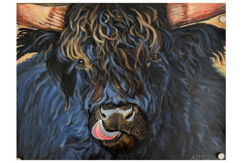
just that Jay's class. We're going to paint a bull highland cow in the most beautiful
blues and browns. And it's going to
be a lot of fun. I'm going to help guide you, but empowering you to make
some decisions on your own that will help make
your piece unique, help you develop your style. And just like I said, have fun along the way. I think it's important to
have fun when we're painting, even though we have
moments where we're feeling challenged or maybe frustrated with that our pieces and
turning out the way we want as we push ourselves forward through
those frustrations, we find the outcome
to be so sweet. Like the pressure a
diamond goes under. Maybe you're frustrated
through most of the painting. And then you get
to a point where, hey, it's actually working. I'm going to help take
some of that pressure away and help you make the decisions
about how to get forward in a sensible way, a way that I found
is really efficient. And let's have fun with this. So are you ready? Let's paint.
2. Let's Talk Materials: Let's talk materials
because if this is a hobby, it can be expensive. Even this is a business,
it can be expensive. So here are some tips and
tricks about materials and the things you're going to
need for this class and just a few little
tips in general. So first of all, we want to have a canvas or
something to paint on. So it could be a Canvas, it could be an art board, so maybe just a piece of wood. There's a lot of things
you can paint on. So leave that up to
you a little bit, but I'm going to show you
what I'm gonna be using. So we're going to
be painting on, if you want to
follow along to a T and 18 by 24 inch canvas. And I got this and
arts and crafts store, and I got the
professional level. So whenever I go to an
arts and crafts store, I go for the professional
level of product, usually at least student
level or higher. But for canvases, don't go the lowest grade of Canvas at an art supplies supplies store. I also like to get the thicker. So this is Gallery wrapped. That's just my preference
because I like to hang them up just as is. And you can get a floating frame in the end if you
want that as well. So that allows you to
have that as an option. Either way, because framing
can be quite expensive. On top of these,
even if you have this thinner framed canvas. So these are just fine
standalone, so I love that. So look for a sale. If there's a sale
coming up on that, That's a great time to get it. If you go for a
lower grade quality, you might have stuff like the
staples not properly done. Maybe it's rippled back here. There are things to
look for even if you're getting the
professional grade. So take a look at
that and see what's available at your
local retailers, art supplies stores, very
range of what they offer. And you can ask them as well, hey, are you having
a sale coming up? Because that can be
your opportunity to save a little money. Okay. Let's talk about paints because I feel like that's where he
spent the most money when it comes to my art. Might be Canvas, maybe paint. Now that would be
good to figure out. Actually, I'm not quite sure, but paint can be
expensive very quickly. For this particular project, you can look at the
paints that we'll be using in the materials
and the listing of the description of
this class and see what you're going to need if you want to
follow it exactly. Or you can use what
you have and adapt. Because if you have a slightly different
red, that's okay. It'll look slightly different, but it'll still be okay. You can still make pink, so you can still make purples. It'll just be
slightly different. Blues the same thing. And then when it
comes to the quality, I just like to avoid craft. If there's anything craft in
the name or acrylic flow. I avoid those ones for
projects like this because they're
just going to not mix as well with other paints. They're great for
a poster project. Or if you're painting a
background for a stage, something like that
where you need to use a lot of paint and you can't be sitting there mixing and
creating little detail. If you want stronger
structured paint, something that's going to last and mix well with other colors. They play well together. Then I would say to go with something more of
a higher viscosity. So these ones are kind
of more of a medium. So I will share with
you what paints I use. But anything higher than
student grade is good. You don't have to go for total
professional level paint. That can be pretty expensive. So find a happy medium
with your paint. Let's talk quickly
about brushes. Brushes. Here's the thing. If you go too cheap
with a brush, you're going to
find the bristles will come off onto
your painting, which can be super frustrating
and difficult to manage. Especially it just
makes it frustrating. So finding a decent brush, I like a really big one
for doing the background. Then I go down to as small as like a quarter-inch
and script liner. I personally love and you might
find you love other ones. But for this painting, I'll be using this one a lot. It's a three-quarter
inch angle brush. So I really loved this guy. Then because I love the
angle brushes so much. I have to quarter-inch ones. And I just loved to
have these on hand. They're really great for
creating lines, detail. You can do so much with them. So really loved that. And then a script liner brush. This is great for if
you think of script. So if you're trying
to create fine lines, whether that's one fine hair or just for signing
your painting. This one's a really
great addition. And that's all really you'll need for this
particular painting. Maybe you want to get a kit that has varying brushes so you can figure out
what you like to use. And that's fine too.
Other than that, you might want an easel because we're working on a large piece. If you're working
on a smaller piece, you can work at it
on a table flat. But I find, I prefer to have it on an easel and then I
can stand in front of it. That gives your body more
movement and ability to create movement
in lines that flow. When you're seated, you can
tighten up and you want to make sure you're able to move
around, have more motion. And that will really
help with your piece. Some other things you
might want to have would be like an apron or a smoke. Just wear clothes
that you're not worried about getting paint on. Having a rag where you can oh, and jars with a little
bit of water in them. So I just like to have a glass
jar so it's easy to clean. And I just put a little
bit because you don't want this to get wet past the
part where it's glued. So I tried to get as I try not to get
any water pass this. If you get some, that's okay. Just don't sit them in
water sitting like that. And I like to have a couple
of different mixing pallets. So this one I use when I'm
doing a larger section. And then like the
whole background and you have lots
of paint to mix. Or you can use just like a little a lightweight
disposable plastic, one that I reuse
this over and over. You can even wash them out are great for when you're
doing detail where you don't have to carry something
heavy and you're just like creating little detail, detail. You can even use a
palette knife for that. So a palette knife can
be good for mixing paint as well as from painting onto. And then I just have
this guy as well. They just keep adding
more and more paint to and it's gotten
quite a crazy. It's kinda fun though, isn't it? It's almost a work
of art in itself. So those are some of the
materials I use, 0 and a rag. Wiping your brush off,
whether it's a little too wet or just trying to get some of the pink color
off of it as well. And then pencil
crayons for sketching. I like to use. These are student grade as well. So I'd say everything
like student green above is something
I would go for. I hope that helps you
with planning some of your purchases to be able
to work on this project. Alright, now we
can get painting. Let's go.
3. Painting the Background : Alright, so let's get
started with the background. So like I said, you're going to want a larger brush to do this. Do not use a 1 " or smaller. If you're using 18 by 24 inch
canvas, get a big brush. This shouldn't
take long and it's really fun and liberating. So let's have some fun with it. Alright, so let's
gather a paints, put in a little bit of blue, red, purple, and black. I like to use this
container because my brush fits nicely into
it and it's easy to clean. I'm just going to
spritz my canvas with some water that just
helps the paint distribute over the
whole surface a little bit easier depends on the paints you're
using though. You can see I've mixed it
up using a nice big brush, just gonna do these
good brushstrokes. You can go up and down side
to side, corner to corner. You want to cover the whole
canvas is basically the idea. I also like to make sure that
when I get to the edges, I go a little bit over the edge. You can paint the full
edge right now as well. That's actually not a bad idea. I tend to paint them afterwards, but it can be nice to paint them now just to get
that taken care of. So you can see I'm brushing in different directions
to make sure it really fills in because the canvas does
have texture to it. So you want to make
sure it's covered. So this is where I'm getting the edge kind of
taken care of so that I don't have anything on the front part of
the canvas showing. So I'm just making sure all of that edge is taken care of. So that when I do go to paint my edge at the very
end, Not a problem. I don't have any whitespaces showing which I
don't want in this. And you know, maybe if you
have something that you're doing where you want that there will be
a different story, but most of the time, I do like to cover that up. So just get that edge nice and taken
care of and yet brush in different directions. Have lot of fun with this. Just be free. Let your arm move with a nice
movement, just relaxing. And I tried to
distributed evenly. So not just, you know, I don't want to clump
of it in one section. Don't really want a
textured look either. I'm going to create
texture through the brushstroke direction
and that kinda thing. So for this, I'm just
going to keep it smooth background so then I can build on the
texture afterwards. And that's just for this
particular project. There might be other projects
where you want to build up a texture layer underneath and that can create
some neat effects when you're doing highlighting and
other brush strokes on top. But for this particular project, if you want to follow
exactly what I'm doing, I'm keeping it nice thin
layer but well-covered. So nice long brush strokes to really hide the
brush strokes. So we know we're using a brush, but if you can kinda hide that fact by really
blending in those strokes. And you want to do
this while it's wet, so don't go and take a
break in the middle of it. You wanna do it all in one go. You're watching it
real time right now. So when you start going over top of areas that
are starting to dry, sometimes you can
pull paint off, so just make sure
you're loaded well and spring the canvas in the beginning does
help a little bit too, but you don't want
it to be dripping. But it does help to kind of
because it can be so dry. So really helps to kind of
blended over the full surface. I'm just going to go over and make sure I don't have
any areas that have excess paint because I can
just affect the texture. Once I start building on top, you'll see certain areas. You can kinda tell if they
have extra paint on them. So even right now you'll
see darker areas. So that shows that there's a bit more paint on those areas. So I'm just going to use a
really light brushstroke. I'm not putting
pressure on the canvas. I am letting the
tool do its job. Just going nice and easy. Fun. Just getting that first
layer of paint on there. Imagining how it's all
going to come together. Just setting my mind free, not really focusing
too much on anything, just this is a really
lightly brushed section. I'm just going really
light with the pressure, barely touching the surface. Just letting that paint, this brushstroke really kind of hiding the fact that I am using a brush almost give you more
of a airbrushed effect. So I'm just noticing that spot there is
a little too thick. So I'm just gonna go
over it and work it while it's still
wet, starts to dry. You won't be able
to work at anymore. So it's a quick process. Don't be shy. Really get in there. Don't have to press
hard on the canvas. Just nice light brushstrokes. I like to do those same
directions to finish it off. You can just let it dry on
its own or use a blow dryer. And that's it.
4. Sketch it! part one: Okay, so we've just finished
painting the background. You have washed your
brush thoroughly, do not let it sit and paint. So your materials are cleaned and now you're just
waiting for it to dry. The weight. You can use heating tool to dry quicker or a blow
dryer can work as well. And once it's completely dry, to make sure that it
is completely dry, you should be able to touch it. Put your hand on it and
touch and it should be fine. If it's not, then wait, then you're going to want
to get a pencil crayon. I like to use something
like a light gray. It's neutral. It's not. I wouldn't go for a red because we are going
to be painting with blue. And sometimes your pencil
crayon can mix with paint. So grab a pencil crayon
and grab the image. So get the image on your phone or something or printed out. And then let's, let's
sketch. Let's go. Alright, so I'd like to have
my reference image close by. I sometimes just keep it on
my phone as you can see. So feel free to have
it on your phone and increase your screen
timeout to as high as it goes. I have 30 min until
mine times out. So I have that brightness setup. Or you can print the image off and just use
it from the image. Now, instead of doing a grid format because I don't
want grid lines to show, because I'm gonna be showing off a lot more of the
background on this piece. I'm just going to
eyeball it a little bit, but there are some tips and tricks that we're
going to go through. So first of all, finding your center on the image as well
as on your Canvas. You can even mark it
with your pencil crayon. And then you just
start lightly making marks in the direction
you think from the image. So there's a lot of
looking back and forth. And I'm also using a bit of
my own measurement tools. So you kind of create your own measurement
tools based on some of the things that
you've already sketched. So let's say you place the like. What is the length of the horns versus the length of the
fur at the top of the head. So is it a third? Is it a third? A third. A third. Is it less than that? Find the ratios and then I use that measurement to base
the rest of my image on. So I start with one thing and I don't just stick
to that one thing. I keep doing similar
measurements to make sure that I'm hitting the
spots the best I can. Start making very faint lines. Don't put hard pressure on your canvas with the pencil
crayon, just light pressure. See how I'm creating
my own guidelines. I'm not using a
ruler, but it's kind of like I make my own ruler. And then I make
light marks that can be easily erased with
a sponge if need be. But at this point, I'm okay doing these what I
call hairy lines. I think it was actually
one of my professors that called it Harry lines. So I'm just referring to lines that aren't
as contour lines. They're more just
making little marks and finding the right
placement for those marks. And because this is
a hairy beast, well, that's alright to do with
these hairy lines, right? So I'm highlighting the
spots of everything. So it's not just
what's lightest. I'm trying to place everything so that when
I start putting paint, I know exactly where the I is. I know exactly where the
nose, the tongue, everything. So we're gonna go bit by bit. And as we establish the
main size of everything, then we're going to know more
easily where everything is. Are the ies exactly in line? Are like where's the nose
in relation to the eyes? And you want to look
at curves and angles. And you can use
your pencil crayon to help you figure
out those angles. You can kind of hold it on
the image and then pull it up towards your Canvas and make sure that the
lines are similar. And that actually
really helps a lot. So you can step back a lot back-and-forth,
back-and-forth. I don't just if you get
too fixated on one, if you're fixating
on your canvas without looking at
your reference image. And I see this a lot. Look at your reference image
more than your Canvas. It's a skill that
you're going to learn. It's not something that's
going to come right away. So just practice and
have fun with it. You can see, you can
see now I'm working on the nose and getting some of those details in now
that I've gotten the eyes in place and over
the horns are going to start. But I've made light
marks just in case I feel like
I've made a mistake. So it's good to make those light marks so
that you can change them. Because what I find
sometimes with myself is I will create lines and then. I feel like I'm stuck. I'm committed to those lines
and I can't change them. So I want you to feel free to be able to change
those lines as needed. Is the angle incorrect? I want you to feel
like yeah, okay. I can fix that. But also, don't worry, if you're really a beginner, give yourself a little grace. And obviously you want to keep practicing
and getting better. But even myself,
I'm not perfect. So I'm still working
towards improving my observational drawing or drawing from an image
without a grid. It's a skill that
can be very useful in helping you increase your observational
drawing skills. So I really want to, in this image, establish
everything in place. I'm going to know exactly
where I'm putting my paint. So I'm going to
spend plenty of time here is maybe 20 min
to half an hour. Really sketching things out and making sure that I'm ready to get
that paint on there. I know you're
probably eager to get paint going, but that's okay. We'll just we'll get there. So when I'm using a lighter
colored pencil crayon, a background, I do like to intensify the highlighting
in this process. So I will focus more
on the highlighting than drawing in any low
lighting if that makes sense. So if the nose has highlight, I'm going to sketch that on. And then if there's a low-light, I might just leave that block and then it's already in there. So I don't really need
to sketch it by filling in all the highlighting
will be able to better determine where those low-light
situations are happening. I'm even going to
start sketching in here some of the hairs. Because although they
look a little bit there, curly, theirs, It's
kind of chaos. You still want to establish some of the space
in which you're going to be creating those
brown hairs that are on top. And here I'm more establishing
the base of the horn. So at first I just marked, where's the horn starting? Before you draw a big line? It's a lot easier to change
as little small lines. So I do like to make it make sense to just mark
where the word Starts. Do some of the other sections. What is most important? Getting, I think certain aspects of the face, getting
the proportions. I'm making sure my nose isn't way too big
or way too small. Making sure it's
the right distance from the eyes, all
of these things. And then as you can see, it's starting to take
more shape as I go along. So I hope you're
able to You won't have to follow every single
sketch mark that I make. But hopefully my process helps you to figure out
the order of what can help you in the fur that's going
along the body of this beast? I always okay, i'm, I'm
calling it a beast. I'm creating lines of the highlighting of
where the fur is latest, where the light is hitting that. Okay, so here I'm starting
to sketch in the ear. The ear has a lot of this highlights must be a brighter sky kind of
thing on the outside of it. So it's really the
background that almost creates the
presence of the ear. So now that I've been able to
create that baseline here, I'm going to try the left side and it's not always symmetrical. So just make sure you're not just going exactly
like the other side, you're focusing on
that reference image to give you direction. Now, when you're standing
up and you're loose and you have freedom to move your whole arm around and
freedom within the wrist, you're going to see how
my wrist has mobility. It's good to have some
mobility within your arm with your wrist as you're
creating sketch marks. When I created the base of
the horn, use two lines. Well, it's not going to
have two lines there. But when you're creating
a straight line without a ruler or sometimes
it's actually not that bad to just
use an arm that's kind of free-flowing and making a mark and you can do a
fairly straight line. And the horns aren't
exactly straight anyways, they have a curve to them, so try to not be too
fussy in the beginning, see her going over it again. And then once we
go in with paint, then we can be more fussy about where we're
putting things right. To some extent, we
still want to have a little bit of a
looseness about ourselves. What do you mean by
that is just not being uptight with your body because if your body is in
a really tight position, you won't be able to create these marks that
are free-flowing. It, that works really well when you're doing a
scratch art piece. And it's really small
detailed piece and you, There's not really
room for movement. You have to keep your
motions really small. But in this case, we're working
on a fairly large canvas. And as we start to put in these various hairs that are going in all kinds of
different directions, all different
lengths, everything. It's good to have. Look at that looseness
and my wrist. So I'm holding the
pencil crayon, holding my arm in place, and then creating a
looseness with that. So as I'm observing, I'm noticing Hold on. I don't know if I have
the right dimensions. The size of Canvas isn't exactly the right
ratio to this image. So that can be a problem. When you're working
off of a photograph, you might find you're like, Whoa, hold on a second. The ratio is off. I'm following the image,
but something's off. That will happen if you're using a different
size canvas ratio. Like if you're working
on a square versus the images on a rectangle,
that kind of thing. Even a subtle rectangle, two rectangle difference, a lot of different ratios
you can work with. So just keep that in mind
when you're creating this, I left more space below
the nose and mouth area. And I figured that I can just fill in some of the
fur at the base of this image to offset that
difference in ratio. Now you're seeing it coming
together more and more as we continue finalizing some of those areas and
adding highlighting. So when I'm feeling
more confident in where I've placed things, I can start to solidify
those exterior lines.
5. Sketch it! part two: I really feel with
this kind of image where we're keeping so much
of the background in there. You don't want to just
outline the image. And this picture in
particular wouldn't really work for. In the past. I've been I've done projects in school and that
kind of thing where you use a silhouette and you
just trace the silhouette to create to get
your image on there. This would not work well with that just
because of all the different There's not really a strong outline
with this image. So that wouldn't work so well. You might have seen in one
of the classes where I teach drawing your pet, like a pet portrait with
a grid that I had more of an outline because my
background was so light. This one, It's just a gradual
change of varying change of highlights and low
lights based on the for that some of those highlights on the nose
working on that tongue, trying to get it in
the right direction. It can be really
tough at times to get things that have
an angle to them, various angles and curves. Almost making shapes that are
recognizable but not quite. It's not quite a rectangle. It's not quite a
circle or oval shape. Its, its, its own form. And there's so many variants to an aspects of trying to
get that exact form correct. So take the time in-between, give yourself a little
break so that you can make sure that it's correct. You could just see
me do there is. How closer to the eyes, to the leg versus the nose? What is this space between the start of the
nose and the eye? And just making sure that I have those proportions set in place. Again, don't worry if you
need to change things up. You can use a damp sponge to erase your pencil
crayon marks, but start with
really light marks so that they won't
show up very much. And I'm also more competent in areas where there's
gonna be a lot of paint, not a lot of black
background showing. As you can see, I hardly have I0 don't really have anything in the bottom-left corner because that's where I'm
going to have a lot of this for coming in, but we will sketch
that area soon. But first, I really
want to make sure that my eyes and my nose and horns are really the right
size in the right place. Those are those
important details that you want to have finished first and done correctly. Let's zoom in a
little bit so you can see just a bit better. Let's see some of my hair lines. Again, I'm using a
very light touch. This is I'd prefer to go
over Section multiple times to get a highlight that's
stronger than to press harder. That's my preference to
just multiple times over the same section rather than Mike harder pressure to
get a stronger color. That's true for this
particular instance. Most of my drawings as well, I do prefer that. I will rarely just press
in with a lot of pressure, especially because you
don't know how that's going to affect negatively the materials you're
using and the marks are making when you have
really hard pressure, you're not going to get
those free flowing marks. And it's just a lot easier
to create curves and lines and everything
when you have just really light touch,
light touch thing. We're not hammering
it. This part might feel a little bit tedious just because you might find
frustrations and not getting things accurate or you really
just want to get painting. I understand. It's hard at times you want to get just I wanted
to start painting. That happens to me a lot. But once you do this part and
you have it all in place, trust me, this will
be so much easier to start painting this
particular painting. So this could be, I might have a different perspective
for another painting. But this one in particular, just with the method
that we're using, it's just a bit easier, a lot easier to have things drawn in place before
we start painting. Because could you imagine
if I started painting already all those little
hairy lines that are extra, that aren't in the right place. Having to try to change those
would be a lot messier. I wouldn't have that nice,
smooth background anymore. I would have it would start to look a little messy
and I paint really thin. So for me, it's sorry, I'm going a little bit
off the picture there. But just marking in place
around the ear section. So you'll get it. You'll get it. I trust you. If you have questions, please. I love to see comments
sharing your work. Even if it's at the
sketching stage, if you wanted to
share your sketch and ask for some tips or opinions before you get
started with your painting, I would love to
help you with that. I am here to help. I want you to learn the skill, to learn that you
can create this. But I also want you to have a bit of freedom
to make it your own. Yes, we want to get
the correct shapes and perspective
proportions, all of that. But if you want to change
the colors a little bit or go off the track
a little bit, go for it, have some fun. Maybe you enjoy
painting thicker. Everybody is going to
have their own style. And as you try my style, this is essentially
trying my style. You're painting with my method
and how I like to paint. And in this particular case, you will start to develop your style as you
study other artists. So I really encourage you to find many artists
that you enjoy, watch their process and paint. This. I'm encouraging
you to follow right along other artists. If you're just watching on YouTube or something like that, you don't want to just copy. But if you're following similar subject matter or learning tips and
tricks from them, you will start to
gain your own style. If you think about it, it's not that easy to copy something exactly like if I were to draw or just create
my signature. That's not easy for
you to get it exactly. It's gonna look a little
bit different if you're just signing my name. And so it's just a bit
easier if you loosen up, follow the steps,
but don't worry, if you're not making the exact same little
hairy lines. I am. Just give it a go
and you'll start to explore and find your style. And that's the beauty of
it because each artist has built up with all
of their experience. This beauty from
life experiences, from who you are, from movements that you've acquired through years and
years of whatever you do. And so it's kind
of a neat thing to see how different
artists can be. I don t think it'd be
that interesting if we all looked the
same with our art. So things are really
coming together. As you can see, we have the for that I'm
starting to build up into the front
front area, top head. And it was easier to establish some of
the hairs that were more maybe uniform or in
place in the right way. And then work on
these curly hairs that are at the
top so that I had better references
of where to put them and various aspects
of it like that. So we'll just keep sketching. I like to use this light
gray because for this image, we're doing the cool colors for the fur and then we have
warm colors for the, for we have the warm
browns at the top. So it's kind of a nice neutral. And if it was a red, oh, maybe I could go
with a warm brown. That'd be fine. But even still I can stick with this for pretty
much any image. So that makes it pretty simple. There might, in the
past I have used pens, sorry, excuse me,
pastels, chalk pastels. I wouldn't use oil
pastels that would not work well with mixing
acrylic paints. But if you use chalk pastels, just those can work as well and they're kind of
easier to erase, but they also bleed
into your paint. So once you touch
water with them, they will bleed into that. So keep that in mind. I mean, that can be
advantageous at times. But for now, let's just
stick with this color. It's not to be the
exact same color, but a light gray color
works really well. You want it to be able to
be something you can see. You want to see your marks, but also have them light
enough that they won't be too obvious if you couldn't paint in that section and
you can erase them easier. So now I'm just establishing
the ear because there's this bright yellowy
sky behind it. So we want to establish
where that's going to be. So when I start painting,
I know exactly. I mean, you can paint
free-flowing and that's fun too. But I just want to show you this method and I think
it's really helpful, gives you better
chance for success. If you just wing it, then you might find you get into places where you don't feel confident in your piece anymore. So we're almost done
this sketch here, but I'm just going to
finish a few things. We just got a couple of
minutes of sketching and last little details
before we can get painting. But how are you feeling? Are you, are you able to get it in the right proportions
and that type of thing? You can notice that I haven't
used an eraser at all. I'm just using fine
fine pressure, light pressure on my canvas. But I have had more practice maybe I'm not sure if you're coming here and
with more experience, maybe, maybe you've
done this a lot. I give this method a try. It's great to work on
your drawing skills. Drawing and painting
go hand in hand. That's why I have
drawing classes as well as painting
classes on here. I'm not going to
mark all of the fur, but I do want to know where
that's going to start. So I can really dive
in when I've got my paint and really have confidence and where I'm
going to make marks. I love the little hairs
on the chin there, just those are some of the
details that really make a piece come to life
and feel realistic. Okay, you guys,
we're going to start painting in our next video. So I hope you're ready, getting excited and feeling
good about your image.
6. What to Paint First? part one: Okay, we've sketched our
background is ready. Now. We're getting ready to
actually put the details on. So this is the
scariest part, right? Well, maybe not because
now you've sketched things in place,
so you're really, you should feel confident in where those highest
highlights are, in those lowest,
where everything is, it should make it less scary. So that's what I really
love about sketching it first is once you
putting the paint on, you're not at a scary step. So don't be afraid. So
what I'd like to do is I like to start with what? Where should you start? I like to start often
with the highlights. So you can start with a neutral white that's
mixed with a little brown to make it a light neutral color depending
on what you're painting. We're going to focus on the horns and these really
lightest areas of the piece. So when I look at
a picture, I say, what is the lightest part? What has the most impact for if I make sure that it's
in the right place. So when we're doing
something like an animal or a person's face, and we have features that are really important to get right, then we wanna make
sure that we're starting with the most
important features. If you're doing a face,
might be the eyes, but also making sure
you've drawn things to a satisfactory Like
proportion and everything like that so
that you can get painting. So we're going to start
with doing the horns, knows the outline
where the ears are. And by starting
with those points, it gives us more
competence in stepping forward into creating
other parts. Like once we do the fur, we're already going
to have those other things in place so we know where to
play around with. Because you can play around
with a little more like I might have my
hair flicking out. I still look like me. And so having the eyes and the nose and mouth in
the correct position, the correct distance from
each other, the correct size. That will be more important. So let's get those
parts in place. Then we can have the
harder section done first and then kinda play after that would be
a little more free. Will have a lot
of fun with that. Alright, let's go. Okay, so know what
you're gonna say. Hey, didn't we already sketched so that we know
exactly where to put things? Yes. But we're still
going to want to get those in a permanent way, right? So now we're getting
it in a permanent way, whereas before it was
kind of the sketch. Now we're setting the permanence
with these brushstrokes. So we prepped
ourselves really well, but now we're the
paint is coming on. So I mixed a brown with a white and I'm using just a
half inch flat brush. But I'm going to switch to
another brush soon too. We're going to use the angle, quarter-inch angle
brush as well. But for this first bit, we're going to just
brush on some of this light tone onto the horns and these lightest
areas of the piece. My apologies for hiding portion of the painting at this
point, you will see it. I will maneuver
it at some point, but just follow the image. I'm doing. Side-to-side strokes, kind of back-and-forth
very lightly. And I'm picking up paint
in-between a few times. So as it starts to diminish off my brush and I see that
it's creating that drag. I will refuel my brush. So looking at my reference
image still, yes, we put the horns in place, but there are some areas of the horn that are bright and
some that aren't as bright. So I'm not going to just paint
all over those sections. So having that reference image nearby is super-helpful
throughout the whole process. Maybe you can put it on
a stand or something, or like I said before, you could print it out
and that might be easier. So I'm using a light hand still. This is how I like to work. If you'd like to use thicker
paint, give it a go. If you want to try something different than what
you've done before, let's say you're more of
an intermediate painter. Grab your sketchbook and do
it in your sketch book first. And maybe you want to try
that anyways, just to say, okay, is this how I do this stroke is Do I
like how it looks? And just know that the very
first mark you make isn't. Yes, it's somewhat permanent, but you can still
cover things up. You can still fix things and make sure you're
having fun with it. We want to have fun here. It can be difficult at times, but for the most part, it's very therapeutic for me. So now I've switched to a
quarter-inch brush so I can get the detail of
this bright line there. If you've noticed just below
the horn and above the ear, There's just a bit of light
that I want to grab into. The thing with this is we're going to have more
than one layer. So this is kind of
our base layer. After we have our background or background is a
complete base layer, but this is the base layer of
our highlighting and color. So because I've created this
kind of neutral color using just a bit of white
and raw sienna. Then you can create
a really nice, neutral but warm or looking at the warm side for our particular
painting at the moment. So I'm just adding a little
bit more of some yellow and some raw sienna
in there just to make it a little
more vibrant. So every time you mix paint, you take one color and
you mix it with another, you're going to decrease
the vibrancy of that color. So take note of that. Sometimes that's
very helpful and oftentimes it really is because most of what we see is not
super vibrant in color. It's not a pure, if you see those
green, green paint, that's what a bright green. You don't see a lot
of that in nature. So you're kinda normally
makes that a little bit. Now, after having
visited Hawaii, I somewhat actually disagree
with what I just said it because there are some
really bright colors there and some areas of the
world you will see that. But what's helpful is when
we're able to mix that green in with another color to mute it down
just a little bit. So what I'm doing here is I'm
just taking a second brush, wetting it and you
don't want to driven, you just want it damp
and you can erase. If you've gone past
the line you wanted. So I didn't like the
baseline of my horn there, so I'm just fixing it up with this other brush and you
have to wash it in-between. And you have to dry
it off a little bit. You don't want it sopping wet. So I'm just going to
bring in the hairs here for the ears. And I'm just doing
gentle brushstrokes in the direction where the hair
is moving, the moon motion. Think of the movement
that we're creating here, because our first layer
isn't going to be so opaque. We're going to be able to
create a little bit of a dynamic effect by adding
layers on top of this. So what's great about this is it gives us a bit of a gradual, more realistic look to this for, because if we just had a
really stark contrast, then you're not
going to have the, the layers of hair that
we really have in here. You can just see how I'm
moving with my brush. This takes practice and it's
going to take some time. If you're a complete beginner, don't get frustrated
with yourself. You can't compare
yourself to somebody who's pin painting a long time. But give it a go. Because if you're, if
you've never start, you're never gonna
get that practice in. So this is a really
great time to practice these light brushstrokes
that have this kind of natural fluid
movement because this is a real animal and
it has movement, the hair, the hair is kind
of a fun thing to paint. If you're learning to
be a little more loose. Or if you're just wanting to practice some
different brushstrokes.
7. What to Paint First? part two: I find it quite freeing because when you're
painting buildings, you have to be very
precise with perspective, but also just your lines
need to be so precise. With this, it's a little
bit more flexible. So I'm not too worried. I'm not painting over the edge, but I want to paint
right up to it and maybe slightly past the corner of it just because it
has a bit of a curve. Most canvases will
have slight curve to it just the way that
the fabric wraps around, even if you have a strong bevel. So anyways, you can decide
if you want to paint the side with the continuation
of the color you're using, or you can just paint the
edge black afterwards. Or if you've already
painted the black and the beginning,
that's good too. So you can kinda see
this more peachy tone that we are working
with right now. And you'll have to layer on top to get more brightness in there. So I'm just switching
back and forth continually using this
quarter inch brush. And looking at my reference. Going to the other side now, same mix of color. I always like to pull color
in a little bit at a time. I don't mix too much paint
at a time just because I work in thin layers
and paint will dry. This paint will dry quickly. So we're using acrylic
paints, right? So they act differently
than if you were to be using oil paints or
even watercolor paints. This is different than that. You can see how I'm
holding my hand and using light brush strokes
in the direction. I kinda use my arm
to hold it in place. You can use tools to help steady your hand if
you have a shaky hand. So I just want to try and
get the directions correct. And I am still having to use my reference image
quite heavily. I am using it a lot just because we all the little hairs we didn't draw out every
single hair, right. And like I said, we're making them
more permanent now. So I really want to make sure that I'm getting it the
way that I want it to be.
8. Painting the Horns part one: So one tip that I have is even if you're focusing
on the mouth area. But let's say you're using
a yellow color that you've mixed and you notice that that same color is in the horns. We'll use that opportunity
because acrylic paint, like I said, dries quickly. Instead of remixing
that color later. Use the color while you have it. So I like to work in
color blocking sections. So having said that, we're going to begin doing exactly what I've
just mentioned with a tip. So we're going to be focusing on these areas,
creating new layers. So we using my quarter
inch angle brush and just some burnt umber, we're going to just paint gently some layers in around
the nose area. So I'm just starting
to build layers. What's nice is when I
don't mix it with white, you can see how it's not covering over the
black 100 per cent. So it's leaving a
bit of transparency, almost creating a glaze effect. Depending on the type
of paint you buy. One thing to note is when
you're buying paint, you might have some that say semi-opaque or opaque
or transparent. So depending on how opaque or
transparent your paint is, will influence how you need to mix it and how you
need to work with it. So I believe this is a
semi-transparent and so I'm able to see a little
bit of what's underneath. But even if you're
using an opaque paint, sometimes it doesn't
cover entirely, so it's still kind of creating
a slight glaze effect. So glazes, this layer of color that still shows
another color underneath. It's kind of the basics of it. So I'm starting to create
some depth, some detail. We're adding some features
in here, some color. So that's when you're
just using one color. It really creates a rich
field to it, a vibrancy. And I'll use that
up in the ears. So now I'm starting
to the horn, sorry. So now I'm starting to use again similar technique
where we're painting now. This point a little bit over top of what we painted before. Having done that first layer, that will give us that the
brightness underneath. So you can see what I'm painting the same color over top of our first layer of that creamy white, peachy, yellowy color. When I go for top of
that with a color, it's gonna be more vibrant. It's going to stand out more. So you can kind of play
around with that in your sketchbook first if it
makes you more comfortable, and then see the effect of
creating a layer over top. You can make some raw sienna into it to make it a little bit more of this warm brown. And then you have to recharge that brush to make sure it
has the paint you need. And also doing it
starting within the black area allows me to take it into the
light area more gently. Again, what kinda working with some burnt umber right here. Look at your reference image to see where those colors change, where they're sectioned off. Because I know what
I'm working with the same colors for the ears
and that kind of thing. I can just alter the
color a little bit by adding some
white or some more, maybe some yellow
ocher right here. That's how I'm getting that
a writer orangey look of the brown is adding
some yellow ocher and mixing a little bit of
white into it here and there. So what don't you like to do on the palate is start
with one color. See if you can
imagine this with me. Start with a color,
you've mixed it, and then on the
side of that color, mix another color, maybe a bit of white,
that kind of thing. Whatever you're depending on what you're working
on in this case, I would say some white, some raw sienna, some maybe some yellow ocher if you want to make
it a brighter color. And instead of just
changing the whole thing, just mix it off to the side and create its own little
pellet of color. And you can do that
multiple times to get a gradient effect. So rather than mixing that, you might have seen it done on the Canvas
which you can do. And I like to do that
for skies sometimes in cases where I'm working with a smaller brush and
with more detail, I like to do that on my palate. So you're just mixing a
gradient on your palate. And then you can pick up the
different colors that you need and put it on your
canvas and work with it. That's what I like to do
in these kinds of cases. So even though I mentioned
at the beginning, I have this tip where
I work with one color. I still work within
the gradient levels. So it's kind of a monochromatic layering effect that I'm doing. I like to stand when I
paint because it gives me this motion of being
able to step back, come close, move around. My body has more
freedom to move. And when your body has
more freedom to move, your brushstrokes, you actually get more
control in some way. Now if you're working
on a really tiny piece, you don't necessarily
need a lot of movements, so you could sit down
and do it if you'd like. But I find that standing up does make a bit of a difference. So if you're able to get even a tabletop easel
and put it on a counter, counter height or bar height, then you can stand up and paint and see if that makes a bit of a
difference for you. So now I can work this
similar color into the eyes. So we're working with
some burnt umber, some yellow ocher in that mix. And remember if
you need to erase just to get that
other brush in there, have it handy of your
tools handy so you can rush to the rescue. Save that color. You can see because of my black background
that looks very matted. Like Matt like it's
not shiny looking. You can see exactly where I'm erasing and it kind
of looks glossy. That's just because
it's getting wet. So I'm erasing my lines
to make sure that, well, for one, it
actually helps erase some of the pencil crayon lines. And then the other way I'm just fixing the paint
that I put on it, Just making sure it's exactly
where I want it to be. And each time you do these
layers, from each layer, subsequent from here, you're
going to find greater depth. And you're going to get
that realistic look. Just as you continue to those layers working
it didn't well. So we get that again, similar color scheme
here, going on. Burnt umber, see how it looks different when I
painted over black. Then when I painted over that cream color
that we painted in, those highlights, does have a
different effect, for sure. Get in some raw sienna mix in a little bit of yellow ocher, maybe a little bit of white. Just a tiny bit of white. If you go too much on the white, you're gonna get just that
similar highlight color. And we want to keep the
vividness of our colors. If you mix too much white, you're just taking away some of that vivid color that we want. But I do like to throw in
that bit of white if I need to go over top of another color, if I don't want that kind of transparent effect showing
the other color underneath. So that's why I like to
start with those highlights. Because now you can see
how it's benefiting us to be layering on top. And my apologies
for having part of the image out of you for one, and also for having the shadow. It's difficult to
create 100% viewpoint for what you're seeing me paint and having not any shadow as my hand comes over
top of the piece. But I'm doing the same
thing on this side as I did with the other horn. I'm just following
the color schemes of the reference image though, which are a bit
different on this side than the other side. And I will change the viewpoint that you will be able
to see the whole image. But at this point,
I do apologize. So if you want to skip
ahead to see what the outcome looks like
for this particular horn. Go, go ahead and please do
and see how the colors look. If you need to. If you're following along
with my voice here, you should be able
to figure it out. But here we go with some. Now we gotta get
some cad yellow. So our cadmium yellow in medium, you don't have to have
these exact colors. But again, if you want
to follow exactly, then use that color so that
cad yellow look at how bright and bold that looks mixed in with a
little yellow ocher, but not, you don't need too much to get those really
bright yellows. You're going to want to get that cadmium yellow going over top of those highlighted areas. So if we didn't have
those highlights in there and we're just like, Oh, we'll just paint yellow. You're going to have
a different color. You can even try it just to see what that
would look like. But it's not going to pop
out in front of the piece.
9. Painting the Horns part two: So I feel like it's a timesaver. It makes it easier to paint
by adding in those highlights underneath any areas where you have to paint
something lighter, I find painting this white, neutral light color
first really helps. And I chose to go the warm
side of things rather than the cool side just
because I knew my outcome would be a yellow outcome. I'd want to be painting yellow
on top of that highlight. If I was going to be painting blue colors over the highlight, then I would have chosen
something more on the cool side, maybe mixed a little white
or purple or whatnot in with my white
as my highlight. The nice thing too, that I
like to do is at this point, I'm knowing that I can still
create more layers on top. So now I'm working with my half inch or three-quarter
inch angle brush. Doesn't have to be exactly
three-quarter length. But what I do like about having different sizes of ankle
brushes is it just gives you a different option
when you're trying to maybe stamp on some lines
and creating texture. It's just gonna be a bit
quicker because a longer, wider brush will help to create that effect
a lot quicker. Right now it's snowing. Well, it's not snowing, but we're having an
early winter and so there's snow outside and so it makes me think
about shoveling. Well, if you have
a small shovel, it's going to take you so many passes did
finish your driveway. Sorry if you don't have
snow where you live, if you don't, you
might have to figure out a different like
mopping the floor. You have a larger mop. You can you don't have
to do as many passes. Right? So having to shovel
the driveway recently. That's what was on my
mind as an analogy. So now to get an even
brighter highlighted area, throw in some white. You might need to clean
your brush off first. Sometimes I don't clean my
brush because I want to keep some of the color that
I've mixed on prayer. That's the only reason I
would keep a brush tainted. So now I'm starting to
create some texture. If you look at the image, you'll see some texture as
you get closer to the fur. And I'm just doing a light stamping effect that you're going
to be able to see. Here. There we go. Again, my apologies. Just when you think you've
set up the camera to show everything and then part of
its head and you're like no. Again, you can skip forward to see what that will look
like in the future videos. But you can see how
that's created. There we go. Now you can see, so if you
skipped ahead and now you can go back and do that. So this is a mix of white. And because I'm on top
of what I've painted, I want this one, this, at this point, I don't
want to taint at brush. I would want a clean brush. Mix some white with yellow, just we'll start with a
little bit of yellow. I like to take a little bit
of a color and then add more. If I need more. Then to create different
tone of a similar effect, creating texture, but
the colors will change. So I'm tapping it underneath and brushing where I want
a smoother look. And sometimes it's easier to
kind of brush a smooth look and then do a tapping
effect over top. Such as how I added
the burnt umber, that dark brown first. And then I did this tapping with the white and lighter
colors on top. It's going to give me a nice
textured look in the horns. Make sure you're following
your reference image and don't let your mind go to, this is what a horn
looks like in my mind. And that will affect your ability to create
something realistic. Because in our minds, a horn doesn't look like this. This, in my mind, this
kinda looks more like a banana in some way. So the top part,
that's really bright, That's a lot of white to a
little bit of cad yellow. And as I'm doing these
darker highlights, that would be just more
of the cadmium yellow. Maybe a little bit of
yellow ocher in there too. And then what's your preference? Do you want it to look
a little different? You can make it a
little different. I do love to have
this painting doesn't require that many
different pink colors. And you really
don't need to have every color under
the sun, right? You can do a lot of mixing. You just have to have
your primary colors. A white and a black I
find is very helpful. I use a lot of white
paint in my paintings. As you can see, it really does help to create those highlights. The opaque and then the
effects that I need. Mixing white with another color to get it, bring it forward. So when I say bring
it forward, I mean, we're hiding the paint
colors underneath. The more you brush over
something, the more it blends. But also with acrylics,
they dry quickly so you can't brush over
it too many times. And then if something's drawing and you try to brush over it, it might pull paint off. So that's something
to keep in mind too. So I do like the textures and effects that I
created on the left side. Let's bring some of that
into the right side, but check your
reference image to see how it's different
on this side, we're not just doing
a symmetrical piece. If you look at your own face, you'll see a lot of
differences from the right side to the
left side typically. Again, I'm going to
have the same color of that cadmium yellow mixed
with a little bit of white. You can see how much of
a difference it makes, depending on how much white
you mix into your paint. And just adding a little bit. You don't want to
go too crazy and cover everything that
you've just painted, depending on what the
reference image says. And I'm not saying
you have to copy a reference image 100-percent. Sometimes I do like to
eliminate objects or things. But just for the purposes of this being beginner
to intermediate, going to help you out follow
that reference image. It's a good practice even
if you're more advanced, I think if I want it to be a little more
opaque or transparent, I will wash my brush and just get some of the
yellow on its own. And that will help to do that. You can see on my brush has a lot of different colors on it. While I'm working on it
and it's all wet still. I don't need to just wash
my brush every time. Working within the
same color scheme. I'm not switching to a purple
or something like that, which is the opposite of
yellow on the color wheel. So that would give us a
different color entirely. So in between, this
is this back around. It's quite this
bright yellow color. So we did that first layer
and look how adding, just going to add some of this
color that's on our brush. We've got some white, some raw sienna in there, possibly some cadmium yellow, definitely lots of
cadmium yellow in there. So we're just going to
brush that in there. It's okay. I don't
want it to necessarily look smooth as in one color. I like that it has some
variety with a bit of maybe some raw sienna showing
through or maybe more of the yellow and
one section or maybe a bit of white in there. I still like to keep my
painting thin personally. Not opposed to if you want to throw on more paint thicker. I just pardon me. There's something about it. I don't know if it's I'm frugal. I don't know if it's
what aspect of it is. I don't like to waste paint. Throw it in a little bit of some of the browns I
have on my palette. Just kinda, kinda brush inward. If you start from the outside
towards the fur of the ear, you're going to be able to
make a nicer transition. Now that's what I
just did there. Adding some white That's not mixing on the
palette as much. That's because I want more blocked random bits of white
to mix just onto the canvas. That's fine to try that too. You don't have to always,
just because this is a little bit more freedom
than working on the horns, doesn't have to be as precise. I feel like you
can just throw in some white kind of
blend it through. You can see I'm
still working with my three-quarter
inch angle brush. Doing the same on this other
side, adding another layer. Tossing in a little
bit of white. It's going to make it more
dynamic and really fun. It's really fun to do. And now we'll move on to our next section
where we'll focus on working on the mouth
and get that on-point.
10. Painting the Mouth part one: Let's talk about the
mouth a little bit. So we have this cute nose and fun cute little
tongue sticking out. Look at the angles of
the tongue that will help you in drawing
and executing it well. And also in blending the colors, like what I said
with color blocking, makes sure that you're
taking time to blend. So when it comes to the tongue and there's different
grades and pinks, I will mix on my paint palette. If I have my darkest pink
and I'm adding white to it, then I will just have my pink here and then mix a little white and
bring that color here, and then makes a little more
white to bring it here. So I have my three levels
of that same pink, same with the gray. I do the same thing so I
can draw from each one. And it's a small enough
section of the painting that my paint will dry too quickly or I'm going to work on it
until it's finished, not go take a break
and let my paint dry. So just make sure that you take that little tip
into consideration. So you can do little
tip of the tongue. Alright, let's have some fun and start working on the tongue. So we're gonna get some pink. So I would like to make
a pink is just take a nice good red and
add some white. And depending on how bright
you want that thing to be will depend on how much,
what you want to add. So cautiously add your white because you really
don't need that much. You can even add a
little yellow to your pink to change it up, make it a little bit
more of a warm tone. So we have a cadmium
red that I used, and that's what I use
to create this pink is titanium white with
that cadmium red. And as you can see, I'm using my quarter inch angular brush. You guys know I love this one. So you're going to see that. So you can see I like to start when I'm using my angle brush, sometimes at the tip, the edge of a point. And then depending on
what I'm doing the for, I might want to start on
the larger section and then brush out to make the
tip of it smaller. Just kinda depends on what
you're actually painting, but you can follow along. Notice how I'm holding my brush, not pressing down beat
gentle to your brushes, be good to them. Ideally in the future, I'd love to get a two
phil mean system where you can see both my palette and then also my painting
because I think it is for the beginner anyways, seen how I'm mixing the colors
can be really beneficial. So maybe I'll just figure that out into my
next video or something, so be on the lookout
for that in the future. But for now, I'll try to
describe it the best I can. When I'm mixing colors. It's good to use a palette. And you can use a palette knife. That can be a good way to mix
your colors because you're not getting it onto a brush so you're not wasting
as much product. So again, I have my secondary
quarter-inch brush. It doesn't have to be
the same type of brush, but in this instance, it is for me and I
like using them. I feel like I'm in control
with it and I love it. So, um, did you
see how I was able to make that line
does sharper by taking the clean one and drawing it off some of that
paint before it dries. And it works quite well. That doesn't mean
you can be super, I would say sloppy
and to free with it. But it does allow you to fix little bits that you
want that need fixing. Because if you're having
to erase too much, it can be painstaking. So just keep that in mind, but definitely give it a go. It's really a nice
handy trick to have on on your tool belt of skills. I'm constantly looking at
what my reference image. You've heard me say it time
and time again and I will. If you're working from a photo, you gotta look at
your reference image. If you're working
as an observation, like live drawing life painting, you need to look
at your reference. So whatever you're painting, you need to look
at it because the more you can analyze the shape, the angle, everything,
the better off. It will be your teaching your
brain what you're seeing, what you're actually seeing. And we have to push past mental notes that we have that
we just pull out quickly. It's like our little speed pass that our brains use to
collect information. We see something
that's familiar and we automatically make
an assumption about it. And I don't want you to do
that when you look at objects, I want you to look at
objects with new eyes. Fresh start. Okay? Okay, So we're getting
that pink down. We're going to zoom right in. Nice and close so you
can see the detail. You can even see the
texture of the canvas. And I'm going to let that pink dry and I'm going to
take on some white. And just get that highlight
in a little stronger. So find the spaces are the parts of the
painting that are most. When I say this, this is so you can use it as on
other paintings. Find the brightest points of your canvas of your
reference image. You can even try
to imagine what it would look like black and white. Well, you can take this image and put it in black
and white and see what actually has
the lightest tones. And that's where you're going
to want to add these marks. And it's just going to
help give that extra, it gives a little
lecture, doesn't it? Fixing up those marks? Brushing really lightly.
You can see I don't have a lot of paint on my brush. Almost like a dry
brush effect here. Just very lightly, like the softest little
feather brush stroke up towards the nose, letting that texture of the canvas lift off some
of what's on the brush. It's picking up some of
it and it's allowing, it's giving me some texture. It's giving me a little extra. If you're working on
something other than Canvas and it has
a smoother surface than It's going to have a bit of a different effect when you try to do something like this. But it's still something
you can work with. You might have a
different texture. So I'm not adding extra
paint to my brush. You don't want it to dry. They'll either. Just like these light
feathery touches. Maybe you have a scrap piece of canvas that you can practice on. Or maybe it's just
a cheaper canvas that you're not worried about. We're going to take some
straight on white and just bring in that middle
line, the tongue. You can see why we
need to do layers. When you get nice and close, you can see how it doesn't fully cover everything and
sometimes we like that. Just like now you can see closer where Adams was brown areas. Got my cleaning rush. I
gotta clean that up a bit. Can even smooth it
out into a gradient. If you want. Sometimes mistakes teach you
how to do things correctly. So don't be hard on yourself
if you make a mistake. Just use it as well. Actually, if I want to
create that effect, now I know how take it as a win, not as, not as a failure. Don't wanna get too cheesy,
but there's not really any failure accept
failure to try, right? Sometimes it seems like
we fail when we're not able to achieve
what we want to. But maybe our bodies or minds, some aspect of
ourselves isn't ready. And maybe it's just
something that's out of our control
in the first place. Don't worry if you don't get
the tongue exactly right. These are actually fairly complex angles
that we're dealing with. Curves and angles together. It has a similar, like something we're used to
seeing this triangle shape, but it's not quite a
triangle shape and it's got these interesting aspects to it that makes it
harder to understand. We're going to let
that part dry and take on some brown here. And just lightly. So we've added a little
white to our burnt umber. We have a bit more of opaque. So can you see how different
it is adding a little white to that brown than when we
had the brown afford that. You can see actually
where we painted on the nose and the chin. Look at how much more this pops, pops out, what comes forward. I'm being very delicate
because these are some of the most important details of this painting would
be this nose area. We're going to spend a
good amount of time in here, have several parts. In this lesson. See how I hold my brush and then I use
the motion of my wrist. Is smooth. Familiar pattern. That's familiar
because of practice. So once you become practiced, the more practice you do, the more familiar these
brushstrokes will become. But it's always good to
keep pushing yourself to. I don't know if I'll ever
get to a point where I'm always fully satisfied, I would say, because
it's an adventure, It's a constant journey. It's not just it's not
really a destination. I don t think. Even
though there are, you want to celebrate
your moments and be happy with
what you create. I think it's important to just
enjoy every aspect of it. Even the parts of a
painting where, you know, where the paintings
out right now doesn't feel necessarily
like an achievement. It doesn't feel great because
it doesn't look right yet. But when it gets to the
point where you can create a piece that does feel right. It's so exciting.
11. Painting the Mouth part two: So just you can see why
this angle brush is really great for giving
your self-control and doing a lot of things. I'm able to do so
much just with this, brush out a little raw sienna in there to warm up the brown. I guess they'll have
some pink on my brush to make sure that
paint isn't GC. Others paint on the close to the metal part of the the
brush like the part like, let's call it the
root of the brush. You want to make sure that
that doesn't build up too much because that can really kinda lose control of what paint is getting
onto your canvas. So it's always good to make sure that what you're
picking up onto your brush, how you get the paint
onto your brush matters. Almost just as much
as how you applying, how you're applying and
brushing onto the Canvas. I'd say almost as much. Again, I'm using that light, just feathery brush stroke. Might have moments
where it kind of takes on more than you expect
and that's okay. Maybe it's better. Really giving it
some character now, rushing into the lip. It's really fun to
paint something that doesn't have too
much perfection to it. You can see I've knocking
around this a little bit. As I work. My, my canvas is on an easel
that is on wheels actually, so I can move it around to suit my physician in the
room, which is nice. We've got some nice
raw sienna there. Can take a little bit and just brush it down to change
the shape of the mouth. Maybe I need to make
it a bit bigger here. These are adjustments to
consider as you're painting. We've took that time to
sketch it out nicely, but maybe when you're painting, you notice I sketched
out this but I didn't quite indicate how how far down the upper lip
comes, the nose area. See how softly I'm brushing? Just not There's not
much paint on there. It's just, again, this
is my method. You can. I encourage students
to try a variety of methods because you're going
to start creating your own, what feels right for you. So your own style. And that's what we're
kinda where it comes from. It's this intuition. But give, give this a go
because you have to push yourself a little bit. So it's not like everything
you do feels supernatural. But by, by practicing, it does become more natural. If you want to make certain
areas come forward more, then you'll just need to do more layering and make sure you let areas dry before
you go there, unless you want it
to blend in with the colors you are
putting on top. This is really
fun. This is where this quarter inch angle
brush just shines, is creating some of
these little fur lines, these little hair lines,
it's pretty awesome. You can bring ourselves
out a little bit so you can see more, a little bit more have
a bigger perspective. We're going to position
our brush in the angle of the hair lines
with a loaded brush, but just lightly loaded. And makes sure that it's
not too thick at the top of the brush and that you just have a good line of paint on it. You're going to find those
areas where the hairs are most concentrated and find the right direction
and start moving. That like raw sienna. Just a little bit, tiny
bit of white in it. Just to bring it forward. You don't wanna go too
much on that white. It'll make it to a little
too bold, perhaps. Where you're looking
mostly right now, where are you looking? Are we looking at
our reference image? That's right. Make sure you've got that
reference image on hand. If it's bothering you
to hold your phone, maybe you can get a stand for your phone or tablet or computer or whatever
you're able to look on, be cool to have a I
just thought of this. I'm sure if thought
of it before, but it'd be really great to
have a big TV right there. You could look at, but one
thing I like about using my phone is I can really
zoom in on certain areas. And that helps to push
my brain past that. Oh, this is how it should be
versus how it actually is, how it actually looks. I feel like I want to get into that place is really fun
because I get into a zone. It's always fun to
be in the zone. And then we just add layer upon layer to make it brighter. If we need to make it brighter. Building up the layers, filling up the shape of the chin area and
the lip and chin. One thing I love about
having these, a painting, even if it's not perfect because
I don't know that. Well. I could say that
there are probably some paintings I think
that are perfect. But just knowing that that
was a moment in your life, It's kind of like
creating a memory. So take a look at how this
effect is coming together, how we're creating this
realistic lighting. So if we add some more
white to our blend, that raw sienna makes us night really gorgeous,
highlighting, warm highlight. Just going to gently
bring it into the spots that need
some highlight. I can flip your brush
around and use the tip. As I'm doing right here. Lightly tapping. I didn't add more paint to my brush because I just want it. These little added highlights
to be very minimal. Let's get some fun fors
on this side here. Holding that brush in
the direction, lightly, pulling, barely
grazing the surface. It does need to make contact. But just let it barely graze. Like how are creating shape? Creating more of a 3D effect
will be more realistic. Tapping into those areas, it's really helping
those transition zones to come to fruition. These little hairs. This is just where
the money's at. This is where you get
that realistic sense of this kind of bull, highland cow or any kind of creature that has
the for the hair. Even if you're drawing a person, it's like those
little flyaway hairs, then make it look more
realistic in a way. I mean, yeah, there's
more to it than that, but they just add that That's
like the icing in a way. If you make one that's too big, too blobby, what can you do? Can take another brush, use that erasing effect and look how it kinda pulled it longer. It's kinda cool. Decide to leave it
or take it out. I had too much paint on my brush and
that's what happened. We can also happen if
you're pushing too hard. But another tool that's great to use for
these little hairs. If you're finding
you're wanting to get these really fine hairs is
using a script liner brush. Yay. For script liner brushes. I only introduce this into my practice maybe a
couple of years ago, not that long ago. And man has made a
huge difference. So here's the
script liner brush. You can see how thin of a market makes giving you that
much more control. Whether you're making tiny
little dots, little dashes, little hair lines,
these little marks, they seem somewhat
insignificant or barely there. But guess what? Those are the marks that are going to make it take you from a level 12, at least a level to
probably higher than that. I don't know what
scale I'm working on, what the highest level is
in my brain right now. But you know what I mean? I hope these little details
look at that, Look at that little hair. Its perfection. But not quite. But
it kind of is. Look at the difference. Those few hairs, just those few little
strands make on that chin, that lip comes to life.
12. Painting the Mouth part three: Maybe don't have the patience
for that. That's okay. You can learn patience. You can put on a song
that you really enjoy. I don't know what's most
beneficial to you to watch a bit and
then to paint it, to paint alongside me, or to just watch, not listen. Maybe my voice irritates
you, that's okay. I want to talk over this, do this voicemail voice-over so that you give you the
most tips that I can, the most help that I can. Yeah. I know I talked too much, so it kinda works for me though. Look at those little hairs. All. You got to try
script liner brush. They're amazing. They're so fun. I could not get those
little hair lines like that very easily with my
other brush that I was using, the angle, which I do love
that angle brush, you know. But look at that, doesn't
it make a huge difference? I think so. I also like the length because it's a long bristles, small bristles. Not many of them may
mean, but very long. It creates these nice movements like when you move your hand, it just, it's beautiful. I love it. You can kinda see my
phone in the corner there hanging onto
that reference image. It's not just coming from
my brain out of nowhere. It's it's the work of looking at something and telling your brain what that
information is. And I'm bringing it
onto the canvas, translating it in a way. You're just gonna
have so much fun if you get the
script liner brush. I'm telling you
for this painting, especially it's just
all of these hairs. Now we're going to
work in some grays. There's actually a number
of ways to make gray. You can take a black and
just add some white to it. I suggest going into
your sketchbook, some scrap paper of some
kind that you'd like to use. I wouldn't use
something too cheap just so that it doesn't tear up, but try out some
different grays. So like I said, you can add
you can make them warmer or cooler by adding
some brown to it. Or varying browns are blue. You can add some blue.
Makes a nice cool gray. Add a little red. You'd be surprised what you
can add to make a gray. And like I said
at the beginning, I make my little pallets
of gray when I'm gonna be working on varying
grades right now. So go ahead and mix some dark
grays and lighter grays. And so you can
kinda work through this and don't plan to
take a break right now. Makes your grades
and stick with it. You got this. You can see sometimes they use
a brushing motion, sometimes a little tapping
motion, little dash marks. Okay. Did you see how I added
just a little bit of grade that lip part. How much of a difference
that kind of adds this extra dimension
because we were just working with these warm browns and adding these
kind of cool grays. And it's giving
this kind of cool, harmonious feel to it. As the balance of dark
and light, warm and cool. You're making, you're
constantly making decisions. Which is interesting because I'm a very indecisive person. But when you're painting, you're making decisions
all the time. That moment I thought,
okay, you know what? It's to. The highlights are too bright. Or I need to kind of bring this down
to a different level. I'm just going to take
another brush here. So you haven't seen this guy? Just any kind of
brush that you have around a round tip one or that kind of thing and just blending off some of that
kind of erasing a little bit. And I'm going to go back into my angle brush quarter-inch, adding a little bit of
a lighter gray on my other medium gray that was on there can blend
right into that. So that's kinda nice. Then
something even lighter. So I just wanted to kind of cover it first so
that I can create a more blended, highlight
and cohesive. Because before it
was a little bit more of a warmer highlight. Just going to give it a
bit of a different feel. So using that one
brush to erase, slash, blend, some kind of erasing
certain areas of it all. So you can use it to pull paint into different
areas and kinda create more misty
looking section. And as the light shines
differently on different areas, if it's a light that's
reflecting off of something, sometimes it's more
subtle or if there's a shadow where that's kinda
transitioning into that area. You want to have that
nice, softer blend. You don't want a harsh line. You can see I'm
taking that brush and pulling some of the paint into that section to give it
a better transition there. Even this part right
there, just gently adding, if you need to add a
little bit of water, should not be
dripping wet at all. I never have a
dripping wet brush unless they want
the drip effect, which isn't usually
part of my practice, but you can certainly add something like
that to this piece. It'd be kinda cool. Play around with
it. This is your, this is your thing. It should say. You should be able to
express yourself with it. You know, take some of that dark gray in with it to blend that. Go both ways, right? And then if you start blending
from light and then dark the light and the dark
with the same brush starting, going to
start getting muddy. So you wanna make sure you clean the brush every once in a while. So just taking a little bit of lighter gray,
almost just white. If you already have
wet paint on there, you can take white if you're trying to get
a nice strong highlight, blend it right in, take your other brush that
you're using to blend. I need to clean it off. Then go in, add a little
paint to it, possibly. Throw that going
in with a darker. This is where you can see the
blue that's in this gray. Now we're going to
take some gray, lighter gray medium gradually and we're going to take
it into the tongue. Because we did that white first. It's going to be easier to cover and bring it forward
over that block. If I had just gone
in with the gray, we'd probably have
to do another layer, which would have been fine too, but this gives it a bright,
brightening effect. So adding white first and
then a color on top is a really good way
to brighten color. I just want to make sure I'd went a little too much with
the pink, which is fine. And you can do that too. No problem. And then it just
allows me to create this nice sharp edge. And then do you
see how I was able to blend it into the other gray like it was made
it super simple. Right. So I didn't worry
about the one end, just getting the
paint on there and then trying to get it
in the right position, but not worrying
over extends into other areas because I can erase it as long as I'm
working immediately. Now, had I done this right
after doing the pink, I probably would have pulled
off some of the pink. It would have blended in
with some of the pink. And when I was trying to erase, I would have erased
some of the pink. So that's why it's
nice to kind of go back and forth from
one to the other. Also because I did
the gray on the nose. Remember what I
said about working in areas of the same color, using that same gray now on the tongue that I was
using on the nose area. So that's why I did those
areas in the order that I did. So it doesn't have to be
an angled brush always to use that erasing
effect right here, I'm just using kind of around
tipped brush, small sized. Then I can go back and
finding that spot where I want to bring the tongue up
closer to the upper lip. I don't know if bowl Highland
cows have upper lips. It seems like they
have lower lips. The nose just goes knows
to tongue to lip, I guess. Okay. So while that gray is wet, I can blend in some lighter
tones, some darker tones. So that's what I'm gonna do.
Get in some of that end. Make sure my line there
is where I want it to be. It's really not that much pink that's showing on this tongue, but it really does stand out. Even just a small strip of
something can stand out. It's going to make
this a little deeper. So working in the highlights
work in the low lights. Because the shape of the tongue
isn't just a round blob. I want to really
indicate that it has varying movement
to the tongue, areas where it dips in.
13. Painting the Mouth part four: See how just making that
section a bit darker really helped nobody think
I'm gonna do right now. Yep. You might have guessed it. Needed that little eraser
tip tool tip trick. It's really a good one. Get that in your tool belt. The other side of
the tongue with the same paint,
darker gray tone. Getting those grades right
under the tongue as well. See what I'm doing. Can those using that color all around the areas
where it's needed. If you add in a little bit of the burnt umber to the gray, you can get a bit of a
warmth in there too. While you're making
it a bit darker. Just kinda nice. It'll help
it to not look too blue also. If it's looking a little
bit on the blue side like that bit of teal
that's kind of in the nose. Lots of looking at
the reference image. I'm mixing paint and
loading my brush properly so that I can get nice thin lines that
are controlled. Getting some of that
highlight onto the tongue. Just being very careful with every decision
that's being made. Every small brushstroke counts. As you can see with the
chin hairs, those errors. I mean, I'm telling
you I'm loving him. Don't know if you're
loving yours, but I hope you are. It absolutely does help
to have good tools. And that script liner
brush is not expensive. If you take care of your
brushes, yeah, it all adds up, but if you take care
of your brushes, you'll be able to use them
for many, many years. I have tools from my
grandmother who was an artist. So it's kind of great. Get that highlight
on that tongue. Again, if you mix your grace, the colors you're
using, you don't want to mix all of them at
the beginning, right? Like not the ones we worked
around the ears and the horn. We're focusing some
time right here. But those would have been dry or these colors
would have been dry by the time we got
to this section. So what I have right now
is my white to dark gray. Those are wet on my palette, so I can pull into them as
needed right now because I'm working in different sections
trying to get it all, all the details in
this section complete. As it is, one of
the most important, if not the most
important sections of this whole painting. They all work together, but these details really do count. Excusing this rounded brush to blend in some of
those highlights, maybe just kind of
secure them in. Feather them out of it. Because it is less linear. It's kinda more fluffy. You can get precision, but it helps to form more of a blended blended
look or blotchy, blotchy Blache it, I'm
making up words now. So just little dabs with this brush will
look different than if I dabbed the paint on
with my angle brush, my quarter-inch
dabbing in the zones, I think need it. And because it's kind
of a rough surface of the nose is not
completely smooth. It has texture to it. We want to maintain
that texture. I want to create it in some of the dark gray and
kind of getting some of the fur on this
outer edge started. While I have this gray. Use it. Well, you got it. Well, it's what might as well. Just going to take some of it
on this outer edge, right? If you're looking at
the reference image, you can probably see why. Blending in some lines into
this upper nose area to kind of get it ready for when we
put in the fun blue for, oh my goodness, That
part is so much fun. Can be a little scary,
but it's mostly just fun. So by taking away some of the contrast of the dark to the light marks made by
adding in these darker bits. It really helps to kind of
blend it in just a little bit. That will help to take
away some of the contrast. If that's what you
want in those areas, That's what I wanted. Taking this dark gray. Remember you can
make it dark gray by mixing black with some white at, in a little color
here and there. Maybe some of the blue bit of the burnt umber to kind of
offset the blue a little bit. You can make grays
also by mixing your opposite colors on the color wheel,
complimentary colors. So if you take
purple and yellow, you bring those together
in the middle somewhere. It should be a gray color. You'll kinda hit brown
colors in that mix too, but grays and browns are
kind of close together. And that's kinda what I want
because I want fluidity, a cohesive kind of blend. But with the variations in it, we're creating something that
visually becomes realistic. Got some highlights, we've
got some little lights, we've got some texture. Got the tongue, it's a
little more smooth-looking. Maybe makes it look more moist. This nose areas a
little more textured. Just taking it very light
feathering touches here. This for me is
therapeutic working into these zones where
it's just very light, feathery and touches, creating the detail that makes it pop. It makes it look real like
that is very satisfying to me. Give me those final
touches on top. That may not be
completely final, but we're going to take it
quite far at this point. And then as we go through
the piece, the very end, I like to revisit
and see if there's any additional details
I need to add. Did I miss something and
something looking off? You can do that in
this process too, but it's nice to do a
double-check at the end. It's also a really satisfying to get this section pretty much done before moving onto the next section
because it feels like an accomplishment which it is, you should be really
proud of yourself. I'm going to pull out so we can pull back and
see the whole image. Step back every once in a while and look at
the whole piece. Overall. We were really fixated just in that section and now
we've pulled back and you can kinda see how what
we've done has what it's done, what we've done, how will
that, what that's done? That really makes
a lot of sense. But stepping back and give
you the whole picture. And it will help you
see whether there are parts that you need to change. At this early stage. Though I say an early stage, we've actually got quite a bit accomplished if
you think about it, we've got those
horns and in place, the highlights around the ears, our iser and in place as well. Nose, lips, tongue, those
are pretty much done. The firm will take some time, but it actually can get
moving pretty quick. But every little
decision sometimes, depending on how confident
you are in your decisions, that can make it
take longer or not. I'm so proud of you for
getting to this stage. Congratulations. You're ready for the next
part. Let's go for it.
14. Blue Fur part one: Alright, so I've got the
finished piece here. And you've already completed the mouth and the eyes a bit, and the horns and yellow. Now let's start with the
blue for this really is going to give impact so
quickly to your piece. It's gonna be really exciting. So one thing is we start
with our one color and we're going to just find those areas where there's a
lot of the blue put together. So I'm not going to start over here where there's
just a few strands. I'm going to start where
there's the most blue in areas. And I'm going to start
marking those areas in kind of like when you were
looking for the highlights, you find those
areas that are most concentrated with the blue
and work on those first. So then I start bringing in areas that are of
greater significance. Like once you start coming
into this nose area, you're going to
want to make sure that you're going in
the right direction. We've got different directions
going on with this. And you're going to
have a lot of fun using your paintbrush to
stroke in those areas. With the blue paint that
you're starting with, start with slightly darker, but it's also going
to dry and you're going to need to do more layers. So even with the same color, maybe start adding a little
white and then you go. So you'll see, let's
get going with that. Alright, so I'm going to
start by mixing a little bit of burnt umber into
ultramarine blue. So I'm switching to this
blue and mostly the blue, but then adding some of
that brown in there, this blue will be a little bit more on the cool side then. Are they low cyanide blue? I'm going to use my
three-quarter inch angle brush. And starting, like I said, in the areas where
there's most of the blue to get things started. And you're gonna notice
we're starting quite dark. This will really help
if you're a beginner, especially even if your intermediate, you're
gonna do this too. But if you're kinda
nervous to start putting on this for now, one tip I have is don't
worry about it being exactly every single stroke unless you're going
for 100% realism. I like to especially in this first stage
where I'm just kind of laying out some of the
darker shades of blue. I'm not so fixated
on getting exactly, but I'm using my
reference image 100%. It's in my left hand, just the same as it was
throughout the whole piece. But it's a little more free than when we're
doing the nose and the tongue area
and even the eyes, because you have more
freedom. The fur can move. It's, a lot of it goes together
in the same direction. The stuff on the
face you're going to be more cautious about, but this section
here is freeing. So let yourself be a
little more relaxed. Sure, your brushes loaded. One thing I don't think
I've mentioned yet is when you're painting, make sure your
brush doesn't draw, isn't dry or it doesn't dry out. So when I first
grabbed my brush, I put it in water, wring it out, and then
go into the paint. So you want I say to
wake up the brush? That's what I say
to my students. Wake up your brush. Give it a little shower. You don't want it
dripping though. We want to just kind
of charge that brush, get it ready to go so that the paint can flow
onto our canvas. And it's not just
sticking onto the brush. Just gives us a better,
more fluid outcome. Just depends if you're trying
to create more texture than maybe you want a dry
brush. Right here. We're creating texture,
but we're creating, it's more of a smooth look. You'll see I turned
sometimes my brush. If there's a section
where I feel like it's covering more area than
I can turn my brush. That's one great thing about
using these angled brushes. Can make nice thin
lines and also these bigger wide thick lines. So again, just going through
using that reference image, making sure you're following
those sections that have the most blue and
the dark areas of blue. See how my hand, I move
around the painting. I don't just in this case, I like to work on a section, but I also kinda move around, add a little bit here, go to another part, add a little bit there. Step back, look at your piece. How's it looking? You can have the, at this part I have my
whole reference image open in view. And another times I will zoom into certain areas like when we were working
on the mouth area, I zoomed right in. You can kinda move your arm
down and dub, dub, dub, dub, dub, dub, dub, dub, dub, dub. As you move it down. It can help to keep it in a good fluid line by having that arm motion
with the risk tap, tap, tap. By starting by
this darker color, it's not as contrasting
with the background, so we're not as worried about
making our marks precise. We don't want to paint over
the whole, whole background, but as you can see, it's not
really showing up that much. Once we start adding some white, it's going to be,
boom in your face. When we start adding white, you want to do so
just a little bit at a time to ensure that we're getting the
color that we want. And if you add too
much at a time, we're going to get
into a baby blue. We don't want that until
we go to highlights. So we're getting almost
done with this darker tone. Hope you're having
fun with this part. I think for me this part's fun. So loosen up. If you're feeling tight. You can't make
those marks fluid. Don't be afraid. You can always go
grab another brush and erase a market that wasn't quite what you wanted it to be. There's more dab, dab, dab. My arm moves around, but then my wrist
has it's looser. You don't want to
have a tight wrist when you're doing
this type of thing. Okay? Alright, so now just
a few more bits. The magic is going
to happen soon. We're gonna get
there with the magic of the eye called the magic, but it's just really
exciting when we start adding a little bit. There. Fun little spot for
your phone if need be. Mix some white into the
color we're just using. And normally I don't just
mix the whole thing, but I need a lot of it gets more of that burnt
umber in there. I'm just mixing with my
brush because I just, I'm gonna be going right in with my brush already had some
color on there anyways, so it wasn't a big deal. Didn't need to pull out
my knife for that one. This is gonna be our medium hue. Make sure my brush is loaded but you see how I'm
wiping one side, flip it over, wipe
the other way. That helps to not have like
globs of paint on your brush. So grabbing my phone again
has my reference image on it. So this, you might feel a little scarier just because it's going to look a
little more bold, but we've got those
first strokes on there to help
guide these strokes. Okay. Then we go into those
areas that have the most hold the brush in
the direction of the fur. What way is the for? Going for you? Get the angle as close
to the image as you can. Stepping back. It's one of
the things I like about painting while standing is you can get closer and move back. And I think doing that frequently while you're
painting helps to make sure that
you're not kind of getting in this
headspace where you get fixated on doing one thing. And then you realize you actually weren't
doing it quite right. It helps you to keep in check. You're keeping
yourself in check, making sure you're
on the right path. So I'm just kinda sticking
to these areas kind of cautiously adding in this color. You can see I'm a little more cautious with this
one than I was with that darker color
because this is going to make more of a difference, more of a contrast. So I want to make sure that I'm placing the color correctly. I would say that I am more of a cautious painter
than some might be. Good practice to loosen up. Doing this. For taking those opportunities to loosen up where
you can will help you to gain more confidence
in loosening up in these other areas so it doesn't all go
the same direction. Look at which around
the mouth parts. It's going in all different
and around the neck area. It's going and all kinds
of different directions. They'll try to map that out. How long are the four sections? How long has the fur
in different areas? Use that as your brush stroke. It's amazing how thin of a line. And then how thick of a
line this brush can do. It's doing a lot of
work for me. I love it. The pressure that I
place on my brush to the Canvas will affect how
thin or thick lines are. It's good to practice
in your sketch book. Especially if you're
feeling nervous. I understand you want
it to look perfect. I know not, not all my
students feel that way. Some of my students
are more accepting and can be very free
flowing with their marks. And just, this is where
I'm at practicing. I understand that this isn't the last painting
I'll ever create. But if you're anything like me, you want every piece you
create to be perfect. And so you have
that worry when you make marks and make decisions.
15. Blue Fur part two: Yeah, This brush is so much
fun to try with this for. How I can create
those varied marks. Really gives it that movement is for really looks like
there's some wind blowing in it or who knows what
this cow was up to? Sometimes do like to
think about my subject. In real life. Like what, what was it doing? One of these eyelashes, this highland cow has, my dog has really
long eyelashes. And then we'll, we'll later use our quarter-inch when we're getting into the smaller detail. But at this point, using a larger brush will just help
things move along quicker. If you don't have one, you
can use a smaller one. But I do recommend investing in a couple of different sizes of brush
styles that you like. Brush types, I should say. Like how the hair on the
head frames the face. And it gives it
this so much fun, like a character to it. Especially when we go in section where I'll
show you doing Brown. So we're going to just do
all the blue for first. And I've chosen to do
the blue for first because it's the majority of it, as well as the brown is
just on top of the head. So I really wanted to establish my marks for the blue first. Let's see how this
brush can really pull, pull the paint nicely into
those shapes that I needed. Taking it with a darker color. And then when I go in
with my quarter-inch, I'll do more individual
hairs for some of it. So this can to get larger areas and it's not necessarily a
single-strand of for hair. It'll just work
through this piece. Did you notice how when I
was using the darker blue, I moved around the
whole painting a little bit more and
now I'm being a little more systematic and working in different sections
a little bit more. I will sometimes kind
of wander off that, but if I'm figuring out where
things are at in groups, in sections, it's helpful when it becomes more
contrasting a little bit. But by placing
those darker marks, we've already helped
navigate this section. And just with each layer
we do will be able to better look at the painting a little bit more
than the reference. So we'll get to a point where near the end you'll be able to just look at the details
like what's missing, what, what can we throw in there to make highlights stand out more or low light or shadow that
needs to needs correcting. I could see him doing that
similar motion of the dab, dab, dab, dab, moving upward. You can see I don't use a lot of pressure from brush to Canvas. If there's any areas where
you put the word dark, we didn't we're not necessarily
covering those areas, but those were our shadows. And some of it will
cover a little bit to kind of blend it and make
it look more realistic. Creating that depth. We want depth. It makes it look more
realistic because things, when we look at them in real
life, they have their 3D. We see shadow, we sealed
highlight that helps things to look
like in real life. And when you're working on
something two-dimensional, you really need to hone in
on those areas so that you can establish that
realistic look. So we're doing quite
well with this color. We're nearing the point where
we can add more white and, and do kind of a brighter blue. There wouldn't be a lot
of point to painting a dark color and then
just paint right over it. So some of it we want
to keep as the shadow. Are you beginning to see why
we painted this whole piece, this kind of dark black mixture. First, can you imagine trying to paint dark lines
in-between these blue lines? I think that would be a
lot more challenging. And take a lot more time. And just not give you the
effect that you'd want. I mean, you can try that
on different projects. See, see what you like,
see what works for you. It's making sure
establishing the cheek area. Some of it is a little
bit more ambiguous, especially if it's
more in shadow. The left side has brighter highlight,
more highlighted areas. Sure, we covered
this color well. Okay, now we're
gonna go a writer. Get more blue, the
ultramarine blue. We're gonna go over top. And really does. It's going to be fantastic. Just a little bit of
burnt umber and there to switch it up, makes it a little
dull, but it's not. I mean, this is still
quite a bright blue. That white will help
us bring it forward. Do you feel that electric
coming through now? Do you feel it coming to life? This is really an exciting part and I feel like this
blue is not as scary as the previous blue because we've
already established a lot of where the firm is located. Even though some
of these areas are really concentrated with blue, I'm not going to just cover
them like crazy right away. I wanted to kinda slowly establish those areas that are concentrated with
a brighter blue. What makes this blue standout
so beautifully as well, is we've put this orangey
yellow, reddish horns up. And the yellow background
like it really creates a beautiful contrast. They make each other pop
because they're opposites on, not exact opposites
on the color wheel, but they are more opposite. The warm, you've got the cool. Those really make
each other pop. And that's why you'll see a lot of advertising agencies and company logos with contrasting colors because it
makes them stand out. So even something like
Superman with red and blue, red, blue, pretty opposite. Make each other pop. Can also make it,
make things stand out by changing their value. So whether you add
more white or black, you can see how the nose really stands out still because we used those highlights and
the tongue still stands out. Even though they're not
as vibrant in color. Is this blue that
we're currently using? If I were to add too
much white to this blue, we would like I said
before you get into the baby blue tones and we just don't
want to go there yet. Just remember when
you're working on this and you're in the
middle of a process, right? You're not at the
finish line yet. So just remember that
because sometimes paintings go through a phase that doesn't feel
very attractive. Sometimes it's hard
to be in that phase. But if you can envision the overall the process
that you're going through and that
it's going to be where it's going to be
if you can envision that a little bit, that helps. And also just know that you're just in the middle
are not at the end. But I think the way
we've done this, I think you can appreciate each step that we go through
each part of the body. Sometimes it's just
a mental battle and mental game of, okay. I got this. Finishing
this section helps me to feel accomplished. I hope you do feel
that because if you've if you've gotten up to this
point, congratulations, this is not sure
where you're at in your painting journey
and your artist journey. But you've arrived, you've
shown up and that's, you know, that's
half the battle. So showing up. Showing up to
practice telling yourself, you know what, this is, the
time I'm gonna do this, I'm going to learn this. I'm going to play,
going to create. At the end of this, you can say, look, I did this. If it wasn't exactly
the way you wanted it, the outcome, you can still say, Hey, I did this. So as I'm working
in these areas, I'm gonna be a
little more cautious around the nose area because those ones I want us to see those individual hairs
a little bit more than the body
because the body is not as in-focus as the
front of this painting, which is the nose
and tongue and eyes. If you can imagine
a photograph that has a blurred background, what would be in focus
with this piece? Obviously, we can use
our reference image to see whether there is areas that aren't in focus and let those be less detailed, less refined, I guess. In the areas where
there's not a lot of the lighter blue
on this right side. Just be more cautious. Be more gentle with
your brush stroking. Some of them, I'm
going very light. And I'm also leaving some of it for using a script liner brush.
16. Blue Fur part three: So basically this whole
painting, if you, I guess if you include also the large brush we use to cover the whole thing
at the beginning. I think we used only five
brushes, brush types. A really big brush, or two sizes of angle brush? Well, I use two of the same one. So I guess you could say six, but we had that round tipped
one for blending around in the nose area of R
script liner brush. Very cool. I'll leave some of those details for
when I use a smaller brush. But I want to do everything
I can with this brush to anything that's kind
of grouped together. Any hairs that kinda
congregate together. Because our time is valuable. And you just want
to give yourself every chance for success. And for me, if I just use a tiny brush
for this whole thing, just imagine I'd still be probably trying to
cover this whole painting. Little dabbing marks because
I don't want to take away previous color.
I want to add to it. I want to create more depth,
great highlight, gradient. Do you see how it's
coming to life? Isn't it exciting? You're feeling exciting,
excited at this point. How much are you using your reference image at this point? Is it something you're
GLUT-2 could see me constantly looking back and forth until I have
it set in my mind. Suppose if you have a
photographic memory, you might not need to
use reference image, but I certainly don't mind, likes to try to trick me. This is how I think it should
be because of experience, because of whatever it's
trying to give me shortcuts. I'm like, no. It's pretty amazing
actually how thin of a line you can make
with this brush. But once we started doing
some of these smaller ones, like you probably
could do some of that. You definitely could
do some of that with the quarter-inch angle. If you're nervous. If you haven't really
practiced a lot. Remember, you can take it to
your sketchbook, to your, to your sketchbook and
just see how thin of a line you can make. What movement is required. I love when I get
to the point in a painting where I would say, I'm two-thirds of
the way finished, which I'd say we're
probably around there now. If not more, we have certain areas really
fully established, the nose, lips, tongue, and we've established
a lot of our fur. And so now I get to be a
little more free because they know where things are
mapped out a lot easier. I can see it. I've already got marks
made in an area so I know a bit better where I'm going and that is
more liberating. And it can be really fun. Hey, we're going to start
adding some more white. So now we're getting
into this little look more like a baby blue. So when we're doing this part, we're going to be a
little cautious in terms of where
we're putting that. I'm just going to cover
everything we just did, but it is going on top of it. If you thought the last part, the last color we just
put on was electric. Just look at what happens
when we add this baby blue. It's kind of a purply blue. This sum, this
ultramarine blue has, to me, has a bit of a
purple. Look to it. You might look at
me and think what? I don't see purple, but the other blue
that we were using had a little bit of
a green look to it. So I guess that's
kinda what I'm saying, closer to the red side
than the yellow side. Because if we add yellow
to blue, what do we get? Green? I don't really want a
green tone in this part. I hope you're having
fun with this because I really had fun
with this section. I think it's so impactful
and really fun. Just barely brushing my
brush, pulling my brush. Or maybe I could say sweeping my brush along these
sections. Very gently. Turning my brush as needed. Especially when I get
to these first sections where it goes in all kinds
of weird directions. You can sure I'm getting
the tone correct. So I'm not giving everything
equal weight of tone. It's varied according
to my reference image. Where the brightest parts, where those kind of medium parts rushing into their Bean bold, going across that whole
section there that felt bold. Sometimes it's little nerve
wracking when we do that. But it was necessary. I needed to bring a little
bit more color into their into brighten it up a
little bit, get that tone up. My cautiously brave. That's kinda what I feel like. Just very lightly. If you work gently with your tools like this
to last a lot longer. I love a good angle
brush for being able to stamp a line to because I
can do that thin lines. They're still using my
three-quarter inch, not going down to my quarter-inch one
until I feel necessary, but we'll go into a little bit with the
script liner as well. That will be really handy
one, you get some of these, especially up here with
these really thin lines that are just a little more challenging to
make with this larger brush. Don't feel like
you have to follow every single mark
exactly how I go because I'm going over here
and then over there. But see how I'm using my brush, see the pressure that I'm using, and following the
steps a little bit. Starting with the
colors that we're going with and following that order of things and
then watch and try things. But when I'm doing a little mark over here and then a little mark over there. It's gonna be really
challenging to follow exactly. I think you would find
that frustrating. I feel like I would. It's really fun to get it
into those ears a little bit, starting to bring those to
life, bringing it forward. But again, being more
cautious on the right side just because there's not a lot of information
shown on this right side. So we don't want to
just throw it in there casually or haphazardly. We do want to have a
little bit brighter. So we will go very
lightly in there. What I love about acrylics is it's going to draw
it quick enough that I can just keep
going to my next layers. In this particular painting. If I was doing the whole
sky and then trying to paint over Skype or
something like that. I might find I need to
wait for it to dry first. But in this case, because I'm working fairly slow, working into different sections, I can get in there and alright, let's go with our
script liner brush. Make some marks. These little curly
bits on the head. Marking them in place. I like to follow the best I can, but not to the point where
I get too frustrated. But also if I'm looking
at my piece and wondering why it doesn't
look like the image. It could be because I
haven't followed enough. Or to the T enough, you know, every little angle matter, every bit of tone change. These will make
really thin marks. They'll help us
indicates some of those areas where we have just these little
fine hairs that are going their own way. Little wispy hairs that
aren't following the crew, they're doing their own thing, maybe being a little
bit rebellious. It looks like I'm hardly
doing anything here, but it is helping me map out where I'm putting the brown girls and
stuff like that. So just using just
a very little bit of that light blue
to indicate Little. Did you know that you
were making a map? Is kind of like making a map. We want to make sure
everything is in its correct place with correct angles and
everything like that.
17. Blue Fur part four: Okay, now we're gonna go into with this quarter inch brush. So we've lost our three current. Don't leave your
three-quarter inch with paint sitting on it. Wash it out, then go
in with this one of your quarter-inch angled brushes or you could do a
different brush, but like I said, I recommend this one. Constantly refueling my brush. So now I can go
into the face area and create more detail. Get more singular. Brush marks made indicate more detail that is
closer to the front. Quite often, detail will be wherever we're
focusing in on, right? So if you've ever taken an image with the portrait
mode on your phone, and it has those certain
section in detail. If you ever tried taking
a photo though with that, and then the part that
you want it to be in detail wasn't, right? So just imagine where do we
want the detail to be in? Where do we want
the focus to be? Where the focuses, the
details should follow. So we want the
focus and detail to be on the nose area, face. This for in the front, we'll have more detailing to it. We'll see more individual hairs. So we'll start with
this quarter-inch brush to get us there. And we can add more with our
script liner brush later. Following our reference
image very closely. Try not to get frustrated
with that aspect of it. Sometimes we just
want to be set free. Let us do what we
want. You're going to have a better outcome though. If you want to get a
realistic looking painting to follow the reference image. If you prefer to just
watch what I'm doing, you can mute this. Just watch, put on
your favorite podcast, put on some music. You don't have to
listen to my voice. I'll try and give you tips
and tricks along the way. If there's any particular
notes that you need to know as we go through. So it's good at
this point to have a variety of your
blues available. Not just the lightest blue that we'd been working on with a
three-quarter inch brush. This will allow me to go
into sections and say, Okay, I need a little bit
of this lighter blue. Probably not the darkest blue, but that medium
to the light one. And we can switch around and without necessarily
having to wash our brush. Having said that, I'm not
going to go from really, really light, all of a
sudden, really dark. And then really late
again, then really dark. I'm going to try and be a little bit smarter
with how I do it. So sure my brush is nice and cleaned up, not gloved up with paint. When you're working
on the same color for quite awhile like we are, you're going to find that
need to recharge your brush, maybe need to wash it. Because you can take breaks
between sections here. And just make sure you know
what paint colors you used. If you didn't have
this exact blue and you want to use a primary
blue, that's fine. Can always mix a little bit of red into your blue to
see what happens there. But make that decision
at the beginning. When you first start the blue, decide on your blue. Unless you want to
have multiple blues in there and you
can do that too. That wouldn't hurt. Can make it your own. Maybe you preferred the greeny blue. That could look really cool. Or maybe you're just like,
I wanna do it exactly how you did it. That's fine. But as you become
more intermediate or advanced, I recommend taking. My processes are taking, take what you like
that's working for you, and then make it your own. So your style can shine forth. I certainly don't
do a full painting just in one sitting
because I feel like mentally we need a bit
of a break or recharge. So one thing, if you do need
to take a little break, I'm talking about longer than
just like a potty break. I'm talking about maybe
lunch or something like that or maybe you're not
painting till the next day. Well, if it's from
one day to the next, your paints will probably dry. That's okay. You can mix them. That's why it makes only
a little bit at a time. And it looks like I took a
little break right there. Actually. That's fine. Take a little break. Make
sure that when you do, you wash your brushes. So there's no paint on them. So do wash your brushes. And then you can also if
you have a water bottle, spray bottle, I should
say, with water in it, you can do one misty spray onto your palate and then cover
it with some plastic wrap. You can also get pellets that the paint will
last longer on. They have just a
kind of humidifying, moisturizing effect on
the palette where you add water underneath it and it
kind of keeps it wet longer. Sometimes if I've paint, if I've created a
lot of colors that I don't want to lose. And I haven't mixed a lot of it. I'll put damp paper towel
directly on just over my palette and then
put plastic wrap around it to maintain that moisture until
I'm ready to paint. If that was overnight, I would definitely do that. And hopefully, if you use an airtight container to something like that
would really help, but it's got to have
some moisture in there. So those acrylics do
they just love to dry? It's the beauty of them. That's part of the
reason we love them. But there's always bonuses, pluses and minuses to
pretty much everything. I'm turning the brush
with my my hand and then I'm creating those motions. Some of these hairs are not following everybody else there. Rho cares rogue for. We want to indicate
those because that gives it that realistic. If everything's in place, it's like this is
not a real cow. What real cow has
every hair in place? Very unlikely. Especially if it's meant
to be a wild animal. So creating these hairs
that kind of go off kilter, they're going on their
own. That helps. Don't want to do
too many of them. But depending on your image, maybe it's really
blowing in the wind. You've got hair's going
all over the place. So it was nice to have
those other hairs in place and then now pulling some
rebellious ones in there. That gives it that. Yeah. Okay. That does look like hair now, with every step these details
that we're adding now, it's really making an impact. Can really tell even
though we haven't put every single fur hair piece on, drawn out or painted out. It's still represents the hair and we can see that
it is hair or fur. I don't know if I can I keep
calling it Heron for because my dog doesn't have
for he has hair. So I kind of wonder, should
I be calling it Hereford? So that's why I'm saying both. Covered covering my bases there. I don't think it
was a waste using my reference image so heavily
in sketching out the piece. Even though you might
be wondering, well, I'm staring at my
reference image even up until this
point so much. But having sketched that gives you that little bit of
confidence throughout the piece. So that when you are
making these marks, you don't have to erase a
lot or paint over a section. We can just keep
going with each step, moving forward and feeling
confident about it. Or at least hopefully gaining
confidence as we do it. What's great about
stepping back and then coming back into it and taking those breaks as you
can come back and see maybe areas that you've missed because right
now we're kind of going in with that medium light blue. Again to establish
these different blues, we just took the
ultramarine with some burnt umber and then
we added more white to it to get the varying highlights and low lights of this blue. And by following
the reference image for lighting, we know that, okay, the sunlight is from this side or there's
some kind of light reflecting from this side, the direction of the light
is coming from here. But if you look around
yourself right now, you might have multiple
light sources. It could be the screen
on your computer. It could be the light
above your head, the light from a window. There's not only one
light source often, but an animal out in the wild might only have the
sudden noises light source, but maybe there's some
other things that are creating a source of light. So you might not just have
one direction of light.
18. Blue Fur part five: In these sections, I would zoom in with my reference image. So again, one of the benefits of using it on my phone or
having it on my phone. I can zoom into those sections. See what's up. Get
those sections done according to the
reference image and not according to what my brain is
telling me should be there. I found this front of the
nose to be quite interesting, just the sections and directions
of the fur on the nose, I thought was quite interesting. I think in my mind, it would have looked one way. But in reality, there was a lot of different
layers of movement and which makes it fun and unique,
gives it character. That's why in the first place, I take so long to choose a
reference image to paint. Because if you've chosen one and you really want to paint
from the reference image, you've chosen something
that's not very interesting. Then you're gonna have a
hard time going through this process of having to
stare at it for so long, having even wanting
to create it. If you're creating, if
you're painting from something you don't
find that interesting, then it's gonna be
hard in the end to really power through
this process, least the way that I do it. I'll even create a file folder
of images that I've taken. Friends images that are going
on those sites like Pexels where you can use
their images to paint from asking a friend who
does some photography, if you can use their paintings. If you see something you
really want to paint, just make sure that you're
allowed to, to paint it. If you're looking to sell it, if you're just doing
it for your own self, as long as you're still
giving credit to the artists, don't think that's
as big of a deal. But I personally would prefer
if somebody were to ask me, especially if it's
another painting. One thing, if it's a
photograph which is still someone's
artistic license, they've got rights and
copyright to that. Compile them into a folder. Sometimes I'll do that
and then I won't really, what I want to go paint won't really feel like painting
those particular items, so I have to keep searching, but it can help to narrow down. Okay. Yeah, I wanted
to paint that. Am I in the mood now? Okay, let's, let's get myself
in the mood. Quite often. If I just start painting,
I'll get in the mood. Even if I wasn't to
begin with and thinking, I don't know if I want
to paint right now. If I start painting, I
quickly get in them. And I do enjoy listening to
something while I'm working. Sometimes it's music, sometimes it's kind of
motivational podcasts. This day and age, we're
quite lucky to have the varying ways
that we can listen to things and access content. And it's finding the good stuff
though that can be tough. There's just so much
out there, right? Just so delicately. This area around the nose where we don't want
to mess with that. We want to get those
shadows correct. How close are those
four lines coming in? I want to get that
highlighting done though. I'm bringing it all forward. Can see why we went from a larger rush to
a smaller brush. Now, to get these little bits of detailing with
that larger brush, it would have just been harder on the hand
and everything. Even as I do these
small details, I often do like to be standing so I can have
motion in my my arm, can move around my wrist. Has motion to help create
these nice fluid lines. See how I move my hand. I never consciously thought of, oh, this is how I
should move my hand, but just by standing
versus sitting, your body will function a bit different when it comes
to painting on a canvas. So that's why we recommend. You may have heard this from other teachers or that
kind of thing to stand up. And that's why you'll see on shows and that kind of thing. When people are
doing live painting, maybe they have
portrait painting. They'll often be standing. You don't have to
be, but as long as you have the mobility, when you have a notebook
in front of you, you're kind of you end up tightening up and
then you're just writing maybe more tightly or your arm doesn't
have that same motion. You'd think that maybe in the details you don't want that, but I want these nice
fluid looking lines and so my arm is helping
to get me there. Once I go into areas where
I feel more comfortable, I can move up into other areas
like I am doing right now, moving upward because I've established the detailing
and closer to the nose, I feel more comfortable moving upward from the
lightest highlights to where it's going darker. So I can get that
kind of gradient and I just find it works. Go to do it in that way. Gently. Brushing,
sweeping the paint onto the canvas very lightly. You're not going to see
globs of paint on my brush. Check your brush right now. Does it have any globs of paint? How's that affecting
you? Is it really dry? That might be affecting
you negatively? It's really coming
together now, isn't it? Are you feeling about it? Sometimes as we get to the
last quarter of our painting, I said the law
two-thirds and I feel really excited and confident. And then you get
close to the end and sometimes you get more nervous. Sometimes you worry because every stroke could ruin
what you've created. Maybe you're really happy
with how it is right now and any further remarks are going to negatively affect your piece. I feel you if you're
experiencing that, I understand. I've been there too. I
still experience that. I still sometimes worry, Should I try this technique? If it's something new
you're trying, well, give it a go in your sketch
book or do it on some kind of test or paper materials so that you're not
going in blind. You have a little bit of an
idea of what you need to do, especially if it's a new thing. But maybe this
Canvas you've chosen is a practice Canvas
and that's okay. The only problem
is if you worked, you're working hours
on a piece and it's not on a good-quality Canvas, you're going to maybe be unhappy with yourself for
not choosing a nicer Canvas. Because if you choose one
that's two inexpensive. Often it can be unless it's just a special
sale or something. You might find that it will bow or it just doesn't stay strong. I've definitely had that
happened in the past when I didn't think it
mattered that much. And I just do a nice painting and then realize it's not sitting
flat on the wall. So it's definitely worth
it. And I find that these gallery robbed canvases which are thicker on the side, those tend to be less
susceptible to warping, but that might not
always be the case. Sometimes I like to
stretch my own canvas. I'm not much of a
woodworker though, so often have to get help getting somebody
else to make me the frame and then I
can stretch the Canvas. I know how to stretch canvas, but these are great
little skills to learn for yourself though. If you want to have
control over the quality. But I'm not going to get
into making my own brushes that you never know. But I'm happy with the brushes
I can buy at the store. You can see I'm taking this
quarter inch brush and just adding those
extra little bits of detail into the fur that's along the neck and
around the face, ears, we're seeing more of where the actual head
is versus the body. And with this brush I can make
quite thin lines as well. And it does have good control. If you're trying to
create a straight line, I find you can loosen up and you need
to make a straight line. You seen an angle brush with the right amount of paint on it. Moving your arm and a kind
of a sweeping motion. Steady motion. You can make some pretty
controlled lines. Whereas I find with
the script liner, I can make really thin lines. But if I'm trying to
make a straight line, I find that a bit
more challenging. Let me get this section around
the mouth done correctly.
19. Blue Fur part six: See how every little
step is bringing us closer to a
recognizable creature. I think it was pretty
recognizable fairly early on, but more realistic, more. You're going to take people to the place of how to do that. We're going to get them to doing these multiple
segments and layers. And using the different brushes, different brush types,
different brush sizes. Give us that very in detail. See how it went over there. And I, sometimes I'm
stroking and it's not even getting on the canvas
because I'm going so lately. So I just want it
to be barely there. I wanted it to be there,
just nice and thin or just a hint of highlight. You can do that too. With not even
touching the canvas, but practicing the motion
just in front of the canvas. And then kind of
bringing it closer. I love that rogue hair that just going off to the
side on an angle. As that character I want. You can really see the depths
that we've created and these front hairs that are
all in different directions. It's quite fun. And I think it's been
quite effective. If I do say so myself. I'm hoping I'm hoping to be
able to see your projects posted so I can see
what you've created. Let me know when you do post it, how the process was for you. There's anything in
particular you'd like me to comment about? Maybe you're learning, you know, maybe this is brand new to you. So I was really proud of myself for getting this
this part in there. I need help with this, or please feel free
to ask questions or give me a little direction
for what kind of critique you like when
you post your project. If you just want to share it, you're like, I don't really want to critique your view. Want how can I improve this? Or I wasn't really
sure if this part was if this is even finished. Love to see the outcome
of your pieces. Even if, even if you weren't
too happy with the outcome, if you've been to
thought, you know what? Didn't work out too well for me. But I'd love to see that too. Might be feel a bit weird
to make these kind of curly ones up top where
they're different shapes. And if you didn't like it, you can always go
in and erase it. We have that little trick
where we can take a brush and erase those lines. If it just looked a bit off. Didn't look quite right. So a clean brush dampened
and that's your eraser. You could use pretty
much any brush. I just make sure it's the right size for what
you're trying to erase. That one was about a
half inch flat brush, but it had more of a not soft bristle that
they're kinda like hard harder brush personally. And don't be afraid if you do
need to erase a little bit, but try not to go wild with it. Try to commit a little bit. You need to take a
break, go for it, right? I certainly don't do. Like I was saying before, taking a break and
be really good to review where
your paintings at. And sometimes we get so fixated
on the finish line that we don't allow ourselves to have that mental
break come back and see, see where we can improve and kinda push ourselves
forward a little bit. I know it helps me
and that's why I don't do a painting
in one sitting. I'll do it in depending on the size of the piece and the complex, the
complexity of it. I might do a few sittings. Might do a lot of sittings. Just depends on what's
going on in your life. How much time do you have
to paint in one setting? I personally think 3
h is a good setting. Maybe that's, it seems
like crazy to you. Maybe not very long, or
maybe that's really long. Try one-hour, give
yourself 1 h to paint. Well, this blue is
really coming together. We're getting there. Then we can start doing the brown and
then the finishing touches. This is exciting.
This blue section is really the longest section. To break it down into
multiple parts just so that you can get all of the can see how I
do work fairly slowly. It's just because each
decision H brush mark I make is a decision. And sometimes I'm indecisive. And I want it to be just right. And I don't want to have
to keep erasing marks. I'd rather take my time thinking about where my mark is gonna
be and then make the mark, then just going making
marks like crazy and then having to erase a
whole bunch or no, that's not, that's not
how I like to do it. But in practice, you'll come to find what
you like to do most, what's most effective for you. Really loved those
hairs right there, that kind of curled up. That was nice. Give that a try. I'm lucky enough to
have found a friend who loves to photograph animals. And as long as I know, she isn't even asked for this, but I always just make sure to give her credit when
I'm posting about it. Because photography
is kind of her hobby. So on a friend who
likes to photograph these highland cows as well
as other animals like birds. So I do like
photography as well, but I haven't done much in terms of animals and I think
they're really fun to paint. So maybe you have a
friend or somebody you can paint from. Just you never know, they might find that very
complimentary that they, that you are to even ask. Try not to rush to
the finish line. But I do find this part
quite fun when I'm just adding highlights
onto what's already there and enhancing those
detailed sections as well. I love how powerful
this images as well as a bit of the comical with
the tongue sticking out. I just thought, you know, it has this presence, this power with the colors, the the framing of it, everything, how it was cropped. And then it just says this cute little
tongue sticking out. And I just thought
it's kind of comical. But it has this intense
look at the same time. So it's that balance and
that's part of my personality. So if you're, if you've
chosen to do this painting, It's either you've taken a class with me and
you've enjoyed it, or maybe you've seen the
picture and you think, wow, I'd love to paint
that and it does have that impact and it's
because of those colors, the presence, the shape, the movement that we're
creating right now. It's coming along.
We're coming along. I sometimes feel
that need to rush to the end because I get
excited at this point, it's thinking, okay, like
we're getting close. Even though I haven't
done any of the brown hairs at the top, still feels very exciting
to you get to this point. And then maybe you want to
do a longer paint session. You want to just keep painting. And that's fine paint
as long as you feel mentally capable and ready. Because it is it
can be physically exhausting as well as
mentally exhausting. Sure. I get all
those row cares in. A little rebellious
ones can share the highlights or how
I want them to be. Every pull it a
little more white. Stepping back to look. Sure my brush is loaded nicely. We don't want to overdo it
with the highlights either. So that's why I'm
being, I'm playing, but I'm being cautious
to keyword just about ready to get on to painting the brown
on the top of the head, which is super exciting. Super exciting. Because it means we're
almost finished. We got this. Stick with it. Take a break if you need. Let's get on to
this next section.
20. Brown Fur part one: Okay, Wasn't that fun? And you're painting is
looking amazing, right? Even if you're
feeling a little bit unsure how it's looking, just keep going
with this process. This is practice. It
doesn't have to be perfect. Let's start with,
with some brown. Now this is going
to make it so fun because a warm brown next to a blue really adds a strong impact because
blue is a cool. And if you have a warm
brown next to it, they're gonna really
boom, help each other. Kind of like if you
have blue eyes and he put brown eye shadow on, it's gonna make a warm brown. It's going to pop your eyes more, going to bring
out that blue. So we're going to
continue with this, although there's not as much
condensed sections of Brown, we're going to find those areas. It's more up in this
area and there's lots of little curly Sue hairs
and a lot of fun. So start with your
brown and will create layers just like
we did with the blue. And we'll make sure to
add any brown we need to add throughout the sections
of the face with the nose, or the ears or the horns, just anywhere you
feel like is missing. Alright, let's get
started with our brown. So a good way to start is to get some raw sienna mixed with
a little bit of white. Or you can just go
straight raw sienna. So we're gonna do that
first and I'm just going to use my quarter inch brush
using the shorter one. There's no rhyme
or reason to that really might as well add a little white to
your raw sienna so that we can bring it forward. But not too much
white because we still want a little bit of the room for some highlighting. So this is really gonna be a similar process to how
we completed the blue for. We're just using
different color. So similar technique. But now also we're dealing with smaller sections and they're in little groups of a
few hairs together. So not just like a
single-strand on its own, but kind of pulling
a few together and finding the ones that really stand out the most and
doing those first and then heading onto ones that are kind of just there with
the others are nearby, are not as not ones
that stand out as much or ones that
frame the face more. Just easier to find. Then I go into the
curly ones after. See how I want to pull. And then I pull my brush and I sweep it and pull
away from the canvas. As I keep that movement,
the same speed. And just, it's just
this light brushing. Pull away from the Canvas
so you don't so you get kind of a tapered hair book. So it looks like
it's disappearing. Because not really drawing
the root of the hair, It's more of the tips
and middle part. Doesn't have to be
completely precise. But it, again, I'm going to follow my reference
image close by. It's in hand. You can keep it zoomed out and then zoom
in at times if you're needing to look up
closely or needing to trick your brain into
seeing something different. Sometimes just by
separating out of space. You're not looking at
Bull or cow, right? You're looking at just
shapes and lines. And it really starts to come to life even
more at this point, we're feeling the
blue was pretty spectacular and this just
really is that extra icing, maybe the sprinkles,
I don't know. It's gotta be the icing
on the cake. I think. The blues grade. But hitting this section in
here, it's just, I mean, it's part of the head
and the head is part of the focus and foreground. Really gentle strokes. For me listening to some music that's a little more soothing, like it's probably a
little more helpful but maybe maybe your jam would be some scream ow
or something to this, but that's not really my jam for getting something subtle. Making gentle brushstrokes, little curly sews on
the head, love it. After painting this, it made
me really want to paint another bull, highland cow. So it's great to practice
painting the same subject, but not the same picture. It's kind of like studying,
creating practice, or even bringing some of that
brown into the nose area. The muscle, they
call it a muzzle. See how it really creates more movement and
depth and interests. Let me get some of that on the side here and look at that. Just really pops. It really puts things
into place too, because right where
we have the horns, they're looked like just kind of a black section that
didn't quite make sense. Now as we bring in some of
those hairs highlighting them, it's making the whole
image of purpose. Every part kinda
makes more sense. Sometimes move my hand. They don't actually
move the paint on it yet. And then I go in. It's like I'm practicing that brushstroke before
it actually happens. That was fun. Well, I'll brush a little hair
coming down there, a little curly sue on the side. Adding just a little
bits of white to it. We got a little hook of
a curl, a little loop. The loop coming down. Might seem strange, might
not always make sense, but it actually
works in the end. A little bit strong there, but sometimes if you
make a strong mark, you can make it work. Then other times you
might want to fix it. So I'll look how I'm adding
little bits of white. Highlighting those periods. Make some almost glimmer, almost just little, those little areas where we add little highlights of white. It's everything makes
all the difference. They're a little
stronger on the Sienna. Feel free to explore and take it your own direction a
little bit here and there. Follow your intuition. There's kind of a feeling like
you know, where to put it. Might take a little
more practice before you can get there, but maybe you already have
it in you a little bit. I'm sure everyone has some
form of artistry in them. To some extent. Even if you don't
have the practice of your muscle memory, highlight in the
eye a little bit that little golden hue and then a hair
coming in the high. Then if you didn't like it,
you can always erase it, but make sure you do
that sooner than later. If you wait too long, it
won't be able to erase. And maybe you feel
more confident and you can move quicker
through this process. That's fine. Maybe you're
quicker at making decisions. Some of these color
into the ear here. Show that there's some hair there that before
it just looks flat, but this pulls it forward,
brings parts back. Fun with it. You can have some, see how that Brown
moved into the blue. You can do that. It's your painting. You are in control here. I bring out some light
into those areas. If you're working
really quickly, you can speed up the class. If it's too slow. Then if you're meeting,
you can always pause. This was the great thing
about this is you can pause. You can message me. You need some help. So happy to help.
So I'm doing this. I love to share what I love. And it just takes me to a
different place when I paint. I've tried using a microphone
and teaching while I paint, but it's not the same for me. I have done live
painting classes, but it's a different experience. What I love about
this is I can really show you myself in my element. Whereas in a live
class I feel like sometimes I'm more focused on my students and my piece
isn't necessarily my best. This allows you to
see me in my space, in my work zone, and then I can
come in later too. I think it's quite apparent
have come in later to create the voice-over
for this class. So that can make sure I give you all the
details that are needed. Sometimes it's helpful
to because if I know of something that I made
a mistake in or something, I can mention it
in the voice-over. So that can be helpful too.
21. Brown Fur part two: With technology these days, we can really connect, can really help
you make the most, get the most out of this class, out of your practice and
utilize those things. There's a reason we have
like how Skillshare has created the ability for you
to share your projects. There's a reason for it. For those who've shared
projects with me, I'm better able to assist them. Brings me joy to, to see
what you've created, how it's impacted you. Just a little bit of white
there will know that some of those hairs are really
hitting the lights, really hitting those hair. Outlines there for the face can kinda see that
that light must be coming from slightly
backward direction or backlit a little bit, but a little bit more from
the left side, right. So definitely a lot more
from the left side. Getting in some of
that raw sienna can mix a little yellow
ocher into it too. Or if you want it a bit darker, mix some burnt umber
into it, burnt umber. To make a color darker. I won't just add black. Often see me add white
to make it lighter. Well, I'm making it lighter. I'm not I'm not keeping
that same vibrancy, so that's something
to keep note of. When you add black. Black is just so strong. As soon as you add a
little bit of black, it just takes away the
strength of your color. When I'm making a color darker, if I wanted to
maintain the vibrancy, I'll stick with another color, not black, which isn't
technically a color. Look at how that hair
really looks like. It has volume to it now on top of the head.
That's what we want. We want this to have volume tough space, to have movement. I wanted to have life.
We want it to feel real. When someone sees it,
they feel something. What is their association to it? Are they, are they scared? Or do they laugh? Do they have some kind of
connection to this animal? To the colors? It's how you're
making someone feel. It's not necessarily a
while that looks like a photograph because
That's great. I applaud you for making
something look realistic. But it's kinda feeling. And your brush stroke is going to be a major
part of that. How you use your tools, how much paint you put on. All these things kind of say
something about who you are. So even without
drawing too really, it's kinda like how your
signature and how you write. It says things about
you hope people can read. It will signature. So, so far I've used
the same brush, this whole segment
here, using the brown. And it's especially
helpful what I've said in the past
videos here within this lesson about mixing more than one tone
of this color. Right? So we have maybe a
darker one mixed, burnt umber mixed
with raw sienna, then maybe we have
some raw sienna. Maybe that one was a little
bit of white from there. We would just keep adding white and we kind of move
it along so that we can keep pulling
from those colors. Allows you to kind
of take a step back. It's were not in Photoshop here. We can't just undo, undo, undo. We can paint over things and with acrylic there's
a little bit more. It's the Word you
can get away with a little bit more
than in watercolor, because watercolor,
you can't just paint over a white
layer and try again. But with on a canvas you have
more capability to do that. With acrylics. You do have more capability
where the struggle may come and acrylics might be. Mixing color and
remixing the same color. That's why if you
know you're going to need a lot of one color, it's good to mix it, mix quite a bit of it. But you'll learn how
much paint you need. Try not to waste it. As we get closer and closer
now to the finish line, you might see me move fairly slow just because I'm analyzing, I'm asking myself a
lot of questions. What's missing? What would add to the piece? Doing more and more
doesn't necessarily add value to the piece. So I just want to make sure that I'm every brush stroke
is adding value. This is still, I didn't
actually clean off my brush, but I'm just adding
more white to get that to a lighter highlight. You could wash your brushes, no problem with that. One reason I like to keep
some of that color on there still is kinda blends nicely. Just adding another
layer of highlight. Over top. You can go over multiple
times before you feel like it's really
hitting the spot. Once you get to a point
where you see there's no more need for adding any more
brushstrokes where you are, you don't feel like you
can make it any better. You look and say, feels done. We'll talk about more of
that in finishing touches. So let's just focus on finishing this brown but layer upon layer. Little fine brush stroke
upon fine brushstroke. Slowly getting
towards destinations. And you see how I did
a little, just little, tiny little lines with how
much of an impact that made. Just very lightly. This section I had left, I didn't paint blue
because I wanted to add in the brown highlighting there. So that really comes
together nicely. Pulling that highlight
down towards the nose. It's like this golden
shimmer almost, almost creates that
golden shimmer. Remember for stability,
you can rest your pinky on the Canvas, just make sure you're not
resting it on a wet spot. Sometimes evens my knuckle
or the side of my hand. The pinky will give you, the tip of the
pinky will give you more freedom of movement. Whereas if you use rest, you're the side of
your hand on there. You're restricting
your movement and sometimes that is helpful. Sometimes you want
more movement. Let's go in with script liner to get even smaller marks in there. So I'm just going to go into all the areas where
I feel like I need to enhance with
smaller brushstrokes. We're fine tuning marks. A few more of these chin heroines very lightly. Trying to follow my
reference where I see some that just stand
out a little more. Few strands that get a
little brighter highlight. With a script liner brush. I won't be mixing any
my paint with it. It's just such a small brush. You need to use another brush. Now because I've already
mixed my browns. I'm going right in with
my script liner with the paint that's already mixed so I don't have to mix anything. I just have to wet my brush. And you do need
to keep it fairly wet and keep going
into your paint. Kinda similar to any other brush but slightly different just because it doesn't
hold as much paint. Since a fairly decent one
though I find I don't have to do too much of that, but very important that you
don't have too much paint on this particular brush. There we go. It's always fun to do a little
sweeping mark like that. I think should be fun. I
had fun with this part. Most everything is in place. You're just getting
those little marks here and there that you
need to brighten up or add a little pizzazz
here and there. Brighten up some of those hairs. So we have some variety. Some spots that are darker
and some that are lighter. Some are just kind of
in the medium zone. We can just practicing the movement of the mark
that I want to make. Especially if it's
something that I don't feel as comfortable with or that's uniquely
placed on the piece. A few wispy pairs here and
there couldn't really take it. Notch. Take your work up a next
level when placed correctly. But also you can play
around a little bit. It's not like the nose where the nose needs to look a
little bit more precise. This is more play
around at a hair here. There. Can't hurt.
It could hurt.
22. Brown Fur part three: Some of my marks
are almost not even very visible at
all with this one. Even just the lightest
brush mark can make, make some difference,
make an impact. When you follow the
reference image, it really does come
out a bit better. I think in some ways. Normally I wouldn't start
doing curls and my mind, I wouldn't create some
of the curls that I did. But by following
the reference image and trusting that process, it's turned out much better than if I made it
up in my own head. It is absolutely
not cheating to use a reference image as an artist. Absolutely not. It's a tool. See how we're able to kind of blend into the blue in some way. We're not mixing into the blue. The blue is completely
dry at this point. But we're able to create
layers on top of the blue, that kind of connect and that kind of creates
a blended look. What I love. It's not a hard
color because we're using multiple tones of this color. It's not hard to recreate. If you do need to take a
break, wash your brushes. Make sure you wash your brushes. Fun little lines, a little fine hairs
here and there. Just barely visible. Don't put too much
paint on here or just mixed with a
little more water or maybe mixed with some water
to make it more fluid. Remember what we said
about mixing too much water breaks down that acrylic paint doesn't have
the same lasting power. Could mean that you won't
have the same longevity in your painting. I not hold up. If you're using pretty professional paints
that are thicker, then you can potentially add a little bit
more water to those. Then if it's already
pretty fluid. If it's already fluid,
there's no need to add any water to that. Just make sure your brushes activated is woken
up with some water. It's been super
gentle and careful on this right side
because we want to maintain that where our
light source is coming from. It's good to imagine where it is right now. Do you ever do that? When I look at the
moon and shining really brightly just
a couple of days ago, it was so bright. It's quite laid out
and taking my dog out and wow, everything was dark, but because the
moon was so bright, it actually lift things up as if there was
a light on outside. But as I looked at
the moon, I was imagining where the sun was to reflect, right? Because the moon isn't emanating light, it's reflecting light. Which is pretty cool. Super gentle. Might have been
wondering, are you even putting any paint on there? Yes. Just very slowly
and carefully. If I go to strongly
on this part, then it's going to
take away that feel, that real feel with the little
details and all of that. The varied thicknesses
of brushstrokes. You can see what a
difference that makes. Look at those chin hairs health than they are versus some of those blue strokes
that are quite thick. That kind of variety makes a painting much
more interesting. Oh, hang in there. We're not
that far from being done. You got this. Stay the course. You've
gotten this far anyways, very close to being finished. So we're just gonna
make sure all of our detailing is on-point. We feel happy with
it that there aren't any spots where we
look and think okay, that I keep looking at that
part and not in a good way. You've ever seen
someone else's look at someone else's
painting and see. Okay, is there something
that's standing out to you that's standing out,
not in a good way. That's probably going to
distract from your piece. So gently. See how my hand is moving in a
very gently, gentle way. My wrist is trying to
maintain a looseness, holding my arm in place and
letting my hand be loose. Sometimes I listened to music. I'll be singing
while I'm painting. Step back. See anything that
you want to add in. Look at your reference image, look back at your piece. Or it could be missing, or it could be enhanced. The highlights look uniform. Or one section that's standing
out a little too much. What can I add without going past that point of
okay. Overworking it? I don't know if you've
ever overwork the piece, but I have the tendency to
overwork watercolor pieces. That's why acrylic is
my medium of choice, but I do enjoy watercolors. They're just magical how quickly things can
come together. But I like the ability to take
my time to make decisions. And although acrylics
dry fairly quickly, I still feel like I
have a good amount of control or the
time it takes me. Just gently grazing over
others you're grazing? No, that's perfect for cow. Grazing brushstrokes. Sorry, that wasn't that funny. Little marks. You can even take pictures of the process
and see for yourself how adding those
fine tune details, how much of a difference
did it make in the end? H4, so close. You're almost done this section. And then we'll move on to our final touches before
concluding this piece. Incredible. Just a few more here and there. I just keep adding little
more layers here and there. A little rebellious hair there. Don't loosen up too much
and then overdo it. Keep going over some of those
areas to enhance some of the highlighting
and throw in some of those little rebellious
hairs. Why not? Are you ready for
this final touches? I'm ready to take you there. I'm excited for you.
23. Finishing touches part one: Alright, so we're
nearing the end of this. How do we finish? So, how do I even know
a painting is finished? Well, this is one
of those debates that a lot of
artists might have. One person might feel like it's finished and another
person says, Hey, you still got a
lot of waste to go. I feel like it's a feeling. So for me, when I look
at my piece, overall, maybe take a break, come
back to it and see there's anything that stands out to
you that feels out of place. Almost like when
you see a painting that's a picture that's just slightly not sitting
right on the wall. You kinda have that intuition. We all do. So I want you to try
to hone in on that and figure out some things
standing out in a bad way. Let's see how we can fix this. That's kinda how I
like to do that. Then I make sure I've added the little bits
of highlighting. Just give those added touches, making sure there's
nothing that's kind of faded into the background because sometimes
with acrylic paints, you feel like some
of it has faded. You need to maybe add more
layers of highlighting. Then lastly, I sign it. Now you might notice
here that there's differences in the shine because some paints were more
shiny than others. In the conclusion, I'm going
to talk about what you can do after you've
finished painting, after you finish signing it, to really give it a
professional look. So I'll give that to
you in the conclusion. So one of the things
when you're finishing your piece is you might
decide to paint the side. So I often like to paint the edges so that when
I have it on the wall, you don't have a
distracting edge. So with this piece of black
edge works pretty well. When you're painting the piece, you could have painted
off to the side, but some of the lines can get thrown off
when you do that. But I just like to kinda do a standard straight on
black like a Mars Black, or mix your paints with dark blue and red and black together. And just carefully using my three-quarter
inch angle brush, I just carefully go
along and clean it up. Alright, so now
I'm going in with my script liner brush and I'm taking some of that
deep shadow color. So I'm going to
have to make some new a new blend
of that because I don't have any of that available from when we first
started this painting. So you'll need to make
some more of that. And I'm just gonna go in and recover some of
those areas that maybe got some paint on them that maybe we do want to actually bring them backwards. So we've just been bringing
everything forward because we painted everything with
this dark shadowy color, but now we're going
to take it back. So it's kinda like getting, we did the highlighting, but sometimes when you're
adding in those pink colors, we paint into areas that
maybe we shouldn't have, or we just need to create
more contrast or areas. And it just makes more
sense to do it this way. Like right now adding
those darker hairs, it's much easier
to paint those in now than to leave those spots blank when
you first paint it. I find this kind of a nice little trick.
It's pretty handy. And just more efficient and a lot more enjoyable, I think, to paint where you can erase things by
painting in the dark. Again, these are like a
subtle finishing touches, but they will make
a big difference. Just adding that little bit
of extra dark and again, makes it look more realistic. And especially around this yellow background
that we have, where the ears meet that
and the fur meets that. We kind of got a little bit, especially on the left side, you'll see it's like just, it looks a little messy, right? That might be okay
for some styles, but I just want to
clean those up. And on this right part here, just the park kept sticking out to me and didn't
quite seem right. So I'm just going
to make it look. The shape of the top
just a bit different. Just look so angular and wasn't my I just
kept going there. So that's kind of where I want you to follow
your intuition. Like you're going to a certain
spot and throwing you off. That's exactly what
we're doing here is fixing those little spots. Just little wispy
hairs that are coming off into those space, into those spaces to
adding that extra layer just kinda helps to make it
look more realistic because. Just adding another layer, like I said, making a
sandwich, you know, you're just thrown in
another piece to it than just adding another
texture and flavor. And when we're
adding the yellow, we weren't able to, you know, we weren't seen as cautious. And so this allows us to kind
of fix little hair details, make them look, make them, this actually kinda
brings it forward, pushing that yellow back. Because that yellow
is actually behind. Just see how that made it
a little bit stronger. And I love how the
script liner does really nice little curvy
lines and just wispy lines. It just the way that it's
created with longer bristles, just longer hairs on
it just really works well for creating
these fluid lines. And almost naturally
wants to make a hairline. Really does. I mean, I guess it is hair, whether it's synthetic or not. So a better way. And to use something
real like that. This last little bit really
just does take it up a level, especially because that
yellow was kind of looking sub-par and we
don't want to leave any section of our
painting feeling that way. As I go in here
and some of it I'm following the dark and the
bag that was already there. And some of it, I'm
creating new lines. Kind of creating
overlapping layers. It makes your audience think, leaves them thinking,
How did they do that? So if you just do one layer, you can almost see how
somebody created it. When we have multiple
layers like this, people almost wonder
how did they do that? So it's a little more
comfortable for me doing the other side because I could start within the
ear and go outward, but now I'm right handed. So if your left hand and maybe the left ear will be
a bit easier for you. I also don't want to
block the camera. Otherwise, I would stand on the other side of my Canvas at this point and brush from the inside of
the ear to the out. That's, that's going
to be more effective. But you can see me struggling. I'm like I want to yeah. See you if I'm standing
on the left side of my Canvas at this point
it'd be a bit better. But then I'd also be
blocking the camera. So that's part of it. Try not to block the camera
when you're painting. You might not be filming here, so you might not
have that issue. Just move around your Canvas. Move the mine is on wheels, my easel so I can
kinda move it around. You've got to keep it
in view for you guys. Bring some of those
hairs over top of that orange because
that's in real life. I mean, that's what it
would look like, right? Even going through into the fur and trying to maybe
separate some of the hairs, giving more character to them. Seeing what needs to be
maybe subdued in some way. See I'm creating some
new lines in there. Not worrying about
every single hair. But I do want to add in some to feather it
out a little bit. What's sticking out
to you in a bad way? What do you need to fix? Going into this? Areas that
need a little bit of help. You get a little
bit of something. I feel like you can almost see my decision-making process
like you can almost read my mind in a
way. I don't know. While I'm painting when I'm
moving my brush and I don't quite paint in an area and
then move it to another. And I actually,
and I paint there. You can kinda see it poses
kinda going on in there. I really love how
this ear section that I'm working on right now. How much movement
there isn't it? It's really feels alive. Love that. An interesting thing when you're painting something, not from experience
because I do like to paint a lot from my own memories,
my own experiences. One interesting
thing about it is, it leaves so many questions about what was
this animal doing? What was it thinking? I don't know if you think about that when you're painting, but I often do like to think about my actual subject
when I'm painting it. Because I didn't
have the experience with it when I'm painting it, it gives me that experience. It gives me those
moments with it. It's like I'm
getting to know it. Really thin ones here. Just barely visible
there, but just quietly.
24. Finishing Touches part two: Now I'm going to
take this sponge. I've let everything dry fully before you do
this step, please. Please do so you don't
want to erase one of them erasing here is actually
the pencil crayon lines. So I'm actually not erasing
my paint at this point, so make sure it's dry. So I took a little break. And if you notice
there some erasing, any of the pencil
crayon marks that are still showing are still visible
that I don't want there. You can also so you can take a sponge just make
sure it's clean, There's no paint on it,
that kind of thing. Dip it in water, squeeze
it out, ringgit right out, and then use it to erase
those pencil crayon marks. So you can see why it
was good that we used something neutral that
matched our image. Had we used like
green or something, or just a different,
something colorful. It might still be showing through and areas and we
just don't want that. Because we have left a lot of our piece that background
color in a way, right? Sometimes when you brush
this darker color next to some of those highlights
like I'm doing here. It's going to define
that more and make that highlight
pop-out more. You're giving it
greater strength. That's often why we
have text that's black on a white background
because it makes it pop. We can really read it very
clearly because they're very contrasting
to similar thing. You're gonna be able to read
some of those details more, read that information more with those contrasting elements. Okay, now I'm gonna go
in again with some pink. So I've mixed some pink
that pink just felt a little bit too dark. So I've mixed some lighter pink. I'm just going to go in and do a little bit
of this pink in here. And I just also felt like
the white on the tongue was taking up too much
of the pink space. So I'm just kinda working in this lighter pink and see what you like. Once you become more
familiar with the subject, you can kind of play around
a little bit more with it, but when it's a newer
subject matter, I like to stick more to observing it and
following what I observe. How you guys, we are ready to sign this piece.
Can you believe it? I like to use my
script liner brush. And I decided to go with the
raw sienna because we have the body of the animal in blue. And so I decided to go with that brown color
re-used at the top. And I like to sign my initials and I kinda have this
signature name, camo. So KM is my thing. But you can create, you can just sign your full name,
whatever you like. Oh my goodness you
guys we did it.
25. Conclusion: Congratulations, you've
finished the class. Well done. I'm so proud of you. You know what, even if your
piece didn't turn out exactly like you wanted,
Don't worry about it. Don't fret and don't stress. Just give yourself a little
pat on the back for doing it. You accomplished it. I'm so proud and I
hope you'll share with all of us in the gallery. And so I can see
what you created. I would love to see
that. So hope you will. The next, Here's a little
tidbit for if you want to take your piece to the next level
from where it already is. So what I would do next
is digitize my piece. So find a way to digitize it. Take a camera, your
nicest camera, good quality photo, and so that you can have
it in digital form. You can print it
however you like. You can share it on social
media. That kinda thing. That's really fun to do next. And then when you
have a digitized, then you can share it in the
gallery to love to see it. Then what I'd love for you to do is consider varnishing it. This protects your piece
from the aging like so. It doesn't fade. And also if somebody touches it, you're not gonna get
fingerprints, that kind of thing, or you'll be able to wipe them off with a damp, very damp, not, not very wet,
dry damp cloth. You can dust it a bit
easier and it's protected. And it just gives
an overall similar like uniform shine
over the whole piece. So you can go matt, like semi gloss, their satin. There's varying levels of shine. I have YouTube videos
about how to do all these steps if you
want to check them out. So how to digitize your piece, how to varnish your piece. And then also the
last step would be to put a wire on the back so you can
hang it up on the wall. So I have video on that as well. So I hope you'll check
me out on there. I have YouTube and Instagram and TikTok and all these fun
channels to check out. So check on my link tree
to see what I'm all about. Thank you so much. I hope you'll take
another class with me. And I can't wait to
make a new one for you Until next time. We'll see you.
 Kristina (Moyor) Choy, fine artist