Transcripts
1. Introduction: Let's get expressive. Okay, You might be wondering why I'm holding a
fork in a knife. Well, today we're
going to be putting away the brushes, give
them a little break. And we're going to
be using a fork in a knife to create a painting. That's right, it seems wild, but it's very doable. A lot of people paint
with palette knife, so that's not too crazy. And the knife is going to
help us a lot in this piece. But we're going to
work on texture. We're going to explore
composition and how we can create balance with color and
working wet on wet, which is really a cool skill to have when you're painting, especially if you
want to learn how to paint more quickly
so you don't have to mix your colors all before you actually
get into the piece. So this sounds like something you want to work on
for your skills. Then let's get into the project. But before we do, you might
want to know who I am. Well, my name is
Christina Meyer and I've been drawing and painting
since I was a little girl. I love to explore and create, and work on honing
my own skills. And as I do that, I love to share with others the
things that I've learned so that they don't get stuck in places that I remember
getting stuck in. So if you want to learn and grow in your art capacity
with fine arts, then make sure to follow me because we're going to
have so much fun together. And I can't wait to help you get to where you want
to be with your art, because I believe that
art is truly for all. Thank you for joining me in this class. Let's get started.
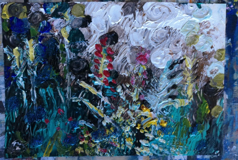
2. Project Overview: In today's class,
you already know that we're going to be
using a fork and a knife. We're going to be
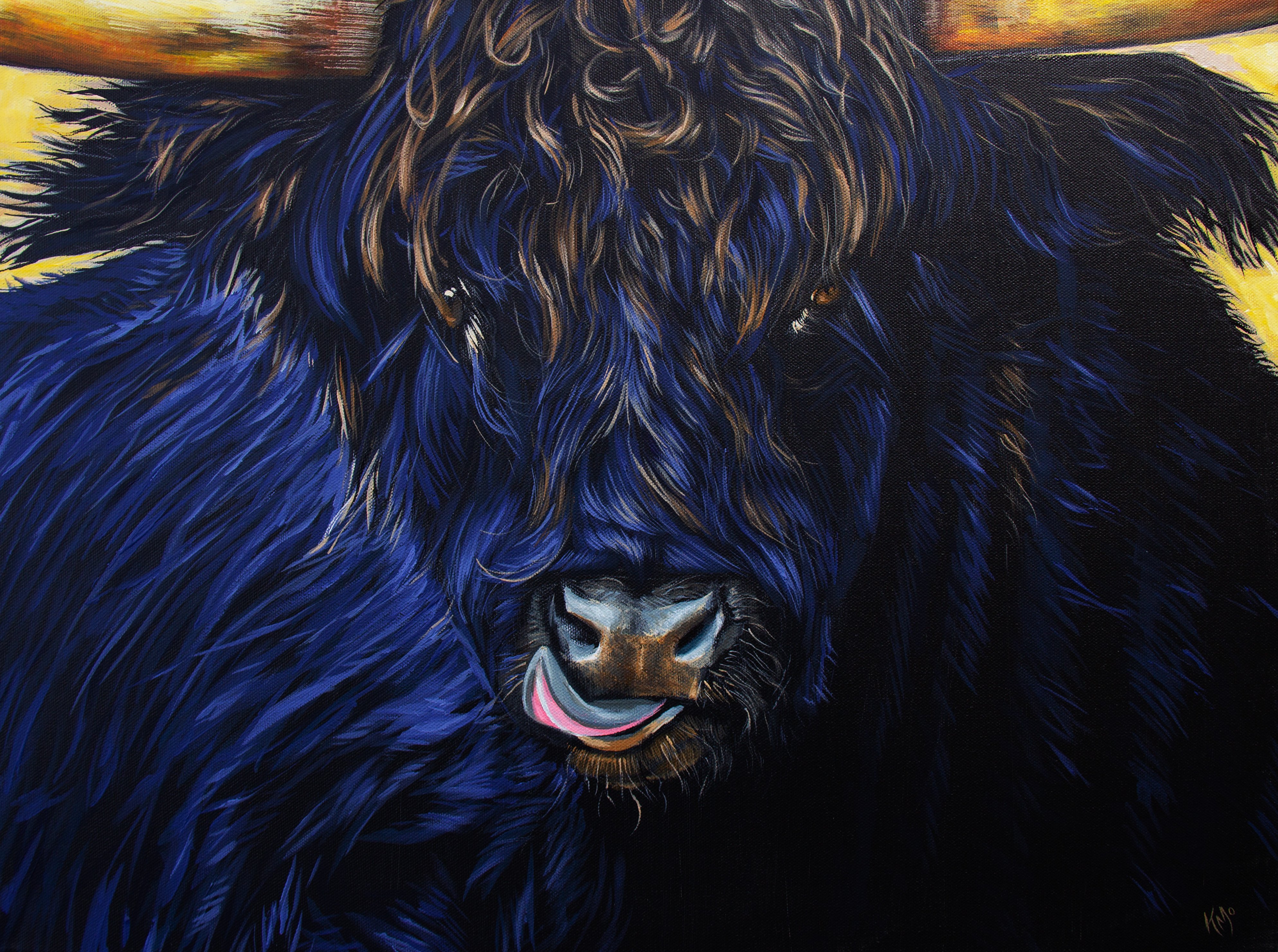
painting this piece here. This is actually a greeting card from the painting
that I've created, because you can
digitize your work and the original piece is sold. So it's gone, it's
found its home. But we're going to be working
on an eight x ten size. And I encourage you to follow
with a similar size so that the tools we're using lend
really well to that size. If you work a lot
bigger than that, you're going to be
having a lot of issues trying to cover
the amount of space, getting the right mark,
making with texture. That's what it's
all about, right? Making marks and how those from our tools
create those marks can be a lot
different than if you went 16 by 20, that's
a little too big. Eight by ten, you could go smaller to a five by
seven if you want, but I wouldn't go any
smaller than that. Try and stick within that range. You can work in your sketchbook. You can work on a canvas, You can work on wood. You can work on something
else that holds paint. Something that's going
to be a surface you can get that acrylic paint on. I encourage you to use Canvas, a sketchbook that has
good paper in it, not something too flimsy, otherwise you're going
to get rippling in the paper or something else
that works well for you. If on that intermediate
painter spectrum, you find yourself feeling a little more on the
beginner side of things, then I encourage you to follow along a little more closely. When I say that, I do say with some hesitation
because I don't want you to feel very stuck trying
to make the same motion, just like our signatures
are different. Although I'm going to show
you maybe how to sign, I want you to follow that
with your own movement. You need to find a place of relaxation when you're being
expressive and painting. If you're too rigid and stuck, you're not going to
find the ability to create movement
in the same way. Encourage you to look
at maybe the colors and placement and
direction of strokes, but don't worry too much about making it look
exactly like that. Because if I tried to do
this the exact same way, it will come out a little bit different and I'm not going
to be worried about that. Okay, So I want you to
start out already with a mindset that is healthy
and an expressive painting. It's going to come from within, it's going to be
personal to you. I encourage you to follow, but listen to your intuition, going to have to
follow that guidance. It's a little scary, but
it's going to be fun. And it's going to
come out way better than if you're trying to
do exactly what I'm doing. Now if you're a
little more advanced on that spectrum or you look at this piece and this isn't the subject matter
that really draws you in, then I encourage you to find
a different reference photo, find something that you feel
passionate about painting. Because when you feel something, when you look at the image
that you want to paint, that's going to make the biggest difference for an
expressive piece. Really make sure it's something that you're going
to want to paint and not just something that I wanted to paint because
I might feel it. And you don't, if you're
on that little bit, you feel more confident
with your skills, then maybe you can try a
different reference image. But if you feel like you
need a little more guidance, no shame in following along with me. That's
what I'm here for. That's why I'm showing you a real time painting project and that's what we're
going to do today. I hope you have a lot of fun. Loosen up a little
bit. Do a warm up, roll your shoulders,
roll your wrists. Let's take a deep breath. Read out and just get
ready to have some fun. Because this is just an
experiment expression of the emotions you feel right
now are going to affect and influence what's coming
out on the piece. And that's okay. I want
you to be accepting of that and appreciative of
where you are right now. You can't help
where you are now. You are where you are
now, and that's okay. I'm going to take
where you are and hopefully we'll grow and soar. But we have to take some action in order for that to happen. Let's get into our first lesson.
3. Base Layer: Okay, It may seem a
little unconventional, but we're going to use
a plastic fork and knife for this entire painting. I know, I know it's
going to be really cool. It's going to give lots of
expression and texture. A lot of fun. So find something
close to that if you can. And then for the paint colors, they're in the description,
but also you can get some. As long as you have something
close to these colors, it'll work just fine, so you don't have to
have these exact colors. What do you have in
your paint box already? We're going to
start with a white, so hopefully you have a white
or something really light. And we're going to scoop that
on and start brushing it. And you're going to see some
really neat textures form. And we're going to
play a little bit. I encourage you to
play right now. What I mean by that is try
different movements with your hand and different
positions of the knife too, Doing some swirls, some
strokes, some daps. Try it out and see what happens. You're going to start
learning some things. We're going to grab some
of that tonal white, It's this nice light bage. If you don't have
this exact color, you could mix a little
brown with some white and black to get this neutral light. It's a sandy beige color. Okay, we're going to dab
some of the black on there. Get a little differentiation. Just starting to create depth as we're learning
what this knife can do. We're learning while
we're painting here, this isn't a
sketchbook practice. This is, we're going right into the project, right into it. Testing it out, as it's pretty safe when you're using a
white to test out things. Starting with a
white is a really great idea and then
we're building, bringing it into
these dark browns, you can use a burnt
umber, raw umber. Either one of those would work, and I'm just scraping it down. We're creating this
base of our painting, this is setting the stage
but it's not the final, you know, like the
end of everything. If you get some of
this incorrect, it's not the biggest worry. This is our base setting
the stage really, it's great when you
get your base down really nicely and it
turns out perfectly. But that's not always
going to be the case. And I build a lot of layers in this project,
so don't worry, you can start to
see as I'm playing, there are certain areas
that I'm going over. I want to create more depth. I want more laying,
more blending. And you don't want
to stop and take a break right at this moment while we're blending
these colors, because acrylics are going
to dry really quickly. As intermediate
painters, you know this. You know that your
paints will dry quickly. If you find your paints
are drying quickly, there are methods and
palettes that you can get. Your paint doesn't
dry as quickly. You can also have a spray bottle and spray your paints
every once in a while. If you're a bit of
a slower painter, let's get some of
that reddish brown in there as well if
you have a rociena. That's a really nice combination with some of these just to
bring some warmth into that. I'm blending it. The more I brush with
brush with my knife, the more it's blending in
areas where I'm just trying to create a base where I
want blended colors. I'm starting with
that. And then we can create textures on top as well. As you're creating
these underlayers, it doesn't have to be the
final texture result. What I'm really trying to do is make sure I have the coloring more accurate before I worry too much about
some of the textures, but might as well go in that right direction
as I'm going. If I can see that I'm
going to want some of those textures then by all
means start throwing them in. This background is very bouquet. Background, this
blurred background in my other class with a
blurry background focus, that one's with a brush and that's completely
different method. This is going to be more
textured and expressive. Absolutely. I tried using the
back of the knife to see, could that help me get
that bouquet effect? You know what I'm
talking about when you see those circles and it's blurry in the
background, that's bouquet. I was trying to see
whether or not using the back end of the knife
could function like that. It wasn't quite doing
what I wanted it to. Onward and upward.
We'll keep trying. You can see the
angle that I'm using the knife on when
I'm using the tip of it and it has a bit
of a rounded tip, I'm going to try using that
to create these swirls and I'm trying to see what is the right method that's
going to work with this. When you're experimenting,
you learn as you go. And that's one of the best ways. But you were here and
you're learning with me. I'm helping you get there with fewer troubles,
with fewer obstacles. But I want you to
try it out so you can see how using the tip of it is really giving me a nice
little, nice little circles. I can create a good
circle with the tip. I just need to get some
more black brown on there. Maybe some burnt umber. You can throw in a little
bit of black if you like. Mix it in with a bit of, if you have just a medium brown. I'm not really cleaning my
knife tip unless I need to get a pure color that's not blended
with another color. Okay. Right now I like
that it's blending, muddying up the other colors. I like that a little bit and we don't want to overblend
in certain areas either. We want to be
somewhat intentional with where we're placing things. I'm looking at my
reference image to help me out with that. If you have a different
reference image, that's fine. You can absolutely still
use this project method, these classes to help
you navigate that. But basically just start
with the background, placing the colors and where
the areas of interest, where the areas, where
there's action going on. But maybe it's not
strongly represented in the background
because it's blurred out. It's not in focus. That's what I'm working on in this first bit of the lesson is getting that out of
focus background bit. That seems unimportant because it's not the main
feature of the painting, but it makes all
the difference with this kind of work where
we're being expressive. The thing about
expressive painting is your energy matters how I paint. You can't copy exactly. You can use the tips holding the tools correctly or using the tool
in a certain way. However, your
movement is unique. Just like your signature, your style is going
to come out in here. And that's what I love about this painting because
with expressive painting, you're seeing all the
movement and texture and it's like a history and
a story all throughout. As I'm creating
this, I'm not going exactly from light to
dark in certain areas. I want areas of interest where maybe it's a stronger boulder
color On top of that, maybe I'm throwing
in some dark areas right on top of
those light ones. Be brave, Go for it. What
are you going to lose? This is a small painting, we're working on an
eight by ten here. It's not, you know,
we're not working on a 30 by 40 inch
painting here. This is a time to have fun, let loose and just see what can happen and maybe you're not
going to like it. Not every painting I make feels
like a masterpiece to me. Some paintings I really
dislike that I've made, but I'm not mad about it. Sometimes it is magic and it
comes out just perfectly. And of course, we do have
control in how that comes out. But if we're so
stuck on ourselves about actually
creating something because we're afraid
to make a mistake, we're never going to get to
the masterpiece point again. Worked so much on that upper
area creating that texture. Now I'm just getting
in some of this because remember this
is an abstract floral, it's like this landscape
floral type of piece. We're zoned in on a landscape where we're
going to have the focus, These plants that
almost look weed like. There's going to be a speck
of this pink that's amazing. The balance is so beautiful. So we started with
this warm background and then these cool greens, teals and you know, aquas that we're putting on top. And then did you
see the juxposition of the rosiena
thrown in there too? Have fun with those greens. Throw on your own greens. You don't have to follow the same greens that
I'm putting on, but fill that background,
fill up that space. Okay, let's get to
the next lesson.
4. Building on Base & Setting Foreground Elements: Now that we've got some
of that base layer down, we're going to keep
working into it. So grab some of that dark brown, maybe with a little
bit of black to mix it, even a bit darker. Again, my brush still has
some of that green on that. So don't worry about,
did I call it a brush? Don't worry about
cleaning off your knife. And we're going to just start adding some
elements here and there to create
interest and depth. Because this is an
interesting space. We want to have different
elements happening and we don't want just
one solid block of color. We want to create layers. So we're going to create some areas that are going
to be a little bit darker that'll create more contrast too with that upper
area that's so bright. And that will really
help us too when we start adding in
the foliage on top. If it's too light, then you're not creating enough contrast. So this is going to
be really helpful. I'm still working in wet
with the greens before. Now, if you didn't get
to this lesson in time and everything dried,
well, that's okay. You can get more of
that green going and place it on there
too, and that's okay. You'll be able to you can
blend it with new color. If you had to take a
break, no problem. If you've continued
onto this class and you still have
wet paint perfect, keep going with that.
Works either way. As you can see, you've left certain areas a little
bit lighter than others, somewhat based on
my reference image. Work with whatever image
you're going with. If you're following
along with me, then you're going to
want this section to be a little bit of our focal
point right in here. We're going to start
adding elements that will build up
towards the foliage, that is our focal
point foreground. We're finishing off
some of the background. Our base layer is pretty much
complete and you'll know that by seeing that the
canvas is totally covered. That's your indication,
we're looking at the canvas. Is there anything
left there now? Technically, it wouldn't
be a problem if you wanted to leave some of
the canvas still visible. However, most people would see that as somewhat unfinished. If you want to rock the
art world a little bit, it's not completely new
that's been done before, but most people would say
that it's not quite finished. It might be left wondering why. You can see that I'm adding
a little bit of warmth to the green in certain areas
to give it a little bit, to bring it forward
a little bit. When you have warm colors, often that brings it forward. I want some of those
grass blades to feel closer than some of
them as we fade away. Sometimes we have
cooler tones that helps to give that
far away feeling. I'm using the edge of my
knife to make sure that my canvas has an edge covered all the way around.
That quickly did that. So I'm trying to kind
of blend it nicely. I want that transition
from that green to the lighter ten tones
and darks to make sense. This is a foliage landscape, kind of in between
kind of image. Add a little bit
of that tan into the grass to lighten it up, to grip some highlights if you're following along
specifically with this, and this is really going to help blend it in to the other areas. You can see how adding some
of that tan is blending. It makes more sense, right? When we first started this
portion of the lesson, you kind of had that
block of green. It almost looked like a fence
and we don't want that. We want more of this natural
field of flowers look. And we're closing in
looking at one flower. And I don't know if
you've ever done that, where you know like the stop and smell the
roses kind of thing. You stop in and you zoom in and focus in on one
little section. Even though it's
just a small flower that's kind of the
beauty of art. You're bringing a focus to something that maybe others
wouldn't be focusing on, maybe they wouldn't even notice. So that's what you're doing. You're bringing attention to it and forcing the viewer
to focus on it, which is really fun, continuing
to work a little bit of dark tones in there too,
play around a little bit. But that's again, creating
a little more depth. Creating a little
more transition. So we're going to take
some light tone now, and I'm going to bring in some scratch marks that will give me where the stems
are that hold the flowers. Okay. And these are the ones
that really are popping out. I'm just going to use like
white mixed with tan or just that really light
beige tone could work or if you have. No paint on your fork. You could actually, if
your paint is still wet, you can use the scraffto method, which is basically
scratching off. If your paint is
still wet, you can actually scratch off and expose what's underneath
as the image. You can decide what
you want to do. Here, I'm adding paint, but you can actually
scratch off. And that works too.
You can do both. You can do a little
bit of that scraffto, then add some paint afterwards because we're
going to add some color. But the reason I'm starting with kind of this lighter tone,
a couple of reasons. Number one, it's already a
color that we've been using. Something. Yeah,
it's jumping out in front of these other colors. But it's not, you know, red. It's not something
totally foreign. It also allows me, and there I've
scratched a little bit, so finding that sometimes it's a bit easier to
just scratch it out, but when you're
using a light color, another reason for that
is when I'm wanting to paint other colors
onto a darker color. Sometimes painting white makes it a lot easier to paint
other colors on top. So you can see I tried
painting a little light green there on that little leaf
and it didn't quite show up. If I paint first with some of this white or that
really light beige, then I'm going to
get the ability to add color On top of that, I'm going to take some yellow mixed in with a little
bit of my green. You can mix it in with some
Racena would be really nice. I'm going to get
some that light tan tone and it's going
to be a lot of fun to bring some little dot action for more texture things that
are happening down here. There's more little
plants. It's not just one type of plant. This isn't a garden
where things are planned out and here's one plant and then there's a little space, and then
there's another plant. This is just this organic field with a lot of different action. Some of these plants have
maybe little flowers, maybe they're just
really tiny flowers. And using the fork
actually was a really, really effective method
to tap on little flowers, multiple flowers at once. Now, the only negative it is that because they're
evenly spaced out, it can look too contrived. If you can do a little
bit of random dotting, it can help to make
it look more natural. Sometimes things are very
symmetrical in nature. However, when they're
in this setting, it's going to look a little more chaotic all compiled together. Create the chaos
you want to create. Just going in here and there, finding the spaces
where I need to add a little detail and figuring out the right
way to use the fork. Getting enough
material on the fork, and then figuring out how
to best utilize the tool. These are items that are
further in the background, so I don't want them
to stand out too much. I'm trying to see if it's
worth using all times at the same time flat or
just the corner of it. It's almost like a toothpick
thing that I'm utilizing. It really big step
away from how I normally work in terms of using a brush
versus using a fork. It's a lot different. If you find yourself feeling a
bit frustrated, it's okay. Maybe try, you know, stepping into your sketchbook and giving that a
go in that way. We're almost finished
this segment, but if you're feeling good, just keep on rolling. We'll keep rolling with these
details into this next one.
5. Layering & Building: Okay, give your painting
some time to dry or use a blow dryer
to dry your piece, because now we're going
to start building on top of everything we've done. Having it dry will be your best bet for
continuing forward. I'm going to take my
fork first and we're going to add more
detail and really make these foliage pieces that are in our foreground
bring them forward. The fork is going
to help me create more detail that instead
of just making one line, it'll make four lines
and it's going to be great depending on how you get the paint on the
fork will depend on what the paint will look like when
it gets onto the canvas. So keep that in mind and play around with applying the
paint onto the fork. Like, do you want
to try scooping it? If you scoop it, you're
going to get more blotching a lot of
paint onto your canvas. That's less controlled. If you don't get enough though, you're not really going to
have anything on the canvas. It's finding that
balance between, try using the fork
in different ways. We're going to bring some of that foliage in the base of
the piece forward as well. More highlighting with this
white, not pure white. We want to mix that white
either with a little bit of raciena or in this case, I'm just blending it in with
that really light tan tone. If you have a paint that's
just like a light beige, that sandy color, that
would work really well. If you want to make it
a little more golden, add a little raciena
to it as well. As you tap on there, you'll
notice that you're going to have different sizes
of dots happening. You could use a flick
method with a brush, you could try more control with the corner like I just did, or you can try to make
the dots different sizes. That's the challenge. When
you put all the flat, all four pieces
at the same time, all four times, it's going
to have the same size. And then it's going
to look a little too much like, oh,
that was a fork. That's why I'm trying to
make some bits a little bit bigger using one tine at a time, one tie at a time, and then just grabbing more
paint so that some areas, just like differentiation
happening down there with the corner, I can pull paint out and
make it into more of a pointed foliage piece
rather than rounded. Okay. I'm not getting the same level of control that
I'm used to with a brush. You might find that
frustrating and that's okay. Like I said in the last lesson, you can practice in your sketchbook, That's
what it's meant for. But I like to work my problems out right on
the canvas sometimes. And that's what I'm doing here, working it out right there. I know I can get a lot of
control when I use the corner, and then when I use
the whole flat bit, I can get even strokes that all look identical
or pretty close to it, depending on how I get
the paint on my brush. And then if I don't
add any paint, I can just pull the
paint as I please. I'm just trying
it out like that. And hopefully it's working
for you and you're able to either follow along with this particular image or you're able to use
your own image. And that these tips are
really helping you with that, please let me know if they are. I do want this to really
help you up your game and be able to really show expression and
that's part of it. When we're trying to create something and we
don't have full control, but we're finding the methods
to create that control. We're showing that with lots
of texture and these tools, it actually does show a lot of about who you are
without you really trying. In some ways, if
that makes sense, just keep working it
with different angles, with different ways until it visually feels right Then we're going to keep going into
other areas that one bit of foliage that I've just been working on
for most of the time. I'm happy with how
that's starting to look. I want to have that bit of
feathery appearance now. I'm creating more of
them because this is a field, it's standing alone. But that one was more
of a focal piece. And then we're bringing
more of them out, out in here. Keep working it. Give yourself good
encouragement. Follow your intuition. If you've made a mark
and you think, okay, that looks right, that
feels good. Stick with it. Let that mark be, don't mess
around with it too much, and then find areas
that seem problematic. As an intermediate painter, you probably have
some experience and understanding as to what that
means when you're painting. Some areas are just
not working quite right when we're
creating our base layer. We're, we're less worried
about these details. But now that we're getting
into the little nitty gritty, we are taking more
time to make decisions about these little details
that we're adding. Because each mark is going
to make a difference. But I don't want that to stop you or slow you down too much. I do like to take my time to make decisions
while I'm painting, but I want to allow myself to follow my
intuition as well. Because sometimes
my head is saying one thing and my heart
is saying another thing. And sometimes you have to go
with what the gut is saying. Just put the heart and
head out of the running. Just go with the gut. More times, I think, than I realize, the
gut has been right. I will be able to sell pieces more with my gut
than when I'm trying to make what other people want follow what feels right
when you're making marks. I'm just continuing
the same process of it's just the same color. I'm not even working in
any different colors. We're creating a stronger layer for adding color
to these sections. Because these aren't
just going to be this white tan color. They're going to have
some color to them. But like I was
mentioning before, this is going to give us
more ability to make it pop. That white is going
to give it a good, the white mixed with tan. It's going to give that good ability to pop in front of it. Getting that foliage in, I want it to look natural, like it's a real
place and it's going to help people feel
different feelings. Depend on who's watching. Also, just because
we're finished, that initial base layer doesn't mean the
background is complete. I have more feelings about coloring that
needs to happen there. We're going to start adding a little bit of, of
different colors. Here and there. I'm feeling like that bit of foliage
isn't quite right. Give myself a little break. Saw, that needs a little
bit of something. I'm going to come in with a different tone and start
blending that I'm using. First, I'm going to try and
scratch some of it off. Remember that scrafito, it's like that we're going
to scratch some of it off. We've got a knife
here, we can do that. We can scratch
some of it off and still maintain the
texture we want. Now because some of
my paint was wet, it blended in to the background, which is not a huge problem because maybe that gives up
myself the variety I want. But if I don't want
that, just keep scratching and
finding what works, what feels right with it. Keep pulling the
paint while it's wet. If it's already too wet. If it's dry, I should say, then you need to
work another color on top of it to make the change. Scratching will only really
work when it's still at least a little bit wet.
So keep that in mind. You can see how I'm using the
knife on different angles, so make sure that you're
not just holding it in one direction perpendicular
to the painting. Sometimes I am. At other
times I use it on more of an angle so that
I can get more of the paint in a thick way onto the piece using the curve to my advantage. We're going to go in with
some raw sienna here that's going to add
that nice golden tone, trying to create something a little bit different
for the background. I had still some of that tan, white color mixed in. No problem, but I just want a
little more warmth in here. It's feeling really cool and
I need to balance that out. I didn't want it to be
too bold with that ciena. By mixing in with some
of that white and tan, it's subduing it a little bit, just enough to give me the
nice blend that I want. You can go back and forth
with a little bit of raciena, add a little more white, see what blend works well, a little bit more white, using a swirling motion to mimic what I had done in the base layer
at the beginning. And then when I get
to the grass layer, I'm using those downward
vertical strokes. Matching the stroke really
helps to keep things blended. When things are dry, sometimes you can see how my knife hovers over the piece and
it pausing for a moment. It's because I'm thinking, because you're constantly making decisions about where
things are going to go. Am I putting in the right spot? And it's almost like
I'm making my move. Before I make my
move, I kind of mimic it above the canvas. I do this sometimes before I actually step into the canvas. I think it's kind
of like practicing your golf swing before you actually go for it,
or even baseball. Who would have thought
that they'd be somewhat similar or
find a similarity there in areas you want a little more
bold color of Rosanna. If you feel like you want it
to be a little more bold, add a little more
Rosanna, make it bolder. You don't have to make it
more subdued like I am.
6. Let It Drip: Okay, get ready because this section is going
to be a lot of fun and experimental and
we're going to get some drips going in here. I've already gotten
started here with some dark blue going
in here and there. I want you to find
what's missing. Where's a balance that
we need to attend to? I'm getting my paint really wet. Just get the knife really wet. You don't necessarily have
to mix the paint really wet, but you could just get
some paint on your knife, then dip right into some water. And then it'll be
nice and drippy. We're going to let things drip. We're going to create some
really fun atmosphere with it so you can dab and then
get more water on it, and dab some more
and let it drip. There's not much dripping
happening at the moment. We're mostly getting
some paint on there. If it's wet, you can
get the paint on there first and then
let some drips. I'm also just trying
to balance some of the color that I feel like it needs a maybe a little
more depth or maybe I just lost some contrast
in some areas. This is where we can
fix some of that. Now, you didn't have to wait for what we had
just done to dry. You can it's not a
problem either way. I'm just trying to balance some of that in that
piece right there. I just felt like it was
too kind of similar tone. I needed to bring in some darkness into this
section here where I had lost that by adding
a little too much of that light tone from
the previous lesson. It happens, and that's okay. We kind of go back and forth
a little bit till we find the perfect balance
in what we're doing. If you need a little
bit more warmth, add some of our warm tones. I would caution you not to go completely opposite in
terms of, you know, stick with the colors that
you've chosen that we've been working with and make
sure we do have a warm tone. We have our Raciena,
which I've added in here. And that's also
lightened up some of the area where I started
with the dark and then blended in some racienna to warm it up and lighten
it up a little bit, give some middle tone range just to create a
little movement, a little dynamic space there. And working both into it, you can see I'm using it almost
flat towards the canvas, It's on a really strong angle. That way, this is going to help me actually get more paint on the canvas rather than looking for
a small line like we were using with the fork
corner tie that thing here. I'm just getting lots
of paint on there. When we have more
paint on there, we can get more textures going. If you really want to have
a fun textured piece, you're going to have to have
more paint on there so we can show some texture. It's going to build up as we continue to layer and all of that and it's
going to be a lot of fun. Just get the paint where
you want it first. We're not just putting
it completely random. We do want to have some sense of where we want things to be
darker and creating balance. That's why I think working from a reference image
is a good idea. Especially I think
at an intermediate, especially if you're
like more of a beginner intermediate than
advanced intermediate. You're going to find
yourself just a lot happier following something
that gives you some guidance as to where those tonal
values are going to be. Start with the reference
image and then play. You can see I might be
following my reference image 75% I'm not worried about
making it 100% the same, especially because if it's
a photograph and we're doing an expressive
type of piece, it's not going to look the same. But having an awareness of where those tonal
values need to be, that's the key thing
that I'm talking about. Take a step back and
see what's missing. See where you need
to create change. If you don't like
something paint over it, you're not stuck with anything. You can always let it all dry, scrape some of it off. If you can just over
it, send it down. Just it and start all over. But just give yourself
a chance to work through some of the issues and challenges that you
face in your piece. As you can see, I
didn't really like those three stocks that I had back there and
painted over it. Rather than start a
full new painting, try to fix some of
those areas that are problematic before just. Going from the beginning,
here's where we're going to get some water
for some dripping going. When my knife is nice and wet, I'm going to try to blend
it out a little bit. It works somewhat depending
on what paints are actually wet around
it for blending. But also going to,
with the water, disperse some of
the acrylic color, those pigments, and it'll
disperse it a little bit. Which is a way to blend
things out as well. One way is to blend wet and wet. You have two tones that are blending together, that are wet. Then, if you have a dry surface and you're
trying to blend something that's wet
onto a dry surface, you could add some
water to blend it out. This is one way. Trying it with a knife is a lot
different than with a brush. If you've never tried
it with a brush, then it's going to be an
interesting experiment. But try to have fun with it and where you need to
add a little color, I added some white to the mix. Um, in certain areas where
it makes sense to do so, that's going to help
with that edge as well. As you can see how that
really work to blend out. I'm letting it be wet and
letting some drips happen. As they may not
worrying about it, it's not going overboard
with dripping in this. But as you can see, I'm allowing those
drips to happen. Maybe if they're too much, you swirl over them
with your knife, you can dab it off with something with a cloth
or some paper towel. It's definitely not cheating
getting those areas wet. I'm liking some
of that dripping. If you're liking the
drips, add more drips. Have fun with it.
See what happens. It makes for a nice, it's like when you throw paint, it creates its own
spontaneous reaction. Although we're putting the
water where we want to, it's going to create
some fun moments that are only partially
in your control. It really makes for a fun
piece in this setting is, I think, perfect for
adding some drips. Now if you're working
photo realism, you're probably not going
to be using drips and you're probably not going to be using a plastic knife either. But in this piece,
it completely works. If your paint is still wet, you're going to be lifting
paint right there. I did add a little
bit of light tone, experiment with it, add a
little paint if you need to. If you're not working
with any wet paint, it's not really going
to do anything. Make sure you have some paint that you're working with,
whether it's the dark, and then you're adding a
little bit of light tone to it to blend it in or mid tone. See what's missing
in your piece. If you're not sure, maybe you need to take a little
break from it. If you've been working from the very beginning of this
piece up until this moment, and you haven't
taken any breaks, I encourage you to stop
for a moment, step away, go take some break, come back to it with new
eyes and see what's missing. It will help. Also, if you're in good lighting
and proper lighting, I'm using natural light here. Make sure you're working
in a space that has lighting that is natural
as much as you can. We're adding some
cool tones in here. With a nice blue, we can find a nice primary
blue will work nicely. Then to balance it, because it was looking
a little too blue, we can put in a warm tone. And our warm tone we're working
with in this is Rosana, I'm throwing that in as well. I'm going to keep
working it, bringing in some of the
white on top of it, blending wet and wet with a
very wet knife, swirling, using these swirling motions, very repetitive in the areas where I'm dealing with
the same subject matter, where I want it to be just
this out of focus zone. You can see how much it
changes As soon as you add a little bit of white on top
of those colors, we blended. Started with that blue throw
in the light warm brown, and then added some white. And look at what you get. It's like a recipe, if
you're new to color mixing. Try out a few recipes,
we'll call them recipes. Try a few recipes
in your sketchbook. I always encourage having
a sketchbook nearby, something you can practice on. If you're not comfortable with color mixing, try
scratching here. Now I'm just taking the knife and using the
cutting edge of it, which has all these
little jagged marks. I'm scraping and it's giving
me this beautiful texture. And then I feel like this bit
right here is encroaching a little bit on what I
want my focus to be. I'm creating this
glaze just by a watered down green color. Just water it down so it's
not going to be opaque. But then in this area here, I'm going to add in a
little bit of white to blend out some of it so that it's a little
more out of focus. Take away some of those
details so that it doesn't encroach too much
on the main subject matter. By having a little
more contrast, it's going to allow
that main foliage piece to be the star of the show. And that's
what I'm going for. If you had some fun
with some drips, how did you go just adding
a little more here. Just a medium total value
in there and to her next.
7. Leaves, Lifting, Dots & Drips: Okay. So I took a little
break and I was working on establishing little
dots correctly. And as you can see, I've got some nice light teal variations of dots that are going
to be my bouquet. And what's worked best is
taking the edge of the knife on an angle and swirling enough paint to get
a nice little dot. That's my dots in there. So I'm working with different
variations of colors, adding what tones
I had in before. Just making those circles
just a little bit stronger. Just going over, creating
layers that are overlapping, some aren't really overlapping, anything like this one here. But then maybe I'll
add something near it that is overlapping. Just play around
a little bit with that for a bouquet image. If you look at a
photograph that has okay, you're going to find
that some of them are overlapping and some aren't. Next up we're going to
get some light green. It's Alt fluorescent. Or lime green actually. Towards yellow. It's
more towards yellow. I'm just going to use the edge of my fork like we did before, but now we're adding
in some color. Let's bring in some color. Gold, more vibrant
if you want to. But I'm going with
this, like I said, fluorescent, yellowy green,
kind of in between those two. If you just take a light
green, add some yellow, add some white, that's
how you can get that color. Not too difficult. I'm just using the corner edge of just one of the
ties of my fork. So I have of control, this is my control tool. The knife isn't going to
give me that same control on the tip as I'm getting
with the fork. And I'm realizing
that this point feeling more comfortable. I hope you're feeling more comfortable with your
tools that you're using and getting to grasp as to what
they can do for you, not just here, but when
you want to create something else in the future and you're like, oh,
I need to do this. Oh, hey, the fork would be
perfect for this or oh, the knife would make that great textured line for my background. I love it. I'm just
adding in some detail. We're bringing it
forward now that our background is
mostly established. There is some changes
that I want to make. But adding some
of these details, there's nothing wrong
with that because we can always go over it if
we need to create a little glaze if it was
too strong or layer it with more colors for even
further detail, further depth, and
that type of thing. Just finding areas of foliage
that we want to stand out. And then also finding these little dots
that are indicative of little flowers or maybe the bits of
foliage that are green. And we're going to just
give some variety to the colors that are in
this little zone here. Just tap here, Little dot there, and playing around,
let's get some of that same green on
the leaves here. Now that we had that base that allows for us
to paint over it, just like when you're
priming the walls before you paint your house a
different color. You have that primer now
and we can add on a color, a nice light color and
it's going to pop. If we had just tried doing this color alone on
top of the dark, it just wouldn't stand out
in front of it as strongly. This gives us a
little variation too, which is always nice to have, especially in an
expressive piece. I love all the scratch lines that this makes so much
interest for the eye. I feel like somebody could
look at this painting for a long time and
really see something different and
really enjoy it and have a lot of fun
and looking at it, even if you've
created it yourself, you might find the same thing. Moments that are more
intentional than others. Hopefully, a feeling that you
were going for hopefully. But because of everyone's
different perspective, you're going to
find that everybody experiences it differently. Maybe there's something that
causes someone to remember, have a moment in a
nostalgic moment. We all have visuals that remind us of things and
experiences that we've had, Other images we've seen, we might not even
know where it's from, but it just feels familiar just finding all those
spaces where we need. That you can use the fork
on more of an angle where it's closer to the canvas, the whole thing, rather than a tip like you
would a pencil or pen. Making sure to balance out
this color here and there. I wanted to just be
found in a single spot. Unless it makes sense for
that, with this green, because we're in this field
with all these grasses, it makes sense to have
more of it here and there. But I don't want to
go overboard either. I want to create nice
highlights with it, rather than just overwhelm
the piece with it. You can make little dots, you can make little lines, you can actually do quite a bit. And I'm curious to know
whether you thought these tools would
be able to do so much or do you feel
very limited by them? Be very curious to know
the challenges you feel well while creating this piece and how you're
working through them. Hopefully the tips I'm
giving are helpful to you. But I also want
you to be able to explore and experience yourself. I think as
intermediate painters, that's an important
thing to experience. Whereas beginner
painters in a more follow me exactly approach
can be more helpful. Here we go. We did some drops. Now drops, drips a
few here and there, make them drippy, drippy dot. Bring some of that into
the center. That glaze. The glaze, like a transparency, allows the underneath to show through bringing more of
that green into this space. I'm feeling like this area is just not looking quite right. The second half
year we're going to try and make it better. Sometimes it looks a bit worse before you make it
better and that's okay. I'm starting with this green
because I really like it, and I feel like there's too much cool green going on in there. I bring in this warm, yellowy green and we're
going to try and make the section just something more special than what
it feels like right now. I'm using a water
down version of it to blend in and see if
I can make it work. Bring in some water even
over here. Blend it in. Blend it out still in the
process, not perfect yet. Once you've done that
and it's watered down, you can grab a cloth and rub a little bit
or dab to remove. We also call this lifting. And it's something you do
a lot in water colors, not something you do
a lot in acrylics, but it is something you can do. You can work with understanding that when an acrylic is wet, you can still lift it, you can still take it off. And you don't just have to
layer on top for removal. And this is give me
a little bit more of a hazy bit of a look there. Which does help to
blend a little bit. If you have a bit of a haze, created a nice hazy look. It helped to alter the
colors a little bit, but I'm still not
quite happy with it. We're going to get
some drips going here. We're going to keep layering. And maybe we need to
fix something here, we will work it out. I think it's just not enough contrast right where
my main top subject is. When in doubt, just keep
working it or take a break. Like I said, maybe take
a break before you go too crazy and start messing
with the whole thing. But sometimes you do need to create that new
level of contrast. If you're not feeling it, you got to go for it
and give it a try. And I didn't really like the
foliage that was on top, so I needed to create a darker layer so that I can then layer on top
some new foliage. I'm just getting my browns. I'm using some loose
work to let it blend out and keep blending in. See when sometimes when
you're working this, you're going to do things that aren't quite what you want. In a moment, I'm going
to start making it too light and then realize that that's not going to
give me the contrast I want for adding in
those details on top, as I add this Rosana, it's going to be a
little too much. We're going to
have to backtrack. This is becoming too light again so you can see I'm
adding the raw Sienna. I would just hold
off for a minute. Just maybe keep it dark. Just see how the changes happen. It doesn't matter how
much experience you have. You might have moments with
an expressive piece where you need to backtrack
and make a change. Just like that, we
removed some of that or just layered on top, you can layer on
top, let it dry. Then what I want
to do is go back in now with a little
more control this time. Because before we're experimenting
with dots and things, with our fork, now I have better idea of
what I want in there. So I'm going to go in
with a fork and with that lime green light tones and this time have a little bit more control of
what is happening in there. Just a bit more contrast. So I'm liking that moment. It's okay to feel like it wasn't quite
right and then have to go back and forth a little bit because that's
going to create layers that are so
interesting to the eye. Now you can see some of
that Rosiana in there. Now you see some
of that green in there, some of the blues. And now this layer on top, it actually makes it so fun. And all the textures that
have happened because of it too, really cool. And it's created a
nice atmospheric blend at the top as well. What do you think
it all worked out? But we still have more
steps to go, keep going, keep having fun with it, and give yourself those
breaks that you need to, either in between these classes, these little segments, or just whenever you're feeling
a little overwhelmed, take a little breath
and a little breather, and make sure you're
having fun with it.
8. Final Details & Signature: Okay, we're in the last
segment of this piece. Before we finish this project, we're actually going to
sign it in this segment. Get ready for that. This is the moment where we
review the whole piece. What details are missing? What would add to it? Remember, as we're painting, we don't want to take
away from the piece. If it's just going to cause more chaos, then just leave it. Okay, this is going
to be really fun. We're going to add some
flowers to this piece. We're going to add some pink. If you're not a fan
of pink, that's okay. You can add red or orange. Either of those would
work really well. I would maybe stay
away from purple. You could do purple.
You could do those. But the pink, the orange or the red will
really give it a nice pop. And we'll also go really nicely with the colors that
we've done in this piece. That's my recommendation,
but it's your painting, so have add it. I'm adding some pink, but I'm going to add in some white as well because I'm following
the reference image. It has white flowers kind
of cone shape to the top. So I'm starting with
the pink as the base. And then I'm bringing in some white colors as
I go towards the top. And that will also also work in front of our dark
background as well. It's super important
that my background that I'm painting over
top of right now, right next to these
flowers is dark, that they really stand out. That contrast is important, leaving some of the dark spaces around can be very
helpful as well. Try not to just create a full shape that is totally
covering any background. Keep some of those bits of background visible.
Don't cover at all. Let some of those be there, because that's going to allow it to pop forward and
look more realistic. Because when you
look at a flower, you're going to see some
background between it. Typically, especially
these kind of cone shaped ones usually have a little bit of background
seeping through. So make sure you
pay attention to that and try not
to go overboard. But again, if you do,
you know that you can backtrack. You
can go backwards. You can add, subtract
all of that with this, see if there's other areas that could use some
of that color. A little pink up in
the top area here. Maybe there's some flowers
in the background there. Maybe it'll help balance it out if you have a
little pink here and there in the distance. So keep that in mind too. I'm just going to add
a little more detail here in the base where I want to blend that piece into the other foliage
that it's next to, because it was kind of getting
a little too separate. So that little bit
that I went with, the fork just real to me, tied that in a lot. Nicer, Just see what's missing. And lots of stepping back, the squinting thing, stepping back really does
help. Look away. Look back, all these things, these are methods that do
work to reset your brain, to make sure that
it's functioning. And you're not just
getting into like a little putting yourself into a
corner, not realizing it. Step back, look and
see where you need to add a little detail,
Little dot here. These are just
really small changes that we're making at this point. Just very tiny little
steps that will add to it. Just like that little bit of
sparkle on top of the cake, you're just adding
a little glitter. It's not a lot, it's not taking away from
what we've done, It's adding something extra. It's making it more exciting. Maybe highlighting
some of the leaves, a little highlights on
some of these dots. Then we're ready to sign. Once you feel like it's
good to go, you can sign. And I encourage
you to try signing with whichever one you
feel more comfortable. The fork or the
knife. Give it a go. Again, if you're nervous, try on your sketchbook
first, but give it a go. It worked out for me.
I used the corner. One tine of a fork. And then now I can say that I didn't use any brushes
in this whole painting, not even for the signature. And I think that's cool, and it keeps the whole look similar. Okay, we're finished
this piece now. We've got it signed, and we're heading on to the
conclusion of this class. Wow, great job.
9. Conclusion: Well, that's a rap.
We're finished. Congratulations. Well done. I'm so proud of
you for finishing this class. You know, sometimes we start things that
we don't finish it. So look at you. You finished now. You
can do a little dance. I'm super excited to see
what you've come up with. So I hope that you
plan to upload a photo of your work in the
student gallery for feedback. And just to show off your piece. We want to share our art
once we've created it. I hope I'm always
looking to improve my teaching skills and
what I offer my students. So if there's any
feedback you have for me, tell me what you love,
tell me what I can improve upon leaving a review. That would be awesome.
Thank you so much. And I can't wait to see you
in the next class. Bye now.
 Kristina (Moyor) Choy, fine artist