Transcripts
1. Introduction: Hello and welcome to this
beginner acrylic paint lesson, where we're going to
focus on the skill of learning how to paint on wood. If you've never painted before, have no fear, this is
a beginner lesson. If you're intermediate,
then you might be able to go through the
lesson a little quicker. If you're advanced, I'm going to challenge you to create
your own design. But the fun part is we're
going to create ornaments. My name is Christina Moyer and I specialize in painting
with acrylics. I love art and have always
drawn and painted and created, and I love to continue creating and exploring various things. I've been teaching for
almost two decades and I can't wait to bring
out the artist in you. Because I believe
that art is truly, for all this could be the perfect gift to give
this holiday season. So let's get started.
2. Materials: Okay. Some things I always use when I'm painting
with acrylics, two glass jars makes it
easy to clean out and I don't have that much water in maybe like a half an inch. If that half an inch
to an inch max. You basically don't
want the water to come past this part on your brush
when you're cleaning it. Okay, that brings me to
brushes for this project. I'm going to use a few brushes that doesn't have to
be this exact shape, but something that you
can flick paint with. This is going to be something
stiffer brush bristles, that's why I chose this one. It could be a flat one
with stiff bristles. You can use old tooth brush. This one here is about a half
inch rounded flat brush. This one is going
to be great for covering more space
with some control. Here we have my favorite brush I always have on hand is my
four inch angle brush. It's a good one
for control then. This one here is hard to see, but it's a script liner brush
and it's nice and thin. It has it's not
just thin, is it? Not many bristles,
but it's long. Elongated bristles are great for creating lines that have
movement to them like branches. That thing, when
you have one that has very few bristles
and is shorter, that's great for small details. But this one is great for
creating those natural flow, thin lines because
of the length of it. I also use this one
to sign my name. That's good to keep it up. We've got brushes, we got water, we've got a reg could see I've used it many
times for painting. Can use an old T shirt, cut that up and to make
it into a G. So you can re use something we're
of course going to need. Well, this isn't
what I always use for painting, but
something to paint on. Today, we're painting
on wood slices. These ones are already purchased with a hole in it for
ornament hanging. You can purchase them or make
them yourself if you want. This is nice because it's
ready to be painted on. When you make them yourself, you're going to have to dry
out the wood and everything. There is a little more process. You're going to have to
make the hole yourself, but then you can also choose which ones are going to
work for you, which ones? Not. When you purchase
these online, you get a whole bunch of them
and some of them are good, some of them are not for
this particular project. What's great is
I'm going to use, since we're covering
up so much of it, there's some of these
ornaments that won't work for keeping most of the
background there. Just because if you
look at this one, I'm going to want
to cover that up. Or you can use it as
a starting point. Like what could you use that
in your imagery to create? If you're more advanced, maybe you can see an image already in that and start it there and
make something beautiful. You can see this one too has
like something unique to it. So that's why I'm going to use this one for this
particular one. And then this one here
is a little weird, but at the bottom that
I want to cover up, when we use these ones
that are pre cut, this is our hanging point. So keep that in mind for when you're going to hang it that you want this always
to be up and down. Okay. Anyways,
back to materials. Okay, we're going to need paint. This is the paint I'm going
to use to create this. Now, keep in mind
some of the colors. You don't have to do
this color exact. And I'm going to do a few that are a bit
different than this, but I'll show you how
to create it like that. We're going to need some black. I have Mars black,
dioxazine purple. This is a fluid type, but it doesn't matter if they're fluid or medium viscosity. Okay. This is like your
regular one that you buy. This is a fancier one. Well, I don't know
if I'd say fancier, but it's just a different style. So it's fluid, you don't really need to
mix water into it. You'll see you shake them up. I also have the
fluid in titanium white, bright aqua green. This is where this
one's not been used in this particular one,
but I'd like to try this. Give that northern
lights look to it, let's put that
there, cobalt blue. This is the one I used
with to create this color. If you wanted to
just do this color, just out the bright Aco
green and inserve this one, that's all you need
for paint colors. I've also used some sparkles, bit of glitter just
to make it shimmer on my tree or on my friend's tree, whoever
I'm giving it to. You can either. I just
have this on hand. It's not something I
went and purchased, but this is some
embossing powder. It was just the right color of blues and silvers in
there that I wanted. With this particular one, I would stick to either white, silver, blue as my
colors for sparkles. This particular sparkle
that I have here, this one I'm going to use for the ones that
I use this green, see how they look nice together. Keep that in mind when
you're like this one, I probably wouldn't use on this, but that's why I have this here. I'm going to do one
that's exactly like this. Then let's do one
that's a bit different. When I say exactly, things are rarely exactly
like something. But I mean the color scheme and method we're
going to follow this first. Because if you
wanted to make that, let's make it okay. The other thing too, that
comes with the kit usually. But if you don't, if
you're making your own, you're going to want some twine, something to loop
through the hole that you can then hang
on your tree. Wonderful. Okay, let's get started. Let's move these out of the way things that you don't need,
going to put them away. The other thing is
we need a palette. You're going to need a palette.
3. Prepping the palette: Okay. To begin with, we don't need our sparkles right away, so I'm going to put
those off to the side. The first color
you need to start with is your dioxizine purple. I'm going to shake that up. If it's a fluid one, you
want to shake it up. If yours isn't, then you
don't have to shake it up. I'm going to just put
that on my palette, just a good little amount there. I'm also going to
put out to begin with some of my cobalt blue. Don't need a lot of that one, well, that's probably too much, but we'll use it again on another one then
shake up your white, if it's fluid, get
out your titanium Pe. Put a little bit of that. We'll be using that one
throughout the piece. Okay, this one out. Let's start with one at
a time, not to confuse, move the other ones to the side and focus on the
one that you have. Okay? Grab a flat,
rounded brush. If you don't have this brush, just get something that's
about a half inch size whenever I wet my brush. If you're a beginner, just know you don't
want it dripping. Okay, let's move
the silver Sean. See better? I don't
want to brush dripping. I always want to wipe it. And then I have my cloth over
here. I'm dabbing it off. Okay, We're going to go, if you were painting
on your hand, you could see a little wet. I'm just going to show you
because this is one of the most important
things as a beginner to note is how much water
is on your brush. Okay? How much paint is
on your brush as well? Those are very important things. Have a look at your
brush before you're about to paint something, okay? If it's like globbed with paint on the handle
and everything, that's not going
to be a very good tool to give you precision. Okay? It's going to be messy. Okay, let's get into
this dioxine purple. I always get into a color on the edge of it so
that if I need to use a clean portion of it that I've set
myself up for success. Okay, then what? We're going to brush this
off a bit because there's probably some little bits. Okay? You're going
to choose a line, one of the rings, depending on how much space
you want to have. Like, if you look
at this one here, you could see I follow
one of the rings around. Sometimes they grow like thicker on one edge and then
thinner on the other side. It depends if you want to
be 100% true to it or not.
4. Painting the Background Part One: Because this one has a bit of a weird thing going
on over here. There must have been an
interesting story to this particular tree that
it got cut down from. You can decide whether
you want to keep the side thick and then
run around thick, thin. I think it's good to start with following one of
the rings and then if you want to make it thicker on one end, make it thicker. Basically I'm going to take this nice thick line
that it's giving me, getting close to the
edge and pulling inward. That way I can get
closer to the edge. If I didn't quite get to it, I don't go accidentally
over the edge. I'm holding with one
hand the ornament, the slice on the other hand. I do have resting on it
as well with my pinky. That always gives me added
stability, brushing on. Now, if you see your
paint doing that, that means you don't
have enough paint on your brush unless you're doing a dry texture look, then you don't want
that carefully. If you accidentally
go over, it's okay. We just want a nice
smooth line going around. I don't want any pools of paint
happening on my ornament. Okay, we're going to try
and work this quickly. Don't do this when you
only have 5 minutes. Make sure you have
plenty of time to work the other paint colors in. Okay. We're just going
to cover this up. I'm going to move
these guys over a little bit so I have
a little more room. Get more paint. Keep reloading your brush every time you feel like your paint
brush is starting to dry out. That might take a
little bit of practice. If you're new, that's okay. Just give yourself a license. See how that now, that means I need more paint. Now here we have to
make a decision. Do we follow the curve? And I think I'm going
to, I like to honor the piece that I'm
working on with wood, when it's a wood slice
like this is unique. A canvas that's created to certain specifications
is going to have the same look from
canvas to canvas. This piece of wood is
unique. It's its own thing. It was a living thing
that got sliced. I like to honor the shape
with this particular design. You can do that once
you fill it in. If you don't like it,
you can cover more, but it's a little bit
harder to cover less. Cover the whole inner part here, following along that
ring that I decided on. If I decide I need
to cover more, I could just go
to the next ring. It's okay. Not a problem. But I like this with
a nice thick border. I don't know, I think it's cool. This one had a thinner border. It's up to you, decide whether
you want to go thinner or thicker. Take a look at it. Remember, hold it up from
where the hole is going to be and decide.
5. Painting the Background Part Two: Okay, once you've got
that all covered, we're going to go right away in with some of this blue
that we've got here, that's that cobalt blue. We don't need a lot
of it, but what we're going to do is
we're going to add it in. We wanted to blend
with the background. Not if you got your
background dried too quickly, then just add a little
bit of purple as well. Just need to get more
purple back on there. My camera battery died, so I had to add a
little more purple in. That's okay. See
how it's creating this interesting ambiance going on to add more blue to it. Let some areas
blend out and then maybe let other areas
stay bright blue. This is where you get to
make some fun decisions. Where you want that blue to, do you want it right
in the middle? Do you want it off to the side? Do you want to creating a line across almost like a
galaxy in the sky? You want more blue
showing the purple. Do you need to add a little
more purple back in? You can do that while it's wet. You can blend it when it dries. You can't really blend it, but you can create
a layer over top. Okay, while this is still wet, we're going to go into
our white just from the corner and tap it in. This is where you want to
be a little more careful. I don't want to go
too crazy with it. I want to be a little
more blue looking, so I'm going to grab some blue. I'm lightly creating some texture,
some interest. I'm not going to
fully blend it out. I want to see something
there. Something's happening. I don't want it to be
bright white either. Might tap out the white part. If we look at the example piece, you can see how it's
got that background. If we want it to be more blue, just add in more blue. If your brush is starting
to look a bit muddy, meaning like it's not
making the colors you want, you need to wash that out. I have two jars
because one is going to wash out initial color. Call it my dirty water. Wipe the side and then
go into the clean one just to make sure we got
all of it nice and clean. Tap on the cloth and
away we go back into it. Want to get it more bright?
Get into that blue. Tap it on, create some movement. You can see I haven't
created a round object. It's not a particular
shape really. It looks like a cloud. Then if we want to do
a little more white, just a tiny bit of white go
in and tap back into there. As you keep tapping in an area, it's going to blend it out, making that white disappear
into that color behind. If I bring it into other areas, it's just showing that maybe there's some
clouds in the sky and a bit of light
that's hitting them, maybe it's some moonlight
about the story a little bit as you create and remember to keep that
hole at the top. Sometimes it drifts and you're like then you
think this is the top. No, we want to make sure this is straight up and down
where the hole is. I have made this mistake. Just remember that.
Okay. All right.
6. Splatter: Remember, if you're a beginner, do not let paint sit on
your brush unattended. If you go on to
use another brush, make sure it's only
for a short second, short minute, and then you're
washing out your brush. If you need to keep this
color in there, if you don't, you need to go
onto another step, then just wash your brush. You can always add the paint
back in there if you need. Okay. By the way, these are about 3.5 inch diameter.
They vary in size. Anyways, that brush
is pretty clean. It shouldn't have any paint
on it that's visible. And also it should come
out clean in this water. Okay, Always it off on my cloth. Next up, this next step could be done when
things are dry. I'm going to move other stuff out of the way
because this is, I'm going to be
splattering a bit. So you want to make
sure you don't have anything in the way that could be ruined by getting splattered. I'm going to take
my stiff brush. I'm going to tap
it into the white. See why it's important to keep
that white nice and clean? I'm just going to tap it off then that's distributed
around my brush. We're not going to stab like
we're not going to stipple, we're going to flick
paint onto this. It's not going to
take long much. That's it created a
little starry night. How quick was that, right? What's great about
flicking paint to create a starry night is you're
going to have different, do you see the different
sizes of dots? That's really nice
to have so that you can have a real
vision of the night. Because stars aren't going to be all the same and
they're not going to be a like a poka
dot dress, right? Like not equally distributed. They're random, right? Make sure you wash
this brush because we're not going to use
this brush anymore. We don't want to leave
any paint on there that will ruin the brush.
So wash your brush. Also need to wash your finger. Could put your finger
in there, get it. Can you might need to
go wash your hands in the bathroom to get that off. Get as much as you
can out there first. And then we go into
here and you can see that still some
is coming out. So we want to make sure we
do both of those steps. And then off on the
cloth and then off to the side for the next step, I'm going to let this dry, so make sure that this is fully dry before you move
on to the next step.
7. A Second Design Part One: While we're waiting
for this one to dry, we could start another one. Grab another round for this one. I'm going to use this
bright aw quieren. I'm going to add
that to my palette. I didn't need very much
of that blue you can see. But I can still use some of that blue in this
one right here. Now, I could decide to start with this blue instead
of the purple. But if I want that dark sky, I'm going to want that purple
back to this brush again. It's already wet, so I'm
going to go right into the purple and decide
where I want this to be. Now I've got lots of rings
going on here, it's chaotic. I might decide to
create my own line, I'm not 100% sure here, I might go a little further because this is a smaller ring. Just try to keep it, maybe the border more
equal this time. You just have to make
those decisions as you go. We all have the
artistic eye within us. It's like this intuition
where you feel like I should do it this
way and then you go for it. Maybe it's not always
the right decision or maybe the method doesn't quite work out the
way you wanted. You can see that I've
turned the piece as I go because it's
easier to create a round shape this direction
than it is on the upswing. The downswing is easier moment if your left hand it might just be the opposite way
that you're doing this. And I might need to get
more purple paint out. Yeah, I need a little more
purple paint. That's okay. I'd rather get more
paint than have too much and then have
to waste it later. I prefer to have my paint on a palette than
adding it directly to my canvas because I have
more control this way. I kind of use it on an
angle to come around. I could go a little bit
closer to the edge over here. I think it was the
side I went closer. Don't want a huge border. I won't have any space for painting anything in the middle. Oops, want a nice rounded edge going around? Nice, clean edge. I can see how wipe off
excess into the center as I go carefully moving around, still following my same steps. See how my pinky is
stabilizing me right there. If I'm just hovering, that's not going to give
me the stability I need. Like when you're
doing other things, If you wear eye
liner, you probably use your pinky to
stabilize your finger. To stabilize your
hand, I should say. Sure. You use a brush that
can give you nice control. Okay, we're almost ready
for the fun freeing, but you have to stay a
little more focused. And then when you get
into the center part, you can explore a little
bit and have some fun. Okay, make sure that this
is straight up and down. Remember, straight up and down, we can go in with our paint. Now, I think I'm still going
to go in with some blue. First gives you that feeling of it being closer to dawn
or something like that. Just going to give us another
layer of depth added to it. You can see it's created
some interesting ambience. I'm going to wash this brush
because if I go into that, it's going to be too muddy. Those are pretty
opposite colors. Into the dirty water first,
into the clean water. Wipe off your brush
on your cloth. Okay, let's go in with this screen. I don't
know what's going to happen.
8. A Second Design Part Two: I have some ideas, but
I'm not 100% sure. If I wanted to look
like Northern Lights, I might want to do some
swirly types of marks. I think I'm going to do these swirly types of lines. Then I'm going to
take another brush. Or maybe just get a
little bit more on there. First, get a little more paint. Okay, I'm going to
watch this brush off. Since my paint is still wet, I might be able to
get that nice effect. Were they kind of blurring into the sky just quickly? Just like making light
sweeping motions upward. Maybe add a little more
green in there because it looks too sporadic. Good repeat. I'm just slightly
brushing upward now. Maybe a fan brush
might be a bit better for this particular step. Something with a wider,
wider brush at the top. There have been a lot
of northern lights in my area recently and
I missed them all. I'll see it the next day. People on their
social media posting all the pictures like
what I missed it. I can really brush
it up longer too. Bring it up further. Lights that are
dancing in that night. Sky, beautiful. It's cool. This is where you play. You
have some fun. All right. We're going to do that
star spray again. You know, he said you wouldn't
need this brush again. It depends what order
of things you're doing. Okay, my brush is now maybe too wet to
create those stars. It's a bit easier
if your brush is dry, so it really flicks. Right now it's not
flicking as well. Good.
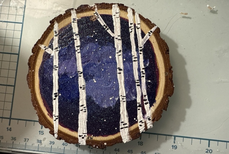
9. Birch Trees Part One: What's great about using
acrylics on wood is you don't necessarily have
to put anything on the wood previous to
painting onto it. If you are concerned about that, maybe you've cut
the word yourself. Do make sure that
it is smoothed out. There are products you can apply to work on so that there isn't any
soakage that happens. It might soak in like if
you're painting on fabric, it can soak into the fabric. But if you're painting
on a Eso canvas or something like that,
it's not a problem. You might have to
do multiple layers if it is soaking
in a little bit. But I find that that's
why it's easiest to just buy them pre prep for this. There's no anything particular but that's been put onto
it to prepare the wood. But it has been
smoothed out so it's not like a rough
surface to paint on. So that's just a
little side note. Okay, let's get some
birch trees go in. So we're going to
need our first one because that one's dry,
it's a nice thing. Acrylic paint dries quickly. I'm going to grab
my white and put a new thing of white
here, a healthy amount. And then I'm going to grab
my four inch angle brush. I'm going to prep it by
putting in some water. Now, if your water
is really dirty, you might want to
get new clean water. But I'm not too worried
about it right now. If I find that my white
isn't staying pure white, then I'll clean these out. Okay, let's make sure this hole is at the top
of our working area. We'll load up our
brush with some white. Remember I always load
it up on the side. And then we're going to
start our first mark. Now, I prefer not to do
one right in the middle. I think it looks nice
to have odd numbers. It's almost like the
rules of design. You don't do pairs of things. Typically you do
like odd numbers. In groupings, there's five total here and that gives it
a nice cohesive look. It doesn't look overcrowded and there's not
anything in the center. I don't want it to
look too symmetrical. I'm going to draw one
from the very top, just a straight line down. Now it's a tree. Trees aren't perfectly straight. You don't have to use a ruler
or any tape or anything. Then I'm going to go over it, maybe slightly to one side, where I'm focusing on making
the one edge look nicer. I can look at my tree and say, is there anything I don't
really love about it? Do I need to make it
thicker at one part, maybe the top side? Okay, then we're going
to make some more, we're going to make
them different thicknesses, just
like in the example. That's going to make
it look more natural. Where do I want to
put my next one? Let's put one not on
the exact same spot over here, maybe a bit further. If you press lightly
with your brush, you're going to have
a thinner mark made. If you press heavily, you're going to have
a wider mark made. You have a little more
control when it's thinner. I'm going to go right over
the bark to take that on. Oh, got my hand in the paint. All right. Going right over the edge here. I don't want it
to be as thick as that other tree branch branch. It's the trunk. These
are tree trunks. Then we have to make
some decisions. I definitely want one over here. I'm thinking, put one right here that's a bit thinner
than that first one. My hands feel a bit shaky.
They're coming out a little. Say, that's okay. You can stabilize yourself
somewhere that's not shaky, then that works, okay? Make sure that you always recorrect where the
top and bottom is at. You don't make any
major mistakes. It'll look a little weird if you have the trees going like this and then it's
hanging up this way. It's like it doesn't quite
look right that way. Okay, now we have
33 is a good place, but I feel like it
looks a little empty. We're going to add another one. We could add a thin one for
following this example. Exactly. We've got
a thin one here, close to this branch.
So let's do it. There we go, thin one there. It's easiest if you can get
the line correctly once, but you probably will have to
go over it more than once. It's a matter of not, don't
think about making it bigger, because you're just going
to a huge, huge, huge. It's just going to get
bigger and bigger, bigger. But if I'm looking
at these two and I don't like that
they're too similar, I want to make this outer
one maybe a bit bigger. Then I'm just going to go over the same line but just
slightly to the right. Or press a little bit more. Don't start on the edge and you're just
going to make it too big because we are going to
have to do another layer. You can already see some of
that dark showing through. We will have to go over that, but don't worry following
that same process.
10. Birch Trees Part Two: If the paint isn't dry, you might just be pulling paint. It's best to just let it dry. All right, then we
want another one. Where do we want to put
it? You can even use your brush to see where
would it look good. Maybe over here,
maybe over here, maybe the right in the center. I said not to do, it's not that you can't do
one in the center. I think it looks a bit better and intentionally
not symmetrical. I'm going to go light
one right here, maybe a bit thicker, again, going over the same line. Maybe pressing harder. We're just watching
the one side to make sure it's looking good. Now looking over
it and thinking, okay, some of them look similar. I could make one thicker. I'm thinking this
one here could look thicker. Let's try it. If I did this one thick, it would look too
much like I was trying to do something
symmetrical. I'm going to go over
that same line, but bring it out to the left. As a right handed person, I can see the left side better. That's why I'm using that
as my control. Okay. The other thing that's
going to make take it up a notch is putting the
little branches in. I'm not going to
do too many, don't want to overpower them. But what you do is you take this brush and
you're going to look for areas that maybe
have some space in them. And we're going to use
that as a bit of a guide. I'm going to follow
the one I did up here. We're going to draw one in here. You can actually start this way and I'm doing pretty
sharp angles upward. If my brush is loaded nicely, I might only need to
make the line once. Now this one, if
I do them all on the same side of the branch, it might not look as natural.
This was on the right. But if I can't do necessarily
alternating either, because that won't
look very natural. All these things
we're considering, how far does it go down? Do I want this one up a
bit higher like that? Looks good. Trying to keep them on a similar
angle going upward. This one here may be a bit
different of an angle there. That bit is done, we could start on the next,
on our other one, while we let those bits dry so that we can do another
layer on top of that after. Do the same thing with this one right there, right?
11. Birch Tree Details: Sure you washed out
that nice brush. And grab your script liner
brush and a bit of black. We're not going to
need much for black. It doesn't have
to be Mars black. If you have a different
black, that's fine. Just a wee bit of
black on my palette. Wake up the brush if it's
dry by putting it in water, brushing it off the excess. Okay, let's grab some black. I want a little bit
of water with it. It's not a fluid acrylic,
it's a bit thicker. Might need a little bit of
water to thin it down a bit. I recommend looking at a real birch tree to help
navigate this section, but I'll show you how I do it so it has a bit more of
a natural look to it. So all of my marks are
basically going to be horizontal and I might use the wood a little
bit to navigate this. Like I've got this bump here, would that be fabulous. Has one of the
knots in the bark. Okay. I'm going to need more
water, Water, way more. Come on, there we go. Bring it out. Bring it out. There we go. Okay. I want to be more like the fluid paint there. Okay? In areas you're
going to want these kinds of rounded bits that are
the knots in the tree. You're going to have little areas where
they have that now. You can just start with
little lines here and there, don't do them exactly, one here, one here,
one here, one here. Try to do a little bit random. Maybe I'll have one
that's in the middle, then maybe over here. Now, plants do sometimes have
patterns to them, right? Like if you look at a
leaf, there are patterns. However, we don't want it
to be too precise looking. I do have them fairly
spaced out, pretty evenly. But if you just start with
these little lines first, then maybe you have
an area that you can add a little bit more
of a blotch there. That's all it really takes, just adding a little
bit of blotch, that's the technical term, okay, if I bring this up
closer for you to see. Might help a bit.
Even on the branch, we want to have some of these. It's just that papery type, I'm just doing light
little dashes. Make sure your brush
is loaded properly, meaning you can use as
much paint as you want. Going to take it all
the way up to the top of where I have white and all
the way down to the base. And I'm going to do that, the
same thing, all of these. If you need to turn
it so that you can use a more comfortable
angle, you can do that. Just make sure
that you recognize where the top of
your painting is. I don't want all of the
dark spots to be in a row. Okay. Maybe I'm going to
have one that's here. That one's going to
be the bigger one. Now also note this is
a smaller tree trunk. My lines should be less visible, In which case I might need to make these ones a little bit bigger so that these
can be visible. Okay, some that
are in the middle, some that are more spread out, some little dashes, some bigger, then you get a nice
amount of variety. You just keep going.
Find a new spot to make a nice thick one. Maybe there's a few
thick ones in here, they're off to the
side a little more. Maybe they're right
in the middle. That's going to
give that variety that going to look real good, give you that real
birch like effect. So they're not all
so that people can imagine you're creating the illusion that's like this is a real object because it's going to go
all the way around. If you just do it in the center, it's not going to look
as fantastically real. Are barely there,
Okay, barely there. Use visual changes in maybe the way that you created
your line as some of the guide because
if something is poking out a certain way, then maybe it works really
nicely as a knot in the tree. But definitely use
a visual reference. I don't just make marks the
way you see me make them. It's going to be more beneficial for you to do a little research. All you have to do
is grab your phone. These days, it's a lot easier. You don't have to go find
a tree if you want to. If you have trees nearby and maybe even in your backyard,
you have these trees, take a look at that
papery bark that they have and use that as a guide. Maybe your lines will
be better than mine. Okay? Then we look over
it and see are there any areas that look overpowering or maybe they need a little bit
more like this. Looks like it might need to blend out a bit
because it looks too clunky for my liking. A few dots in there. Okay. Any other areas where
I want to kind of fix? All right. We'll do the
same with the other one and then I'll
show you how to sign. That's all we have
left. After we do this, we're going to sign this
piece. How cool is that?
12. Birch Tree Details Part Two: Hey, so I'm just going to, there is a little touch of
I want to do with white. Can you use this brush washed? Oh no. Look at that.
Always look at your tool. Sometimes the bristles will separate a little bit if you're working it a
little too strong. Be kind to your brush, see how
it's splitting at the top? It probably was
being a little kind. Okay, fabulous. All right. Now you need to decide on how
you're going to sign this. Okay? What color do you
want to sign it on? This one I signed with a white. You could sign with white. What is light? It's going
to be hard to see that. You can choose a
different color. Maybe the blue, maybe
blue mixed with white. Maybe a few colors mixed
together, maybe gray. Let's see what we
want to do here. Maybe the purple mixed in, I don't have much purple
that's still there. That should do. I want
it nice and thin. Not so thin that it see through. Might be a little bit
on the cusp of that. Then I just like
to do my initials. So I go little, it's a big K, but then see how I reloaded. Oh, and then this one maybe. Let's add a little of that
green in there to that mix. Make sure it's straight
up and down again. Choose a spot, maybe
right here following the curve of this line.
13. Finishing Touches: All right, now we have
our two ornaments signed. A couple more things for one, we can write on the back. If you're going to
write any information on the back, maybe your name, maybe the date, maybe a message to whomever you're
presenting it for. I have my own thing I
put on the back there. Then you can also add
a little sparkle. We didn't add our sparkle yet. This one. I was going
to add this one. We'll move this one
out of the way. Just take a just a little bit. It's going to stay
on pretty well. And then once everything's dry, I can just quickly spray with like a fixative of some kind
to have it stay on there. And this one here,
we're going to use this silvery powder here. I'm sure you spread
it out nicely. Then you can tap it off. To tap it a bit off so that
you don't have too much going on there. Perfect. Okay. Then you can spray it
with some varnish, fixative. When you're writing on the back, make sure you use something
that's not going to bleed. I highly recommend
these micron pens, this is three and it's a really
good size for writing on these that's going to work really well and
not bleed on these. I really like that.
The last thing we're going to want
to do is put in, I'm going to show
you how I do this. Part two, you can do something different
or you can add like a little bead or a bow. What I do is I just
take my two ends. Now this is about 13 "
of length that I cut. They're not pre cut for you. Typically, I just
pull them together, make a knot, simple knot. And pull it tight so that there's not too much at the top. Okay. Then I pull it like that. Pull the string together so
I can make this into a tip. And then I feed that through. Hopefully things aren't
too wet still doing this. Feed that through a little
wait, not all the way through. Open up the loop part. Feed this through the loop and pull there you have an
ornament ready to go. You can spray or spray it. The spray will help to keep everything a little
bit more protected. You can use a glossy
spray or a matt spray. I'm probably going to use a matt finished
spray on these guys. Let's do it again on this
one if you want to see how I did the knot
again and everything. 13 " that I cut. Make a little, not make
sure the knot doesn't take, you don't want the
knot down here with like these too long. Pull that into a thin bit. Feed it through
the hole a little ways enough that it
has space for you to feed this bit through that hole. Tighten it up and
it's ready to go.
14. Conclusion: Thank you so much for joining
me in today's lesson. What do you think
of your ornament? I hope that you were
successful in creating it. That you love it
so much that you want to share it in the gallery. I can't wait to see it and
give you the feedback that you so deserve from
taking this class. If you have any feedback
you'd like to give me, please write me a review
so that I can know what I'm doing well and what I can improve upon. Thank you so much. And if you want to connect
with me anywhere else, I'm on Youtube, Tiktok,
Instagram, and Facebook. Go check it out on whichever
platform you like to be on. We'll see you in
next class by now.
 Kristina (Moyor) Choy, fine artist