Transcripts
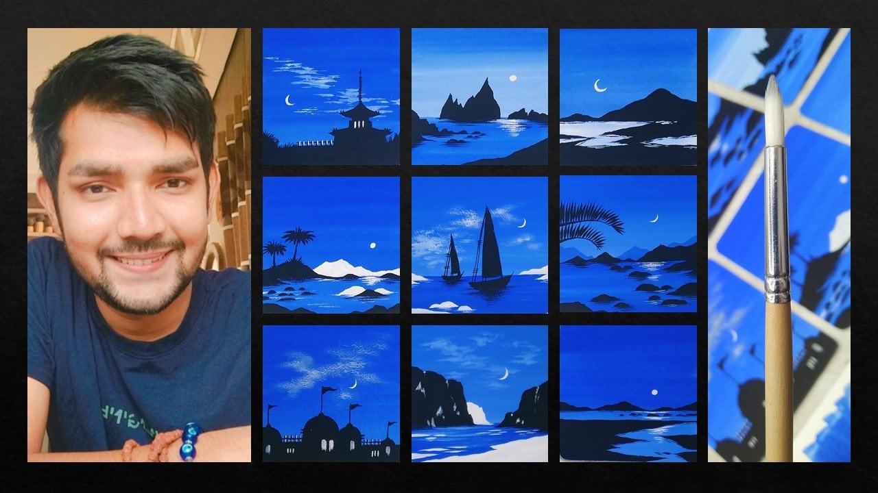
1. Welcome to the Class: In order to create easy, simple and elegant painting. Using minimal elements in a painting which can
create a great impact. A thought that came into
my mind is let me create a class which requires
minimal art supplies. As an artist, I love to
explore different art mediums. This time we are going to create a beautiful achromatic
beads sunset. The best part about the classes, the painting is going to be a very minimal and
elegant painting using only two colors, which are going to
be black and white. Hey everybody myself,
vertex Patel. I'm a self-taught artist and an interior
designer by profession. Bayesian, good job.
Indian, you can find all my artwork
on Instagram. This class we are
going to learn about all the art supplies
that you will need. We're going to talk
about the brushes and the watercolor paper
before starting the class. That is going to be a
nice class overview. I'll be teaching
you how you can cut your A5 size watercolor
paper into a perfect square. Before starting, we will
learn how you can tape your watercolor paper
carefully so that you can get a nice white border. We are going to have a
nice practice session in which we are going to learn about all the
elements that we are going to incorporate
into the painting. So the entire practice
sheet will help you to learn about all the
elements in the painting. We are going to
start by applying a nice gradient background. We are going to create
different color values by adding black and
white together. There'll be also
painting the water body, which is going to be
an undifferentiated. We're going to learn
how you can use a nice detailing brush to
paint beautiful hills. By using the same
detailing brush, we are going to paint a
nice reflection effect onto the water body. We are going to paint a
beautiful, elegant moon, which is going to be in
contrast with the background. We are going to paint
some amazing waves that will give us a
nice, elegant B to Y. At the end of the class, I'll be teaching you how you can remove your site tape carefully
so that you do not end up tearing your
beautiful gouache painting. The class is absolutely
suited for beginners, also intermediate and advanced
level artists can try it. No need to worry at all. The classes are very
short and easy class. You can definitely give it
a try without any delay, grab your supplies,
and let's get started.
2. Art Supplies: Hey everybody. So
before we start, it is very important
for all of you to know the correct art
supplies that you will need to paint this
particular painting. So here are all the art supplies
that we're going to use. The first one is the
watercolor paper, which is very important. These are watercolor
papers of 300 GSM, and these are loose
sheets of a fi size. You just have to
make sure that you have the correct
GSM, which is 300. Gsm is basically for
the thickness of the paper so that it
can take heavy washes. Now let us talk about
the other art supplies. You will need a simple color palette in
which we are going to mix the colors and make different shades of black
and white together. Don't need to worry
at all in case you do not have a same color palette, you can go for any other
good alternative as well. Now let us talk
about the brushes. It's very amazing that for the entire project you will
need only two brushes. One is a flat brush of size 1 " and other one is around
rush of size eight. And the best part is that only by using these two brushes, we're going to complete
the entire class project. Next up, we have
our simple pencil that we are going to use. Then we have a pair of scissors, which we are going to use to cut the A5 size paper into
a perfect square. You will need a simple ruler. This is our simple
plastic ruler, which is having dimensions
in centimeters. So we will use this ruler to cut the A5 size paper into
a perfect square. Then additional variable,
which is very important to remove the excess amount
of water from your brush, and it will also help
you to clean your brush. Then we have a simple
masking tape of size 1 ". We're going to use
the masking tape to tape the watercolor paper so that we can get a
nice white border when we remove the masking tape. Then we are going to
use to wash colors. It is very amazing that it
is an achromatic painting. So we are going to
use only black and white for the entire
class project. And these are washed
colors basically. In case you are new
to wash colors, you can definitely go for
smaller tubes as well. Then you will need a simple
glass in which you can have your clean water so that
we can clean the brushes. So that's it. These are all the art supplies
that you will need for this particular class. In case you are missing on
any particular ad supply, you'll find them very easily
in nearby local art store. Now let us move
towards the next part.
3. Class Overview and Details: Hey everybody, you
are most welcome to the class overview and details. And this particular part, we are going to learn
about what all we are going to learn in
this particular class. So here is the painting and the practice sheet
in front of you. Let me talk about all the
elements that we have in the entire painting
that we're going to learn. And here is the practice sheet, which we are going to
make completely together. Now let us talk about
all the elements that we have in this beautiful
achromatic beat sunset. You can see we have a nice gradient background in the sky. And we are going to
create it together. And it is not at all
going to be difficult. Then we have a beautiful white, vibrant moon that we
are going to paint. And as you can see,
it is going to be in a good contrast with
the background. We are going to have these beautiful hills that
we are going to paint with solid black color.
No need to worry at all. I'll be teaching
you each and every element how to paint
them in detail. Then we are going to have these beautiful
white reflections that we have created
on the water body. And a solid dark tone of gray which we are going to
create for the water body. You are going to paint these beautiful wave lines that they are going to create by applying a nice texture effect
using the brush. As you can observe,
we're going to have very minimal elements to complete this entire
class project. And by creating these
beautiful elements together, we are going to complete
the entire painting. But before starting
the entire painting, I'll be teaching you
how you can create these beautiful tones by
using just two colors, which are going to
be black and white. We're going to create
the gradient background. I'm going to teach you
how you can create these beautiful gradient
background will be learning how you can paint these beautiful waves by creating textures
using your brush. We are going to learn
how you can create these beautiful
solid black hills and having a nice
reflection effect. And as you can
see, the wave line that we have in the
final painting. So altogether we are going
to learn the entire process of creating the painting from
the beginning to the end. And to be very honest, to create a nice
practice sheet will help you a lot to come towards
your final painting. And it also reduces the
chances of making mistakes. And very short that
you're going to enjoy the entire practice
session as well. And we are going to
learn a lot together. Wash as a very new
medium for me as well. And you can see how beautiful
matte finish and guilds. And the best part is that we are going to use only two colors, which are going to be black and white to create this
entire project. So without any delay, just grab your supplies and let's move towards
the next part.
4. Lets Practice the Elements: Hey everybody, you're
most welcome to the, let's practice the
elements spot. And this is the
most beautiful part of the entire class in
which we are going to learn about all the elements
in detail that we are going to paint
in the final painting. As you can see, I have
my practice sheet ready, which is of size five, and it's the watercolor
paper basically. Let me just tell you quickly
about all the elements that gradient effect that we have in the background,
which is in the sky. A nice vibrant moon,
solid black holes, which is having a nice
reflection in the water body. Now the reflection
of the moon and the beautiful wavy lines
that we are going to create. So these are all the
minimal elements that we are going to have in
this particular painting. Let us start by
creating the shades. Let us talk about the achromatic
color scheme basically. So since we are going to
have only two colors, which are going to
be black and white. Let me show you how you can
create these shades of black, gray, and white together. So here I have my color palette on the left side,
as you can see, I'm taking my one-inch
flat brush and I'll be taking a little bit of water
to loosen the cholera. The reason behind
taking water is that your color will be a little
bit loose and you can apply it on the sheet of paper in case you take
the color directly from the tube or the
container that you are using, it won't be that much
smoother to apply from the brush on the
watercolor paper sheet. I'll be taking some light, as you can see in
my color palette. And now what we're going to
do is that we're going to add white into the solid black
color that we have slowly. And we're going to create
the shades of gray. So whenever we add
white to any color, it is known as
attend to basically. And it will give you a range of different colors together. It depends on how much
white we add in the color. I've added a little bit of
white, and as you can see, the color tone changes and it comes a little bit lighter than the first shade that
we have applied. Now what we're
going to do is that we are going to repeat
the same process, but you have to increase the amount of white color
that we are adding. And slowly you will observe
that we are going to have different type of shade as they move
towards the right area. From the darker tone of black, the shade will come towards gray and it will move towards
a little bit of white. I'm adding some more
white and my shade, and you can see the
color is changing. No need to worry at all. Just do it very
slowly and carefully. And this is how you will
know that how you can create these beautiful differentiates
by just adding white. You have to be very
much careful with the amount of white color that you are adding so
that you can get a nice variation in the shade. Let me create two more shades. I'll be adding a
bit of white again. And MBAs, you find
that your brush is becoming a little bit rough. What you can do is
you can just take a little bit of water
in your flat brush, add it so that it can give
you a nice smooth movement. So again, I have
taken some more white and I'll be creating
the last sheet. Now you can observe
how beautiful the entire variation
from dark black, a lighter shade of
gray is coming. And this is how we
are going to create the shapes that we have in
the final painting as well. That'll be labeling it. I love to label in the practice sheet. It gives a nice satisfaction
to me as an artist. And you can also create
your own practice sheets. Will be some sort of journaling for your
entire project as well. As you can see, we are
done with the variation in the shade by using
just two colors, which is black and white. Now let us move
towards the next part, which is creating a nice
gradient background, which is coming from
the darkest tone of black to a lighter
tone shade of gray. So what we're going to
do is we're going to use the same 1 " flat brush. And we are going to
apply a thin coat of water on the watercolor paper. As you can see, just make
sure that you do not apply access amount of water that will definitely
spoil your painting. You can dab your brush onto the tissue paper and remove
the excess amount of water. Then I have taken
solid black color and applied it on
the topmost part. And you can observe the
movement of my flat brush. It is just a simple
horizontal movement. And you can relate it with the first shade that we have created, which
is solid black. Now simply clean
your flat brush and we'll be taking a
nice tone of gray, which is already in
my color palette. No need to worry at all. In case you do not
have the same shape, it is absolutely fine. You can create your
own shade as well. It is not at all compulsory to have a same shame
that I have created. So now, after creating
a nice gray shade, I'll be applying it just
below the solid black color. Now just dab your brush on the tissue paper and try to
blend the colors together. The reason behind dabbing your flat brush on
the tissue paper is it becomes dry and there
won't be any water. And it will help both the
colors to blend them together. Now for the water body, we have a solid gray tone. Don't need to worry
at all this time. We are not going to
create a gradient effect. So I'm just trying to create
a different shade of gray. And again, I'll be telling
you that no need to worry, you can create your own
gray shade as well. Just try to make it a
little bit lighter by adding some more amount
of white color in it. I'll be taking some more water also so that we can
lose him the cholera. And as you can see,
I'm just applying it, decide the gradient shade
that we have created. So this is a simple
shade of gray that we're going to use
in the water body. You can apply the coat of color and this particular
horizontal direction, as you can observe. Now let it dry for awhile. Let us move towards the
next step. Until then. Now, I'll be teaching
you how we are going to create these beautiful
solid black holes, are going to use a round
brush of size eight. Now the reason behind using
a round brush basically is that it will help you to
create these pointy edges. And the tip of your
round brush will help you to paint in the
difficult areas. Let me give the labeling
as well as I told you, I love to label the
practice sheet flow, the gradient effect, and simple plain shades of
gray that we have applied. Now what I'm going to do
is that I'm going to take my round brush of size
eight and I'll be taking some solid black
color and the color palette. Just take a little
bit of water as well so that you can
lose them the cholera. So let me repeat again why we are using a
detailing brush, or I can say a round
brush of David. So as you can see, we
have a nice pointy tip and this particular
brush so you can create the beautiful
irregular shapes for the hills that
we are having. You can just create
the outline initially and you can also have
a nice natural shape. According to your convenience. It is not adult
compulsory or necessary to create the same shape
that I'm creating. You can create your own
natural shapes as well. You can just give a
nice outline to have the particular
shape and then you can fill in the solid
black color inside. I'll be adding
some more hills so that you can relate it
with the final painting. You can use a combination
of heads together and you can paint it according to your composition as well. As you can see the way
I'm using the tip of my round brush to
create the outline first and then filling
in that solid color. Let me also tell you
the reason behind choosing a solid black
color to paint the hills. So as you can see, we have a nice gradient
background which is going in the tone of gray. And we also have the water
body in a great one to enhance the hills and give it a nice contrast
with the background. We have painted them in
a solid black color. You can observe that
the hairs are very much visible while we have painted
it in the final painting. We are done with the
hills, as you can see. Now let me tell you
how you can get this beautiful
reflection effect. Now to do this, you
just have to take your detailing brush and just take some solid
black color in it. Dab your brush onto the
tissue paper so that this amount of water is removed and your brush
should be dry enough. And you just have to make these
little horizontal strokes in this random way
as you can observe. And you will find this
beautiful rough strokes just below the hills and it will give a nice reflection effect. This is how we are
going to paint the beautiful solid black holes and the reflection effect. Now it'll be just creating a nice gray tone below
the hills to show you how we are going to paint the nice wave that we have
in this particular painting. I'm just taking some water
and loosening the cholera. I have made a nice gray patch. So we'll just let it dry for
a while and I'll be adding the labels again to make my practice sheet look a
little bit more attractive. These are the smaller
hills that we have painted using small
solid black color. And we also have painted these beautiful
reflection effect just below the
solid black holes. Now let us move
towards the next part, which is painting
the beautiful waves that we have in this
particular painting. You will be really surprised
to see that how easily we are going to paint the waves that we have in this
particular painting. Just make sure that you clean your round brush
carefully and water. And we're going to take
solid white color this time. And the color palette,
as you can observe, just use the tip of
your round brush and make a nice stroke that way
I have painted right now. And you can see how
beautiful it looks in contrast with the gray shade. We are also going to add one more strokes since
we have two wave lines. Now once we have painted
the outline for the wave, wave are going to add some
rough strokes just above it. And this is going to be in a
very random and natural way. You just have to make
sure that you do not have access amount of
water in your round brush. Just try to have your brush very much dry enough so
that you can have these little rough
strokes just above the main line that we have painted with solid white color. In case you find that your
brushes having water in it, you can dab your brush into the tissue paper and you can make it a little
bit rough N j. Now on the portion where we have created a nice gray background as well for the water body. Let me show you how you
can play with WBS as well. The first one is a
simple plain white line, and I have created the rough
strokes just above it. The second one can be a
little bit in called format. As you can see, you can
create your own shapes as well to make the waves look
a little bit more natural. And it is absolutely on you. You can take your own
call to paint the leaves. And you just have to make these little horizontal
stroke above the main white line
that we have painted to make it a little bit more
natural and realistic. And let me also add that up
strokes on the last frame. So this is how we have created these beautiful waves
and the final painting, I hope that you have
understood the entire process. Now, let us take all the
elements together and painted on the gradient background
that we have painted using solid black and
white color together. That'll be taking solid black
color in my color palette, as you can see,
adding some water to loosen the color up so that we can move the brush carefully. And in a smoother way. I'm adding these little
solid black holes. Initially. This is going to be a little prototype for
the final painting. You can create it in the practice sheet to
get a nice reference. You can play with those sizes of the hills and the composition together. No need to hurry. Atonic tried to paint it in your own pace and
in a slow manner. No need to make any mistakes. And also in case you
make any mistakes, It's absolutely fine since
it's a practice sheet. The reason behind creating the entire practice
sheet so that you can create a lot of mistakes
and do a lot of experiments. And then you can move
towards your final painting. I'm adding solid black color just below the last leaves so that we can get a
nice difference between the land area
and the water body. We can also do this
just below the waves to create a nice depth
and some details. So this will enhance the entire wave and it
will give a nice look, but the background together. So now I'll be cleaning
my round brush and I'll be taking some
solid white color in it. Now using the tip
of the round brush, we'll be painting the sun. Are you can also
consider it as a moon, since it's an, a
chromatic painting, it is absolutely fine. You can consider it any particular thing,
a sun or a moon. And using the same brush
with solid white color. Adding these little
strokes to create a nice reflection effect
onto the water body, which is coming through the sun. As you can see, we are done with all the elements in
the practice sheet, and these are all the elements
that you will need to learn before painting
the final class project. And I hope that you got
to learn something from this entire practice sheet.
No need to worry at all. Just try to create your
own practice sheet. Tried to create
your own elements. And now let us move
towards the next part.
5. Lets Cut the Paper: Hey everybody. Now let us cut the watercolor paper
into a perfect square. In case you find a perfect
square watercolor paper from the art storage
is absolutely fine. But how far as I know, I got an A5 size
watercolor paper. So we're going to cut it
into a perfect square. And the watercolor paper
is basically 300 DSM. The DSM is basically
the thickness of the paper so that it
can take heavy washes. Here, I have a simple pencil and a ruler and a pair of scissors. I'll be using my
pencil and we'll be calculating the vertical
side, which is smaller. The paper is basically
a rectangle. So just, let's measure the
smaller side from the ruler. It's basically giving
us 14.7 dimension. So it'll be taking it on the
longer side and just keep one side of your ruler at zero and put it on
edge of the paper. And then take the
reading at 14.7. It's okay not to be
that much accurate. You can also take 14 cm. I've just moved two dots at 14 cm so that we can get
a nice cool linear line. And I have just simply drawn a line parallel to the
smaller line which we have. You can see we've got
the perfect square. And now I'll be using
my scissors to cut it. Be very much careful
while doing this. Try to follow the line that
we have drawn with pencil. No need to hurry at all
and just follow the line. As you can see,
we are ready with the entire queer people in
which we are going to paint, the final wash painting and
the remaining scrap of paper. You just can save it to apply the color tones and no
need to worry at all. It will be very helpful not
only to throw it in garbage, we do not want to waste paper. You can practice some elements
and color tones on it. So we are done cutting the
entire A5 size people, as you can see, I have my painting also to give
you a nice reference. Now let us move
towards the next part.
6. Lets Tape the Paper: Hey everybody, now let us take the watercolor paper before
starting the final painting. Now the reason behind adding a nice masking tape
onto the border of the watercolor paper
is so that we can get a nice white border when we
remove the masking tape. Here I have a one-inch
masking tape. So this is basically
a paper tape only. It will help us to prevent the side having the color
that we are going to apply. We're going to apply the masking tape on
all the four sides. Let us start by applying the masking tape
from the right side. So just make sure that you align your masking tape limb to the edge and be
very much careful. You can keep the
portion accordingly. How much white area you
want to your painting. Just make sure that some
part of the masking tape is onto your watercolor
paper and some bad is on the backside where whatever
surface that you're using or wherever you have
placed your watercolor paper. Now, I have placed my
another masking tape on the left area and make
sure that you press your finger or thumb onto the masking tape to
make sure that it is completely stuck with
the watercolor paper and the surface that you
have on the backside. Now let us apply
the masking tape on the bottom portion as well. The process is absolutely same. Just try to make sure
that the marketing team is perfectly aligned and
battle with the paper edge. And I'm applying my
finger on it so that it is completely stuck
with the watercolor paper. And let us place the last masking tape on the top portion. And we're done. This is how you have to cite tape your watercolor paper to get a nice perfect white
edge when we remove it. Now without any delay, Let's
move towards the next part.
7. Painting the Background: Hey everybody. So we're starting
with the final painting. And the first part is
painting the background. So as you can see,
I'm ready with my watercolor paper
with the site team. I have a clean glass of water. I have my color palette ready
and official paper with me. So I'm using my pencil to create a simple horizon line
which will separate our sky area and the water
body. No need to worry at all. Just try to make a
simple horizontal line. So here I have my 1 " flat
brush and we are going to apply a thin coat of
water on the sky area. You can observe the
movement of my flat brush. You just have to make these
little horizontal directions. No need to hurry at all. Do it in a very slow
and steady manner. So that reason behind
applying a thin coat of water initially is basically known
as a wet on wet technique. This will help us to blend the colors that we're going to apply in the
background together. I'll be taking some solid
black wash color in my color palette using
the same 1 " flat brush. Makes sure that you have right composition of
color and water together. No need to have access
amount of water. Just try to check it on
the scape of people that was left when the cut at
the A5 size sheet of paper, I have made a nice
horizontal stroke on the upper portion of
the watercolor paper. Also make sure that there
isn't any space left between the masking tape
and the watercolor paper. That will not look nice when we remove the masking
tape at the end. So now I have taken some
solid white wash color in the color palette
and we're going to create a nice shade of gray in case you find that
the color is a little bit thick and it will not be moving that smooth on
the watercolor paper. You can add a little
bit of water. Does try to get the perfect
shade and apply it on the strip of paper and check it whether it
is perfect or not. I don't need to worry at
all in case the shade is not absolutely similar to
the one that I have made, you can create your
own shade as well. It is absolutely fine. As you can see, we have applied a nice gray shade on
the bottom potion, just below the
darker black color. Now, just simply take your 1 " flat brush and we are going to
make it completely dry to blend in both the colors. Just have to dab your brush
to the tissue paper so that it can just get dry and excess amount
of water is removed. Now, just to make these
horizontal strokes together and blend it with the solid black color
on the upper portion. So now you can see there
isn't any difference of line in between the solid
black color and a gray shade. Now once it dries, the gradient effect will look
really nice and beautiful. You can also just clean your flat brush and
make it completely dry. And you can create the
horizontal stroke on it. As you can see, the
entire sky area is dry. Now let us paint the water body. So to create a different
shade of gray this time, I have added some amount of whitewash color and already
made shade of gray. And I'll add some water
to loosen the cholera. No need to worry in case you create a different shade of
green that is absolutely fine because it will be definitely different the amount of light color that you add. You can also add some water
to loosen the color up. Now this time we haven't applied a thin coat of
water on the water body. We can directly apply
a shade of gray to the water bodies since
it is not going to be a gradient effect for the blending effect
is not required here. I have created a different
shade of gray this time. Let us check it on
a scrap of paper. It is having a nice difference
with the above ocean will be using the color and making the horizontal
strokes again. Make sure the white
line is not visible. Once you apply the
horizontal stroke just below the horizon line. Take some more color in case the color is not
enough to apply. Also make sure that there is no space left between
the masking tape and watercolor paper because it will not look nice when
we remove the masking tape. You can observe how beautiful
the mat finished looks when the wash colors dries. We are done with the
entire background. Now, let us move
towards the next part, which is painting the hills.
8. Painting the Black Hills: Hey everybody. Now let us
paint the solid black hills. So as you can observe, we are done with the
entire gradient sky area, and we are also done
with the water body. So it is basically the
background that we have painted. Now let us come towards the elements that we
are going to paint. Now the reason behind taking solid black color
and my round brush, which is of size eight, is it can create a nice
contrast with the background. So there will be more visible
than the lighter shade, which is gray in tone and it is a lighter
background basically. Let me show you how
we are painting the hills on a scrap
of paper that was left when we used the FIFA sheet to create
a perfect square. You can see how beautifully
we can use the tip of the brush to create
these beautiful else does take some solid black color and the color palette add some amount of water
to loosen the color up so that it won't
be that much rough. While painting. You can create the
outline of the house initially and then you can
fill in the solid black color. No need to hurry at all, painted in a very slow
and steady manner. Now to make the house
look a little bit more realistic and
in depth format, what we're going to
do is we're going to add another layer of L, which is coming out from the
main hill so that it can look a little bit more
realistic and detailed format. So you can just make
sure that you apply solid black color inside the
outline that we are doing. Now one more thing that I
would like to tell you is that mountains or hills generally
have natural shapes. So it is not at all
compulsory or necessary to paint the hills in the exact
manner that I have painted. You can create your own shapes and sizes of health as well. You can also play with the
composition of health. I'll be taking some more
solid black color in my color palette
and I'll be adding some water to loosen the color. Now let me add some more hairs
on the right area as well. You can see I'm trying to
create the outline initially so that I can decide on the shape of the hill
that I want to have. And then I'll be filling it with solid black color inside. Here. You have to make sure that you use the brush correctly and nice way to the tip of the brush will be helpful
to create the entire shape. You can absorb. And once
you press the brush, it will be really helpful to
fill into solid black color. You can see I have added some more hints on the
bottom portion of the mean. Let us add some more help
on the center portion. Again, I'll be using the
tip of my round brush. The tip of the round brushes also very helpful to paint in the difficult areas where thicker brush won't
be able to paint. That isn't having
to have to be very much careful while painting. That has add few more hills
on the center portion. So you can see the **** is
very small and tiny in size, but it is really easy while we are using
the detailing brush. I'm adding few more hills and
the entire background area, which is the water
body basically. Now, again, as I told you, you can create your
own composition of the hills together. You can also make
them bigger and smaller according to
your requirement. It is not at all
necessary to paint it in the same way
I have painted. Now you can already observe
that the solid black color of the hills as creating a nice contrast with
the background color. It makes them look more visible. And you can also observe the effect of the
gouache colors. It is getting a nice
matte finished look. I'm just trying to add these
tiny holes near the bigger so that I can create
a nice composition for the final painting. Always make sure that you
add some amount of water to the solid black color
so that you can easily move your brush
to the final painting. I'm adding some more solid
black line my color palette. Now this time we
are just creating a line below the
water body area. This is basically a
separation line which is telling the ground area is
different from the water body. I've created a line and
I'm just filling in solid black color below the
line that I have painted. This is basically a
simple line which is separating the water body and the land area. No
need to hurry at all. Just make sure that
you use the tip of your round brush to create the outline and then fill in the solid
black color inside. Now let us move
towards the next part.
9. Moon and Reflection: Hey everybody, now let us paint the moon and the
reflection effect, which is one of my favorite part or the favorite element
in the entire painting. You can observe that I
have my round brush. And this time the round brush is going to be absolutely dry. Just dab it on the tissue
paper and make sure that there isn't any
amount of water in it. And while having
black color in it, you can see I have created these little horizontal strokes. So just try to have some
amount of black color, but make sure that there
is no water in it. Now you just have to make these little horizontal
strokes just below the hills. It will give you a
nice reflection effect to the entire painting. Now the reason behind creating this reflection effect is so that we can create a nice depth. And the mountains will
look a little bit more realistic onto
the water body. And naturally also
whenever we have any object or anything
on water surface, it will definitely create a nice depth and
reflection effect. You can see I'm
just trying to make these little horizontal
strokes just below the area. Now, in every particular hill or below every particular hill, you have to repeat
the same process. No need to hide it all. Do it in a very slow
and steady manner. In case you find painting
the reflection effect or making the horizontal strokes using the tip of your brush. A little bit harder to
do than what you can do is just take our
landscape of paper, practice that on it. And then you can come towards
your final painting to make the little horizontal strokes to create reflection effect. You can observe how beautiful
the reflection effect looks when we apply these
little horizontal strokes. Now, in case you find that
the brushes are very dry, you can add a little
bit of water in it, but just make sure
that the water is not an excessive amount. The strokes are not
supposed to be perfect. It can be rough and it
can be random as well. You can see we are
done with then dive reflection effect and it is giving a nice
depth to the hills. Now, let us paint
the beautiful fun. Or you can also
consider it as moon, since it's an
achromatic painting, you can consider it whatever
you want to be taking, solid white color and
my color palette. But before that, just clean your brush carefully with water. I have taken solid white gouache color
in my color palette, and I'll be taking
my round brush. Now just try to make a simple circle on
the center portion. You can design the position
of the sun or the moon, whatever you have painted according to your convenience as when I've just painted it
above the horizon line, just try to have
a perfect circle. Use the tip of your round brush carefully so that you
can have a nice shape. We're done painting the Dyson. Now, let me create a
nice reflection effect. So what happens is that on the
water body we are going to create a nice reflection
effect of the sun or moon. Whatever we are considering, what we can do is that
we are going to take some solid white color
and the same round brush. And we're going to make the same horizontal strokes that we have given for the
reflection for the hills. You can see I'm just adding little horizontal strokes
and our last and randomly. But this time the
horizontal strokes will be below the moon onto
the water body. So again, there is
very less amount of water in my round brush
and motor amount of color. Dab your brush on the tissue paper so that Ax
is amount of water will be removed and you'll be having
this nice textured effect. You can see as I'm moving
towards the bottom portion, I'm trying to make
the horizontal stroke shorter and smaller in size. No need to hurry at all. Try to paint it in a
slow and steady manner. Also in case you find painting the reflection effect of the
moon or the sun difficult, what you can do
is practice it on a landscape of paper initially. Then you can come towards
your final painting. Let us also add
few white strokes below the hills so that
it can also enhance the has a little bit the moonlight or the sunlight while we also falling
on the hills. So that's why I'm adding
these little strokes. And it will also enhance
the entire painting. You can see the white
color is also creating a nice contrast with the background color and
the water body color. We are done painting the entire deflection
effect as well. I'm just trying to enhance
it a little bit more. You can put some more
horizontal strokes just below the hills. As you can observe. No need to do it in a very
slow and steady manner. We are done with this
particular element. Now, let us move
towards the next part.
10. Painting the Waves: Hey everybody. Now let
us paint the leaves, which is the most beautiful
part and the entire painting. We are having two wave
on the front portion, just about the ground line. No need to worry at all. I have taken solid white color and my round brush
of size eight, just make a nice
thin strokes using the tip of the round brush
just above the ground line. Now about the, firstly, we are going to create
another wave line which is going to be a
little bit shorter than it. I'm using the tip of
my round brush and I'll be making the line
a little bit thicker. So this is basically to make sure that this is the
position of the wheel. Now to make it look a little bit more realistic and in depth, what we're going to do
is we're going to add some rough strokes
just above it. You can already see that
the wave lines is having a nice solid white color that is no excess amount of water
in my detailing brush. The brush is having
solid white color only. So you can see how beautiful the rough strokes I'm making. Tried to make these
little strokes and adjust and random way it is absolutely fine since it's a natural wave coming
towards the ground area. And it is giving a nice
effect of a beach. So basically, you have to create these little natural
white strokes just above the solid white
line that we have painted. Also, no need to hurry, just observe the movement
of my round brush. I'm using the tip of the round
brush at certain areas and I'm trying to make it come
towards the ground area. So it is looking as
if the waves are coming towards the ground area. And you can see how beautiful
the white shade is looking. Now, again, you can observe the contrast between the gray
shade in the background, which is the water body, and the wave lines that we have painted with solid white color. In case you find it
difficult to paint, you can definitely practice
it on a landscape of paper initially and then come towards your
final painting. As you can see, we are done with the final painting of a beautiful achromatic
gouache sunset. Now I'll be removing
the site tape and that is a trick behind it, does try to remove the side
tip in an angle so that you do not end up getting your
pressure. Gouache painting. You can see how
beautiful the side edge look and it is having
a nice white border. That's why I told you to place the masking
tape carefully. Now let me remove the last step and it is the most
satisfactory part as well. So we are ready with
the entire painting. Let me take you a
little bit closer. I hope that you enjoyed this particular painting using
minimal and easy elements. I hope that you've got
to learn something new and creative from this
particular project. Keep practicing and
happy painting.
11. Class Conclusion: I believe that anyone can paint and using minimal
and simple elements, you can always create magic. Being an artist, I love to
explore new art mediums, and that is something I always suggest my students as well. The most important part in any art or craft
book is to maintain an art journal that helps you to keep a record of your artwork
and see your progress. Practicing as
something that will always take you one step ahead. I'm very happy to share
this class with all of you, and I hope that you've
got to learn something new and creative from
this particular class. I would be really
excited to see all of your projects into
the project gallery. Free to ask any doubts you
have related to the class. Let me know your
reviews for the class. Keep practicing and
happy painting.
 Rutvik Patel, Artist and Instructor