Transcripts
1. Welcome to the Class: When I talk about
elegant painting, it always includes a
minimal color palette and some easy, simple
painting techniques. In this class, we
are going to create three beautiful beat
sunset paintings using the medium
of gouache colors. You're going to paint it on square coasters in case you want to paint on
a watercolor paper, it is completely fine. There are going to be three
beautiful class projects which is going to be very easy and simple to create everybody myself
with Rick Patel. I'm a self taught
independent artist and an interior
designer by profession. As someone who's very much
passionate about teaching, my major focus is always to
create classes for beginners, for trying to develop their
skills on a regular basis. I personally love to explore different art mediums and not stick to one
particular thing. If you're joining
me, you'll find a variety of classes
that I create. We're going to start
by understanding all the details of the class projects that
we're going to create. I'll be giving you details about the art supplies that
you will need for the entire class in case you're missing out on any
particular art supply. You can go for any other
good alternative as well. We're going to use the
medium of gouache colors, which is going to give
us a nice matt finish. We're going to understand
the color palette that we're going to use in all the
three class projects. Before starting
with the projects, we're going to have a beautiful practice session in
which we're going to learn about all the elements and how to paint them in detail. The practice sheet will help you a lot to develop
confidence while painting, and the chances of making
mistakes will be very less. I'll be teaching you how you
can place your coaster on your desk surface so that it will not move while
you're painting. You're going to
start by painting a beautiful gradient background with some amazing
abstract clouds. There are going to be
elements like islands, rock bodies, a beautiful tree, some nice city lights
that we're going to have. You're going to
paint a beautiful glowing sun in the sky area. We're going to enhance the
class project by adding a beautiful reflection all over using simple and
minimal painting techniques. We're going to create
these three class projects that you're definitely
going to enjoy. Yeah, without any delay, grab your art supplies. Join me on this creative journey and let's get started
with the class.
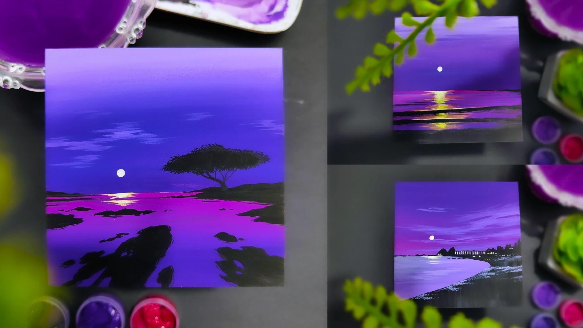
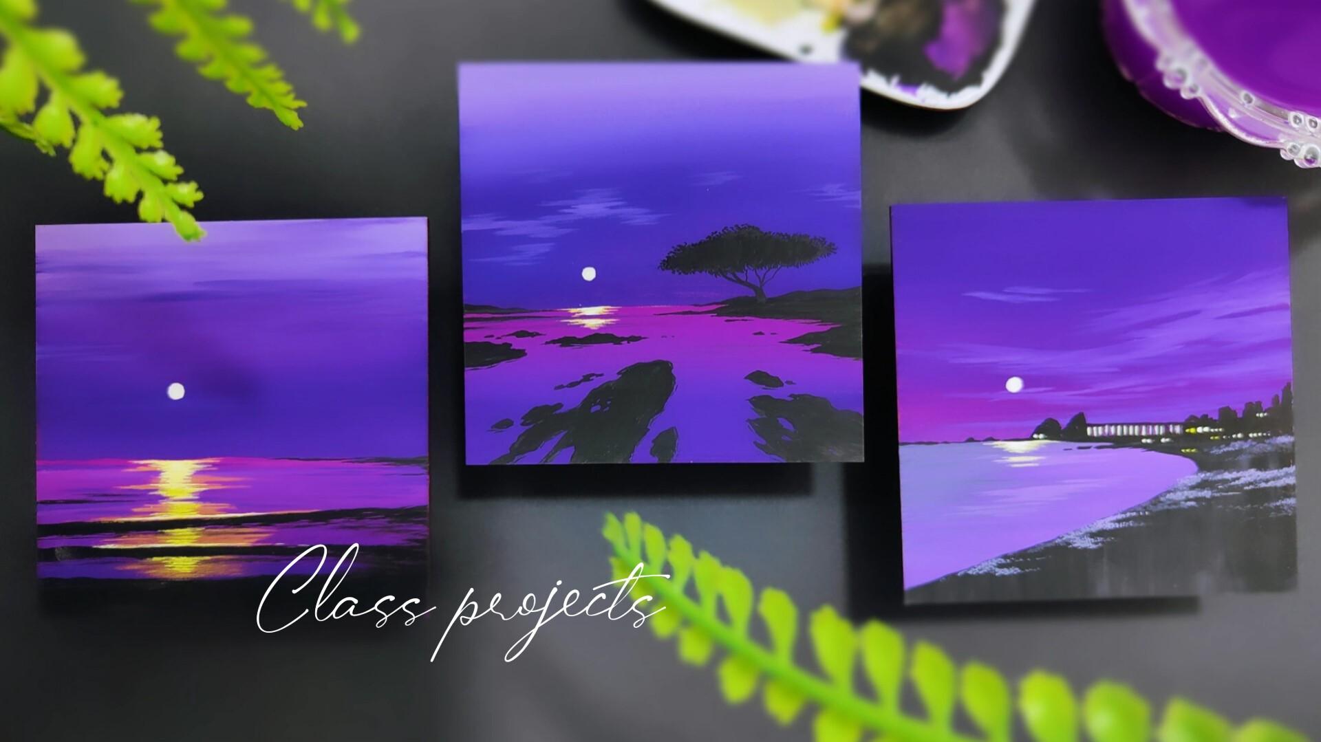
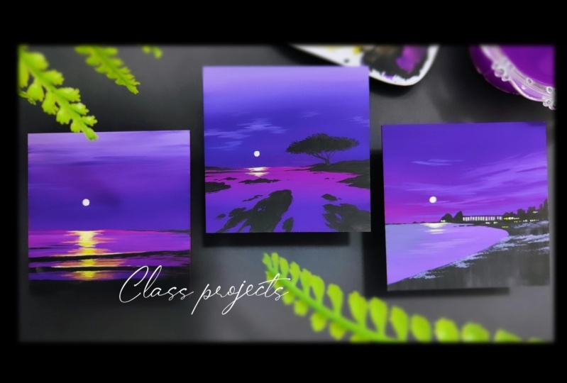
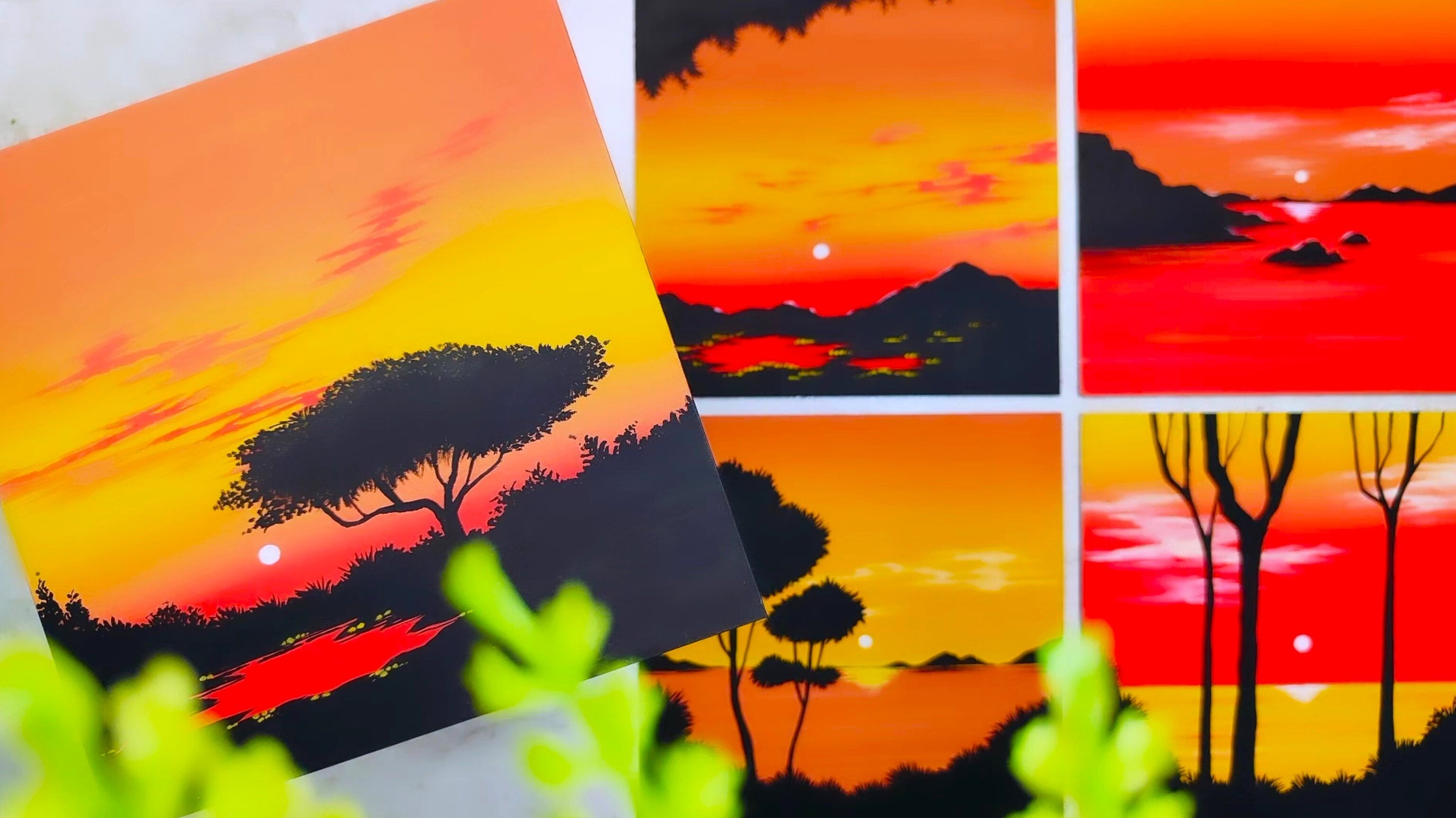
2. Details About the Class Project: Everybody, now let us talk about all the details about the class projects that
we're going to create. There are going to
be three beautiful class projects that
we're going to create. I have placed them
on my desk surface. Here is a beautiful
practice sheet in which you can observe
on the bottom portion. We're going to learn about all the elements and how
to paint them in detail. On the above portion,
I have all the colors that we're going to use to
create the class projects. The shades of purple color and the tins of purple color
that we're going to create. The color palette will
help you a lot to understand the application of
the color onto the surface, whether it's a watercolor
paper or a coaster. Now you can observe
that the practice sheet will be having different
elements in the bottom portion. Let me take you towards
the first class project. It's a simple scenery in which we have some beautiful waves, a nice reflection effect, and a beautiful glowing sun. Basically, there is going
to be a nice gradient sky that we're going to create
above the horizon line. There is going to be
some abstract clouds, a beautiful glowing sun, some nice waves, having some
nice depth and details, a nice reflection effect that enhances the
entire painting. It's having minimal elements
but a beautiful scenery. Then the next class project, we have these beautiful contrast islands
in the water body, a beautiful gradient sky. There are going to be some
nice abstract clouds, a glowing sun with its
reflection effect, and a beautiful tree that we are going to paint in detail. There are some more elements than the first class project, but the scenery is
absolutely beautiful. Then the last class
project is having some beautiful city lights
just above the horizon line. A nice landscape area in the bottom portion
with a water body, there is going to be some
nice abstract clouds with a beautiful gradient sky. In all the three class projects, there is going to be
a common element, which is a beautiful glowing sun with its reflection effect, which basically makes it a
nice elegant beat sunset. We are basically going
to paint on a coaster, which is a medium
density fiber board. In case you want to take up the class projects
on watercolor paper, it is completely fine. You can use an six
size watercolor paper or whatever size you're
comfortable with. Just make sure that it is
300 GSM because it will have nice thickness and you can apply heavy coat of colors
and water on it. Yeah, these are the details
about the class projects. Now let us move
towards the next part.
3. Art Supplies: Hey everybody. Now
let us talk about all the art supplies that you will need for the entire class. No need to worry at
all in case you're missing out on any
particular art supply. You'll find it very easily in
any nearby local art store, or you can go for any other
good alternative as well. The first art supply is a simple eraser and a
sharpener that you all must be having to sharpen
your pencils and erase the mistakes in case you
have while using a pencil. Then the next art supply is a simple tissue paper which you will definitely need to remove, access amount of water and
color from your brush. Then comes the most
important art supply, which is the brushes you'll
need only three brushes. The first one is a flat
brush of size seven. Then two simple round brushes, which is going to be of
size zero and size three. Isn't it amazing
that you'll need only three brushes to complete all the
three class projects? The next up, I have a simple
pencil that we're going to use to create a rough sketch before starting with
the class project. Now we are basically
going to create the class projects
onto the coasters. But in case you want to
paint on a watercolor paper, it is completely fine. You can use an six
size watercolor paper or whichever size you're
comfortable with, just make sure that
it is 300 GSM so that you can apply heavy coat
of color and water on it. You can cut it into a
square piece of paper, or you can also paint it on a rectangular sheet.
It is completely fine. Here I have all the
three class projects that I have created
on Square coasters, which is made out of MDF,
medium density fiberboard. Let me show you how it looks. On the back side, I have a simple coaster here
which is completely plain. It is 4 " by 4 ". You can definitely play with the shape and size of
the coaster as well. It is completely fine. Now let us talk about the colors that we're
going to use here. I have three basic colors, which is black,
white, and yellow. I was out on the tubes, so I'm using the bottles, these are basically
poster colors, but it will definitely give you a beautiful output, like a gash. In case you're having Guh
colors, it is completely fine. No need to worry
about the brand. You can use any basic, good quality wash colors. Now comes the major colors, which is basically the
Gh tubes that I'm using. The first one is rose,
move and violet. These are very near to purple
color in case you're having a single shade of purple that will also work completely fine. These are the basic colors
that you will need. I have taken out all
the three major colors in these small containers so that we can access them
in a nice way in case you want to take it directly
from your Gah tube. It is also absolutely fine. Then the next art supply
is a simple color palette in which you can already
observe all my gouache colors. Just make sure that your
color palette is having enough space in which you can mix all the colors
in a nice way. Then the next art supply is
a simple glass container in which I'm having some
nice colored water. No need to worry at all. We're going to take
some clear water, but you'll need the
water to loosen the color up in the
entire painting. It helps to clean
the brushes as well. These are all the art supplies that you will need
for the entire class. In case you're missing out on
any particular art supply. You'll find it very easily in any nearby local
art store or you can go for any other good
alternative as well. Now let us move
towards the next part.
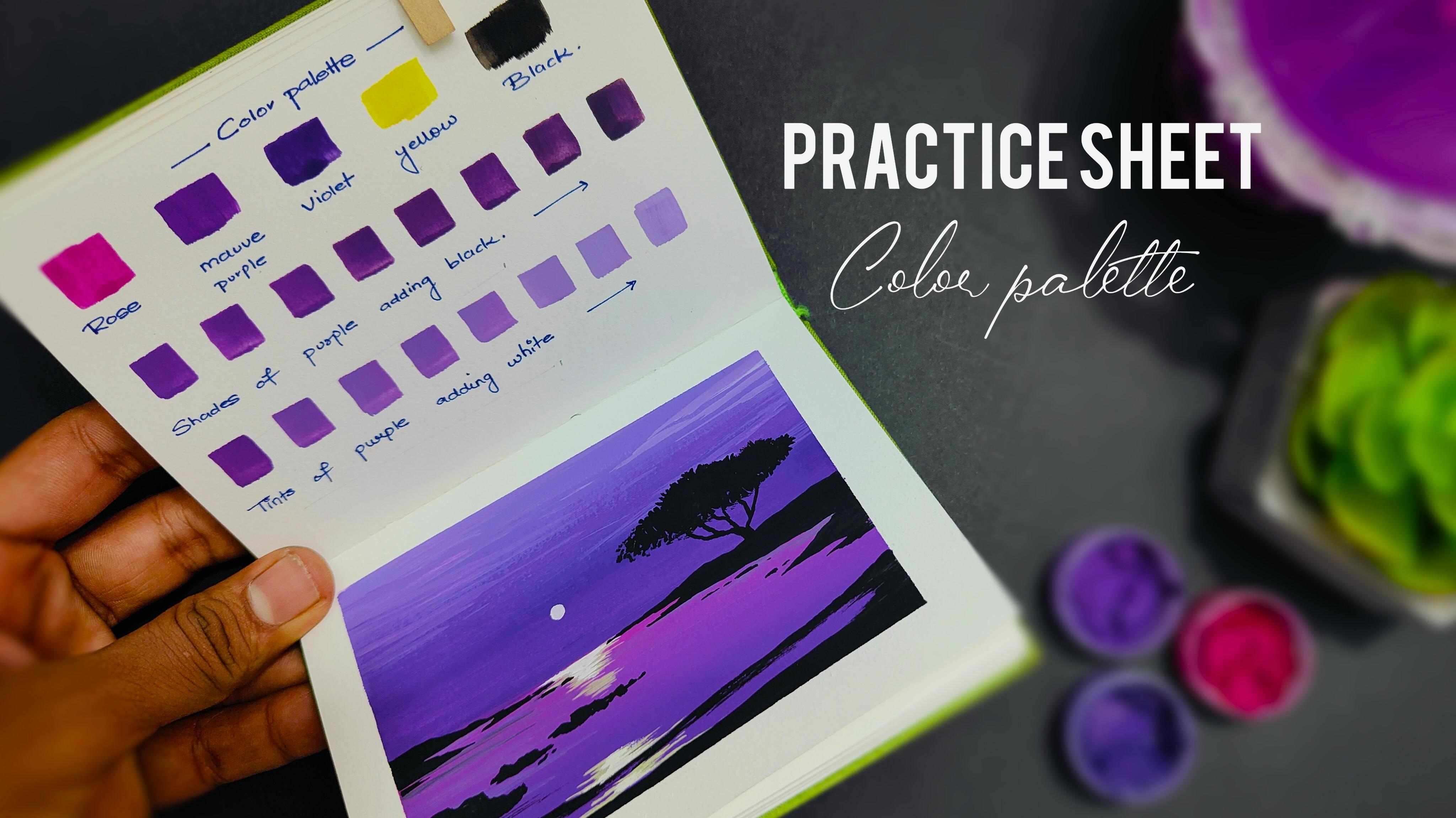
4. Color Palette: Hey everybody. Now
let us talk about the color palette
that we're going to use in the entire class. We only need six basic colors that are placed on
the above portion. I have a simple
practice book here, which is basically
a rough sketch book in which I practice
on a regular basis. I have given all the
labelings of the colors. On the topmost
portion below that, we have shades of purple color
and tints of purple color. All the three colors which
are very near to purple. That's why I've taken
the labeling as purple. I'll be using my flat
brush of size seven. Let us apply the first color, which is very near to pink, but it is rose. Basically, I'll be applying this little strokes just
above the labeling. Now, you must be wondering why we are doing this
particular step. It is because so that
you can understand the application of the
color onto the paper. Now the second color is move, which is exactly
similar to purple. And the last color
would be violet. All these three colors
are very near to purple. That's why I'm going to create the shades and tints of
purple on the bottom portion. Now let us apply the next
color, which is yellow. I'll be taking some yellow
from the bottle and just apply these little strokes
just above its labeling. Always clean your brush whenever you're using
a different color. And then we have the last color which is going to
be solid black. We are not going to apply
white color because it is not going to be visible onto
a white watercolor paper. Now let us create the
shades of purple color. Take some good amount
of purple color in your color palette using
your same flat brush. Apply the exact shade of
the color onto the paper. Now to create its shades
is basically adding little amount of black slowly onto the exact saturated color. The moment you'll apply more solid black color to the
exact shade of the color, it will get a little bit darker, creating its multiple shades. No need to hurry at all. Take
your time, Mix the colors. Well, increase the amount of
solid black color slowly, and you'll observe that it
gets a nice darker shade. Now, similarly, we'll be adding the purple color with
solid white color. Again, we are going to
take some good amount of purple in the
color palette and take some solid white color in the color palette separately
using a different rush. Now, slowly, as we
increase the size of solid white color in
the exact saturated color, you'll observe that the
saturation of the color will decrease and the shade will
get a little bit lighter, creating different
tints of purple. Start by applying the
exact same color. Now slowly add solid white
color into the mixture. Make a good composition
of color and water together so that you get
a nice matte finish. You have to increase
the amount of solid white color slowly so that you can get a lighter tint of
the exact saturated color. This is how we create the
tints of the purple color. No need to worry about getting the exact shade and tint that
I have created. Your shade. And tints might vary from mine
and it is absolutely fine. You can also observe that it's a very minimal and
simple color palette. We are done with the
entire color palette. I hope that you got an exact
idea of all the colors that we're going to use in
the class projects that we're going to create. Now let us move
towards the next part.
5. Lets Practice the Elements: Hey everybody. Now
let us practice all the elements
that we are going to paint in all the class projects. Just below the color palette, I'm having this beautiful
rough scrape of paper, which is part of my
practicing journal. Here is the beautiful class projects that
we're going to create. Now there are different
elements like the sellouts, which is part of
the entire scenery. A beautiful abstract
sky area with the water body which is having some noise gradient effect. A beautiful glowing sun and its reflection
effect that we are going to practice onto the
rough scrape of paper. If you observe in this
particular class project, we have these beautiful
islands and a beautiful tree, which is the part of the
entire class project. In the last class project, we have these beautiful
waves that we are going to create in the
practice sheet as well. Now since we are going
to use the paper, I'm going to use a simple
masking tape of size 1 " in case you're creating the class projects onto
the watercolor paper, you'll need a simple masking
tape to place it onto the borders so that when you
remove the masking tape, after you're done painting, it will give you a
nice white border. You can observe that I
have placed a simple piece of masking tape onto
the topmost portion. Similarly, I'll be placing one piece on the bottom portion. Just make sure that
your masking tape is parallel with the paper edge. Apply a little bit of
pressure using your finger so that the masking tape will be completely stuck with
the watercolor paper. Now I'll be placing one
on the right side and similarly one on the
left hand side as well. Once you're done
with the painting and you remove the masking tape, it is one of the most
satisfying part. You can observe
that I have placed the masking tape on
all the four sides. Now let us start by creating
a simple horizon line. So I'll be using
a simple pencil. Just create a horizontal
line in between the paper. This basically separates the
sky area and the water body. Now I'll be using my
flat brush of size seven and I'll be taking
some nice violet color. Just apply it above
the horizon line. Make a good composition of
color and water together. You can observe that it's a
simple horizontal movement. We are not going to
cover the entire area using the exact shade of volet. No need to hurry at all. Try to apply the color in a
very slow and steady manner. The more horizontal
strokes you'll apply, the better blend you'll get. Now I will simply decrease
the saturation of the volet color by adding
some solid white color, which I was already having
in my color palette. Now you can observe
that it is a little bit lighter than the first
shade that we applied. You can increase the amount of solid white color and you'll observe that it is even more lighter on the topmost portion. Now there is a nice variation
in all the three colors. Slowly blend them together by applying these
horizontal strokes. Now I'll be using
my same flat brush. Just clean it in water, dab it onto the tissue paper
to make it a little bit dry. And I'll be using some rose. Take it from the container and add it onto
your color palette. Mix it well, creating a nice composition of
water and color together. Just apply it below
the horizon line. Be a little bit careful
between the line of separation between the sky
area and the water body. Apply a simple
horizontal stroke. Now I'll be taking
some nice amount of purple in the color palette. Apply it just below
the rose color. Try to blend both the
colors together by applying more horizontal
strokes together. Now we are going to have a nice darker shade in the
bottom portion. I have taken some violet
in the same flat brush. Apply it on the bottom portion. Slowly move towards
the above area. Now you can already observe a nice gradient effect from the horizon line
to the bottom portion, which is the entire
part of the water body. Now I'll be cleaning my
flat brush in water, make it dry onto
the tissue paper, take some solid white color, and again, try to have less amount of water
and more color. Now we are going
to randomly apply these beautiful horizontal
strokes in the sky area, which is going to create
some abstract clouds in the sky area. You can observe the way I'm
holding my flat brush in an angle so that I can get these thin, horizontal strokes. In case you want to use your
round brush of size three, that is completely
fine. It will work. No need to worry about
creating the clouds in the exact same way I'm
creating right now. You can decide the position of the horizontal strokes wherever
you want to apply them. While doing this
particular step, just make sure that you keep your hand very
much loose and free. No need to make it stiff in case you want to increase
the contrast between the clouds
and the sky area, you can take some more
solid white color. I'll be adding the same
horizontal strokes onto the water body as well. To create some noise waves, you can add a little bit
of solid black color in your beautiful purple color
in the color palette. You can apply these
little horizontal strokes just below the horizon line. Again, it's the same step, you just have to be very much careful near the horizon line. You can already observe
a beautiful contrast of the horizontal
lines that we have created and the background
color in the water body. I'll be using my round
brush of size three. Take some good amount of
solid black color and create a nice random line
on the bottom portion, leaving some space
between the masking tape and cover the entire portion
with solid black color. This is basically acting
as the landscape area. Similarly, we're going to
add one more organic line, just leaving some
space in between. You can use the tip of your round brush to
create a nice thin line. Then you can add
multiple strokes to make it a little bit thicker. The second line that
we have painted is basically the shadow of the wave that we're
going to create. You can add these little
horizontal strokes on the edges to make
some nice depth and details in the
entire painting. No need to hurry at all. Try to take your time and try to apply these little
horizontal strokes. The more horizontal
strokes you'll apply, the more detailed your
entire painting will look. Also, in case you want to create another variation
in the entire wave, it is completely fine. You can play with
the entire painting by creating a different
composition as well. The entire purpose of creating this beautiful practice
session is so that you can get a nice idea of all the elements before starting with the
final class projects. Now I'll be using my same
round brush of size three. Take some good amount of yellow and white together
in your color palette, mix it well with water. You can also use your
round brush of size zero, that is completely fine. And just apply these little horizontal
strokes in the wave, you can leave the
solid black line of the shadow in between. Similarly, just below
the horizon line, you can add these little
horizontal strokes. You can observe the way
I'm moving my hand. It's a simple
horizontal movement. Try to apply very
less pressure on your hand as you move
towards the bottom portion. You can simply decrease the size of the strokes
that you're making. Now using the same round
brush of size zero, I'll be taking some solid
white color to make the reflection effect look
a little bit more vibrant. Now, just decrease the size of the horizontal strokes
that you're making. You can observe this
particular step that I'm doing in
the class project, which is placed on the left hand side of
the practice sheet. There is a noise glowing effect which is basically the
reflection of the sun. I'll be adding the
solid white color near the waves as well. By adding these little
horizontal strokes, it's a very satisfying process. Just take your time and try to paint in a very slow
and steady manner. Now let us add the Sun. By adding a circular shape, you just have to paint a
circular shape in the sky area. You can decide the position of the reflection
effect and the sun according to your
convenience as well. It is completely fine. Now let us paint
the landscape area. I'll be using my round
brush of size three. Take some good amount of solid black color from
your color palette. Mix it well with water. Create a nice composition of
color and water together. In case you have axis amount
of water in your brush, just simply dab it onto the tissue paper so that axis amount of water
will be removed. Now you just have to
create these random lines, which is basically
the landscape area, and create the outline first. And then you can fill in solid black color in the
inner portion. It's a very simple
and easy technique. Also, no need to worry
about painting it in the exact same way
I'm painting right now. You can create your
own composition of the landscape area. You can play with the shape and size of the landscape
area as well. You can already observe
in the class project, we have these beautiful islands, which is in a very
random and natural way. Similarly, I'm trying to create it in this particular
practice sheet as well. Wherever you want to paint some smaller landscape areas and a nice little rock bodies, you can use the tip of your round brush and
apply very less pressure on it to get a nice
solid black patch in a very smaller portion. You can also create a nice organic rough outline initially, and then you can fill
in solid black color in the inner portion wherever you're painting the
landscape area. And near the masking tape, just make sure that you
have applied the color in the entire surface
and there is no space left between the masking tape
and the watercolor paper, because it will not look nice when you remove
the masking tape. If you're painting on a coaster, it is completely fine. It can be painted again. So you can observe
that I have created some nice landscape
area in the water body. Now let us paint
a beautiful tree. It's a very simple
and easy technique. Use your round
brush of size zero. Take some solid
black color in it, Apply these little strokes. Using the tip of
your round brush, just create a nice organic
outline of the tree. No need to worry
about getting it in the exact same way
I have painted. Then fill in solid black color in the entire inner portion. You can use the tip of
your round brush to create the natural organic outline
for the entire tree as well. No need to hurry at
all. Try to paint it. With a lot of patience. I'll be connecting
the entire bush of the tree with
the landscape area. Just use the tip of
your round brush. Create these little thin lines
combining together to form a beautiful branch and connect it with the landscape
area in the bottom portion. This is how you have to paint a beautiful tree just
above the landscape area. You can play with the shape
and size of the tree as well. Now let us remove
the masking tape. It is a very satisfying process. Try to remove the masking
tape in an angle so that you do not end up tearing your
beautiful practice sheet. You can observe the
beautiful edge we get once we remove
the masking tape. And it gives a nice solid
white border in case you are creating the class projects onto the water color paper. This will definitely
help you a lot. Now you can observe
that we are done with the color palette and
the practice sheet. We have practiced all the
basic elements that are required for all the
three class projects that we are going to create. I hope that you
got an exact idea. The color palette will help
you a lot to understand the application of the
colors onto the surface. And the practice sheet will
help you a lot to develop confidence file painting and the chances of making
mistakes will be very less. I hope that you enjoyed the
entire practice session. Got an exact idea of all the elements and how
to paint them in detail. Now let us move
towards the next part.
6. Lets Place the Coaster: Everybody, before we start
with the first class project, let me teach you how you
can place your coaster onto your desk surface so that it will not move
while you're painting. If you observe the class
project carefully, it's a simple MDF coaster, which is a medium
density fiber board. If you apply these
beautiful strokes on it, it will definitely move. While you're painting, there is a very simple and
easy technique to place the coaster onto
the desk surface. You can observe that I'm
having a simple plain coaster over here of size 4 " by 4 ". We're going to use a simple
masking tape to place the coaster in case you're painting on
a watercolor paper. You can use a watercolor
paper of size six. You can cut it into
a perfect square, or you can go for any
other good alternative in size as well. If you're using a
watercolor paper, you can place the masking
tape on the borders. As you remove the masking tape, you'll get this
beautiful white borders. You can use the watercolor
paper of 300 GSM, which will work completely fine. Now since we are going to create the class projects
onto the coaster, I'll be taking a simple
piece of the masking tape. Flip it over each other so that the sticky part
comes on both sides. Apply it onto the coaster. Apply it using your fingers and add a little
bit of pressure. Similarly, I'll be taking another piece and apply
it on the second corner. Since the coaster
is a smaller one, you can apply two tapes
and just flip it over. Place it onto the desk surface wherever you're
comfortable to paint. Apply a little bit of
pressure using your fingers, and you'll observe that it
will not move while you're applying heavy coats of
colors and water on it. In case you're using
a bigger coaster, you can apply some more
masking tape on the back side. It's a simple and easy
technique to place the coaster, and it will easily get removed from the desk
surface as well. Now let us move towards
the first class project.
7. Painting 1 - The Waves: Everybody, you're most welcome
to the first painting, which is the Waves. It's a very simple and
minimal class project. You can observe that I'm ready
with all my art supplies placed nearby so that I can access them in a
very comfortable manner. I have placed my coaster
onto the desk surface. Let us start with
the first step. I'll be using a simple pencil. And I'm starting from the left hand side and I'll move towards
the right hand side, creating this simple
horizontal line. This is basically the
horizon line which separates the sky area
and the water body. Now let us start
with the sky area. The three guash colors are more violet and rows
that I have taken in these small containers so that we can access them
in a very careful manner. I'll be starting by using my
flat brush of size seven. You can observe that we are ready with the color
palette as well. Let us start by taking
some good amount of violet in the color palette. Make a good composition of
water and color together. Make sure that you do not have axis amount of water
in your brush. That will decrease
the saturation of the color and you won't
get a nice matte finish. You can be a little bit
careful near the horizon line. And then you can
slowly observe that it's a simple
horizontal movement. And I'm applying the violet
color on the bottom portion. Slowly, we are
going to convert it into a beautiful
gradient effect. Now, once we have applied a beautiful violet color
on the bottom portion, just make sure that there is no space left on
the entire coaster. Now I'll be taking some purple, which is a mauve color, basically, very near to purple. No need to worry about that. Take some nice mauve
color in your brush. Simply apply it
above violet color. You can apply more
horizontal strokes to blend both the
colors together. Now you can carefully observe
there is some space left on the topmost portion to make
a nice gradient effect. You can add a little bit
of solid white color. In this mauve color, you can add a little bit of
water to loose on the color A make a good composition of
color and water together. Now start applying it
on the topmost portion. Be a little bit careful and apply the horizontal strokes in a nice way in case you find that your color is getting
finished from the brush, You can definitely
take some more color from the color palette. Now you can observe, again, it's a simple
horizontal movement. Now there is a
difference between both the colors in the bottom portion and
the topmost portion. To make a nice blend, just simply clean
your brush in water, dab it onto the tissue paper. Now reapply the horizontal
strokes in between, both the colors, you will slowly observe that
you'll get a nice blend. You can take some more color in between in case you want to
blend it in a very nice way. Take some more move color, apply it in the center
portion of both the colors. Now, the more horizontal
strokes you'll apply, the better blend you'll get. No need to hurry at all. Try to paint it in a very
slow and steady manner. Take your time. Now, once the
entire background is done, we can add these little horizontal strokes
using some violet. You can simply observe the way I'm holding
my flat brush in an angle so that I can get these thin, horizontal strokes. As you all know that
clouds generally have a very natural and
organic shape. There is no specific
way of painting them. You can create your
own organic shape. You can play with the shape and size of the clouds as well. By creating variation in
these horizontal strokes, in case you want to use
your round brush of size three and create these
horizontal strokes randomly, that is also absolutely fine. Right now, you can
observe that we have created these beautiful
horizontal strokes, creating some abstract
clouds in the sky area. Now just above the horizon line, we have a darker
shade of background. I'll be taking some
lighter tones of move color by adding
some nice white color in it and apply these little horizontal strokes on either sides of the coaster. There is no specific way of applying the horizontal strokes, so you can naturally apply it in your own convenience as well. You can observe that
we have created some nice abstract clouds
in the entire sky area. Now let us paint the water body. I'll be using my flat
brush of size seven. Again, take some rose color
in your color palette and add a little bit
of water in case you find your color is
a little bit stiff. Now just below the horizon line, we are going to apply these
little horizontal strokes. You can just keep your flat brush in an angle
so that you can paint in a careful manner below the horizon line in case you find that your
color is getting finished. From the brush, you can take some more color from
the color palette. Now the way we created a nice gradient effect
in the sky area. Similarly, we are
going to create some variation in the
water body as well. You can observe the
way I'm applying the horizontal strokes
of this rose color. Now we will be mixing some
violet and move together, make a nice combination of water and all the
colors together, reapply the horizontal strokes and between the rose color. Don't worry about the
rough strokes right now. We are definitely
going to make it smoother by reapplying
some horizontal strokes. I'll be adding a
little bit of water in mauve color to make a nice composition
of the entire color. Since we have a good
surface area to paint, so you can take some more color. Now simply observe
the way I'm applying the horizontal strokes on the entire surface
of the coaster. Now you can apply the
horizontal strokes near the rose color as well. We can make the contrast below the horizon line by reapplying these
horizontal strokes. I just added a little bit
of solid white color. Now you can observe
that there is a nice sharp difference
between all the colors. Simply clean your
brush in water, dab it onto the tissue paper, and reapply the
horizontal strokes just below the horizon line. The more horizontal
strokes you'll apply, the better variation in the colors and blend you'll
get between all the colors. I'll be taking some
solid violet on the bottom portion and I'll be applying the
horizontal strokes again. Slowly move towards
the above area, blending all the colors together in case you're
not that much confident enough to create this
beautiful variation of color in the water body directly towards
your final coaster. What you can do is you
can practice it on a rough scrape of
paper initially, and then you can come
towards your final painting. This will help your lot to develop confidence
while painting, and the chances of making
mistakes will be very less. Now I'm using my round
brush of size three. I have taken some violet
in the color palette. Now I'll just make
a good consistency of water and color together. And we're going to apply some horizontal strokes to create some nice depth and details
to the entire water body. These horizontal strokes
basically creates some nice wave effect in
the entire water body. No need to worry about applying the horizontal strokes in the exact same way I'm
applying right now. Your strokes might
be a little bit different than mine and
it is absolutely fine. There is no specific
way of applying them. Just make sure that you use
the tip of your round brush, apply very less pressure on it. Whenever you're applying
these thin strokes, always try to keep your hand
very much loose and free. Similarly, I'll be adding these horizontal lines near
the horizon line as well. In case you find that your color is getting finished
from the brush, you can definitely
take some more color from the color palette. In fact, you can create some
nice variation by adding different colors
together of this violet and move shades whenever you're trying to apply these little thin horizontal strokes, always make sure that you
try to keep your hand very much loose and free
and not make it stiff, apply very less pressure on it. And simply just create
these horizontal strokes. Now once we are done adding these beautiful depth to
the entire water body, I'll be taking some
solid black color in my round brush of size three and just create
a natural organic line. You can make it a
little bit thicker by reapplying some nice
horizontal strokes together. The black line is
basically the shadow of the wave that we are
going to create now. Similarly, we are going to
add another line as well, but by leaving some
space in between. But before that, you can add these little horizontal lines in the bottom portion as well. Just simply use the tip of your round brush to create
these little horizontal lines. Now I'm adding another line
just below the first one, but leaving some
space in between. You can definitely make
it a little bit thicker. By adding some more
horizontal strokes, you can observe that
we have created two shadows of the waves
that we are going to paint. Now we're going to
add one more line, but this time it is
going to be the line for the landscape area in
the bottom portion. Once you have added the line, we are going to fill
in solid black color in the entire portion. Take some more solid black
color in your color palette. Make a good composition of
water and color together. Now you can observe the
movement of my round brush. It's a simple vertical movement and we're going to
cover the entire area. No need to hurry at all. Try to paint it in a very
slow and steady manner. Make sure that there is no
space left on the coaster. Where we are applying
the solid black color, We are almost done painting the landscape area using this beautiful
solid black color. You can just make
sure that there is no space left to cover
the solid black color. Now in order to create
some depth near the waves, we are going to add these
little horizontal strokes in the right hand side and
the left hand side as well. Just make sure that your hand is very much loose and free. And try to create these
little horizontal strokes, you can increase the density of the strokes near the edges
of the entire coaster. It basically creates
some nice depth to the entire painting
and it will look a little bit more realistic in terms of the waves using the
same solid black color. I'll be adding some more
horizontal strokes near the water body on the
topmost portion as well. The more horizontal
strokes you'll apply, the more detail you'll get near the shadow of
the waves as well. In case you find that there is axis amount of water
in your round brush, you can dab it onto the
tissue paper to make it a little bit dry and to get
this beautiful texture. Now you can observe
some nice variation in the water body where we have created these
beautiful waves with its shadow effect. Some nice landscape area
in the bottom portion, now I'll be taking
some yellow and I'll be mixing it with some
rose color together. And it will convert it
into a nice orange shade. And we're going to apply
it in the water body. By adding these
horizontal strokes, it's basically a part of the reflection effect of the sun that we are
going to paint. You can directly use
solid yellow color, or you can mix it with rose to get it a little bit orangish. You can observe
the way I'm moving my round brush in this
horizontal movement. It's a very simple
and easy technique. You just have to keep your
hand very much loose and free. Try to apply these little
horizontal strokes combined together to form this beautiful
reflection effect. While I'm adding this
reflection effect, I'll make sure that I
don't move my brush inside the solid black
color of the wave, which is the shadow, because there the light is not falling, leaving the solid black space. Again, I'll be adding
these horizontal strokes. You can play with the size of the horizontal strokes by increasing and decreasing
the size of the strokes. Make sure that you
mix the colors well in your color palette. You can add a little bit of
water to loosen the color up. I'll be slowly adding these horizontal strokes in
the bottom portion as well. Now, once we are done painting this beautiful
reflection effect, I'll be painting a
beautiful, vibrant sun. So take your round
brush of size zero, take some good amount of solid white color in your
color palette, and just simply paint a
circular shape in the sky area. You can paint the sun a little bit above
from the horizon line, and you can observe
that very carefully. I have created this
circular shape. No need to hurry at all. Just try to paint it in a
very slow and steady manner. Right now, we have
painted the entire sun. Now we are going to create a nice contrast of the
reflection effect as well. This time we are going to take some solid yellow color
directly in our round brush. And I'm starting with
the bottom portion, adding these little
horizontal strokes. Now this time the
horizontal strokes are going to be a little bit
smaller than the first one, because this time it is going
to be a sharp reflection. No need to hurry at all. Try to apply the
horizontal strokes in a very slow and
steady manner. Again, we'll be leaving
the solid black color, which is the shadow
of the waves. You can observe how
beautiful the contrast of solid yellow color
is coming with the orangish shade that we have applied in
the background. We are going to repeat the same steps and I'm going to add these little horizontal strokes using this beautiful
solid yellow color now, just below
the horizon line, to make the entire reflection look a little bit more vibrant, we can add some solid
white color and then reapply these little
horizontal strokes around it. I'll be using the tip of my round brush
carefully and slowly. I'm adding these little
horizontal strokes near the horizon line as well. Connecting it with the
horizontal strokes that we have already created. In the bottom portion,
you can observe a beautiful contrast of the reflection effect
with the entire painting. It makes the entire
painting look a little bit more
vibrant and elegant. Also, it's a very satisfying
process of creating this beautiful reflection
effect onto the water body. You can carefully observe, the more horizontal
strokes we apply, the better detailed
output we get. I'm almost done adding the nice reflection effect
onto the entire water body. I'm just adding a few more horizontal
strokes near the wave. You can take some solid white
color in the color palette. You can loosen the color
up by adding a little bit of water to enhance
the entire wave. You can add a nice
thin horizontal line just above the
solid black color. It makes the entire wave look a little bit more
attractive and aesthetic. We are almost done with
the entire painting. I'll be adding a little bit of solid black color on the horizon line using my
round brush of size zero. Take some nice solid
black color and apply these horizontal strokes
on the horizon line. On the right hand side, I wanted to make the horizon line look a little bit
more in contrast, that's why I'm adding this
beautiful solid black color. We are done with the
entire painting. Now let me take you a little bit closer so that
you can observe all the details carefully from painting this
beautiful gradient sky, creating some nice variation
in the water body painting. A beautiful, vibrant sun
and its reflection effect. I hope that you enjoyed creating this particular
class project. Now let us move towards
the next project.
8. Painting 2 - The Tree: Everybody, you're
most welcome to the second painting,
which is the tree. In this particular painting, the major element is a tree
and the beautiful islands. That's why I've named
it as the tree. I'll be using a simple pencil
to draw a horizontal line, which is basically
the horizon line separating the sky area
and the water body. Now in my color palette, I'm already having
some volet color, but I'll be adding
some more volet color. I'll be using my round
brush of size seven. I'm also adding some move to it, which is very near to purple. Try to mix the colors well
in the color palette. Make a good composition of
water and color together. Now start applying the color
just above the horizon line. No need to hurry at all. You can observe the movement of my hand. It's a simple
horizontal movement. We are not going to cover the entire sky area using boilet. We are going to
leave some space on the topmost portion to create a nice gradient effect while you're applying the color, just make sure that there is no space left on
the entire coaster. I'll be adding a
little bit of white in the color palette to lighter the saturation of
the entire color. Again, try to mix the colors
well in the color palette. Now we are going to apply this particular color
On the topmost portion, you can observe, again, it's a simple horizontal movement. The best part about
gage colors is that it gives a nice matte
finish when it dries. Right now, you must
be able to observe a line of separation
between both the colors. But we are going to
blend them together to create a nice
gradient effect. Now, in order to blend
both the colors, just simply clean your
flat brush in water and dab it onto the tissue paper to make it a little bit dry. Now apply it in between
both the colors, and you'll slowly observe a nice blend between
both the colors. You can add a little bit
of oilet in case you find that your color
is less in saturation. The more horizontal
strokes you'll apply, the better blend of both
the colors you'll get. You can observe that getting a nice darker shade of volet
in the bottom portion, above the horizon line to the
topmost portion of the sky. We have created a
nice gradient effect. Now let the background dry for
a while and we're going to create some beautiful abstract
clouds in the sky area. I'll be using my round
brush of size three. I have taken some nice
tint of mauve color. I have simply mixed it with some solid white color and
decreased its saturation. Now slowly apply these little horizontal strokes
combining together, forming a beautiful
cluster of clouds. You can use the tip of your
round brush carefully, apply very less pressure on it, and try to keep your hand
very much loose and free. As you all know that
clouds generally have a very natural and
organic shape in the sky. There is no specific
way of painting them. You can create your own composition of the
clouds as well. You can play with the shape
and size of the clouds. You can decide the position
of the clouds as well. You're free to experiment
with the entire scenery. You can carefully observe
that after creating a beautiful cluster of clouds
in the left hand portion, I've created a small cluster
of clouds in between. Slowly, I'm going
to create a cluster of cloud in the right
hand side as well. The steps and method
is absolutely same. Just use the tip of
your round brush. Apply very less pressure on it. Simply create these beautiful little horizontal strokes in case you want to practice these beautiful cluster of clouds on a rough scrape
of paper initially, and then you want to come
towards your final painting. It is absolutely fine. Now let us paint a
beautiful water body just below the horizon line. I'll be taking my flat
brush of size seven. Again, I'll be taking some rose color from the color palette. You can use the tip of your
flat brush to paint just below the horizon line by just flipping your
flatbrush in an angle. Now you can use the entire
surface of the brush. Apply a nice horizontal coat of rose color just below
the horizon line. Now slowly we are going to
create some nice depth. So I'll be cleaning my flat
brush and we're going to take some move color in
the color palette. So I'll be taking
some more color because we have
some good surface to paint and apply it just
below the rose color. Try to apply the
horizontal strokes and slowly move towards
the above portion, blending both the
colors together. We still have some portion
on the bottom portion, which is going to be
a little bit darker, where we are going to
apply some nice volet. Now we are going to apply some volet color in
the bottom portion. I'll be taking some
nice solid volet color from the container directly, choosing my flatbrush of size seven and slowly move
towards the topmost portion, blending all the colors together in case you
want a better blend, you can just clean your
flat brush in water, dab it onto the tissue paper, make the brush dry and reapply. The horizontal
strokes, you'll get a beautiful gradient effect. Right now we are done painting the entire background for
the beautiful water body. We'll add some nice
horizontal lines in this particular portion as well to create some
beautiful waves. So I'll be using my round
brush of size zero. I have added a little bit of solid black color in the
mixture of mauve and violet, which was already there
in my color palette. Now just below the horizon line, in a very random way, you have to apply these
little horizontal lines. It's a very simple
and easy technique. Try to keep your hand
very much loose and free. Use the tip of your
round brush to add these little horizontal strokes in between the water body. There is no specific way of applying these
horizontal strokes, so you can apply them in a very random and
natural manner. Now let us start painting some beautiful islands
in the entire painting. I'm starting with
a beautiful island just above the horizon line. Take some good amount of solid black color from
the color palette. Make a good composition of
color and water together. Make sure that there is no
axis amount of water in your beautiful mixture
of color because it will decrease the saturation
of solid black color. You can observe that
I am just creating a small landscape area which
is on the right hand side. It would be really great
if you create the outline first and then you fill in solid black color in
the inner portion. This is how we have created
a beautiful patch of solid black color which is
creating a nice island. Similarly, we are
going to create some more islands in the
entire bottom portion, creating some beautiful
outline initially, and then filling in solid black color in the
inner portion. You can carefully
observe that we have created some beautiful islands
in the right hand side. Similarly, we are going to add some islands in the left
hand portion as well. By creating a beautiful
organic outline initially and then filling in solid black color in
the inner portion. Between you can add some
solid rock bodies which are having variation in sizes
that is completely fine. Also, one thing I
would like to tell you is that no need
to worry about painting the islands in the exact same way I
have painted right now. You can create your
own composition of the islands as well. You can play with
the shape and sizes. You can decide the position of the entire rock body as well. You're free to
experiment and explore. Now in the bottom portion, I'm having a huge island, which is having some
spaces in between as well. You can just create the outline, leaving some spaces in between. Then you can slowly
start filling solid black color in
the entire portion. In case you find that your color is getting finished
from the brush, you can definitely
take some more color from the color palette. Just make sure that you do
not have axis amount of water that will decrease the saturation of
solid black color. You can carefully observe
that I have added another huge piece of island
in the bottom portion, which is on the right hand side. Again, it's a very
organic shape. No need to worry
about painting it in the exact same way I have
painted right now in case you are not that much
confident enough to add these beautiful solid black
patches directly towards your beautiful water body and you do not want to
spoil your background. What you can do is you
can practice it on a rough scrape of
paper initially, and then you can come
towards your final painting. This will help you a lot to develop confidence
while painting, and the chances of making
mistakes will be very less. I have added a little portion of Island on the left hand side. Now let us add some nice
reflection effect of the beautiful island on the bottom portion by simply adding thin
horizontal strokes. It's a very simple
and easy step. Just use the tip of
your round brush. Apply least pressure on it, and just simply add these
little horizontal lines. This basically creates
some nice depth to the entire island. You can also add
these little strokes below the small rock bodies
that we have painted around. Right now, you can observe a beautiful cluster of islands
in the entire water body. You can also observe a
beautiful contrast between the islands rock bodies and the water body that
is in the background. Together, it forms a
beautiful scenery. Now let us paint the main
element of the entire painting, which is going to be
a beautiful tree. I'll be using my round
brush of size zero and I'll be taking some solid black color from
the color palette. We're going to start by painting the entire bush of the tree. I'll be using the tip
of my round brush, creating these little strokes, forming a beautiful outline
for the entire bush. No need to hurry at all. Try to paint it in a very
slow and steady manner. Also, no need to
worry about getting the exact shape that I
have created right now. Your shape might vary. You can also play with the shape and size of the entire tree. You can decide the position
of the tree as well. Now, once you're done painting
a rough organic outline, you can simply take some
more solid black color and apply it in the
entire portion. You can observe that
we have created a beautiful sill out for a
tree which is huge enough. I'll be adding some little dots around to make it look a
little bit more aesthetic, which is basically the leaves. While you're filling
solid black color in the entire inner portion, just make sure that there
is no space left in between because it will not look nice
when the entire tree dries. We are almost done painting
the entire bush of the tree. Now let us paint the trunk
of the tree as well. We are going to connect
the entire trunk of the tree with the landscape
area in the bottom portion. It's a very simple
and easy technique. I'll be taking some
good amount of solid black color from
the color palette. Start from the bush and
apply very less pressure. Use the tip of your
round brush and just connect this little
strokes together. Connect the entire branch with the landscape area in
the bottom portion. This is the entire trunk
of the tree and you can observe how beautiful the
entire tree is looking. We are almost done painting all the elements in
the entire painting. I'll be taking some solid
lemon yellow color from the color palette and we're going to create a beautiful
reflection effect. You just have to create these
little horizontal strokes just below the horizon line. No need to hurry at all. Take some time, paint
it with patients. Try to apply these little
horizontal strokes, and as you move towards
the bottom portion, you can simply decrease the size of the strokes
that you're making. The more horizontal
strokes you'll apply, the better reflection
effect you'll get just above the
reflection effect. We're going to paint
a beautiful sun. I'll be cleaning my
round brush in water, dab it onto the tissue paper, take some solid white color, add a little bit
of yellow in it, mix them well in
the color palette. Now I'm going to paint a
beautiful sun in the sky area. Take a little bit of space from the horizon line and just
paint a circular shape. No need to hurry at all. Use the tip of your
round brush and carefully paint a
circular shape. Similarly, add these little
horizontal white strokes on the reflection effect, a little bit smaller
than the first one. We are done with the
entire painting. Now let me take you a
little bit closer so that you can observe all
the details carefully. You can observe how
beautifully we have combined all the elements together to
form this beautiful scenery, which is basically
a beach sunset. I hope that you enjoyed creating this particular
class project. Now let us move towards
the next project.
9. Painting 3 - The City Lights: Hey everybody. You're most
welcome to the third painting, which is the city lights. It's going to be a beat sunset, but it is going to have
some nice city light on the horizon line. I'll be using a simple pencil
to draw a horizon line, which is basically separating the sky area and the water body. Simply draw a horizontal line. I'll be taking some
oilet color in the color palette using my
flat brush of size seven. And we're going to apply
it on the topmost portion. Now slowly move towards
the bottom area, but we are not
going to cover the entire area with violet. We're going to create
a gradient effect while you're applying the
color on the topmost portion. Be a little bit
careful that you have applied the color in
the entire surface. Now, take some mauve color
from the container directly, or you can take it from
your color palette as well. Take some rose color
in the bottom portion. Now right now, you
can observe that all the colors are in
a very random way. We're going to blend
them together. Simply dab your brush
onto the tissue paper. Slowly, start applying
these horizontal strokes to get a better blend. Make sure that your
flat brush is dry. Now I'll be taking some solid white color in the
color palette. Mix it well with violet
to make it a little bit dull and decrease the
saturation of violet color. Just simply keep your
flatbrush in an angle, make it a little bit inclined, and try to add these
little horizontal strokes, which are combining
together to form some beautiful abstract
clouds in the sky area. You can observe the way
I'm holding my flat brush. As you all know that
clouds generally have a very natural and
organic shape. There is no specific
way of painting them. You can create your
own composition. You can play with
the shape and size. You can decide the position
of the clouds as well. You can simply
observe the way I'm moving my flat
brush in an angle. So that I can get these
beautiful horizontal strokes combining together to form a
beautiful cluster of clouds. Starting from the
right hand side, slowly moving towards
the left hand portion. Wherever you want to
have thinner strokes, just apply very less pressure. Use the tip of your flat
brush also in case you want to paint the clouds using your
round brush of size three. That is completely
fine. It will work. You can observe a
beautiful contrast between the clouds and the background
color that we have created. No need to hurry at
all. Take your time. Try to paint the clouds in a
very slow and steady manner. I have added two little strokes on the left hand side as well. The more horizontal
strokes you'll apply, the better blend you'll get between the cluster
of clouds as well. I'm adding maximum horizontal
strokes just above the horizon line in case you want to practice the cluster of clouds
on a rough scrap of paper initially and then you want to come towards
your final painting, it is completely fine. This will help you a lot to develop confidence
while painting, and the chances of making
mistakes will be very less. Now let us paint the water
body. I have taken some more. Add a little bit of
solid white color in it and apply it just
below the horizon line. You can observe that I
have used the tip of my flat brush to paint below
the horizon line slowly. I'll be adding a little bit of solid black color in this
particular mixture to make the tone a little bit darker and apply it on the remaining
portion of the entire coaster. In the bottom portion,
we are going to have some landscape area as
well and the water body, before we paint the
landscape area, let us create some
nice depth and details to the
entire water body. I'll be taking some solid
black color to increase the darker tone of the entire color that
we are using right now, which is basically a mixture of move and solid black color. The water body is going to
be on the left hand side. I'm creating the
horizontal strokes from the left hand side and I'm just leaving the strokes as I move towards the
right hand portion, you can observe the
movement of my hand. Whenever you're applying the horizontal strokes
in a very thin manner, always make sure
that you try to keep your hand in a very
loose and free way. No need to make it stiff and apply very less
pressure on it. You can carefully
observe that we have created some nice
variation using this beautiful darker
tone by adding some solid black color in
the mixture of the colors. No need to hurry at all. Try to apply these strokes in a very slow and steady manner the way we added
the darker tones, applying these beautiful
horizontal strokes. Similarly, just add a little
bit of solid white color in the mixture and add these
beautiful horizontal strokes. In between using your
round brush of size three, you can also use your
round brush of size zero. That is completely fine. You can observe a
beautiful combination of darker tones and lighter tones together in the water body. It basically creates
some nice depth and details to the
entire water body. I'll be using my round
brush of size zero. Take some solid black color in it and we're going to create a beautiful city line just
above the horizon line. Start applying these
little thin strokes using your solid black color. Starting from the
left hand portion, slowly moving towards the
right hand side area. Now there is going to be
a beautiful curved shape that we're going to create
in the bottom part. But before that let us paint the elements just above
the horizon line. We are just going to add some beautiful rock bodies
in a very smaller portion. There is going to
be some sellouts of buildings and a bridge element
above the horizon line. Now using the tip
of my round brush, I'm just creating a thin
line which is basically separating the landscape
area and the water body. The remaining portion is going
to be completely black on the right hand side
in case you want to create some variation in between the water body and
the landscape area, it is completely fine, you can play with the
entire composition. Now I'm going to use
my flat brush of size seven and I'll be taking some solid black color
in the color palette. You're going to paint the
entire remaining portion using the flat brush
of size seven, so that we can cover
the area quickly. You can observe it's a
simple vertical movement. No need to hurry at all. Try to apply the color in
a slow and steady manner. Apply it carefully near
the line of separation. Slowly add these
vertical strokes below the line of separation. While you're applying
solid black color in the landscape area. Just make sure that there
is no space left on the entire coaster
because it will not look nice when the
entire color dries up. You can always take
some more color from the color palette in case you find that your color
is getting finished. You can observe that
I'm done painting the landscape area using
solid black color. Now let us paint some
beautiful elements just above the horizon line, which is going to be
some rock bodies, some beautiful
building elements, and a bridge element, which is going to
be very beautiful. I'm just trying to
create it randomly, only there is no specific
way of painting it. You can create these
little rectangular shapes on the topmost portion. You can create the
outline initially, and then you can fill in solid black color in the
inner portion. No need to hurry at all. Try to do this particular step in a very slow and
steady manner. You can create some
nice variation as well. You can observe
that I have created some noise building elements
on the right hand side, just above the horizon line between the rock bodies and the building elements
that we have created, there is some space left. So we are going to add a sell
out of a bridge in between. I'll be using my same
round brush of size zero. Take some good amount of solid black color from
the color palette and add a thin horizontal
line connecting it with the rock body
on the left hand side. No need to hurry at all. Just apply very less pressure on your round brush and just create a beautiful
horizontal line. Now slowly we're going to
add vertical lines which are going to be connected with the horizon line in the
bottom portion. This basically enhances
the entire bridge and make it look a little
bit more aesthetic. No need to hurry at all. Try to do this particular step in a very slow and
steady manner. Try to apply the
vertical lines in a very careful way in case you want to make the vertical
lines a little bit thicker, you can reapply another
vertical stroke on it. I'll be using my round brush of size zero and we
are going to create a beautiful reflection effect of the sun that we are going
to paint in the sky area. It's a very simple
and easy technique. Just try to create these
little horizontal strokes. Start from the bottom portion of the horizon line and slowly
move towards the bottom area. As you move towards
the bottom area, simply decrease the size of the strokes that
you're making. No need to hurry at all. The more horizontal
strokes you'll apply, the better depth you'll get. I'll be taking some more solid white color in my color palette. I'll be using my round
brush of size zero. Add a little bit of water
to loosen the color a. And we are going to paint a beautiful sun in the sky area. Leave some space from
the horizon line, and paint a circular
shape in the sky area. Be a little bit careful
while painting the sun. Apply very less pressure
and try to create a circular shape using the
tip of your round brush. Now once we are done
painting the sun, you can add the
solid white color in the reflection
effect as well. In case you want to use yellow
for the reflection effect, that is also completely fine. You can create a combination of yellow and white together. I'll be using some solid
white color to add some nice details in
the entire bridge. You can apply these
little vertical strokes in between the black
vertical strokes. Basically, it basically acts as lights in the entire bridge. No need to hurry at all. Try to do this particular step in a very slow and
steady manner. Now near the building portion, we are going to add
some beautiful lights. So I'll be using my round
brush of size zero again. And you just have to create
these little dots just below the building element
that we have painted again. It's a very simple
and easy step. You just have to randomly add these dots near
the horizon line. There is no specific way
of applying these dots. You can randomly apply
them wherever you want to. I'll be taking some
yellow color also to have some nice
variation in the lights. Take some solid yellow
in the color palette. Loosen the color up by adding
a little bit of water. And similarly, you
can compose the dots together in the combination of two to three dots together. Now I wanted to make the
black lines below the bridge, which are vertical a
little bit thicker. I'll be taking some
more solid black color. I reapply these vertical strokes Now in the bottom portion, where we have applied this
beautiful solid black color to the entire landscape area. What I'm going to do is
that I'm going to create a rough texture on
the entire surface. To do that particular step, just take your round
brush of size three. Add a little bit of solid
black color in the mixture of boil it and move together so you'll get a less
saturated, dull color. Now simply use the tip of your round brush and apply
it in this random manner. You just have to dab it using the tip of
your round brush. We're not applying
a solid color. This basically creates
a nice texture in the entire landscape area. It's a very simple
and easy technique. You just have to randomly
move your brush on the topmost surface of the
entire landscape area. You're not going to
cover it completely. There is no specific way
of applying the texture. Also, no need to worry
about getting it in the exact same way I
am painting right now. Now, to make it a little bit lighter on the topmost portion, you can add a little bit of solid white color in
this particular mixture. Simply dab it onto
the topmost surface. While you're doing
this particular step, make sure that your
brush is dry enough, you should not have excess
amount of water in it. Then you won't be able to get this beautiful texture
onto the landscape area. No need to hurry at all. Try to do this
particular step in a very slow and steady manner in case you want to practice it on a rough scrape of
paper initially, and then you want to come
towards your final painting, it is completely fine. This will help you a lot to develop confidence
while painting, and the chances of making
mistakes will be very less. You can carefully observe that I'm adding the texture near the line of separation between the water body and
the landscape area. We are done with the
entire painting. Let me take you a little
bit closer so that you can observe all
the details carefully. You can observe how
beautifully we have combined these minimal elements together to form a beautiful scenery, which is basically
a beach sunset. I hope that you enjoyed creating this particular
class project. Now let us move
towards the next part.
10. Class Conclusion: Gash is a really
amazing medium as it gives a beautiful matt
finish when it dries. Whenever I want to create
an elegant painting, I always try to keep my
color palette minimal. You can also go for a
monochromatic color scheme. While I was creating
this particular class, I made any number of mistakes. And that is something I tell my students never to be
afraid of making mistakes. It's always a part of
the learning process. You can experiment with
the class projects and create your own
sceneries as well. No need to worry
about painting it in the exact same
way I have painted. I would be really excited to see all of your class projects. Do not forget to add your projects to the project gallery. Feel free to ask any questions or doubts you have
related to the class. I would be really happy
to answer them all. It would be really great if you leave a review for
the class as it encourages me a lot and my class can reach many
more students like you. At the end, I would like
to say keep learning, keep practicing, enjoy
the process of creating. Thank you so much for joining the class and happy painting.
 Rutvik Patel, Artist and Instructor