Transcripts
1. Welcome to the Class: Sketching is
something very basic. When we start exploring art, whatever you want to
replicate in your painting, you will definitely
start it with a basic sketch in order to enhance your
beautiful sketches. We're going to combine it with
the medium of watercolors. The most amazing part about watercolors is it's a
very free flowing medium. There are a lot of
possibilities to explore them. It's a very easy and
simple art medium that we're going to
explore together. Everybody, myself
for Quick Patel, I'm a self taught
independent artist and an interior
designer by profession. Find most of my artworks
being displayed on Instagram. I go by the name
Shitraj Artisans. As someone who is very much
passionate about teaching, my major focus is always to create classes for beginners and intermediate artists
who are trying to develop their skills
on a regular basis. In this class, we
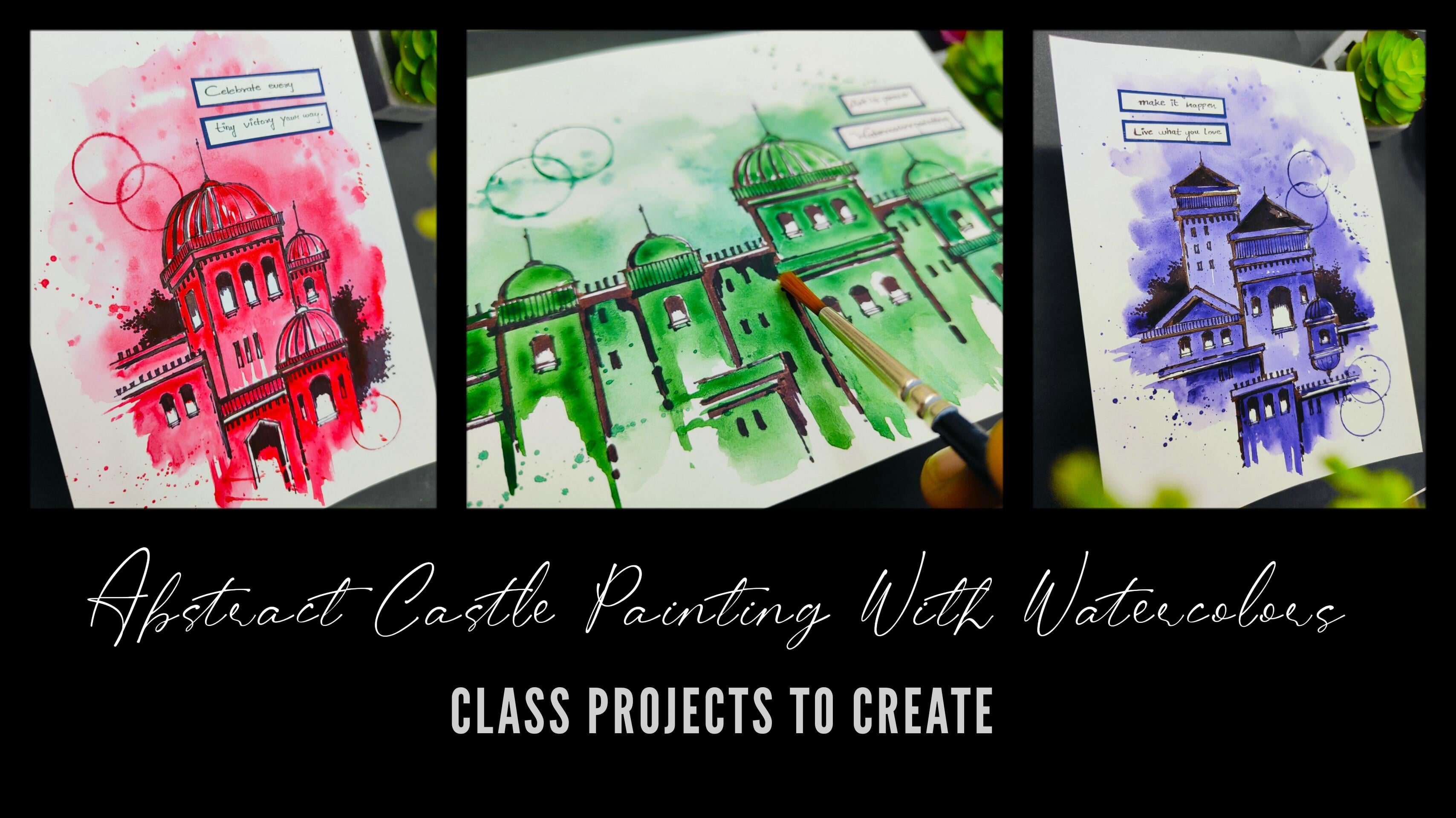
are going to create three beautiful abstract
castle paintings with the medium of watercolors. We are going to talk about
all the art supplies in detail that you will need
for this particular class. From brushes to all the
watercolors that you will need. We are going to talk about
the color palette that we are going to use in all
the three class projects. Before starting with
all the class projects, we are going to have a beautiful practice session in
which we are going to learn about all
the elements that we are going to paint detail. The practice sheet will
help you a lot to develop confidence and improvise your sketching and painting skills. The first step includes a
basic sketch using a pencil. Then the second step
includes inking of the basic sketch
using a black marker. We are going to
enhance and create a beautiful contrast using a
thick black marker as well. The last step includes applying water colors to the entire
sketch that we have created. No need to worry at all. It's a very easy and
simple technique of applying water colors. We are going to paint
a beautiful sky. Applying these minute
details that is going to enhance all the
three class projects. We're also going to add
some beautiful messages to all the three projects using some basic craft work all over. We are going to create all
the three class projects using three basic steps, which is sketching,
inking, and watercoloring. The class is absolutely suited for all level
artists and it would be really great
for beginners who are trying to develop
their sketching skills. I'm very happy and
excited to share this class with all of
you without any delay. Grab your art supplies and join me in this
creative journey.
2. Art Supplies: Everybody. Now let us talk about all the art supplies
that you will need for this particular class
in case you're missing out on any particular
art supply. No need to worry at all. You will find it very easily in any nearby local art
store or you can go for any other good
alternative as well. You can observe,
I have very well placed all my art
supplies on the desk. Now let me give you details
about it one by one. The first one is a very
important art supply, which is the brushes that
we are going to use. You will need only two
brushes for the entire class. The first one is of size zero and the second
one is of size two. These are basically
quill brushes, but in case you are not
having quill brushes, you can go for a
round brush as well. Then next up, we
have simple pencils that you will need to
draw a basic sketch. The next up, we
have three markers which we are going
to use for inking. The first one is
from fabric assele. You can observe the
tip of the marker. It's a thin tip, basically. Now, apart from this
particular marker, you can also go for a stick pen. This is also
basically a blacking and it is having a thin tip. No need to worry
about the markers. You can go for any
other good alternative. Also, then another marker which is also from fabricassele. This particular marker will
be having a very thick tip, which we are going to use to
create some nice depth and details so you can observe the tip of this particular
marker, it is very thick. Then next up, we have the
watercolors that we are going to use for
the class projects. For this particular class, you will need only
three water colors. The first one is deep
green, crimson, and oilet. No need to worry
about these shades. You can go for any other
good alternative as well. Also, in case you're missing
out on the exact color, you can definitely go for
any other good alternative. It is absolutely fine. The next up we have
a simple eraser, in case there is any
mistake while sketching, you can definitely
use an eraser. The next up, we have a simple tissue paper which we can use to dab our brushes so that we can remove excess amount
of water or color. Then we have a simple favistick which is basically
a glue stick only. We are going to
basically use it cap for adding some nice
details in the paintings. And we're also going to
use the glue to attach the small messages
that we are going to create using some
basic craft work. Then next up I have a simple
pair of scissor that we're going to use to cut out the messages from
the scrape of paper. Then I have these
two scrape of paper. One is a simple white paper and a dark blue colored paper. You can go for any other
good alternative as well. We are going to use some
basic craft work to add some nice messages
in the class project. As you can observe right now in all the three class project, we are going to add these
little messages using some basic craft work using this dark blue colored
paper and white paper. Now let's talk about
the sketchbook. This is basically a simple
five size sketchbook and it is 140 GSM. Just take care of the
GSM and you can use the sketchbook to create these
beautiful class projects, or else you can use loose
watercolor sheets as well. Then next up, I have a
simple color palette. Make sure your color
palette is having enough space to take out
multiple colors in it, as you can observe right now. Then I have a
simple glass holder in which I have some
colored water right now. But we are going to take some
clear water when we start. This is basically to
clean your brushes and apply water while
we are painting. These are all the
art supplies that you will need for
this entire class. No need to worry at
all in case you're missing out on any
particular art supply. You can go for any other
good alternative as well. I hope that you
got an exact idea and details about all
the art supplies. Now let us move
towards the next part.
3. Understanding the Color Palette: Everybody. Now let's talk about the color palette
that we're going to use for all the three class projects that
we're going to create. If you observe all the three
class projects carefully, it's a very cool and vibrant color palette that
we're going to use. Here I have a simple
sketchbook in which I have labeled all the
three colors in detail. Then we're going to learn about
the color combination and the solid black color
that we are going to use in all the
three class projects. We are going to
use a single color in all the three class project, which is basically known as a
monochromatic color scheme. I'll be giving you
the details about all the three water colors before we start applying
it onto the sketchbook, so that you can
observe it in detail. The reason behind applying it in a simple
sketchbook is so that you can observe the application of the color after it dries up. The three water
colors that we are going to use are volet, deep green and crimson that you can already observe
in the color palette. The reason behind studying the color palette is there
is a huge difference between the color in liquid form and the color once it dries up. I'll be taking my Quill
brush of size zero and we're going to learn about the first color,
which is violet. You can observe in
the color palette. We have a good composition
of water and color together. Make sure that you do
not have axis amount of water that will decrease the
saturation of the color. Now simply apply a small
patch of the color onto the watercolor paper in case you have axis amount
of water in your brush, You can simply dab your
brush onto the tissue paper. Now, right now, the
color is very much wet, but once it dries up, you can observe it carefully. Then next up, we
have deep green. Simply clean your brush and take some good amount
of water in it. In the color palette,
you can observe I have a good composition
of color and water together and simply apply a small patch of
deep green color. In case you find that your color is a little bit
less in saturation, you can just mix it well
in the color palette. Now you can observe
it's in a darker tone. Then we have the last
color, which is crimson. Now again, simply clean
your brush and water. Take some good amount of
crimson in your brush. Make a good composition of
color and water together. We are going to apply its
no need to hurry at all. Just simply apply a
nice patch of color. Right now, you can observe
it's very much wet. Once it dries up, you can
observe it in detail. Just below, we have a nice color combination of all the three
colors together. The first one is violet. Again, I'll be just making a simple vertical
movement of my brush. Apply a small patch of volet, clean your brush, and take
some deep green in it. You can simply combine it with the volet color that
we applied initially. Again, it's going to be a
simple vertical movement. You can observe that I'm
mixing my color well in the color palette and I will
combine it with the volet. You can observe that there is a nice variation from
volet to deep green. And then comes the
last, which is crimson. I have attached it with
the deep green color. This is basically the
entire color combination of all the three
colors together. You can mix it well, you can create your own
color palette as well. Now comes the last color, which is basically a
solid black patch, which we are going to create
using a thick black marker. In the class projects,
we are going to use this thick black marker to create some nice
depth and details. And we're also going to draw the bushes using
this black color. It creates a nice contrast
with the white paper. Now you can observe all
the three colors carefully onto the watercolor paper
and the black patch as well. This is the entire color
palette that we are going to use in all the
three class projects. In case you want to experiment, explore, and create
your own color palette. It is absolutely fine. You can also combine
two colors together. I hope that you got an exact
idea of the color palette. Now let us move
towards the next part.
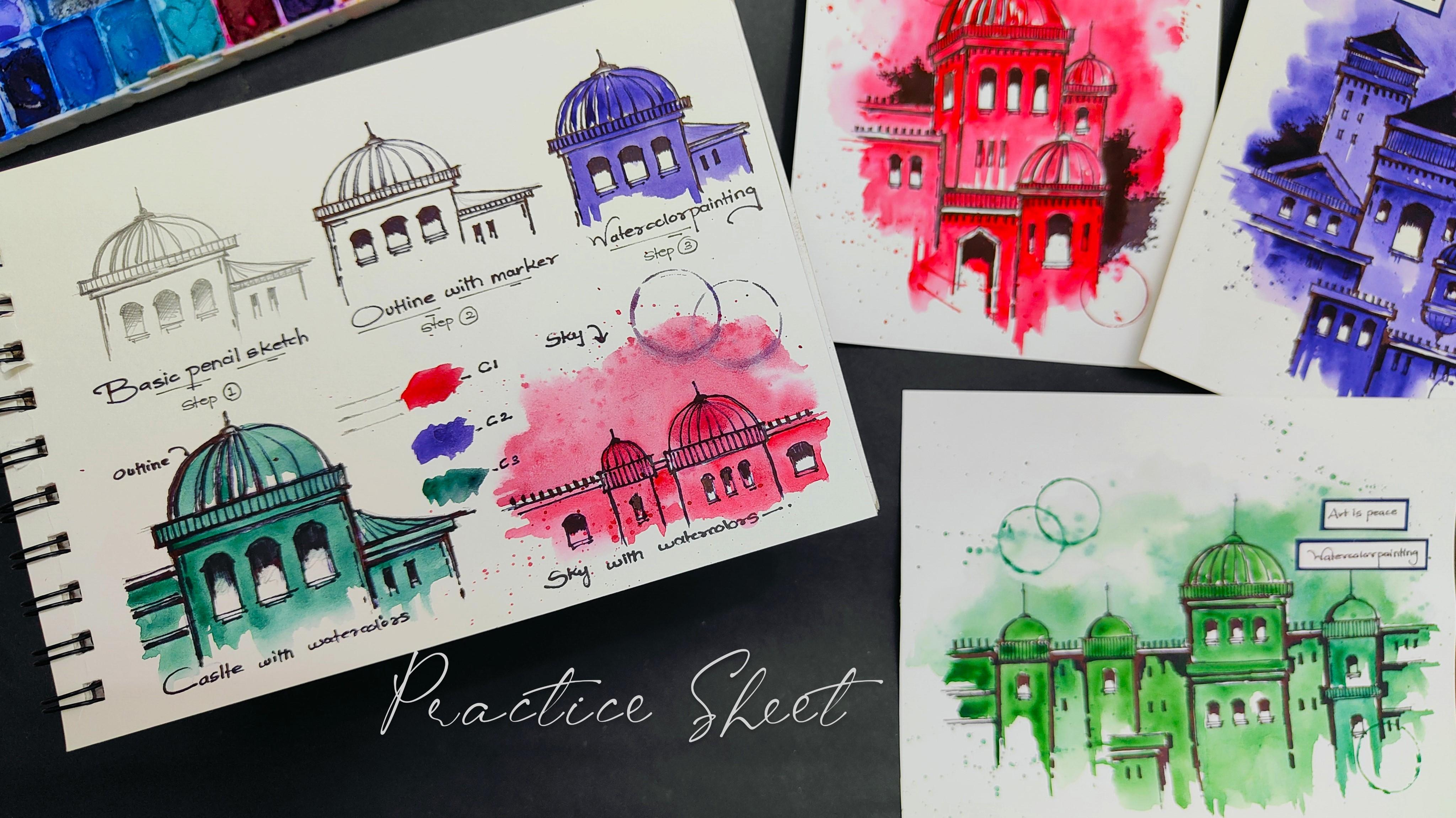
4. Lets Practice the Elements: Hey everybody. Before we start with all the
three class projects, let us practice all the
elements that we're going to use while creating all
the three class projects. The practice sheet will
help you a lot to develop confidence and improvise your painting and
sketching skills. You can observe all the
three class projects here. There are basically three
basic steps to create them. If you observe all the three
class projects carefully, there is a monochromatic
color scheme in all the three class projects before we start creating all
the three class projects. This practice session
will help you a lot to get a nice
prior knowledge of how we are going to create
them in the sketch book. The first step is a basic pencil sketch that we're going to draw
using a pencil. The second step is an
outline using a marker. And the last step is
watercolor painting, which is the third step. Let us start with
the first step, which is a basic pencil
sketch in the bottom portion. As you can observe, I'll use a simple pencil to
create a basic sketch. You can observe I have drawn a simple rectangular shape
and there is a simple dome, which is in a semicircular
form on the top portion. You have to observe the way
I'm making my pencil strokes. You don't have to worry
about perfection. Sketching is not
about perfection. You just have to create these strokes in a
very rough manner. Now we are going to just draw these simple windows in
a combination of three. I have just drawn a semicircular shape
on the top portion, and then you have to just create these details
in the bottom area. Now in the dome, you can
just apply these strokes to make it look a little bit more
aesthetic and attractive. Now similarly, I'll be having one more building element
on the right hand portion, having two small windows. Once you're done with
a basic rough sketch, you can dark the lines. You can apply a little
bit of more pressure in your pencil to make the sketch look a little bit more darker. This will create
a nice contrast, also with the white paper. I'm just adding these little
strokes in the windows so that it can create
a nice contrast and we know where to
apply darker tones. You can see there is a very simple and easy
technique of pencil sketching. You don't have to
hurry, just try to draw it in a slow
and steady manner. Now, I'll be using my
marker with a thin tip. You just have to
use a marker and follow the line that we
have drawn with pencil. No need to hurry at all. Also, no need to worry
in case there is a little bit of mismatch between the pencil line and
the marker line. It is absolutely
fine because this is basically known as a
rough sketching method. Just make sure that when you give an outline using a marker, no need to hurry at all. Try to apply it in a very
slow and steady manner. You can observe
that we are trying to cover all the pencil lines. And these vertical
lines basically creates a nice depth and details
to the entire sketch. You might be wondering why we are doing this particular step. This is basically to give you a nice grip of the art
supplies in your hand. It will also give you a warm up so that before you start
your final class project, you can get a nice
grip in your hands. Also, this particular
practice session will help you a lot to develop confidence and enhance your sketching
and painting skills. You can observe the movement of my hand and the way
I'm holding my marker. The hand should be
very much loose. No need to make it very stiff. Just try to keep your
hand very loose. And no need to worry about
the lines that we are making in case they are not
that much straight enough. It is absolutely fine. Now you can observe
that we are almost done applying an outline
using a thin marker. Now, I'll be using my
marker with a thick tip, which is having a very bigger
tip than the first one, creating some good depth and details to the
entire sketch. No need to hurry
at all. Just try to use this particular marker in a very slow and steady
manner because it is having a very thick tip and it
is going to give you a nice depth and detail
you can observe. We are not applying it
in the entire sketch, we are just applying
it in the edges. Now, to make the windows look a little bit
more attractive, and in contrast with the
background on the upper portion, you just have to apply
these vertical strokes and make them a little
bit more attractive. Similarly, we are
going to enhance the building area in the
right hand portion as well, so we are done giving
the outline to the entire sketch using
a black ink, basically. Now we are going to
apply water color. I'll be using my Quill brush of size zero in
the color palette. I already have some deep green. You can use any
other color as well. It is absolutely fine. Since it's a practice session, I'll be taking some good values of deep green in
the color palette. Add a little bit of water, make a good composition of
color and water together. Now you can observe the way
I'm using the tip of my brush to apply some water color
to the entire sketch. It's a very random and natural
way of applying the color. No need to hurry at all. It's
a very simple technique. You can observe the
movement of my brush. A simple horizontal stroke, initially, and then
a vertical stroke. We have applied the color in
the entire building portion, only leaving the windows. You can observe the white
color in the windows, and the background
color, which is green, creates a nice contrast
to the entire sketch. Similarly, you can apply the water color in
the building area, in the right hand portion, as well as you observed. It's a very easy
and simple step. I just created a similar sketch in the right hand portion. And we're going to learn how
to paint the sky area again. It's a very easy and
simple technique. I'll be using my Quill
brush of size two. Take some good amount of water and apply a thin coat of water, leaving the entire
building area, just outside the
entire building area. Now, once you have applied
a nice coat of water, take your quill
brush of size zero. Take some good amount
of crimson in it. And just observe the way I'm applying it in
the outline area, you'll observe that the color
will spread automatically. And it is basically known
as a wet on wet technique. Now this is how it looks in
the class project as well. Now, once we have painted
the entire sky area, you can take a little bit of
more color and just simply tap your finger to the brush so that you can
splatter some color. You will observe the color
forming in this dot manner, and it creates a very nice classic look to
the entire sketch. In case you're not able
to splatter the color, you can just add a
little bit of water. This is how we have
created a nice sky area. Now let me show you all the three color patches
on the practice sheet. The first one is crimson, then the second one is violet. Then the last one is deep green. These are the three colors
that we are going to use, which is also a part of the color palette for the
entire class project. To create some classic detail, I'll be using the cap
of my glue stick, put it in the color palette, and just make these
circular shapes. In the sketch area, you'll
observe a nice circular shape. Now let me take you a
little bit closer so that you can observe all
the details carefully. I have added few more labelings. The practice sheet
will help you a lot to develop confidence while
painting and sketching, and your chances of making
mistakes will be less. It would be really great if you practice prior to
the class projects. Now let us move
towards the next part.
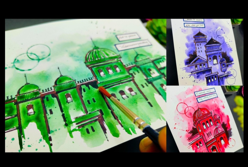
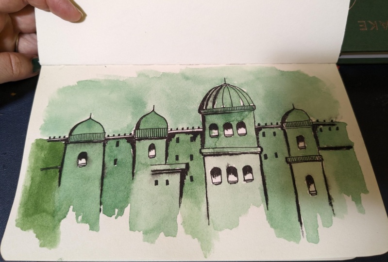
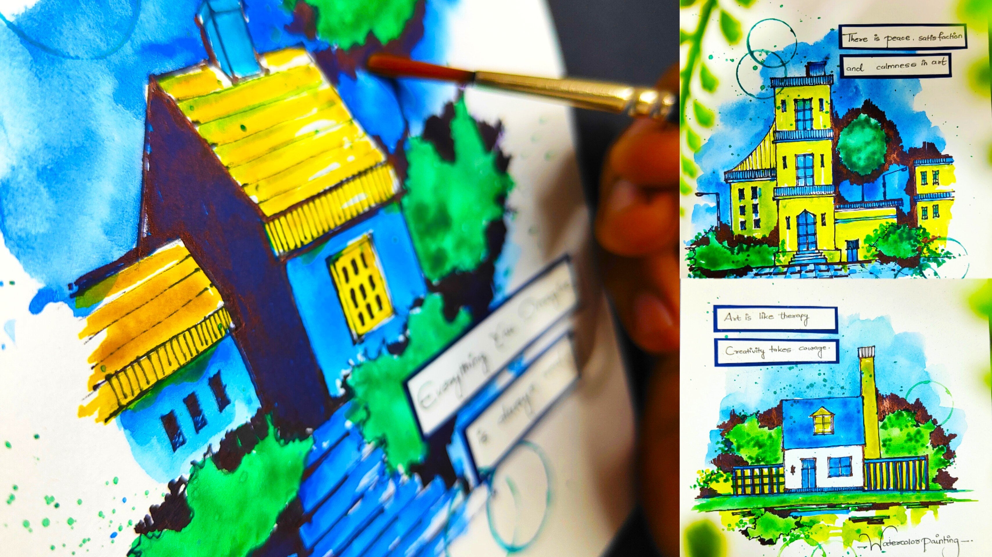
5. Painting 1 - Deep Green Castle: Everybody, you're most welcome
to the first painting, which is a Deep Green Castle. As you can observe, I'm ready
with my sketchbook and we will need a simple pencil to
start with a basic sketch. No need to worry
about sketching. It's a very simple
and easy technique. You just have to use a simple
pencil and start drawing. I'm starting with a
simple rectangular shape. You can observe that
I'm not trying to have a perfect lines here. You can observe the way
I'm moving my pencil. Now, once you're done
with a rectangular shape, just draw a semicircular dome
shape on the top portion. And you can observe I'm
applying multiple strokes. It's not a single stroke, No need to worry
about perfection. Now on the semicircular shape, you can add another
small semicircular shape and a simple tower
like structure, which is a simple vertical line. Now I'm starting to draw the vertical lines with
walls you can observe. Similarly, you have to draw
another rectangular shape. Once you have drawn two walls on either sides and repeat
the same process. Now you have to
observe carefully that I'm trying to make
rough strokes. Basically, these are
not perfect lines. Whenever we are sketching, try to keep a very
light and free hand. No need to make it very stiff. Just make sure that
your hand is loose and you just have to move your
pencil in a very free manner. If you observe carefully, we just apply very
light pressure to the pencil to get a very
basic sketch initially. Once you find that your sketch
is very much final enough, you can apply some
more pressure on your pencil to make the
sketch a little bit darker. You can observe
that I have added two towers on the
left hand portion, which are very much
similar to each other. And we have added two more
semicircular shapes on it. There is a little bit
of building structure on the bottom portion as well. Now similarly, we'll be adding another tower on the
right hand side. No need to hurry at all. Try to draw it in a very
slow and steady manner. So you can observe
that I have added another tower on the
right hand side as well, and I'll be adding some more
rectangular shapes in it. This particular tower is very much similar
to the first one, but it is a little bit smaller. You can observe that we have almost created the
entire structure. Now we'll add some
details which is windows. The bigger windows are having a semicircular shape on the top, and the remaining portion is
a simple rectangular shape. You can observe that
we are adding it in a combination of three
in the bigger tower. In the smaller tower, you
can add one single window. You can also play with the
composition of the windows. It is absolutely fine, and the smaller windows are
simple, rectangular shapes. You can observe that
the windows makes the sketch look a little
bit more aesthetic. It increases the amount of details in the
entire painting. If you might have observed
a castle in detail, it generally have a lot of
windows and details in it. Now, I'll be using my black
marker with a thin tip. The marker that I'm using
is from Faber Castle. You can go for any other
good alternative as well. Now I'll be simply
following the pencil line, but this time we're going
to add few more details. No need to worry at
all. Just simply observe the movement
of the marker. You can observe carefully. It is not a simple stroke. We are trying to
have some depth at the corners In the
rectangular shape, you can just add these
little vertical lines in a slow and steady
manner so that it can get some nice minute
details in it. Now if you observe
a single stroke, it's not a complete line
that we are following. We are moving the
entire marker in a rough manner, applying
multiple strokes. Similarly for the windows, also for the terrace area. You can add these little
rectangular shape to give some more minor
details to the entire castle. Now we'll be just simply
repeating the entire step, which is covering
the pencil line. One thing that I
would like to tell you is that no need to hurry. Just apply the inking in a very slow and steady manner in case you're not that much confident enough to apply
the marker directly towards your final painting and you do not want to spoil it. What you can do is you
can just practice it on a rough scrape
of paper initially, so that you can make your hand a little bit more loose and free, then you can come towards
your final painting. This will definitely help you to develop confidence
while sketching, and the chances of making
mistakes will be very less now. Similarly, I'll be adding the black ink to the bottom
building portion as well. You can observe it is a
very minute structure. Now let us come towards the
bigger building portion. No need to complete the
entire line in one go. You can just make little
strokes or you can apply multiple strokes to
cover the pencil line. Also, no need to worry about not overlapping
the pencil line in a perfect manner in
case your marker line goes a little bit out
of the pencil line, it is absolutely fine,
it's a rough sketch. No need to worry about
that in case you might be wondering
why we are using a marker rather
than a black pen. There's a reason behind it. If you observe carefully
the lines that we are applying right
now using a marker, there are these
strong saturated dots forming in the corners, which can happen only when
you use a solid marker. If you use a black pen, you can get an even stroke, which is also absolutely fine. You can choose according
to your convenience. But this particular depth looks very nice when we
apply the water colors. Right now you can observe
that I have covered all the six windows in the
bigger structure as well. Now similarly, we'll
be just completing the entire building area
in the right hand portion. Now you can observe the
entire castle looks in a very good contrast
with the background, which is solid white
color of our sketch book. These little minute details that we add using vertical lines in the entire structure create some nice aesthetics
to the entire sketch. You can do it in a very
slow and steady manner. Also, if you observe carefully, it's a combination of horizontal
and vertical strokes. There are a few
minor curvatures, but that is absolutely fine. Now you can observe
that we are done applying the outline
using a thin marker. Now I'll be using my marker with a thick tip which is a
solid black color only. This particular marker is
also from fabric assele, you can go for any other
good alternative also. Now this time we are
not going to cover all the lines using
this thick marker. We are just going to add it in certain areas where we want to create some nice
depth and shadow. You can observe
that I'm applying the marker in the wall edges, which is basically vertical. You have to be a little
bit careful when you use a thick black
marker because it is going to apply some
nice solid black color which is going to
be a little bit thicker than the first marker. Having a thin tip, you
can observe that I'm just enhancing the edges and I'm not applying it
in all the areas. Now the reason behind
using a thick, solid marker is it will create even more
depth and details to the entire sketch
and it looks really nice after the apply watercolors
to the entire structure. Also, I would like to suggest is that in case you're not
that much confident enough to apply a
thick marker directly towards your sketch and you
do not want to spoil it. What you can do is
you can definitely practice it on a rough
scrape of paper initially, and then you can come
towards your final painting. This will definitely
help you a lot to develop confidence
while sketching, and your chances of making
mistakes will be very less for the bigger structure. Also, I have applied the solid black marker in certain areas, only in the windows. If you observe carefully,
we are just applying these little vertical strokes in the topmost portion only. We are not covering
the entire window. We are almost done applying
the solid black thick marker. Also, let us add it
in few more areas. Try to have a very
loose and free hand while you are applying
this thick marker. Also, no need to make
your hand very stiff. Also, no need to worry
about perfect strokes. It is absolutely fine if your strokes goes a
little bit slant. Now comes the last step, which is applying water colors. I have taken some deep
green in the color palette. As you can observe, take color
in a required amount only. We have to save resources, so I'll be taking my
quill brush of size zero. In case you're missing
out on a Quill brush, you can definitely use
a round brush as well. Now I'll be adding a little bit of water in the color palette. Make a good combination of color and water together in
the color palette. So mix it well, no
need to hurry at all. Also, in case you
find that there is axis amount of water
in your brush, you can definitely dab your
brush to the tissue paper. It will remove axis
amount of water and we'll get a nice
saturation of the color. I'm starting from the
leftmost portion, no need to hurry at all. And you can observe
carefully that we are not covering the entire area up. It's an abstract
form of painting. If there are certain areas
which are left to be painted, it is absolutely fine. It will look really nice. I'm going to apply these
vertical strokes to cover the building area and you just have to leave the
window portion white. It will create a
nice contrast with the solid color that we
are applying right now. No need to color
inside the window. Just observe the movement of
my quill brush carefully the way I'm using the tip of my quill brush to paint
in difficult areas, you can observe
how carefully I'm not moving the brush
inside the window. We are particularly using
deep green color to make the entire castle look in a monochromatic color scheme. In case you want to go for
any other good alternative, that is absolutely fine. You're free to explore also. In case you want to explore with the composition of the
entire building structure, that is also completely fine. You can observe that we have almost applied the color
in the left hand portion. I'll be slowly moving
towards the right hand area. Now, if you observe in this
particular building area, we have solid black windows, so no need to worry about
getting the color inside that. One thing I can tell you about watercolors is that the
saturation of the color that you're observing right now will be one shade lighter
when it dries up. You can create the
combination of color and water together accordingly, so that you can get
a nice saturation of the color once the entire
watercolor dries up. Now I'm adding color to the
bigger building structure. You can observe that we have
painted the entire dome. Now slowly, I'll be
using the tip of my quill brush to paint in
the entire building area. I'm leaving the white space
in the entire window, and you can observe it creates a nice contrast with the water
color in the background. You have to be very much
slow and steady while you're applying the color in the
entire building structure. Because you have to
make sure that you do not go inside
the window area. Also, in case you find that the color is getting
finished from your brush, you can definitely take some more color from
the color palette. In case you find that you have axis amount of water
in your brush, you can definitely dab your
brush to the tissue paper. It will remove axis
amount of water from your brush and you can get a better saturation
of the color. Now similarly, I'll be
adding the color in the right hand portion of the entire building
structure as well. In the bottom portion, if
you observe carefully, we have left the color in a
very random and rough way. Leaving these vertical strokes. No need to worry about painting
it in a complete area. We have left it in this manner because it is an abstract
form of painting. I'm almost done painting
the entire castle. I'm just adding the watercolor to the last building portion, which is in the right hand area and you can observe the
way I'm leaving the brush. No need to worry
about painting it in the exact same way
I'm painting right now. You can have your
own composition and abstract format as well. Now we are going to paint
some beautiful sky area. Just simply turn your sketchbook so that you can get a
better hand movement. I'll be using my quill brush
of size two and we're going to apply a thin coat of water
outside the castle area. You have to be very much
careful while doing this. You can use the tip of the brush to apply the water
in the outline area. And simply apply the water using the entire surface of the brush
to the remaining portion. No need to hurry at all. Try to do this in a very
slow and steady manner. This is basically known as
a wet on wet technique, in which we apply a thin
coat of water initially and then some color
so that the color can spread in a very natural
and organic manner. This also creates a
beautiful abstract effect. Now I'll be using my
quill brush of size zero. Take some good amount of
deep green color in it, make a good composition of
color and water together. You can observe carefully. I'm using the tip of my
quill brush to paint the outline area and I'm not getting the
color inside the castle, you can observe that we get a nice darker tone just
outside the castle area. You can add a little bit of water and you can just
spread the color. The reason behind applying a thin coat of water, initially, you can observe it right now, the color spreads in
a very natural way. You can leave some
white space in between, which will give a
nice cloudy effect. Also, no need to worry
about the effect. It's a very natural
and random way of applying water colors. You can simply clean your brush, take some good amount of water, and you can make
the color vanish in the entire background area. Try to do this particular step in a very slow and
steady manner, in case you're not
that much confident enough to apply the
background color directly. You can definitely
practice it on a rough scrape of
paper initially, and then you can come
towards your final painting. This will definitely
help you a lot to develop confidence
while painting. Now using the same brush, just simply tap your finger
to the brush and just splatter this color in a
very random and natural way. So this basically creates a nice classic look to
the entire painting. And it makes the painting look a little bit
more aesthetic, so you can observe
the beautiful dots. They look really nice in the entire white background
and in the painting as well. So now I'll be using the
cap of my glue stick. You can use any
other object also. It is absolutely fine, just dip it in the color palette
having some water in it, and you will find these
beautiful circular shape. You can put the circular
shape wherever you want to according to whatever
composition you want to create. I have just added it
in a very random way, in a combination of two on the sky area and one
in the bottom area. You can use your quill brush, take some darker values of
deep green color and you can enhance these circles also using the tip of
your quill brush. Now I'll be using two
papers basically. One is a simple white paper, another one is a
dark blue paper. You can have a
different color of paper as well in case
you want to experiment. Now we're going to write a simple message
using our marker. I'm just writing
watercolor painting. And the second message
is art is peace. In case you might not be able
to see the way I'm writing, but you can just write it
in your own handwriting. Or you can write it in a
very good calligraphy way, It is absolutely fine. Now, once you have written
the entire message, just use a simple pair of scissors and cut
the entire message. I'm also going to separate watercolor painting
and arts piece. No need to hurry at all. Try to do this step in a
very slow and steady manner. Make sure that you
apply the cuts in a very nice way you can observe. We are done with
both the messages. Now I'll be using my
simple glue stick. Apply a little bit of glue on the back
side of the message. And simply place it on
the dark blue paper. And simply apply some
pressure using your fingers. Now similarly, I'll be adding some glue to the second message. Also, make sure that you apply some good
amount of glue so that your messages can get stick to the paper
in a good manner. Now, once we have
applied the messages, I have left some dark blue
space on the top portion. Similarly, we'll be just cutting
both the messages again, leaving some dark blue
paper in the outline. You can observe that I have completely cut the messages from the dark blue paper
and it leaves some nice dark blue outline
in the entire message. This basically creates
a nice contrast. You can create your
own positive quotes or you can write other
messages as well. It is absolutely fine if
you want to experiment. Now we are going to place
both the messages in the entire painting
to make it look a little bit more
aesthetically appealing. I'll be deciding the composition
of both the messages. We can place it in
the right hand area, we can place them
one below the other, or we can place it in the either sides of
the bigger castle. You can decide the
composition of both the messages according
to your convenience as well. It is absolutely fine. Okay. I'm thinking to place
it in the right hand portion. I'll be applying
some glue again and just simply place it on
the right hand portion. Apply a little bit of
pressure on the messages so that it gets completely
stuck to the entire painting. You can observe
that I have placed both the messages and we are done with the
entire painting. Let me take you a
little bit closer so that you can observe all
the details carefully. I hope that you enjoyed creating this
particular painting. I got to learn something new. Now, let us move towards
the next painting.
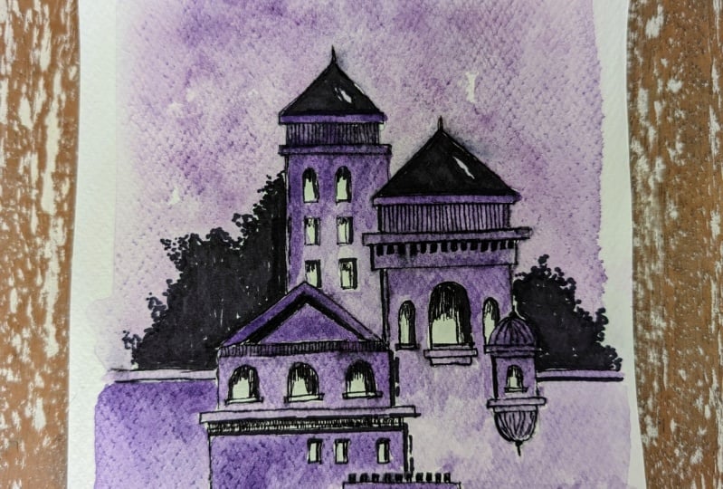
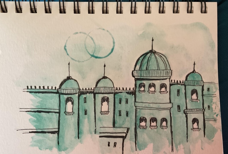
6. Painting 2 - Violet Castle: Hey buddy, You're most welcome
to the second painting, which is a violet castle. As you can observe, I'm ready with my sketchbook and this time we're going in a vertical
portrait manner, which is basically placing your sketchbook in
a vertical manner. I have my simple
pencil and we're going to start by
drawing a basic sketch, which is a triangular
shape on the top portion. No need to hurry
at all whenever we are sketching using
a simple pencil, try to apply least pressure and make a rough
sketch initially. Basically, it's going to
be a little bit lighter and when you find that your
sketch is perfect enough, or it's at least
looking like what you're trying to implement
in the sketch book, you can apply a little bit of more pressure to make the sketch look a little bit darker. You can observe
that I have drawn a simple triangular shape
on the topmost portion. And these rectangular shapes combining and forming
a building element. I'll be just drawing
the walls also. Now, if you observe carefully, I'm not trying to
apply a single stroke. Sketching is about
creating rough strokes. You can apply multiple
strokes to create a beautiful sketch and no need
to worry about perfection. So once we are done drawing
a building structure, I'm going to add a nice element which is very much beautiful. We're going to add it just below the first building element
on the right hand portion, creating two
semicircular shapes on the top and bottom portion and having a rectangular
shape in between. Now I'll be repeating the
same building structure, which is going to
be triangulated, but it's going to be a
little bit smaller than the first one you can
observe very carefully. I have just added it on the left hand portion.
No need to hurry at all. Try to draw it in a very
slow and steady manner in case you find any mistakes. You can use an eraser
to erase the mistakes. And draw it again. It
is absolutely fine. Now we're going to
add a nice element on the left hand
portion as well. Whenever you are
trying to create a basic sketch using a pencil, no need to hurry at all. Try to keep your hand
very much loose and free. No need to make
your hand stiff so that you can get these
beautiful rough strokes. And your hand would be really
moving in a very nice way. Now let us add some minute
details to the entire castle. I'll be adding two types
of windows, basically. The first one is a simple
rectangular windows that you can observe
are very small. And the second one is a
simple semicircular shape that you can observe right now. And just make these
rectangular shape in the bottom portion
to make the window look a little bit more
aesthetic and appealing. If you might have observed
castles carefully, you will observe
that there are a lot of windows and
complicated structures, which makes the castle look very much beautiful
and aesthetic. As you can observe,
we are almost done creating a
beautiful pencil sketch. I'll be adding
these little bushes in either sides of the sketch. You just have to create
the rough strokes and make a bush area. Now we are going to
outline the entire sketch. I'll be using my black
marker from Faber Castle. You can use any other
good alternative as well. It is absolutely fine. We are just going to follow the pencil line and give
a beautiful outline to the entire sketch in case you might be wondering
why we are using a marker rather
than a black pen. You will observe that we get a very beautiful
stroke using a marker, and there is going to be
the little black dots. When you leave the ends, observe the corners carefully in case you want to
use a black pen. Also, it is absolutely fine. You will find a
different type of outline when you give
it using a marker. In case you observe carefully, I'm not applying a single
stroke to make the outline. You can apply multiple strokes. Also, no need to worry
about overlapping the pencil line in exact manner. In case your marker line goes a little bit
out of the line, it is absolutely fine. It is a rough sketch. No
need to worry about that. Similarly, I'll be covering
the other building element. Also, it is always good to start outlining the entire sketch from the top portion and slowly
move towards the bottom area. Now you can observe in
the building structure, I have added these
little windows, which are rectangular in shape. While we are adding
this beautiful outline to the entire sketch. Let
me tell you one thing. Whenever you're using a marker, or let us take an example
of a pencil also, always try to keep your hand
very much free and lose. It's a practice.
Basically, no need to worry about getting it
in the first attempt. Only slowly the muscle
habit will develop. The reason behind this
is if you maintain a loose hand and try to keep your hand free
while you're sketching, you'll get a better output while giving an outline
or basic sketching. Also, one more thing
I would like to tell you is that in case
you're not that much confident enough
to give an outline to your entire sketch directly towards your final
class project. What you can do is
you can practice it on a rough scrape
of paper initially, and then you can come
towards your final painting. This will help you a lot to develop confidence
while sketching, and the chances of making
mistakes will be very less. Right now you can observe
that I have covered the building element in
the left hand portion. Now we are adding
the outline to the. Bottom building area as well. No need to hurry at all. Try to add the outline in a
very slow and steady manner. You can observe the way I'll add the outline to
the window element, just simply add this
semicircular shape on the top portion and then
complete the entire window. In case you find that
your line is going a little bit out of
the pencil line, don't worry about that. It is absolutely fine. It's a rough sketch element. Similarly, we are having windows in this building
element as well. The center window is
a little bit bigger. Then I'll be adding
the aesthetic element, which is very amazing. And I love this
particular element. In this particular
class project, if you observe carefully, it's a combination of
horizontal and vertical lines together that we are creating. There are a little
bit of curves, but it is absolutely fine. Adding minute details helps us to make the entire painting
look very much aesthetic. And it makes it look
even more better. Now we are going to
use a thick marker, which is having a
bigger tip than the first one, which is also black. And from Faber Castle you can go for any other good
alternative as well. It is absolutely fine. In this particular marker,
you'll observe that its tip is a little bit
thicker than the first one. I'm starting with the bush that we have in the
left hand portion, just beside the
building element. You just have to
apply the outline and fill in solid black
color in the inner portion, you can simply tab your marker tip to get this nice bush effect
for the entire bush. Similarly, I'll be adding
the solid black color in the bush that we have created in the right
hand side as well. Just simply create a random line and then fill in solid black
color in the inner portion. No need to hurry at all. Try to do this particular step in a very slow and
steady manner. Also at the same time,
no need to worry about drawing it in the exact
same way I have drawn. You can create your
own composition. In fact, you can
decide the position of the bush according to
your convenience as well. Similarly, I'll be adding the solid black color in
the building element. Also, for the triangular roof, we are trying to
cover the entire roof with solid black color, leaving a little bit of space which is going to create
a nice aesthetic. Using this thick marker, we are not going to cover
the entire sketch and give outline using this
particular thick marker. We're just going to apply it
in certain areas to enhance the entire sketch and create
some nice depth and shadow. For the second
building elements, I'm just covering the triangular roof with solid black color, leaving some space in between. You can also cover that up
with solid black color. It is absolutely fine
just below the roof. You can add these
horizontal strokes. No need to hurry at all. Try to do this in a very
slow and steady manner. You can also add details
using this thick marker. It's a combination of both a thin and thick
marker together. Now in the windows,
we are not going to apply this solid black
color in the entire window. We are just going to apply
it in the topmost portion, applying little
vertical strokes. But before that, I'll just
enhance them by applying a small line beside the
entire building element. As you can observe,
we have almost enhanced the entire
building element. Now let me tell you that in case you're not that much
confident enough to apply a thick marker
directly towards your outlined painting and
you do not want to spoil it. What you can do is you
can practice it on a rough scrape of
paper initially, and then you can come
towards your final painting. This will help you a lot to develop confidence
while sketching, and the chances of making
mistakes will be very less. Now, you can observe in
the window carefully, I have not covered the entire window with
solid black color. I have just applied
these vertical strokes. In the topmost portion, we are leaving white space in the entire window because when we are going to apply
the water color, it is going to create a nice contrast with the
background color. Similarly, I'll be
repeating the same step in the windows that we have in the bottom building
area as well. We are done adding the
depth using a thick marker. Also. Now the water
color that we are going to use for this particular
class project is volet. I'll be taking some volet
in the color palette. As you can observe, add
a little bit of water and create a nice composition of water and color together. I'll be using my Quill
brush of size zero. And we're going to start
from the topmost portion. No need to hurry at all. Try to keep your hand very
much steady and lose. You can observe that I applied a nice solid patch of volet starting from
the topmost portion, and slowly we'll be moving
towards the bottom area. Now add a little bit of water
to make the saturation of the color a little bit lighter as you move towards
the bottom area. It's a very simple
and easy step. No need to hurry at all. Now we are going to take some
nice saturated color again. And in the second building
element, repeat the same step. We are basically creating
an abstract painting in case there is a little bit of white space left in between. It is absolutely fine. I'm knowingly doing
this because we want to make the painting look a little
bit abstract and classic. If you find that the color is getting finished
from your brush, you can definitely
take some more color from the color palette. In case you find that there is axis amount of water
in your brush, just simply dab your brush
to the tissue paper, that axis amount of
water will be removed. Now you have to observe the movement of my
quill brush carefully. I'm using the tip
of my quill brush to paint in difficult areas, and I'm not moving my
brush inside the window. You will observe a nice contrast between the water
color and the window. It's a very simple
and easy step. You just have to keep some patience and paint
it in a very slow manner. Right now, you can
observe a nice variation using a single color, only where we have applied
more amount of water, the saturation of the
color gets a little bit less and it creates
a nice variation. Now similarly, I'll be painting the building element in
the left hand portion. No need to hurry at all. Just use the tip of your brush to paint in a smaller portion. Similarly, we'll be just adding the water color
near the window, but make sure that you do
not move inside the window. You have to leave
some white space to create a nice contrast
in the entire building. Now, in case you find a
little bit difficult to apply the water color directly towards your final
class project, what you can do is you can
create a rough sketch in a rough scrap of paper
initially, or a practice book. You can learn to apply water
colors in it initially, and then you can come towards
your final class project. It will definitely
help you a lot to develop confidence
while painting, and the chances of making
mistakes will be very less. Right. Now, you can observe
a beautiful dark tone in the topmost portion, and then I applied
a little bit of water to make a nice
variation in the colors. Now in the bottom portion, you have to just
observe carefully. We are not going to
paint the entire area. In the bottom area,
you just have to leave these strokes
in a random way. You can also create it
according to your convenience. It is absolutely fine, so no need to worry
about painting it in the exact same way I'm
painting right now. Also, you can play with
the color composition, you can change the
building position. That is absolutely fine. You are free to explore
and experiment. Now, I have also painted the favorite building
element of mine. And I'll be painting
the last element, which is in the bottom area. You can add a little bit of darker tones wherever
you want to. It is absolutely fine. In case you find that your color is finished from the brush, you can definitely
take some more color from the color palette. Make a good composition of
color and water together. In case you find the axis
amount of water in your brush, just simply dab it
onto the tissue paper. Let us paint some
beautiful sky area. Just simply rotate
your skate book so that you can get a
better hand moment. I'll be using my
Quill brush of size two and I'll be applying
a thin coat of water. Initially, just in
the outside area of the entire castle. No
need to hurry at all. Do it in a very slow
and steady manner. This is basically known as
a wet on wet technique, in which we apply a thin
coat of water initially. And then we apply a
brush full of color so that the color will spread automatically in the background, creating a beautiful
abstract effect. Once you have applied
a thin coat of water, take your quill
brush of size zero. Take some good amount
of ilet in it, creating a nice combination
of water and color together. Now you can observe carefully. I'll be using the tip of my
brush near the castle area. From the outline you can
observe the color will spread automatically in a very
natural and random way. If you observe, it's a
very easy and simple step. You just have to
keep some patience. Try to paint it in a
slow and steady manner. Use the tip of your brush to
paint near the castle area. And in the smaller
portion, slowly, you can just spread the
color in a very natural way. You can also leave
some white space in between to create a
nice cloudy effect. If you want to blend the color completely with the sketchbook, you can just clean
your entire brush. Take some good amount
of water in it, and just observe the way I'm blending the color
with the white area. We are almost done painting
the entire sky area. Now I'll be adding a little bit of water in the color palette. Take some good amount
of wilet in it and simply tap your finger
to the brush and splatter the color
randomly in the sky area and the castle area. No
need to hurry at all. Do it in a very slow and steady
manner and you'll observe these small dots forming and creating a nice classy effect
to the entire painting. Now I'll be using the cap of my glue stick and I'll just
put it in the color palette, add a little bit of water. Just put your cap in
the color palette. And you can place it wherever you want to in the painting. And it will create this
beautiful circular shapes. It is absolutely fine. You can place these circles according to your convenience. Now we're going to
add some beautiful messages to the entire painting. I have two rough
scrape of papers. One is white and another
one is dark blue. You can go for any other
good alternative as well. It is absolutely fine. The message that I'm writing
for this particular painting is live what you
love, make it happen. You can use any other
positive quote also. It is absolutely fine. You can select according
to your convenience. Now I'll be using a pair
of scissor and I have removed both the messages
in a rectangular format. Now simply I'll be
using a glue stick to apply it on the back side
of the entire message. And simply place it in
the dark blue paper, leaving some space
on the top portion. Similarly, I'll be
taking another message. Apply some glue in
the backside portion, and place it in the
dark blue paper. Apply a little bit pressure
using your finger so that it gets completely stuck
with the dark blue paper. Now again, I'll be
using a pair of scissor and we're going to
remove the messages again. But this time you have
to make sure that you leave a little bit
of dark blue space. It creates a nice
dark blue outline for the entire message. You can remove extra
amount of paper. It's a very basic craft work.
No need to hurry at all. Just do it in a very
slow and careful manner in case you want to use
a different message. That is also absolutely fine. Now, you can compose
both the messages according to your convenience. Wherever you want to place them, you can decide it according
to your convenience. Now, I'll be putting some glue again in the backside portion of the entire message and we'll simply place it on
the sketch area. Apply a little bit of pressure
on the message so that the message can get completely stuck with the entire painting. This particular
element also creates a nice aesthetic for
the entire painting, and we are done with the
entire class project. Let me take you a little
bit closer so that you can observe all
the details carefully. I hope that you enjoyed creating this particular painting and
got to learn something new. Now let us move towards
the next painting.
7. Painting 3 - Crimson Red Castle: Everybody, you're most welcome
to the third painting, which is a crimson red Castle. As you can observe,
I'm ready with my sketchbook this time. Also we are going to place
it in a vertical manner. I'll be using my simple pencil
to draw a basic sketch. We are starting with
a rectangular shape. This time we are
having the building element in a three D format. You just have to
observe it carefully. We are just going to keep it in a little bit of perspective. No need to hurry at all. Try to draw it in a very
slow and steady manner. I'll be adding the
walls right now. Once we are done with
the building element, we're going to add
a little bit of dome on the topmost portion. This time we are
having this particular element in a perspective manner. That's why it's a
little bit in three D, I'll be adding a
horizontal line in the left hand area where we have another
building element. Basically, it's a combination of horizontal and vertical
lines together. No need to worry about that. You can just practice it on a rough scrape of
paper initially, In case you find it a little
bit difficult to draw, then you can come towards
your final painting. This will definitely
help your lot to develop confidence
while sketching. You can observe I have added a semicircular dome in
the topmost portion. We're going to add a little bit of tower in the topmost portion by adding a little bit of vertical line in case
you find any mistakes. You can definitely
use an eraser to erase the pencil line
and redraw it again. Now let us add few details by adding these little windows. It's a simple semicircular
shape in the topmost portion. Then a regular window
in the bottom area, which is a rectangular shape. We have three windows and then one separately in the side area. Now I'm going to
add another dome in the right hand portion, which is a part of the
entire building element. We have another building
element in the bottom portion. It's a simple combination of two rectangular
shapes and two walls. Another dome area. This is
how we create a castle. Basically, it's a
combination of curves and horizontal and
vertical lines together. It is not at all necessary
or compulsory for you to draw it in the exact same
way I'm drawing right now. You can create your
own composition of the castle as well. If you have observed any castle, you will observe that
it has a lot of details by having small windows
and basic elements. And it's a nice form
of architecture. It is completely fine if you experiment according
to your convenience. I'll be adding one nice
door in the bottom area, which is triangulated
in the top portion. No need to hurry at all. Try to draw it in a very
slow and steady manner. Now I'll be using
my black marker, which is having a thin tip. Basically, using this
particular marker, we are going to give an
outline to the entire sketch. No need to hurry at all, try to give the outline in a
very slow and steady manner. We are basically starting
from the topmost portion, which is the dome area
of the entire castle. Now, one thing I
would like to tell you is whenever you're giving an outline or also we can talk about holding a pencil and
drawing a basic sketch, Always try to have your hand in a very free and loose manner. No need to make it stiff. If you keep your hand in a
very loose and free manner, you will definitely
be able to give the outline in a very
perfect and good way. But also while sketching and creating some
abstract paintings, you do not have to worry about
perfection as no need to worry about the marker line going a little bit out
of the pencil line, it is absolutely fine. This is basically sketching. No need to worry about
perfection can observe that it's a combination of horizontal
and vertical lines together having few
minor curves in between. You can also add
these little details by adding solid black, rectangular shape
on the roof portion while we apply the outline
using a solid black color, you can also observe
a nice contrast with the white paper in the background in case you might be wondering why we are using a marker rather
than a black pen. If you observe carefully in
the edges and the corners, you'll observe a solid black dot or a saturated black color. This happens when
we use a marker. If you use a black pen also, it is absolutely fine. You will get a simple line
rather than a marker. You can select it according
to your convenience, but this basically
looks a little bit more nice when we
apply water colors. Now, I'll be adding the outline
in the building portion, in the bottom area as well. You can also add these
little vertical lines in between the structure to
create some more aesthetics. Also, no need to worry about
applying a single stroke. You can definitely
apply multiple strokes to the entire sketch. Also, I'll be adding the
outline in the windows as well. Now you can observe
after the pencil sketch and applying the outline, the sketch looks a little bit
more in contrast and clear. We are going to
give the outline to the bush area in the
right hand side as well. I'm also going to create a
bush in the left hand portion. Also, now I'll be
using my marker, which is having a
thick tip basically. Then the first one,
this time when we apply an outline using
this particular marker, we get a nice solid black line. We are not going to
cover the entire sketch with this particular marker, we're just going to apply
it in certain areas where we want to create some
nice depth and details. This basically also helps us to create some nice
shadow effect. Now if you observe carefully, I'm just getting the
entire bush area done. You just have to
create the outline and fill in solid black color
in the inner portion. And you can simply tap your marker with these little
dots in the outline area. It creates a nice aesthetic. Now in the lines that
we have created also, you can apply few strokes. No need to give a single stroke. You can just apply it
in a very rough manner. If you observe the
windows carefully. I'm not going to cover the entire window with
solid black color. We have left some white
portion in the entire window. The reason behind leaving
some white space in the entire window is so that when we apply
the water colors, there is going to
be a nice contrast between the windows
and the water color. We are going to
repeat the same steps in the remaining
windows as well. No need to cover
the entire window. Just apply these little
vertical strokes in the topmost portion. Similarly, we can add these horizontal and
vertical lines in certain areas to create
some nice shadow effect. No need to worry about
adding the strokes in the exact same way
I'm adding right now. You can create your
own composition of the building
elements as well. You can experiment and explore. You can create the entire
scenery of the castle according to your
convenience as well. Now I'll be completing the bush area in the
right hand side as well. Just simply fill in
solid black color in the entire bush and just tap your marker using the
tip of the marker and create these little dot
structure in the outline area. It basically
replicates the leaves. And no need to hurry at all. Try to do it in a very
slow and steady manner in case you are not
that much confident enough to apply the thick
marker directly towards your final sketch and you do not want to spoil
your basic sketching. What you can do is you
can practice it on a rough scrape of
paper initially, and then you can come
towards your final painting. This will basically
help you a lot to develop confidence
while sketching, and the chances of making
mistakes will be very less. We are almost done adding
details using a thick marker. Also, I'll be just finishing these little windows
in the bottom area. Even if I'm using
a thick marker, you have to keep
your hand loose. The water color that we
are going to use for this particular painting
is crimson red. In the color palette, I have
taken some good amount of crimson red and just make a good composition of
color and water together. I will be using
my quill brush of size zero and we are starting
with the topmost portion. You can observe the way I'm using the tip of my Quill brush. This is basically an
abstract painting, so no need to worry about
covering the entire area up. If there is a little bit
of white portion left, it is absolutely fine. It will look really
aesthetic when it dries up. In case you find that your color is finished from the brush, you can definitely
take some more color from the color palette. Now you have to
observe, carefully while I'm painting the
building structure, you can observe the
movement of my quill brush. I'm using the tip of my quill brush to paint
in smaller areas, and I'm not going
inside the window. Now you can observe
a beautiful contrast between the water
colors and the windows. Now you can just
add a little bit of water in the bottom
portion so that the saturation of the
color will be a little bit less and you can observe
a nice gradient effect. Now, similarly, we'll
be adding the color in the building area that we have
in the left hand portion. On the topmost portion, you can take a little
bit of saturated color, having more color
and less water. You can just simply
add a little bit of water as you move
towards the bottom area. Again, you can observe carefully that I have left the windows, which is solid white, and it creates a nice beautiful contrast in the bottom portion. If you observe
carefully, we are not going to paint the entire area. I have just leave the
random vertical strokes, which creates a nice
abstract effect. Even if you're painting
using a brush, no need to hurry at all. Just paint it in a very
slow and steady manner. Try to keep your hand
very much loose and free. This will help you a lot to move your hand in a
very free manner. We are left with a
little bit of elements. We are just going to
repeat the same process. Also, one more thing I
would like to tell you is the saturation of
the color that you are. Seeing right now will be one shade lighter when it dries up. This is one thing
that you have to take care about water colors. Now, in this particular
building element also, you can observe
that I have applied a nice solid crimson red color. In the topmost portion, I'll be taking a
little bit of water, and as you can observe, it creates a nice gradient effect. The color basically becomes
a little bit lighter. When we apply more water,
we are almost done. I'll be painting the
last building element in the center area where we have the triangulated door structure. Also, adding this
beautiful color to the entire sketch is a
very satisfying process. You'll definitely enjoy it. While you're doing this
particular abstract painting, it is not at all necessary or compulsory for you to
select the same color. You can experiment and select the color palette according
to your convenience as well. Now let us paint a
beautiful sky area. Just simply rotate
your sketchbook so that you can get a
better hand movement. I'll be using my Quill
brush of size two this time and we're going to apply a thin coat of water
in the background. Just make sure that you do not move inside the castle area. Use the tip of your quill brush to apply water in
difficult areas. This is basically known as
a wet on wet technique, in which we apply a
thin coat of water initially and then
colored brush. This basically helps us to get a nice abstract background and the color can spread
in a very natural way. Now I'll be taking my Quill
brush of size zero again. Take some good amount
of crimson red in it, apply it with water. Make a good composition of
water and color together. And simply use the
tip of your brush to create this
beautiful outline area. You can observe the color
will spread automatically. And you can slowly move
towards the above area, leaving some white
space in between, which will create a
nice cloud effect. In case you want to blend the color with solid
white background, you can just clean your
quill brush in water, dab it onto the tissue paper, and simply blend it with
the background white color. You will observe it
that the color will get a nice blend with solid white
color in the background, and it creates a nice
abstract sky area. No need to hurry at all. Try to paint it in a very slow
and steady manner. I'll be taking some more color
and water combination in the color palette using my
Quill brush of size zero. And just simply
tap your finger to the brush splattering this
color in the bottom portion. And also you can splatter
it on the sky area. You will observe the
color forming in these little dots and it creates a classic abstract background. No need to hurry at all. Try to do this particular step in a very slow and
steady manner, and it's a very random
way of splattering color. Now I'll be using the cap of my glue stick and
just simply put it in the color palette and then
apply it in the painting. And you will observe these beautiful circular
shapes and you can apply it
wherever you want to according to your
convenience as well, I'll be using two
scrape of paper, one is a white paper, another one is a
dark blue paper. And we're going to add
a beautiful message. The message is, celebrate
every tiny victory your way, you can select any other
motivational quote or any positive message as well, according to your convenience. Now using a pair of scissor, I have taken out the cut out, you can separate
both the messages. Now I'll be using my glue
stick and we're going to apply it in the backside
of one of the messages. Just take the message, apply
some nice amount of glue, and simply put it onto
the dark blue paper. Apply some pressure
using your fingers. Similarly, we'll be doing it with the second message as well, in order to get a nice dark blue border for
both the messages. We have just pasted the messages
on the dark blue paper. Now using the same
pair of scissor, I'll be removing it from the
dark blue paper as well, leaving some space
between the paper. You will observe that
behind both the messages, we get this nice, beautiful,
dark blue border. You can remove the
extra portion, and you can observe both
the messages carefully. No need to hurry at all. It's a basic craft work that you can do in a slow
and steady manner. Now, when we are ready
with both the messages, you can just compose the
position of both the messages. Just apply a little bit of
glue in the backside portion. And simply place it
wherever you want to apply a little bit of pressure
so that the message can get completely stuck
with the entire painting. Similarly, I have added the second message and we are done with the
entire painting. Let me take you a little
bit closer so that you can observe all
the details carefully. I hope that you enjoyed creating this particular class project and got to learn something new. Now let us move
towards the next part.
8. Class Conclusion: When it comes to exploring
different art mediums, I personally love to
explore them in detail. The most amazing part
about watercolors is that you do not have to
worry about perfection, especially when it is
about abstract painting. There are a lot of
possibilities of creativity once you
start exploring them. While I was creating
this particular class, I made a lot of mistakes. And that is something I
always tell my students, never to be afraid
of making mistakes. One thing that I always tell
my students is to maintain an art journal in which you can practice on a regular basis. And keep a record
of your artwork. In case you have any questions or doubts related to the class, feel free to ask them into
the discussion section. No need to worry
about the output and painting it in the exact
same way I have painted. You can definitely explore and show your own
creativity as well. I would be very
excited to see all of your class projects into
the project gallery. The practice sheet
will help you a lot to develop confidence
while painting, keep learning, and
keep practicing. It would be really great if you leave a review
for the class, as it encourages me a lot to create some beautiful
classes for all of you. I'm very happy to share
this class with all of you. I hope that you enjoyed this particular class and
got to learn something new. Thank you so much for joining the class and happy painting.
 Rutvik Patel, Artist and Instructor