Transcripts
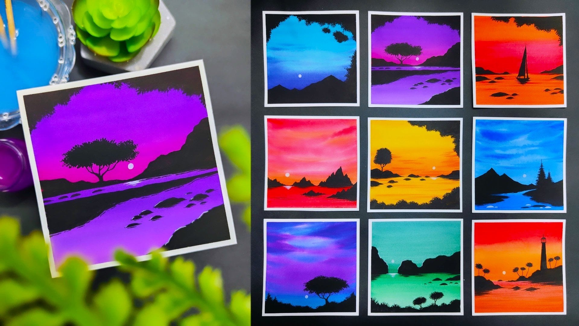
1. Welcome to the Class: When we talk about watercolors, it's a very free flowing
artistic medium. When we combine a basic sketch with the medium of watercolors, it can turn into something
really beautiful. Hey buddy, I'm Rick Pat. I'm a self taught
independent artist and an interior
designer by profession. You can find most of my artworks being displayed on Instagram. I go by the name Shira Artisans. In this class, we
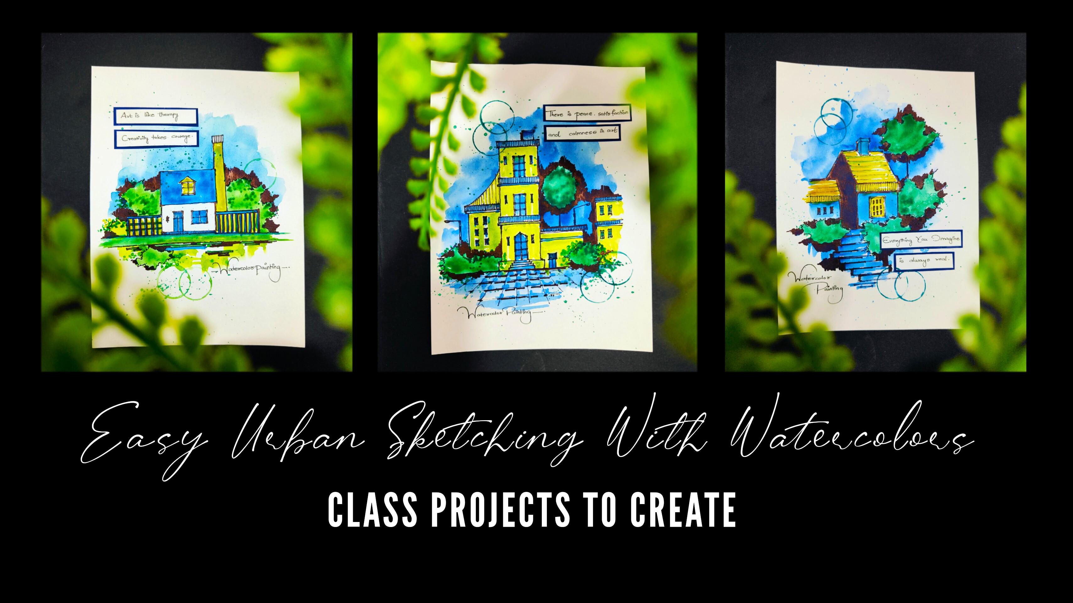
are going to create three beautiful urban sketches, combining it with the
medium of watercolors. There are going to be
three beautiful sketches that we are going to
do based on houses. The class is best suited
for intermediate artists, but also beginners and advanced
level artists can write. They're going to
start by learning about all the art
supplies in detail. We're going to talk about the brushes that we
are going to use. We're also going to talk about the markers and the pens
that we're going to use. They're going to talk about
the color palette in detail. The best part about the
class is that you will need only two brushes to create
the entire painting. Before starting with
all the class projects, we are going to have a beautiful practice session in which we are going to learn about
all the elements in detail. The practice sheet will help you a lot to enhance your
painting skills. We're going to start
with a basic sketch, painting the background,
having a vibrant sky. So we're going to move in
a step by step manner. I'll be teaching
you how you have to paint all the
elements in detail. You're going to enhance the
entire urban sketch and the watercolor painting together by using some depth and detail. Using the markers,
you're going to add a beautiful message using
some amazing craft work. It's a very simple
and easy class based on urban sketching. I'm very happy and excited
to share this class with all of you
without any delay. Grab your art supplies and join me in this
creative journey.
2. Art Supplies: Everybody. Now let's talk about all the art supplies in
detail that you will need for this particular class
in case you're missing out on any particular
art supply. No need to worry at all. You will find it very easily in any nearby local art store. Now let's talk about
the first art supply, which is a simple fevistick. It's basically a
simple glue stick. We're going to use this
particular glue stick to add some beautiful messages
into our class projects. No need to worry
about the brand. You can use any other
good alternative as well. Then next up, we have
a simple pencil to draw a basic sketch before
starting the class project. The next up, we have the
most important art supply, which is the brushes that
we are going to use. These are basically
quill brushes of size 0.2 You can use a
round brush as well, that is absolutely fine. The best part about this particular thing is that you will need only two brushes. Then here I have a
simple black marker. This particular marker
is from fabricasle. It's a thin tip black
marker that we are going to use to add some beautiful
details in the entire painting. Then another one is a
simple marker as well. This is also a black marker, only we can use this to add some beautiful text
in the entire painting. Then again, I have
one more marker which is from Faber Castle. This marker is a little bit
thick that we're going to use to add some beautiful
dark background in all the paintings. You can observe the tip of
this particular marker, it's a bit thicker
than the first 21. We're going to use the markers after we are done
with a basic sketch. Now let us talk about all the watercolors
that you will need for this entire class. There are going to
be five beautiful, cool watercolors that
we're going to use. The first one is bal blue, cerreline blue, light green, deep green, and gambage. These are all the
five watercolors that you will need for
this entire class. No need to worry about having the exact same
shade of the color. You can go for any other
good alternative as well. That is absolutely fine. Then I have a simple
tissue paper here. This particular art supply is very important
in water colors, so that you can dab
your brushes on it and remove excess amount
of water and color. Then next up, we have a
simple color palette. Try to have a good
surface area in your color palette
so that you can take out multiple colors, as you can observe
here right now. Then next up, we have
a simple container that we're going to use to
have some clear water in it. Don't worry, this is colored water right now in front of you. You will need container to
take some clear water so that you can make a nice combination
of water colors together. Then you will need a
simple tinted paper, which is going to
be darker in shade. And a white paper on which we're going to add
some messages. A simple scissor that
we're going to use to cut that messages that
we're going to create. Now let's talk about
the sketchbook on which we are going to
create the class projects. The size is 5.8 " by 8.3 ". It is 140 GSM. A GSM basically means
the thickness of the paper so that you can
apply heavy washes on it. You can observe the sketchbook. Right now, I have already created some
beautiful sketches in it in case you are missing
out on a sketchbook, you can definitely use loose
watercolor sheets as well. That is absolutely fine. Or else in case you're
having a sketchbook, only you can paint on it
and then you can remove the paper also in case you
want that to be framed. You can observe one
of our class projects in this particular sketchbook. This is how we are
going to create all the three class projects. These are all the
art supplies that you will need for this
particular class. No need to worry at all in
case you're missing out on any particular art supply you can go for any other
good alternative. Now let us move
towards the next part.
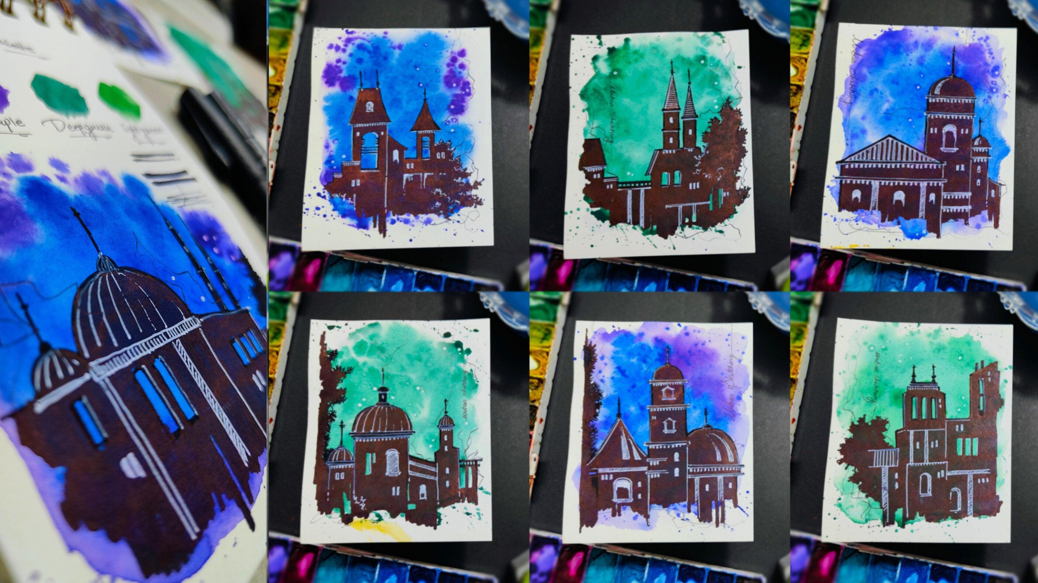
3. Understanding the Color Palette: Everybody, now let us talk about the color palette
that we're going to use in all the three class
projects you can observe. Right now, I'm ready with
all my art supplies. Nearby I have a simple
small sketchbook, and in this particular
class project, you can observe these beautiful, cool colors that we have used
for the entire painting. Now I have a small sketchbook
right in front of you. But before that, let me talk
about all the water colors. I'll be placing all the
tubes one by one in my hand so that I can take
you a little bit closer. As you can observe,
these are five beautiful, cool water colors. The first one is Gambage, then we have Cerlline blue. Then we have Cobal blue, light green, and deep green. These are all the
five water colors that you will need, no
need to worry at all. In case you do not
have the exact shade, you can go for any other
good alternative as well. That is absolutely fine. Now one by one, I'll be showing you all
the five colors on this particular sketchbook
so that you can observe how they are
implemented on the paper. I'll be taking my Quill
brush of size zero and I'm going to take the first
color which is cobalblue. You can observe in
the color palette. I have already taken out
some good amount of color, take a little bit of water
and lose in the color up. And you can observe in this
particular sketchbook, I'll be applying it in
this little manner. We are not going to apply
it on the entire surface, just a small patch
so that you can get an exact idea of how the color is going to
look on the entire paper. Once we are done applying
the first color, you can clean your brush in some water and dab it
onto the tissue paper. Take some good amount
of water again. And this time we're going
to take some Cerline Blue. You can observe in
the color palette. I have added a little bit
of water into the color, and I'll be again applying a little patch so that you
can observe it in detail. Now once we are done
with ceruline blue, I'm going to take
some gambage using the same steps I'll be
applying its small patch. You can observe that in
this particular sketchbook, I have just labeled
all the colors in the bottom portion so that
you can get an exact idea. This is how you can also create your entire color palette so that you know how the color looks on the entire
paper surface. Right now, I have
applied deep green. We are left with the last
color which is light green. You can just add a little bit of water in the color palette. Now I'm going to
apply the last patch. Now you can observe
all the five colors in a separate section and with its labeling on
the bottom portion. Now on the bottom area
of the sketchbook, I'm going to combine
all the colors together so that you can observe how the colors are
getting a nice variation. Once you have applied a
nice patch of deep green, we're going to continue
it with light green. Then similarly, I'll be
continuing it with bald blue. No need to hurry
at all. Try to do it in a very slow
and steady manner. This is just to get
an exact idea of how the colors are
getting a nice variation. This is basically a
cool color palette. I'll be taking some
serulene blue, continuing it with bal blue. Then we have last color,
which is gambage. You can already observe a beautiful variation from
deep green towards gambage. It's a nice color
palette that is forming. We have used only
five water colors. This particular part of creating the entire color palette
on a rough scrape of paper or a sketch book will
help you a lot while you are applying all the
colors in your class project. Now talking about
the last color, which is basically
a black color, which we're going to apply
using a marker only. You're not going to use
it with water colors. You can observe, I have
just applied a nice patch of solid black color
using this thick marker. Now you can compare
all the colors and the black color
also together, which is forming an
entire color palette. And you can just compare it with the class project placed
in the left portion. So these are all the
colors that we are going to use for all the
three class projects. No need to worry at all in case you're missing out on
any particular color. You can go for any other
good alternative as well. Now let us move
towards the next part.
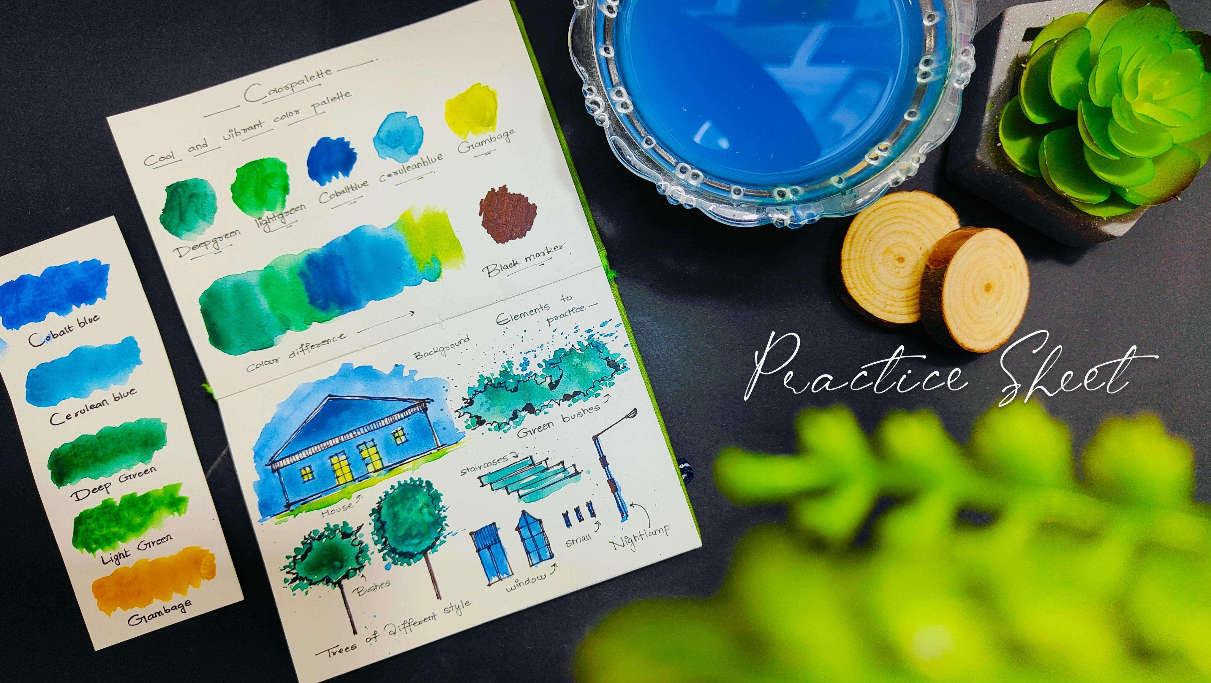
4. Lets Practice the Elements: Hey everybody. So before we start with the
class projects, let us practice some elements in detail so that you can get an exact idea of how to draw the sketch and combine
it with watercolors. So this is the entire practice sheet that we are
going to create, just below the color palette. I have some beautiful space. I'll be showing you
how you can simply draw a house using
a simple marker. Let us start by drawing
a simple house. I'll be using a simple
marker having a pointed tip. You can observe, I have drawn a simple roof which
is triangulated. You just have to draw
these two slopey lines. And no need to worry about
perfection while sketching. You just don't have to
draw a perfect line. Just try to have a rough line, but it has to be in
a good perspective. You can observe I have taken one more horizontal line
in the bottom portion. Right now, we are directly using a marker in
case you're not that much confident enough to sketch the entire house directly
towards your practice sheet. What you can do is you
can use a simple pencil, and you can create the sketch
using the pencil first, and then you can use
the marker on it. Now I have completed the entire house with
the walls and the base. We have drawn two
beautiful windows in a simple square and
just added some frames, adding a vertical
and horizontal line. And you can observe,
this is how you can just simply sketch
a simple house. You can also observe a similar house in one
of our class projects, which is placed on the
left hand portion. It is not at all
necessary that you try to draw it in the exact same
way I'm drawing right now. You can create your
own composition and the shape of
the house as well. Now we are going to have
some beautiful plant body in the entire class project. These are basically plants. You just have to move your marker in this
rough and random manner, creating a beautiful
organic line to make it look a
little bit in depth. I'm just adding this black
patches in between portion, you can observe that
we have created a nice plantation body also
using a simple marker. Then we have a tree also, in a particular class project, you can observe that you just have to create
this natural line. As you all know that
plants generally have a very natural and
organic shape. There isn't any specific shape
that we are going to draw. It's a very random and
natural way of drawing. No need to worry
about drawing it in the exact same way
I'm drawing right now. Once you are done
drawing the entire bush, you can just simply add
this vertical line, which is basically the
trunk of the tree. This is basically a simple style of creating a beautiful sketch. Now we have some staircase, so you just have to draw
these rectangular shapes. You can create a
combination of steps, as you can observe in the
class project as well. Now in this particular
class project, you can observe a
simple lamp post. You just have to draw a
vertical line using the marker and a line in an angle having
a small light at the tip. You can add the light
boxes also in between. This is how you have to use your marker and create
these beautiful shapes. We have some nice
windows and doors also. In this particular
class project, you just have to draw a
simple rectangular shape, add these little vertical lines, and you can just make a nice composition of
the dog and windows. We have another door which
is having a pointed roof. You can create that as well. You can observe
that I'm not adding a single line while I'm
creating the sketches. I'm trying to have double lines and I'm just making it in a
very rough and random manner. That is what sketching
is all about. By using a pencil and
the marker together, you can create
beautiful sketches. And you can practice them on a rough scrap of
paper initially. And then you can move
towards your final painting. That will definitely help
you a lot to enhance your painting confidence and your chances of making
mistakes will be very less. Now, I have used some
beautiful Coval blue in my Quill brush of size zero. Add a little bit of water in the color palette and just
simply paint the background. Use the tip of your brush to
paint in difficult areas. Similarly, I have painted the roof of the
entire house as well, taking some darker
tones of the color. While you're painting
the entire house, make sure that you do not take the color inside the windows and the door in case a little bit of color goes inside the doors and the window. That is fine, because this is a very natural and
free flowing medium. No need to worry
about perfection. Now I'll be taking
a little bit of gambage so that we can create a beautiful contrast with the color of the house
and the doors and window. Similarly, we'll be adding a
little bit of landscape in the bottom portion using
the tip of the round brush. Now I'll be painting
the plantations. So I've taken some
good amount of deep green and light
green together. Add a little bit of water in the color palette so that
you can loosen the color up. You can observe that
I'm using the tip of my quill brush to add
these little dots, having a good amount of
color so that we can create a nice texture in the outline
of the entire plantation. Similarly, I'll be painting the trees in the bottom portion. We are already done
with a sketch, having some good amount
of black marker. I'll be just creating this
entire solid color of deep green and light green
together on the outline. You can just randomly
use the tip of the brush to create a
nice organic shape. No need to worry
about painting it in the exact same way I'm
painting right now. You can create your own
composition and you can also work on
your brush strokes. Similarly, will observe that for this particular
practice sheet, there isn't any particular
thing about perfection. I'm just randomly moving my brush and covering
the entire area. You can observe
in the staircase. Also, there's a little bit of
color outside the outline, which is absolutely fine. It creates a nice authenticity to your entire
sketch and painting. You can observe using bal blue. I have painted the
windows and the door, some little windows and
the entire lamppost. You can add a little
bit of color in the color palette and
splatter some color by tapping your finger onto
the brush at the end. I have added some labelings
in the entire practice sheet. This particular practice
sheet will help you a lot to enhance your
painting confidence. You can find it in the
resources section.
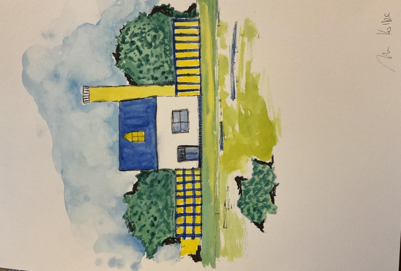
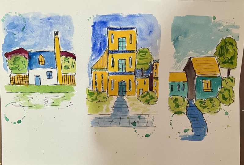
5. Painting 1 - Vintage House: Everybody, you're most welcome
to the first painting, which is a vintage house. As you can observe,
I'm ready with my sketchbook and I'll be using a simple pencil to create the basic sketch
of the entire painting. You can observe we are
starting with the roof of the entire house before
using the marker, which is going to
be black and create a nice outline for
the entire sketch. We are using a pencil
so that we can get the exact idea of where
to draw the elements. This will also help you a lot to enhance your
sketching confidence. Now, whenever you are
sketching with a pencil, just make sure that you do
not go for perfect lines. Whenever we are sketching,
you can observe that whenever I'm trying to draw a vertical
or a horizontal line, even if a slant line, there are multiple strokes
that I'm applying on it, there shouldn't be
one single stroke defining your entire line. Sketching is not
about perfection. It is about getting
a basic sketch of the particular thing
that you want to paint. You can observe that once we are done sketching the houses, we have one small house on the
left hand portion as well. Into that, I have drawn
these little windows, which are basically
rectangular shapes. No need to hurry at all. Try to draw it in a very
slow and steady manner. Observe the movement of my hand whenever
you're sketching, try to keep your hand in a
very loose and free manner. No need to make it very stiff. Now, once we are done
drawing the vintage houses, we are going to place some
beautiful plants around it. You can observe that
I'm just using the tip of my pencil creating
these organic lines, forming some beautiful
bushes around the house. Similarly, we are going to have a beautiful tree on
the top portion. I'm just adding a very
random and natural line creating a beautiful
outline of a tree. A simple vertical line, which is basically the
trunk of the entire tree. You can observe it's a very
random and natural way of creating some
beautiful plantation. No need to worry
about the perfection. Now we have some space on the bottom portion
between two bushes. We're going to add
some staircases. These are basically
rectangular shapes, having some variation in the placement you can observe as I'm moving
towards the bottom area, I'm slowly increasing the size
of the rectangular shape. This is basically
the perspective. Now, once we are done
with the rough sketch, we can just apply
some more pressure to the pencil and make the
sketch a little bit darker. You can observe that near the tips or wherever
the lines are touching, we are going to have
some darker values of the graphite pencil in case you want to know the
details about the pencil. It's a very simple
pencil that you can find it in a very local
nearby art store. There isn't any particular Gb
of this particular pencil, You can use any pencil, that is absolutely fine. It's a basic sketch only right now you can observe
that I'm just adding the lines again and
we are just adding these horizontal
line on the roof so that we can make it a
little bit in detail. Wherever we have the tips, we can just apply
some more pressure on the pencil so that we can
get some nice pointed edges. You can also observe I've added a double line
near the window. I'm just enhancing
the entire window by applying a little bit
of pressure on the pencil. Again, I'll be telling
you the same thing. These are basically
rough sketches. No need to worry about
perfection also. No need to worry
about drawing it in the exact same way
I'm drawing right now. It is absolutely fine if you
have some differences in case you want to create
your own composition and a beautiful scenery. Having a beautiful
vintage house, that is also absolutely fine. You can decide the
position of the house, you can place the
bushes according to your convenience as well. You can observe I have just created the darker tones
near the staircase, and I'm just enhancing the bushes by applying a
little bit of pressure in the pencil and we're done
with the entire basic sketch. Now we are going to
use a simple marker to make the entire
sketch in black, and it's going to create
a beautiful contrast with the background white paper. The step is absolutely same, you just have to follow the pencil line
that we have drawn. Just make sure that you do not go out of the line that we have drawn using the pencil
in case you go also, that is absolutely fine. You can just apply
a little bit of more strokes to cover
the entire mistake. You can observe
that I'm trying to apply a little bit
of pressure on the edges so that we can get
a nice rough sketch of the. Entire scenery with this
black marker as well. I'm adding these
little vertical lines to create some minute details. It will enhance the
entire roof area and make the painting look a little bit more attractive and aesthetic. I'll be telling you
why we are using a marker instead of a black pen. If you observe carefully
when you're using the marker to create these rough lines
on the pencil line, you will observe that on
the ends there is going to be a little bit of
darker tone of black value, or it will create a
nice dot on the ends. It enhances the entire
sketch very nicely. Rather than a black pen, you'll observe a beautiful outline for the entire sketch in case you want to experiment
it with a black pen. That is also absolutely fine. Now in the small windows
that you can observe, I'm just adding
solid black color by applying maximum
strokes inside it. Similarly, I have added these
vertical lines on the roof, on the smaller house as well. Now you can observe we are just creating the outline
for the entire window. You can observe that
my hand is completely free and in a very loose manner. No need to make your hand stiff in case you
make any mistake. Also, that is absolutely fine. It's a very rough
and natural sketch. Similarly, we are
going to create the outline for the
plantation as well. You can observe carefully that my marker is not moving
exactly on the pencil line. You can see the randomness
of the entire sketch. It is absolutely fine. Similarly, I'll be adding the outline for
the tree as well. You can observe that I'm using the tip of the marker
carefully right now. And you can apply a little bit of pressure
to get a thicker stroke. Also, in case you're
not that much confident enough to use the marker directly towards
your final class project, what you can do is you
can practice it on a rough scrape of
paper initially, and then you can come
towards your final painting. It will definitely decrease
the chances of making mistakes and it will help you to enhance your
drawing confidence. Now I'm adding the outline in
the staircase area as well. You can observe that I'm not
applying a single stroke, I'm just adding a lot of strokes to create
one single line. This basically creates a
nice rough texture also. So it's basically a style only no need to worry
about perfection. And you can just practice
it as much as you want to. And then you can come towards
your final class project. We are done adding a beautiful black outline
for the entire sketch. Now let us enhance the elements. So it's a very simple
and easy step. You just have to
add these little black patches by applying maximum strokes where we have these little cavities
in the bushes. So it's a very random
and natural process. No need to worry about adding these little black patches in the exact same way
I'm adding right now. You can decide the position of these little small black patches according to your
convenience as well. Now let me tell
you the reason of adding these little
small black patches. It will basically create a beautiful contrast with
the entire white background. What happens is that when we apply water colors to
the entire sketch, it becomes a little bit dull. The black line will get
a little bit bloody, and it will be a little
bit lighter in tone. By adding these
solid black patches, it creates a beautiful contrast with the water colors as well. The sketch can look a little bit more attractive
and aesthetic. Now, similarly on the bushes that we are having on
the upper portion, I'm also going to add these
little black patches. No need to hurry at all. Try to draw it in a very
slow and steady manner. Try to apply maximum strokes
to get a nice black patch. You can also enhance the lines
wherever you want to make the black outline a little bit thicker by adding
maximum strokes on it. Also, in case you're not that much confident enough to add these beautiful black patches directly towards your
final class project, what you can do is you
can practice it on a rough scrape of
paper initially, and then you can come
towards your final painting. This will help you a lot to develop confidence
while drawing. Your chances of
making mistakes will be very less you can observe. I have simply added one more
line on the entire outline, creating the entire sketch
in a very darker manner. This is basically my style of creating a beautiful sketch, which is a very rough
and random way. There is no perfection here. No need to worry
about drawing it in the exact same way I
have drawn right now. Now in this color palette, you can observe that we're
going to use two colors, cobal blue and ceruline blue
to paint the background, which is a beautiful,
vibrant sky. Take a little bit
of cobal blue in the color palette and a
little bit of ceruline blue. No need to worry about
the exact shade. You can go for any other
good alternative as well. Now I'll be using my
quill brush of size to take some good amount
of clear water in it. We're going to apply a thin coat of water in the background. Use the tip of your
quill brush to paint in the difficult areas and
make sure that you do not move inside the
house or the bushes. We are going to paint
the blue background only in the background area. You just don't have to move your brush inside the elements. You can move a little bit
in the staircase area, which is going to be blue only once we have applied
a thin coat of water. Take some good
amount of water in your brush and add it
in the color palette. Now simply just apply the
tip of your brush near the outline area and you will observe that the color
will spread automatically. You can use the surface
of the brush as well. Apply a little bit of pressure
on it, near the outline. Just be careful
and use the tip of your brush and you can observe
a beautiful background. The reason behind applying
a thin coat of water initially is it is basically known as a
wet on wet technique, so that the color can spread a little bit in a
natural and random way. You can observe. I have created some nice natural patches
near the staircase, also now inside the
staircase also, we are going to paint some bal blue and erolene
blue combination. I'm just using the tip
of my quill brush. Now here also, you
can observe that this is not at all
about perfection. There is some space left also with white background color. That is absolutely fine. It's a very random
and natural sketch. We are combining it
with porter colors. I'm taking some clear water in the Quill brush and you
can observe I'm just adding it on the outer area and it will spread the
background color a little bit. Now let me tell you
this once again, that no need to worry
about painting it in the exact same way I'm
painting right now. You can create your own
combination of colors as well. You can also paint it in
your own composition. Now I have taken
some good amount of ceruline blue and I'm adding it on one of the
walls of the vintage house. It's on the left hand portion. It creates a nice combination
with the background. That's why I've added
this particular color. Now on the front wall also, you can observe that
I'm using the tip of my quill brush of size zero. Be a little bit careful in case there is a little bit of
color inside the window. Also, it is absolutely fine.
No need to worry about that. Similarly, we'll be painting the wall of the
smaller house as well. You can add the darker tones
on the topmost portion. It's a good combination of
color and water together. Wherever you want to
have lighter shade, try to have more
water and less color. Wherever you want to
have darker shades, try to have more
color and less water. To make the sketch look a
little bit more classy, you can simply tap your
finger to the brush and splatter some color around
in a very natural way. Again, no need to worry
about perfection. I'll be taking some gambage
in my color palette. No need to worry about the exact shade you can go for any other good alternative. You can also experiment
with the color as well. Now I'll be taking my
quill brush of size zero. Again, take some good
amount of color and water together and you're
going to paint the roof. You can also observe that this particular color also creates a nice contrast with the colors that we
have used initially. Now again, it's a very rough and random movement
of the brush. You can observe it's a
simple horizontal movement leaving some space
in between as well. You can also observe carefully that while we are applying
the water colors, the black marker lines
are still visible and it creates a nice detail
in the entire sketch. You can also observe
the reason behind applying a darker tone
of marker as well. Even after applying
water colors, the outline is still visible and the sketch is really
clear right now. That's why we applied a thick
coat of solid black color. Now, similarly using
the bal blue color, I have painted the
chimney as well. Now we are going to
paint the plantations. So we are going to combine deep green and light
green together. Take a little bit of color
in the color palette. I'm taking deep
green and I'll be also taking some
light green as well. Now we are going to
combine both the colors together and paint the
bushes with these colors, creating some nice plantations
in the entire scenery. It's a good combination of all the colors together that we have in
the color palette. Take a little bit of water,
loosen the color up, combine both the
colors together, and simply apply it
in the entire bush. Again, no need to worry about getting the color
outside the outline. It is absolutely fine. You can observe that I've
covered the first tree now. Similarly, we'll be covering
the other bushes also near the house area. No
need to hurry at all. Try to paint it in
a very slow and steady manner in case you're not that much confident
enough to paint the color directly towards
your final painting. What you can do is you
can practice it on a rough scrape of
paper initially, and then you can come
towards your final painting. This will definitely
help you to improvise your painting skills and enhance your confidence
while painting, and the chances of making
mistakes will be very less. You can observe that we
have covered all the bushes and the tree using deep green
and light green together. I'll simply tap my
finger on the brush, flatter some color
around to make the sketch look a little
bit more classic. Now again, I'll be telling
you the same thing. No need to worry
about painting it in the exact same way I
have painted right now. You can create your
own composition and a beautiful color
scheme as well. You can always
experiment and explore. Now to enhance the entire
sketch and the entire painting, we're going to use
a thick marker, which is basically
a black marker only having a thick tip. And we're going to apply
this solid black patches to enhance and make
the entire painting look a little bit in depth. This is basically
my style of making the entire painting look a
little bit more attractive. You can apply the black patches randomly according
to your convenience. I'm just trying to add them near the bushes that
we have painted. So it's a very simple
and easy technique. You just have to create these little vertical
lines combining together, forming these little black
patches around the bushes. Right now, this basically helps us to enhance
the entire sketch. And you can observe that it
creates a beautiful contrast with the colors and the white
paper background as well. We already applied
a beautiful color on one of the walls of
the venttage house. We're also going to
make it a little bit darker so that it looks a
little bit more attractive. You can observe
that I have added the patches on the left
hand portion as well. No need to hurry at all. Try to apply these
solid black patches in a very slow and steady manner
in case you're not that much confident enough to apply the patches directly towards
your final painting. What you can do is
you can practice it on a rough scrape
of paper initially, then you can come towards
your final painting. This will help you
a lot to enhance your sketching skills and the chances of making
mistakes will be very less. Now, you can observe that
I'm using the tip of the marker to apply
these strokes again. And we're going to
make one of the walls completely black very carefully. You just have to use the tip
of your marker and apply a solid black patch on the entire wall on
the left hand area. No need to hurry at all. You can observe the movement of my hand and the
tip of the marker. It's a simple vertical movement combining all the
strokes together. Now you can observe a nice
contrast of the entire wall. We can also enhance
these staircases by applying these
horizontal strokes. And you can observe that, again, I have applied these strokes
in a very rough manner. It's not a complete stroke
I have left in between. Only now again, we are going to add a little text on the entire
portion of the painting, making the painting look a
little bit more aesthetic. I'll be writing a
small message on a rough scrape of
paper which is white. You can use any rough
scrape of paper, it is absolutely fine. The message that I'm writing is, everything you imagine
is always real. It's a very simple positive o, you can write in a good
calligraphy and you can simply cut it out
using a pair of scissor. I've written the
message in two steps. We have one line on
the top portion, another on the bottom portion. Simply cut it out,
leaving some space. And you can observe we have
got two rectangular pieces. Now to enhance both the pieces, we are going to use a
nice dark blue paper. You can use any other
good alternative as well. It is absolutely fine, whichever is available
with you now, you can just cut off the extra edges from
the message paper. I'll be using my glue stick and we're going to apply
it on the back side. Make sure that you apply the
glue on the back portion. No need to apply it where you
have written the message. Be very much careful
while applying some glue and just paste
it on the dark blue paper. Carefully apply
some pressure using your finger so that
the paper can get stuck to the dark blue
paper completely. Similarly, I'll be
adding some glue on the smaller message as well and apply it just
below the first one. You can observe I have left some space around the messages. Now we're going to
cut it out again. This time you're going to leave some space having some dark
blue in the background. No need to hurry at all. Try to cut it in a very slow
and steady manner. Make sure that your
cuts are perfect and be very much careful while
you're using a scissor. Now you can observe
that we have got a nice dark blue border
for both the messages, and it makes the messages look a little bit more
attractive and aesthetic. It will also create
a nice contrast with the painting as well. You can observe we
have some extra edges, You can just simply remove it. Be very much careful
while using the scissor. Just make a parallel cut
with the paper edge. Just remove the extra portion,
no need to hurry at all. Try to cut it in a very
slow and steady manner. You can remove the extra pages and we are done with
both the messages. Now you can place
both the messages according to your convenience. It is absolutely fine. You can decide the position. I'm basically going to place it here on the bottom right corner. You can apply some more glue on the back side
of the messages. And apply some good
amount of glue so that the messages do not get
removed from the painting. Now you can simply apply some pressure using your
finger so that the message can get stuck with
the entire painting. No need to hurry at all. Try to do it in a very careful manner and you can
observe we have added a nice positive quote
in the entire painting. Now using my marker, I'm just going to add a little
text which is handwritten. It's watercolor painting, you can write it in
a good calligraphy. No need to hurry at all. Try to write it in a slow
and steady manner. We have created a
nice combination of painting message and
some text together. I'll be using the lid or I can say the cap of the glue
stick which is circular. Add a little bit of water
in the color palette and simply use this to get
this nice circular shape. Simply dab the cap to the color palette and place it on the entire
watercolor paper. In this combination of
two circular shapes, or even one, is absolutely fine. You can do it according
to your convenience. It's absolutely fine. Now let me take you a little bit closer so that you can observe all the details carefully and they are done with
the entire painting. This is how you can create
a beautiful combination of an urban sketch with a
medium of watercolors. I hope that you enjoyed
this particular painting. Now let us move towards
the next painting.
6. Painting 2 - Blue Cottage: Everybody, you're most welcome
to the second painting, which is a blue cottage. As you can observe,
I'm ready with my sketchbook and all
the art supplies nearby. Now this time we are going to directly sketch using a marker. In case you are not
that much confident enough to sketch it
directly using a marker. You can use a simple pencil to initiate the initial sketch, and then you can overlap it
using a solid black marker. Right now, I'll be just
drawing the house initially. We're going to start by
drawing the roof first. So it's a simple,
rectangular shape. Now, while you're using
a solid black marker, no need to hurry at all. Try to draw it in a very
slow and steady manner. It's going to be a very
rough and random sketch, so no need to worry
about perfection. You can also observe
that I'm not applying a single stroke to
draw a simple line. I'm applying multiple strokes
to get a nice sketch. So you can observe
that I have drawn a simple window inside
this rectangular shape. We also have a small
triangular shape just above the
rectangular shape. Now to make the window look a
little bit more attractive, I'm just adding a simple
vertical and horizontal line to draw the frame of
the entire window. Now let us draw the walls. These are, again,
simple vertical lines and a small horizontal line, which is going to be the
ground line as well. I have extended
the ground line on both the sides because we are
having some more elements. Also, you can observe
that I'm adding few more strokes to make the
line a little bit thicker. Now I've added a simple
horizontal line. And we're going
to draw the door. And one more window. No
need to hurry at all. Observe carefully, and you can observe that I'm also adding few more strokes
to make the sketch look a little bit more
rough and authentic. This is basically my style of creating sketches and
it is absolutely fine. No need to worry
about drawing it in the exact same way I'm
drawing right now. You can practice and
you can just make sure that you are able to
sketch in an easy manner. I'll be adding these
little strokes, enhancing the entire house. So you can observe,
we have drawn the entire cottage and it looks really simple and elegant. Now we're going to
add a little chimney, but before that let's add some fence on the
right hand side, draw a simple horizontal line. We are just drawing
a double line and we are going to add
these vertical lines, which are part of the fence.
No need to hurry at all. Try to draw it in a very
slow and steady manner in case you find that your lines
are not that much straight, it is absolutely fine. No need to worry
about perfection. Sketches are always very
much random and rough. Now, once we are
done with the fence in the right hand portion, I'm going to add
a little chimney which is a little bit heighted
than the entire cottage. It's a very simple
and easy technique. As you can observe, we have
drawn the entire chimney. Now let us add a
nice bush which is basically going to be green and this is a
part of plantation. In the entire scenery, you just have to draw
organic and natural shape. There isn't any specific
way of drawing it. You can draw it in a very
random and natural way. Now we are going to
have one more fence on the left hand portion. It's again, a very
simple and easy step. Just draw these
double lines having a horizontal and vertical
lines forming together. Now this time we
are going to have some horizontal lines in the
between portion as well. This basically makes
both the fence look a little bit different. Now we're going to add a
little bit of bushes on the background just
above the fence that we drew on the left
hand portion as well. No need to worry
about drawing it in the exact same way I'm
drawing right now. You can create your
own composition of the bushes as well. You can create your
own composition by placing it in
different manner as well. We are done with
the entire sketch. Let us add some nice
road in the front area. I'll be adding one
more horizontal line. And you can observe I have drawn it in a very rough manner, not a single straight line. It's a very rough and
random way of drawing. You might be
wondering why we are using a marker rather
than a black pen. There's a reason behind it. If you observe carefully, the marker leaves a
little bit of black dots and it makes the ends look a little bit
thicker and darker. It creates a nice depth and
detail in the entire sketch. You will also observe it carefully while you're
drawing it practically. We are almost done with
the entire sketch. Let us add these
little black patches. We are just going to add
these vertical lines, or we are just going to add
these rough black patches in certain areas to make the sketch look a little
bit more in depth. No need to hurry at all. Just take your time.
Observe it carefully. And just apply some
more lines to make the sketch look a little bit
more darker and in depth, in case you're wondering
why we are adding these little black patches
in the entire sketch. Let me tell you, once we
apply the watercolors, the sketch might get a little
bit lighter in tone to make sure that the sketch is also in an even tone
with the watercolors. We are just adding these black
patches in certain areas so that it looks a
little bit more in contrast and the sketch
is completely visible. I have added a little bit of plantation in the
bottom portion as well. Now let us paint a beautiful I've taken some cobalt blue and ceruline blue in my
quill brush of size to take a little bit of water in the color palette,
to loose in the colorra. Use the tip of your quill brush to paint in difficult areas. Basically, the outline of the entire house
and the plantation. Make sure that you
do not move inside this particular area
in case you move also. That is absolutely fine. It's a rough way of creating a beautiful watercolor sketch. It is absolutely fine. You can, but make sure that you paint it in a
very careful manner. You can observe a
beautiful, vibrant sky. It looks really amazing
when it dries up. No need to hurry at all. Try to paint it in a very slow
and steady manner. You can simply take
some more amount of color and make the
entire background a little bit more wider by applying some more strokes
on the outer area. Now let us state some darker
values of Cobal Blue. I'll be taking my Quill
brush of size zero. Add a little bit of water
in the color palette and make sure this time you have more amount of color
and less water. We want a nice saturation
of the entire color. I'll be using the tip of my Quill brush to paint
in difficult areas. No need to hurry at all. Try to paint it in a very slow
and steady manner. Make sure that you do not apply color inside the window
because it is going to be in a different color in case it does goes
inside the window. That is also absolutely fine. You can observe I have
covered the entire roof using cobalt blue and
seruline blue together. And it is a little
bit darker than the background color
because we have used less amount of water now. Similarly using the same color, I'll be painting the fence which is in the
right hand portion. Simply use the tip of your quill brush
and apply the color and you can observe a beautiful contrast with
the background as well. Now similarly we'll be painting the fence on the
left hand portion. You just have to
apply the brush above the lines that we have
drawn using the marker. Now, I'm just adding
a little bit of blue color in the
road area as well. I'm just applying the
strokes in a random way, only there isn't any specific
way of applying them now. Simply using the tip
of the quill brush. I'm painting the door and
window in the ground floor. No need to hear at all. Try to paint it in a very slow
and steady manner. You can also observe that
the lines that we have drawn using the
sketch pen are not that much faded or
becoming lighter. Even after applying
the water color, they are still visible. And that is the
most amazing part about the entire sketch, I'll be using a little bit of gambage in the color palette, using my Quill
brush of size zero. Apply it in the window,
on the roof area, and the chimney that we have painted. No need
to hurry at all. It's a simple vertical
movement and just paint it now we have some space
in between the fence there. Also, you can apply
this gambage. It can enhance the
entire fence area and creates a nice contrast
with the blue color as well. I have added it a little bit in the bush that we have on the
left hand portion as well. Right now you can
observe that there is no perfection while we are painting this
particular scenery. I'm just applying the color in a very random and natural way. You do not have to
worry about painting it in the exact same way
I'm painting right now. You might get a different output and that is absolutely fine. This is the specialty about
this particular sketching. As you all know
that water colors are a very free flowing medium. I've taken some deep
green and light green together and I have
painted all the bushes. You can observe that it
is absolutely fine if the color goes outside
the outline as well. This will make your
entire painting look a little bit more
authentic as well. I've taken some darker tones of the color having less
amount of water in it. In case you have axis
amount of water, just simply dab your brush to the tissue paper so that axis amount of water
will be removed. Now simply tap your brush
on the entire bush area, leaving these darker tone dots, you will observe
a nice variation of dark green and
light green together. Now similarly, I'll
be doing this on the bushes that we have in
the bottom portion as well. In case you want to loosen the color up in
the color palette, just simply add a
little bit of water. Now let us paint the road. I've added a little bit of green on the left hand portion. Take some gambage and just
apply it on the entire road. You will observe a nice
combination of green and gambage together you can observe it's a very random and
natural way of painting. You can see how roughly I'm applying these strokes to make the painting look a little
bit more rough and authentic. We are almost done
applying the colors. Now let us add some gambage
on the bottom portion, you can observe the
movement of my Quill brush, and I'm just adding it
on the bottom portion. Now in order to create some nice aesthetics in
the entire painting. To make it look a little
bit more attractive, add a little bit of water in the color palette,
loose in the color. I'll be taking the
cap off my fevistic. I've just added these
little circular shapes in the painting in a
very random way, only. There isn't any specific
way of adding them. You can decide the position according to your
convenience as well. This basically makes a nice
classic style of a coloring. I'll take my quill brush
and tap my finger on it to splatter some color randomly on the entire painting. No need to hurry
at all. Try to do it in a very slow
and steady manner. We are almost done with
the entire painting. Now I'll be taking my marker, which is having a thicker tip. Now we are going to enhance
all the elements together. Initially, we apply
small black patches in the entire painting to make
some nice depth and detail. Now this time we're
going to apply some bigger black patches
which is going to create a nice contrast of
all the elements and the background. No
need to hurry at all. Try to apply these little vertical lines
combining together, forming a nice big black patch. This is basically my style of creating some nice
urban sketches. Combining it with watercolors, it makes it look a little bit more authentic and
creates a nice sense of sketching in case you're not that much
confident enough to apply these dark
black patches and you do not want to spoil your
beautiful class project. You can practice it on a rough
scrape of paper initially, and then you can come
towards your final painting, so that the chances of making
mistakes will be very less. And you can develop some
more confidence of applying these beautiful black patches
in the entire painting. You can observe I
have added it on the fences and some more
strokes on the bottom portion, very randomly, in
a natural manner. Now let us add some
beautiful messages, basically some
positive quotes that we're going to add to
enhance the entire painting. I'm going to write a
nice positive message. Art is like therapy. Creativity takes courage. You can select any positive te, according to your convenience. It is absolutely fine. I'm having two lines basically. And then I'm going to use a pair of scissors to cut
them carefully, leave some white space, and just simply remove
the entire message. We are going to have the
message in two parts. Basically, you can
observe how carefully I have divided into two parts. Now, once we are done removing both the messages from a
rough scrape of paper, you're going to add a
darker tone paper on the background so that both
the messages gets enhanced. I'm going to use a
dark blue paper. You can go for any other
good alternative as well. You can use any other
color paper as well. I'll be using a fevistic, applying some glue
on the back side of the entire message. No
need to her at all. Try to apply the glue
in a nice way so that it gets stuck to the
paper in a good way. Similarly, I'll be adding some glue in the second
message as well, and placing it just
below the first one. Simply dab your finger
onto the message so that it gets stuck with
the background paper. I'll be using the same scissor and removing the messages again. But this time we have to leave some dark blue space so
that we get a nice outline. You can observe how beautiful
the entire message looks. Once we apply a nice dark
blue color in the background. No need to hurry at all. Try to remove the edges
in a careful manner. We are ready with
both the messages. Now we are going to place
them in the entire painting. You can decide the position of both the messages according
to your convenience. You can place it in whatever
manner you want to, even if you want to place
it in a vertical manner, that is also absolutely fine. The reason behind adding these beautiful
messages is so that we can make the
entire painting look a little bit more
aesthetic and attractive. In case you want to
place one message on the above portion and
one on the bottom, That is also absolutely fine. You can make your
own composition. I'm going to place
both the messages on the top left corner. I'll be adding some glue again
in the backside portion. No need to hurry at all. Do it in a very careful
and steady manner. I have placed one message. Similarly, we'll be adding some more glue in
the second message. Once you're done
applying the glue, just place it below
the first one. Now you can observe we are
done with both the messages. I'll be using my another marker, which is basically a
black marker only. And I'm going to write
watercolor painting on the bottom right corner so you can observe that we have nicely composed all
the elements together. Let me take you a little
bit closer so that you can observe all
the details carefully. I hope that you enjoyed this particular painting and
got to learn something new. Now let us move towards
the next painting.
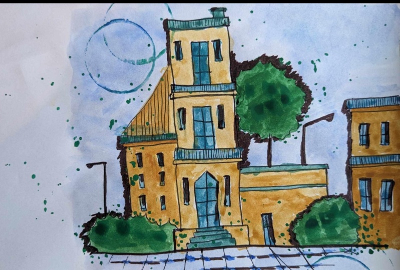
7. Painting 3 - Town House: Everybody, you're most welcome
to the third painting, which is a town house. As you can observe,
I'm ready with my sketchbook and all
the art supplies nearby. We are going to
start with a basic sketch using the marker, only in case you're not
that much confident enough to draw the basic sketch
directly using a marker. What you can do is you can use a simple pencil and
draw the sketch first, and then you can overlap
it using a marker. This will help you
a lot to develop confidence to draw
directly using a marker. As you can observe,
we are starting from the topmost portion, which is basically the
roof of the entire house. It's a simple rectangular shape and a smaller rectangular shape having a small chimney or
outlet on the top portion. You can observe
carefully that while I'm applying these strokes
for the sketching part, I'm not applying
a single stroke. I'm basically giving
it multiple strokes. This is basically
about rough sketching. We are not talking
about perfection. Here. You can observe
we have added little window and I'm going
to add one door also. These are basically
rectangular shapes only you just have to simply add vertical and
horizontal lines together forming these
beautiful doors and windows. You might be
wondering why we are using a marker rather
than a black pen. The reason behind that
is if you can observe carefully while I'm using this particular
marker on the edges, you can observe a
small black dot which comes when we leave
the entire strokes. You'll observe a darker tone at the ends that you won't able
to give using a black pen. But it is absolutely
fine in case you want to use a black pen that
is completely okay, you can explore according
to your convenience. Now, similarly we
are going to repeat the same flow that we have
drawn on the top portion. Again, I'll be just adding a square shape on
the bottom part. And then we're going to add
the little door and windows. No need to hurry at all. Try to draw it in a very
slow and steady manner if you observe carefully. Right now, I'm sketching
directly using a marker in case you want to have a
basic pencil sketch first, and then you want to use a marker that is
completely fine. Also, you can practice it on a rough scrape of
paper initially, and then you can come
towards your final painting. This will help you a lot to develop confidence
while sketching, and your chances of making
mistakes will be very less. Now, in the ground portion, I have a different type of door, which is pointed on
the top portion. You can experiment all the time. We are adding these
little staircases. Now I'll be simply adding
a horizontal line, which is basically the ground
line for the entire sketch. Then we have another building
on the left hand portion. It is going to have
a pointed roof. This time you can just
simply take a slant line and add these little
vertical lines to enhance the entire sketch. This basically creates
a beautiful contrast with the white background. Now I'll be having a
little plantation, which is basically a bush
on the bottom left portion. You just have to draw an
organic line like this. Now to complete the
entire building, I'll just add the wall
and these little windows, you can fill in
solid black color. Applying these little
strokes so that the windows become a little
bit more in contrast. And you're going to add a little lamp post on the left portion. One thing that I would
like to tell you all is that no need to worry about drawing it in the exact same way I'm
drawing right now. Sketching is not
about perfection. It's all about creating rough strokes which
replicates something. Once we are done drawing all the elements on
the left hand portion, let us add few building elements on the right hand side as well. I'll be having a small
building portion. You can observe this is a combination of horizontal
and vertical strokes. It's a very simple
and easy technique. No need to hurry at all. Try to draw it in a very
slow and steady manner. I'll be adding the
last building element. On the right hand side, I'm adding these
horizontal lines, replicating the floors. And one vertical line which
is basically the walls. We have drawn few windows. Adding these horizontal and
vertical lines together, I'll be adding these
little vertical strokes to enhance the floors. Now we have one simple
tree in between. Again, you can observe just a simple organic line which is very rough and random, forming a small bush. You can create your own shape and composition of the
entire tree as well. And a little lamppost
as you can see, combining horizontal and
vertical lines and few elements, we have completed
the entire sketch. Now just below the ground line, we are going to add
few floor tiles. You just have to
draw these lines and perspective
horizontal line which is going to form the
entire flooring. As you move towards
the bottom part, just increase the distance
between the horizontal lines. That will give you
a nice perspective. And you can add these little
dots at the cross section. As you can observe, we are
done with the entire sketch. Now I'll be using my
quill brush of size two, and we're going to
apply a thin coat of water in the background. No need to hurry at all. Use the tip of your quill brush to paint in difficult areas. Make sure that you do not move
inside the sketch area in case there is a little bit of portion that is absolutely fine. No need to worry about that Now, once we have applied
a thin coat of water, I'll be taking some cobalt blue and seruline blue together. And simply apply it on
the first layer of water. And you will observe
a nice spread of the color automatically. You can observe that
I'm using the tip of my brush to paint
in smaller portion. The reason behind
applying a thin coat of water initially is
it is basically known as a wet on wet
technique in which we apply a thin coat of water
initially and then the color. This helps us to
get a nice blend of colors together and the color
can spread automatically. In case you find that there is axis amount of water
in your brush, you can simply dab it
onto the tissue paper so that axis amount of
water will be removed. Now I'll add a little bit of
water in the color palette. Take some more color and we're going to paint
the ground area. You can observe that using
the entire surface of the brush I have
used to color it. On the bottom portion, we
have applied a thin coat. Now you can take some
darker tones of the color, having less water and
more color in your brush, and just add these little
dots at the cross section. This will help to get a
nice, attractive aesthetics. We are almost done
painting the background, which is the sky area
and the ground area. Now I'll be taking my
Quill brush of size zero. Take some good amount of cobalt blue and cerulene blue together, and just simply paint
the doors and windows, also the railing that is
in the front portion. No need to hurry at all. Try to paint it in a very
slow and steady manner. You can observe that I'm using the tip of my brush to paint. In this smaller portion. Try to keep your hand
very loose and free. No need to make it very stiff. Similarly, we'll be
adding the color in the building that we have drawn on the left
hand portion as well. If you observe carefully, I'm not trying to paint the elements in a
very perfect manner. I'm just simply
leaving the strokes. It's a very classic
way of combining urban sketches and
water colors together. We are almost done adding the blue color to the
smaller elements. Now I'll be taking some gamba, so you can observe in
the color palette. You can add a little bit of
water to loosen the color up. And we're going to paint
the remaining elements. Starting from the roof
for the left building, you can observe the
way I have used my round brush or basically
the Quill brush of size zero. You can add a little bit of deep green gambage to
get a darker tone. You can always combine and create some variation
in the colors. You can also create
your own color palette. Right now, the color
palette that I have selected is basically
a cool color palette. Now similarly, we'll
be adding the color in the entire walls
of the building. You can observe the
movement of my Quill brush. It's a simple horizontal
and vertical movement. I have left the doors and we do not want both the
colors to blend together. That's why you can just
simply add the color carefully in case
you are not that much confident enough to add the colors directly towards
your final class project. What you can do is
you can practice it on a rough scrape
of paper initially, then you can come towards
your final painting. This will help you a lot to develop confidence
while painting, and the chances of making
mistakes will be very less. You can observe we are almost done painting all the
building elements. Now let us add some deep green and light green together
to the plantation. In the color palette, just
take a little bit of water. Combine both the
colors together, which is deep green
and light green. Take some good
value of the color. Make sure that you create
a nice composition of water and color together. Simply paint the entire bush. No need to hurry at all. Try to paint it in a very
slow and steady manner in case your color goes
outside the outline. It is absolutely fine. In case you find that there is axis amount of water
in your brush, you can simply dab your
brush to the tissue paper. It will absorb axis
amount of water and give you a nice saturated
color in your brush. We are done with both the
bushes on the bottom portion. Now I'll be painting
the entire tree. Also you can observe
we have covered the entire tree and
I'll be leaving these small dots in the outline. Take some darker tone of deep green and just dab your brush. It's a very random way
of dabbing the brush. No need to hurry at all. Try to paint it in a very
slow and steady manner In case you find that there is axis amount of water
in your brush, just simply dab your brush
to the tissue paper, it will remove axis amount of water and you'll get a
nice saturated color. I'm adding these little
dots around the outline so that the plants look a
little bit more aesthetic. And it creates a nice contrast in the entire painting as well, in case you want to practice
all the elements and paint them in a rough scrape of paper or you're
practicing journal, and then you want
to come towards your final class project. It is absolutely fine. It will help your lot to develop confidence
while painting. Now I'll be adding a
little bit of water in the color palette and just take some good amount of color. Tap your finger
onto the brush and splatter some color on
the entire class project. It's a very random
way of applying these beautiful
splattering effect. This makes the
entire class project look a little bit more classic. Now I'll be using the
cap of my fevistic, which is basically
a circular shape. Take some water in
the color palette, loose in the color up. Simply put the cap in the color palette and add
these little circular shapes. You can decide the position of the circular shape according
to your convenience. It's absolutely fine. Now let us add some
beautiful messages in this particular
painting as well. I'll be writing a
positive quote. There is peace, satisfaction, and calmness in art. You can decide your
own message as well. It is absolutely fine. Now, once you have written the message on a rough
scrape of paper, simply remove the extra portion. We have two lines. Basically, I'm going to
separate that as well. I'm going to use a
pair of scissor. Be a little bit careful while
you're using a scissor. We have separated
both the messages. You can remove the extra
part from the sides. You can observe we have
two beautiful strips. And now we're going to add
some nice dark background. I'll be using a dark blue paper. You can go for any other
good alternative as well. Put some glue on the
back portion and just apply the entire message
on the dark blue paper. Similarly for the
second message also, I'll be applying some glue. Just put it below the first one. Now we are going to
leave some border. Just use your scissor carefully and leave some dark
blue space this time. So you can observe that we
get a nice border which is dark blue and it creates an nice contrast with
the white paper. No need to hurry at all. Try to cut it in a very
slow and steady manner. You can observe we have got both the messages with a nice dark blue color
in the background. Now we are going to place
them in the entire painting. You can decide the position of the messages according
to your convenience. It is absolutely fine. You can place the messages in a horizontal manner or else you can also place them
in a vertical manner. You can decide the composition. Simply add the glue
in the back portion and place it on the
entire watercolor paper. No need to hurry at all. Just simply apply some good
amount of glue so that it do not get detached
from the painting. Apply some pressure
using your finger. You can observe
carefully that we are done adding the messages. Now I'll be using my marker and I'll be adding a nice text, which is watercolor painting, using some nice calligraphy. I'll be using my marker, which is having a thick tip, and we're going to add
some solid black patches. No need to hurry at all. Be very much careful while
adding these black patches. The reason behind adding these black patches
is that we can create some nice contrast in the entire painting and it
creates some nice depth. Also, this is
basically my style of adding these strokes
in my sketches. You can create your own as well. You can decide the position
of the black patches. You can create your own
composition as well. You can observe I'm slowly
enhancing all the elements. I'm adding these black
patches in a different way. We are adding it
near the bushes. There is no specific
way of adding them. You can just apply it
in a very random way, but it has to look
aesthetically good. You can observe that we are
adding a few more strokes in the bottom portion
in case you're not that much confident
enough to add these black patches directly towards your final
class project. What you can do is you
can practice it on a rough scrape of
paper initially, and then you can come
towards your final painting. It will help you a lot to develop confidence
while drawing. Also, your chances of making
mistakes will be very less. No need to hurry at all. Just apply these strokes in a very slow and
steady manner. You can carefully observe
the movement of my hand. Also, just try to keep your
hand very loose and free. We are done adding all the
black patches as well. I'll be just enhancing
the ground area as well. Just simply adding these horizontal lines
in the floor area. You can observe it's
not even overlapping, so it's a very random
way of adding the lines. We are done with the
entire painting. Let me take you a little
bit closer so that you can observe all the
details carefully. I hope that you enjoyed creating this particular painting and
got to learn something new. Now let us move
towards the next part.
8. Class Conclusion: When it comes to exploring
different art forms, I love to explore
them in detail. The most amazing part
about watercolors is that you do not have to
worry about perfection. There are a lot of
possibilities of creativity once you
start exploring them. While I was creating
this particular class, I made any number of mistakes. And that is something I
always tell my students, never to be afraid
of making mistakes. One thing that I always tell
my students is to maintain an art journal in which you can practice on a regular basis. And keep a record
of your artwork. In case you have any questions or doubts related to the class, feel free to ask them to
the discussion section I would be very excited to see of your class projects
into the project gallery. No need to worry
about the output. You can definitely explore and experiment with the
class projects also. No need to worry
about painting it in the exact same
way I have painted. Keep learning and practicing. It would be really great if you leave a review
for the class. As it encourages me a lot, my class can reach many
more students like you. I'm very happy to
share this class with all of you and I hope that you enjoyed and got to learn something from
this particular class. Thank you so much for joining the class and happy painting.
 Rutvik Patel, Artist and Instructor