Transcripts
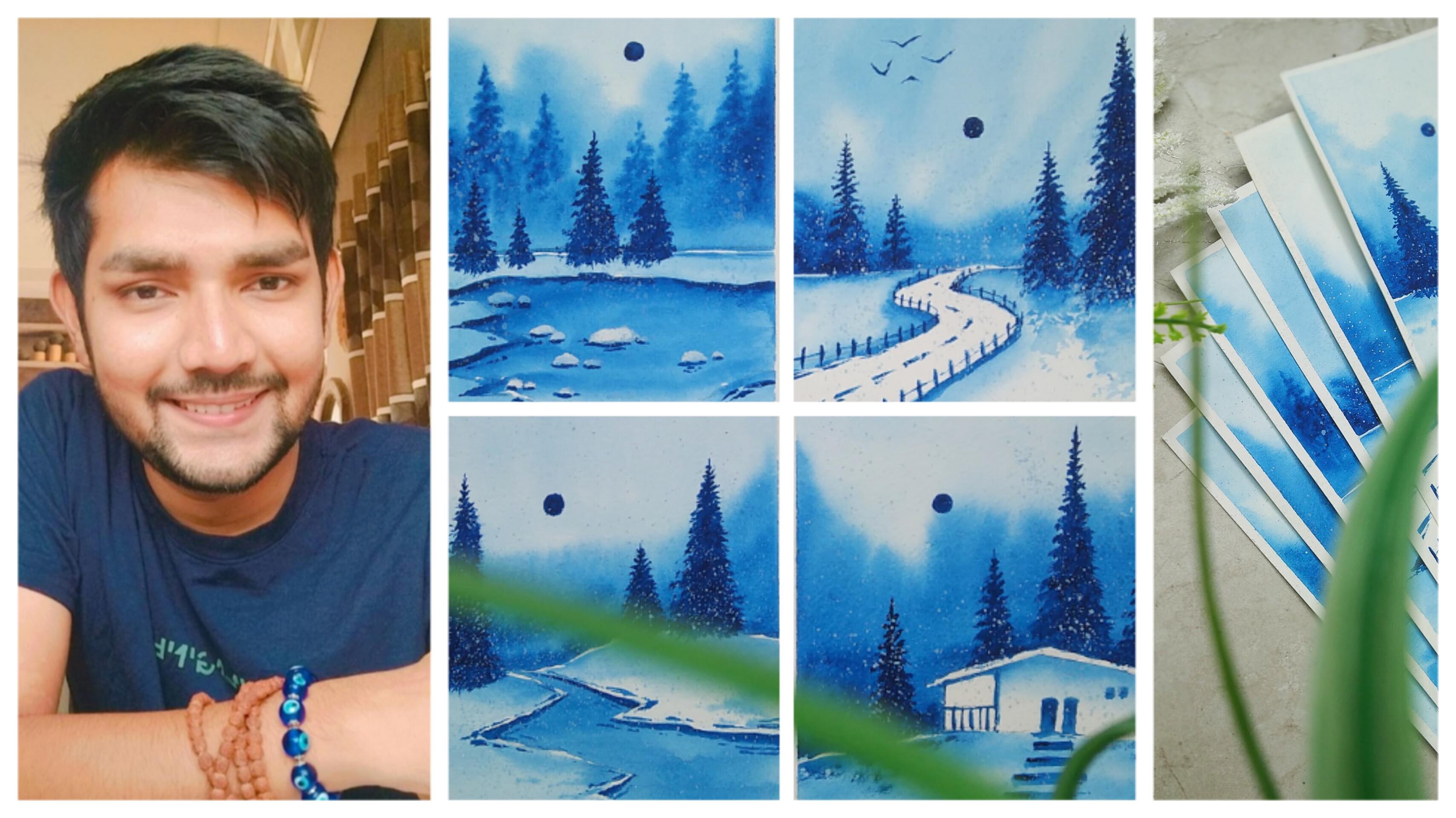
1. Welcome to the Class: Amongst all the seasons
we have in India, winter is a season
that I love the most. And behind every class that
I create for my students, that has to be some story. Hey everybody, I'm, I'm a self-taught independent
artist based in Gujarat, India. I'm also an interior
designer by profession. So people who might not be
knowing me and had joined me recently can find most of my AdWords being
displayed on Instagram. I go by the name
shuttle adaptations. In this class, we are
going to paint for beautiful winter
landscape paintings, which are going to be based on monochromatic
painting scheme. And the color is
going to be blue, which is my personal favorite. You can go for your
favorite color as well. We'll be talking about
all the art supplies that you will need in
this particular class. I'll be giving you
the details about the watercolor paper
that we're going to use. How they also teaching
you how you can cite tape your watercolor
paper carefully. Before starting all
the class projects, we are going to have a
beautiful practice session in which we are going to learn
all the elements in detail. We are going to create a
beautiful gradient background will be adding some
beautiful pine trees. I'll be teaching you
how you can give her a nice snowy effect
to your paintings. All the four projects
are going to be easy, simple, and elegant. And I'll be teaching you all
the tips and tricks about the paintings that are basically going to
be for projects. Winter house or frozen lake as simple winter forest and
an elegant snowy road. I'll be really
excited to see all of your projects into
the project gallery. Feel free to ask any questions or doubts you have
related to the class. I'll be happy to
answer them all. Being an artist, I always believed that anybody can paint. You just require some basic
techniques and methods. And this class is
all about that. And every particular painting we are going to have some basic, easy techniques that you
can learn for painting. So without any delay, grab your supplies and let's get
started with the class.
2. Art Supplies: Before we start, it is very important for all of you to know the character art
supplies that you will need for this
particular class. And I'll be giving you
the basic brief about the art supplies that you will need in this particular class. No need to worry at all. In case you do not have
the correct art supplies. You can find them in any
nearby local stationery or any nearby art store. So here are all the art
supplies that I've placed nicely to let you know
about the details. So the first one is a simple watercolor,
which is Prussian blue. And this is the single
color that we are going to use for all the for
class projects. A simple pencil to draw, a basic sketch before
starting the painting. So far, the entire class, you will need only
three brushes, which are basically
quill brushes. In case you do not
have a quill brush, you can go for a
round brush as well. So there are three
different sizes. The first one is size for, the second one is size two, and the last one is size zero. So only three brushes are
required annually to worry, you can go for a
round brush as well. Now, I'll be showing you
a simple color palette, which I have, and this is my favorite color
palettes that I have. So it's basically a
simple ceramic palette, which is adding three
sections in which you can have your different
colors mixed together. Sorry, the color
palette is dirty and no need to worry in case you do not have a ceramic palette. You can go for a simple
color palette as well. Now let us talk about
the watercolor papers that you will need for
this particular class. And the size of
watercolor paper that I'm using is A6 and it is 300 GSM. So no need to worry
at all. You will find the watercolor papers very easily in any
nearby local stationery. You just have to take
care of the GSM. This is the painting. And as you can see, we have a nice side edge which
is white in color. Now the reason behind
it is that we are going to tape it with masking tape. You will find a
half-inch masking tape very easily in any
nearby local art store. Next, not supply as a
simple white poster color. You can go for a
watercolor as well, but I'm available
with pasta color. It will give you
the same effect. We're going to use white color only to give a nice no effect. Now this is a simple glands
in which you can hold your clear water and use
it to clean your brushes. Now we'll be having
some basic art supplies like a sharpener and an eraser, which everybody must be having. So these are all
the art supplies that you will need for
this particular class. In case you are missing on
any particular art supply, you'll get that very easily in any nearby local art store.
3. Class Overview and Details: Hey everybody. So
before we start, I wanted to give you
a nice class who will do and details about
the entire class. So we'll be talking about
all the four class projects that we are going to make
in this particular class. And I'll be giving you
a basic brief about what all you are going to learn
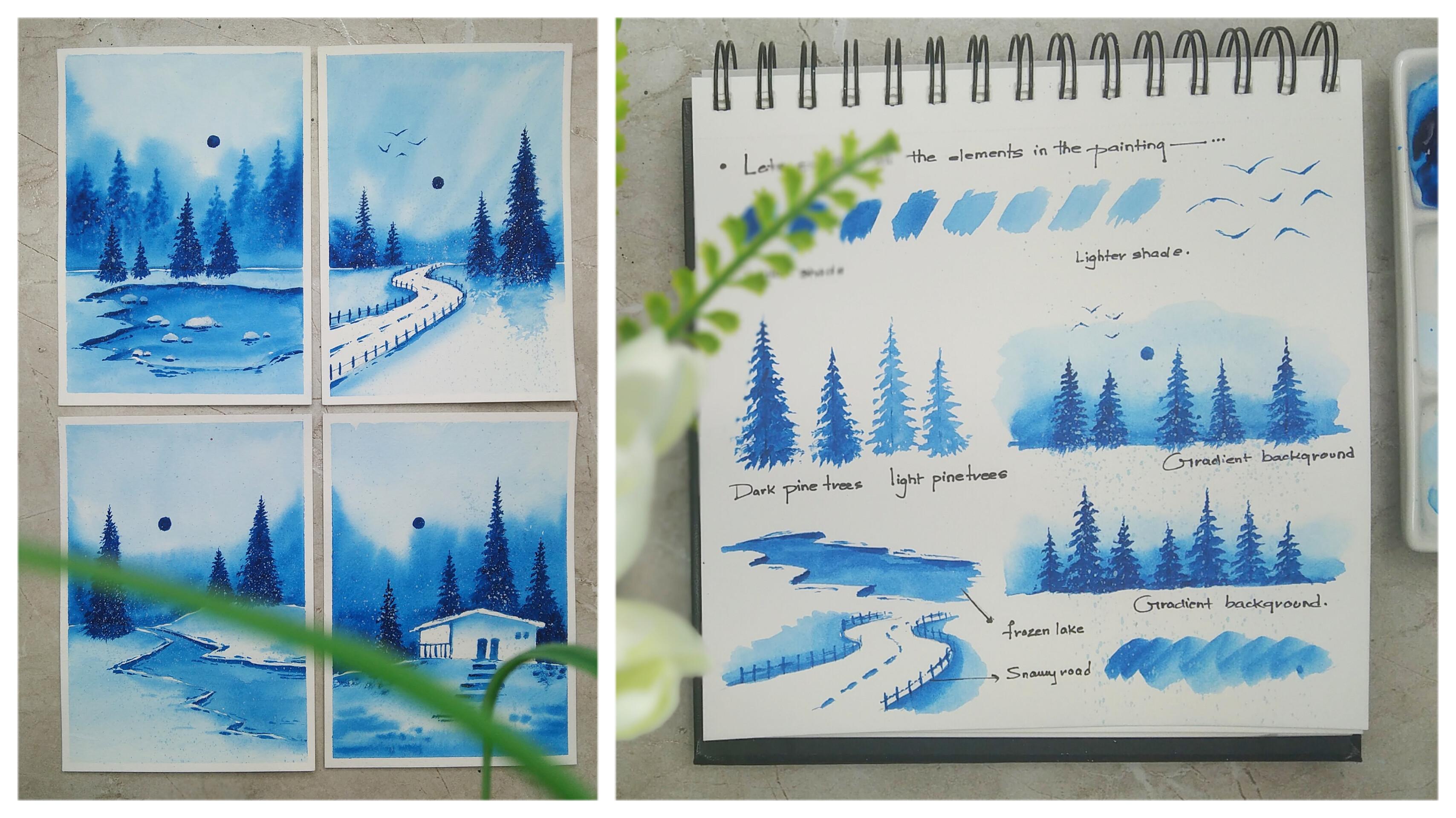
in this particular class. So as you can see, that initial practice sheet
shows you the entire shade. We can see the tones that we're going to create using
a single color, which is going to
be Prussian blue. Basically, they're going
to have a nice set of modes that you can see in this particular painting
that we are going to paint. You're going to have pine trees and all the four paintings. A little bit of
difference in opacity. We're going to learn
how you can paint these beautiful pine trees which are going to be there and
all the four paintings. So as you can see, there is a nice gradient effect
in the background, which is coming from a darker
tone to a lighter shade. So we're going to practice
how you can create this beautiful shade
in the background. No need to worry at
all before painting all the difficult elements
to the final painting, we are going to practice them in the practice sheet initially. Now as you can see, we have a nice frozen lake in this particular painting
that we are going to paint. And then we are going to
have a nice snowy road, which is just below that. As you can see, we are going to paint a nice
snowy road as well. And that role is going to be there in this
particular painting. As you can see, these
are the elements that we're going to
practice before we start. All the class projects are right in front of you and
we are going to use a single color to paint
all that for class projects. And the white color
that I showed you in the art supplies is
only going to be used to create this
beautiful snow effect in all the four paintings. Apart from this, we
are going to have small elements like
icebergs, shadow effect, and some little elements
that we are going to paint in that final
painting directly, which is not going to be that difficult for the
practice sheet, will be having all the
difficult elements that you can learn easily for
the class projects. And then we can move
towards the final painting. No need to worry at all. We are going to have
this nice house painting also that we are going to learn. And it is not going to
be difficult at all. It is a very simple and easy sketch that we
are going to make. The reason behind keeping a nice Class Overview is
that so that you can get a good idea about all the four class project that we are going to make in
this particular class. Also being an artist, I believe that practicing
is the most important part. And practicing makes you a
little bit more perfect, and it also decreases the chances of making
mistakes. That's fine. I have kept a nice
tactics session in which we are going to create this beautiful practice
sheet which will help you in your folder
projects as well. So as I said, we are going
to use a single color, which is going to
be Prussian blue. And side-by-side,
we'll be keeping a nice tissue paper
so that we can remove excess amount of water and we can grab our brushes
carefully on it. No need to worry at all
that are going to be very easy and simple
techniques and tips and tricks that I'll give
you so that you can create all your fall class
projects very easily. And in an amazing way. You are definitely
going to learn something new and creative. So now let's move
towards the next part.
4. Lets Practice the Elements: Hey everybody. So
before we start, it is very important
to know that you have to get a little
bit of practice. Now since we are going to use a single color for all
the full class project, which is going to
be Prussian blue. You can see I'm having a
simple blank sheet of paper, which is a practice
sheet basically. And I'm ready with my color
palette and tissue paper. I'll be using a size zero brush. And as you can see, we are going to create some
beautiful tonal values for the entire class. The first one is
the exact color, which we take out from
the watercolor tube. So they won't be there won't be an excess
amount of water. Now slowly you have to add water to your color palette and you'll have to
create these shades. So you can see eventually
your color tone, or we can say the saturation of your color will slowly start to decrease as you start to add a little water and
your color palette. As you can see, that
initial color is the exact color that you have taken out of
your color tool. Now, as you add a
little water to it, or you start adding water to it, then your color values will change and it will
become lighter in tone. You can see the difference, and this is how you
have to practice it on the raft scrap of paper
or your practice book. And then you will get
an exact idea how you can create this
beautiful shades. So the initial is a darker shade and the last
one is a lighter shade. This happen just by adding
water to the color and this will help us to create the darker shades
in the painting. And the lighter shades,
as you can see. I hope that you've got
an exact idea about how we are going to
create different shades. Or you can say saturation in the color by adding
the amount of water. It is very important
to control the amount of water that we add
in the color palette. Now let us learn how you can paint some beautiful pine trees, which is going to be there in
every individual painting. So you must be
thinking that painting pine trees is very difficult,
but let me tell you, it is the most simple
and easy element that you will find
in every painting. You have to just make
vertical lines and different sizes to create
these eyes of a pine tree. I'll start from the
top portion and move these little strokes coming
towards the down portion. And as you can see,
I'm just using the tip of my brush to create these little strokes
which are increasing in size as we move
towards the bottom area. You can see it is a very
simple and easy technique to paint pine trees. This is not at all difficult. It will just require a
little bit of practice. For the first and
second pine tree, what I have done is I have
taken the first shade, as you can see, which
is the darker shade. I'll be adding very
less water to it. Now for the second pine tree
that I'm painting right now, I'll be having a little bit more water in
my color palette. So as you can see,
the saturation of the color changes
completely from the first and second pine tree. It is a little bit lighter. This is how we are
going to create the background and
the foreground. The trees that comes in the behind portion are
going to be lighter shade. And the two is that comes in the front portion are
going to be darker. Shade. You can see the
difference right now. So now I hope that you got an exact idea about how you
have to paint the pine trees. Basically. No need to worry at all. It will just require a little bit of practice
and you'll be able to paint them in a very
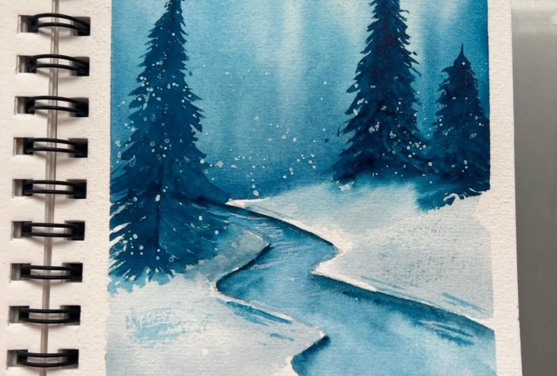
easy and creative manner. So now let us create a
beautiful gradient effect that every painting
is having Users tab to take your flat brush size 1 " in case you do not
have a plaid brush, you can apply directly from your quill brush or
round brush as well. But to apply an even coat, we will need a flat brush. I might have
forgotten to tell you about the flat brush and
the art supplies section, but you can use a flat brush to apply a thin coat of water. Initially. I'll be taking some
solid darker tones of pollution low and my
quill brush of size two. And you have to apply it
on the bottom portion. So you can observe the color
is spreading automatically. So since we have applied a nice thin coat of
water initially, the color will spread
automatically. Now just simply clean
your brush and dab it just above the surface of the color that
you have applied. It will give you a nice
gradient effect automatically. And you can see how beautiful
the gradient effect looks. Let me show you once again. I'll be taking my
one-inch flat brush and applying a thin
coat of water. Initially, I'll be
taking my size two brush and simply applying
the darker tones of color at the bottom portion. And the color will automatically spread in the entire paper. You just have to simply observe the movement
of the quill brush. Now once you have spread
the color and a nice bond, just clean your brush
and apply it again just above the color that
you have applied initially. So this is basically
known as a wet on wet technique in which we apply a thin coat of water initially, and then we apply
the color so that it can spread in a
very amazing format. So now I'll be just painting the pine trees over the
background that we have created. No need to worry in case you
do not have 1 " flat brush. We are going to
apply a thin coat of water from the brush only. Now to give you a technical term for the gradient
background that we have created is known as
a baton wet technique, in which we initially apply
a thin coat of water. And then we apply the color
so that it spreads naturally. So you can observe,
I have painted too beautiful pine
trees or small sun, or we can consider it
as a moon as well. And you are going to
paint some little birds. So the painting of bird
is not at all difficult. You just have to use
the tip of your brush, which is going to be
very much pointed. And you have to draw
these little reshapes. This is how we are going to
create the pine trees with the gradient background and some small elements that
you need to practice. Don't need to worry at all. It is not at all difficult. So now let us just
paint or learn to paint how you can simply
paint this frozen lake. You can simply
observe that I have just drawn these
zigzag lines and a perspective format to create a natural flow for the lake
which is going to be frozen. And I've simply taken some Prussian blue color
and my quill brush, and I'll be just applying
it inside the lake. And this is just going to
be a shade in-between the darker and the lighter
tone of blue color. So you can see I
have just applied a nice solid color and where
you find difficult to paint, you just have to use the
tip of your quill brush. Now to add some nice depth and
detail to the frozen lake, we are just going to take
some darker tone colors. Have less amount of
water in your brush and just enhance the edges. And the other land
area that you are, league will look a little
bit more dense and in-depth. And it will also give
a nice 3D effect. We can use the dip of the quill brush and
create these rough lines side-by-side so that you can make it look a little
bit more realistic. This is how you have to paint
a beautiful frozen lay. No need to worry at
all with practice, you can get a nice grab on the rash moment and techniques. Now just below, I have a
nice snowy road to paint. It's a simple perspective line that you have to draw
with your pencil. Then we are going to enhance the road by applying color on the outer area rather than applying it in the end abortion. To make it look a little
bit more realistic, I have just applied
some dotted line in-between the road,
which is very easy. You just have to use the
tip of your quill brush. And we're just enhancing
the entire road by applying Prussian blue
color on the outer portion. And I'm just simply
using my tip of the branch to give a nice
fence to the entire row. You just have to take
some solid color and your brush and meet these little vertical lines on the outline of the entire load. Now using the tip of the brush, we're also going to connect
the vertical lines together. No need to hurry at all. In case you find me painting
a little bit faster, you can definitely
slow the frame rate. So as you can see, for the
entire practice sheet, I have just used a single color, which is Prussian blue. You can go for any other good
alternative for blockchain. Now let us create a
beautiful snowy effect. I have taken some solid white
color in my color palette. I'm using white poster color, but you can use white
watercolor as well. Just take some amount of water, added any old white color. Take another brush
and just splatter the random drops off white
color on the pine trees. And you can see how beautiful it comes in contrast
with the background. So this will give you a
nice amazing snow effect and it will look as if
there is a nice uniform. So we are done with the
entire practice session. I hope that you got to
learn something from this entire practice
sheet and you can create your own
practice sheet as well. Now, let us move
towards the next part.
5. Lets Tape the Paper: Hey everybody. So before we start, it is very important for all of you to know that how to tape
your watercolor paper. So here I have my
watercolor paper of size is six and it is 300 GSM. So now let us know
how you can just simply side take your
entire watercolor sheet. You can see I have placed
my watercolor paper where I want to paint simply. We are going to use a
half-inch masking tape, decide tape, the entire
watercolor paper. So this is basically
a paper tape only. By applying this on the edge of the entire
watercolor paper, we get a nice solid
white border, which looks really beautiful when we remove the
entire masking tape. This entire step, you
need to be very much careful and just observe once you remove
the masking tape, this is how the entire solid
white border will look. Let us start by applying
the masking tape. I'll be applying the
first masking tape on the right portion. Just try to make sure that the masking tape is parallel
with the paper edge. Try to keep some part of the masking tape
on the paper and some part on the surface
that you are using. Now simply tap your finger, make sure that the masking
tape is properly stuck with watercolor paper and the esophagus in the background. Now I'll be applying another
deep on the left portion. So we are done with
both the sides. Now, we are left with the
top and the bottom potion. Again, I'll be taking a
nice masking tape piece to apply it on the
bottom potion, make sure that the masking tape is parallel with the paper edge. Tried to keep some part
of the masking tape on the paper and some on
the background surface, whatever you are using. Sam done with the
top portion as when. And just make sure that you
apply some nice pressure on the masking tape so that it's ducks with your watercolor
paper properly. So we are done taping the
entire watercolor paper. Now, let us move
towards the next part.
6. Project 1 - Frozen Lake: Hello everybody. So you are most welcome
to the first project, which is a frozen lake. I'm ready with my
watercolor paper. When does light tape
my color palette, a tissue paper, and the glass of water
with my quill brushes. You can systematically
organize your things and start working on the first project
using my simple pencil, I have drawn a nice random line. And between the
watercolor paper, you can simply draw an actual horizontal line
using a random shape, which creates a
nice mountain area. Now I have simply
drawn a nice lake, as you can see using
as exact line. Since it's a
monochromatic painting, we are going to have
only a single color. Just take it in your
color palette and also make sure that you
do not waste any color. We're going to apply
a thin coat of water. I'm having my quill
brush off size for now, I'll be very carefully
applying a thin coat of water just about the pencil
line that we have drawn, which is creating a
difference between the skyline and the
landscape area. Make sure that you apply a nice thin coat of
water very carefully. Use the tip of your brush to apply water and
difficult areas. And also no need
to worry at all. You can create your own natural
line of origin as well. Now, I'll be taking
my quill brush off. Size two will be taking some solid blue color and the color palette
just tried to lose. And I'm the color using some
water in the color palette. Now we'll apply the color just
above the horizontal line. And as you can see, the color
is spreading automatically. Now this is basically
known as a wet on wet technique in which we have applied at ten coat
of water initially. And then we are
applying the color. Now you can observe the
movement of my brush. I'm just trying to spread
the color in the background. So initially we
are going to have a darker tone on
the bottom portion. Now, I'll be just
cleaning my quill brush. And you can see
we are just going to blend the color
with the background. Now you can see the tonal
values of the colors are lighter than the color that we have applied near
the horizon line. So this is how we can create
a nice gradient background. No need to worry at all. In case you find this a
little bit difficult, you can just practice it on
a scrap of paper initially, and then you can come
towards your final painting. Also, it's not at all compulsory that you'll find the sheets to be completely seem as
I'm creating right now. They can be minor changes. It is absolutely fine. It's a painting, so no need
to take that seriously. I'll be taking some solid
blue color and Mike, well, brush again and we will be painting the frozen lake. It's going to be a solid color, so no need to worry at all. Not going to create a gradient
effect inside the leaf. You can see I'm just using
the tip of my brush to paint in the difficult areas where we have these
pointed edges. Once you apply there,
you can just use the brush carefully to
apply a solid color. In case you find me painting
a little bit faster, you can definitely
slow the frame rate. So now let us create
some nice depth and give some nice 3D effect to
the entire frozen lake. I'll be using my quill
brush off size zero. And we will be taking some
solid blue color this time, which is going to be a
little bit darker in shade. So try to have less
amount of water and more color in
your quill brush. We're just going to add a nice outline to
the landscape area. You can observe
that when you have less amount of water
in your quill brush, that tonal values of the color will be a
little bit darker. I'm just using the
tip of my brush. You can observe the moment
how I'm using the tip of the brush to an enhance
the landscape area. Again, similarly,
we will be doing this on the left
portion as well. This will give a nice depth and detail to the entire area. It seems as if the lake is a little bit on a lower level
than the landscape area. We can also enhance by putting these random strokes
near the lake. You just have to be very much careful and use the
tip of your brush in case you find it a little bit difficult to give
this random strokes. You can practice it on a dark
strip of paper initially, and then you can come
towards your final painting. Now let us enhance the
landscape area as well. I have applied a nice thin
coat of water, as you can see. No need to periodontal. Just use your brush
very carefully. And we'll be digging
some lighter tone of blue and I'll be applying
it on the top portion. You can see the colors spreads automatically and
it will give you a nice gradient
effect once you have applied a ten coat
of water initially. By using the same method, we are going to enhance the landscape area on the
left portion as well. I'll be simply taking my quill brush and applying
a thin coat of water. So you can see that we
have a lighter tone of blue already in the brush. I haven't cleaned it that well, but it's absolutely fine. We just want a lighter
tone of blue shade. So you can do that as well. Just make sure that you do it in a slow and careful manner. Now while applying to
the bottom potion, made sure that there
isn't any space left between the masking tape
and the watercolor paper. I'll be taking some color in my brush and I'll be applying
it on the outer portion. You can see the color
spreads automatically. Be very much careful
while doing this. Try to maintain a nice space in between the landscape area and the frozen lakes so you can
already see the difference. So now let us paint
the pine tree that we are going to have in
this particular painting. And this is one of the most
favorite part that I have. I have taken some darker tone of blue color as you can see. And you just have to draw
a simple vertical line. Use the tip of your
brush and start making these little strokes from the
top to the bottom portion. As you can see, there isn't any specific way
of painting this. You just have to apply these
strokes in a random way. But once you move towards
the bottom portion, you have to increase the size
of the stores that you're making so that it gives you
a nice triangular shape, which pine trees generally
have. No need to worry at all. This is one of the most
easiest part to paint. And in case you find me
painting a little bit faster, you can definitely
slow the frame rate. There is an option below. So as you can see,
we are ready with the first pine tree in case you find painting this pine tree a
little bit difficult, what you can do is you
can practice it on a scrap of paper on
your art journal. And then you can come
towards your final painting. Just make sure that you paint it in a slow and steady way. I'll be painting
another pine tree just beside the first pine tree. The method and technique
is absolutely same. Just the pine tree is a
little bit smaller in size. As you can see, both
the pine trees looks really beautiful with
the gradient background. Now we'll be painting
another binary which is going to be a
little bit larger in size on the landscape area
that we have on the left. So simply draw a vertical line. Take some solid blue color, make sure that you
have less amount of water and more color
in your quill brush. Try to apply these
little strokes from the top portion and come
towards the bottom path. As you start moving
towards the bottom part, make sure that these tools and Andrea I'm making
are increasing in size. No need to worry at all. Pine trees are generally having a nice random shape since these are leaves that we are
going to replicate, it isn't absolutely fine if you make these random strokes, just try to create a
nice triangular shape that pine trees generally
have naturally. We are almost done painting
the pine tree as well, just creating the
bottom portion. And I'm just trying to spread the leaves in the bottom portion using the tip of my brush. As you can see, once you
use the tip of your brush, it will give you a
nice random shape of the entire pine tree. And you can see we are ready
with all the three binaries. Now, let us paint a nice sun, or you can also consider
it as a moon because it does not at all clear that it's a night view or the labial, since it's a
monochromatic painting. So you can consider it as a
son also hormone as well. So just simply take some solid blue color and
try to paint a goods. So Cula shape in-between
the pine trees. As you can see. I have tried to keep the
sun on the lighter tone of blue so that it can get a nice contrast effect
with the background. Will be enhancing the
landscape area by putting these little strokes which are going to
be random and graph. As you can see, there isn't any particular
method of doing this. I have simply taken darker
tones of blue color. And that'll be applying
these little strokes nearby the landscape area. So this is basically
enhancing the outline. So as you can see, this will add some more details to
the entire painting. Now let us give a nice effect. I'm taking some solid white
color and my color palette. As you can see, I'm
using poster color, but you can also use
white watercolor. That is absolutely fine. It is going to give
you the same effect. Add some amount of water and your quill brush of size zero. Now we'll be taking another
brush and simply tap your brush on the second
version that you have taken. So by doing this, the color splatter on the entire painting
in a format of snow, as you can see, it gives
you a nice smooth effect, rose onto the entire painting
in the form of dots. Make sure that you do this
in a very careful way. So we are done with
the entire painting now let us remove the tape. So there's a technique to remove the site team tried
to remove this. I type in an angle
so that you do not end up tearing your
precious painting. You can see how beautiful the border looks in
a solid white color. We are done with
the first project, and I hope that you
enjoyed painting this beautiful frozen
lake painting. And I also hope that you've
got to learn something new and creative from
this particular painting. Now, let us move towards
the next project.
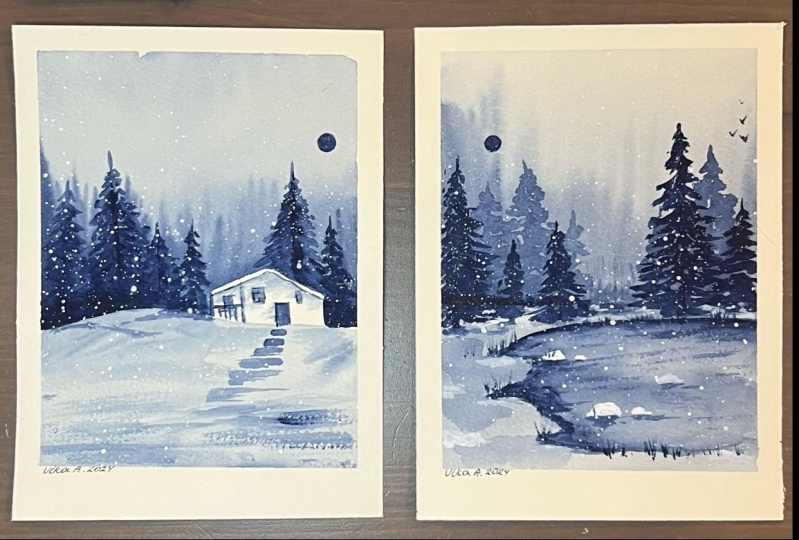
7. Project 2 - Winter House: Hey everybody, you are most welcome to the second project, which is a winter house. As you can see, we are ready
with the watercolor paper. So let us draw a
simple landscape area in a very random and roughly now we're going to have a simple winter house on the
top of the horizon line. So just draw two
simple vertical lines. As you can see, I have
drawn it with my pencil. Now let us draw these rules, which is going to be slammed. Let us make it a
double line so that we can enhance the roof area. No need to worry at
all in case you find drawing this particular house
a little bit difficult, what you can do is
you can practice this on a rough scrape
off paper initially, and then you can come
towards the final painting. I have just added a
little offense on the left side and two doors to enhance the details
in the house. Now, let us start painting. I'll be taking my brush of size four will be applying
a thin coat of water. Just make sure that you
use the tip of your brush and make sure that no water
is getting inside the house. We just want a
gradient background in which houses excluded. So you can observe that
I'm using the tip of my brush to paint in
the difficult areas. So basically I'm applying a thin coat of water
in difficult areas. And then on the above
ocean you can simply just use the quill brush to
apply a thin coat of water. So the reason behind applying
a thin coat of water is so that once we
apply solid color, it can get spread into
the background very easily and it will give you
a nice gradient background. And technically this is known
as a wet-on-wet technique. Now using the same quill
brush will be taking some solid blue color
and our quill brush. And we're going to apply it on the above portion of
the horizon line. And you can see the
color is spreading. Just be very much careful by you move your brush
near the house. Just make sure that no color
enters inside the house. You just have to be very much
careful while doing this. You can see how beautiful the calorie spreading
automatically. No need to hire doll in case you find me painting a
little bit faster, you can definitely
slow the frame rate. There's an option below. Now, will be just spreading
the color about the house. Now you can move your brush in this particular format so you can observe how beautiful
the background color looks. Now we'll just clean the quill
brush and we have to apply some nice water just
about the color that we have applied so that you can create a nice
gradient effect. This time we do not have any color and the
brush only water. And you can see how beautiful
the gradient effect looks. So it's from a darker
tone to a lighter shade. We are done with the
entire background. That'll be just finishing up the horizon line so that it looks a little
bit more clear. Now, I'll be just taking
my brush and applying a thin coat of water
below the horizon line. So we are going to paint
the landscape area. As you can see, I've applied
a nice tan color border. Be very much careful
while doing this. Make sure that you
have applied the water on every particular area
of your watercolor paper. And also make sure that
there isn't any space left between the watercolor
paper and the masking tape. In my quill brush,
I've taken some Prussian blue and I'll be just applying it on the top
portion of the horizon line. And you just have to observe the movement of my
grid brush slowly. I'm moving towards
the bottom portion, making these little
horizontal strokes so that we can create a nice texture in
the landscape area. No need to worry at all
in case you do not get the exact similar kind of
pattern which I'm having. It's absolutely fine. Watercolors always gives you a nice random color effect
whenever you are applying it. And also make sure that the intensity or
the saturation of color you are
observing right now will be one shade lighter
once it dries up. So we are done with
the landscape area. Now let us paint the beautiful
house that we are having, basically the winter house. We just taking my quill
brush off size zero, it has a thin strokes to make. Just apply a thin coat of
water inside the house. And just below
that, you're going to keep the roof absolutely wide so that we can create a nice contrast between the
House and the background. Now, I'll be taking
some amount of color in my brush and I'll be applying
it in just below the roof. You can see the color is again
spreading automatically. So that'll be our darker
tone just below the rules. And it will fade as they moved towards the
bottom portion. No need to worry
at all in case you find painting this a
little bit difficult, what you can do is
you can practice this on a rough scrape off
people initially. And then you can come
towards your final painting. Now, let us enhance the fence that we have on
the left portion. I've taken some darker
tones of tuition low, and I have simply used
the tip of my brush. I'm given a nice outline
to the entire area. Now let us enhance the doors. We are also going to
apply solid blue color, having less amount of
water in the brush, it will give a nice
saturation to the color. It creates a nice contrast
with the white background. I have created two
small windows also. You can experiment accordingly. Now let us create
some steps just below the doors in
the winter house. So as we move towards
the bottom area, we are going to increase
the size of these steps. And these are basically some random rectangles that you can draw or paint naturally
using your quill brush. I'll be just making
it in a random way, not even completing the shapes. We just want to keep it
in an abstract format. As you can see how beautiful the steps are looking
just below the doors. So we are done with
the winter house. Now let us paint the pine trees. One of the most
favorite elements that I have in every
particular painting. You just have to
take darker tones of blue and you have to apply a nice vertical line
just above the winter house. Now you have to create
these little strokes. And as we moved towards
the bottom portion, you have to increase the size of the strokes that I'm making. Now these strokes,
I'm absolutely random and rough in nature
as you can observe. No need to hire doll, draw it in a very
slow and steady way. Just make sure that as you move towards
the bottom portion, you increase the size of the stroke that you
are making right now. I'm almost done painting
the huge tree that we have. Now apart from this
particular pine tree, we are going to have fewer, more pine trees in the background. Now once I come
towards the roof area, just make sure that
the color doesn't go inside the white portion. Be a little bit careful
while doing that. Now we're going to paint
the remaining pine trees. The method is going to
be absolutely same. Just draw a simple
vertical line. Tried to make these
little strokes which are coming towards
the bottom portion. And as you move towards
the bottom area and try to increase the size of the
stroke that you're making. I'm just painting another pine
tree on the right portion. Also one more thing
that I would like to mention that I always
tell my students is that in case
you find painting any particular element a
little bit difficult to paint, what you can do is
you can maintain an art journal or you can
also have a practice sheet, which we also have for
this particular class. So what you can do is you can practice on that
particular sheet. Initially, you can grab our hand on this particular
element easily, and then you can come towards your particular painting and
have it in a better way. So as you can see,
I have painted one more pine tree
on the right side. And it's looking
really beautiful. You can add your own
pine trees as well. I mean, you can add number of pine trees according to your
particular environment, you can definitely experiment
with the entire painting. It is not compulsory to paint. In the similar way
I have painted. For pine trees in
the background. I'll be just enhancing
the steps that I have painted just
below the doors. I have taken some darker
values of Prussian blue and applied it on the right
side of the steps. Now, let us add
some rough texture just below the horizon line. So I have less
amount of water and more amount of color
in my quill brush. And I'll be just dabbing it
just below the horizon line. And as you can
see, we're getting some nice darker texture
just below the horizon line. Also. No need to worry at all in case you make any mistake. It is absolutely fine. You can redo it again. Now I'll be just painting a sun, or you can consider
it as a moon as well, since it's a
monochromatic painting. So it's fine, you can consider
it any particular thing. Just simply draw a small circle. The darker tones of blue. Now we'll be creating
some nice snowy effects. I have taken some
white pasta color. I'll be adding some water
to loosen the cholera. I'm using my quill
brush of Psi zero. Take another brush and simply tap your quill brush on that. Make sure that you
do it in a very limited and optimum alone. Don't make it too much. Also, you can see how
beautiful the white dot looks and it
creates a nice effect. I'm missing on
white watercolors. So that's why I've
used both tequila. It is also absolutely fine if you use white
watercolor as well. So I'll be removing
the side deep now and be very much careful
while you're moving this. I try to remove this. I type in an angle
so that you do not end up tearing
your brushes painting. You can see how beautiful the
white border looks once you remove the masking tape and it's the most satisfactory part. And we are done with
the entire painting. I hope that you got to
learn something new and creative from this
particular painting. You can see the details. You can see there's no effect, and I'm very happy with
the final painting. Now, let us move towards
the next project.
8. Project 3 - Snowy Road: Hey everybody, you are most
welcome to the third project, which is a snowy road. As you can see, I'm ready with
my watercolor paper again. And I'm just going to draw a simple horizon line
which is going to separate our skyline
and the landscape area. You just have to simply
draw a horizontal line. Be very much careful
while doing this. No need to hurry at all. Now once you're done
with the horizon line, what we're going to do, we're going to create a nice road which is going
to be combed and format. You can just observe
It's like an S shape, which is going to be in a
good post back to weigh. As you can see, you
just have to make it a double line format, tried to have some
space in between. So since we want
the road to being a good perspective
form and that's why it's on the top portion. And as we come towards the bottom part, that
road is broader. So yeah, that's it. This is the only element that we
need to draw with pencil. Now you can use your pencil
to simply draw vertical line where you can
decide the position of the pine tree that
we are going to paint. So now let us start painting
the background color, which is going to be gradient. And we're going to
paint the sky for us. So I'll be using my quill
brush of size four. And we just have to simply apply a thin coat of water
initially in the background. So no need to worry at all. Just be very much careful
and make sure that no spaces left where water
is not being applied. So as you can see, we have applied a
thin coat of water, and this is basically known
as wet-on-wet technique. Now, I'll be using the same quill brush and I'll be taking some darker tones of Prussian
blue and my quill brush. You just have to apply the color on the horizon
line. As you can see. Now, I want some
more darker tones of crucial and low just
above the horizon line. So you can observe the
movement of my quill brush. And now I have to clean my
quill brush with water. And you have to just make these random strokes
with your quill brush. You can create our own patterns and experiment with
the background. Just make sure that the quill
brushes clean this time. So we have darker
tones of blue at the bottom portion
and it's getting lighter as we move
towards the above ocean. No need to worry at all. It's a painting, so don't
take it that seriously. Also in case you find
it difficult to paint, you can definitely try to practice it on adapt
strip of paper initially, and then you can come
towards your final painting. Now, let us paint
the landscape area. So we're going to keep
the entire road wipe sends us know erode, and we are going to paint the remaining area
with pollution. Luckily, I've applied a
thin coat of water again. Now I'll be taking some darker
tones and my quill brush. And I'll be simply putting it on the outline just below
the horizon line. Now make sure that you paint the remaining portion apart from their own very carefully. Use the tip of your quill brush and be very much careful
while doing this. Now I have cleaned
my brush with water and see how beautifully
the color is spreading. So this is how we have created
a nice gradient effect. Apart from the role that all is going to be
absolutely right. Now. Similarly, I'll be doing the same technique on the
right portion as well, where we have the landscape
area at ten cutoff water. I'll be using the tip of my brush to paint in
the difficult area. Now I'll be taking some
darker tones of Prussian blue and that'll be applying it at the outline of
the entire road. You can see automatically yard
snowy road gets enhanced. In case you find painting this particular element
a little bit difficult. What you can do is you can go to the let's practice section. I have explained in
detail how you can paint this particular part very
carefully and easily. Taken some nice darker
tones of pollution blue. I'll be using the
tip of my brush. And as you can see,
it gets a little bit more in contrast
with the background. No need to hurry at all. Try to paint it in a very
slow and steady manner. So as you can see,
we are done with the landscape area and
the skyline as well. I'll be now adding
a center line and snowy road to make it a
little bit more attractive, you just have to simply take some darker tones of
blue color and use the tip of your brush to paint these little lines in between, which is basically
the separation, Lord for left and right side. As you can see, it does
not at all difficult to just be very much careful
while doing this. Try to have a nice thin line. You can also add a double line to make it a
little bit more attractive. As you can see, we are done with the entire snowy road and it looks really amazing
and beautiful. Not to make the entire snowy road a little
bit more attractive, we'll be adding some nice pens just on the outlines of
the entire snowy road. What I'm doing is I'm
taking my brush off size zero and I have taken some
darker tones of blue in it. And you have to use the tip of your brush to make these
little vertical lines. You can do this
step very precisely in a very careful
and steady hand. No need to hurry a time. Otherwise, you'll
definitely spoil your entire snowy road. So definitely you
just have to be very much patient and
count while doing this. As you can see, I'm adding the vertical lines on the next
side of the road as well. In order to make the entire
snowy road a little bit more attractive and it looks a
little bit more detail as well. That's why we have decided to add the little vertical lines. Now, as we move towards
the top portion, the size of the
vertical lines can decrease so that you
can give a nice spot, a view to the entire snowy road. Now we'll be connecting the
vertical lines together. So just try to make
these thin strokes, which is going to be connecting all the vertical lines
that we have drawn. So since this is a
very detailed step, no need to hurry at all. And it gives you fine painting, this particular element
a little bit difficult. You can definitely practice this on our app strip of
paper initially. And then you can come
towards your final painting. Now let us add some nice
texture to the entire Smilodon. I'll be making these
little strokes using some solid blue color. Now I'll be having less
amount of water and darker tones of blue
and Mike, well brush. Let us start painting
the pine trees. So simply just draw
a vertical line, tried to have darker tones
of blue color in it. Now once we have drawn
the vertical line, it shows the position
of the binary. We are going to start painting these little strokes starting
from the top portion. And I'll be moving
towards the bottom area. Now as the moon towards
the bottom area, the size of the little strokes
are going to increase. And we are done with
the little pine tree. Now where does our face joins? You just have to make
these little strokes coming towards doubt abortion. Now, let us paint
another binary, which is going to be a
little bit bigger in size. We simply adding one
more vertical line, which is going to be a little bit larger than the first one. So by drawing the vertical line, we particularly know from where to start the
little strokes. And also it tells about the position of the
entire pine tree. That'll be starting
painting the little strokes from the top portion coming
towards the bottom area. As you can see, I'm
using the tip of my brush to create this
particular pine tree. And you can also
observe the movement of my quill brush as I'm moving
towards the bottom part, I'm trying to increase the size of the strokes
that I'm making. That gives you a nice
triangular shape that generally pine
trees are having. So since this particular tree is a little bit bigger in size, it's going to be a little
bit more attractive also. As I touched towards
the ground line, I'll be just making the
strokes a little bit more visible using the
tip of my brush. So we are almost done painting
the huge binary as well. Now let us create some nice shadow effect on
the ground line. I've taken some
amount of water and I'm just making
this rough stroke just below the pine
tree so that it creates a nice shadow
effect on the ground area. As you can see, the entire
shadow effect makes the entire painting a little bit more attractive and detailed. Now, let us paint one
more pine tree on the left area so that the painting looks a
little bit more composed. Simply drawn the vertical line, the metal and the procedure
is absolutely same. Now once you have drawn
the vertical line, try to add these little strokes from top portion to
the bottom area. Let us add one more pine tree, which is going to be very
small and very detail. And this is not
at all difficult. We are done painting all
the four pine trees. Now let us add a sun, or you can consider
it as a moon, since the monochromatic painting just try to draw a small
circle using solid blue color. Tried to have less
amount of water so that we can have good
saturation of the color. We are almost done painting
the entire painting. Let's add some smaller boards. So this is not at all difficult. You just have to take
solid blue color and make these
reshapes in the sky. Using the tip of the brush, you can paint the
body very carefully. I'll be taking some white color, light post-doc color basically, since I'm missing out
on white watercolor, you can use white
watercolor as well. Try to add some
amount of water in the white color so
that it loosens up, then only you will
be able to splatter these dots on the
entire painting, which gives you a
nice no effect. In case you're finding that the dots are not coming
to the painting, what you have to do
is you have to add some amount of water
to the color so that it loosens up
and you can find this particular effect
in your entire painting. Now, let us remove this.
I tried to remove this. I type in an angle
so that you do not end up tearing
your brushes painting. And you can see once
we remove this item, we get this nice,
beautiful white border. This is the reason behind
applying and adding a nice side trip to the
entire watercolor painting. I'll be removing the
last step as well. And we are done with
the entire painting. Let me take you a
little bit closer. You can observe the details. And I hope that
you've got to learn something new and creative from this particular project as
well. No need to worry at all. You can also experiment with the road placement and the
placement of the pine trees. You can also play with
your own compositions. Now, let us move towards
the next project.
9. Project 4 - Winter Forest: Hey everybody, you
are most welcome to the final and
the last project, which is project
four, which is going to be our winter forest. So as you can see, I'm ready
with my watercolor paper and we are starting with drawing
a nice horizon line. And we are going to
have a nice lake in front of the entire forest. So we just have to
make the zigzag lines. And no need to worry,
you can experiment in the shape of the entire
league that you want, particularly, that is
also absolutely fine. Or you can follow the
same way I have painted. Now simply, I have taken my
quill brush of size four and applied a thin coat of water
just above the horizon line, which is going to be
our skyline as when. So you can see I've applied a nice them caught
up water carefully, make sure that there
isn't any space left between the masking tape
and your watercolor paper. This time we are going to
have pine trees into format. It'd be just giving you a nice idea how you
have to be in them. Just above the horizon line, you have to apply a thin coat of water in a very careful way so that the water does
not rise up quickly. I'll be taking my
brush off size zero, and we're going to take
some lighter tones of Prussian blue this time try to have some
amount of water. And as you can see, I'll be making these vertical strokes. This is basically like creating the pine trees
and a lighter format. You can observe the movement. I'm just trying to
create this zigzag line. And this is basically
vertical strokes. Don't need to worry at all. You can create them in your
own natural way as well. Just try to observe the
movement of my quill brush. So the point is Strokes
basically gives a nice effect of
pine trees only. That'll be applying
the solid color on the bottom portion. Now use the tip of your
brush to fill the color inside the horizon line. I have covered the color. Just adding some
horizontal strokes just below the horizon line. Now I've taken my
brush outside zero, added some water in it and we will be blending
it with the background. Tried to clean the
brush with water carefully and just apply the water about the color
that we have applied. So you can see how beautifully the gradient effect
have come up. So as I told you this time, we are going to
have pine trees and a lighter shade and a
darker shade as well. So I have taken my
tuition blue color and the quill brush
of size zero. And this time we are having more amount of water
rather than solid color. So you can see the binaries are looking lighter in tone itself. No need to worry at all. The water is not completely
dried in the background. So the pine trees will automatically become a
little bit lighter in shade. Also while using watercolors, one thing that you can keep
in mind is the saturation of color that you're seeing
right now will be one shade lighter
as it dries up. We're going to cover
the entire background with these beautiful pine trees. These trees are
lighter in shade. It will give you a
nice dense forest. Look. No need to wait at all in case you find painting this particular element
a little bit difficult, you can definitely practice
them on a scrap of paper or your art journal in which you practice
on a regular basis. We're done painting the
lighter tone pine trees. Now let us add some color
to the landscape area. I'll be using my
same brush of size zero since there are
difficult areas to paint in. So we'll be using the
tip of the brush. And as you can see, we have these pointed areas where we do not have
the league portion that we just using the
tip of my brush to paint in the difficult
areas remaining portion, you can just swipe your brush carefully time having a
lighter tone of color. And we're not having
solid blue color inside. To create a nice contrast between the league and
the landscape area. Basically cleaning up my brush. And this time I'll be taking some darker tones of Prussian
blue and my quill brush. And as you can see,
I'll be applying the solid blue color
inside the leg this time. So inside the difficulty, I'll be using the
tip of my brush, as you can see, be very much
careful while doing this. And by applying a solid color, we can just swipe
the entire brush on the entire area of the lake. You can already observe
the difference. We have a nice color
don't difference in between the landscape
area and the entirely. So I'll be taking
some darker tones. I'll be adding them
on the edges of the landscape area using
the tip of my brush. As you can see, no
need to worry at all. It is not at all compulsory to paint the similar
way I have painted. You can experiment
on your own by creating some other
natural shape for the league in-between. You can also take some
simpler shapes as well. That'll be enhancing the edges. Or we can see the outline on the landscape area by
adding the darker tones so that we can create
a nice contrast and it will look a
little bit more detail. You can add these
little strokes on the landscape area as well to create some rough
textures on the ground. We are almost done painting
the foreground as well. Now, I'll be taking my
white poster color, since I'm missing on
white watercolor. In case you have
white watercolor, that will also work
absolutely fine. That'll be taking my
quill brush of size zero. Again, I'll be using
the tip of the brush to paint these little
icebergs on the lake. So you just have to make these little rocks creating
some natural shapes. You can play with your
own natural compositions and shape as well. You just have to use solid white color and you can see how beautiful it looks
when you paint them. So it is giving a nice effect of Eisenberg's and the leak
is completely frozen. So to create a nice contrast, That's why I've used white color over the
darker blue tone. Now we'll be painting
darker tone pine trees, which are going to
be a little bit darker than the
background pine trees. I have taken solid blue color in my quill brush outside zero. This time we have
less amount of water and more color so
that we can create a nice difference between the background pine trees
and different pine tree. So as you can already observed, that the pine tree that I
have painted right now is a little bit darker than the pine trees that
are on the background. This is how we can create a nice dense effect
for the forest. So the technique is
absolutely same and similar as we have painted
in all the other projects. You just have to simply draw a vertical line and
you have to start applying small strokes from the top portion to
the bottom area. And as we move towards
the bottom part, you have to increase the size of the strokes that
you're making. You can observe how beautifully and in a quick and easy way, you can paint the pine trees. Let us add one more
little pine tree. You can see how beautifully
you can use the tip of your brushes to make some beautiful elements
in your paintings. No need to worry at all. You can definitely practice
them on your roof. Staple of people, add journal you have on
a regular basis. Now it'll be
enhancing the icebox. I'm just adding a darker tone offline just below
the iceberg so that it can give
you a nice contrast from the frozen lake. You can add these details. You can see how beautiful
the darker tone makes a nice contrast to the entire background
and the foreground. Tonight I'll be
painting a small son, or you can consider
it as a moon as well, since it's a
monochromatic painting. Just simply draw
a circular shape. Use the tip of your
brush carefully. We are done with the
entire painting. Now let us add a nice effect. I'm using my white
poster Colossians, I'm missing out on
light watercolor. You can use white
watercolor as well. Try to add some amount of water, then only you will be able to splatter these beautiful dots, which will give you a nice no effect to the entire painting. Dab it on another
brush and you can see how beautiful the
entire effect looks. In case you're not able
to splatter the dots, just try to add some amount of water and you are good to go. Now, let us remove the tape. Tried to remove this I tape
and an angle so that you do not end up tearing your
precious watercolor painting. And you can see how beautifully the white border looks
when we remove this ID. This is the most
satisfactory part of the entire project that I love
to remove the side tapes. And trust me, you are
also willing to like it. Now let me remove the last step. We are done with the
entire painting and let me take you a little bit closer so that you can observe
the details. I hope that you've got to
learn something new and creative from this
particular project as well. I'll be really excited to see all of your projects into
the project gallery.
10. Class Conclusion: I always believed
that anyone can paint using minimal
art supplies and basic techniques to paint can create some amazing sense of
satisfaction while painting. Being an artist,
I always love to explore new art mediums
and techniques. And that is something I always suggest my students as well. Also, one thing
that I always tell my students is to maintain
an art journal in which you can practice on a regular basis and keep
the record of your artwork. Always improves your
painting skills and decreases the chances
of making mistakes. I own that you've got to learn something new and creative from this particular class of winter landscape with
monochromatic color scheme. Feel free to ask any doubts in case you have
related to the class. I'll be really
excited to see all of your projects into
the project gallery. Keep practicing and
happy painting.
 Rutvik Patel, Artist and Instructor