Transcripts
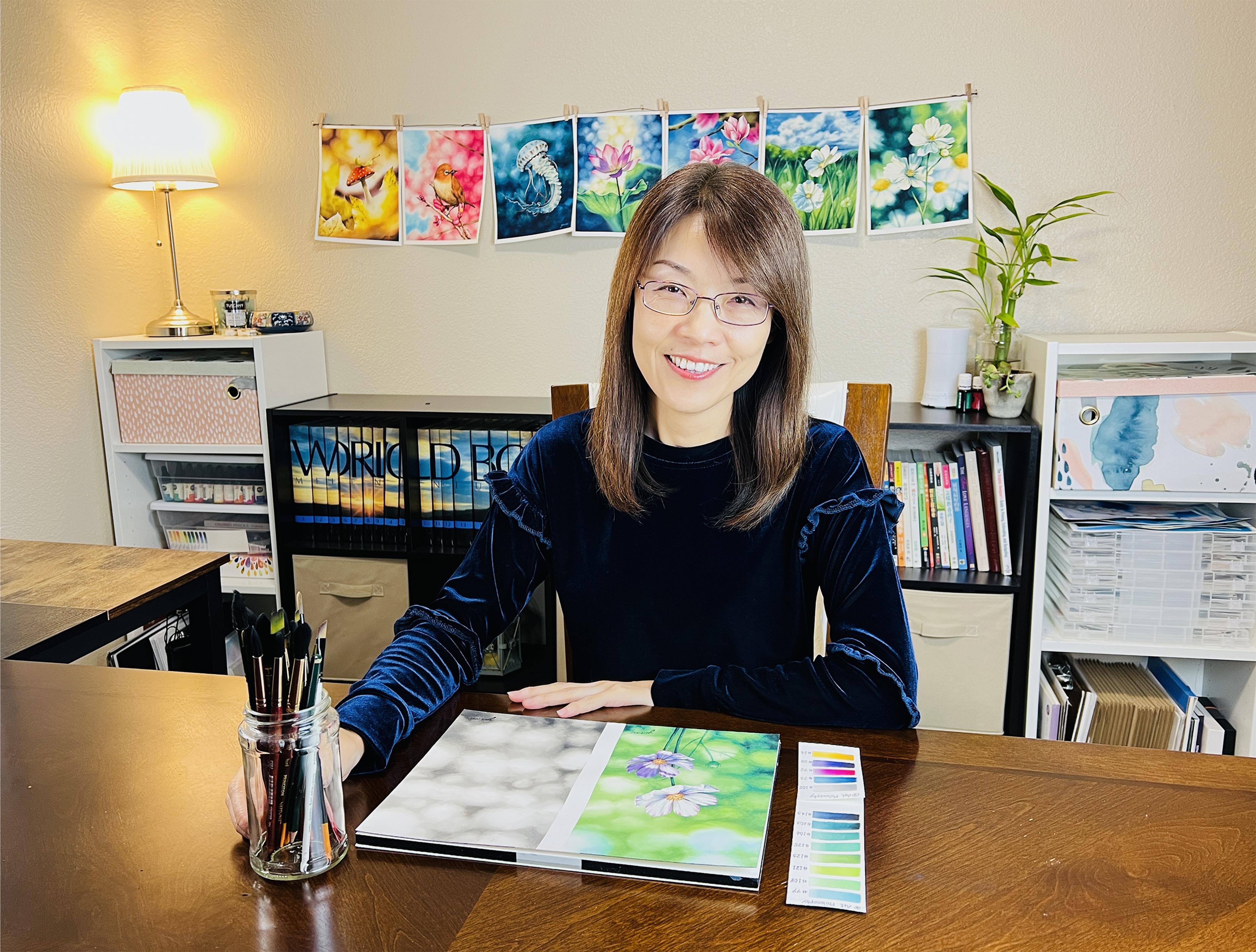
1. Introduction: Hello everyone. My name is Yu-Yin Lin. The artists behind Yin
creative studio on Instagram. Art has been an important part in my life since I was a child. After receiving a
bachelor degree in Oil Painting and the master's
degree in Art Education. I somehow ended up working in design industries,
including Graphic Design, Interior Design, and
Textile Design in Fashion, Stationary, and Home
Decoration industries. Around two years ago, I have devoted more time
to water color. From then on, I have use watercolor for both my textile design and
the personal interests. Funneling. All. The more I paint
with watercolors, the more I like, less meeting. I'm so inspire and
amazed by nature. Lad has a provided a variety of beautiful and amazing
elements for me to paint. That's why I always have
my camera and phone with me. No matter where I go. Detail oriented personality, I'm attracted to the beauty that
might not be so noticeable, which it can be simply leaves, flowers, or mushrooms
covered by that tree. In order to emphasize the
main subjects in my picture, I have adopted the effect of a soft out-of-focus background
when shooting a subject, which is called Volcan
in photography. In this class, you
will be running all about my painting process, including how to
find inspiration by taking your own photos
or searching online. Our surprise that I
use for this class, how to compose my painting by applying the basic
principles of art. The tips of masking
through including what, when, why, and how, how to create Bokeh effects. Impulsive, monochrome
and multi-colored styles by using different
watercolor techniques, including washes, wet on wet, and lifting out colors. How to pan the main subject
in a realistic way. Also, I will show
you a bonus tips on how to fix some imperfect
areas of the book. Bake. This class is for everyone of all skill levels who not only just tall layer
watercolor journey, but also has a work with
watercolor for awhile. After this class, you
will be able to not only apply less bulky fast
to your back arm, or just certain areas
of your paintings. But also create a portal
like painting with us, dreaming and Sophia, I cannot wait to show
you all of them. Let's grab your
supplies and join me for less exciting class.
2. Class Project: Focus out by new law. In this class, you will create a watercolor painting
off Pokemon. If I beg wrong with
the main subject line, you would like love
viewers to focus on, such as leaves, flowers, birds, or even machines. You will be running each step of my painting process,
including inspiration. How do I take a pictures? And how do I find
inspiration and personalize lives and
reference our surprise. What can our
surprised that I use, including what kind of
watercolor paper that I choose, different kinds of brushes. Watercolor paints, masking, flu, eraser, residue, eraser
tape to watch your pencil. Palettes, towels, water
bucket, and liquids. So the composition,
how do I compose my paintings by using the
basic principles of art? Watercolor techniques. What can the watercolor
techniques that I use, including washes, wet on
wet and lifting our colors. Bulk can effect a conflict guide of how to create soft
poking playgrounds, including monochrome and
multi-colored styles. The focal subject. How to paint your
main subject in a realistic style as Cosmo flowers will be my
subject for this project. Please feel free to
choose your own. Any subject you would like
the mirrors to focus on. Less nullius, bonus tip. How to fix certain imperfect
areas of book can be ground. After this class. You will be able
to not only apply this effect to your background or just small areas
of your painting, but also create a photo
like paintings with us, soft, dreamy, and Sophia. Are you all ready? Let's get started.
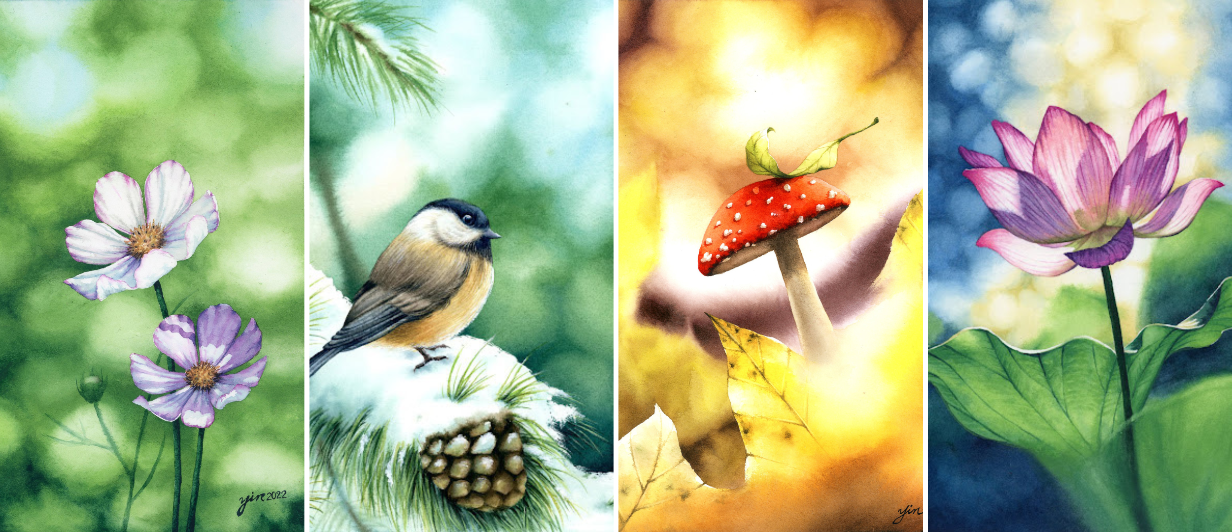
3. Inspiration: As an artist, I'm so inspired
and amazed by nature that I always have my phone
with me to take a beautiful moments and
reference for my paintings. I keep figuring out how
to create survey in fast by watercolors such as Klaus, summaries, ocean
wave, water ribose, and especially burry
out-of-focus effect like a pumpkin in photography. One is for Kim. Kim was originally a Japanese awards
translating literary ads per bucket first became used in photography
in the late 1990s. Bookend is the
aesthetic quality of the burr produce in out-of-focus
parts of the image, which is present in fat with the softness of the
lighting in an image, We spend more about blocking
in my following lesson. To achieve bulkier
in photography, you will need to use
a lens with at least F2 0.8 aperture with a
faster actors of F2, F1 point a or f 1
for being ideal. However, not everyone has a professional DSLR
camera to take pictures as a European
reference, including myself. Fortunately, due to the
new tech knowledge, now, I have an iPhone Pro that
has a built in macro mole, which allows me to take
a detailed pictures with the bulkier if background
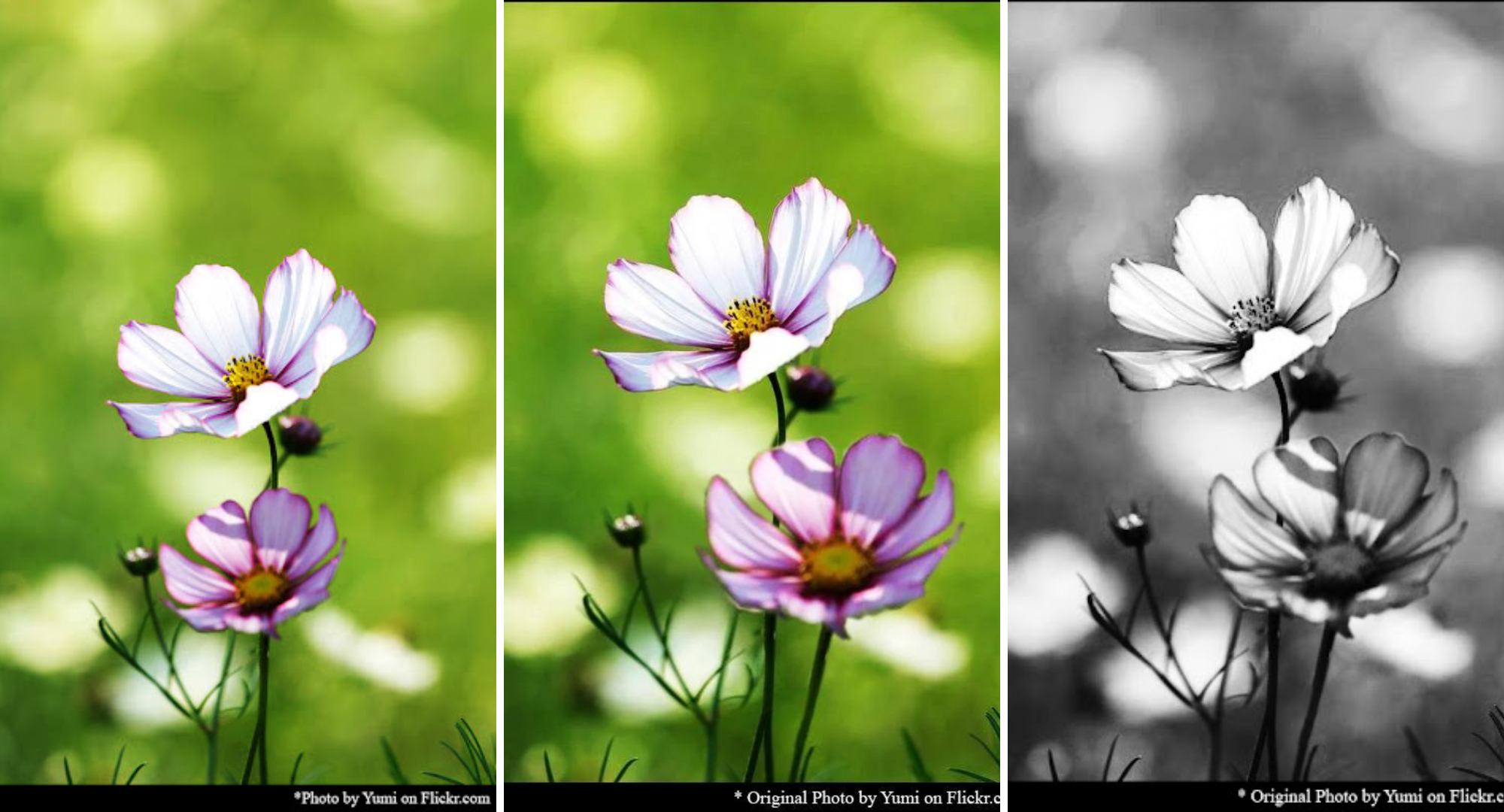
using y angle name. Most of time I tried to use my own photos as
painting reference, but sometimes I just cannot take all the
pictures that I like due to the ability of
equipment, time, or locations. In my case, I search
image online, such as pin tree or google. Laying our brain loads image and reference to Adobe Photoshop, where I can modify personalized and Liz
reference as what I need. Here, I'll assemble how I modify the reference from original
photo to what I need. Omega high contrast. I adjust the lighting
and even move one flower to be little
bit taller, right? Enlarge and rotate a little bit. So finally, you can see the reference right here
on the right-hand side, which is what I like. I will have another
class to teach you all the tips including how
I do it and everything. You need to be aware
before you use other photos from
other websites. No matter what kind of
equipment like you have used, you can find your inspiration
by whatever you can. Once we have decided which you referenced
that we're going to use is time to get all
our supplies ready.
4. Art Supplies: In this lesson, we will cover all the materials you will
need for this project. Pencil I like to use to Etch a Sketch because layer
creating with holidays Greece, for technical drawings, they
don't group cakes so much. So you can work with ln x plus the allylic create
our gray, not black. So it's easier to
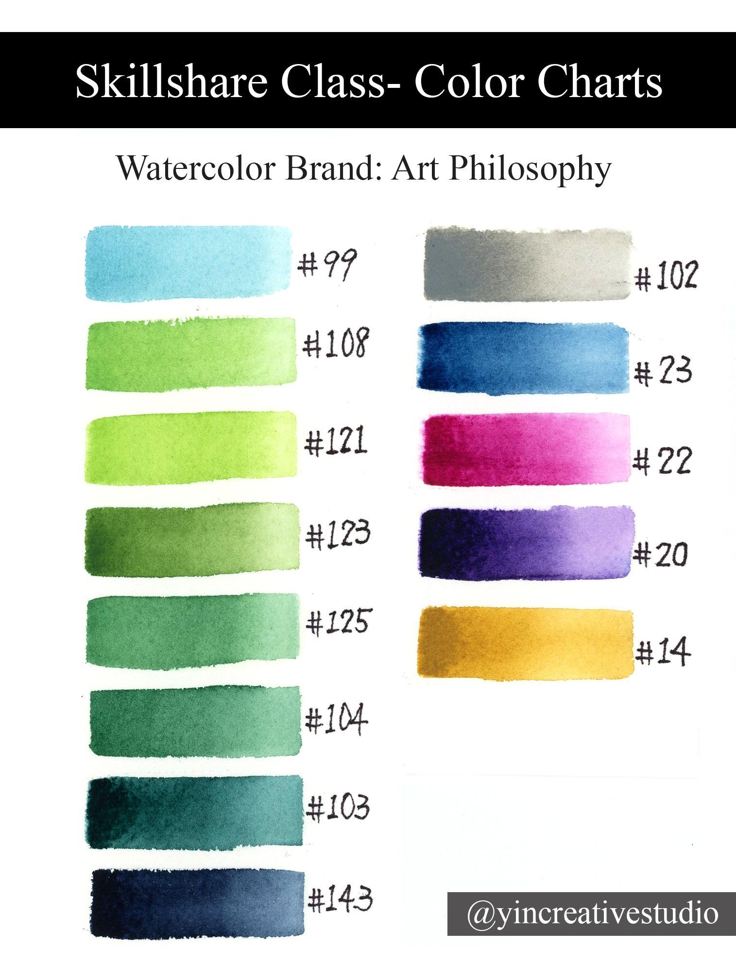
cover by watercolor. Watercolor paints. For this class, I'm going to use the products from the brand Coke,
or philosophy. There are so many
different kinds of sets of colors for you
to choose from. Mainly I going to
use this for sets. But no worry, I'm not going
to use all the colors. And just like I'm showing you
where I get my colors from. So I usually pick cooler colors, any color I need
for this project. And then I will create
my own pallets. So if you don't have the same products or
brands, no worry. Just go to the resource and the final color swatch that
I created for this class. As long as the
Recolor match and you can just use your own products. Brushes. Here for this class, I will show you three groups of brushes to show you how
am I going to cooperate, loads brushes together to
achieve today's project? First of all, let's
talk about background. Background is like large area. Usually I will use
the coil sizes six or coil size for to do major washes because they can hold
onto a lot of waters is so easy for you to do wet in wet techniques for
the background and also for the bouquet effect. I love this brush is
so much because I always use this one to
fix the imperfect area, which is the following lesson. I will talk about it. But when you create
a saphenous age, I really like this one to solve the strong contrast edge
of your bouquet effect. So you will see me
use this brush a lot about too is full. The beaker major washes. And then, then the
rest of brushes is just the regular size
that we have here. Or I have a twelv here, we have a ten here, a and six loads just
for the background. Same as list too. When you do the book, can you fat, less? Console handy? Because we will do the
multi-colored style for loud while we need different brushes with
different colors. So it comes very handy. And for the half
oval wash reason I like it because when
you do the background, when we create the South
bouquet fat account, when you turn it sideways, it kinda like a really fine, you can really pick the
colors you want to pick. And also for you turn
the downside this way. You can really also branding
colors so well together. So this one you will
see me use quite often, especially when we do
the soft bouquet effect. So that's the first set layout. Most often I use them for
playground in the main subject. But when I found out this set, which is a silver black
velvet layer, really pointed. So the good thing about
pointing part is they can really go to the details
and really small details. And also plus they can
whole other waters as well. So when you do the background, I will use a major, this one to add the darker
area around the book, any fat. And the least two. For a and for Eugenia, use it for the main subject is good for do the base
of human subjects. And the number four is
very good for the details. So I will show you later more. Final set. They are from actual studio. Some of you may hear
about the studio. So I use this so much so
you can see it is this, why is it kinda
peel off already? I can talk about this one later. For this three. So for their size is 6423. One should be 631. I use them as the
details when I pay my main subject with some
details layer really pointed. So it's really good
for me to go to my flowers in a spatially the vane inside the leaves or maybe the detail
of flower petals. So we're going to use
this for the details. And then the last
group is less well, which is a flat, very small. And the reason I
picked this one, LEA this one's angular brush leads to I don't
use them to pain, but I use them as the
tool for lifting colors. So for example, if
you want to leave some colors around the rock and you can just go in and see it can come up with
such a fine line here. So once you lift colors, you can control which area or maybe in a small area
you want and leave colors. So really like list one
and for the angular one, since it come with the angle. So when you try to leave
color around the subject, it might not be straight line. The subject can be, go
around, can be rounded. Then at the latter,
we live colors. This one comes in really handy. You can just go around your
main subject to lift colors. Later on, I will use these two mainly
full lifting colors, papers, watercolor papers. In this class, we
are going to use cold press, £140.100%
cotton paper. Here I'm going to show
you the two brands. One is Arches, another way is actually overlap is called
a perfect sketch book. So in this class, you will see me
use both of them. The reason I'm choosing a cold press,
watercolor paper is, as you can see, the surface has made top
is slightly texture. Like you absorb more water. And a pen pigments
can be fixed into the paper more quickly
than the hot press one. And plus paper with a £140 has very good
resistance to fraction. That's why we are going
to use a cold press. £140.100% cotton paper. Paris. Watercolor palettes. Comes to watercolor palettes, the best material is a ceramic. Ceramic palettes
can kill the pain, stay moisture longer, and
the shoulder true color. So for example, I would
like to show you this blue. You can see right here, that's the boyd going
to demonstrate. You can see when you
put it in a ceramic, Pali is so close to
the actual pins. So the color is pretty
much so we can really see which color you are going
to be easy for you to see. And plus, the ceramic
palette is so easy to clean up a whole. Once you finish,
you can just go to the sink to wash it by here. Since I'm going to
demonstrate to show you how easy you add more water. And now I've just
taken the napkin. It's easy to clean up. It doesn't stay any stain, so it's good as new. So next time when you use
it is still pretty clean. So easy to clean, very sturdy and
also long-lasting. And it can with different
kinds of size and shape. And you will see the list
one ready queue, small one. So this one you will see
me using in the class for the masking fluid
and liquid soap. We will talk about this in our masking fluid session here. As my suggestion. Ceramic palette, Yes. Price may be higher, but for the long-term is
still very good investment. Ness, I'm going to show
you masking fluid. So in this class, I will use a Winsor
and Newton watercolor or masking through. So you can easily to Friday in any local art store or online. In the lesson, liquid
soap, they both, I'm going to talk more in
my masking fluid lesson. I will show you why and
the how to use leaves. But I will have this
including in my art supplies. And this one, I'm going
to talk about the tape. You might think why I need tape. Some people might not need it, but for me, I usually like to. So for example, if I just have practices, certain
new techniques, or just do the sketch, our, divide our paper into two by
using the tape in between. Or some people like to
frame your watercolor, like a harder bore
WorkBoard for you to pay. And some people
might just use it to device sky and ocean. So it depends on how you paint, on how you use it. For me. I have in this tape
for either frame my watercolor painting
or divide the paper, I can practice more. And I found this
one is coasting, so tape is pretty good for me. Some people may
use a washi tape. So it depends on how you feel
it for me is easy to use. And then when you peel off, it doesn't really damage
my paper too much. So for example, I
tape this paper, tape, maybe a tail go. So if even right now, when I purely it doesn't really leave any kind
of grew on my paper, also doesn't damage
my paper that much. So when you make a mistake
and you wanna pull it back, still stay pretty well. The pen will now breathing in. So really legalese tape. And this one I'm going to show
you is the regular eraser. Of course, just for the sketch. If you make a
mistake or you don't like the sub dealer you sketch, you can use reason to erase. Also, I use this one in
the mask info session. When we, before we apply masking through in the area
of your main subject, I like to leave some
pencil off because I don't want to have a
really dark pencil mark in the painting. So usually I use this
one, just tap, tap, tap to the fall, some pencil. And the USC me how I do it. When we go to the sketch
main subject area. Another one is this one we
call grew residue eraser. The reason I have it
is also go along with masking through whom I remove
masking fluid from a paper, I use this tool, it come to Hindi. So I will also
demonstrate how to use it In the masking
through session. And now we go to
the water bucket. So I have a one is a
ceramic, is a taker. Have a bigger container. And sometimes I, if I
do a small painting, I might just have
a small glass jar. Any kind of jargon phi from
your home? I just use it. The reason I pick a ceramic in glass because they are easy
to clean, also sturdy. So same reason as
the lapel ceramic, my stay longer and
easy to clean. Same as the grads. And the last one is o tau. Anyhow, you can find
it from your home. As long as the layer cotton, they can absorb water and they will not
make the table mess. So you can have a awesome people like to use the paper towel. So it's up to you For me. I like a tau since
it will last longer. So that's all our materials
that we need for this class. Now, we have all the
materials ready. Let's move to the next lesson. How to compose your opinion.
5. Composition: There's no right or wrong
when you come to art. However, how to compose a
painting might be overwhelming, sometimes is spatially,
or you tried to simplify a painting
from your reference. Simple way to ease spraying compensation in
painting is how you arrange your elements
on your paper to attract and communicate
with the viewers. I'm going to show you the
basic ways to compose a painting by applying
the principles of art. What are the principles of art? Layer, so many principles of
art if you search online. But here I'm going to
only talk about six loud, well, applied to our class. The first principles
of art layer I'm going to talk about is emphasis. Emphasis is low focal
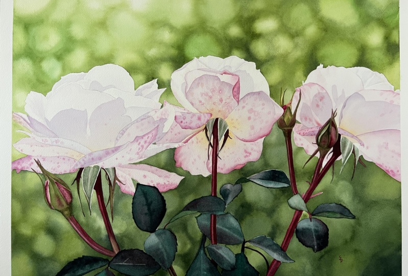
point of your painting. Or other main thing that you want to catch the viewer's eyes. For example. Here are
my two paintings. In list, two paintings. What do you see first? That's right, The
Owl and water lady. So I emphasize the main
subjects by putting, laying in the focal points, which is a huge arena
center of the paper. Next one, I'm going to
talk about contracts. Contrast is the difference between elements
in a compensation. Contracting elements come
in the viewer's attention. For example, three are
some of my paintings. As you can see, I create some high contract
by using colors and negative and positive
space to make love for coal leaves sticking out
more like a first one, I use it a high contrast
between leaf and background. And also here, the
darker background, making the leaf pop out more. Also I cream and
negative space in the background that can make your main subject
standing out more. Next one, I'm going to
talk about movement. Movement is how to lead the viewer's eye through
our and our work. So in this mushrooms, you can see, ended up
falling leaves painting. And the evil are running. The rain drops one, I create a movement by
the illusion of space. So as you can see
for the fallen leaf, I create the illusion of space, the background, same as
the marginal row one. And then I use the illusion of a reputation like right here, kinda like a worse
the trace behind. And also right here,
learn dropper anyone. That's also the
illusion of repetition. So the raindrop kept going
down to make it a movement. That's how you catch
the viewer's eyes. Next, let's talk about balance. Balance is the distribution of visual weight
in an hour work. There are three types
that you can use. Symmetrical and
symmetrical and radical. So here I have a three
paintings to show you. First, while when
I pin the door, I kinda Guillot war and the door core space almost equal to omega less
symmetrical composition. And a second one for the bur
and the pine tree with snow. I kinda pull the bird still in the center
of the painting. But for the branch
and the outer leaf, I can put it all on the
left side to make and symmetrical layout to make a list painting
more interesting. And then the last one, radical, as you can see, the
maple leaf or around. So it's kinda bring the viewer's eyes go
around the main leaf. And because of here is lighter. So it will go all the way
back to the main leaf. Next one. Let's talk
about proportion. Proportion is the
relationship of elements in our work to the whole
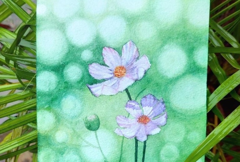
and to one another. So here I have a three cosmos flowers
painting to show you. As you can see. I make the main flowers bigger. Most of them are bigger in the front to catching your eyes. And then I use different
smaller size of flowers as the background to create an interesting layout. But you still can see the
main flowers in the front, which are usually the biggest one to catch you,
the viewers eyes. Last one. Let's talk about United. United is all elements
of our work in harmony by either colors or
relationship with each other. So here I have two
paintings of swung. So as you can see, I put a swan almost
in the center, make a focal point. But how do I make a uniting of lists painting between main
subject and big round. I use colors. So I bring some yellow from
a background to this one, and same as the
one on the right. So I use the colors coherence to make it a
whole painting United. So in this class, we will learn how
to create unity of your painting by
using colors as well. Having less principles
of art in my, when you compose the painting
can really surprise you. Based on these six
principles of R, I'm going to show you how I compose the painting
for this class. First of all, I visually divide our paper
into nine section. But here today, I'm going to use this grid to help you understand
what I'm going to do. So based on the green, you can see I divide our
paper into nine sessions. Usually session phi, is it a focal point which is at
the center of your paper? So I'm going to put
the first flower, which is a main flower, into session five,
right over here. For a second flower, I'm going to put the
among 5689 right here. It can be a little bit
higher or lower sometimes, depending on your main subject. Based on the original reference. You can see the two flowers. They kinda lying together
is really straightforward, which I don't really like it. That's why I go to Photoshop to move the second flower a
little bit taller, right? Enlarge. Also rotate a little bit. You can see the difference. Smaller, right below
the main flower. But I'm moody right here. So you can see now from
the lightest part, all the way you see
the main flower. And your eyes will go around coming down and
follow this thing, going to the hole, goes through the whole painting. That's kind of one of
the principles of art, which is a movement. How you guy the viewers to
go through your artwork. When I sketch, I like to use the pencil to edge
because it can create a lies with accuracy
and colors are more gray, not black when you sketch a light to make a mark
like a wireless paddle, another PEDOT you
can mark and then remind yourself where
each paddle will go. And also, I really
like when the paddle folding that really make the
flower Logan more vivid. So I'm gonna do this one in
the base on the picture, needs another petal which
is affording right here. So based on the mark, we can come pray. The shape of the petal. So usually when I sketch, I don't press pencil, the heart. But today since I'm recording, I want to make sure you
can see where my pencil goes as y. I kinda push
a little bit harder. So you can see the sketch
that I've put it in. Okay, there's one more
petal here which is angled. Another one sentence, if even the flower picture doesn't
have a son folding angle, as long as you know where, how the pedal goes. You can create your own to make your painting more
interesting. Okay? So the first, second flower, and then we add them
as thin down here. So that's the basic
sketch for this painting. And also, if you go
back to the reference, you can see like a
little tiny leaf around. So I might add a one
or two in the back by, don't want to add
too many since I tried to simplify this painting. So I'm going to add one more here to make it
more interesting. But I don't want to make each one looks like a pure
lighting each other. So I'm going to do in this
one going that direction. Can then leave going
behind in this pane. For our, can be this way. And then you don't
want them megaliths saying high as second flower. So I'm gonna put it right here. So this way you have a 123. This is three different
height of the flowers. This one, I don't do too
much detailed sketch because it's going to be
brewery in the background. Unlike a list two, I will use masking fluid to cover it when we
paint the background. So I just roughly remind myself, here's a leaf right here. So when I do the background, I going to remember to add a sudden leafy thing
right over here. So if you ally later on, you can add a one more here. So it depends how
you feel about it. So I will see how I feel
when I paint the background. Okay. That's all the sketch
for less pending. Now, we have the sketch down. Let's move to the next
lesson. Masking fluid.
6. Masking Fluid: In this lesson, you will learn everything
about masking fruit, including what,
when, why, and how. First, let's start with
what is masking fluid? Masking fluid is latex based, medium lacking prevent the pain from reaching certain
areas of your paper. There are so many
different kinds of brands of masking
fluid in a store. So you can pick a little one, lie you like a painter. And four here, I'm going
to use a Winsor and Newton watercolor,
our masking fluid. I found this one so easy to remove and does not damage
your paper too much, even when you leave it
on your paper overnight. However, look best timing. The ideal timing to
remove masking fluid is right after your background
is completely dry. When do we need to use masking fluid for
watercolor painting? The masking fluid is used
to keep certain area of your paper white when the pain are applied
in the background. Sometimes I use a masking fluid two times in
the same painting, such as a water
drop on the leaves, I apply masking fluid on both water drop and
leaps area first. After complete the background, I remove masking through them. Before I paint the leaves, I apply masking fluid. Again, only water drop area. This way. I can kill a water drop
to be white and clear, to have transparent effects. Why do we use masking
fluid for this class? The masking fruit
can not only prevent a paints from painting the
pumpkin if a background, but also create a purest
white of cosmos flowers. In the high contrast
between the main subject and background that we
need in this class. How can I apply masking fluid? You can apply masking fluid to your paper by using brushes, alula, pain, silicone,
applicator, or sponge. I prefer synthetic brushes because I can apply
the masking fluid to different sizes of
areas and also create different texture based on
the subject that I make. For example, I use a brush
size is six to fill in the area of upper flowers,
leaves, a mushroom. Man. I use brush. Number two, says two to
create a frothy edge of miscanthus and then a
texture on the machines. How can we remove
masking through? Please do not remove
masking through until the paint around it
are completely dry. You can remove masking fluid
by using different methods, including your own fingertips. Any robbery materials,
such as the handle of Caesar's and rule
residue eraser, which is my personal preference. I don't use my fingers
because of the cancer. Lama live trace of OEO
from my fingertips. The group residue eraser is designed to remove
masking fluid. So isn't reliable and efficient. After you renew the whole masking through,
before you paint, make sure you check
every inches, including all the corners here. Everything measure all
the masking fluids off. Like a here. We
forgot to remove it. Sometimes it'll
color might still go through the masking
fluid, which is fine. We can cover it. But the reason we
double-check before we pin is we had to measure
masking fluid is off, otherwise the pain will
not stay on the paper. So that's the final
thing we need to check. There are some tips of
applying masking fluid. First. Once you open
the masking fluid. Stern it gently with the handle of a brush or any
kind of wooden stick. Just turn gently. Then you can clean
the stick right away. Now, we pour the masking
for in a ceramic palette. You can see some remaining
masking fluid around. Open the area. Remember it cleaner right away. Otherwise, next time
when you opened it, you might have a
heart and to open. Okay, now we have a masking
through right here. Nest. Use in expensive
brushes or alone in pain. For me, I prefer to use a
synthetic brushes because I can control the area where I'm
going to cover a certain area. I can use brush to control better nest in order not to room and clock
out your brushes. So that's why I have
the liquid soap here. We only need a few drops or even just one drop
roundness to it right here. So the tip is in order
not to ruin your brushes. After you pull your
brush into water, dip into the liquid soap before masking
through. That way. Once you finish, you
wash your eye away, the brush will not be crack. So that's another tip when
you use masking through. Also right here, since we will have a
masking for already. Before we apply
that to our paper. One more thing to remember. The schedule we did earlier, since I kinda using more pressure to make the lines darker in order for
you to see better. But right now, before
I apply masking fluid, I usually use a kneaded eraser. I don't want the pencil marks to be so dark because the
flower is going to be y. So you don't want to
see the pencil like O pins on Mars showing up as
why I use kneaded eraser. You can just tap a certain
area you feel it too dark. Just leave out
some pencil marks. As long as you use, you
can see where to apply. The masking fluid, especially like a transparent
the nice part. You don't want this
thing to see through it. So now it's a lighter.
And also remember, when you remove masking through, it will also leave out
some pencil marks. That helps too. So now we can apply the masking
fluid to the flower area. So David, the liquid soap
thoroughly your brush. Now you can use a masking flu
to cover your main subject. Now, we complete a prior
masking for two human subjects. Another tip right here, wash your brushes right away immediately after you finish. The reason here is once
you wash it right away, plus, we use liquid soap
before masking fluid. Now as you can see, your brush is not clock up. It's all ready for
use for next time. So that's a tip
about the brushes. And also one more tip. Try not to tint the
masking fluid by yourself. Adding regular pens in masking from my liberal
staying on your paper. If you would like
to have a contrast between the paper masking fruit, that can help you see where
the covered areas are better. You can purchase the Tinder
masking fluid, found a store. And the last, none of these
try not to pin the background until the surface of the main
subject is completely dry. So now we have covered a
Cosmo flowers with mezzanine. While waiting the
surface to dry. Let's move to the next session. How to pain, monochrome
bouquet effect. Baker.
7. Bokeh Effects Monochrome: There are so many
different types of volcanic effects
in photography. But I'm going to only mentioned
two times in this lesson. In the central chart, you can see when you focus
on the subject correctly, it looks like a correct it down the bottom,
very last one. However, when you
don't the image, it can be either under
carotid or over carotid. That's how bulky it
fires are produced. As you can see, the
right photo has obvious circles with a
strong contrast colors. And then the left one has a soft contrast with
undefined edges, which is why I'm going
to create today. In order to explain this
technique with in-depth details, I'm going to show you the
monochrome style first. This way, you can understand the basic concept of how to create a softness
of your background. Once you complete less lesson, I will show you how to use a multi colors for
dreaming soft background. In the next lesson,
Let's get started. Now is time to wet your paper. This step since basic,
but actually tricky. If you apply too
much water on paper. European Welsh breed too much. And Leila watermarks
after layer dry. On the other hand, if layers not enough water, Europeans will not miss
smoothly for the amplifier age. My tip is to apply water to your paper until the texture on the surface has been covered. So let's apply the water here. And usually I don't wet the
paper all the way through. I kinda divide by sections. For example, I'm doing
the top part first. So only wet this area. Say if we, you don't wet enough, you still will see the
texture of the paper. For you or pry water
cover the texture. But the water is enough
floating around. Then that's the perfect
water for this effect. Now I'm going to add the
pins to miss project. So after, well a paper, I'm going to use the lightest gray to define where
it's a lot lighter area. We use a light gray to define where is lighter whereas
darker later on. So use your brush creek kinda
like a circular pattern. We do the first layer. Can kinda see where it's
lighter, where it's darker. Kinda define later on
where it's going to par. And I have a less
brush coil six on him. Just make sure all
the IE, Edge or soft. Spatially the first layer
isn't very important. And once the Eukarya
some colors, make sure to wash it
because you want, you don't want to carry too
much pens to a lighter area. Here, the first layer in
this area is all done. So we can again see
we are going to be the lighter, refreshing area. We're going to be darker. Tried to create a
different sizes of circle to make the pattern, the background more interesting. So semi-circles, a baker, some of the circle or smoother. Once you've kept going down, you can see paper
is getting dry. And now's the time to add more. Water. Surely are always wet enough for you
to apply the paint. This area, I'm going to leave out some paint
to make it lighter. Can just create a
circle right here. Every time you lift color. Tried to make sure when
you go to the next area, your wash a tip so you
don't carry the colors too. Lighter area. Okay, I
think this era is good. So we're going to
add a darker gray. When it's still wet. That will be the best time
to add the darker gray. Even fill a second layer, you still can try to
define the pattern. Some areas, darker. Area is better. So the more layer you did, it will make your background
more interesting. Here I'm going to add
a little bit darker. Based on the picture reference. Here, I'm going to add
some darker area as well. So as you can see, when the paper is still wet, once you add the
different colors, they can blending in together. But if some of them end
up reading too well, use this brush. Just water. Can adjust, carry the
color to face the edge. So any fill that
area now smooth. Carry out too much colors. Go begging. In the first
layer on the top is done. So now we're going to move it
down to the second section. We go now when a
papers and things, you can carry some
water up here, but try not to lift out
colors from previous layer. Okay, let's continue
for the middle section. Strap on the light gray here. So based on a reference, some area is darker
on the left side. So I'm going to emphasize
some area here. Make them darker. I said time to use it. A coil. Six brush. Here again, I'm curious and
water here since I can see the edge here and
that's smooth enough, I can then just squeeze
the actual water. So maybe here you can see a
squeeze that extra water out. Just a little bit light gray. Go into this area
just when the paper. Then I'll continue
here still wet is the best time to
add the darker gray. In the meantime, I
want to make sure here they can printing
smoothly tool in this area. So again, say I can't buy
washes and lifting colors, taking the full opaque row. You can see me moving this side, kinda just washing
this brush and then squeeze the water out. Here can be lighter, so I can leave out some colors. Then down here, you can create your own pattern. Sometimes you feel older
grades are too dark. No worry. Same thing
using this brush. Some water, just carry
color around it. Carry to the area you want. And sometimes I will
rotate my paper, since that's the easier
way for my hand to move. So for example, this area easier for my hand
to more wrong. So my paper this way. And the wash all the colors
on the tip and go back here. And some area here. I still want to add
the sun going again. Okay. Here area, the bottom parking lot
getting darker and darker. Still start with a lighter gray, but I'm going to add a
sun middle gray here. So you can see here is darker. So you can always go back to your reference to see
where the darker with is a laser or something,
just they float. Follow your intuition. You want to make it
darker or lighter. They're all good. So this brush, again, water only
soften the edge. Jerry, color or wrong? I mentioned the brush earlier
about this oval wash. Seem like they can't
do the whole area but a certain small area, if you will obtain a brush, you can fix a smaller area
like an ankle nice way. Don't worry too much. Certain area might
not be perfect. Because later on, if
when the paper is dry, you might see some
area now perfect, which means very
obvious watermark or like obvious brushy stroke. I will have another
session following up to show you how
to fix those area. So don't worry too much. And I go here, you can
see some watermark. When you see you
can fix right away. But if not, some awful and Nash showing until the
paper completely dry. So we can always fix later. Okay, Now let's continue here. Since it's getting darker. The user first
light gray as base. So going down here, I cannot call them all off live together. They
are all darker. Since the background still
some kind of flower showing. You don't have to
worry about like have a fully flower shape. But the edit this, you can see cent area, IBA is a donkey is par. Some areas still lighter. Color background,
more interesting. Some area once you smooth or
you will carry some colors, just be aware how much
color you carry around. So a lot of people asked me
how much water means enough. It depends on the brushes. The one I'm using. I like to squeeze all the extra water out
until it's drifting. But some brushes
may be different since they are designed for different company,
different brain. So use whatever you have. But just experiment. How much water you squeeze
out might be perfect for you. So just repeating this
process at the colors, smooth out the edge. If not enough, go back
in, add more colors. Darker area can be here. Ashley sound over here too. As you can see, when
the paper is dry, add the color is really
strong, sharp edge. It doesn't breathing
in like a button here. It says the body here still wet. So I'm going to show
you how to fix. The area is dry already. And the ones you
add a darker color, they are going to stay
a lot like a list. So let me smooth out
here first. Thank you. Show you how to do that. Simply measure not
too much water. The tip is the brush
tip sheet tool a darker color and gently carry
color to a lighter area. In this area here
might be darker, so I'm going to add, keep adding darker and darker. So same thing for you. You can keep looking
and say, oh, maybe here should be
a little bit darker. You can always go back in. Add more darker color you. So the process is really simple. Just add the colors. Smooth, ER, the edge. It just take a tie. So this area can see
cancer, very harsh edge. So I can just add the water on the top and add them later
be light gray from leftover. So for this project, basically just let
you know how I used three different brushes. Many this one to help me
to smooth out the edge, how to add the more
darker colors. So you can always go
back, take a look. I want this area to be darker. And some area you
won't be lighter, which you can use the lifting,
our colors technique. But when you do that,
it should be really careful if you
carry out too much. And, uh, you might
making a strong edge. So now here is our bouquet
effect in monochrome style. Now, we just complete monochrome volcanic
effects in watercolor. You ready for the next level by applying more like
colors for this effect? If we, yes, let's jump right in.
8. Bokeh Effects Multicolored: Congratulations. You've
successfully creating the monochrome or can
effect in watercolor. In our previous lesson, now is the most exciting moment to use some watercolors
for blocking effect. After this lesson,
you will be able to apply this technique
to your paintings. Not only law, whole background, but also the specific part
like you want to apply. We have a cover, basic knowledge and
tips of how to create monochrome softly out-of-focus
if fat in the background. So let's just jump right in to what colors that we're going
to use for this lesson. If you haven't gone through
the previous lesson. But in fact, in
watercolor, monochrome, it's recommended to watch
it prior to this lesson, is easier for you to follow
this lesson. Smooth three. Here are some tips for painting multi-color effects
in watercolor. First, let's get all the
pins that we need ready. In this background,
I'm going to use light blue and six
different kinds of greens, plus the navy blue, which is called deep-sea. To add the depth
of the background. The brain I'm using is
called our philosophy. That's why I write down all
the colors numbers here. If you don't have
the same brain, which is totally fine, you can just use
your own colors. Phi, something similar
to this color chart. Otherwise, you
feel free to pilot same brain to match this lesson. Nest. I will have a five brushes
for this background. In the previous lesson, I mentioned the three already, which is coil size six, Overwatch size half
for the wrong brush, which is size eight. And in this background, I'm going to add other two. Why is wrong brushes size ten. And the last one is
wrong, brush size six. That's total five brushes
I'm going to use. Finally, the last tip. When you pain in a bigger
area for Putin effect. I suggest painting
session by session, Navajo big run at the same time. In order to create a
soft, undefined edges, we need to make sure when we add all the
pins to the paper, which is still wet. That's very important. If you went through
the previous lesson, you will see why we had to add the different colors
on paper is still wet. If you are already
Let's get started. First. Less well of paper. Usually I don't want a
whole paper at once. I will do a session by session. Right here. I'm going
to do a copper first. That's why I only add the
water on the top section. Make sure you cover all
the texture of the paper. Now I'm going to
star lightest blue, which is a number 99. To defy when a light is from. And while the pattern
will look like. As we mentioned in
the previous lesson, we create circular patterns
by using different sizes. And once you add a light blue, you can use a quill six, size six, brush with water
only to soften the edge. So based on the reference, adding greens on certain area to create different
sizes of circles. When the paper is still wet, the color will blend in
with each other perfectly. But if you see certain area, It's kind of a rough. Now self enough. Same thing. Use size, coil, size six to softer the
edge by using water only certain area and you can even lifting out colors if you feel
it's too dark. We can just use a quill size
six to live out some colors. So when you see the pain you
add on the adjunct kinda feel it can brandy in
the previous color. Well, that means there's
not enough water. That's why we use, I use it a query size six to add more water
Download button. And then we'll just continue. Now we add the blue ink to
make a certain area darker. Now I kinda feel the water, the paper is not wet enough. In order not to lean the
watermark Ola colors gonna be dry all to cause some
very obvious strong edge. Then I go in to soften the edge by using brush with water. Only. Now we add more
greens, darker greens. The more colors you use, more layers you create, the more interesting
the background can be. Now you can see the edge between light
green and dark green. Very obvious. Now solve enough. I use the brushing with lighter
green to soften the edge. I use a coil six, size six, just a
little bit green. To carry over some
color to the edge. They can bring in smoothly. Sometimes you just have to
turn your head saying, oh, if you want to turn a
paper like a hallway did in monochrome session,
which is a Phi. Depends on how, which
way is better for you. We can either use lifting our colors technique
to make, uh, some areas lighter when
the paper is still wet. So for example, the
left top corner. I would like to make a
certain areas lighter. That's why I tried to leave out some
colors from a corner. Just to remember
when you do that, make sure your
paper is still wet, is easier to live our
colors with a soft edge. In this certain
area you might feel is not profane enough, but we can always go
back to fix it dry. Now I'm going to continue to add more green
for the background. So same thing. Well, a paper. Just as an error
you go into pinned. Then we add greens. So let's steps. For Vulcan. If I background or when
the paper add the pins, use Quill size six with water
only to soften the edge. Then add the darker
color in certain area. So let's just repeat
these steps for the rest of the background. So just to make sure
every time you use a coil size six
brush with water. Not too much water. Should be enough water. Too much water. Leave the
martyr watermark with a trite. But if not enough, you may be very obvious. Brushes, strokes. So now I can feel the top bar is not self
enough or so I'm going to use the brush or was it just a little bit color
to smooth the edge? To soften the edge. In a certain area you feel like, I don't wanna be too bright and you add
a really light blue or light green to
push them back. Okay, now let's continue
to add more greens. Let's continue to finish
the rest of the paper. After you paint the background, you might take a look
in a certain area, ship it darker to
push them back. So for example, this area, I feel like I can
push it back and war. That's why I use, I add them wore dark green
to cover a whole thing. Where you add the
more green measure. The edge is soft. Then when Amiga lab
certain area as Barker. So you can see that I mentioned winds are
from one to the back. So you can make a different
kind of layers over there. And I don t feel it's
dark green Alpha, so I add more dark. Now you can no, you can see it's obvious
that went behind. And same thing. Soften the edge. Gently, add the water
to soften the edge. Now I can kinda happy with it. Now you can see obviously, I push it back in the fall in this area
I don t think is perfect. So I might try to
fix a little bit. Sentence. If you can
step back and look at your painting, that
usually helps. You can see better
from certain distance. Once you push a
certain area back. You can create the
depths of European team. Now let's continue to
add some dark green. To emphasize some area. Sentence. You see certain area are not perfect or
not the way you want. I will go back into
fix that area, especially the strong
contrast edge, which is, I don't like it. So I add the light green
color to soften the edge. So as you can see, a contrast and not that big. So I can turn me down. But while you add
the different green or lighter green
valiant measure, it brings breeze well
with other colors. In certain areas, you might
need to add the darker green. Every time you use
different colors, make sure you wash off
because you don't want to carry the darker green
to the lighter area. And then just gently brush
water on top of a surface. You don't want to reactivate the pencil from previous layer. So it's a really gentle brush. The surface only. Now we have finished
the background. But before we move on
to the next session, let's do the final review. So for me, when I'm looking
at the top left corner, I feel I want to
add more layers, layer, so it's not so flat. That's why I use the light green to add the more
darker area around. So let areas and not so flat
before it's just kinda Fred, light green with a light blue, you don't really see the
depths of that area. So now add a little
bit green so you can see some things but don't, you feel it's not enough? Just add a little
bit a certain area. You have just creative
multi-colored polka effect in watercolor. For success, for volcanic event, in watercolor, timing and water control
are the main keys. As long as you understand how much water your brushes hole and the characteristics
of your paper, you can create a soft,
dreamy backgrounds. Just to remember,
different brands might be slightly different. So you just need to try and find a perfect ones
to suit your needs. Furthermore, we can
always come back to fix some imperfect areas. I will show you the tips on how I fix those areas
in less than ten. Now, let's wait for
the paper to complete it dry and then remove
the masking fluid, as we have learned
in lesson six. So if we are already, let's move to the next lesson. How to pin your main subject
in a realistic style.
9. The Main Subject - Petals: After completing the
South, dreaming, poking if a background, if nine to focus on your main
subject of your painting. I strongly recommend
that you choose a year old subjects that
you relate to the most, such as different kinds
of flowers, leaves, trees, buildings, animals,
or even just your own hand. In this lesson, I'm going to ping cosmos flowers
as amendments subject because of their
delicate and elegant appearance. Here is the picture that I will adopt as my reference
before painting. There are two main
elements to consider. First, light direction,
where the lighter Russia is. So we know where to apply the lightest colors
and create shadows. In this photo, the light is
from the left top corner. So the lightest part
is right around here. The more we move towards
the right button corner, the darker it becomes. That's why you can
see the shadow of a first flower is
right over here. Second, colors. What colors show and
refresh on the paddles. So we know what
colors that we need. Here is the color chart that I'm going to use
for this cosmos. Flowers, including light gray, blue, pink, purple, and yellow. These colors are from the
brain core philosophy. And either all the
numbers down here. If you don't have the same
brands, which is phi, I will attach the color chart in resource section session. So you can download it to
find something similar. Because this cosmos flowers are surrounded by blue
sky and green leaves. I'm going to use some Bruce from a background
on Cosmo flowers. It's a perfect way to query the cohesion between background
and the main subject. Now, you can take a look, your reference, our layer, any colors that refresh on both the main subject in the
front ground and background. If you find something, you can use the
color, just like me, I cannot cooperate blue on both flowers in the background. In the following session, I will show you the
steps of how to create Cosmo flowers
in a realistic style. You can apply the concepts and techniques to
your own subjects. Once you've figured
out the subject, lighter Russia, and have
all the colors ready. Let's get started. In this lesson, I'm going to use
for brushes mainly. Size ie 431. They are all very
pointed round brushes, which are very good
for the details. Let's paint one flower, one paddle each time. Let's pin the first petal. First we use the size, size four to wet the paper. Now, I'm going to use
the light gray to defy that I mentioned. You can remind yourself where our talker and then the
lightest part, white. For the first stair, sometimes maybe not too dark. So you have a chance
to make it darker. Okay, Now you can see where is the darker, the shadow area. Also define the
texture of the paddle. And now I can see
the top area is dry. So I use another brush
with some water. Just tap around the edge because I'm going to add
a pink in that area. The best time to add the pinks is when the paper is still wet. Solo pinks can read in
the base very well. If not just like what I did, use another brush with water
only too well that area. Another pink. You add in. You can just breathe in
to a different area. Sometimes you can carry
the pink all the way through and try to avoid Stan. Try to avoid sorry to avoid
a statement and Poland area because you don't want the
color to go to that area. Now use more saturated
pink to make it darker. Now I can see the texture of
the pedal is more obvious. Now I find out here
is not wet enough, so use brush with water only to carry pink
All the way in. Now it's a softer. Now we go back to add a
light gray whispering. To emphasize the contrast. Just keep key my where
is the lighter Russian? So when you add the shadows
or the darker area. Now we have a finished
the first petal. Now let's move to the next one by using the same
steps for each paddle. Now you have just finished
the first flower. Let's repeat the same steps
for the second flower. Now we have a two flowers done. It's time to take a look. Here is the shadow. And you can compare two flowers to see
which one is darker. So the bottom one
should be darker. So take a look. This one is a lighter, so we can add some shadow, some darker layer on it to make a kind of moved
back in the background. When you add a shadow. Kyla flowers, pasture surveys
and moving up and down. So we follow the flowers
texture on the top. So let's share
though we'll look at more nature in the whole area here is darker. So we can add down here
and the way is still wet. Let's add some darker
area right here. So now you can see some
part EVA is a shadow. You still can see some areas, darker. Area is lighter. The first one is done. Let's move to the next pedal. Since the whole area
almost the same. So I can to make them
more color here. And then we're going to
cover the hill paddle. So same thing here. They follow the flower's
pedal. Texture. In. Here is going down and going up. They may color shadow, pretty nature match the flower. So it's not like Leah, 40 on the top. So now's the time to
add the darker one. When the surface is
still dry, is still wet. It's the best time to
add some darker area.
10. The Main Subject - Pollen & Stems: Now we have a dung,
all the petals. Let's paint the Pullman
and statements. First of all, we will use the yellow and the added some
pink here to make orange. Then we can add some dark
blue to make it darker. So let's do the first
one here. So same thing. We make a vase area wet first. Made sure not too much water. Now we start from yellow. We can fill in the whole area, which is totally fine. You can leave some areas white. Okay, same here. Now we add our first layer, which is a yellow. Okay? Now we're gonna add some orange. Orange anymore, kinda like the between and the
download button. Here. Just make sure you still take some yellow
color recover by orange. Okay, now we have
a second color in. We add a brown, like a darker, reddish. And the other bromine made sure the paper is
a little bit dry. Otherwise in a darker
color going is it going to bring it all the
way to cover the yellow, which we don't want
that to happen. So we're here, we're a little
bit until it's really dry, then we can add a darker color. Okay, Now, I just
don't mix yellow, pink, and blue altogether. And they're also add
a little bit brown. There'll be brownish
color in here. The number is 24. Just a little bit. Then we can add that to the
darker part right now. So as you can see, the paper's still kinda wise
or color can really go in. Let's do printing,
which is a perfect. Now it's time to paint the
stem and leaf in the back. I'm going to use color one
load for right here as base. And then for the darker pro, I'm going to use at a
140th three plus 104 to add a dark shadow here and
the dark here and also here. So I'm going to
finish the last part to show you how I'm
going to do it. First of all, I use it a
size four for the base. I'm going to use a
size three to add a darker part right here. So here's a 143, puzzle 103. So once you have two colors
ready, we can go in. And I use it a darker color. Andre here, all the
way on the right side. The right here, down the bottom here is getting
darker and darker. And here because of
the flower petals, shadows will make this
part is also darker. So now we can lay
dry a little bit. We can add the darkest one, which is 1434, very thumb pad a year. Okay. That's how
we did the stain. Less. I'm going to add some staying in leaf behind
my main flower. If we take a look, the reference, as you can see, some offline here by Leanna, unfocused can be high. So I can make a local brewery
so no strong contrast edge. And then we can undo,
add the right over here. Not too much, just
maybe one here, one here, and another one here. So for this part is tricky. But let me show
you how to do it. So Cynthia, let's bring
the coil six brush again. That's why I use it
for all the water. Only now one. So you add some water
for your brush. Remember, not too much water. Make sure you can
tap on your fingers. The watchers, not too much. Then the next thing
you're going to do is brush the water on
a certain area, light you want to
put the stem behind. So gently brush on the surveys. Do not reactivate the paint, the background you
didn't already. So it's really
gentle, refreshing. You can see the area is wet, but not too much. Then now you go
back to size four. Usually screen. And then just remember
where you put a wash. And once you put a green USC, the edge is not very strong. They just bringing
in where you have a water full of back. You don't have to
worry about too much about how it looks like. How it looks like a very
realistic way is a bank run. So you can also like to add the water on the top as you go. That's another way. Like I'm going to
add some water, you know where it
stems going in, then you add a color. Follow where you put a water. You can see the water just help you to make a
not very focused edge. I'm going to stop
here since, uh, here's another stink
and going that way. So I'm adding here some water. So when you see the
edge is kinda strong, measure at the watery going in and then make the edge
kind of brewery on focus. So you can see is
right behind layer. But you don't really see that alveolus in the old
way is tend to hear. So I'm going to add
a little bit behind right here as well. So now you have a
second layer kind of middle ground for this painting. If you want to go
all the way up, which is a fine too. So we can add a little bit right over here to make a layer more interesting. There we go. And the events and
the second layer, you still can see
some areas darker. So I'm going to add some
darker green in certain area. For example, here is darker. So I've also added some
color on a certain area. And they add the darker green. In sum here is darker, so I'm going to add some water. In that area. You can either stay
in the green up later by using what color
on this brush already. Or you can go in here. If you can have your
reference runners view that also help. So you can see where
is maybe going. I think that's pretty good. It's a second layer. So you can see here the writer, certain areas darker also,
I think that's good. But follow reference,
you can kinda see kinda wide area which is at
a flower, not even bromine. So for lab par, we're going to use the lift, our color technique, just a
small brush with some water. And that just lifting
certain area over here. They fall some green. We go. So we got some area here. Then you can face the shape. And if you want, you can either add some pink, just a little bit pink. In really tiny area right here. The wave is still wet. The color just blending. Just a little bit pink. Make a coherence
with other area. That will be good. You
can always go back in. If we were searching,
area is brighter. And then we can
add a little bit. Green. Can be either degree. Always kinda details. You can add more if you want. But now I have a 12. I can add a few more
right here to make it, make a layout more interesting. So let's repeat the same steps. Have a brush with water only. And just brush are certain area you want
to add that green. They use it a green. Add to that area. Sometimes you don't even
need to comment then since the lighting wins, the lighter, you don't even see a little bit see-through lighting going over. Some more friends
right over here. Another May 1 be
right down here. So it's a pretty free. You can do your own Divi theme. I think that's a pretty good
for the back of the leaf. So if you would
like to add more, you can feel free to add more or some people might want
to add some more here. But for me, I'm going
to just stop here. We're going to do
the final review. And then let's add a little
bit darker color around here. So right here too. So let's move to that state.
11. Main Subject - Final Details: Now, let's do a final
review of your painting. You can take a
look and see which area you want to
emphasize or fixed more. For me, I would like to add
some darker color or wrong. The area between Poland and paddle to make you
pick emphasize more. So I'm going to add
some colors right here in the coding here. So that's only two braces. I'm going to add a
little bit darker, like a dark is color. So here we have a previous
green and blue from the stain. And then I'm going to add
some purple right here. And then that will be
the darkest color I'm going to add in the O, so I will have my squeal six. I'm going to just make sure if the color is
thin or too much. I can always bring
them in altogether. So let's do that. Make
a certain area here, I want to emphasize
them to be darkest, one, some other here. So many is on the
right button, area. Top, maybe a little bit. And then use it as a brush. You can get some
color, just stand out. Especially the darkest
area right here. You can add the more details you can add or you don't
want it is up to you, just give me the option. So here the center
part is darker. And now let's go to here. So this area will add some
darker color as well. So since now this area is also darker all the
way in, which is good. The top, they really have
a darker pollen than men. You can add assemble Flinto. Same here. Roughly
in the middle. Too much, just a
little bit. Some here. Some of them too much. Okay. So now when I take
a look one more time, I'm pretty happy
with the final work. How about you? Now? I have completed my painting. Last, not least. Remember to sign your name
on your final artwork. So I'm going to use the
darkest blue right here, One 43 as a color for
me to say my name. I usually put it on the
right bottom corner. So let's do this. Very exciting moment. Sometimes you can add a
little bit more color. Cell can make it a
brush more smooth. In their life to date, which here we go. There we go. It's done. So also the final thing we can
do is remove the tape. So that's seen all the Euro way. They remove the tape. So you can reveal your final R. So this means you have
complete this lesson.
12. Bonus Tips: Absolute complete everything
in your painting. You might see some
certain area of your pocket if the background that are not quite
you like to be. For example, right here. Let me get closer. You can see really obvious
watermarks right here. And also very sharp
edge right here. You can see the line. So if a certain area you are not happy with this
sachet is for you. Because I'm going to
show you how to fix those area by
giving you my tips. First, you had to make sure like Europeans are completely dry. Second, have a look colors that you want to
cover sections ready. Set, using a coil size six brush to wet the surface
area you want to fix. But before that, I'm
going to show you people. People always ask
me how much water of a quill brush she have. So if you dip your
brush into the water, as you can see, the water is dripping, dripping down from your brush. But this way I usually hold it. And then I use my fingers
just squeeze the water out until it's not dripping, but still have enough
water to fix the area. So that's how I control how
much water I have. Now. I have a brush ready. We go back to the
area we want to fix. Now, I'm going to
start from this area. As you can see, the ad is not really
smooth. Once you have it. You can also pull a
brush on your finger. As you can see in a
refresher for water. It can be too much. They can squeeze
out one more time. Squeeze a few, drop
and try one more time. Now, it's wet. But it's not like a fraud
team, so that's good. So we're going to wet the
paper just at a surface. Try not to push it too hard. Not to reactivate old lift all the colors from
the previous painting. So kinda briefly just
wash on the surface. On a refreshing can
see is wet by unit. Lifting out any colors
from previous layer. And now it's wet. Use the same brush. Add a light gray
right over here. Not too much. Then you can just brush. Add a light gray Tunis area. You can do the same thing and
measure the edge. Is ISAF. If we you see is
not dark enough, use the same brush. Add a second Grey. Made sure the tip of the brush
is a tour, a darker par. And the eukarya, the color
from the darker to lighter. You can add another
layer on the top. Wash off the natural color. Combat. Muscle, the edge, same here, over here. Smooth out the edge. And my wanna turn your paper
face in this area as well. With a light gray to cover. Carry over to the nearby area. Very gentle because you try not to lift all the colors
from previous layer. Here. Since the agonist muscle, the edge. The edge. Now this area is a fixed, says in more smooth. So no more watermark
and the harsh edge. And now let's move to
the next one here. As you can see, very sharp edge right here, here and here. So same technique. I'm going to squeeze the
water out of the brush and just brush gently
on the surface here. Here, we use a lighter gray. Any left over from
previous painting. Should be enough. Then I think just add
a light gray top. Sometimes add a
little bit darker gray to bring the invader. Okay. Now see your finished
squeeze water theory, the actual color. Combat here. Thin thing. Salvage. This area as well. You can go back. May be light gray in this area,
smooths out more. Okay, now, as you can see, this area gives me this
error is a softer, so the sharp edge is gone. So that's another way
you can fix this area. And the ads for the
watermark right here. Let me get closer. You can see when you
have too much water, when you bring colors, you can see the dry. When they dry out, they have some kind of
watermark right here. And I'm going to fix
that area as well. Same thing, squeezy your brush. Just when the paper surveys. Sometimes a little
watermark is not too dark. You can even just get rid it
by a prior water on the top. Just in case I'm going
to add the light gray to summation of
Burundi within the back. So it depends on why
the colors around the watermark using
that color around it. So you will not see
the obvious. Hi there. So once you've
added more color in the same theme,
gently smoothes out. Now, as you can see, the watermark is this kind of branding in the background
pretty well right here. But if you feel like a stew too obvious, like a right here. That's the way I'm going to add more darker gray to cover it. And same as this area. So let's try one more time
how to fix nose area? Same steps. Squeeze extra water
from your brush. Gently, brush in the
water on the surveys, but not activate the
previous pigment. This time is darker. So I'm going to start with the second darker gray and
then just kinda tap on it. Since the water is wet already. Once you tap on it, they will go to the area. You just have a waterfall, as you can see, can bring
Brady in a certain area. Now why shallow? Squeeze water? Go buy it. Carries out what color it all. Sousa other edge. Now, as you see, the watermark illness
area is gone. Let's just simple tips for you. When you see certain
area you don't like. No, don't worry about it. You can always go
back in and add another layer by
applying these tips. For the first few times, you might not be able to control how much water on your
brush needs to hold? Well, you're not alone because it happened
to me before as well. Even right now still happen. You can practice
this technique on a different paper
first, for example, here is Arches,
£140.1, 100% cotton. And then you can use
different kind of brands. Just make sure you
practice the technique and see how much water for you
to hold on your brush. However, as I mentioned before, there's nothing right or
wrong when it comes to art. This bonus tip is just
for your reference. Some people might
feel here, it's fine. It doesn't bother me too much. But if you do hear it for you.
13. Final Thoughts: Congratulations, you have
completed this class. I'm so excited to
have a you-all for joining my very first
Skillshare class. I hope all my lessons will
help you your art journey. I'm looking forward
to see your artwork by adopting the techniques
from this class. Please go to the
discussion session to start a conversation, share european teens, or
ask me any questions. You can also go to the review session to let me know why you haven't
run from this class. If there's anything you
would like me to cover in the next class
or any comments. I will be so happy
to hear from you. I also can be rich in
creative studio on integral. Please feel free to take a knee and Skillshare with your
beautiful paintings. Again. Thank you so
much for joining me. I hope to see you all
in my next class. Happy painting.
 YU-YIN LIN, Artist/ Teacher